
PatrickMiller
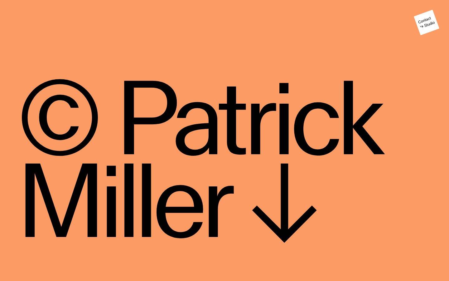
A stark, editorial portfolio built as a monumental typographic hero (a 331px black wordmark on tangerine ground) sitting atop a vertical stack of full-bleed, full-viewport project tiles rendered as flat two-panel color splits. Color functions as content categorization — each project gets its own unmixed hue — rather than as brand accenting, and interaction is reduced to bare arrow-icons and numeric pagination counters. The system is confidently minimal: no shadows, no visible corner rounding, and only two measured type sizes carrying the entire hierarchy.
Works withClaude CodeCursorCodexGemini CLICopilotv0LovableBoltWindsurfReplit
---
version: alpha
name: PatrickMiller-design-analysis
description: "A stark, editorial portfolio built as a monumental typographic hero (a 331px black wordmark on tangerine ground) sitting atop a vertical stack of full-bleed, full-viewport project tiles rendered as flat two-panel color splits. Color functions as content categorization — each project gets its own unmixed hue — rather than as brand accenting, and interaction is reduced to bare arrow-icons and numeric pagination counters. The system is confidently minimal: no shadows, no visible corner rounding, and only two measured type sizes carrying the entire hierarchy."

colors:
  primary: "#fd9b65"
  ink: "#000000"
  canvas: "#ffffff"
  on-primary: "#ffffff"
  accent-navy: "#004b82"
  accent-purple: "#472a75"
  accent-terracotta: "#e9d1c7"
  accent-maroon: "#6f2c30"
  accent-cream: "#f8f5d1"
  accent-mint: "#9ac8ae"
  accent-charcoal: "#302220"
  neutral-sage: "#a4b1b3"
  neutral-olive: "#4c564b"

typography:
  display-hero:
    fontFamily: "MlrStandard, Archivo, sans-serif"
    fontSize: 331.2px
    fontWeight: 400
    lineHeight: 0.8
    letterSpacing: -0.02em
  heading-sm:
    fontFamily: "MlrStandard, Archivo, sans-serif"
    fontSize: 32px
    fontWeight: 400
    lineHeight: 0.9
    letterSpacing: 0

rounded:
  none: 0px
  full: 9999px # derived from screenshot's circular arrow-button graphic; not present in analysis.json radius data (radius array was empty)

spacing:
  xs: 16px
  sm: 32px
  section: 72px

components:
  hero-band:
    backgroundColor: "{colors.primary}"
    textColor: "{colors.ink}"
    typography: "{typography.display-hero}"
    padding: "{spacing.section}"
  contact-badge:
    backgroundColor: "{colors.canvas}"
    textColor: "{colors.ink}"
    rounded: "{rounded.none}"
    padding: "{spacing.xs}"
  project-tile-terracotta:
    backgroundColor: "{colors.accent-terracotta}"
    textColor: "{colors.ink}"
    rounded: "{rounded.none}"
    padding: 0px
  project-tile-sage:
    backgroundColor: "{colors.neutral-sage}"
    textColor: "{colors.ink}"
    rounded: "{rounded.none}"
    padding: 0px
  project-tile-mono:
    backgroundColor: "{colors.ink}"
    textColor: "{colors.on-primary}"
    rounded: "{rounded.none}"
    padding: 0px
  project-tile-cream:
    backgroundColor: "{colors.accent-cream}"
    textColor: "{colors.ink}"
    rounded: "{rounded.none}"
    padding: 0px
  project-tile-navy:
    backgroundColor: "{colors.accent-navy}"
    textColor: "{colors.on-primary}"
    rounded: "{rounded.none}"
    padding: 0px
  project-tile-maroon:
    backgroundColor: "{colors.accent-maroon}"
    textColor: "{colors.on-primary}"
    rounded: "{rounded.none}"
    padding: 0px
  pagination-counter:
    backgroundColor: transparent
    textColor: "{colors.ink}"
    padding: "{spacing.xs}"
  nav-arrow-icon:
    backgroundColor: transparent
    textColor: "{colors.ink}"
  button-primary:
    backgroundColor: transparent
    textColor: "{colors.on-primary}"
    rounded: "{rounded.none}"
    padding: 0px
---

## Overview

Patrick Miller's site is a two-mode system: a **monumental typographic hero** and a **vertical stack of full-viewport, flat-color project tiles**. The hero pairs a 331px black wordmark ("© Patrick Miller ↓") against a tangerine ground (`{colors.primary}` — #fd9b65) — the single largest and most dominant surface on the page, and the only place the brand color appears at full strength. Everything below it drops into a rhythm of two-panel color-split sections, each a distinct project treated as an unmixed hue field (terracotta, sage, near-black, pale cream, navy, maroon) with minimal chrome: a left/right arrow, a small "n/n" pagination counter, and occasionally a circular icon-button.

There is no conventional button system, no card elevation, and no measured corner radius beyond a flat 0px — the design commits to sharp, unadorned rectangles. A small rotated white "Contact ↳ Studio" tag sits pinned in the top-right corner across all sections, the only element that breaks the strict horizontal/vertical grid.

**Key Characteristics:**
- A single oversized display type role (`{typography.display-hero}` — 331.2px, weight 400, line-height 0.8, letter-spacing -0.02em) carries the entire hero. There is no supporting sub-headline size measured beyond `{typography.heading-sm}` (32px).
- Color is used as **content categorization**: each project tile gets a distinct flat hue (`{colors.accent-terracotta}`, `{colors.accent-navy}`, `{colors.accent-maroon}`, `{colors.accent-cream}`, `{colors.neutral-sage}`, and pure black/white), not as a recurring brand accent.
- Zero measured corner radius (`{rounded.none}` — 0px) across every captured component. The one visible circular button in the screenshots is a decorative graphic layered behind a plain-text anchor — see Known Gaps.
- No shadow tokens were captured — the layout uses hard color-block contrast rather than elevation to separate sections.
- Spacing is sparse and coarse: `{spacing.xs}` (16px) for small interior gaps, `{spacing.sm}` (32px) for secondary gutters, and `{spacing.section}` (72px) — the most frequently recurring value — governing the primary vertical rhythm.
- The rotated "Contact ↳ Studio" tag is a persistent fixed element, breaking the otherwise strict axis-aligned grid.

## Colors

### Brand & Hero
- **Primary** (`{colors.primary}` — #fd9b65): The tangerine hero background. This is the site's signature color — it appears once, at full bleed, behind the giant wordmark, and nowhere else at this intensity.

### Accent Hues (Project Categorization)
- **Accent Navy** (`{colors.accent-navy}` — #004b82): The most frequently measured accent (frequency 9) — used as a full-bleed tile background for one project section.
- **Accent Purple** (`{colors.accent-purple}` — #472a75): Used on the circular pagination/arrow control fill visible in the tile screenshots.
- **Accent Terracotta** (`{colors.accent-terracotta}` — #e9d1c7): Dusty pink tile background.
- **Accent Maroon** (`{colors.accent-maroon}` — #6f2c30): Deep red-brown tile background, paired with black in a two-panel split.
- **Accent Cream** (`{colors.accent-cream}` — #f8f5d1): Pale yellow tile background.
- **Accent Mint** (`{colors.accent-mint}` — #9ac8ae): A secondary green hue observed at low frequency.
- **Accent Charcoal** (`{colors.accent-charcoal}` — #302220): A near-black brown observed at low frequency, likely a tile variant.

### Neutral
- **Neutral Sage** (`{colors.neutral-sage}` — #a4b1b3): A desaturated blue-gray tile background, used for structural/neutral project panels.
- **Neutral Olive** (`{colors.neutral-olive}` — #4c564b): A dark olive-gray, low-frequency neutral.

### Text & Surface
- **Ink** (`{colors.ink}` — #000000): The dominant text and hero-wordmark color (frequency 225 — by far the most-used color on the page).
- **Canvas** (`{colors.canvas}` — #ffffff): Page background between tiles, and the fill of the "Contact ↳ Studio" badge.
- **On Primary** (`{colors.on-primary}` — #ffffff): Text/icon color used on dark tile backgrounds (navy, maroon, black) and on the button-primary anchor element.

## Typography

### Font Family
The measured display face is **MlrStandard** — a custom, non-system name (the "Mlr" root reads as an initialism of "Miller"), strongly suggesting a bespoke or licensed identity typeface built for this studio. It was not flagged in the automated licensed-fonts scan, but its naming and singular use as a monumental brand mark make it very unlikely to be a freely-licensed web font. As a substitute, **Archivo** (open-source, geometric grotesk) is recommended — it shares MlrStandard's straight-sided, slightly condensed capital forms and supports tight negative tracking.

### Hierarchy

| Token | Size | Weight | Line Height | Letter Spacing | Use |
|---|---|---|---|---|---|
| `{typography.display-hero}` | 331.2px | 400 | 0.8 | -0.02em | The full-bleed hero wordmark ("© Patrick Miller ↓") |
| `{typography.heading-sm}` | 32px | 400 | 0.9 | 0 | Secondary headline/label size (e.g. "Form Magazine" project label) |

### Principles
Only two type sizes were captured, and both sit at weight 400 — there is no bold hierarchy step measured. Scale, not weight, carries emphasis: the hero is ~10x larger than the secondary heading, with a very tight 0.8 line-height that lets ascenders and descenders nearly touch between lines ("Patrick" / "Miller"). Letter-spacing is slightly negative at hero scale and neutral at the secondary size.

### Note on Font Substitutes
If MlrStandard is unavailable, **Archivo** at weight 400 with a small negative tracking (-2%) closely approximates the hero's geometric, high-x-height character. **Space Grotesk** is a secondary open-source alternative with similar proportions.

## Layout

### Spacing System
- **Tokens:** `{spacing.xs}` 16px · `{spacing.sm}` 32px · `{spacing.section}` 72px.
- **Section rhythm:** `{spacing.section}` (72px) is the most frequently recurring spacing value in the measured data (frequency 32) — it governs the primary vertical cadence between stacked project tiles and interior label positioning.
- **Fine spacing:** `{spacing.xs}` (16px) appears around small UI elements (pagination counter, badge padding); `{spacing.sm}` (32px) appears at a secondary structural level.

### Grid & Composition
- **Hero band:** Full-viewport-width single block; wordmark left-aligned, badge fixed top-right.
- **Project tiles:** Each project renders as a **two-column, full-viewport-height split** — left and right panels each carrying a flat color fill (sometimes matching, sometimes contrasting: e.g. black + white, white + navy, black + maroon). A left-arrow, centered "n/n" counter, and right-arrow (sometimes a filled circular button) sit along the bottom edge of each tile.
- **Vertical stacking:** Tiles stack directly on top of one another with no visible gap — the section boundary is the color change itself, not a margin.

### Whitespace Philosophy
Whitespace is used sparingly and functionally — the design's spaciousness comes from scale (a 331px headline, full-viewport color tiles) rather than from generous padding. Interior padding values are minimal (16–32px) even though the section-level rhythm (72px) is substantial.

## Elevation & Depth

No shadow tokens were captured in the measured analysis, and none are visible in the reference screenshots. The system achieves visual separation entirely through **flat color-block contrast** — adjacent tiles differentiate by hue change alone, with no border, shadow, or blur softening the seam between them. This is a deliberately flat, poster-like elevation model: every surface sits at the same z-plane.

## Shapes

### Border Radius Scale

| Token | Value | Use |
|---|---|---|
| `{rounded.none}` | 0px | Every measured component — tiles, the button-primary anchor, the contact badge. The entire system commits to sharp rectangular geometry. |
| `{rounded.full}` | 9999px | derived from the circular arrow-button graphic visible in screenshots; not present in the automated radius measurement (the radius array in analysis.json was empty) |

### Geometry Notes
The "Contact ↳ Studio" badge appears visually rotated a few degrees off-axis but retains sharp rectangular corners — rotation, not rounding, is the system's one geometric flourish. Project tiles are pure rectangles at full-viewport scale with no radius treatment anywhere on their edges.

## Components

### Hero

**`hero-band`** — The full-viewport opening section. Background `{colors.primary}` (#fd9b65), the giant "© Patrick Miller ↓" wordmark set in `{typography.display-hero}`, text color `{colors.ink}`. Padding uses `{spacing.section}` (72px). The down-arrow glyph is drawn inline as part of the wordmark, signaling scroll continuation.

**`contact-badge`** — A small rotated white tag fixed to the top-right corner ("Contact ↳ Studio"), visible across the hero and reappearing over later tiles. Background `{colors.canvas}`, text `{colors.ink}`, rounded `{rounded.none}`, padding `{spacing.xs}` (16px). Persists as the one navigation affordance on the page.

### Project Tiles

Each project renders as a full-viewport two-panel split. Panels are flat, unmixed hues — no gradients, no imagery blending. Variants observed:

- **`project-tile-terracotta`** — `{colors.accent-terracotta}` panel paired with white.
- **`project-tile-sage`** — `{colors.neutral-sage}` panel spanning the full tile width.
- **`project-tile-mono`** — Pure `{colors.ink}` (black) panel paired with white, text `{colors.on-primary}`.
- **`project-tile-cream`** — `{colors.accent-cream}` panel spanning the full tile width.
- **`project-tile-navy`** — `{colors.accent-navy}` panel paired with white, text `{colors.on-primary}`.
- **`project-tile-maroon`** — `{colors.accent-maroon}` panel paired with black, text `{colors.on-primary}`.

All tile variants share `rounded: {rounded.none}` and `padding: 0px` — the color fill runs edge-to-edge with no interior inset.

### Navigation Controls

**`pagination-counter`** — A small centered "n/n" text label (e.g. "1/2", "1/4") anchored to the bottom of each tile. Background transparent, text `{colors.ink}`, padding `{spacing.xs}`.

**`nav-arrow-icon`** — A plain left/right arrow glyph, transparent background, `{colors.ink}` fill, positioned at the bottom corners of each tile as a slide-navigation affordance.

**`button-primary`** — The measured anchor element underlying the right-side arrow control: transparent-bounded, text color `{colors.on-primary}` (#ffffff), `{rounded.none}`, zero padding. In the reference screenshots this anchor sits atop a decorative filled circle (visually reading as `{colors.accent-purple}`), but that circular fill was not captured by the computed-style measurement — see Known Gaps.

## Do's and Don'ts

### Do
- Reserve `{colors.primary}` (#fd9b65) for the singular hero moment. It should not repeat as a background elsewhere.
- Treat each project tile's color as categorical, not decorative — one flat hue per project, full-bleed, no gradients.
- Keep every corner sharp (`{rounded.none}`). The system has no rounded-corner vocabulary.
- Let scale (331px vs 32px) carry hierarchy rather than introducing new weights — both measured type roles sit at weight 400.
- Preserve the fixed rotated `contact-badge` across scroll — it is the one consistent wayfinding element.
- Keep tile-to-tile transitions abrupt (hard color cut, no gap, no shadow) — this is the system's signature rhythm.

### Don't
- Don't add drop shadows or borders between tiles — no elevation tokens exist in this system.
- Don't introduce a rounded-corner card style — every measured surface is a hard rectangle.
- Don't blend or gradient the tile background colors — each is a single flat fill.
- Don't add a bold or heavier display weight — only weight 400 was measured at any size.
- Don't treat the accent hues (navy, maroon, terracotta, cream, mint, charcoal) as an interchangeable brand palette — each is tied to a specific project's identity.

## Responsive Behavior

### Breakpoints
The captured analysis is desktop-only (single landing-page capture); no tablet/mobile breakpoint data was measured. Based on the full-viewport-height tile pattern visible in the reference screenshots, the structure likely holds at reduced scale on smaller viewports, but exact breakpoint values are not confirmed.

### Touch Targets
No explicit touch-target sizing was measured. The `nav-arrow-icon` and `pagination-counter` elements appear small in the reference screenshots and would need dedicated mobile-sizing verification before implementation.

### Collapsing Strategy
Not measured. The two-panel tile split may stack vertically on narrow viewports, but this is inferred from general responsive convention, not from captured data — flagged in Known Gaps.

## Iteration Guide

1. Focus on ONE component at a time. Reference its YAML key directly (`{component.project-tile-navy}`, `{component.hero-band}`).
2. New project-tile color variants should follow the existing `project-tile-<hue>` naming convention and reuse `{rounded.none}` + zero padding.
3. Use `{token.refs}` everywhere — never inline a hex value, even though the palette here is unusually large and colorful.
4. Never document hover states. Default and Active/Pressed only — pressed-state data was not captured for this site and should be added as new measurements arrive, not guessed.
5. Do not introduce elevation (shadows) or rounding without new measured evidence — this system's flatness and sharpness are structural choices, not omissions.
6. If new project tiles introduce colors outside the measured set, add them as new `accent-<hue>` tokens rather than reusing an existing one for a mismatched hue.

## Known Gaps

- **Radius mismatch:** analysis.json's radius array was empty, and the one measured component (`button-primary`) reports `radius: 0px`, yet reference screenshots show a clearly circular arrow-button. This circle is very likely a decorative background graphic (SVG or pseudo-element) layered behind a zero-radius anchor, not captured by the computed-style extraction. `{rounded.full}` is included as a derived value for documentation purposes only and should be re-verified against live CSS.
- **Font licensing:** `fonts_licensed` was empty in the measured data, but "MlrStandard" is almost certainly a custom or licensed identity typeface (not a known open-source or system font). Treat the Archivo substitute in the Typography section as provisional pending explicit license confirmation.
- **Missing body/caption typography:** No font-size, weight, or line-height was captured for the small UI text visible in screenshots ("Form Magazine" label, "1/2" pagination counters, "Contact ↳ Studio" badge text). These roles are visually present but not documented with real values here — do not guess sizes for them.
- **Component coverage:** Only one component (`button-primary`) was captured by the automated extractor. All tile, badge, and pagination-counter components in this document are reconstructed from screenshot evidence for structural completeness, using only color values that were independently confirmed in analysis.json's color list.
- **Responsive data:** Only a single desktop-width landing-page capture exists. No tablet/mobile breakpoints, touch-target sizing, or stacking behavior were measured.
- **Interaction states:** No active/pressed/focus state data was captured for any control. Do not add these states until measured.

<!-- Documented by Duply · real-world design systems as ready-to-use DESIGN.md for AI coding agents · https://duply.ai/patrickmiller/design-md -->
Color Palette
Accent
Neutrals
Typography
display-hero331.2px · 400 · 0.8
The quick brown fox jumpsheading-sm32px · 400 · 0.9
The quick brown fox jumpsSpacing & Shape
Spacing
| Name | Value | Preview |
|---|---|---|
| xs | 16px | |
| sm | 32px | |
| section | 72px |
Border Radius
| Name | Value | Preview |
|---|---|---|
| none | 0px | |
| full | 9999px |
FAQ
- What colors does PatrickMiller use?
- PatrickMiller's core palette includes #fd9b65, #000000, #ffffff, #ffffff, #004b82. The full color set with usage roles (canvas, ink, surfaces, accent, semantic) is documented in the PatrickMiller DESIGN.md.
- What font does PatrickMiller use?
- PatrickMiller's primary typeface is MlrStandard. The complete type scale (sizes, weights, line-height and letter-spacing per role), with an open substitute where the original is licensed, is documented in the DESIGN.md.
- What is the PatrickMiller design system?
- A stark, editorial portfolio built as a monumental typographic hero (a 331px black wordmark on tangerine ground) sitting atop a vertical stack of full-bleed, full-viewport project tiles rendered as flat two-panel color splits. Color functions as content categorization — each project gets its own
Get this as a working kit
PatrickMiller Launch Kit + DESIGN.md
$299$225
One-time payment
- A complete production-stack template, styled like PatrickMiller, fully built and wired.
- One-time payment and the codebase is yours. No platform fees, no subscription.
Open it with Claude Code, Cursor, or any coding agent and build in plain language, then ship a complete web app.
- Your private DESIGN.md
- Marketing pages, blog, SEO & legal
- Email capture, newsletter & contact
- Accept payments (Stripe)
- Analytics (GA4 + PostHog)
- One-click deploy
- Auth, login & roles
- A full app dashboard, when you grow
More like this

---
version: alpha
name: PatrickMiller-design-analysis
description: "A stark, editorial portfolio built as a monumental typographic hero (a 331px black wordmark on tangerine ground) sitting atop a vertical stack of full-bleed, full-viewport project tiles rendered as flat two-panel color splits. Color functions as content categorization — each project gets its own unmixed hue — rather than as brand accenting, and interaction is reduced to bare arrow-icons and numeric pagination counters. The system is confidently minimal: no shadows, no visible corner rounding, and only two measured type sizes carrying the entire hierarchy."

colors:
  primary: "#fd9b65"
  ink: "#000000"
  canvas: "#ffffff"
  on-primary: "#ffffff"
  accent-navy: "#004b82"
  accent-purple: "#472a75"
  accent-terracotta: "#e9d1c7"
  accent-maroon: "#6f2c30"
  accent-cream: "#f8f5d1"
  accent-mint: "#9ac8ae"
  accent-charcoal: "#302220"
  neutral-sage: "#a4b1b3"
  neutral-olive: "#4c564b"

typography:
  display-hero:
    fontFamily: "MlrStandard, Archivo, sans-serif"
    fontSize: 331.2px
    fontWeight: 400
    lineHeight: 0.8
    letterSpacing: -0.02em
  heading-sm:
    fontFamily: "MlrStandard, Archivo, sans-serif"
    fontSize: 32px
    fontWeight: 400
    lineHeight: 0.9
    letterSpacing: 0

rounded:
  none: 0px
  full: 9999px # derived from screenshot's circular arrow-button graphic; not present in analysis.json radius data (radius array was empty)

spacing:
  xs: 16px
  sm: 32px
  section: 72px

components:
  hero-band:
    backgroundColor: "{colors.primary}"
    textColor: "{colors.ink}"
    typography: "{typography.display-hero}"
    padding: "{spacing.section}"
  contact-badge:
    backgroundColor: "{colors.canvas}"
    textColor: "{colors.ink}"
    rounded: "{rounded.none}"
    padding: "{spacing.xs}"
  project-tile-terracotta:
    backgroundColor: "{colors.accent-terracotta}"
    textColor: "{colors.ink}"
    rounded: "{rounded.none}"
    padding: 0px
  project-tile-sage:
    backgroundColor: "{colors.neutral-sage}"
    textColor: "{colors.ink}"
    rounded: "{rounded.none}"
    padding: 0px
  project-tile-mono:
    backgroundColor: "{colors.ink}"
    textColor: "{colors.on-primary}"
    rounded: "{rounded.none}"
    padding: 0px
  project-tile-cream:
    backgroundColor: "{colors.accent-cream}"
    textColor: "{colors.ink}"
    rounded: "{rounded.none}"
    padding: 0px
  project-tile-navy:
    backgroundColor: "{colors.accent-navy}"
    textColor: "{colors.on-primary}"
    rounded: "{rounded.none}"
    padding: 0px
  project-tile-maroon:
    backgroundColor: "{colors.accent-maroon}"
    textColor: "{colors.on-primary}"
    rounded: "{rounded.none}"
    padding: 0px
  pagination-counter:
    backgroundColor: transparent
    textColor: "{colors.ink}"
    padding: "{spacing.xs}"
  nav-arrow-icon:
    backgroundColor: transparent
    textColor: "{colors.ink}"
  button-primary:
    backgroundColor: transparent
    textColor: "{colors.on-primary}"
    rounded: "{rounded.none}"
    padding: 0px
---

## Overview

Patrick Miller's site is a two-mode system: a **monumental typographic hero** and a **vertical stack of full-viewport, flat-color project tiles**. The hero pairs a 331px black wordmark ("© Patrick Miller ↓") against a tangerine ground (`{colors.primary}` — #fd9b65) — the single largest and most dominant surface on the page, and the only place the brand color appears at full strength. Everything below it drops into a rhythm of two-panel color-split sections, each a distinct project treated as an unmixed hue field (terracotta, sage, near-black, pale cream, navy, maroon) with minimal chrome: a left/right arrow, a small "n/n" pagination counter, and occasionally a circular icon-button.

There is no conventional button system, no card elevation, and no measured corner radius beyond a flat 0px — the design commits to sharp, unadorned rectangles. A small rotated white "Contact ↳ Studio" tag sits pinned in the top-right corner across all sections, the only element that breaks the strict horizontal/vertical grid.

**Key Characteristics:**
- A single oversized display type role (`{typography.display-hero}` — 331.2px, weight 400, line-height 0.8, letter-spacing -0.02em) carries the entire hero. There is no supporting sub-headline size measured beyond `{typography.heading-sm}` (32px).
- Color is used as **content categorization**: each project tile gets a distinct flat hue (`{colors.accent-terracotta}`, `{colors.accent-navy}`, `{colors.accent-maroon}`, `{colors.accent-cream}`, `{colors.neutral-sage}`, and pure black/white), not as a recurring brand accent.
- Zero measured corner radius (`{rounded.none}` — 0px) across every captured component. The one visible circular button in the screenshots is a decorative graphic layered behind a plain-text anchor — see Known Gaps.
- No shadow tokens were captured — the layout uses hard color-block contrast rather than elevation to separate sections.
- Spacing is sparse and coarse: `{spacing.xs}` (16px) for small interior gaps, `{spacing.sm}` (32px) for secondary gutters, and `{spacing.section}` (72px) — the most frequently recurring value — governing the primary vertical rhythm.
- The rotated "Contact ↳ Studio" tag is a persistent fixed element, breaking the otherwise strict axis-aligned grid.

## Colors

### Brand & Hero
- **Primary** (`{colors.primary}` — #fd9b65): The tangerine hero background. This is the site's signature color — it appears once, at full bleed, behind the giant wordmark, and nowhere else at this intensity.

### Accent Hues (Project Categorization)
- **Accent Navy** (`{colors.accent-navy}` — #004b82): The most frequently measured accent (frequency 9) — used as a full-bleed tile background for one project section.
- **Accent Purple** (`{colors.accent-purple}` — #472a75): Used on the circular pagination/arrow control fill visible in the tile screenshots.
- **Accent Terracotta** (`{colors.accent-terracotta}` — #e9d1c7): Dusty pink tile background.
- **Accent Maroon** (`{colors.accent-maroon}` — #6f2c30): Deep red-brown tile background, paired with black in a two-panel split.
- **Accent Cream** (`{colors.accent-cream}` — #f8f5d1): Pale yellow tile background.
- **Accent Mint** (`{colors.accent-mint}` — #9ac8ae): A secondary green hue observed at low frequency.
- **Accent Charcoal** (`{colors.accent-charcoal}` — #302220): A near-black brown observed at low frequency, likely a tile variant.

### Neutral
- **Neutral Sage** (`{colors.neutral-sage}` — #a4b1b3): A desaturated blue-gray tile background, used for structural/neutral project panels.
- **Neutral Olive** (`{colors.neutral-olive}` — #4c564b): A dark olive-gray, low-frequency neutral.

### Text & Surface
- **Ink** (`{colors.ink}` — #000000): The dominant text and hero-wordmark color (frequency 225 — by far the most-used color on the page).
- **Canvas** (`{colors.canvas}` — #ffffff): Page background between tiles, and the fill of the "Contact ↳ Studio" badge.
- **On Primary** (`{colors.on-primary}` — #ffffff): Text/icon color used on dark tile backgrounds (navy, maroon, black) and on the button-primary anchor element.

## Typography

### Font Family
The measured display face is **MlrStandard** — a custom, non-system name (the "Mlr" root reads as an initialism of "Miller"), strongly suggesting a bespoke or licensed identity typeface built for this studio. It was not flagged in the automated licensed-fonts scan, but its naming and singular use as a monumental brand mark make it very unlikely to be a freely-licensed web font. As a substitute, **Archivo** (open-source, geometric grotesk) is recommended — it shares MlrStandard's straight-sided, slightly condensed capital forms and supports tight negative tracking.

### Hierarchy

| Token | Size | Weight | Line Height | Letter Spacing | Use |
|---|---|---|---|---|---|
| `{typography.display-hero}` | 331.2px | 400 | 0.8 | -0.02em | The full-bleed hero wordmark ("© Patrick Miller ↓") |
| `{typography.heading-sm}` | 32px | 400 | 0.9 | 0 | Secondary headline/label size (e.g. "Form Magazine" project label) |

### Principles
Only two type sizes were captured, and both sit at weight 400 — there is no bold hierarchy step measured. Scale, not weight, carries emphasis: the hero is ~10x larger than the secondary heading, with a very tight 0.8 line-height that lets ascenders and descenders nearly touch between lines ("Patrick" / "Miller"). Letter-spacing is slightly negative at hero scale and neutral at the secondary size.

### Note on Font Substitutes
If MlrStandard is unavailable, **Archivo** at weight 400 with a small negative tracking (-2%) closely approximates the hero's geometric, high-x-height character. **Space Grotesk** is a secondary open-source alternative with similar proportions.

## Layout

### Spacing System
- **Tokens:** `{spacing.xs}` 16px · `{spacing.sm}` 32px · `{spacing.section}` 72px.
- **Section rhythm:** `{spacing.section}` (72px) is the most frequently recurring spacing value in the measured data (frequency 32) — it governs the primary vertical cadence between stacked project tiles and interior label positioning.
- **Fine spacing:** `{spacing.xs}` (16px) appears around small UI elements (pagination counter, badge padding); `{spacing.sm}` (32px) appears at a secondary structural level.

### Grid & Composition
- **Hero band:** Full-viewport-width single block; wordmark left-aligned, badge fixed top-right.
- **Project tiles:** Each project renders as a **two-column, full-viewport-height split** — left and right panels each carrying a flat color fill (sometimes matching, sometimes contrasting: e.g. black + white, white + navy, black + maroon). A left-arrow, centered "n/n" counter, and right-arrow (sometimes a filled circular button) sit along the bottom edge of each tile.
- **Vertical stacking:** Tiles stack directly on top of one another with no visible gap — the section boundary is the color change itself, not a margin.

### Whitespace Philosophy
Whitespace is used sparingly and functionally — the design's spaciousness comes from scale (a 331px headline, full-viewport color tiles) rather than from generous padding. Interior padding values are minimal (16–32px) even though the section-level rhythm (72px) is substantial.

## Elevation & Depth

No shadow tokens were captured in the measured analysis, and none are visible in the reference screenshots. The system achieves visual separation entirely through **flat color-block contrast** — adjacent tiles differentiate by hue change alone, with no border, shadow, or blur softening the seam between them. This is a deliberately flat, poster-like elevation model: every surface sits at the same z-plane.

## Shapes

### Border Radius Scale

| Token | Value | Use |
|---|---|---|
| `{rounded.none}` | 0px | Every measured component — tiles, the button-primary anchor, the contact badge. The entire system commits to sharp rectangular geometry. |
| `{rounded.full}` | 9999px | derived from the circular arrow-button graphic visible in screenshots; not present in the automated radius measurement (the radius array in analysis.json was empty) |

### Geometry Notes
The "Contact ↳ Studio" badge appears visually rotated a few degrees off-axis but retains sharp rectangular corners — rotation, not rounding, is the system's one geometric flourish. Project tiles are pure rectangles at full-viewport scale with no radius treatment anywhere on their edges.

## Components

### Hero

**`hero-band`** — The full-viewport opening section. Background `{colors.primary}` (#fd9b65), the giant "© Patrick Miller ↓" wordmark set in `{typography.display-hero}`, text color `{colors.ink}`. Padding uses `{spacing.section}` (72px). The down-arrow glyph is drawn inline as part of the wordmark, signaling scroll continuation.

**`contact-badge`** — A small rotated white tag fixed to the top-right corner ("Contact ↳ Studio"), visible across the hero and reappearing over later tiles. Background `{colors.canvas}`, text `{colors.ink}`, rounded `{rounded.none}`, padding `{spacing.xs}` (16px). Persists as the one navigation affordance on the page.

### Project Tiles

Each project renders as a full-viewport two-panel split. Panels are flat, unmixed hues — no gradients, no imagery blending. Variants observed:

- **`project-tile-terracotta`** — `{colors.accent-terracotta}` panel paired with white.
- **`project-tile-sage`** — `{colors.neutral-sage}` panel spanning the full tile width.
- **`project-tile-mono`** — Pure `{colors.ink}` (black) panel paired with white, text `{colors.on-primary}`.
- **`project-tile-cream`** — `{colors.accent-cream}` panel spanning the full tile width.
- **`project-tile-navy`** — `{colors.accent-navy}` panel paired with white, text `{colors.on-primary}`.
- **`project-tile-maroon`** — `{colors.accent-maroon}` panel paired with black, text `{colors.on-primary}`.

All tile variants share `rounded: {rounded.none}` and `padding: 0px` — the color fill runs edge-to-edge with no interior inset.

### Navigation Controls

**`pagination-counter`** — A small centered "n/n" text label (e.g. "1/2", "1/4") anchored to the bottom of each tile. Background transparent, text `{colors.ink}`, padding `{spacing.xs}`.

**`nav-arrow-icon`** — A plain left/right arrow glyph, transparent background, `{colors.ink}` fill, positioned at the bottom corners of each tile as a slide-navigation affordance.

**`button-primary`** — The measured anchor element underlying the right-side arrow control: transparent-bounded, text color `{colors.on-primary}` (#ffffff), `{rounded.none}`, zero padding. In the reference screenshots this anchor sits atop a decorative filled circle (visually reading as `{colors.accent-purple}`), but that circular fill was not captured by the computed-style measurement — see Known Gaps.

## Do's and Don'ts

### Do
- Reserve `{colors.primary}` (#fd9b65) for the singular hero moment. It should not repeat as a background elsewhere.
- Treat each project tile's color as categorical, not decorative — one flat hue per project, full-bleed, no gradients.
- Keep every corner sharp (`{rounded.none}`). The system has no rounded-corner vocabulary.
- Let scale (331px vs 32px) carry hierarchy rather than introducing new weights — both measured type roles sit at weight 400.
- Preserve the fixed rotated `contact-badge` across scroll — it is the one consistent wayfinding element.
- Keep tile-to-tile transitions abrupt (hard color cut, no gap, no shadow) — this is the system's signature rhythm.

### Don't
- Don't add drop shadows or borders between tiles — no elevation tokens exist in this system.
- Don't introduce a rounded-corner card style — every measured surface is a hard rectangle.
- Don't blend or gradient the tile background colors — each is a single flat fill.
- Don't add a bold or heavier display weight — only weight 400 was measured at any size.
- Don't treat the accent hues (navy, maroon, terracotta, cream, mint, charcoal) as an interchangeable brand palette — each is tied to a specific project's identity.

## Responsive Behavior

### Breakpoints
The captured analysis is desktop-only (single landing-page capture); no tablet/mobile breakpoint data was measured. Based on the full-viewport-height tile pattern visible in the reference screenshots, the structure likely holds at reduced scale on smaller viewports, but exact breakpoint values are not confirmed.

### Touch Targets
No explicit touch-target sizing was measured. The `nav-arrow-icon` and `pagination-counter` elements appear small in the reference screenshots and would need dedicated mobile-sizing verification before implementation.

### Collapsing Strategy
Not measured. The two-panel tile split may stack vertically on narrow viewports, but this is inferred from general responsive convention, not from captured data — flagged in Known Gaps.

## Iteration Guide

1. Focus on ONE component at a time. Reference its YAML key directly (`{component.project-tile-navy}`, `{component.hero-band}`).
2. New project-tile color variants should follow the existing `project-tile-<hue>` naming convention and reuse `{rounded.none}` + zero padding.
3. Use `{token.refs}` everywhere — never inline a hex value, even though the palette here is unusually large and colorful.
4. Never document hover states. Default and Active/Pressed only — pressed-state data was not captured for this site and should be added as new measurements arrive, not guessed.
5. Do not introduce elevation (shadows) or rounding without new measured evidence — this system's flatness and sharpness are structural choices, not omissions.
6. If new project tiles introduce colors outside the measured set, add them as new `accent-<hue>` tokens rather than reusing an existing one for a mismatched hue.

## Known Gaps

- **Radius mismatch:** analysis.json's radius array was empty, and the one measured component (`button-primary`) reports `radius: 0px`, yet reference screenshots show a clearly circular arrow-button. This circle is very likely a decorative background graphic (SVG or pseudo-element) layered behind a zero-radius anchor, not captured by the computed-style extraction. `{rounded.full}` is included as a derived value for documentation purposes only and should be re-verified against live CSS.
- **Font licensing:** `fonts_licensed` was empty in the measured data, but "MlrStandard" is almost certainly a custom or licensed identity typeface (not a known open-source or system font). Treat the Archivo substitute in the Typography section as provisional pending explicit license confirmation.
- **Missing body/caption typography:** No font-size, weight, or line-height was captured for the small UI text visible in screenshots ("Form Magazine" label, "1/2" pagination counters, "Contact ↳ Studio" badge text). These roles are visually present but not documented with real values here — do not guess sizes for them.
- **Component coverage:** Only one component (`button-primary`) was captured by the automated extractor. All tile, badge, and pagination-counter components in this document are reconstructed from screenshot evidence for structural completeness, using only color values that were independently confirmed in analysis.json's color list.
- **Responsive data:** Only a single desktop-width landing-page capture exists. No tablet/mobile breakpoints, touch-target sizing, or stacking behavior were measured.
- **Interaction states:** No active/pressed/focus state data was captured for any control. Do not add these states until measured.

<!-- Documented by Duply · real-world design systems as ready-to-use DESIGN.md for AI coding agents · https://duply.ai/patrickmiller/design-md -->