11x
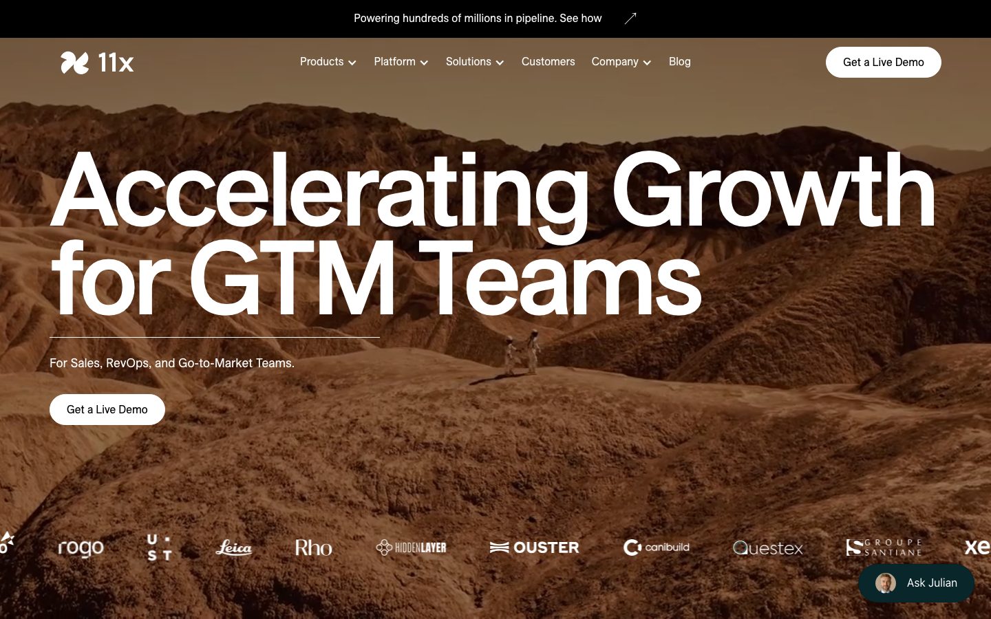
A cinematic, editorial SaaS interface for an AI "digital workforce" product — anchored on white canvas with pure-black ink and oversized ES Allianz grotesque display type set extremely tight (negative tracking down to -6.84px). The system reads as confident, warm, and image-led: a sepia desert hero, photographic "digital worker" cards, and a palette of muted sand/blush/lavender surface tints that alternate with white and deep editorial bands. Brand voltage comes from the giant tight-tracked headline and the warm neutral surface family rather than from saturated accent color.
---
version: alpha
name: 11x-design-analysis
description: "A cinematic, editorial SaaS interface for an AI \"digital workforce\" product — anchored on white canvas with pure-black ink and oversized ES Allianz grotesque display type set extremely tight (negative tracking down to -6.84px). The system reads as confident, warm, and image-led: a sepia desert hero, photographic \"digital worker\" cards, and a palette of muted sand/blush/lavender surface tints that alternate with white and deep editorial bands. Brand voltage comes from the giant tight-tracked headline and the warm neutral surface family rather than from saturated accent color."

colors:
  ink: "#000000"
  ink-soft: "#222222"
  ink-muted: "#333333"
  canvas: "#ffffff"
  surface-faint: "#fafafa"
  surface-faint-alt: "#f9f9f9"
  surface-mist: "#f6f5f5"
  surface-soft: "#f3f4f6"
  surface-warm: "#d7cecc"
  surface-cream: "#ede2d7"
  surface-blush: "#f5ece6"
  surface-peach: "#e8ccbf"
  surface-lavender: "#e0dae5"
  surface-cool: "#d7dedf"
  sand: "#d2b596"
  accent-teal: "#406e7a"
  accent-blue: "#3898ec"
  brown-dark: "#4c312b"
  hairline: "#dddddd"
  neutral: "#cccccc"
  on-ink: "#ffffff"

typography:
  display:
    fontFamily: "ES Allianz, Archivo, Inter, sans-serif"
    fontSize: 152px
    fontWeight: 500
    lineHeight: 0.85
    letterSpacing: -6.84px
  heading:
    fontFamily: "ES Allianz, Archivo, Inter, sans-serif"
    fontSize: 64px
    fontWeight: 500
    lineHeight: 1.0
    letterSpacing: -2.56px
  title:
    fontFamily: "ES Allianz, Archivo, Inter, sans-serif"
    fontSize: 32px
    fontWeight: 500
    lineHeight: 1.2
    letterSpacing: -0.64px
  body:
    fontFamily: "ES Allianz, Archivo, Inter, sans-serif"
    fontSize: 18px
    fontWeight: 400
    lineHeight: 1.4
    letterSpacing: normal
  button:
    fontFamily: "ES Allianz, Archivo, Inter, sans-serif"
    fontSize: 16px
    fontWeight: 400
    lineHeight: 1.4
    letterSpacing: normal

rounded:
  xs: 2px
  sm: 8px
  md: 16px
  lg: 24px
  xl: 32px
  pill: 999px
  full: 9999px

spacing:
  xxs: 4px
  xs: 8px
  sm: 12px
  md: 16px
  lg: 24px
  xl: 32px
  xxl: 48px
  huge: 64px
  huge-lg: 72px
  huge-xl: 80px
  section: 128px

components:
  announcement-bar:
    backgroundColor: "{colors.ink}"
    textColor: "{colors.on-ink}"
    typography: "{typography.button}"
    padding: 8px 16px
  top-nav:
    backgroundColor: transparent
    textColor: "{colors.on-ink}"
    typography: "{typography.button}"
    padding: 16px 24px
  button-cta-light:
    backgroundColor: "{colors.canvas}"
    textColor: "{colors.ink}"
    typography: "{typography.button}"
    rounded: "{rounded.pill}"
    padding: 8px 12px
  button-cta-dark:
    backgroundColor: "{colors.ink}"
    textColor: "{colors.on-ink}"
    typography: "{typography.button}"
    rounded: "{rounded.pill}"
    padding: 8px 12px
  button-primary:
    backgroundColor: "{colors.canvas}"
    textColor: "{colors.ink}"
    typography: "{typography.button}"
    rounded: "{rounded.xs}"
    padding: 8px 12px
  hero-band:
    backgroundColor: "{colors.canvas}"
    textColor: "{colors.on-ink}"
    typography: "{typography.display}"
    padding: 128px
  worker-card:
    backgroundColor: "{colors.canvas}"
    textColor: "{colors.ink}"
    typography: "{typography.title}"
    rounded: "{rounded.md}"
    padding: 16px
  feature-band-warm:
    backgroundColor: "{colors.surface-warm}"
    textColor: "{colors.ink}"
    typography: "{typography.heading}"
    padding: 80px
  platform-card:
    backgroundColor: "{colors.surface-cream}"
    textColor: "{colors.ink}"
    typography: "{typography.heading}"
    rounded: "{rounded.xl}"
    padding: 48px
  feature-mini-card:
    backgroundColor: "{colors.canvas}"
    textColor: "{colors.ink}"
    typography: "{typography.body}"
    rounded: "{rounded.md}"
    padding: 16px
  stat-card:
    backgroundColor: "{colors.surface-lavender}"
    textColor: "{colors.ink}"
    typography: "{typography.title}"
    rounded: "{rounded.sm}"
    padding: 24px
  testimonial-card:
    backgroundColor: "{colors.surface-mist}"
    textColor: "{colors.ink}"
    typography: "{typography.body}"
    rounded: "{rounded.sm}"
    padding: 24px
  pill-tag:
    backgroundColor: "{colors.surface-soft}"
    textColor: "{colors.ink}"
    typography: "{typography.button}"
    rounded: "{rounded.pill}"
    padding: 8px 16px
  audio-player:
    backgroundColor: "{colors.surface-cream}"
    textColor: "{colors.ink}"
    rounded: "{rounded.pill}"
    padding: 16px 24px
  chat-widget:
    backgroundColor: "{colors.ink}"
    textColor: "{colors.on-ink}"
    typography: "{typography.button}"
    rounded: "{rounded.pill}"
    padding: 8px 16px
  card:
    backgroundColor: "{colors.canvas}"
    textColor: "{colors.ink}"
    rounded: "{rounded.xs}"
---

## Overview

11x's landing page is a cinematic, editorial SaaS surface for an AI "digital workforce" product. The page opens with a full-bleed sepia desert photograph behind a single, enormous headline — "Accelerating Growth for GTM Teams" — set in **ES Allianz** at 152px (`{typography.display}`) with extreme negative tracking (-6.84px). The system reads as confident and warm rather than clinical: black ink (`{colors.ink}` — #000000) on white canvas (`{colors.canvas}` — #ffffff), photographic digital-worker portrait cards, and a family of muted, warm surface tints (sand, blush, cream, lavender, warm gray) that pace the long scroll.

The type voice is single-family and tightness-driven. Everything — display headlines, body copy, buttons — runs in **ES Allianz** (a commercial neo-grotesque; substitute documented below). Hierarchy is carried by size and weight (500 for headings, 400 for body) plus aggressively negative letter-spacing on the large sizes. There is no second typeface and no decorative accent face — the giant tight-tracked headline is the brand.

Color voltage is deliberately low-saturation. The dominant non-neutral tones are warm and earthy — `{colors.sand}` (#d2b596) pulled from the hero photograph, `{colors.surface-warm}` (#d7cecc), `{colors.surface-cream}` (#ede2d7), and a muted teal `{colors.accent-teal}` (#406e7a). A pastel set (`{colors.surface-blush}`, `{colors.surface-lavender}`, `{colors.surface-peach}`) tints stat and feature cards. The system uses these warm neutrals as full-section backgrounds, alternating with pure white to pace the page.

**Key Characteristics:**
- Oversized ES Allianz display type set extremely tight (`{typography.display}` — 152px / 500 / -6.84px tracking). The headline is the brand's loudest signal.
- White canvas (`{colors.canvas}`) alternating with warm full-bleed bands (`{colors.surface-warm}`, `{colors.surface-cream}`) and a deep editorial dark band.
- Photographic "digital worker" portrait cards (Alice the SDR, Julian the Phone Agent) — the product is personified, not illustrated.
- Pill-shaped CTAs (`{rounded.pill}`) — white-on-image in the hero, black-on-light in mid-page bands.
- A muted, earthy palette sampled from the hero photography rather than a saturated brand accent.
- Flat surfaces — no measured shadows. Depth comes from color-block bands and photographic contrast.
- Black announcement bar pinned to the very top ("Powering hundreds of millions in pipeline").
- A persistent "Ask Julian" chat-widget pill anchored bottom-right.

## Colors

### Brand & Accent
- **Sand** (`{colors.sand}` — #d2b596): The signature warm tone, pulled from the sepia desert hero. Appears in audio-waveform fills and as a high-frequency surface accent.
- **Accent Teal** (`{colors.accent-teal}` — #406e7a): A muted blue-green used sparingly for small UI accents (call-control icons in worker cards, the "Ask Julian" avatar surround). The highest-frequency true color after ink/canvas.
- **Accent Blue** (`{colors.accent-blue}` — #3898ec): A rare bright blue (low frequency) used for occasional interactive accents.
- **Brown Dark** (`{colors.brown-dark}` — #4c312b): A deep warm brown sampled from the hero's shadow tones; used in small dark accents.

### Surface
- **Canvas** (`{colors.canvas}` — #ffffff): The default page floor.
- **Surface Faint / Faint-Alt / Mist** (`{colors.surface-faint}` #fafafa · `{colors.surface-faint-alt}` #f9f9f9 · `{colors.surface-mist}` #f6f5f5): Barely-tinted near-white surfaces for testimonial cards and soft section breaks.
- **Surface Soft** (`{colors.surface-soft}` — #f3f4f6): Light cool gray for pill-tag chips and feature mini-card grounds. High frequency.
- **Surface Warm** (`{colors.surface-warm}` — #d7cecc): The "Digital workers transform your workforce" full-section band — a warm taupe.
- **Surface Cream** (`{colors.surface-cream}` — #ede2d7): The large "From prospecting to closing" platform card and the audio-player background.
- **Surface Blush / Peach** (`{colors.surface-blush}` #f5ece6 · `{colors.surface-peach}` #e8ccbf): Warm pastel tints for feature and accent cards.
- **Surface Lavender** (`{colors.surface-lavender}` — #e0dae5): Cool lilac tint for stat cards.
- **Surface Cool** (`{colors.surface-cool}` — #d7dedf): A cool gray-blue tint used in small surface moments.

### Text
- **Ink** (`{colors.ink}` — #000000): All headlines and primary text.
- **Ink Soft / Ink Muted** (`{colors.ink-soft}` #222222 · `{colors.ink-muted}` #333333): Near-black tones for secondary text and dense UI labels.
- **On Ink** (`{colors.on-ink}` — #ffffff): Text on the black announcement bar, dark CTAs, and over the hero photograph.

### Neutral / Hairline
- **Hairline** (`{colors.hairline}` — #dddddd): 1px divider tone on light surfaces.
- **Neutral** (`{colors.neutral}` — #cccccc): Secondary divider / disabled tone.

## Typography

### Font Family
The system runs a single typeface across every role: **ES Allianz**, a commercial neo-grotesque. Its defining trait here is extreme negative tracking at large sizes (-6.84px at 152px, -2.56px at 64px), which gives the giant headlines a packed, monolithic feel. Weight splits at exactly two levels — 500 for all headings, 400 for body and button text.

Because ES Allianz is a licensed commercial face (not flagged in `fonts_licensed`, but it is not an open web font), the production stack falls back to **Archivo** then **Inter**. See the substitute note below.

### Hierarchy

| Token | Size | Weight | Line Height | Letter Spacing | Use |
|---|---|---|---|---|---|
| `{typography.display}` | 152px | 500 | 0.85 | -6.84px | Hero headline ("Accelerating Growth for GTM Teams") |
| `{typography.heading}` | 64px | 500 | 1.0 | -2.56px | Section heads ("Meet our digital workers", "Amplify Intelligence") |
| `{typography.title}` | 32px | 500 | 1.2 | -0.64px | Card titles, sub-section heads, worker names |
| `{typography.body}` | 18px | 400 | 1.4 | normal | Default running text, descriptions |
| `{typography.button}` | 16px | 400 | 1.4 | normal | Button labels, nav items, tags |

### Principles
Hierarchy comes from size jumps and tracking, not from a second family or many weights. The 152→64→32 size cascade is dramatic, and the negative tracking scales with size — the bigger the type, the tighter the set. Body text relaxes to `normal` tracking at 18px / 400. Never set body copy at heading weight, and never loosen the display tracking — the packed headline is the brand's signature.

### Note on Font Substitutes
**ES Allianz** is a licensed commercial typeface and is not available as a free web font; it must not be shipped without a license. The closest open-source substitutes that preserve the neo-grotesque character and tolerate tight negative tracking are **Archivo** (variable, weights 400–600) and **Inter** (weight 500). Apply roughly -0.045em tracking at display sizes to approximate the -6.84px-at-152px signature. The substitution preserves the weight + tracking feel but not ES Allianz's exact letterforms.

## Layout

### Spacing System
- **Base unit:** 8px — the dominant measured value (frequency 282), with 16px close behind (233).
- **Tokens:** `{spacing.xxs}` 4px · `{spacing.xs}` 8px · `{spacing.sm}` 12px · `{spacing.md}` 16px · `{spacing.lg}` 24px · `{spacing.xl}` 32px · `{spacing.xxl}` 48px · `{spacing.huge}` 64px · `{spacing.huge-lg}` 72px · `{spacing.huge-xl}` 80px · `{spacing.section}` 128px.
- **Section padding:** Large editorial bands use `{spacing.huge-xl}` (80px) to `{spacing.section}` (128px) of vertical rhythm.
- **Card internal padding:** `{spacing.md}` (16px) for worker and mini cards; `{spacing.lg}` (24px) for stat and testimonial cards; `{spacing.xxl}` (48px) for the large platform card.
- **Tight clusters:** 8px and 16px dominate small-element gaps (tag rows, button padding, icon spacing).

### Grid & Container
- **Hero:** Full-bleed background photograph with a left-aligned headline block overlaid; logo strip pinned along the bottom of the hero band.
- **Worker cards:** 2-up grid at desktop (Alice / Julian).
- **Feature mini-cards:** Horizontal carousel/slider inside the warm band (dot pagination).
- **Tag rows:** Wrapping pill-tag rows in the dark band.
- **Stat / testimonial grid:** Mixed 2–3-up grid in the "Pipeline from leads you'd written off" section.

### Whitespace Philosophy
The page leans on large full-bleed color bands and generous vertical padding to separate ideas, rather than dense multi-column layouts. The hero headline alone occupies a full viewport. Whitespace is calibrated cinematic — one big idea per band, lots of air, photographic and color-block contrast doing the structural work.

## Elevation & Depth

| Level | Treatment | Use |
|---|---|---|
| Flat | No shadow, no border | All measured surfaces — cards report `shadow: none` and the shadows set is empty |
| Color band | Full-bleed warm/dark background change | Section separation (warm taupe band, deep editorial band) |
| Photographic | Full-bleed image with text overlay | Hero band, digital-worker portrait cards |

The system has **no measured box-shadows** — depth is entirely color-block and photographic. Bands alternate canvas → warm → dark → canvas, and the eye reads each color shift as a new layer. Worker cards gain depth from the portrait photography itself and small inset UI chips (status badges, call controls), not from drop shadows.

### Decorative Depth
- The hero's sepia desert photograph carries its own atmospheric gradient (dark at top under the nav, warm mid-tones below) — this is content imagery, not a system token.
- Worker cards overlay small floating UI chips (an email preview on Alice, a call-control row on Julian) that read as live product chrome at small scale.

## Shapes

### Border Radius Scale

| Token | Value | Use |
|---|---|---|
| `{rounded.xs}` | 2px | Subtle softening on small elements; measured default on the bare `button-primary` / `card` selectors |
| `{rounded.sm}` | 8px | Stat cards, testimonial cards, small content tiles (high frequency) |
| `{rounded.md}` | 16px | Worker portrait cards, feature mini-cards |
| `{rounded.lg}` | 24px | Larger rounded containers |
| `{rounded.xl}` | 32px | The large "From prospecting to closing" platform card (high frequency) |
| `{rounded.pill}` | 999px | CTA buttons, pill-tags, audio player, chat widget |
| `{rounded.full}` | 9999px | Fully circular elements (avatars, icon buttons) |

### Photography Geometry
Digital-worker portraits sit in `{rounded.md}` (16px) cards. The hero photograph is full-bleed and edge-to-edge (no radius). Avatar thumbnails (e.g., the "Ask Julian" chip, testimonial author photos) are circular via `{rounded.full}`.

## Components

### Top Bars

**`announcement-bar`** — A pure-black bar pinned to the very top of the page. Background `{colors.ink}`, text `{colors.on-ink}`, type `{typography.button}` (16px / 400), centered ("Powering hundreds of millions in pipeline. See how →").

**`top-nav`** — Transparent nav overlaid on the hero photograph. The 11x wordmark + logo at left, horizontal menu (Products, Platform, Solutions, Customers, Company, Blog) center, and a `{component.button-cta-light}` "Get a Live Demo" pill at right. Menu items render in `{colors.on-ink}` over the hero image, in `{typography.button}`.

### Buttons

**`button-cta-light`** — The primary hero/nav CTA. White pill: background `{colors.canvas}`, text `{colors.ink}`, type `{typography.button}`, rounded `{rounded.pill}`, padding `{spacing.xs}` × `{spacing.sm}` (8px × 12px). Used as "Get a Live Demo" over dark/photographic grounds.

**`button-cta-dark`** — The mid-page CTA on light bands. Black pill: background `{colors.ink}`, text `{colors.on-ink}`, rounded `{rounded.pill}`, same padding. Used repeatedly down the page ("Get a Live Demo" on white and warm sections).

**`button-primary`** — The bare measured button selector (background `{colors.canvas}`, text `{colors.ink}`, rounded `{rounded.xs}` from the measured 2px default, padding 8px × 12px). In practice the visible CTAs render as pill variants above (derived: the measured selector returned a near-square radius while screenshots show pill buttons — see Known Gaps).

### Cards & Containers

**`hero-band`** — Full-bleed sepia desert photograph with the giant left-aligned headline in `{typography.display}` (`{colors.on-ink}` text), a one-line sub-head, and a `{component.button-cta-light}`. Vertical padding up to `{spacing.section}` (128px). Partner logo strip runs along the bottom in `{colors.on-ink}`.

**`worker-card`** — Photographic portrait card for each digital worker (Alice the SDR, Julian the Phone Agent). Background `{colors.canvas}`, rounded `{rounded.md}` (16px), padding `{spacing.md}`. Carries a full-bleed portrait, a small status/UI chip overlay, the worker name + role in `{typography.title}`, a body description, and a text-link CTA ("Hire Alice →").

**`feature-band-warm`** — The "Digital workers transform your workforce" full-bleed section. Background `{colors.surface-warm}` (#d7cecc), heading in `{typography.heading}`, vertical padding `{spacing.huge-xl}` (80px). Holds a horizontal `{component.feature-mini-card}` carousel with dot pagination.

**`feature-mini-card`** — Small carousel tiles inside the warm band ("Always learning", "Customised to you", "Deeply integrated"). Background `{colors.canvas}`, rounded `{rounded.md}`, padding `{spacing.md}`, body text in `{typography.body}`.

**`platform-card`** — The large "From prospecting to closing: All-in-one" card. Background `{colors.surface-cream}` (#ede2d7), rounded `{rounded.xl}` (32px), padding `{spacing.xxl}` (48px). Carries a small "11x Platform" tag, a `{typography.heading}` title, and a four-column step list (Identify / Research / Personalize / Engage).

**`stat-card`** — Metric tiles in the "Pipeline from leads you'd written off" section ("1.5x increase", "$1M+ pipeline"). Background `{colors.surface-lavender}` (#e0dae5) or sibling pastel tints, rounded `{rounded.sm}` (8px), padding `{spacing.lg}` (24px). Large figure in `{typography.title}`.

**`testimonial-card`** — Customer-quote tiles in the same grid. Background `{colors.surface-mist}` (#f6f5f5), rounded `{rounded.sm}`, padding `{spacing.lg}`, quote in `{typography.body}` with author name + role below.

### Tags & Widgets

**`pill-tag`** — Small rounded chips for capability labels ("Operational efficiency", "Decrease costs per lead", "Increase pipeline") clustered in the dark band. Background `{colors.surface-soft}`, text `{colors.ink}`, type `{typography.button}`, rounded `{rounded.pill}`, padding `{spacing.xs}` × `{spacing.md}` (8px × 16px).

**`audio-player`** — The "Listen to Julian" waveform player. Background `{colors.surface-cream}`, rounded `{rounded.pill}`, padding 16px × 24px, with a `{colors.sand}`-toned waveform and a play control.

**`chat-widget`** — The persistent "Ask Julian" pill anchored bottom-right. Background `{colors.ink}`, text `{colors.on-ink}`, type `{typography.button}`, rounded `{rounded.pill}`, padding `{spacing.xs}` × `{spacing.md}`, with a circular avatar at left.

**`card`** — The bare measured generic card (background `{colors.canvas}`, rounded `{rounded.xs}` from measured 0–2px, `shadow: none`). Most content cards override radius upward to `{rounded.sm}`–`{rounded.xl}` as documented above.

## Do's and Don'ts

### Do
- Set display headlines in ES Allianz (substitute: Archivo/Inter) at weight 500 with heavy negative tracking. The packed 152px headline is the brand.
- Use full-bleed warm color bands (`{colors.surface-warm}`, `{colors.surface-cream}`) to separate sections — color-block, not shadow, does the layering.
- Personify the product with photographic worker cards; show real UI chips inside them.
- Keep CTAs pill-shaped (`{rounded.pill}`): white over photographic/dark grounds, black over light bands.
- Pull accent tints from the photography family (sand, cream, blush, peach, lavender) — keep saturation low.
- Anchor the "Ask Julian" chat widget bottom-right and the black announcement bar top.

### Don't
- Don't introduce a second display typeface — the system is single-family ES Allianz.
- Don't loosen display tracking; ES Allianz at normal tracking reads off-brand at 152px.
- Don't add drop shadows — the system is flat (no measured shadows). Use color bands for depth.
- Don't use saturated brand color on primary CTAs; CTAs are black or white, not teal or blue.
- Don't bold headings past weight 500 — hierarchy comes from size and tracking, not weight.
- Don't document hover states; default and active/pressed only.

## Responsive Behavior

### Breakpoints

| Name | Width | Key Changes |
|---|---|---|
| Mobile | < 768px | Hamburger nav; hero display scales down sharply from 152px; worker cards stack 1-up; carousels become swipe; stat/testimonial grid collapses to 1-up |
| Tablet | 768–1024px | Nav tightens; worker cards stay 2-up; platform-card step list wraps to 2-up |
| Desktop | 1024–1440px | Full horizontal nav; 2-up worker cards; 4-up platform step list; full hero display size |
| Wide | > 1440px | Hero photograph fills wider; content blocks gain outer breathing room |

### Touch Targets
- `{component.button-cta-light}` / `{component.button-cta-dark}` use 8px × 12px padding around a 16px label — small as measured; production should pad toward a 44px minimum tap height.
- `{component.chat-widget}` pill is comfortably tappable with its 8px × 16px padding plus avatar.
- `{component.pill-tag}` chips at 8px × 16px should be treated as display labels, not primary tap targets.

### Collapsing Strategy
- Hero display type scales down dramatically on small screens — the 152px size is desktop-only.
- Worker cards collapse 2-up → 1-up; portrait photos retain `{rounded.md}` corners.
- Feature mini-card and tag carousels become horizontal swipe on mobile.
- The large platform-card's four-column step list reflows to 2-up then 1-up.
- Full-bleed color bands persist at every breakpoint; padding compresses from `{spacing.section}` toward `{spacing.huge}`.

### Image Behavior
- The hero desert photograph stays full-bleed and crops rather than letterboxes.
- Worker portraits maintain aspect ratio inside their `{rounded.md}` cards.
- Avatar thumbnails crop to circles (`{rounded.full}`) at all sizes.

## Iteration Guide

1. Focus on ONE component at a time. Reference its YAML key directly (`{component.worker-card}`, `{component.platform-card}`).
2. Variants of a component (`-active`, `-disabled`) live as separate entries in `components:`.
3. Use `{token.refs}` everywhere — never inline hex in a component.
4. Never document hover. Default and Active/Pressed states only.
5. Display headlines stay ES Allianz (substitute Archivo/Inter) 500 with heavy negative tracking; body stays 400 at normal tracking.
6. Depth is color-block, not shadow — the measured system has zero shadows.
7. When in doubt about emphasis: bigger, tighter ES Allianz before any new color.

## Known Gaps

- **ES Allianz is a licensed commercial typeface** and is not in `fonts_licensed`, but it cannot be shipped freely; Archivo / Inter substitutes are documented in the Typography section.
- The deep editorial dark band ("Amplify Intelligence, Accelerate Growth" / "From prospecting to closing") appears as a deep teal-green in screenshots, but its exact background hex was **not measured** — it is documented as a band but no `{colors.*}` token is asserted for it. Do not assume `{colors.brown-dark}` or `{colors.accent-teal}` is the band color.
- The measured `button-primary` and `card` selectors returned ~0–2px radius (`{rounded.xs}`), while visible CTAs render as full pills — the pill CTA radius (`{rounded.pill}`) is **derived** from screenshots, not from the measured component selectors.
- No box-shadows were captured (`shadows: []`); any subtle elevation on cards in production is not represented here.
- Exact per-card pastel assignments (blush vs. peach vs. lavender per stat/feature card) are inferred from screenshots; the analysis measured the tints as a frequency set, not mapped to specific components.
- Component-level padding beyond the measured button (8px × 12px) is derived from the spacing scale and screenshot proportions, not from per-element measurement.
- Animation/transition timings (carousel slides, audio waveform playback, chat-widget reveal) are out of scope.
- Only the landing page was captured; interior product, pricing, and worker-detail pages are not represented.

<!-- Documented by duply · real-world design systems as ready-to-use DESIGN.md for AI coding agents · https://duply.ai/11x/design-md -->
Color Palette
Accent
Neutrals
Typography
display152px · 500 · 0.85
The quick brown fox jumpsheading64px · 500 · 1
The quick brown fox jumpstitle32px · 500 · 1.2
The quick brown fox jumpsbody18px · 400 · 1.4
The quick brown fox jumpsbutton16px · 400 · 1.4
The quick brown fox jumpsSpacing & Shape
Spacing
| Name | Value | Preview |
|---|---|---|
| xxs | 4px | |
| xs | 8px | |
| sm | 12px | |
| md | 16px | |
| lg | 24px | |
| xl | 32px | |
| xxl | 48px | |
| huge | 64px | |
| huge-lg | 72px | |
| huge-xl | 80px | |
| section | 128px |
Border Radius
| Name | Value | Preview |
|---|---|---|
| xs | 2px | |
| sm | 8px | |
| md | 16px | |
| lg | 24px | |
| xl | 32px | |
| pill | 999px | |
| full | 9999px |
More like this


---
version: alpha
name: 11x-design-analysis
description: "A cinematic, editorial SaaS interface for an AI \"digital workforce\" product — anchored on white canvas with pure-black ink and oversized ES Allianz grotesque display type set extremely tight (negative tracking down to -6.84px). The system reads as confident, warm, and image-led: a sepia desert hero, photographic \"digital worker\" cards, and a palette of muted sand/blush/lavender surface tints that alternate with white and deep editorial bands. Brand voltage comes from the giant tight-tracked headline and the warm neutral surface family rather than from saturated accent color."

colors:
  ink: "#000000"
  ink-soft: "#222222"
  ink-muted: "#333333"
  canvas: "#ffffff"
  surface-faint: "#fafafa"
  surface-faint-alt: "#f9f9f9"
  surface-mist: "#f6f5f5"
  surface-soft: "#f3f4f6"
  surface-warm: "#d7cecc"
  surface-cream: "#ede2d7"
  surface-blush: "#f5ece6"
  surface-peach: "#e8ccbf"
  surface-lavender: "#e0dae5"
  surface-cool: "#d7dedf"
  sand: "#d2b596"
  accent-teal: "#406e7a"
  accent-blue: "#3898ec"
  brown-dark: "#4c312b"
  hairline: "#dddddd"
  neutral: "#cccccc"
  on-ink: "#ffffff"

typography:
  display:
    fontFamily: "ES Allianz, Archivo, Inter, sans-serif"
    fontSize: 152px
    fontWeight: 500
    lineHeight: 0.85
    letterSpacing: -6.84px
  heading:
    fontFamily: "ES Allianz, Archivo, Inter, sans-serif"
    fontSize: 64px
    fontWeight: 500
    lineHeight: 1.0
    letterSpacing: -2.56px
  title:
    fontFamily: "ES Allianz, Archivo, Inter, sans-serif"
    fontSize: 32px
    fontWeight: 500
    lineHeight: 1.2
    letterSpacing: -0.64px
  body:
    fontFamily: "ES Allianz, Archivo, Inter, sans-serif"
    fontSize: 18px
    fontWeight: 400
    lineHeight: 1.4
    letterSpacing: normal
  button:
    fontFamily: "ES Allianz, Archivo, Inter, sans-serif"
    fontSize: 16px
    fontWeight: 400
    lineHeight: 1.4
    letterSpacing: normal

rounded:
  xs: 2px
  sm: 8px
  md: 16px
  lg: 24px
  xl: 32px
  pill: 999px
  full: 9999px

spacing:
  xxs: 4px
  xs: 8px
  sm: 12px
  md: 16px
  lg: 24px
  xl: 32px
  xxl: 48px
  huge: 64px
  huge-lg: 72px
  huge-xl: 80px
  section: 128px

components:
  announcement-bar:
    backgroundColor: "{colors.ink}"
    textColor: "{colors.on-ink}"
    typography: "{typography.button}"
    padding: 8px 16px
  top-nav:
    backgroundColor: transparent
    textColor: "{colors.on-ink}"
    typography: "{typography.button}"
    padding: 16px 24px
  button-cta-light:
    backgroundColor: "{colors.canvas}"
    textColor: "{colors.ink}"
    typography: "{typography.button}"
    rounded: "{rounded.pill}"
    padding: 8px 12px
  button-cta-dark:
    backgroundColor: "{colors.ink}"
    textColor: "{colors.on-ink}"
    typography: "{typography.button}"
    rounded: "{rounded.pill}"
    padding: 8px 12px
  button-primary:
    backgroundColor: "{colors.canvas}"
    textColor: "{colors.ink}"
    typography: "{typography.button}"
    rounded: "{rounded.xs}"
    padding: 8px 12px
  hero-band:
    backgroundColor: "{colors.canvas}"
    textColor: "{colors.on-ink}"
    typography: "{typography.display}"
    padding: 128px
  worker-card:
    backgroundColor: "{colors.canvas}"
    textColor: "{colors.ink}"
    typography: "{typography.title}"
    rounded: "{rounded.md}"
    padding: 16px
  feature-band-warm:
    backgroundColor: "{colors.surface-warm}"
    textColor: "{colors.ink}"
    typography: "{typography.heading}"
    padding: 80px
  platform-card:
    backgroundColor: "{colors.surface-cream}"
    textColor: "{colors.ink}"
    typography: "{typography.heading}"
    rounded: "{rounded.xl}"
    padding: 48px
  feature-mini-card:
    backgroundColor: "{colors.canvas}"
    textColor: "{colors.ink}"
    typography: "{typography.body}"
    rounded: "{rounded.md}"
    padding: 16px
  stat-card:
    backgroundColor: "{colors.surface-lavender}"
    textColor: "{colors.ink}"
    typography: "{typography.title}"
    rounded: "{rounded.sm}"
    padding: 24px
  testimonial-card:
    backgroundColor: "{colors.surface-mist}"
    textColor: "{colors.ink}"
    typography: "{typography.body}"
    rounded: "{rounded.sm}"
    padding: 24px
  pill-tag:
    backgroundColor: "{colors.surface-soft}"
    textColor: "{colors.ink}"
    typography: "{typography.button}"
    rounded: "{rounded.pill}"
    padding: 8px 16px
  audio-player:
    backgroundColor: "{colors.surface-cream}"
    textColor: "{colors.ink}"
    rounded: "{rounded.pill}"
    padding: 16px 24px
  chat-widget:
    backgroundColor: "{colors.ink}"
    textColor: "{colors.on-ink}"
    typography: "{typography.button}"
    rounded: "{rounded.pill}"
    padding: 8px 16px
  card:
    backgroundColor: "{colors.canvas}"
    textColor: "{colors.ink}"
    rounded: "{rounded.xs}"
---

## Overview

11x's landing page is a cinematic, editorial SaaS surface for an AI "digital workforce" product. The page opens with a full-bleed sepia desert photograph behind a single, enormous headline — "Accelerating Growth for GTM Teams" — set in **ES Allianz** at 152px (`{typography.display}`) with extreme negative tracking (-6.84px). The system reads as confident and warm rather than clinical: black ink (`{colors.ink}` — #000000) on white canvas (`{colors.canvas}` — #ffffff), photographic digital-worker portrait cards, and a family of muted, warm surface tints (sand, blush, cream, lavender, warm gray) that pace the long scroll.

The type voice is single-family and tightness-driven. Everything — display headlines, body copy, buttons — runs in **ES Allianz** (a commercial neo-grotesque; substitute documented below). Hierarchy is carried by size and weight (500 for headings, 400 for body) plus aggressively negative letter-spacing on the large sizes. There is no second typeface and no decorative accent face — the giant tight-tracked headline is the brand.

Color voltage is deliberately low-saturation. The dominant non-neutral tones are warm and earthy — `{colors.sand}` (#d2b596) pulled from the hero photograph, `{colors.surface-warm}` (#d7cecc), `{colors.surface-cream}` (#ede2d7), and a muted teal `{colors.accent-teal}` (#406e7a). A pastel set (`{colors.surface-blush}`, `{colors.surface-lavender}`, `{colors.surface-peach}`) tints stat and feature cards. The system uses these warm neutrals as full-section backgrounds, alternating with pure white to pace the page.

**Key Characteristics:**
- Oversized ES Allianz display type set extremely tight (`{typography.display}` — 152px / 500 / -6.84px tracking). The headline is the brand's loudest signal.
- White canvas (`{colors.canvas}`) alternating with warm full-bleed bands (`{colors.surface-warm}`, `{colors.surface-cream}`) and a deep editorial dark band.
- Photographic "digital worker" portrait cards (Alice the SDR, Julian the Phone Agent) — the product is personified, not illustrated.
- Pill-shaped CTAs (`{rounded.pill}`) — white-on-image in the hero, black-on-light in mid-page bands.
- A muted, earthy palette sampled from the hero photography rather than a saturated brand accent.
- Flat surfaces — no measured shadows. Depth comes from color-block bands and photographic contrast.
- Black announcement bar pinned to the very top ("Powering hundreds of millions in pipeline").
- A persistent "Ask Julian" chat-widget pill anchored bottom-right.

## Colors

### Brand & Accent
- **Sand** (`{colors.sand}` — #d2b596): The signature warm tone, pulled from the sepia desert hero. Appears in audio-waveform fills and as a high-frequency surface accent.
- **Accent Teal** (`{colors.accent-teal}` — #406e7a): A muted blue-green used sparingly for small UI accents (call-control icons in worker cards, the "Ask Julian" avatar surround). The highest-frequency true color after ink/canvas.
- **Accent Blue** (`{colors.accent-blue}` — #3898ec): A rare bright blue (low frequency) used for occasional interactive accents.
- **Brown Dark** (`{colors.brown-dark}` — #4c312b): A deep warm brown sampled from the hero's shadow tones; used in small dark accents.

### Surface
- **Canvas** (`{colors.canvas}` — #ffffff): The default page floor.
- **Surface Faint / Faint-Alt / Mist** (`{colors.surface-faint}` #fafafa · `{colors.surface-faint-alt}` #f9f9f9 · `{colors.surface-mist}` #f6f5f5): Barely-tinted near-white surfaces for testimonial cards and soft section breaks.
- **Surface Soft** (`{colors.surface-soft}` — #f3f4f6): Light cool gray for pill-tag chips and feature mini-card grounds. High frequency.
- **Surface Warm** (`{colors.surface-warm}` — #d7cecc): The "Digital workers transform your workforce" full-section band — a warm taupe.
- **Surface Cream** (`{colors.surface-cream}` — #ede2d7): The large "From prospecting to closing" platform card and the audio-player background.
- **Surface Blush / Peach** (`{colors.surface-blush}` #f5ece6 · `{colors.surface-peach}` #e8ccbf): Warm pastel tints for feature and accent cards.
- **Surface Lavender** (`{colors.surface-lavender}` — #e0dae5): Cool lilac tint for stat cards.
- **Surface Cool** (`{colors.surface-cool}` — #d7dedf): A cool gray-blue tint used in small surface moments.

### Text
- **Ink** (`{colors.ink}` — #000000): All headlines and primary text.
- **Ink Soft / Ink Muted** (`{colors.ink-soft}` #222222 · `{colors.ink-muted}` #333333): Near-black tones for secondary text and dense UI labels.
- **On Ink** (`{colors.on-ink}` — #ffffff): Text on the black announcement bar, dark CTAs, and over the hero photograph.

### Neutral / Hairline
- **Hairline** (`{colors.hairline}` — #dddddd): 1px divider tone on light surfaces.
- **Neutral** (`{colors.neutral}` — #cccccc): Secondary divider / disabled tone.

## Typography

### Font Family
The system runs a single typeface across every role: **ES Allianz**, a commercial neo-grotesque. Its defining trait here is extreme negative tracking at large sizes (-6.84px at 152px, -2.56px at 64px), which gives the giant headlines a packed, monolithic feel. Weight splits at exactly two levels — 500 for all headings, 400 for body and button text.

Because ES Allianz is a licensed commercial face (not flagged in `fonts_licensed`, but it is not an open web font), the production stack falls back to **Archivo** then **Inter**. See the substitute note below.

### Hierarchy

| Token | Size | Weight | Line Height | Letter Spacing | Use |
|---|---|---|---|---|---|
| `{typography.display}` | 152px | 500 | 0.85 | -6.84px | Hero headline ("Accelerating Growth for GTM Teams") |
| `{typography.heading}` | 64px | 500 | 1.0 | -2.56px | Section heads ("Meet our digital workers", "Amplify Intelligence") |
| `{typography.title}` | 32px | 500 | 1.2 | -0.64px | Card titles, sub-section heads, worker names |
| `{typography.body}` | 18px | 400 | 1.4 | normal | Default running text, descriptions |
| `{typography.button}` | 16px | 400 | 1.4 | normal | Button labels, nav items, tags |

### Principles
Hierarchy comes from size jumps and tracking, not from a second family or many weights. The 152→64→32 size cascade is dramatic, and the negative tracking scales with size — the bigger the type, the tighter the set. Body text relaxes to `normal` tracking at 18px / 400. Never set body copy at heading weight, and never loosen the display tracking — the packed headline is the brand's signature.

### Note on Font Substitutes
**ES Allianz** is a licensed commercial typeface and is not available as a free web font; it must not be shipped without a license. The closest open-source substitutes that preserve the neo-grotesque character and tolerate tight negative tracking are **Archivo** (variable, weights 400–600) and **Inter** (weight 500). Apply roughly -0.045em tracking at display sizes to approximate the -6.84px-at-152px signature. The substitution preserves the weight + tracking feel but not ES Allianz's exact letterforms.

## Layout

### Spacing System
- **Base unit:** 8px — the dominant measured value (frequency 282), with 16px close behind (233).
- **Tokens:** `{spacing.xxs}` 4px · `{spacing.xs}` 8px · `{spacing.sm}` 12px · `{spacing.md}` 16px · `{spacing.lg}` 24px · `{spacing.xl}` 32px · `{spacing.xxl}` 48px · `{spacing.huge}` 64px · `{spacing.huge-lg}` 72px · `{spacing.huge-xl}` 80px · `{spacing.section}` 128px.
- **Section padding:** Large editorial bands use `{spacing.huge-xl}` (80px) to `{spacing.section}` (128px) of vertical rhythm.
- **Card internal padding:** `{spacing.md}` (16px) for worker and mini cards; `{spacing.lg}` (24px) for stat and testimonial cards; `{spacing.xxl}` (48px) for the large platform card.
- **Tight clusters:** 8px and 16px dominate small-element gaps (tag rows, button padding, icon spacing).

### Grid & Container
- **Hero:** Full-bleed background photograph with a left-aligned headline block overlaid; logo strip pinned along the bottom of the hero band.
- **Worker cards:** 2-up grid at desktop (Alice / Julian).
- **Feature mini-cards:** Horizontal carousel/slider inside the warm band (dot pagination).
- **Tag rows:** Wrapping pill-tag rows in the dark band.
- **Stat / testimonial grid:** Mixed 2–3-up grid in the "Pipeline from leads you'd written off" section.

### Whitespace Philosophy
The page leans on large full-bleed color bands and generous vertical padding to separate ideas, rather than dense multi-column layouts. The hero headline alone occupies a full viewport. Whitespace is calibrated cinematic — one big idea per band, lots of air, photographic and color-block contrast doing the structural work.

## Elevation & Depth

| Level | Treatment | Use |
|---|---|---|
| Flat | No shadow, no border | All measured surfaces — cards report `shadow: none` and the shadows set is empty |
| Color band | Full-bleed warm/dark background change | Section separation (warm taupe band, deep editorial band) |
| Photographic | Full-bleed image with text overlay | Hero band, digital-worker portrait cards |

The system has **no measured box-shadows** — depth is entirely color-block and photographic. Bands alternate canvas → warm → dark → canvas, and the eye reads each color shift as a new layer. Worker cards gain depth from the portrait photography itself and small inset UI chips (status badges, call controls), not from drop shadows.

### Decorative Depth
- The hero's sepia desert photograph carries its own atmospheric gradient (dark at top under the nav, warm mid-tones below) — this is content imagery, not a system token.
- Worker cards overlay small floating UI chips (an email preview on Alice, a call-control row on Julian) that read as live product chrome at small scale.

## Shapes

### Border Radius Scale

| Token | Value | Use |
|---|---|---|
| `{rounded.xs}` | 2px | Subtle softening on small elements; measured default on the bare `button-primary` / `card` selectors |
| `{rounded.sm}` | 8px | Stat cards, testimonial cards, small content tiles (high frequency) |
| `{rounded.md}` | 16px | Worker portrait cards, feature mini-cards |
| `{rounded.lg}` | 24px | Larger rounded containers |
| `{rounded.xl}` | 32px | The large "From prospecting to closing" platform card (high frequency) |
| `{rounded.pill}` | 999px | CTA buttons, pill-tags, audio player, chat widget |
| `{rounded.full}` | 9999px | Fully circular elements (avatars, icon buttons) |

### Photography Geometry
Digital-worker portraits sit in `{rounded.md}` (16px) cards. The hero photograph is full-bleed and edge-to-edge (no radius). Avatar thumbnails (e.g., the "Ask Julian" chip, testimonial author photos) are circular via `{rounded.full}`.

## Components

### Top Bars

**`announcement-bar`** — A pure-black bar pinned to the very top of the page. Background `{colors.ink}`, text `{colors.on-ink}`, type `{typography.button}` (16px / 400), centered ("Powering hundreds of millions in pipeline. See how →").

**`top-nav`** — Transparent nav overlaid on the hero photograph. The 11x wordmark + logo at left, horizontal menu (Products, Platform, Solutions, Customers, Company, Blog) center, and a `{component.button-cta-light}` "Get a Live Demo" pill at right. Menu items render in `{colors.on-ink}` over the hero image, in `{typography.button}`.

### Buttons

**`button-cta-light`** — The primary hero/nav CTA. White pill: background `{colors.canvas}`, text `{colors.ink}`, type `{typography.button}`, rounded `{rounded.pill}`, padding `{spacing.xs}` × `{spacing.sm}` (8px × 12px). Used as "Get a Live Demo" over dark/photographic grounds.

**`button-cta-dark`** — The mid-page CTA on light bands. Black pill: background `{colors.ink}`, text `{colors.on-ink}`, rounded `{rounded.pill}`, same padding. Used repeatedly down the page ("Get a Live Demo" on white and warm sections).

**`button-primary`** — The bare measured button selector (background `{colors.canvas}`, text `{colors.ink}`, rounded `{rounded.xs}` from the measured 2px default, padding 8px × 12px). In practice the visible CTAs render as pill variants above (derived: the measured selector returned a near-square radius while screenshots show pill buttons — see Known Gaps).

### Cards & Containers

**`hero-band`** — Full-bleed sepia desert photograph with the giant left-aligned headline in `{typography.display}` (`{colors.on-ink}` text), a one-line sub-head, and a `{component.button-cta-light}`. Vertical padding up to `{spacing.section}` (128px). Partner logo strip runs along the bottom in `{colors.on-ink}`.

**`worker-card`** — Photographic portrait card for each digital worker (Alice the SDR, Julian the Phone Agent). Background `{colors.canvas}`, rounded `{rounded.md}` (16px), padding `{spacing.md}`. Carries a full-bleed portrait, a small status/UI chip overlay, the worker name + role in `{typography.title}`, a body description, and a text-link CTA ("Hire Alice →").

**`feature-band-warm`** — The "Digital workers transform your workforce" full-bleed section. Background `{colors.surface-warm}` (#d7cecc), heading in `{typography.heading}`, vertical padding `{spacing.huge-xl}` (80px). Holds a horizontal `{component.feature-mini-card}` carousel with dot pagination.

**`feature-mini-card`** — Small carousel tiles inside the warm band ("Always learning", "Customised to you", "Deeply integrated"). Background `{colors.canvas}`, rounded `{rounded.md}`, padding `{spacing.md}`, body text in `{typography.body}`.

**`platform-card`** — The large "From prospecting to closing: All-in-one" card. Background `{colors.surface-cream}` (#ede2d7), rounded `{rounded.xl}` (32px), padding `{spacing.xxl}` (48px). Carries a small "11x Platform" tag, a `{typography.heading}` title, and a four-column step list (Identify / Research / Personalize / Engage).

**`stat-card`** — Metric tiles in the "Pipeline from leads you'd written off" section ("1.5x increase", "$1M+ pipeline"). Background `{colors.surface-lavender}` (#e0dae5) or sibling pastel tints, rounded `{rounded.sm}` (8px), padding `{spacing.lg}` (24px). Large figure in `{typography.title}`.

**`testimonial-card`** — Customer-quote tiles in the same grid. Background `{colors.surface-mist}` (#f6f5f5), rounded `{rounded.sm}`, padding `{spacing.lg}`, quote in `{typography.body}` with author name + role below.

### Tags & Widgets

**`pill-tag`** — Small rounded chips for capability labels ("Operational efficiency", "Decrease costs per lead", "Increase pipeline") clustered in the dark band. Background `{colors.surface-soft}`, text `{colors.ink}`, type `{typography.button}`, rounded `{rounded.pill}`, padding `{spacing.xs}` × `{spacing.md}` (8px × 16px).

**`audio-player`** — The "Listen to Julian" waveform player. Background `{colors.surface-cream}`, rounded `{rounded.pill}`, padding 16px × 24px, with a `{colors.sand}`-toned waveform and a play control.

**`chat-widget`** — The persistent "Ask Julian" pill anchored bottom-right. Background `{colors.ink}`, text `{colors.on-ink}`, type `{typography.button}`, rounded `{rounded.pill}`, padding `{spacing.xs}` × `{spacing.md}`, with a circular avatar at left.

**`card`** — The bare measured generic card (background `{colors.canvas}`, rounded `{rounded.xs}` from measured 0–2px, `shadow: none`). Most content cards override radius upward to `{rounded.sm}`–`{rounded.xl}` as documented above.

## Do's and Don'ts

### Do
- Set display headlines in ES Allianz (substitute: Archivo/Inter) at weight 500 with heavy negative tracking. The packed 152px headline is the brand.
- Use full-bleed warm color bands (`{colors.surface-warm}`, `{colors.surface-cream}`) to separate sections — color-block, not shadow, does the layering.
- Personify the product with photographic worker cards; show real UI chips inside them.
- Keep CTAs pill-shaped (`{rounded.pill}`): white over photographic/dark grounds, black over light bands.
- Pull accent tints from the photography family (sand, cream, blush, peach, lavender) — keep saturation low.
- Anchor the "Ask Julian" chat widget bottom-right and the black announcement bar top.

### Don't
- Don't introduce a second display typeface — the system is single-family ES Allianz.
- Don't loosen display tracking; ES Allianz at normal tracking reads off-brand at 152px.
- Don't add drop shadows — the system is flat (no measured shadows). Use color bands for depth.
- Don't use saturated brand color on primary CTAs; CTAs are black or white, not teal or blue.
- Don't bold headings past weight 500 — hierarchy comes from size and tracking, not weight.
- Don't document hover states; default and active/pressed only.

## Responsive Behavior

### Breakpoints

| Name | Width | Key Changes |
|---|---|---|
| Mobile | < 768px | Hamburger nav; hero display scales down sharply from 152px; worker cards stack 1-up; carousels become swipe; stat/testimonial grid collapses to 1-up |
| Tablet | 768–1024px | Nav tightens; worker cards stay 2-up; platform-card step list wraps to 2-up |
| Desktop | 1024–1440px | Full horizontal nav; 2-up worker cards; 4-up platform step list; full hero display size |
| Wide | > 1440px | Hero photograph fills wider; content blocks gain outer breathing room |

### Touch Targets
- `{component.button-cta-light}` / `{component.button-cta-dark}` use 8px × 12px padding around a 16px label — small as measured; production should pad toward a 44px minimum tap height.
- `{component.chat-widget}` pill is comfortably tappable with its 8px × 16px padding plus avatar.
- `{component.pill-tag}` chips at 8px × 16px should be treated as display labels, not primary tap targets.

### Collapsing Strategy
- Hero display type scales down dramatically on small screens — the 152px size is desktop-only.
- Worker cards collapse 2-up → 1-up; portrait photos retain `{rounded.md}` corners.
- Feature mini-card and tag carousels become horizontal swipe on mobile.
- The large platform-card's four-column step list reflows to 2-up then 1-up.
- Full-bleed color bands persist at every breakpoint; padding compresses from `{spacing.section}` toward `{spacing.huge}`.

### Image Behavior
- The hero desert photograph stays full-bleed and crops rather than letterboxes.
- Worker portraits maintain aspect ratio inside their `{rounded.md}` cards.
- Avatar thumbnails crop to circles (`{rounded.full}`) at all sizes.

## Iteration Guide

1. Focus on ONE component at a time. Reference its YAML key directly (`{component.worker-card}`, `{component.platform-card}`).
2. Variants of a component (`-active`, `-disabled`) live as separate entries in `components:`.
3. Use `{token.refs}` everywhere — never inline hex in a component.
4. Never document hover. Default and Active/Pressed states only.
5. Display headlines stay ES Allianz (substitute Archivo/Inter) 500 with heavy negative tracking; body stays 400 at normal tracking.
6. Depth is color-block, not shadow — the measured system has zero shadows.
7. When in doubt about emphasis: bigger, tighter ES Allianz before any new color.

## Known Gaps

- **ES Allianz is a licensed commercial typeface** and is not in `fonts_licensed`, but it cannot be shipped freely; Archivo / Inter substitutes are documented in the Typography section.
- The deep editorial dark band ("Amplify Intelligence, Accelerate Growth" / "From prospecting to closing") appears as a deep teal-green in screenshots, but its exact background hex was **not measured** — it is documented as a band but no `{colors.*}` token is asserted for it. Do not assume `{colors.brown-dark}` or `{colors.accent-teal}` is the band color.
- The measured `button-primary` and `card` selectors returned ~0–2px radius (`{rounded.xs}`), while visible CTAs render as full pills — the pill CTA radius (`{rounded.pill}`) is **derived** from screenshots, not from the measured component selectors.
- No box-shadows were captured (`shadows: []`); any subtle elevation on cards in production is not represented here.
- Exact per-card pastel assignments (blush vs. peach vs. lavender per stat/feature card) are inferred from screenshots; the analysis measured the tints as a frequency set, not mapped to specific components.
- Component-level padding beyond the measured button (8px × 12px) is derived from the spacing scale and screenshot proportions, not from per-element measurement.
- Animation/transition timings (carousel slides, audio waveform playback, chat-widget reveal) are out of scope.
- Only the landing page was captured; interior product, pricing, and worker-detail pages are not represented.

<!-- Documented by duply · real-world design systems as ready-to-use DESIGN.md for AI coding agents · https://duply.ai/11x/design-md -->