Ventriloc
A quiet, editorial business-intelligence interface built on a warm off-white canvas (#f5f5f5) with near-black ink, sharp zero-radius UI primitives, and a bronze/gold accent that signals "analytics consultancy". The system is flat — no shadows — and leans on a large PolySans display headline, restrained Inter body copy, and full-bleed dark feature bands with soft-rounded corners that punctuate an otherwise airy, generous-whitespace layout. Brand voltage comes from a single warm orange motion-mark and product dashboard fragments shown inside the hero rather than from decorative color.
---
version: alpha
name: Ventriloc-design-analysis
description: A quiet, editorial business-intelligence interface built on a warm off-white canvas (#f5f5f5) with near-black ink, sharp zero-radius UI primitives, and a bronze/gold accent that signals "analytics consultancy". The system is flat — no shadows — and leans on a large PolySans display headline, restrained Inter body copy, and full-bleed dark feature bands with soft-rounded corners that punctuate an otherwise airy, generous-whitespace layout. Brand voltage comes from a single warm orange motion-mark and product dashboard fragments shown inside the hero rather than from decorative color.
colors:
ink: "#202020"
black: "#000000"
muted: "#4d4d4d"
neutral: "#828282"
accent: "#816729"
accent-orange: "#ff682c"
accent-brown: "#512520"
accent-blush: "#edd0c6"
accent-clay: "#863b32"
link-blue: "#007aff"
canvas: "#f5f5f5"
surface: "#ffffff"
surface-soft: "#efefef"
surface-strong: "#e8e8e8"
surface-cream: "#ebe6dd"
hairline: "#e4e4e4"
on-dark: "#ffffff"
typography:
h1:
fontFamily: "PolySans, Inter, sans-serif"
fontSize: 66px
fontWeight: 400
lineHeight: 0.909
letterSpacing: -1.32px
h2:
fontFamily: "PolySans, Inter, sans-serif"
fontSize: 24px
fontWeight: 400
lineHeight: 1.0
letterSpacing: -0.48px
h3:
fontFamily: "PolySans, Inter, sans-serif"
fontSize: 20px
fontWeight: 600
lineHeight: 1.0
letterSpacing: 0
body:
fontFamily: "Inter, sans-serif"
fontSize: 18px
fontWeight: 500
lineHeight: 1.333
letterSpacing: 0
button:
fontFamily: "PolySans, Inter, sans-serif"
fontSize: 16px
fontWeight: 400
lineHeight: 1.0
letterSpacing: 0
rounded:
none: 0px
xs: 3px
sm: 6px
md: 8px
lg: 12px
xl: 16px
xxl: 20px
pill: 200px
spacing:
xxs: 5px
xs: 8px
sm: 10px
md: 15px
lg: 20px
xl: 24px
xxl: 30px
xxxl: 40px
huge: 50px
components:
button-primary:
backgroundColor: "{colors.ink}"
textColor: "{colors.on-dark}"
typography: "{typography.button}"
rounded: "{rounded.none}"
padding: 0px 12px 2px 18px
button-secondary:
backgroundColor: transparent
textColor: "{colors.ink}"
typography: "{typography.button}"
rounded: "{rounded.none}"
padding: 0px 12px 2px 18px
button-pill:
backgroundColor: "{colors.ink}"
textColor: "{colors.on-dark}"
typography: "{typography.button}"
rounded: "{rounded.pill}"
padding: 0px 12px 2px 18px
text-link:
backgroundColor: transparent
textColor: "{colors.ink}"
typography: "{typography.button}"
card:
backgroundColor: "{colors.surface}"
textColor: "{colors.ink}"
rounded: "{rounded.none}"
dashboard-fragment-card:
backgroundColor: "{colors.surface}"
textColor: "{colors.ink}"
typography: "{typography.body}"
rounded: "{rounded.md}"
input:
backgroundColor: "{colors.surface}"
textColor: "{colors.ink}"
typography: "{typography.body}"
rounded: "{rounded.none}"
dark-feature-band:
backgroundColor: "{colors.ink}"
textColor: "{colors.on-dark}"
typography: "{typography.h1}"
rounded: "{rounded.xxl}"
padding: 50px
hero-band:
backgroundColor: "{colors.canvas}"
textColor: "{colors.ink}"
typography: "{typography.h1}"
padding: 40px
logo-strip:
backgroundColor: "{colors.canvas}"
textColor: "{colors.neutral}"
typography: "{typography.body}"
padding: 20px
cookie-banner:
backgroundColor: "{colors.surface}"
textColor: "{colors.muted}"
typography: "{typography.body}"
rounded: "{rounded.md}"
padding: 20px
search-tile:
backgroundColor: "{colors.surface-cream}"
textColor: "{colors.muted}"
typography: "{typography.body}"
rounded: "{rounded.xxl}"
padding: 30px
---
## Overview
Ventriloc's landing surface is a calm, editorial business-intelligence interface — a warm off-white canvas (`{colors.canvas}` — #f5f5f5) carrying near-black ink (`{colors.ink}` — #202020), a bronze/gold accent (`{colors.accent}` — #816729), and a single warm orange motion-mark (`{colors.accent-orange}` — #ff682c). The system reads as a confident analytics consultancy: lots of whitespace, a large quiet display headline, and real product dashboard fragments shown directly in the hero rather than marketing illustration.
Type voice splits into two roles: **PolySans** (the display + UI face — h1, h2, h3, and button labels) and **Inter** (running body copy). The h1 is set large (66px) at regular weight 400 with tight negative tracking (-1.32px) and a sub-unity line-height (0.909) — a modern, slightly compressed editorial headline that does the brand work without bold weight.
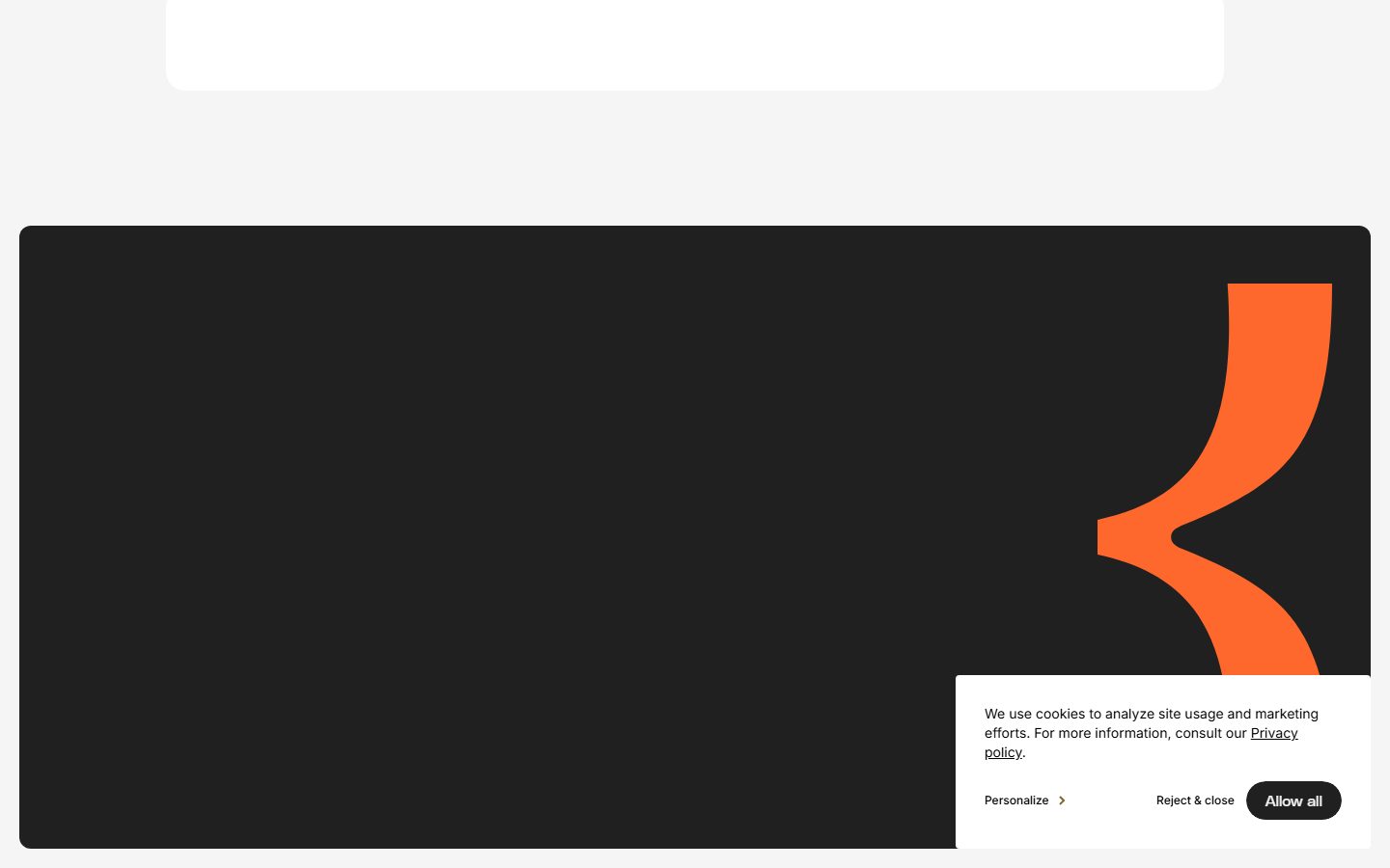
The most distinctive structural move is the **flat, zero-radius UI layer**: buttons, cards, and inputs all measure 0px border-radius (sharp corners), and the system carries **no shadows at all**. Depth comes entirely from color blocking — most notably the full-bleed dark feature band (`{colors.ink}`) with soft 20px rounded corners that punctuates the long-scroll page, where the orange motion-mark glyph appears at large scale.
Color is deployed sparingly. The page is almost monochrome — off-white canvas, near-black ink, gray secondary text — with the bronze accent reserved for small highlights ("Trusted by") and the orange reserved for the brand glyph and accents inside dashboard fragments. A small warm-brown / blush / clay palette (`{colors.accent-brown}`, `{colors.accent-blush}`, `{colors.accent-clay}`) appears only inside embedded product UI and illustrative tiles.
**Key Characteristics:**
- Warm off-white canvas (`{colors.canvas}` — #f5f5f5) rather than pure white — the page floor reads soft and editorial.
- Zero-radius UI primitives: buttons, cards, and inputs all measured at 0px radius. Sharp corners are the system's signature on the interactive layer.
- No shadows anywhere — depth is purely color-block contrast (the measured shadow set is empty).
- Large quiet PolySans h1 (66px / weight 400 / -1.32px tracking / 0.909 line-height) — display presence without bold weight.
- Bronze/gold accent (`{colors.accent}` — #816729) used sparingly for label highlights; warm orange (`{colors.accent-orange}` — #ff682c) used for the brand motion-mark and dashboard accents.
- Full-bleed dark feature band (`{colors.ink}`) with soft `{rounded.xxl}` (20px) corners — the only large rounded surface, and the place where the orange glyph lives.
- Pill-radius treatment (`{rounded.pill}` — 200px) reserved for the cookie-consent "Allow all" button — derived as a pill from the 200px measurement.
- Real product dashboard fragments (revenue charts, profitability donut, finance cards) shown in-hero at `{rounded.md}` (8px) — brand voltage from actual product chrome, not illustration.
## Colors
### Brand & Accent
- **Accent / Bronze** (`{colors.accent}` — #816729): The brand's signature warm-metal tone. Used on the "Trusted by" highlight and small label accents. It is the highest-frequency non-ink color in the analysis, but appears as small text/highlight rather than fills.
- **Accent Orange** (`{colors.accent-orange}` — #ff682c): The brand motion-mark color — the large flowing glyph in the dark feature band, and accent moments inside dashboard fragments. The single piece of high-chroma voltage in an otherwise monochrome system.
- **Accent Brown / Clay / Blush** (`{colors.accent-brown}` — #512520, `{colors.accent-clay}` — #863b32, `{colors.accent-blush}` — #edd0c6): A small warm earth-tone set observed only inside embedded product UI fragments and illustrative tiles. Never used on primary CTAs or editorial type.
- **Link Blue** (`{colors.link-blue}` — #007aff): The system default link/UI blue — appears rarely (4 occurrences), likely inside product chrome or native controls, not in the marketing voice.
### Surface
- **Canvas** (`{colors.canvas}` — #f5f5f5): The warm off-white page floor.
- **Surface** (`{colors.surface}` — #ffffff): White cards, cookie banner, dashboard fragment backgrounds.
- **Surface Soft** (`{colors.surface-soft}` — #efefef): Soft section dividers / low-contrast panels.
- **Surface Strong** (`{colors.surface-strong}` — #e8e8e8): Slightly deeper neutral panel.
- **Surface Cream** (`{colors.surface-cream}` — #ebe6dd): A warm cream tile background used in the lower search/illustration zone.
- **Hairline** (`{colors.hairline}` — #e4e4e4): The 1px divider / border tone on light surfaces.
### Text
- **Ink** (`{colors.ink}` — #202020): All headlines and primary text; also the dark feature-band background and primary button fill.
- **Muted** (`{colors.muted}` — #4d4d4d): Body and secondary running text (the cookie-banner copy, paragraph text).
- **Neutral** (`{colors.neutral}` — #828282): Tertiary text — greyscale partner logos, fine print.
- **Black** (`{colors.black}` — #000000): Pure-black used in occasional UI fragments / glyph strokes.
- **On Dark** (`{colors.on-dark}` — #ffffff): Text on the dark feature band and primary buttons.
## Typography
### Font Family
The system runs **PolySans** for display + UI (h1, h2, h3, button labels) and **Inter** for body copy. PolySans is a commercial geometric grotesque — it is not freely available as a public web font, so an open substitute should ship in its place (see note below). Inter carries the running text at weight 500.
The split is functional:
- PolySans (display + UI, weight 400–600, negative tracking on large sizes) — h1, h2, h3, button labels
- Inter (body, weight 500, neutral tracking) — paragraphs and supporting copy
### Hierarchy
| Token | Size | Weight | Line Height | Letter Spacing | Use |
|---|---|---|---|---|---|
| `{typography.h1}` | 66px | 400 | 0.909 | -1.32px | Hero headline ("Accelerating Growth Through Analytics") — PolySans |
| `{typography.h2}` | 24px | 400 | 1.0 | -0.48px | Section sub-heads — PolySans |
| `{typography.h3}` | 20px | 600 | 1.0 | 0 | Small card / list titles — PolySans (weight 600) |
| `{typography.body}` | 18px | 500 | 1.333 | 0 | Running text, descriptions, banner copy — Inter |
| `{typography.button}` | 16px | 400 | 1.0 | 0 | Button labels — PolySans |
### Principles
The h1 is the brand's loudest statement, but it is loud through **size and negative tracking, not weight** — PolySans at 400 with -1.32px tracking and a sub-unity 0.909 line-height creates a compressed, modern editorial headline. Don't bold the display headline; the regular weight is the voice.
Body copy stays Inter at weight 500 — slightly heavier than a typical 400 body, which keeps small text legible against the warm canvas. The boundary between PolySans (structure) and Inter (prose) is strict.
### Note on Font Substitutes
PolySans is a licensed/commercial typeface and should not be shipped without a license. A close open-source substitute is **Inter Display** (or **Inter** itself) at the equivalent weights with the measured negative tracking applied (-1.32px on the 66px h1, -0.48px on the 24px h2). For a more geometric character closer to PolySans, **Schibsted Grotesk** or **Hanken Grotesk** are usable open alternatives. Preserve the weight (400 display / 600 h3) and the negative letter-spacing signature in any substitution.
## Layout
### Spacing System
- **Base unit:** ~5px (the smallest measured value; the scale runs in 5/8/10px increments rather than a strict 4px grid).
- **Tokens:** `{spacing.xxs}` 5px · `{spacing.xs}` 8px · `{spacing.sm}` 10px · `{spacing.md}` 15px · `{spacing.lg}` 20px · `{spacing.xl}` 24px · `{spacing.xxl}` 30px · `{spacing.xxxl}` 40px · `{spacing.huge}` 50px.
- **Most frequent steps:** 20px (`{spacing.lg}`) and 10px (`{spacing.sm}`) dominate the measured set — they are the workhorse gap/padding values.
- **Section padding:** the dark feature band and large tiles use `{spacing.huge}` (50px) / `{spacing.xxxl}` (40px) for generous internal breathing room.
### Grid & Container
- **Hero band:** a left-aligned headline + body + button row, with product dashboard fragment cards floated to the right — a roughly 1/2 editorial split at desktop.
- **Logo strip:** "Trusted by 80+ partners" with a single horizontal row of greyscale partner logos (ABB, Olymel, Cascades, Angelcare, etc.).
- **Long-scroll rhythm:** large amounts of empty canvas separate bands — the page is deliberately airy, with the dark feature band acting as the major visual punctuation point.
### Whitespace Philosophy
Ventriloc uses very generous whitespace — far more empty canvas than a typical SaaS page. The editorial intent is calm and confident: a single large headline, a short paragraph, two buttons, and a quiet logo strip carry the entire above-the-fold, with the product dashboard fragments providing the only visual density.
## Elevation & Depth
| Level | Treatment | Use |
|---|---|---|
| Flat | No shadow, no border | Body sections, hero band, logo strip — the default |
| Hairline | 1px `{colors.hairline}` border | Card outlines, input borders where present |
| Color-block | `{colors.ink}` full-bleed dark band on `{colors.canvas}` | The dark feature band — color contrast does all the elevation work |
| Soft tile | `{colors.surface-cream}` / `{colors.surface}` panels at `{rounded.xxl}` | Lower-page search / illustration tiles |
The measured shadow set is **empty** — the system uses no drop shadows at all. Depth is achieved entirely through color blocking and the soft 20px corners of the dark band. This is a deliberately flat, editorial elevation model.
### Decorative Depth
- The large orange motion-mark glyph inside the dark feature band is the system's single decorative focal point — a flowing curved form in `{colors.accent-orange}` against `{colors.ink}`.
- Dashboard fragment cards carry their own internal product chrome (chart lines, donut gauges, value labels) — these render as content, not as system-level elevation.
## Shapes
### Border Radius Scale
| Token | Value | Use |
|---|---|---|
| `{rounded.none}` | 0px | Buttons, cards, inputs — the sharp-corner UI layer (measured directly on all three primitives) |
| `{rounded.xs}` | 3px | Minor inline accents |
| `{rounded.sm}` | 6px | Small chips / inner elements |
| `{rounded.md}` | 8px | Dashboard fragment cards in the hero |
| `{rounded.lg}` | 12px | Mid-size panels |
| `{rounded.xl}` | 16px | Larger inner panels |
| `{rounded.xxl}` | 20px | The dark feature band and large lower-page tiles — the dominant rounded surface |
| `{rounded.pill}` | 200px | Cookie-consent "Allow all" button — derived as pill from the 200px measurement |
The shape system is deliberately bimodal: **interactive primitives are sharp (0px)** while **large content surfaces are soft (20px)**. The contrast between sharp buttons/inputs and the soft-cornered dark band is a defining characteristic.
### Photography & Glyph Geometry
Partner logos render as flat greyscale wordmarks in `{colors.neutral}`. The orange motion-mark is a freeform curved vector glyph, not a geometric shape. Dashboard fragments retain their native product chrome at `{rounded.md}` (8px).
## Components
### Buttons
**`button-primary`** — The signature dark CTA ("Contact us"). Background `{colors.ink}` (#202020), text `{colors.on-dark}`, type `{typography.button}` (PolySans 16px / 400), zero radius (`{rounded.none}`), padding measured at 0px 12px 2px 18px (the slightly asymmetric padding is a real measured value).
**`button-secondary`** — The outlined alternate ("About us"). Transparent background, `{colors.ink}` text, type `{typography.button}`, zero radius. A 1px hairline outline distinguishes it from canvas.
**`button-pill`** — The cookie-consent primary ("Allow all"). Background `{colors.ink}`, text `{colors.on-dark}`, `{rounded.pill}` (200px, derived). The pill radius appears only in the consent UI — it is not the marketing-button shape.
**`text-link`** — Inline text actions ("Reject & close", "Personalize", "Privacy policy"). Transparent background, `{colors.ink}` text, type `{typography.button}`. Underlined where used as a body-inline link (e.g., "Privacy policy").
### Cards & Containers
**`card`** — The base content card. Background `{colors.surface}` (#ffffff), zero radius (`{rounded.none}`), no shadow (measured). The system's default container is sharp and flat.
**`dashboard-fragment-card`** — Product UI fragments shown in the hero (Finance chart, Revenue $14,878,500 panel, Profitability 26% donut). Background `{colors.surface}`, rounded `{rounded.md}` (8px), holding live-style chart chrome. These show the actual product at small scale rather than illustrating it.
**`hero-band`** — The above-the-fold band. Background `{colors.canvas}`, headline in `{typography.h1}`, body in `{typography.body}`, button row beneath, dashboard fragments to the right. Internal padding around `{spacing.xxxl}` (40px).
**`dark-feature-band`** — The full-bleed dark punctuation band. Background `{colors.ink}` (#202020), text `{colors.on-dark}`, soft `{rounded.xxl}` (20px) corners, generous `{spacing.huge}` (50px) padding. Carries the large orange motion-mark glyph (`{colors.accent-orange}`). The only large dark surface on the page.
**`search-tile`** — A warm lower-page tile holding a search field and small illustrative thumbnails. Background `{colors.surface-cream}` (#ebe6dd), rounded `{rounded.xxl}` (20px), padding `{spacing.xxl}` (30px).
**`logo-strip`** — "Trusted by 80+ partners" row. Background `{colors.canvas}`, greyscale partner wordmarks in `{colors.neutral}`, "Trusted by" label highlighted in `{colors.accent}` (#816729). Padding `{spacing.lg}` (20px).
### Inputs & Forms
**`input`** — Standard text/search input. Background `{colors.surface}`, text `{colors.ink}`, type `{typography.body}`, zero radius (`{rounded.none}`). The sharp-corner treatment matches buttons and cards.
### Consent
**`cookie-banner`** — The bottom-right consent card. Background `{colors.surface}` (#ffffff), copy in `{colors.muted}` via `{typography.body}`, rounded `{rounded.md}` (8px), padding `{spacing.lg}` (20px). Carries the `{component.text-link}` "Personalize" / "Reject & close" and the `{component.button-pill}` "Allow all".
## Do's and Don'ts
### Do
- Keep buttons, cards, and inputs at zero radius (`{rounded.none}`). The sharp corner is the system's interactive signature.
- Reserve `{rounded.xxl}` (20px) for large content surfaces — the dark feature band and the warm cream tiles. Don't soften the small primitives.
- Set the h1 large and quiet — PolySans 400 with -1.32px tracking. Size and tracking carry the headline, not weight.
- Keep the palette nearly monochrome: off-white canvas, near-black ink, gray secondary text. Let `{colors.accent}` (bronze) and `{colors.accent-orange}` appear only as small highlights.
- Show real product dashboard fragments in `{component.dashboard-fragment-card}` rather than marketing illustration.
- Use the dark feature band (`{component.dark-feature-band}`) as the single major punctuation point in the long scroll.
- Keep the system flat — no drop shadows. Use color blocking for depth.
### Don't
- Don't add shadows. The measured system carries none — shadows would break the flat editorial voice.
- Don't round the buttons or inputs. Sharp corners are intentional; the only pill is the cookie "Allow all".
- Don't bold the h1 or set it in Inter. Display is PolySans 400 with negative tracking.
- Don't spread the warm earth-tones (`{colors.accent-brown}`, `{colors.accent-clay}`, `{colors.accent-blush}`) into the editorial layer — they belong inside product fragments and illustrations only.
- Don't use the orange (`{colors.accent-orange}`) on primary CTAs — the CTA is `{colors.ink}`. Orange is the brand glyph color.
- Don't crowd the layout — generous whitespace is part of the voice.
## Responsive Behavior
### Breakpoints
Only the desktop landing page was captured, so responsive rules are inferred from the band structure rather than measured at multiple widths.
| Name | Width | Key Changes (inferred) |
|---|---|---|
| Mobile | < 768px | Hero headline + dashboard fragments stack to single column; h1 scales down from 66px; logo strip wraps to multiple rows |
| Tablet | 768–1024px | Hero retains split but tightens; dashboard fragments shrink |
| Desktop | 1024–1440px | Full hero split (headline left, fragments right); single-row logo strip |
| Wide | > 1440px | Same as desktop with more outer canvas breathing room |
### Touch Targets
- `{component.button-primary}` padding (0px 12px 2px 18px) yields a compact label button — on touch surfaces it should be padded to a 44px minimum height.
- `{component.button-pill}` (cookie "Allow all") is comfortably tappable at pill scale.
- `{component.text-link}` actions are small — they need adequate spacing on touch.
### Collapsing Strategy
- Hero's headline/fragment split collapses to single-column on mobile — copy first, dashboard fragments below.
- The dark feature band keeps its `{rounded.xxl}` corners but reduces padding from `{spacing.huge}` (50px) at narrow widths.
- The logo strip reduces to wrapped multi-row at mobile rather than scaling logos down.
### Image Behavior
- Dashboard fragment cards retain native aspect ratios and resize proportionally.
- Partner logos stay flat greyscale wordmarks at every breakpoint.
- The orange motion-mark glyph scales with the dark band.
## Iteration Guide
1. Focus on ONE component at a time. Reference its YAML key directly (`{component.dark-feature-band}`, `{component.dashboard-fragment-card}`).
2. Variants of an existing component live as separate entries in `components:` (e.g., `button-pill` vs `button-primary`).
3. Use `{token.refs}` everywhere — never inline a hex in a component.
4. Never document hover. Default and Active/Pressed states only.
5. Keep the bimodal shape rule intact: sharp (0px) on primitives, soft (20px) on big surfaces.
6. The system is flat — resist adding shadows.
7. When in doubt about emphasis: bigger PolySans before bolder PolySans.
## Known Gaps
- Only the desktop landing page was captured; tablet/mobile breakpoints, the full navigation bar, and footer are not in the analysis. Responsive rules above are inferred.
- PolySans is a licensed/commercial typeface (though not flagged in `fonts_licensed` by the analyzer); an open substitute is documented in the Typography section and must be used unless a license is held.
- The dark feature band's background is documented as `{colors.ink}` (#202020) — its exact background was not measured separately and may be a marginally different near-black; the orange glyph color (`{colors.accent-orange}`) is confirmed by frequency.
- The asymmetric button padding (0px 12px 2px 18px) is a verbatim measured value; the secondary/outlined "About us" button's exact border color and radius were not separately measured (documented as hairline + zero-radius by inference).
- No shadow tokens were measured (the shadow set is empty) — confirmed flat, but any subtle product-UI shadows inside dashboard fragments belong to product chrome and are out of scope.
- The deep warm-brown / clay / blush tones (`#512520`, `#863b32`, `#edd0c6`, plus `#3c1e1a`, `#331613`, `#6b1e1c`, `#1f3138`) were measured at low frequency and appear to originate inside embedded product UI and illustration; their systematic roles are not confirmed.
- Animation and transition timings (the motion-mark, chart reveals) are not in scope.
- Input focus, error, and success states were not captured — only base zero-radius input geometry is documented.
<!-- Documented by duply · real-world design systems as ready-to-use DESIGN.md for AI coding agents · https://duply.ai/ventriloc/design-md -->
Color Palette
Accent
Neutrals
Typography
h166px · 400 · 0.909
The quick brown fox jumpsh224px · 400 · 1
The quick brown fox jumpsh320px · 600 · 1
The quick brown fox jumpsbody18px · 500 · 1.333
The quick brown fox jumpsbutton16px · 400 · 1
The quick brown fox jumpsSpacing & Shape
Spacing
| Name | Value | Preview |
|---|---|---|
| xxs | 5px | |
| xs | 8px | |
| sm | 10px | |
| md | 15px | |
| lg | 20px | |
| xl | 24px | |
| xxl | 30px | |
| xxxl | 40px | |
| huge | 50px |
Border Radius
| Name | Value | Preview |
|---|---|---|
| none | 0px | |
| xs | 3px | |
| sm | 6px | |
| md | 8px | |
| lg | 12px | |
| xl | 16px | |
| xxl | 20px | |
| pill | 200px |
More like this


---
version: alpha
name: Ventriloc-design-analysis
description: A quiet, editorial business-intelligence interface built on a warm off-white canvas (#f5f5f5) with near-black ink, sharp zero-radius UI primitives, and a bronze/gold accent that signals "analytics consultancy". The system is flat — no shadows — and leans on a large PolySans display headline, restrained Inter body copy, and full-bleed dark feature bands with soft-rounded corners that punctuate an otherwise airy, generous-whitespace layout. Brand voltage comes from a single warm orange motion-mark and product dashboard fragments shown inside the hero rather than from decorative color.

colors:
  ink: "#202020"
  black: "#000000"
  muted: "#4d4d4d"
  neutral: "#828282"
  accent: "#816729"
  accent-orange: "#ff682c"
  accent-brown: "#512520"
  accent-blush: "#edd0c6"
  accent-clay: "#863b32"
  link-blue: "#007aff"
  canvas: "#f5f5f5"
  surface: "#ffffff"
  surface-soft: "#efefef"
  surface-strong: "#e8e8e8"
  surface-cream: "#ebe6dd"
  hairline: "#e4e4e4"
  on-dark: "#ffffff"

typography:
  h1:
    fontFamily: "PolySans, Inter, sans-serif"
    fontSize: 66px
    fontWeight: 400
    lineHeight: 0.909
    letterSpacing: -1.32px
  h2:
    fontFamily: "PolySans, Inter, sans-serif"
    fontSize: 24px
    fontWeight: 400
    lineHeight: 1.0
    letterSpacing: -0.48px
  h3:
    fontFamily: "PolySans, Inter, sans-serif"
    fontSize: 20px
    fontWeight: 600
    lineHeight: 1.0
    letterSpacing: 0
  body:
    fontFamily: "Inter, sans-serif"
    fontSize: 18px
    fontWeight: 500
    lineHeight: 1.333
    letterSpacing: 0
  button:
    fontFamily: "PolySans, Inter, sans-serif"
    fontSize: 16px
    fontWeight: 400
    lineHeight: 1.0
    letterSpacing: 0

rounded:
  none: 0px
  xs: 3px
  sm: 6px
  md: 8px
  lg: 12px
  xl: 16px
  xxl: 20px
  pill: 200px

spacing:
  xxs: 5px
  xs: 8px
  sm: 10px
  md: 15px
  lg: 20px
  xl: 24px
  xxl: 30px
  xxxl: 40px
  huge: 50px

components:
  button-primary:
    backgroundColor: "{colors.ink}"
    textColor: "{colors.on-dark}"
    typography: "{typography.button}"
    rounded: "{rounded.none}"
    padding: 0px 12px 2px 18px
  button-secondary:
    backgroundColor: transparent
    textColor: "{colors.ink}"
    typography: "{typography.button}"
    rounded: "{rounded.none}"
    padding: 0px 12px 2px 18px
  button-pill:
    backgroundColor: "{colors.ink}"
    textColor: "{colors.on-dark}"
    typography: "{typography.button}"
    rounded: "{rounded.pill}"
    padding: 0px 12px 2px 18px
  text-link:
    backgroundColor: transparent
    textColor: "{colors.ink}"
    typography: "{typography.button}"
  card:
    backgroundColor: "{colors.surface}"
    textColor: "{colors.ink}"
    rounded: "{rounded.none}"
  dashboard-fragment-card:
    backgroundColor: "{colors.surface}"
    textColor: "{colors.ink}"
    typography: "{typography.body}"
    rounded: "{rounded.md}"
  input:
    backgroundColor: "{colors.surface}"
    textColor: "{colors.ink}"
    typography: "{typography.body}"
    rounded: "{rounded.none}"
  dark-feature-band:
    backgroundColor: "{colors.ink}"
    textColor: "{colors.on-dark}"
    typography: "{typography.h1}"
    rounded: "{rounded.xxl}"
    padding: 50px
  hero-band:
    backgroundColor: "{colors.canvas}"
    textColor: "{colors.ink}"
    typography: "{typography.h1}"
    padding: 40px
  logo-strip:
    backgroundColor: "{colors.canvas}"
    textColor: "{colors.neutral}"
    typography: "{typography.body}"
    padding: 20px
  cookie-banner:
    backgroundColor: "{colors.surface}"
    textColor: "{colors.muted}"
    typography: "{typography.body}"
    rounded: "{rounded.md}"
    padding: 20px
  search-tile:
    backgroundColor: "{colors.surface-cream}"
    textColor: "{colors.muted}"
    typography: "{typography.body}"
    rounded: "{rounded.xxl}"
    padding: 30px
---

## Overview

Ventriloc's landing surface is a calm, editorial business-intelligence interface — a warm off-white canvas (`{colors.canvas}` — #f5f5f5) carrying near-black ink (`{colors.ink}` — #202020), a bronze/gold accent (`{colors.accent}` — #816729), and a single warm orange motion-mark (`{colors.accent-orange}` — #ff682c). The system reads as a confident analytics consultancy: lots of whitespace, a large quiet display headline, and real product dashboard fragments shown directly in the hero rather than marketing illustration.

Type voice splits into two roles: **PolySans** (the display + UI face — h1, h2, h3, and button labels) and **Inter** (running body copy). The h1 is set large (66px) at regular weight 400 with tight negative tracking (-1.32px) and a sub-unity line-height (0.909) — a modern, slightly compressed editorial headline that does the brand work without bold weight.

The most distinctive structural move is the **flat, zero-radius UI layer**: buttons, cards, and inputs all measure 0px border-radius (sharp corners), and the system carries **no shadows at all**. Depth comes entirely from color blocking — most notably the full-bleed dark feature band (`{colors.ink}`) with soft 20px rounded corners that punctuates the long-scroll page, where the orange motion-mark glyph appears at large scale.

Color is deployed sparingly. The page is almost monochrome — off-white canvas, near-black ink, gray secondary text — with the bronze accent reserved for small highlights ("Trusted by") and the orange reserved for the brand glyph and accents inside dashboard fragments. A small warm-brown / blush / clay palette (`{colors.accent-brown}`, `{colors.accent-blush}`, `{colors.accent-clay}`) appears only inside embedded product UI and illustrative tiles.

**Key Characteristics:**
- Warm off-white canvas (`{colors.canvas}` — #f5f5f5) rather than pure white — the page floor reads soft and editorial.
- Zero-radius UI primitives: buttons, cards, and inputs all measured at 0px radius. Sharp corners are the system's signature on the interactive layer.
- No shadows anywhere — depth is purely color-block contrast (the measured shadow set is empty).
- Large quiet PolySans h1 (66px / weight 400 / -1.32px tracking / 0.909 line-height) — display presence without bold weight.
- Bronze/gold accent (`{colors.accent}` — #816729) used sparingly for label highlights; warm orange (`{colors.accent-orange}` — #ff682c) used for the brand motion-mark and dashboard accents.
- Full-bleed dark feature band (`{colors.ink}`) with soft `{rounded.xxl}` (20px) corners — the only large rounded surface, and the place where the orange glyph lives.
- Pill-radius treatment (`{rounded.pill}` — 200px) reserved for the cookie-consent "Allow all" button — derived as a pill from the 200px measurement.
- Real product dashboard fragments (revenue charts, profitability donut, finance cards) shown in-hero at `{rounded.md}` (8px) — brand voltage from actual product chrome, not illustration.

## Colors

### Brand & Accent
- **Accent / Bronze** (`{colors.accent}` — #816729): The brand's signature warm-metal tone. Used on the "Trusted by" highlight and small label accents. It is the highest-frequency non-ink color in the analysis, but appears as small text/highlight rather than fills.
- **Accent Orange** (`{colors.accent-orange}` — #ff682c): The brand motion-mark color — the large flowing glyph in the dark feature band, and accent moments inside dashboard fragments. The single piece of high-chroma voltage in an otherwise monochrome system.
- **Accent Brown / Clay / Blush** (`{colors.accent-brown}` — #512520, `{colors.accent-clay}` — #863b32, `{colors.accent-blush}` — #edd0c6): A small warm earth-tone set observed only inside embedded product UI fragments and illustrative tiles. Never used on primary CTAs or editorial type.
- **Link Blue** (`{colors.link-blue}` — #007aff): The system default link/UI blue — appears rarely (4 occurrences), likely inside product chrome or native controls, not in the marketing voice.

### Surface
- **Canvas** (`{colors.canvas}` — #f5f5f5): The warm off-white page floor.
- **Surface** (`{colors.surface}` — #ffffff): White cards, cookie banner, dashboard fragment backgrounds.
- **Surface Soft** (`{colors.surface-soft}` — #efefef): Soft section dividers / low-contrast panels.
- **Surface Strong** (`{colors.surface-strong}` — #e8e8e8): Slightly deeper neutral panel.
- **Surface Cream** (`{colors.surface-cream}` — #ebe6dd): A warm cream tile background used in the lower search/illustration zone.
- **Hairline** (`{colors.hairline}` — #e4e4e4): The 1px divider / border tone on light surfaces.

### Text
- **Ink** (`{colors.ink}` — #202020): All headlines and primary text; also the dark feature-band background and primary button fill.
- **Muted** (`{colors.muted}` — #4d4d4d): Body and secondary running text (the cookie-banner copy, paragraph text).
- **Neutral** (`{colors.neutral}` — #828282): Tertiary text — greyscale partner logos, fine print.
- **Black** (`{colors.black}` — #000000): Pure-black used in occasional UI fragments / glyph strokes.
- **On Dark** (`{colors.on-dark}` — #ffffff): Text on the dark feature band and primary buttons.

## Typography

### Font Family
The system runs **PolySans** for display + UI (h1, h2, h3, button labels) and **Inter** for body copy. PolySans is a commercial geometric grotesque — it is not freely available as a public web font, so an open substitute should ship in its place (see note below). Inter carries the running text at weight 500.

The split is functional:
- PolySans (display + UI, weight 400–600, negative tracking on large sizes) — h1, h2, h3, button labels
- Inter (body, weight 500, neutral tracking) — paragraphs and supporting copy

### Hierarchy

| Token | Size | Weight | Line Height | Letter Spacing | Use |
|---|---|---|---|---|---|
| `{typography.h1}` | 66px | 400 | 0.909 | -1.32px | Hero headline ("Accelerating Growth Through Analytics") — PolySans |
| `{typography.h2}` | 24px | 400 | 1.0 | -0.48px | Section sub-heads — PolySans |
| `{typography.h3}` | 20px | 600 | 1.0 | 0 | Small card / list titles — PolySans (weight 600) |
| `{typography.body}` | 18px | 500 | 1.333 | 0 | Running text, descriptions, banner copy — Inter |
| `{typography.button}` | 16px | 400 | 1.0 | 0 | Button labels — PolySans |

### Principles
The h1 is the brand's loudest statement, but it is loud through **size and negative tracking, not weight** — PolySans at 400 with -1.32px tracking and a sub-unity 0.909 line-height creates a compressed, modern editorial headline. Don't bold the display headline; the regular weight is the voice.

Body copy stays Inter at weight 500 — slightly heavier than a typical 400 body, which keeps small text legible against the warm canvas. The boundary between PolySans (structure) and Inter (prose) is strict.

### Note on Font Substitutes
PolySans is a licensed/commercial typeface and should not be shipped without a license. A close open-source substitute is **Inter Display** (or **Inter** itself) at the equivalent weights with the measured negative tracking applied (-1.32px on the 66px h1, -0.48px on the 24px h2). For a more geometric character closer to PolySans, **Schibsted Grotesk** or **Hanken Grotesk** are usable open alternatives. Preserve the weight (400 display / 600 h3) and the negative letter-spacing signature in any substitution.

## Layout

### Spacing System
- **Base unit:** ~5px (the smallest measured value; the scale runs in 5/8/10px increments rather than a strict 4px grid).
- **Tokens:** `{spacing.xxs}` 5px · `{spacing.xs}` 8px · `{spacing.sm}` 10px · `{spacing.md}` 15px · `{spacing.lg}` 20px · `{spacing.xl}` 24px · `{spacing.xxl}` 30px · `{spacing.xxxl}` 40px · `{spacing.huge}` 50px.
- **Most frequent steps:** 20px (`{spacing.lg}`) and 10px (`{spacing.sm}`) dominate the measured set — they are the workhorse gap/padding values.
- **Section padding:** the dark feature band and large tiles use `{spacing.huge}` (50px) / `{spacing.xxxl}` (40px) for generous internal breathing room.

### Grid & Container
- **Hero band:** a left-aligned headline + body + button row, with product dashboard fragment cards floated to the right — a roughly 1/2 editorial split at desktop.
- **Logo strip:** "Trusted by 80+ partners" with a single horizontal row of greyscale partner logos (ABB, Olymel, Cascades, Angelcare, etc.).
- **Long-scroll rhythm:** large amounts of empty canvas separate bands — the page is deliberately airy, with the dark feature band acting as the major visual punctuation point.

### Whitespace Philosophy
Ventriloc uses very generous whitespace — far more empty canvas than a typical SaaS page. The editorial intent is calm and confident: a single large headline, a short paragraph, two buttons, and a quiet logo strip carry the entire above-the-fold, with the product dashboard fragments providing the only visual density.

## Elevation & Depth

| Level | Treatment | Use |
|---|---|---|
| Flat | No shadow, no border | Body sections, hero band, logo strip — the default |
| Hairline | 1px `{colors.hairline}` border | Card outlines, input borders where present |
| Color-block | `{colors.ink}` full-bleed dark band on `{colors.canvas}` | The dark feature band — color contrast does all the elevation work |
| Soft tile | `{colors.surface-cream}` / `{colors.surface}` panels at `{rounded.xxl}` | Lower-page search / illustration tiles |

The measured shadow set is **empty** — the system uses no drop shadows at all. Depth is achieved entirely through color blocking and the soft 20px corners of the dark band. This is a deliberately flat, editorial elevation model.

### Decorative Depth
- The large orange motion-mark glyph inside the dark feature band is the system's single decorative focal point — a flowing curved form in `{colors.accent-orange}` against `{colors.ink}`.
- Dashboard fragment cards carry their own internal product chrome (chart lines, donut gauges, value labels) — these render as content, not as system-level elevation.

## Shapes

### Border Radius Scale

| Token | Value | Use |
|---|---|---|
| `{rounded.none}` | 0px | Buttons, cards, inputs — the sharp-corner UI layer (measured directly on all three primitives) |
| `{rounded.xs}` | 3px | Minor inline accents |
| `{rounded.sm}` | 6px | Small chips / inner elements |
| `{rounded.md}` | 8px | Dashboard fragment cards in the hero |
| `{rounded.lg}` | 12px | Mid-size panels |
| `{rounded.xl}` | 16px | Larger inner panels |
| `{rounded.xxl}` | 20px | The dark feature band and large lower-page tiles — the dominant rounded surface |
| `{rounded.pill}` | 200px | Cookie-consent "Allow all" button — derived as pill from the 200px measurement |

The shape system is deliberately bimodal: **interactive primitives are sharp (0px)** while **large content surfaces are soft (20px)**. The contrast between sharp buttons/inputs and the soft-cornered dark band is a defining characteristic.

### Photography & Glyph Geometry
Partner logos render as flat greyscale wordmarks in `{colors.neutral}`. The orange motion-mark is a freeform curved vector glyph, not a geometric shape. Dashboard fragments retain their native product chrome at `{rounded.md}` (8px).

## Components

### Buttons

**`button-primary`** — The signature dark CTA ("Contact us"). Background `{colors.ink}` (#202020), text `{colors.on-dark}`, type `{typography.button}` (PolySans 16px / 400), zero radius (`{rounded.none}`), padding measured at 0px 12px 2px 18px (the slightly asymmetric padding is a real measured value).

**`button-secondary`** — The outlined alternate ("About us"). Transparent background, `{colors.ink}` text, type `{typography.button}`, zero radius. A 1px hairline outline distinguishes it from canvas.

**`button-pill`** — The cookie-consent primary ("Allow all"). Background `{colors.ink}`, text `{colors.on-dark}`, `{rounded.pill}` (200px, derived). The pill radius appears only in the consent UI — it is not the marketing-button shape.

**`text-link`** — Inline text actions ("Reject & close", "Personalize", "Privacy policy"). Transparent background, `{colors.ink}` text, type `{typography.button}`. Underlined where used as a body-inline link (e.g., "Privacy policy").

### Cards & Containers

**`card`** — The base content card. Background `{colors.surface}` (#ffffff), zero radius (`{rounded.none}`), no shadow (measured). The system's default container is sharp and flat.

**`dashboard-fragment-card`** — Product UI fragments shown in the hero (Finance chart, Revenue $14,878,500 panel, Profitability 26% donut). Background `{colors.surface}`, rounded `{rounded.md}` (8px), holding live-style chart chrome. These show the actual product at small scale rather than illustrating it.

**`hero-band`** — The above-the-fold band. Background `{colors.canvas}`, headline in `{typography.h1}`, body in `{typography.body}`, button row beneath, dashboard fragments to the right. Internal padding around `{spacing.xxxl}` (40px).

**`dark-feature-band`** — The full-bleed dark punctuation band. Background `{colors.ink}` (#202020), text `{colors.on-dark}`, soft `{rounded.xxl}` (20px) corners, generous `{spacing.huge}` (50px) padding. Carries the large orange motion-mark glyph (`{colors.accent-orange}`). The only large dark surface on the page.

**`search-tile`** — A warm lower-page tile holding a search field and small illustrative thumbnails. Background `{colors.surface-cream}` (#ebe6dd), rounded `{rounded.xxl}` (20px), padding `{spacing.xxl}` (30px).

**`logo-strip`** — "Trusted by 80+ partners" row. Background `{colors.canvas}`, greyscale partner wordmarks in `{colors.neutral}`, "Trusted by" label highlighted in `{colors.accent}` (#816729). Padding `{spacing.lg}` (20px).

### Inputs & Forms

**`input`** — Standard text/search input. Background `{colors.surface}`, text `{colors.ink}`, type `{typography.body}`, zero radius (`{rounded.none}`). The sharp-corner treatment matches buttons and cards.

### Consent

**`cookie-banner`** — The bottom-right consent card. Background `{colors.surface}` (#ffffff), copy in `{colors.muted}` via `{typography.body}`, rounded `{rounded.md}` (8px), padding `{spacing.lg}` (20px). Carries the `{component.text-link}` "Personalize" / "Reject & close" and the `{component.button-pill}` "Allow all".

## Do's and Don'ts

### Do
- Keep buttons, cards, and inputs at zero radius (`{rounded.none}`). The sharp corner is the system's interactive signature.
- Reserve `{rounded.xxl}` (20px) for large content surfaces — the dark feature band and the warm cream tiles. Don't soften the small primitives.
- Set the h1 large and quiet — PolySans 400 with -1.32px tracking. Size and tracking carry the headline, not weight.
- Keep the palette nearly monochrome: off-white canvas, near-black ink, gray secondary text. Let `{colors.accent}` (bronze) and `{colors.accent-orange}` appear only as small highlights.
- Show real product dashboard fragments in `{component.dashboard-fragment-card}` rather than marketing illustration.
- Use the dark feature band (`{component.dark-feature-band}`) as the single major punctuation point in the long scroll.
- Keep the system flat — no drop shadows. Use color blocking for depth.

### Don't
- Don't add shadows. The measured system carries none — shadows would break the flat editorial voice.
- Don't round the buttons or inputs. Sharp corners are intentional; the only pill is the cookie "Allow all".
- Don't bold the h1 or set it in Inter. Display is PolySans 400 with negative tracking.
- Don't spread the warm earth-tones (`{colors.accent-brown}`, `{colors.accent-clay}`, `{colors.accent-blush}`) into the editorial layer — they belong inside product fragments and illustrations only.
- Don't use the orange (`{colors.accent-orange}`) on primary CTAs — the CTA is `{colors.ink}`. Orange is the brand glyph color.
- Don't crowd the layout — generous whitespace is part of the voice.

## Responsive Behavior

### Breakpoints
Only the desktop landing page was captured, so responsive rules are inferred from the band structure rather than measured at multiple widths.

| Name | Width | Key Changes (inferred) |
|---|---|---|
| Mobile | < 768px | Hero headline + dashboard fragments stack to single column; h1 scales down from 66px; logo strip wraps to multiple rows |
| Tablet | 768–1024px | Hero retains split but tightens; dashboard fragments shrink |
| Desktop | 1024–1440px | Full hero split (headline left, fragments right); single-row logo strip |
| Wide | > 1440px | Same as desktop with more outer canvas breathing room |

### Touch Targets
- `{component.button-primary}` padding (0px 12px 2px 18px) yields a compact label button — on touch surfaces it should be padded to a 44px minimum height.
- `{component.button-pill}` (cookie "Allow all") is comfortably tappable at pill scale.
- `{component.text-link}` actions are small — they need adequate spacing on touch.

### Collapsing Strategy
- Hero's headline/fragment split collapses to single-column on mobile — copy first, dashboard fragments below.
- The dark feature band keeps its `{rounded.xxl}` corners but reduces padding from `{spacing.huge}` (50px) at narrow widths.
- The logo strip reduces to wrapped multi-row at mobile rather than scaling logos down.

### Image Behavior
- Dashboard fragment cards retain native aspect ratios and resize proportionally.
- Partner logos stay flat greyscale wordmarks at every breakpoint.
- The orange motion-mark glyph scales with the dark band.

## Iteration Guide

1. Focus on ONE component at a time. Reference its YAML key directly (`{component.dark-feature-band}`, `{component.dashboard-fragment-card}`).
2. Variants of an existing component live as separate entries in `components:` (e.g., `button-pill` vs `button-primary`).
3. Use `{token.refs}` everywhere — never inline a hex in a component.
4. Never document hover. Default and Active/Pressed states only.
5. Keep the bimodal shape rule intact: sharp (0px) on primitives, soft (20px) on big surfaces.
6. The system is flat — resist adding shadows.
7. When in doubt about emphasis: bigger PolySans before bolder PolySans.

## Known Gaps

- Only the desktop landing page was captured; tablet/mobile breakpoints, the full navigation bar, and footer are not in the analysis. Responsive rules above are inferred.
- PolySans is a licensed/commercial typeface (though not flagged in `fonts_licensed` by the analyzer); an open substitute is documented in the Typography section and must be used unless a license is held.
- The dark feature band's background is documented as `{colors.ink}` (#202020) — its exact background was not measured separately and may be a marginally different near-black; the orange glyph color (`{colors.accent-orange}`) is confirmed by frequency.
- The asymmetric button padding (0px 12px 2px 18px) is a verbatim measured value; the secondary/outlined "About us" button's exact border color and radius were not separately measured (documented as hairline + zero-radius by inference).
- No shadow tokens were measured (the shadow set is empty) — confirmed flat, but any subtle product-UI shadows inside dashboard fragments belong to product chrome and are out of scope.
- The deep warm-brown / clay / blush tones (`#512520`, `#863b32`, `#edd0c6`, plus `#3c1e1a`, `#331613`, `#6b1e1c`, `#1f3138`) were measured at low frequency and appear to originate inside embedded product UI and illustration; their systematic roles are not confirmed.
- Animation and transition timings (the motion-mark, chart reveals) are not in scope.
- Input focus, error, and success states were not captured — only base zero-radius input geometry is documented.

<!-- Documented by duply · real-world design systems as ready-to-use DESIGN.md for AI coding agents · https://duply.ai/ventriloc/design-md -->