Medium
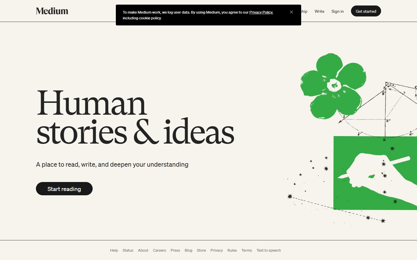
An editorial, reading-first interface built on a warm cream canvas (#f7f4ed) with near-black ink, a giant GT Super serif display headline, and Söhne sans-serif for all supporting UI. The system reads as confident print-magazine minimalism — almost no chrome, one black pill CTA, a single oversized serif headline, and a hand-drawn green illustration as the sole chromatic flourish. Brand voltage comes entirely from the scale of the serif display type and the cream-paper background, not from accent color.
---
version: alpha
name: Medium-design-analysis
description: An editorial, reading-first interface built on a warm cream canvas (#f7f4ed) with near-black ink, a giant GT Super serif display headline, and Söhne sans-serif for all supporting UI. The system reads as confident print-magazine minimalism — almost no chrome, one black pill CTA, a single oversized serif headline, and a hand-drawn green illustration as the sole chromatic flourish. Brand voltage comes entirely from the scale of the serif display type and the cream-paper background, not from accent color.
colors:
  primary: "#191919"
  ink: "#242424"
  link: "#000000"
  neutral: "#6b6b6b"
  canvas: "#f7f4ed"
  on-primary: "#ffffff"
typography:
  display:
    fontFamily: "gt-super, Georgia, serif"
    fontSize: 120px
    fontWeight: 400
    lineHeight: 0.833
    letterSpacing: -6.6px
  title:
    fontFamily: "sohne, Inter, sans-serif"
    fontSize: 22px
    fontWeight: 400
    lineHeight: 1.273
    letterSpacing: 0
  body:
    fontFamily: "sohne, Inter, sans-serif"
    fontSize: 14px
    fontWeight: 400
    lineHeight: 1.429
    letterSpacing: 0
  button:
    fontFamily: "sohne, Inter, sans-serif"
    fontSize: 14px
    fontWeight: 400
    lineHeight: 1.429
    letterSpacing: 0
rounded:
  xs: 2px
  sm: 4px
  pill: 1386px
  full: 1980px
spacing:
  xs: 8px
  sm: 16px
  md: 20px
  lg: 24px
  xl: 25px
  section: 75px
components:
  button-primary:
    backgroundColor: "{colors.primary}"
    textColor: "{colors.on-primary}"
    typography: "{typography.button}"
    rounded: "{rounded.pill}"
    padding: 8px 16px
  top-nav:
    backgroundColor: "{colors.canvas}"
    textColor: "{colors.link}"
    typography: "{typography.button}"
  nav-link:
    backgroundColor: transparent
    textColor: "{colors.link}"
    typography: "{typography.button}"
  text-link:
    backgroundColor: transparent
    textColor: "{colors.link}"
    typography: "{typography.body}"
  hero-band:
    backgroundColor: "{colors.canvas}"
    textColor: "{colors.ink}"
    typography: "{typography.display}"
    padding: 75px
  hero-subhead:
    backgroundColor: transparent
    textColor: "{colors.ink}"
    typography: "{typography.title}"
  cookie-banner:
    backgroundColor: "{colors.primary}"
    textColor: "{colors.on-primary}"
    typography: "{typography.body}"
  footer:
    backgroundColor: "{colors.canvas}"
    textColor: "{colors.neutral}"
    typography: "{typography.body}"
    padding: 24px
---

## Overview

Medium's landing surface is editorial minimalism taken to its logical end — a warm cream canvas (`{colors.canvas}` — #f7f4ed) holding one enormous serif headline, a single line of supporting copy, and one black pill CTA. There is almost no UI chrome. The page reads like the cover of a literary magazine: confident, quiet, and built around the scale of a single typographic gesture.

The type voice splits into two roles. **GT Super** — a high-contrast display serif — carries the hero headline at a measured 120px with aggressive negative tracking (-6.6px) and a tight 0.833 line-height so the two lines of "Human stories & ideas" stack into a dense slab. Everything else — sub-headline, navigation, button label, footer links — runs in **Söhne**, a clean grotesque sans, at small sizes (14–22px, weight 400). The contrast between the giant serif and the modest sans is the entire design tension.

Color is deliberately scarce. The action layer is near-black: the primary CTA sits at `{colors.primary}` (#191919), nav links and inline links at `{colors.link}` (#000000), body ink at `{colors.ink}` (#242424), and secondary text at `{colors.neutral}` (#6b6b6b). The only chromatic moment is the hand-drawn green flower-and-hand illustration in the hero's right zone — and that green was not captured as a token (see Known Gaps).

The CTA is a fully-rounded black pill (`{rounded.pill}` — a 1386px radius that resolves to a capsule). It is the single most assertive element on an otherwise restrained page, and its silhouette is the system's signature.

**Key Characteristics:**
- Warm cream paper canvas (`{colors.canvas}` — #f7f4ed) instead of stark white — the page reads as printed stock, not screen.
- A single oversized GT Super serif headline (`{typography.display}` — 120px, -6.6px tracking, 0.833 line-height). Display scale, not display weight (the serif stays at weight 400).
- All UI type in Söhne (`{typography.body}`, `{typography.button}`, `{typography.title}`) at small sizes and weight 400. Quiet, grotesque, supportive.
- Near-monochrome action layer: black pill CTA (`{colors.primary}`), black nav + links (`{colors.link}`), gray secondary text (`{colors.neutral}`).
- Fully-rounded pill buttons (`{rounded.pill}`) — the only assertive shape on the page.
- A dark cookie-consent banner (`{colors.primary}` background, `{colors.on-primary}` text) overlays the top nav — the one dark surface in the layout.
- A single hand-drawn green illustration provides the lone splash of color; the rest of the page is paper + ink.
- Footer is a quiet single row of gray text links in `{typography.body}`, separated from the body by a hairline.

## Colors

### Brand & Action
- **Primary** (`{colors.primary}` — #191919): The CTA pill background and the dark cookie-banner surface. Medium's "black" is a soft near-black, not pure #000.
- **Link** (`{colors.link}` — #000000): The truest black in the system — used on top-nav links, the wordmark, and inline text links. The most frequent measured color (frequency 71).

### Text
- **Ink** (`{colors.ink}` — #242424): Default running text and the hero headline color — a warm dark gray, gentler than pure black.
- **Neutral** (`{colors.neutral}` — #6b6b6b): Secondary text — sub-headline support, footer link rows, fine print.
- **On Primary** (`{colors.on-primary}` — #ffffff): Text on the black CTA pill and inside the dark cookie banner.

### Surface
- **Canvas** (`{colors.canvas}` — #f7f4ed): The warm cream page floor across the entire layout. This is the brand's signature surface — printed-paper warmth rather than screen white.

Medium's palette is intentionally tiny: one paper tone, two blacks, one gray, and white-on-black. There is no measured accent color — the green illustration is artwork, not a system token (see Known Gaps).

## Typography

### Font Family
The system pairs **GT Super** (a licensed high-contrast display serif) for the hero headline with **Söhne** (a licensed grotesque sans, flagged in `fonts_licensed`) for all supporting UI. Both are commercial typefaces and are not shipped here directly — substitutes are documented below.

The split is strict:
- GT Super (display serif, weight 400, heavy negative tracking) — the hero headline only.
- Söhne (sans, weight 400) — sub-headline, navigation, button labels, footer, body.

### Hierarchy

| Token | Family | Size | Weight | Line Height | Letter Spacing | Use |
|---|---|---|---|---|---|---|
| `{typography.display}` | GT Super (serif) | 120px | 400 | 0.833 | -6.6px | Hero headline ("Human stories & ideas") |
| `{typography.title}` | Söhne (sans) | 22px | 400 | 1.273 | 0 | Hero sub-headline, larger supporting lines |
| `{typography.body}` | Söhne (sans) | 14px | 400 | 1.429 | 0 | Body text, footer links, cookie banner |
| `{typography.button}` | Söhne (sans) | 14px | 400 | 1.429 | 0 | CTA label, nav links |

### Principles
Medium achieves hierarchy through **scale, not weight**. The display headline is enormous (120px) but stays at weight 400 — the high contrast of the GT Super serif carries the visual weight. Everything else is small and quiet at the same weight 400. The system never bolds its way to emphasis; it scales.

The negative tracking on the display role (-6.6px) is essential — it pulls the serif letterforms into a tight, magazine-cover slab. Without it the headline reads as loose and ordinary.

### Note on Font Substitutes
- **Söhne** is licensed; **Inter** is the documented substitute and is encoded in the fallback stack for all sans roles. Inter at weight 400 preserves the clean grotesque character.
- **GT Super** is also a licensed commercial serif. A reasonable open-source substitute is **Playfair Display** or **Source Serif 4** at weight 400 with tight negative tracking; the fallback stack here uses `Georgia, serif`. Note that no open-source face matches GT Super's exact high-contrast cut — treat the substitute as an approximation of the scale + tracking signature.

## Layout

### Spacing System
- **Measured tokens:** `{spacing.xs}` 8px · `{spacing.sm}` 16px · `{spacing.md}` 20px · `{spacing.lg}` 24px · `{spacing.xl}` 25px · `{spacing.section}` 75px.
- **Button padding:** `{spacing.xs}` × `{spacing.sm}` (8px vertical, 16px horizontal) on the primary CTA.
- **Section rhythm:** `{spacing.section}` (75px) is the largest measured gap — used for the generous vertical breathing room of the hero band.
- The 16px value is the most frequent spacing measured (frequency 4) — the workhorse gutter for inline gaps and footer-link spacing.

### Grid & Container
- **Hero layout:** A two-zone split — the headline + sub-headline + CTA occupy the left, the green illustration occupies the right. (Exact column ratios were not measured.)
- **Top nav:** Single horizontal row — wordmark at left, nav links + "Sign in" + "Get started" pill at right.
- **Footer:** A single centered row of text links separated from the body by a hairline rule.

### Whitespace Philosophy
Medium uses radical whitespace. The hero gives the 120px headline room to dominate, with the cream canvas left almost entirely empty around it. There are no cards, no grids of features, no dense lists — the entire landing page is one editorial statement. Negative space is the design.

## Elevation & Depth

| Level | Treatment | Use |
|---|---|---|
| Flat | No shadow, no border | The cream canvas, hero band, footer — the default for nearly everything |
| Soft glow | `rgb(128,128,128) 0px 0px 5px 0px` | A faint gray ambient glow (measured) — likely on a focused/overlay element |
| White glow | `rgba(255,255,255,0.4) 0px 0px 2px 0px` | A faint white 2px glow (measured) — subtle edge lift on a light element |
| Dark overlay | `{colors.primary}` surface | The cookie-consent banner — the one dark, layered element above the nav |

Medium's elevation philosophy is essentially flat. The page sits on paper with no card shadows and no layered surfaces. The two measured box-shadows are faint, low-radius glows rather than drop shadows — depth is suggested at the edges, never stacked.

## Shapes

### Border Radius Scale

| Token | Value | Use |
|---|---|---|
| `{rounded.xs}` | 2px | Minimal corner softening on small elements |
| `{rounded.sm}` | 4px | Slightly rounded small containers / inputs |
| `{rounded.pill}` | 1386px | The primary CTA pill — an effectively capsule radius (`{component.button-primary}`) |
| `{rounded.full}` | 1980px | Fully-rounded elements — circular / capsule treatment at the largest scale |

The radius scale is bimodal: either barely-rounded (2–4px) for incidental containers, or fully-rounded capsule (`{rounded.pill}` / `{rounded.full}`) for buttons. There is no mid-range "card radius" because the page has no cards — the pill silhouette is the only deliberate curved shape.

### Illustration Geometry
The hero artwork (green flower, hand-with-pen, scattered geometric line work) is a hand-drawn editorial illustration placed in the right zone. It carries no system radius — it sits directly on the cream canvas with no frame or container.

## Components

### Navigation

**`top-nav`** — A single horizontal bar on the cream canvas (`{colors.canvas}`). The "Medium" wordmark sits at left (serif, black), with nav links ("Membership", "Write", "Sign in") and the "Get started" pill clustered at right. Links use `{typography.button}` in `{colors.link}` (#000000). A hairline rule separates the nav from the body.

**`nav-link`** — Inline navigation text. Transparent background, `{colors.link}` text, `{typography.button}` (Söhne 14px / 400). Used for "Membership", "Write", "Sign in".

**`text-link`** — Inline links inside body content and the footer row. Transparent background, `{colors.link}` text, `{typography.body}`.

### Buttons

**`button-primary`** — The signature CTA. Background `{colors.primary}` (#191919), text `{colors.on-primary}` (#ffffff), label in `{typography.button}` (Söhne 14px / 400), padding `{spacing.xs}` × `{spacing.sm}` (8px × 16px), fully rounded `{rounded.pill}`. Appears twice on the landing page — "Get started" in the nav and "Start reading" in the hero. The black capsule is the most assertive element on the page.

### Hero

**`hero-band`** — The full landing statement on `{colors.canvas}`, with generous `{spacing.section}` (75px) vertical breathing room. Holds the giant `{typography.display}` headline ("Human stories & ideas"), the `{component.hero-subhead}` line below it, and a `{component.button-primary}` ("Start reading"). The green illustration occupies the right zone.

**`hero-subhead`** — The supporting line ("A place to read, write, and deepen your understanding"). Transparent background, `{colors.ink}` text, `{typography.title}` (Söhne 22px / 400).

### Overlays

**`cookie-banner`** — A dark consent banner overlaying the top-center of the nav. Background `{colors.primary}` (#191919), text `{colors.on-primary}`, body copy in `{typography.body}`, with an inline `{component.text-link}` to the Privacy Policy and a close (×) control. This is the only dark surface in the layout.

### Footer

**`footer`** — A quiet single row of text links (Help, Status, About, Careers, Press, Blog, Store, Privacy, Rules, Terms, Text to speech) centered below a hairline. Background `{colors.canvas}`, links in `{colors.neutral}` (#6b6b6b), type `{typography.body}` (Söhne 14px / 400), padding `{spacing.lg}` (24px). Deliberately understated — no columns, no headings, no dark surface.

## Do's and Don'ts

### Do
- Keep the entire surface on the cream canvas (`{colors.canvas}` — #f7f4ed). The warm paper tone is the brand — never default to stark white.
- Reserve scale, not weight, for hierarchy. The hero headline is 120px at weight 400 — let size carry the emphasis.
- Apply the heavy negative tracking (-6.6px) on the display serif. Loose tracking reads as off-brand.
- Use the black pill (`{rounded.pill}`) for the single primary action. One assertive shape per band.
- Keep all supporting UI in small Söhne weight 400 — sub-head, nav, button, footer.
- Let the green illustration be the only color moment. The rest of the page stays paper + ink.
- Use radical whitespace. Empty cream space around the headline is the design.

### Don't
- Don't introduce card shadows or layered surfaces — the page is flat by design.
- Don't bold the display serif to add emphasis; scale it instead. GT Super stays at weight 400.
- Don't add accent colors to the action layer. CTAs are near-black (`{colors.primary}`), never green or blue.
- Don't crowd the hero with feature grids or dense lists. The landing page is one editorial statement.
- Don't put body or UI copy in the GT Super serif — Söhne handles everything that isn't the marquee headline.
- Don't add a second dark surface beyond the cookie banner.

## Responsive Behavior

Only the desktop landing page was captured, so responsive rules are inferred from the layout structure and must be confirmed against mobile captures (see Known Gaps).

### Breakpoints (inferred)

| Name | Width | Likely Changes |
|---|---|---|
| Mobile | < 768px | Nav likely collapses; hero illustration drops below or hides; display headline scales down well below 120px; single-column stack |
| Tablet | 768–1024px | Two-zone hero tightens; headline scales down; footer link row wraps |
| Desktop | > 1024px | Full two-zone hero with 120px headline + right-side illustration as captured |

### Touch Targets
- `{component.button-primary}` measured padding is 8px × 16px with `{typography.button}` (14px). At desktop this is comfortable; on mobile the tap height may need to grow toward a 44px minimum (not measured).
- Footer text links are tightly spaced and small (14px) — likely require larger spacing on touch surfaces.

### Collapsing Strategy
- The display headline at 120px cannot survive narrow viewports unchanged; expect a significant downscale (exact mobile sizes not measured).
- The hero's two-zone (text + illustration) split most likely collapses to single-column with the illustration moving below or being suppressed.

## Iteration Guide

1. Focus on ONE component at a time. Reference its YAML key directly (`{component.button-primary}`, `{component.hero-band}`).
2. Variants of a component (`-active`, `-disabled`) should be added as separate entries in `components:` once their states are measured.
3. Use `{token.refs}` everywhere — never inline a hex into a component.
4. Never document hover. Default and Active/Pressed states only.
5. Hierarchy comes from scale, not weight — bigger GT Super before bolder anything.
6. Keep the action layer monochrome near-black. The green illustration is artwork, not a token.
7. Preserve the cream canvas as the universal surface; introducing white would break the paper-stock identity.

## Known Gaps

- **The green illustration color was not captured.** The hand-drawn flower/hand artwork is the page's only chromatic element, but no green hex was measured into the palette — it is documented as artwork, not a token. A capture of the SVG/asset is needed to add a brand-green token.
- **GT Super and Söhne are both licensed commercial typefaces.** Söhne is flagged in `fonts_licensed` with Inter as the substitute; GT Super was inferred as a licensed display serif and is documented with `Georgia` / Playfair-style substitutes. Neither licensed face ships here.
- **Only the desktop landing page was captured.** All responsive breakpoints, mobile headline sizes, and the nav's collapse behavior are inferred, not measured.
- **Button states beyond default were not measured** — active/pressed, focus, and disabled states for `{component.button-primary}` need ground-truth capture.
- **The two measured box-shadows** (`rgb(128,128,128) 0 0 5px` and `rgba(255,255,255,0.4) 0 0 2px`) could not be mapped to specific elements; they are documented as faint ambient glows rather than assigned to a named component.
- **Form/input components are absent** from the captured landing page — the sign-in and write surfaces (which would carry inputs, validation, and authenticated chrome) are out of scope.
- **The spacing tokens 24px and 25px** are near-duplicates from the measurement; they are kept as distinct (`{spacing.lg}` / `{spacing.xl}`) but may collapse to a single value once more pages are captured.
- **Animation and transition timings** are not in scope.

<!-- Documented by duply · real-world design systems as ready-to-use DESIGN.md for AI coding agents · https://duply.ai/medium/design-md -->
Color Palette
Accent
Neutrals
Typography
display120px · 400 · 0.833
The quick brown fox jumpstitle22px · 400 · 1.273
The quick brown fox jumpsbody14px · 400 · 1.429
The quick brown fox jumpsbutton14px · 400 · 1.429
The quick brown fox jumpsSpacing & Shape
Spacing
| Name | Value | Preview |
|---|---|---|
| xs | 8px | |
| sm | 16px | |
| md | 20px | |
| lg | 24px | |
| xl | 25px | |
| section | 75px |
Border Radius
| Name | Value | Preview |
|---|---|---|
| xs | 2px | |
| sm | 4px | |
| pill | 1386px | |
| full | 1980px |
More like this


---
version: alpha
name: Medium-design-analysis
description: An editorial, reading-first interface built on a warm cream canvas (#f7f4ed) with near-black ink, a giant GT Super serif display headline, and Söhne sans-serif for all supporting UI. The system reads as confident print-magazine minimalism — almost no chrome, one black pill CTA, a single oversized serif headline, and a hand-drawn green illustration as the sole chromatic flourish. Brand voltage comes entirely from the scale of the serif display type and the cream-paper background, not from accent color.
colors:
  primary: "#191919"
  ink: "#242424"
  link: "#000000"
  neutral: "#6b6b6b"
  canvas: "#f7f4ed"
  on-primary: "#ffffff"
typography:
  display:
    fontFamily: "gt-super, Georgia, serif"
    fontSize: 120px
    fontWeight: 400
    lineHeight: 0.833
    letterSpacing: -6.6px
  title:
    fontFamily: "sohne, Inter, sans-serif"
    fontSize: 22px
    fontWeight: 400
    lineHeight: 1.273
    letterSpacing: 0
  body:
    fontFamily: "sohne, Inter, sans-serif"
    fontSize: 14px
    fontWeight: 400
    lineHeight: 1.429
    letterSpacing: 0
  button:
    fontFamily: "sohne, Inter, sans-serif"
    fontSize: 14px
    fontWeight: 400
    lineHeight: 1.429
    letterSpacing: 0
rounded:
  xs: 2px
  sm: 4px
  pill: 1386px
  full: 1980px
spacing:
  xs: 8px
  sm: 16px
  md: 20px
  lg: 24px
  xl: 25px
  section: 75px
components:
  button-primary:
    backgroundColor: "{colors.primary}"
    textColor: "{colors.on-primary}"
    typography: "{typography.button}"
    rounded: "{rounded.pill}"
    padding: 8px 16px
  top-nav:
    backgroundColor: "{colors.canvas}"
    textColor: "{colors.link}"
    typography: "{typography.button}"
  nav-link:
    backgroundColor: transparent
    textColor: "{colors.link}"
    typography: "{typography.button}"
  text-link:
    backgroundColor: transparent
    textColor: "{colors.link}"
    typography: "{typography.body}"
  hero-band:
    backgroundColor: "{colors.canvas}"
    textColor: "{colors.ink}"
    typography: "{typography.display}"
    padding: 75px
  hero-subhead:
    backgroundColor: transparent
    textColor: "{colors.ink}"
    typography: "{typography.title}"
  cookie-banner:
    backgroundColor: "{colors.primary}"
    textColor: "{colors.on-primary}"
    typography: "{typography.body}"
  footer:
    backgroundColor: "{colors.canvas}"
    textColor: "{colors.neutral}"
    typography: "{typography.body}"
    padding: 24px
---

## Overview

Medium's landing surface is editorial minimalism taken to its logical end — a warm cream canvas (`{colors.canvas}` — #f7f4ed) holding one enormous serif headline, a single line of supporting copy, and one black pill CTA. There is almost no UI chrome. The page reads like the cover of a literary magazine: confident, quiet, and built around the scale of a single typographic gesture.

The type voice splits into two roles. **GT Super** — a high-contrast display serif — carries the hero headline at a measured 120px with aggressive negative tracking (-6.6px) and a tight 0.833 line-height so the two lines of "Human stories & ideas" stack into a dense slab. Everything else — sub-headline, navigation, button label, footer links — runs in **Söhne**, a clean grotesque sans, at small sizes (14–22px, weight 400). The contrast between the giant serif and the modest sans is the entire design tension.

Color is deliberately scarce. The action layer is near-black: the primary CTA sits at `{colors.primary}` (#191919), nav links and inline links at `{colors.link}` (#000000), body ink at `{colors.ink}` (#242424), and secondary text at `{colors.neutral}` (#6b6b6b). The only chromatic moment is the hand-drawn green flower-and-hand illustration in the hero's right zone — and that green was not captured as a token (see Known Gaps).

The CTA is a fully-rounded black pill (`{rounded.pill}` — a 1386px radius that resolves to a capsule). It is the single most assertive element on an otherwise restrained page, and its silhouette is the system's signature.

**Key Characteristics:**
- Warm cream paper canvas (`{colors.canvas}` — #f7f4ed) instead of stark white — the page reads as printed stock, not screen.
- A single oversized GT Super serif headline (`{typography.display}` — 120px, -6.6px tracking, 0.833 line-height). Display scale, not display weight (the serif stays at weight 400).
- All UI type in Söhne (`{typography.body}`, `{typography.button}`, `{typography.title}`) at small sizes and weight 400. Quiet, grotesque, supportive.
- Near-monochrome action layer: black pill CTA (`{colors.primary}`), black nav + links (`{colors.link}`), gray secondary text (`{colors.neutral}`).
- Fully-rounded pill buttons (`{rounded.pill}`) — the only assertive shape on the page.
- A dark cookie-consent banner (`{colors.primary}` background, `{colors.on-primary}` text) overlays the top nav — the one dark surface in the layout.
- A single hand-drawn green illustration provides the lone splash of color; the rest of the page is paper + ink.
- Footer is a quiet single row of gray text links in `{typography.body}`, separated from the body by a hairline.

## Colors

### Brand & Action
- **Primary** (`{colors.primary}` — #191919): The CTA pill background and the dark cookie-banner surface. Medium's "black" is a soft near-black, not pure #000.
- **Link** (`{colors.link}` — #000000): The truest black in the system — used on top-nav links, the wordmark, and inline text links. The most frequent measured color (frequency 71).

### Text
- **Ink** (`{colors.ink}` — #242424): Default running text and the hero headline color — a warm dark gray, gentler than pure black.
- **Neutral** (`{colors.neutral}` — #6b6b6b): Secondary text — sub-headline support, footer link rows, fine print.
- **On Primary** (`{colors.on-primary}` — #ffffff): Text on the black CTA pill and inside the dark cookie banner.

### Surface
- **Canvas** (`{colors.canvas}` — #f7f4ed): The warm cream page floor across the entire layout. This is the brand's signature surface — printed-paper warmth rather than screen white.

Medium's palette is intentionally tiny: one paper tone, two blacks, one gray, and white-on-black. There is no measured accent color — the green illustration is artwork, not a system token (see Known Gaps).

## Typography

### Font Family
The system pairs **GT Super** (a licensed high-contrast display serif) for the hero headline with **Söhne** (a licensed grotesque sans, flagged in `fonts_licensed`) for all supporting UI. Both are commercial typefaces and are not shipped here directly — substitutes are documented below.

The split is strict:
- GT Super (display serif, weight 400, heavy negative tracking) — the hero headline only.
- Söhne (sans, weight 400) — sub-headline, navigation, button labels, footer, body.

### Hierarchy

| Token | Family | Size | Weight | Line Height | Letter Spacing | Use |
|---|---|---|---|---|---|---|
| `{typography.display}` | GT Super (serif) | 120px | 400 | 0.833 | -6.6px | Hero headline ("Human stories & ideas") |
| `{typography.title}` | Söhne (sans) | 22px | 400 | 1.273 | 0 | Hero sub-headline, larger supporting lines |
| `{typography.body}` | Söhne (sans) | 14px | 400 | 1.429 | 0 | Body text, footer links, cookie banner |
| `{typography.button}` | Söhne (sans) | 14px | 400 | 1.429 | 0 | CTA label, nav links |

### Principles
Medium achieves hierarchy through **scale, not weight**. The display headline is enormous (120px) but stays at weight 400 — the high contrast of the GT Super serif carries the visual weight. Everything else is small and quiet at the same weight 400. The system never bolds its way to emphasis; it scales.

The negative tracking on the display role (-6.6px) is essential — it pulls the serif letterforms into a tight, magazine-cover slab. Without it the headline reads as loose and ordinary.

### Note on Font Substitutes
- **Söhne** is licensed; **Inter** is the documented substitute and is encoded in the fallback stack for all sans roles. Inter at weight 400 preserves the clean grotesque character.
- **GT Super** is also a licensed commercial serif. A reasonable open-source substitute is **Playfair Display** or **Source Serif 4** at weight 400 with tight negative tracking; the fallback stack here uses `Georgia, serif`. Note that no open-source face matches GT Super's exact high-contrast cut — treat the substitute as an approximation of the scale + tracking signature.

## Layout

### Spacing System
- **Measured tokens:** `{spacing.xs}` 8px · `{spacing.sm}` 16px · `{spacing.md}` 20px · `{spacing.lg}` 24px · `{spacing.xl}` 25px · `{spacing.section}` 75px.
- **Button padding:** `{spacing.xs}` × `{spacing.sm}` (8px vertical, 16px horizontal) on the primary CTA.
- **Section rhythm:** `{spacing.section}` (75px) is the largest measured gap — used for the generous vertical breathing room of the hero band.
- The 16px value is the most frequent spacing measured (frequency 4) — the workhorse gutter for inline gaps and footer-link spacing.

### Grid & Container
- **Hero layout:** A two-zone split — the headline + sub-headline + CTA occupy the left, the green illustration occupies the right. (Exact column ratios were not measured.)
- **Top nav:** Single horizontal row — wordmark at left, nav links + "Sign in" + "Get started" pill at right.
- **Footer:** A single centered row of text links separated from the body by a hairline rule.

### Whitespace Philosophy
Medium uses radical whitespace. The hero gives the 120px headline room to dominate, with the cream canvas left almost entirely empty around it. There are no cards, no grids of features, no dense lists — the entire landing page is one editorial statement. Negative space is the design.

## Elevation & Depth

| Level | Treatment | Use |
|---|---|---|
| Flat | No shadow, no border | The cream canvas, hero band, footer — the default for nearly everything |
| Soft glow | `rgb(128,128,128) 0px 0px 5px 0px` | A faint gray ambient glow (measured) — likely on a focused/overlay element |
| White glow | `rgba(255,255,255,0.4) 0px 0px 2px 0px` | A faint white 2px glow (measured) — subtle edge lift on a light element |
| Dark overlay | `{colors.primary}` surface | The cookie-consent banner — the one dark, layered element above the nav |

Medium's elevation philosophy is essentially flat. The page sits on paper with no card shadows and no layered surfaces. The two measured box-shadows are faint, low-radius glows rather than drop shadows — depth is suggested at the edges, never stacked.

## Shapes

### Border Radius Scale

| Token | Value | Use |
|---|---|---|
| `{rounded.xs}` | 2px | Minimal corner softening on small elements |
| `{rounded.sm}` | 4px | Slightly rounded small containers / inputs |
| `{rounded.pill}` | 1386px | The primary CTA pill — an effectively capsule radius (`{component.button-primary}`) |
| `{rounded.full}` | 1980px | Fully-rounded elements — circular / capsule treatment at the largest scale |

The radius scale is bimodal: either barely-rounded (2–4px) for incidental containers, or fully-rounded capsule (`{rounded.pill}` / `{rounded.full}`) for buttons. There is no mid-range "card radius" because the page has no cards — the pill silhouette is the only deliberate curved shape.

### Illustration Geometry
The hero artwork (green flower, hand-with-pen, scattered geometric line work) is a hand-drawn editorial illustration placed in the right zone. It carries no system radius — it sits directly on the cream canvas with no frame or container.

## Components

### Navigation

**`top-nav`** — A single horizontal bar on the cream canvas (`{colors.canvas}`). The "Medium" wordmark sits at left (serif, black), with nav links ("Membership", "Write", "Sign in") and the "Get started" pill clustered at right. Links use `{typography.button}` in `{colors.link}` (#000000). A hairline rule separates the nav from the body.

**`nav-link`** — Inline navigation text. Transparent background, `{colors.link}` text, `{typography.button}` (Söhne 14px / 400). Used for "Membership", "Write", "Sign in".

**`text-link`** — Inline links inside body content and the footer row. Transparent background, `{colors.link}` text, `{typography.body}`.

### Buttons

**`button-primary`** — The signature CTA. Background `{colors.primary}` (#191919), text `{colors.on-primary}` (#ffffff), label in `{typography.button}` (Söhne 14px / 400), padding `{spacing.xs}` × `{spacing.sm}` (8px × 16px), fully rounded `{rounded.pill}`. Appears twice on the landing page — "Get started" in the nav and "Start reading" in the hero. The black capsule is the most assertive element on the page.

### Hero

**`hero-band`** — The full landing statement on `{colors.canvas}`, with generous `{spacing.section}` (75px) vertical breathing room. Holds the giant `{typography.display}` headline ("Human stories & ideas"), the `{component.hero-subhead}` line below it, and a `{component.button-primary}` ("Start reading"). The green illustration occupies the right zone.

**`hero-subhead`** — The supporting line ("A place to read, write, and deepen your understanding"). Transparent background, `{colors.ink}` text, `{typography.title}` (Söhne 22px / 400).

### Overlays

**`cookie-banner`** — A dark consent banner overlaying the top-center of the nav. Background `{colors.primary}` (#191919), text `{colors.on-primary}`, body copy in `{typography.body}`, with an inline `{component.text-link}` to the Privacy Policy and a close (×) control. This is the only dark surface in the layout.

### Footer

**`footer`** — A quiet single row of text links (Help, Status, About, Careers, Press, Blog, Store, Privacy, Rules, Terms, Text to speech) centered below a hairline. Background `{colors.canvas}`, links in `{colors.neutral}` (#6b6b6b), type `{typography.body}` (Söhne 14px / 400), padding `{spacing.lg}` (24px). Deliberately understated — no columns, no headings, no dark surface.

## Do's and Don'ts

### Do
- Keep the entire surface on the cream canvas (`{colors.canvas}` — #f7f4ed). The warm paper tone is the brand — never default to stark white.
- Reserve scale, not weight, for hierarchy. The hero headline is 120px at weight 400 — let size carry the emphasis.
- Apply the heavy negative tracking (-6.6px) on the display serif. Loose tracking reads as off-brand.
- Use the black pill (`{rounded.pill}`) for the single primary action. One assertive shape per band.
- Keep all supporting UI in small Söhne weight 400 — sub-head, nav, button, footer.
- Let the green illustration be the only color moment. The rest of the page stays paper + ink.
- Use radical whitespace. Empty cream space around the headline is the design.

### Don't
- Don't introduce card shadows or layered surfaces — the page is flat by design.
- Don't bold the display serif to add emphasis; scale it instead. GT Super stays at weight 400.
- Don't add accent colors to the action layer. CTAs are near-black (`{colors.primary}`), never green or blue.
- Don't crowd the hero with feature grids or dense lists. The landing page is one editorial statement.
- Don't put body or UI copy in the GT Super serif — Söhne handles everything that isn't the marquee headline.
- Don't add a second dark surface beyond the cookie banner.

## Responsive Behavior

Only the desktop landing page was captured, so responsive rules are inferred from the layout structure and must be confirmed against mobile captures (see Known Gaps).

### Breakpoints (inferred)

| Name | Width | Likely Changes |
|---|---|---|
| Mobile | < 768px | Nav likely collapses; hero illustration drops below or hides; display headline scales down well below 120px; single-column stack |
| Tablet | 768–1024px | Two-zone hero tightens; headline scales down; footer link row wraps |
| Desktop | > 1024px | Full two-zone hero with 120px headline + right-side illustration as captured |

### Touch Targets
- `{component.button-primary}` measured padding is 8px × 16px with `{typography.button}` (14px). At desktop this is comfortable; on mobile the tap height may need to grow toward a 44px minimum (not measured).
- Footer text links are tightly spaced and small (14px) — likely require larger spacing on touch surfaces.

### Collapsing Strategy
- The display headline at 120px cannot survive narrow viewports unchanged; expect a significant downscale (exact mobile sizes not measured).
- The hero's two-zone (text + illustration) split most likely collapses to single-column with the illustration moving below or being suppressed.

## Iteration Guide

1. Focus on ONE component at a time. Reference its YAML key directly (`{component.button-primary}`, `{component.hero-band}`).
2. Variants of a component (`-active`, `-disabled`) should be added as separate entries in `components:` once their states are measured.
3. Use `{token.refs}` everywhere — never inline a hex into a component.
4. Never document hover. Default and Active/Pressed states only.
5. Hierarchy comes from scale, not weight — bigger GT Super before bolder anything.
6. Keep the action layer monochrome near-black. The green illustration is artwork, not a token.
7. Preserve the cream canvas as the universal surface; introducing white would break the paper-stock identity.

## Known Gaps

- **The green illustration color was not captured.** The hand-drawn flower/hand artwork is the page's only chromatic element, but no green hex was measured into the palette — it is documented as artwork, not a token. A capture of the SVG/asset is needed to add a brand-green token.
- **GT Super and Söhne are both licensed commercial typefaces.** Söhne is flagged in `fonts_licensed` with Inter as the substitute; GT Super was inferred as a licensed display serif and is documented with `Georgia` / Playfair-style substitutes. Neither licensed face ships here.
- **Only the desktop landing page was captured.** All responsive breakpoints, mobile headline sizes, and the nav's collapse behavior are inferred, not measured.
- **Button states beyond default were not measured** — active/pressed, focus, and disabled states for `{component.button-primary}` need ground-truth capture.
- **The two measured box-shadows** (`rgb(128,128,128) 0 0 5px` and `rgba(255,255,255,0.4) 0 0 2px`) could not be mapped to specific elements; they are documented as faint ambient glows rather than assigned to a named component.
- **Form/input components are absent** from the captured landing page — the sign-in and write surfaces (which would carry inputs, validation, and authenticated chrome) are out of scope.
- **The spacing tokens 24px and 25px** are near-duplicates from the measurement; they are kept as distinct (`{spacing.lg}` / `{spacing.xl}`) but may collapse to a single value once more pages are captured.
- **Animation and transition timings** are not in scope.

<!-- Documented by duply · real-world design systems as ready-to-use DESIGN.md for AI coding agents · https://duply.ai/medium/design-md -->