RunwayML
A film-grade, research-lab interface built on white canvas with pure-black primary actions and a custom grotesk display face (abcNormal). The system reads as editorial and cinematic — full-bleed media bands, sharp-cornered cards that let imagery and product stills carry the page, tight negative-tracked headlines, and a near-monochrome palette where neutral grays and a black footer do all the structural work. Brand voltage comes from full-bleed video/imagery and the disciplined typographic restraint, not from accent color.
---
version: alpha
name: RunwayML-design-analysis
description: A film-grade, research-lab interface built on white canvas with pure-black primary actions and a custom grotesk display face (abcNormal). The system reads as editorial and cinematic — full-bleed media bands, sharp-cornered cards that let imagery and product stills carry the page, tight negative-tracked headlines, and a near-monochrome palette where neutral grays and a black footer do all the structural work. Brand voltage comes from full-bleed video/imagery and the disciplined typographic restraint, not from accent color.
colors:
primary: "#000000"
primary-active: "#1a1a1a"
ink: "#0c0c0c"
ink-strong: "#1f2937"
body: "#404040"
body-soft: "#3a3a3a"
muted: "#6b7280"
muted-strong: "#374151"
muted-soft: "#9ca3af"
gray: "#7c7c7c"
gray-soft: "#999999"
divider-soft: "#dcdcdc"
hairline: "#e5e7eb"
hairline-strong: "#d1d5db"
canvas: "#ffffff"
surface-soft: "#f7f7f7"
surface-tint: "#eef1f5"
surface-tint-cool: "#e8eaf0"
surface-dark: "#000000"
surface-dark-elevated: "#1a1a1a"
neutral-darker: "#111827"
accent-warm: "#44402c"
on-primary: "#ffffff"
on-dark: "#ffffff"
typography:
display-xl:
fontFamily: "abcNormal, Helvetica Neue, Arial, sans-serif"
fontSize: 48px
fontWeight: 400
lineHeight: 1.0
letterSpacing: -1.2px
display-lg:
fontFamily: "abcNormal, Helvetica Neue, Arial, sans-serif"
fontSize: 36px
fontWeight: 400
lineHeight: 1.0
letterSpacing: -0.9px
display-md:
fontFamily: "abcNormal, Helvetica Neue, Arial, sans-serif"
fontSize: 24px
fontWeight: 400
lineHeight: 1.0
letterSpacing: 0
overline:
fontFamily: "abcNormal, Helvetica Neue, Arial, sans-serif"
fontSize: 14px
fontWeight: 500
lineHeight: 1.429
letterSpacing: 0.35px
body:
fontFamily: "abcNormal, Helvetica Neue, Arial, sans-serif"
fontSize: 14px
fontWeight: 400
lineHeight: 1.25
letterSpacing: 0
button:
fontFamily: "abcNormal, Helvetica Neue, Arial, sans-serif"
fontSize: 14px
fontWeight: 600
lineHeight: 1.429
letterSpacing: 0
rounded:
none: 0px
xs: 4px
sm: 6px
md: 8px
lg: 12px
spacing:
xxs: 4px
xs: 8px
sm: 12px
md: 16px
lg: 20px
xl: 28px
xxl: 40px
components:
button-primary:
backgroundColor: "{colors.primary}"
textColor: "{colors.on-primary}"
typography: "{typography.button}"
rounded: "{rounded.xs}"
padding: 4px 8px
button-primary-active:
backgroundColor: "{colors.primary-active}"
textColor: "{colors.on-primary}"
rounded: "{rounded.xs}"
button-secondary:
backgroundColor: "{colors.canvas}"
textColor: "{colors.ink}"
typography: "{typography.button}"
rounded: "{rounded.xs}"
padding: 4px 8px
button-text-link:
backgroundColor: transparent
textColor: "{colors.ink}"
typography: "{typography.button}"
top-nav:
backgroundColor: "{colors.canvas}"
textColor: "{colors.ink}"
typography: "{typography.overline}"
nav-link:
backgroundColor: transparent
textColor: "{colors.ink}"
typography: "{typography.overline}"
hero-band:
backgroundColor: "{colors.surface-dark}"
textColor: "{colors.on-dark}"
typography: "{typography.display-xl}"
hero-link-list:
backgroundColor: transparent
textColor: "{colors.on-dark}"
typography: "{typography.overline}"
media-card:
backgroundColor: "{colors.canvas}"
textColor: "{colors.ink}"
typography: "{typography.display-md}"
rounded: "{rounded.none}"
feature-card:
backgroundColor: "{colors.canvas}"
textColor: "{colors.ink}"
typography: "{typography.body}"
rounded: "{rounded.none}"
research-band:
backgroundColor: "{colors.surface-dark}"
textColor: "{colors.on-dark}"
typography: "{typography.body}"
research-list-item:
backgroundColor: transparent
textColor: "{colors.on-dark}"
typography: "{typography.body}"
partner-logo-row:
backgroundColor: "{colors.canvas}"
textColor: "{colors.muted}"
typography: "{typography.overline}"
case-study-card:
backgroundColor: "{colors.canvas}"
textColor: "{colors.ink}"
typography: "{typography.body}"
rounded: "{rounded.none}"
cta-band-dark:
backgroundColor: "{colors.surface-dark}"
textColor: "{colors.on-dark}"
typography: "{typography.display-lg}"
footer:
backgroundColor: "{colors.surface-dark}"
textColor: "{colors.muted-soft}"
typography: "{typography.body}"
---
## Overview
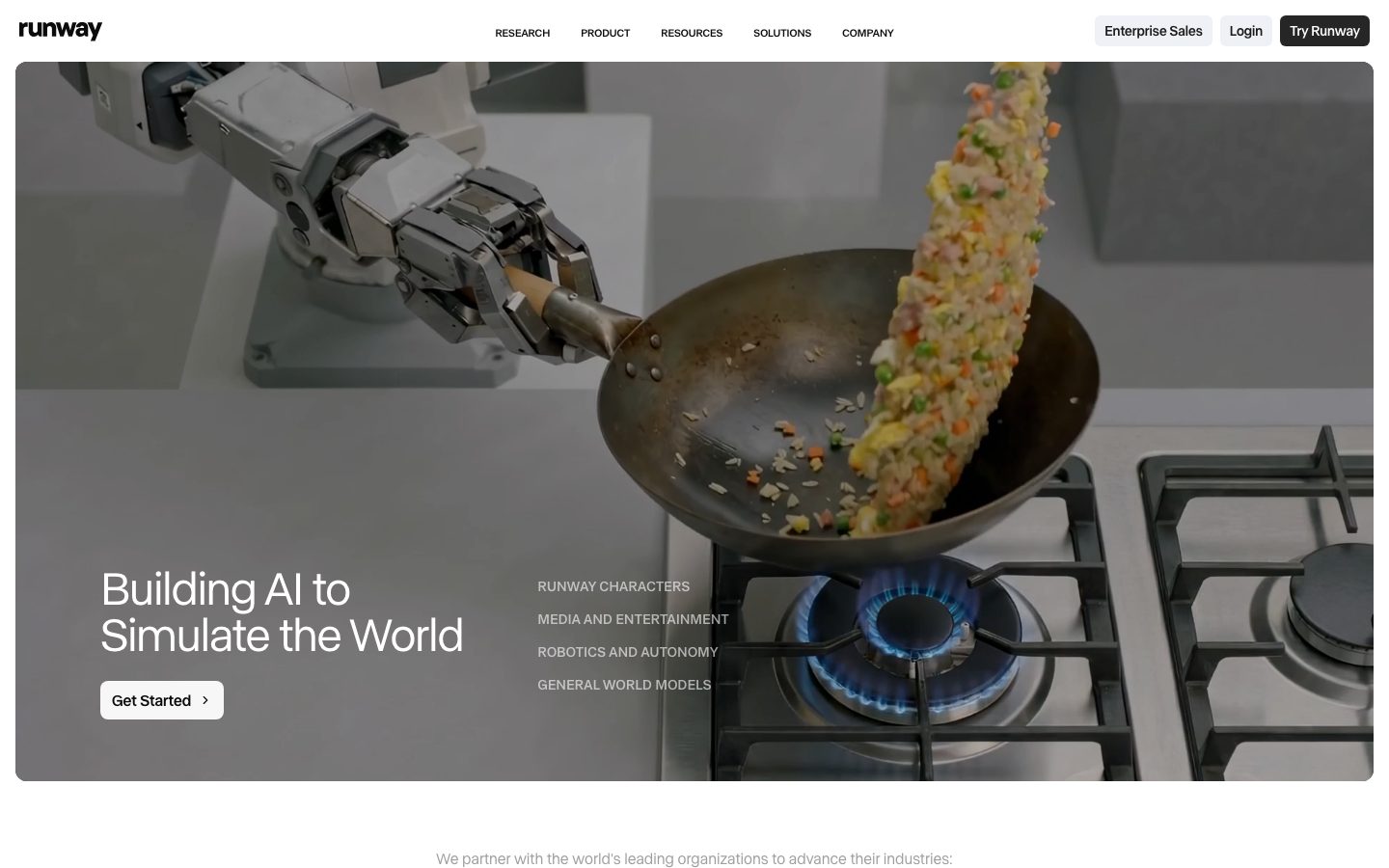
RunwayML's marketing surface is an editorial, research-lab interface — white canvas (`{colors.canvas}` — #ffffff) with pure-black actions (`{colors.primary}` — #000000), a custom grotesk display face (**abcNormal**), and full-bleed cinematic media doing the heavy visual work. The system reads as a film studio crossed with an AI research lab: restrained, monochrome, confident enough to let imagery and product stills speak for themselves.
The most striking measured trait is **sharp corners**. The measured `card` component carries `radius: 0px` — Runway's content cards, media tiles, and case-study panels sit flush with the imagery they hold, no rounding. Only buttons and small interactive chips pick up a tight `{rounded.xs}` (4px). This squared geometry is core to the editorial, gallery-like feel.
Typography is a single-family system: **abcNormal** runs everything — display headlines, body, labels, and buttons. The hierarchy is built with size, weight, and negative letter-spacing rather than a second typeface. Display headlines use weight 400 (not bold) with tight negative tracking (-0.9 to -1.2px), giving a precise, gallery-caption feel. Buttons step up to weight 600; uppercase labels (`{typography.overline}`) take slightly positive tracking (+0.35px).
The palette is near-monochrome: black, white, and a deep bench of neutral grays (`{colors.body}` #404040, `{colors.muted}` #6b7280, `{colors.hairline}` #e5e7eb). There is no saturated brand accent — the only chromatic warmth measured is `{colors.accent-warm}` (#44402c), an incidental dark tone. Brand voltage is supplied by full-bleed video/photography and the black footer, not by color.
**Key Characteristics:**
- White canvas with pure-black actions (`{colors.primary}` — #000000), buttons at the tight `{rounded.xs}` (4px) radius with weight-600 labels.
- Single custom grotesk (**abcNormal**) for the entire type system; hierarchy comes from size + negative tracking, never from a serif/sans pairing.
- Sharp-cornered cards (`{rounded.none}` — measured 0px) that let full-bleed imagery and product stills sit flush.
- Dark bands (`{colors.surface-dark}` — #000000) for the hero, research panels, the closing CTA, and the footer — the dark surfaces frame and bookend the white editorial body.
- Near-monochrome palette: black, white, and a layered gray ramp; no saturated accent.
- Flat depth — no measured shadows. Separation comes from imagery edges and color blocks, not elevation.
## Colors
### Action & Ink
- **Primary** (`{colors.primary}` — #000000): The action color and dark-surface color. Primary CTAs ("Try Runway", "Get Started", "Learn more" chips). Press state shifts to `{colors.primary-active}` (#1a1a1a).
- **Ink** (`{colors.ink}` — #0c0c0c): Near-black link / primary text color (measured from `a.color`).
- **Ink Strong** (`{colors.ink-strong}` — #1f2937): A cool near-black used on some emphasized text.
### Text
- **Body** (`{colors.body}` — #404040): Default running-text color.
- **Body Soft** (`{colors.body-soft}` — #3a3a3a): A slightly lighter body tone.
- **Muted** (`{colors.muted}` — #6b7280): Secondary text — descriptions, sub-labels.
- **Muted Strong** (`{colors.muted-strong}` — #374151): Darker secondary text.
- **Muted Soft** (`{colors.muted-soft}` — #9ca3af): Tertiary text, footer links.
- **Gray / Gray Soft** (`{colors.gray}` — #7c7c7c / `{colors.gray-soft}` — #999999): Fine print, disabled labels, partner-logo gray.
### Surface
- **Canvas** (`{colors.canvas}` — #ffffff): The default editorial floor.
- **Surface Soft** (`{colors.surface-soft}` — #f7f7f7): Very-soft section fills / dividers.
- **Surface Tint** (`{colors.surface-tint}` — #eef1f5) and **Surface Tint Cool** (`{colors.surface-tint-cool}` — #e8eaf0): Faint cool-gray tinted blocks behind certain panels.
- **Surface Dark** (`{colors.surface-dark}` — #000000): Hero band, research panels, closing CTA band, footer.
- **Surface Dark Elevated** (`{colors.surface-dark-elevated}` — #1a1a1a): Nested surfaces / press states inside dark bands.
- **Neutral Darker** (`{colors.neutral-darker}` — #111827): A measured deep-navy-black used on some dark UI fragments.
### Lines
- **Hairline** (`{colors.hairline}` — #e5e7eb): 1px dividers on light surfaces.
- **Hairline Strong** (`{colors.hairline-strong}` — #d1d5db): Slightly stronger divider tone.
- **Divider Soft** (`{colors.divider-soft}` — #dcdcdc): Faint divider in lists / footers.
### Incidental
- **Accent Warm** (`{colors.accent-warm}` — #44402c): A single dark warm tone measured at low frequency — likely from imagery overlay or a tinted block, not a brand accent. Use with care.
> Runway has no saturated brand accent in the measured set. The system is deliberately monochrome — color comes from photography and video, not from UI chrome.
## Typography
### Font Family
The entire system runs on **abcNormal**, a custom neo-grotesk display/text face. It is used for every role — display headlines, body copy, labels, and buttons — with hierarchy driven by size, weight, and letter-spacing rather than a second family. The measured fallback stack is `Helvetica Neue, Arial, sans-serif`.
### Note on Font Substitutes
**abcNormal** is a custom/proprietary typeface and is not a public web font — it should not be assumed redistributable. When abcNormal is unavailable, use **Helvetica Now Display** or **Inter** at weight 400 with negative tracking (-0.03em) for display sizes; **Helvetica Neue** is the closest system-default fallback. The substitution must preserve the signature: light display weight (400, never bold) with tight negative letter-spacing.
### Hierarchy
| Token | Size | Weight | Line Height | Letter Spacing | Use |
|---|---|---|---|---|---|
| `{typography.display-xl}` | 48px | 400 | 1.0 | -1.2px | Hero h1 ("Building AI to Simulate the World") |
| `{typography.display-lg}` | 36px | 400 | 1.0 | -0.9px | Section heads, closing CTA headline |
| `{typography.display-md}` | 24px | 400 | 1.0 | 0 | Media-card titles, product feature headings |
| `{typography.overline}` | 14px | 500 | 1.429 | +0.35px | Uppercase nav labels, hero link list, eyebrow labels |
| `{typography.body}` | 14px | 400 | 1.25 | 0 | Default running-text, descriptions, footer links |
| `{typography.button}` | 14px | 600 | 1.429 | 0 | Button labels |
### Principles
Display headlines stay at weight 400 — the lightness is the voice. Negative tracking (-0.9 to -1.2px) on the large sizes tightens the grotesk into precise, gallery-caption headlines; without it the face reads generic. Body text is small (14px) and tightly leaded (1.25), reinforcing the dense editorial feel. The only weight escalation is buttons (600) and labels (500); never bold the display sizes.
## Layout
### Spacing System
- **Base unit:** 4px.
- **Tokens:** `{spacing.xxs}` 4px · `{spacing.xs}` 8px · `{spacing.sm}` 12px · `{spacing.md}` 16px · `{spacing.lg}` 20px · `{spacing.xl}` 28px · `{spacing.xxl}` 40px.
- **Most frequent step:** 8px (measured 55×) is the dominant micro-rhythm — chip padding, icon gaps, label spacing. 16px (21×) and 20px (14×) handle component-internal spacing.
- Intermediate values 6, 10, 15, 24, 29, 32, 36px were also measured at lower frequency; treat them as one-off adjustments rather than canonical steps (derived intermediates).
### Grid & Container
- **Hero band:** Full-bleed media with overlaid text — h1 + link-list bottom-left.
- **Feature grids:** 4-up media-card row at desktop ("Gen-4.5 / GWM Robotics / GWM Worlds / GWM Avatars").
- **Research / product rows:** 2-column media-left, text-right alternating layout.
- **Case-study grid:** 2-up cards with logo-pair thumbnails.
- **Footer:** Multi-column link list (Product / Initiatives / Company / Get Started / Connect) on a black surface.
### Whitespace Philosophy
Runway uses tight internal spacing (8/16/20px) inside components but large breathing room between full-bleed media bands. The contrast — dense type blocks against expansive imagery — produces the cinematic, gallery-catalog rhythm. Cards butt directly against their imagery with sharp corners and no internal padding fuss.
## Elevation & Depth
| Level | Treatment | Use |
|---|---|---|
| Flat | No shadow, no border | All cards, media tiles, buttons — no shadows were measured |
| Edge separation | Image/color-block boundary | Media cards separate from canvas by their imagery edges, not elevation |
| Dark band | `{colors.surface-dark}` block | Hero, research panels, CTA band, footer — color contrast frames content |
The shadow set is empty in the measured data — **the system is flat**. Separation is achieved entirely through full-bleed imagery edges, sharp card corners, and the black/white surface contrast. No drop shadows, no neumorphism, no glassmorphism.
### Decorative Depth
- Full-bleed photography and video carry their own internal lighting/depth (the robotic arm + wok hero), but these are content, not system tokens.
- Dark research bands (`{colors.surface-dark}`) use faint imagery/gradient backgrounds behind light text to create atmospheric depth without UI shadows.
## Shapes
### Border Radius Scale
| Token | Value | Use |
|---|---|---|
| `{rounded.none}` | 0px | Content cards, media tiles, case-study panels — the measured `card` radius is 0px (sharp corners) |
| `{rounded.xs}` | 4px | Primary/secondary buttons, small chips (measured `button` radius) |
| `{rounded.sm}` | 6px | Minor inputs / dropdown items (measured, low frequency) |
| `{rounded.md}` | 8px | Larger interactive containers / occasional panels (measured) |
| `{rounded.lg}` | 12px | Rare — largest measured radius, used sparingly (measured once) |
### Photography Geometry
Media tiles and hero imagery are rectangular with sharp `{rounded.none}` corners — Runway treats imagery like film frames, not rounded app cards. Buttons are the primary place rounding appears, at the tight `{rounded.xs}` (4px).
## Components
### Top Navigation
**`top-nav`** — White nav bar with the lowercase "runway" wordmark at left, center menu (Research, Product, Resources, Solutions, Company) in `{typography.overline}` (abcNormal 14px / 500, +0.35px tracking), and a right cluster: "Enterprise Sales" + "Login" as `{component.button-secondary}`-style links and "Try Runway" as a `{component.button-primary}`. Over the dark hero the wordmark and links render light.
**`nav-link`** — Individual menu item, transparent background, `{colors.ink}` text, `{typography.overline}`.
### Buttons
**`button-primary`** — The signature action. Background `{colors.primary}` (#000000), text `{colors.on-primary}`, type `{typography.button}` (abcNormal 14px / 600), rounded `{rounded.xs}` (4px), measured padding 4px × 8px. Used for "Try Runway", "Get Started", "Learn more" chips. Press state `button-primary-active` shifts to `{colors.primary-active}` (#1a1a1a).
**`button-secondary`** — White/outline button used for "Login" and "Enterprise Sales". Background `{colors.canvas}`, text `{colors.ink}`, same radius and type as primary.
**`button-text-link`** — Inline text action ("Explore the Research", "See careers"), transparent background, `{colors.ink}` text, `{typography.button}`.
### Hero
**`hero-band`** — Full-bleed cinematic media band (the robotic-arm-and-wok still) with overlaid text bottom-left: h1 in `{typography.display-xl}`, a `{component.hero-link-list}`, and a `{component.button-primary}` ("Get Started"). Background reads as `{colors.surface-dark}` because of the dark media overlay; text inverts to `{colors.on-dark}`.
**`hero-link-list`** — A vertical list of uppercase category links inside the hero ("RUNWAY CHARACTERS", "MEDIA AND ENTERTAINMENT", "ROBOTICS AND AUTONOMY", "GENERAL WORLD MODELS") in `{typography.overline}`, light text on the dark hero.
### Cards & Bands
**`media-card`** — A 4-up feature tile with a full-bleed image top, a `{typography.display-md}` title, a `{typography.body}` description, and inline action chips below. Background `{colors.canvas}`, sharp corners (`{rounded.none}`).
**`feature-card`** — General light content card. Background `{colors.canvas}`, text `{colors.ink}`, `{typography.body}`, `{rounded.none}`. No shadow.
**`research-band`** — Dark atmospheric panel ("Runway Research / We are building foundational General World Models…"). Background `{colors.surface-dark}`, light text, with a right-hand `{component.research-list-item}` link list (GWM-1, Gen-4.5, General World Models) separated by faint `{colors.divider-soft}` rules.
**`research-list-item`** — A bordered list row inside the dark research band: a `{typography.body}` title + short description with a top-right arrow glyph, light text on dark.
**`partner-logo-row`** — The "We partner with the world's leading organizations" strip — grayed partner wordmarks (Allstate, Lionsgate, Amazon, etc.) on `{colors.canvas}`, with the eyebrow label in `{typography.overline}` / `{colors.muted}`.
**`case-study-card`** — A 2-up card with a logo-pair thumbnail ("Runway × NVIDIA", "Runway × Lionsgate"), a `{typography.body}` heading + description, and a "Learn more ›" text link. Background `{colors.canvas}`, sharp corners.
### CTA / Footer
**`cta-band-dark`** — The closing "We are building AI to simulate the world through merging art and science." band. Background `{colors.surface-dark}`, headline in `{typography.display-lg}` light, sub-line, and a centered `{component.button-secondary}` ("See careers").
**`footer`** — Black footer that closes every page. Background `{colors.surface-dark}` (#000000), link text in `{colors.muted-soft}`, type `{typography.body}`. Multi-column link list (Product / Initiatives / Company / Get Started / Connect) with the "runway" wordmark and legal line in `{colors.gray}` at the bottom. The dark footer + dark hero bookend the white editorial body.
## Do's and Don'ts
### Do
- Reserve `{colors.primary}` (#000000) for actions and dark surfaces. Runway's button is true black, never a colored accent.
- Use **abcNormal** (or its substitute) for everything; build hierarchy with size + negative tracking, not a second typeface.
- Keep display headlines at weight 400 with tight negative letter-spacing (-0.9 to -1.2px) — the lightness is the voice.
- Keep cards sharp-cornered (`{rounded.none}`) so imagery sits flush, film-frame style.
- Let full-bleed media and product stills carry the page; reserve UI chrome to a near-monochrome neutral ramp.
- Bookend long pages with dark bands — dark hero up top, dark CTA + black footer at the bottom.
### Don't
- Don't introduce a saturated accent color on actions. The measured system is monochrome at the UI layer.
- Don't bold display headlines — 400 weight only; bolding breaks the gallery-caption feel.
- Don't round content cards. Rounding is reserved for the small `{rounded.xs}` (4px) on buttons.
- Don't add drop shadows — no shadows were measured; depth comes from imagery edges and color blocks.
- Don't widen letter-spacing on display type; only the uppercase `{typography.overline}` label takes positive tracking.
- Don't document hover states — default and active/pressed only.
## Responsive Behavior
| Name | Width | Key Changes |
|---|---|---|
| Mobile | < 768px | Nav collapses; hero h1 48→smaller; 4-up media row stacks to 1-up; case-study grid 2→1; footer columns stack |
| Tablet | 768–1024px | Nav tightens; media-card row 4→2; research band stacks media above text |
| Desktop | 1024–1440px | Full nav; 4-up media-card row; alternating 2-column research/product rows |
| Wide | > 1440px | Full-bleed hero scales; content blocks gain outer breathing room |
### Touch Targets
- The measured `button-primary` padding (4px × 8px) is tight; for touch surfaces the effective tap area should be padded to meet a ~44px minimum (the screenshot CTAs render visibly larger than the measured inner padding). Flag this when implementing — see Known Gaps.
### Collapsing Strategy
- The 4-up media-card row reduces column count rather than shrinking imagery.
- Hero media stays full-bleed; the overlaid text + link list reflow to a single column.
- Dark research/CTA bands keep their full-width color block at every breakpoint.
- Footer columns wrap from multi-column to stacked.
### Image Behavior
- Full-bleed hero and media tiles crop to fill their frames at every breakpoint, retaining sharp corners.
- Case-study logo-pair thumbnails keep their aspect ratio.
## Iteration Guide
1. Focus on ONE component at a time. Reference its YAML key directly (`{component.media-card}`, `{component.cta-band-dark}`).
2. Variants of an existing component (`-active`, `-secondary`) live as separate entries in `components:`.
3. Use `{token.refs}` everywhere — never inline hex.
4. Never document hover. Default and Active/Pressed states only.
5. Display headlines stay abcNormal weight 400 with negative tracking. Buttons step to 600. The system never bolds display type.
6. Cards stay sharp-cornered; rounding is a button-only signal.
7. Dark bands are scarce structural moments (hero, research, CTA, footer) — don't scatter black blocks through the editorial body.
## Known Gaps
- **abcNormal** is a custom/proprietary typeface flagged by name; it is not assumed redistributable and a substitute (Helvetica Now / Inter / Helvetica Neue) is documented in Typography. Exact licensing was not in the measured data.
- The measured `button-primary` padding (4px × 8px) is far smaller than the buttons appear in screenshots — likely an inner content box rather than the full padded hit area. Real CTA sizing/height was not reliably captured; treat padding as a floor and confirm against the live site.
- Only two components (`button-primary`, `card`) were machine-measured; all other component specs (nav, hero, media-card, research band, footer) are documented from screenshot ground-truth mapped to measured tokens.
- No shadows were measured (empty shadow set); the flat-depth reading is asserted from the absence of measured elevation plus screenshot evidence.
- The `accent-warm` (#44402c) tone appears at low frequency and may be an imagery-overlay artifact rather than a deliberate palette token — its role is uncertain.
- Spacing intermediates (6, 10, 15, 24, 29, 32, 36px) were measured but not canonicalized into the scale; they may be one-off layout adjustments (derived).
- Animation, video autoplay behavior, and transition timings (hero media, hover-reveal on cards) are out of scope.
- Form/input states, pricing-table specifics, and the in-product editor UI were not captured beyond the landing/product marketing surfaces.
<!-- Documented by duply · real-world design systems as ready-to-use DESIGN.md for AI coding agents · https://duply.ai/runwayml/design-md -->
Color Palette
Accent
Neutrals
Typography
display-xl48px · 400 · 1
The quick brown fox jumpsdisplay-lg36px · 400 · 1
The quick brown fox jumpsdisplay-md24px · 400 · 1
The quick brown fox jumpsoverline14px · 500 · 1.429
The quick brown fox jumpsbody14px · 400 · 1.25
The quick brown fox jumpsbutton14px · 600 · 1.429
The quick brown fox jumpsSpacing & Shape
Spacing
| Name | Value | Preview |
|---|---|---|
| xxs | 4px | |
| xs | 8px | |
| sm | 12px | |
| md | 16px | |
| lg | 20px | |
| xl | 28px | |
| xxl | 40px |
Border Radius
| Name | Value | Preview |
|---|---|---|
| none | 0px | |
| xs | 4px | |
| sm | 6px | |
| md | 8px | |
| lg | 12px |
More like this


---
version: alpha
name: RunwayML-design-analysis
description: A film-grade, research-lab interface built on white canvas with pure-black primary actions and a custom grotesk display face (abcNormal). The system reads as editorial and cinematic — full-bleed media bands, sharp-cornered cards that let imagery and product stills carry the page, tight negative-tracked headlines, and a near-monochrome palette where neutral grays and a black footer do all the structural work. Brand voltage comes from full-bleed video/imagery and the disciplined typographic restraint, not from accent color.

colors:
  primary: "#000000"
  primary-active: "#1a1a1a"
  ink: "#0c0c0c"
  ink-strong: "#1f2937"
  body: "#404040"
  body-soft: "#3a3a3a"
  muted: "#6b7280"
  muted-strong: "#374151"
  muted-soft: "#9ca3af"
  gray: "#7c7c7c"
  gray-soft: "#999999"
  divider-soft: "#dcdcdc"
  hairline: "#e5e7eb"
  hairline-strong: "#d1d5db"
  canvas: "#ffffff"
  surface-soft: "#f7f7f7"
  surface-tint: "#eef1f5"
  surface-tint-cool: "#e8eaf0"
  surface-dark: "#000000"
  surface-dark-elevated: "#1a1a1a"
  neutral-darker: "#111827"
  accent-warm: "#44402c"
  on-primary: "#ffffff"
  on-dark: "#ffffff"

typography:
  display-xl:
    fontFamily: "abcNormal, Helvetica Neue, Arial, sans-serif"
    fontSize: 48px
    fontWeight: 400
    lineHeight: 1.0
    letterSpacing: -1.2px
  display-lg:
    fontFamily: "abcNormal, Helvetica Neue, Arial, sans-serif"
    fontSize: 36px
    fontWeight: 400
    lineHeight: 1.0
    letterSpacing: -0.9px
  display-md:
    fontFamily: "abcNormal, Helvetica Neue, Arial, sans-serif"
    fontSize: 24px
    fontWeight: 400
    lineHeight: 1.0
    letterSpacing: 0
  overline:
    fontFamily: "abcNormal, Helvetica Neue, Arial, sans-serif"
    fontSize: 14px
    fontWeight: 500
    lineHeight: 1.429
    letterSpacing: 0.35px
  body:
    fontFamily: "abcNormal, Helvetica Neue, Arial, sans-serif"
    fontSize: 14px
    fontWeight: 400
    lineHeight: 1.25
    letterSpacing: 0
  button:
    fontFamily: "abcNormal, Helvetica Neue, Arial, sans-serif"
    fontSize: 14px
    fontWeight: 600
    lineHeight: 1.429
    letterSpacing: 0

rounded:
  none: 0px
  xs: 4px
  sm: 6px
  md: 8px
  lg: 12px

spacing:
  xxs: 4px
  xs: 8px
  sm: 12px
  md: 16px
  lg: 20px
  xl: 28px
  xxl: 40px

components:
  button-primary:
    backgroundColor: "{colors.primary}"
    textColor: "{colors.on-primary}"
    typography: "{typography.button}"
    rounded: "{rounded.xs}"
    padding: 4px 8px
  button-primary-active:
    backgroundColor: "{colors.primary-active}"
    textColor: "{colors.on-primary}"
    rounded: "{rounded.xs}"
  button-secondary:
    backgroundColor: "{colors.canvas}"
    textColor: "{colors.ink}"
    typography: "{typography.button}"
    rounded: "{rounded.xs}"
    padding: 4px 8px
  button-text-link:
    backgroundColor: transparent
    textColor: "{colors.ink}"
    typography: "{typography.button}"
  top-nav:
    backgroundColor: "{colors.canvas}"
    textColor: "{colors.ink}"
    typography: "{typography.overline}"
  nav-link:
    backgroundColor: transparent
    textColor: "{colors.ink}"
    typography: "{typography.overline}"
  hero-band:
    backgroundColor: "{colors.surface-dark}"
    textColor: "{colors.on-dark}"
    typography: "{typography.display-xl}"
  hero-link-list:
    backgroundColor: transparent
    textColor: "{colors.on-dark}"
    typography: "{typography.overline}"
  media-card:
    backgroundColor: "{colors.canvas}"
    textColor: "{colors.ink}"
    typography: "{typography.display-md}"
    rounded: "{rounded.none}"
  feature-card:
    backgroundColor: "{colors.canvas}"
    textColor: "{colors.ink}"
    typography: "{typography.body}"
    rounded: "{rounded.none}"
  research-band:
    backgroundColor: "{colors.surface-dark}"
    textColor: "{colors.on-dark}"
    typography: "{typography.body}"
  research-list-item:
    backgroundColor: transparent
    textColor: "{colors.on-dark}"
    typography: "{typography.body}"
  partner-logo-row:
    backgroundColor: "{colors.canvas}"
    textColor: "{colors.muted}"
    typography: "{typography.overline}"
  case-study-card:
    backgroundColor: "{colors.canvas}"
    textColor: "{colors.ink}"
    typography: "{typography.body}"
    rounded: "{rounded.none}"
  cta-band-dark:
    backgroundColor: "{colors.surface-dark}"
    textColor: "{colors.on-dark}"
    typography: "{typography.display-lg}"
  footer:
    backgroundColor: "{colors.surface-dark}"
    textColor: "{colors.muted-soft}"
    typography: "{typography.body}"
---

## Overview

RunwayML's marketing surface is an editorial, research-lab interface — white canvas (`{colors.canvas}` — #ffffff) with pure-black actions (`{colors.primary}` — #000000), a custom grotesk display face (**abcNormal**), and full-bleed cinematic media doing the heavy visual work. The system reads as a film studio crossed with an AI research lab: restrained, monochrome, confident enough to let imagery and product stills speak for themselves.

The most striking measured trait is **sharp corners**. The measured `card` component carries `radius: 0px` — Runway's content cards, media tiles, and case-study panels sit flush with the imagery they hold, no rounding. Only buttons and small interactive chips pick up a tight `{rounded.xs}` (4px). This squared geometry is core to the editorial, gallery-like feel.

Typography is a single-family system: **abcNormal** runs everything — display headlines, body, labels, and buttons. The hierarchy is built with size, weight, and negative letter-spacing rather than a second typeface. Display headlines use weight 400 (not bold) with tight negative tracking (-0.9 to -1.2px), giving a precise, gallery-caption feel. Buttons step up to weight 600; uppercase labels (`{typography.overline}`) take slightly positive tracking (+0.35px).

The palette is near-monochrome: black, white, and a deep bench of neutral grays (`{colors.body}` #404040, `{colors.muted}` #6b7280, `{colors.hairline}` #e5e7eb). There is no saturated brand accent — the only chromatic warmth measured is `{colors.accent-warm}` (#44402c), an incidental dark tone. Brand voltage is supplied by full-bleed video/photography and the black footer, not by color.

**Key Characteristics:**
- White canvas with pure-black actions (`{colors.primary}` — #000000), buttons at the tight `{rounded.xs}` (4px) radius with weight-600 labels.
- Single custom grotesk (**abcNormal**) for the entire type system; hierarchy comes from size + negative tracking, never from a serif/sans pairing.
- Sharp-cornered cards (`{rounded.none}` — measured 0px) that let full-bleed imagery and product stills sit flush.
- Dark bands (`{colors.surface-dark}` — #000000) for the hero, research panels, the closing CTA, and the footer — the dark surfaces frame and bookend the white editorial body.
- Near-monochrome palette: black, white, and a layered gray ramp; no saturated accent.
- Flat depth — no measured shadows. Separation comes from imagery edges and color blocks, not elevation.

## Colors

### Action & Ink
- **Primary** (`{colors.primary}` — #000000): The action color and dark-surface color. Primary CTAs ("Try Runway", "Get Started", "Learn more" chips). Press state shifts to `{colors.primary-active}` (#1a1a1a).
- **Ink** (`{colors.ink}` — #0c0c0c): Near-black link / primary text color (measured from `a.color`).
- **Ink Strong** (`{colors.ink-strong}` — #1f2937): A cool near-black used on some emphasized text.

### Text
- **Body** (`{colors.body}` — #404040): Default running-text color.
- **Body Soft** (`{colors.body-soft}` — #3a3a3a): A slightly lighter body tone.
- **Muted** (`{colors.muted}` — #6b7280): Secondary text — descriptions, sub-labels.
- **Muted Strong** (`{colors.muted-strong}` — #374151): Darker secondary text.
- **Muted Soft** (`{colors.muted-soft}` — #9ca3af): Tertiary text, footer links.
- **Gray / Gray Soft** (`{colors.gray}` — #7c7c7c / `{colors.gray-soft}` — #999999): Fine print, disabled labels, partner-logo gray.

### Surface
- **Canvas** (`{colors.canvas}` — #ffffff): The default editorial floor.
- **Surface Soft** (`{colors.surface-soft}` — #f7f7f7): Very-soft section fills / dividers.
- **Surface Tint** (`{colors.surface-tint}` — #eef1f5) and **Surface Tint Cool** (`{colors.surface-tint-cool}` — #e8eaf0): Faint cool-gray tinted blocks behind certain panels.
- **Surface Dark** (`{colors.surface-dark}` — #000000): Hero band, research panels, closing CTA band, footer.
- **Surface Dark Elevated** (`{colors.surface-dark-elevated}` — #1a1a1a): Nested surfaces / press states inside dark bands.
- **Neutral Darker** (`{colors.neutral-darker}` — #111827): A measured deep-navy-black used on some dark UI fragments.

### Lines
- **Hairline** (`{colors.hairline}` — #e5e7eb): 1px dividers on light surfaces.
- **Hairline Strong** (`{colors.hairline-strong}` — #d1d5db): Slightly stronger divider tone.
- **Divider Soft** (`{colors.divider-soft}` — #dcdcdc): Faint divider in lists / footers.

### Incidental
- **Accent Warm** (`{colors.accent-warm}` — #44402c): A single dark warm tone measured at low frequency — likely from imagery overlay or a tinted block, not a brand accent. Use with care.

> Runway has no saturated brand accent in the measured set. The system is deliberately monochrome — color comes from photography and video, not from UI chrome.

## Typography

### Font Family
The entire system runs on **abcNormal**, a custom neo-grotesk display/text face. It is used for every role — display headlines, body copy, labels, and buttons — with hierarchy driven by size, weight, and letter-spacing rather than a second family. The measured fallback stack is `Helvetica Neue, Arial, sans-serif`.

### Note on Font Substitutes
**abcNormal** is a custom/proprietary typeface and is not a public web font — it should not be assumed redistributable. When abcNormal is unavailable, use **Helvetica Now Display** or **Inter** at weight 400 with negative tracking (-0.03em) for display sizes; **Helvetica Neue** is the closest system-default fallback. The substitution must preserve the signature: light display weight (400, never bold) with tight negative letter-spacing.

### Hierarchy

| Token | Size | Weight | Line Height | Letter Spacing | Use |
|---|---|---|---|---|---|
| `{typography.display-xl}` | 48px | 400 | 1.0 | -1.2px | Hero h1 ("Building AI to Simulate the World") |
| `{typography.display-lg}` | 36px | 400 | 1.0 | -0.9px | Section heads, closing CTA headline |
| `{typography.display-md}` | 24px | 400 | 1.0 | 0 | Media-card titles, product feature headings |
| `{typography.overline}` | 14px | 500 | 1.429 | +0.35px | Uppercase nav labels, hero link list, eyebrow labels |
| `{typography.body}` | 14px | 400 | 1.25 | 0 | Default running-text, descriptions, footer links |
| `{typography.button}` | 14px | 600 | 1.429 | 0 | Button labels |

### Principles
Display headlines stay at weight 400 — the lightness is the voice. Negative tracking (-0.9 to -1.2px) on the large sizes tightens the grotesk into precise, gallery-caption headlines; without it the face reads generic. Body text is small (14px) and tightly leaded (1.25), reinforcing the dense editorial feel. The only weight escalation is buttons (600) and labels (500); never bold the display sizes.

## Layout

### Spacing System
- **Base unit:** 4px.
- **Tokens:** `{spacing.xxs}` 4px · `{spacing.xs}` 8px · `{spacing.sm}` 12px · `{spacing.md}` 16px · `{spacing.lg}` 20px · `{spacing.xl}` 28px · `{spacing.xxl}` 40px.
- **Most frequent step:** 8px (measured 55×) is the dominant micro-rhythm — chip padding, icon gaps, label spacing. 16px (21×) and 20px (14×) handle component-internal spacing.
- Intermediate values 6, 10, 15, 24, 29, 32, 36px were also measured at lower frequency; treat them as one-off adjustments rather than canonical steps (derived intermediates).

### Grid & Container
- **Hero band:** Full-bleed media with overlaid text — h1 + link-list bottom-left.
- **Feature grids:** 4-up media-card row at desktop ("Gen-4.5 / GWM Robotics / GWM Worlds / GWM Avatars").
- **Research / product rows:** 2-column media-left, text-right alternating layout.
- **Case-study grid:** 2-up cards with logo-pair thumbnails.
- **Footer:** Multi-column link list (Product / Initiatives / Company / Get Started / Connect) on a black surface.

### Whitespace Philosophy
Runway uses tight internal spacing (8/16/20px) inside components but large breathing room between full-bleed media bands. The contrast — dense type blocks against expansive imagery — produces the cinematic, gallery-catalog rhythm. Cards butt directly against their imagery with sharp corners and no internal padding fuss.

## Elevation & Depth

| Level | Treatment | Use |
|---|---|---|
| Flat | No shadow, no border | All cards, media tiles, buttons — no shadows were measured |
| Edge separation | Image/color-block boundary | Media cards separate from canvas by their imagery edges, not elevation |
| Dark band | `{colors.surface-dark}` block | Hero, research panels, CTA band, footer — color contrast frames content |

The shadow set is empty in the measured data — **the system is flat**. Separation is achieved entirely through full-bleed imagery edges, sharp card corners, and the black/white surface contrast. No drop shadows, no neumorphism, no glassmorphism.

### Decorative Depth
- Full-bleed photography and video carry their own internal lighting/depth (the robotic arm + wok hero), but these are content, not system tokens.
- Dark research bands (`{colors.surface-dark}`) use faint imagery/gradient backgrounds behind light text to create atmospheric depth without UI shadows.

## Shapes

### Border Radius Scale

| Token | Value | Use |
|---|---|---|
| `{rounded.none}` | 0px | Content cards, media tiles, case-study panels — the measured `card` radius is 0px (sharp corners) |
| `{rounded.xs}` | 4px | Primary/secondary buttons, small chips (measured `button` radius) |
| `{rounded.sm}` | 6px | Minor inputs / dropdown items (measured, low frequency) |
| `{rounded.md}` | 8px | Larger interactive containers / occasional panels (measured) |
| `{rounded.lg}` | 12px | Rare — largest measured radius, used sparingly (measured once) |

### Photography Geometry
Media tiles and hero imagery are rectangular with sharp `{rounded.none}` corners — Runway treats imagery like film frames, not rounded app cards. Buttons are the primary place rounding appears, at the tight `{rounded.xs}` (4px).

## Components

### Top Navigation

**`top-nav`** — White nav bar with the lowercase "runway" wordmark at left, center menu (Research, Product, Resources, Solutions, Company) in `{typography.overline}` (abcNormal 14px / 500, +0.35px tracking), and a right cluster: "Enterprise Sales" + "Login" as `{component.button-secondary}`-style links and "Try Runway" as a `{component.button-primary}`. Over the dark hero the wordmark and links render light.

**`nav-link`** — Individual menu item, transparent background, `{colors.ink}` text, `{typography.overline}`.

### Buttons

**`button-primary`** — The signature action. Background `{colors.primary}` (#000000), text `{colors.on-primary}`, type `{typography.button}` (abcNormal 14px / 600), rounded `{rounded.xs}` (4px), measured padding 4px × 8px. Used for "Try Runway", "Get Started", "Learn more" chips. Press state `button-primary-active` shifts to `{colors.primary-active}` (#1a1a1a).

**`button-secondary`** — White/outline button used for "Login" and "Enterprise Sales". Background `{colors.canvas}`, text `{colors.ink}`, same radius and type as primary.

**`button-text-link`** — Inline text action ("Explore the Research", "See careers"), transparent background, `{colors.ink}` text, `{typography.button}`.

### Hero

**`hero-band`** — Full-bleed cinematic media band (the robotic-arm-and-wok still) with overlaid text bottom-left: h1 in `{typography.display-xl}`, a `{component.hero-link-list}`, and a `{component.button-primary}` ("Get Started"). Background reads as `{colors.surface-dark}` because of the dark media overlay; text inverts to `{colors.on-dark}`.

**`hero-link-list`** — A vertical list of uppercase category links inside the hero ("RUNWAY CHARACTERS", "MEDIA AND ENTERTAINMENT", "ROBOTICS AND AUTONOMY", "GENERAL WORLD MODELS") in `{typography.overline}`, light text on the dark hero.

### Cards & Bands

**`media-card`** — A 4-up feature tile with a full-bleed image top, a `{typography.display-md}` title, a `{typography.body}` description, and inline action chips below. Background `{colors.canvas}`, sharp corners (`{rounded.none}`).

**`feature-card`** — General light content card. Background `{colors.canvas}`, text `{colors.ink}`, `{typography.body}`, `{rounded.none}`. No shadow.

**`research-band`** — Dark atmospheric panel ("Runway Research / We are building foundational General World Models…"). Background `{colors.surface-dark}`, light text, with a right-hand `{component.research-list-item}` link list (GWM-1, Gen-4.5, General World Models) separated by faint `{colors.divider-soft}` rules.

**`research-list-item`** — A bordered list row inside the dark research band: a `{typography.body}` title + short description with a top-right arrow glyph, light text on dark.

**`partner-logo-row`** — The "We partner with the world's leading organizations" strip — grayed partner wordmarks (Allstate, Lionsgate, Amazon, etc.) on `{colors.canvas}`, with the eyebrow label in `{typography.overline}` / `{colors.muted}`.

**`case-study-card`** — A 2-up card with a logo-pair thumbnail ("Runway × NVIDIA", "Runway × Lionsgate"), a `{typography.body}` heading + description, and a "Learn more ›" text link. Background `{colors.canvas}`, sharp corners.

### CTA / Footer

**`cta-band-dark`** — The closing "We are building AI to simulate the world through merging art and science." band. Background `{colors.surface-dark}`, headline in `{typography.display-lg}` light, sub-line, and a centered `{component.button-secondary}` ("See careers").

**`footer`** — Black footer that closes every page. Background `{colors.surface-dark}` (#000000), link text in `{colors.muted-soft}`, type `{typography.body}`. Multi-column link list (Product / Initiatives / Company / Get Started / Connect) with the "runway" wordmark and legal line in `{colors.gray}` at the bottom. The dark footer + dark hero bookend the white editorial body.

## Do's and Don'ts

### Do
- Reserve `{colors.primary}` (#000000) for actions and dark surfaces. Runway's button is true black, never a colored accent.
- Use **abcNormal** (or its substitute) for everything; build hierarchy with size + negative tracking, not a second typeface.
- Keep display headlines at weight 400 with tight negative letter-spacing (-0.9 to -1.2px) — the lightness is the voice.
- Keep cards sharp-cornered (`{rounded.none}`) so imagery sits flush, film-frame style.
- Let full-bleed media and product stills carry the page; reserve UI chrome to a near-monochrome neutral ramp.
- Bookend long pages with dark bands — dark hero up top, dark CTA + black footer at the bottom.

### Don't
- Don't introduce a saturated accent color on actions. The measured system is monochrome at the UI layer.
- Don't bold display headlines — 400 weight only; bolding breaks the gallery-caption feel.
- Don't round content cards. Rounding is reserved for the small `{rounded.xs}` (4px) on buttons.
- Don't add drop shadows — no shadows were measured; depth comes from imagery edges and color blocks.
- Don't widen letter-spacing on display type; only the uppercase `{typography.overline}` label takes positive tracking.
- Don't document hover states — default and active/pressed only.

## Responsive Behavior

| Name | Width | Key Changes |
|---|---|---|
| Mobile | < 768px | Nav collapses; hero h1 48→smaller; 4-up media row stacks to 1-up; case-study grid 2→1; footer columns stack |
| Tablet | 768–1024px | Nav tightens; media-card row 4→2; research band stacks media above text |
| Desktop | 1024–1440px | Full nav; 4-up media-card row; alternating 2-column research/product rows |
| Wide | > 1440px | Full-bleed hero scales; content blocks gain outer breathing room |

### Touch Targets
- The measured `button-primary` padding (4px × 8px) is tight; for touch surfaces the effective tap area should be padded to meet a ~44px minimum (the screenshot CTAs render visibly larger than the measured inner padding). Flag this when implementing — see Known Gaps.

### Collapsing Strategy
- The 4-up media-card row reduces column count rather than shrinking imagery.
- Hero media stays full-bleed; the overlaid text + link list reflow to a single column.
- Dark research/CTA bands keep their full-width color block at every breakpoint.
- Footer columns wrap from multi-column to stacked.

### Image Behavior
- Full-bleed hero and media tiles crop to fill their frames at every breakpoint, retaining sharp corners.
- Case-study logo-pair thumbnails keep their aspect ratio.

## Iteration Guide

1. Focus on ONE component at a time. Reference its YAML key directly (`{component.media-card}`, `{component.cta-band-dark}`).
2. Variants of an existing component (`-active`, `-secondary`) live as separate entries in `components:`.
3. Use `{token.refs}` everywhere — never inline hex.
4. Never document hover. Default and Active/Pressed states only.
5. Display headlines stay abcNormal weight 400 with negative tracking. Buttons step to 600. The system never bolds display type.
6. Cards stay sharp-cornered; rounding is a button-only signal.
7. Dark bands are scarce structural moments (hero, research, CTA, footer) — don't scatter black blocks through the editorial body.

## Known Gaps

- **abcNormal** is a custom/proprietary typeface flagged by name; it is not assumed redistributable and a substitute (Helvetica Now / Inter / Helvetica Neue) is documented in Typography. Exact licensing was not in the measured data.
- The measured `button-primary` padding (4px × 8px) is far smaller than the buttons appear in screenshots — likely an inner content box rather than the full padded hit area. Real CTA sizing/height was not reliably captured; treat padding as a floor and confirm against the live site.
- Only two components (`button-primary`, `card`) were machine-measured; all other component specs (nav, hero, media-card, research band, footer) are documented from screenshot ground-truth mapped to measured tokens.
- No shadows were measured (empty shadow set); the flat-depth reading is asserted from the absence of measured elevation plus screenshot evidence.
- The `accent-warm` (#44402c) tone appears at low frequency and may be an imagery-overlay artifact rather than a deliberate palette token — its role is uncertain.
- Spacing intermediates (6, 10, 15, 24, 29, 32, 36px) were measured but not canonicalized into the scale; they may be one-off layout adjustments (derived).
- Animation, video autoplay behavior, and transition timings (hero media, hover-reveal on cards) are out of scope.
- Form/input states, pricing-table specifics, and the in-product editor UI were not captured beyond the landing/product marketing surfaces.

<!-- Documented by duply · real-world design systems as ready-to-use DESIGN.md for AI coding agents · https://duply.ai/runwayml/design-md -->