Captions
A bright, editorial AI-video interface built on a soft warm-to-cool gradient header fading into a near-white canvas, anchored by an Exposure serif display headline and DenimINK body type. The system reads as confident creative-tooling — soft 12px rounded cards, hairline-inset borders instead of heavy shadows, real product/video chrome shown inside cards, and a single electric-cyan (#00d0ff) accent used sparingly for tags and inline links against an otherwise monochrome graphite palette.
---
version: alpha
name: Captions-design-analysis
description: "A bright, editorial AI-video interface built on a soft warm-to-cool gradient header fading into a near-white canvas, anchored by an Exposure serif display headline and DenimINK body type. The system reads as confident creative-tooling — soft 12px rounded cards, hairline-inset borders instead of heavy shadows, real product/video chrome shown inside cards, and a single electric-cyan (#00d0ff) accent used sparingly for tags and inline links against an otherwise monochrome graphite palette."
colors:
primary-accent: "#00d0ff"
ink: "#1d1f20"
black: "#000000"
body: "#434647"
muted: "#7e8486"
muted-soft: "#9fa5a7"
hairline: "#bec3c6"
canvas: "#ffffff"
surface-dark: "#2a2c2d"
surface-soft: "#f5f9fa"
surface-tint: "#eef4f6"
surface-tint-cool: "#e8eff2"
accent-soft: "#effbff"
on-dark: "#ffffff"
typography:
display:
fontFamily: "Exposure, Georgia, serif"
fontSize: 48px
fontWeight: 400
lineHeight: 1.41
letterSpacing: "-0.48px"
display-tight:
fontFamily: "Exposure, Georgia, serif"
fontSize: 48px
fontWeight: 400
lineHeight: 1.0
letterSpacing: "-0.48px"
heading:
fontFamily: "DenimINK, Inter, sans-serif"
fontSize: 32px
fontWeight: 400
lineHeight: 1.0
letterSpacing: "normal"
subhead:
fontFamily: "DenimINK, Inter, sans-serif"
fontSize: 18px
fontWeight: 500
lineHeight: 1.3
letterSpacing: "normal"
body:
fontFamily: "DenimINK, Inter, sans-serif"
fontSize: 13px
fontWeight: 400
lineHeight: 1.385
letterSpacing: "0.325px"
rounded:
xs: 6px
sm: 8px
md: 12px
lg: 15px
xl: 20px
xxl: 30px
xxxl: 40px
hero: 58px
full: 9999px
spacing:
xxs: 4px
xs: 8px
sm: 12px
md: 16px
lg: 20px
xl: 24px
xxl: 40px
xxxl: 44px
components:
top-nav:
backgroundColor: "{colors.canvas}"
textColor: "{colors.ink}"
typography: "{typography.body}"
rounded: "{rounded.xxxl}"
padding: 16px 24px
nav-link:
backgroundColor: transparent
textColor: "{colors.ink}"
typography: "{typography.body}"
button-signup:
backgroundColor: "{colors.canvas}"
textColor: "{colors.ink}"
typography: "{typography.body}"
rounded: "{rounded.full}"
padding: 12px 24px
button-primary:
backgroundColor: "{colors.canvas}"
textColor: "{colors.ink}"
typography: "{typography.body}"
rounded: "{rounded.full}"
padding: 0px 16px
button-dark:
backgroundColor: "{colors.black}"
textColor: "{colors.on-dark}"
typography: "{typography.body}"
rounded: "{rounded.full}"
padding: 12px 24px
tag-pill:
backgroundColor: "{colors.canvas}"
textColor: "{colors.primary-accent}"
typography: "{typography.body}"
rounded: "{rounded.full}"
padding: 8px 12px
dropdown-pill:
backgroundColor: "{colors.canvas}"
textColor: "{colors.ink}"
typography: "{typography.body}"
rounded: "{rounded.full}"
padding: 8px 16px
hero-upload-card:
backgroundColor: "{colors.surface-soft}"
textColor: "{colors.ink}"
typography: "{typography.body}"
rounded: "{rounded.lg}"
padding: 24px
video-thumbnail-card:
backgroundColor: "{colors.canvas}"
textColor: "{colors.ink}"
rounded: "{rounded.md}"
feature-card:
backgroundColor: "{colors.accent-soft}"
textColor: "{colors.ink}"
typography: "{typography.subhead}"
rounded: "{rounded.md}"
padding: 24px
feature-list-item:
backgroundColor: transparent
textColor: "{colors.body}"
typography: "{typography.body}"
product-mockup-card:
backgroundColor: "{colors.surface-soft}"
textColor: "{colors.ink}"
rounded: "{rounded.lg}"
padding: 20px
stat-block:
backgroundColor: transparent
textColor: "{colors.muted}"
typography: "{typography.heading}"
---
## Overview
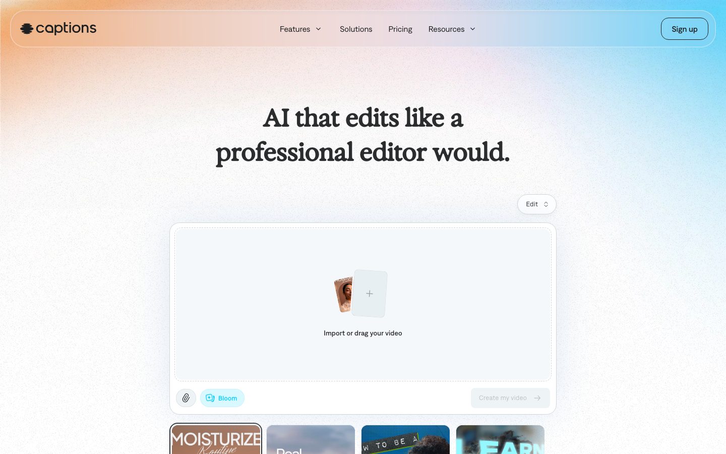
Captions' marketing surface is a bright, editorial AI-video tool. Pages open on a soft warm-to-cool gradient header band (peach → lilac → sky-blue) that dissolves into a near-white textured canvas (`{colors.canvas}` — #ffffff). The brand voice is split between a friendly **Exposure** serif display headline ("AI that edits like a professional editor would.") and a clean **DenimINK** sans for everything else — a serif-display-over-sans-body pairing that reads as confident creative software rather than generic SaaS.
The palette is overwhelmingly monochrome graphite — `{colors.ink}` (#1d1f20) for headlines and primary text, `{colors.body}` (#434647) and `{colors.muted}` (#7e8486) stepping down through the text hierarchy. The single chromatic spark is **electric cyan** (`{colors.primary-accent}` — #00d0ff), used sparingly on the "Bloom" tag pill, inline links, and small product-UI accents. Everything else is restrained cool-white surfaces.
Component voltage comes from **real product and video chrome shown inside cards** — the hero shows the actual "Import or drag your video" upload canvas with a tray of vertical-video thumbnails below it; feature bands show real captioned video frames ("MOISTURIZE Routine", "and it will find"). Captions shows the product editing real footage rather than illustrating it.
Depth is handled almost entirely with **hairline inset borders** (a 0.5px inset ring in ~#d0d6d7 tone) rather than drop shadows. The system reads as flat, soft, and modern — light cards floating on a light canvas, separated by thin rings and the occasional faint blue glow behind a hero video frame.
**Key Characteristics:**
- Soft gradient header band fading into near-white canvas; no dark sections except small dark CTA buttons.
- Exposure serif display headline (substituted with a serif fallback here) paired with DenimINK sans body — serif-over-sans is the signature.
- Near-monochrome graphite palette with one electric-cyan accent (`{colors.primary-accent}` — #00d0ff) reserved for tags and inline links.
- Hairline inset borders (`rgb(208,214,215) 0 0 0 0.5px inset`) instead of drop shadows — flat, ringed cards.
- Real video/product chrome embedded directly in cards — vertical-video thumbnails, captioned frames, the live upload canvas.
- Pill-shaped buttons (`{rounded.full}`) for nav and CTAs; cards at `{rounded.md}` (12px, the dominant radius) up to `{rounded.lg}` (15px) for the hero upload card.
- Pervasive 12/16/24px spacing rhythm with 40/44px steps for section gaps.
## Colors
### Accent
- **Primary Accent** (`{colors.primary-accent}` — #00d0ff): Electric cyan. The only saturated color in the system. Used on the "Bloom" tag pill, inline text links inside body copy, and small product-UI highlights. It also appears as a low-alpha cyan inset ring (`color(srgb 0 0.815686 1 / 0.2) 0 0 0 0.5px inset`) on selected/active chrome. Never used as a button fill on marketing surfaces.
### Text
- **Ink** (`{colors.ink}` — #1d1f20): Headlines and primary text; also the text color on light/primary buttons.
- **Black** (`{colors.black}` — #000000): The darkest tone — used for dark CTA buttons and the wordmark logo.
- **Body** (`{colors.body}` — #434647): Default running-text color.
- **Muted** (`{colors.muted}` — #7e8486): Secondary text, supporting captions, stat labels.
- **Muted Soft** (`{colors.muted-soft}` — #9fa5a7): Tertiary text — fine print, placeholder/disabled labels (e.g. "Create my video" in its inactive state).
### Surface
- **Canvas** (`{colors.canvas}` — #ffffff): The default page floor and the nav/button surface. Note the live page floor carries a subtle gradient + noise texture over white.
- **Surface Soft** (`{colors.surface-soft}` — #f5f9fa): The hero upload card interior and product-mockup card backgrounds — a barely-cool off-white.
- **Surface Tint** (`{colors.surface-tint}` — #eef4f6) / **Surface Tint Cool** (`{colors.surface-tint-cool}` — #e8eff2): Faint cool-gray tints for nested panels and dividers.
- **Accent Soft** (`{colors.accent-soft}` — #effbff): A very pale cyan-tinted wash used as the fill behind feature cards and the highlighted product-mockup frame.
- **Surface Dark** (`{colors.surface-dark}` — #2a2c2d): A dark graphite reserved for the rare dark surface / control.
### Lines & Inverse
- **Hairline** (`{colors.hairline}` — #bec3c6): The 1px/0.5px border tone on light surfaces — card rings, dividers, the nav container outline.
- **On Dark** (`{colors.on-dark}` — #ffffff): Text on dark CTA buttons.
## Typography
### Font Family
The system pairs **Exposure** (a serif display face — used for the hero h1/h2 marketing headlines) with **DenimINK** (a clean sans — used for h3, h4, body, UI, and captions). The serif-display-over-sans-body pairing is the brand's typographic signature: the warmth of the serif headline against the neutral sans body is what makes Captions read as a craft tool rather than generic SaaS.
- Exposure (serif, weight 400, -0.48px tracking) — hero headlines only
- DenimINK (sans, weight 400–500) — section headings, body, buttons, nav, captions
### Hierarchy
| Token | Size | Weight | Line Height | Letter Spacing | Use |
|---|---|---|---|---|---|
| `{typography.display}` | 48px | 400 | 1.41 | -0.48px | Hero h1 ("AI that edits like a professional editor would.") — Exposure |
| `{typography.display-tight}` | 48px | 400 | 1.0 | -0.48px | Section h2 ("Captions edits with taste, not just speed.") — Exposure, tighter leading |
| `{typography.heading}` | 32px | 400 | 1.0 | normal | h3 section heads — DenimINK |
| `{typography.subhead}` | 18px | 500 | 1.3 | normal | h4 / feature-card titles — DenimINK medium |
| `{typography.body}` | 13px | 400 | 1.385 | 0.325px | Body copy, captions, button labels, nav links — DenimINK |
### Principles
Exposure is reserved exclusively for hero-scale marketing headlines. Everything functional — section labels, feature descriptions, navigation, button text — runs in DenimINK. Body type is small (13px) with a touch of positive tracking (0.325px) for legibility at that size. Headings drop tracking slightly negative only on the serif display sizes.
### Note on Font Substitutes
Neither **Exposure** nor **DenimINK** is a common public web font, so deployments without a license should substitute. For the Exposure display headline, an open-source serif such as **Fraunces** (optical-size display cut, weight 400) or **PT Serif** preserves the warm editorial character. For DenimINK body/UI, **Inter** at the matching weights (400/500) is a safe humanist-sans substitute. Substituting preserves the serif-over-sans contrast even if exact letterforms differ.
## Layout
### Spacing System
- **Base unit:** 4px.
- **Tokens:** `{spacing.xxs}` 4px · `{spacing.xs}` 8px · `{spacing.sm}` 12px · `{spacing.md}` 16px · `{spacing.lg}` 20px · `{spacing.xl}` 24px · `{spacing.xxl}` 40px · `{spacing.xxxl}` 44px.
- **Most frequent values:** 16px and 24px dominate internal padding/gaps; 12px is the common tight gap; 40px is the common large band step. (10px and 22px were also measured and are treated as derived in-betweens.)
- **Card internal padding:** `{spacing.xl}` (24px) for the hero upload card and feature cards; `{spacing.lg}` (20px) for product-mockup cards.
### Grid & Container
- **Centered single-column editorial flow** — hero headline centered, upload card centered below, video-thumbnail tray in a 4-up row beneath the hero card.
- **Feature bands:** 2-up large feature cards ("AI Edit" / "Custom avatars") and a 3-column × 3-row capability grid ("Everything you need to make great videos").
- **"See AI Edit in action":** 3-up vertical-video frames (Elevate / Paper / Prime).
- **Stat row:** 3-up metric blocks (100K+ / 20M / 3M+).
### Whitespace Philosophy
Captions uses very generous vertical whitespace — large empty gaps separate each band, letting single product artifacts breathe in the center of the page. The composition is calm and centered, never densely packed, reinforcing the "edits with taste, not just speed" positioning.
## Elevation & Depth
| Level | Treatment | Use |
|---|---|---|
| Flat | No border, no shadow | Body sections, canvas |
| Hairline inset ring | `rgb(208,214,215) 0 0 0 0.5px inset` (the dominant treatment, ~21 occurrences) | Card outlines, nav container, upload card, video thumbnails |
| Soft drop shadow | `rgba(0,0,0,0.05) 0 4px 10px` | Occasional lifted card / floating control |
| White inset highlight | `rgba(255,255,255,0.4) 0 0 0 1.5px inset` (with zeroed drop-shadow layers) | Glassy control / pill on the gradient header |
| Cyan inset ring | `color(srgb 0 0.815686 1 / 0.2) 0 0 0 0.5px inset` | Active/selected product-UI chrome (accent state) |
| Blue glow | `rgba(190,210,235,0.45) 0 0 80px` | Diffuse glow behind the hero product video frame |
The elevation philosophy is **flat-with-rings**: cards are separated from the canvas by thin inset hairline borders rather than shadows. The only real shadow is a faint 5%-alpha drop on a lifted control; the only colored depth is the soft blue glow behind hero product imagery.
### Decorative Depth
- The gradient header band (warm peach → lilac → sky blue) plus a faint paper-noise texture over the white canvas supplies atmospheric depth without geometry.
- Embedded video frames carry their own native caption overlays and chrome — these are product content, not system tokens.
## Shapes
### Border Radius Scale
| Token | Value | Use |
|---|---|---|
| `{rounded.xs}` | 6px | Smallest inner chips |
| `{rounded.sm}` | 8px | Small controls, inner panels |
| `{rounded.md}` | 12px | The dominant radius — video thumbnails, feature cards, most content cards (~61 occurrences) |
| `{rounded.lg}` | 15px | Hero upload card, product-mockup cards |
| `{rounded.xl}` | 20px | Larger framed panels |
| `{rounded.xxl}` | 30px | Large rounded containers |
| `{rounded.xxxl}` | 40px | Nav container / oversized rounded bands |
| `{rounded.hero}` | 58px | Single largest rounded container (gradient hero shell) |
| `{rounded.full}` | 9999px | Pill buttons (Sign up, tags, dropdowns) |
### Media Geometry
Video thumbnails and embedded product frames use a 9:16 vertical (Shorts/Reels) aspect ratio at `{rounded.md}` (12px) corners. The hero upload card sits at `{rounded.lg}` (15px). Pills (`{rounded.full}`) are used for all buttons and tags.
## Components
### Navigation
**`top-nav`** — A rounded floating nav container pinned to the top of the page, sitting on the gradient header band. Background `{colors.canvas}` with a hairline inset ring, rounded `{rounded.xxxl}` (40px). Carries the lowercase "captions" wordmark + logo at left, a centered horizontal menu (Features ⌄, Solutions, Pricing, Resources ⌄) in `{typography.body}`, and a `{component.button-signup}` pill at right.
**`nav-link`** — Inline menu item, transparent background, `{colors.ink}` text in `{typography.body}`. Some items carry a small dropdown chevron.
### Buttons
**`button-signup`** — The top-right "Sign up" pill. Background `{colors.canvas}`, text `{colors.ink}`, hairline ring border, rounded `{rounded.full}`, padding ~12px × 24px.
**`button-primary`** — Light pill CTA. Background `{colors.canvas}`, text `{colors.ink}` (measured button text color #1d1f20), `{typography.body}`, padding 0px × 16px, rounded `{rounded.full}`. Used for inline light-surface actions.
**`button-dark`** — The dark conversion CTA ("Edit online"). Background `{colors.black}`, text `{colors.on-dark}`, rounded `{rounded.full}`. Paired alongside a light "Get the app" button in the "Start creating" band.
### Tags & Controls
**`tag-pill`** — Small pill label (e.g. "Bloom"). Background `{colors.canvas}`, text `{colors.primary-accent}` (#00d0ff cyan), `{typography.body}`, rounded `{rounded.full}`, padding 8px × 12px. The cyan is the one place the accent reaches the type layer.
**`dropdown-pill`** — A small pill toggle ("Edit ⇅") floating above the hero upload card. Background `{colors.canvas}`, text `{colors.ink}`, hairline ring, rounded `{rounded.full}`, padding 8px × 16px.
### Cards & Containers
**`hero-upload-card`** — The marquee product artifact: the live "Import or drag your video" canvas with a centered "+" drop zone, an attachment icon and the `{component.tag-pill}` ("Bloom") at bottom-left, and a disabled "Create my video →" action at bottom-right. Background `{colors.surface-soft}` (#f5f9fa), hairline inset ring, rounded `{rounded.lg}` (15px), internal padding `{spacing.xl}` (24px).
**`video-thumbnail-card`** — 9:16 vertical-video frame shown in the tray beneath the hero and in the "See AI Edit in action" row. Background `{colors.canvas}`, rounded `{rounded.md}` (12px). Displays real captioned video frames as content.
**`feature-card`** — Large feature panel ("AI Edit", "Custom avatars"). Background `{colors.accent-soft}` (#effbff pale cyan wash), title in `{typography.subhead}`, body in `{typography.body}`, rounded `{rounded.md}`, padding `{spacing.xl}` (24px). Holds embedded product/video chrome above the text.
**`feature-list-item`** — A single capability in the 3×3 "Everything you need" grid. Transparent background, small icon, a `{typography.body}` label in `{colors.ink}` with an inline cyan-linked phrase and a `{colors.body}` description line.
**`product-mockup-card`** — A cool-white framed product mockup (e.g. the "Add b-roll / Applying edits…" editor frame in the "edits with taste" band). Background `{colors.surface-soft}`, rounded `{rounded.lg}`, padding `{spacing.lg}` (20px). Often carries the soft blue glow behind it.
**`stat-block`** — A centered metric in the social-proof row. Transparent background, large numeral in `{typography.heading}` (`{colors.ink}`), label below in `{typography.body}` (`{colors.muted}`). Three across: 100K+ Daily users / 20M Creators and businesses / 3M+ Monthly videos.
## Do's and Don'ts
### Do
- Keep the palette monochrome graphite and reserve `{colors.primary-accent}` (#00d0ff) for tags and inline links only.
- Use Exposure (serif) for hero headlines and DenimINK (sans) for everything else — the serif-over-sans contrast is the brand.
- Separate cards from the canvas with the hairline inset ring, not drop shadows.
- Show real captioned video frames and live product chrome inside cards — Captions demonstrates the product, it doesn't illustrate it.
- Use pill shapes (`{rounded.full}`) for all buttons and tags; use `{rounded.md}` (12px) for content cards.
- Center hero content with generous surrounding whitespace.
- Apply the soft blue glow only behind hero/feature product imagery for a subtle lift.
### Don't
- Don't fill marketing CTAs with cyan — the accent stays on tags and links; conversion buttons are light (`button-primary`) or `{colors.black}` (`button-dark`).
- Don't set body copy in Exposure or hero headlines in DenimINK — keep the serif/sans boundary strict.
- Don't add heavy or layered drop shadows; the system is flat-with-rings.
- Don't introduce dark full-bleed sections — the canvas stays near-white; dark is limited to small CTA buttons.
- Don't push card radii beyond `{rounded.lg}` (15px) for standard content cards; the larger radii (30–58px) are reserved for oversized shells.
## Responsive Behavior
The site was captured at desktop widths; the following describes observed desktop structure and standard collapse behavior (mobile/tablet breakpoints were not directly measured — see Known Gaps).
### Observed Desktop Structure
- Centered single-column hero with the floating rounded nav across the top.
- Hero upload card centered, with a 4-up video-thumbnail tray below.
- Feature bands as 2-up cards; capability grid as 3 columns × 3 rows.
- "See AI Edit in action" as a 3-up row of vertical-video frames.
- 3-up stat row near the page foot.
### Expected Collapsing Strategy
- The floating nav menu would collapse to a hamburger at narrow widths; the wordmark + Sign up pill persist.
- 4-up thumbnail tray and 3-up grids reduce columns (3 → 2 → 1) rather than scaling cards down.
- 2-up feature cards stack to single column.
- Vertical 9:16 video frames are mobile-native and stay legible at every width.
### Touch Targets
- Pill buttons (`button-signup`, `button-primary`, `button-dark`) and `dropdown-pill` should retain ≥44px effective height — note `button-primary` was measured with `0px 16px` padding, so vertical sizing must be enforced separately (see Known Gaps).
## Iteration Guide
1. Focus on ONE component at a time, referencing its YAML key (`{component.feature-card}`, `{component.hero-upload-card}`).
2. Variants (`-active`, `-disabled`, dark vs. light CTA) live as separate entries in `components:`.
3. Use `{token.refs}` everywhere — never inline a hex in a component.
4. Document default and active/pressed states only — never hover.
5. Hero headlines stay Exposure 400; body/UI stays DenimINK. The serif/sans split does not blur.
6. The cyan accent is scarce by design — when adding emphasis, reach for size or the serif headline before adding color.
7. Prefer the hairline inset ring over shadow for any new card surface.
## Known Gaps
- **Component metrics are thin.** The analyzer captured only `button-primary` (color #1d1f20, radius 0px, padding 0px 16px) and a `card` (radius 0px, shadow none). Both radius `0px` readings conflict with the observed pill buttons and 12px cards in the screenshots and are treated as analyzer artifacts; documented radii/padding for buttons and cards are derived from the radius/spacing scales and screenshot ground-truth.
- **Button background colors were not measured** — only the on-button text color (#1d1f20) was captured. `button-primary` is documented as light-surfaced (text-color-driven) and `button-dark` background is inferred from the observed dark "Edit online" CTA using measured palette colors; exact fills need confirmation.
- **Exposure and DenimINK are non-standard web fonts** (not flagged in `fonts_licensed`, but unavailable publicly); open-source substitutes are documented in the Typography section. Exact licensing status is unconfirmed.
- **Gradient header values** (the peach→lilac→sky-blue band) and the page noise texture were not captured as tokens; only flat palette swatches were measured.
- **No measured breakpoints.** All responsive behavior is inferred from a desktop capture; mobile/tablet layouts, the mobile nav sheet, and collapse thresholds need verification.
- **No footer, FAQ, or pricing-table component specs** were extracted despite pricing/FAQ regions appearing in the long-scroll screenshot.
- Animation/transition timings (AI Edit style-switch, upload interactions) are out of scope.
- The 10px and 22px spacing values and the 30/40/58px radii were measured but appear in low-frequency or shell contexts; treat as derived/secondary until confirmed.
<!-- Documented by duply · real-world design systems as ready-to-use DESIGN.md for AI coding agents · https://duply.ai/captions/design-md -->
Color Palette
Accent
Neutrals
Typography
display48px · 400 · 1.41
The quick brown fox jumpsdisplay-tight48px · 400 · 1
The quick brown fox jumpsheading32px · 400 · 1
The quick brown fox jumpssubhead18px · 500 · 1.3
The quick brown fox jumpsbody13px · 400 · 1.385
The quick brown fox jumpsSpacing & Shape
Spacing
| Name | Value | Preview |
|---|---|---|
| xxs | 4px | |
| xs | 8px | |
| sm | 12px | |
| md | 16px | |
| lg | 20px | |
| xl | 24px | |
| xxl | 40px | |
| xxxl | 44px |
Border Radius
| Name | Value | Preview |
|---|---|---|
| xs | 6px | |
| sm | 8px | |
| md | 12px | |
| lg | 15px | |
| xl | 20px | |
| xxl | 30px | |
| xxxl | 40px | |
| hero | 58px | |
| full | 9999px |
More like this


---
version: alpha
name: Captions-design-analysis
description: "A bright, editorial AI-video interface built on a soft warm-to-cool gradient header fading into a near-white canvas, anchored by an Exposure serif display headline and DenimINK body type. The system reads as confident creative-tooling — soft 12px rounded cards, hairline-inset borders instead of heavy shadows, real product/video chrome shown inside cards, and a single electric-cyan (#00d0ff) accent used sparingly for tags and inline links against an otherwise monochrome graphite palette."

colors:
  primary-accent: "#00d0ff"
  ink: "#1d1f20"
  black: "#000000"
  body: "#434647"
  muted: "#7e8486"
  muted-soft: "#9fa5a7"
  hairline: "#bec3c6"
  canvas: "#ffffff"
  surface-dark: "#2a2c2d"
  surface-soft: "#f5f9fa"
  surface-tint: "#eef4f6"
  surface-tint-cool: "#e8eff2"
  accent-soft: "#effbff"
  on-dark: "#ffffff"

typography:
  display:
    fontFamily: "Exposure, Georgia, serif"
    fontSize: 48px
    fontWeight: 400
    lineHeight: 1.41
    letterSpacing: "-0.48px"
  display-tight:
    fontFamily: "Exposure, Georgia, serif"
    fontSize: 48px
    fontWeight: 400
    lineHeight: 1.0
    letterSpacing: "-0.48px"
  heading:
    fontFamily: "DenimINK, Inter, sans-serif"
    fontSize: 32px
    fontWeight: 400
    lineHeight: 1.0
    letterSpacing: "normal"
  subhead:
    fontFamily: "DenimINK, Inter, sans-serif"
    fontSize: 18px
    fontWeight: 500
    lineHeight: 1.3
    letterSpacing: "normal"
  body:
    fontFamily: "DenimINK, Inter, sans-serif"
    fontSize: 13px
    fontWeight: 400
    lineHeight: 1.385
    letterSpacing: "0.325px"

rounded:
  xs: 6px
  sm: 8px
  md: 12px
  lg: 15px
  xl: 20px
  xxl: 30px
  xxxl: 40px
  hero: 58px
  full: 9999px

spacing:
  xxs: 4px
  xs: 8px
  sm: 12px
  md: 16px
  lg: 20px
  xl: 24px
  xxl: 40px
  xxxl: 44px

components:
  top-nav:
    backgroundColor: "{colors.canvas}"
    textColor: "{colors.ink}"
    typography: "{typography.body}"
    rounded: "{rounded.xxxl}"
    padding: 16px 24px
  nav-link:
    backgroundColor: transparent
    textColor: "{colors.ink}"
    typography: "{typography.body}"
  button-signup:
    backgroundColor: "{colors.canvas}"
    textColor: "{colors.ink}"
    typography: "{typography.body}"
    rounded: "{rounded.full}"
    padding: 12px 24px
  button-primary:
    backgroundColor: "{colors.canvas}"
    textColor: "{colors.ink}"
    typography: "{typography.body}"
    rounded: "{rounded.full}"
    padding: 0px 16px
  button-dark:
    backgroundColor: "{colors.black}"
    textColor: "{colors.on-dark}"
    typography: "{typography.body}"
    rounded: "{rounded.full}"
    padding: 12px 24px
  tag-pill:
    backgroundColor: "{colors.canvas}"
    textColor: "{colors.primary-accent}"
    typography: "{typography.body}"
    rounded: "{rounded.full}"
    padding: 8px 12px
  dropdown-pill:
    backgroundColor: "{colors.canvas}"
    textColor: "{colors.ink}"
    typography: "{typography.body}"
    rounded: "{rounded.full}"
    padding: 8px 16px
  hero-upload-card:
    backgroundColor: "{colors.surface-soft}"
    textColor: "{colors.ink}"
    typography: "{typography.body}"
    rounded: "{rounded.lg}"
    padding: 24px
  video-thumbnail-card:
    backgroundColor: "{colors.canvas}"
    textColor: "{colors.ink}"
    rounded: "{rounded.md}"
  feature-card:
    backgroundColor: "{colors.accent-soft}"
    textColor: "{colors.ink}"
    typography: "{typography.subhead}"
    rounded: "{rounded.md}"
    padding: 24px
  feature-list-item:
    backgroundColor: transparent
    textColor: "{colors.body}"
    typography: "{typography.body}"
  product-mockup-card:
    backgroundColor: "{colors.surface-soft}"
    textColor: "{colors.ink}"
    rounded: "{rounded.lg}"
    padding: 20px
  stat-block:
    backgroundColor: transparent
    textColor: "{colors.muted}"
    typography: "{typography.heading}"
---

## Overview

Captions' marketing surface is a bright, editorial AI-video tool. Pages open on a soft warm-to-cool gradient header band (peach → lilac → sky-blue) that dissolves into a near-white textured canvas (`{colors.canvas}` — #ffffff). The brand voice is split between a friendly **Exposure** serif display headline ("AI that edits like a professional editor would.") and a clean **DenimINK** sans for everything else — a serif-display-over-sans-body pairing that reads as confident creative software rather than generic SaaS.

The palette is overwhelmingly monochrome graphite — `{colors.ink}` (#1d1f20) for headlines and primary text, `{colors.body}` (#434647) and `{colors.muted}` (#7e8486) stepping down through the text hierarchy. The single chromatic spark is **electric cyan** (`{colors.primary-accent}` — #00d0ff), used sparingly on the "Bloom" tag pill, inline links, and small product-UI accents. Everything else is restrained cool-white surfaces.

Component voltage comes from **real product and video chrome shown inside cards** — the hero shows the actual "Import or drag your video" upload canvas with a tray of vertical-video thumbnails below it; feature bands show real captioned video frames ("MOISTURIZE Routine", "and it will find"). Captions shows the product editing real footage rather than illustrating it.

Depth is handled almost entirely with **hairline inset borders** (a 0.5px inset ring in ~#d0d6d7 tone) rather than drop shadows. The system reads as flat, soft, and modern — light cards floating on a light canvas, separated by thin rings and the occasional faint blue glow behind a hero video frame.

**Key Characteristics:**
- Soft gradient header band fading into near-white canvas; no dark sections except small dark CTA buttons.
- Exposure serif display headline (substituted with a serif fallback here) paired with DenimINK sans body — serif-over-sans is the signature.
- Near-monochrome graphite palette with one electric-cyan accent (`{colors.primary-accent}` — #00d0ff) reserved for tags and inline links.
- Hairline inset borders (`rgb(208,214,215) 0 0 0 0.5px inset`) instead of drop shadows — flat, ringed cards.
- Real video/product chrome embedded directly in cards — vertical-video thumbnails, captioned frames, the live upload canvas.
- Pill-shaped buttons (`{rounded.full}`) for nav and CTAs; cards at `{rounded.md}` (12px, the dominant radius) up to `{rounded.lg}` (15px) for the hero upload card.
- Pervasive 12/16/24px spacing rhythm with 40/44px steps for section gaps.

## Colors

### Accent
- **Primary Accent** (`{colors.primary-accent}` — #00d0ff): Electric cyan. The only saturated color in the system. Used on the "Bloom" tag pill, inline text links inside body copy, and small product-UI highlights. It also appears as a low-alpha cyan inset ring (`color(srgb 0 0.815686 1 / 0.2) 0 0 0 0.5px inset`) on selected/active chrome. Never used as a button fill on marketing surfaces.

### Text
- **Ink** (`{colors.ink}` — #1d1f20): Headlines and primary text; also the text color on light/primary buttons.
- **Black** (`{colors.black}` — #000000): The darkest tone — used for dark CTA buttons and the wordmark logo.
- **Body** (`{colors.body}` — #434647): Default running-text color.
- **Muted** (`{colors.muted}` — #7e8486): Secondary text, supporting captions, stat labels.
- **Muted Soft** (`{colors.muted-soft}` — #9fa5a7): Tertiary text — fine print, placeholder/disabled labels (e.g. "Create my video" in its inactive state).

### Surface
- **Canvas** (`{colors.canvas}` — #ffffff): The default page floor and the nav/button surface. Note the live page floor carries a subtle gradient + noise texture over white.
- **Surface Soft** (`{colors.surface-soft}` — #f5f9fa): The hero upload card interior and product-mockup card backgrounds — a barely-cool off-white.
- **Surface Tint** (`{colors.surface-tint}` — #eef4f6) / **Surface Tint Cool** (`{colors.surface-tint-cool}` — #e8eff2): Faint cool-gray tints for nested panels and dividers.
- **Accent Soft** (`{colors.accent-soft}` — #effbff): A very pale cyan-tinted wash used as the fill behind feature cards and the highlighted product-mockup frame.
- **Surface Dark** (`{colors.surface-dark}` — #2a2c2d): A dark graphite reserved for the rare dark surface / control.

### Lines & Inverse
- **Hairline** (`{colors.hairline}` — #bec3c6): The 1px/0.5px border tone on light surfaces — card rings, dividers, the nav container outline.
- **On Dark** (`{colors.on-dark}` — #ffffff): Text on dark CTA buttons.

## Typography

### Font Family
The system pairs **Exposure** (a serif display face — used for the hero h1/h2 marketing headlines) with **DenimINK** (a clean sans — used for h3, h4, body, UI, and captions). The serif-display-over-sans-body pairing is the brand's typographic signature: the warmth of the serif headline against the neutral sans body is what makes Captions read as a craft tool rather than generic SaaS.

- Exposure (serif, weight 400, -0.48px tracking) — hero headlines only
- DenimINK (sans, weight 400–500) — section headings, body, buttons, nav, captions

### Hierarchy

| Token | Size | Weight | Line Height | Letter Spacing | Use |
|---|---|---|---|---|---|
| `{typography.display}` | 48px | 400 | 1.41 | -0.48px | Hero h1 ("AI that edits like a professional editor would.") — Exposure |
| `{typography.display-tight}` | 48px | 400 | 1.0 | -0.48px | Section h2 ("Captions edits with taste, not just speed.") — Exposure, tighter leading |
| `{typography.heading}` | 32px | 400 | 1.0 | normal | h3 section heads — DenimINK |
| `{typography.subhead}` | 18px | 500 | 1.3 | normal | h4 / feature-card titles — DenimINK medium |
| `{typography.body}` | 13px | 400 | 1.385 | 0.325px | Body copy, captions, button labels, nav links — DenimINK |

### Principles
Exposure is reserved exclusively for hero-scale marketing headlines. Everything functional — section labels, feature descriptions, navigation, button text — runs in DenimINK. Body type is small (13px) with a touch of positive tracking (0.325px) for legibility at that size. Headings drop tracking slightly negative only on the serif display sizes.

### Note on Font Substitutes
Neither **Exposure** nor **DenimINK** is a common public web font, so deployments without a license should substitute. For the Exposure display headline, an open-source serif such as **Fraunces** (optical-size display cut, weight 400) or **PT Serif** preserves the warm editorial character. For DenimINK body/UI, **Inter** at the matching weights (400/500) is a safe humanist-sans substitute. Substituting preserves the serif-over-sans contrast even if exact letterforms differ.

## Layout

### Spacing System
- **Base unit:** 4px.
- **Tokens:** `{spacing.xxs}` 4px · `{spacing.xs}` 8px · `{spacing.sm}` 12px · `{spacing.md}` 16px · `{spacing.lg}` 20px · `{spacing.xl}` 24px · `{spacing.xxl}` 40px · `{spacing.xxxl}` 44px.
- **Most frequent values:** 16px and 24px dominate internal padding/gaps; 12px is the common tight gap; 40px is the common large band step. (10px and 22px were also measured and are treated as derived in-betweens.)
- **Card internal padding:** `{spacing.xl}` (24px) for the hero upload card and feature cards; `{spacing.lg}` (20px) for product-mockup cards.

### Grid & Container
- **Centered single-column editorial flow** — hero headline centered, upload card centered below, video-thumbnail tray in a 4-up row beneath the hero card.
- **Feature bands:** 2-up large feature cards ("AI Edit" / "Custom avatars") and a 3-column × 3-row capability grid ("Everything you need to make great videos").
- **"See AI Edit in action":** 3-up vertical-video frames (Elevate / Paper / Prime).
- **Stat row:** 3-up metric blocks (100K+ / 20M / 3M+).

### Whitespace Philosophy
Captions uses very generous vertical whitespace — large empty gaps separate each band, letting single product artifacts breathe in the center of the page. The composition is calm and centered, never densely packed, reinforcing the "edits with taste, not just speed" positioning.

## Elevation & Depth

| Level | Treatment | Use |
|---|---|---|
| Flat | No border, no shadow | Body sections, canvas |
| Hairline inset ring | `rgb(208,214,215) 0 0 0 0.5px inset` (the dominant treatment, ~21 occurrences) | Card outlines, nav container, upload card, video thumbnails |
| Soft drop shadow | `rgba(0,0,0,0.05) 0 4px 10px` | Occasional lifted card / floating control |
| White inset highlight | `rgba(255,255,255,0.4) 0 0 0 1.5px inset` (with zeroed drop-shadow layers) | Glassy control / pill on the gradient header |
| Cyan inset ring | `color(srgb 0 0.815686 1 / 0.2) 0 0 0 0.5px inset` | Active/selected product-UI chrome (accent state) |
| Blue glow | `rgba(190,210,235,0.45) 0 0 80px` | Diffuse glow behind the hero product video frame |

The elevation philosophy is **flat-with-rings**: cards are separated from the canvas by thin inset hairline borders rather than shadows. The only real shadow is a faint 5%-alpha drop on a lifted control; the only colored depth is the soft blue glow behind hero product imagery.

### Decorative Depth
- The gradient header band (warm peach → lilac → sky blue) plus a faint paper-noise texture over the white canvas supplies atmospheric depth without geometry.
- Embedded video frames carry their own native caption overlays and chrome — these are product content, not system tokens.

## Shapes

### Border Radius Scale

| Token | Value | Use |
|---|---|---|
| `{rounded.xs}` | 6px | Smallest inner chips |
| `{rounded.sm}` | 8px | Small controls, inner panels |
| `{rounded.md}` | 12px | The dominant radius — video thumbnails, feature cards, most content cards (~61 occurrences) |
| `{rounded.lg}` | 15px | Hero upload card, product-mockup cards |
| `{rounded.xl}` | 20px | Larger framed panels |
| `{rounded.xxl}` | 30px | Large rounded containers |
| `{rounded.xxxl}` | 40px | Nav container / oversized rounded bands |
| `{rounded.hero}` | 58px | Single largest rounded container (gradient hero shell) |
| `{rounded.full}` | 9999px | Pill buttons (Sign up, tags, dropdowns) |

### Media Geometry
Video thumbnails and embedded product frames use a 9:16 vertical (Shorts/Reels) aspect ratio at `{rounded.md}` (12px) corners. The hero upload card sits at `{rounded.lg}` (15px). Pills (`{rounded.full}`) are used for all buttons and tags.

## Components

### Navigation

**`top-nav`** — A rounded floating nav container pinned to the top of the page, sitting on the gradient header band. Background `{colors.canvas}` with a hairline inset ring, rounded `{rounded.xxxl}` (40px). Carries the lowercase "captions" wordmark + logo at left, a centered horizontal menu (Features ⌄, Solutions, Pricing, Resources ⌄) in `{typography.body}`, and a `{component.button-signup}` pill at right.

**`nav-link`** — Inline menu item, transparent background, `{colors.ink}` text in `{typography.body}`. Some items carry a small dropdown chevron.

### Buttons

**`button-signup`** — The top-right "Sign up" pill. Background `{colors.canvas}`, text `{colors.ink}`, hairline ring border, rounded `{rounded.full}`, padding ~12px × 24px.

**`button-primary`** — Light pill CTA. Background `{colors.canvas}`, text `{colors.ink}` (measured button text color #1d1f20), `{typography.body}`, padding 0px × 16px, rounded `{rounded.full}`. Used for inline light-surface actions.

**`button-dark`** — The dark conversion CTA ("Edit online"). Background `{colors.black}`, text `{colors.on-dark}`, rounded `{rounded.full}`. Paired alongside a light "Get the app" button in the "Start creating" band.

### Tags & Controls

**`tag-pill`** — Small pill label (e.g. "Bloom"). Background `{colors.canvas}`, text `{colors.primary-accent}` (#00d0ff cyan), `{typography.body}`, rounded `{rounded.full}`, padding 8px × 12px. The cyan is the one place the accent reaches the type layer.

**`dropdown-pill`** — A small pill toggle ("Edit ⇅") floating above the hero upload card. Background `{colors.canvas}`, text `{colors.ink}`, hairline ring, rounded `{rounded.full}`, padding 8px × 16px.

### Cards & Containers

**`hero-upload-card`** — The marquee product artifact: the live "Import or drag your video" canvas with a centered "+" drop zone, an attachment icon and the `{component.tag-pill}` ("Bloom") at bottom-left, and a disabled "Create my video →" action at bottom-right. Background `{colors.surface-soft}` (#f5f9fa), hairline inset ring, rounded `{rounded.lg}` (15px), internal padding `{spacing.xl}` (24px).

**`video-thumbnail-card`** — 9:16 vertical-video frame shown in the tray beneath the hero and in the "See AI Edit in action" row. Background `{colors.canvas}`, rounded `{rounded.md}` (12px). Displays real captioned video frames as content.

**`feature-card`** — Large feature panel ("AI Edit", "Custom avatars"). Background `{colors.accent-soft}` (#effbff pale cyan wash), title in `{typography.subhead}`, body in `{typography.body}`, rounded `{rounded.md}`, padding `{spacing.xl}` (24px). Holds embedded product/video chrome above the text.

**`feature-list-item`** — A single capability in the 3×3 "Everything you need" grid. Transparent background, small icon, a `{typography.body}` label in `{colors.ink}` with an inline cyan-linked phrase and a `{colors.body}` description line.

**`product-mockup-card`** — A cool-white framed product mockup (e.g. the "Add b-roll / Applying edits…" editor frame in the "edits with taste" band). Background `{colors.surface-soft}`, rounded `{rounded.lg}`, padding `{spacing.lg}` (20px). Often carries the soft blue glow behind it.

**`stat-block`** — A centered metric in the social-proof row. Transparent background, large numeral in `{typography.heading}` (`{colors.ink}`), label below in `{typography.body}` (`{colors.muted}`). Three across: 100K+ Daily users / 20M Creators and businesses / 3M+ Monthly videos.

## Do's and Don'ts

### Do
- Keep the palette monochrome graphite and reserve `{colors.primary-accent}` (#00d0ff) for tags and inline links only.
- Use Exposure (serif) for hero headlines and DenimINK (sans) for everything else — the serif-over-sans contrast is the brand.
- Separate cards from the canvas with the hairline inset ring, not drop shadows.
- Show real captioned video frames and live product chrome inside cards — Captions demonstrates the product, it doesn't illustrate it.
- Use pill shapes (`{rounded.full}`) for all buttons and tags; use `{rounded.md}` (12px) for content cards.
- Center hero content with generous surrounding whitespace.
- Apply the soft blue glow only behind hero/feature product imagery for a subtle lift.

### Don't
- Don't fill marketing CTAs with cyan — the accent stays on tags and links; conversion buttons are light (`button-primary`) or `{colors.black}` (`button-dark`).
- Don't set body copy in Exposure or hero headlines in DenimINK — keep the serif/sans boundary strict.
- Don't add heavy or layered drop shadows; the system is flat-with-rings.
- Don't introduce dark full-bleed sections — the canvas stays near-white; dark is limited to small CTA buttons.
- Don't push card radii beyond `{rounded.lg}` (15px) for standard content cards; the larger radii (30–58px) are reserved for oversized shells.

## Responsive Behavior

The site was captured at desktop widths; the following describes observed desktop structure and standard collapse behavior (mobile/tablet breakpoints were not directly measured — see Known Gaps).

### Observed Desktop Structure
- Centered single-column hero with the floating rounded nav across the top.
- Hero upload card centered, with a 4-up video-thumbnail tray below.
- Feature bands as 2-up cards; capability grid as 3 columns × 3 rows.
- "See AI Edit in action" as a 3-up row of vertical-video frames.
- 3-up stat row near the page foot.

### Expected Collapsing Strategy
- The floating nav menu would collapse to a hamburger at narrow widths; the wordmark + Sign up pill persist.
- 4-up thumbnail tray and 3-up grids reduce columns (3 → 2 → 1) rather than scaling cards down.
- 2-up feature cards stack to single column.
- Vertical 9:16 video frames are mobile-native and stay legible at every width.

### Touch Targets
- Pill buttons (`button-signup`, `button-primary`, `button-dark`) and `dropdown-pill` should retain ≥44px effective height — note `button-primary` was measured with `0px 16px` padding, so vertical sizing must be enforced separately (see Known Gaps).

## Iteration Guide

1. Focus on ONE component at a time, referencing its YAML key (`{component.feature-card}`, `{component.hero-upload-card}`).
2. Variants (`-active`, `-disabled`, dark vs. light CTA) live as separate entries in `components:`.
3. Use `{token.refs}` everywhere — never inline a hex in a component.
4. Document default and active/pressed states only — never hover.
5. Hero headlines stay Exposure 400; body/UI stays DenimINK. The serif/sans split does not blur.
6. The cyan accent is scarce by design — when adding emphasis, reach for size or the serif headline before adding color.
7. Prefer the hairline inset ring over shadow for any new card surface.

## Known Gaps

- **Component metrics are thin.** The analyzer captured only `button-primary` (color #1d1f20, radius 0px, padding 0px 16px) and a `card` (radius 0px, shadow none). Both radius `0px` readings conflict with the observed pill buttons and 12px cards in the screenshots and are treated as analyzer artifacts; documented radii/padding for buttons and cards are derived from the radius/spacing scales and screenshot ground-truth.
- **Button background colors were not measured** — only the on-button text color (#1d1f20) was captured. `button-primary` is documented as light-surfaced (text-color-driven) and `button-dark` background is inferred from the observed dark "Edit online" CTA using measured palette colors; exact fills need confirmation.
- **Exposure and DenimINK are non-standard web fonts** (not flagged in `fonts_licensed`, but unavailable publicly); open-source substitutes are documented in the Typography section. Exact licensing status is unconfirmed.
- **Gradient header values** (the peach→lilac→sky-blue band) and the page noise texture were not captured as tokens; only flat palette swatches were measured.
- **No measured breakpoints.** All responsive behavior is inferred from a desktop capture; mobile/tablet layouts, the mobile nav sheet, and collapse thresholds need verification.
- **No footer, FAQ, or pricing-table component specs** were extracted despite pricing/FAQ regions appearing in the long-scroll screenshot.
- Animation/transition timings (AI Edit style-switch, upload interactions) are out of scope.
- The 10px and 22px spacing values and the 30/40/58px radii were measured but appear in low-frequency or shell contexts; treat as derived/secondary until confirmed.

<!-- Documented by duply · real-world design systems as ready-to-use DESIGN.md for AI coding agents · https://duply.ai/captions/design-md -->