
NewGenre
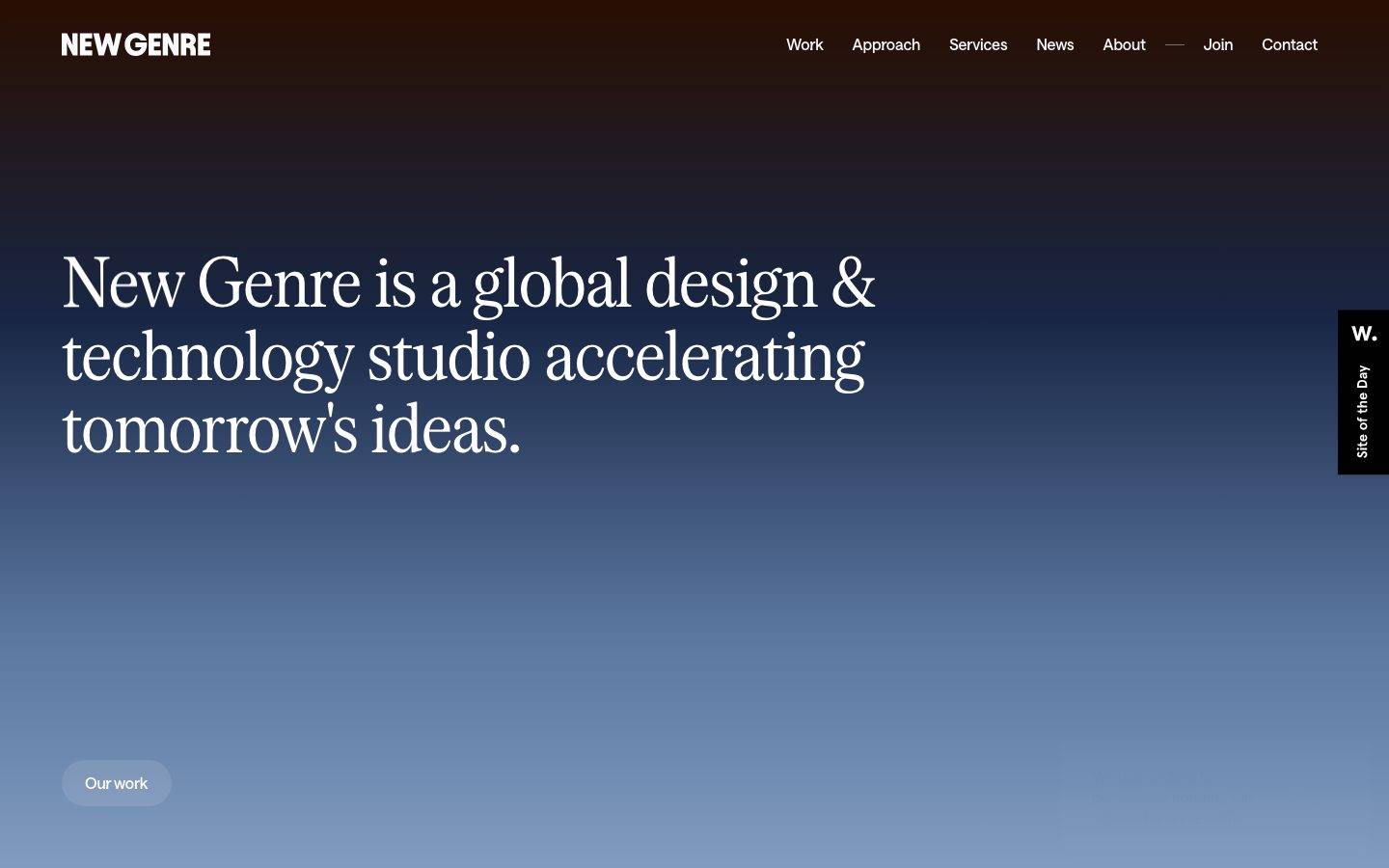
A cinematic studio portfolio landing built on a full-bleed vertical gradient that runs from near-black navy-espresso at the top down to a warm off-white floor. The system is editorial and near-monochrome — a large condensed serif display headline over a light-on-dark hero, quiet Saans-grotesque supporting type, and a single soft gray pill CTA. Voltage comes from the gradient canvas and the oversized serif headline rather than from color accents.
Works withClaude CodeCursorCodexGemini CLICopilotv0LovableBoltWindsurfReplit
---
version: alpha
name: NewGenre-design-analysis
description: "A cinematic studio portfolio landing built on a full-bleed vertical gradient that runs from near-black navy-espresso at the top down to a warm off-white floor. The system is editorial and near-monochrome — a large condensed serif display headline over a light-on-dark hero, quiet Saans-grotesque supporting type, and a single soft gray pill CTA. Voltage comes from the gradient canvas and the oversized serif headline rather than from color accents."
colors:
  ink: "#000000"
  link: "#0000ee"
  canvas: "#ffffff"
  on-dark: "#f9fafb"
  primary: "#99a1af"
  surface-dark: "#0c1018"
  accent-slate: "#44546b"
  accent-espresso: "#1e1310"
  accent-blue: "#007aff"
typography:
  display:
    fontFamily: "Serrif Condensed, Georgia, serif"
    fontSize: 72px
    fontWeight: 400
    lineHeight: 1.05
    letterSpacing: -0.02em
  heading:
    fontFamily: "Saans Variable, Inter, sans-serif"
    fontSize: 32px
    fontWeight: 400
    lineHeight: 1.1
    letterSpacing: -0.01em
  body:
    fontFamily: "Saans Variable, Inter, sans-serif"
    fontSize: 16px
    fontWeight: 400
    lineHeight: 1.0
    letterSpacing: -0.01em
rounded:
  none: 0px
  sm: 8px
  lg: 16px
  pill: 50px
  pill-xl: 90px
spacing:
  xxs: 4px
  xs: 6px
  sm: 8px
  base: 10px
  md: 16px
  lg: 24px
  xl: 32px
  xxl: 48px
  section: 64px
components:
  top-nav:
    backgroundColor: transparent
    textColor: "{colors.on-dark}"
    typography: "{typography.body}"
  wordmark:
    backgroundColor: transparent
    textColor: "{colors.on-dark}"
    typography: "{typography.body}"
  hero-band:
    backgroundColor: "{colors.surface-dark}"
    textColor: "{colors.on-dark}"
    typography: "{typography.display}"
    padding: 64px
  button-primary:
    backgroundColor: "{colors.primary}"
    textColor: "{colors.ink}"
    typography: "{typography.body}"
    rounded: "{rounded.pill-xl}"
    padding: 16px 24px
  text-link:
    backgroundColor: transparent
    textColor: "{colors.link}"
    typography: "{typography.body}"
  input:
    backgroundColor: "{colors.canvas}"
    textColor: "{colors.ink}"
    typography: "{typography.body}"
    rounded: "{rounded.none}"
  site-badge:
    backgroundColor: "{colors.ink}"
    textColor: "{colors.canvas}"
    typography: "{typography.body}"
    rounded: "{rounded.none}"
---

## Overview

New Genre's landing surface is a single, cinematic full-bleed hero: one continuous vertical gradient that begins in near-black navy-espresso at the top of the page (`{colors.surface-dark}` — #0c1018, with the warmer `{colors.accent-espresso}` — #1e1310 tinting the very top band) and dissolves downward through slate-blue (`{colors.accent-slate}` — #44546b) into a warm off-white floor. The effect reads as a sunrise seen through a window — editorial, restrained, confident.

The type voice is a deliberate two-face pairing: a large **condensed serif** display headline (`{typography.display}` — Serrif Condensed, 72px) carrying the entire brand statement ("New Genre is a global design & technology studio accelerating tomorrow's ideas."), and a quiet **Saans** grotesque (`{typography.heading}` / `{typography.body}`) handling navigation, sub-copy, and UI labels. The serif does the talking; everything else recedes.

Color is near-monochrome. There is no marketing palette — the interest lives entirely in the gradient and in the black-on-white/white-on-dark contrast. The only chromatic UI moments are the default hyperlink blue (`{colors.link}` — #0000ee) captured on anchors and a soft gray pill CTA (`{colors.primary}` — #99a1af). A single black vertical "Site of the Day" badge (`{component.site-badge}`) is pinned to the right edge.

**Key Characteristics:**
- Full-page vertical gradient canvas — dark navy-espresso top to warm off-white bottom. No section bands, no cards; the gradient IS the layout.
- Oversized condensed serif display headline (`{typography.display}` — 72px, weight 400, -0.02em) as the single hero element and primary brand voltage.
- Saans grotesque (`{typography.heading}` / `{typography.body}`) for nav, labels, and body — quiet, tight (-0.01em), weight 400 throughout.
- One soft gray pill CTA (`{component.button-primary}`) — background `{colors.primary}` (#99a1af), black label, fully rounded at `{rounded.pill-xl}` (90px).
- Light-on-dark text at the top of the hero (`{colors.on-dark}` — #f9fafb) resolving toward dark-on-light lower down.
- Near-monochrome system; the only accent hues are the anchor blue (`{colors.link}`) and a barely-used iOS-blue (`{colors.accent-blue}` — #007aff).
- Vertical "Site of the Day" black badge pinned to the right viewport edge — the one hard-edged black block in the composition.

## Colors

### Brand & Accent
- **Ink** (`{colors.ink}` — #000000): The dominant text and hard-block color — the wordmark, the display headline lower in the gradient, and the vertical badge block.
- **Link** (`{colors.link}` — #0000ee): Anchor color captured across the page's links. This is the classic browser link blue — used for inline text links (`{component.text-link}`).
- **Accent Slate** (`{colors.accent-slate}` — #44546b): A mid-gradient slate-blue that forms the middle of the hero wash.
- **Accent Espresso** (`{colors.accent-espresso}` — #1e1310): The warm brown-black tinting the very top of the gradient behind the nav — a single-instance measured tone.
- **Accent Blue** (`{colors.accent-blue}` — #007aff): A near-unused bright blue captured once. Reserved; not a UI staple.

### Surface
- **Canvas** (`{colors.canvas}` — #ffffff): The base page floor where the gradient resolves toward the bottom, and the surface behind form inputs.
- **Surface Dark** (`{colors.surface-dark}` — #0c1018): The near-black navy at the top of the hero gradient — the darkest measured surface.

### Text
- **Ink** (`{colors.ink}` — #000000): Dark text against the light lower gradient and the wordmark against the dark top.
- **On Dark** (`{colors.on-dark}` — #f9fafb): Near-white paragraph/nav text used against the dark top of the hero (measured on `p.color`).

### UI
- **Primary** (`{colors.primary}` — #99a1af): A soft gray-blue used as the "Our work" pill CTA background (`{component.button-primary}`). The button's label is `{colors.ink}` black.

## Typography

### Font Family
The system pairs two custom faces: **Serrif Condensed** (a high-contrast condensed serif used only for the display headline) and **Saans Variable** (a neutral grotesque by Displaay, used for navigation, headings, and body). The split is strict — serif for the hero statement, grotesque for everything else. Both are weight 400 throughout; the system never bolds.

### Hierarchy

| Token | Family | Size | Weight | Line Height | Letter Spacing | Use |
|---|---|---|---|---|---|---|
| `{typography.display}` | Serrif Condensed | 72px | 400 | 1.05 | -0.02em | Hero brand statement (h1) |
| `{typography.heading}` | Saans Variable | 32px | 400 | 1.1 | -0.01em | Section headings (h2, h3) |
| `{typography.body}` | Saans Variable | 16px | 400 | 1.0 | -0.01em | Nav links, labels, body copy, button labels |

### Principles
The display serif is the entire brand voice — at 72px, weight 400, with -0.02em tracking, it carries the hero alone. Never bold it; the elegance depends on the regular weight of a condensed high-contrast serif. Saans handles all supporting roles at tight -0.01em tracking and stays at weight 400. The two-face contrast (condensed serif vs. neutral grotesque) is the signature.

### Note on Font Substitutes
Both faces are custom/licensed and should not be assumed available. For **Serrif Condensed**, an open-source substitute is **Playfair Display** or **Bodoni Moda** (both high-contrast serifs; use a condensed axis or negative tracking to approximate). For **Saans Variable**, substitute **Inter** or **Space Grotesk** at weight 400 with -0.01em tracking. The fallback stacks declared here walk `Georgia, serif` for the display and `Inter, sans-serif` for Saans.

## Layout

### Spacing System
- **Base unit:** effectively 2px, but the measured rhythm clusters on `{spacing.base}` (10px, highest frequency) and `{spacing.md}` (16px).
- **Tokens:** `{spacing.xxs}` 4px · `{spacing.xs}` 6px · `{spacing.sm}` 8px · `{spacing.base}` 10px · `{spacing.md}` 16px · `{spacing.lg}` 24px · `{spacing.xl}` 32px · `{spacing.xxl}` 48px · `{spacing.section}` 64px.
- **Button padding:** 16px × 24px on `{component.button-primary}`.
- **Large gaps:** `{spacing.section}` (64px) appears as the largest recurrent structural gap.

### Grid & Container
- The captured page is a single full-viewport hero. The wordmark sits top-left, the nav row top-right, and the display headline occupies the left ~60% of the viewport.
- The "Our work" pill anchors near the lower-left of the first viewport.
- The vertical "Site of the Day" badge is pinned flush to the right viewport edge, vertically centered in the hero.

### Whitespace Philosophy
The composition is deliberately sparse — a single headline, a single CTA, and a nav row floating over an uninterrupted gradient. Whitespace (or rather, gradient-space) is the primary compositional device: the headline breathes against a large empty expanse of wash below it.

## Elevation & Depth

| Level | Treatment | Use |
|---|---|---|
| Flat | No shadow, no border | Nav, headline, wordmark — everything sits directly on the gradient |
| Inset hairline | `rgba(0,0,0,0.05) 0 0 0 1px inset` | A single measured inset ring — the softest possible edge definition, likely on the pill CTA or an input |
| Gradient depth | Vertical color wash | The dark-to-light gradient itself supplies all perceived depth; there are no drop shadows |

The elevation philosophy is essentially flat. The only measured shadow is a 1px inset hairline at 5% black alpha — there are no drop shadows anywhere. Depth is created entirely by the gradient wash, not by layering.

## Shapes

### Border Radius Scale

| Token | Value | Use |
|---|---|---|
| `{rounded.none}` | 0px | Form inputs (hard-edged), the vertical badge block |
| `{rounded.sm}` | 8px | Small rounded surfaces (most frequent radius) |
| `{rounded.lg}` | 16px | Larger rounded surfaces / containers |
| `{rounded.pill}` | 50px | Fully-rounded small elements |
| `{rounded.pill-xl}` | 90px | The "Our work" pill CTA (`{component.button-primary}`) |

The system runs two radius personalities simultaneously: hard 0px edges (inputs, the black badge) and fully-rounded pills (the CTA at 90px). The 8px/16px radii cover intermediate rounded surfaces.

### Photography Geometry
No photography is present in the captured hero — the visual field is a pure gradient. Any imagery treatment is out of scope for this capture.

## Components

### Navigation

**`top-nav`** — Horizontal nav row floating over the dark top of the gradient. Transparent background, `{colors.on-dark}` (#f9fafb) light text in `{typography.body}` (Saans 16px / 400). Menu items: Work, Approach, Services, News, About, then a short divider dash, then Join, Contact.

**`wordmark`** — "NEW GENRE" set top-left in `{typography.body}` (Saans), `{colors.on-dark}` against the dark top band. Transparent background.

### Hero

**`hero-band`** — The full-viewport hero. Background is the vertical gradient anchored at `{colors.surface-dark}` (#0c1018) at the top. Text `{colors.on-dark}` at the top. Carries the display headline in `{typography.display}` (Serrif Condensed 72px) and the CTA. Structural padding around `{spacing.section}` (64px).

### Buttons

**`button-primary`** — The single "Our work" CTA. Background `{colors.primary}` (#99a1af), label `{colors.ink}` (#000000) in `{typography.body}`, fully-rounded at `{rounded.pill-xl}` (90px), padding 16px × 24px. Sits low-left in the hero. The soft gray fill and pill shape are the system's one interactive accent.

### Links

**`text-link`** — Inline anchors captured in `{colors.link}` (#0000ee), `{typography.body}`. Transparent background. This is the default anchor color measured across the page.

### Forms

**`input`** — Text input with hard 0px corners (`{rounded.none}`), `{colors.canvas}` background, `{colors.ink}` text, `{typography.body}`. The sharp-cornered input contrasts deliberately with the fully-rounded button.

### Badge

**`site-badge`** — A vertical black block pinned flush to the right viewport edge, reading "W. / Site of the Day" (rotated). Background `{colors.ink}` (#000000), text `{colors.canvas}` (#ffffff), `{typography.body}`, hard corners (`{rounded.none}`). The single hard black block in the composition.

## Do's and Don'ts

### Do
- Let the vertical gradient (`{colors.surface-dark}` top → light bottom) carry the entire layout. It is the page, not a decoration on the page.
- Keep the display headline in Serrif Condensed at weight 400. The condensed high-contrast serif at regular weight is the brand.
- Use Saans (`{typography.body}` / `{typography.heading}`) for all nav and supporting type at tight -0.01em tracking, weight 400.
- Keep the CTA a single soft gray pill (`{component.button-primary}`) at `{rounded.pill-xl}` (90px) with a black label.
- Switch text color from `{colors.on-dark}` at the dark top to `{colors.ink}` as the gradient resolves toward light — legibility depends on it.
- Keep the "Site of the Day" badge (`{component.site-badge}`) as a hard black block; it is the intentional counterpoint to the soft gradient.

### Don't
- Don't bold the display serif or the Saans body. The system is weight-400 throughout.
- Don't introduce marketing accent colors. The palette is near-monochrome — the gradient and black/white contrast do the work.
- Don't round the form inputs; they are deliberately hard-edged (`{rounded.none}`) against the pill CTA.
- Don't add drop shadows. The only measured depth cue is a 5%-alpha inset hairline; keep the system flat.
- Don't crowd the hero. The composition depends on a single headline, single CTA, and large empty gradient expanse.

## Responsive Behavior

### Breakpoints
Only a desktop landing capture and its full-height mobile-proportioned render were provided; breakpoint values are not measured. Observed behavior:

| Name | Behavior (observed) |
|---|---|
| Desktop | Wordmark top-left, full horizontal nav top-right, 72px display headline left-aligned, pill CTA lower-left, vertical badge pinned right edge |
| Narrow / mobile | Layout compresses proportionally; the display headline and nav scale down but retain the same left-aligned, single-column arrangement over the gradient |

Exact breakpoint widths, nav collapse behavior, and mobile type scaling were not captured — see Known Gaps.

### Touch Targets
- `{component.button-primary}` at 16px × 24px padding on a 16px label comfortably exceeds a 44px tap height.
- Nav links in `{typography.body}` (16px) are the smallest interactive targets; spacing between them was not individually measured.

### Collapsing Strategy
Not measured. The single-viewport hero suggests the nav would collapse to a menu affordance at small widths, but no mobile nav pattern was captured.

## Iteration Guide

1. Focus on ONE component at a time. Reference its YAML key directly (`{component.button-primary}`, `{component.site-badge}`).
2. Variants (`-active`, `-disabled`, `-focused`) live as separate entries in `components:` when measured — none were captured here.
3. Use `{token.refs}` everywhere — never inline hex.
4. Never document hover. Default and Active/Pressed states only.
5. The display serif stays Serrif Condensed 400; supporting type stays Saans 400. The pairing does not blur.
6. The gradient is the system's signature — treat `{colors.surface-dark}` as the top anchor and let it resolve to `{colors.canvas}` at the bottom.
7. When adding emphasis, reach for scale in the serif before any color accent.

## Known Gaps

- The dominant hero gradient (navy-espresso → slate → warm off-white) is not a single measured token; only its stop colors (`{colors.surface-dark}`, `{colors.accent-slate}`, `{colors.accent-espresso}`, resolving to `{colors.canvas}`) were captured. The exact gradient angle, stops, and percentages are not measured.
- Only the landing page was captured; interior pages (Work, Approach, Services, News, About) and their component vocabulary are out of scope.
- **Serrif Condensed** and **Saans Variable** are custom/licensed faces (not flagged in `fonts_licensed`, which was empty, but treated as custom); open-source substitutes are documented in the Typography section — do not assume the originals ship.
- Body `line-height` was measured at 1.0, which is unusually tight and may reflect a single-line measured element rather than a paragraph setting; multi-line body leading is unconfirmed.
- Button and link interactive states (active/pressed/focus) were not captured — only default styling is documented.
- The `{colors.link}` value (#0000ee) is the default browser anchor blue and may indicate unstyled anchors in the capture rather than an intentional link treatment.
- `{colors.accent-blue}` (#007aff) appeared once and is documented as reserved; its actual usage is unconfirmed.
- Responsive breakpoints, mobile nav collapse behavior, and animation/transition timings (gradient motion, CTA interaction) were not extracted.

<!-- Documented by Duply · real-world design systems as ready-to-use DESIGN.md for AI coding agents · https://duply.ai/newgenre/design-md -->
Color Palette
Accent
Neutrals
Typography
display72px · 400 · 1.05
The quick brown fox jumpsheading32px · 400 · 1.1
The quick brown fox jumpsbody16px · 400 · 1
The quick brown fox jumpsSpacing & Shape
Spacing
| Name | Value | Preview |
|---|---|---|
| xxs | 4px | |
| xs | 6px | |
| sm | 8px | |
| base | 10px | |
| md | 16px | |
| lg | 24px | |
| xl | 32px | |
| xxl | 48px | |
| section | 64px |
Border Radius
| Name | Value | Preview |
|---|---|---|
| none | 0px | |
| sm | 8px | |
| lg | 16px | |
| pill | 50px | |
| pill-xl | 90px |
FAQ
- What colors does NewGenre use?
- NewGenre's core palette includes #000000, #0000ee, #ffffff, #f9fafb, #99a1af. The full color set with usage roles (canvas, ink, surfaces, accent, semantic) is documented in the NewGenre DESIGN.md.
- What font does NewGenre use?
- NewGenre's primary typeface is Serrif Condensed. The complete type scale (sizes, weights, line-height and letter-spacing per role), with an open substitute where the original is licensed, is documented in the DESIGN.md.
- What is the NewGenre design system?
- A cinematic studio portfolio landing built on a full-bleed vertical gradient that runs from near-black navy-espresso at the top down to a warm off-white floor. The system is editorial and near-monochrome — a large condensed serif display headline over a light-on-dark hero, quiet Saans-grotesque
Get this as a working kit
NewGenre Launch Kit + DESIGN.md
$299$225
One-time payment
- A complete production-stack template, styled like NewGenre, fully built and wired.
- One-time payment and the codebase is yours. No platform fees, no subscription.
Open it with Claude Code, Cursor, or any coding agent and build in plain language, then ship a complete web app.
- Your private DESIGN.md
- Marketing pages, blog, SEO & legal
- Email capture, newsletter & contact
- Accept payments (Stripe)
- Analytics (GA4 + PostHog)
- One-click deploy
- Auth, login & roles
- A full app dashboard, when you grow
More like this
Marketing
MediaMonochromePlantin
Marketing
MediaMonochromeCochin
Marketing
MinimalDesignPolySans
Marketing
BoldDesignSwitzer

Marketing
MinimalDesignFounders Grotesk
Marketing
BoldDesignHelveticaNow
---
version: alpha
name: NewGenre-design-analysis
description: "A cinematic studio portfolio landing built on a full-bleed vertical gradient that runs from near-black navy-espresso at the top down to a warm off-white floor. The system is editorial and near-monochrome — a large condensed serif display headline over a light-on-dark hero, quiet Saans-grotesque supporting type, and a single soft gray pill CTA. Voltage comes from the gradient canvas and the oversized serif headline rather than from color accents."
colors:
  ink: "#000000"
  link: "#0000ee"
  canvas: "#ffffff"
  on-dark: "#f9fafb"
  primary: "#99a1af"
  surface-dark: "#0c1018"
  accent-slate: "#44546b"
  accent-espresso: "#1e1310"
  accent-blue: "#007aff"
typography:
  display:
    fontFamily: "Serrif Condensed, Georgia, serif"
    fontSize: 72px
    fontWeight: 400
    lineHeight: 1.05
    letterSpacing: -0.02em
  heading:
    fontFamily: "Saans Variable, Inter, sans-serif"
    fontSize: 32px
    fontWeight: 400
    lineHeight: 1.1
    letterSpacing: -0.01em
  body:
    fontFamily: "Saans Variable, Inter, sans-serif"
    fontSize: 16px
    fontWeight: 400
    lineHeight: 1.0
    letterSpacing: -0.01em
rounded:
  none: 0px
  sm: 8px
  lg: 16px
  pill: 50px
  pill-xl: 90px
spacing:
  xxs: 4px
  xs: 6px
  sm: 8px
  base: 10px
  md: 16px
  lg: 24px
  xl: 32px
  xxl: 48px
  section: 64px
components:
  top-nav:
    backgroundColor: transparent
    textColor: "{colors.on-dark}"
    typography: "{typography.body}"
  wordmark:
    backgroundColor: transparent
    textColor: "{colors.on-dark}"
    typography: "{typography.body}"
  hero-band:
    backgroundColor: "{colors.surface-dark}"
    textColor: "{colors.on-dark}"
    typography: "{typography.display}"
    padding: 64px
  button-primary:
    backgroundColor: "{colors.primary}"
    textColor: "{colors.ink}"
    typography: "{typography.body}"
    rounded: "{rounded.pill-xl}"
    padding: 16px 24px
  text-link:
    backgroundColor: transparent
    textColor: "{colors.link}"
    typography: "{typography.body}"
  input:
    backgroundColor: "{colors.canvas}"
    textColor: "{colors.ink}"
    typography: "{typography.body}"
    rounded: "{rounded.none}"
  site-badge:
    backgroundColor: "{colors.ink}"
    textColor: "{colors.canvas}"
    typography: "{typography.body}"
    rounded: "{rounded.none}"
---

## Overview

New Genre's landing surface is a single, cinematic full-bleed hero: one continuous vertical gradient that begins in near-black navy-espresso at the top of the page (`{colors.surface-dark}` — #0c1018, with the warmer `{colors.accent-espresso}` — #1e1310 tinting the very top band) and dissolves downward through slate-blue (`{colors.accent-slate}` — #44546b) into a warm off-white floor. The effect reads as a sunrise seen through a window — editorial, restrained, confident.

The type voice is a deliberate two-face pairing: a large **condensed serif** display headline (`{typography.display}` — Serrif Condensed, 72px) carrying the entire brand statement ("New Genre is a global design & technology studio accelerating tomorrow's ideas."), and a quiet **Saans** grotesque (`{typography.heading}` / `{typography.body}`) handling navigation, sub-copy, and UI labels. The serif does the talking; everything else recedes.

Color is near-monochrome. There is no marketing palette — the interest lives entirely in the gradient and in the black-on-white/white-on-dark contrast. The only chromatic UI moments are the default hyperlink blue (`{colors.link}` — #0000ee) captured on anchors and a soft gray pill CTA (`{colors.primary}` — #99a1af). A single black vertical "Site of the Day" badge (`{component.site-badge}`) is pinned to the right edge.

**Key Characteristics:**
- Full-page vertical gradient canvas — dark navy-espresso top to warm off-white bottom. No section bands, no cards; the gradient IS the layout.
- Oversized condensed serif display headline (`{typography.display}` — 72px, weight 400, -0.02em) as the single hero element and primary brand voltage.
- Saans grotesque (`{typography.heading}` / `{typography.body}`) for nav, labels, and body — quiet, tight (-0.01em), weight 400 throughout.
- One soft gray pill CTA (`{component.button-primary}`) — background `{colors.primary}` (#99a1af), black label, fully rounded at `{rounded.pill-xl}` (90px).
- Light-on-dark text at the top of the hero (`{colors.on-dark}` — #f9fafb) resolving toward dark-on-light lower down.
- Near-monochrome system; the only accent hues are the anchor blue (`{colors.link}`) and a barely-used iOS-blue (`{colors.accent-blue}` — #007aff).
- Vertical "Site of the Day" black badge pinned to the right viewport edge — the one hard-edged black block in the composition.

## Colors

### Brand & Accent
- **Ink** (`{colors.ink}` — #000000): The dominant text and hard-block color — the wordmark, the display headline lower in the gradient, and the vertical badge block.
- **Link** (`{colors.link}` — #0000ee): Anchor color captured across the page's links. This is the classic browser link blue — used for inline text links (`{component.text-link}`).
- **Accent Slate** (`{colors.accent-slate}` — #44546b): A mid-gradient slate-blue that forms the middle of the hero wash.
- **Accent Espresso** (`{colors.accent-espresso}` — #1e1310): The warm brown-black tinting the very top of the gradient behind the nav — a single-instance measured tone.
- **Accent Blue** (`{colors.accent-blue}` — #007aff): A near-unused bright blue captured once. Reserved; not a UI staple.

### Surface
- **Canvas** (`{colors.canvas}` — #ffffff): The base page floor where the gradient resolves toward the bottom, and the surface behind form inputs.
- **Surface Dark** (`{colors.surface-dark}` — #0c1018): The near-black navy at the top of the hero gradient — the darkest measured surface.

### Text
- **Ink** (`{colors.ink}` — #000000): Dark text against the light lower gradient and the wordmark against the dark top.
- **On Dark** (`{colors.on-dark}` — #f9fafb): Near-white paragraph/nav text used against the dark top of the hero (measured on `p.color`).

### UI
- **Primary** (`{colors.primary}` — #99a1af): A soft gray-blue used as the "Our work" pill CTA background (`{component.button-primary}`). The button's label is `{colors.ink}` black.

## Typography

### Font Family
The system pairs two custom faces: **Serrif Condensed** (a high-contrast condensed serif used only for the display headline) and **Saans Variable** (a neutral grotesque by Displaay, used for navigation, headings, and body). The split is strict — serif for the hero statement, grotesque for everything else. Both are weight 400 throughout; the system never bolds.

### Hierarchy

| Token | Family | Size | Weight | Line Height | Letter Spacing | Use |
|---|---|---|---|---|---|---|
| `{typography.display}` | Serrif Condensed | 72px | 400 | 1.05 | -0.02em | Hero brand statement (h1) |
| `{typography.heading}` | Saans Variable | 32px | 400 | 1.1 | -0.01em | Section headings (h2, h3) |
| `{typography.body}` | Saans Variable | 16px | 400 | 1.0 | -0.01em | Nav links, labels, body copy, button labels |

### Principles
The display serif is the entire brand voice — at 72px, weight 400, with -0.02em tracking, it carries the hero alone. Never bold it; the elegance depends on the regular weight of a condensed high-contrast serif. Saans handles all supporting roles at tight -0.01em tracking and stays at weight 400. The two-face contrast (condensed serif vs. neutral grotesque) is the signature.

### Note on Font Substitutes
Both faces are custom/licensed and should not be assumed available. For **Serrif Condensed**, an open-source substitute is **Playfair Display** or **Bodoni Moda** (both high-contrast serifs; use a condensed axis or negative tracking to approximate). For **Saans Variable**, substitute **Inter** or **Space Grotesk** at weight 400 with -0.01em tracking. The fallback stacks declared here walk `Georgia, serif` for the display and `Inter, sans-serif` for Saans.

## Layout

### Spacing System
- **Base unit:** effectively 2px, but the measured rhythm clusters on `{spacing.base}` (10px, highest frequency) and `{spacing.md}` (16px).
- **Tokens:** `{spacing.xxs}` 4px · `{spacing.xs}` 6px · `{spacing.sm}` 8px · `{spacing.base}` 10px · `{spacing.md}` 16px · `{spacing.lg}` 24px · `{spacing.xl}` 32px · `{spacing.xxl}` 48px · `{spacing.section}` 64px.
- **Button padding:** 16px × 24px on `{component.button-primary}`.
- **Large gaps:** `{spacing.section}` (64px) appears as the largest recurrent structural gap.

### Grid & Container
- The captured page is a single full-viewport hero. The wordmark sits top-left, the nav row top-right, and the display headline occupies the left ~60% of the viewport.
- The "Our work" pill anchors near the lower-left of the first viewport.
- The vertical "Site of the Day" badge is pinned flush to the right viewport edge, vertically centered in the hero.

### Whitespace Philosophy
The composition is deliberately sparse — a single headline, a single CTA, and a nav row floating over an uninterrupted gradient. Whitespace (or rather, gradient-space) is the primary compositional device: the headline breathes against a large empty expanse of wash below it.

## Elevation & Depth

| Level | Treatment | Use |
|---|---|---|
| Flat | No shadow, no border | Nav, headline, wordmark — everything sits directly on the gradient |
| Inset hairline | `rgba(0,0,0,0.05) 0 0 0 1px inset` | A single measured inset ring — the softest possible edge definition, likely on the pill CTA or an input |
| Gradient depth | Vertical color wash | The dark-to-light gradient itself supplies all perceived depth; there are no drop shadows |

The elevation philosophy is essentially flat. The only measured shadow is a 1px inset hairline at 5% black alpha — there are no drop shadows anywhere. Depth is created entirely by the gradient wash, not by layering.

## Shapes

### Border Radius Scale

| Token | Value | Use |
|---|---|---|
| `{rounded.none}` | 0px | Form inputs (hard-edged), the vertical badge block |
| `{rounded.sm}` | 8px | Small rounded surfaces (most frequent radius) |
| `{rounded.lg}` | 16px | Larger rounded surfaces / containers |
| `{rounded.pill}` | 50px | Fully-rounded small elements |
| `{rounded.pill-xl}` | 90px | The "Our work" pill CTA (`{component.button-primary}`) |

The system runs two radius personalities simultaneously: hard 0px edges (inputs, the black badge) and fully-rounded pills (the CTA at 90px). The 8px/16px radii cover intermediate rounded surfaces.

### Photography Geometry
No photography is present in the captured hero — the visual field is a pure gradient. Any imagery treatment is out of scope for this capture.

## Components

### Navigation

**`top-nav`** — Horizontal nav row floating over the dark top of the gradient. Transparent background, `{colors.on-dark}` (#f9fafb) light text in `{typography.body}` (Saans 16px / 400). Menu items: Work, Approach, Services, News, About, then a short divider dash, then Join, Contact.

**`wordmark`** — "NEW GENRE" set top-left in `{typography.body}` (Saans), `{colors.on-dark}` against the dark top band. Transparent background.

### Hero

**`hero-band`** — The full-viewport hero. Background is the vertical gradient anchored at `{colors.surface-dark}` (#0c1018) at the top. Text `{colors.on-dark}` at the top. Carries the display headline in `{typography.display}` (Serrif Condensed 72px) and the CTA. Structural padding around `{spacing.section}` (64px).

### Buttons

**`button-primary`** — The single "Our work" CTA. Background `{colors.primary}` (#99a1af), label `{colors.ink}` (#000000) in `{typography.body}`, fully-rounded at `{rounded.pill-xl}` (90px), padding 16px × 24px. Sits low-left in the hero. The soft gray fill and pill shape are the system's one interactive accent.

### Links

**`text-link`** — Inline anchors captured in `{colors.link}` (#0000ee), `{typography.body}`. Transparent background. This is the default anchor color measured across the page.

### Forms

**`input`** — Text input with hard 0px corners (`{rounded.none}`), `{colors.canvas}` background, `{colors.ink}` text, `{typography.body}`. The sharp-cornered input contrasts deliberately with the fully-rounded button.

### Badge

**`site-badge`** — A vertical black block pinned flush to the right viewport edge, reading "W. / Site of the Day" (rotated). Background `{colors.ink}` (#000000), text `{colors.canvas}` (#ffffff), `{typography.body}`, hard corners (`{rounded.none}`). The single hard black block in the composition.

## Do's and Don'ts

### Do
- Let the vertical gradient (`{colors.surface-dark}` top → light bottom) carry the entire layout. It is the page, not a decoration on the page.
- Keep the display headline in Serrif Condensed at weight 400. The condensed high-contrast serif at regular weight is the brand.
- Use Saans (`{typography.body}` / `{typography.heading}`) for all nav and supporting type at tight -0.01em tracking, weight 400.
- Keep the CTA a single soft gray pill (`{component.button-primary}`) at `{rounded.pill-xl}` (90px) with a black label.
- Switch text color from `{colors.on-dark}` at the dark top to `{colors.ink}` as the gradient resolves toward light — legibility depends on it.
- Keep the "Site of the Day" badge (`{component.site-badge}`) as a hard black block; it is the intentional counterpoint to the soft gradient.

### Don't
- Don't bold the display serif or the Saans body. The system is weight-400 throughout.
- Don't introduce marketing accent colors. The palette is near-monochrome — the gradient and black/white contrast do the work.
- Don't round the form inputs; they are deliberately hard-edged (`{rounded.none}`) against the pill CTA.
- Don't add drop shadows. The only measured depth cue is a 5%-alpha inset hairline; keep the system flat.
- Don't crowd the hero. The composition depends on a single headline, single CTA, and large empty gradient expanse.

## Responsive Behavior

### Breakpoints
Only a desktop landing capture and its full-height mobile-proportioned render were provided; breakpoint values are not measured. Observed behavior:

| Name | Behavior (observed) |
|---|---|
| Desktop | Wordmark top-left, full horizontal nav top-right, 72px display headline left-aligned, pill CTA lower-left, vertical badge pinned right edge |
| Narrow / mobile | Layout compresses proportionally; the display headline and nav scale down but retain the same left-aligned, single-column arrangement over the gradient |

Exact breakpoint widths, nav collapse behavior, and mobile type scaling were not captured — see Known Gaps.

### Touch Targets
- `{component.button-primary}` at 16px × 24px padding on a 16px label comfortably exceeds a 44px tap height.
- Nav links in `{typography.body}` (16px) are the smallest interactive targets; spacing between them was not individually measured.

### Collapsing Strategy
Not measured. The single-viewport hero suggests the nav would collapse to a menu affordance at small widths, but no mobile nav pattern was captured.

## Iteration Guide

1. Focus on ONE component at a time. Reference its YAML key directly (`{component.button-primary}`, `{component.site-badge}`).
2. Variants (`-active`, `-disabled`, `-focused`) live as separate entries in `components:` when measured — none were captured here.
3. Use `{token.refs}` everywhere — never inline hex.
4. Never document hover. Default and Active/Pressed states only.
5. The display serif stays Serrif Condensed 400; supporting type stays Saans 400. The pairing does not blur.
6. The gradient is the system's signature — treat `{colors.surface-dark}` as the top anchor and let it resolve to `{colors.canvas}` at the bottom.
7. When adding emphasis, reach for scale in the serif before any color accent.

## Known Gaps

- The dominant hero gradient (navy-espresso → slate → warm off-white) is not a single measured token; only its stop colors (`{colors.surface-dark}`, `{colors.accent-slate}`, `{colors.accent-espresso}`, resolving to `{colors.canvas}`) were captured. The exact gradient angle, stops, and percentages are not measured.
- Only the landing page was captured; interior pages (Work, Approach, Services, News, About) and their component vocabulary are out of scope.
- **Serrif Condensed** and **Saans Variable** are custom/licensed faces (not flagged in `fonts_licensed`, which was empty, but treated as custom); open-source substitutes are documented in the Typography section — do not assume the originals ship.
- Body `line-height` was measured at 1.0, which is unusually tight and may reflect a single-line measured element rather than a paragraph setting; multi-line body leading is unconfirmed.
- Button and link interactive states (active/pressed/focus) were not captured — only default styling is documented.
- The `{colors.link}` value (#0000ee) is the default browser anchor blue and may indicate unstyled anchors in the capture rather than an intentional link treatment.
- `{colors.accent-blue}` (#007aff) appeared once and is documented as reserved; its actual usage is unconfirmed.
- Responsive breakpoints, mobile nav collapse behavior, and animation/transition timings (gradient motion, CTA interaction) were not extracted.

<!-- Documented by Duply · real-world design systems as ready-to-use DESIGN.md for AI coding agents · https://duply.ai/newgenre/design-md -->