Cluely
A sky-gradient marketing page for an "undetectable AI for meetings" app, anchored on a blue-to-white atmospheric hero with a large EB Garamond serif headline, Geist sans for all supporting UI, a single saturated-blue primary CTA, and a glassy product-mockup card carrying soft blue glow shadows. The voice is confident-consumer-tech: oversized serif display, minimal chrome, and a quiet light footer that closes a very long-scroll page.
---
version: alpha
name: Cluely-design-analysis
description: "A sky-gradient marketing page for an \"undetectable AI for meetings\" app, anchored on a blue-to-white atmospheric hero with a large EB Garamond serif headline, Geist sans for all supporting UI, a single saturated-blue primary CTA, and a glassy product-mockup card carrying soft blue glow shadows. The voice is confident-consumer-tech: oversized serif display, minimal chrome, and a quiet light footer that closes a very long-scroll page."
colors:
ink: "#000000"
canvas: "#ffffff"
body: "#edeef2"
accent-blue: "#4984fd"
slate: "#374151"
slate-soft: "#3d4150"
ink-deep: "#1c1d22"
ink-soft: "#2e3038"
accent-navy: "#263043"
neutral: "#b2b3ba"
neutral-mid: "#898b91"
neutral-cool: "#777a88"
neutral-slate: "#5e616e"
neutral-muted: "#71717a"
neutral-dark: "#464853"
neutral-blue-grey: "#8c929d"
muted: "#6b7280"
surface-soft: "#dde2ee"
surface-light: "#d1d6e0"
surface-faint: "#f9fafb"
typography:
display:
fontFamily: "EB Garamond, Georgia, serif"
fontSize: 80px
fontWeight: 500
lineHeight: 0.96
letterSpacing: -1px
heading:
fontFamily: "Geist, sans-serif"
fontSize: 28px
fontWeight: 500
lineHeight: 1.25
letterSpacing: -0.5px
subhead:
fontFamily: "Geist, sans-serif"
fontSize: 19px
fontWeight: 500
lineHeight: 1.4
letterSpacing: -0.38px
button:
fontFamily: "Geist, sans-serif"
fontSize: 16px
fontWeight: 500
lineHeight: 1.5
letterSpacing: -0.13px
body:
fontFamily: "Geist, sans-serif"
fontSize: 12px
fontWeight: 400
lineHeight: 1.6
letterSpacing: normal
rounded:
none: 0px
xs: 4px
sm: 6px
md: 8px
lg: 12px
xl: 16px
xxl: 24px
xxxl: 32px
pill: 110px
spacing:
xxs: 4px
xs: 6px
sm: 8px
md: 10px
lg: 12px
xl: 16px
xxl: 20px
xxxl: 24px
huge: 28px
components:
top-nav:
backgroundColor: transparent
textColor: "{colors.canvas}"
typography: "{typography.button}"
hero-band:
backgroundColor: transparent
textColor: "{colors.body}"
typography: "{typography.display}"
button-primary:
backgroundColor: "{colors.accent-blue}"
textColor: "{colors.canvas}"
typography: "{typography.button}"
rounded: "{rounded.lg}"
padding: 10px 20px
product-mockup-card:
backgroundColor: transparent
textColor: "{colors.canvas}"
rounded: "{rounded.lg}"
faq-item:
backgroundColor: "{colors.canvas}"
textColor: "{colors.ink}"
typography: "{typography.subhead}"
rounded: "{rounded.none}"
padding: 20px
cta-band:
backgroundColor: "{colors.surface-faint}"
textColor: "{colors.ink}"
typography: "{typography.heading}"
padding: 24px
text-input:
backgroundColor: "{colors.canvas}"
textColor: "{colors.ink}"
typography: "{typography.body}"
rounded: "{rounded.none}"
footer:
backgroundColor: "{colors.surface-faint}"
textColor: "{colors.muted}"
typography: "{typography.body}"
padding: 20px
---
## Overview
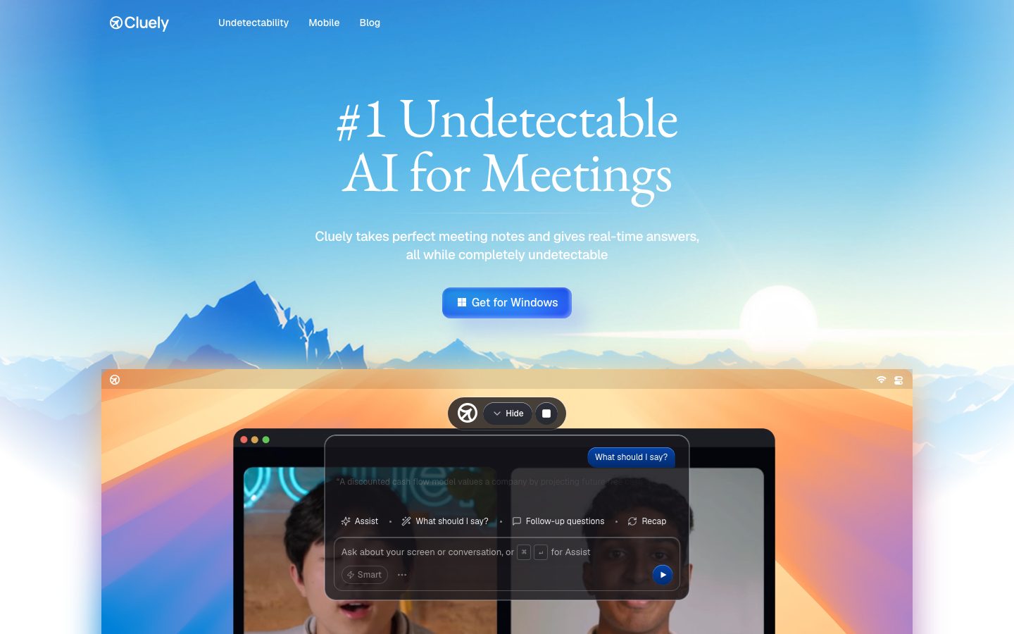
Cluely's landing page is a single long-scroll marketing surface built around one big atmospheric idea: a blue-to-white sky gradient hero with a mountain-range silhouette and a rising-sun glow, topped by an oversized **EB Garamond** serif headline ("#1 Undetectable AI for Meetings"). Everything below the headline — sub-copy, nav, buttons, FAQ, footer — runs in **Geist**, Vercel's open-source grotesque. The two-typeface split (serif display + sans UI) is the entire type system.
The brand's only saturated color is `{colors.accent-blue}` (#4984fd), reserved for the single primary CTA ("Get for Windows"). The rest of the palette is a long ramp of cool neutrals and slate-greys (`{colors.ink-soft}`, `{colors.slate}`, `{colors.neutral}`) that read as product-UI chrome inside the embedded app mockup rather than as marketing color. The canvas is white (`{colors.canvas}`); the hero's light text (`{colors.body}` — #edeef2) sits over the gradient sky.
The marquee component is the **product-mockup-card** — a glassy macOS-style window showing the actual Cluely overlay running over a video call. It carries the system's signature soft blue glow shadows (cool blue and pale-cyan halos rather than neutral drop shadows), which is where the "atmospheric" feeling comes from.
After the hero the page drops into a very large stretch of whitespace before a compact FAQ accordion and a light pre-footer CTA band, closing on a quiet near-white footer. The page is confident and sparse — one headline, one button, one product shot.
**Key Characteristics:**
- Sky-gradient hero (blue → white, mountains + sun) under a giant EB Garamond serif headline at `{typography.display}` (80px / weight 500 / -1px tracking).
- Geist for every non-display element — nav, sub-copy, button labels, FAQ, footer.
- A single saturated-blue primary CTA (`{colors.accent-blue}`) — the only chromatic action in the system. Rounded `{rounded.lg}` (12px), padding 10×20px.
- Glassy product-mockup window carrying blue/cyan glow shadows instead of neutral drop shadows.
- Cool-neutral ramp (`{colors.neutral}`, `{colors.ink-soft}`, `{colors.slate}`) used mostly inside product chrome, not on marketing surfaces.
- Light, quiet footer on `{colors.surface-faint}` (#f9fafb) closing a long, whitespace-heavy page.
- Hierarchical radius: `{rounded.xs}` (4px) and `{rounded.sm}` (6px) for small chrome, `{rounded.lg}` (12px) for buttons + cards, up to `{rounded.xxxl}` (32px) and `{rounded.pill}` (110px) for soft pill containers.
## Colors
### Brand & Accent
- **Accent Blue** (`{colors.accent-blue}` — #4984fd): The only saturated brand color. Used exclusively on the primary CTA and small in-product accent chips ("What should I say?" badge). Cluely is otherwise a monochrome-plus-gradient brand.
- **Accent Navy** (`{colors.accent-navy}` — #263043) and **Slate** (`{colors.slate}` — #374151, `{colors.slate-soft}` — #3d4150): Deep blue-greys observed in the product UI chrome and dark overlay panels.
### Surface
- **Canvas** (`{colors.canvas}` — #ffffff): The page floor below the hero gradient; FAQ and content sections sit on white.
- **Surface Faint** (`{colors.surface-faint}` — #f9fafb): The pre-footer CTA band and footer background — a barely-off-white that closes the page.
- **Surface Soft** (`{colors.surface-soft}` — #dde2ee) and **Surface Light** (`{colors.surface-light}` — #d1d6e0): Pale cool-blue surfaces / hairlines used in subtle dividers and glassy panel fills.
### Text
- **Ink** (`{colors.ink}` — #000000): All dark headlines and body text on white sections (FAQ, CTA band).
- **Body** (`{colors.body}` — #edeef2): Light text over the hero gradient — sub-headline and nav links read as near-white.
- **Muted** (`{colors.muted}` — #6b7280), **Neutral Muted** (`{colors.neutral-muted}` — #71717a): Secondary / footer text on light surfaces.
### Neutral Ramp
A long cool-grey ramp captured mostly from product-UI chrome and fine type: `{colors.neutral}` (#b2b3ba), `{colors.neutral-blue-grey}` (#8c929d), `{colors.neutral-mid}` (#898b91), `{colors.neutral-cool}` (#777a88), `{colors.neutral-slate}` (#5e616e), `{colors.neutral-dark}` (#464853), `{colors.ink-soft}` (#2e3038), `{colors.ink-deep}` (#1c1d22). These are dividers, icon greys, and dark-overlay tones — not marketing accents.
## Typography
### Font Family
Cluely runs exactly two families: **EB Garamond** (an open-source classical serif by Georg Duffner) for the single hero display headline, and **Geist** (Vercel's open-source grotesque sans) for everything else — sub-copy, nav, buttons, FAQ questions, footer. The contrast between a high-style serif display and a clean modern sans is the whole personality of the system.
The split is strict:
- EB Garamond — only the hero h1 display headline (80px, weight 500, -1px tracking).
- Geist — all UI text: h2/h3 headings, body, buttons, nav.
### Hierarchy
| Token | Family | Size | Weight | Line Height | Letter Spacing | Use |
|---|---|---|---|---|---|---|
| `{typography.display}` | EB Garamond | 80px | 500 | 0.96 | -1px | Hero h1 ("#1 Undetectable AI for Meetings") |
| `{typography.heading}` | Geist | 28px | 500 | 1.25 | -0.5px | Section / CTA-band headings (h3) |
| `{typography.subhead}` | Geist | 19px | 500 | 1.4 | -0.38px | FAQ questions, nav, mid-weight labels (h2) |
| `{typography.button}` | Geist | 16px | 500 | 1.5 | -0.13px | Primary CTA label, nav links |
| `{typography.body}` | Geist | 12px | 400 | 1.6 | normal | Body copy, footer text, fine print |
### Principles
EB Garamond is the brand's voice and appears exactly once — as the hero headline. Never set body copy or UI labels in the serif. Geist carries everything functional. The display headline is tight (0.96 line-height, -1px tracking) and large; it reads as editorial, almost magazine-like, against the soft photographic sky.
Weights stay low — display and headings at 500, body at 400. The system never goes to 700; the elegance comes from size and tracking, not boldness.
### Note on Font Substitutes
No licensed/custom typefaces were detected (`fonts_licensed` is empty). Both faces are freely available: **EB Garamond** ships on Google Fonts; **Geist** ships open-source from Vercel. If unavailable, substitute EB Garamond with **Cormorant Garamond** or system `Georgia, serif`, and Geist with **Inter** or the system grotesque stack `-apple-system, "Segoe UI", sans-serif`.
## Layout
### Spacing System
- **Base unit:** measured spacing clusters around a 2px grid; the most frequent steps are 6px and 8px.
- **Tokens:** `{spacing.xxs}` 4px · `{spacing.xs}` 6px · `{spacing.sm}` 8px · `{spacing.md}` 10px · `{spacing.lg}` 12px · `{spacing.xl}` 16px · `{spacing.xxl}` 20px · `{spacing.xxxl}` 24px · `{spacing.huge}` 28px.
- **Component padding:** primary CTA uses 10px × 20px (`{spacing.md}` × `{spacing.xxl}`); compact chrome and pills use 6–8px internal padding.
- Larger section-level rhythm (the deep whitespace gaps between hero, FAQ, and footer visible in the full-page screenshot) was not captured in the measured spacing set — see Known Gaps.
### Grid & Container
- **Hero:** single centered column — wordmark + 3-item nav at top, centered serif headline, centered sub-copy, centered CTA, then a full-bleed product-mockup window beneath.
- **FAQ:** single full-width stacked accordion list.
- **Footer:** multi-column link list (Resources / Support / Legal) on a light surface, with the wordmark and status indicator.
### Whitespace Philosophy
The page is deliberately sparse — one idea per viewport. The hero gives the serif headline room to dominate, and the post-hero section is mostly empty space before the FAQ, signalling consumer-confidence rather than feature density.
## Elevation & Depth
| Level | Treatment | Use |
|---|---|---|
| Flat | No shadow | Hero text, FAQ rows, footer |
| Inset hairline | `rgb(175,179,196) 0px 0.7px 0px 0px inset` | Subtle top-edge highlight on chrome elements |
| Glassy inset | `rgba(255,255,255,0.13) 1.9px 1.77px 8.17px inset` (and similar) | Frosted-glass pill buttons / overlay controls |
| Blue button bevel | `rgb(12,68,161) 0 0 0 0.5px, rgb(2,44,112) 0 -1px 0 inset, rgb(129,182,255) 0 0.5px 0 inset` | The primary CTA's pressed-metal blue bevel |
| Atmospheric card glow | `rgba(148,172,243,0.4) 20px 20px 24px, rgba(191,229,251,0.4) -3px -3px 4px inset, rgba(19,26,228,0.1) 4px 4px 4px inset` | The product-mockup-card's signature blue/cyan glow |
The elevation philosophy is **atmospheric, not neutral** — shadows are tinted blue and cyan to harmonize with the sky gradient, and several surfaces use inset glassy highlights to read as frosted glass. There are no plain grey drop shadows in the system.
### Decorative Depth
- The hero's sun-glow and mountain silhouette create a painterly background depth that the blue card shadows extend downward.
- Pill controls inside the product overlay use translucent white inset highlights to simulate glass.
## Shapes
### Border Radius Scale
| Token | Value | Use |
|---|---|---|
| `{rounded.none}` | 0px | Text inputs (square-cornered) |
| `{rounded.xs}` | 4px | Smallest chrome — chips, tags (most frequent radius) |
| `{rounded.sm}` | 6px | Small buttons, dropdown rows |
| `{rounded.md}` | 8px | Mid chrome elements |
| `{rounded.lg}` | 12px | Primary CTA, product-mockup card (most prominent radius) |
| `{rounded.xl}` | 16px | Larger panels |
| `{rounded.xxl}` | 24px | Soft container blocks |
| `{rounded.xxxl}` | 32px | Large rounded panels |
| `{rounded.pill}` | 110px | Pill-shaped control wrappers (Hide / record toolbar) |
### Geometry
Square corners are reserved for inputs (`{rounded.none}`); everything visible-as-a-surface rounds. The product overlay's floating toolbar uses the `{rounded.pill}` (110px) capsule shape, while the marquee mockup window and CTA share the `{rounded.lg}` (12px) value.
## Components
### Navigation
**`top-nav`** — Transparent bar over the hero gradient. Wordmark ("Cluely" with target-circle logo) at left, three text links (Undetectability, Mobile, Blog) beside it in `{typography.button}`. Text renders in `{colors.canvas}` (white) for legibility against the blue sky. No background fill, no border — the nav floats on the gradient.
### Hero
**`hero-band`** — The full atmospheric hero. Transparent background (a blue→white sky gradient with mountain silhouette and sun glow — the gradient is a rendered background image, not a single token). Carries the centered `{typography.display}` serif headline in light text (`{colors.body}`), a Geist sub-headline, and the centered `{component.button-primary}`. The product-mockup window sits full-bleed beneath.
### Buttons
**`button-primary`** — The single CTA ("Get for Windows"). Background `{colors.accent-blue}` (#4984fd), label `{colors.canvas}`, typography `{typography.button}` (Geist 16px / 500), rounded `{rounded.lg}` (12px), padding 10px × 20px. Carries a blue pressed-metal bevel shadow (deep-blue outline + dark inset bottom + light-blue inset top) that gives it a tactile, glossy app-store feel.
### Cards & Containers
**`product-mockup-card`** — The marquee component: a macOS-style window showing the Cluely overlay running over a live video call, with the floating Hide/record pill toolbar above it. Transparent/glassy fill, rounded `{rounded.lg}` (12px), and the signature atmospheric glow shadow (blue `rgba(148,172,243,0.4)` halo plus pale-cyan and indigo insets). This card is where the brand's blue-glow depth language lives.
### FAQ
**`faq-item`** — A stacked accordion row in the lower page ("Why real-time vs. a regular AI notetaker?", "Who is Cluely for?", etc.). Background `{colors.canvas}`, question text in `{colors.ink}` at `{typography.subhead}` (Geist 19px / 500), with a chevron affordance at right and square `{rounded.none}` corners separated by thin dividers. Padding ~20px.
### Inputs
**`text-input`** — Square-cornered input (`{rounded.none}` — 0px, measured). Background `{colors.canvas}`, text `{colors.ink}`, typography `{typography.body}`. Inputs are the one place the system rejects rounding entirely.
### CTA / Footer
**`cta-band`** — The pre-footer band ("Meeting AI that helps during the call, not after. Try Cluely on your next meeting today."). Background `{colors.surface-faint}` (#f9fafb), heading in `{colors.ink}` at `{typography.heading}` (Geist 28px / 500), with a dark `Get for Windows` button beneath. Padding ~24px.
**`footer`** — Quiet near-white footer closing the page. Background `{colors.surface-faint}`, text `{colors.muted}` at `{typography.body}` (Geist 12px / 400). Multi-column link lists (Resources / Support / Legal), a copyright line, an "All systems operational" status indicator, and social icons. The footer stays light — Cluely never inverts to a dark footer.
## Do's and Don'ts
### Do
- Reserve `{colors.accent-blue}` (#4984fd) for the single primary CTA. The brand is monochrome-plus-gradient everywhere else.
- Use EB Garamond exactly once, for the hero display headline, at weight 500 with tight tracking (-1px) and sub-1.0 line-height (0.96).
- Set all UI text — nav, body, buttons, FAQ — in Geist.
- Tint elevation shadows blue/cyan to harmonize with the sky gradient, as on `{component.product-mockup-card}`.
- Keep inputs square (`{rounded.none}`) and buttons/cards at `{rounded.lg}` (12px).
- Let the hero breathe — one headline, one button, one product shot per viewport.
### Don't
- Don't set body copy or UI labels in EB Garamond — the serif is the display voice only.
- Don't introduce a second saturated accent. The system is blue-CTA-plus-neutrals.
- Don't use plain grey drop shadows; the depth language is tinted-glow and glassy inset.
- Don't push type weight past 500 — elegance comes from size and tracking, not boldness.
- Don't invert the footer to dark; Cluely closes on a light `{colors.surface-faint}` surface.
- Don't document hover states — default and active/pressed only.
## Responsive Behavior
| Name | Width | Key Changes |
|---|---|---|
| Mobile | < 768px | Single-column hero; serif headline scales down from 80px; product-mockup window goes full-width; nav likely collapses |
| Tablet | 768–1024px | Centered hero column tightens; FAQ stays single-column |
| Desktop | > 1024px | Full centered hero with floating nav; full-bleed product mockup; multi-column footer |
### Touch Targets
- `{component.button-primary}` at 10px × 20px padding on a 16px label gives a comfortable tap height.
- FAQ rows are full-width tap targets with ~20px padding.
### Collapsing Strategy
- Hero remains single-column at every breakpoint; only the display headline scale and mockup width change.
- Footer link columns (Resources / Support / Legal) wrap toward a stacked layout on narrow screens.
- Exact breakpoint values were not measured — the table above is derived from the captured desktop layout and standard practice.
### Image Behavior
- The hero sky gradient and mountain silhouette are a full-bleed background that scales with the viewport.
- The product-mockup window scales proportionally while keeping its blue glow shadow.
## Iteration Guide
1. Focus on ONE component at a time, referencing its YAML key (`{component.product-mockup-card}`, `{component.button-primary}`).
2. Keep variants as separate `components:` entries (`-active`, `-disabled`) rather than inline states.
3. Use `{token.refs}` everywhere — never inline a hex in a component.
4. Document only default and active/pressed states; no hover.
5. EB Garamond stays the display-only serif; Geist stays the UI sans. Don't blur the boundary.
6. The single blue CTA is the only saturated action — resist adding accent colors.
7. When adding depth, tint shadows blue/cyan to match the existing glow language.
## Known Gaps
- **Section-level spacing not captured.** The measured spacing set tops out at 28px, but the full-page screenshot shows very large vertical gaps between the hero, FAQ, and footer. Those macro section paddings were not extracted and are not tokenized here.
- **Hero gradient is not a token.** The blue→white sky with mountains and sun-glow is a rendered background image/gradient; it can't be expressed as a single `{colors.*}` value, so `hero-band` and `product-mockup-card` backgrounds are marked `transparent`.
- **Active/pressed states inferred from shadows only.** The blue button bevel shadow implies a pressed-metal treatment, but no distinct measured `-active` background color exists; no active-state color was invented.
- **Card/panel fill colors unmeasured.** The product-mockup card and toolbar are glassy/translucent; their solid fills weren't isolated, so they are documented via shadow + transparent.
- **Only the landing page was captured.** Mobile, Blog, and Help Center surfaces, plus the FAQ expanded state and any form validation states, are out of scope.
- **Neutral ramp role-mapping is approximate.** The long cool-grey set (#b2b3ba → #1c1d22) was frequency-sampled largely from product-UI chrome; precise per-element assignment would need component-level inspection.
- **Footer status colors** (the "All systems operational" indicator) were not isolated as discrete tokens.
<!-- Documented by duply · real-world design systems as ready-to-use DESIGN.md for AI coding agents · https://duply.ai/cluely/design-md -->
Color Palette
Accent
Neutrals
Typography
display80px · 500 · 0.96
The quick brown fox jumpsheading28px · 500 · 1.25
The quick brown fox jumpssubhead19px · 500 · 1.4
The quick brown fox jumpsbutton16px · 500 · 1.5
The quick brown fox jumpsbody12px · 400 · 1.6
The quick brown fox jumpsSpacing & Shape
Spacing
| Name | Value | Preview |
|---|---|---|
| xxs | 4px | |
| xs | 6px | |
| sm | 8px | |
| md | 10px | |
| lg | 12px | |
| xl | 16px | |
| xxl | 20px | |
| xxxl | 24px | |
| huge | 28px |
Border Radius
| Name | Value | Preview |
|---|---|---|
| none | 0px | |
| xs | 4px | |
| sm | 6px | |
| md | 8px | |
| lg | 12px | |
| xl | 16px | |
| xxl | 24px | |
| xxxl | 32px | |
| pill | 110px |
More like this


---
version: alpha
name: Cluely-design-analysis
description: "A sky-gradient marketing page for an \"undetectable AI for meetings\" app, anchored on a blue-to-white atmospheric hero with a large EB Garamond serif headline, Geist sans for all supporting UI, a single saturated-blue primary CTA, and a glassy product-mockup card carrying soft blue glow shadows. The voice is confident-consumer-tech: oversized serif display, minimal chrome, and a quiet light footer that closes a very long-scroll page."

colors:
  ink: "#000000"
  canvas: "#ffffff"
  body: "#edeef2"
  accent-blue: "#4984fd"
  slate: "#374151"
  slate-soft: "#3d4150"
  ink-deep: "#1c1d22"
  ink-soft: "#2e3038"
  accent-navy: "#263043"
  neutral: "#b2b3ba"
  neutral-mid: "#898b91"
  neutral-cool: "#777a88"
  neutral-slate: "#5e616e"
  neutral-muted: "#71717a"
  neutral-dark: "#464853"
  neutral-blue-grey: "#8c929d"
  muted: "#6b7280"
  surface-soft: "#dde2ee"
  surface-light: "#d1d6e0"
  surface-faint: "#f9fafb"

typography:
  display:
    fontFamily: "EB Garamond, Georgia, serif"
    fontSize: 80px
    fontWeight: 500
    lineHeight: 0.96
    letterSpacing: -1px
  heading:
    fontFamily: "Geist, sans-serif"
    fontSize: 28px
    fontWeight: 500
    lineHeight: 1.25
    letterSpacing: -0.5px
  subhead:
    fontFamily: "Geist, sans-serif"
    fontSize: 19px
    fontWeight: 500
    lineHeight: 1.4
    letterSpacing: -0.38px
  button:
    fontFamily: "Geist, sans-serif"
    fontSize: 16px
    fontWeight: 500
    lineHeight: 1.5
    letterSpacing: -0.13px
  body:
    fontFamily: "Geist, sans-serif"
    fontSize: 12px
    fontWeight: 400
    lineHeight: 1.6
    letterSpacing: normal

rounded:
  none: 0px
  xs: 4px
  sm: 6px
  md: 8px
  lg: 12px
  xl: 16px
  xxl: 24px
  xxxl: 32px
  pill: 110px

spacing:
  xxs: 4px
  xs: 6px
  sm: 8px
  md: 10px
  lg: 12px
  xl: 16px
  xxl: 20px
  xxxl: 24px
  huge: 28px

components:
  top-nav:
    backgroundColor: transparent
    textColor: "{colors.canvas}"
    typography: "{typography.button}"
  hero-band:
    backgroundColor: transparent
    textColor: "{colors.body}"
    typography: "{typography.display}"
  button-primary:
    backgroundColor: "{colors.accent-blue}"
    textColor: "{colors.canvas}"
    typography: "{typography.button}"
    rounded: "{rounded.lg}"
    padding: 10px 20px
  product-mockup-card:
    backgroundColor: transparent
    textColor: "{colors.canvas}"
    rounded: "{rounded.lg}"
  faq-item:
    backgroundColor: "{colors.canvas}"
    textColor: "{colors.ink}"
    typography: "{typography.subhead}"
    rounded: "{rounded.none}"
    padding: 20px
  cta-band:
    backgroundColor: "{colors.surface-faint}"
    textColor: "{colors.ink}"
    typography: "{typography.heading}"
    padding: 24px
  text-input:
    backgroundColor: "{colors.canvas}"
    textColor: "{colors.ink}"
    typography: "{typography.body}"
    rounded: "{rounded.none}"
  footer:
    backgroundColor: "{colors.surface-faint}"
    textColor: "{colors.muted}"
    typography: "{typography.body}"
    padding: 20px
---

## Overview

Cluely's landing page is a single long-scroll marketing surface built around one big atmospheric idea: a blue-to-white sky gradient hero with a mountain-range silhouette and a rising-sun glow, topped by an oversized **EB Garamond** serif headline ("#1 Undetectable AI for Meetings"). Everything below the headline — sub-copy, nav, buttons, FAQ, footer — runs in **Geist**, Vercel's open-source grotesque. The two-typeface split (serif display + sans UI) is the entire type system.

The brand's only saturated color is `{colors.accent-blue}` (#4984fd), reserved for the single primary CTA ("Get for Windows"). The rest of the palette is a long ramp of cool neutrals and slate-greys (`{colors.ink-soft}`, `{colors.slate}`, `{colors.neutral}`) that read as product-UI chrome inside the embedded app mockup rather than as marketing color. The canvas is white (`{colors.canvas}`); the hero's light text (`{colors.body}` — #edeef2) sits over the gradient sky.

The marquee component is the **product-mockup-card** — a glassy macOS-style window showing the actual Cluely overlay running over a video call. It carries the system's signature soft blue glow shadows (cool blue and pale-cyan halos rather than neutral drop shadows), which is where the "atmospheric" feeling comes from.

After the hero the page drops into a very large stretch of whitespace before a compact FAQ accordion and a light pre-footer CTA band, closing on a quiet near-white footer. The page is confident and sparse — one headline, one button, one product shot.

**Key Characteristics:**
- Sky-gradient hero (blue → white, mountains + sun) under a giant EB Garamond serif headline at `{typography.display}` (80px / weight 500 / -1px tracking).
- Geist for every non-display element — nav, sub-copy, button labels, FAQ, footer.
- A single saturated-blue primary CTA (`{colors.accent-blue}`) — the only chromatic action in the system. Rounded `{rounded.lg}` (12px), padding 10×20px.
- Glassy product-mockup window carrying blue/cyan glow shadows instead of neutral drop shadows.
- Cool-neutral ramp (`{colors.neutral}`, `{colors.ink-soft}`, `{colors.slate}`) used mostly inside product chrome, not on marketing surfaces.
- Light, quiet footer on `{colors.surface-faint}` (#f9fafb) closing a long, whitespace-heavy page.
- Hierarchical radius: `{rounded.xs}` (4px) and `{rounded.sm}` (6px) for small chrome, `{rounded.lg}` (12px) for buttons + cards, up to `{rounded.xxxl}` (32px) and `{rounded.pill}` (110px) for soft pill containers.

## Colors

### Brand & Accent
- **Accent Blue** (`{colors.accent-blue}` — #4984fd): The only saturated brand color. Used exclusively on the primary CTA and small in-product accent chips ("What should I say?" badge). Cluely is otherwise a monochrome-plus-gradient brand.
- **Accent Navy** (`{colors.accent-navy}` — #263043) and **Slate** (`{colors.slate}` — #374151, `{colors.slate-soft}` — #3d4150): Deep blue-greys observed in the product UI chrome and dark overlay panels.

### Surface
- **Canvas** (`{colors.canvas}` — #ffffff): The page floor below the hero gradient; FAQ and content sections sit on white.
- **Surface Faint** (`{colors.surface-faint}` — #f9fafb): The pre-footer CTA band and footer background — a barely-off-white that closes the page.
- **Surface Soft** (`{colors.surface-soft}` — #dde2ee) and **Surface Light** (`{colors.surface-light}` — #d1d6e0): Pale cool-blue surfaces / hairlines used in subtle dividers and glassy panel fills.

### Text
- **Ink** (`{colors.ink}` — #000000): All dark headlines and body text on white sections (FAQ, CTA band).
- **Body** (`{colors.body}` — #edeef2): Light text over the hero gradient — sub-headline and nav links read as near-white.
- **Muted** (`{colors.muted}` — #6b7280), **Neutral Muted** (`{colors.neutral-muted}` — #71717a): Secondary / footer text on light surfaces.

### Neutral Ramp
A long cool-grey ramp captured mostly from product-UI chrome and fine type: `{colors.neutral}` (#b2b3ba), `{colors.neutral-blue-grey}` (#8c929d), `{colors.neutral-mid}` (#898b91), `{colors.neutral-cool}` (#777a88), `{colors.neutral-slate}` (#5e616e), `{colors.neutral-dark}` (#464853), `{colors.ink-soft}` (#2e3038), `{colors.ink-deep}` (#1c1d22). These are dividers, icon greys, and dark-overlay tones — not marketing accents.

## Typography

### Font Family
Cluely runs exactly two families: **EB Garamond** (an open-source classical serif by Georg Duffner) for the single hero display headline, and **Geist** (Vercel's open-source grotesque sans) for everything else — sub-copy, nav, buttons, FAQ questions, footer. The contrast between a high-style serif display and a clean modern sans is the whole personality of the system.

The split is strict:
- EB Garamond — only the hero h1 display headline (80px, weight 500, -1px tracking).
- Geist — all UI text: h2/h3 headings, body, buttons, nav.

### Hierarchy

| Token | Family | Size | Weight | Line Height | Letter Spacing | Use |
|---|---|---|---|---|---|---|
| `{typography.display}` | EB Garamond | 80px | 500 | 0.96 | -1px | Hero h1 ("#1 Undetectable AI for Meetings") |
| `{typography.heading}` | Geist | 28px | 500 | 1.25 | -0.5px | Section / CTA-band headings (h3) |
| `{typography.subhead}` | Geist | 19px | 500 | 1.4 | -0.38px | FAQ questions, nav, mid-weight labels (h2) |
| `{typography.button}` | Geist | 16px | 500 | 1.5 | -0.13px | Primary CTA label, nav links |
| `{typography.body}` | Geist | 12px | 400 | 1.6 | normal | Body copy, footer text, fine print |

### Principles
EB Garamond is the brand's voice and appears exactly once — as the hero headline. Never set body copy or UI labels in the serif. Geist carries everything functional. The display headline is tight (0.96 line-height, -1px tracking) and large; it reads as editorial, almost magazine-like, against the soft photographic sky.

Weights stay low — display and headings at 500, body at 400. The system never goes to 700; the elegance comes from size and tracking, not boldness.

### Note on Font Substitutes
No licensed/custom typefaces were detected (`fonts_licensed` is empty). Both faces are freely available: **EB Garamond** ships on Google Fonts; **Geist** ships open-source from Vercel. If unavailable, substitute EB Garamond with **Cormorant Garamond** or system `Georgia, serif`, and Geist with **Inter** or the system grotesque stack `-apple-system, "Segoe UI", sans-serif`.

## Layout

### Spacing System
- **Base unit:** measured spacing clusters around a 2px grid; the most frequent steps are 6px and 8px.
- **Tokens:** `{spacing.xxs}` 4px · `{spacing.xs}` 6px · `{spacing.sm}` 8px · `{spacing.md}` 10px · `{spacing.lg}` 12px · `{spacing.xl}` 16px · `{spacing.xxl}` 20px · `{spacing.xxxl}` 24px · `{spacing.huge}` 28px.
- **Component padding:** primary CTA uses 10px × 20px (`{spacing.md}` × `{spacing.xxl}`); compact chrome and pills use 6–8px internal padding.
- Larger section-level rhythm (the deep whitespace gaps between hero, FAQ, and footer visible in the full-page screenshot) was not captured in the measured spacing set — see Known Gaps.

### Grid & Container
- **Hero:** single centered column — wordmark + 3-item nav at top, centered serif headline, centered sub-copy, centered CTA, then a full-bleed product-mockup window beneath.
- **FAQ:** single full-width stacked accordion list.
- **Footer:** multi-column link list (Resources / Support / Legal) on a light surface, with the wordmark and status indicator.

### Whitespace Philosophy
The page is deliberately sparse — one idea per viewport. The hero gives the serif headline room to dominate, and the post-hero section is mostly empty space before the FAQ, signalling consumer-confidence rather than feature density.

## Elevation & Depth

| Level | Treatment | Use |
|---|---|---|
| Flat | No shadow | Hero text, FAQ rows, footer |
| Inset hairline | `rgb(175,179,196) 0px 0.7px 0px 0px inset` | Subtle top-edge highlight on chrome elements |
| Glassy inset | `rgba(255,255,255,0.13) 1.9px 1.77px 8.17px inset` (and similar) | Frosted-glass pill buttons / overlay controls |
| Blue button bevel | `rgb(12,68,161) 0 0 0 0.5px, rgb(2,44,112) 0 -1px 0 inset, rgb(129,182,255) 0 0.5px 0 inset` | The primary CTA's pressed-metal blue bevel |
| Atmospheric card glow | `rgba(148,172,243,0.4) 20px 20px 24px, rgba(191,229,251,0.4) -3px -3px 4px inset, rgba(19,26,228,0.1) 4px 4px 4px inset` | The product-mockup-card's signature blue/cyan glow |

The elevation philosophy is **atmospheric, not neutral** — shadows are tinted blue and cyan to harmonize with the sky gradient, and several surfaces use inset glassy highlights to read as frosted glass. There are no plain grey drop shadows in the system.

### Decorative Depth
- The hero's sun-glow and mountain silhouette create a painterly background depth that the blue card shadows extend downward.
- Pill controls inside the product overlay use translucent white inset highlights to simulate glass.

## Shapes

### Border Radius Scale

| Token | Value | Use |
|---|---|---|
| `{rounded.none}` | 0px | Text inputs (square-cornered) |
| `{rounded.xs}` | 4px | Smallest chrome — chips, tags (most frequent radius) |
| `{rounded.sm}` | 6px | Small buttons, dropdown rows |
| `{rounded.md}` | 8px | Mid chrome elements |
| `{rounded.lg}` | 12px | Primary CTA, product-mockup card (most prominent radius) |
| `{rounded.xl}` | 16px | Larger panels |
| `{rounded.xxl}` | 24px | Soft container blocks |
| `{rounded.xxxl}` | 32px | Large rounded panels |
| `{rounded.pill}` | 110px | Pill-shaped control wrappers (Hide / record toolbar) |

### Geometry
Square corners are reserved for inputs (`{rounded.none}`); everything visible-as-a-surface rounds. The product overlay's floating toolbar uses the `{rounded.pill}` (110px) capsule shape, while the marquee mockup window and CTA share the `{rounded.lg}` (12px) value.

## Components

### Navigation

**`top-nav`** — Transparent bar over the hero gradient. Wordmark ("Cluely" with target-circle logo) at left, three text links (Undetectability, Mobile, Blog) beside it in `{typography.button}`. Text renders in `{colors.canvas}` (white) for legibility against the blue sky. No background fill, no border — the nav floats on the gradient.

### Hero

**`hero-band`** — The full atmospheric hero. Transparent background (a blue→white sky gradient with mountain silhouette and sun glow — the gradient is a rendered background image, not a single token). Carries the centered `{typography.display}` serif headline in light text (`{colors.body}`), a Geist sub-headline, and the centered `{component.button-primary}`. The product-mockup window sits full-bleed beneath.

### Buttons

**`button-primary`** — The single CTA ("Get for Windows"). Background `{colors.accent-blue}` (#4984fd), label `{colors.canvas}`, typography `{typography.button}` (Geist 16px / 500), rounded `{rounded.lg}` (12px), padding 10px × 20px. Carries a blue pressed-metal bevel shadow (deep-blue outline + dark inset bottom + light-blue inset top) that gives it a tactile, glossy app-store feel.

### Cards & Containers

**`product-mockup-card`** — The marquee component: a macOS-style window showing the Cluely overlay running over a live video call, with the floating Hide/record pill toolbar above it. Transparent/glassy fill, rounded `{rounded.lg}` (12px), and the signature atmospheric glow shadow (blue `rgba(148,172,243,0.4)` halo plus pale-cyan and indigo insets). This card is where the brand's blue-glow depth language lives.

### FAQ

**`faq-item`** — A stacked accordion row in the lower page ("Why real-time vs. a regular AI notetaker?", "Who is Cluely for?", etc.). Background `{colors.canvas}`, question text in `{colors.ink}` at `{typography.subhead}` (Geist 19px / 500), with a chevron affordance at right and square `{rounded.none}` corners separated by thin dividers. Padding ~20px.

### Inputs

**`text-input`** — Square-cornered input (`{rounded.none}` — 0px, measured). Background `{colors.canvas}`, text `{colors.ink}`, typography `{typography.body}`. Inputs are the one place the system rejects rounding entirely.

### CTA / Footer

**`cta-band`** — The pre-footer band ("Meeting AI that helps during the call, not after. Try Cluely on your next meeting today."). Background `{colors.surface-faint}` (#f9fafb), heading in `{colors.ink}` at `{typography.heading}` (Geist 28px / 500), with a dark `Get for Windows` button beneath. Padding ~24px.

**`footer`** — Quiet near-white footer closing the page. Background `{colors.surface-faint}`, text `{colors.muted}` at `{typography.body}` (Geist 12px / 400). Multi-column link lists (Resources / Support / Legal), a copyright line, an "All systems operational" status indicator, and social icons. The footer stays light — Cluely never inverts to a dark footer.

## Do's and Don'ts

### Do
- Reserve `{colors.accent-blue}` (#4984fd) for the single primary CTA. The brand is monochrome-plus-gradient everywhere else.
- Use EB Garamond exactly once, for the hero display headline, at weight 500 with tight tracking (-1px) and sub-1.0 line-height (0.96).
- Set all UI text — nav, body, buttons, FAQ — in Geist.
- Tint elevation shadows blue/cyan to harmonize with the sky gradient, as on `{component.product-mockup-card}`.
- Keep inputs square (`{rounded.none}`) and buttons/cards at `{rounded.lg}` (12px).
- Let the hero breathe — one headline, one button, one product shot per viewport.

### Don't
- Don't set body copy or UI labels in EB Garamond — the serif is the display voice only.
- Don't introduce a second saturated accent. The system is blue-CTA-plus-neutrals.
- Don't use plain grey drop shadows; the depth language is tinted-glow and glassy inset.
- Don't push type weight past 500 — elegance comes from size and tracking, not boldness.
- Don't invert the footer to dark; Cluely closes on a light `{colors.surface-faint}` surface.
- Don't document hover states — default and active/pressed only.

## Responsive Behavior

| Name | Width | Key Changes |
|---|---|---|
| Mobile | < 768px | Single-column hero; serif headline scales down from 80px; product-mockup window goes full-width; nav likely collapses |
| Tablet | 768–1024px | Centered hero column tightens; FAQ stays single-column |
| Desktop | > 1024px | Full centered hero with floating nav; full-bleed product mockup; multi-column footer |

### Touch Targets
- `{component.button-primary}` at 10px × 20px padding on a 16px label gives a comfortable tap height.
- FAQ rows are full-width tap targets with ~20px padding.

### Collapsing Strategy
- Hero remains single-column at every breakpoint; only the display headline scale and mockup width change.
- Footer link columns (Resources / Support / Legal) wrap toward a stacked layout on narrow screens.
- Exact breakpoint values were not measured — the table above is derived from the captured desktop layout and standard practice.

### Image Behavior
- The hero sky gradient and mountain silhouette are a full-bleed background that scales with the viewport.
- The product-mockup window scales proportionally while keeping its blue glow shadow.

## Iteration Guide

1. Focus on ONE component at a time, referencing its YAML key (`{component.product-mockup-card}`, `{component.button-primary}`).
2. Keep variants as separate `components:` entries (`-active`, `-disabled`) rather than inline states.
3. Use `{token.refs}` everywhere — never inline a hex in a component.
4. Document only default and active/pressed states; no hover.
5. EB Garamond stays the display-only serif; Geist stays the UI sans. Don't blur the boundary.
6. The single blue CTA is the only saturated action — resist adding accent colors.
7. When adding depth, tint shadows blue/cyan to match the existing glow language.

## Known Gaps

- **Section-level spacing not captured.** The measured spacing set tops out at 28px, but the full-page screenshot shows very large vertical gaps between the hero, FAQ, and footer. Those macro section paddings were not extracted and are not tokenized here.
- **Hero gradient is not a token.** The blue→white sky with mountains and sun-glow is a rendered background image/gradient; it can't be expressed as a single `{colors.*}` value, so `hero-band` and `product-mockup-card` backgrounds are marked `transparent`.
- **Active/pressed states inferred from shadows only.** The blue button bevel shadow implies a pressed-metal treatment, but no distinct measured `-active` background color exists; no active-state color was invented.
- **Card/panel fill colors unmeasured.** The product-mockup card and toolbar are glassy/translucent; their solid fills weren't isolated, so they are documented via shadow + transparent.
- **Only the landing page was captured.** Mobile, Blog, and Help Center surfaces, plus the FAQ expanded state and any form validation states, are out of scope.
- **Neutral ramp role-mapping is approximate.** The long cool-grey set (#b2b3ba → #1c1d22) was frequency-sampled largely from product-UI chrome; precise per-element assignment would need component-level inspection.
- **Footer status colors** (the "All systems operational" indicator) were not isolated as discrete tokens.

<!-- Documented by duply · real-world design systems as ready-to-use DESIGN.md for AI coding agents · https://duply.ai/cluely/design-md -->