Rox
A restrained, enterprise-AI marketing surface built on a warm off-white canvas with near-black ink, a single high-contrast serif display headline, and a clean Geist sans for everything else. Brand voltage comes from the large FH Total Display serif headline (set in two tones — solid black over light gray), light-gray product-UI cards arranged in dense bento grids, and one electric-blue primary CTA that is the only saturated color in an otherwise monochrome warm-gray system.
---
version: alpha
name: Rox-design-analysis
description: A restrained, enterprise-AI marketing surface built on a warm off-white canvas with near-black ink, a single high-contrast serif display headline, and a clean Geist sans for everything else. Brand voltage comes from the large FH Total Display serif headline (set in two tones — solid black over light gray), light-gray product-UI cards arranged in dense bento grids, and one electric-blue primary CTA that is the only saturated color in an otherwise monochrome warm-gray system.
colors:
primary: "#0b64e9"
primary-active: "#0b63e8"
ink: "#000000"
ink-deep: "#0c0a09"
ink-warm: "#1c1917"
body: "#44403b"
neutral: "#57534d"
muted: "#87827d"
muted-soft: "#a6a09b"
muted-faint: "#d4d2d1"
hairline: "#f0efef"
canvas: "#ececea"
surface-soft: "#f5f5f4"
surface-faint: "#fafaf9"
surface-card: "#ffffff"
on-primary: "#ffffff"
link: "#0000ee"
accent-lavender: "#e1e2ee"
accent-lavender-mid: "#c8cfed"
accent-lavender-deep: "#a3b2ec"
typography:
display:
fontFamily: "FH Total Display, Fraunces, Georgia, serif"
fontSize: 75px
fontWeight: 400
lineHeight: 1.1
letterSpacing: normal
heading-lg:
fontFamily: "Geist, -apple-system, BlinkMacSystemFont, sans-serif"
fontSize: 36px
fontWeight: 400
lineHeight: 1.4
letterSpacing: -0.72px
heading-md:
fontFamily: "Geist, -apple-system, BlinkMacSystemFont, sans-serif"
fontSize: 28px
fontWeight: 400
lineHeight: 1.4
letterSpacing: normal
heading-sm:
fontFamily: "Geist, -apple-system, BlinkMacSystemFont, sans-serif"
fontSize: 24px
fontWeight: 400
lineHeight: 1.4
letterSpacing: normal
body:
fontFamily: "Geist, -apple-system, BlinkMacSystemFont, sans-serif"
fontSize: 14px
fontWeight: 500
lineHeight: 1.2
letterSpacing: normal
rounded:
xs: 2px
sm: 4px
md: 6px
lg: 8px
xl: 12px
xxl: 16px
pill: 99px
spacing:
xxs: 4px
xs: 8px
sm: 12px
md: 16px
lg: 20px
xl: 24px
components:
top-nav:
backgroundColor: "{colors.canvas}"
textColor: "{colors.ink}"
typography: "{typography.body}"
padding: 20px 24px
button-primary:
backgroundColor: "{colors.primary}"
textColor: "{colors.on-primary}"
typography: "{typography.body}"
rounded: "{rounded.lg}"
padding: 12px 20px
button-primary-active:
backgroundColor: "{colors.primary-active}"
textColor: "{colors.on-primary}"
rounded: "{rounded.lg}"
button-secondary:
backgroundColor: "{colors.surface-faint}"
textColor: "{colors.ink}"
typography: "{typography.body}"
rounded: "{rounded.md}"
padding: 10px 16px
nav-link:
backgroundColor: transparent
textColor: "{colors.neutral}"
typography: "{typography.body}"
pill-badge:
backgroundColor: "{colors.surface-faint}"
textColor: "{colors.neutral}"
typography: "{typography.body}"
rounded: "{rounded.pill}"
padding: 8px 16px
feature-card:
backgroundColor: "{colors.surface-soft}"
textColor: "{colors.ink}"
typography: "{typography.heading-sm}"
rounded: "{rounded.xl}"
padding: 20px
logo-bar:
backgroundColor: "{colors.surface-soft}"
textColor: "{colors.muted}"
typography: "{typography.body}"
rounded: "{rounded.xl}"
padding: 24px
text-input:
backgroundColor: "{colors.surface-card}"
textColor: "{colors.body}"
typography: "{typography.body}"
rounded: "{rounded.md}"
padding: 12px 16px
testimonial-card:
backgroundColor: "{colors.surface-card}"
textColor: "{colors.on-primary}"
typography: "{typography.body}"
rounded: "{rounded.lg}"
compliance-card:
backgroundColor: "{colors.surface-soft}"
textColor: "{colors.neutral}"
typography: "{typography.body}"
rounded: "{rounded.lg}"
padding: 24px
link-inline:
backgroundColor: transparent
textColor: "{colors.link}"
typography: "{typography.body}"
---
## Overview
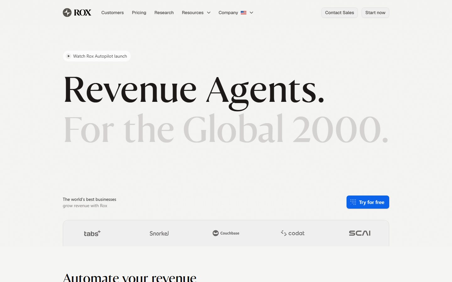
Rox's marketing surface is a restrained enterprise-AI interface built on a warm off-white canvas (`{colors.canvas}` — #ececea) with near-black ink (`{colors.ink}` — #000000). The system reads as serious, precise, and infrastructure-grade — built for "the Global 2000" — and it earns that tone through extreme color discipline. The entire palette is warm gray plus black, with exactly one saturated accent: an electric blue (`{colors.primary}` — #0b64e9) that appears only on primary CTAs.
The brand's whole voltage lives in its single display headline. The hero "Revenue Agents. For the Global 2000." is set in **FH Total Display** — a high-contrast serif — at 75px, with the first line in solid black and the second line dropping to a pale gray (`{colors.muted-faint}` — #d4d2d1). That two-tone serif split is the brand signature; nothing else on the page is decorative. Everything below the hero is Geist sans, the supporting type that does all the actual work.
Content is organized as dense **bento grids** of light-gray product-UI cards (`{colors.surface-soft}` — #f5f5f4) — "Agent Workflows", "Sales Intelligence", "Revenue Intelligence", "Account Intelligence" — each showing a fragment of the real product chrome at small scale. Rox shows the product inside cards rather than illustrating around it.
**Key Characteristics:**
- Warm-gray monochrome canvas (`{colors.canvas}` — #ececea) — no white-bright page floor; the off-white is deliberately warm and low-glare.
- One serif display headline (FH Total Display, substituted here with Fraunces) set in two tones — solid `{colors.ink}` over pale `{colors.muted-faint}`. This is the only serif and the only display moment in the system.
- Geist sans (open-source, weight 400–500) for every other role — headings, body, nav, buttons, labels.
- A single saturated CTA color (`{colors.primary}` — #0b64e9). Blue is reserved exclusively for "Try for free" / "Start now". The system is otherwise grayscale.
- Light-gray bento cards (`{colors.surface-soft}` — #f5f5f4) with small radii (`{rounded.xl}` — 12px) holding product-UI fragments.
- Soft, low-alpha shadows only (`rgba(0,0,0,0.04)` family). The system is nearly flat — elevation comes from background tone shifts, not heavy shadows.
- Pill-shaped badges (`{rounded.pill}` — 99px) for the "Watch Rox Autopilot launch" announcement chip.
- Small, tight radius hierarchy: 2px → 16px on cards and controls, with pill radius reserved for badges.
## Colors
### Brand & Accent
- **Primary** (`{colors.primary}` — #0b64e9): The single saturated color in the system. Used only on primary CTAs ("Try for free", "Start now"). Press state shifts to `{colors.primary-active}` (#0b63e8) — derived as the adjacent measured blue.
- **Link** (`{colors.link}` — #0000ee): Default browser-blue captured on inline `<a>` elements; appears on raw text links not styled as buttons.
- **Lavender accents** (`{colors.accent-lavender}` — #e1e2ee, `{colors.accent-lavender-mid}` — #c8cfed, `{colors.accent-lavender-deep}` — #a3b2ec): A pale blue-violet set appearing inside product-UI fragments (data visualizations, the "Account Intelligence" node cloud, small chart fills). Never used on chrome or CTAs.
### Text
- **Ink** (`{colors.ink}` — #000000): The hero serif headline (solid line) and primary headings.
- **Ink Deep** (`{colors.ink-deep}` — #0c0a09) / **Ink Warm** (`{colors.ink-warm}` — #1c1917): Near-black warm tones used for dense text and dark UI fragments.
- **Body** (`{colors.body}` — #44403b): Default running-text color (warm dark gray).
- **Neutral** (`{colors.neutral}` — #57534d): Secondary text, nav links, supporting paragraphs.
- **Muted** (`{colors.muted}` — #87827d) / **Muted Soft** (`{colors.muted-soft}` — #a6a09b): Tertiary text, captions, logo-bar marks.
- **Muted Faint** (`{colors.muted-faint}` — #d4d2d1): The pale gray used for the second line of the two-tone hero headline ("For the Global 2000.").
- **On Primary** (`{colors.on-primary}` — #ffffff): Text on the blue CTA and on dark testimonial overlays.
### Surface
- **Canvas** (`{colors.canvas}` — #ececea): The warm off-white page floor.
- **Surface Soft** (`{colors.surface-soft}` — #f5f5f4): Bento cards, logo bar, compliance cards — the dominant card surface.
- **Surface Faint** (`{colors.surface-faint}` — #fafaf9): The lightest tone — pill badges, secondary buttons.
- **Surface Card** (`{colors.surface-card}` — #ffffff): Pure white, used for inset input fields and elevated nested elements inside cards.
- **Hairline** (`{colors.hairline}` — #f0efef): The 1px divider / border tone between same-canvas regions.
## Typography
### Font Family
The system runs two faces: **FH Total Display** for the single hero headline and **Geist** for everything else. FH Total Display is a high-contrast serif used at large size and weight 400 — it carries the entire brand voice in one headline. Geist (Vercel's open-source sans, weight 400–500) handles all section headings, body, nav, and UI labels.
The split is strict and minimal:
- FH Total Display (serif, 400, 75px) — the hero headline only
- Geist (sans, 400–500) — h2/h3/h4, body, nav, buttons, captions
### Hierarchy
| Token | Family | Size | Weight | Line Height | Letter Spacing | Use |
|---|---|---|---|---|---|---|
| `{typography.display}` | FH Total Display | 75px | 400 | 1.1 | normal | Hero headline ("Revenue Agents. / For the Global 2000.") — serif |
| `{typography.heading-lg}` | Geist | 36px | 400 | 1.4 | -0.72px | Section heads ("Automate your revenue") |
| `{typography.heading-md}` | Geist | 28px | 400 | 1.4 | normal | Sub-section heads |
| `{typography.heading-sm}` | Geist | 24px | 400 | 1.4 | normal | Card titles |
| `{typography.body}` | Geist | 14px | 500 | 1.2 | normal | Running text, nav, buttons, labels |
### Principles
The serif display is scarce — used once, in two tones, at the top of the page. Never set body or section copy in the serif. Geist does all supporting work, and its measured weight stays light (400 for headings, 500 for body). Rox never bolds into heavyweight type; restraint is the voice. The heading-lg role carries a subtle negative tracking (-0.72px); the smaller Geist roles run at normal tracking.
Button typography reuses `{typography.body}` (Geist 14/500) — no dedicated button role was measured, so the body role is referenced directly (derived).
### Note on Font Substitutes
**FH Total Display** is a licensed/custom serif typeface and is not available as a free web font. Document and ship an open-source substitute: **Fraunces** (a variable high-contrast serif) at weight 400 closely matches the display contrast and terminals; **Playfair Display** at weight 400 is an alternative. Never claim to ship FH Total Display. **Geist** is open-source (Vercel, OFL/MIT) and can be shipped directly; if unavailable, **Inter** is a usable fallback.
## Layout
### Spacing System
- **Base unit:** 4px.
- **Tokens:** `{spacing.xxs}` 4px · `{spacing.xs}` 8px · `{spacing.sm}` 12px · `{spacing.md}` 16px · `{spacing.lg}` 20px · `{spacing.xl}` 24px.
- **Card internal padding:** `{spacing.lg}` (20px) for bento feature cards; `{spacing.xl}` (24px) for logo bar and compliance cards.
- **Control padding:** 10–12px vertical on buttons and inputs; 8px on pill badges.
- Larger section-level rhythm (vertical band gaps) was not reliably measured — see Known Gaps.
### Grid & Container
- **Bento grids:** The product-UI cards form an irregular bento layout — a wide hero card paired with narrower stacked cards, then a full-width "Account Intelligence" card. Card spans vary deliberately for visual rhythm.
- **Logo bar:** 5-up single-row band of customer marks inside one rounded surface.
- **Compliance row:** 4-up grid of icon cards (SOC2, GDPR, ISO).
- **Testimonial row:** 2-up dark image cards with overlaid quotes.
### Whitespace Philosophy
Rox uses generous negative space around the hero — the serif headline floats in a large empty warm-gray field before content begins. Below the hero, density increases sharply into bento grids. The contrast between the airy hero and the dense product cards is intentional: it signals "calm brand, busy product."
## Elevation & Depth
| Level | Treatment | Use |
|---|---|---|
| Flat | No shadow; tone shift only | Bento cards, logo bar, compliance cards on the warm canvas |
| Hairline | 1px `{colors.hairline}` (#f0efef) border | Card outlines, dividers between same-tone regions |
| Soft drop | `rgba(0,0,0,0.04) 0px 1px 2px` / `rgba(0,0,0,0.04) 0px 2px 8px 2px` | Nested elements inside cards, floating chips |
| Subtle raise | `rgba(0,0,0,0.05) 0px 1px 2px, 0px 2px 4px` / `rgba(0,0,0,0.08) 0px 2px 3px` | Buttons, small popovers |
| Modal lift | `rgba(0,0,0,0.25) 0px 14px 32px` | The strongest measured shadow — deep popovers / overlays / floating UI fragments |
The elevation philosophy is **nearly flat**. Most separation comes from the tone gap between `{colors.canvas}` (#ececea) and `{colors.surface-soft}` (#f5f5f4) rather than from shadows. The heaviest shadow (`0 14px 32px rgba(0,0,0,0.25)`) appears only twice and is reserved for true overlay moments.
### Decorative Depth
- Product-UI fragments inside bento cards carry their own internal chrome and micro-shadows — these are content, not system tokens.
- The "Account Intelligence" node-cloud visualization uses the lavender accent set (`{colors.accent-lavender}` family) for its dots — a rare chromatic flourish that stays inside product UI.
## Shapes
### Border Radius Scale
| Token | Value | Use |
|---|---|---|
| `{rounded.xs}` | 2px | Smallest UI accents, tight chips inside product fragments |
| `{rounded.sm}` | 4px | Small inline elements |
| `{rounded.md}` | 6px | Buttons, inputs, secondary controls (most common measured radius) |
| `{rounded.lg}` | 8px | Standard cards, testimonial cards, compliance cards |
| `{rounded.xl}` | 12px | Bento feature cards, logo bar |
| `{rounded.xxl}` | 16px | Larger container cards |
| `{rounded.pill}` | 99px | Pill badges ("Watch Rox Autopilot launch"), fully-rounded chips |
Larger one-off radii were measured (36px, 41px, 220px) but appear as isolated decorative/avatar shapes; they are not part of the repeating scale (see Known Gaps).
### Photography Geometry
Testimonial cards use rounded rectangle photos (`{rounded.lg}` — 8px) with dark overlays carrying white quote text. Customer logo marks sit unstyled (grayscale) inside the logo bar. Product screenshots retain their native chrome.
## Components
### Top Navigation
**`top-nav`** — Pinned bar on the warm canvas (`{colors.canvas}`). Left: the ROX wordmark + circular logo mark. Center: `{component.nav-link}` items (Customers, Pricing, Research, Resources, Company) in `{typography.body}` (Geist 14/500). Right cluster: a `{component.button-secondary}` ("Contact Sales") and a second outlined/filled action ("Start now"). Vertical padding ~20px.
**`nav-link`** — Inline nav item, transparent background, `{colors.neutral}` text. No accent.
### Buttons
**`button-primary`** — The signature blue CTA. Background `{colors.primary}` (#0b64e9), text `{colors.on-primary}`, type `{typography.body}`, rounded `{rounded.lg}` (8px), padding ~12px × 20px. Carries a small leading glyph in "Try for free". Active state `button-primary-active` shifts to `{colors.primary-active}` (#0b63e8). This is the only saturated control in the system.
**`button-secondary`** — Quiet button used for "Contact Sales" / nav actions. Background `{colors.surface-faint}` (#fafaf9), text `{colors.ink}`, hairline border, rounded `{rounded.md}` (6px), padding ~10px × 16px.
### Badges
**`pill-badge`** — The announcement chip ("▶ Watch Rox Autopilot launch") at the top of the hero. Background `{colors.surface-faint}`, text `{colors.neutral}`, type `{typography.body}`, rounded `{rounded.pill}` (99px), padding ~8px × 16px.
### Cards & Containers
**`feature-card`** — The bento product cards ("Agent Workflows", "Sales Intelligence", "Sales Engagement", "Conversation Intelligence", "Revenue Intelligence", "Account Intelligence"). Background `{colors.surface-soft}` (#f5f5f4), rounded `{rounded.xl}` (12px), internal padding `{spacing.lg}` (20px). Each carries a `{typography.heading-sm}` title at top-left, a small expand icon at top-right, and a fragment of real product UI inside.
**`logo-bar`** — Single-row customer-logo band (tabs, Snorkel, Couchbase, codat, SCAI). Background `{colors.surface-soft}`, rounded `{rounded.xl}`, padding `{spacing.xl}` (24px). Logo marks render in `{colors.muted}` grayscale.
**`testimonial-card`** — Dark portrait image card with an overlaid white quote and a customer mark (MongoDB, Cloud) at the bottom. Rounded `{rounded.lg}` (8px), text `{colors.on-primary}` over the photo. Used in a 2-up row.
**`compliance-card`** — Icon card in the "Standards & Compliance" 4-up row (SOC2 I, SOC2 II, GDPR Compliant, ISO 27001). Background `{colors.surface-soft}`, rounded `{rounded.lg}`, padding `{spacing.xl}`, label in `{typography.body}` / `{colors.neutral}`. Pending items render dimmed ("Coming soon").
### Inputs
**`text-input`** — The inset prompt field inside the "Agent Workflows" card ("Ask a question, type @ to add context"). Background `{colors.surface-card}` (#ffffff), text `{colors.body}`, type `{typography.body}`, rounded `{rounded.md}` (6px), padding ~12px × 16px.
### Links
**`link-inline`** — Raw inline text link in `{colors.link}` (#0000ee). Appears on un-styled anchor text; most navigational links are styled as `{component.nav-link}` instead.
## Do's and Don'ts
### Do
- Reserve `{colors.primary}` (#0b64e9) exclusively for primary CTAs. Blue is the only saturated color — keep it scarce.
- Use the serif `{typography.display}` once per page, in the two-tone treatment (solid `{colors.ink}` line over pale `{colors.muted-faint}` line). It is the brand signature.
- Set all supporting type in Geist. Keep weights light (400 headings, 500 body) — restraint is the voice.
- Build content as bento grids of `{colors.surface-soft}` cards showing real product UI fragments, not illustrations.
- Let elevation come from the tone gap between `{colors.canvas}` and `{colors.surface-soft}`, with only soft `rgba(0,0,0,0.04)` shadows.
- Keep card radii in the 8–12px range (`{rounded.lg}`–`{rounded.xl}`); reserve `{rounded.pill}` for badges.
- Keep customer logos grayscale (`{colors.muted}`) in the logo bar.
### Don't
- Don't introduce a second saturated accent. The lavender set (`{colors.accent-lavender}` family) stays inside product-UI visualizations only.
- Don't set body or section copy in the serif display face.
- Don't bold Geist into heavyweight type; the system never goes above weight 500 in chrome.
- Don't use heavy drop shadows on cards — only the modal-lift shadow goes deep, and only on true overlays.
- Don't put pure white (`{colors.surface-card}`) as a large page surface; white is reserved for inset fields inside cards. The page floor is warm `{colors.canvas}`.
- Don't document hover state styling beyond press: primary darkens to `{colors.primary-active}`; nothing else changes.
## Responsive Behavior
| Name | Width | Key Changes |
|---|---|---|
| Mobile | < 768px | Nav collapses to hamburger; hero serif scales down from 75px; bento grid collapses to single column; logo bar wraps; testimonial cards stack 1-up; compliance row 2-up |
| Tablet | 768–1024px | Nav tightens but stays horizontal; bento cards reduce to 1–2 columns; compliance 2-up |
| Desktop | 1024–1440px | Full nav; multi-span bento grid at full density; 5-up logo bar; 4-up compliance |
| Wide | > 1440px | Same as desktop with more outer breathing room around the hero |
### Touch Targets
- `{component.button-primary}` and `{component.button-secondary}` meet tap-target minimums via ~10–12px vertical padding on `{typography.body}` labels.
- `{component.nav-link}` items sit in the horizontal nav with adequate spacing; collapse to a stacked menu on mobile.
- `{component.text-input}` uses ~12px vertical padding.
### Collapsing Strategy
- The two-tone serif hero scales proportionally; both lines stay stacked.
- Bento product cards reflow from multi-span grid to a single column, preserving each card's product fragment.
- The logo bar wraps to multiple rows rather than shrinking marks below legibility.
- Exact breakpoint values were not measured from the capture — the table above is inferred from the desktop + scaled-page screenshots (derived).
### Image Behavior
- Testimonial portrait photos crop to rounded rectangles at every breakpoint with the quote overlay reflowing.
- Product-UI fragments inside cards retain native aspect ratios; cards resize around them.
## Iteration Guide
1. Focus on ONE component at a time. Reference its YAML key directly (`{component.feature-card}`, `{component.button-primary}`).
2. Variants (`-active`, `-disabled`, `-focused`) live as separate entries in `components:`.
3. Use `{token.refs}` everywhere — never inline a hex.
4. Never document hover. Default and Active/Pressed only.
5. The serif display stays scarce and two-toned; Geist does everything else at light weight. The split does not blur.
6. Blue (`{colors.primary}`) is the only saturated color — don't add accents casually.
7. When emphasizing, prefer the tone gap (canvas vs surface-soft) and larger type over shadow or color.
## Known Gaps
- The analyzer captured `components: []` — no component geometry (heights, exact paddings, border widths) was machine-measured. All component specs are reconstructed from screenshot ground-truth plus the measured color/spacing/radius/shadow tokens; numeric paddings and heights marked above are approximate.
- **FH Total Display** is a licensed/custom serif and is not shippable as a free web font; an open-source substitute (Fraunces / Playfair Display) is documented in Typography. Exact size for the second hero tone and any responsive scale ramp were not measured.
- Section-level vertical rhythm (band gaps between hero, bento, testimonials, compliance) was not captured — only sub-24px spacing values were measured, so large layout spacing is unknown.
- Several large one-off radii (36px, 41px, 220px) were measured but their exact usage (avatar mask, decorative blob) could not be confirmed; they are excluded from the repeating scale.
- The `#0000ee` link color is the default browser anchor color; it may be an unstyled fallback rather than an intentional brand token.
- Pricing page tokens were captured in aggregate with the landing page; pricing-specific components (tier cards, toggles) are not separately specified.
- Footer styling was not captured in the provided screenshots and is out of scope.
- Animation, transition timings, and dark/light mode variants are not in scope.
<!-- Documented by duply · real-world design systems as ready-to-use DESIGN.md for AI coding agents · https://duply.ai/rox/design-md -->
Color Palette
Accent
Neutrals
Typography
display75px · 400 · 1.1
The quick brown fox jumpsheading-lg36px · 400 · 1.4
The quick brown fox jumpsheading-md28px · 400 · 1.4
The quick brown fox jumpsheading-sm24px · 400 · 1.4
The quick brown fox jumpsbody14px · 500 · 1.2
The quick brown fox jumpsSpacing & Shape
Spacing
| Name | Value | Preview |
|---|---|---|
| xxs | 4px | |
| xs | 8px | |
| sm | 12px | |
| md | 16px | |
| lg | 20px | |
| xl | 24px |
Border Radius
| Name | Value | Preview |
|---|---|---|
| xs | 2px | |
| sm | 4px | |
| md | 6px | |
| lg | 8px | |
| xl | 12px | |
| xxl | 16px | |
| pill | 99px |
More like this


---
version: alpha
name: Rox-design-analysis
description: A restrained, enterprise-AI marketing surface built on a warm off-white canvas with near-black ink, a single high-contrast serif display headline, and a clean Geist sans for everything else. Brand voltage comes from the large FH Total Display serif headline (set in two tones — solid black over light gray), light-gray product-UI cards arranged in dense bento grids, and one electric-blue primary CTA that is the only saturated color in an otherwise monochrome warm-gray system.

colors:
  primary: "#0b64e9"
  primary-active: "#0b63e8"
  ink: "#000000"
  ink-deep: "#0c0a09"
  ink-warm: "#1c1917"
  body: "#44403b"
  neutral: "#57534d"
  muted: "#87827d"
  muted-soft: "#a6a09b"
  muted-faint: "#d4d2d1"
  hairline: "#f0efef"
  canvas: "#ececea"
  surface-soft: "#f5f5f4"
  surface-faint: "#fafaf9"
  surface-card: "#ffffff"
  on-primary: "#ffffff"
  link: "#0000ee"
  accent-lavender: "#e1e2ee"
  accent-lavender-mid: "#c8cfed"
  accent-lavender-deep: "#a3b2ec"

typography:
  display:
    fontFamily: "FH Total Display, Fraunces, Georgia, serif"
    fontSize: 75px
    fontWeight: 400
    lineHeight: 1.1
    letterSpacing: normal
  heading-lg:
    fontFamily: "Geist, -apple-system, BlinkMacSystemFont, sans-serif"
    fontSize: 36px
    fontWeight: 400
    lineHeight: 1.4
    letterSpacing: -0.72px
  heading-md:
    fontFamily: "Geist, -apple-system, BlinkMacSystemFont, sans-serif"
    fontSize: 28px
    fontWeight: 400
    lineHeight: 1.4
    letterSpacing: normal
  heading-sm:
    fontFamily: "Geist, -apple-system, BlinkMacSystemFont, sans-serif"
    fontSize: 24px
    fontWeight: 400
    lineHeight: 1.4
    letterSpacing: normal
  body:
    fontFamily: "Geist, -apple-system, BlinkMacSystemFont, sans-serif"
    fontSize: 14px
    fontWeight: 500
    lineHeight: 1.2
    letterSpacing: normal

rounded:
  xs: 2px
  sm: 4px
  md: 6px
  lg: 8px
  xl: 12px
  xxl: 16px
  pill: 99px

spacing:
  xxs: 4px
  xs: 8px
  sm: 12px
  md: 16px
  lg: 20px
  xl: 24px

components:
  top-nav:
    backgroundColor: "{colors.canvas}"
    textColor: "{colors.ink}"
    typography: "{typography.body}"
    padding: 20px 24px
  button-primary:
    backgroundColor: "{colors.primary}"
    textColor: "{colors.on-primary}"
    typography: "{typography.body}"
    rounded: "{rounded.lg}"
    padding: 12px 20px
  button-primary-active:
    backgroundColor: "{colors.primary-active}"
    textColor: "{colors.on-primary}"
    rounded: "{rounded.lg}"
  button-secondary:
    backgroundColor: "{colors.surface-faint}"
    textColor: "{colors.ink}"
    typography: "{typography.body}"
    rounded: "{rounded.md}"
    padding: 10px 16px
  nav-link:
    backgroundColor: transparent
    textColor: "{colors.neutral}"
    typography: "{typography.body}"
  pill-badge:
    backgroundColor: "{colors.surface-faint}"
    textColor: "{colors.neutral}"
    typography: "{typography.body}"
    rounded: "{rounded.pill}"
    padding: 8px 16px
  feature-card:
    backgroundColor: "{colors.surface-soft}"
    textColor: "{colors.ink}"
    typography: "{typography.heading-sm}"
    rounded: "{rounded.xl}"
    padding: 20px
  logo-bar:
    backgroundColor: "{colors.surface-soft}"
    textColor: "{colors.muted}"
    typography: "{typography.body}"
    rounded: "{rounded.xl}"
    padding: 24px
  text-input:
    backgroundColor: "{colors.surface-card}"
    textColor: "{colors.body}"
    typography: "{typography.body}"
    rounded: "{rounded.md}"
    padding: 12px 16px
  testimonial-card:
    backgroundColor: "{colors.surface-card}"
    textColor: "{colors.on-primary}"
    typography: "{typography.body}"
    rounded: "{rounded.lg}"
  compliance-card:
    backgroundColor: "{colors.surface-soft}"
    textColor: "{colors.neutral}"
    typography: "{typography.body}"
    rounded: "{rounded.lg}"
    padding: 24px
  link-inline:
    backgroundColor: transparent
    textColor: "{colors.link}"
    typography: "{typography.body}"
---

## Overview

Rox's marketing surface is a restrained enterprise-AI interface built on a warm off-white canvas (`{colors.canvas}` — #ececea) with near-black ink (`{colors.ink}` — #000000). The system reads as serious, precise, and infrastructure-grade — built for "the Global 2000" — and it earns that tone through extreme color discipline. The entire palette is warm gray plus black, with exactly one saturated accent: an electric blue (`{colors.primary}` — #0b64e9) that appears only on primary CTAs.

The brand's whole voltage lives in its single display headline. The hero "Revenue Agents. For the Global 2000." is set in **FH Total Display** — a high-contrast serif — at 75px, with the first line in solid black and the second line dropping to a pale gray (`{colors.muted-faint}` — #d4d2d1). That two-tone serif split is the brand signature; nothing else on the page is decorative. Everything below the hero is Geist sans, the supporting type that does all the actual work.

Content is organized as dense **bento grids** of light-gray product-UI cards (`{colors.surface-soft}` — #f5f5f4) — "Agent Workflows", "Sales Intelligence", "Revenue Intelligence", "Account Intelligence" — each showing a fragment of the real product chrome at small scale. Rox shows the product inside cards rather than illustrating around it.

**Key Characteristics:**
- Warm-gray monochrome canvas (`{colors.canvas}` — #ececea) — no white-bright page floor; the off-white is deliberately warm and low-glare.
- One serif display headline (FH Total Display, substituted here with Fraunces) set in two tones — solid `{colors.ink}` over pale `{colors.muted-faint}`. This is the only serif and the only display moment in the system.
- Geist sans (open-source, weight 400–500) for every other role — headings, body, nav, buttons, labels.
- A single saturated CTA color (`{colors.primary}` — #0b64e9). Blue is reserved exclusively for "Try for free" / "Start now". The system is otherwise grayscale.
- Light-gray bento cards (`{colors.surface-soft}` — #f5f5f4) with small radii (`{rounded.xl}` — 12px) holding product-UI fragments.
- Soft, low-alpha shadows only (`rgba(0,0,0,0.04)` family). The system is nearly flat — elevation comes from background tone shifts, not heavy shadows.
- Pill-shaped badges (`{rounded.pill}` — 99px) for the "Watch Rox Autopilot launch" announcement chip.
- Small, tight radius hierarchy: 2px → 16px on cards and controls, with pill radius reserved for badges.

## Colors

### Brand & Accent
- **Primary** (`{colors.primary}` — #0b64e9): The single saturated color in the system. Used only on primary CTAs ("Try for free", "Start now"). Press state shifts to `{colors.primary-active}` (#0b63e8) — derived as the adjacent measured blue.
- **Link** (`{colors.link}` — #0000ee): Default browser-blue captured on inline `<a>` elements; appears on raw text links not styled as buttons.
- **Lavender accents** (`{colors.accent-lavender}` — #e1e2ee, `{colors.accent-lavender-mid}` — #c8cfed, `{colors.accent-lavender-deep}` — #a3b2ec): A pale blue-violet set appearing inside product-UI fragments (data visualizations, the "Account Intelligence" node cloud, small chart fills). Never used on chrome or CTAs.

### Text
- **Ink** (`{colors.ink}` — #000000): The hero serif headline (solid line) and primary headings.
- **Ink Deep** (`{colors.ink-deep}` — #0c0a09) / **Ink Warm** (`{colors.ink-warm}` — #1c1917): Near-black warm tones used for dense text and dark UI fragments.
- **Body** (`{colors.body}` — #44403b): Default running-text color (warm dark gray).
- **Neutral** (`{colors.neutral}` — #57534d): Secondary text, nav links, supporting paragraphs.
- **Muted** (`{colors.muted}` — #87827d) / **Muted Soft** (`{colors.muted-soft}` — #a6a09b): Tertiary text, captions, logo-bar marks.
- **Muted Faint** (`{colors.muted-faint}` — #d4d2d1): The pale gray used for the second line of the two-tone hero headline ("For the Global 2000.").
- **On Primary** (`{colors.on-primary}` — #ffffff): Text on the blue CTA and on dark testimonial overlays.

### Surface
- **Canvas** (`{colors.canvas}` — #ececea): The warm off-white page floor.
- **Surface Soft** (`{colors.surface-soft}` — #f5f5f4): Bento cards, logo bar, compliance cards — the dominant card surface.
- **Surface Faint** (`{colors.surface-faint}` — #fafaf9): The lightest tone — pill badges, secondary buttons.
- **Surface Card** (`{colors.surface-card}` — #ffffff): Pure white, used for inset input fields and elevated nested elements inside cards.
- **Hairline** (`{colors.hairline}` — #f0efef): The 1px divider / border tone between same-canvas regions.

## Typography

### Font Family
The system runs two faces: **FH Total Display** for the single hero headline and **Geist** for everything else. FH Total Display is a high-contrast serif used at large size and weight 400 — it carries the entire brand voice in one headline. Geist (Vercel's open-source sans, weight 400–500) handles all section headings, body, nav, and UI labels.

The split is strict and minimal:
- FH Total Display (serif, 400, 75px) — the hero headline only
- Geist (sans, 400–500) — h2/h3/h4, body, nav, buttons, captions

### Hierarchy

| Token | Family | Size | Weight | Line Height | Letter Spacing | Use |
|---|---|---|---|---|---|---|
| `{typography.display}` | FH Total Display | 75px | 400 | 1.1 | normal | Hero headline ("Revenue Agents. / For the Global 2000.") — serif |
| `{typography.heading-lg}` | Geist | 36px | 400 | 1.4 | -0.72px | Section heads ("Automate your revenue") |
| `{typography.heading-md}` | Geist | 28px | 400 | 1.4 | normal | Sub-section heads |
| `{typography.heading-sm}` | Geist | 24px | 400 | 1.4 | normal | Card titles |
| `{typography.body}` | Geist | 14px | 500 | 1.2 | normal | Running text, nav, buttons, labels |

### Principles
The serif display is scarce — used once, in two tones, at the top of the page. Never set body or section copy in the serif. Geist does all supporting work, and its measured weight stays light (400 for headings, 500 for body). Rox never bolds into heavyweight type; restraint is the voice. The heading-lg role carries a subtle negative tracking (-0.72px); the smaller Geist roles run at normal tracking.

Button typography reuses `{typography.body}` (Geist 14/500) — no dedicated button role was measured, so the body role is referenced directly (derived).

### Note on Font Substitutes
**FH Total Display** is a licensed/custom serif typeface and is not available as a free web font. Document and ship an open-source substitute: **Fraunces** (a variable high-contrast serif) at weight 400 closely matches the display contrast and terminals; **Playfair Display** at weight 400 is an alternative. Never claim to ship FH Total Display. **Geist** is open-source (Vercel, OFL/MIT) and can be shipped directly; if unavailable, **Inter** is a usable fallback.

## Layout

### Spacing System
- **Base unit:** 4px.
- **Tokens:** `{spacing.xxs}` 4px · `{spacing.xs}` 8px · `{spacing.sm}` 12px · `{spacing.md}` 16px · `{spacing.lg}` 20px · `{spacing.xl}` 24px.
- **Card internal padding:** `{spacing.lg}` (20px) for bento feature cards; `{spacing.xl}` (24px) for logo bar and compliance cards.
- **Control padding:** 10–12px vertical on buttons and inputs; 8px on pill badges.
- Larger section-level rhythm (vertical band gaps) was not reliably measured — see Known Gaps.

### Grid & Container
- **Bento grids:** The product-UI cards form an irregular bento layout — a wide hero card paired with narrower stacked cards, then a full-width "Account Intelligence" card. Card spans vary deliberately for visual rhythm.
- **Logo bar:** 5-up single-row band of customer marks inside one rounded surface.
- **Compliance row:** 4-up grid of icon cards (SOC2, GDPR, ISO).
- **Testimonial row:** 2-up dark image cards with overlaid quotes.

### Whitespace Philosophy
Rox uses generous negative space around the hero — the serif headline floats in a large empty warm-gray field before content begins. Below the hero, density increases sharply into bento grids. The contrast between the airy hero and the dense product cards is intentional: it signals "calm brand, busy product."

## Elevation & Depth

| Level | Treatment | Use |
|---|---|---|
| Flat | No shadow; tone shift only | Bento cards, logo bar, compliance cards on the warm canvas |
| Hairline | 1px `{colors.hairline}` (#f0efef) border | Card outlines, dividers between same-tone regions |
| Soft drop | `rgba(0,0,0,0.04) 0px 1px 2px` / `rgba(0,0,0,0.04) 0px 2px 8px 2px` | Nested elements inside cards, floating chips |
| Subtle raise | `rgba(0,0,0,0.05) 0px 1px 2px, 0px 2px 4px` / `rgba(0,0,0,0.08) 0px 2px 3px` | Buttons, small popovers |
| Modal lift | `rgba(0,0,0,0.25) 0px 14px 32px` | The strongest measured shadow — deep popovers / overlays / floating UI fragments |

The elevation philosophy is **nearly flat**. Most separation comes from the tone gap between `{colors.canvas}` (#ececea) and `{colors.surface-soft}` (#f5f5f4) rather than from shadows. The heaviest shadow (`0 14px 32px rgba(0,0,0,0.25)`) appears only twice and is reserved for true overlay moments.

### Decorative Depth
- Product-UI fragments inside bento cards carry their own internal chrome and micro-shadows — these are content, not system tokens.
- The "Account Intelligence" node-cloud visualization uses the lavender accent set (`{colors.accent-lavender}` family) for its dots — a rare chromatic flourish that stays inside product UI.

## Shapes

### Border Radius Scale

| Token | Value | Use |
|---|---|---|
| `{rounded.xs}` | 2px | Smallest UI accents, tight chips inside product fragments |
| `{rounded.sm}` | 4px | Small inline elements |
| `{rounded.md}` | 6px | Buttons, inputs, secondary controls (most common measured radius) |
| `{rounded.lg}` | 8px | Standard cards, testimonial cards, compliance cards |
| `{rounded.xl}` | 12px | Bento feature cards, logo bar |
| `{rounded.xxl}` | 16px | Larger container cards |
| `{rounded.pill}` | 99px | Pill badges ("Watch Rox Autopilot launch"), fully-rounded chips |

Larger one-off radii were measured (36px, 41px, 220px) but appear as isolated decorative/avatar shapes; they are not part of the repeating scale (see Known Gaps).

### Photography Geometry
Testimonial cards use rounded rectangle photos (`{rounded.lg}` — 8px) with dark overlays carrying white quote text. Customer logo marks sit unstyled (grayscale) inside the logo bar. Product screenshots retain their native chrome.

## Components

### Top Navigation

**`top-nav`** — Pinned bar on the warm canvas (`{colors.canvas}`). Left: the ROX wordmark + circular logo mark. Center: `{component.nav-link}` items (Customers, Pricing, Research, Resources, Company) in `{typography.body}` (Geist 14/500). Right cluster: a `{component.button-secondary}` ("Contact Sales") and a second outlined/filled action ("Start now"). Vertical padding ~20px.

**`nav-link`** — Inline nav item, transparent background, `{colors.neutral}` text. No accent.

### Buttons

**`button-primary`** — The signature blue CTA. Background `{colors.primary}` (#0b64e9), text `{colors.on-primary}`, type `{typography.body}`, rounded `{rounded.lg}` (8px), padding ~12px × 20px. Carries a small leading glyph in "Try for free". Active state `button-primary-active` shifts to `{colors.primary-active}` (#0b63e8). This is the only saturated control in the system.

**`button-secondary`** — Quiet button used for "Contact Sales" / nav actions. Background `{colors.surface-faint}` (#fafaf9), text `{colors.ink}`, hairline border, rounded `{rounded.md}` (6px), padding ~10px × 16px.

### Badges

**`pill-badge`** — The announcement chip ("▶ Watch Rox Autopilot launch") at the top of the hero. Background `{colors.surface-faint}`, text `{colors.neutral}`, type `{typography.body}`, rounded `{rounded.pill}` (99px), padding ~8px × 16px.

### Cards & Containers

**`feature-card`** — The bento product cards ("Agent Workflows", "Sales Intelligence", "Sales Engagement", "Conversation Intelligence", "Revenue Intelligence", "Account Intelligence"). Background `{colors.surface-soft}` (#f5f5f4), rounded `{rounded.xl}` (12px), internal padding `{spacing.lg}` (20px). Each carries a `{typography.heading-sm}` title at top-left, a small expand icon at top-right, and a fragment of real product UI inside.

**`logo-bar`** — Single-row customer-logo band (tabs, Snorkel, Couchbase, codat, SCAI). Background `{colors.surface-soft}`, rounded `{rounded.xl}`, padding `{spacing.xl}` (24px). Logo marks render in `{colors.muted}` grayscale.

**`testimonial-card`** — Dark portrait image card with an overlaid white quote and a customer mark (MongoDB, Cloud) at the bottom. Rounded `{rounded.lg}` (8px), text `{colors.on-primary}` over the photo. Used in a 2-up row.

**`compliance-card`** — Icon card in the "Standards & Compliance" 4-up row (SOC2 I, SOC2 II, GDPR Compliant, ISO 27001). Background `{colors.surface-soft}`, rounded `{rounded.lg}`, padding `{spacing.xl}`, label in `{typography.body}` / `{colors.neutral}`. Pending items render dimmed ("Coming soon").

### Inputs

**`text-input`** — The inset prompt field inside the "Agent Workflows" card ("Ask a question, type @ to add context"). Background `{colors.surface-card}` (#ffffff), text `{colors.body}`, type `{typography.body}`, rounded `{rounded.md}` (6px), padding ~12px × 16px.

### Links

**`link-inline`** — Raw inline text link in `{colors.link}` (#0000ee). Appears on un-styled anchor text; most navigational links are styled as `{component.nav-link}` instead.

## Do's and Don'ts

### Do
- Reserve `{colors.primary}` (#0b64e9) exclusively for primary CTAs. Blue is the only saturated color — keep it scarce.
- Use the serif `{typography.display}` once per page, in the two-tone treatment (solid `{colors.ink}` line over pale `{colors.muted-faint}` line). It is the brand signature.
- Set all supporting type in Geist. Keep weights light (400 headings, 500 body) — restraint is the voice.
- Build content as bento grids of `{colors.surface-soft}` cards showing real product UI fragments, not illustrations.
- Let elevation come from the tone gap between `{colors.canvas}` and `{colors.surface-soft}`, with only soft `rgba(0,0,0,0.04)` shadows.
- Keep card radii in the 8–12px range (`{rounded.lg}`–`{rounded.xl}`); reserve `{rounded.pill}` for badges.
- Keep customer logos grayscale (`{colors.muted}`) in the logo bar.

### Don't
- Don't introduce a second saturated accent. The lavender set (`{colors.accent-lavender}` family) stays inside product-UI visualizations only.
- Don't set body or section copy in the serif display face.
- Don't bold Geist into heavyweight type; the system never goes above weight 500 in chrome.
- Don't use heavy drop shadows on cards — only the modal-lift shadow goes deep, and only on true overlays.
- Don't put pure white (`{colors.surface-card}`) as a large page surface; white is reserved for inset fields inside cards. The page floor is warm `{colors.canvas}`.
- Don't document hover state styling beyond press: primary darkens to `{colors.primary-active}`; nothing else changes.

## Responsive Behavior

| Name | Width | Key Changes |
|---|---|---|
| Mobile | < 768px | Nav collapses to hamburger; hero serif scales down from 75px; bento grid collapses to single column; logo bar wraps; testimonial cards stack 1-up; compliance row 2-up |
| Tablet | 768–1024px | Nav tightens but stays horizontal; bento cards reduce to 1–2 columns; compliance 2-up |
| Desktop | 1024–1440px | Full nav; multi-span bento grid at full density; 5-up logo bar; 4-up compliance |
| Wide | > 1440px | Same as desktop with more outer breathing room around the hero |

### Touch Targets
- `{component.button-primary}` and `{component.button-secondary}` meet tap-target minimums via ~10–12px vertical padding on `{typography.body}` labels.
- `{component.nav-link}` items sit in the horizontal nav with adequate spacing; collapse to a stacked menu on mobile.
- `{component.text-input}` uses ~12px vertical padding.

### Collapsing Strategy
- The two-tone serif hero scales proportionally; both lines stay stacked.
- Bento product cards reflow from multi-span grid to a single column, preserving each card's product fragment.
- The logo bar wraps to multiple rows rather than shrinking marks below legibility.
- Exact breakpoint values were not measured from the capture — the table above is inferred from the desktop + scaled-page screenshots (derived).

### Image Behavior
- Testimonial portrait photos crop to rounded rectangles at every breakpoint with the quote overlay reflowing.
- Product-UI fragments inside cards retain native aspect ratios; cards resize around them.

## Iteration Guide

1. Focus on ONE component at a time. Reference its YAML key directly (`{component.feature-card}`, `{component.button-primary}`).
2. Variants (`-active`, `-disabled`, `-focused`) live as separate entries in `components:`.
3. Use `{token.refs}` everywhere — never inline a hex.
4. Never document hover. Default and Active/Pressed only.
5. The serif display stays scarce and two-toned; Geist does everything else at light weight. The split does not blur.
6. Blue (`{colors.primary}`) is the only saturated color — don't add accents casually.
7. When emphasizing, prefer the tone gap (canvas vs surface-soft) and larger type over shadow or color.

## Known Gaps

- The analyzer captured `components: []` — no component geometry (heights, exact paddings, border widths) was machine-measured. All component specs are reconstructed from screenshot ground-truth plus the measured color/spacing/radius/shadow tokens; numeric paddings and heights marked above are approximate.
- **FH Total Display** is a licensed/custom serif and is not shippable as a free web font; an open-source substitute (Fraunces / Playfair Display) is documented in Typography. Exact size for the second hero tone and any responsive scale ramp were not measured.
- Section-level vertical rhythm (band gaps between hero, bento, testimonials, compliance) was not captured — only sub-24px spacing values were measured, so large layout spacing is unknown.
- Several large one-off radii (36px, 41px, 220px) were measured but their exact usage (avatar mask, decorative blob) could not be confirmed; they are excluded from the repeating scale.
- The `#0000ee` link color is the default browser anchor color; it may be an unstyled fallback rather than an intentional brand token.
- Pricing page tokens were captured in aggregate with the landing page; pricing-specific components (tier cards, toggles) are not separately specified.
- Footer styling was not captured in the provided screenshots and is out of scope.
- Animation, transition timings, and dark/light mode variants are not in scope.

<!-- Documented by duply · real-world design systems as ready-to-use DESIGN.md for AI coding agents · https://duply.ai/rox/design-md -->