Public.com
A serious, editorial fintech interface anchored on a pure-white canvas with a high-contrast light serif (Denton) headline voice and a grotesque UI sans (Invest Pro) for everything else. The system reads as confident-but-restrained brokerage software — black pill CTAs, near-zero chrome, no shadows, sharp-cornered content cards, and a cool slate-blue accent family carried mostly inside embedded product UI rather than on marketing surfaces.
---
version: alpha
name: Public.com-design-analysis
description: A serious, editorial fintech interface anchored on a pure-white canvas with a high-contrast light serif (Denton) headline voice and a grotesque UI sans (Invest Pro) for everything else. The system reads as confident-but-restrained brokerage software — black pill CTAs, near-zero chrome, no shadows, sharp-cornered content cards, and a cool slate-blue accent family carried mostly inside embedded product UI rather than on marketing surfaces.
colors:
ink: "#000000"
ink-soft: "#242527"
ink-slate: "#34374c"
neutral: "#555555"
slate: "#516880"
slate-mid: "#6b8aaf"
slate-light: "#a8b4bf"
canvas: "#ffffff"
muted: "#fafafa"
surface-cool: "#f1f4f7"
surface-cool-alt: "#e9edf3"
surface-slate: "#dce2ea"
hairline: "#e8e8e8"
link: "#0000ee"
brand-blue: "#0038ff"
brand-blue-mid: "#0038df"
brand-blue-deep: "#0027b3"
brand-blue-darker: "#00379a"
accent-blue: "#007aff"
accent-blue-soft: "#99afff"
on-primary: "#ffffff"
typography:
display:
fontFamily: "Denton, Cormorant Garamond, Georgia, serif"
fontSize: 80px
fontWeight: 300
lineHeight: 1.0
letterSpacing: normal
heading:
fontFamily: "Denton, Cormorant Garamond, Georgia, serif"
fontSize: 48px
fontWeight: 300
lineHeight: 1.12
letterSpacing: normal
title:
fontFamily: "Invest Pro, Inter, sans-serif"
fontSize: 24px
fontWeight: 400
lineHeight: 1.167
letterSpacing: normal
body:
fontFamily: "Invest Pro, Inter, sans-serif"
fontSize: 14px
fontWeight: 500
lineHeight: 1.286
letterSpacing: normal
button:
fontFamily: "Invest Pro, Inter, sans-serif"
fontSize: 16px
fontWeight: 500
lineHeight: 1.37
letterSpacing: normal
rounded:
xs: 4px
sm: 6px
md: 12px
lg: 16px
circle: 100px
pill: 999px
spacing:
xxs: 4px
xs: 8px
sm: 12px
md: 16px
lg: 24px
xl: 32px
xxl: 40px
huge: 56px
giant: 60px
section: 112px
mega: 160px
components:
top-nav:
backgroundColor: "{colors.canvas}"
textColor: "{colors.ink}"
typography: "{typography.body}"
button-primary:
backgroundColor: "{colors.ink}"
textColor: "{colors.on-primary}"
typography: "{typography.button}"
rounded: "{rounded.circle}"
padding: 0px 40px
button-secondary:
backgroundColor: "{colors.canvas}"
textColor: "{colors.ink}"
typography: "{typography.button}"
rounded: "{rounded.pill}"
padding: 0px 40px
text-link:
backgroundColor: transparent
textColor: "{colors.link}"
typography: "{typography.body}"
hero-band:
backgroundColor: "{colors.canvas}"
textColor: "{colors.ink}"
typography: "{typography.display}"
padding: 112px
card:
backgroundColor: "{colors.surface-cool}"
textColor: "{colors.ink}"
typography: "{typography.body}"
rounded: "{rounded.xs}"
product-mockup-card:
backgroundColor: "{colors.canvas}"
textColor: "{colors.ink}"
typography: "{typography.body}"
rounded: "{rounded.md}"
dark-band:
backgroundColor: "{colors.ink}"
textColor: "{colors.on-primary}"
typography: "{typography.title}"
padding: 112px
input:
backgroundColor: "{colors.canvas}"
textColor: "{colors.ink}"
typography: "{typography.body}"
rounded: "{rounded.sm}"
badge-pill:
backgroundColor: "{colors.surface-cool}"
textColor: "{colors.ink}"
typography: "{typography.body}"
rounded: "{rounded.pill}"
padding: 4px 8px
---
## Overview
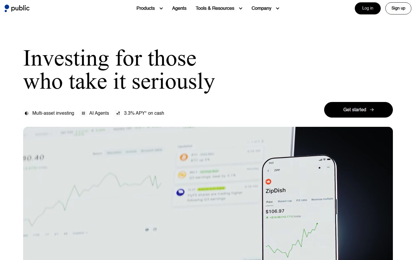
Public.com's marketing surface is a serious, editorial fintech interface — a pure-white canvas (`{colors.canvas}` — #ffffff) carrying a high-contrast light serif headline ("Investing for those who take it seriously") set in **Denton** at weight 300, paired with a grotesque UI sans (**Invest Pro**) for navigation, body, and buttons. The system reads as restrained, premium brokerage software: almost no chrome, no measured shadows, and black pill-shaped CTAs that carry the only strong color voltage on the page.
The type voice is deliberately bifurcated: **Denton** (a light, high-contrast didone-style serif) does the emotional, editorial work in the hero headline and the large section heads; **Invest Pro** (a neutral grotesque) does everything functional — nav links, body copy, button labels, table data. The serif-at-weight-300 against tiny weight-500 sans is the signature contrast of the brand.
Brand color lives almost entirely *inside* embedded product UI — charts, holdings rows, the iPhone "ZipDish" mockup — rather than on marketing surfaces. The marketing layer itself is near-monochrome: black ink on white, with a cool slate-blue accent family (`{colors.slate}`, `{colors.brand-blue}`, `{colors.link}`) appearing in app screenshots, the dark-blue logo mark, and inline links. One dark band ("The new standard. For active trading.") inverts to a full-black surface (`{colors.ink}`) to break the long white scroll.
**Key Characteristics:**
- Pure-white canvas with black pill CTAs (`{component.button-primary}` — `{colors.ink}` background, `{rounded.circle}` 100px radius, 0×40px padding). The "Get started" and "Log in" pills are the loudest elements on the page.
- Light serif display headlines in **Denton** weight 300 (substituted with Cormorant Garamond here) — the editorial, premium voice. Headline sizes measured at 48px (`{typography.heading}`) and 80px (`{typography.display}`).
- Functional sans (**Invest Pro**, substituted with Inter) for nav, body, and buttons — weight 400–500, small sizes (14–24px).
- Near-zero elevation — analysis captured no box-shadows; content cards measured with `0px` radius (`{rounded.xs}` 4px is the smallest documented step). The system relies on color blocks and hairlines, not shadows.
- A cool slate-blue accent family (`{colors.slate}`, `{colors.slate-light}`, `{colors.brand-blue}`) carried mostly inside embedded product UI fragments rather than marketing chrome.
- One full-black inverted band (`{component.dark-band}`) splits the long white scroll — the only dark surface in the system.
- Inline links use the classic browser blue (`{colors.link}` — #0000ee), reinforcing the no-nonsense, document-like tone.
## Colors
### Brand & Accent
- **Link** (`{colors.link}` — #0000ee): Classic browser-blue used on inline text links — a deliberate plain-document signal.
- **Brand Blue family** (`{colors.brand-blue}` — #0038ff, `{colors.brand-blue-mid}` — #0038df, `{colors.brand-blue-deep}` — #0027b3, `{colors.brand-blue-darker}` — #00379a): A saturated blue ramp appearing in the logo mark, chart accents, and app UI. These are product/brand blues, not marketing-CTA colors.
- **Accent Blue** (`{colors.accent-blue}` — #007aff, `{colors.accent-blue-soft}` — #99afff): Lighter blues observed inside embedded product UI (chart fills, data highlights).
### Slate / Cool Neutrals
- **Slate** (`{colors.slate}` — #516880): The most frequent cool neutral — used for secondary UI text and chart/iconography inside product fragments.
- **Slate Mid** (`{colors.slate-mid}` — #6b8aaf) and **Slate Light** (`{colors.slate-light}` — #a8b4bf): Lighter cool tones for muted labels and chart gridlines.
- **Ink Slate** (`{colors.ink-slate}` — #34374c): A near-black with a cool cast, used in dense product UI.
### Surface
- **Canvas** (`{colors.canvas}` — #ffffff): The default page floor — dominant across the whole page.
- **Muted** (`{colors.muted}` — #fafafa): A barely-off-white captured on low-contrast text/surfaces.
- **Surface Cool** (`{colors.surface-cool}` — #f1f4f7) and **Surface Cool Alt** (`{colors.surface-cool-alt}` — #e9edf3): The light cool-gray fills behind the AI-feature cards and embedded UI panels.
- **Surface Slate** (`{colors.surface-slate}` — #dce2ea): A slightly deeper cool fill for nested panels.
- **Hairline** (`{colors.hairline}` — #e8e8e8): The 1px divider tone on light surfaces.
### Text
- **Ink** (`{colors.ink}` — #000000): All headlines and primary text — pure black.
- **Ink Soft** (`{colors.ink-soft}` — #242527): A near-black for dense body text.
- **Neutral** (`{colors.neutral}` — #555555): Secondary/muted running text.
- **On Primary** (`{colors.on-primary}` — #ffffff): Text on black pill buttons and the dark band.
## Typography
### Font Family
The system runs two custom faces: **Denton** for display headlines and **Invest Pro** for all functional text. Denton is a high-contrast, light-weight serif (didone lineage) — it carries the hero headline and the large section heads at weight 300. Invest Pro is a neutral grotesque sans used for navigation, body, buttons, badges, and table data at weights 400–500.
The split is strict:
- Denton (serif, weight 300) — hero headline, large editorial section heads
- Invest Pro (sans, weight 400–500) — titles, body, buttons, nav, embedded UI labels
### Hierarchy
| Token | Family | Size | Weight | Line Height | Letter Spacing | Use |
|---|---|---|---|---|---|---|
| `{typography.display}` | Denton | 80px | 300 | 1.0 | normal | Largest editorial section heads ("The new standard.") |
| `{typography.heading}` | Denton | 48px | 300 | 1.12 | normal | Hero h1 ("Investing for those who take it seriously") |
| `{typography.title}` | Invest Pro | 24px | 400 | 1.167 | normal | Card titles, sub-section labels |
| `{typography.body}` | Invest Pro | 14px | 500 | 1.286 | normal | Default running text, nav, captions, table data |
| `{typography.button}` | Invest Pro | 16px | 500 | 1.37 | normal | Button labels |
Note: the measured `h2` (Denton 80px) is *larger* than the measured `h1` (Denton 48px) — the hero headline is the 48px setting while the largest editorial heads appear deeper in the page at 80px. Both are documented as captured.
### Principles
Denton is the emotional voice — used only for the hero and the biggest section heads, always at weight 300. Never set Denton heavier; the light weight against its high-contrast strokes is the entire effect. Invest Pro handles all functional text and never appears at display sizes. The serif/sans boundary is the brand: don't set body copy in Denton, don't set a hero headline in Invest Pro.
### Note on Font Substitutes
Both Denton and Invest Pro are custom/commercial faces not available as open web fonts (treat them as licensed even though analysis did not flag them). For Denton, **Cormorant Garamond** at weight 300 is the closest open-source approximation — it preserves the high-contrast, light didone character. **Playfair Display** is a heavier alternative if more presence is needed. For Invest Pro, **Inter** at weights 400–500 is a faithful grotesque substitute. The fallback stacks declared above (`Cormorant Garamond, Georgia, serif` and `Inter, sans-serif`) reflect these substitutions.
## Layout
### Spacing System
- **Base unit:** 4px.
- **Tokens:** `{spacing.xxs}` 4px · `{spacing.xs}` 8px · `{spacing.sm}` 12px · `{spacing.md}` 16px · `{spacing.lg}` 24px · `{spacing.xl}` 32px · `{spacing.xxl}` 40px · `{spacing.huge}` 56px · `{spacing.giant}` 60px · `{spacing.section}` 112px · `{spacing.mega}` 160px.
- **Dominant rhythm:** 8px (`{spacing.xs}`) is by far the most frequent gap (125 occurrences) — the system packs UI fragments on a tight 8px grid. 32px (`{spacing.xl}`) and 24px (`{spacing.lg}`) carry mid-level card spacing.
- **Section padding:** `{spacing.section}` (112px) between major editorial bands; `{spacing.mega}` (160px) appears once for the largest vertical break.
### Grid & Container
- **Editorial body:** Left-aligned single-column hero (headline at left, no right-rail) followed by full-width product mockup.
- **Feature grids:** AI-features section runs 1-up and 2-up card rows alternating; "Five nerdy features" runs 2-up.
- **Dark band:** 3-up column layout (Trade options / Lowest margin / API access).
### Whitespace Philosophy
The hero is generous and editorial — the light serif headline floats on white with significant breathing room and a single black CTA pill aligned right. Below the hero, the page tightens into dense, data-rich product cards on an 8px grid. The pacing alternates white feature bands with one full-black band to create a clear mid-page pivot from "the philosophy" to "the product."
## Elevation & Depth
| Level | Treatment | Use |
|---|---|---|
| Flat | No shadow, no border | Hero, top nav, body sections |
| Hairline | 1px `{colors.hairline}` (#e8e8e8) | Card dividers, table rows, input borders |
| Color-block | `{colors.surface-cool}` / `{colors.surface-cool-alt}` fills | Feature cards, embedded-UI panels |
| Inverted | `{colors.ink}` full-black band | The "active trading" band — contrast does the elevation work |
The analysis captured **zero box-shadows** — this is a deliberately flat system. Depth is created through color-block contrast (cool-gray panels on white) and one full-black inverted band, never through drop shadows. Content cards were measured at `0px` radius, reinforcing the sharp, document-like, no-frills aesthetic.
### Decorative Depth
- Embedded product UI fragments (the iPhone "ZipDish" mockup, charts, holdings tables) carry their own internal chrome and subtle shading from the product itself — these are content, not system tokens.
- The hero product image is a large composite screenshot/photo bleed, the only photographic element; everything else is flat UI.
## Shapes
### Border Radius Scale
| Token | Value | Use |
|---|---|---|
| `{rounded.xs}` | 4px | Most common radius (21 occurrences) — small UI chips, embedded panels, card corners |
| `{rounded.sm}` | 6px | Text inputs (`{component.input}`) |
| `{rounded.md}` | 12px | Product-mockup card containers |
| `{rounded.lg}` | 16px | Larger panel containers |
| `{rounded.circle}` | 100px | Pill buttons (`{component.button-primary}`) |
| `{rounded.pill}` | 999px | Fully-rounded pills, badges, secondary buttons |
### Geometry
Marketing content cards measured at `0px` radius — sharp, editorial, document-like. The softer radii (4–16px) appear on embedded product UI panels and inputs. The strongest shape signal is the fully-rounded black CTA pill (`{rounded.circle}` 100px) against the otherwise square layout.
## Components
### Top Navigation
**`top-nav`** — White nav bar across the top of the page. Background `{colors.canvas}`, text `{colors.ink}`, type `{typography.body}` (Invest Pro 14px / 500). Carries the lowercase "public" wordmark + dark-blue dot mark at left; center menu (Products, Agents, Tools & Resources, Company) with dropdown carets; right cluster with a filled black "Log in" pill (`{component.button-primary}`) and an outlined white "Sign up" pill (`{component.button-secondary}`).
### Buttons
**`button-primary`** — The signature CTA. Background `{colors.ink}` (#000000), text `{colors.on-primary}`, type `{typography.button}` (Invest Pro 16px / 500), radius `{rounded.circle}` (100px — fully rounded pill), padding 0×40px. Used for "Get started" (large) and "Log in" (compact). Often carries a trailing → arrow.
**`button-secondary`** — Outlined white pill. Background `{colors.canvas}`, text `{colors.ink}`, 1px hairline border, radius `{rounded.pill}` (999px), padding 0×40px. Used for "Sign up" in the nav.
**`text-link`** — Inline link in `{colors.link}` (#0000ee), type `{typography.body}`. Used for "Learn more →" links throughout feature cards.
### Cards & Containers
**`hero-band`** — White-canvas hero with left-aligned Denton headline, a small feature row ("Multi-asset investing · AI Agents · 3.3% APY* on cash"), and a right-aligned black CTA pill. Vertical padding `{spacing.section}` (112px). Below sits a full-width product composite image.
**`card`** — The base feature card. Background `{colors.surface-cool}` (#f1f4f7), text `{colors.ink}`, type `{typography.body}`, radius `{rounded.xs}` (4px — measured at 0px on some instances; sharp corners). No shadow. Used across the "Bring AI into every part of your investing experience" grid.
**`product-mockup-card`** — A card holding actual Public product UI (Agents panel, market briefing, generated assets, earnings-call summaries). Background `{colors.canvas}`, radius `{rounded.md}` (12px). The product UI inside carries its own chrome — these cards display the product, not decoration around it.
**`dark-band`** — The full-black inverted band ("The new standard. For active trading."). Background `{colors.ink}`, text `{colors.on-primary}`, title type `{typography.title}`, padding `{spacing.section}` (112px). Holds a 3-up comparison/feature layout (Trade options / Lowest margin rates / API access). The only dark surface in the system.
### Inputs & Forms
**`input`** — Text input. Background `{colors.canvas}`, text `{colors.ink}`, type `{typography.body}`, radius `{rounded.sm}` (6px), 1px hairline border in `{colors.hairline}`.
### Tags / Badges
**`badge-pill`** — Small inline pill used for data labels inside product UI ("5.70% yield", "3.30% APY*", "1% MATCH"). Background `{colors.surface-cool}`, text `{colors.ink}`, type `{typography.body}`, radius `{rounded.pill}`, padding 4×8px.
## Do's and Don'ts
### Do
- Reserve `{colors.ink}` (#000000) pill buttons for primary actions. The black `{rounded.circle}` pill is the loudest brand element — use it sparingly.
- Set hero and large section heads in Denton weight 300. The light serif is the editorial voice.
- Use Invest Pro for all functional text — nav, body, buttons, table data — at weights 400–500.
- Keep marketing surfaces near-monochrome (black ink on white). Let blue and slate live inside embedded product UI.
- Use cool-gray color blocks (`{colors.surface-cool}`, `{colors.surface-cool-alt}`) for feature cards — not shadows — to separate panels.
- Embed real product UI fragments inside cards (Agents panel, charts, the ZipDish mockup) rather than illustrating the product.
- Use the single dark band (`{component.dark-band}`) as the page's mid-scroll pivot. Keep it scarce.
### Don't
- Don't set Denton heavier than weight 300 — the high-contrast serif depends on its light weight.
- Don't add drop shadows. The analysis captured none; the system is intentionally flat.
- Don't put body copy in Denton or hero headlines in Invest Pro — the serif/sans boundary is the brand.
- Don't add more dark surfaces beyond the one active-trading band.
- Don't round marketing content cards heavily — they stay sharp (0–4px); only the pill CTAs are fully rounded.
- Don't recolor primary CTAs blue — the blue family belongs to the logo, links, and product UI, not the marketing CTA layer.
## Responsive Behavior
### Breakpoints
The analysis captured a single desktop landing render plus a full-page scroll. Breakpoint values were not measured; the following is derived from the desktop composition and standard practice.
| Name | Width | Key Changes (derived) |
|---|---|---|
| Mobile | < 768px | Hamburger nav; hero headline scales down from 48px; feature grids collapse to 1-up; dark-band 3-up stacks vertically |
| Tablet | 768–1024px | Nav tightens; feature cards 1–2-up |
| Desktop | 1024–1440px | Full horizontal nav; 2-up feature grids; 3-up dark band |
| Wide | > 1440px | Same as desktop with more outer breathing room |
### Touch Targets
- `{component.button-primary}` uses 0×40px padding with the `{typography.button}` 16px label; effective height clears comfortable tap minimums (derived).
- `{component.input}` radius is `{rounded.sm}` (6px); height not measured.
### Collapsing Strategy (derived)
- Top nav collapses to a hamburger at narrow widths.
- The hero's left-aligned headline + right-aligned CTA pill stack vertically on mobile.
- Feature grids reduce columns rather than scaling card content.
- The dark band's 3-up comparison columns stack to a single column.
## Iteration Guide
1. Focus on ONE component at a time. Reference its YAML key directly (`{component.button-primary}`, `{component.product-mockup-card}`).
2. Variants (`-active`, `-disabled`, `-focused`) live as separate entries in `components:`.
3. Use `{token.refs}` everywhere — never inline a hex in a component.
4. Never document hover. Default and Active/Pressed states only.
5. Hero and large heads stay Denton 300; functional text stays Invest Pro 400–500. The serif/sans split does not blur.
6. The system is flat — no shadows. Reach for color blocks and hairlines for separation.
7. The black pill CTA and the single dark band are scarce signals — don't multiply them.
## Known Gaps
- **Active/pressed, focus, and disabled states** for buttons and inputs were not extracted — only default rendering was measured. These need a live interaction capture.
- **Shadows:** the analysis captured zero box-shadows. If subtle elevation exists on hover or in product UI, it was not measured and is documented as flat.
- **Denton and Invest Pro are treated as custom/licensed** (not flagged in `fonts_licensed`, but neither is an open web font). Open-source substitutes are documented in Typography; exact metrics of the originals are not reproduced.
- **The `h1`/`h2` size inversion** (48px hero vs 80px deeper heads) is documented exactly as measured; the semantic role mapping may differ from the source markup.
- **Spacing tokens at 22px, 36px** were measured but omitted from the named scale to keep the rhythm clean; treat them as one-off values.
- **Breakpoints and touch-target heights** are derived from a single desktop capture, not measured across viewports.
- **The accent/blue color family** (`{colors.brand-blue}`, `{colors.slate}`, etc.) was captured largely from embedded product UI; exact usage on marketing chrome vs. product chrome may shift, and the blue ramp may be a single brand blue rendered at varying opacity.
- **The embedded app UI** (charts, holdings tables, ZipDish mockup) is the product, not a marketing surface — its component spec is out of scope.
- **Card radius** was measured at both `0px` and small values across instances; `{rounded.xs}` (4px) is documented as the smallest reliable step, but some cards render fully square.
<!-- Documented by duply · real-world design systems as ready-to-use DESIGN.md for AI coding agents · https://duply.ai/public/design-md -->
Color Palette
Accent
Neutrals
Typography
display80px · 300 · 1
The quick brown fox jumpsheading48px · 300 · 1.12
The quick brown fox jumpstitle24px · 400 · 1.167
The quick brown fox jumpsbody14px · 500 · 1.286
The quick brown fox jumpsbutton16px · 500 · 1.37
The quick brown fox jumpsSpacing & Shape
Spacing
| Name | Value | Preview |
|---|---|---|
| xxs | 4px | |
| xs | 8px | |
| sm | 12px | |
| md | 16px | |
| lg | 24px | |
| xl | 32px | |
| xxl | 40px | |
| huge | 56px | |
| giant | 60px | |
| section | 112px | |
| mega | 160px |
Border Radius
| Name | Value | Preview |
|---|---|---|
| xs | 4px | |
| sm | 6px | |
| md | 12px | |
| lg | 16px | |
| circle | 100px | |
| pill | 999px |
More like this


---
version: alpha
name: Public.com-design-analysis
description: A serious, editorial fintech interface anchored on a pure-white canvas with a high-contrast light serif (Denton) headline voice and a grotesque UI sans (Invest Pro) for everything else. The system reads as confident-but-restrained brokerage software — black pill CTAs, near-zero chrome, no shadows, sharp-cornered content cards, and a cool slate-blue accent family carried mostly inside embedded product UI rather than on marketing surfaces.

colors:
  ink: "#000000"
  ink-soft: "#242527"
  ink-slate: "#34374c"
  neutral: "#555555"
  slate: "#516880"
  slate-mid: "#6b8aaf"
  slate-light: "#a8b4bf"
  canvas: "#ffffff"
  muted: "#fafafa"
  surface-cool: "#f1f4f7"
  surface-cool-alt: "#e9edf3"
  surface-slate: "#dce2ea"
  hairline: "#e8e8e8"
  link: "#0000ee"
  brand-blue: "#0038ff"
  brand-blue-mid: "#0038df"
  brand-blue-deep: "#0027b3"
  brand-blue-darker: "#00379a"
  accent-blue: "#007aff"
  accent-blue-soft: "#99afff"
  on-primary: "#ffffff"

typography:
  display:
    fontFamily: "Denton, Cormorant Garamond, Georgia, serif"
    fontSize: 80px
    fontWeight: 300
    lineHeight: 1.0
    letterSpacing: normal
  heading:
    fontFamily: "Denton, Cormorant Garamond, Georgia, serif"
    fontSize: 48px
    fontWeight: 300
    lineHeight: 1.12
    letterSpacing: normal
  title:
    fontFamily: "Invest Pro, Inter, sans-serif"
    fontSize: 24px
    fontWeight: 400
    lineHeight: 1.167
    letterSpacing: normal
  body:
    fontFamily: "Invest Pro, Inter, sans-serif"
    fontSize: 14px
    fontWeight: 500
    lineHeight: 1.286
    letterSpacing: normal
  button:
    fontFamily: "Invest Pro, Inter, sans-serif"
    fontSize: 16px
    fontWeight: 500
    lineHeight: 1.37
    letterSpacing: normal

rounded:
  xs: 4px
  sm: 6px
  md: 12px
  lg: 16px
  circle: 100px
  pill: 999px

spacing:
  xxs: 4px
  xs: 8px
  sm: 12px
  md: 16px
  lg: 24px
  xl: 32px
  xxl: 40px
  huge: 56px
  giant: 60px
  section: 112px
  mega: 160px

components:
  top-nav:
    backgroundColor: "{colors.canvas}"
    textColor: "{colors.ink}"
    typography: "{typography.body}"
  button-primary:
    backgroundColor: "{colors.ink}"
    textColor: "{colors.on-primary}"
    typography: "{typography.button}"
    rounded: "{rounded.circle}"
    padding: 0px 40px
  button-secondary:
    backgroundColor: "{colors.canvas}"
    textColor: "{colors.ink}"
    typography: "{typography.button}"
    rounded: "{rounded.pill}"
    padding: 0px 40px
  text-link:
    backgroundColor: transparent
    textColor: "{colors.link}"
    typography: "{typography.body}"
  hero-band:
    backgroundColor: "{colors.canvas}"
    textColor: "{colors.ink}"
    typography: "{typography.display}"
    padding: 112px
  card:
    backgroundColor: "{colors.surface-cool}"
    textColor: "{colors.ink}"
    typography: "{typography.body}"
    rounded: "{rounded.xs}"
  product-mockup-card:
    backgroundColor: "{colors.canvas}"
    textColor: "{colors.ink}"
    typography: "{typography.body}"
    rounded: "{rounded.md}"
  dark-band:
    backgroundColor: "{colors.ink}"
    textColor: "{colors.on-primary}"
    typography: "{typography.title}"
    padding: 112px
  input:
    backgroundColor: "{colors.canvas}"
    textColor: "{colors.ink}"
    typography: "{typography.body}"
    rounded: "{rounded.sm}"
  badge-pill:
    backgroundColor: "{colors.surface-cool}"
    textColor: "{colors.ink}"
    typography: "{typography.body}"
    rounded: "{rounded.pill}"
    padding: 4px 8px
---

## Overview

Public.com's marketing surface is a serious, editorial fintech interface — a pure-white canvas (`{colors.canvas}` — #ffffff) carrying a high-contrast light serif headline ("Investing for those who take it seriously") set in **Denton** at weight 300, paired with a grotesque UI sans (**Invest Pro**) for navigation, body, and buttons. The system reads as restrained, premium brokerage software: almost no chrome, no measured shadows, and black pill-shaped CTAs that carry the only strong color voltage on the page.

The type voice is deliberately bifurcated: **Denton** (a light, high-contrast didone-style serif) does the emotional, editorial work in the hero headline and the large section heads; **Invest Pro** (a neutral grotesque) does everything functional — nav links, body copy, button labels, table data. The serif-at-weight-300 against tiny weight-500 sans is the signature contrast of the brand.

Brand color lives almost entirely *inside* embedded product UI — charts, holdings rows, the iPhone "ZipDish" mockup — rather than on marketing surfaces. The marketing layer itself is near-monochrome: black ink on white, with a cool slate-blue accent family (`{colors.slate}`, `{colors.brand-blue}`, `{colors.link}`) appearing in app screenshots, the dark-blue logo mark, and inline links. One dark band ("The new standard. For active trading.") inverts to a full-black surface (`{colors.ink}`) to break the long white scroll.

**Key Characteristics:**
- Pure-white canvas with black pill CTAs (`{component.button-primary}` — `{colors.ink}` background, `{rounded.circle}` 100px radius, 0×40px padding). The "Get started" and "Log in" pills are the loudest elements on the page.
- Light serif display headlines in **Denton** weight 300 (substituted with Cormorant Garamond here) — the editorial, premium voice. Headline sizes measured at 48px (`{typography.heading}`) and 80px (`{typography.display}`).
- Functional sans (**Invest Pro**, substituted with Inter) for nav, body, and buttons — weight 400–500, small sizes (14–24px).
- Near-zero elevation — analysis captured no box-shadows; content cards measured with `0px` radius (`{rounded.xs}` 4px is the smallest documented step). The system relies on color blocks and hairlines, not shadows.
- A cool slate-blue accent family (`{colors.slate}`, `{colors.slate-light}`, `{colors.brand-blue}`) carried mostly inside embedded product UI fragments rather than marketing chrome.
- One full-black inverted band (`{component.dark-band}`) splits the long white scroll — the only dark surface in the system.
- Inline links use the classic browser blue (`{colors.link}` — #0000ee), reinforcing the no-nonsense, document-like tone.

## Colors

### Brand & Accent
- **Link** (`{colors.link}` — #0000ee): Classic browser-blue used on inline text links — a deliberate plain-document signal.
- **Brand Blue family** (`{colors.brand-blue}` — #0038ff, `{colors.brand-blue-mid}` — #0038df, `{colors.brand-blue-deep}` — #0027b3, `{colors.brand-blue-darker}` — #00379a): A saturated blue ramp appearing in the logo mark, chart accents, and app UI. These are product/brand blues, not marketing-CTA colors.
- **Accent Blue** (`{colors.accent-blue}` — #007aff, `{colors.accent-blue-soft}` — #99afff): Lighter blues observed inside embedded product UI (chart fills, data highlights).

### Slate / Cool Neutrals
- **Slate** (`{colors.slate}` — #516880): The most frequent cool neutral — used for secondary UI text and chart/iconography inside product fragments.
- **Slate Mid** (`{colors.slate-mid}` — #6b8aaf) and **Slate Light** (`{colors.slate-light}` — #a8b4bf): Lighter cool tones for muted labels and chart gridlines.
- **Ink Slate** (`{colors.ink-slate}` — #34374c): A near-black with a cool cast, used in dense product UI.

### Surface
- **Canvas** (`{colors.canvas}` — #ffffff): The default page floor — dominant across the whole page.
- **Muted** (`{colors.muted}` — #fafafa): A barely-off-white captured on low-contrast text/surfaces.
- **Surface Cool** (`{colors.surface-cool}` — #f1f4f7) and **Surface Cool Alt** (`{colors.surface-cool-alt}` — #e9edf3): The light cool-gray fills behind the AI-feature cards and embedded UI panels.
- **Surface Slate** (`{colors.surface-slate}` — #dce2ea): A slightly deeper cool fill for nested panels.
- **Hairline** (`{colors.hairline}` — #e8e8e8): The 1px divider tone on light surfaces.

### Text
- **Ink** (`{colors.ink}` — #000000): All headlines and primary text — pure black.
- **Ink Soft** (`{colors.ink-soft}` — #242527): A near-black for dense body text.
- **Neutral** (`{colors.neutral}` — #555555): Secondary/muted running text.
- **On Primary** (`{colors.on-primary}` — #ffffff): Text on black pill buttons and the dark band.

## Typography

### Font Family
The system runs two custom faces: **Denton** for display headlines and **Invest Pro** for all functional text. Denton is a high-contrast, light-weight serif (didone lineage) — it carries the hero headline and the large section heads at weight 300. Invest Pro is a neutral grotesque sans used for navigation, body, buttons, badges, and table data at weights 400–500.

The split is strict:
- Denton (serif, weight 300) — hero headline, large editorial section heads
- Invest Pro (sans, weight 400–500) — titles, body, buttons, nav, embedded UI labels

### Hierarchy

| Token | Family | Size | Weight | Line Height | Letter Spacing | Use |
|---|---|---|---|---|---|---|
| `{typography.display}` | Denton | 80px | 300 | 1.0 | normal | Largest editorial section heads ("The new standard.") |
| `{typography.heading}` | Denton | 48px | 300 | 1.12 | normal | Hero h1 ("Investing for those who take it seriously") |
| `{typography.title}` | Invest Pro | 24px | 400 | 1.167 | normal | Card titles, sub-section labels |
| `{typography.body}` | Invest Pro | 14px | 500 | 1.286 | normal | Default running text, nav, captions, table data |
| `{typography.button}` | Invest Pro | 16px | 500 | 1.37 | normal | Button labels |

Note: the measured `h2` (Denton 80px) is *larger* than the measured `h1` (Denton 48px) — the hero headline is the 48px setting while the largest editorial heads appear deeper in the page at 80px. Both are documented as captured.

### Principles
Denton is the emotional voice — used only for the hero and the biggest section heads, always at weight 300. Never set Denton heavier; the light weight against its high-contrast strokes is the entire effect. Invest Pro handles all functional text and never appears at display sizes. The serif/sans boundary is the brand: don't set body copy in Denton, don't set a hero headline in Invest Pro.

### Note on Font Substitutes
Both Denton and Invest Pro are custom/commercial faces not available as open web fonts (treat them as licensed even though analysis did not flag them). For Denton, **Cormorant Garamond** at weight 300 is the closest open-source approximation — it preserves the high-contrast, light didone character. **Playfair Display** is a heavier alternative if more presence is needed. For Invest Pro, **Inter** at weights 400–500 is a faithful grotesque substitute. The fallback stacks declared above (`Cormorant Garamond, Georgia, serif` and `Inter, sans-serif`) reflect these substitutions.

## Layout

### Spacing System
- **Base unit:** 4px.
- **Tokens:** `{spacing.xxs}` 4px · `{spacing.xs}` 8px · `{spacing.sm}` 12px · `{spacing.md}` 16px · `{spacing.lg}` 24px · `{spacing.xl}` 32px · `{spacing.xxl}` 40px · `{spacing.huge}` 56px · `{spacing.giant}` 60px · `{spacing.section}` 112px · `{spacing.mega}` 160px.
- **Dominant rhythm:** 8px (`{spacing.xs}`) is by far the most frequent gap (125 occurrences) — the system packs UI fragments on a tight 8px grid. 32px (`{spacing.xl}`) and 24px (`{spacing.lg}`) carry mid-level card spacing.
- **Section padding:** `{spacing.section}` (112px) between major editorial bands; `{spacing.mega}` (160px) appears once for the largest vertical break.

### Grid & Container
- **Editorial body:** Left-aligned single-column hero (headline at left, no right-rail) followed by full-width product mockup.
- **Feature grids:** AI-features section runs 1-up and 2-up card rows alternating; "Five nerdy features" runs 2-up.
- **Dark band:** 3-up column layout (Trade options / Lowest margin / API access).

### Whitespace Philosophy
The hero is generous and editorial — the light serif headline floats on white with significant breathing room and a single black CTA pill aligned right. Below the hero, the page tightens into dense, data-rich product cards on an 8px grid. The pacing alternates white feature bands with one full-black band to create a clear mid-page pivot from "the philosophy" to "the product."

## Elevation & Depth

| Level | Treatment | Use |
|---|---|---|
| Flat | No shadow, no border | Hero, top nav, body sections |
| Hairline | 1px `{colors.hairline}` (#e8e8e8) | Card dividers, table rows, input borders |
| Color-block | `{colors.surface-cool}` / `{colors.surface-cool-alt}` fills | Feature cards, embedded-UI panels |
| Inverted | `{colors.ink}` full-black band | The "active trading" band — contrast does the elevation work |

The analysis captured **zero box-shadows** — this is a deliberately flat system. Depth is created through color-block contrast (cool-gray panels on white) and one full-black inverted band, never through drop shadows. Content cards were measured at `0px` radius, reinforcing the sharp, document-like, no-frills aesthetic.

### Decorative Depth
- Embedded product UI fragments (the iPhone "ZipDish" mockup, charts, holdings tables) carry their own internal chrome and subtle shading from the product itself — these are content, not system tokens.
- The hero product image is a large composite screenshot/photo bleed, the only photographic element; everything else is flat UI.

## Shapes

### Border Radius Scale

| Token | Value | Use |
|---|---|---|
| `{rounded.xs}` | 4px | Most common radius (21 occurrences) — small UI chips, embedded panels, card corners |
| `{rounded.sm}` | 6px | Text inputs (`{component.input}`) |
| `{rounded.md}` | 12px | Product-mockup card containers |
| `{rounded.lg}` | 16px | Larger panel containers |
| `{rounded.circle}` | 100px | Pill buttons (`{component.button-primary}`) |
| `{rounded.pill}` | 999px | Fully-rounded pills, badges, secondary buttons |

### Geometry
Marketing content cards measured at `0px` radius — sharp, editorial, document-like. The softer radii (4–16px) appear on embedded product UI panels and inputs. The strongest shape signal is the fully-rounded black CTA pill (`{rounded.circle}` 100px) against the otherwise square layout.

## Components

### Top Navigation

**`top-nav`** — White nav bar across the top of the page. Background `{colors.canvas}`, text `{colors.ink}`, type `{typography.body}` (Invest Pro 14px / 500). Carries the lowercase "public" wordmark + dark-blue dot mark at left; center menu (Products, Agents, Tools & Resources, Company) with dropdown carets; right cluster with a filled black "Log in" pill (`{component.button-primary}`) and an outlined white "Sign up" pill (`{component.button-secondary}`).

### Buttons

**`button-primary`** — The signature CTA. Background `{colors.ink}` (#000000), text `{colors.on-primary}`, type `{typography.button}` (Invest Pro 16px / 500), radius `{rounded.circle}` (100px — fully rounded pill), padding 0×40px. Used for "Get started" (large) and "Log in" (compact). Often carries a trailing → arrow.

**`button-secondary`** — Outlined white pill. Background `{colors.canvas}`, text `{colors.ink}`, 1px hairline border, radius `{rounded.pill}` (999px), padding 0×40px. Used for "Sign up" in the nav.

**`text-link`** — Inline link in `{colors.link}` (#0000ee), type `{typography.body}`. Used for "Learn more →" links throughout feature cards.

### Cards & Containers

**`hero-band`** — White-canvas hero with left-aligned Denton headline, a small feature row ("Multi-asset investing · AI Agents · 3.3% APY* on cash"), and a right-aligned black CTA pill. Vertical padding `{spacing.section}` (112px). Below sits a full-width product composite image.

**`card`** — The base feature card. Background `{colors.surface-cool}` (#f1f4f7), text `{colors.ink}`, type `{typography.body}`, radius `{rounded.xs}` (4px — measured at 0px on some instances; sharp corners). No shadow. Used across the "Bring AI into every part of your investing experience" grid.

**`product-mockup-card`** — A card holding actual Public product UI (Agents panel, market briefing, generated assets, earnings-call summaries). Background `{colors.canvas}`, radius `{rounded.md}` (12px). The product UI inside carries its own chrome — these cards display the product, not decoration around it.

**`dark-band`** — The full-black inverted band ("The new standard. For active trading."). Background `{colors.ink}`, text `{colors.on-primary}`, title type `{typography.title}`, padding `{spacing.section}` (112px). Holds a 3-up comparison/feature layout (Trade options / Lowest margin rates / API access). The only dark surface in the system.

### Inputs & Forms

**`input`** — Text input. Background `{colors.canvas}`, text `{colors.ink}`, type `{typography.body}`, radius `{rounded.sm}` (6px), 1px hairline border in `{colors.hairline}`.

### Tags / Badges

**`badge-pill`** — Small inline pill used for data labels inside product UI ("5.70% yield", "3.30% APY*", "1% MATCH"). Background `{colors.surface-cool}`, text `{colors.ink}`, type `{typography.body}`, radius `{rounded.pill}`, padding 4×8px.

## Do's and Don'ts

### Do
- Reserve `{colors.ink}` (#000000) pill buttons for primary actions. The black `{rounded.circle}` pill is the loudest brand element — use it sparingly.
- Set hero and large section heads in Denton weight 300. The light serif is the editorial voice.
- Use Invest Pro for all functional text — nav, body, buttons, table data — at weights 400–500.
- Keep marketing surfaces near-monochrome (black ink on white). Let blue and slate live inside embedded product UI.
- Use cool-gray color blocks (`{colors.surface-cool}`, `{colors.surface-cool-alt}`) for feature cards — not shadows — to separate panels.
- Embed real product UI fragments inside cards (Agents panel, charts, the ZipDish mockup) rather than illustrating the product.
- Use the single dark band (`{component.dark-band}`) as the page's mid-scroll pivot. Keep it scarce.

### Don't
- Don't set Denton heavier than weight 300 — the high-contrast serif depends on its light weight.
- Don't add drop shadows. The analysis captured none; the system is intentionally flat.
- Don't put body copy in Denton or hero headlines in Invest Pro — the serif/sans boundary is the brand.
- Don't add more dark surfaces beyond the one active-trading band.
- Don't round marketing content cards heavily — they stay sharp (0–4px); only the pill CTAs are fully rounded.
- Don't recolor primary CTAs blue — the blue family belongs to the logo, links, and product UI, not the marketing CTA layer.

## Responsive Behavior

### Breakpoints
The analysis captured a single desktop landing render plus a full-page scroll. Breakpoint values were not measured; the following is derived from the desktop composition and standard practice.

| Name | Width | Key Changes (derived) |
|---|---|---|
| Mobile | < 768px | Hamburger nav; hero headline scales down from 48px; feature grids collapse to 1-up; dark-band 3-up stacks vertically |
| Tablet | 768–1024px | Nav tightens; feature cards 1–2-up |
| Desktop | 1024–1440px | Full horizontal nav; 2-up feature grids; 3-up dark band |
| Wide | > 1440px | Same as desktop with more outer breathing room |

### Touch Targets
- `{component.button-primary}` uses 0×40px padding with the `{typography.button}` 16px label; effective height clears comfortable tap minimums (derived).
- `{component.input}` radius is `{rounded.sm}` (6px); height not measured.

### Collapsing Strategy (derived)
- Top nav collapses to a hamburger at narrow widths.
- The hero's left-aligned headline + right-aligned CTA pill stack vertically on mobile.
- Feature grids reduce columns rather than scaling card content.
- The dark band's 3-up comparison columns stack to a single column.

## Iteration Guide

1. Focus on ONE component at a time. Reference its YAML key directly (`{component.button-primary}`, `{component.product-mockup-card}`).
2. Variants (`-active`, `-disabled`, `-focused`) live as separate entries in `components:`.
3. Use `{token.refs}` everywhere — never inline a hex in a component.
4. Never document hover. Default and Active/Pressed states only.
5. Hero and large heads stay Denton 300; functional text stays Invest Pro 400–500. The serif/sans split does not blur.
6. The system is flat — no shadows. Reach for color blocks and hairlines for separation.
7. The black pill CTA and the single dark band are scarce signals — don't multiply them.

## Known Gaps

- **Active/pressed, focus, and disabled states** for buttons and inputs were not extracted — only default rendering was measured. These need a live interaction capture.
- **Shadows:** the analysis captured zero box-shadows. If subtle elevation exists on hover or in product UI, it was not measured and is documented as flat.
- **Denton and Invest Pro are treated as custom/licensed** (not flagged in `fonts_licensed`, but neither is an open web font). Open-source substitutes are documented in Typography; exact metrics of the originals are not reproduced.
- **The `h1`/`h2` size inversion** (48px hero vs 80px deeper heads) is documented exactly as measured; the semantic role mapping may differ from the source markup.
- **Spacing tokens at 22px, 36px** were measured but omitted from the named scale to keep the rhythm clean; treat them as one-off values.
- **Breakpoints and touch-target heights** are derived from a single desktop capture, not measured across viewports.
- **The accent/blue color family** (`{colors.brand-blue}`, `{colors.slate}`, etc.) was captured largely from embedded product UI; exact usage on marketing chrome vs. product chrome may shift, and the blue ramp may be a single brand blue rendered at varying opacity.
- **The embedded app UI** (charts, holdings tables, ZipDish mockup) is the product, not a marketing surface — its component spec is out of scope.
- **Card radius** was measured at both `0px` and small values across instances; `{rounded.xs}` (4px) is documented as the smallest reliable step, but some cards render fully square.

<!-- Documented by duply · real-world design systems as ready-to-use DESIGN.md for AI coding agents · https://duply.ai/public/design-md -->