NewFormCap
A stark editorial finance interface built on a pale mint-white canvas with near-black neo-grotesque headlines set at extreme scale. New Form Capital reads as confident, institutional, and minimal — a single oversized TWK Lausanne hero statement with black-and-white photographic tiles knitted directly into the headline lines, a tiny restrained wordmark, and a near-monochrome palette where a single electric green accent supplies all the brand voltage. The system is quiet at the surface and loud at the headline.
---
version: alpha
name: NewFormCap-design-analysis
description: A stark editorial finance interface built on a pale mint-white canvas with near-black neo-grotesque headlines set at extreme scale. New Form Capital reads as confident, institutional, and minimal — a single oversized TWK Lausanne hero statement with black-and-white photographic tiles knitted directly into the headline lines, a tiny restrained wordmark, and a near-monochrome palette where a single electric green accent supplies all the brand voltage. The system is quiet at the surface and loud at the headline.
colors:
primary: "#2e3830"
on-primary: "#000000"
accent: "#2bee4b"
ink: "#121613"
muted: "#516254"
muted-soft: "#3a463c"
surface-dark: "#232924"
canvas: "#fafffa"
hairline: "#c8d2c8"
on-dark: "#fafffa"
white: "#ffffff"
link: "#0000ee"
typography:
display-xl:
fontFamily: "TWK Lausanne, Inter, sans-serif"
fontSize: 155px
fontWeight: 550
lineHeight: 1.0
letterSpacing: -6.2px
label:
fontFamily: "TWK Lausanne, Inter, sans-serif"
fontSize: 18px
fontWeight: 550
lineHeight: 1.0
letterSpacing: -0.36px
body:
fontFamily: "TWK Lausanne, Inter, sans-serif"
fontSize: 16px
fontWeight: 200
lineHeight: 1.4
letterSpacing: 0.16px
rounded:
sm: 5px
md: 8px
lg: 10px
xl: 14px
spacing:
xxs: 8px
xs: 10px
sm: 15px
md: 20px
lg: 30px
xl: 40px
xxl: 50px
huge: 80px
section: 120px
components:
top-nav:
backgroundColor: "{colors.canvas}"
textColor: "{colors.ink}"
typography: "{typography.label}"
padding: 50px
logo-wordmark:
backgroundColor: transparent
textColor: "{colors.ink}"
typography: "{typography.label}"
menu-button:
backgroundColor: transparent
textColor: "{colors.ink}"
typography: "{typography.label}"
menu-indicator:
backgroundColor: transparent
textColor: "{colors.accent}"
hero-headline:
backgroundColor: "{colors.canvas}"
textColor: "{colors.ink}"
typography: "{typography.display-xl}"
padding: 50px
inline-image-tile:
backgroundColor: "{colors.surface-dark}"
textColor: "{colors.on-dark}"
rounded: "{rounded.lg}"
button-primary:
backgroundColor: "{colors.primary}"
textColor: "{colors.on-primary}"
typography: "{typography.label}"
rounded: "{rounded.lg}"
padding: 20px
body-text:
backgroundColor: "{colors.canvas}"
textColor: "{colors.muted}"
typography: "{typography.body}"
text-link:
backgroundColor: transparent
textColor: "{colors.link}"
typography: "{typography.body}"
---
## Overview
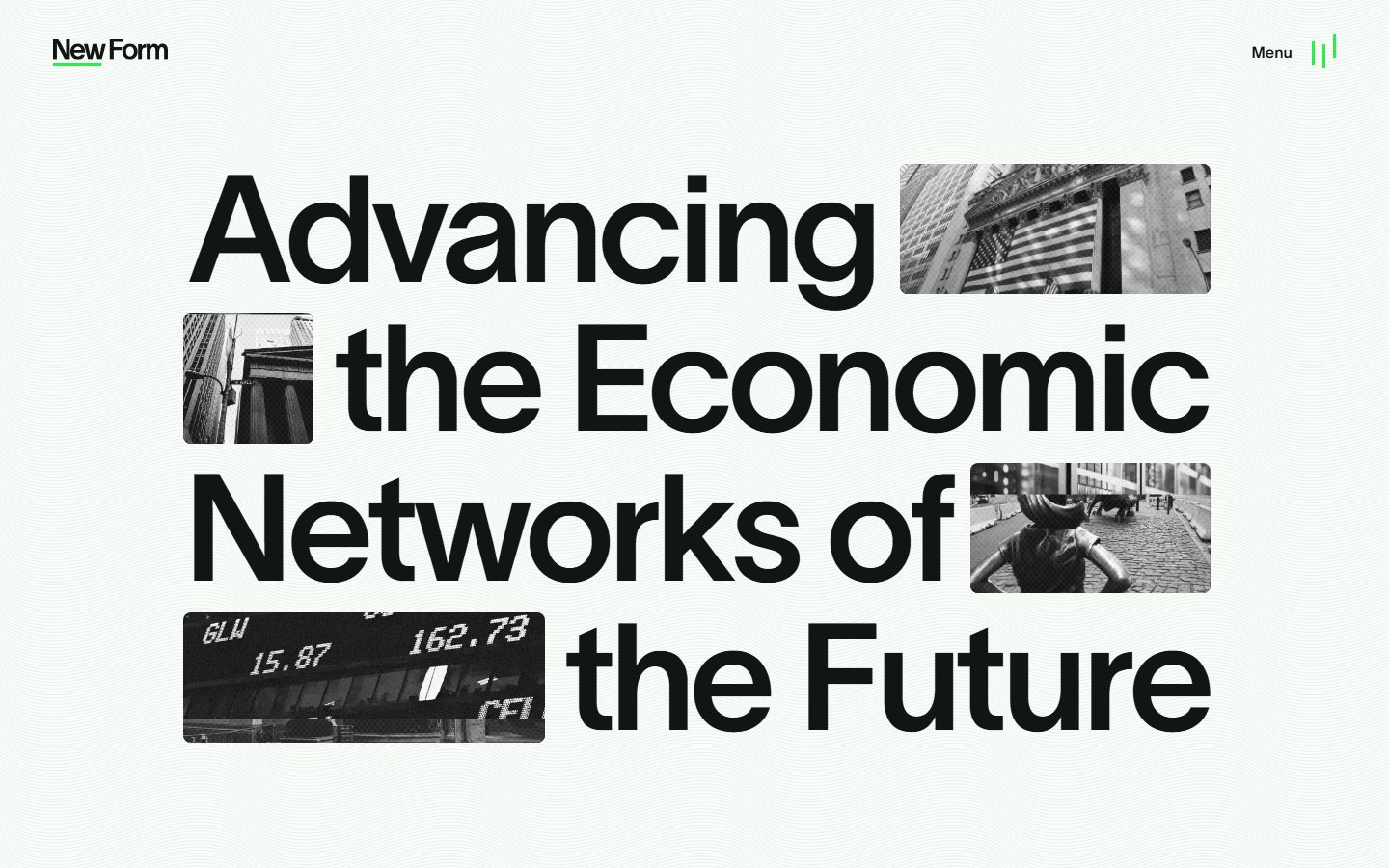
New Form Capital's landing surface is a stark editorial finance interface — a pale mint-white canvas (`{colors.canvas}` — #fafffa) carrying a single oversized near-black headline statement set in **TWK Lausanne** at 155px. The whole captured page is essentially one declarative hero: "Advancing the Economic Networks of the Future," with black-and-white photographic tiles (`{component.inline-image-tile}`) knitted directly into the headline lines where words would otherwise sit. The system reads as institutional, confident, and deliberately minimal.
The type voice is monolithic: one family (**TWK Lausanne**) carries the headline, the small nav label, and the body. The hero runs at weight 550 with aggressive negative tracking (-6.2px); body copy drops to a thin weight 200. There is no secondary display face — scale and weight do all the hierarchy work.
Color is near-monochrome. The canvas is an almost-white green-tinted off-white (`{colors.canvas}`), headlines are a deep near-black green-black (`{colors.ink}` — #121613), and a single electric green (`{colors.accent}` — #2bee4b) supplies all brand voltage: the underline beneath "New" in the wordmark and the equalizer-style bars beside the "Menu" trigger. Even the system's shadows carry a green tint, reinforcing the monochrome-with-green-spark identity.
**Key Characteristics:**
- Pale green-white canvas (`{colors.canvas}` — #fafffa) with deep green-black headlines (`{colors.ink}` — #121613). The contrast is near-maximal but warmed by the green undertone in both extremes.
- One typeface — **TWK Lausanne** (a licensed neo-grotesque; substituted with Inter here). Hierarchy comes entirely from scale (155px → 18px → 16px) and weight (550 → 200).
- A massive hero headline with extreme negative letter-spacing (-6.2px at 155px) — tight, confident, magazine-cover scale.
- Black-and-white photographic tiles (`{component.inline-image-tile}`) embedded inline within the headline lines, rounded `{rounded.lg}` (10px). The images sit where words would be — the page's signature compositional move.
- A single electric green accent (`{colors.accent}` — #2bee4b) used only on the wordmark underline and the menu indicator bars. Never on large surfaces.
- A tiny restrained two-word wordmark and a "Menu" text trigger anchor the corners — the chrome stays minimal so the headline dominates.
- Green-tinted drop shadows (`rgba(16, 94, 29, 0.45)` and `rgba(18, 146, 39, 0.25)`) — the only depth treatment, carrying the brand green even into elevation.
## Colors
### Brand & Accent
- **Accent** (`{colors.accent}` — #2bee4b): The single brand spark — electric green. Used on the underline beneath "New" in the wordmark and the small equalizer-style indicator bars next to the "Menu" trigger. It never fills a surface; it appears only as a thin line or small graphic accent. The brand's entire chromatic identity rides on this one color against an otherwise monochrome field.
- **Primary** (`{colors.primary}` — #2e3830): A dark desaturated green-gray measured as the primary button background. A near-neutral dark surface rather than a vivid action color.
### Surface
- **Canvas** (`{colors.canvas}` — #fafffa): The page floor — an almost-white green-tinted off-white. Every band sits on this.
- **Surface Dark** (`{colors.surface-dark}` — #232924): The dark surface tone behind the inline photographic tiles and dark blocks.
- **White** (`{colors.white}` — #ffffff): A pure white used sparingly within image tiles and small fills.
- **Hairline** (`{colors.hairline}` — #c8d2c8): A pale green-gray used for fine dividers and low-contrast separations.
### Text
- **Ink** (`{colors.ink}` — #121613): The headline and primary-text color — a deep green-black. Carries the entire 155px hero.
- **Muted** (`{colors.muted}` — #516254): Secondary / body text — a desaturated mid green-gray.
- **Muted Soft** (`{colors.muted-soft}` — #3a463c): Tertiary text and faint labels.
- **On Primary** (`{colors.on-primary}` — #000000): Pure black label color measured on the primary button.
- **On Dark** (`{colors.on-dark}` — #fafffa): Near-white text used on dark surfaces and image tiles.
### Semantic
- **Link** (`{colors.link}` — #0000ee): The default browser-blue measured on anchor elements. Almost certainly unstyled fallback links rather than an intentional brand link color — see Known Gaps.
No success / warning / error tokens were measured on the captured landing page.
## Typography
### Font Family
The system runs a single family — **TWK Lausanne** — across every role. TWK Lausanne is a contemporary neo-grotesque (commercial, licensed from Weltkern) with tight, even forms that scale cleanly from a 155px hero to 16px body copy. There is no second typeface; the brand voice is one family used at extreme size and weight contrast.
### Note on Font Substitutes
**TWK Lausanne is a commercial, licensed typeface and cannot be shipped freely.** For an open-source substitute, use **Inter** (which shares the neutral neo-grotesque proportions and supports a 200 thin weight) tightened with negative letter-spacing on display sizes. **Hanken Grotesk** or **Schibsted Grotesk** are alternative open-source grotesques that approximate Lausanne's character. To match the hero, apply weight 550–600 with roughly -0.04em tracking; for body, use weight 200 with near-zero tracking.
### Hierarchy
| Token | Size | Weight | Line Height | Letter Spacing | Use |
|---|---|---|---|---|---|
| `{typography.display-xl}` | 155px | 550 | 1.0 | -6.2px | The hero headline ("Advancing the Economic Networks of the Future") — TWK Lausanne |
| `{typography.label}` | 18px | 550 | 1.0 | -0.36px | Wordmark, "Menu" trigger, small UI labels |
| `{typography.body}` | 16px | 200 | 1.4 | 0.16px | Running body copy (thin weight) |
### Principles
Hierarchy is built entirely from scale and weight, not from family or color. The hero runs at 155px / weight 550 with extreme negative tracking — the tracking is part of the voice; without it the headline reads as generic. Body copy inverts to a thin weight 200 with slightly positive tracking for legibility at small size. The 8.6× jump between display and label is intentional: there is no mid-tier heading on the captured page — the page is a single statement plus chrome.
## Layout
### Spacing System
- **Base unit:** ~5px (most values fall on 5/10 multiples: 10, 15, 20, 30, 40, 50).
- **Tokens:** `{spacing.xxs}` 8px · `{spacing.xs}` 10px · `{spacing.sm}` 15px · `{spacing.md}` 20px · `{spacing.lg}` 30px · `{spacing.xl}` 40px · `{spacing.xxl}` 50px · `{spacing.huge}` 80px · `{spacing.section}` 120px.
- **Most frequent gaps:** 20px (13×) and 50px (20×) dominate — 50px is the workhorse page-margin / inter-element rhythm; 20px handles tighter internal spacing.
- **Outer page margin:** ~50px frames the nav and hero on the captured viewport.
- **Largest rhythm:** 120px (2×) reserved for major vertical breaks.
### Grid & Container
- **Hero composition:** The headline runs near-full-width with photographic tiles flowing inline between words — the layout is a justified text-block-with-image-inserts rather than a column grid.
- **Corners:** Wordmark pinned top-left, "Menu" + indicator pinned top-right. The chrome occupies only the corners; the center belongs to the headline.
### Whitespace Philosophy
The page is generous with negative space at the edges and dense at the headline. Only one screen of content was captured — the design front-loads a single oversized statement and lets the canvas breathe below it. The 50px margins keep the chrome quiet so the 155px headline reads as the entire page.
## Elevation & Depth
| Level | Treatment | Use |
|---|---|---|
| Flat | No shadow, no border | Canvas, headline, nav chrome |
| Green-tinted shadow (strong) | `rgba(16, 94, 29, 0.45) 1px 8px 20px 0px` | Elevated tiles / cards (3 instances) |
| Green-tinted shadow (soft) | `rgba(18, 146, 39, 0.25) 1px 8px 20px 0px` | Lighter elevated elements (1 instance) |
The depth philosophy is subtle and brand-consistent — the only shadows in the system carry a **green tint** rather than neutral black, echoing the accent color even in elevation. Both shadows share the same offset/blur/spread (`1px 8px 20px 0px`); only the green alpha differs. There is no neumorphism, glassmorphism, or heavy drop-shadow stacking.
### Decorative Depth
The inline photographic tiles are flat-placed within the headline; their depth reads from the black-and-white photographic content itself, not from system shadows.
## Shapes
### Border Radius Scale
| Token | Value | Use |
|---|---|---|
| `{rounded.sm}` | 5px | Small UI elements (4 instances) |
| `{rounded.md}` | 8px | Mid-size elements (5 instances) |
| `{rounded.lg}` | 10px | The dominant radius (14 instances) — inline image tiles, buttons |
| `{rounded.xl}` | 14px | Larger containers (2 instances) |
`{rounded.lg}` (10px) is the system default — the inline photographic tiles and most rounded surfaces use it. The scale is tight and uniform; nothing approaches pill or fully-round geometry on the captured page.
### Photography Geometry
The inline image tiles are black-and-white photographs (financial / urban imagery — stock tickers, NYSE facade, the Wall Street bull) cropped to horizontal and vertical rectangles, rounded `{rounded.lg}` (10px), and slotted directly into the headline lines. They alternate orientation to fit the negative space left by the type, creating the page's signature collage-headline effect.
## Components
### Navigation & Chrome
**`top-nav`** — Minimal corner-anchored chrome on `{colors.canvas}`, padded ~50px from the page edges. No bar, no background fill — just the wordmark at left and the menu cluster at right floating over the canvas.
**`logo-wordmark`** — The "New Form" two-word wordmark in `{colors.ink}`, type `{typography.label}` (TWK Lausanne 18px / 550). "New" carries a short `{colors.accent}` (#2bee4b) underline — the only place the brand green appears at the wordmark.
**`menu-button`** — The "Menu" text trigger at top-right in `{colors.ink}`, type `{typography.label}`. No background; pure text.
**`menu-indicator`** — A small equalizer-style set of vertical bars rendered in `{colors.accent}` (#2bee4b) beside the "Menu" label. The second spot where brand green appears.
### Hero
**`hero-headline`** — The page's centerpiece: a 155px `{typography.display-xl}` statement in `{colors.ink}` on `{colors.canvas}`, with negative -6.2px tracking. The headline flows across four lines with `{component.inline-image-tile}` tiles inserted between words.
**`inline-image-tile`** — Black-and-white photographic tiles embedded within the headline lines. Dark surface (`{colors.surface-dark}`), rounded `{rounded.lg}` (10px). They occupy positions in the line where the type leaves gaps, alternating horizontal and vertical crops. This is the signature component of the brand.
### Actions
**`button-primary`** — Measured primary button: background `{colors.primary}` (#2e3830), label `{colors.on-primary}` (#000000), type `{typography.label}`. Note: the captured measurement returned `radius: 0px` and `padding: 0px`, which suggests the measured element was an unstyled or icon-only trigger rather than a full CTA — the documented `{rounded.lg}` and 20px padding here are the system defaults the button should adopt (derived from the dominant radius and spacing tokens). See Known Gaps.
**`text-link`** — Inline anchors. Measured at the browser-default `{colors.link}` (#0000ee), type `{typography.body}` — almost certainly an unstyled fallback rather than an intentional link treatment.
### Content
**`body-text`** — Running copy in `{colors.muted}` (#516254) on `{colors.canvas}`, type `{typography.body}` (TWK Lausanne 16px / 200, thin). Used for supporting paragraph text below the hero.
## Do's and Don'ts
### Do
- Let the hero headline dominate. The system is built around one oversized `{typography.display-xl}` statement — scale is the brand.
- Keep the negative tracking on the hero (-6.2px). TWK Lausanne at 155px without tight tracking reads as generic.
- Use `{colors.accent}` (#2bee4b) only as a thin line or small graphic — the wordmark underline and the menu bars. Never fill a surface with it.
- Embed photographic tiles inline within headline lines via `{component.inline-image-tile}`, rounded `{rounded.lg}`. Alternate horizontal and vertical crops.
- Keep imagery black-and-white. The monochrome photography against the green-white canvas is the brand's restraint.
- Use weight 200 for body copy — the thin weight is part of the editorial voice against the heavy hero.
### Don't
- Don't introduce a second typeface. The system is one family (TWK Lausanne / its substitute) across all roles.
- Don't let the brand green spread onto large surfaces or backgrounds — it lives only in accents.
- Don't use neutral-black shadows; the system's shadows carry a deliberate green tint.
- Don't add a mid-tier heading style that competes with the hero — hierarchy is the 155px statement plus 18px labels, nothing between.
- Don't ship TWK Lausanne without a license — use the documented open-source substitute.
- Don't add hover-state styling beyond default + pressed.
## Responsive Behavior
### Breakpoints
Only desktop and a tall mobile/narrow capture were observed. From the two screenshots:
| Name | Behavior |
|---|---|
| Desktop (~1400px) | Hero runs at full 155px; image tiles slot inline across four headline lines; wordmark + menu pinned to corners with ~50px margins |
| Narrow / Mobile | Headline scales down dramatically to fit the column; image tiles shrink and re-flow but stay inline within the headline; wordmark + menu remain corner-anchored |
Exact mobile type sizes and breakpoint widths were not measured — see Known Gaps.
### Touch Targets
- The "Menu" trigger and wordmark are the only interactive chrome on the captured page; their tap areas were not measured.
- No measured button height or padding (the measured `button-primary` returned 0px padding) — minimum 44px targets should be enforced when implementing.
### Collapsing Strategy
- The hero headline scales fluidly with the viewport rather than re-wrapping into a fixed grid — the type and inline tiles re-flow together to maintain the collage composition.
- Corner chrome (wordmark, menu) stays pinned at all sizes.
### Image Behavior
- Inline photographic tiles scale proportionally with the headline type and retain their `{rounded.lg}` corners at every size.
## Iteration Guide
1. Focus on ONE component at a time. Reference its YAML key directly (`{component.hero-headline}`, `{component.inline-image-tile}`).
2. Variants of an existing component (`-active`, `-disabled`) live as separate entries in `components:`.
3. Use `{token.refs}` everywhere — never inline hex.
4. Never document hover. Default and Active/Pressed states only.
5. The hero is the brand — when in doubt about emphasis, scale the headline before adding color or weight.
6. The green accent is scarce by design. Adding more green dilutes the identity.
7. Shadows stay green-tinted, matching the measured `rgba(16, 94, 29, 0.45)` / `rgba(18, 146, 39, 0.25)` treatments.
## Known Gaps
- The captured page is a single landing hero — only one screen of real content was visible. Interior sections, footers, additional CTAs, and content bands below the hero were not captured and are unspecified.
- **Color role inversion:** the analyzer reported `#fafffa` (near-white) as `ink` from `computed:text.color` (frequency 514) and `#121613` (near-black) as `neutral`. The screenshots clearly show a light canvas with dark text, so this entry assigns `{colors.canvas}` = #fafffa and `{colors.ink}` = #121613. The high frequency of near-white text likely reflects light text rendered over the dark photographic tiles.
- **Button measurement is unreliable:** `button-primary` returned `radius: 0px` and `padding: 0px`, inconsistent with the dominant 10px radius and 20px spacing elsewhere. The documented radius/padding are derived defaults; a true CTA needs to be confirmed against a live interaction.
- **Link color** (`#0000ee`) is the browser default and almost certainly an unstyled fallback, not an intentional brand link treatment.
- **TWK Lausanne is a commercial licensed typeface** (not flagged in `fonts_licensed`, but known to be proprietary). An open-source substitute is documented in Typography; do not ship the licensed font without a license.
- No mid-tier heading (h3–h6), caption, code, or button typography roles were measured — the hierarchy gap between 155px and 18px is large and may need intermediate sizes for interior pages.
- Responsive breakpoint widths, mobile type sizes, and touch-target dimensions were not measured.
- Animation, transition timings, and the expanded "Menu" overlay state are out of scope (not captured).
- Semantic colors (success / warning / error) were not present on the captured page.
<!-- Documented by duply · real-world design systems as ready-to-use DESIGN.md for AI coding agents · https://duply.ai/newformcap/design-md -->
Color Palette
Accent
Neutrals
Typography
display-xl155px · 550 · 1
The quick brown fox jumpslabel18px · 550 · 1
The quick brown fox jumpsbody16px · 200 · 1.4
The quick brown fox jumpsSpacing & Shape
Spacing
| Name | Value | Preview |
|---|---|---|
| xxs | 8px | |
| xs | 10px | |
| sm | 15px | |
| md | 20px | |
| lg | 30px | |
| xl | 40px | |
| xxl | 50px | |
| huge | 80px | |
| section | 120px |
Border Radius
| Name | Value | Preview |
|---|---|---|
| sm | 5px | |
| md | 8px | |
| lg | 10px | |
| xl | 14px |
More like this


---
version: alpha
name: NewFormCap-design-analysis
description: A stark editorial finance interface built on a pale mint-white canvas with near-black neo-grotesque headlines set at extreme scale. New Form Capital reads as confident, institutional, and minimal — a single oversized TWK Lausanne hero statement with black-and-white photographic tiles knitted directly into the headline lines, a tiny restrained wordmark, and a near-monochrome palette where a single electric green accent supplies all the brand voltage. The system is quiet at the surface and loud at the headline.

colors:
  primary: "#2e3830"
  on-primary: "#000000"
  accent: "#2bee4b"
  ink: "#121613"
  muted: "#516254"
  muted-soft: "#3a463c"
  surface-dark: "#232924"
  canvas: "#fafffa"
  hairline: "#c8d2c8"
  on-dark: "#fafffa"
  white: "#ffffff"
  link: "#0000ee"

typography:
  display-xl:
    fontFamily: "TWK Lausanne, Inter, sans-serif"
    fontSize: 155px
    fontWeight: 550
    lineHeight: 1.0
    letterSpacing: -6.2px
  label:
    fontFamily: "TWK Lausanne, Inter, sans-serif"
    fontSize: 18px
    fontWeight: 550
    lineHeight: 1.0
    letterSpacing: -0.36px
  body:
    fontFamily: "TWK Lausanne, Inter, sans-serif"
    fontSize: 16px
    fontWeight: 200
    lineHeight: 1.4
    letterSpacing: 0.16px

rounded:
  sm: 5px
  md: 8px
  lg: 10px
  xl: 14px

spacing:
  xxs: 8px
  xs: 10px
  sm: 15px
  md: 20px
  lg: 30px
  xl: 40px
  xxl: 50px
  huge: 80px
  section: 120px

components:
  top-nav:
    backgroundColor: "{colors.canvas}"
    textColor: "{colors.ink}"
    typography: "{typography.label}"
    padding: 50px
  logo-wordmark:
    backgroundColor: transparent
    textColor: "{colors.ink}"
    typography: "{typography.label}"
  menu-button:
    backgroundColor: transparent
    textColor: "{colors.ink}"
    typography: "{typography.label}"
  menu-indicator:
    backgroundColor: transparent
    textColor: "{colors.accent}"
  hero-headline:
    backgroundColor: "{colors.canvas}"
    textColor: "{colors.ink}"
    typography: "{typography.display-xl}"
    padding: 50px
  inline-image-tile:
    backgroundColor: "{colors.surface-dark}"
    textColor: "{colors.on-dark}"
    rounded: "{rounded.lg}"
  button-primary:
    backgroundColor: "{colors.primary}"
    textColor: "{colors.on-primary}"
    typography: "{typography.label}"
    rounded: "{rounded.lg}"
    padding: 20px
  body-text:
    backgroundColor: "{colors.canvas}"
    textColor: "{colors.muted}"
    typography: "{typography.body}"
  text-link:
    backgroundColor: transparent
    textColor: "{colors.link}"
    typography: "{typography.body}"

---

## Overview

New Form Capital's landing surface is a stark editorial finance interface — a pale mint-white canvas (`{colors.canvas}` — #fafffa) carrying a single oversized near-black headline statement set in **TWK Lausanne** at 155px. The whole captured page is essentially one declarative hero: "Advancing the Economic Networks of the Future," with black-and-white photographic tiles (`{component.inline-image-tile}`) knitted directly into the headline lines where words would otherwise sit. The system reads as institutional, confident, and deliberately minimal.

The type voice is monolithic: one family (**TWK Lausanne**) carries the headline, the small nav label, and the body. The hero runs at weight 550 with aggressive negative tracking (-6.2px); body copy drops to a thin weight 200. There is no secondary display face — scale and weight do all the hierarchy work.

Color is near-monochrome. The canvas is an almost-white green-tinted off-white (`{colors.canvas}`), headlines are a deep near-black green-black (`{colors.ink}` — #121613), and a single electric green (`{colors.accent}` — #2bee4b) supplies all brand voltage: the underline beneath "New" in the wordmark and the equalizer-style bars beside the "Menu" trigger. Even the system's shadows carry a green tint, reinforcing the monochrome-with-green-spark identity.

**Key Characteristics:**
- Pale green-white canvas (`{colors.canvas}` — #fafffa) with deep green-black headlines (`{colors.ink}` — #121613). The contrast is near-maximal but warmed by the green undertone in both extremes.
- One typeface — **TWK Lausanne** (a licensed neo-grotesque; substituted with Inter here). Hierarchy comes entirely from scale (155px → 18px → 16px) and weight (550 → 200).
- A massive hero headline with extreme negative letter-spacing (-6.2px at 155px) — tight, confident, magazine-cover scale.
- Black-and-white photographic tiles (`{component.inline-image-tile}`) embedded inline within the headline lines, rounded `{rounded.lg}` (10px). The images sit where words would be — the page's signature compositional move.
- A single electric green accent (`{colors.accent}` — #2bee4b) used only on the wordmark underline and the menu indicator bars. Never on large surfaces.
- A tiny restrained two-word wordmark and a "Menu" text trigger anchor the corners — the chrome stays minimal so the headline dominates.
- Green-tinted drop shadows (`rgba(16, 94, 29, 0.45)` and `rgba(18, 146, 39, 0.25)`) — the only depth treatment, carrying the brand green even into elevation.

## Colors

### Brand & Accent
- **Accent** (`{colors.accent}` — #2bee4b): The single brand spark — electric green. Used on the underline beneath "New" in the wordmark and the small equalizer-style indicator bars next to the "Menu" trigger. It never fills a surface; it appears only as a thin line or small graphic accent. The brand's entire chromatic identity rides on this one color against an otherwise monochrome field.
- **Primary** (`{colors.primary}` — #2e3830): A dark desaturated green-gray measured as the primary button background. A near-neutral dark surface rather than a vivid action color.

### Surface
- **Canvas** (`{colors.canvas}` — #fafffa): The page floor — an almost-white green-tinted off-white. Every band sits on this.
- **Surface Dark** (`{colors.surface-dark}` — #232924): The dark surface tone behind the inline photographic tiles and dark blocks.
- **White** (`{colors.white}` — #ffffff): A pure white used sparingly within image tiles and small fills.
- **Hairline** (`{colors.hairline}` — #c8d2c8): A pale green-gray used for fine dividers and low-contrast separations.

### Text
- **Ink** (`{colors.ink}` — #121613): The headline and primary-text color — a deep green-black. Carries the entire 155px hero.
- **Muted** (`{colors.muted}` — #516254): Secondary / body text — a desaturated mid green-gray.
- **Muted Soft** (`{colors.muted-soft}` — #3a463c): Tertiary text and faint labels.
- **On Primary** (`{colors.on-primary}` — #000000): Pure black label color measured on the primary button.
- **On Dark** (`{colors.on-dark}` — #fafffa): Near-white text used on dark surfaces and image tiles.

### Semantic
- **Link** (`{colors.link}` — #0000ee): The default browser-blue measured on anchor elements. Almost certainly unstyled fallback links rather than an intentional brand link color — see Known Gaps.

No success / warning / error tokens were measured on the captured landing page.

## Typography

### Font Family
The system runs a single family — **TWK Lausanne** — across every role. TWK Lausanne is a contemporary neo-grotesque (commercial, licensed from Weltkern) with tight, even forms that scale cleanly from a 155px hero to 16px body copy. There is no second typeface; the brand voice is one family used at extreme size and weight contrast.

### Note on Font Substitutes
**TWK Lausanne is a commercial, licensed typeface and cannot be shipped freely.** For an open-source substitute, use **Inter** (which shares the neutral neo-grotesque proportions and supports a 200 thin weight) tightened with negative letter-spacing on display sizes. **Hanken Grotesk** or **Schibsted Grotesk** are alternative open-source grotesques that approximate Lausanne's character. To match the hero, apply weight 550–600 with roughly -0.04em tracking; for body, use weight 200 with near-zero tracking.

### Hierarchy

| Token | Size | Weight | Line Height | Letter Spacing | Use |
|---|---|---|---|---|---|
| `{typography.display-xl}` | 155px | 550 | 1.0 | -6.2px | The hero headline ("Advancing the Economic Networks of the Future") — TWK Lausanne |
| `{typography.label}` | 18px | 550 | 1.0 | -0.36px | Wordmark, "Menu" trigger, small UI labels |
| `{typography.body}` | 16px | 200 | 1.4 | 0.16px | Running body copy (thin weight) |

### Principles
Hierarchy is built entirely from scale and weight, not from family or color. The hero runs at 155px / weight 550 with extreme negative tracking — the tracking is part of the voice; without it the headline reads as generic. Body copy inverts to a thin weight 200 with slightly positive tracking for legibility at small size. The 8.6× jump between display and label is intentional: there is no mid-tier heading on the captured page — the page is a single statement plus chrome.

## Layout

### Spacing System
- **Base unit:** ~5px (most values fall on 5/10 multiples: 10, 15, 20, 30, 40, 50).
- **Tokens:** `{spacing.xxs}` 8px · `{spacing.xs}` 10px · `{spacing.sm}` 15px · `{spacing.md}` 20px · `{spacing.lg}` 30px · `{spacing.xl}` 40px · `{spacing.xxl}` 50px · `{spacing.huge}` 80px · `{spacing.section}` 120px.
- **Most frequent gaps:** 20px (13×) and 50px (20×) dominate — 50px is the workhorse page-margin / inter-element rhythm; 20px handles tighter internal spacing.
- **Outer page margin:** ~50px frames the nav and hero on the captured viewport.
- **Largest rhythm:** 120px (2×) reserved for major vertical breaks.

### Grid & Container
- **Hero composition:** The headline runs near-full-width with photographic tiles flowing inline between words — the layout is a justified text-block-with-image-inserts rather than a column grid.
- **Corners:** Wordmark pinned top-left, "Menu" + indicator pinned top-right. The chrome occupies only the corners; the center belongs to the headline.

### Whitespace Philosophy
The page is generous with negative space at the edges and dense at the headline. Only one screen of content was captured — the design front-loads a single oversized statement and lets the canvas breathe below it. The 50px margins keep the chrome quiet so the 155px headline reads as the entire page.

## Elevation & Depth

| Level | Treatment | Use |
|---|---|---|
| Flat | No shadow, no border | Canvas, headline, nav chrome |
| Green-tinted shadow (strong) | `rgba(16, 94, 29, 0.45) 1px 8px 20px 0px` | Elevated tiles / cards (3 instances) |
| Green-tinted shadow (soft) | `rgba(18, 146, 39, 0.25) 1px 8px 20px 0px` | Lighter elevated elements (1 instance) |

The depth philosophy is subtle and brand-consistent — the only shadows in the system carry a **green tint** rather than neutral black, echoing the accent color even in elevation. Both shadows share the same offset/blur/spread (`1px 8px 20px 0px`); only the green alpha differs. There is no neumorphism, glassmorphism, or heavy drop-shadow stacking.

### Decorative Depth
The inline photographic tiles are flat-placed within the headline; their depth reads from the black-and-white photographic content itself, not from system shadows.

## Shapes

### Border Radius Scale

| Token | Value | Use |
|---|---|---|
| `{rounded.sm}` | 5px | Small UI elements (4 instances) |
| `{rounded.md}` | 8px | Mid-size elements (5 instances) |
| `{rounded.lg}` | 10px | The dominant radius (14 instances) — inline image tiles, buttons |
| `{rounded.xl}` | 14px | Larger containers (2 instances) |

`{rounded.lg}` (10px) is the system default — the inline photographic tiles and most rounded surfaces use it. The scale is tight and uniform; nothing approaches pill or fully-round geometry on the captured page.

### Photography Geometry
The inline image tiles are black-and-white photographs (financial / urban imagery — stock tickers, NYSE facade, the Wall Street bull) cropped to horizontal and vertical rectangles, rounded `{rounded.lg}` (10px), and slotted directly into the headline lines. They alternate orientation to fit the negative space left by the type, creating the page's signature collage-headline effect.

## Components

### Navigation & Chrome

**`top-nav`** — Minimal corner-anchored chrome on `{colors.canvas}`, padded ~50px from the page edges. No bar, no background fill — just the wordmark at left and the menu cluster at right floating over the canvas.

**`logo-wordmark`** — The "New Form" two-word wordmark in `{colors.ink}`, type `{typography.label}` (TWK Lausanne 18px / 550). "New" carries a short `{colors.accent}` (#2bee4b) underline — the only place the brand green appears at the wordmark.

**`menu-button`** — The "Menu" text trigger at top-right in `{colors.ink}`, type `{typography.label}`. No background; pure text.

**`menu-indicator`** — A small equalizer-style set of vertical bars rendered in `{colors.accent}` (#2bee4b) beside the "Menu" label. The second spot where brand green appears.

### Hero

**`hero-headline`** — The page's centerpiece: a 155px `{typography.display-xl}` statement in `{colors.ink}` on `{colors.canvas}`, with negative -6.2px tracking. The headline flows across four lines with `{component.inline-image-tile}` tiles inserted between words.

**`inline-image-tile`** — Black-and-white photographic tiles embedded within the headline lines. Dark surface (`{colors.surface-dark}`), rounded `{rounded.lg}` (10px). They occupy positions in the line where the type leaves gaps, alternating horizontal and vertical crops. This is the signature component of the brand.

### Actions

**`button-primary`** — Measured primary button: background `{colors.primary}` (#2e3830), label `{colors.on-primary}` (#000000), type `{typography.label}`. Note: the captured measurement returned `radius: 0px` and `padding: 0px`, which suggests the measured element was an unstyled or icon-only trigger rather than a full CTA — the documented `{rounded.lg}` and 20px padding here are the system defaults the button should adopt (derived from the dominant radius and spacing tokens). See Known Gaps.

**`text-link`** — Inline anchors. Measured at the browser-default `{colors.link}` (#0000ee), type `{typography.body}` — almost certainly an unstyled fallback rather than an intentional link treatment.

### Content

**`body-text`** — Running copy in `{colors.muted}` (#516254) on `{colors.canvas}`, type `{typography.body}` (TWK Lausanne 16px / 200, thin). Used for supporting paragraph text below the hero.

## Do's and Don'ts

### Do
- Let the hero headline dominate. The system is built around one oversized `{typography.display-xl}` statement — scale is the brand.
- Keep the negative tracking on the hero (-6.2px). TWK Lausanne at 155px without tight tracking reads as generic.
- Use `{colors.accent}` (#2bee4b) only as a thin line or small graphic — the wordmark underline and the menu bars. Never fill a surface with it.
- Embed photographic tiles inline within headline lines via `{component.inline-image-tile}`, rounded `{rounded.lg}`. Alternate horizontal and vertical crops.
- Keep imagery black-and-white. The monochrome photography against the green-white canvas is the brand's restraint.
- Use weight 200 for body copy — the thin weight is part of the editorial voice against the heavy hero.

### Don't
- Don't introduce a second typeface. The system is one family (TWK Lausanne / its substitute) across all roles.
- Don't let the brand green spread onto large surfaces or backgrounds — it lives only in accents.
- Don't use neutral-black shadows; the system's shadows carry a deliberate green tint.
- Don't add a mid-tier heading style that competes with the hero — hierarchy is the 155px statement plus 18px labels, nothing between.
- Don't ship TWK Lausanne without a license — use the documented open-source substitute.
- Don't add hover-state styling beyond default + pressed.

## Responsive Behavior

### Breakpoints
Only desktop and a tall mobile/narrow capture were observed. From the two screenshots:

| Name | Behavior |
|---|---|
| Desktop (~1400px) | Hero runs at full 155px; image tiles slot inline across four headline lines; wordmark + menu pinned to corners with ~50px margins |
| Narrow / Mobile | Headline scales down dramatically to fit the column; image tiles shrink and re-flow but stay inline within the headline; wordmark + menu remain corner-anchored |

Exact mobile type sizes and breakpoint widths were not measured — see Known Gaps.

### Touch Targets
- The "Menu" trigger and wordmark are the only interactive chrome on the captured page; their tap areas were not measured.
- No measured button height or padding (the measured `button-primary` returned 0px padding) — minimum 44px targets should be enforced when implementing.

### Collapsing Strategy
- The hero headline scales fluidly with the viewport rather than re-wrapping into a fixed grid — the type and inline tiles re-flow together to maintain the collage composition.
- Corner chrome (wordmark, menu) stays pinned at all sizes.

### Image Behavior
- Inline photographic tiles scale proportionally with the headline type and retain their `{rounded.lg}` corners at every size.

## Iteration Guide

1. Focus on ONE component at a time. Reference its YAML key directly (`{component.hero-headline}`, `{component.inline-image-tile}`).
2. Variants of an existing component (`-active`, `-disabled`) live as separate entries in `components:`.
3. Use `{token.refs}` everywhere — never inline hex.
4. Never document hover. Default and Active/Pressed states only.
5. The hero is the brand — when in doubt about emphasis, scale the headline before adding color or weight.
6. The green accent is scarce by design. Adding more green dilutes the identity.
7. Shadows stay green-tinted, matching the measured `rgba(16, 94, 29, 0.45)` / `rgba(18, 146, 39, 0.25)` treatments.

## Known Gaps

- The captured page is a single landing hero — only one screen of real content was visible. Interior sections, footers, additional CTAs, and content bands below the hero were not captured and are unspecified.
- **Color role inversion:** the analyzer reported `#fafffa` (near-white) as `ink` from `computed:text.color` (frequency 514) and `#121613` (near-black) as `neutral`. The screenshots clearly show a light canvas with dark text, so this entry assigns `{colors.canvas}` = #fafffa and `{colors.ink}` = #121613. The high frequency of near-white text likely reflects light text rendered over the dark photographic tiles.
- **Button measurement is unreliable:** `button-primary` returned `radius: 0px` and `padding: 0px`, inconsistent with the dominant 10px radius and 20px spacing elsewhere. The documented radius/padding are derived defaults; a true CTA needs to be confirmed against a live interaction.
- **Link color** (`#0000ee`) is the browser default and almost certainly an unstyled fallback, not an intentional brand link treatment.
- **TWK Lausanne is a commercial licensed typeface** (not flagged in `fonts_licensed`, but known to be proprietary). An open-source substitute is documented in Typography; do not ship the licensed font without a license.
- No mid-tier heading (h3–h6), caption, code, or button typography roles were measured — the hierarchy gap between 155px and 18px is large and may need intermediate sizes for interior pages.
- Responsive breakpoint widths, mobile type sizes, and touch-target dimensions were not measured.
- Animation, transition timings, and the expanded "Menu" overlay state are out of scope (not captured).
- Semantic colors (success / warning / error) were not present on the captured page.

<!-- Documented by duply · real-world design systems as ready-to-use DESIGN.md for AI coding agents · https://duply.ai/newformcap/design-md -->