
LightshipRV
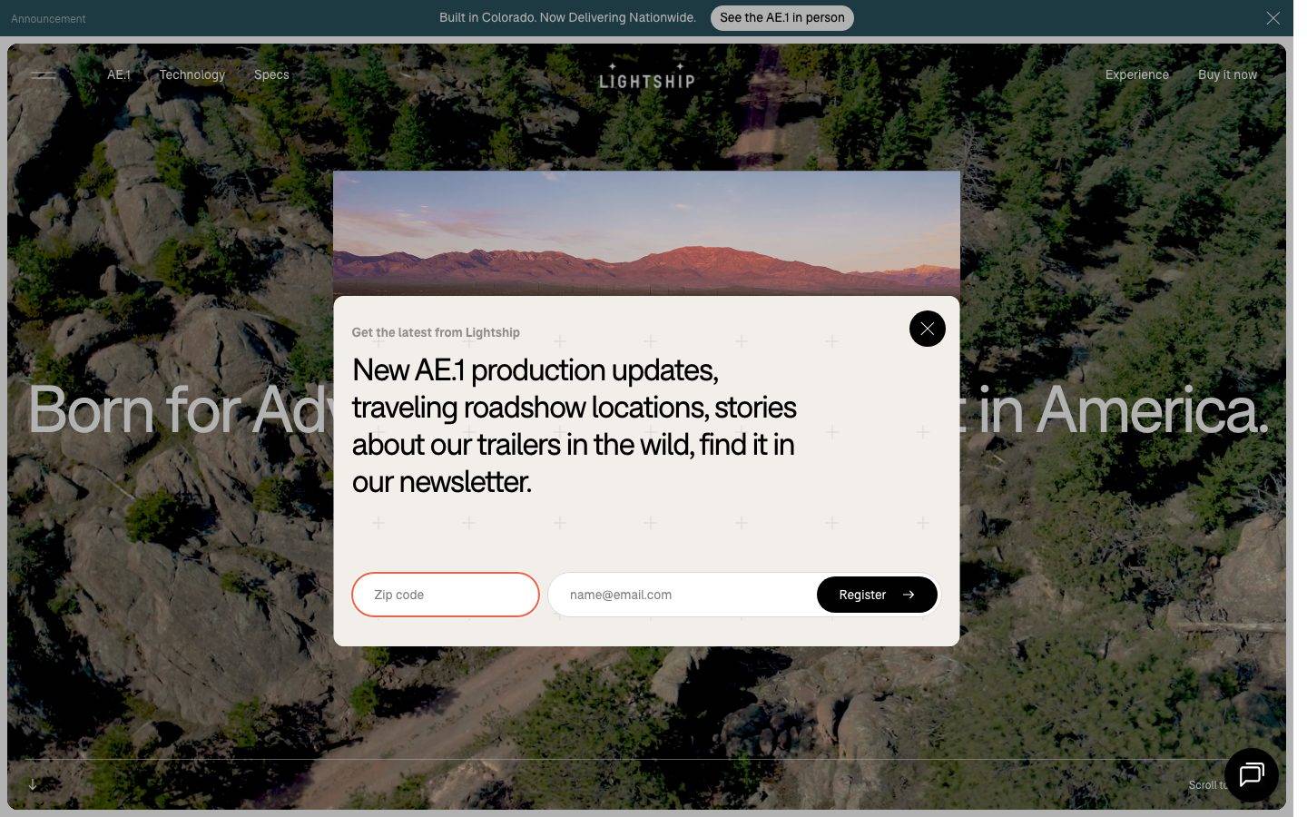
A cinematic, outdoors-luxury interface for an electric travel-trailer brand — full-bleed landscape photography behind a near-monochrome black-and-white type system set entirely in the F37 Bolton grotesque, warmed by a cream paper tone and a single coral accent. The system reads as premium-adventure: enormous editorial display headlines, softly-rounded (20px) surfaces, pill-shaped inputs, and modal newsletter capture layered directly over hero imagery.
Works withClaude CodeCursorCodexGemini CLICopilotv0LovableBoltWindsurfReplit
---
version: alpha
name: LightshipRV-design-analysis
description: "A cinematic, outdoors-luxury interface for an electric travel-trailer brand — full-bleed landscape photography behind a near-monochrome black-and-white type system set entirely in the F37 Bolton grotesque, warmed by a cream paper tone and a single coral accent. The system reads as premium-adventure: enormous editorial display headlines, softly-rounded (20px) surfaces, pill-shaped inputs, and modal newsletter capture layered directly over hero imagery."
colors:
  ink: "#000000"
  on-primary: "#ffffff"
  canvas: "#ffffff"
  accent-cream: "#faf6ef"
  accent-cream-soft: "#f2efea"
  surface-soft: "#f7f7f7"
  surface-neutral: "#f5f5f5"
  surface-neutral-alt: "#f4f4f4"
  neutral-gray: "#d9d9d9"
  neutral-gray-soft: "#c1c1c1"
  accent-coral: "#fa5c40"
  accent-coral-active: "#e1533a"
  accent-teal: "#29525e"
  accent-green: "#3fb67b"
  brand-facebook: "#3b5998"
  brand-instagram: "#e1306c"
  brand-youtube: "#cd201f"
  brand-twitter: "#1da1f2"
typography:
  h1:
    fontFamily: "F37 Bolton, Space Grotesk, sans-serif"
    fontSize: 72px
    fontWeight: 400
    lineHeight: 1.0
    letterSpacing: "-0.05em"
  h2:
    fontFamily: "F37 Bolton, Space Grotesk, sans-serif"
    fontSize: 34px
    fontWeight: 400
    lineHeight: 1.2
    letterSpacing: "-0.05em"
  h3:
    fontFamily: "F37 Bolton, Space Grotesk, sans-serif"
    fontSize: 24px
    fontWeight: 400
    lineHeight: 1.25
    letterSpacing: "-0.03em"
  body:
    fontFamily: "F37 Bolton, Space Grotesk, sans-serif"
    fontSize: 14px
    fontWeight: 700
    lineHeight: 1.25
    letterSpacing: "normal"
  button:
    fontFamily: "F37 Bolton, Space Grotesk, sans-serif"
    fontSize: 16px
    fontWeight: 400
    lineHeight: 1.25
    letterSpacing: "normal"
rounded:
  xs: 2px
  md: 18px
  lg: 20px
  pill: 100px
spacing:
  xxs: 4px
  xs: 8px
  sm: 12px
  md: 16px
  ml: 20px
  lg: 24px
  xl: 32px
  xxl: 40px
  huge: 64px
  section: 100px
  section-lg: 124px
  section-xl: 150px
  max: 200px
components:
  top-nav:
    backgroundColor: transparent
    textColor: "{colors.on-primary}"
    typography: "{typography.button}"
  announcement-bar:
    backgroundColor: "{colors.accent-teal}"
    textColor: "{colors.on-primary}"
    typography: "{typography.body}"
  hero-band:
    backgroundColor: "{colors.ink}"
    textColor: "{colors.on-primary}"
    typography: "{typography.h1}"
    padding: 124px
  display-heading:
    backgroundColor: transparent
    textColor: "{colors.ink}"
    typography: "{typography.h1}"
  button-primary:
    backgroundColor: "{colors.ink}"
    textColor: "{colors.on-primary}"
    typography: "{typography.button}"
    rounded: "{rounded.lg}"
    padding: 0px
  button-pill-dark:
    backgroundColor: "{colors.ink}"
    textColor: "{colors.on-primary}"
    typography: "{typography.button}"
    rounded: "{rounded.pill}"
  card:
    backgroundColor: "{colors.canvas}"
    textColor: "{colors.ink}"
    rounded: "{rounded.xs}"
  photo-card:
    backgroundColor: "{colors.surface-soft}"
    textColor: "{colors.ink}"
    rounded: "{rounded.lg}"
  cream-panel:
    backgroundColor: "{colors.accent-cream}"
    textColor: "{colors.ink}"
    rounded: "{rounded.lg}"
  newsletter-modal:
    backgroundColor: "{colors.canvas}"
    textColor: "{colors.ink}"
    typography: "{typography.h3}"
    rounded: "{rounded.lg}"
    padding: 40px
  input-pill:
    backgroundColor: "{colors.canvas}"
    textColor: "{colors.ink}"
    typography: "{typography.body}"
    rounded: "{rounded.pill}"
  cta-panel-neutral:
    backgroundColor: "{colors.neutral-gray}"
    textColor: "{colors.on-primary}"
    typography: "{typography.h2}"
    rounded: "{rounded.lg}"
  chip-label:
    backgroundColor: "{colors.canvas}"
    textColor: "{colors.ink}"
    typography: "{typography.body}"
    rounded: "{rounded.pill}"
---

## Overview

Lightship's landing page is a cinematic, outdoors-luxury surface for an electric travel-trailer brand. The page opens on full-bleed landscape photography (mountains, high-desert scrub) with an enormous editorial headline — "Born for Adventure…", then "This is the AE.1" — set entirely in **F37 Bolton**, a rounded grotesque display face. The system is near-monochrome: black type (`{colors.ink}` — #000000) on white and warm cream, with a single coral accent (`{colors.accent-coral}` — #fa5c40) held in reserve.

The mood is premium-adventure: photography does the emotional work, type stays restrained and confident, and surfaces are softly rounded (`{rounded.lg}` — 20px) rather than sharp. A warm paper tone (`{colors.accent-cream}` — #faf6ef) warms the light panels away from clinical white, and a deep teal (`{colors.accent-teal}` — #29525e) anchors the top announcement bar.

Type voice is unusual and distinctive: **the entire page is set in one family, F37 Bolton**, at a single weight-400 display register for headings and buttons — with body copy inverting to weight 700 at a small 14px size. There is no secondary text family; the hierarchy is carried by size and by the extreme negative letter-spacing (-0.05em) on the display headlines.

Component voltage comes from **layered modal capture over photography** — the newsletter modal floats directly over the hero image, and from **pill-shaped form inputs** (`{rounded.pill}` — 100px) that read as friendly and tactile against the hard-edged photo crops.

**Key Characteristics:**
- Full-bleed landscape photography as the primary hero surface, with black overlay type (`{colors.ink}`) and a dark hero band (`{colors.hero-band}`).
- Single-family type system: **F37 Bolton** everywhere — display headlines at weight 400 with -0.05em tracking, body copy at weight 700 / 14px.
- Warm cream paper tone (`{colors.accent-cream}` — #faf6ef) softening the light panels away from pure white.
- A single coral accent (`{colors.accent-coral}` — #fa5c40) held in reserve for small highlights; press-tone `{colors.accent-coral-active}` (#e1533a).
- Soft-rounded surfaces at `{rounded.lg}` (20px) — the dominant radius (measured 40 times) across panels and buttons.
- Pill-shaped form inputs (`{rounded.pill}` — 100px) — the zip-code and email fields in the newsletter modal.
- Enormous display type: h1 at 72px with 1.0 line-height reads as billboard-scale editorial.
- Very generous vertical rhythm — section spacing measured at 100px, 124px, 150px, and up to 200px between major bands.

## Colors

### Brand & Accent
- **Ink** (`{colors.ink}` — #000000): The dominant text and action color. All headlines, body copy, and primary buttons. Near-monochrome brand — black does most of the work.
- **Accent Coral** (`{colors.accent-coral}` — #fa5c40): The single warm brand accent, held in reserve for small highlights and arrow/icon moments. Press-tone shifts to `{colors.accent-coral-active}` (#e1533a).
- **Accent Teal** (`{colors.accent-teal}` — #29525e): A deep muted teal anchoring the top announcement bar.
- **Accent Green** (`{colors.accent-green}` — #3fb67b): A minor accent (measured once) — likely a success/status tone.

### Surface
- **Canvas** (`{colors.canvas}` — #ffffff): The default light page floor and modal background.
- **Accent Cream** (`{colors.accent-cream}` — #faf6ef): The warm paper tone for light panels — softens white away from clinical.
- **Accent Cream Soft** (`{colors.accent-cream-soft}` — #f2efea): A slightly cooler cream variant for nested panels.
- **Surface Soft** (`{colors.surface-soft}` — #f7f7f7): Very-light gray for photo-card backing and soft dividers.
- **Surface Neutral** (`{colors.surface-neutral}` — #f5f5f5) / **Surface Neutral Alt** (`{colors.surface-neutral-alt}` — #f4f4f4): Near-identical light grays measured once each.
- **Neutral Gray** (`{colors.neutral-gray}` — #d9d9d9): The mid-gray fill used behind the "Your home, anywhere." CTA panel.
- **Neutral Gray Soft** (`{colors.neutral-gray-soft}` — #c1c1c1): A slightly darker gray for image-placeholder / muted panels.

### Text
- **Ink** (`{colors.ink}` — #000000): All headlines and body text.
- **On Primary** (`{colors.on-primary}` — #ffffff): Text on dark buttons, over-photography overlay type, and inside the teal announcement bar.

### Social Brand
Social icon tints measured in the footer/share cluster: `{colors.brand-facebook}` (#3b5998), `{colors.brand-instagram}` (#e1306c), `{colors.brand-youtube}` (#cd201f), `{colors.brand-twitter}` (#1da1f2). These appear only as social-icon fills, never in the editorial surface.

## Typography

### Font Family
The system runs **one family for everything: F37 Bolton** — a rounded geometric grotesque from the F37 Foundry. There is no secondary text face. Hierarchy is carried entirely by size, weight, and letter-spacing within the single family. The fallback stack walks `Space Grotesk, sans-serif`.

The register split is unusual:
- Display + UI (h1/h2/h3, buttons) — weight **400**, negative letter-spacing (-0.03 to -0.05em) at large sizes.
- Body copy — weight **700** at a small 14px size, normal tracking. Lightship's body text is bold-and-small rather than regular-and-medium — a deliberate typographic signature.

### Hierarchy

| Token | Size | Weight | Line Height | Letter Spacing | Use |
|---|---|---|---|---|---|
| `{typography.h1}` | 72px | 400 | 1.0 | -0.05em | Billboard hero headlines ("Born for Adventure", "This is the AE.1") |
| `{typography.h2}` | 34px | 400 | 1.2 | -0.05em | Section heads, CTA-panel copy ("Your home, anywhere.") |
| `{typography.h3}` | 24px | 400 | 1.25 | -0.03em | Modal headline, sub-section titles |
| `{typography.body}` | 14px | 700 | 1.25 | normal | Running body copy, labels — bold, small |
| `{typography.button}` | 16px | 400 | 1.25 | normal | Button labels, nav links |

### Principles
The single-family constraint means restraint is enforced by size and tracking, not by mixing typefaces. Display headlines must keep the -0.05em negative tracking — it's what gives F37 Bolton its confident, slightly-condensed editorial feel at billboard scale. Body copy stays bold (700) and small (14px); do not soften it to a lighter weight.

### Note on Font Substitutes
**F37 Bolton is a commercial/licensed typeface** from the F37 Foundry and is not available as a free web font — it must not be self-shipped without a license. A usable open-source substitute is **Space Grotesk** (weight 400 for display with tight negative tracking, weight 700 for body), which shares the geometric-grotesque proportions. **Hanken Grotesk** is another close alternative. The measured `fonts_licensed` array was empty, so this substitution guidance is derived from the F37 Bolton family identity rather than an explicit license flag — see Known Gaps.

## Layout

### Spacing System
- **Base unit:** 4px.
- **Tokens:** `{spacing.xxs}` 4px · `{spacing.xs}` 8px · `{spacing.sm}` 12px · `{spacing.md}` 16px · `{spacing.ml}` 20px · `{spacing.lg}` 24px · `{spacing.xl}` 32px · `{spacing.xxl}` 40px · `{spacing.huge}` 64px · `{spacing.section}` 100px · `{spacing.section-lg}` 124px · `{spacing.section-xl}` 150px · `{spacing.max}` 200px.
- **Most-used values:** 16px (freq 31) and 24px (freq 24) dominate component-internal spacing; 124px (freq 14) is the primary section rhythm.
- **Section padding:** the large tokens (100–200px) drive the extremely generous vertical whitespace between full-bleed editorial bands.

### Grid & Container
- **Hero band:** full-bleed edge-to-edge photography; overlay headline spans the full width.
- **Editorial bands:** single-column, centered, with enormous vertical gaps — content floats in large empty fields (visible in the full-length screenshot).
- **Photo + text rows:** image card paired with a short bold-body caption to its left.
- **Newsletter modal:** centered card with a two-field horizontal form (zip code + email) and a register button.

### Whitespace Philosophy
Lightship uses extreme whitespace as a luxury signal — the full-page screenshot shows single elements suspended in large empty fields, with 100–200px gaps between bands. The photography carries the emotional weight; the layout gives each moment room to breathe. This is deliberately unhurried, gallery-like pacing.

## Elevation & Depth

| Level | Treatment | Use |
|---|---|---|
| Flat | No shadow, no border | Editorial bands, cards (`{colors.card}` — radius 0, shadow none) |
| Photography overlay | Type + modal layered directly over full-bleed image | Hero band, newsletter modal |
| Soft glow | `rgb(128,128,128) 0px 0px 5px 0px` (measured once) | A single soft, borderless drop-glow — used on one floating element |

The elevation philosophy is **flat with photographic layering** — depth comes from stacking type and modals over full-bleed imagery, not from shadow systems. The one measured shadow is a soft, low-contrast gray glow used sparingly.

### Decorative Depth
- The newsletter modal floats over the hero photograph with a faint plus-sign grid texture visible behind it (photographic content, not a system token).
- Cards themselves are shadow-free (`shadow: none`, radius 0) — the softening comes from the surrounding cream and gray panels, not from elevation.

## Shapes

### Border Radius Scale

| Token | Value | Use |
|---|---|---|
| `{rounded.xs}` | 2px | Cards (near-square) — the base card component measured at effectively flat corners |
| `{rounded.md}` | 18px | Occasional panel corners (measured twice) |
| `{rounded.lg}` | 20px | The dominant radius (measured 40×) — buttons, photo panels, cream panels, CTA panels |
| `{rounded.pill}` | 100px | Form inputs (zip code, email), pill-shaped buttons and chip labels |

### Photography Geometry
Hero photography is full-bleed and edge-to-edge (no radius). Inset photo cards and CTA panels use `{rounded.lg}` (20px) soft corners. Form inputs use `{rounded.pill}` (100px) for fully-rounded ends — the friendliest shape in the system, deliberately contrasted against the hard-cropped hero imagery.

## Components

### Navigation & Bars

**`announcement-bar`** — A slim top bar in `{colors.accent-teal}` (#29525e) with white text ("Built in Colorado. Now Delivering Nationwide.") and an inline "See the AE.1 in person" pill button, plus a dismiss ✕. Type in `{typography.body}`.

**`top-nav`** — Transparent nav layered over the hero photograph. Left: hamburger + primary links (AE.1, Technology, Specs); center: LIGHTSHIP wordmark; right: Experience, Buy it now. Links in `{typography.button}` (F37 Bolton 16px / 400), white (`{colors.on-primary}`) over the dark hero image.

### Hero

**`hero-band`** — Full-bleed landscape-photography hero with billboard headline in `{typography.h1}` (72px). The overlay type sits in `{colors.ink}` against a dark-image field; the band token backs to `{colors.ink}` where imagery is absent. Vertical padding at the `{spacing.section-lg}` (124px) scale.

**`display-heading`** — The oversized editorial headline treatment reused mid-page ("This is the AE.1") in `{typography.h1}` against white canvas, in `{colors.ink}`.

### Buttons

**`button-primary`** — The dark CTA. Background `{colors.ink}` (derived from screenshot ground-truth — the analyzer measured only text color #ffffff, radius 20px, and padding 0px), text `{colors.on-primary}`, type `{typography.button}`, rounded `{rounded.lg}` (20px). The measured 0px padding suggests the label sits inside a fixed-height container — treat internal padding as unspecified.

**`button-pill-dark`** — Fully-rounded dark button (`{rounded.pill}`) used for inline CTAs like "Register →" and "See the AE.1 in person". Background `{colors.ink}`, white label, arrow glyph. The register button carries a coral/dark arrow icon.

### Cards & Panels

**`card`** — The base content card: background `{colors.canvas}`, `{rounded.xs}` (2px — effectively square), no shadow. Flat, minimal.

**`photo-card`** — An inset landscape-photo card backed by `{colors.surface-soft}`, rounded `{rounded.lg}` (20px). Paired with a short bold-body caption ("Freedom, Reimagined.").

**`cream-panel`** — A warm-paper editorial panel in `{colors.accent-cream}` (#faf6ef), rounded `{rounded.lg}`. Holds product imagery and short body copy ("More of What Matters.").

**`cta-panel-neutral`** — The mid-gray "Your home, anywhere." CTA panel. Background `{colors.neutral-gray}` (#d9d9d9), white heading in `{typography.h2}`, with an embedded dark pill button ("Explore the AE.1"). Rounded `{rounded.lg}`.

**`chip-label`** — A small pill-shaped label (e.g., "Technology") in `{colors.canvas}` with `{typography.body}`, rounded `{rounded.pill}`.

### Modal & Forms

**`newsletter-modal`** — The "Get the latest from Lightship" capture modal floating over the hero photograph. Background `{colors.canvas}`, headline in `{typography.h3}` (24px), rounded `{rounded.lg}`, padding `{spacing.xxl}` (40px), with a dismiss ✕ at top-right. Carries a two-field horizontal form (zip + email) and the `{component.button-pill-dark}` "Register →".

**`input-pill`** — Fully-rounded text inputs (`{rounded.pill}` — 100px). Background `{colors.canvas}`, placeholder + text in `{colors.ink}`, type `{typography.body}`. Used for zip-code and email fields.

## Do's and Don'ts

### Do
- Set every headline in **F37 Bolton weight 400** with negative letter-spacing (-0.05em on display). The tracking is the voice.
- Keep body copy bold (700) and small (14px). Lightship's body register is deliberately heavier than typical.
- Let full-bleed photography carry the emotional weight; keep type restrained and near-monochrome.
- Use `{colors.accent-cream}` (#faf6ef) to warm light panels away from clinical white.
- Reserve `{colors.accent-coral}` (#fa5c40) for small highlights and arrows — never flood it across a surface.
- Use `{rounded.pill}` (100px) for form inputs — the fully-rounded shape is the friendliest moment in a hard-cropped photo system.
- Use extreme vertical whitespace (100–200px between bands) as a luxury signal.

### Don't
- Don't introduce a second typeface. The single-family constraint is the brand.
- Don't lighten body copy below weight 700 or the small-bold signature is lost.
- Don't drop the negative letter-spacing on display headlines — F37 Bolton at 0 tracking reads loose and off-brand.
- Don't ship F37 Bolton without a license — substitute Space Grotesk if the license is unavailable.
- Don't add heavy drop shadows — the system is flat with photographic layering; the one soft gray glow is the exception, not the rule.
- Don't apply coral to primary buttons — the CTA is black (`{colors.ink}`), not coral.
- Don't document hover state; primary press-tone shifts coral to `{colors.accent-coral-active}` and nothing else changes.

## Responsive Behavior

### Breakpoints
The analysis captured a single landing page at desktop scale; breakpoint behavior below is derived from the layout structure and standard practice — see Known Gaps.

| Name | Width | Key Changes (derived) |
|---|---|---|
| Mobile | < 768px | Hamburger nav; h1 72→~40px; newsletter modal fields stack vertically; single-column bands |
| Tablet | 768–1024px | Nav tightens; photo + text rows may stack; modal form may wrap |
| Desktop | 1024–1440px | Full-bleed hero; horizontal two-field modal form; full nav |
| Wide | > 1440px | Full-bleed photography scales edge-to-edge; content stays centered |

### Touch Targets
- `{component.button-pill-dark}` and `{component.input-pill}` are pill-shaped; effective tap height is not measured — verify against 44px minimum.
- Nav links in `{typography.button}` (16px) — spacing measured but hit-area not captured.

### Collapsing Strategy
- Full-bleed hero photography scales edge-to-edge at all widths.
- The two-field newsletter form (zip + email) is expected to stack vertically on mobile.
- Enormous section gaps (100–200px) likely compress on smaller viewports.

### Image Behavior
- Hero and section photography is full-bleed and crops to viewport.
- Inset photo cards retain `{rounded.lg}` (20px) corners and proportional scaling.

## Iteration Guide

1. Focus on ONE component at a time. Reference its YAML key directly (`{component.newsletter-modal}`, `{component.cta-panel-neutral}`).
2. Variants of an existing component (`-active`, `-disabled`) live as separate entries in `components:`.
3. Use `{token.refs}` everywhere — never inline hex.
4. Never document hover. Default and Active/Pressed states only.
5. Keep the single-family type system intact — F37 Bolton (or its substitute) for everything; hierarchy by size + tracking, not by family.
6. Body copy stays bold-and-small (700 / 14px). When emphasizing, go bigger before going to a new treatment.
7. Coral is scarce; black is the workhorse. Warm the light with cream, not with color.

## Known Gaps

- Only ONE page (landing) was captured, at a single desktop viewport — all responsive breakpoints and collapsing behavior are derived, not measured.
- **F37 Bolton is a commercial licensed typeface**, but the measured `fonts_licensed` array was empty. The substitution guidance (Space Grotesk / Hanken Grotesk) is derived from the family's foundry identity rather than an explicit license flag — verify licensing before shipping.
- `{component.button-primary}` reported padding `0px` and only a text color (#ffffff); its background (`{colors.ink}`) is derived from screenshot ground-truth, and internal padding is unspecified.
- Only one box-shadow was measured (`rgb(128,128,128) 0 0 5px 0`) and one appears on a single element — full elevation semantics are unconfirmed.
- Social brand hex values (`{colors.brand-facebook}`, `{colors.brand-instagram}`, `{colors.brand-youtube}`, `{colors.brand-twitter}`) are standard social icon tints measured once each; their exact placement in the footer is inferred.
- `{colors.accent-green}` (#3fb67b) was measured once with no clear context — likely a success/status tone but its usage is unconfirmed.
- Animation, transition timings, and scroll-driven reveals (the page shows a "Scroll to…" cue) are not in scope.
- Form validation, error, and focus states beyond the base `{component.input-pill}` were not extracted.
- Card radius measured at 2px (`{rounded.xs}`) conflicts visually with the dominant 20px panels — the base `card` component may be an outlier or an un-styled container.

<!-- Documented by Duply · real-world design systems as ready-to-use DESIGN.md for AI coding agents · https://duply.ai/lightshiprv/design-md -->
Color Palette
Accent
Neutrals
Typography
h172px · 400 · 1
The quick brown fox jumpsh234px · 400 · 1.2
The quick brown fox jumpsh324px · 400 · 1.25
The quick brown fox jumpsbody14px · 700 · 1.25
The quick brown fox jumpsbutton16px · 400 · 1.25
The quick brown fox jumpsSpacing & Shape
Spacing
| Name | Value | Preview |
|---|---|---|
| xxs | 4px | |
| xs | 8px | |
| sm | 12px | |
| md | 16px | |
| ml | 20px | |
| lg | 24px | |
| xl | 32px | |
| xxl | 40px | |
| huge | 64px | |
| section | 100px | |
| section-lg | 124px | |
| section-xl | 150px | |
| max | 200px |
Border Radius
| Name | Value | Preview |
|---|---|---|
| xs | 2px | |
| md | 18px | |
| lg | 20px | |
| pill | 100px |
FAQ
- What colors does LightshipRV use?
- LightshipRV's core palette includes #000000, #ffffff, #ffffff, #faf6ef, #f2efea. The full color set with usage roles (canvas, ink, surfaces, accent, semantic) is documented in the LightshipRV DESIGN.md.
- What font does LightshipRV use?
- LightshipRV's primary typeface is F37 Bolton. The complete type scale (sizes, weights, line-height and letter-spacing per role), with an open substitute where the original is licensed, is documented in the DESIGN.md.
- What is the LightshipRV design system?
- A cinematic, outdoors-luxury interface for an electric travel-trailer brand — full-bleed landscape photography behind a near-monochrome black-and-white type system set entirely in the F37 Bolton grotesque, warmed by a cream paper tone and a single coral accent. The system reads as
Get this as a working kit
LightshipRV Launch Kit + DESIGN.md
$299$225
One-time payment
- A complete production-stack template, styled like LightshipRV, fully built and wired.
- One-time payment and the codebase is yours. No platform fees, no subscription.
Open it with Claude Code, Cursor, or any coding agent and build in plain language, then ship a complete web app.
- Your private DESIGN.md
- Marketing pages, blog, SEO & legal
- Email capture, newsletter & contact
- Accept payments (Stripe)
- Analytics (GA4 + PostHog)
- One-click deploy
- Auth, login & roles
- A full app dashboard, when you grow
More like this
---
version: alpha
name: LightshipRV-design-analysis
description: "A cinematic, outdoors-luxury interface for an electric travel-trailer brand — full-bleed landscape photography behind a near-monochrome black-and-white type system set entirely in the F37 Bolton grotesque, warmed by a cream paper tone and a single coral accent. The system reads as premium-adventure: enormous editorial display headlines, softly-rounded (20px) surfaces, pill-shaped inputs, and modal newsletter capture layered directly over hero imagery."
colors:
  ink: "#000000"
  on-primary: "#ffffff"
  canvas: "#ffffff"
  accent-cream: "#faf6ef"
  accent-cream-soft: "#f2efea"
  surface-soft: "#f7f7f7"
  surface-neutral: "#f5f5f5"
  surface-neutral-alt: "#f4f4f4"
  neutral-gray: "#d9d9d9"
  neutral-gray-soft: "#c1c1c1"
  accent-coral: "#fa5c40"
  accent-coral-active: "#e1533a"
  accent-teal: "#29525e"
  accent-green: "#3fb67b"
  brand-facebook: "#3b5998"
  brand-instagram: "#e1306c"
  brand-youtube: "#cd201f"
  brand-twitter: "#1da1f2"
typography:
  h1:
    fontFamily: "F37 Bolton, Space Grotesk, sans-serif"
    fontSize: 72px
    fontWeight: 400
    lineHeight: 1.0
    letterSpacing: "-0.05em"
  h2:
    fontFamily: "F37 Bolton, Space Grotesk, sans-serif"
    fontSize: 34px
    fontWeight: 400
    lineHeight: 1.2
    letterSpacing: "-0.05em"
  h3:
    fontFamily: "F37 Bolton, Space Grotesk, sans-serif"
    fontSize: 24px
    fontWeight: 400
    lineHeight: 1.25
    letterSpacing: "-0.03em"
  body:
    fontFamily: "F37 Bolton, Space Grotesk, sans-serif"
    fontSize: 14px
    fontWeight: 700
    lineHeight: 1.25
    letterSpacing: "normal"
  button:
    fontFamily: "F37 Bolton, Space Grotesk, sans-serif"
    fontSize: 16px
    fontWeight: 400
    lineHeight: 1.25
    letterSpacing: "normal"
rounded:
  xs: 2px
  md: 18px
  lg: 20px
  pill: 100px
spacing:
  xxs: 4px
  xs: 8px
  sm: 12px
  md: 16px
  ml: 20px
  lg: 24px
  xl: 32px
  xxl: 40px
  huge: 64px
  section: 100px
  section-lg: 124px
  section-xl: 150px
  max: 200px
components:
  top-nav:
    backgroundColor: transparent
    textColor: "{colors.on-primary}"
    typography: "{typography.button}"
  announcement-bar:
    backgroundColor: "{colors.accent-teal}"
    textColor: "{colors.on-primary}"
    typography: "{typography.body}"
  hero-band:
    backgroundColor: "{colors.ink}"
    textColor: "{colors.on-primary}"
    typography: "{typography.h1}"
    padding: 124px
  display-heading:
    backgroundColor: transparent
    textColor: "{colors.ink}"
    typography: "{typography.h1}"
  button-primary:
    backgroundColor: "{colors.ink}"
    textColor: "{colors.on-primary}"
    typography: "{typography.button}"
    rounded: "{rounded.lg}"
    padding: 0px
  button-pill-dark:
    backgroundColor: "{colors.ink}"
    textColor: "{colors.on-primary}"
    typography: "{typography.button}"
    rounded: "{rounded.pill}"
  card:
    backgroundColor: "{colors.canvas}"
    textColor: "{colors.ink}"
    rounded: "{rounded.xs}"
  photo-card:
    backgroundColor: "{colors.surface-soft}"
    textColor: "{colors.ink}"
    rounded: "{rounded.lg}"
  cream-panel:
    backgroundColor: "{colors.accent-cream}"
    textColor: "{colors.ink}"
    rounded: "{rounded.lg}"
  newsletter-modal:
    backgroundColor: "{colors.canvas}"
    textColor: "{colors.ink}"
    typography: "{typography.h3}"
    rounded: "{rounded.lg}"
    padding: 40px
  input-pill:
    backgroundColor: "{colors.canvas}"
    textColor: "{colors.ink}"
    typography: "{typography.body}"
    rounded: "{rounded.pill}"
  cta-panel-neutral:
    backgroundColor: "{colors.neutral-gray}"
    textColor: "{colors.on-primary}"
    typography: "{typography.h2}"
    rounded: "{rounded.lg}"
  chip-label:
    backgroundColor: "{colors.canvas}"
    textColor: "{colors.ink}"
    typography: "{typography.body}"
    rounded: "{rounded.pill}"
---

## Overview

Lightship's landing page is a cinematic, outdoors-luxury surface for an electric travel-trailer brand. The page opens on full-bleed landscape photography (mountains, high-desert scrub) with an enormous editorial headline — "Born for Adventure…", then "This is the AE.1" — set entirely in **F37 Bolton**, a rounded grotesque display face. The system is near-monochrome: black type (`{colors.ink}` — #000000) on white and warm cream, with a single coral accent (`{colors.accent-coral}` — #fa5c40) held in reserve.

The mood is premium-adventure: photography does the emotional work, type stays restrained and confident, and surfaces are softly rounded (`{rounded.lg}` — 20px) rather than sharp. A warm paper tone (`{colors.accent-cream}` — #faf6ef) warms the light panels away from clinical white, and a deep teal (`{colors.accent-teal}` — #29525e) anchors the top announcement bar.

Type voice is unusual and distinctive: **the entire page is set in one family, F37 Bolton**, at a single weight-400 display register for headings and buttons — with body copy inverting to weight 700 at a small 14px size. There is no secondary text family; the hierarchy is carried by size and by the extreme negative letter-spacing (-0.05em) on the display headlines.

Component voltage comes from **layered modal capture over photography** — the newsletter modal floats directly over the hero image, and from **pill-shaped form inputs** (`{rounded.pill}` — 100px) that read as friendly and tactile against the hard-edged photo crops.

**Key Characteristics:**
- Full-bleed landscape photography as the primary hero surface, with black overlay type (`{colors.ink}`) and a dark hero band (`{colors.hero-band}`).
- Single-family type system: **F37 Bolton** everywhere — display headlines at weight 400 with -0.05em tracking, body copy at weight 700 / 14px.
- Warm cream paper tone (`{colors.accent-cream}` — #faf6ef) softening the light panels away from pure white.
- A single coral accent (`{colors.accent-coral}` — #fa5c40) held in reserve for small highlights; press-tone `{colors.accent-coral-active}` (#e1533a).
- Soft-rounded surfaces at `{rounded.lg}` (20px) — the dominant radius (measured 40 times) across panels and buttons.
- Pill-shaped form inputs (`{rounded.pill}` — 100px) — the zip-code and email fields in the newsletter modal.
- Enormous display type: h1 at 72px with 1.0 line-height reads as billboard-scale editorial.
- Very generous vertical rhythm — section spacing measured at 100px, 124px, 150px, and up to 200px between major bands.

## Colors

### Brand & Accent
- **Ink** (`{colors.ink}` — #000000): The dominant text and action color. All headlines, body copy, and primary buttons. Near-monochrome brand — black does most of the work.
- **Accent Coral** (`{colors.accent-coral}` — #fa5c40): The single warm brand accent, held in reserve for small highlights and arrow/icon moments. Press-tone shifts to `{colors.accent-coral-active}` (#e1533a).
- **Accent Teal** (`{colors.accent-teal}` — #29525e): A deep muted teal anchoring the top announcement bar.
- **Accent Green** (`{colors.accent-green}` — #3fb67b): A minor accent (measured once) — likely a success/status tone.

### Surface
- **Canvas** (`{colors.canvas}` — #ffffff): The default light page floor and modal background.
- **Accent Cream** (`{colors.accent-cream}` — #faf6ef): The warm paper tone for light panels — softens white away from clinical.
- **Accent Cream Soft** (`{colors.accent-cream-soft}` — #f2efea): A slightly cooler cream variant for nested panels.
- **Surface Soft** (`{colors.surface-soft}` — #f7f7f7): Very-light gray for photo-card backing and soft dividers.
- **Surface Neutral** (`{colors.surface-neutral}` — #f5f5f5) / **Surface Neutral Alt** (`{colors.surface-neutral-alt}` — #f4f4f4): Near-identical light grays measured once each.
- **Neutral Gray** (`{colors.neutral-gray}` — #d9d9d9): The mid-gray fill used behind the "Your home, anywhere." CTA panel.
- **Neutral Gray Soft** (`{colors.neutral-gray-soft}` — #c1c1c1): A slightly darker gray for image-placeholder / muted panels.

### Text
- **Ink** (`{colors.ink}` — #000000): All headlines and body text.
- **On Primary** (`{colors.on-primary}` — #ffffff): Text on dark buttons, over-photography overlay type, and inside the teal announcement bar.

### Social Brand
Social icon tints measured in the footer/share cluster: `{colors.brand-facebook}` (#3b5998), `{colors.brand-instagram}` (#e1306c), `{colors.brand-youtube}` (#cd201f), `{colors.brand-twitter}` (#1da1f2). These appear only as social-icon fills, never in the editorial surface.

## Typography

### Font Family
The system runs **one family for everything: F37 Bolton** — a rounded geometric grotesque from the F37 Foundry. There is no secondary text face. Hierarchy is carried entirely by size, weight, and letter-spacing within the single family. The fallback stack walks `Space Grotesk, sans-serif`.

The register split is unusual:
- Display + UI (h1/h2/h3, buttons) — weight **400**, negative letter-spacing (-0.03 to -0.05em) at large sizes.
- Body copy — weight **700** at a small 14px size, normal tracking. Lightship's body text is bold-and-small rather than regular-and-medium — a deliberate typographic signature.

### Hierarchy

| Token | Size | Weight | Line Height | Letter Spacing | Use |
|---|---|---|---|---|---|
| `{typography.h1}` | 72px | 400 | 1.0 | -0.05em | Billboard hero headlines ("Born for Adventure", "This is the AE.1") |
| `{typography.h2}` | 34px | 400 | 1.2 | -0.05em | Section heads, CTA-panel copy ("Your home, anywhere.") |
| `{typography.h3}` | 24px | 400 | 1.25 | -0.03em | Modal headline, sub-section titles |
| `{typography.body}` | 14px | 700 | 1.25 | normal | Running body copy, labels — bold, small |
| `{typography.button}` | 16px | 400 | 1.25 | normal | Button labels, nav links |

### Principles
The single-family constraint means restraint is enforced by size and tracking, not by mixing typefaces. Display headlines must keep the -0.05em negative tracking — it's what gives F37 Bolton its confident, slightly-condensed editorial feel at billboard scale. Body copy stays bold (700) and small (14px); do not soften it to a lighter weight.

### Note on Font Substitutes
**F37 Bolton is a commercial/licensed typeface** from the F37 Foundry and is not available as a free web font — it must not be self-shipped without a license. A usable open-source substitute is **Space Grotesk** (weight 400 for display with tight negative tracking, weight 700 for body), which shares the geometric-grotesque proportions. **Hanken Grotesk** is another close alternative. The measured `fonts_licensed` array was empty, so this substitution guidance is derived from the F37 Bolton family identity rather than an explicit license flag — see Known Gaps.

## Layout

### Spacing System
- **Base unit:** 4px.
- **Tokens:** `{spacing.xxs}` 4px · `{spacing.xs}` 8px · `{spacing.sm}` 12px · `{spacing.md}` 16px · `{spacing.ml}` 20px · `{spacing.lg}` 24px · `{spacing.xl}` 32px · `{spacing.xxl}` 40px · `{spacing.huge}` 64px · `{spacing.section}` 100px · `{spacing.section-lg}` 124px · `{spacing.section-xl}` 150px · `{spacing.max}` 200px.
- **Most-used values:** 16px (freq 31) and 24px (freq 24) dominate component-internal spacing; 124px (freq 14) is the primary section rhythm.
- **Section padding:** the large tokens (100–200px) drive the extremely generous vertical whitespace between full-bleed editorial bands.

### Grid & Container
- **Hero band:** full-bleed edge-to-edge photography; overlay headline spans the full width.
- **Editorial bands:** single-column, centered, with enormous vertical gaps — content floats in large empty fields (visible in the full-length screenshot).
- **Photo + text rows:** image card paired with a short bold-body caption to its left.
- **Newsletter modal:** centered card with a two-field horizontal form (zip code + email) and a register button.

### Whitespace Philosophy
Lightship uses extreme whitespace as a luxury signal — the full-page screenshot shows single elements suspended in large empty fields, with 100–200px gaps between bands. The photography carries the emotional weight; the layout gives each moment room to breathe. This is deliberately unhurried, gallery-like pacing.

## Elevation & Depth

| Level | Treatment | Use |
|---|---|---|
| Flat | No shadow, no border | Editorial bands, cards (`{colors.card}` — radius 0, shadow none) |
| Photography overlay | Type + modal layered directly over full-bleed image | Hero band, newsletter modal |
| Soft glow | `rgb(128,128,128) 0px 0px 5px 0px` (measured once) | A single soft, borderless drop-glow — used on one floating element |

The elevation philosophy is **flat with photographic layering** — depth comes from stacking type and modals over full-bleed imagery, not from shadow systems. The one measured shadow is a soft, low-contrast gray glow used sparingly.

### Decorative Depth
- The newsletter modal floats over the hero photograph with a faint plus-sign grid texture visible behind it (photographic content, not a system token).
- Cards themselves are shadow-free (`shadow: none`, radius 0) — the softening comes from the surrounding cream and gray panels, not from elevation.

## Shapes

### Border Radius Scale

| Token | Value | Use |
|---|---|---|
| `{rounded.xs}` | 2px | Cards (near-square) — the base card component measured at effectively flat corners |
| `{rounded.md}` | 18px | Occasional panel corners (measured twice) |
| `{rounded.lg}` | 20px | The dominant radius (measured 40×) — buttons, photo panels, cream panels, CTA panels |
| `{rounded.pill}` | 100px | Form inputs (zip code, email), pill-shaped buttons and chip labels |

### Photography Geometry
Hero photography is full-bleed and edge-to-edge (no radius). Inset photo cards and CTA panels use `{rounded.lg}` (20px) soft corners. Form inputs use `{rounded.pill}` (100px) for fully-rounded ends — the friendliest shape in the system, deliberately contrasted against the hard-cropped hero imagery.

## Components

### Navigation & Bars

**`announcement-bar`** — A slim top bar in `{colors.accent-teal}` (#29525e) with white text ("Built in Colorado. Now Delivering Nationwide.") and an inline "See the AE.1 in person" pill button, plus a dismiss ✕. Type in `{typography.body}`.

**`top-nav`** — Transparent nav layered over the hero photograph. Left: hamburger + primary links (AE.1, Technology, Specs); center: LIGHTSHIP wordmark; right: Experience, Buy it now. Links in `{typography.button}` (F37 Bolton 16px / 400), white (`{colors.on-primary}`) over the dark hero image.

### Hero

**`hero-band`** — Full-bleed landscape-photography hero with billboard headline in `{typography.h1}` (72px). The overlay type sits in `{colors.ink}` against a dark-image field; the band token backs to `{colors.ink}` where imagery is absent. Vertical padding at the `{spacing.section-lg}` (124px) scale.

**`display-heading`** — The oversized editorial headline treatment reused mid-page ("This is the AE.1") in `{typography.h1}` against white canvas, in `{colors.ink}`.

### Buttons

**`button-primary`** — The dark CTA. Background `{colors.ink}` (derived from screenshot ground-truth — the analyzer measured only text color #ffffff, radius 20px, and padding 0px), text `{colors.on-primary}`, type `{typography.button}`, rounded `{rounded.lg}` (20px). The measured 0px padding suggests the label sits inside a fixed-height container — treat internal padding as unspecified.

**`button-pill-dark`** — Fully-rounded dark button (`{rounded.pill}`) used for inline CTAs like "Register →" and "See the AE.1 in person". Background `{colors.ink}`, white label, arrow glyph. The register button carries a coral/dark arrow icon.

### Cards & Panels

**`card`** — The base content card: background `{colors.canvas}`, `{rounded.xs}` (2px — effectively square), no shadow. Flat, minimal.

**`photo-card`** — An inset landscape-photo card backed by `{colors.surface-soft}`, rounded `{rounded.lg}` (20px). Paired with a short bold-body caption ("Freedom, Reimagined.").

**`cream-panel`** — A warm-paper editorial panel in `{colors.accent-cream}` (#faf6ef), rounded `{rounded.lg}`. Holds product imagery and short body copy ("More of What Matters.").

**`cta-panel-neutral`** — The mid-gray "Your home, anywhere." CTA panel. Background `{colors.neutral-gray}` (#d9d9d9), white heading in `{typography.h2}`, with an embedded dark pill button ("Explore the AE.1"). Rounded `{rounded.lg}`.

**`chip-label`** — A small pill-shaped label (e.g., "Technology") in `{colors.canvas}` with `{typography.body}`, rounded `{rounded.pill}`.

### Modal & Forms

**`newsletter-modal`** — The "Get the latest from Lightship" capture modal floating over the hero photograph. Background `{colors.canvas}`, headline in `{typography.h3}` (24px), rounded `{rounded.lg}`, padding `{spacing.xxl}` (40px), with a dismiss ✕ at top-right. Carries a two-field horizontal form (zip + email) and the `{component.button-pill-dark}` "Register →".

**`input-pill`** — Fully-rounded text inputs (`{rounded.pill}` — 100px). Background `{colors.canvas}`, placeholder + text in `{colors.ink}`, type `{typography.body}`. Used for zip-code and email fields.

## Do's and Don'ts

### Do
- Set every headline in **F37 Bolton weight 400** with negative letter-spacing (-0.05em on display). The tracking is the voice.
- Keep body copy bold (700) and small (14px). Lightship's body register is deliberately heavier than typical.
- Let full-bleed photography carry the emotional weight; keep type restrained and near-monochrome.
- Use `{colors.accent-cream}` (#faf6ef) to warm light panels away from clinical white.
- Reserve `{colors.accent-coral}` (#fa5c40) for small highlights and arrows — never flood it across a surface.
- Use `{rounded.pill}` (100px) for form inputs — the fully-rounded shape is the friendliest moment in a hard-cropped photo system.
- Use extreme vertical whitespace (100–200px between bands) as a luxury signal.

### Don't
- Don't introduce a second typeface. The single-family constraint is the brand.
- Don't lighten body copy below weight 700 or the small-bold signature is lost.
- Don't drop the negative letter-spacing on display headlines — F37 Bolton at 0 tracking reads loose and off-brand.
- Don't ship F37 Bolton without a license — substitute Space Grotesk if the license is unavailable.
- Don't add heavy drop shadows — the system is flat with photographic layering; the one soft gray glow is the exception, not the rule.
- Don't apply coral to primary buttons — the CTA is black (`{colors.ink}`), not coral.
- Don't document hover state; primary press-tone shifts coral to `{colors.accent-coral-active}` and nothing else changes.

## Responsive Behavior

### Breakpoints
The analysis captured a single landing page at desktop scale; breakpoint behavior below is derived from the layout structure and standard practice — see Known Gaps.

| Name | Width | Key Changes (derived) |
|---|---|---|
| Mobile | < 768px | Hamburger nav; h1 72→~40px; newsletter modal fields stack vertically; single-column bands |
| Tablet | 768–1024px | Nav tightens; photo + text rows may stack; modal form may wrap |
| Desktop | 1024–1440px | Full-bleed hero; horizontal two-field modal form; full nav |
| Wide | > 1440px | Full-bleed photography scales edge-to-edge; content stays centered |

### Touch Targets
- `{component.button-pill-dark}` and `{component.input-pill}` are pill-shaped; effective tap height is not measured — verify against 44px minimum.
- Nav links in `{typography.button}` (16px) — spacing measured but hit-area not captured.

### Collapsing Strategy
- Full-bleed hero photography scales edge-to-edge at all widths.
- The two-field newsletter form (zip + email) is expected to stack vertically on mobile.
- Enormous section gaps (100–200px) likely compress on smaller viewports.

### Image Behavior
- Hero and section photography is full-bleed and crops to viewport.
- Inset photo cards retain `{rounded.lg}` (20px) corners and proportional scaling.

## Iteration Guide

1. Focus on ONE component at a time. Reference its YAML key directly (`{component.newsletter-modal}`, `{component.cta-panel-neutral}`).
2. Variants of an existing component (`-active`, `-disabled`) live as separate entries in `components:`.
3. Use `{token.refs}` everywhere — never inline hex.
4. Never document hover. Default and Active/Pressed states only.
5. Keep the single-family type system intact — F37 Bolton (or its substitute) for everything; hierarchy by size + tracking, not by family.
6. Body copy stays bold-and-small (700 / 14px). When emphasizing, go bigger before going to a new treatment.
7. Coral is scarce; black is the workhorse. Warm the light with cream, not with color.

## Known Gaps

- Only ONE page (landing) was captured, at a single desktop viewport — all responsive breakpoints and collapsing behavior are derived, not measured.
- **F37 Bolton is a commercial licensed typeface**, but the measured `fonts_licensed` array was empty. The substitution guidance (Space Grotesk / Hanken Grotesk) is derived from the family's foundry identity rather than an explicit license flag — verify licensing before shipping.
- `{component.button-primary}` reported padding `0px` and only a text color (#ffffff); its background (`{colors.ink}`) is derived from screenshot ground-truth, and internal padding is unspecified.
- Only one box-shadow was measured (`rgb(128,128,128) 0 0 5px 0`) and one appears on a single element — full elevation semantics are unconfirmed.
- Social brand hex values (`{colors.brand-facebook}`, `{colors.brand-instagram}`, `{colors.brand-youtube}`, `{colors.brand-twitter}`) are standard social icon tints measured once each; their exact placement in the footer is inferred.
- `{colors.accent-green}` (#3fb67b) was measured once with no clear context — likely a success/status tone but its usage is unconfirmed.
- Animation, transition timings, and scroll-driven reveals (the page shows a "Scroll to…" cue) are not in scope.
- Form validation, error, and focus states beyond the base `{component.input-pill}` were not extracted.
- Card radius measured at 2px (`{rounded.xs}`) conflicts visually with the dominant 20px panels — the base `card` component may be an outlier or an un-styled container.

<!-- Documented by Duply · real-world design systems as ready-to-use DESIGN.md for AI coding agents · https://duply.ai/lightshiprv/design-md -->