
teenage-engineering
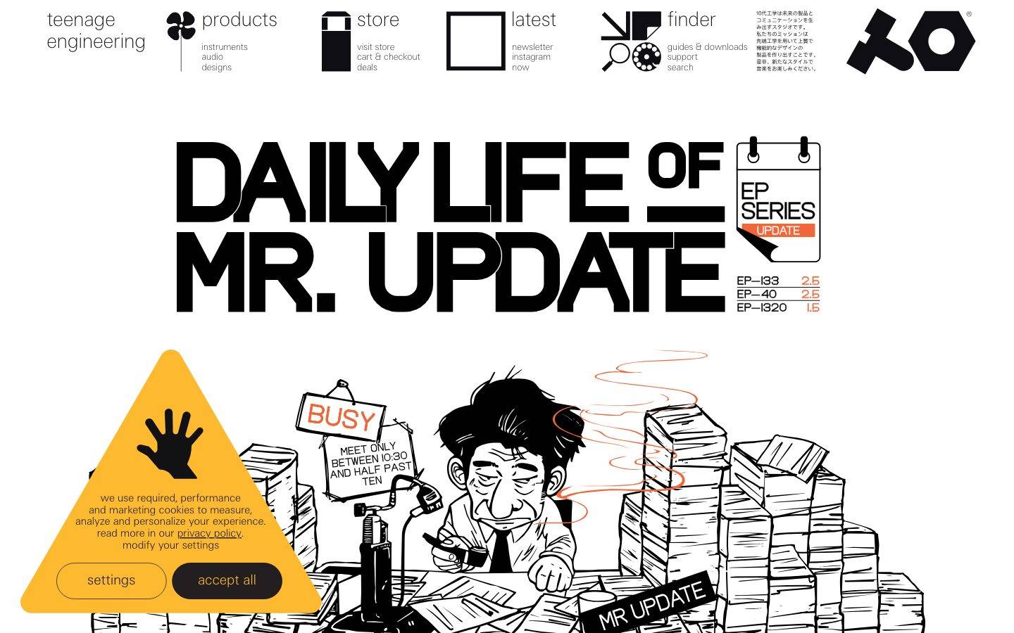
A stark, editorial, product-catalog interface built on pure white canvas with black ink, sharp zero-radius geometry, and teenage engineering's ultralight custom "te-20" typeface. The system reads as industrial-design deadpan — no rounded corners, no shadows, oversized black display lettering set against clean white, product photography floated on black backgrounds, and a small utilitarian palette of pure signal accents (blue, orange, amber, green, red) used sparingly for icons, warnings, and catalog tags.
Works withClaude CodeCursorCodexGemini CLICopilotv0LovableBoltWindsurfReplit
---
version: alpha
name: teenage-engineering-design-analysis
description: "A stark, editorial, product-catalog interface built on pure white canvas with black ink, sharp zero-radius geometry, and teenage engineering's ultralight custom \"te-20\" typeface. The system reads as industrial-design deadpan — no rounded corners, no shadows, oversized black display lettering set against clean white, product photography floated on black backgrounds, and a small utilitarian palette of pure signal accents (blue, orange, amber, green, red) used sparingly for icons, warnings, and catalog tags."
colors:
  ink: "#000000"
  near-black: "#0f0e12"
  ink-soft: "#272727"
  body: "#4d4d4d"
  muted: "#767676"
  muted-alt: "#7f7f7f"
  muted-soft: "#b2b2b2"
  hairline: "#cccccc"
  hairline-soft: "#e5e5e5"
  cool-gray: "#a1a7af"
  surface: "#f5f5f5"
  surface-soft: "#f6f8f7"
  canvas: "#ffffff"
  accent-blue: "#0071bb"
  accent-green: "#006837"
  accent-orange: "#f05a24"
  accent-red: "#b81d13"
  accent-crimson: "#c0262c"
  accent-amber: "#fab413"
  accent-pink: "#f0cccc"
typography:
  body:
    fontFamily: "te-20, 'Helvetica Neue', Arial, sans-serif"
    fontSize: 19px
    fontWeight: 100
    lineHeight: 1.154
    letterSpacing: normal
  button:
    fontFamily: "te-20, 'Helvetica Neue', Arial, sans-serif"
    fontSize: 23.5px
    fontWeight: 100
    lineHeight: 1.5
    letterSpacing: normal
rounded:
  none: 0px
spacing:
  sm: 22px
  md: 33px
  lg: 66px
components:
  top-nav:
    backgroundColor: "{colors.canvas}"
    textColor: "{colors.ink}"
    typography: "{typography.body}"
  nav-link:
    backgroundColor: transparent
    textColor: "{colors.ink}"
    typography: "{typography.body}"
  nav-sublink:
    backgroundColor: transparent
    textColor: "{colors.body}"
    typography: "{typography.body}"
  button-primary:
    backgroundColor: transparent
    textColor: "{colors.near-black}"
    typography: "{typography.button}"
    rounded: "{rounded.none}"
    padding: 0px
  input:
    backgroundColor: "{colors.canvas}"
    textColor: "{colors.ink}"
    typography: "{typography.body}"
    rounded: "{rounded.none}"
  cookie-banner:
    backgroundColor: "{colors.accent-amber}"
    textColor: "{colors.ink}"
    typography: "{typography.body}"
    rounded: "{rounded.none}"
  product-showcase:
    backgroundColor: "{colors.ink}"
    textColor: "{colors.muted-soft}"
    typography: "{typography.body}"
    rounded: "{rounded.none}"
  product-tile-light:
    backgroundColor: "{colors.surface}"
    textColor: "{colors.ink}"
    typography: "{typography.body}"
    rounded: "{rounded.none}"
  buy-now-link:
    backgroundColor: transparent
    textColor: "{colors.ink}"
    typography: "{typography.body}"
  catalog-tag:
    backgroundColor: transparent
    textColor: "{colors.accent-orange}"
    typography: "{typography.body}"
---

## Overview

teenage engineering's site is a stark, industrial-design catalog surface — pure white canvas (`{colors.canvas}` — #ffffff) with black ink (`{colors.ink}` — #000000), zero border radius everywhere, and no shadow tokens at all. The aesthetic is deadpan Swiss-industrial: oversized black display lettering, hairline product-detail tables, and product photography floated on deep black backgrounds. Nothing is soft; every corner measured came back at `{rounded.none}` (0px).

The type voice is teenage engineering's own **te-20** — an ultralight (weight 100) grotesque used for body and interface copy at ~19px, and slightly larger (~23.5px) for interactive/button labels. The extreme thin weight paired with big black display headlines (the "DAILY LIFE OF MR. UPDATE" marquee) creates the brand's signature contrast: hairline-thin running text against slab-black poster type.

Color is almost entirely monochrome — black ink on white — punctuated by a small set of pure signal accents: a catalog blue (`{colors.accent-blue}` — #0071bb), a warning amber (`{colors.accent-amber}` — #fab413, seen on the cookie triangle), an orange (`{colors.accent-orange}` — #f05a24, used on EP-series tags and the "MR UPDATE" flash), a green (`{colors.accent-green}` — #006837, the cart icon), and reds (`{colors.accent-red}`, `{colors.accent-crimson}`). These are used as tiny functional flashes, never as fill fields.

**Key Characteristics:**
- Pure white canvas, black ink, no shadows, zero radius. Everything is flat and razor-sharp.
- Custom **te-20** ultralight typeface (weight 100) for body + UI — substituted with Helvetica Neue / Arial here.
- Oversized black poster-display lettering for hero headlines (heavier weight — not measured; see Known Gaps).
- Icon-driven top nav ("products / store / latest / finder") with tiny sub-link stacks under each pictographic mark.
- Product photography floated on deep black `{colors.ink}` showcase bands — the product is the hero, isolated on black.
- A small utilitarian accent palette (blue, orange, amber, green, red, pink) used only for signals: warning triangle, catalog tags, cart, price flags.
- Coarse spacing rhythm on an 11px-derived base — measured stops at 22px, 33px, and 66px.

## Colors

### Ink & Text
- **Ink** (`{colors.ink}` — #000000): The dominant text and display color — headlines, nav, body. Also the background of the product-showcase bands.
- **Near-black** (`{colors.near-black}` — #0f0e12): Interactive/button label color — the measured `color` on button elements.
- **Ink Soft** (`{colors.ink-soft}` — #272727): Slightly-lifted dark text tone.
- **Body** (`{colors.body}` — #4d4d4d): Secondary running text.
- **Muted** (`{colors.muted}` — #767676) and **Muted Alt** (`{colors.muted-alt}` — #7f7f7f): Tertiary labels, captions, product meta lines.
- **Muted Soft** (`{colors.muted-soft}` — #b2b2b2): Low-contrast text over black showcase bands.
- **Cool Gray** (`{colors.cool-gray}` — #a1a7af): A faint blue-gray neutral for fine detail.

### Surface & Line
- **Canvas** (`{colors.canvas}` — #ffffff): The default page floor.
- **Surface** (`{colors.surface}` — #f5f5f5) and **Surface Soft** (`{colors.surface-soft}` — #f6f8f7): Very-faint off-white panels used for light product tiles / empty catalog cells.
- **Hairline** (`{colors.hairline}` — #cccccc) and **Hairline Soft** (`{colors.hairline-soft}` — #e5e5e5): 1px divider tones — used on the product-detail rules and catalog table lines. `{colors.hairline-soft}` was measured as a low-contrast text tone as well.

### Signal Accents
teenage engineering's accent set is functional, not decorative — each hue carries a specific catalog meaning and appears only as a small flash:
- **Accent Blue** (`{colors.accent-blue}` — #0071bb): The most frequent accent — catalog links / labels.
- **Accent Orange** (`{colors.accent-orange}` — #f05a24): EP-series tags, the "MR UPDATE" flash, price highlights.
- **Accent Amber** (`{colors.accent-amber}` — #fab413): The cookie-consent warning triangle.
- **Accent Green** (`{colors.accent-green}` — #006837): The cart / store icon.
- **Accent Red** (`{colors.accent-red}` — #b81d13) and **Accent Crimson** (`{colors.accent-crimson}` — #c0262c): Alert / price-flag reds.
- **Accent Pink** (`{colors.accent-pink}` — #f0cccc): A pale tint used sparingly in illustrations / tags.

## Typography

### Font Family
The system runs **te-20** — teenage engineering's proprietary grotesque typeface — for both body and interactive copy. te-20 is a custom (non-public) web font; if it is unavailable, **Helvetica Neue** or **Arial** at a thin/ultralight weight is the closest widely-available substitute, and **Inter** at weight 100–200 approximates the thin grotesque character. The site never ships a licensed fallback — the stack degrades to system Helvetica/Arial.

The measured weight is **100 (ultralight)** across both roles — this is the brand's signature: hairline-thin interface text. The oversized black poster headlines on the landing page are a heavier weight, but that weight was not captured by measurement (see Known Gaps).

### Hierarchy

| Token | Size | Weight | Line Height | Letter Spacing | Use |
|---|---|---|---|---|---|
| `{typography.button}` | 23.5px | 100 | 1.5 | normal | Interactive labels, buttons (e.g. "settings", "accept all") |
| `{typography.body}` | 19px | 100 | 1.154 | normal | Body copy, nav links, product meta, catalog text |

### Principles
The interface voice is uniformly thin — weight 100 everywhere measured, no tracking adjustments (letter-spacing normal). The tension in the system comes from pairing this hairline UI type against very large, heavy black display lettering. Keep running text ultralight; reserve heavy weight for poster-scale headlines only.

### Note on Font Substitutes
te-20 is teenage engineering's custom typeface and is not available as a public web font. Use **Helvetica Neue** (thin/ultralight) or **Arial** as the shipping fallback, or **Inter** at weight 100–200 for the closest thin-grotesque approximation. Do not claim to ship te-20.

## Layout

### Spacing System
- **Base unit:** ~11px (derived — the measured stops 22 / 33 / 66 are all multiples of 11).
- **Tokens:** `{spacing.sm}` 22px · `{spacing.md}` 33px · `{spacing.lg}` 66px.
- **Section rhythm:** `{spacing.lg}` (66px) is the most frequently measured stop — the primary gap between major bands and product-showcase blocks.
- Only three spacing values were measured; finer paddings inside catalog rows are not captured (see Known Gaps).

### Grid & Container
- The landing page is a single full-width column: icon nav row across the top, oversized display headline, then a full-bleed illustration.
- The products page is a stacked sequence of full-bleed product-showcase bands (product floated on black) followed by a multi-column catalog grid of buy-now cells at the foot.
- Catalog cells align to a 3-up grid at desktop (observed in the "EP-133 K.O. II / EP splash cover / K.O. II soft bag" row).

### Whitespace Philosophy
The system is generous with negative space around isolated objects — product photography sits in large fields of black, and the display headline is given the full page width. Whitespace is used to isolate single objects (industrial-catalog style), not to pad dense content clusters.

## Elevation & Depth

No shadow tokens were measured — the system is entirely flat.

| Level | Treatment | Use |
|---|---|---|
| Flat | No shadow, no border | Nav, body, headlines, catalog cells |
| Hairline | 1px `{colors.hairline}` / `{colors.hairline-soft}` rule | Product-detail tables, EP-series price rows, catalog dividers |
| Black showcase field | `{colors.ink}` background | Product photography bands — depth is created by studio lighting inside the photo, not by CSS elevation |

Depth on the product pages comes entirely from the photography itself — objects are lit and shadowed within the image, floating on solid black. The interface layer adds no synthetic elevation.

## Shapes

### Border Radius Scale

| Token | Value | Use |
|---|---|---|
| `{rounded.none}` | 0px | Everything — buttons, inputs, tiles, panels |

Every measured component (`button-primary`, `input`) returned a radius of 0px. The system is uniformly sharp-cornered — this is a core brand signal. (Note: the cookie-banner action controls appear pill-shaped in the screenshot but were not individually measured; see Known Gaps.)

### Photography Geometry
Product photography is presented as full-bleed rectangles with no rounding and no frame — objects float on black or white. Vinyl records, samplers, and hardware are shot at angle on seamless studio backgrounds; the imagery carries all texture and depth the flat UI omits.

## Components

### Navigation

**`top-nav`** — Full-width white nav row pinned to the top of every page. Background `{colors.canvas}`, text `{colors.ink}`, type `{typography.body}` (te-20 ultralight). Structured as a row of pictographic marks ("teenage engineering" wordmark, products, store, latest, finder) each with a small stacked list of sub-links beneath, plus the TO logo mark and Japanese mission copy at the far right.

**`nav-link`** — Primary nav category label. Transparent background, `{colors.ink}` text, `{typography.body}`.

**`nav-sublink`** — The small stacked sub-links under each nav mark (e.g. "instruments / audio / designs"). Transparent background, `{colors.body}` text, `{typography.body}`.

### Buttons & Inputs

**`button-primary`** — Interactive label control. Transparent background, text `{colors.near-black}` (#0f0e12), type `{typography.button}` (te-20 ~23.5px / 100), radius `{rounded.none}`, padding 0px as measured. Seen in the cookie banner as "settings" and "accept all".

**`input`** — Form field. Background `{colors.canvas}`, text `{colors.ink}`, type `{typography.body}`, radius `{rounded.none}` (sharp corners). Border/padding not measured (see Known Gaps).

### Content & Catalog

**`product-showcase`** — Full-bleed band presenting a single product photographed on deep black. Background `{colors.ink}`, caption text `{colors.muted-soft}`, type `{typography.body}`. The product image carries its own studio lighting; the caption (e.g. "APC-2", "virus transmission completed") sits small at the lower-left.

**`product-tile-light`** — Catalog cell on the light foot-of-page grid. Background `{colors.surface}` / `{colors.surface-soft}`, text `{colors.ink}`, type `{typography.body}`. Holds a product name and a `{component.buy-now-link}`.

**`buy-now-link`** — Inline text call-to-action ("buy now") under each catalog product. Transparent background, `{colors.ink}` text, `{typography.body}`.

**`catalog-tag`** — Small signal label used on EP-series listings ("UPDATE", price flags). Transparent background, text in an accent — commonly `{colors.accent-orange}`, type `{typography.body}`.

### Consent

**`cookie-banner`** — The bright warning-triangle consent panel bottom-left of the landing page. Background `{colors.accent-amber}` (#fab413), text `{colors.ink}`, type `{typography.body}`, radius `{rounded.none}`. Contains the consent copy, an underlined "privacy policy" link, and two `{component.button-primary}` controls.

## Do's and Don'ts

### Do
- Keep every corner sharp — `{rounded.none}` (0px) is a core brand signal. Buttons, inputs, tiles, panels are all rectangular.
- Keep interface type ultralight — te-20 / Helvetica Neue thin at weight 100. The hairline text is intentional.
- Isolate products on solid black `{component.product-showcase}` fields — let studio photography carry depth.
- Reserve accent hues for functional signals only: `{colors.accent-amber}` for the warning triangle, `{colors.accent-green}` for cart, `{colors.accent-orange}` for catalog/price tags.
- Keep the palette monochrome (black ink on white) at the interface layer; accents are tiny flashes.
- Build the top nav from pictographic marks with small stacked sub-link lists.

### Don't
- Don't add border radius. Rounded corners are off-brand for this system.
- Don't add drop shadows or synthetic elevation — the system is flat; depth lives inside photography.
- Don't fill large fields with accent color. Accents are signals, not backgrounds (except the amber cookie triangle).
- Don't bolden body/UI text — the ultralight weight is the voice.
- Don't crowd product imagery; single objects deserve large isolating whitespace.

## Responsive Behavior

Only landing and products pages at a single desktop capture were measured — responsive breakpoints were not directly observed. General guidance derived from the captured layout:

### Breakpoints
| Name | Width | Key Changes (inferred) |
|---|---|---|
| Desktop | ≥ 1024px | Full icon-nav row across the top; 3-up catalog grid; full-bleed showcase bands |
| Tablet / Mobile | < 1024px | Not measured — see Known Gaps |

### Touch Targets
- `{component.button-primary}` measured padding is 0px — tap area is defined by the label bounds. Confirm minimum 44×44px hit targets when implementing (not measured).

### Collapsing Strategy
- The multi-icon nav row and 3-up catalog grid would need to collapse to fewer columns on narrow viewports; exact behavior not captured.

## Iteration Guide

1. Focus on ONE component at a time; reference its YAML key directly (`{component.product-showcase}`, `{component.cookie-banner}`).
2. Variants live as separate entries in `components:`.
3. Use `{token.refs}` everywhere — never inline a hex or size.
4. Never document hover; default and active/pressed states only.
5. Keep every radius at `{rounded.none}` — sharpness is the brand.
6. Keep interface type te-20 ultralight (weight 100); reserve heavy weight for poster-scale display only.
7. Accents are functional signals — add one only when it carries catalog meaning.

## Known Gaps

- **te-20** is teenage engineering's custom (non-public) typeface; a Helvetica Neue / Arial thin substitute is documented in Typography. `fonts_licensed` was empty in the analysis, but te-20 is proprietary and should never be claimed as shipped.
- The oversized black poster display headline ("DAILY LIFE OF MR. UPDATE") is a heavier weight than the measured body/button weight 100 — its exact font weight and size were not captured, so no `display` typography role is declared.
- Only two typography roles (body, button) were measured; heading/caption/label roles are inferred visually but not tokenized.
- Radius measured only on `button-primary` and `input` (both 0px); the cookie-banner action controls appear pill-shaped in the screenshot but were not individually measured — the discrepancy is unresolved.
- No shadow tokens were measured; the flat treatment is documented, but any subtle borders/insets on inputs were not captured.
- Only three spacing values (22 / 33 / 66px) were measured; the 11px base unit is derived. Finer catalog-row and nav paddings are not captured.
- Button/input border, padding, and background beyond the measured `color` and `radius` are not extracted.
- Responsive breakpoints, touch-target sizing, and mobile nav collapse behavior were not measured (single desktop capture).
- Accent-usage mapping (which hue maps to which catalog function) is inferred from screenshots; exact CSS assignments were not measured.

<!-- Documented by Duply · real-world design systems as ready-to-use DESIGN.md for AI coding agents · https://duply.ai/teenage/design-md -->
Color Palette
Accent
Neutrals
Typography
body19px · 100 · 1.154
The quick brown fox jumpsbutton23.5px · 100 · 1.5
The quick brown fox jumpsSpacing & Shape
Spacing
| Name | Value | Preview |
|---|---|---|
| sm | 22px | |
| md | 33px | |
| lg | 66px |
Border Radius
| Name | Value | Preview |
|---|---|---|
| none | 0px |
FAQ
- What colors does teenage-engineering use?
- teenage-engineering's core palette includes #000000, #0f0e12, #272727, #4d4d4d, #767676. The full color set with usage roles (canvas, ink, surfaces, accent, semantic) is documented in the teenage-engineering DESIGN.md.
- What font does teenage-engineering use?
- teenage-engineering's primary typeface is te-20. The complete type scale (sizes, weights, line-height and letter-spacing per role), with an open substitute where the original is licensed, is documented in the DESIGN.md.
- What is the teenage-engineering design system?
- A stark, editorial, product-catalog interface built on pure white canvas with black ink, sharp zero-radius geometry, and teenage engineering's ultralight custom "te-20" typeface. The system reads as industrial-design deadpan — no rounded corners, no shadows, oversized black display lettering set
Get this as a working kit
teenage-engineering Launch Kit + DESIGN.md
$299$225
One-time payment
- A complete production-stack template, styled like teenage-engineering, fully built and wired.
- One-time payment and the codebase is yours. No platform fees, no subscription.
Open it with Claude Code, Cursor, or any coding agent and build in plain language, then ship a complete web app.
- Your private DESIGN.md
- Marketing pages, blog, SEO & legal
- Email capture, newsletter & contact
- Accept payments (Stripe)
- Analytics (GA4 + PostHog)
- One-click deploy
- Auth, login & roles
- A full app dashboard, when you grow
More like this
---
version: alpha
name: teenage-engineering-design-analysis
description: "A stark, editorial, product-catalog interface built on pure white canvas with black ink, sharp zero-radius geometry, and teenage engineering's ultralight custom \"te-20\" typeface. The system reads as industrial-design deadpan — no rounded corners, no shadows, oversized black display lettering set against clean white, product photography floated on black backgrounds, and a small utilitarian palette of pure signal accents (blue, orange, amber, green, red) used sparingly for icons, warnings, and catalog tags."
colors:
  ink: "#000000"
  near-black: "#0f0e12"
  ink-soft: "#272727"
  body: "#4d4d4d"
  muted: "#767676"
  muted-alt: "#7f7f7f"
  muted-soft: "#b2b2b2"
  hairline: "#cccccc"
  hairline-soft: "#e5e5e5"
  cool-gray: "#a1a7af"
  surface: "#f5f5f5"
  surface-soft: "#f6f8f7"
  canvas: "#ffffff"
  accent-blue: "#0071bb"
  accent-green: "#006837"
  accent-orange: "#f05a24"
  accent-red: "#b81d13"
  accent-crimson: "#c0262c"
  accent-amber: "#fab413"
  accent-pink: "#f0cccc"
typography:
  body:
    fontFamily: "te-20, 'Helvetica Neue', Arial, sans-serif"
    fontSize: 19px
    fontWeight: 100
    lineHeight: 1.154
    letterSpacing: normal
  button:
    fontFamily: "te-20, 'Helvetica Neue', Arial, sans-serif"
    fontSize: 23.5px
    fontWeight: 100
    lineHeight: 1.5
    letterSpacing: normal
rounded:
  none: 0px
spacing:
  sm: 22px
  md: 33px
  lg: 66px
components:
  top-nav:
    backgroundColor: "{colors.canvas}"
    textColor: "{colors.ink}"
    typography: "{typography.body}"
  nav-link:
    backgroundColor: transparent
    textColor: "{colors.ink}"
    typography: "{typography.body}"
  nav-sublink:
    backgroundColor: transparent
    textColor: "{colors.body}"
    typography: "{typography.body}"
  button-primary:
    backgroundColor: transparent
    textColor: "{colors.near-black}"
    typography: "{typography.button}"
    rounded: "{rounded.none}"
    padding: 0px
  input:
    backgroundColor: "{colors.canvas}"
    textColor: "{colors.ink}"
    typography: "{typography.body}"
    rounded: "{rounded.none}"
  cookie-banner:
    backgroundColor: "{colors.accent-amber}"
    textColor: "{colors.ink}"
    typography: "{typography.body}"
    rounded: "{rounded.none}"
  product-showcase:
    backgroundColor: "{colors.ink}"
    textColor: "{colors.muted-soft}"
    typography: "{typography.body}"
    rounded: "{rounded.none}"
  product-tile-light:
    backgroundColor: "{colors.surface}"
    textColor: "{colors.ink}"
    typography: "{typography.body}"
    rounded: "{rounded.none}"
  buy-now-link:
    backgroundColor: transparent
    textColor: "{colors.ink}"
    typography: "{typography.body}"
  catalog-tag:
    backgroundColor: transparent
    textColor: "{colors.accent-orange}"
    typography: "{typography.body}"
---

## Overview

teenage engineering's site is a stark, industrial-design catalog surface — pure white canvas (`{colors.canvas}` — #ffffff) with black ink (`{colors.ink}` — #000000), zero border radius everywhere, and no shadow tokens at all. The aesthetic is deadpan Swiss-industrial: oversized black display lettering, hairline product-detail tables, and product photography floated on deep black backgrounds. Nothing is soft; every corner measured came back at `{rounded.none}` (0px).

The type voice is teenage engineering's own **te-20** — an ultralight (weight 100) grotesque used for body and interface copy at ~19px, and slightly larger (~23.5px) for interactive/button labels. The extreme thin weight paired with big black display headlines (the "DAILY LIFE OF MR. UPDATE" marquee) creates the brand's signature contrast: hairline-thin running text against slab-black poster type.

Color is almost entirely monochrome — black ink on white — punctuated by a small set of pure signal accents: a catalog blue (`{colors.accent-blue}` — #0071bb), a warning amber (`{colors.accent-amber}` — #fab413, seen on the cookie triangle), an orange (`{colors.accent-orange}` — #f05a24, used on EP-series tags and the "MR UPDATE" flash), a green (`{colors.accent-green}` — #006837, the cart icon), and reds (`{colors.accent-red}`, `{colors.accent-crimson}`). These are used as tiny functional flashes, never as fill fields.

**Key Characteristics:**
- Pure white canvas, black ink, no shadows, zero radius. Everything is flat and razor-sharp.
- Custom **te-20** ultralight typeface (weight 100) for body + UI — substituted with Helvetica Neue / Arial here.
- Oversized black poster-display lettering for hero headlines (heavier weight — not measured; see Known Gaps).
- Icon-driven top nav ("products / store / latest / finder") with tiny sub-link stacks under each pictographic mark.
- Product photography floated on deep black `{colors.ink}` showcase bands — the product is the hero, isolated on black.
- A small utilitarian accent palette (blue, orange, amber, green, red, pink) used only for signals: warning triangle, catalog tags, cart, price flags.
- Coarse spacing rhythm on an 11px-derived base — measured stops at 22px, 33px, and 66px.

## Colors

### Ink & Text
- **Ink** (`{colors.ink}` — #000000): The dominant text and display color — headlines, nav, body. Also the background of the product-showcase bands.
- **Near-black** (`{colors.near-black}` — #0f0e12): Interactive/button label color — the measured `color` on button elements.
- **Ink Soft** (`{colors.ink-soft}` — #272727): Slightly-lifted dark text tone.
- **Body** (`{colors.body}` — #4d4d4d): Secondary running text.
- **Muted** (`{colors.muted}` — #767676) and **Muted Alt** (`{colors.muted-alt}` — #7f7f7f): Tertiary labels, captions, product meta lines.
- **Muted Soft** (`{colors.muted-soft}` — #b2b2b2): Low-contrast text over black showcase bands.
- **Cool Gray** (`{colors.cool-gray}` — #a1a7af): A faint blue-gray neutral for fine detail.

### Surface & Line
- **Canvas** (`{colors.canvas}` — #ffffff): The default page floor.
- **Surface** (`{colors.surface}` — #f5f5f5) and **Surface Soft** (`{colors.surface-soft}` — #f6f8f7): Very-faint off-white panels used for light product tiles / empty catalog cells.
- **Hairline** (`{colors.hairline}` — #cccccc) and **Hairline Soft** (`{colors.hairline-soft}` — #e5e5e5): 1px divider tones — used on the product-detail rules and catalog table lines. `{colors.hairline-soft}` was measured as a low-contrast text tone as well.

### Signal Accents
teenage engineering's accent set is functional, not decorative — each hue carries a specific catalog meaning and appears only as a small flash:
- **Accent Blue** (`{colors.accent-blue}` — #0071bb): The most frequent accent — catalog links / labels.
- **Accent Orange** (`{colors.accent-orange}` — #f05a24): EP-series tags, the "MR UPDATE" flash, price highlights.
- **Accent Amber** (`{colors.accent-amber}` — #fab413): The cookie-consent warning triangle.
- **Accent Green** (`{colors.accent-green}` — #006837): The cart / store icon.
- **Accent Red** (`{colors.accent-red}` — #b81d13) and **Accent Crimson** (`{colors.accent-crimson}` — #c0262c): Alert / price-flag reds.
- **Accent Pink** (`{colors.accent-pink}` — #f0cccc): A pale tint used sparingly in illustrations / tags.

## Typography

### Font Family
The system runs **te-20** — teenage engineering's proprietary grotesque typeface — for both body and interactive copy. te-20 is a custom (non-public) web font; if it is unavailable, **Helvetica Neue** or **Arial** at a thin/ultralight weight is the closest widely-available substitute, and **Inter** at weight 100–200 approximates the thin grotesque character. The site never ships a licensed fallback — the stack degrades to system Helvetica/Arial.

The measured weight is **100 (ultralight)** across both roles — this is the brand's signature: hairline-thin interface text. The oversized black poster headlines on the landing page are a heavier weight, but that weight was not captured by measurement (see Known Gaps).

### Hierarchy

| Token | Size | Weight | Line Height | Letter Spacing | Use |
|---|---|---|---|---|---|
| `{typography.button}` | 23.5px | 100 | 1.5 | normal | Interactive labels, buttons (e.g. "settings", "accept all") |
| `{typography.body}` | 19px | 100 | 1.154 | normal | Body copy, nav links, product meta, catalog text |

### Principles
The interface voice is uniformly thin — weight 100 everywhere measured, no tracking adjustments (letter-spacing normal). The tension in the system comes from pairing this hairline UI type against very large, heavy black display lettering. Keep running text ultralight; reserve heavy weight for poster-scale headlines only.

### Note on Font Substitutes
te-20 is teenage engineering's custom typeface and is not available as a public web font. Use **Helvetica Neue** (thin/ultralight) or **Arial** as the shipping fallback, or **Inter** at weight 100–200 for the closest thin-grotesque approximation. Do not claim to ship te-20.

## Layout

### Spacing System
- **Base unit:** ~11px (derived — the measured stops 22 / 33 / 66 are all multiples of 11).
- **Tokens:** `{spacing.sm}` 22px · `{spacing.md}` 33px · `{spacing.lg}` 66px.
- **Section rhythm:** `{spacing.lg}` (66px) is the most frequently measured stop — the primary gap between major bands and product-showcase blocks.
- Only three spacing values were measured; finer paddings inside catalog rows are not captured (see Known Gaps).

### Grid & Container
- The landing page is a single full-width column: icon nav row across the top, oversized display headline, then a full-bleed illustration.
- The products page is a stacked sequence of full-bleed product-showcase bands (product floated on black) followed by a multi-column catalog grid of buy-now cells at the foot.
- Catalog cells align to a 3-up grid at desktop (observed in the "EP-133 K.O. II / EP splash cover / K.O. II soft bag" row).

### Whitespace Philosophy
The system is generous with negative space around isolated objects — product photography sits in large fields of black, and the display headline is given the full page width. Whitespace is used to isolate single objects (industrial-catalog style), not to pad dense content clusters.

## Elevation & Depth

No shadow tokens were measured — the system is entirely flat.

| Level | Treatment | Use |
|---|---|---|
| Flat | No shadow, no border | Nav, body, headlines, catalog cells |
| Hairline | 1px `{colors.hairline}` / `{colors.hairline-soft}` rule | Product-detail tables, EP-series price rows, catalog dividers |
| Black showcase field | `{colors.ink}` background | Product photography bands — depth is created by studio lighting inside the photo, not by CSS elevation |

Depth on the product pages comes entirely from the photography itself — objects are lit and shadowed within the image, floating on solid black. The interface layer adds no synthetic elevation.

## Shapes

### Border Radius Scale

| Token | Value | Use |
|---|---|---|
| `{rounded.none}` | 0px | Everything — buttons, inputs, tiles, panels |

Every measured component (`button-primary`, `input`) returned a radius of 0px. The system is uniformly sharp-cornered — this is a core brand signal. (Note: the cookie-banner action controls appear pill-shaped in the screenshot but were not individually measured; see Known Gaps.)

### Photography Geometry
Product photography is presented as full-bleed rectangles with no rounding and no frame — objects float on black or white. Vinyl records, samplers, and hardware are shot at angle on seamless studio backgrounds; the imagery carries all texture and depth the flat UI omits.

## Components

### Navigation

**`top-nav`** — Full-width white nav row pinned to the top of every page. Background `{colors.canvas}`, text `{colors.ink}`, type `{typography.body}` (te-20 ultralight). Structured as a row of pictographic marks ("teenage engineering" wordmark, products, store, latest, finder) each with a small stacked list of sub-links beneath, plus the TO logo mark and Japanese mission copy at the far right.

**`nav-link`** — Primary nav category label. Transparent background, `{colors.ink}` text, `{typography.body}`.

**`nav-sublink`** — The small stacked sub-links under each nav mark (e.g. "instruments / audio / designs"). Transparent background, `{colors.body}` text, `{typography.body}`.

### Buttons & Inputs

**`button-primary`** — Interactive label control. Transparent background, text `{colors.near-black}` (#0f0e12), type `{typography.button}` (te-20 ~23.5px / 100), radius `{rounded.none}`, padding 0px as measured. Seen in the cookie banner as "settings" and "accept all".

**`input`** — Form field. Background `{colors.canvas}`, text `{colors.ink}`, type `{typography.body}`, radius `{rounded.none}` (sharp corners). Border/padding not measured (see Known Gaps).

### Content & Catalog

**`product-showcase`** — Full-bleed band presenting a single product photographed on deep black. Background `{colors.ink}`, caption text `{colors.muted-soft}`, type `{typography.body}`. The product image carries its own studio lighting; the caption (e.g. "APC-2", "virus transmission completed") sits small at the lower-left.

**`product-tile-light`** — Catalog cell on the light foot-of-page grid. Background `{colors.surface}` / `{colors.surface-soft}`, text `{colors.ink}`, type `{typography.body}`. Holds a product name and a `{component.buy-now-link}`.

**`buy-now-link`** — Inline text call-to-action ("buy now") under each catalog product. Transparent background, `{colors.ink}` text, `{typography.body}`.

**`catalog-tag`** — Small signal label used on EP-series listings ("UPDATE", price flags). Transparent background, text in an accent — commonly `{colors.accent-orange}`, type `{typography.body}`.

### Consent

**`cookie-banner`** — The bright warning-triangle consent panel bottom-left of the landing page. Background `{colors.accent-amber}` (#fab413), text `{colors.ink}`, type `{typography.body}`, radius `{rounded.none}`. Contains the consent copy, an underlined "privacy policy" link, and two `{component.button-primary}` controls.

## Do's and Don'ts

### Do
- Keep every corner sharp — `{rounded.none}` (0px) is a core brand signal. Buttons, inputs, tiles, panels are all rectangular.
- Keep interface type ultralight — te-20 / Helvetica Neue thin at weight 100. The hairline text is intentional.
- Isolate products on solid black `{component.product-showcase}` fields — let studio photography carry depth.
- Reserve accent hues for functional signals only: `{colors.accent-amber}` for the warning triangle, `{colors.accent-green}` for cart, `{colors.accent-orange}` for catalog/price tags.
- Keep the palette monochrome (black ink on white) at the interface layer; accents are tiny flashes.
- Build the top nav from pictographic marks with small stacked sub-link lists.

### Don't
- Don't add border radius. Rounded corners are off-brand for this system.
- Don't add drop shadows or synthetic elevation — the system is flat; depth lives inside photography.
- Don't fill large fields with accent color. Accents are signals, not backgrounds (except the amber cookie triangle).
- Don't bolden body/UI text — the ultralight weight is the voice.
- Don't crowd product imagery; single objects deserve large isolating whitespace.

## Responsive Behavior

Only landing and products pages at a single desktop capture were measured — responsive breakpoints were not directly observed. General guidance derived from the captured layout:

### Breakpoints
| Name | Width | Key Changes (inferred) |
|---|---|---|
| Desktop | ≥ 1024px | Full icon-nav row across the top; 3-up catalog grid; full-bleed showcase bands |
| Tablet / Mobile | < 1024px | Not measured — see Known Gaps |

### Touch Targets
- `{component.button-primary}` measured padding is 0px — tap area is defined by the label bounds. Confirm minimum 44×44px hit targets when implementing (not measured).

### Collapsing Strategy
- The multi-icon nav row and 3-up catalog grid would need to collapse to fewer columns on narrow viewports; exact behavior not captured.

## Iteration Guide

1. Focus on ONE component at a time; reference its YAML key directly (`{component.product-showcase}`, `{component.cookie-banner}`).
2. Variants live as separate entries in `components:`.
3. Use `{token.refs}` everywhere — never inline a hex or size.
4. Never document hover; default and active/pressed states only.
5. Keep every radius at `{rounded.none}` — sharpness is the brand.
6. Keep interface type te-20 ultralight (weight 100); reserve heavy weight for poster-scale display only.
7. Accents are functional signals — add one only when it carries catalog meaning.

## Known Gaps

- **te-20** is teenage engineering's custom (non-public) typeface; a Helvetica Neue / Arial thin substitute is documented in Typography. `fonts_licensed` was empty in the analysis, but te-20 is proprietary and should never be claimed as shipped.
- The oversized black poster display headline ("DAILY LIFE OF MR. UPDATE") is a heavier weight than the measured body/button weight 100 — its exact font weight and size were not captured, so no `display` typography role is declared.
- Only two typography roles (body, button) were measured; heading/caption/label roles are inferred visually but not tokenized.
- Radius measured only on `button-primary` and `input` (both 0px); the cookie-banner action controls appear pill-shaped in the screenshot but were not individually measured — the discrepancy is unresolved.
- No shadow tokens were measured; the flat treatment is documented, but any subtle borders/insets on inputs were not captured.
- Only three spacing values (22 / 33 / 66px) were measured; the 11px base unit is derived. Finer catalog-row and nav paddings are not captured.
- Button/input border, padding, and background beyond the measured `color` and `radius` are not extracted.
- Responsive breakpoints, touch-target sizing, and mobile nav collapse behavior were not measured (single desktop capture).
- Accent-usage mapping (which hue maps to which catalog function) is inferred from screenshots; exact CSS assignments were not measured.

<!-- Documented by Duply · real-world design systems as ready-to-use DESIGN.md for AI coding agents · https://duply.ai/teenage/design-md -->