Vol.co
An editorial, gallery-quiet e-commerce surface for a fine-art / typographic book publisher (Thames & Hudson's Volume). The system is near-monochrome — white canvas, near-black ink, mid-gray CTAs — with sharp 0px corners on every interactive surface and full-bleed image cards that carry all the color. Type is set in the light-weight Messina Sans grotesque at large sizes with negative tracking, giving a museum-catalog calm. Voltage comes entirely from the photography inside cards and from small pill-shaped status badges (black, red, orange) overlaid on those images.
---
version: alpha
name: Vol.co-design-analysis
description: An editorial, gallery-quiet e-commerce surface for a fine-art / typographic book publisher (Thames & Hudson's Volume). The system is near-monochrome — white canvas, near-black ink, mid-gray CTAs — with sharp 0px corners on every interactive surface and full-bleed image cards that carry all the color. Type is set in the light-weight Messina Sans grotesque at large sizes with negative tracking, giving a museum-catalog calm. Voltage comes entirely from the photography inside cards and from small pill-shaped status badges (black, red, orange) overlaid on those images.
colors:
primary: "#949494"
ink: "#272727"
on-primary: "#ffffff"
canvas: "#ffffff"
neutral-strong: "#717171"
neutral: "#cdcccc"
neutral-soft: "#ededef"
neutral-faint: "#dedede"
hairline: "#cdcccc"
surface-dark: "#121212"
badge-black: "#000000"
accent-red: "#ff4e4e"
accent-red-deep: "#c52910"
accent-orange: "#e75a00"
accent-green: "#4c8b3f"
accent-blue: "#1990c6"
typography:
display-xl:
fontFamily: "Messina Sans, Inter, sans-serif"
fontSize: 80px
fontWeight: 300
lineHeight: 1.18
letterSpacing: normal
heading-md:
fontFamily: "Messina Sans, Inter, sans-serif"
fontSize: 50px
fontWeight: 300
lineHeight: 1.18
letterSpacing: -1px
button:
fontFamily: "Messina Sans, Inter, sans-serif"
fontSize: 14px
fontWeight: 300
lineHeight: 1.0
letterSpacing: 0.98px
body-sm:
fontFamily: "Messina Sans, Inter, sans-serif"
fontSize: 14px
fontWeight: 300
lineHeight: 1.4
letterSpacing: 0
rounded:
sharp: 0px
pill: 50px
spacing:
xxs: 8px
xs: 10px
sm: 12px
md: 15px
lg: 30px
xl: 45px
xxl: 60px
components:
top-nav:
backgroundColor: "{colors.canvas}"
textColor: "{colors.ink}"
typography: "{typography.button}"
rounded: "{rounded.sharp}"
button-primary:
backgroundColor: "{colors.primary}"
textColor: "{colors.on-primary}"
typography: "{typography.button}"
rounded: "{rounded.sharp}"
padding: 18.75px 60px
product-card:
backgroundColor: "{colors.canvas}"
textColor: "{colors.on-primary}"
typography: "{typography.heading-md}"
rounded: "{rounded.sharp}"
card:
backgroundColor: "{colors.canvas}"
textColor: "{colors.ink}"
rounded: "{rounded.sharp}"
text-input:
backgroundColor: "{colors.canvas}"
textColor: "{colors.ink}"
typography: "{typography.body-sm}"
rounded: "{rounded.sharp}"
newsletter-band:
backgroundColor: "{colors.canvas}"
textColor: "{colors.ink}"
typography: "{typography.display-xl}"
rounded: "{rounded.sharp}"
badge-pill-dark:
backgroundColor: "{colors.badge-black}"
textColor: "{colors.on-primary}"
typography: "{typography.button}"
rounded: "{rounded.pill}"
padding: 8px 15px
badge-pill-red:
backgroundColor: "{colors.accent-red}"
textColor: "{colors.on-primary}"
typography: "{typography.button}"
rounded: "{rounded.pill}"
padding: 8px 15px
badge-pill-orange:
backgroundColor: "{colors.accent-orange}"
textColor: "{colors.on-primary}"
typography: "{typography.button}"
rounded: "{rounded.pill}"
padding: 8px 15px
footer:
backgroundColor: "{colors.surface-dark}"
textColor: "{colors.neutral}"
typography: "{typography.body-sm}"
rounded: "{rounded.sharp}"
---
## Overview
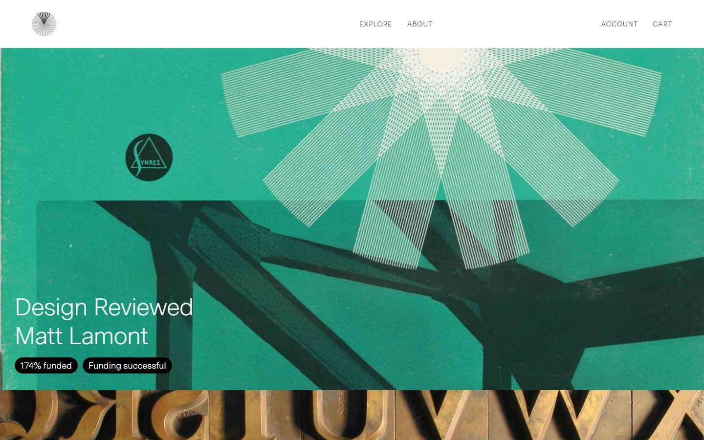
Vol.co (the Volume storefront, published under Thames & Hudson) is an editorial, gallery-quiet e-commerce surface for fine-art and typographic books. The system is deliberately near-monochrome: white canvas (`{colors.canvas}` — #ffffff), near-black ink (`{colors.ink}` — #272727), and a single mid-gray CTA color (`{colors.primary}` — #949494). Every interactive surface uses sharp 0px corners — buttons, inputs, and cards all square off — which gives the layout a precise, catalog-like rigor.
All chromatic energy lives inside the photography. The page is built from edge-to-edge full-bleed image cards (a green Synres book cover, a row of gilt Caslon type, a night-scene photograph, a Pet Shop Boys editorial shot) stacked vertically. The chrome around them stays achromatic so the imagery reads as the product.
Type is set in **Messina Sans** at a light weight (300) across the board — a neo-grotesque that runs from tiny 14px nav/button labels (with positive 0.98px tracking) up to an 80px newsletter display headline. The light weight plus large sizes produces a museum-wall-label calm rather than a SaaS shout.
Brand voltage comes from two narrow sources: the imagery itself, and small pill-shaped status badges (`{rounded.pill}` — 50px) overlaid on the lower-left of each card — black "174% funded", red "Limited copies / 276% funded", orange "Edition sold out". These pills are the only rounded shapes and nearly the only saturated color in the chrome layer.
**Key Characteristics:**
- Near-monochrome chrome: white canvas, ink text (`{colors.ink}` — #272727), gray CTA (`{colors.primary}` — #949494). Color is confined to photography and status pills.
- Universal sharp corners — `{rounded.sharp}` (0px) on buttons, inputs, and image cards. The only rounded element is the status badge at `{rounded.pill}` (50px).
- Light-weight Messina Sans (300) at large editorial sizes — 50px card/section headings, an 80px newsletter display headline.
- Full-bleed stacked image cards as the primary layout module — each is effectively a product tile that fills the column width.
- Status badges as pills overlaid bottom-left on imagery, color-coded by state (black = neutral, red = urgent/funded, orange = sold out).
- A dark footer (`{colors.surface-dark}` — #121212) closes the page beneath a white body, holding multi-column link lists and the Thames & Hudson wordmark.
- No measured shadows anywhere — depth is created by full-bleed color photography against flat white, not by elevation.
## Colors
### Brand & CTA
- **Primary** (`{colors.primary}` — #949494): The single CTA color — used as the newsletter "SIGN UP" button background. Mid-gray, deliberately quiet so it never competes with imagery.
- **Ink** (`{colors.ink}` — #272727): Near-black used for nearly all text — nav links, headings, the newsletter headline, footer wordmark.
- **On Primary** (`{colors.on-primary}` — #ffffff): Text on the gray button, and white captions/headings overlaid on dark photography.
### Surface
- **Canvas** (`{colors.canvas}` — #ffffff): The page floor and input background.
- **Surface Dark** (`{colors.surface-dark}` — #121212): The footer background — the only dark chrome surface on the page.
- **Neutral Soft** (`{colors.neutral-soft}` — #ededef) / **Neutral Faint** (`{colors.neutral-faint}` — #dedede): Very light gray fills and divider tones.
### Text & Hairline
- **Neutral Strong** (`{colors.neutral-strong}` — #717171): Secondary text — footer column labels, muted captions.
- **Neutral** (`{colors.neutral}` — #cdcccc): Tertiary text and hairline borders (input outline, footer link rows). Used here as `{colors.hairline}`.
### Status & Accent (imagery layer only)
- **Badge Black** (`{colors.badge-black}` — #000000): Neutral status pill background ("174% funded", "Funding successful").
- **Accent Red** (`{colors.accent-red}` — #ff4e4e): Active/urgent status pills ("Limited copies", "Available now", "276% funded").
- **Accent Red Deep** (`{colors.accent-red-deep}` — #c52910): A deeper red drawn from imagery tones; sparse use.
- **Accent Orange** (`{colors.accent-orange}` — #e75a00): "Edition sold out" status pill.
- **Accent Green** (`{colors.accent-green}` — #4c8b3f): Drawn from the green Synres hero card; appears as an image-derived tone rather than a chrome color.
- **Accent Blue** (`{colors.accent-blue}` — #1990c6): A minor measured accent (likely a link or in-image tone); rare.
These accents — apart from the status pills — originate in the photography and should not be applied to chrome surfaces.
## Typography
### Font Family
The system runs entirely on **Messina Sans** — a contemporary neo-grotesque (Luzi Type) — at weight **300** across all roles, from 14px UI labels to an 80px display headline. There is no secondary family; hierarchy is built from size and tracking alone. The light weight at large sizes gives the storefront its quiet, editorial, gallery-catalog character.
### Note on Font Substitutes
Messina Sans is a commercial licensed typeface and cannot be shipped freely. A usable open-source substitute is **Inter** at weight 300 (Light), which matches the neo-grotesque proportions and tracks well at large sizes. **Hanken Grotesk** Light is a close second. When substituting, preserve the negative tracking on the 50px heading (-1px) and the positive 0.98px tracking on the 14px uppercase button/nav labels — those tracking signatures carry the brand voice.
### Hierarchy
| Token | Size | Weight | Line Height | Letter Spacing | Use |
|---|---|---|---|---|---|
| `{typography.display-xl}` | 80px | 300 | 1.18 | normal | Newsletter band headline ("Join the Volume newsletter…") |
| `{typography.heading-md}` | 50px | 300 | 1.18 | -1px | Card titles ("Design Reviewed", "Arcana"), section heads (h2) |
| `{typography.body-sm}` | 14px | 300 | 1.4 | 0 | Footer links and labels — derived from the measured 14px UI baseline |
| `{typography.button}` | 14px | 300 | 1.0 | 0.98px | Nav links ("EXPLORE", "ABOUT"), button labels, status-pill text |
The `body-sm` role is **derived** from the measured 14px / weight-300 UI baseline (button role) — the analysis captured only display, heading, and button sizes directly. Running body-copy sizes beyond these were not measured (see Known Gaps).
### Principles
One family, one weight (300). Establish hierarchy through size jumps (14 → 50 → 80) rather than weight contrast. Keep the negative tracking on the large heading and the wide tracking on small uppercase labels — those are the only typographic flourishes the system allows.
## Layout
### Spacing System
- **Tokens:** `{spacing.xxs}` 8px · `{spacing.xs}` 10px · `{spacing.sm}` 12px · `{spacing.md}` 15px · `{spacing.lg}` 30px · `{spacing.xl}` 45px · `{spacing.xxl}` 60px.
- The most frequent measured step is `{spacing.lg}` (30px), which acts as the workhorse gutter/padding rhythm; `{spacing.md}` (15px) is its half-step.
- The CTA button carries an unusually wide horizontal padding (18.75px × 60px = `{spacing.xxl}`), giving the gray "SIGN UP" button its broad, confident footprint.
### Grid & Container
- **Stacked full-bleed cards:** The landing page is a single vertical stack of edge-to-edge image cards, each filling the content width. No multi-column card grid is used on the captured page.
- **Top nav:** Three zones — logo left, centered primary links ("EXPLORE", "ABOUT"), right utility cluster ("ACCOUNT", "CART").
- **Newsletter band:** Full-width white band with a single-column 80px headline above a full-width input + button row.
- **Footer:** Multi-column link list (Account / Information / Email / Follow / Development) over the dark surface, with the Thames & Hudson wordmark anchoring the bottom-left and a region/currency selector ("Sweden EUR") bottom-right.
### Whitespace Philosophy
Imagery runs edge-to-edge with no internal card padding; the breathing room is concentrated in the white newsletter band and the footer. The contrast between dense full-bleed photography and the airy white text bands is the page's primary rhythm.
## Elevation & Depth
| Level | Treatment | Use |
|---|---|---|
| Flat | No shadow, no border | Everything — nav, buttons, cards, footer |
| Image-as-depth | Full-bleed photography against flat white | Product cards create depth through imagery, not elevation |
| Hairline | 1px `{colors.hairline}` (#cdcccc) | Input outline, footer divider rows |
The analysis measured **zero shadows**. Depth in this system is entirely about contrast: saturated full-bleed photography set against flat white chrome. There is no neumorphism, no glassmorphism, no drop shadows. Status pills sit flat on top of imagery with no shadow separation — color contrast alone lifts them.
## Shapes
### Border Radius Scale
| Token | Value | Use |
|---|---|---|
| `{rounded.sharp}` | 0px | All buttons, inputs, and image cards — the default geometry of the system |
| `{rounded.pill}` | 50px | Status badges overlaid on imagery (the only rounded shape) |
The system is defined by a hard binary: everything is a sharp rectangle except the status pills, which are fully rounded. This single contrast — square chrome, round badge — is the entire shape language.
### Photography Geometry
Image cards are full-bleed rectangles with 0px corners that fill the column width at native aspect ratio. Status badges (`{rounded.pill}` — 50px radius) sit in the lower-left of each image, sized to their text content.
## Components
### Navigation
**`top-nav`** — White bar pinned to the top of the page, `{colors.canvas}` background, no border or shadow. Logo (the radiant burst mark) at left, centered link pair ("EXPLORE", "ABOUT") in `{typography.button}` (uppercase, 14px / 300 / 0.98px tracking), and a right utility cluster ("ACCOUNT", "CART"). All links in `{colors.ink}`.
### Buttons
**`button-primary`** — The newsletter "SIGN UP" CTA. Background `{colors.primary}` (#949494), text `{colors.on-primary}`, type `{typography.button}` (uppercase 14px / 300, 0.98px tracking), rounded `{rounded.sharp}` (0px), padding 18.75px × 60px. The broad horizontal padding and quiet gray fill keep it understated. No measured active/pressed variant — see Known Gaps.
### Cards & Containers
**`product-card`** — The primary content module: a full-bleed photographic tile filling the column width with sharp 0px corners. Title overlaid in `{typography.heading-md}` (50px / 300) in `{colors.on-primary}` on the lower-left, with one or more status badges beneath it. Examples: "Design Reviewed / Matt Lamont", "Arcana / Briscoe Park", "Pet Shop Boys / Volume".
**`card`** — Generic flat container. Background `{colors.canvas}`, `{rounded.sharp}` (0px), no shadow. Used for any boxed content that isn't a full-bleed image tile.
### Newsletter
**`newsletter-band`** — A full-width white band carrying the 80px `{typography.display-xl}` headline ("Join the Volume newsletter to learn about new book launches and exclusive offers.") above an input + button row.
**`text-input`** — The email field. Background `{colors.canvas}`, text `{colors.ink}`, type `{typography.body-sm}`, 1px `{colors.hairline}` (#cdcccc) outline, `{rounded.sharp}` (0px). Sits inline with `{component.button-primary}` to its right.
### Status Badges
**`badge-pill-dark`** — Neutral status pill. Background `{colors.badge-black}` (#000000), text `{colors.on-primary}`, type `{typography.button}`, rounded `{rounded.pill}` (50px). Used for "174% funded" / "Funding successful".
**`badge-pill-red`** — Urgent/active status. Background `{colors.accent-red}` (#ff4e4e), white text, same pill shape. Used for "Limited copies", "Available now", "276% funded".
**`badge-pill-orange`** — Sold-out status. Background `{colors.accent-orange}` (#e75a00), white text, same pill shape. Used for "Edition sold out".
All three pills share the `{rounded.pill}` radius, `{typography.button}` label, and ~8px × 15px padding (derived from measured spacing tokens); only the background color changes by state.
### Footer
**`footer`** — Dark band that closes the page. Background `{colors.surface-dark}` (#121212), text `{colors.neutral}` with `{colors.neutral-strong}` (#717171) column labels. Multi-column link list (Account / Information / Email / Follow / Development), an upward "back to top" arrow, the large "Thames & Hudson" wordmark bottom-left in `{colors.on-primary}`, and a "Sweden EUR" region selector bottom-right. `{typography.body-sm}` throughout. The only dark surface in the layout — it deliberately closes the otherwise-white page.
## Do's and Don'ts
### Do
- Keep chrome near-monochrome: white canvas, `{colors.ink}` text, `{colors.primary}` (#949494) for the CTA. Let photography carry the color.
- Use `{rounded.sharp}` (0px) on every button, input, and image card. Square corners are the system's signature.
- Reserve `{rounded.pill}` (50px) exclusively for status badges. Pills are the one rounded shape.
- Set all type in Messina Sans weight 300. Build hierarchy by size (14 → 50 → 80), not weight.
- Color-code status pills by meaning: black for neutral/funded, red for urgent/available, orange for sold out.
- Run image cards full-bleed to the column width — they are the product, not decoration.
- Close the page with the dark `{component.footer}`; it's the only dark surface and provides the page's closing punctuation.
### Don't
- Don't introduce shadows or beveled depth — the analysis measured none. Depth comes from photography against flat white.
- Don't round chrome elements — buttons and inputs stay at 0px.
- Don't pull image-layer accents (`{colors.accent-green}`, `{colors.accent-blue}`) onto chrome surfaces; they belong to the photography.
- Don't bold the type — weight 300 is the only weight; heavier weights break the gallery-calm voice.
- Don't drop the negative tracking on 50px headings or the 0.98px tracking on uppercase labels.
- Don't add a second saturated CTA color; the gray button is intentionally quiet.
## Responsive Behavior
### Breakpoints
The analysis captured a single desktop landing page; explicit breakpoints were not measured. The following is inferred from the stacked-card structure and should be verified.
| Name | Width | Inferred Behavior |
|---|---|---|
| Mobile | < 768px | Full-bleed cards already span the column, so they scale down cleanly; nav likely collapses; newsletter input + button likely stack |
| Tablet | 768–1024px | Stacked card layout persists; nav tightens |
| Desktop | > 1024px | Full top-nav with centered links; 80px display headline; full-width image cards |
### Touch Targets
- `{component.button-primary}` carries 18.75px × 60px padding — a generously sized tap target.
- Nav links at 14px should retain adequate hit padding (not separately measured).
- `{component.text-input}` height was not measured.
### Collapsing Strategy
- The vertical stack of full-bleed cards is inherently responsive — each card simply reflows to the available width.
- The newsletter input + button row likely stacks vertically on narrow viewports.
- The footer's multi-column link list likely collapses to fewer columns on mobile.
These behaviors are inferred (only the desktop landing page was captured) — see Known Gaps.
## Iteration Guide
1. Focus on ONE component at a time. Reference its YAML key directly (`{component.product-card}`, `{component.badge-pill-red}`).
2. Variants of an existing component (status-pill colors, button states) live as separate entries in `components:`.
3. Use `{token.refs}` everywhere — never inline a hex.
4. Never document hover. Default and Active/Pressed states only.
5. Keep type in Messina Sans 300 (or Inter 300 substitute). Hierarchy is size-driven, not weight-driven.
6. Sharp corners everywhere except status pills. Don't soften chrome.
7. When adding emphasis, reach for a larger size or a colored full-bleed image — not a new chrome color.
## Known Gaps
- **Messina Sans is a commercial licensed typeface** (Luzi Type); it cannot be shipped freely. Inter 300 / Hanken Grotesk 300 are documented as substitutes. The `fonts_licensed` field was empty in the analysis, but Messina Sans is verified commercial and treated as such here.
- **Body/paragraph type sizes were not measured** — only display (80px), heading (50px), and button/UI (14px) roles were captured. The `body-sm` role is derived from the 14px UI baseline.
- **Footer background color** is documented as `{colors.surface-dark}` (#121212, a measured neutral), but the precise footer fill was not isolated in the component pass; verify against the live footer charcoal.
- **No active/pressed or focus states** were measured for the button or input — only default fills are documented.
- **Status-pill padding** (~8px × 15px) is derived from measured spacing tokens, not directly captured per-badge.
- **No shadows measured** — confirmed flat. If any subtle elevation exists on hover/scroll it was not captured.
- **Responsive breakpoints, nav-collapse behavior, and touch-target heights** are inferred from a single desktop capture; the mobile and tablet layouts need verification.
- **Logo / brand mark geometry** (the radiant burst icon) was not extracted as a token.
- Several measured accents (`{colors.accent-green}`, `{colors.accent-blue}`, `{colors.accent-red-deep}`) likely originate inside photography rather than chrome; their intended chrome use, if any, is unconfirmed.
<!-- Documented by duply · real-world design systems as ready-to-use DESIGN.md for AI coding agents · https://duply.ai/vol/design-md -->
Color Palette
Accent
Neutrals
Typography
display-xl80px · 300 · 1.18
The quick brown fox jumpsheading-md50px · 300 · 1.18
The quick brown fox jumpsbutton14px · 300 · 1
The quick brown fox jumpsbody-sm14px · 300 · 1.4
The quick brown fox jumpsSpacing & Shape
Spacing
| Name | Value | Preview |
|---|---|---|
| xxs | 8px | |
| xs | 10px | |
| sm | 12px | |
| md | 15px | |
| lg | 30px | |
| xl | 45px | |
| xxl | 60px |
Border Radius
| Name | Value | Preview |
|---|---|---|
| sharp | 0px | |
| pill | 50px |
More like this


---
version: alpha
name: Vol.co-design-analysis
description: An editorial, gallery-quiet e-commerce surface for a fine-art / typographic book publisher (Thames & Hudson's Volume). The system is near-monochrome — white canvas, near-black ink, mid-gray CTAs — with sharp 0px corners on every interactive surface and full-bleed image cards that carry all the color. Type is set in the light-weight Messina Sans grotesque at large sizes with negative tracking, giving a museum-catalog calm. Voltage comes entirely from the photography inside cards and from small pill-shaped status badges (black, red, orange) overlaid on those images.
colors:
  primary: "#949494"
  ink: "#272727"
  on-primary: "#ffffff"
  canvas: "#ffffff"
  neutral-strong: "#717171"
  neutral: "#cdcccc"
  neutral-soft: "#ededef"
  neutral-faint: "#dedede"
  hairline: "#cdcccc"
  surface-dark: "#121212"
  badge-black: "#000000"
  accent-red: "#ff4e4e"
  accent-red-deep: "#c52910"
  accent-orange: "#e75a00"
  accent-green: "#4c8b3f"
  accent-blue: "#1990c6"
typography:
  display-xl:
    fontFamily: "Messina Sans, Inter, sans-serif"
    fontSize: 80px
    fontWeight: 300
    lineHeight: 1.18
    letterSpacing: normal
  heading-md:
    fontFamily: "Messina Sans, Inter, sans-serif"
    fontSize: 50px
    fontWeight: 300
    lineHeight: 1.18
    letterSpacing: -1px
  button:
    fontFamily: "Messina Sans, Inter, sans-serif"
    fontSize: 14px
    fontWeight: 300
    lineHeight: 1.0
    letterSpacing: 0.98px
  body-sm:
    fontFamily: "Messina Sans, Inter, sans-serif"
    fontSize: 14px
    fontWeight: 300
    lineHeight: 1.4
    letterSpacing: 0
rounded:
  sharp: 0px
  pill: 50px
spacing:
  xxs: 8px
  xs: 10px
  sm: 12px
  md: 15px
  lg: 30px
  xl: 45px
  xxl: 60px
components:
  top-nav:
    backgroundColor: "{colors.canvas}"
    textColor: "{colors.ink}"
    typography: "{typography.button}"
    rounded: "{rounded.sharp}"
  button-primary:
    backgroundColor: "{colors.primary}"
    textColor: "{colors.on-primary}"
    typography: "{typography.button}"
    rounded: "{rounded.sharp}"
    padding: 18.75px 60px
  product-card:
    backgroundColor: "{colors.canvas}"
    textColor: "{colors.on-primary}"
    typography: "{typography.heading-md}"
    rounded: "{rounded.sharp}"
  card:
    backgroundColor: "{colors.canvas}"
    textColor: "{colors.ink}"
    rounded: "{rounded.sharp}"
  text-input:
    backgroundColor: "{colors.canvas}"
    textColor: "{colors.ink}"
    typography: "{typography.body-sm}"
    rounded: "{rounded.sharp}"
  newsletter-band:
    backgroundColor: "{colors.canvas}"
    textColor: "{colors.ink}"
    typography: "{typography.display-xl}"
    rounded: "{rounded.sharp}"
  badge-pill-dark:
    backgroundColor: "{colors.badge-black}"
    textColor: "{colors.on-primary}"
    typography: "{typography.button}"
    rounded: "{rounded.pill}"
    padding: 8px 15px
  badge-pill-red:
    backgroundColor: "{colors.accent-red}"
    textColor: "{colors.on-primary}"
    typography: "{typography.button}"
    rounded: "{rounded.pill}"
    padding: 8px 15px
  badge-pill-orange:
    backgroundColor: "{colors.accent-orange}"
    textColor: "{colors.on-primary}"
    typography: "{typography.button}"
    rounded: "{rounded.pill}"
    padding: 8px 15px
  footer:
    backgroundColor: "{colors.surface-dark}"
    textColor: "{colors.neutral}"
    typography: "{typography.body-sm}"
    rounded: "{rounded.sharp}"
---

## Overview

Vol.co (the Volume storefront, published under Thames & Hudson) is an editorial, gallery-quiet e-commerce surface for fine-art and typographic books. The system is deliberately near-monochrome: white canvas (`{colors.canvas}` — #ffffff), near-black ink (`{colors.ink}` — #272727), and a single mid-gray CTA color (`{colors.primary}` — #949494). Every interactive surface uses sharp 0px corners — buttons, inputs, and cards all square off — which gives the layout a precise, catalog-like rigor.

All chromatic energy lives inside the photography. The page is built from edge-to-edge full-bleed image cards (a green Synres book cover, a row of gilt Caslon type, a night-scene photograph, a Pet Shop Boys editorial shot) stacked vertically. The chrome around them stays achromatic so the imagery reads as the product.

Type is set in **Messina Sans** at a light weight (300) across the board — a neo-grotesque that runs from tiny 14px nav/button labels (with positive 0.98px tracking) up to an 80px newsletter display headline. The light weight plus large sizes produces a museum-wall-label calm rather than a SaaS shout.

Brand voltage comes from two narrow sources: the imagery itself, and small pill-shaped status badges (`{rounded.pill}` — 50px) overlaid on the lower-left of each card — black "174% funded", red "Limited copies / 276% funded", orange "Edition sold out". These pills are the only rounded shapes and nearly the only saturated color in the chrome layer.

**Key Characteristics:**
- Near-monochrome chrome: white canvas, ink text (`{colors.ink}` — #272727), gray CTA (`{colors.primary}` — #949494). Color is confined to photography and status pills.
- Universal sharp corners — `{rounded.sharp}` (0px) on buttons, inputs, and image cards. The only rounded element is the status badge at `{rounded.pill}` (50px).
- Light-weight Messina Sans (300) at large editorial sizes — 50px card/section headings, an 80px newsletter display headline.
- Full-bleed stacked image cards as the primary layout module — each is effectively a product tile that fills the column width.
- Status badges as pills overlaid bottom-left on imagery, color-coded by state (black = neutral, red = urgent/funded, orange = sold out).
- A dark footer (`{colors.surface-dark}` — #121212) closes the page beneath a white body, holding multi-column link lists and the Thames & Hudson wordmark.
- No measured shadows anywhere — depth is created by full-bleed color photography against flat white, not by elevation.

## Colors

### Brand & CTA
- **Primary** (`{colors.primary}` — #949494): The single CTA color — used as the newsletter "SIGN UP" button background. Mid-gray, deliberately quiet so it never competes with imagery.
- **Ink** (`{colors.ink}` — #272727): Near-black used for nearly all text — nav links, headings, the newsletter headline, footer wordmark.
- **On Primary** (`{colors.on-primary}` — #ffffff): Text on the gray button, and white captions/headings overlaid on dark photography.

### Surface
- **Canvas** (`{colors.canvas}` — #ffffff): The page floor and input background.
- **Surface Dark** (`{colors.surface-dark}` — #121212): The footer background — the only dark chrome surface on the page.
- **Neutral Soft** (`{colors.neutral-soft}` — #ededef) / **Neutral Faint** (`{colors.neutral-faint}` — #dedede): Very light gray fills and divider tones.

### Text & Hairline
- **Neutral Strong** (`{colors.neutral-strong}` — #717171): Secondary text — footer column labels, muted captions.
- **Neutral** (`{colors.neutral}` — #cdcccc): Tertiary text and hairline borders (input outline, footer link rows). Used here as `{colors.hairline}`.

### Status & Accent (imagery layer only)
- **Badge Black** (`{colors.badge-black}` — #000000): Neutral status pill background ("174% funded", "Funding successful").
- **Accent Red** (`{colors.accent-red}` — #ff4e4e): Active/urgent status pills ("Limited copies", "Available now", "276% funded").
- **Accent Red Deep** (`{colors.accent-red-deep}` — #c52910): A deeper red drawn from imagery tones; sparse use.
- **Accent Orange** (`{colors.accent-orange}` — #e75a00): "Edition sold out" status pill.
- **Accent Green** (`{colors.accent-green}` — #4c8b3f): Drawn from the green Synres hero card; appears as an image-derived tone rather than a chrome color.
- **Accent Blue** (`{colors.accent-blue}` — #1990c6): A minor measured accent (likely a link or in-image tone); rare.

These accents — apart from the status pills — originate in the photography and should not be applied to chrome surfaces.

## Typography

### Font Family
The system runs entirely on **Messina Sans** — a contemporary neo-grotesque (Luzi Type) — at weight **300** across all roles, from 14px UI labels to an 80px display headline. There is no secondary family; hierarchy is built from size and tracking alone. The light weight at large sizes gives the storefront its quiet, editorial, gallery-catalog character.

### Note on Font Substitutes
Messina Sans is a commercial licensed typeface and cannot be shipped freely. A usable open-source substitute is **Inter** at weight 300 (Light), which matches the neo-grotesque proportions and tracks well at large sizes. **Hanken Grotesk** Light is a close second. When substituting, preserve the negative tracking on the 50px heading (-1px) and the positive 0.98px tracking on the 14px uppercase button/nav labels — those tracking signatures carry the brand voice.

### Hierarchy

| Token | Size | Weight | Line Height | Letter Spacing | Use |
|---|---|---|---|---|---|
| `{typography.display-xl}` | 80px | 300 | 1.18 | normal | Newsletter band headline ("Join the Volume newsletter…") |
| `{typography.heading-md}` | 50px | 300 | 1.18 | -1px | Card titles ("Design Reviewed", "Arcana"), section heads (h2) |
| `{typography.body-sm}` | 14px | 300 | 1.4 | 0 | Footer links and labels — derived from the measured 14px UI baseline |
| `{typography.button}` | 14px | 300 | 1.0 | 0.98px | Nav links ("EXPLORE", "ABOUT"), button labels, status-pill text |

The `body-sm` role is **derived** from the measured 14px / weight-300 UI baseline (button role) — the analysis captured only display, heading, and button sizes directly. Running body-copy sizes beyond these were not measured (see Known Gaps).

### Principles
One family, one weight (300). Establish hierarchy through size jumps (14 → 50 → 80) rather than weight contrast. Keep the negative tracking on the large heading and the wide tracking on small uppercase labels — those are the only typographic flourishes the system allows.

## Layout

### Spacing System
- **Tokens:** `{spacing.xxs}` 8px · `{spacing.xs}` 10px · `{spacing.sm}` 12px · `{spacing.md}` 15px · `{spacing.lg}` 30px · `{spacing.xl}` 45px · `{spacing.xxl}` 60px.
- The most frequent measured step is `{spacing.lg}` (30px), which acts as the workhorse gutter/padding rhythm; `{spacing.md}` (15px) is its half-step.
- The CTA button carries an unusually wide horizontal padding (18.75px × 60px = `{spacing.xxl}`), giving the gray "SIGN UP" button its broad, confident footprint.

### Grid & Container
- **Stacked full-bleed cards:** The landing page is a single vertical stack of edge-to-edge image cards, each filling the content width. No multi-column card grid is used on the captured page.
- **Top nav:** Three zones — logo left, centered primary links ("EXPLORE", "ABOUT"), right utility cluster ("ACCOUNT", "CART").
- **Newsletter band:** Full-width white band with a single-column 80px headline above a full-width input + button row.
- **Footer:** Multi-column link list (Account / Information / Email / Follow / Development) over the dark surface, with the Thames & Hudson wordmark anchoring the bottom-left and a region/currency selector ("Sweden EUR") bottom-right.

### Whitespace Philosophy
Imagery runs edge-to-edge with no internal card padding; the breathing room is concentrated in the white newsletter band and the footer. The contrast between dense full-bleed photography and the airy white text bands is the page's primary rhythm.

## Elevation & Depth

| Level | Treatment | Use |
|---|---|---|
| Flat | No shadow, no border | Everything — nav, buttons, cards, footer |
| Image-as-depth | Full-bleed photography against flat white | Product cards create depth through imagery, not elevation |
| Hairline | 1px `{colors.hairline}` (#cdcccc) | Input outline, footer divider rows |

The analysis measured **zero shadows**. Depth in this system is entirely about contrast: saturated full-bleed photography set against flat white chrome. There is no neumorphism, no glassmorphism, no drop shadows. Status pills sit flat on top of imagery with no shadow separation — color contrast alone lifts them.

## Shapes

### Border Radius Scale

| Token | Value | Use |
|---|---|---|
| `{rounded.sharp}` | 0px | All buttons, inputs, and image cards — the default geometry of the system |
| `{rounded.pill}` | 50px | Status badges overlaid on imagery (the only rounded shape) |

The system is defined by a hard binary: everything is a sharp rectangle except the status pills, which are fully rounded. This single contrast — square chrome, round badge — is the entire shape language.

### Photography Geometry
Image cards are full-bleed rectangles with 0px corners that fill the column width at native aspect ratio. Status badges (`{rounded.pill}` — 50px radius) sit in the lower-left of each image, sized to their text content.

## Components

### Navigation

**`top-nav`** — White bar pinned to the top of the page, `{colors.canvas}` background, no border or shadow. Logo (the radiant burst mark) at left, centered link pair ("EXPLORE", "ABOUT") in `{typography.button}` (uppercase, 14px / 300 / 0.98px tracking), and a right utility cluster ("ACCOUNT", "CART"). All links in `{colors.ink}`.

### Buttons

**`button-primary`** — The newsletter "SIGN UP" CTA. Background `{colors.primary}` (#949494), text `{colors.on-primary}`, type `{typography.button}` (uppercase 14px / 300, 0.98px tracking), rounded `{rounded.sharp}` (0px), padding 18.75px × 60px. The broad horizontal padding and quiet gray fill keep it understated. No measured active/pressed variant — see Known Gaps.

### Cards & Containers

**`product-card`** — The primary content module: a full-bleed photographic tile filling the column width with sharp 0px corners. Title overlaid in `{typography.heading-md}` (50px / 300) in `{colors.on-primary}` on the lower-left, with one or more status badges beneath it. Examples: "Design Reviewed / Matt Lamont", "Arcana / Briscoe Park", "Pet Shop Boys / Volume".

**`card`** — Generic flat container. Background `{colors.canvas}`, `{rounded.sharp}` (0px), no shadow. Used for any boxed content that isn't a full-bleed image tile.

### Newsletter

**`newsletter-band`** — A full-width white band carrying the 80px `{typography.display-xl}` headline ("Join the Volume newsletter to learn about new book launches and exclusive offers.") above an input + button row.

**`text-input`** — The email field. Background `{colors.canvas}`, text `{colors.ink}`, type `{typography.body-sm}`, 1px `{colors.hairline}` (#cdcccc) outline, `{rounded.sharp}` (0px). Sits inline with `{component.button-primary}` to its right.

### Status Badges

**`badge-pill-dark`** — Neutral status pill. Background `{colors.badge-black}` (#000000), text `{colors.on-primary}`, type `{typography.button}`, rounded `{rounded.pill}` (50px). Used for "174% funded" / "Funding successful".

**`badge-pill-red`** — Urgent/active status. Background `{colors.accent-red}` (#ff4e4e), white text, same pill shape. Used for "Limited copies", "Available now", "276% funded".

**`badge-pill-orange`** — Sold-out status. Background `{colors.accent-orange}` (#e75a00), white text, same pill shape. Used for "Edition sold out".

All three pills share the `{rounded.pill}` radius, `{typography.button}` label, and ~8px × 15px padding (derived from measured spacing tokens); only the background color changes by state.

### Footer

**`footer`** — Dark band that closes the page. Background `{colors.surface-dark}` (#121212), text `{colors.neutral}` with `{colors.neutral-strong}` (#717171) column labels. Multi-column link list (Account / Information / Email / Follow / Development), an upward "back to top" arrow, the large "Thames & Hudson" wordmark bottom-left in `{colors.on-primary}`, and a "Sweden EUR" region selector bottom-right. `{typography.body-sm}` throughout. The only dark surface in the layout — it deliberately closes the otherwise-white page.

## Do's and Don'ts

### Do
- Keep chrome near-monochrome: white canvas, `{colors.ink}` text, `{colors.primary}` (#949494) for the CTA. Let photography carry the color.
- Use `{rounded.sharp}` (0px) on every button, input, and image card. Square corners are the system's signature.
- Reserve `{rounded.pill}` (50px) exclusively for status badges. Pills are the one rounded shape.
- Set all type in Messina Sans weight 300. Build hierarchy by size (14 → 50 → 80), not weight.
- Color-code status pills by meaning: black for neutral/funded, red for urgent/available, orange for sold out.
- Run image cards full-bleed to the column width — they are the product, not decoration.
- Close the page with the dark `{component.footer}`; it's the only dark surface and provides the page's closing punctuation.

### Don't
- Don't introduce shadows or beveled depth — the analysis measured none. Depth comes from photography against flat white.
- Don't round chrome elements — buttons and inputs stay at 0px.
- Don't pull image-layer accents (`{colors.accent-green}`, `{colors.accent-blue}`) onto chrome surfaces; they belong to the photography.
- Don't bold the type — weight 300 is the only weight; heavier weights break the gallery-calm voice.
- Don't drop the negative tracking on 50px headings or the 0.98px tracking on uppercase labels.
- Don't add a second saturated CTA color; the gray button is intentionally quiet.

## Responsive Behavior

### Breakpoints
The analysis captured a single desktop landing page; explicit breakpoints were not measured. The following is inferred from the stacked-card structure and should be verified.

| Name | Width | Inferred Behavior |
|---|---|---|
| Mobile | < 768px | Full-bleed cards already span the column, so they scale down cleanly; nav likely collapses; newsletter input + button likely stack |
| Tablet | 768–1024px | Stacked card layout persists; nav tightens |
| Desktop | > 1024px | Full top-nav with centered links; 80px display headline; full-width image cards |

### Touch Targets
- `{component.button-primary}` carries 18.75px × 60px padding — a generously sized tap target.
- Nav links at 14px should retain adequate hit padding (not separately measured).
- `{component.text-input}` height was not measured.

### Collapsing Strategy
- The vertical stack of full-bleed cards is inherently responsive — each card simply reflows to the available width.
- The newsletter input + button row likely stacks vertically on narrow viewports.
- The footer's multi-column link list likely collapses to fewer columns on mobile.

These behaviors are inferred (only the desktop landing page was captured) — see Known Gaps.

## Iteration Guide

1. Focus on ONE component at a time. Reference its YAML key directly (`{component.product-card}`, `{component.badge-pill-red}`).
2. Variants of an existing component (status-pill colors, button states) live as separate entries in `components:`.
3. Use `{token.refs}` everywhere — never inline a hex.
4. Never document hover. Default and Active/Pressed states only.
5. Keep type in Messina Sans 300 (or Inter 300 substitute). Hierarchy is size-driven, not weight-driven.
6. Sharp corners everywhere except status pills. Don't soften chrome.
7. When adding emphasis, reach for a larger size or a colored full-bleed image — not a new chrome color.

## Known Gaps

- **Messina Sans is a commercial licensed typeface** (Luzi Type); it cannot be shipped freely. Inter 300 / Hanken Grotesk 300 are documented as substitutes. The `fonts_licensed` field was empty in the analysis, but Messina Sans is verified commercial and treated as such here.
- **Body/paragraph type sizes were not measured** — only display (80px), heading (50px), and button/UI (14px) roles were captured. The `body-sm` role is derived from the 14px UI baseline.
- **Footer background color** is documented as `{colors.surface-dark}` (#121212, a measured neutral), but the precise footer fill was not isolated in the component pass; verify against the live footer charcoal.
- **No active/pressed or focus states** were measured for the button or input — only default fills are documented.
- **Status-pill padding** (~8px × 15px) is derived from measured spacing tokens, not directly captured per-badge.
- **No shadows measured** — confirmed flat. If any subtle elevation exists on hover/scroll it was not captured.
- **Responsive breakpoints, nav-collapse behavior, and touch-target heights** are inferred from a single desktop capture; the mobile and tablet layouts need verification.
- **Logo / brand mark geometry** (the radiant burst icon) was not extracted as a token.
- Several measured accents (`{colors.accent-green}`, `{colors.accent-blue}`, `{colors.accent-red-deep}`) likely originate inside photography rather than chrome; their intended chrome use, if any, is unconfirmed.

<!-- Documented by duply · real-world design systems as ready-to-use DESIGN.md for AI coding agents · https://duply.ai/vol/design-md -->