
PeakDesign
A premium, monochrome outdoor-gear commerce interface built on a hard split between pure-white product canvas and full-black category tiles. The system reads as precision-engineered and editorial — sharp 0px-radius buttons and cards, a serif display headline for emotional brand moments, and Geist sans for all UI chrome. Chromatic voltage is almost entirely absent: color lives only in product photography and a tiny reserved accent set (forest green, salmon, red). Deep black bands and black image tiles alternate with white to pace the long-scroll landing page.
Works withClaude CodeCursorCodexGemini CLICopilotv0LovableBoltWindsurfReplit
---
version: alpha
name: PeakDesign-design-analysis
description: "A premium, monochrome outdoor-gear commerce interface built on a hard split between pure-white product canvas and full-black category tiles. The system reads as precision-engineered and editorial — sharp 0px-radius buttons and cards, a serif display headline for emotional brand moments, and Geist sans for all UI chrome. Chromatic voltage is almost entirely absent: color lives only in product photography and a tiny reserved accent set (forest green, salmon, red). Deep black bands and black image tiles alternate with white to pace the long-scroll landing page."
colors:
  ink: "#1a211e"
  canvas: "#ffffff"
  surface-black: "#000000"
  surface-black-soft: "#0c0c0c"
  on-dark: "#ffffff"
  muted: "#606562"
  surface-soft: "#eef1f0"
  surface-tint: "#fbfdfc"
  hairline: "#e6e9e8"
  neutral-mist: "#cccfcd"
  neutral-fog: "#b8bcba"
  neutral-pale: "#d7dad8"
  neutral-line: "#e0e0e0"
  neutral-edge: "#e2e2e2"
  neutral-slate: "#363537"
  neutral-shadow: "#333132"
  neutral-graphite: "#505050"
  surface-forest: "#2f3734"
  accent-green: "#407961"
  accent-salmon: "#f5a898"
  accent-red: "#cc2e39"
typography:
  h2:
    fontFamily: "Geist, -apple-system, BlinkMacSystemFont, sans-serif"
    fontSize: 18px
    fontWeight: 600
    lineHeight: 1.2
    letterSpacing: "0"
  body:
    fontFamily: "Bryant, Montserrat, -apple-system, sans-serif"
    fontSize: 14px
    fontWeight: 700
    lineHeight: 1.4
    letterSpacing: "0"
  button:
    fontFamily: "Geist, -apple-system, BlinkMacSystemFont, sans-serif"
    fontSize: 16px
    fontWeight: 400
    lineHeight: 1.2
    letterSpacing: "0"
rounded:
  sharp: 0px
  xs: 2px
  sm: 4px
  md: 8px
  lg: 16px
  xl: 32px
  full: 9999px
spacing:
  xxs: 4px
  xs: 8px
  sm: 12px
  md: 16px
  lg: 20px
  xl: 24px
  xxl: 32px
  xxxl: 40px
  huge: 48px
  section: 64px
components:
  button-primary:
    backgroundColor: "{colors.canvas}"
    textColor: "{colors.ink}"
    typography: "{typography.button}"
    rounded: "{rounded.sharp}"
    padding: 0px 16px
  card-product:
    backgroundColor: "{colors.surface-soft}"
    textColor: "{colors.ink}"
    typography: "{typography.body}"
    rounded: "{rounded.sharp}"
  category-tile:
    backgroundColor: "{colors.surface-black}"
    textColor: "{colors.on-dark}"
    typography: "{typography.h2}"
    rounded: "{rounded.sharp}"
  dark-band:
    backgroundColor: "{colors.surface-black}"
    textColor: "{colors.on-dark}"
    typography: "{typography.h2}"
    padding: 64px
  feature-panel-dark:
    backgroundColor: "{colors.surface-black}"
    textColor: "{colors.on-dark}"
    typography: "{typography.body}"
    rounded: "{rounded.sharp}"
  filter-pill:
    backgroundColor: "{colors.surface-soft}"
    textColor: "{colors.ink}"
    typography: "{typography.body}"
    rounded: "{rounded.sm}"
    padding: 8px 12px
  filter-pill-active:
    backgroundColor: "{colors.ink}"
    textColor: "{colors.on-dark}"
    typography: "{typography.body}"
    rounded: "{rounded.sm}"
    padding: 8px 12px
  circular-icon-button:
    backgroundColor: "{colors.canvas}"
    textColor: "{colors.ink}"
    rounded: "{rounded.full}"
  badge-new:
    backgroundColor: "{colors.surface-black}"
    textColor: "{colors.on-dark}"
    typography: "{typography.body}"
    rounded: "{rounded.xl}"
    padding: 4px 12px
  input:
    backgroundColor: "{colors.canvas}"
    textColor: "{colors.ink}"
    typography: "{typography.button}"
    rounded: "{rounded.sm}"
    padding: 12px 16px
  newsletter-modal:
    backgroundColor: "{colors.surface-black}"
    textColor: "{colors.on-dark}"
    rounded: "{rounded.sharp}"
  footer:
    backgroundColor: "{colors.canvas}"
    textColor: "{colors.ink}"
    typography: "{typography.body}"
    padding: 64px
---

## Overview

Peak Design's landing surface is a precision-engineered, near-monochrome commerce interface. The system alternates two extremes: a pure-white product canvas (`{colors.canvas}` — #ffffff) and full-black surfaces (`{colors.surface-black}` — #000000) used for category tiles, editorial bands, and the newsletter modal. Between them sit soft-gray product cards (`{colors.surface-soft}` — #eef1f0). The result reads as engineered, editorial, and confident — the product photography carries all the color, while the UI chrome stays strictly grayscale.

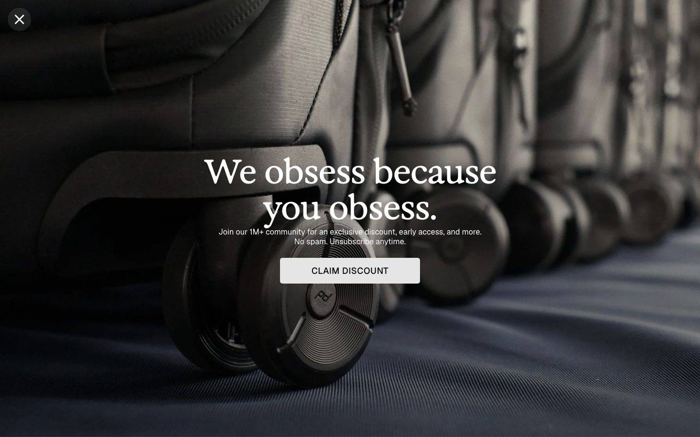
Type voice splits into two functional roles. **Geist** (Vercel's open geometric sans) handles UI chrome — section headings (`{typography.h2}`, 18px / 600) and button labels (`{typography.button}`, 16px / 400). A second face, **Bryant**, carries the small tracked body/label text at 14px / 700. The large serif display line seen in the hero ("We obsess because you obsess.") is a distinct emotional-brand voice — it was not captured in the measurement pass and is documented as a Known Gap below.

The most distinctive structural signature is the **hard 0px radius**. Buttons (`{component.button-primary}`) and cards (`{component.card-product}`) both measured a literal `0px` corner radius — Peak Design deliberately favors sharp, engineered edges over friendly rounding. The only rounded elements are the circular icon/arrow buttons (`{rounded.full}`), the small "New" badge (`{rounded.xl}`), and the thin-border input (`{rounded.sm}`).

**Key Characteristics:**
- Hard-edged geometry: `{component.button-primary}` and `{component.card-product}` render at `{rounded.sharp}` (0px). Sharp corners are the system's engineering signature.
- Two-mode surface rhythm: white canvas bands and full-black bands (`{colors.surface-black}`) alternate down the page to pace the long scroll.
- White CTA buttons with dark ink labels (`{colors.ink}` — #1a211e). The primary CTA is a white block with all-caps sans text, on both light and dark bands.
- Black image tiles for category navigation (TRAVEL, OUTDOOR, STRAPS, CLIPS…), each with a circular arrow icon button in the corner (`{component.circular-icon-button}`).
- Near-total monochrome: color appears only in product photography and a tiny reserved accent set — `{colors.accent-green}` (#407961), `{colors.accent-salmon}` (#f5a898), `{colors.accent-red}` (#cc2e39).
- Filter pills for the best-sellers rail (CAMERA GEAR / TRAVEL / EVERYDAY…): light-gray inactive (`{component.filter-pill}`), inverting to dark ink when active (`{component.filter-pill-active}`).
- A serif display headline reserved for hero and editorial emotional moments (not in the measured token set).

## Colors

### Brand & Accent
Peak Design is a monochrome brand at the UI layer. The measured accents appear rarely — on product-photo details, tags, and small highlights, never on primary buttons or navigation.
- **Accent Green** (`{colors.accent-green}` — #407961): The closest thing to a brand hue — a muted forest green, appearing on small marks and product accents.
- **Accent Salmon** (`{colors.accent-salmon}` — #f5a898): A warm peach used sparingly on product details / strap hardware.
- **Accent Red** (`{colors.accent-red}` — #cc2e39): A saturated red reserved for the smallest highlight moments (sale flags, alert marks).

### Surface
- **Canvas** (`{colors.canvas}` — #ffffff): The default page floor and the product-rail background.
- **Surface Soft** (`{colors.surface-soft}` — #eef1f0): Light-gray product-card and filter-pill background.
- **Surface Tint** (`{colors.surface-tint}` — #fbfdfc): A barely-off-white used on very-soft panels.
- **Surface Black** (`{colors.surface-black}` — #000000): Category tiles, editorial dark bands, the newsletter modal, and the dark feature panel.
- **Surface Black Soft** (`{colors.surface-black-soft}` — #0c0c0c): A near-black used for nested dark panels.
- **Surface Forest** (`{colors.surface-forest}` — #2f3734): A very dark green-tinted surface variant.

### Text
- **Ink** (`{colors.ink}` — #1a211e): The primary dark text tone and the color of button labels on white CTAs. A near-black with a faint green cast.
- **On Dark** (`{colors.on-dark}` — #ffffff): Text on all black surfaces — category tiles, dark bands, modal, feature panel.
- **Muted** (`{colors.muted}` — #606562): Secondary / supporting text.

### Neutral Ramp (hairlines & tonal grays)
A cool gray ramp used for borders, dividers, disabled states, and subtle fills: `{colors.hairline}` (#e6e9e8), `{colors.neutral-pale}` (#d7dad8), `{colors.neutral-mist}` (#cccfcd), `{colors.neutral-fog}` (#b8bcba), `{colors.neutral-line}` (#e0e0e0), `{colors.neutral-edge}` (#e2e2e2), `{colors.neutral-graphite}` (#505050), `{colors.neutral-slate}` (#363537), `{colors.neutral-shadow}` (#333132). These carry no semantic meaning individually — they form the grayscale scaffolding between white and black.

## Typography

### Font Family
The system runs **Geist** for UI chrome (section headings and button labels) and **Bryant** for small tracked body/label text. Geist is Vercel's open-source geometric sans — the fallback stack walks `-apple-system, BlinkMacSystemFont, "Segoe UI", sans-serif`. The functional split:
- Geist (`{typography.h2}`, `{typography.button}`) — section headings and button labels.
- Bryant (`{typography.body}`, 14px / 700) — small tracked labels, product meta, footer link lists.

### Hierarchy

| Token | Size | Weight | Line Height | Letter Spacing | Use |
|---|---|---|---|---|---|
| `{typography.h2}` | 18px | 600 | 1.2 | 0 | Section headings, category-tile labels — Geist |
| `{typography.button}` | 16px | 400 | 1.2 | 0 | Button labels, input text — Geist |
| `{typography.body}` | 14px | 700 | 1.4 | 0 | Small labels, product meta, footer lists — Bryant |

### Principles
The UI type stays small and quiet — 14–18px across all measured roles — deliberately deferring visual weight to the product photography and the black/white surface contrast. Bryant runs at heavy 700 weight at small sizes, giving the label text a compact, uppercase-friendly stamp (e.g., "CLAIM DISCOUNT", "SHOP NOW", "FIND A RETAILER").

### Note on Font Substitutes
**Bryant** is a licensed commercial typeface (House Industries) and is not shipped as an open web font in this system. Use **Montserrat** (weight 700) as the closest open-source substitute — it preserves Bryant's geometric, slightly-rounded character at small tracked sizes. **Geist** is open-source (SIL Open Font License via Vercel) and can be shipped directly.

## Layout

### Spacing System
- **Base unit:** 4px.
- **Tokens:** `{spacing.xxs}` 4px · `{spacing.xs}` 8px · `{spacing.sm}` 12px · `{spacing.md}` 16px · `{spacing.lg}` 20px · `{spacing.xl}` 24px · `{spacing.xxl}` 32px · `{spacing.xxxl}` 40px · `{spacing.huge}` 48px · `{spacing.section}` 64px.
- **Dominant values (by frequency):** `{spacing.xl}` (24px) is by far the most-used gap/padding, followed by `{spacing.xs}` (8px), `{spacing.xxs}` (4px), and `{spacing.md}` (16px).
- **Section rhythm:** `{spacing.section}` (64px) is the vertical rhythm between major editorial bands.

### Grid & Container
- **Best-sellers rail:** a horizontally scrolling 4-up product carousel with arrow-button paging and dot pagination.
- **Category tile grid:** 3-up grid of black image tiles at desktop (TRAVEL / PACKING CUBES / OUTDOOR, then subsequent rows).
- **Editorial feature grid:** OUR MISSION / IMPACT REPORT / FILMS as a 3-up black-tile row.
- **Footer:** multi-column link list (SUPPORT / ABOUT / SHOP / store + newsletter block) at desktop.

### Whitespace Philosophy
The layout uses generous 64px band spacing and a 24px internal grid gap. Product cards and category tiles sit edge-to-edge inside their grids, letting the black/white surface contrast — rather than borders — define regions. The whitespace is calm and editorial, deferring attention to full-bleed product photography.

## Elevation & Depth

| Level | Treatment | Use |
|---|---|---|
| Flat | No shadow, no border | Default cards, category tiles, bands — the system is overwhelmingly flat |
| Hairline | 1px `{colors.hairline}` / neutral-ramp border | Inputs, dividers |
| Soft glow | `rgba(0,0,0,0.04) 0px 0px 4px 0px` (measured) | A very faint ambient lift on a single elevated element |
| Drop shadow | `rgba(0,0,0,0.1) 0px 10px 15px -3px, rgba(0,0,0,0.1) 0px 4px 6px -4px` (measured) | The strongest shadow in the system — used on one floating/elevated surface (e.g., a dropdown or floating card) |

The elevation philosophy is **flat-first**. Peak Design relies on hard-edged surface blocks and black/white contrast for depth rather than shadow. Only two box-shadow values were measured across the entire page, each used once.

## Shapes

### Border Radius Scale

| Token | Value | Use |
|---|---|---|
| `{rounded.sharp}` | 0px | Buttons, product cards, category tiles — the system's default corner (measured 0px) |
| `{rounded.xs}` | 2px | Rare small accents |
| `{rounded.sm}` | 4px | Text inputs, filter pills |
| `{rounded.md}` | 8px | Occasional small panels (most frequent radius in the measured set after 0/4) |
| `{rounded.lg}` | 16px | Rare larger panel corner |
| `{rounded.xl}` | 32px | The "New" product badge, pill-shaped tags |
| `{rounded.full}` | 9999px | Circular arrow / icon buttons, the modal close button |

### Photography Geometry
Product and lifestyle imagery fills its containers edge-to-edge at `{rounded.sharp}` (0px) — the black category tiles are full-bleed photographs cropped to hard rectangles. The circular arrow controls (`{rounded.full}`) provide the only curved counterpoint against the otherwise strictly rectilinear layout.

## Components

### Buttons

**`button-primary`** — The signature CTA. White block (`{colors.canvas}`) with dark `{colors.ink}` label in `{typography.button}` (Geist 16px / 400), padding 0px × 16px, rounded `{rounded.sharp}` (0px, measured). Used for "CLAIM DISCOUNT", "SHOP NOW", "SHOP NEW ARRIVALS", "WATCH THE FILM". Renders identically on white and black bands — the white block reads as the action regardless of surface.

**`circular-icon-button`** — A perfectly circular icon button (`{rounded.full}`), `{colors.canvas}` background with `{colors.ink}` icon. Used for the carousel paging arrows, category-tile corner arrows, and the newsletter-modal close (X) button.

### Cards & Tiles

**`card-product`** — Best-sellers rail card. Light-gray `{colors.surface-soft}` background, `{colors.ink}` text, rounded `{rounded.sharp}` (0px, measured). Holds the product image, name, colorway line, and price in `{typography.body}`.

**`category-tile`** — Full-bleed black image tile for category navigation (TRAVEL, PACKING CUBES, OUTDOOR, PHONE CASES, WALLETS, MOTORCYCLE, STRAPS, CLIPS, TRIPODS). Background `{colors.surface-black}`, label in `{colors.on-dark}` / `{typography.h2}` at bottom-left, `{component.circular-icon-button}` at bottom-right, rounded `{rounded.sharp}`.

**`feature-panel-dark`** — The "At the expense of nobody / FEATURED" editorial panel. Background `{colors.surface-black}`, text `{colors.on-dark}`, contains a small tracked eyebrow, a serif heading, body copy in `{typography.body}`, and a `{component.button-primary}`.

**`badge-new`** — Small "New" tag over product imagery. Background `{colors.surface-black}`, text `{colors.on-dark}` in `{typography.body}`, rounded `{rounded.xl}` (pill-like), padding 4px × 12px.

### Bands

**`dark-band`** — Full-width black editorial band ("Your next essential just dropped."). Background `{colors.surface-black}`, text `{colors.on-dark}`, `{spacing.section}` (64px) vertical padding, containing an eyebrow label, serif heading, body line, and a `{component.button-primary}`.

### Filters

**`filter-pill`** — Best-sellers category filter (inactive). Background `{colors.surface-soft}`, text `{colors.ink}`, type `{typography.body}`, rounded `{rounded.sm}`, padding 8px × 12px.

**`filter-pill-active`** — Active filter (e.g., "CAMERA GEAR"). Inverts to `{colors.ink}` background with `{colors.on-dark}` text, same radius and padding.

### Inputs & Forms

**`input`** — Text input (retailer-location search, newsletter email). Background `{colors.canvas}` (measured), 1px hairline border in `{colors.hairline}`, rounded `{rounded.sm}` (4px, measured), padding 12px × 16px, text in `{typography.button}`.

### Overlays & Footer

**`newsletter-modal`** — Full-viewport promo modal ("We obsess because you obsess."). Full-bleed dark product photograph over `{colors.surface-black}`, text `{colors.on-dark}`, serif headline, body sub-line in `{typography.body}`, a white `{component.button-primary}`, and a `{component.circular-icon-button}` close control at top-left.

**`footer`** — Page-closing footer on `{colors.canvas}` with `{colors.ink}` text. Multi-column link lists (SUPPORT / ABOUT / SHOP), a store selector, a newsletter subscribe block (`{component.input}` + `{component.button-primary}` "SIGN ME UP"), social icon row, and certification marks. Body text in `{typography.body}`, `{spacing.section}` (64px) padding.

## Do's and Don'ts

### Do
- Keep buttons and cards at `{rounded.sharp}` (0px). The hard edge is the system's engineering identity.
- Use `{component.button-primary}` (white block, `{colors.ink}` label) on both light and dark bands — it reads as the action either way.
- Alternate white canvas bands with full-black bands / tiles to pace the long scroll.
- Let product photography carry the color. Keep the UI chrome grayscale.
- Reserve `{colors.accent-green}`, `{colors.accent-salmon}`, and `{colors.accent-red}` for tiny highlight moments only.
- Pair the serif display headline with Geist/Bryant sans supporting text for emotional-brand moments.
- Use `{component.circular-icon-button}` for all directional / close controls — the circle is the only curved shape in the system.

### Don't
- Don't round buttons or product cards — 0px radius is measured and intentional.
- Don't introduce accent color into navigation, buttons, or headings. The action layer is strictly monochrome.
- Don't add heavy shadows; the system is flat-first with only two faint measured shadows.
- Don't put body copy in the serif display face — the serif is reserved for headlines and emotional lines.
- Don't repeat the same surface mode in consecutive bands — the pacing alternates white → gray-cards → black tiles → black band → white → footer.
- Don't ship Bryant directly (licensed) — use the documented Montserrat substitute.

## Responsive Behavior

### Breakpoints

| Name | Width | Key Changes |
|---|---|---|
| Mobile | < 768px | Category tiles stack to 1-up; best-sellers rail becomes a swipe carousel; footer columns collapse to stacked lists; newsletter modal scales to full screen |
| Tablet | 768–1024px | Category grid 2-up; product rail shows fewer cards; footer to 2-up columns |
| Desktop | 1024–1440px | Category grid 3-up; 4-up best-sellers rail; full multi-column footer |
| Wide | > 1440px | Same as desktop with wider outer margins |

### Touch Targets
- `{component.button-primary}` uses 16px horizontal padding; effective height derives from line-height and band padding (exact height not measured — see Known Gaps).
- `{component.circular-icon-button}` provides a full-circle tap target for carousel and close controls.
- `{component.input}` uses 12px × 16px padding for a comfortable tap area.

### Collapsing Strategy
- The best-sellers rail scrolls horizontally with arrow-button paging on desktop and swipe on mobile; dot pagination indicates position.
- Category tiles reduce columns (3 → 2 → 1) rather than shrinking; each tile retains its bottom-left label + corner arrow.
- The dark editorial bands stay full-bleed at every breakpoint.
- The footer collapses its multi-column link lists into stacked groups on mobile.

### Image Behavior
- Category-tile and hero photography is full-bleed, cropped to hard rectangles at `{rounded.sharp}`.
- Product-card imagery sits centered on the `{colors.surface-soft}` card.

## Iteration Guide

1. Focus on ONE component at a time. Reference its YAML key directly (`{component.category-tile}`, `{component.filter-pill-active}`).
2. Variants of an existing component (`-active`) live as separate entries in `components:`.
3. Use `{token.refs}` everywhere — never inline hex.
4. Never document hover. Default and active/pressed states only.
5. Keep 0px radius on buttons and cards; only circular controls and the "New" badge deviate.
6. Keep the action layer monochrome — accents stay in photography and micro-highlights.
7. When in doubt about emphasis: use surface contrast (white vs black block) before adding color.

## Known Gaps

- **The serif display headline is not in the measured token set.** The hero and editorial headlines ("We obsess because you obsess.", "Your next essential just dropped.", "At the expense of nobody.") are clearly a distinct serif display face in the screenshots, but the measurement pass captured only Geist (h2, button) and Bryant (body). A `display-serif` typography role should be added once the face, size ramp, weight, and tracking are measured directly.
- **Button height is not measured.** `{component.button-primary}` padding measured as `0px 16px` with no vertical value; effective height depends on line-height and container — treat rendered height as derived until confirmed.
- **Bryant is a licensed commercial typeface** (not flagged in fonts_licensed but confirmed proprietary); the Montserrat substitute is documented. Verify Bryant licensing before shipping.
- Accent colors (green / salmon / red) were captured at low frequency and may originate partly from product photography rather than UI tokens; their exact UI usage needs confirmation.
- Only two box-shadow values were measured (each used once); a fuller elevation scale is not available.
- Only the landing page was captured — product-detail, cart, and checkout surfaces are out of scope.
- Form validation states (error / success / focus) beyond the base `{component.input}` were not extracted.
- Animation and transition timings (carousel paging, modal entrance, tile hover-reveal) are not in scope.

<!-- Documented by Duply · real-world design systems as ready-to-use DESIGN.md for AI coding agents · https://duply.ai/peakdesign/design-md -->
Color Palette
Accent
Neutrals
Typography
h218px · 600 · 1.2
The quick brown fox jumpsbody14px · 700 · 1.4
The quick brown fox jumpsbutton16px · 400 · 1.2
The quick brown fox jumpsSpacing & Shape
Spacing
| Name | Value | Preview |
|---|---|---|
| xxs | 4px | |
| xs | 8px | |
| sm | 12px | |
| md | 16px | |
| lg | 20px | |
| xl | 24px | |
| xxl | 32px | |
| xxxl | 40px | |
| huge | 48px | |
| section | 64px |
Border Radius
| Name | Value | Preview |
|---|---|---|
| sharp | 0px | |
| xs | 2px | |
| sm | 4px | |
| md | 8px | |
| lg | 16px | |
| xl | 32px | |
| full | 9999px |
FAQ
- What colors does PeakDesign use?
- PeakDesign's core palette includes #1a211e, #ffffff, #000000, #0c0c0c, #ffffff. The full color set with usage roles (canvas, ink, surfaces, accent, semantic) is documented in the PeakDesign DESIGN.md.
- What font does PeakDesign use?
- PeakDesign's primary typeface is Geist. The complete type scale (sizes, weights, line-height and letter-spacing per role), with an open substitute where the original is licensed, is documented in the DESIGN.md.
- What is the PeakDesign design system?
- A premium, monochrome outdoor-gear commerce interface built on a hard split between pure-white product canvas and full-black category tiles. The system reads as precision-engineered and editorial — sharp 0px-radius buttons and cards, a serif display headline for emotional brand moments, and Geist
Get this as a working kit
PeakDesign Launch Kit + DESIGN.md
$299$225
One-time payment
- A complete production-stack template, styled like PeakDesign, fully built and wired.
- One-time payment and the codebase is yours. No platform fees, no subscription.
Open it with Claude Code, Cursor, or any coding agent and build in plain language, then ship a complete web app.
- Your private DESIGN.md
- Marketing pages, blog, SEO & legal
- Email capture, newsletter & contact
- Accept payments (Stripe)
- Analytics (GA4 + PostHog)
- One-click deploy
- Auth, login & roles
- A full app dashboard, when you grow
More like this
---
version: alpha
name: PeakDesign-design-analysis
description: "A premium, monochrome outdoor-gear commerce interface built on a hard split between pure-white product canvas and full-black category tiles. The system reads as precision-engineered and editorial — sharp 0px-radius buttons and cards, a serif display headline for emotional brand moments, and Geist sans for all UI chrome. Chromatic voltage is almost entirely absent: color lives only in product photography and a tiny reserved accent set (forest green, salmon, red). Deep black bands and black image tiles alternate with white to pace the long-scroll landing page."
colors:
  ink: "#1a211e"
  canvas: "#ffffff"
  surface-black: "#000000"
  surface-black-soft: "#0c0c0c"
  on-dark: "#ffffff"
  muted: "#606562"
  surface-soft: "#eef1f0"
  surface-tint: "#fbfdfc"
  hairline: "#e6e9e8"
  neutral-mist: "#cccfcd"
  neutral-fog: "#b8bcba"
  neutral-pale: "#d7dad8"
  neutral-line: "#e0e0e0"
  neutral-edge: "#e2e2e2"
  neutral-slate: "#363537"
  neutral-shadow: "#333132"
  neutral-graphite: "#505050"
  surface-forest: "#2f3734"
  accent-green: "#407961"
  accent-salmon: "#f5a898"
  accent-red: "#cc2e39"
typography:
  h2:
    fontFamily: "Geist, -apple-system, BlinkMacSystemFont, sans-serif"
    fontSize: 18px
    fontWeight: 600
    lineHeight: 1.2
    letterSpacing: "0"
  body:
    fontFamily: "Bryant, Montserrat, -apple-system, sans-serif"
    fontSize: 14px
    fontWeight: 700
    lineHeight: 1.4
    letterSpacing: "0"
  button:
    fontFamily: "Geist, -apple-system, BlinkMacSystemFont, sans-serif"
    fontSize: 16px
    fontWeight: 400
    lineHeight: 1.2
    letterSpacing: "0"
rounded:
  sharp: 0px
  xs: 2px
  sm: 4px
  md: 8px
  lg: 16px
  xl: 32px
  full: 9999px
spacing:
  xxs: 4px
  xs: 8px
  sm: 12px
  md: 16px
  lg: 20px
  xl: 24px
  xxl: 32px
  xxxl: 40px
  huge: 48px
  section: 64px
components:
  button-primary:
    backgroundColor: "{colors.canvas}"
    textColor: "{colors.ink}"
    typography: "{typography.button}"
    rounded: "{rounded.sharp}"
    padding: 0px 16px
  card-product:
    backgroundColor: "{colors.surface-soft}"
    textColor: "{colors.ink}"
    typography: "{typography.body}"
    rounded: "{rounded.sharp}"
  category-tile:
    backgroundColor: "{colors.surface-black}"
    textColor: "{colors.on-dark}"
    typography: "{typography.h2}"
    rounded: "{rounded.sharp}"
  dark-band:
    backgroundColor: "{colors.surface-black}"
    textColor: "{colors.on-dark}"
    typography: "{typography.h2}"
    padding: 64px
  feature-panel-dark:
    backgroundColor: "{colors.surface-black}"
    textColor: "{colors.on-dark}"
    typography: "{typography.body}"
    rounded: "{rounded.sharp}"
  filter-pill:
    backgroundColor: "{colors.surface-soft}"
    textColor: "{colors.ink}"
    typography: "{typography.body}"
    rounded: "{rounded.sm}"
    padding: 8px 12px
  filter-pill-active:
    backgroundColor: "{colors.ink}"
    textColor: "{colors.on-dark}"
    typography: "{typography.body}"
    rounded: "{rounded.sm}"
    padding: 8px 12px
  circular-icon-button:
    backgroundColor: "{colors.canvas}"
    textColor: "{colors.ink}"
    rounded: "{rounded.full}"
  badge-new:
    backgroundColor: "{colors.surface-black}"
    textColor: "{colors.on-dark}"
    typography: "{typography.body}"
    rounded: "{rounded.xl}"
    padding: 4px 12px
  input:
    backgroundColor: "{colors.canvas}"
    textColor: "{colors.ink}"
    typography: "{typography.button}"
    rounded: "{rounded.sm}"
    padding: 12px 16px
  newsletter-modal:
    backgroundColor: "{colors.surface-black}"
    textColor: "{colors.on-dark}"
    rounded: "{rounded.sharp}"
  footer:
    backgroundColor: "{colors.canvas}"
    textColor: "{colors.ink}"
    typography: "{typography.body}"
    padding: 64px
---

## Overview

Peak Design's landing surface is a precision-engineered, near-monochrome commerce interface. The system alternates two extremes: a pure-white product canvas (`{colors.canvas}` — #ffffff) and full-black surfaces (`{colors.surface-black}` — #000000) used for category tiles, editorial bands, and the newsletter modal. Between them sit soft-gray product cards (`{colors.surface-soft}` — #eef1f0). The result reads as engineered, editorial, and confident — the product photography carries all the color, while the UI chrome stays strictly grayscale.

Type voice splits into two functional roles. **Geist** (Vercel's open geometric sans) handles UI chrome — section headings (`{typography.h2}`, 18px / 600) and button labels (`{typography.button}`, 16px / 400). A second face, **Bryant**, carries the small tracked body/label text at 14px / 700. The large serif display line seen in the hero ("We obsess because you obsess.") is a distinct emotional-brand voice — it was not captured in the measurement pass and is documented as a Known Gap below.

The most distinctive structural signature is the **hard 0px radius**. Buttons (`{component.button-primary}`) and cards (`{component.card-product}`) both measured a literal `0px` corner radius — Peak Design deliberately favors sharp, engineered edges over friendly rounding. The only rounded elements are the circular icon/arrow buttons (`{rounded.full}`), the small "New" badge (`{rounded.xl}`), and the thin-border input (`{rounded.sm}`).

**Key Characteristics:**
- Hard-edged geometry: `{component.button-primary}` and `{component.card-product}` render at `{rounded.sharp}` (0px). Sharp corners are the system's engineering signature.
- Two-mode surface rhythm: white canvas bands and full-black bands (`{colors.surface-black}`) alternate down the page to pace the long scroll.
- White CTA buttons with dark ink labels (`{colors.ink}` — #1a211e). The primary CTA is a white block with all-caps sans text, on both light and dark bands.
- Black image tiles for category navigation (TRAVEL, OUTDOOR, STRAPS, CLIPS…), each with a circular arrow icon button in the corner (`{component.circular-icon-button}`).
- Near-total monochrome: color appears only in product photography and a tiny reserved accent set — `{colors.accent-green}` (#407961), `{colors.accent-salmon}` (#f5a898), `{colors.accent-red}` (#cc2e39).
- Filter pills for the best-sellers rail (CAMERA GEAR / TRAVEL / EVERYDAY…): light-gray inactive (`{component.filter-pill}`), inverting to dark ink when active (`{component.filter-pill-active}`).
- A serif display headline reserved for hero and editorial emotional moments (not in the measured token set).

## Colors

### Brand & Accent
Peak Design is a monochrome brand at the UI layer. The measured accents appear rarely — on product-photo details, tags, and small highlights, never on primary buttons or navigation.
- **Accent Green** (`{colors.accent-green}` — #407961): The closest thing to a brand hue — a muted forest green, appearing on small marks and product accents.
- **Accent Salmon** (`{colors.accent-salmon}` — #f5a898): A warm peach used sparingly on product details / strap hardware.
- **Accent Red** (`{colors.accent-red}` — #cc2e39): A saturated red reserved for the smallest highlight moments (sale flags, alert marks).

### Surface
- **Canvas** (`{colors.canvas}` — #ffffff): The default page floor and the product-rail background.
- **Surface Soft** (`{colors.surface-soft}` — #eef1f0): Light-gray product-card and filter-pill background.
- **Surface Tint** (`{colors.surface-tint}` — #fbfdfc): A barely-off-white used on very-soft panels.
- **Surface Black** (`{colors.surface-black}` — #000000): Category tiles, editorial dark bands, the newsletter modal, and the dark feature panel.
- **Surface Black Soft** (`{colors.surface-black-soft}` — #0c0c0c): A near-black used for nested dark panels.
- **Surface Forest** (`{colors.surface-forest}` — #2f3734): A very dark green-tinted surface variant.

### Text
- **Ink** (`{colors.ink}` — #1a211e): The primary dark text tone and the color of button labels on white CTAs. A near-black with a faint green cast.
- **On Dark** (`{colors.on-dark}` — #ffffff): Text on all black surfaces — category tiles, dark bands, modal, feature panel.
- **Muted** (`{colors.muted}` — #606562): Secondary / supporting text.

### Neutral Ramp (hairlines & tonal grays)
A cool gray ramp used for borders, dividers, disabled states, and subtle fills: `{colors.hairline}` (#e6e9e8), `{colors.neutral-pale}` (#d7dad8), `{colors.neutral-mist}` (#cccfcd), `{colors.neutral-fog}` (#b8bcba), `{colors.neutral-line}` (#e0e0e0), `{colors.neutral-edge}` (#e2e2e2), `{colors.neutral-graphite}` (#505050), `{colors.neutral-slate}` (#363537), `{colors.neutral-shadow}` (#333132). These carry no semantic meaning individually — they form the grayscale scaffolding between white and black.

## Typography

### Font Family
The system runs **Geist** for UI chrome (section headings and button labels) and **Bryant** for small tracked body/label text. Geist is Vercel's open-source geometric sans — the fallback stack walks `-apple-system, BlinkMacSystemFont, "Segoe UI", sans-serif`. The functional split:
- Geist (`{typography.h2}`, `{typography.button}`) — section headings and button labels.
- Bryant (`{typography.body}`, 14px / 700) — small tracked labels, product meta, footer link lists.

### Hierarchy

| Token | Size | Weight | Line Height | Letter Spacing | Use |
|---|---|---|---|---|---|
| `{typography.h2}` | 18px | 600 | 1.2 | 0 | Section headings, category-tile labels — Geist |
| `{typography.button}` | 16px | 400 | 1.2 | 0 | Button labels, input text — Geist |
| `{typography.body}` | 14px | 700 | 1.4 | 0 | Small labels, product meta, footer lists — Bryant |

### Principles
The UI type stays small and quiet — 14–18px across all measured roles — deliberately deferring visual weight to the product photography and the black/white surface contrast. Bryant runs at heavy 700 weight at small sizes, giving the label text a compact, uppercase-friendly stamp (e.g., "CLAIM DISCOUNT", "SHOP NOW", "FIND A RETAILER").

### Note on Font Substitutes
**Bryant** is a licensed commercial typeface (House Industries) and is not shipped as an open web font in this system. Use **Montserrat** (weight 700) as the closest open-source substitute — it preserves Bryant's geometric, slightly-rounded character at small tracked sizes. **Geist** is open-source (SIL Open Font License via Vercel) and can be shipped directly.

## Layout

### Spacing System
- **Base unit:** 4px.
- **Tokens:** `{spacing.xxs}` 4px · `{spacing.xs}` 8px · `{spacing.sm}` 12px · `{spacing.md}` 16px · `{spacing.lg}` 20px · `{spacing.xl}` 24px · `{spacing.xxl}` 32px · `{spacing.xxxl}` 40px · `{spacing.huge}` 48px · `{spacing.section}` 64px.
- **Dominant values (by frequency):** `{spacing.xl}` (24px) is by far the most-used gap/padding, followed by `{spacing.xs}` (8px), `{spacing.xxs}` (4px), and `{spacing.md}` (16px).
- **Section rhythm:** `{spacing.section}` (64px) is the vertical rhythm between major editorial bands.

### Grid & Container
- **Best-sellers rail:** a horizontally scrolling 4-up product carousel with arrow-button paging and dot pagination.
- **Category tile grid:** 3-up grid of black image tiles at desktop (TRAVEL / PACKING CUBES / OUTDOOR, then subsequent rows).
- **Editorial feature grid:** OUR MISSION / IMPACT REPORT / FILMS as a 3-up black-tile row.
- **Footer:** multi-column link list (SUPPORT / ABOUT / SHOP / store + newsletter block) at desktop.

### Whitespace Philosophy
The layout uses generous 64px band spacing and a 24px internal grid gap. Product cards and category tiles sit edge-to-edge inside their grids, letting the black/white surface contrast — rather than borders — define regions. The whitespace is calm and editorial, deferring attention to full-bleed product photography.

## Elevation & Depth

| Level | Treatment | Use |
|---|---|---|
| Flat | No shadow, no border | Default cards, category tiles, bands — the system is overwhelmingly flat |
| Hairline | 1px `{colors.hairline}` / neutral-ramp border | Inputs, dividers |
| Soft glow | `rgba(0,0,0,0.04) 0px 0px 4px 0px` (measured) | A very faint ambient lift on a single elevated element |
| Drop shadow | `rgba(0,0,0,0.1) 0px 10px 15px -3px, rgba(0,0,0,0.1) 0px 4px 6px -4px` (measured) | The strongest shadow in the system — used on one floating/elevated surface (e.g., a dropdown or floating card) |

The elevation philosophy is **flat-first**. Peak Design relies on hard-edged surface blocks and black/white contrast for depth rather than shadow. Only two box-shadow values were measured across the entire page, each used once.

## Shapes

### Border Radius Scale

| Token | Value | Use |
|---|---|---|
| `{rounded.sharp}` | 0px | Buttons, product cards, category tiles — the system's default corner (measured 0px) |
| `{rounded.xs}` | 2px | Rare small accents |
| `{rounded.sm}` | 4px | Text inputs, filter pills |
| `{rounded.md}` | 8px | Occasional small panels (most frequent radius in the measured set after 0/4) |
| `{rounded.lg}` | 16px | Rare larger panel corner |
| `{rounded.xl}` | 32px | The "New" product badge, pill-shaped tags |
| `{rounded.full}` | 9999px | Circular arrow / icon buttons, the modal close button |

### Photography Geometry
Product and lifestyle imagery fills its containers edge-to-edge at `{rounded.sharp}` (0px) — the black category tiles are full-bleed photographs cropped to hard rectangles. The circular arrow controls (`{rounded.full}`) provide the only curved counterpoint against the otherwise strictly rectilinear layout.

## Components

### Buttons

**`button-primary`** — The signature CTA. White block (`{colors.canvas}`) with dark `{colors.ink}` label in `{typography.button}` (Geist 16px / 400), padding 0px × 16px, rounded `{rounded.sharp}` (0px, measured). Used for "CLAIM DISCOUNT", "SHOP NOW", "SHOP NEW ARRIVALS", "WATCH THE FILM". Renders identically on white and black bands — the white block reads as the action regardless of surface.

**`circular-icon-button`** — A perfectly circular icon button (`{rounded.full}`), `{colors.canvas}` background with `{colors.ink}` icon. Used for the carousel paging arrows, category-tile corner arrows, and the newsletter-modal close (X) button.

### Cards & Tiles

**`card-product`** — Best-sellers rail card. Light-gray `{colors.surface-soft}` background, `{colors.ink}` text, rounded `{rounded.sharp}` (0px, measured). Holds the product image, name, colorway line, and price in `{typography.body}`.

**`category-tile`** — Full-bleed black image tile for category navigation (TRAVEL, PACKING CUBES, OUTDOOR, PHONE CASES, WALLETS, MOTORCYCLE, STRAPS, CLIPS, TRIPODS). Background `{colors.surface-black}`, label in `{colors.on-dark}` / `{typography.h2}` at bottom-left, `{component.circular-icon-button}` at bottom-right, rounded `{rounded.sharp}`.

**`feature-panel-dark`** — The "At the expense of nobody / FEATURED" editorial panel. Background `{colors.surface-black}`, text `{colors.on-dark}`, contains a small tracked eyebrow, a serif heading, body copy in `{typography.body}`, and a `{component.button-primary}`.

**`badge-new`** — Small "New" tag over product imagery. Background `{colors.surface-black}`, text `{colors.on-dark}` in `{typography.body}`, rounded `{rounded.xl}` (pill-like), padding 4px × 12px.

### Bands

**`dark-band`** — Full-width black editorial band ("Your next essential just dropped."). Background `{colors.surface-black}`, text `{colors.on-dark}`, `{spacing.section}` (64px) vertical padding, containing an eyebrow label, serif heading, body line, and a `{component.button-primary}`.

### Filters

**`filter-pill`** — Best-sellers category filter (inactive). Background `{colors.surface-soft}`, text `{colors.ink}`, type `{typography.body}`, rounded `{rounded.sm}`, padding 8px × 12px.

**`filter-pill-active`** — Active filter (e.g., "CAMERA GEAR"). Inverts to `{colors.ink}` background with `{colors.on-dark}` text, same radius and padding.

### Inputs & Forms

**`input`** — Text input (retailer-location search, newsletter email). Background `{colors.canvas}` (measured), 1px hairline border in `{colors.hairline}`, rounded `{rounded.sm}` (4px, measured), padding 12px × 16px, text in `{typography.button}`.

### Overlays & Footer

**`newsletter-modal`** — Full-viewport promo modal ("We obsess because you obsess."). Full-bleed dark product photograph over `{colors.surface-black}`, text `{colors.on-dark}`, serif headline, body sub-line in `{typography.body}`, a white `{component.button-primary}`, and a `{component.circular-icon-button}` close control at top-left.

**`footer`** — Page-closing footer on `{colors.canvas}` with `{colors.ink}` text. Multi-column link lists (SUPPORT / ABOUT / SHOP), a store selector, a newsletter subscribe block (`{component.input}` + `{component.button-primary}` "SIGN ME UP"), social icon row, and certification marks. Body text in `{typography.body}`, `{spacing.section}` (64px) padding.

## Do's and Don'ts

### Do
- Keep buttons and cards at `{rounded.sharp}` (0px). The hard edge is the system's engineering identity.
- Use `{component.button-primary}` (white block, `{colors.ink}` label) on both light and dark bands — it reads as the action either way.
- Alternate white canvas bands with full-black bands / tiles to pace the long scroll.
- Let product photography carry the color. Keep the UI chrome grayscale.
- Reserve `{colors.accent-green}`, `{colors.accent-salmon}`, and `{colors.accent-red}` for tiny highlight moments only.
- Pair the serif display headline with Geist/Bryant sans supporting text for emotional-brand moments.
- Use `{component.circular-icon-button}` for all directional / close controls — the circle is the only curved shape in the system.

### Don't
- Don't round buttons or product cards — 0px radius is measured and intentional.
- Don't introduce accent color into navigation, buttons, or headings. The action layer is strictly monochrome.
- Don't add heavy shadows; the system is flat-first with only two faint measured shadows.
- Don't put body copy in the serif display face — the serif is reserved for headlines and emotional lines.
- Don't repeat the same surface mode in consecutive bands — the pacing alternates white → gray-cards → black tiles → black band → white → footer.
- Don't ship Bryant directly (licensed) — use the documented Montserrat substitute.

## Responsive Behavior

### Breakpoints

| Name | Width | Key Changes |
|---|---|---|
| Mobile | < 768px | Category tiles stack to 1-up; best-sellers rail becomes a swipe carousel; footer columns collapse to stacked lists; newsletter modal scales to full screen |
| Tablet | 768–1024px | Category grid 2-up; product rail shows fewer cards; footer to 2-up columns |
| Desktop | 1024–1440px | Category grid 3-up; 4-up best-sellers rail; full multi-column footer |
| Wide | > 1440px | Same as desktop with wider outer margins |

### Touch Targets
- `{component.button-primary}` uses 16px horizontal padding; effective height derives from line-height and band padding (exact height not measured — see Known Gaps).
- `{component.circular-icon-button}` provides a full-circle tap target for carousel and close controls.
- `{component.input}` uses 12px × 16px padding for a comfortable tap area.

### Collapsing Strategy
- The best-sellers rail scrolls horizontally with arrow-button paging on desktop and swipe on mobile; dot pagination indicates position.
- Category tiles reduce columns (3 → 2 → 1) rather than shrinking; each tile retains its bottom-left label + corner arrow.
- The dark editorial bands stay full-bleed at every breakpoint.
- The footer collapses its multi-column link lists into stacked groups on mobile.

### Image Behavior
- Category-tile and hero photography is full-bleed, cropped to hard rectangles at `{rounded.sharp}`.
- Product-card imagery sits centered on the `{colors.surface-soft}` card.

## Iteration Guide

1. Focus on ONE component at a time. Reference its YAML key directly (`{component.category-tile}`, `{component.filter-pill-active}`).
2. Variants of an existing component (`-active`) live as separate entries in `components:`.
3. Use `{token.refs}` everywhere — never inline hex.
4. Never document hover. Default and active/pressed states only.
5. Keep 0px radius on buttons and cards; only circular controls and the "New" badge deviate.
6. Keep the action layer monochrome — accents stay in photography and micro-highlights.
7. When in doubt about emphasis: use surface contrast (white vs black block) before adding color.

## Known Gaps

- **The serif display headline is not in the measured token set.** The hero and editorial headlines ("We obsess because you obsess.", "Your next essential just dropped.", "At the expense of nobody.") are clearly a distinct serif display face in the screenshots, but the measurement pass captured only Geist (h2, button) and Bryant (body). A `display-serif` typography role should be added once the face, size ramp, weight, and tracking are measured directly.
- **Button height is not measured.** `{component.button-primary}` padding measured as `0px 16px` with no vertical value; effective height depends on line-height and container — treat rendered height as derived until confirmed.
- **Bryant is a licensed commercial typeface** (not flagged in fonts_licensed but confirmed proprietary); the Montserrat substitute is documented. Verify Bryant licensing before shipping.
- Accent colors (green / salmon / red) were captured at low frequency and may originate partly from product photography rather than UI tokens; their exact UI usage needs confirmation.
- Only two box-shadow values were measured (each used once); a fuller elevation scale is not available.
- Only the landing page was captured — product-detail, cart, and checkout surfaces are out of scope.
- Form validation states (error / success / focus) beyond the base `{component.input}` were not extracted.
- Animation and transition timings (carousel paging, modal entrance, tile hover-reveal) are not in scope.

<!-- Documented by Duply · real-world design systems as ready-to-use DESIGN.md for AI coding agents · https://duply.ai/peakdesign/design-md -->