
cthdrl
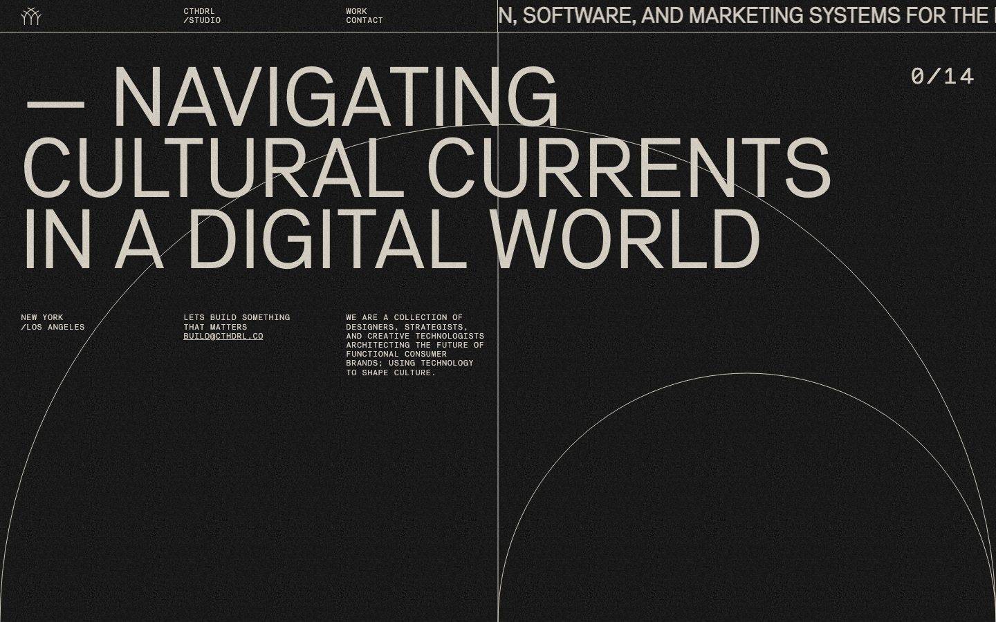
A brutalist-editorial single-page studio site — pure black canvas, oversized NB Akademie display type in warm cream ink, tight monospace labels, and a full-bleed hairline-arc line-art motif. Sharp square edges (zero radius) throughout, a duplicated marquee headline suggesting kinetic scroll motion, and a strict two-color foreground/background discipline broken only by rare, low-frequency accent hexes whose usage context was not visually confirmed.
Works withClaude CodeCursorCodexGemini CLICopilotv0LovableBoltWindsurfReplit
---
version: alpha
name: cthdrl-design-analysis
description: "A brutalist-editorial single-page studio site — pure black canvas, oversized NB Akademie display type in warm cream ink, tight monospace labels, and a full-bleed hairline-arc line-art motif. Sharp square edges (zero radius) throughout, a duplicated marquee headline suggesting kinetic scroll motion, and a strict two-color foreground/background discipline broken only by rare, low-frequency accent hexes whose usage context was not visually confirmed."

colors:
  primary: "#e7ded1"
  canvas: "#000000"
  accent-maroon: "#4c0b02"
  accent-rust: "#871a03"
  accent-brown: "#6e1815"
  accent-crimson: "#981d26"
  accent-red: "#b60122"
  accent-red-deep: "#b4041c"
  accent-olive: "#7d820e"
  accent-olive-light: "#778818"
  accent-chartreuse: "#a8b428"
  accent-indigo: "#1e1594"
  accent-magenta: "#6d0251"

typography:
  display-h1:
    fontFamily: "NB Akademie, Archivo, sans-serif"
    fontSize: 120.96px
    fontWeight: 400
    lineHeight: 0.85
    letterSpacing: normal
  body-mono:
    fontFamily: "NB Akademie Mono, Space Mono, monospace"
    fontSize: 11px
    fontWeight: 400
    lineHeight: 1.2
    letterSpacing: -0.0455em
  button:
    fontFamily: "NB Akademie, Archivo, sans-serif"
    fontSize: 35px
    fontWeight: 400
    lineHeight: 1.0
    letterSpacing: normal

rounded:
  none: 0px

spacing:
  xxs: 10px
  xs: 11px
  sm: 30px
  md: 45px
  lg: 50px

components:
  button-primary:
    backgroundColor: transparent
    textColor: "{colors.primary}"
    typography: "{typography.button}"
    rounded: "{rounded.none}"
    padding: 0px
  top-nav:
    backgroundColor: "{colors.canvas}"
    textColor: "{colors.primary}"
    typography: "{typography.body-mono}"
    padding: 11px 30px
  nav-index-counter:
    backgroundColor: transparent
    textColor: "{colors.primary}"
    typography: "{typography.body-mono}"
  hero-headline:
    backgroundColor: transparent
    textColor: "{colors.primary}"
    typography: "{typography.display-h1}"
  hero-marquee-ticker:
    backgroundColor: "{colors.canvas}"
    textColor: "{colors.primary}"
    typography: "{typography.display-h1}"
  body-label:
    backgroundColor: transparent
    textColor: "{colors.primary}"
    typography: "{typography.body-mono}"
  text-link:
    backgroundColor: transparent
    textColor: "{colors.primary}"
    typography: "{typography.body-mono}"
  decorative-arc:
    backgroundColor: transparent
    textColor: "{colors.primary}"
    rounded: "{rounded.none}"
---

## Overview

cthdrl's landing page is a monochrome, brutalist-editorial studio site: a black canvas (`{colors.canvas}` — #000000) carrying a single warm cream ink (`{colors.primary}` — #e7ded1) for every headline, label, and line. There is no secondary UI palette in the rendered surface — the discipline is foreground/background only, reinforced by zero border-radius everywhere and 1px hairline strokes for the only decorative geometry on the page (large arcing circles that bleed off the viewport).

Type carries almost the entire brand voltage. **NB Akademie** is set at ~121px, weight 400, with an extremely tight 0.85 line-height — three stacked headline lines nearly touch, reading as a dense architectural block rather than airy display type. A duplicate copy of the same headline appears higher and slightly offset in the "before" vs. "after" screenshot pair, indicating a horizontal marquee/ticker treatment layered behind or above the hero. Supporting copy runs in **NB Akademie Mono** at a small 11px with tight negative tracking (-0.0455em) — the labels ("NEW YORK / LOS ANGELES," "0/14," "BUILD@CTHDRL.CO") read as coded, technical annotations rather than soft marketing copy.

The layout is a strict two-column split defined by a full-height vertical hairline near center, with the nav bar spanning both columns at top. Everything is flat: no shadows, no gradients, no rounded corners were measured anywhere in the system.

**Key Characteristics:**
- Pure black canvas (`{colors.canvas}`) with a single cream ink (`{colors.primary}`) — no secondary neutral scale was measured.
- NB Akademie display type at 120.96px / weight 400 / line-height 0.85 — an unusually tight, almost-collapsed leading that reads as intentionally dense/architectural.
- NB Akademie Mono for all supporting copy at 11px with -0.0455em tracking — small, technical, all-caps label voice.
- Zero border radius (`{rounded.none}`) system-wide — every edge is square, consistent with the brutalist reading.
- A duplicated hero headline visible at two scroll/animation states — a marquee/ticker component appears to drive kinetic motion rather than static hierarchy.
- Thin 1px arc/circle line-art bleeds full-width behind the hero copy — the system's only ornamental device, entirely achromatic.
- A sparse family of low-frequency accent hexes (reds, olives, an indigo, a magenta) was captured in the computed CSS scan but is not visible in either reference screenshot — treated here as a documented-but-unconfirmed decorative layer (see Known Gaps).
- Spacing is compact and irregular by measured frequency (10px, 11px, 30px, 45px, 50px) rather than a clean geometric scale — consistent with a hand-tuned, editorial layout rather than a systemized component library.

## Colors

### Foreground / Background
- **Primary** (`{colors.primary}` — #e7ded1): The system's only foreground color. Used for the hero headline, nav labels, body-mono copy, the index counter, the email link, and the button-primary text. It reads as warm off-white/parchment rather than pure white — the max-contrast ink against the black canvas.
- **Canvas** (`{colors.canvas}` — #000000): The page floor. True black, used behind the entire viewport including the nav bar.

### Accent (unconfirmed usage)
A set of eleven low-frequency accent hexes was captured by the computed-style scan, each appearing only once: `{colors.accent-maroon}` (#4c0b02), `{colors.accent-rust}` (#871a03), `{colors.accent-brown}` (#6e1815), `{colors.accent-crimson}` (#981d26), `{colors.accent-red}` (#b60122), `{colors.accent-red-deep}` (#b4041c), `{colors.accent-olive}` (#7d820e), `{colors.accent-olive-light}` (#778818), `{colors.accent-chartreuse}` (#a8b428), `{colors.accent-indigo}` (#1e1594), `{colors.accent-magenta}` (#6d0251). None of these appear in the two reference screenshots, which are entirely black-and-cream. They may power an animated grain/spectrum layer, a hover/focus state, or a canvas-based effect that wasn't captured mid-animation. Document them as reserved tokens; do not apply them to primary text, headlines, or the button-primary component until their actual usage context is confirmed.

## Typography

### Font Family
The system runs on **NB Akademie** for display and **NB Akademie Mono** for everything else — both are commercial/licensed grotesk faces, not open-source. Because they cannot be shipped as-is, substitute with:
- **NB Akademie → Archivo** (or Neue Haas Grotesk Text as a paid alternative) — Archivo shares the squared, no-nonsense grotesk character and holds up at the extreme tight line-height cthdrl uses.
- **NB Akademie Mono → Space Mono** (or JetBrains Mono) — a geometric monospace that preserves the technical, coded feel of the tracked-in label copy.

### Hierarchy

| Token | Size | Weight | Line Height | Letter Spacing | Use |
|---|---|---|---|---|---|
| `{typography.display-h1}` | 120.96px | 400 | 0.85 | normal | Hero headline, marquee-ticker duplicate |
| `{typography.button}` | 35px | 400 | 1.0 | normal | Button-primary label (NB Akademie, not mono) |
| `{typography.body-mono}` | 11px | 400 | 1.2 | -0.0455em | Nav labels, index counter, location/CTA/description copy, email link |

### Principles
Only three type roles were measured — a display role, a mid-size button role, and a small tracked-in mono role. There is no measured h2/h3/body-paragraph size between 11px and 121px; the system appears to deliberately skip a middle register, letting the huge display headline and the tiny mono labels carry all hierarchy with nothing in between. Do not invent an intermediate size — treat the gap as a genuine two-register system until further pages are captured.

The mono role's negative tracking (-0.0455em) at such a small size is unusual — most systems add positive tracking to small caps for legibility. Here the type is tightened instead, reinforcing the compressed, dense reading of the whole system.

### Note on Font Substitutes
NB Akademie and NB Akademie Mono are commercial retail typefaces and must not be redistributed. Archivo (display) and Space Mono (label/mono) are recommended open-source substitutes that preserve weight-400 grotesk geometry and monospace technical character respectively.

## Layout

### Spacing System
- **Measured values only:** `{spacing.xxs}` 10px · `{spacing.xs}` 11px · `{spacing.sm}` 30px · `{spacing.md}` 45px · `{spacing.lg}` 50px.
- These five discrete values are the only spacing captured by the computed-style scan; they read as small/mid-range component gaps (nav item gaps, label-to-value gaps, column gutters) rather than a full macro-to-micro scale.
- Large vertical gaps visible in the screenshots (nav-to-hero, hero-to-footer-info) exceed the largest measured value (50px) — those larger rhythms were not captured numerically and should not be assumed; see Known Gaps.

### Grid & Container
- A full-height vertical hairline sits just right of horizontal center, splitting the page into a wider left content column and a narrower right column that holds the scrolling ticker text and the "0/14" index counter.
- The nav bar spans the full width above the hairline split, with four label groups: logo mark, "CTHDRL/STUDIO," "WORK/CONTACT," and (in the right column) the scrolling ticker copy.
- Below the hero headline, a three-column info row (location, CTA + email, descriptive paragraph) sits left of the hairline, each column set in `{typography.body-mono}`.

### Whitespace Philosophy
Density is asymmetric: the hero headline block is set almost line-on-line (0.85 line-height) while the space between the headline block and the info row below is comparatively vast. This creates a "type as monument, everything else whispers" rhythm — a hallmark of the brutalist-editorial genre this site belongs to.

## Elevation & Depth

No shadow values were captured in the analysis (`shadows: []`), and no shadows are visible in either reference screenshot. The system is entirely flat:

| Level | Treatment | Use |
|---|---|---|
| Flat | No shadow, no border, no elevation | Every surface — nav, hero, info row |
| Hairline stroke | 1px `{colors.primary}` stroke at low visual weight | Decorative arc/circle line-art, vertical column divider |

Depth in this system is not achieved through z-axis shadow — it's achieved through **layering and motion**: the ticker headline duplicate sits at a different horizontal offset than the static hero headline across the two captured states, implying a scrolling/kinetic layer stacked behind or above the primary type block. This is the system's substitute for elevation.

## Shapes

### Border Radius Scale

| Token | Value | Use |
|---|---|---|
| `{rounded.none}` | 0px | Universal — button-primary, and by visual inference every other edge on the page (nav, info blocks, dividers) |

No rounded corners were measured anywhere in the system. This is a deliberate brutalist choice — combined with the tight-leading display type, it reinforces a hard-edged, architectural read.

### Decorative Geometry
The large circular/arc strokes that bleed across the hero are vector line-art, not corner-radius tokens — thin (~1px), achromatic (`{colors.primary}` at what appears to be reduced opacity), and scaled to intersect the vertical column divider. They are the only curved forms in an otherwise entirely square-edged system.

## Components

### Navigation

**`top-nav`** — Full-width bar pinned to the top of the page. Background `{colors.canvas}`, text `{colors.primary}`, type `{typography.body-mono}`. Carries a small three-diamond glyph mark at far left, then two stacked label pairs — "CTHDRL / STUDIO" and "WORK / CONTACT" — set at small mono size with a slash-separated two-line stack.

**`nav-index-counter`** — The "0/14" counter fixed at top-right of the hero band, set in `{typography.body-mono}`, `{colors.primary}`. Reads as a slide/section index, reinforcing the coded, technical label voice.

### Hero

**`hero-headline`** — The three-line "— NAVIGATING / CULTURAL CURRENTS / IN A DIGITAL WORLD" statement, set in `{typography.display-h1}` (NB Akademie, 120.96px / 400 / 0.85 line-height), color `{colors.primary}`, opening with an em-dash prefix. Fills nearly the full viewport width across the left column.

**`hero-marquee-ticker`** — A duplicate line of copy ("...N, SOFTWARE, AND MARKETING SYSTEMS FOR THE..." / "DESIGN, SOFTWARE, AND MARKETING SYSTEMS FOR..." across the two captured states) rendered in the same `{typography.display-h1}` size but positioned in the right column and top-cropped by the nav bar. The differing text position between the two screenshots indicates continuous horizontal scroll — a marquee/ticker treatment layered above the static hero.

### Info Row

**`body-label`** — Small mono text blocks below the hero: location ("NEW YORK / LOS ANGELES"), CTA line ("LETS BUILD SOMETHING THAT MATTERS"), and description paragraph ("WE ARE A COLLECTION OF DESIGNERS, STRATEGISTS, AND CREATIVE TECHNOLOGISTS..."). All set in `{typography.body-mono}`, `{colors.primary}`, laid out in three columns with `{spacing.sm}`–`{spacing.md}` range gaps.

**`text-link`** — The underlined email address "BUILD@CTHDRL.CO" sitting inline within the CTA column, `{colors.primary}`, `{typography.body-mono}`, underline as the only affordance (no color shift, no button chrome).

### Button

**`button-primary`** — Measured directly from the analysis: text color `{colors.primary}`, `{rounded.none}` (0px), zero padding, set in `{typography.button}` (NB Akademie, 35px / 400 / line-height 1.0). No background fill was captured — it behaves as a large, unstyled text-button rather than a filled CTA chip, consistent with the system's flat, no-chrome aesthetic.

### Decorative

**`decorative-arc`** — Full-bleed thin circular/arc strokes in `{colors.primary}`, `{rounded.none}` is not applicable here (vector stroke, not a corner radius) — included as a component reference for consistency. These arcs cross the vertical column divider and extend beyond the viewport edges on both the top and bottom of the hero band.

## Do's and Don'ts

### Do
- Keep the foreground/background pairing to exactly `{colors.primary}` on `{colors.canvas}` for all primary text and UI. The system's power comes from restraint, not palette breadth.
- Set display headlines in `{typography.display-h1}` at the measured 0.85 line-height — loosening the leading breaks the dense, architectural read that defines the brand.
- Keep every corner at `{rounded.none}` (0px). Any rounded corner immediately reads as off-brand for this system.
- Use `{typography.body-mono}`'s negative tracking (-0.0455em) for all small label copy — it is intentional, not a rendering artifact.
- Reserve decorative arc line-art for full-bleed background moments only; never use it to frame or box content.
- Treat the ticker/marquee duplicate headline as a distinct animated layer, not a second static headline — it should move independently of the primary hero block.

### Don't
- Don't apply the low-frequency accent hexes (`{colors.accent-*}`) to primary text, headlines, or the button-primary component until their actual usage is confirmed — they were not observed in the rendered screenshots.
- Don't add drop shadows, gradients, or glassmorphism — no shadow values exist in this system and none should be introduced.
- Don't invent a mid-size type role between the 11px mono label and the 120.96px display headline — the two-register jump is a deliberate structural choice, not a missing token.
- Don't round any corner. A single rounded element will read as inconsistent against the otherwise square-edged system.
- Don't fill `button-primary` with a background color — it was measured as a bare text treatment with zero padding, not a chip or pill.

## Responsive Behavior

Only a single desktop-width capture of the landing page was analyzed, and no breakpoint, mobile, or tablet data was captured in the analysis. The guidance below is therefore **inferential design guidance**, not measured fact, and should be validated against an actual mobile capture before being treated as canonical:

- The two-column hairline-divided layout would likely need to collapse to a single column below a conventional tablet breakpoint, with the ticker/index-counter column stacking beneath or above the primary hero headline.
- The 120.96px display headline would need to scale down substantially on narrow viewports to avoid line-wrapping mid-word; an exact mobile size was not measured and should not be assumed.
- The three-column info row (location / CTA / description) would likely stack to a single column on mobile.
- The decorative arc line-art, being full-bleed and viewport-relative, would need to be re-scaled or cropped rather than reflowed.

## Iteration Guide

1. Focus on ONE component at a time. Reference its YAML key directly (`{component.hero-headline}`, `{component.body-label}`).
2. Preserve the two-register type system — display (`{typography.display-h1}`) and mono-label (`{typography.body-mono}`) — until a genuinely new size is measured from additional pages.
3. Never introduce a border-radius value other than `{rounded.none}` without new measured evidence.
4. Use `{token.refs}` everywhere — never inline a hex, including for the unconfirmed accent set.
5. Never document hover. Default and Active/Pressed states only, per system policy.
6. Before applying any `{colors.accent-*}` token to a visible surface, confirm its actual usage context (likely an animation, canvas effect, or hover state) via a fresh capture — do not assume it belongs on static text.
7. When adding new pages (Work, Contact — both linked in nav but not captured), extend this document rather than starting a new one; note any new type sizes, spacing values, or colors as newly measured, not inferred.

## Known Gaps

- Only the landing page was captured (`captured_pages: ["landing"]`); Work and Contact pages referenced in the nav were not analyzed.
- The eleven low-frequency accent hexes (each frequency 1) have no confirmed visual context — they do not appear in either reference screenshot and may belong to an animation, canvas/WebGL effect, or a state not captured mid-transition.
- No border-radius values were measured except the single `0px` on button-primary; this has been generalized to a system-wide `{rounded.none}` based on visual inspection of the screenshots, but no other component's radius was independently confirmed.
- No shadow data exists in the analysis (`shadows: []`); the "flat" elevation model is inferred from the absence of shadow data plus visual inspection, not from a positive absence-check across all elements.
- Spacing data is limited to five discrete values (10, 11, 30, 45, 50px); the large macro-level gaps visible between the hero and the footer info row in the screenshots exceed all measured values and were not captured numerically.
- No responsive/breakpoint data was captured — the Responsive Behavior section above is inferential guidance only.
- NB Akademie and NB Akademie Mono are commercial typefaces; exact foundry licensing terms were not verified, and `fonts_licensed` was empty in the analysis. Open-source substitutes are documented as a precaution regardless.
- The marquee/ticker behavior (speed, direction, loop point) is inferred from two static screenshots showing the headline at two different horizontal offsets — actual animation timing was not measured.
- Hover and hover-adjacent states (e.g., on the email `text-link` or nav items) were not captured and are out of scope per the no-hover-documentation policy.

<!-- Documented by Duply · real-world design systems as ready-to-use DESIGN.md for AI coding agents · https://duply.ai/cthdrl/design-md -->
Color Palette
Accent
Neutrals
Typography
display-h1120.96px · 400 · 0.85
The quick brown fox jumpsbody-mono11px · 400 · 1.2
The quick brown fox jumpsbutton35px · 400 · 1
The quick brown fox jumpsSpacing & Shape
Spacing
| Name | Value | Preview |
|---|---|---|
| xxs | 10px | |
| xs | 11px | |
| sm | 30px | |
| md | 45px | |
| lg | 50px |
Border Radius
| Name | Value | Preview |
|---|---|---|
| none | 0px |
FAQ
- What colors does cthdrl use?
- cthdrl's core palette includes #e7ded1, #000000, #4c0b02, #871a03, #6e1815. The full color set with usage roles (canvas, ink, surfaces, accent, semantic) is documented in the cthdrl DESIGN.md.
- What font does cthdrl use?
- cthdrl's primary typeface is NB Akademie. The complete type scale (sizes, weights, line-height and letter-spacing per role), with an open substitute where the original is licensed, is documented in the DESIGN.md.
- What is the cthdrl design system?
- A brutalist-editorial single-page studio site — pure black canvas, oversized NB Akademie display type in warm cream ink, tight monospace labels, and a full-bleed hairline-arc line-art motif. Sharp square edges (zero radius) throughout, a duplicated marquee headline suggesting kinetic scroll motion
Get this as a working kit
cthdrl Launch Kit + DESIGN.md
$299$225
One-time payment
- A complete production-stack template, styled like cthdrl, fully built and wired.
- One-time payment and the codebase is yours. No platform fees, no subscription.
Open it with Claude Code, Cursor, or any coding agent and build in plain language, then ship a complete web app.
- Your private DESIGN.md
- Marketing pages, blog, SEO & legal
- Email capture, newsletter & contact
- Accept payments (Stripe)
- Analytics (GA4 + PostHog)
- One-click deploy
- Auth, login & roles
- A full app dashboard, when you grow
More like this
---
version: alpha
name: cthdrl-design-analysis
description: "A brutalist-editorial single-page studio site — pure black canvas, oversized NB Akademie display type in warm cream ink, tight monospace labels, and a full-bleed hairline-arc line-art motif. Sharp square edges (zero radius) throughout, a duplicated marquee headline suggesting kinetic scroll motion, and a strict two-color foreground/background discipline broken only by rare, low-frequency accent hexes whose usage context was not visually confirmed."

colors:
  primary: "#e7ded1"
  canvas: "#000000"
  accent-maroon: "#4c0b02"
  accent-rust: "#871a03"
  accent-brown: "#6e1815"
  accent-crimson: "#981d26"
  accent-red: "#b60122"
  accent-red-deep: "#b4041c"
  accent-olive: "#7d820e"
  accent-olive-light: "#778818"
  accent-chartreuse: "#a8b428"
  accent-indigo: "#1e1594"
  accent-magenta: "#6d0251"

typography:
  display-h1:
    fontFamily: "NB Akademie, Archivo, sans-serif"
    fontSize: 120.96px
    fontWeight: 400
    lineHeight: 0.85
    letterSpacing: normal
  body-mono:
    fontFamily: "NB Akademie Mono, Space Mono, monospace"
    fontSize: 11px
    fontWeight: 400
    lineHeight: 1.2
    letterSpacing: -0.0455em
  button:
    fontFamily: "NB Akademie, Archivo, sans-serif"
    fontSize: 35px
    fontWeight: 400
    lineHeight: 1.0
    letterSpacing: normal

rounded:
  none: 0px

spacing:
  xxs: 10px
  xs: 11px
  sm: 30px
  md: 45px
  lg: 50px

components:
  button-primary:
    backgroundColor: transparent
    textColor: "{colors.primary}"
    typography: "{typography.button}"
    rounded: "{rounded.none}"
    padding: 0px
  top-nav:
    backgroundColor: "{colors.canvas}"
    textColor: "{colors.primary}"
    typography: "{typography.body-mono}"
    padding: 11px 30px
  nav-index-counter:
    backgroundColor: transparent
    textColor: "{colors.primary}"
    typography: "{typography.body-mono}"
  hero-headline:
    backgroundColor: transparent
    textColor: "{colors.primary}"
    typography: "{typography.display-h1}"
  hero-marquee-ticker:
    backgroundColor: "{colors.canvas}"
    textColor: "{colors.primary}"
    typography: "{typography.display-h1}"
  body-label:
    backgroundColor: transparent
    textColor: "{colors.primary}"
    typography: "{typography.body-mono}"
  text-link:
    backgroundColor: transparent
    textColor: "{colors.primary}"
    typography: "{typography.body-mono}"
  decorative-arc:
    backgroundColor: transparent
    textColor: "{colors.primary}"
    rounded: "{rounded.none}"
---

## Overview

cthdrl's landing page is a monochrome, brutalist-editorial studio site: a black canvas (`{colors.canvas}` — #000000) carrying a single warm cream ink (`{colors.primary}` — #e7ded1) for every headline, label, and line. There is no secondary UI palette in the rendered surface — the discipline is foreground/background only, reinforced by zero border-radius everywhere and 1px hairline strokes for the only decorative geometry on the page (large arcing circles that bleed off the viewport).

Type carries almost the entire brand voltage. **NB Akademie** is set at ~121px, weight 400, with an extremely tight 0.85 line-height — three stacked headline lines nearly touch, reading as a dense architectural block rather than airy display type. A duplicate copy of the same headline appears higher and slightly offset in the "before" vs. "after" screenshot pair, indicating a horizontal marquee/ticker treatment layered behind or above the hero. Supporting copy runs in **NB Akademie Mono** at a small 11px with tight negative tracking (-0.0455em) — the labels ("NEW YORK / LOS ANGELES," "0/14," "BUILD@CTHDRL.CO") read as coded, technical annotations rather than soft marketing copy.

The layout is a strict two-column split defined by a full-height vertical hairline near center, with the nav bar spanning both columns at top. Everything is flat: no shadows, no gradients, no rounded corners were measured anywhere in the system.

**Key Characteristics:**
- Pure black canvas (`{colors.canvas}`) with a single cream ink (`{colors.primary}`) — no secondary neutral scale was measured.
- NB Akademie display type at 120.96px / weight 400 / line-height 0.85 — an unusually tight, almost-collapsed leading that reads as intentionally dense/architectural.
- NB Akademie Mono for all supporting copy at 11px with -0.0455em tracking — small, technical, all-caps label voice.
- Zero border radius (`{rounded.none}`) system-wide — every edge is square, consistent with the brutalist reading.
- A duplicated hero headline visible at two scroll/animation states — a marquee/ticker component appears to drive kinetic motion rather than static hierarchy.
- Thin 1px arc/circle line-art bleeds full-width behind the hero copy — the system's only ornamental device, entirely achromatic.
- A sparse family of low-frequency accent hexes (reds, olives, an indigo, a magenta) was captured in the computed CSS scan but is not visible in either reference screenshot — treated here as a documented-but-unconfirmed decorative layer (see Known Gaps).
- Spacing is compact and irregular by measured frequency (10px, 11px, 30px, 45px, 50px) rather than a clean geometric scale — consistent with a hand-tuned, editorial layout rather than a systemized component library.

## Colors

### Foreground / Background
- **Primary** (`{colors.primary}` — #e7ded1): The system's only foreground color. Used for the hero headline, nav labels, body-mono copy, the index counter, the email link, and the button-primary text. It reads as warm off-white/parchment rather than pure white — the max-contrast ink against the black canvas.
- **Canvas** (`{colors.canvas}` — #000000): The page floor. True black, used behind the entire viewport including the nav bar.

### Accent (unconfirmed usage)
A set of eleven low-frequency accent hexes was captured by the computed-style scan, each appearing only once: `{colors.accent-maroon}` (#4c0b02), `{colors.accent-rust}` (#871a03), `{colors.accent-brown}` (#6e1815), `{colors.accent-crimson}` (#981d26), `{colors.accent-red}` (#b60122), `{colors.accent-red-deep}` (#b4041c), `{colors.accent-olive}` (#7d820e), `{colors.accent-olive-light}` (#778818), `{colors.accent-chartreuse}` (#a8b428), `{colors.accent-indigo}` (#1e1594), `{colors.accent-magenta}` (#6d0251). None of these appear in the two reference screenshots, which are entirely black-and-cream. They may power an animated grain/spectrum layer, a hover/focus state, or a canvas-based effect that wasn't captured mid-animation. Document them as reserved tokens; do not apply them to primary text, headlines, or the button-primary component until their actual usage context is confirmed.

## Typography

### Font Family
The system runs on **NB Akademie** for display and **NB Akademie Mono** for everything else — both are commercial/licensed grotesk faces, not open-source. Because they cannot be shipped as-is, substitute with:
- **NB Akademie → Archivo** (or Neue Haas Grotesk Text as a paid alternative) — Archivo shares the squared, no-nonsense grotesk character and holds up at the extreme tight line-height cthdrl uses.
- **NB Akademie Mono → Space Mono** (or JetBrains Mono) — a geometric monospace that preserves the technical, coded feel of the tracked-in label copy.

### Hierarchy

| Token | Size | Weight | Line Height | Letter Spacing | Use |
|---|---|---|---|---|---|
| `{typography.display-h1}` | 120.96px | 400 | 0.85 | normal | Hero headline, marquee-ticker duplicate |
| `{typography.button}` | 35px | 400 | 1.0 | normal | Button-primary label (NB Akademie, not mono) |
| `{typography.body-mono}` | 11px | 400 | 1.2 | -0.0455em | Nav labels, index counter, location/CTA/description copy, email link |

### Principles
Only three type roles were measured — a display role, a mid-size button role, and a small tracked-in mono role. There is no measured h2/h3/body-paragraph size between 11px and 121px; the system appears to deliberately skip a middle register, letting the huge display headline and the tiny mono labels carry all hierarchy with nothing in between. Do not invent an intermediate size — treat the gap as a genuine two-register system until further pages are captured.

The mono role's negative tracking (-0.0455em) at such a small size is unusual — most systems add positive tracking to small caps for legibility. Here the type is tightened instead, reinforcing the compressed, dense reading of the whole system.

### Note on Font Substitutes
NB Akademie and NB Akademie Mono are commercial retail typefaces and must not be redistributed. Archivo (display) and Space Mono (label/mono) are recommended open-source substitutes that preserve weight-400 grotesk geometry and monospace technical character respectively.

## Layout

### Spacing System
- **Measured values only:** `{spacing.xxs}` 10px · `{spacing.xs}` 11px · `{spacing.sm}` 30px · `{spacing.md}` 45px · `{spacing.lg}` 50px.
- These five discrete values are the only spacing captured by the computed-style scan; they read as small/mid-range component gaps (nav item gaps, label-to-value gaps, column gutters) rather than a full macro-to-micro scale.
- Large vertical gaps visible in the screenshots (nav-to-hero, hero-to-footer-info) exceed the largest measured value (50px) — those larger rhythms were not captured numerically and should not be assumed; see Known Gaps.

### Grid & Container
- A full-height vertical hairline sits just right of horizontal center, splitting the page into a wider left content column and a narrower right column that holds the scrolling ticker text and the "0/14" index counter.
- The nav bar spans the full width above the hairline split, with four label groups: logo mark, "CTHDRL/STUDIO," "WORK/CONTACT," and (in the right column) the scrolling ticker copy.
- Below the hero headline, a three-column info row (location, CTA + email, descriptive paragraph) sits left of the hairline, each column set in `{typography.body-mono}`.

### Whitespace Philosophy
Density is asymmetric: the hero headline block is set almost line-on-line (0.85 line-height) while the space between the headline block and the info row below is comparatively vast. This creates a "type as monument, everything else whispers" rhythm — a hallmark of the brutalist-editorial genre this site belongs to.

## Elevation & Depth

No shadow values were captured in the analysis (`shadows: []`), and no shadows are visible in either reference screenshot. The system is entirely flat:

| Level | Treatment | Use |
|---|---|---|
| Flat | No shadow, no border, no elevation | Every surface — nav, hero, info row |
| Hairline stroke | 1px `{colors.primary}` stroke at low visual weight | Decorative arc/circle line-art, vertical column divider |

Depth in this system is not achieved through z-axis shadow — it's achieved through **layering and motion**: the ticker headline duplicate sits at a different horizontal offset than the static hero headline across the two captured states, implying a scrolling/kinetic layer stacked behind or above the primary type block. This is the system's substitute for elevation.

## Shapes

### Border Radius Scale

| Token | Value | Use |
|---|---|---|
| `{rounded.none}` | 0px | Universal — button-primary, and by visual inference every other edge on the page (nav, info blocks, dividers) |

No rounded corners were measured anywhere in the system. This is a deliberate brutalist choice — combined with the tight-leading display type, it reinforces a hard-edged, architectural read.

### Decorative Geometry
The large circular/arc strokes that bleed across the hero are vector line-art, not corner-radius tokens — thin (~1px), achromatic (`{colors.primary}` at what appears to be reduced opacity), and scaled to intersect the vertical column divider. They are the only curved forms in an otherwise entirely square-edged system.

## Components

### Navigation

**`top-nav`** — Full-width bar pinned to the top of the page. Background `{colors.canvas}`, text `{colors.primary}`, type `{typography.body-mono}`. Carries a small three-diamond glyph mark at far left, then two stacked label pairs — "CTHDRL / STUDIO" and "WORK / CONTACT" — set at small mono size with a slash-separated two-line stack.

**`nav-index-counter`** — The "0/14" counter fixed at top-right of the hero band, set in `{typography.body-mono}`, `{colors.primary}`. Reads as a slide/section index, reinforcing the coded, technical label voice.

### Hero

**`hero-headline`** — The three-line "— NAVIGATING / CULTURAL CURRENTS / IN A DIGITAL WORLD" statement, set in `{typography.display-h1}` (NB Akademie, 120.96px / 400 / 0.85 line-height), color `{colors.primary}`, opening with an em-dash prefix. Fills nearly the full viewport width across the left column.

**`hero-marquee-ticker`** — A duplicate line of copy ("...N, SOFTWARE, AND MARKETING SYSTEMS FOR THE..." / "DESIGN, SOFTWARE, AND MARKETING SYSTEMS FOR..." across the two captured states) rendered in the same `{typography.display-h1}` size but positioned in the right column and top-cropped by the nav bar. The differing text position between the two screenshots indicates continuous horizontal scroll — a marquee/ticker treatment layered above the static hero.

### Info Row

**`body-label`** — Small mono text blocks below the hero: location ("NEW YORK / LOS ANGELES"), CTA line ("LETS BUILD SOMETHING THAT MATTERS"), and description paragraph ("WE ARE A COLLECTION OF DESIGNERS, STRATEGISTS, AND CREATIVE TECHNOLOGISTS..."). All set in `{typography.body-mono}`, `{colors.primary}`, laid out in three columns with `{spacing.sm}`–`{spacing.md}` range gaps.

**`text-link`** — The underlined email address "BUILD@CTHDRL.CO" sitting inline within the CTA column, `{colors.primary}`, `{typography.body-mono}`, underline as the only affordance (no color shift, no button chrome).

### Button

**`button-primary`** — Measured directly from the analysis: text color `{colors.primary}`, `{rounded.none}` (0px), zero padding, set in `{typography.button}` (NB Akademie, 35px / 400 / line-height 1.0). No background fill was captured — it behaves as a large, unstyled text-button rather than a filled CTA chip, consistent with the system's flat, no-chrome aesthetic.

### Decorative

**`decorative-arc`** — Full-bleed thin circular/arc strokes in `{colors.primary}`, `{rounded.none}` is not applicable here (vector stroke, not a corner radius) — included as a component reference for consistency. These arcs cross the vertical column divider and extend beyond the viewport edges on both the top and bottom of the hero band.

## Do's and Don'ts

### Do
- Keep the foreground/background pairing to exactly `{colors.primary}` on `{colors.canvas}` for all primary text and UI. The system's power comes from restraint, not palette breadth.
- Set display headlines in `{typography.display-h1}` at the measured 0.85 line-height — loosening the leading breaks the dense, architectural read that defines the brand.
- Keep every corner at `{rounded.none}` (0px). Any rounded corner immediately reads as off-brand for this system.
- Use `{typography.body-mono}`'s negative tracking (-0.0455em) for all small label copy — it is intentional, not a rendering artifact.
- Reserve decorative arc line-art for full-bleed background moments only; never use it to frame or box content.
- Treat the ticker/marquee duplicate headline as a distinct animated layer, not a second static headline — it should move independently of the primary hero block.

### Don't
- Don't apply the low-frequency accent hexes (`{colors.accent-*}`) to primary text, headlines, or the button-primary component until their actual usage is confirmed — they were not observed in the rendered screenshots.
- Don't add drop shadows, gradients, or glassmorphism — no shadow values exist in this system and none should be introduced.
- Don't invent a mid-size type role between the 11px mono label and the 120.96px display headline — the two-register jump is a deliberate structural choice, not a missing token.
- Don't round any corner. A single rounded element will read as inconsistent against the otherwise square-edged system.
- Don't fill `button-primary` with a background color — it was measured as a bare text treatment with zero padding, not a chip or pill.

## Responsive Behavior

Only a single desktop-width capture of the landing page was analyzed, and no breakpoint, mobile, or tablet data was captured in the analysis. The guidance below is therefore **inferential design guidance**, not measured fact, and should be validated against an actual mobile capture before being treated as canonical:

- The two-column hairline-divided layout would likely need to collapse to a single column below a conventional tablet breakpoint, with the ticker/index-counter column stacking beneath or above the primary hero headline.
- The 120.96px display headline would need to scale down substantially on narrow viewports to avoid line-wrapping mid-word; an exact mobile size was not measured and should not be assumed.
- The three-column info row (location / CTA / description) would likely stack to a single column on mobile.
- The decorative arc line-art, being full-bleed and viewport-relative, would need to be re-scaled or cropped rather than reflowed.

## Iteration Guide

1. Focus on ONE component at a time. Reference its YAML key directly (`{component.hero-headline}`, `{component.body-label}`).
2. Preserve the two-register type system — display (`{typography.display-h1}`) and mono-label (`{typography.body-mono}`) — until a genuinely new size is measured from additional pages.
3. Never introduce a border-radius value other than `{rounded.none}` without new measured evidence.
4. Use `{token.refs}` everywhere — never inline a hex, including for the unconfirmed accent set.
5. Never document hover. Default and Active/Pressed states only, per system policy.
6. Before applying any `{colors.accent-*}` token to a visible surface, confirm its actual usage context (likely an animation, canvas effect, or hover state) via a fresh capture — do not assume it belongs on static text.
7. When adding new pages (Work, Contact — both linked in nav but not captured), extend this document rather than starting a new one; note any new type sizes, spacing values, or colors as newly measured, not inferred.

## Known Gaps

- Only the landing page was captured (`captured_pages: ["landing"]`); Work and Contact pages referenced in the nav were not analyzed.
- The eleven low-frequency accent hexes (each frequency 1) have no confirmed visual context — they do not appear in either reference screenshot and may belong to an animation, canvas/WebGL effect, or a state not captured mid-transition.
- No border-radius values were measured except the single `0px` on button-primary; this has been generalized to a system-wide `{rounded.none}` based on visual inspection of the screenshots, but no other component's radius was independently confirmed.
- No shadow data exists in the analysis (`shadows: []`); the "flat" elevation model is inferred from the absence of shadow data plus visual inspection, not from a positive absence-check across all elements.
- Spacing data is limited to five discrete values (10, 11, 30, 45, 50px); the large macro-level gaps visible between the hero and the footer info row in the screenshots exceed all measured values and were not captured numerically.
- No responsive/breakpoint data was captured — the Responsive Behavior section above is inferential guidance only.
- NB Akademie and NB Akademie Mono are commercial typefaces; exact foundry licensing terms were not verified, and `fonts_licensed` was empty in the analysis. Open-source substitutes are documented as a precaution regardless.
- The marquee/ticker behavior (speed, direction, loop point) is inferred from two static screenshots showing the headline at two different horizontal offsets — actual animation timing was not measured.
- Hover and hover-adjacent states (e.g., on the email `text-link` or nav items) were not captured and are out of scope per the no-hover-documentation policy.

<!-- Documented by Duply · real-world design systems as ready-to-use DESIGN.md for AI coding agents · https://duply.ai/cthdrl/design-md -->