MasterClass
A cinematic, full-dark streaming-education interface built on a pure black canvas (#000000) with white type, anchored by a towering condensed Sohne Schmal display headline and instructor portrait grids. The system reads as premium, editorial, and confident — near-monochrome surfaces in layered dark grays, a single hot crimson CTA (#e32652) for the "Get MasterClass" action, and tight letter-spaced uppercase headlines that feel like film posters more than software.
---
version: alpha
name: MasterClass-design-analysis
description: A cinematic, full-dark streaming-education interface built on a pure black canvas (#000000) with white type, anchored by a towering condensed Sohne Schmal display headline and instructor portrait grids. The system reads as premium, editorial, and confident — near-monochrome surfaces in layered dark grays, a single hot crimson CTA (#e32652) for the "Get MasterClass" action, and tight letter-spaced uppercase headlines that feel like film posters more than software.
colors:
primary: "#222326"
ink: "#ffffff"
on-primary: "#ffffff"
canvas: "#000000"
canvas-raised: "#0d0d0e"
surface: "#191c21"
surface-raised: "#272c33"
surface-strong: "#31333b"
hairline: "#43454c"
brand-red: "#e32652"
brand-red-strong: "#e00000"
accent-green: "#3ebb70"
accent-gold: "#eed37f"
accent-gold-dark: "#211d0d"
cream: "#fffef2"
muted: "#9ea0a9"
muted-alt: "#949aa4"
muted-strong: "#596170"
light-100: "#f4f4f5"
light-200: "#f3f3f3"
light-300: "#dbdde1"
typography:
display:
fontFamily: "Sohne Schmal, Inter, sans-serif"
fontSize: 80px
fontWeight: 500
lineHeight: 0.85
letterSpacing: 0.8px
h2:
fontFamily: "Sohne, Inter, sans-serif"
fontSize: 32px
fontWeight: 600
lineHeight: 1.25
letterSpacing: 0.96px
h3:
fontFamily: "Sohne, Inter, sans-serif"
fontSize: 16px
fontWeight: 600
lineHeight: 1.25
letterSpacing: 0.48px
body:
fontFamily: "Sohne, Inter, sans-serif"
fontSize: 16px
fontWeight: 600
lineHeight: 1.5
letterSpacing: 0.32px
button:
fontFamily: "Sohne, Inter, sans-serif"
fontSize: 16px
fontWeight: 600
lineHeight: 1.0
letterSpacing: 0.16px
rounded:
xs: 4px
sm: 8px
md: 12px
lg: 16px
xl: 20px
pill: 48px
spacing:
xxs: 4px
xs: 8px
sm: 12px
md: 16px
lg: 20px
xl: 24px
xxl: 32px
block: 48px
section: 64px
section-lg: 96px
components:
top-nav:
backgroundColor: "{colors.canvas}"
textColor: "{colors.ink}"
typography: "{typography.h3}"
padding: 16px 32px
button-primary:
backgroundColor: "{colors.primary}"
textColor: "{colors.on-primary}"
typography: "{typography.button}"
rounded: "{rounded.sm}"
padding: 12px 20px
button-cta:
backgroundColor: "{colors.brand-red}"
textColor: "{colors.on-primary}"
typography: "{typography.button}"
rounded: "{rounded.sm}"
padding: 12px 20px
search-input:
backgroundColor: "{colors.surface}"
textColor: "{colors.muted}"
typography: "{typography.body}"
rounded: "{rounded.sm}"
padding: 12px 16px
text-input:
backgroundColor: "{colors.canvas}"
textColor: "{colors.ink}"
typography: "{typography.body}"
rounded: 0px
padding: 12px 16px
checkbox-row:
backgroundColor: "{colors.surface}"
textColor: "{colors.ink}"
typography: "{typography.body}"
rounded: "{rounded.sm}"
padding: 16px 20px
category-tab:
backgroundColor: transparent
textColor: "{colors.ink}"
typography: "{typography.button}"
rounded: "{rounded.pill}"
padding: 8px 16px
card:
backgroundColor: "{colors.surface}"
textColor: "{colors.ink}"
rounded: "{rounded.xs}"
padding: 0px
class-card:
backgroundColor: "{colors.surface-raised}"
textColor: "{colors.ink}"
typography: "{typography.h3}"
rounded: "{rounded.sm}"
team-band:
backgroundColor: "{colors.surface-raised}"
textColor: "{colors.ink}"
typography: "{typography.h2}"
rounded: "{rounded.md}"
padding: 48px
certificates-band:
backgroundColor: "{colors.accent-gold-dark}"
textColor: "{colors.cream}"
typography: "{typography.h2}"
rounded: "{rounded.md}"
padding: 48px
testimonial-card:
backgroundColor: "{colors.surface}"
textColor: "{colors.ink}"
typography: "{typography.body}"
rounded: "{rounded.sm}"
padding: 32px
faq-row:
backgroundColor: "{colors.surface}"
textColor: "{colors.ink}"
typography: "{typography.body}"
rounded: "{rounded.sm}"
padding: 16px 20px
footer:
backgroundColor: "{colors.canvas}"
textColor: "{colors.muted}"
typography: "{typography.body}"
padding: 64px
---
## Overview
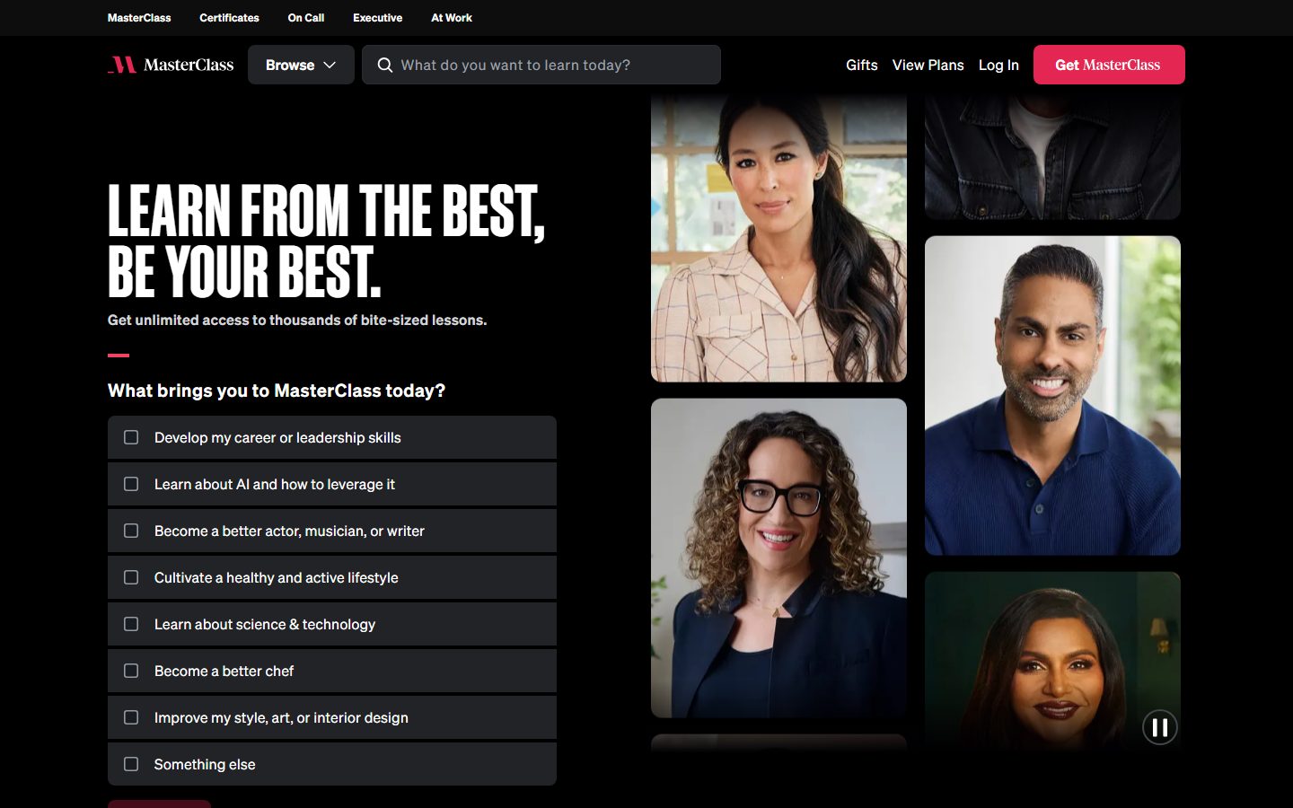
MasterClass's marketing surface is a cinematic, full-dark streaming-education interface. The page floor is pure black (`{colors.canvas}` — #000000), type is white (`{colors.ink}` — #ffffff), and the entire system layers dark-gray surfaces (`{colors.surface}` — #191c21, `{colors.surface-raised}` — #272c33) over the black to create depth without ever leaving the dark mode. The voice is premium and editorial — closer to a film studio's title sequence than to a typical SaaS dashboard.
The headline voice is the star: a towering condensed **Sohne Schmal** display face at 80px, weight 500, line-height 0.85, set in tight all-caps ("LEARN FROM THE BEST, BE YOUR BEST."). The negative-feeling 0.85 line-height stacks the two lines into a dense poster block. Everything below the headline runs in **Sohne** (the body/UI family) at weight 600 with small positive letter-spacing.
Brand voltage is intentionally scarce. The page is near-monochrome — the only saturated color is the hot crimson `{colors.brand-red}` (#e32652) reserved for the single highest-priority action ("Get MasterClass"). Secondary CTAs use the near-black `{colors.primary}` (#222326) pill button. Occasional accent moments appear in `{colors.accent-green}` (#3ebb70) and `{colors.accent-gold}` (#eed37f), the latter anchoring the Certificates band.
Hero content is built from real instructor portrait tiles — a right-side video/photo grid of MasterClass instructors plays as the brand's living artifact. The page doesn't illustrate the product; it shows the talent.
**Key Characteristics:**
- Pure-black canvas (`{colors.canvas}` — #000000) with white type throughout. The system never leaves dark mode.
- Condensed Sohne Schmal display headline at 80px / weight 500 / line-height 0.85 — uppercase, tightly stacked, poster-like (Sohne Schmal is licensed; substituted with Inter here).
- Layered dark-gray surfaces (`{colors.surface}` #191c21, `{colors.surface-raised}` #272c33, `{colors.surface-strong}` #31333b) create depth on the black floor without borders or shadows.
- Single hot-crimson CTA (`{colors.brand-red}` — #e32652) reserved for the primary "Get MasterClass" action; secondary CTAs use the near-black `{colors.primary}` (#222326) pill.
- Instructor portrait grid as the hero artifact — real talent imagery, not marketing illustration.
- Tight radius language: `{rounded.xs}` (4px) on imagery cards, `{rounded.sm}` (8px) on buttons and list rows, up to `{rounded.pill}` (48px) on category filter tabs.
- Inset-ring box-shadows (e.g. `{colors.muted-alt}` 0 0 0 2px inset) act as borders/focus rings rather than drop shadows — the system has no elevation shadows.
- Category filter tabs render as pill-radius chips with inset ring outlines.
## Colors
### Brand & Accent
- **Brand Red** (`{colors.brand-red}` — #e32652): The single saturated brand color. Reserved for the primary "Get MasterClass" CTA, the logo mark, and the small accent rule under the hero sub-head.
- **Brand Red Strong** (`{colors.brand-red-strong}` — #e00000): A deeper red used sparingly in promotional accents.
- **Accent Green** (`{colors.accent-green}` — #3ebb70): A small confirmation / checkmark accent appearing in the membership feature checklist.
- **Accent Gold** (`{colors.accent-gold}` — #eed37f): Used on the Certificates band — the "Try Certificates" pill and gold-on-dark headline.
- **Accent Gold Dark** (`{colors.accent-gold-dark}` — #211d0d): The deep olive-gold background of the Certificates band.
- **Cream** (`{colors.cream}` — #fffef2): A warm off-white used for type on the gold Certificates band.
### Surface
- **Canvas** (`{colors.canvas}` — #000000): The default page floor — pure black.
- **Canvas Raised** (`{colors.canvas-raised}` — #0d0d0e): A barely-lifted near-black for subtle section separation.
- **Surface** (`{colors.surface}` — #191c21): The default card / list-row / input fill on the black floor.
- **Surface Raised** (`{colors.surface-raised}` — #272c33): A lighter dark gray for elevated bands (class cards, "Level up your team" band).
- **Surface Strong** (`{colors.surface-strong}` — #31333b): The strongest dark-gray surface, used for nested fills.
- **Hairline** (`{colors.hairline}` — #43454c): The border / inset-ring tone on dark surfaces.
### Primary / Action
- **Primary** (`{colors.primary}` — #222326): The near-black secondary button fill (e.g. "Gift", "Explore Classes").
### Text
- **Ink** (`{colors.ink}` — #ffffff): All headlines and primary text. Also `{colors.on-primary}` on dark buttons.
- **Muted** (`{colors.muted}` — #9ea0a9): Secondary text, placeholder copy, footer links.
- **Muted Alt** (`{colors.muted-alt}` — #949aa4): A near-identical secondary gray used for inset focus rings and minor labels.
- **Muted Strong** (`{colors.muted-strong}` — #596170): Tertiary / fine-print gray.
### Light Neutrals
- **Light 100 / 200 / 300** (`{colors.light-100}` — #f4f4f5, `{colors.light-200}` — #f3f3f3, `{colors.light-300}` — #dbdde1): Near-white neutrals used on the rare light surfaces and high-contrast type fragments.
## Typography
### Font Family
The system runs two members of the **Sohne** superfamily: **Sohne Schmal** (the condensed display cut — used only for the hero h1) and **Sohne** (the standard cut — used for h2, h3, body, and buttons). Both are licensed commercial typefaces from Klim Type Foundry. Sohne Schmal is flagged licensed; it is substituted with **Inter** in the token stack here, and Sohne likewise falls back to Inter.
The split is strict:
- Sohne Schmal (condensed, weight 500, line-height 0.85) — the hero h1 only
- Sohne (weight 600, small positive letter-spacing) — every other text role
### Hierarchy
| Token | Size | Weight | Line Height | Letter Spacing | Use |
|---|---|---|---|---|---|
| `{typography.display}` | 80px | 500 | 0.85 | 0.8px | Hero h1 ("LEARN FROM THE BEST, BE YOUR BEST.") — Sohne Schmal, uppercase |
| `{typography.h2}` | 32px | 600 | 1.25 | 0.96px | Section heads ("Meet the world's best.", "Start your journey today.") |
| `{typography.h3}` | 16px | 600 | 1.25 | 0.48px | Card titles, nav labels, sub-section labels |
| `{typography.body}` | 16px | 600 | 1.5 | 0.32px | Running text, list rows, footer links, FAQ rows |
| `{typography.button}` | 16px | 600 | 1.0 | 0.16px | All button labels |
### Principles
The hero headline is the entire typographic voice — condensed, uppercase, weight 500, sub-1.0 line-height so two lines stack into a single dense block. Everything else is Sohne at weight 600. Note that even "body" copy runs at weight 600 here, not the conventional 400 — MasterClass keeps its supporting text relatively heavy for legibility on the black floor. Letter-spacing is small and positive across all roles (0.16px–0.96px), opening the dark-mode type slightly.
### Note on Font Substitutes
Both Sohne Schmal and Sohne are licensed and cannot be shipped publicly. For the condensed **Sohne Schmal** display, a usable open-source substitute is **Archivo Narrow** or **Saira Condensed** at weight 500–600 (true condensed forms preserve the poster stacking better than Inter); the token stack lists **Inter** as a baseline fallback. For the standard **Sohne** UI text, **Inter** at weight 600 is the closest open-source match — both are clean grotesques with similar x-height.
## Layout
### Spacing System
- **Base unit:** 4px.
- **Tokens:** `{spacing.xxs}` 4px · `{spacing.xs}` 8px · `{spacing.sm}` 12px · `{spacing.md}` 16px · `{spacing.lg}` 20px · `{spacing.xl}` 24px · `{spacing.xxl}` 32px · `{spacing.block}` 48px · `{spacing.section}` 64px · `{spacing.section-lg}` 96px.
- **Most frequent values:** 16px, 12px, and 8px dominate inner padding and gaps; 96px is the most common large section rhythm.
- **Section rhythm:** `{spacing.section-lg}` (96px) and `{spacing.section}` (64px) between major editorial bands.
- **Card / band internal padding:** `{spacing.block}` (48px) for feature bands; `{spacing.md}` (16px) to `{spacing.lg}` (20px) for list rows.
- A single 112px value was measured once (derived as a one-off hero offset) — not promoted to a token.
### Grid & Container
- **Hero:** roughly a 1:1 split — h1 + checkbox list on the left, instructor portrait grid on the right (2-up tiled column of varying-height portraits).
- **Class cards:** horizontal scroll carousel ("Popular now") with ~5 visible cards at desktop.
- **Footer:** multi-column link list (Explore / About / Social / Download) at desktop.
### Whitespace Philosophy
The black canvas does most of the spacing work — content floats in large fields of pure black, which reads as cinematic and premium. Section padding is generous (64–96px) and bands are widely separated so each editorial moment lands on its own dark stage.
## Elevation & Depth
| Level | Treatment | Use |
|---|---|---|
| Flat black | `{colors.canvas}` (#000000), no border | Default page floor, nav, footer |
| Layered surface | `{colors.surface}` / `{colors.surface-raised}` fill, no shadow | Cards, list rows, feature bands |
| Inset ring (border) | `{colors.muted-alt}` 0 0 0 2px inset | Outlined buttons, default chip outlines |
| Inset ring (strong) | `{colors.hairline}` 0 0 0 2px inset | Heavier outlined controls |
| Inset hairline | `{colors.surface-raised}` 0 0 0 1px inset · `{colors.muted-alt}` 0 0 0 1px inset | Fine 1px outlines on cards / inputs |
The elevation model uses **no drop shadows** — depth comes entirely from layering progressively-lighter dark grays on the black floor, and the only box-shadows present are **inset rings** that function as borders and focus outlines. This keeps the page flat and graphic, like a streaming UI.
### Decorative Depth
- Instructor portrait tiles in the hero carry their own photographic depth (real photography); they are content, not system surfaces.
- The Certificates band breaks the monochrome scheme with a warm gold-on-dark color block (`{colors.accent-gold-dark}` background, `{colors.cream}` and `{colors.accent-gold}` type) — color contrast does the emphasis work instead of shadow.
## Shapes
### Border Radius Scale
| Token | Value | Use |
|---|---|---|
| `{rounded.xs}` | 4px | Imagery cards, portrait tiles |
| `{rounded.sm}` | 8px | Buttons, checkbox list rows, class cards, FAQ rows (most common radius) |
| `{rounded.md}` | 12px | Larger feature bands ("Level up your team", Certificates) |
| `{rounded.lg}` | 16px | Occasional large container corners |
| `{rounded.xl}` | 20px | Rare — large rounded panels |
| `{rounded.pill}` | 48px | Category filter tabs (pill chips) |
Text inputs are measured at **0px radius** (sharp corners) — a deliberate contrast to the rounded buttons and cards.
### Photography Geometry
Instructor portraits use `{rounded.xs}` (4px) corners and varying aspect ratios tiled into a masonry-like hero grid. Class cards in the carousel use `{rounded.sm}` (8px) with poster-style cover artwork filling the card.
## Components
### Top Navigation
**`top-nav`** — Black nav bar (`{colors.canvas}`) pinned at top. Carries the red MasterClass logo mark + wordmark at left, a "Browse" dropdown, the search input center, and a right cluster of text links (Gifts, View Plans, Log In) ending in the red `{component.button-cta}` ("Get MasterClass"). Above it sits a thin utility row (MasterClass / Certificates / On Call / Executive / At Work) in `{typography.h3}`.
### Buttons
**`button-primary`** — The near-black secondary CTA. Background `{colors.primary}` (#222326), text `{colors.on-primary}` (#ffffff), type `{typography.button}` (Sohne 16px / 600), padding 12px × 20px, rounded `{rounded.sm}` (8px). Used for "Gift", "Explore Classes", and other secondary actions.
**`button-cta`** — The signature crimson CTA. Background `{colors.brand-red}` (#e32652), text `{colors.on-primary}`, same type / padding / radius as primary. Reserved exclusively for the highest-priority "Get MasterClass" action (derived: the red is measured as an accent color and mapped to this CTA from screenshot ground-truth, as the analyzer captured only the dark button variant).
### Inputs & Forms
**`search-input`** — The nav search field. Background `{colors.surface}` (#191c21), placeholder text `{colors.muted}`, type `{typography.body}`, rounded `{rounded.sm}` (8px), padding 12px × 16px, leading search icon.
**`text-input`** — Email-capture / form input. Background `{colors.canvas}`, text `{colors.ink}`, type `{typography.body}`, **0px radius** (sharp corners), padding 12px × 16px. Used in the "Try some of our classes" email-capture row and the footer newsletter field.
**`checkbox-row`** — The "What brings you to MasterClass today?" selectable list rows. Background `{colors.surface}` (#191c21), text `{colors.ink}`, type `{typography.body}`, rounded `{rounded.sm}` (8px), padding 16px × 20px, leading square checkbox. Each option is a full-width tappable row.
### Tabs / Filters
**`category-tab`** — Pill-radius filter chips ("Trending", "Acting & Performing Arts", "Art & Design", etc.) in the "A dose of inspiration" band. Transparent background with an inset-ring outline (`{colors.muted-alt}` 0 0 0 2px inset), text `{colors.ink}`, type `{typography.button}`, rounded `{rounded.pill}` (48px), padding 8px × 16px. The active tab fills lighter.
### Cards & Containers
**`card`** — Base imagery card. Background `{colors.surface}`, rounded `{rounded.xs}` (4px), no shadow. Used for instructor portrait tiles in the hero grid.
**`class-card`** — Carousel class card ("THE CONFLICT PLAYBOOK", "The Science of Connection"). Background `{colors.surface-raised}`, poster cover art filling the top, title in `{typography.h3}`, rounded `{rounded.sm}` (8px). Carries small "New" badge and instructor / duration meta below.
**`team-band`** — The "LEVEL UP YOUR TEAM" enterprise band. Background `{colors.surface-raised}` (#272c33), text `{colors.ink}`, headline in `{typography.h2}`, rounded `{rounded.md}` (12px), padding `{spacing.block}` (48px). Carries a `{component.button-cta}` ("Contact Sales") and a text "Learn More" link.
**`certificates-band`** — The "MasterClass Certificates / The Fastest Way to Advance Your Career" band. Background `{colors.accent-gold-dark}` (#211d0d), type in `{colors.cream}` and `{colors.accent-gold}`, headline in `{typography.h2}`, rounded `{rounded.md}` (12px), padding `{spacing.block}` (48px). Carries a gold "Try Certificates" pill. The only warm-toned band in the system.
**`testimonial-card`** — Member quote card ("See what our members are saying."). Background `{colors.surface}`, text `{colors.ink}`, quote in `{typography.body}`, name/role meta in `{colors.muted}`, rounded `{rounded.sm}`, padding `{spacing.xxl}` (32px). Presented in a carousel with arrow controls.
### FAQ / Footer
**`faq-row`** — Accordion question rows ("What is MasterClass?", "How much does MasterClass cost?"). Background `{colors.surface}`, text `{colors.ink}`, type `{typography.body}`, rounded `{rounded.sm}`, padding 16px × 20px, trailing chevron. Grouped under "General" and "Pricing & Payment" headings.
**`footer`** — Black footer (`{colors.canvas}`) closing the page. Multi-column link list (Explore / About / Social / Download) in `{typography.body}` with link text in `{colors.muted}`. Carries the newsletter `{component.text-input}` ("Join the inner circle.") and app-store / Roku download badges. Vertical padding `{spacing.section}` (64px).
## Do's and Don'ts
### Do
- Keep the canvas pure black (`{colors.canvas}` — #000000). The full-dark treatment is the brand's premium signal.
- Reserve `{colors.brand-red}` (#e32652) for the single highest-priority action ("Get MasterClass"). Use `{colors.primary}` (#222326) for all secondary CTAs.
- Set the hero h1 in condensed Sohne Schmal, uppercase, weight 500, line-height 0.85 — the tight two-line stack is the brand's poster signature.
- Build depth by layering dark grays (`{colors.surface}` → `{colors.surface-raised}` → `{colors.surface-strong}`), never with drop shadows.
- Use inset-ring box-shadows for borders and focus outlines on outlined controls.
- Let instructor portraits be the hero artifact — show real talent, not abstract illustration.
- Use pill-radius (`{rounded.pill}`) only for category filter chips; keep buttons and cards at 8px / 4px.
### Don't
- Don't introduce a light/white page background. Every band lives on black or layered dark gray (the gold Certificates band is the only chromatic exception).
- Don't use the crimson CTA color for more than one action per view — it loses its priority signal.
- Don't add drop shadows for elevation; the system uses surface layering and inset rings only.
- Don't set the hero headline in the standard Sohne cut — the condensed Sohne Schmal at line-height 0.85 is non-negotiable for the poster look.
- Don't round text inputs — they are deliberately sharp (0px) against the rounded buttons.
- Don't document hover states — primary darkens / chip fills on press; nothing else changes.
## Responsive Behavior
### Breakpoints
The analysis captured a single desktop landing render plus a full-page tall composite; explicit breakpoint widths were not measured. The following is the observed desktop layout with derived collapse behavior.
| Name | Width | Key Changes (derived) |
|---|---|---|
| Mobile | < 768px | Nav collapses to logo + hamburger + red CTA; hero h1 scales down from 80px; portrait grid stacks below content; class carousel becomes a swipe row; footer columns stack |
| Tablet | 768–1024px | Nav tightens; hero stays roughly 1:1 but portrait grid narrows; category chips wrap to multiple rows |
| Desktop | 1024px+ | Full nav with all links; 1:1 hero split with portrait grid; ~5-card class carousel |
### Touch Targets
- `{component.button-cta}` and `{component.button-primary}` use 12px × 20px padding on 16px type — comfortably above 44px effective height.
- `{component.checkbox-row}` rows are full-width with 16px × 20px padding — large, easy tap targets.
- `{component.category-tab}` chips use 8px × 16px padding; the pill silhouette helps but small chips may sit near the 44px minimum.
### Collapsing Strategy
- Hero collapses from a side-by-side split to a stacked column (headline + checkbox list first, portrait grid below).
- Class and testimonial carousels remain horizontal swipe rows at all sizes.
- Category filter chips wrap to additional rows rather than scrolling.
- Footer link columns reflow from 4-up to stacked.
### Image Behavior
- Instructor portrait tiles retain `{rounded.xs}` corners and crop to fill their grid cells at every breakpoint.
- Class-card poster art fills the card top and scales proportionally.
## Iteration Guide
1. Focus on ONE component at a time. Reference its YAML key directly (`{component.button-cta}`, `{component.checkbox-row}`).
2. Variants of an existing component (`-active`, `-disabled`, `-focused`) live as separate entries in `components:`.
3. Use `{token.refs}` everywhere — never inline hex in components.
4. Never document hover. Default and Active/Pressed states only.
5. The hero stays condensed Sohne Schmal 500 / line-height 0.85; everything else stays Sohne 600. The boundary does not blur.
6. Crimson (`{colors.brand-red}`) is a one-action-per-view color. Reach for `{colors.primary}` before adding a second red.
7. Build new surfaces by layering dark grays, not by adding shadows.
## Known Gaps
- Sohne and Sohne Schmal are licensed commercial typefaces (Klim Type Foundry) and cannot be shipped; open-source substitutes are documented in the Typography section.
- The crimson "Get MasterClass" CTA color is mapped to `button-cta` from screenshot ground-truth — the analyzer captured only the dark `button-primary` background (#222326), so the red CTA's exact padding/height inherit the measured primary spec (derived).
- Only the landing page was captured; interior pages (class detail, pricing, browse) may introduce surfaces, type roles, or accent usage not represented here.
- No explicit responsive breakpoints were measured; the responsive table is derived from the desktop render and standard collapse behavior.
- Animation and transition timings (hero video playback, carousel scroll, accordion expand) are not in scope.
- Form validation, error, and success states beyond the base `{component.text-input}` were not captured.
- The accent greens, golds, and the second red (`{colors.brand-red-strong}`) were measured at low frequency; their precise roles (badges, checkmarks, promos) are inferred from screenshot context and may vary by campaign.
- A single 112px spacing value was measured once and treated as a one-off hero offset rather than a token.
<!-- Documented by duply · real-world design systems as ready-to-use DESIGN.md for AI coding agents · https://duply.ai/masterclass/design-md -->
Color Palette
Accent
Neutrals
Typography
display80px · 500 · 0.85
The quick brown fox jumpsh232px · 600 · 1.25
The quick brown fox jumpsh316px · 600 · 1.25
The quick brown fox jumpsbody16px · 600 · 1.5
The quick brown fox jumpsbutton16px · 600 · 1
The quick brown fox jumpsSpacing & Shape
Spacing
| Name | Value | Preview |
|---|---|---|
| xxs | 4px | |
| xs | 8px | |
| sm | 12px | |
| md | 16px | |
| lg | 20px | |
| xl | 24px | |
| xxl | 32px | |
| block | 48px | |
| section | 64px | |
| section-lg | 96px |
Border Radius
| Name | Value | Preview |
|---|---|---|
| xs | 4px | |
| sm | 8px | |
| md | 12px | |
| lg | 16px | |
| xl | 20px | |
| pill | 48px |
More like this


---
version: alpha
name: MasterClass-design-analysis
description: A cinematic, full-dark streaming-education interface built on a pure black canvas (#000000) with white type, anchored by a towering condensed Sohne Schmal display headline and instructor portrait grids. The system reads as premium, editorial, and confident — near-monochrome surfaces in layered dark grays, a single hot crimson CTA (#e32652) for the "Get MasterClass" action, and tight letter-spaced uppercase headlines that feel like film posters more than software.
colors:
  primary: "#222326"
  ink: "#ffffff"
  on-primary: "#ffffff"
  canvas: "#000000"
  canvas-raised: "#0d0d0e"
  surface: "#191c21"
  surface-raised: "#272c33"
  surface-strong: "#31333b"
  hairline: "#43454c"
  brand-red: "#e32652"
  brand-red-strong: "#e00000"
  accent-green: "#3ebb70"
  accent-gold: "#eed37f"
  accent-gold-dark: "#211d0d"
  cream: "#fffef2"
  muted: "#9ea0a9"
  muted-alt: "#949aa4"
  muted-strong: "#596170"
  light-100: "#f4f4f5"
  light-200: "#f3f3f3"
  light-300: "#dbdde1"
typography:
  display:
    fontFamily: "Sohne Schmal, Inter, sans-serif"
    fontSize: 80px
    fontWeight: 500
    lineHeight: 0.85
    letterSpacing: 0.8px
  h2:
    fontFamily: "Sohne, Inter, sans-serif"
    fontSize: 32px
    fontWeight: 600
    lineHeight: 1.25
    letterSpacing: 0.96px
  h3:
    fontFamily: "Sohne, Inter, sans-serif"
    fontSize: 16px
    fontWeight: 600
    lineHeight: 1.25
    letterSpacing: 0.48px
  body:
    fontFamily: "Sohne, Inter, sans-serif"
    fontSize: 16px
    fontWeight: 600
    lineHeight: 1.5
    letterSpacing: 0.32px
  button:
    fontFamily: "Sohne, Inter, sans-serif"
    fontSize: 16px
    fontWeight: 600
    lineHeight: 1.0
    letterSpacing: 0.16px
rounded:
  xs: 4px
  sm: 8px
  md: 12px
  lg: 16px
  xl: 20px
  pill: 48px
spacing:
  xxs: 4px
  xs: 8px
  sm: 12px
  md: 16px
  lg: 20px
  xl: 24px
  xxl: 32px
  block: 48px
  section: 64px
  section-lg: 96px
components:
  top-nav:
    backgroundColor: "{colors.canvas}"
    textColor: "{colors.ink}"
    typography: "{typography.h3}"
    padding: 16px 32px
  button-primary:
    backgroundColor: "{colors.primary}"
    textColor: "{colors.on-primary}"
    typography: "{typography.button}"
    rounded: "{rounded.sm}"
    padding: 12px 20px
  button-cta:
    backgroundColor: "{colors.brand-red}"
    textColor: "{colors.on-primary}"
    typography: "{typography.button}"
    rounded: "{rounded.sm}"
    padding: 12px 20px
  search-input:
    backgroundColor: "{colors.surface}"
    textColor: "{colors.muted}"
    typography: "{typography.body}"
    rounded: "{rounded.sm}"
    padding: 12px 16px
  text-input:
    backgroundColor: "{colors.canvas}"
    textColor: "{colors.ink}"
    typography: "{typography.body}"
    rounded: 0px
    padding: 12px 16px
  checkbox-row:
    backgroundColor: "{colors.surface}"
    textColor: "{colors.ink}"
    typography: "{typography.body}"
    rounded: "{rounded.sm}"
    padding: 16px 20px
  category-tab:
    backgroundColor: transparent
    textColor: "{colors.ink}"
    typography: "{typography.button}"
    rounded: "{rounded.pill}"
    padding: 8px 16px
  card:
    backgroundColor: "{colors.surface}"
    textColor: "{colors.ink}"
    rounded: "{rounded.xs}"
    padding: 0px
  class-card:
    backgroundColor: "{colors.surface-raised}"
    textColor: "{colors.ink}"
    typography: "{typography.h3}"
    rounded: "{rounded.sm}"
  team-band:
    backgroundColor: "{colors.surface-raised}"
    textColor: "{colors.ink}"
    typography: "{typography.h2}"
    rounded: "{rounded.md}"
    padding: 48px
  certificates-band:
    backgroundColor: "{colors.accent-gold-dark}"
    textColor: "{colors.cream}"
    typography: "{typography.h2}"
    rounded: "{rounded.md}"
    padding: 48px
  testimonial-card:
    backgroundColor: "{colors.surface}"
    textColor: "{colors.ink}"
    typography: "{typography.body}"
    rounded: "{rounded.sm}"
    padding: 32px
  faq-row:
    backgroundColor: "{colors.surface}"
    textColor: "{colors.ink}"
    typography: "{typography.body}"
    rounded: "{rounded.sm}"
    padding: 16px 20px
  footer:
    backgroundColor: "{colors.canvas}"
    textColor: "{colors.muted}"
    typography: "{typography.body}"
    padding: 64px
---

## Overview

MasterClass's marketing surface is a cinematic, full-dark streaming-education interface. The page floor is pure black (`{colors.canvas}` — #000000), type is white (`{colors.ink}` — #ffffff), and the entire system layers dark-gray surfaces (`{colors.surface}` — #191c21, `{colors.surface-raised}` — #272c33) over the black to create depth without ever leaving the dark mode. The voice is premium and editorial — closer to a film studio's title sequence than to a typical SaaS dashboard.

The headline voice is the star: a towering condensed **Sohne Schmal** display face at 80px, weight 500, line-height 0.85, set in tight all-caps ("LEARN FROM THE BEST, BE YOUR BEST."). The negative-feeling 0.85 line-height stacks the two lines into a dense poster block. Everything below the headline runs in **Sohne** (the body/UI family) at weight 600 with small positive letter-spacing.

Brand voltage is intentionally scarce. The page is near-monochrome — the only saturated color is the hot crimson `{colors.brand-red}` (#e32652) reserved for the single highest-priority action ("Get MasterClass"). Secondary CTAs use the near-black `{colors.primary}` (#222326) pill button. Occasional accent moments appear in `{colors.accent-green}` (#3ebb70) and `{colors.accent-gold}` (#eed37f), the latter anchoring the Certificates band.

Hero content is built from real instructor portrait tiles — a right-side video/photo grid of MasterClass instructors plays as the brand's living artifact. The page doesn't illustrate the product; it shows the talent.

**Key Characteristics:**
- Pure-black canvas (`{colors.canvas}` — #000000) with white type throughout. The system never leaves dark mode.
- Condensed Sohne Schmal display headline at 80px / weight 500 / line-height 0.85 — uppercase, tightly stacked, poster-like (Sohne Schmal is licensed; substituted with Inter here).
- Layered dark-gray surfaces (`{colors.surface}` #191c21, `{colors.surface-raised}` #272c33, `{colors.surface-strong}` #31333b) create depth on the black floor without borders or shadows.
- Single hot-crimson CTA (`{colors.brand-red}` — #e32652) reserved for the primary "Get MasterClass" action; secondary CTAs use the near-black `{colors.primary}` (#222326) pill.
- Instructor portrait grid as the hero artifact — real talent imagery, not marketing illustration.
- Tight radius language: `{rounded.xs}` (4px) on imagery cards, `{rounded.sm}` (8px) on buttons and list rows, up to `{rounded.pill}` (48px) on category filter tabs.
- Inset-ring box-shadows (e.g. `{colors.muted-alt}` 0 0 0 2px inset) act as borders/focus rings rather than drop shadows — the system has no elevation shadows.
- Category filter tabs render as pill-radius chips with inset ring outlines.

## Colors

### Brand & Accent
- **Brand Red** (`{colors.brand-red}` — #e32652): The single saturated brand color. Reserved for the primary "Get MasterClass" CTA, the logo mark, and the small accent rule under the hero sub-head.
- **Brand Red Strong** (`{colors.brand-red-strong}` — #e00000): A deeper red used sparingly in promotional accents.
- **Accent Green** (`{colors.accent-green}` — #3ebb70): A small confirmation / checkmark accent appearing in the membership feature checklist.
- **Accent Gold** (`{colors.accent-gold}` — #eed37f): Used on the Certificates band — the "Try Certificates" pill and gold-on-dark headline.
- **Accent Gold Dark** (`{colors.accent-gold-dark}` — #211d0d): The deep olive-gold background of the Certificates band.
- **Cream** (`{colors.cream}` — #fffef2): A warm off-white used for type on the gold Certificates band.

### Surface
- **Canvas** (`{colors.canvas}` — #000000): The default page floor — pure black.
- **Canvas Raised** (`{colors.canvas-raised}` — #0d0d0e): A barely-lifted near-black for subtle section separation.
- **Surface** (`{colors.surface}` — #191c21): The default card / list-row / input fill on the black floor.
- **Surface Raised** (`{colors.surface-raised}` — #272c33): A lighter dark gray for elevated bands (class cards, "Level up your team" band).
- **Surface Strong** (`{colors.surface-strong}` — #31333b): The strongest dark-gray surface, used for nested fills.
- **Hairline** (`{colors.hairline}` — #43454c): The border / inset-ring tone on dark surfaces.

### Primary / Action
- **Primary** (`{colors.primary}` — #222326): The near-black secondary button fill (e.g. "Gift", "Explore Classes").

### Text
- **Ink** (`{colors.ink}` — #ffffff): All headlines and primary text. Also `{colors.on-primary}` on dark buttons.
- **Muted** (`{colors.muted}` — #9ea0a9): Secondary text, placeholder copy, footer links.
- **Muted Alt** (`{colors.muted-alt}` — #949aa4): A near-identical secondary gray used for inset focus rings and minor labels.
- **Muted Strong** (`{colors.muted-strong}` — #596170): Tertiary / fine-print gray.

### Light Neutrals
- **Light 100 / 200 / 300** (`{colors.light-100}` — #f4f4f5, `{colors.light-200}` — #f3f3f3, `{colors.light-300}` — #dbdde1): Near-white neutrals used on the rare light surfaces and high-contrast type fragments.

## Typography

### Font Family
The system runs two members of the **Sohne** superfamily: **Sohne Schmal** (the condensed display cut — used only for the hero h1) and **Sohne** (the standard cut — used for h2, h3, body, and buttons). Both are licensed commercial typefaces from Klim Type Foundry. Sohne Schmal is flagged licensed; it is substituted with **Inter** in the token stack here, and Sohne likewise falls back to Inter.

The split is strict:
- Sohne Schmal (condensed, weight 500, line-height 0.85) — the hero h1 only
- Sohne (weight 600, small positive letter-spacing) — every other text role

### Hierarchy

| Token | Size | Weight | Line Height | Letter Spacing | Use |
|---|---|---|---|---|---|
| `{typography.display}` | 80px | 500 | 0.85 | 0.8px | Hero h1 ("LEARN FROM THE BEST, BE YOUR BEST.") — Sohne Schmal, uppercase |
| `{typography.h2}` | 32px | 600 | 1.25 | 0.96px | Section heads ("Meet the world's best.", "Start your journey today.") |
| `{typography.h3}` | 16px | 600 | 1.25 | 0.48px | Card titles, nav labels, sub-section labels |
| `{typography.body}` | 16px | 600 | 1.5 | 0.32px | Running text, list rows, footer links, FAQ rows |
| `{typography.button}` | 16px | 600 | 1.0 | 0.16px | All button labels |

### Principles
The hero headline is the entire typographic voice — condensed, uppercase, weight 500, sub-1.0 line-height so two lines stack into a single dense block. Everything else is Sohne at weight 600. Note that even "body" copy runs at weight 600 here, not the conventional 400 — MasterClass keeps its supporting text relatively heavy for legibility on the black floor. Letter-spacing is small and positive across all roles (0.16px–0.96px), opening the dark-mode type slightly.

### Note on Font Substitutes
Both Sohne Schmal and Sohne are licensed and cannot be shipped publicly. For the condensed **Sohne Schmal** display, a usable open-source substitute is **Archivo Narrow** or **Saira Condensed** at weight 500–600 (true condensed forms preserve the poster stacking better than Inter); the token stack lists **Inter** as a baseline fallback. For the standard **Sohne** UI text, **Inter** at weight 600 is the closest open-source match — both are clean grotesques with similar x-height.

## Layout

### Spacing System
- **Base unit:** 4px.
- **Tokens:** `{spacing.xxs}` 4px · `{spacing.xs}` 8px · `{spacing.sm}` 12px · `{spacing.md}` 16px · `{spacing.lg}` 20px · `{spacing.xl}` 24px · `{spacing.xxl}` 32px · `{spacing.block}` 48px · `{spacing.section}` 64px · `{spacing.section-lg}` 96px.
- **Most frequent values:** 16px, 12px, and 8px dominate inner padding and gaps; 96px is the most common large section rhythm.
- **Section rhythm:** `{spacing.section-lg}` (96px) and `{spacing.section}` (64px) between major editorial bands.
- **Card / band internal padding:** `{spacing.block}` (48px) for feature bands; `{spacing.md}` (16px) to `{spacing.lg}` (20px) for list rows.
- A single 112px value was measured once (derived as a one-off hero offset) — not promoted to a token.

### Grid & Container
- **Hero:** roughly a 1:1 split — h1 + checkbox list on the left, instructor portrait grid on the right (2-up tiled column of varying-height portraits).
- **Class cards:** horizontal scroll carousel ("Popular now") with ~5 visible cards at desktop.
- **Footer:** multi-column link list (Explore / About / Social / Download) at desktop.

### Whitespace Philosophy
The black canvas does most of the spacing work — content floats in large fields of pure black, which reads as cinematic and premium. Section padding is generous (64–96px) and bands are widely separated so each editorial moment lands on its own dark stage.

## Elevation & Depth

| Level | Treatment | Use |
|---|---|---|
| Flat black | `{colors.canvas}` (#000000), no border | Default page floor, nav, footer |
| Layered surface | `{colors.surface}` / `{colors.surface-raised}` fill, no shadow | Cards, list rows, feature bands |
| Inset ring (border) | `{colors.muted-alt}` 0 0 0 2px inset | Outlined buttons, default chip outlines |
| Inset ring (strong) | `{colors.hairline}` 0 0 0 2px inset | Heavier outlined controls |
| Inset hairline | `{colors.surface-raised}` 0 0 0 1px inset · `{colors.muted-alt}` 0 0 0 1px inset | Fine 1px outlines on cards / inputs |

The elevation model uses **no drop shadows** — depth comes entirely from layering progressively-lighter dark grays on the black floor, and the only box-shadows present are **inset rings** that function as borders and focus outlines. This keeps the page flat and graphic, like a streaming UI.

### Decorative Depth
- Instructor portrait tiles in the hero carry their own photographic depth (real photography); they are content, not system surfaces.
- The Certificates band breaks the monochrome scheme with a warm gold-on-dark color block (`{colors.accent-gold-dark}` background, `{colors.cream}` and `{colors.accent-gold}` type) — color contrast does the emphasis work instead of shadow.

## Shapes

### Border Radius Scale

| Token | Value | Use |
|---|---|---|
| `{rounded.xs}` | 4px | Imagery cards, portrait tiles |
| `{rounded.sm}` | 8px | Buttons, checkbox list rows, class cards, FAQ rows (most common radius) |
| `{rounded.md}` | 12px | Larger feature bands ("Level up your team", Certificates) |
| `{rounded.lg}` | 16px | Occasional large container corners |
| `{rounded.xl}` | 20px | Rare — large rounded panels |
| `{rounded.pill}` | 48px | Category filter tabs (pill chips) |

Text inputs are measured at **0px radius** (sharp corners) — a deliberate contrast to the rounded buttons and cards.

### Photography Geometry
Instructor portraits use `{rounded.xs}` (4px) corners and varying aspect ratios tiled into a masonry-like hero grid. Class cards in the carousel use `{rounded.sm}` (8px) with poster-style cover artwork filling the card.

## Components

### Top Navigation

**`top-nav`** — Black nav bar (`{colors.canvas}`) pinned at top. Carries the red MasterClass logo mark + wordmark at left, a "Browse" dropdown, the search input center, and a right cluster of text links (Gifts, View Plans, Log In) ending in the red `{component.button-cta}` ("Get MasterClass"). Above it sits a thin utility row (MasterClass / Certificates / On Call / Executive / At Work) in `{typography.h3}`.

### Buttons

**`button-primary`** — The near-black secondary CTA. Background `{colors.primary}` (#222326), text `{colors.on-primary}` (#ffffff), type `{typography.button}` (Sohne 16px / 600), padding 12px × 20px, rounded `{rounded.sm}` (8px). Used for "Gift", "Explore Classes", and other secondary actions.

**`button-cta`** — The signature crimson CTA. Background `{colors.brand-red}` (#e32652), text `{colors.on-primary}`, same type / padding / radius as primary. Reserved exclusively for the highest-priority "Get MasterClass" action (derived: the red is measured as an accent color and mapped to this CTA from screenshot ground-truth, as the analyzer captured only the dark button variant).

### Inputs & Forms

**`search-input`** — The nav search field. Background `{colors.surface}` (#191c21), placeholder text `{colors.muted}`, type `{typography.body}`, rounded `{rounded.sm}` (8px), padding 12px × 16px, leading search icon.

**`text-input`** — Email-capture / form input. Background `{colors.canvas}`, text `{colors.ink}`, type `{typography.body}`, **0px radius** (sharp corners), padding 12px × 16px. Used in the "Try some of our classes" email-capture row and the footer newsletter field.

**`checkbox-row`** — The "What brings you to MasterClass today?" selectable list rows. Background `{colors.surface}` (#191c21), text `{colors.ink}`, type `{typography.body}`, rounded `{rounded.sm}` (8px), padding 16px × 20px, leading square checkbox. Each option is a full-width tappable row.

### Tabs / Filters

**`category-tab`** — Pill-radius filter chips ("Trending", "Acting & Performing Arts", "Art & Design", etc.) in the "A dose of inspiration" band. Transparent background with an inset-ring outline (`{colors.muted-alt}` 0 0 0 2px inset), text `{colors.ink}`, type `{typography.button}`, rounded `{rounded.pill}` (48px), padding 8px × 16px. The active tab fills lighter.

### Cards & Containers

**`card`** — Base imagery card. Background `{colors.surface}`, rounded `{rounded.xs}` (4px), no shadow. Used for instructor portrait tiles in the hero grid.

**`class-card`** — Carousel class card ("THE CONFLICT PLAYBOOK", "The Science of Connection"). Background `{colors.surface-raised}`, poster cover art filling the top, title in `{typography.h3}`, rounded `{rounded.sm}` (8px). Carries small "New" badge and instructor / duration meta below.

**`team-band`** — The "LEVEL UP YOUR TEAM" enterprise band. Background `{colors.surface-raised}` (#272c33), text `{colors.ink}`, headline in `{typography.h2}`, rounded `{rounded.md}` (12px), padding `{spacing.block}` (48px). Carries a `{component.button-cta}` ("Contact Sales") and a text "Learn More" link.

**`certificates-band`** — The "MasterClass Certificates / The Fastest Way to Advance Your Career" band. Background `{colors.accent-gold-dark}` (#211d0d), type in `{colors.cream}` and `{colors.accent-gold}`, headline in `{typography.h2}`, rounded `{rounded.md}` (12px), padding `{spacing.block}` (48px). Carries a gold "Try Certificates" pill. The only warm-toned band in the system.

**`testimonial-card`** — Member quote card ("See what our members are saying."). Background `{colors.surface}`, text `{colors.ink}`, quote in `{typography.body}`, name/role meta in `{colors.muted}`, rounded `{rounded.sm}`, padding `{spacing.xxl}` (32px). Presented in a carousel with arrow controls.

### FAQ / Footer

**`faq-row`** — Accordion question rows ("What is MasterClass?", "How much does MasterClass cost?"). Background `{colors.surface}`, text `{colors.ink}`, type `{typography.body}`, rounded `{rounded.sm}`, padding 16px × 20px, trailing chevron. Grouped under "General" and "Pricing & Payment" headings.

**`footer`** — Black footer (`{colors.canvas}`) closing the page. Multi-column link list (Explore / About / Social / Download) in `{typography.body}` with link text in `{colors.muted}`. Carries the newsletter `{component.text-input}` ("Join the inner circle.") and app-store / Roku download badges. Vertical padding `{spacing.section}` (64px).

## Do's and Don'ts

### Do
- Keep the canvas pure black (`{colors.canvas}` — #000000). The full-dark treatment is the brand's premium signal.
- Reserve `{colors.brand-red}` (#e32652) for the single highest-priority action ("Get MasterClass"). Use `{colors.primary}` (#222326) for all secondary CTAs.
- Set the hero h1 in condensed Sohne Schmal, uppercase, weight 500, line-height 0.85 — the tight two-line stack is the brand's poster signature.
- Build depth by layering dark grays (`{colors.surface}` → `{colors.surface-raised}` → `{colors.surface-strong}`), never with drop shadows.
- Use inset-ring box-shadows for borders and focus outlines on outlined controls.
- Let instructor portraits be the hero artifact — show real talent, not abstract illustration.
- Use pill-radius (`{rounded.pill}`) only for category filter chips; keep buttons and cards at 8px / 4px.

### Don't
- Don't introduce a light/white page background. Every band lives on black or layered dark gray (the gold Certificates band is the only chromatic exception).
- Don't use the crimson CTA color for more than one action per view — it loses its priority signal.
- Don't add drop shadows for elevation; the system uses surface layering and inset rings only.
- Don't set the hero headline in the standard Sohne cut — the condensed Sohne Schmal at line-height 0.85 is non-negotiable for the poster look.
- Don't round text inputs — they are deliberately sharp (0px) against the rounded buttons.
- Don't document hover states — primary darkens / chip fills on press; nothing else changes.

## Responsive Behavior

### Breakpoints
The analysis captured a single desktop landing render plus a full-page tall composite; explicit breakpoint widths were not measured. The following is the observed desktop layout with derived collapse behavior.

| Name | Width | Key Changes (derived) |
|---|---|---|
| Mobile | < 768px | Nav collapses to logo + hamburger + red CTA; hero h1 scales down from 80px; portrait grid stacks below content; class carousel becomes a swipe row; footer columns stack |
| Tablet | 768–1024px | Nav tightens; hero stays roughly 1:1 but portrait grid narrows; category chips wrap to multiple rows |
| Desktop | 1024px+ | Full nav with all links; 1:1 hero split with portrait grid; ~5-card class carousel |

### Touch Targets
- `{component.button-cta}` and `{component.button-primary}` use 12px × 20px padding on 16px type — comfortably above 44px effective height.
- `{component.checkbox-row}` rows are full-width with 16px × 20px padding — large, easy tap targets.
- `{component.category-tab}` chips use 8px × 16px padding; the pill silhouette helps but small chips may sit near the 44px minimum.

### Collapsing Strategy
- Hero collapses from a side-by-side split to a stacked column (headline + checkbox list first, portrait grid below).
- Class and testimonial carousels remain horizontal swipe rows at all sizes.
- Category filter chips wrap to additional rows rather than scrolling.
- Footer link columns reflow from 4-up to stacked.

### Image Behavior
- Instructor portrait tiles retain `{rounded.xs}` corners and crop to fill their grid cells at every breakpoint.
- Class-card poster art fills the card top and scales proportionally.

## Iteration Guide

1. Focus on ONE component at a time. Reference its YAML key directly (`{component.button-cta}`, `{component.checkbox-row}`).
2. Variants of an existing component (`-active`, `-disabled`, `-focused`) live as separate entries in `components:`.
3. Use `{token.refs}` everywhere — never inline hex in components.
4. Never document hover. Default and Active/Pressed states only.
5. The hero stays condensed Sohne Schmal 500 / line-height 0.85; everything else stays Sohne 600. The boundary does not blur.
6. Crimson (`{colors.brand-red}`) is a one-action-per-view color. Reach for `{colors.primary}` before adding a second red.
7. Build new surfaces by layering dark grays, not by adding shadows.

## Known Gaps

- Sohne and Sohne Schmal are licensed commercial typefaces (Klim Type Foundry) and cannot be shipped; open-source substitutes are documented in the Typography section.
- The crimson "Get MasterClass" CTA color is mapped to `button-cta` from screenshot ground-truth — the analyzer captured only the dark `button-primary` background (#222326), so the red CTA's exact padding/height inherit the measured primary spec (derived).
- Only the landing page was captured; interior pages (class detail, pricing, browse) may introduce surfaces, type roles, or accent usage not represented here.
- No explicit responsive breakpoints were measured; the responsive table is derived from the desktop render and standard collapse behavior.
- Animation and transition timings (hero video playback, carousel scroll, accordion expand) are not in scope.
- Form validation, error, and success states beyond the base `{component.text-input}` were not captured.
- The accent greens, golds, and the second red (`{colors.brand-red-strong}`) were measured at low frequency; their precise roles (badges, checkmarks, promos) are inferred from screenshot context and may vary by campaign.
- A single 112px spacing value was measured once and treated as a one-off hero offset rather than a token.

<!-- Documented by duply · real-world design systems as ready-to-use DESIGN.md for AI coding agents · https://duply.ai/masterclass/design-md -->