aristidebenoist
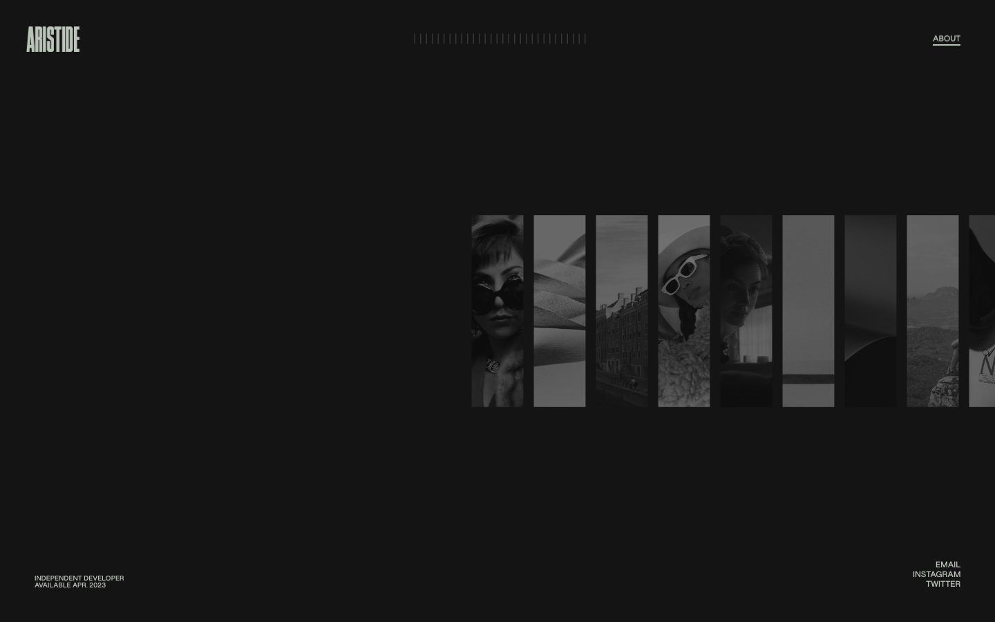
A near-black, minimalist portfolio interface for an independent developer — a single full-bleed dark canvas, a horizontally-scrolling strip of monochrome project thumbnails, and tiny uppercase grotesque labels pinned to the four corners. Brand voltage comes almost entirely from negative space and restraint: a sage-grey text tone on a charcoal field, a single condensed "ARISTIDE" wordmark, and a lone gold accent reserved for interactive emphasis. The interface reads as confident, editorial, and almost wordless — the work itself (the image strip) is the only content.
---
version: alpha
name: aristidebenoist-design-analysis
description: "A near-black, minimalist portfolio interface for an independent developer — a single full-bleed dark canvas, a horizontally-scrolling strip of monochrome project thumbnails, and tiny uppercase grotesque labels pinned to the four corners. Brand voltage comes almost entirely from negative space and restraint: a sage-grey text tone on a charcoal field, a single condensed \"ARISTIDE\" wordmark, and a lone gold accent reserved for interactive emphasis. The interface reads as confident, editorial, and almost wordless — the work itself (the image strip) is the only content."

colors:
  ink: "#bac4b8"
  link: "#000000"
  accent: "#cc9933"
  surface: "#1e1e1e"

typography:
  wordmark:
    fontFamily: "jws, 'Arial Narrow', sans-serif"
    fontSize: 24px
    fontWeight: 400
    lineHeight: 1.0
    letterSpacing: normal
  label:
    fontFamily: "jws, 'Arial Narrow', sans-serif"
    fontSize: 11px
    fontWeight: 400
    lineHeight: 0.909
    letterSpacing: normal
  body:
    fontFamily: "jws, 'Arial Narrow', sans-serif"
    fontSize: 11px
    fontWeight: 400
    lineHeight: 0.909
    letterSpacing: normal

rounded:
  none: 0px

spacing:
  xxs: 4px
  xs: 12px
  sm: 15px
  md: 20px
  lg: 24px
  xl: 30px
  xxl: 68px

components:
  top-nav:
    backgroundColor: transparent
    textColor: "{colors.ink}"
    typography: "{typography.label}"
    padding: 30px
  wordmark:
    backgroundColor: transparent
    textColor: "{colors.ink}"
    typography: "{typography.wordmark}"
  nav-link:
    backgroundColor: transparent
    textColor: "{colors.ink}"
    typography: "{typography.label}"
  nav-link-active:
    backgroundColor: transparent
    textColor: "{colors.accent}"
    typography: "{typography.label}"
  scroll-ticks:
    backgroundColor: transparent
    textColor: "{colors.ink}"
    typography: "{typography.label}"
  image-strip:
    backgroundColor: "{colors.surface}"
    textColor: "{colors.ink}"
    rounded: "{rounded.none}"
  image-thumb:
    backgroundColor: "{colors.surface}"
    textColor: "{colors.ink}"
    rounded: "{rounded.none}"
  footer-meta:
    backgroundColor: transparent
    textColor: "{colors.ink}"
    typography: "{typography.label}"
    padding: 30px
  footer-links:
    backgroundColor: transparent
    textColor: "{colors.ink}"
    typography: "{typography.label}"
    padding: 30px

---

## Overview

aristidebenoist.com is a single-screen, near-black portfolio surface for an independent developer. It is the inverse of a dense marketing page — almost nothing is on screen except a horizontally-scrolling strip of monochrome project thumbnails floating in the lower-right quadrant, four tiny uppercase labels pinned to the corners, and a row of decorative tick marks across the top center. The system's entire visual language is restraint: vast charcoal negative space, a single condensed wordmark, and one gold accent held in reserve.

The measured palette is tiny and deliberate: a sage-grey text tone (`{colors.ink}` — #bac4b8) reads softly against the dark `{colors.surface}` (#1e1e1e) charcoal field, with a single gold (`{colors.accent}` — #cc9933) for interactive emphasis. There is no card system, no shadow language, no border radius — image thumbnails are hard-edged rectangles, and the layout is anchored to the viewport's four corners rather than to a content grid.

Typography is a single small role: an 11px grotesque (the custom **jws** family) set uppercase for every label on the page. The "ARISTIDE" wordmark uses the same family at a larger, condensed display scale. There is no body-copy band on the landing page — the work is the content.

**Key Characteristics:**
- One dark surface, no panels — `{colors.surface}` (#1e1e1e) is the entire canvas; thumbnails sit directly on it with no containers, borders, or shadows.
- Corner-anchored layout — wordmark top-left, ABOUT top-right, meta bottom-left, social links bottom-right. The center is held empty.
- A horizontally-scrolling strip of hard-edged monochrome thumbnails (`{component.image-strip}`) is the only content region.
- Sage-grey text (`{colors.ink}` — #bac4b8) against charcoal — low-contrast, calm, editorial.
- A single gold accent (`{colors.accent}` — #cc9933) reserved for interactive/active emphasis; it never appears on large fills.
- Tiny uppercase grotesque labels at 11px (`{typography.label}`) — every text element on the page shares this single role.
- Zero border radius (`{rounded.none}`) — every edge is sharp, reinforcing the architectural, no-ornament tone.
- A decorative row of tick marks (`{component.scroll-ticks}`) across the top center acts as a scroll/position indicator.

## Colors

The measured palette is four colors. The system is effectively monochrome — a charcoal field, a sage-grey text tone, and a single gold accent.

### Surface
- **Surface** (`{colors.surface}` — #1e1e1e): The charcoal page floor and the only measured background tone. The entire landing page sits on this surface; image thumbnails rest directly on it.

### Text
- **Ink** (`{colors.ink}` — #bac4b8): The sage-grey text color used for the wordmark, all corner labels, the ABOUT link, footer meta, and footer social links. Frequency-dominant (203 occurrences) — it is the default text tone across the whole page.

### Accent & Interactive
- **Accent** (`{colors.accent}` — #cc9933): A muted gold reserved for interactive emphasis (active/hovered states on links and the scroll indicator). It is the only chromatic moment in the system and appears sparingly (34 occurrences).
- **Link** (`{colors.link}` — #000000): A pure-black tone measured on anchor elements. On the dark surface this is effectively invisible as text, so it likely sits beneath an overriding rule or is used on lighter/inverted moments not captured on the landing page. Documented as measured; see Known Gaps.

## Typography

### Font Family
The system runs a single custom family — **jws** — across every text element. The "ARISTIDE" wordmark uses it at a condensed display size; all corner labels use it tiny (11px) and uppercase. The measured body/label role is 11px, weight 400, with a tight 0.909 line height and normal letter-spacing.

**jws** is not a public web font (the family name is an abbreviation/custom alias, not a standard typeface). It must be substituted with an open-source face when shipping — see the substitution note below.

### Hierarchy

| Token | Size | Weight | Line Height | Letter Spacing | Use |
|---|---|---|---|---|---|
| `{typography.wordmark}` | 24px | 400 | 1.0 | normal | The "ARISTIDE" logo top-left — condensed display scale (size **derived** from screenshot proportions; not directly measured) |
| `{typography.label}` | 11px | 400 | 0.909 | normal | Every corner label — ABOUT, INDEPENDENT DEVELOPER / AVAILABLE APR. 2023, EMAIL / INSTAGRAM / TWITTER, scroll ticks |
| `{typography.body}` | 11px | 400 | 0.909 | normal | Reserved for running text (e.g. the About page) — same measured baseline as label |

### Principles
There is one type voice on this page: small, uppercase, grotesque. The only hierarchy is scale — the wordmark is larger and condensed, everything else is the 11px label. The tight 0.909 line height keeps multi-line labels (the bottom-left meta block, the bottom-right social stack) compact and architectural. Letter-spacing stays normal as measured.

### Note on Font Substitutes
Because **jws** is a custom/non-distributable family, substitute with a condensed grotesque when shipping. **Oswald** (Google Fonts) approximates the tall, narrow wordmark; **Archivo Narrow** or **Arial Narrow** approximate the compressed label proportions. The substitution preserves the condensed, uppercase, all-caps signature even though the exact letterforms will differ.

## Layout

### Spacing System
- **Tokens (all measured):** `{spacing.xxs}` 4px · `{spacing.xs}` 12px · `{spacing.sm}` 15px · `{spacing.md}` 20px · `{spacing.lg}` 24px · `{spacing.xl}` 30px · `{spacing.xxl}` 68px.
- **Dominant rhythm:** 12px (35 occurrences) is the most frequent unit — used for tight internal gaps. 30px (15 occurrences) is the dominant edge/inset value — corner labels sit roughly 30px from the viewport edges.
- **Corner insets:** The four anchored label clusters are offset from the viewport edges using the `{spacing.xl}` (30px) inset rhythm.

### Grid & Container
- **No content grid.** The layout is anchored to the four viewport corners, not to a centered column. The wordmark, ABOUT, meta block, and social links each pin to a corner.
- **Image strip:** A single horizontal row of equal-width portrait thumbnails occupies the lower-right of the viewport and scrolls horizontally off the right edge. Thumbnails are uniform-width vertical rectangles separated by tight gaps.
- **Center band:** The horizontal top-center carries the decorative tick row; the rest of the center is deliberately empty.

### Whitespace Philosophy
This is a negative-space-first layout. The empty charcoal field is the dominant element — content occupies maybe a quarter of the viewport. The emptiness is the statement: confident, editorial, unhurried. Nothing competes with the image strip.

## Elevation & Depth

| Level | Treatment | Use |
|---|---|---|
| Flat | No shadow, no border, no radius | Everything — the entire page is a single flat plane |

No shadows were measured (`shadows: []`) and no radii were measured (`radius: []`). The system has no elevation language whatsoever — thumbnails sit flat on the surface, labels float directly on the charcoal field. Depth, where it exists, is implied only by the horizontal scroll of the image strip (parallax/motion is suggested by the screenshots but not captured as a token). The flatness is intentional and consistent with the minimal, architectural tone.

## Shapes

### Border Radius Scale

| Token | Value | Use |
|---|---|---|
| `{rounded.none}` | 0px | Every element — image thumbnails, label clusters. All corners are sharp |

No border radii were measured. The screenshots confirm hard-edged rectangular thumbnails with no rounding, so `{rounded.none}` (0px) is documented as the system's only shape rule. Sharp edges reinforce the architectural, no-ornament voice.

### Photography Geometry
Thumbnails are uniform-width vertical (portrait) rectangles, rendered in monochrome/desaturated grayscale. They retain hard 0px corners and are tightly gapped in a single horizontal row. The monochrome treatment unifies a diverse set of project images into one calm strip that doesn't fight the dark field.

## Components

### Navigation

**`top-nav`** — The top edge of the page. Transparent background (it sits directly on `{colors.surface}`), text in `{colors.ink}`, labels in `{typography.label}`. Holds the `{component.wordmark}` at top-left and the `{component.nav-link}` (ABOUT) at top-right, with the `{component.scroll-ticks}` row centered between them. Inset roughly `{spacing.xl}` (30px) from the edges.

**`wordmark`** — The "ARISTIDE" logo, top-left. Transparent background, `{colors.ink}` text, `{typography.wordmark}` (condensed display scale). The single largest piece of type on the page.

**`nav-link`** — The "ABOUT" link, top-right. Transparent background, `{colors.ink}` text, `{typography.label}` (11px uppercase). Underlined in the screenshots.

**`nav-link-active`** — Active/pressed state for links. Text shifts to `{colors.accent}` (#cc9933) — the gold accent is the system's only interactive-emphasis signal.

**`scroll-ticks`** — A decorative row of vertical tick marks across the top center, acting as a scroll/position indicator for the image strip. Transparent background, `{colors.ink}` ticks, `{typography.label}` scale.

### Content

**`image-strip`** — The single content region: a horizontally-scrolling row of monochrome project thumbnails in the lower-right of the viewport. Background `{colors.surface}`, `{rounded.none}` (sharp edges). The only content surface on the landing page.

**`image-thumb`** — An individual portrait-orientation thumbnail inside the strip. Uniform width, desaturated grayscale image, `{rounded.none}` corners, separated from neighbors by a tight `{spacing.xs}` (12px) gap. Background `{colors.surface}` shows through behind/between thumbnails.

### Footer / Corner Meta

**`footer-meta`** — Bottom-left two-line meta block ("INDEPENDENT DEVELOPER" / "AVAILABLE APR. 2023"). Transparent background, `{colors.ink}` text, `{typography.label}` (11px uppercase) with the tight 0.909 line height keeping the two lines compact. Inset ~`{spacing.xl}` (30px) from the corner.

**`footer-links`** — Bottom-right stacked social/contact links ("EMAIL" / "INSTAGRAM" / "TWITTER"). Transparent background, `{colors.ink}` text, `{typography.label}`, right-aligned. Active state follows `{component.nav-link-active}` (gold).

## Do's and Don'ts

### Do
- Keep the page on a single flat `{colors.surface}` (#1e1e1e) field. The emptiness is the design.
- Anchor labels to the four viewport corners using the `{spacing.xl}` (30px) inset rhythm.
- Use `{colors.ink}` (#bac4b8) for all text — it is the system's calm, low-contrast default tone.
- Reserve `{colors.accent}` (#cc9933) strictly for interactive/active emphasis. It is the only chromatic moment.
- Render all imagery monochrome/grayscale with sharp `{rounded.none}` corners.
- Keep all labels uppercase at the 11px `{typography.label}` scale; only the wordmark scales up.
- Let the image strip be the only content. Resist adding cards, captions, or panels.

### Don't
- Don't introduce border radius, shadows, or card containers — the system has none and is intentionally flat.
- Don't raise text contrast to pure white; the sage-grey `{colors.ink}` against charcoal is the deliberate tone.
- Don't use `{colors.accent}` gold on large fills or as a background — it is an emphasis-only color.
- Don't fill the center of the viewport; the negative space is structural.
- Don't add a second type voice — the page is one grotesque family at two scales.
- Don't document hover states; only default and active/pressed (gold) are defined.

## Responsive Behavior

| Name | Width | Key Changes |
|---|---|---|
| Mobile | < 768px | Corner clusters likely restack toward edges; image strip remains horizontally scrollable; wordmark stays top-left (behavior inferred — only desktop landing was captured) |
| Tablet | 768–1024px | Corner-anchored layout holds; thumbnail strip width adapts (inferred) |
| Desktop | > 1024px | Full corner-anchored layout as captured: wordmark + ticks + ABOUT across the top, meta + social at the bottom, image strip lower-right |

### Touch Targets
- `{component.nav-link}` and `{component.footer-links}` are small 11px uppercase labels — touch-target sizing was not measured and would need verification against WCAG's 44×44 minimum on mobile.

### Collapsing Strategy
Only the desktop landing page was captured. The corner-anchored model implies labels would migrate toward viewport edges at smaller sizes and the horizontal image strip would continue to scroll, but no responsive rules were measured. Treat all responsive guidance here as inferred, not measured.

## Iteration Guide

1. Focus on ONE component at a time and reference its YAML key directly (`{component.image-strip}`, `{component.footer-links}`).
2. Variants of an existing component (`-active`) live as separate entries in `components:`.
3. Use `{token.refs}` everywhere — never inline a hex.
4. Never document hover. Default and active/pressed (gold) only.
5. Preserve the single-surface, corner-anchored layout. New content should respect the empty center.
6. Keep the type to one grotesque family at the wordmark + 11px label scales.
7. When emphasis is needed, reach for `{colors.accent}` gold sparingly — never for fills.

## Known Gaps

- Only the desktop landing page was captured; the About page, any hover/transition motion, and the horizontal-scroll interaction (parallax, snap behavior) are out of scope and unmeasured.
- The custom **jws** font family is not a public web font; open-source substitutes (Oswald / Archivo Narrow) are documented in the Typography section. Exact letterforms and the true display weight of the wordmark are unverified.
- The `{typography.wordmark}` size (24px) is **derived** from screenshot proportions, not directly measured — the analysis captured only the single 11px body/label role.
- The true page-background tone may be darker than the measured `{colors.surface}` (#1e1e1e); the screenshots read closer to pure black in the corners, but only #1e1e1e was captured as a neutral.
- `{colors.link}` (#000000) was measured on anchor elements but is effectively invisible on the dark field — its real usage (possibly an inverted About page or an overridden default) could not be confirmed from the landing page alone.
- No border-radius, shadow, or component metrics were emitted by the analyzer (`radius`, `shadows`, `components` all empty); component padding/heights are inferred from the measured spacing scale and screenshot ground-truth.
- Responsive breakpoints and touch-target sizing were not measured; the Responsive Behavior section is inferred.

<!-- Documented by duply · real-world design systems as ready-to-use DESIGN.md for AI coding agents · https://duply.ai/aristidebenoist/design-md -->
Color Palette
Accent
Neutrals
Typography
wordmark24px · 400 · 1
The quick brown fox jumpslabel11px · 400 · 0.909
The quick brown fox jumpsbody11px · 400 · 0.909
The quick brown fox jumpsSpacing & Shape
Spacing
| Name | Value | Preview |
|---|---|---|
| xxs | 4px | |
| xs | 12px | |
| sm | 15px | |
| md | 20px | |
| lg | 24px | |
| xl | 30px | |
| xxl | 68px |
Border Radius
| Name | Value | Preview |
|---|---|---|
| none | 0px |
More like this


---
version: alpha
name: aristidebenoist-design-analysis
description: "A near-black, minimalist portfolio interface for an independent developer — a single full-bleed dark canvas, a horizontally-scrolling strip of monochrome project thumbnails, and tiny uppercase grotesque labels pinned to the four corners. Brand voltage comes almost entirely from negative space and restraint: a sage-grey text tone on a charcoal field, a single condensed \"ARISTIDE\" wordmark, and a lone gold accent reserved for interactive emphasis. The interface reads as confident, editorial, and almost wordless — the work itself (the image strip) is the only content."

colors:
  ink: "#bac4b8"
  link: "#000000"
  accent: "#cc9933"
  surface: "#1e1e1e"

typography:
  wordmark:
    fontFamily: "jws, 'Arial Narrow', sans-serif"
    fontSize: 24px
    fontWeight: 400
    lineHeight: 1.0
    letterSpacing: normal
  label:
    fontFamily: "jws, 'Arial Narrow', sans-serif"
    fontSize: 11px
    fontWeight: 400
    lineHeight: 0.909
    letterSpacing: normal
  body:
    fontFamily: "jws, 'Arial Narrow', sans-serif"
    fontSize: 11px
    fontWeight: 400
    lineHeight: 0.909
    letterSpacing: normal

rounded:
  none: 0px

spacing:
  xxs: 4px
  xs: 12px
  sm: 15px
  md: 20px
  lg: 24px
  xl: 30px
  xxl: 68px

components:
  top-nav:
    backgroundColor: transparent
    textColor: "{colors.ink}"
    typography: "{typography.label}"
    padding: 30px
  wordmark:
    backgroundColor: transparent
    textColor: "{colors.ink}"
    typography: "{typography.wordmark}"
  nav-link:
    backgroundColor: transparent
    textColor: "{colors.ink}"
    typography: "{typography.label}"
  nav-link-active:
    backgroundColor: transparent
    textColor: "{colors.accent}"
    typography: "{typography.label}"
  scroll-ticks:
    backgroundColor: transparent
    textColor: "{colors.ink}"
    typography: "{typography.label}"
  image-strip:
    backgroundColor: "{colors.surface}"
    textColor: "{colors.ink}"
    rounded: "{rounded.none}"
  image-thumb:
    backgroundColor: "{colors.surface}"
    textColor: "{colors.ink}"
    rounded: "{rounded.none}"
  footer-meta:
    backgroundColor: transparent
    textColor: "{colors.ink}"
    typography: "{typography.label}"
    padding: 30px
  footer-links:
    backgroundColor: transparent
    textColor: "{colors.ink}"
    typography: "{typography.label}"
    padding: 30px

---

## Overview

aristidebenoist.com is a single-screen, near-black portfolio surface for an independent developer. It is the inverse of a dense marketing page — almost nothing is on screen except a horizontally-scrolling strip of monochrome project thumbnails floating in the lower-right quadrant, four tiny uppercase labels pinned to the corners, and a row of decorative tick marks across the top center. The system's entire visual language is restraint: vast charcoal negative space, a single condensed wordmark, and one gold accent held in reserve.

The measured palette is tiny and deliberate: a sage-grey text tone (`{colors.ink}` — #bac4b8) reads softly against the dark `{colors.surface}` (#1e1e1e) charcoal field, with a single gold (`{colors.accent}` — #cc9933) for interactive emphasis. There is no card system, no shadow language, no border radius — image thumbnails are hard-edged rectangles, and the layout is anchored to the viewport's four corners rather than to a content grid.

Typography is a single small role: an 11px grotesque (the custom **jws** family) set uppercase for every label on the page. The "ARISTIDE" wordmark uses the same family at a larger, condensed display scale. There is no body-copy band on the landing page — the work is the content.

**Key Characteristics:**
- One dark surface, no panels — `{colors.surface}` (#1e1e1e) is the entire canvas; thumbnails sit directly on it with no containers, borders, or shadows.
- Corner-anchored layout — wordmark top-left, ABOUT top-right, meta bottom-left, social links bottom-right. The center is held empty.
- A horizontally-scrolling strip of hard-edged monochrome thumbnails (`{component.image-strip}`) is the only content region.
- Sage-grey text (`{colors.ink}` — #bac4b8) against charcoal — low-contrast, calm, editorial.
- A single gold accent (`{colors.accent}` — #cc9933) reserved for interactive/active emphasis; it never appears on large fills.
- Tiny uppercase grotesque labels at 11px (`{typography.label}`) — every text element on the page shares this single role.
- Zero border radius (`{rounded.none}`) — every edge is sharp, reinforcing the architectural, no-ornament tone.
- A decorative row of tick marks (`{component.scroll-ticks}`) across the top center acts as a scroll/position indicator.

## Colors

The measured palette is four colors. The system is effectively monochrome — a charcoal field, a sage-grey text tone, and a single gold accent.

### Surface
- **Surface** (`{colors.surface}` — #1e1e1e): The charcoal page floor and the only measured background tone. The entire landing page sits on this surface; image thumbnails rest directly on it.

### Text
- **Ink** (`{colors.ink}` — #bac4b8): The sage-grey text color used for the wordmark, all corner labels, the ABOUT link, footer meta, and footer social links. Frequency-dominant (203 occurrences) — it is the default text tone across the whole page.

### Accent & Interactive
- **Accent** (`{colors.accent}` — #cc9933): A muted gold reserved for interactive emphasis (active/hovered states on links and the scroll indicator). It is the only chromatic moment in the system and appears sparingly (34 occurrences).
- **Link** (`{colors.link}` — #000000): A pure-black tone measured on anchor elements. On the dark surface this is effectively invisible as text, so it likely sits beneath an overriding rule or is used on lighter/inverted moments not captured on the landing page. Documented as measured; see Known Gaps.

## Typography

### Font Family
The system runs a single custom family — **jws** — across every text element. The "ARISTIDE" wordmark uses it at a condensed display size; all corner labels use it tiny (11px) and uppercase. The measured body/label role is 11px, weight 400, with a tight 0.909 line height and normal letter-spacing.

**jws** is not a public web font (the family name is an abbreviation/custom alias, not a standard typeface). It must be substituted with an open-source face when shipping — see the substitution note below.

### Hierarchy

| Token | Size | Weight | Line Height | Letter Spacing | Use |
|---|---|---|---|---|---|
| `{typography.wordmark}` | 24px | 400 | 1.0 | normal | The "ARISTIDE" logo top-left — condensed display scale (size **derived** from screenshot proportions; not directly measured) |
| `{typography.label}` | 11px | 400 | 0.909 | normal | Every corner label — ABOUT, INDEPENDENT DEVELOPER / AVAILABLE APR. 2023, EMAIL / INSTAGRAM / TWITTER, scroll ticks |
| `{typography.body}` | 11px | 400 | 0.909 | normal | Reserved for running text (e.g. the About page) — same measured baseline as label |

### Principles
There is one type voice on this page: small, uppercase, grotesque. The only hierarchy is scale — the wordmark is larger and condensed, everything else is the 11px label. The tight 0.909 line height keeps multi-line labels (the bottom-left meta block, the bottom-right social stack) compact and architectural. Letter-spacing stays normal as measured.

### Note on Font Substitutes
Because **jws** is a custom/non-distributable family, substitute with a condensed grotesque when shipping. **Oswald** (Google Fonts) approximates the tall, narrow wordmark; **Archivo Narrow** or **Arial Narrow** approximate the compressed label proportions. The substitution preserves the condensed, uppercase, all-caps signature even though the exact letterforms will differ.

## Layout

### Spacing System
- **Tokens (all measured):** `{spacing.xxs}` 4px · `{spacing.xs}` 12px · `{spacing.sm}` 15px · `{spacing.md}` 20px · `{spacing.lg}` 24px · `{spacing.xl}` 30px · `{spacing.xxl}` 68px.
- **Dominant rhythm:** 12px (35 occurrences) is the most frequent unit — used for tight internal gaps. 30px (15 occurrences) is the dominant edge/inset value — corner labels sit roughly 30px from the viewport edges.
- **Corner insets:** The four anchored label clusters are offset from the viewport edges using the `{spacing.xl}` (30px) inset rhythm.

### Grid & Container
- **No content grid.** The layout is anchored to the four viewport corners, not to a centered column. The wordmark, ABOUT, meta block, and social links each pin to a corner.
- **Image strip:** A single horizontal row of equal-width portrait thumbnails occupies the lower-right of the viewport and scrolls horizontally off the right edge. Thumbnails are uniform-width vertical rectangles separated by tight gaps.
- **Center band:** The horizontal top-center carries the decorative tick row; the rest of the center is deliberately empty.

### Whitespace Philosophy
This is a negative-space-first layout. The empty charcoal field is the dominant element — content occupies maybe a quarter of the viewport. The emptiness is the statement: confident, editorial, unhurried. Nothing competes with the image strip.

## Elevation & Depth

| Level | Treatment | Use |
|---|---|---|
| Flat | No shadow, no border, no radius | Everything — the entire page is a single flat plane |

No shadows were measured (`shadows: []`) and no radii were measured (`radius: []`). The system has no elevation language whatsoever — thumbnails sit flat on the surface, labels float directly on the charcoal field. Depth, where it exists, is implied only by the horizontal scroll of the image strip (parallax/motion is suggested by the screenshots but not captured as a token). The flatness is intentional and consistent with the minimal, architectural tone.

## Shapes

### Border Radius Scale

| Token | Value | Use |
|---|---|---|
| `{rounded.none}` | 0px | Every element — image thumbnails, label clusters. All corners are sharp |

No border radii were measured. The screenshots confirm hard-edged rectangular thumbnails with no rounding, so `{rounded.none}` (0px) is documented as the system's only shape rule. Sharp edges reinforce the architectural, no-ornament voice.

### Photography Geometry
Thumbnails are uniform-width vertical (portrait) rectangles, rendered in monochrome/desaturated grayscale. They retain hard 0px corners and are tightly gapped in a single horizontal row. The monochrome treatment unifies a diverse set of project images into one calm strip that doesn't fight the dark field.

## Components

### Navigation

**`top-nav`** — The top edge of the page. Transparent background (it sits directly on `{colors.surface}`), text in `{colors.ink}`, labels in `{typography.label}`. Holds the `{component.wordmark}` at top-left and the `{component.nav-link}` (ABOUT) at top-right, with the `{component.scroll-ticks}` row centered between them. Inset roughly `{spacing.xl}` (30px) from the edges.

**`wordmark`** — The "ARISTIDE" logo, top-left. Transparent background, `{colors.ink}` text, `{typography.wordmark}` (condensed display scale). The single largest piece of type on the page.

**`nav-link`** — The "ABOUT" link, top-right. Transparent background, `{colors.ink}` text, `{typography.label}` (11px uppercase). Underlined in the screenshots.

**`nav-link-active`** — Active/pressed state for links. Text shifts to `{colors.accent}` (#cc9933) — the gold accent is the system's only interactive-emphasis signal.

**`scroll-ticks`** — A decorative row of vertical tick marks across the top center, acting as a scroll/position indicator for the image strip. Transparent background, `{colors.ink}` ticks, `{typography.label}` scale.

### Content

**`image-strip`** — The single content region: a horizontally-scrolling row of monochrome project thumbnails in the lower-right of the viewport. Background `{colors.surface}`, `{rounded.none}` (sharp edges). The only content surface on the landing page.

**`image-thumb`** — An individual portrait-orientation thumbnail inside the strip. Uniform width, desaturated grayscale image, `{rounded.none}` corners, separated from neighbors by a tight `{spacing.xs}` (12px) gap. Background `{colors.surface}` shows through behind/between thumbnails.

### Footer / Corner Meta

**`footer-meta`** — Bottom-left two-line meta block ("INDEPENDENT DEVELOPER" / "AVAILABLE APR. 2023"). Transparent background, `{colors.ink}` text, `{typography.label}` (11px uppercase) with the tight 0.909 line height keeping the two lines compact. Inset ~`{spacing.xl}` (30px) from the corner.

**`footer-links`** — Bottom-right stacked social/contact links ("EMAIL" / "INSTAGRAM" / "TWITTER"). Transparent background, `{colors.ink}` text, `{typography.label}`, right-aligned. Active state follows `{component.nav-link-active}` (gold).

## Do's and Don'ts

### Do
- Keep the page on a single flat `{colors.surface}` (#1e1e1e) field. The emptiness is the design.
- Anchor labels to the four viewport corners using the `{spacing.xl}` (30px) inset rhythm.
- Use `{colors.ink}` (#bac4b8) for all text — it is the system's calm, low-contrast default tone.
- Reserve `{colors.accent}` (#cc9933) strictly for interactive/active emphasis. It is the only chromatic moment.
- Render all imagery monochrome/grayscale with sharp `{rounded.none}` corners.
- Keep all labels uppercase at the 11px `{typography.label}` scale; only the wordmark scales up.
- Let the image strip be the only content. Resist adding cards, captions, or panels.

### Don't
- Don't introduce border radius, shadows, or card containers — the system has none and is intentionally flat.
- Don't raise text contrast to pure white; the sage-grey `{colors.ink}` against charcoal is the deliberate tone.
- Don't use `{colors.accent}` gold on large fills or as a background — it is an emphasis-only color.
- Don't fill the center of the viewport; the negative space is structural.
- Don't add a second type voice — the page is one grotesque family at two scales.
- Don't document hover states; only default and active/pressed (gold) are defined.

## Responsive Behavior

| Name | Width | Key Changes |
|---|---|---|
| Mobile | < 768px | Corner clusters likely restack toward edges; image strip remains horizontally scrollable; wordmark stays top-left (behavior inferred — only desktop landing was captured) |
| Tablet | 768–1024px | Corner-anchored layout holds; thumbnail strip width adapts (inferred) |
| Desktop | > 1024px | Full corner-anchored layout as captured: wordmark + ticks + ABOUT across the top, meta + social at the bottom, image strip lower-right |

### Touch Targets
- `{component.nav-link}` and `{component.footer-links}` are small 11px uppercase labels — touch-target sizing was not measured and would need verification against WCAG's 44×44 minimum on mobile.

### Collapsing Strategy
Only the desktop landing page was captured. The corner-anchored model implies labels would migrate toward viewport edges at smaller sizes and the horizontal image strip would continue to scroll, but no responsive rules were measured. Treat all responsive guidance here as inferred, not measured.

## Iteration Guide

1. Focus on ONE component at a time and reference its YAML key directly (`{component.image-strip}`, `{component.footer-links}`).
2. Variants of an existing component (`-active`) live as separate entries in `components:`.
3. Use `{token.refs}` everywhere — never inline a hex.
4. Never document hover. Default and active/pressed (gold) only.
5. Preserve the single-surface, corner-anchored layout. New content should respect the empty center.
6. Keep the type to one grotesque family at the wordmark + 11px label scales.
7. When emphasis is needed, reach for `{colors.accent}` gold sparingly — never for fills.

## Known Gaps

- Only the desktop landing page was captured; the About page, any hover/transition motion, and the horizontal-scroll interaction (parallax, snap behavior) are out of scope and unmeasured.
- The custom **jws** font family is not a public web font; open-source substitutes (Oswald / Archivo Narrow) are documented in the Typography section. Exact letterforms and the true display weight of the wordmark are unverified.
- The `{typography.wordmark}` size (24px) is **derived** from screenshot proportions, not directly measured — the analysis captured only the single 11px body/label role.
- The true page-background tone may be darker than the measured `{colors.surface}` (#1e1e1e); the screenshots read closer to pure black in the corners, but only #1e1e1e was captured as a neutral.
- `{colors.link}` (#000000) was measured on anchor elements but is effectively invisible on the dark field — its real usage (possibly an inverted About page or an overridden default) could not be confirmed from the landing page alone.
- No border-radius, shadow, or component metrics were emitted by the analyzer (`radius`, `shadows`, `components` all empty); component padding/heights are inferred from the measured spacing scale and screenshot ground-truth.
- Responsive breakpoints and touch-target sizing were not measured; the Responsive Behavior section is inferred.

<!-- Documented by duply · real-world design systems as ready-to-use DESIGN.md for AI coding agents · https://duply.ai/aristidebenoist/design-md -->