Estuary
A dark, engineering-confident data-platform interface built on a deep navy canvas (#04192b) with white Inter type, electric-violet primary CTAs, and a cooler blue used for links and accents. The system reads as enterprise data-infrastructure SaaS — dense feature bands, slate-bordered cards, pill-shaped stat chips, and isometric product diagrams shown directly on the dark canvas. Brand voltage comes from the violet/blue action layer and the gradient-glow accents against an almost entirely dark, navy-on-navy surface stack.
---
version: alpha
name: Estuary-design-analysis
description: "A dark, engineering-confident data-platform interface built on a deep navy canvas (#04192b) with white Inter type, electric-violet primary CTAs, and a cooler blue used for links and accents. The system reads as enterprise data-infrastructure SaaS — dense feature bands, slate-bordered cards, pill-shaped stat chips, and isometric product diagrams shown directly on the dark canvas. Brand voltage comes from the violet/blue action layer and the gradient-glow accents against an almost entirely dark, navy-on-navy surface stack."
colors:
primary: "#625eff"
link: "#5072eb"
link-soft: "#a4b6f4"
ink: "#ffffff"
on-primary: "#000000"
canvas: "#04192b"
surface: "#0e2443"
surface-slate: "#2e353f"
slate: "#47506d"
slate-muted: "#64809c"
slate-soft: "#666f8d"
ice: "#b7c6dd"
ice-soft: "#d7dce5"
neutral: "#808080"
near-white: "#f2f3f5"
near-white-soft: "#f8f8f8"
near-black: "#080808"
ink-black: "#101010"
white-pure: "#fdfdfe"
typography:
display-xl:
fontFamily: "Inter, sans-serif"
fontSize: 60px
fontWeight: 600
lineHeight: 1.1
letterSpacing: -1.5px
display-lg:
fontFamily: "Inter, sans-serif"
fontSize: 40px
fontWeight: 600
lineHeight: 1.2
letterSpacing: -1px
title:
fontFamily: "Inter, sans-serif"
fontSize: 16px
fontWeight: 700
lineHeight: 1.1
letterSpacing: -0.4px
overline:
fontFamily: "Inter, sans-serif"
fontSize: 10.8px
fontWeight: 600
lineHeight: 1.1
letterSpacing: -0.27px
body:
fontFamily: "Inter, sans-serif"
fontSize: 14px
fontWeight: 400
lineHeight: 2.143
letterSpacing: 0
button:
fontFamily: "Inter, sans-serif"
fontSize: 18px
fontWeight: 400
lineHeight: 1.5
letterSpacing: 0
rounded:
xs: 3px
sm: 4px
md: 8px
lg: 12px
xl: 16px
xxl: 24px
pill: 100px
spacing:
xxs: 4px
xs: 8px
sm: 12px
md: 16px
lg: 20px
xl: 24px
components:
top-nav:
backgroundColor: "{colors.canvas}"
textColor: "{colors.ink}"
typography: "{typography.button}"
padding: 16px 24px
button-primary:
backgroundColor: "{colors.primary}"
textColor: "{colors.ink}"
typography: "{typography.button}"
rounded: "{rounded.md}"
padding: 12px 24px
button-primary-active:
backgroundColor: "{colors.link}"
textColor: "{colors.ink}"
rounded: "{rounded.md}"
button-secondary:
backgroundColor: "{colors.surface}"
textColor: "{colors.ink}"
typography: "{typography.button}"
rounded: "{rounded.md}"
padding: 12px 24px
button-outline:
backgroundColor: transparent
textColor: "{colors.ink}"
typography: "{typography.button}"
rounded: "{rounded.sm}"
padding: 8px 16px
announcement-bar:
backgroundColor: "{colors.surface-slate}"
textColor: "{colors.ink}"
typography: "{typography.overline}"
rounded: "{rounded.md}"
padding: 8px 16px
stat-chip:
backgroundColor: "{colors.surface}"
textColor: "{colors.ink}"
typography: "{typography.title}"
rounded: "{rounded.lg}"
padding: 16px 24px
success-card:
backgroundColor: "{colors.surface}"
textColor: "{colors.ink}"
typography: "{typography.body}"
rounded: "{rounded.xl}"
padding: 24px
deployment-card:
backgroundColor: "{colors.near-white-soft}"
textColor: "{colors.near-black}"
typography: "{typography.body}"
rounded: "{rounded.xl}"
padding: 24px
diagram-node:
backgroundColor: "{colors.surface}"
textColor: "{colors.ice}"
typography: "{typography.body}"
rounded: "{rounded.xxl}"
padding: 12px 16px
connector-pill:
backgroundColor: "{colors.surface}"
textColor: "{colors.ink}"
typography: "{typography.body}"
rounded: "{rounded.pill}"
padding: 8px 16px
email-input:
backgroundColor: "{colors.canvas}"
textColor: "{colors.ink}"
typography: "{typography.body}"
rounded: "{rounded.sm}"
padding: 12px 16px
footer:
backgroundColor: "{colors.canvas}"
textColor: "{colors.ice}"
typography: "{typography.body}"
padding: 24px
pricing-card:
backgroundColor: "{colors.surface}"
textColor: "{colors.ink}"
typography: "{typography.title}"
rounded: "{rounded.xl}"
padding: 24px
---
## Overview
Estuary's marketing surface is a dark, engineering-first data-platform interface — a deep navy canvas (`{colors.canvas}` — #04192b) carrying white Inter type, electric-violet primary CTAs (`{colors.primary}` — #625eff), and a slightly cooler blue (`{colors.link}` — #5072eb) used for links, accent headings, and pressed states. The system reads as enterprise data-infrastructure SaaS — confident, dense, and technical, with isometric product diagrams and connector grids shown directly on the dark canvas.
The type system runs **Inter** at every level. Display headlines are large (60px h1, 40px h2) at weight 600 with tight negative tracking (-1.5px / -1px); body copy is a small 14px at a notably loose line-height (2.143 — derived from the measured body role). The hierarchy is steep: huge headlines, small luxuriously-spaced body, and a tiny 10.8px overline used for eyebrow labels like the announcement bar.
Surfaces stack navy-on-navy. The page floor is `{colors.canvas}` (#04192b); cards and chips lift to `{colors.surface}` (#0e2443); the most frequently measured tone — `{colors.surface-slate}` (#2e353f) — handles borders, slate panels, and the muted utility bars. A small family of cooler ice tones (`{colors.ice}` — #b7c6dd, `{colors.ice-soft}` — #d7dce5) carries secondary text and diagram labels against the dark.
Brand voltage lives entirely in the action layer: violet primary buttons, blue links, and gradient-glow accents (an amber product badge, a white halo on the hero logo). Everything else is near-monochrome dark navy. A small number of inverted light cards (the deployment-mode panels) flip to near-white (`{colors.near-white-soft}` — #f8f8f8) to read as product diagrams against the dark page.
**Key Characteristics:**
- Deep navy canvas (`{colors.canvas}` — #04192b) as the universal page floor; near-everything sits dark-on-dark.
- Electric-violet primary CTA (`{colors.primary}` — #625eff) is the single dominant action color; blue (`{colors.link}`) carries links and accent headings.
- Inter throughout, weight 600 display with tight negative tracking and a small, loosely-leaded 14px body.
- Pill-shaped chips and tags (`{rounded.pill}` — 100px) for stat callouts and connector tiles; mid-radius cards (`{rounded.xl}` — 16px, `{rounded.xxl}` — 24px) for content panels.
- Slate-bordered, navy-fill cards (`{colors.surface}` — #0e2443) holding success stories, pricing, and feature copy.
- Isometric product diagrams and connector logo grids rendered directly on the dark canvas — the product is shown, not illustrated around.
- Occasional inverted near-white panels (deployment modes) provide contrast inside an otherwise dark page.
- Soft glow shadows (amber, white, teal-tinted) used sparingly for emphasis rather than literal elevation.
## Colors
### Brand & Action
- **Primary** (`{colors.primary}` — #625eff): The electric-violet primary CTA color — "Try it Free", "Submit", "Manage Cookie Preferences", "Register Now". The single dominant action color. Pressed state shifts toward `{colors.link}` (#5072eb) (derived from the blue/violet action pairing).
- **Link** (`{colors.link}` — #5072eb): Inline links, accent words inside headlines ("dependable", "any source"), and "Move and transform data…" accent heading. The system's most-used blue.
- **Link Soft** (`{colors.link-soft}` — #a4b6f4): Lighter periwinkle for secondary links and small accent text.
### Surface
- **Canvas** (`{colors.canvas}` — #04192b): The deep-navy page floor across all bands and the footer.
- **Surface** (`{colors.surface}` — #0e2443): Cards, stat chips, success-story panels, connector pills, pricing cards — the standard lift above canvas.
- **Surface Slate** (`{colors.surface-slate}` — #2e353f): The most frequently measured tone — borders, slate utility bars, the announcement strip, and divider panels.
- **Near White Soft** (`{colors.near-white-soft}` — #f8f8f8) / **Near White** (`{colors.near-white}` — #f2f3f5): The inverted light panels (deployment-mode diagram cards) that flip light against the dark page.
- **White Pure** (`{colors.white-pure}` — #fdfdfe): Pure-white surface fragments inside product diagrams.
- **Near Black** (`{colors.near-black}` — #080808) / **Ink Black** (`{colors.ink-black}` — #101010): Text on the inverted light panels, and the darkest diagram fills.
### Slate / Ice Text
- **Ink** (`{colors.ink}` — #ffffff): All primary headlines and body text on dark surfaces.
- **Ice** (`{colors.ice}` — #b7c6dd): Secondary text, footer body, and diagram labels against navy.
- **Ice Soft** (`{colors.ice-soft}` — #d7dce5): Tertiary captions and faint diagram strokes.
- **Slate** (`{colors.slate}` — #47506d) / **Slate Muted** (`{colors.slate-muted}` — #64809c) / **Slate Soft** (`{colors.slate-soft}` — #666f8d): Muted blue-gray tones for borders, deactivated text, and diagram connectors.
- **Neutral** (`{colors.neutral}` — #808080): Plain gray for fine-print and disabled states.
### On-Action
- **On Primary** (`{colors.on-primary}` — #000000): The measured button text color — used on light/secondary action surfaces. Violet primary CTAs invert to `{colors.ink}` (white) for the label.
> No semantic success / warning / error palette was reliably isolated — see Known Gaps.
## Typography
### Font Family
The system runs **Inter** at every level — display, body, buttons, and labels. Inter is open-source (no licensed/custom face was flagged), so it ships as-is with a `-apple-system, BlinkMacSystemFont, "Segoe UI", Roboto, sans-serif` fallback stack. There is no second display face; hierarchy is built entirely from size, weight, and tracking.
### Hierarchy
| Token | Size | Weight | Line Height | Letter Spacing | Use |
|---|---|---|---|---|---|
| `{typography.display-xl}` | 60px | 600 | 1.1 | -1.5px | Hero h1 ("The Right Data. At the Right Time.") |
| `{typography.display-lg}` | 40px | 600 | 1.2 | -1px | Section heads ("Success stories", "Deployment modes…") |
| `{typography.title}` | 16px | 700 | 1.1 | -0.4px | Card titles, stat labels, sub-heads |
| `{typography.overline}` | 10.8px | 600 | 1.1 | -0.27px | Tiny eyebrow labels — announcement bar, micro-tags |
| `{typography.body}` | 14px | 400 | 2.143 | 0 | Running body copy, footer links, card descriptions |
| `{typography.button}` | 18px | 400 | 1.5 | 0 | Button + nav labels |
### Principles
The hierarchy is steep and confident: very large display headlines (60/40px) at weight 600 with tight negative tracking, dropping straight to small 14px body. The body line-height is unusually loose (2.143 — measured) which gives long technical paragraphs breathing room on the dark canvas. Accent words inside headlines flip to `{colors.link}` (#5072eb) to add chromatic emphasis without changing weight.
Display stays at 600 (never 700) for headlines; the 700 weight is reserved for the small `{typography.title}` card labels where extra punch is needed at 16px. The tiny `{typography.overline}` (10.8px) is purely a label face — used for the announcement bar and micro-tags, never for content.
### Note on Font Substitutes
Inter is open-source and shipped directly — no substitution is required. If unavailable, **Roboto** or the system UI stack are acceptable fallbacks, though they will not match Inter's tight negative-tracking display rhythm.
## Layout
### Spacing System
- **Base unit:** 4px.
- **Tokens:** `{spacing.xxs}` 4px · `{spacing.xs}` 8px · `{spacing.sm}` 12px · `{spacing.md}` 16px · `{spacing.lg}` 20px · `{spacing.xl}` 24px.
- **Dominant rhythm:** 8px, 12px, 16px, and 24px carry the overwhelming majority of measured gaps/padding — the system lives in a tight 8–24px band.
- **Card internal padding:** `{spacing.xl}` (24px) for content cards; `{spacing.md}` (16px) for stat chips and tighter panels.
### Grid & Container
- **Editorial body:** Centered marketing column with full-width dark bands stacked vertically.
- **Success-story grid:** 3-up cards at desktop with a carousel control row beneath.
- **Connector grid:** Multi-column pill grid of integration logos (Postgres, Snowflake, BigQuery, Kafka, etc.).
- **Footer:** 4-column link list (Brand blurb + Product / Resources / Company) above a full-width copyright row.
### Whitespace Philosophy
Estuary packs more density than a typical consumer SaaS page — feature bands carry checklists, diagrams, and stat rows rather than single-claim hero moments. The tight 8–24px spacing scale keeps content compact, while the loose 14px body line-height keeps dense technical copy legible. Major bands alternate dark-navy fills, occasionally broken by an inverted near-white diagram panel.
## Elevation & Depth
| Level | Treatment | Use |
|---|---|---|
| Flat | No shadow, navy-on-navy | Page bands, footer, most cards |
| Border lift | `{colors.surface-slate}` 1px border on `{colors.surface}` fill | Standard cards, stat chips, pricing panels |
| Teal-tinted drop | `rgba(23, 73, 77, 0.15) 0px 20px 30px` | Lifted feature/diagram cards |
| Amber glow | `rgba(255, 168, 0, 0.3) 0px 4px 12px, inset rgba(255,255,255,0.2) 0px 1px 0px` | The "Premier" / announcement accent badge |
| White halo | `rgba(255,255,255,0.4) 0px 4px 40px, rgba(255,255,255,0.3) 0px 2px 16px, inset rgba(255,255,255,0.6) 0px 0px 0px 2px, rgba(0,0,0,0.1) 0px 2px 4px` | The hero logo halo / glowing focal element |
| Soft drop | `rgba(0,0,0,0.25) 0px 2px 7px` | Small floating elements (chat bubble, popovers) |
The elevation philosophy is **glow over shadow** — on a dark canvas, depth is signaled by colored glows (amber, white, teal) and slate borders rather than conventional gray drop shadows.
### Decorative Depth
- Isometric product diagrams (control plane / data plane, connector flows) carry their own internal node chrome on the dark canvas.
- The hero features a glowing white-halo logo treatment as a single bright focal point against the navy.
- Compliance badges (SOC 2, GDPR, CCPA, HIPAA) are rendered as small circular emblems with teal check accents.
## Shapes
### Border Radius Scale
| Token | Value | Use |
|---|---|---|
| `{rounded.xs}` | 3px | Rare — small inline accents |
| `{rounded.sm}` | 4px | Most-common small radius — inputs, compact buttons, tags |
| `{rounded.md}` | 8px | Primary/secondary buttons, announcement bar |
| `{rounded.lg}` | 12px | Stat chips, mid-size panels |
| `{rounded.xl}` | 16px | Content cards, success-story panels, pricing cards |
| `{rounded.xxl}` | 24px | Diagram nodes, larger feature containers |
| `{rounded.pill}` | 100px | Connector pills, stat tags, fully-rounded chips |
### Photography & Diagram Geometry
The page favors product diagrams and connector logo tiles over photography. Connector logos sit in pill or rounded-square tiles; diagram nodes use the larger `{rounded.xxl}` (24px) softening. Brand logos in the social-proof row sit unframed directly on the canvas.
## Components
### Navigation
**`top-nav`** — Dark navy nav bar on `{colors.canvas}`, white wordmark + logo at left, horizontal menu (Product, Solutions, Pricing, Connectors, Resources) center, and a right cluster with Slack/GitHub icons, a "Log in" link, and the violet `{component.button-primary}` "Try it Free". Menu labels in `{typography.button}` (Inter 18px).
**`announcement-bar`** — A slim utility strip pinned above the hero ("Estuary Flow is now Estuary…"). Background `{colors.surface-slate}`, text `{colors.overline}`, rounded `{rounded.md}`, with a gold gradient border accent (the gold tone is not a measured token — see Known Gaps).
### Buttons
**`button-primary`** — The signature violet CTA. Background `{colors.primary}` (#625eff), label `{colors.ink}` (white), type `{typography.button}` (Inter 18px), rounded `{rounded.md}`, padding 12px × 24px. Pressed state `button-primary-active` shifts to `{colors.link}` (#5072eb).
**`button-secondary`** — Navy-fill secondary action ("Book a Demo", "See Details"). Background `{colors.surface}`, text `{colors.ink}`, same type and radius as primary.
**`button-outline`** — Transparent outlined action for low-emphasis controls ("Read" on success cards, carousel arrows). Background transparent, text `{colors.ink}`, rounded `{rounded.sm}`, padding 8px × 16px.
### Cards & Containers
**`stat-chip`** — The hero metric row ("5500+ Users", "<100ms Latency", "3 petabytes/month", "99.9% Uptime"). Background `{colors.surface}`, title in `{typography.title}`, rounded `{rounded.lg}`, padding 16px × 24px.
**`success-card`** — Customer success-story card (Glossier, Xometry, Prodege). Background `{colors.surface}`, slate border, rounded `{rounded.xl}`, padding `{spacing.xl}` (24px). Carries a brand logo, a short description in `{typography.body}`, and a `{component.button-outline}` "Read".
**`deployment-card`** — Inverted light panel showing deployment-mode diagrams (Public / Private / BYOC). Background `{colors.near-white-soft}` (#f8f8f8), text `{colors.near-black}`, rounded `{rounded.xl}`, padding `{spacing.xl}` (24px). The light fill flips against the dark page so the diagram reads as product chrome.
**`diagram-node`** — A node block inside the isometric data-flow diagrams (CDC streams, files & databases, analytics, operations, AI). Background `{colors.surface}`, label `{colors.ice}`, rounded `{rounded.xxl}` (24px), padding 12px × 16px.
**`pricing-card`** — Pricing/TCO panel ("Your price at Estuary — $1,000/month"). Background `{colors.surface}`, headline in `{typography.title}`, rounded `{rounded.xl}`, padding `{spacing.xl}` (24px).
### Tags / Connectors
**`connector-pill`** — Integration logo tile in the connector grid (PostgreSQL, Snowflake, Databricks, BigQuery, Kafka, etc.). Background `{colors.surface}`, label `{colors.ink}`, fully rounded `{rounded.pill}` (100px), padding 8px × 16px.
### Inputs & Forms
**`email-input`** — The footer newsletter field. Background `{colors.canvas}`, text `{colors.ink}`, type `{typography.body}`, rounded `{rounded.sm}` (4px), padding 12px × 16px, with a leading mail icon. Paired with a violet `{component.button-primary}` "Submit".
### Footer
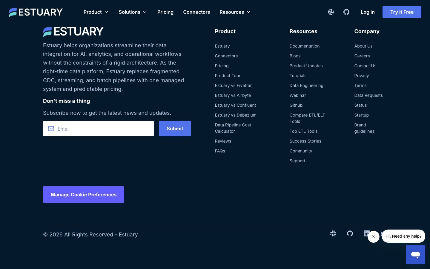
**`footer`** — Deep-navy footer on `{colors.canvas}` closing the page. White wordmark + product blurb at left, a 4-column link list (Product / Resources / Company), a newsletter `{component.email-input}` + Submit, social icons, and a copyright row in `{typography.body}` colored `{colors.ice}`. A violet "Manage Cookie Preferences" `{component.button-primary}` sits in the lower-left.
## Do's and Don'ts
### Do
- Keep the page on the dark navy stack: `{colors.canvas}` floor, `{colors.surface}` cards, `{colors.surface-slate}` borders.
- Reserve `{colors.primary}` (#625eff) for primary actions only. The violet is the single loudest color in the system.
- Use `{colors.link}` (#5072eb) for inline links and accent words inside headlines — it's the cooler companion to the violet CTA.
- Build hierarchy with Inter weight 600 display + tight negative tracking; keep body at the loose 14px / 2.143 line-height for dense technical copy.
- Use pill tiles (`{rounded.pill}`) for connector logos and stat tags; use `{rounded.xl}` for content cards.
- Flip to the near-white `{component.deployment-card}` only for product diagrams that need to read as light artifacts against the dark page.
- Signal elevation with colored glows (teal / amber / white) and slate borders rather than gray drop shadows.
### Don't
- Don't introduce a second typeface — the system is Inter end-to-end.
- Don't put the violet primary on more than one action per band; competing violet buttons flatten the hierarchy.
- Don't render large light surfaces casually — light panels are scarce diagram artifacts, not default cards.
- Don't tighten the body line-height; the loose 2.143 leading is part of the legibility strategy on dark navy.
- Don't add hover-state styling beyond the documented pressed shift (violet → blue).
- Don't invent semantic accent colors (success green, error red) — they were not measured.
## Responsive Behavior
### Breakpoints
| Name | Width | Key Changes |
|---|---|---|
| Mobile | < 768px | Hamburger nav; hero h1 60→~32px; stat chips stack 1-up; success cards 1-up; connector grid wraps to fewer columns; footer columns collapse to 1 |
| Tablet | 768–1024px | Nav tightens; stat chips 2-up; success cards 2-up; deployment panels stack |
| Desktop | 1024–1440px | Full horizontal nav; 3-up success cards; multi-column connector grid; 4-column footer |
| Wide | > 1440px | Same as desktop with wider outer margins; centered content column |
> Exact breakpoint pixel values were not measured — the table above is derived from the captured layouts.
### Touch Targets
- `{component.button-primary}` padding (12 × 24) yields a comfortable tap area.
- `{component.email-input}` height comfortably exceeds 40px with 12px vertical padding.
- `{component.connector-pill}` tiles in the grid should retain a minimum 44px tap height when stacked on mobile.
### Collapsing Strategy
- Top nav collapses to a hamburger on mobile.
- The hero's stat-chip row reflows from 4-up to stacked.
- Success-story cards reduce columns (3 → 2 → 1) rather than shrinking type.
- The connector logo grid wraps to fewer pill columns.
- Footer's 4-column link list collapses to a single column.
### Image / Diagram Behavior
- Isometric diagrams scale proportionally and stay legible on the dark canvas.
- Connector logo pills wrap rather than scroll.
## Iteration Guide
1. Focus on ONE component at a time. Reference its YAML key directly (`{component.success-card}`, `{component.connector-pill}`).
2. Variants (`-active`, `-secondary`, `-outline`) live as separate entries in `components:`.
3. Use `{token.refs}` everywhere — never inline a hex in a component.
4. Never document hover. Default and Active/Pressed states only (primary violet → blue on press).
5. Keep the dark navy surface stack intact; light panels are scarce diagram artifacts.
6. Build emphasis with the violet action color and blue accent words — not with new hues.
7. When in doubt about hierarchy: bigger Inter 600 display before introducing a new weight.
## Known Gaps
- Measured component selectors returned `radius: 0px` and `padding: 0px` for `button`, `card`, and `input` — these are unreliable (likely captured reset/wrapper elements). Button, card, and input radii/padding in this spec are reconstructed from the radius/spacing token frequencies and screenshot ground-truth.
- The gold/amber gradient on the announcement bar and the "Premier" badge appears only inside a box-shadow value (`rgba(255,168,0,0.3)`) — no solid gold fill color was measured, so the announcement bar is documented with a `{colors.surface-slate}` base and the gold accent noted as a gap.
- No semantic palette (success / warning / error) was isolated; the teal compliance-badge checks and green flow accents seen in screenshots were not captured as tokens.
- Section-level vertical spacing (the rhythm between large bands) was not measured — only the tight 4–24px component band is confirmed.
- Radius values 20px and 36px appeared at very low frequency and are not assigned tokens; they may represent isolated diagram or badge elements.
- Hero gradient backgrounds, animated diagram transitions, and carousel timing are out of scope.
- Form validation, focus, and error states for `{component.email-input}` were not extracted.
- The `{typography.overline}` size (10.8px) is a computed measurement of a small label and may reflect a transform-scaled element rather than an authored size.
<!-- Documented by duply · real-world design systems as ready-to-use DESIGN.md for AI coding agents · https://duply.ai/estuary/design-md -->
Color Palette
Accent
Neutrals
Typography
display-xl60px · 600 · 1.1
The quick brown fox jumpsdisplay-lg40px · 600 · 1.2
The quick brown fox jumpstitle16px · 700 · 1.1
The quick brown fox jumpsoverline10.8px · 600 · 1.1
The quick brown fox jumpsbody14px · 400 · 2.143
The quick brown fox jumpsbutton18px · 400 · 1.5
The quick brown fox jumpsSpacing & Shape
Spacing
| Name | Value | Preview |
|---|---|---|
| xxs | 4px | |
| xs | 8px | |
| sm | 12px | |
| md | 16px | |
| lg | 20px | |
| xl | 24px |
Border Radius
| Name | Value | Preview |
|---|---|---|
| xs | 3px | |
| sm | 4px | |
| md | 8px | |
| lg | 12px | |
| xl | 16px | |
| xxl | 24px | |
| pill | 100px |
More like this


---
version: alpha
name: Estuary-design-analysis
description: "A dark, engineering-confident data-platform interface built on a deep navy canvas (#04192b) with white Inter type, electric-violet primary CTAs, and a cooler blue used for links and accents. The system reads as enterprise data-infrastructure SaaS — dense feature bands, slate-bordered cards, pill-shaped stat chips, and isometric product diagrams shown directly on the dark canvas. Brand voltage comes from the violet/blue action layer and the gradient-glow accents against an almost entirely dark, navy-on-navy surface stack."

colors:
  primary: "#625eff"
  link: "#5072eb"
  link-soft: "#a4b6f4"
  ink: "#ffffff"
  on-primary: "#000000"
  canvas: "#04192b"
  surface: "#0e2443"
  surface-slate: "#2e353f"
  slate: "#47506d"
  slate-muted: "#64809c"
  slate-soft: "#666f8d"
  ice: "#b7c6dd"
  ice-soft: "#d7dce5"
  neutral: "#808080"
  near-white: "#f2f3f5"
  near-white-soft: "#f8f8f8"
  near-black: "#080808"
  ink-black: "#101010"
  white-pure: "#fdfdfe"

typography:
  display-xl:
    fontFamily: "Inter, sans-serif"
    fontSize: 60px
    fontWeight: 600
    lineHeight: 1.1
    letterSpacing: -1.5px
  display-lg:
    fontFamily: "Inter, sans-serif"
    fontSize: 40px
    fontWeight: 600
    lineHeight: 1.2
    letterSpacing: -1px
  title:
    fontFamily: "Inter, sans-serif"
    fontSize: 16px
    fontWeight: 700
    lineHeight: 1.1
    letterSpacing: -0.4px
  overline:
    fontFamily: "Inter, sans-serif"
    fontSize: 10.8px
    fontWeight: 600
    lineHeight: 1.1
    letterSpacing: -0.27px
  body:
    fontFamily: "Inter, sans-serif"
    fontSize: 14px
    fontWeight: 400
    lineHeight: 2.143
    letterSpacing: 0
  button:
    fontFamily: "Inter, sans-serif"
    fontSize: 18px
    fontWeight: 400
    lineHeight: 1.5
    letterSpacing: 0

rounded:
  xs: 3px
  sm: 4px
  md: 8px
  lg: 12px
  xl: 16px
  xxl: 24px
  pill: 100px

spacing:
  xxs: 4px
  xs: 8px
  sm: 12px
  md: 16px
  lg: 20px
  xl: 24px

components:
  top-nav:
    backgroundColor: "{colors.canvas}"
    textColor: "{colors.ink}"
    typography: "{typography.button}"
    padding: 16px 24px
  button-primary:
    backgroundColor: "{colors.primary}"
    textColor: "{colors.ink}"
    typography: "{typography.button}"
    rounded: "{rounded.md}"
    padding: 12px 24px
  button-primary-active:
    backgroundColor: "{colors.link}"
    textColor: "{colors.ink}"
    rounded: "{rounded.md}"
  button-secondary:
    backgroundColor: "{colors.surface}"
    textColor: "{colors.ink}"
    typography: "{typography.button}"
    rounded: "{rounded.md}"
    padding: 12px 24px
  button-outline:
    backgroundColor: transparent
    textColor: "{colors.ink}"
    typography: "{typography.button}"
    rounded: "{rounded.sm}"
    padding: 8px 16px
  announcement-bar:
    backgroundColor: "{colors.surface-slate}"
    textColor: "{colors.ink}"
    typography: "{typography.overline}"
    rounded: "{rounded.md}"
    padding: 8px 16px
  stat-chip:
    backgroundColor: "{colors.surface}"
    textColor: "{colors.ink}"
    typography: "{typography.title}"
    rounded: "{rounded.lg}"
    padding: 16px 24px
  success-card:
    backgroundColor: "{colors.surface}"
    textColor: "{colors.ink}"
    typography: "{typography.body}"
    rounded: "{rounded.xl}"
    padding: 24px
  deployment-card:
    backgroundColor: "{colors.near-white-soft}"
    textColor: "{colors.near-black}"
    typography: "{typography.body}"
    rounded: "{rounded.xl}"
    padding: 24px
  diagram-node:
    backgroundColor: "{colors.surface}"
    textColor: "{colors.ice}"
    typography: "{typography.body}"
    rounded: "{rounded.xxl}"
    padding: 12px 16px
  connector-pill:
    backgroundColor: "{colors.surface}"
    textColor: "{colors.ink}"
    typography: "{typography.body}"
    rounded: "{rounded.pill}"
    padding: 8px 16px
  email-input:
    backgroundColor: "{colors.canvas}"
    textColor: "{colors.ink}"
    typography: "{typography.body}"
    rounded: "{rounded.sm}"
    padding: 12px 16px
  footer:
    backgroundColor: "{colors.canvas}"
    textColor: "{colors.ice}"
    typography: "{typography.body}"
    padding: 24px
  pricing-card:
    backgroundColor: "{colors.surface}"
    textColor: "{colors.ink}"
    typography: "{typography.title}"
    rounded: "{rounded.xl}"
    padding: 24px
---

## Overview

Estuary's marketing surface is a dark, engineering-first data-platform interface — a deep navy canvas (`{colors.canvas}` — #04192b) carrying white Inter type, electric-violet primary CTAs (`{colors.primary}` — #625eff), and a slightly cooler blue (`{colors.link}` — #5072eb) used for links, accent headings, and pressed states. The system reads as enterprise data-infrastructure SaaS — confident, dense, and technical, with isometric product diagrams and connector grids shown directly on the dark canvas.

The type system runs **Inter** at every level. Display headlines are large (60px h1, 40px h2) at weight 600 with tight negative tracking (-1.5px / -1px); body copy is a small 14px at a notably loose line-height (2.143 — derived from the measured body role). The hierarchy is steep: huge headlines, small luxuriously-spaced body, and a tiny 10.8px overline used for eyebrow labels like the announcement bar.

Surfaces stack navy-on-navy. The page floor is `{colors.canvas}` (#04192b); cards and chips lift to `{colors.surface}` (#0e2443); the most frequently measured tone — `{colors.surface-slate}` (#2e353f) — handles borders, slate panels, and the muted utility bars. A small family of cooler ice tones (`{colors.ice}` — #b7c6dd, `{colors.ice-soft}` — #d7dce5) carries secondary text and diagram labels against the dark.

Brand voltage lives entirely in the action layer: violet primary buttons, blue links, and gradient-glow accents (an amber product badge, a white halo on the hero logo). Everything else is near-monochrome dark navy. A small number of inverted light cards (the deployment-mode panels) flip to near-white (`{colors.near-white-soft}` — #f8f8f8) to read as product diagrams against the dark page.

**Key Characteristics:**
- Deep navy canvas (`{colors.canvas}` — #04192b) as the universal page floor; near-everything sits dark-on-dark.
- Electric-violet primary CTA (`{colors.primary}` — #625eff) is the single dominant action color; blue (`{colors.link}`) carries links and accent headings.
- Inter throughout, weight 600 display with tight negative tracking and a small, loosely-leaded 14px body.
- Pill-shaped chips and tags (`{rounded.pill}` — 100px) for stat callouts and connector tiles; mid-radius cards (`{rounded.xl}` — 16px, `{rounded.xxl}` — 24px) for content panels.
- Slate-bordered, navy-fill cards (`{colors.surface}` — #0e2443) holding success stories, pricing, and feature copy.
- Isometric product diagrams and connector logo grids rendered directly on the dark canvas — the product is shown, not illustrated around.
- Occasional inverted near-white panels (deployment modes) provide contrast inside an otherwise dark page.
- Soft glow shadows (amber, white, teal-tinted) used sparingly for emphasis rather than literal elevation.

## Colors

### Brand & Action
- **Primary** (`{colors.primary}` — #625eff): The electric-violet primary CTA color — "Try it Free", "Submit", "Manage Cookie Preferences", "Register Now". The single dominant action color. Pressed state shifts toward `{colors.link}` (#5072eb) (derived from the blue/violet action pairing).
- **Link** (`{colors.link}` — #5072eb): Inline links, accent words inside headlines ("dependable", "any source"), and "Move and transform data…" accent heading. The system's most-used blue.
- **Link Soft** (`{colors.link-soft}` — #a4b6f4): Lighter periwinkle for secondary links and small accent text.

### Surface
- **Canvas** (`{colors.canvas}` — #04192b): The deep-navy page floor across all bands and the footer.
- **Surface** (`{colors.surface}` — #0e2443): Cards, stat chips, success-story panels, connector pills, pricing cards — the standard lift above canvas.
- **Surface Slate** (`{colors.surface-slate}` — #2e353f): The most frequently measured tone — borders, slate utility bars, the announcement strip, and divider panels.
- **Near White Soft** (`{colors.near-white-soft}` — #f8f8f8) / **Near White** (`{colors.near-white}` — #f2f3f5): The inverted light panels (deployment-mode diagram cards) that flip light against the dark page.
- **White Pure** (`{colors.white-pure}` — #fdfdfe): Pure-white surface fragments inside product diagrams.
- **Near Black** (`{colors.near-black}` — #080808) / **Ink Black** (`{colors.ink-black}` — #101010): Text on the inverted light panels, and the darkest diagram fills.

### Slate / Ice Text
- **Ink** (`{colors.ink}` — #ffffff): All primary headlines and body text on dark surfaces.
- **Ice** (`{colors.ice}` — #b7c6dd): Secondary text, footer body, and diagram labels against navy.
- **Ice Soft** (`{colors.ice-soft}` — #d7dce5): Tertiary captions and faint diagram strokes.
- **Slate** (`{colors.slate}` — #47506d) / **Slate Muted** (`{colors.slate-muted}` — #64809c) / **Slate Soft** (`{colors.slate-soft}` — #666f8d): Muted blue-gray tones for borders, deactivated text, and diagram connectors.
- **Neutral** (`{colors.neutral}` — #808080): Plain gray for fine-print and disabled states.

### On-Action
- **On Primary** (`{colors.on-primary}` — #000000): The measured button text color — used on light/secondary action surfaces. Violet primary CTAs invert to `{colors.ink}` (white) for the label.

> No semantic success / warning / error palette was reliably isolated — see Known Gaps.

## Typography

### Font Family
The system runs **Inter** at every level — display, body, buttons, and labels. Inter is open-source (no licensed/custom face was flagged), so it ships as-is with a `-apple-system, BlinkMacSystemFont, "Segoe UI", Roboto, sans-serif` fallback stack. There is no second display face; hierarchy is built entirely from size, weight, and tracking.

### Hierarchy

| Token | Size | Weight | Line Height | Letter Spacing | Use |
|---|---|---|---|---|---|
| `{typography.display-xl}` | 60px | 600 | 1.1 | -1.5px | Hero h1 ("The Right Data. At the Right Time.") |
| `{typography.display-lg}` | 40px | 600 | 1.2 | -1px | Section heads ("Success stories", "Deployment modes…") |
| `{typography.title}` | 16px | 700 | 1.1 | -0.4px | Card titles, stat labels, sub-heads |
| `{typography.overline}` | 10.8px | 600 | 1.1 | -0.27px | Tiny eyebrow labels — announcement bar, micro-tags |
| `{typography.body}` | 14px | 400 | 2.143 | 0 | Running body copy, footer links, card descriptions |
| `{typography.button}` | 18px | 400 | 1.5 | 0 | Button + nav labels |

### Principles
The hierarchy is steep and confident: very large display headlines (60/40px) at weight 600 with tight negative tracking, dropping straight to small 14px body. The body line-height is unusually loose (2.143 — measured) which gives long technical paragraphs breathing room on the dark canvas. Accent words inside headlines flip to `{colors.link}` (#5072eb) to add chromatic emphasis without changing weight.

Display stays at 600 (never 700) for headlines; the 700 weight is reserved for the small `{typography.title}` card labels where extra punch is needed at 16px. The tiny `{typography.overline}` (10.8px) is purely a label face — used for the announcement bar and micro-tags, never for content.

### Note on Font Substitutes
Inter is open-source and shipped directly — no substitution is required. If unavailable, **Roboto** or the system UI stack are acceptable fallbacks, though they will not match Inter's tight negative-tracking display rhythm.

## Layout

### Spacing System
- **Base unit:** 4px.
- **Tokens:** `{spacing.xxs}` 4px · `{spacing.xs}` 8px · `{spacing.sm}` 12px · `{spacing.md}` 16px · `{spacing.lg}` 20px · `{spacing.xl}` 24px.
- **Dominant rhythm:** 8px, 12px, 16px, and 24px carry the overwhelming majority of measured gaps/padding — the system lives in a tight 8–24px band.
- **Card internal padding:** `{spacing.xl}` (24px) for content cards; `{spacing.md}` (16px) for stat chips and tighter panels.

### Grid & Container
- **Editorial body:** Centered marketing column with full-width dark bands stacked vertically.
- **Success-story grid:** 3-up cards at desktop with a carousel control row beneath.
- **Connector grid:** Multi-column pill grid of integration logos (Postgres, Snowflake, BigQuery, Kafka, etc.).
- **Footer:** 4-column link list (Brand blurb + Product / Resources / Company) above a full-width copyright row.

### Whitespace Philosophy
Estuary packs more density than a typical consumer SaaS page — feature bands carry checklists, diagrams, and stat rows rather than single-claim hero moments. The tight 8–24px spacing scale keeps content compact, while the loose 14px body line-height keeps dense technical copy legible. Major bands alternate dark-navy fills, occasionally broken by an inverted near-white diagram panel.

## Elevation & Depth

| Level | Treatment | Use |
|---|---|---|
| Flat | No shadow, navy-on-navy | Page bands, footer, most cards |
| Border lift | `{colors.surface-slate}` 1px border on `{colors.surface}` fill | Standard cards, stat chips, pricing panels |
| Teal-tinted drop | `rgba(23, 73, 77, 0.15) 0px 20px 30px` | Lifted feature/diagram cards |
| Amber glow | `rgba(255, 168, 0, 0.3) 0px 4px 12px, inset rgba(255,255,255,0.2) 0px 1px 0px` | The "Premier" / announcement accent badge |
| White halo | `rgba(255,255,255,0.4) 0px 4px 40px, rgba(255,255,255,0.3) 0px 2px 16px, inset rgba(255,255,255,0.6) 0px 0px 0px 2px, rgba(0,0,0,0.1) 0px 2px 4px` | The hero logo halo / glowing focal element |
| Soft drop | `rgba(0,0,0,0.25) 0px 2px 7px` | Small floating elements (chat bubble, popovers) |

The elevation philosophy is **glow over shadow** — on a dark canvas, depth is signaled by colored glows (amber, white, teal) and slate borders rather than conventional gray drop shadows.

### Decorative Depth
- Isometric product diagrams (control plane / data plane, connector flows) carry their own internal node chrome on the dark canvas.
- The hero features a glowing white-halo logo treatment as a single bright focal point against the navy.
- Compliance badges (SOC 2, GDPR, CCPA, HIPAA) are rendered as small circular emblems with teal check accents.

## Shapes

### Border Radius Scale

| Token | Value | Use |
|---|---|---|
| `{rounded.xs}` | 3px | Rare — small inline accents |
| `{rounded.sm}` | 4px | Most-common small radius — inputs, compact buttons, tags |
| `{rounded.md}` | 8px | Primary/secondary buttons, announcement bar |
| `{rounded.lg}` | 12px | Stat chips, mid-size panels |
| `{rounded.xl}` | 16px | Content cards, success-story panels, pricing cards |
| `{rounded.xxl}` | 24px | Diagram nodes, larger feature containers |
| `{rounded.pill}` | 100px | Connector pills, stat tags, fully-rounded chips |

### Photography & Diagram Geometry
The page favors product diagrams and connector logo tiles over photography. Connector logos sit in pill or rounded-square tiles; diagram nodes use the larger `{rounded.xxl}` (24px) softening. Brand logos in the social-proof row sit unframed directly on the canvas.

## Components

### Navigation

**`top-nav`** — Dark navy nav bar on `{colors.canvas}`, white wordmark + logo at left, horizontal menu (Product, Solutions, Pricing, Connectors, Resources) center, and a right cluster with Slack/GitHub icons, a "Log in" link, and the violet `{component.button-primary}` "Try it Free". Menu labels in `{typography.button}` (Inter 18px).

**`announcement-bar`** — A slim utility strip pinned above the hero ("Estuary Flow is now Estuary…"). Background `{colors.surface-slate}`, text `{colors.overline}`, rounded `{rounded.md}`, with a gold gradient border accent (the gold tone is not a measured token — see Known Gaps).

### Buttons

**`button-primary`** — The signature violet CTA. Background `{colors.primary}` (#625eff), label `{colors.ink}` (white), type `{typography.button}` (Inter 18px), rounded `{rounded.md}`, padding 12px × 24px. Pressed state `button-primary-active` shifts to `{colors.link}` (#5072eb).

**`button-secondary`** — Navy-fill secondary action ("Book a Demo", "See Details"). Background `{colors.surface}`, text `{colors.ink}`, same type and radius as primary.

**`button-outline`** — Transparent outlined action for low-emphasis controls ("Read" on success cards, carousel arrows). Background transparent, text `{colors.ink}`, rounded `{rounded.sm}`, padding 8px × 16px.

### Cards & Containers

**`stat-chip`** — The hero metric row ("5500+ Users", "<100ms Latency", "3 petabytes/month", "99.9% Uptime"). Background `{colors.surface}`, title in `{typography.title}`, rounded `{rounded.lg}`, padding 16px × 24px.

**`success-card`** — Customer success-story card (Glossier, Xometry, Prodege). Background `{colors.surface}`, slate border, rounded `{rounded.xl}`, padding `{spacing.xl}` (24px). Carries a brand logo, a short description in `{typography.body}`, and a `{component.button-outline}` "Read".

**`deployment-card`** — Inverted light panel showing deployment-mode diagrams (Public / Private / BYOC). Background `{colors.near-white-soft}` (#f8f8f8), text `{colors.near-black}`, rounded `{rounded.xl}`, padding `{spacing.xl}` (24px). The light fill flips against the dark page so the diagram reads as product chrome.

**`diagram-node`** — A node block inside the isometric data-flow diagrams (CDC streams, files & databases, analytics, operations, AI). Background `{colors.surface}`, label `{colors.ice}`, rounded `{rounded.xxl}` (24px), padding 12px × 16px.

**`pricing-card`** — Pricing/TCO panel ("Your price at Estuary — $1,000/month"). Background `{colors.surface}`, headline in `{typography.title}`, rounded `{rounded.xl}`, padding `{spacing.xl}` (24px).

### Tags / Connectors

**`connector-pill`** — Integration logo tile in the connector grid (PostgreSQL, Snowflake, Databricks, BigQuery, Kafka, etc.). Background `{colors.surface}`, label `{colors.ink}`, fully rounded `{rounded.pill}` (100px), padding 8px × 16px.

### Inputs & Forms

**`email-input`** — The footer newsletter field. Background `{colors.canvas}`, text `{colors.ink}`, type `{typography.body}`, rounded `{rounded.sm}` (4px), padding 12px × 16px, with a leading mail icon. Paired with a violet `{component.button-primary}` "Submit".

### Footer

**`footer`** — Deep-navy footer on `{colors.canvas}` closing the page. White wordmark + product blurb at left, a 4-column link list (Product / Resources / Company), a newsletter `{component.email-input}` + Submit, social icons, and a copyright row in `{typography.body}` colored `{colors.ice}`. A violet "Manage Cookie Preferences" `{component.button-primary}` sits in the lower-left.

## Do's and Don'ts

### Do
- Keep the page on the dark navy stack: `{colors.canvas}` floor, `{colors.surface}` cards, `{colors.surface-slate}` borders.
- Reserve `{colors.primary}` (#625eff) for primary actions only. The violet is the single loudest color in the system.
- Use `{colors.link}` (#5072eb) for inline links and accent words inside headlines — it's the cooler companion to the violet CTA.
- Build hierarchy with Inter weight 600 display + tight negative tracking; keep body at the loose 14px / 2.143 line-height for dense technical copy.
- Use pill tiles (`{rounded.pill}`) for connector logos and stat tags; use `{rounded.xl}` for content cards.
- Flip to the near-white `{component.deployment-card}` only for product diagrams that need to read as light artifacts against the dark page.
- Signal elevation with colored glows (teal / amber / white) and slate borders rather than gray drop shadows.

### Don't
- Don't introduce a second typeface — the system is Inter end-to-end.
- Don't put the violet primary on more than one action per band; competing violet buttons flatten the hierarchy.
- Don't render large light surfaces casually — light panels are scarce diagram artifacts, not default cards.
- Don't tighten the body line-height; the loose 2.143 leading is part of the legibility strategy on dark navy.
- Don't add hover-state styling beyond the documented pressed shift (violet → blue).
- Don't invent semantic accent colors (success green, error red) — they were not measured.

## Responsive Behavior

### Breakpoints

| Name | Width | Key Changes |
|---|---|---|
| Mobile | < 768px | Hamburger nav; hero h1 60→~32px; stat chips stack 1-up; success cards 1-up; connector grid wraps to fewer columns; footer columns collapse to 1 |
| Tablet | 768–1024px | Nav tightens; stat chips 2-up; success cards 2-up; deployment panels stack |
| Desktop | 1024–1440px | Full horizontal nav; 3-up success cards; multi-column connector grid; 4-column footer |
| Wide | > 1440px | Same as desktop with wider outer margins; centered content column |

> Exact breakpoint pixel values were not measured — the table above is derived from the captured layouts.

### Touch Targets
- `{component.button-primary}` padding (12 × 24) yields a comfortable tap area.
- `{component.email-input}` height comfortably exceeds 40px with 12px vertical padding.
- `{component.connector-pill}` tiles in the grid should retain a minimum 44px tap height when stacked on mobile.

### Collapsing Strategy
- Top nav collapses to a hamburger on mobile.
- The hero's stat-chip row reflows from 4-up to stacked.
- Success-story cards reduce columns (3 → 2 → 1) rather than shrinking type.
- The connector logo grid wraps to fewer pill columns.
- Footer's 4-column link list collapses to a single column.

### Image / Diagram Behavior
- Isometric diagrams scale proportionally and stay legible on the dark canvas.
- Connector logo pills wrap rather than scroll.

## Iteration Guide

1. Focus on ONE component at a time. Reference its YAML key directly (`{component.success-card}`, `{component.connector-pill}`).
2. Variants (`-active`, `-secondary`, `-outline`) live as separate entries in `components:`.
3. Use `{token.refs}` everywhere — never inline a hex in a component.
4. Never document hover. Default and Active/Pressed states only (primary violet → blue on press).
5. Keep the dark navy surface stack intact; light panels are scarce diagram artifacts.
6. Build emphasis with the violet action color and blue accent words — not with new hues.
7. When in doubt about hierarchy: bigger Inter 600 display before introducing a new weight.

## Known Gaps

- Measured component selectors returned `radius: 0px` and `padding: 0px` for `button`, `card`, and `input` — these are unreliable (likely captured reset/wrapper elements). Button, card, and input radii/padding in this spec are reconstructed from the radius/spacing token frequencies and screenshot ground-truth.
- The gold/amber gradient on the announcement bar and the "Premier" badge appears only inside a box-shadow value (`rgba(255,168,0,0.3)`) — no solid gold fill color was measured, so the announcement bar is documented with a `{colors.surface-slate}` base and the gold accent noted as a gap.
- No semantic palette (success / warning / error) was isolated; the teal compliance-badge checks and green flow accents seen in screenshots were not captured as tokens.
- Section-level vertical spacing (the rhythm between large bands) was not measured — only the tight 4–24px component band is confirmed.
- Radius values 20px and 36px appeared at very low frequency and are not assigned tokens; they may represent isolated diagram or badge elements.
- Hero gradient backgrounds, animated diagram transitions, and carousel timing are out of scope.
- Form validation, focus, and error states for `{component.email-input}` were not extracted.
- The `{typography.overline}` size (10.8px) is a computed measurement of a small label and may reflect a transform-scaled element rather than an authored size.

<!-- Documented by duply · real-world design systems as ready-to-use DESIGN.md for AI coding agents · https://duply.ai/estuary/design-md -->