
Shopify

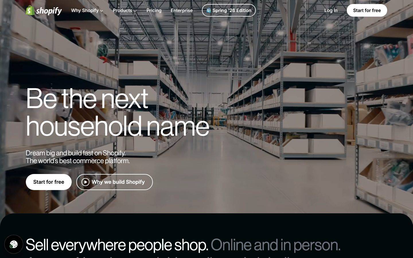
A dark, cinematic commerce-platform interface anchored on pure-black canvas (#000000) with white Neue Haas Grotesk display headlines set enormous (96px) and thin. The system reads as premium, confident, and editorial — full-bleed hero photography, near-black teal-tinted cards, mint and electric-purple accent bands, and white pill CTAs. Brand voltage comes from oversized low-weight display type and a scarce accent palette of mint-green and violet against the black floor.
Works withClaude CodeCursorCodexGemini CLICopilotv0LovableBoltWindsurfReplit
---
version: alpha
name: Shopify-design-analysis
description: "A dark, cinematic commerce-platform interface anchored on pure-black canvas (#000000) with white Neue Haas Grotesk display headlines set enormous (96px) and thin. The system reads as premium, confident, and editorial — full-bleed hero photography, near-black teal-tinted cards, mint and electric-purple accent bands, and white pill CTAs. Brand voltage comes from oversized low-weight display type and a scarce accent palette of mint-green and violet against the black floor."
colors:
  ink: "#ffffff"
  canvas: "#000000"
  surface: "#02090a"
  surface-raised: "#18181b"
  surface-teal: "#061a1c"
  surface-teal-soft: "#121c1e"
  body: "#d4d4d8"
  muted: "#a1a1aa"
  muted-strong: "#71717a"
  muted-deep: "#52525b"
  hairline: "#3f3f46"
  neutral-soft: "#e4e4e7"
  neutral-faint: "#f4f4f5"
  accent-mint: "#36f4a4"
  accent-purple: "#751be9"
  accent-emerald: "#008060"
  accent-slate: "#99b3ad"
typography:
  display-hero:
    fontFamily: "NeueHaasGrotesk, Inter, Helvetica, Arial, sans-serif"
    fontSize: 96px
    fontWeight: 400
    lineHeight: 1.0
    letterSpacing: normal
  display-section:
    fontFamily: "NeueHaasGrotesk, Inter, Helvetica, Arial, sans-serif"
    fontSize: 96px
    fontWeight: 400
    lineHeight: 1.0
    letterSpacing: 0.025em
  display-md:
    fontFamily: "NeueHaasGrotesk, Inter, Helvetica, Arial, sans-serif"
    fontSize: 55px
    fontWeight: 330
    lineHeight: 1.164
    letterSpacing: normal
  title:
    fontFamily: "NeueHaasGrotesk, Inter, Helvetica, Arial, sans-serif"
    fontSize: 20px
    fontWeight: 400
    lineHeight: 1.4
    letterSpacing: 0.015em
  body-sm:
    fontFamily: "Inter, sans-serif"
    fontSize: 10px
    fontWeight: 400
    lineHeight: 1.2
    letterSpacing: normal
  button:
    fontFamily: "Inter, sans-serif"
    fontSize: 14px
    fontWeight: 400
    lineHeight: 1.5
    letterSpacing: normal
rounded:
  xs: 4px
  sm: 8px
  md: 12px
  lg: 16px
  xl: 20px
  xxl: 48px
  blob: 340px
  pill: 9999px
spacing:
  xxs: 4px
  xs: 8px
  sm: 12px
  md: 16px
  lg: 24px
  xl: 32px
  xxl: 48px
  section: 64px
components:
  top-nav:
    backgroundColor: transparent
    textColor: "{colors.ink}"
    typography: "{typography.button}"
  button-primary:
    backgroundColor: "{colors.ink}"
    textColor: "{colors.canvas}"
    typography: "{typography.button}"
    rounded: "{rounded.pill}"
  button-secondary:
    backgroundColor: transparent
    textColor: "{colors.ink}"
    typography: "{typography.button}"
    rounded: "{rounded.pill}"
  badge-pill:
    backgroundColor: transparent
    textColor: "{colors.ink}"
    typography: "{typography.button}"
    rounded: "{rounded.pill}"
  card:
    backgroundColor: "{colors.surface}"
    textColor: "{colors.ink}"
    rounded: "{rounded.lg}"
  feature-card:
    backgroundColor: "{colors.surface-teal}"
    textColor: "{colors.ink}"
    typography: "{typography.title}"
    rounded: "{rounded.lg}"
  chat-card:
    backgroundColor: "{colors.surface-teal}"
    textColor: "{colors.ink}"
    typography: "{typography.title}"
    rounded: "{rounded.lg}"
  sidekick-band:
    backgroundColor: "{colors.accent-purple}"
    textColor: "{colors.ink}"
    typography: "{typography.display-md}"
    rounded: "{rounded.lg}"
  buy-now-button:
    backgroundColor: "{colors.canvas}"
    textColor: "{colors.ink}"
    typography: "{typography.button}"
    rounded: "{rounded.sm}"
  link-inline:
    backgroundColor: transparent
    textColor: "{colors.ink}"
    typography: "{typography.body-sm}"
---

## Overview

Shopify's marketing surface is a **dark, cinematic commerce-platform interface** — pure-black canvas (`{colors.canvas}` — #000000) carrying oversized white Neue Haas Grotesk display headlines. The hero opens full-bleed on warehouse photography with a giant thin "Be the next household name" headline set at 96px, then the page drops into an unbroken black floor holding near-black teal-tinted cards, a mint-green agentic-commerce card, and an electric-violet Sidekick band.

The type voice is the loudest signal: **Neue Haas Grotesk** at low weight (330–400) set enormous. Display headlines run 96px with `lineHeight` 1.0 — tight, editorial, confident. The thinness at that scale is deliberate — the headlines feel like premium print, not SaaS shouting. Supporting UI type (buttons, fine print) switches to **Inter**.

Component voltage comes from **scarce accent bands against black**: a mint-green (`{colors.accent-mint}` — #36f4a4) agentic-commerce card, an electric-purple (`{colors.accent-purple}` — #751be9) Sidekick section, and the classic Shopify emerald (`{colors.accent-emerald}` — #008060) appearing in small product-UI moments. Most cards stay near-black (`{colors.surface}` — #02090a) with subtle teal tinting (`{colors.surface-teal}` — #061a1c), so the accent bands pop hard when they arrive.

**Key Characteristics:**
- Pure-black canvas (`{colors.canvas}` — #000000) as the universal floor. This is a dark-first system — white is the ink, not the background.
- Oversized thin display type — Neue Haas Grotesk at 96px, weight 400 (h1) and a lighter weight 330 (h3). The low weight at large scale is the brand's editorial signature.
- White pill CTAs (`{component.button-primary}`) with black labels, paired with transparent outline pills (`{component.button-secondary}`). Pill radius (`{rounded.pill}`) throughout.
- Near-black teal-tinted cards (`{colors.surface}` — #02090a and `{colors.surface-teal}` — #061a1c) that barely separate from the black floor — depth is created by radial gradient glows inside cards rather than borders.
- Scarce, high-voltage accent bands — mint-green and electric-purple — that appear once each and dominate their section.
- Rounded content cards (`{rounded.lg}` — 16px, with 12px the dominant measured radius) and full-pill controls (`{rounded.pill}`).
- Soft, layered shadows including inset white hairlines (`rgba(255,255,255,0.08) 0px 0px 0px 1px`) that separate near-black cards from the black canvas.

## Colors

### Brand & Accent
- **Accent Mint** (`{colors.accent-mint}` — #36f4a4): The agentic-commerce "Your brand has entered the chat" card glow and small highlight moments. The brightest color in the system — used once, prominently.
- **Accent Purple** (`{colors.accent-purple}` — #751be9): The electric-violet Sidekick band. A full-band accent that closes the mid-page rhythm.
- **Accent Emerald** (`{colors.accent-emerald}` — #008060): The classic Shopify brand green — appears in small product-UI fragments and logo moments, not on marketing CTAs.
- **Accent Slate** (`{colors.accent-slate}` — #99b3ad): A muted teal-gray used in low-contrast product-UI chrome and quiet decorative fills.

### Surface
- **Canvas** (`{colors.canvas}` — #000000): The pure-black page floor — the only page background.
- **Surface** (`{colors.surface}` — #02090a): The default near-black card background. Barely lifts off the canvas.
- **Surface Teal** (`{colors.surface-teal}` — #061a1c): Teal-tinted card surface for feature cards and the chat card base.
- **Surface Teal Soft** (`{colors.surface-teal-soft}` — #121c1e): A slightly lighter teal-tinted surface for nested elements.
- **Surface Raised** (`{colors.surface-raised}` — #18181b): A neutral near-black used for raised chips and nested panels.

### Text
- **Ink** (`{colors.ink}` — #ffffff): All headlines and primary text — white on black.
- **Body** (`{colors.body}` — #d4d4d8): Running body text — light gray for reduced glare on black.
- **Muted** (`{colors.muted}` — #a1a1aa): Secondary text — the second-line of two-tone headlines ("Online and in person." set muted), sub-copy.
- **Muted Strong** (`{colors.muted-strong}` — #71717a): Tertiary labels and captions.
- **Muted Deep** (`{colors.muted-deep}` — #52525b): Fine print, disabled labels.

### Neutral / Line
- **Hairline** (`{colors.hairline}` — #3f3f46): The 1px separator tone on dark surfaces and outline-pill borders.
- **Neutral Soft** (`{colors.neutral-soft}` — #e4e4e7): Light neutral used inside inverted (light) product-UI fragments.
- **Neutral Faint** (`{colors.neutral-faint}` — #f4f4f5): Near-white used for light chips inside product mockups (e.g., the "Buy now" card).

## Typography

### Font Family
The system runs **Neue Haas Grotesk** for all display + heading type and **Inter** for UI/body text. Neue Haas Grotesk is a licensed commercial typeface — its low-weight, tight-leading grotesque forms are the brand's editorial signature. Inter handles button labels and fine print. The fallback stack for the display face walks `NeueHaasGrotesk, Inter, Helvetica, Arial, sans-serif`.

The split is functional:
- Neue Haas Grotesk (display, weight 330–400, tight `lineHeight` 1.0–1.16) — h1, h2, h3, h4
- Inter (400 weight) — buttons, small body/fine print

### Hierarchy

| Token | Size | Weight | Line Height | Letter Spacing | Use |
|---|---|---|---|---|---|
| `{typography.display-hero}` | 96px | 400 | 1.0 | normal | Hero h1 ("Be the next household name") — Neue Haas Grotesk |
| `{typography.display-section}` | 96px | 400 | 1.0 | 0.025em | Full-width section headlines ("Sell everywhere people shop.") |
| `{typography.display-md}` | 55px | 330 | 1.164 | normal | Sub-section heads and mid-band titles — the thin weight-330 cut |
| `{typography.title}` | 20px | 400 | 1.4 | 0.015em | Card titles ("Your brand has entered the chat", "Sell more in more places") |
| `{typography.body-sm}` | 10px | 400 | 1.2 | normal | Fine print, small labels, inline links — Inter |
| `{typography.button}` | 14px | 400 | 1.5 | normal | Button labels, nav links — Inter |

### Principles
Neue Haas Grotesk is the brand voice — every headline uses it, and the thin cut at large scale (weight 400 at 96px, weight 330 at 55px) is what makes the system read as premium editorial rather than typical SaaS. Never bold display headlines beyond weight 400 — the thinness is the point. Two-tone headlines (white primary + `{colors.muted}` secondary clause) are a repeated device on section heads.

### Note on Font Substitutes
Neue Haas Grotesk is a licensed typeface and not shipped here. The closest **open-source** substitute is **Inter** (weight 300–400 at large sizes with tight line-height), which preserves the neutral-grotesque tone. **Public Sans** (weight 300) is another usable open substitute. Neither reproduces the exact Neue Haas character, but both hold the thin-at-scale editorial signature.

## Layout

### Spacing System
- **Base unit:** 4px.
- **Tokens:** `{spacing.xxs}` 4px · `{spacing.xs}` 8px · `{spacing.sm}` 12px · `{spacing.md}` 16px · `{spacing.lg}` 24px · `{spacing.xl}` 32px · `{spacing.xxl}` 48px · `{spacing.section}` 64px.
- **Most frequent measured values:** 12px, 16px, and 32px dominate the padding/gap distribution — the workhorse rhythm inside cards and between grouped elements.
- **Section rhythm:** `{spacing.section}` (64px) separates the major black bands.

### Grid & Container
- **Hero:** full-bleed background photography with left-aligned headline block and a two-button CTA row beneath.
- **Feature grids:** 3-up card rows ("Sell on every channel / Sell face to face / Sell to 250M+ shoppers") on the "Sell more in more places" band.
- **Sidekick band:** 2-up video/feature split inside the purple section.
- **Editorial bands:** single large headline + supporting inline link, followed by full-width or gridded cards.

### Whitespace Philosophy
Shopify's dark canvas uses generous vertical spacing to let oversized headlines breathe against black. The near-black cards float on the black floor with meaningful gaps, and the accent bands (mint, purple) get full section width. The result reads as confident and cinematic — content arrives in deliberate, spaced beats rather than dense stacking.

## Elevation & Depth

| Level | Treatment | Use |
|---|---|---|
| Flat | No shadow — near-black card on black canvas | Default cards (`{component.card}`) |
| Inset hairline | `rgba(255,255,255,0.08) 0px 0px 0px 1px` inset (measured) | Separating near-black cards from the black floor |
| Soft lift | `rgba(0,0,0,0.1) 0px 8px 8px` + `0px 4px 4px` (measured) | Raised chips and product-UI fragments |
| Deep drop | `rgba(0,0,0,0.25) 0px 25px 50px -12px` (measured) | Floating product-mockup cards (e.g., the "Buy now" storefront card) |
| Glow lift | `rgba(0,0,0,0.25) 0px 10px 50px` + `rgba(255,255,255,0.25) 0px 0px 0px 1px` (measured) | Emphasized floating cards with a bright hairline ring |

The elevation philosophy is **glow-and-hairline on black** — because near-black cards barely separate from the black canvas by color alone, the system uses inset white hairlines and radial-gradient interior glows (visible as soft teal and blue bloom inside cards) to create depth. Heavy black drop shadows push the light product-UI mockups forward.

### Decorative Depth
- Cards carry internal radial gradient glows (teal, blue, purple bloom) rather than flat fills — visible on the "Sell more in more places" grid cards and the Sidekick band.
- Light product-UI fragments (a storefront "Buy now" card, order chips) float on the dark surfaces with strong drop shadows, inverting the palette locally to show real product chrome.

## Shapes

### Border Radius Scale

| Token | Value | Use |
|---|---|---|
| `{rounded.xs}` | 4px | Small chips, inline tags |
| `{rounded.sm}` | 8px | Light product-UI buttons (e.g., "Buy now") |
| `{rounded.md}` | 12px | The dominant measured radius — most cards and panels |
| `{rounded.lg}` | 16px | Larger content cards |
| `{rounded.xl}` | 20px | Feature-card containers |
| `{rounded.xxl}` | 48px | Large rounded band containers |
| `{rounded.blob}` | 340px | Very-large soft-corner decorative shapes |
| `{rounded.pill}` | 9999px | CTA buttons, nav badge pills, avatar/icon circles |

### Photography Geometry
The hero uses full-bleed rectangular warehouse photography with no corner rounding — it bleeds to all edges. Product-UI mockup fragments (storefronts, order cards) use `{rounded.sm}`–`{rounded.md}` corners matching real Shopify admin chrome. The circular "chat" avatar chips at the top of the agentic card use `{rounded.pill}`.

## Components

### Top Navigation

**`top-nav`** — Transparent nav bar overlaid on the hero photography. Carries the Shopify wordmark + green shopping-bag logo at left, primary menu (Why Shopify, Products, Pricing, Enterprise) center, a rounded outline "Spring '26 Edition" `{component.badge-pill}`, and a right cluster with "Log in" text-link + "Start for free" `{component.button-primary}`. Menu labels in `{typography.button}` (Inter 14px), white ink over the photo.

### Buttons

**`button-primary`** — The signature CTA. White background (`{colors.ink}`) with black label (`{colors.canvas}`), `{typography.button}`, full pill radius (`{rounded.pill}` — derived from screenshot; the frequency analyzer measured 0px radius/padding because Shopify renders CTAs as styled links). Used for "Start for free" throughout.

**`button-secondary`** — Transparent outline pill with white label and a 1px hairline ring. Used for "Why we build Shopify" (with a play-icon glyph) beside the primary CTA. Radius `{rounded.pill}`.

**`badge-pill`** — A small outline pill in the nav ("Spring '26 Edition") with a product icon. Transparent background, `{colors.ink}` text, `{rounded.pill}`.

**`buy-now-button`** — A light-mode product-UI button inside the storefront mockup card ("Buy now"). Background `{colors.canvas}` region within a light card, `{typography.button}`, radius `{rounded.sm}`. This is product chrome shown as content.

### Cards & Containers

**`card`** — The default near-black card. Background `{colors.surface}` (#02090a), white text, rounded `{rounded.lg}` (derived — the measured card radius returned 0px but 12px is the dominant radius in the system). Separated from the black canvas by an inset white hairline shadow rather than a fill contrast.

**`feature-card`** — Used in the 3-up "Sell more in more places" grid ("Sell on every channel", "Sell face to face", "Sell to 250M+ shoppers with Shop"). Background `{colors.surface-teal}` (#061a1c) with an internal radial glow, title in `{typography.title}` (20px), body and inline links beneath. Rounded `{rounded.lg}`.

**`chat-card`** — The agentic-commerce feature card ("Your brand has entered the chat"). Teal-tinted `{colors.surface-teal}` surface with a bright mint (`{colors.accent-mint}`) interior glow and circular chat-avatar chips at top. Title in `{typography.title}`.

**`sidekick-band`** — The full-width "Meet your secret weapon, Sidekick" band. Background `{colors.accent-purple}` (#751be9), white ink, headline in `{typography.display-md}`, containing a 2-up video/feature split. The one saturated full-band accent in the system.

### Links

**`link-inline`** — Underlined inline links inside body copy ("Get a stunning store", "multichannel integration", "Shopify Markets", "Universal Commerce Protocol"). White text (`{colors.ink}`), `{typography.body-sm}`, underlined. The system keeps inline links monochrome white.

## Do's and Don'ts

### Do
- Keep the canvas pure black (`{colors.canvas}` — #000000). White is the ink; the black floor is the constant.
- Set display headlines enormous and thin — Neue Haas Grotesk at 96px weight 400, or 55px weight 330. The thinness at scale is the brand.
- Use two-tone headlines: white primary clause + `{colors.muted}` secondary clause on the same line.
- Reserve accent bands (`{colors.accent-mint}`, `{colors.accent-purple}`) for a single high-voltage section each. Their scarcity is what makes them land.
- Create card depth with inset white hairlines and interior radial glows, not with border color — near-black cards barely separate from black by fill alone.
- Use white pill CTAs (`{component.button-primary}`) as the single strongest action; pair with a transparent outline pill for the secondary action.
- Show real light-mode product-UI fragments (storefronts, order cards) floating on the dark surfaces with strong drop shadows.

### Don't
- Don't bold display headlines beyond weight 400. Heavier weights kill the editorial thinness.
- Don't put more than one saturated accent band per view — the mint and purple sections are deliberately singular.
- Don't rely on fill contrast alone to separate near-black cards — always add the inset hairline or interior glow.
- Don't use the Shopify emerald (`{colors.accent-emerald}`) on marketing CTAs — it belongs to logo + product-UI moments.
- Don't add hover-state styling beyond default + active/pressed.

## Responsive Behavior

The capture includes a full-length desktop composite and a narrow (mobile-width) full-page render, confirming a responsive collapse.

### Breakpoints (inferred from captured renders)

| Name | Behavior |
|---|---|
| Mobile (narrow render) | Nav collapses to a condensed bar; hero headline scales down from 96px but stays thin; feature cards stack 1-up; accent bands stay full-width; two-tone section heads wrap |
| Desktop (wide render) | Full nav with all menu items + badge pill; hero headline at full 96px; feature grids 3-up; Sidekick band 2-up |

### Touch Targets
- `{component.button-primary}` and `{component.button-secondary}` render as full pills with generous horizontal padding — comfortably above 44px tap height in the desktop render.
- Nav links in `{typography.button}` (14px) sit in a spaced horizontal row.

### Collapsing Strategy
- Hero photography stays full-bleed at both widths; the headline reflows and downsizes while keeping tight line-height.
- Multi-column feature grids reduce to single-column stacks on mobile rather than shrinking cards.
- Accent bands (mint chat card, purple Sidekick) retain full width and their interior glows at every size.
- Exact breakpoint pixel values were not measured — see Known Gaps.

### Image Behavior
- Hero warehouse photography bleeds edge-to-edge and crops rather than letterboxing.
- Product-UI mockup fragments retain aspect ratios and their drop shadows while their host cards resize.

## Iteration Guide

1. Focus on ONE component at a time. Reference its YAML key directly (`{component.feature-card}`, `{component.sidekick-band}`).
2. Variants of an existing component (`-active`, `-disabled`) live as separate entries in `components:`.
3. Use `{token.refs}` everywhere — never inline hex.
4. Never document hover. Default and Active/Pressed states only.
5. Display headlines stay Neue Haas Grotesk thin (330–400). Never bold them to compensate for the black background.
6. Accent bands are scarce by design — don't add a third saturated band casually.
7. When in doubt about emphasis: bigger thin Neue Haas before bolder Neue Haas.

## Known Gaps

- The frequency analyzer measured `button-primary` with `radius: 0px` and `padding: 0px` — Shopify renders CTAs as styled `<a>` link elements, which the button selector doesn't capture. Pill radius and padding are documented from screenshot ground-truth and marked derived.
- The `card` component measured `radius: 0px` / `shadow: none`, but the screenshots and the radius distribution (12px dominant, 29 occurrences) show rounded cards with glow/hairline shadows; the documented `{rounded.lg}` is derived.
- Neue Haas Grotesk is a licensed typeface and is not shippable; open-source substitutes (Inter, Public Sans) are documented in the Typography section. `fonts_licensed` was returned empty by the analyzer, so the license flag is inferred from the family name.
- Body text was measured at 10px (`{typography.body-sm}`) — likely a fine-print / label sample; the primary body copy in the screenshots renders larger. The larger body role was not captured.
- Exact letter-spacing on the display faces is mixed (`normal` on h1/h3, `0.025em` on h2, `0.015em` on h4) as measured; a unified display tracking value was not derivable.
- Responsive breakpoint pixel values, the footer, form/input states, and animation/transition timings are out of scope — only landing and pricing pages were captured.
- The mid-page "Hyperdriven by AI" blue-glow band and its build-tool chips are visible in the screenshot but were not resolved into measured component tokens.
- Radial-gradient interior card fills (teal/blue/purple bloom) are visible but were captured only as flat surface colors; the gradient stops were not measured.

<!-- Documented by Duply · real-world design systems as ready-to-use DESIGN.md for AI coding agents · https://duply.ai/shopify/design-md -->
Color Palette
Accent
Neutrals
Typography
display-hero96px · 400 · 1
The quick brown fox jumpsdisplay-section96px · 400 · 1
The quick brown fox jumpsdisplay-md55px · 330 · 1.164
The quick brown fox jumpstitle20px · 400 · 1.4
The quick brown fox jumpsbody-sm10px · 400 · 1.2
The quick brown fox jumpsbutton14px · 400 · 1.5
The quick brown fox jumpsSpacing & Shape
Spacing
| Name | Value | Preview |
|---|---|---|
| xxs | 4px | |
| xs | 8px | |
| sm | 12px | |
| md | 16px | |
| lg | 24px | |
| xl | 32px | |
| xxl | 48px | |
| section | 64px |
Border Radius
| Name | Value | Preview |
|---|---|---|
| xs | 4px | |
| sm | 8px | |
| md | 12px | |
| lg | 16px | |
| xl | 20px | |
| xxl | 48px | |
| blob | 340px | |
| pill | 9999px |
FAQ
- What colors does Shopify use?
- Shopify's core palette includes #ffffff, #000000, #02090a, #18181b, #061a1c. The full color set with usage roles (canvas, ink, surfaces, accent, semantic) is documented in the Shopify DESIGN.md.
- What font does Shopify use?
- Shopify's primary typeface is NeueHaasGrotesk. The complete type scale (sizes, weights, line-height and letter-spacing per role), with an open substitute where the original is licensed, is documented in the DESIGN.md.
- What is the Shopify design system?
- A dark, cinematic commerce-platform interface anchored on pure-black canvas (#000000) with white Neue Haas Grotesk display headlines set enormous (96px) and thin. The system reads as premium, confident, and editorial — full-bleed hero photography, near-black teal-tinted cards, mint and
Get this as a working kit
Shopify Launch Kit + DESIGN.md
$299$225
One-time payment
- A complete production-stack template, styled like Shopify, fully built and wired.
- One-time payment and the codebase is yours. No platform fees, no subscription.
Open it with Claude Code, Cursor, or any coding agent and build in plain language, then ship a complete web app.
- Your private DESIGN.md
- Marketing pages, blog, SEO & legal
- Email capture, newsletter & contact
- Accept payments (Stripe)
- Analytics (GA4 + PostHog)
- One-click deploy
- Auth, login & roles
- A full app dashboard, when you grow
More like this
---
version: alpha
name: Shopify-design-analysis
description: "A dark, cinematic commerce-platform interface anchored on pure-black canvas (#000000) with white Neue Haas Grotesk display headlines set enormous (96px) and thin. The system reads as premium, confident, and editorial — full-bleed hero photography, near-black teal-tinted cards, mint and electric-purple accent bands, and white pill CTAs. Brand voltage comes from oversized low-weight display type and a scarce accent palette of mint-green and violet against the black floor."
colors:
  ink: "#ffffff"
  canvas: "#000000"
  surface: "#02090a"
  surface-raised: "#18181b"
  surface-teal: "#061a1c"
  surface-teal-soft: "#121c1e"
  body: "#d4d4d8"
  muted: "#a1a1aa"
  muted-strong: "#71717a"
  muted-deep: "#52525b"
  hairline: "#3f3f46"
  neutral-soft: "#e4e4e7"
  neutral-faint: "#f4f4f5"
  accent-mint: "#36f4a4"
  accent-purple: "#751be9"
  accent-emerald: "#008060"
  accent-slate: "#99b3ad"
typography:
  display-hero:
    fontFamily: "NeueHaasGrotesk, Inter, Helvetica, Arial, sans-serif"
    fontSize: 96px
    fontWeight: 400
    lineHeight: 1.0
    letterSpacing: normal
  display-section:
    fontFamily: "NeueHaasGrotesk, Inter, Helvetica, Arial, sans-serif"
    fontSize: 96px
    fontWeight: 400
    lineHeight: 1.0
    letterSpacing: 0.025em
  display-md:
    fontFamily: "NeueHaasGrotesk, Inter, Helvetica, Arial, sans-serif"
    fontSize: 55px
    fontWeight: 330
    lineHeight: 1.164
    letterSpacing: normal
  title:
    fontFamily: "NeueHaasGrotesk, Inter, Helvetica, Arial, sans-serif"
    fontSize: 20px
    fontWeight: 400
    lineHeight: 1.4
    letterSpacing: 0.015em
  body-sm:
    fontFamily: "Inter, sans-serif"
    fontSize: 10px
    fontWeight: 400
    lineHeight: 1.2
    letterSpacing: normal
  button:
    fontFamily: "Inter, sans-serif"
    fontSize: 14px
    fontWeight: 400
    lineHeight: 1.5
    letterSpacing: normal
rounded:
  xs: 4px
  sm: 8px
  md: 12px
  lg: 16px
  xl: 20px
  xxl: 48px
  blob: 340px
  pill: 9999px
spacing:
  xxs: 4px
  xs: 8px
  sm: 12px
  md: 16px
  lg: 24px
  xl: 32px
  xxl: 48px
  section: 64px
components:
  top-nav:
    backgroundColor: transparent
    textColor: "{colors.ink}"
    typography: "{typography.button}"
  button-primary:
    backgroundColor: "{colors.ink}"
    textColor: "{colors.canvas}"
    typography: "{typography.button}"
    rounded: "{rounded.pill}"
  button-secondary:
    backgroundColor: transparent
    textColor: "{colors.ink}"
    typography: "{typography.button}"
    rounded: "{rounded.pill}"
  badge-pill:
    backgroundColor: transparent
    textColor: "{colors.ink}"
    typography: "{typography.button}"
    rounded: "{rounded.pill}"
  card:
    backgroundColor: "{colors.surface}"
    textColor: "{colors.ink}"
    rounded: "{rounded.lg}"
  feature-card:
    backgroundColor: "{colors.surface-teal}"
    textColor: "{colors.ink}"
    typography: "{typography.title}"
    rounded: "{rounded.lg}"
  chat-card:
    backgroundColor: "{colors.surface-teal}"
    textColor: "{colors.ink}"
    typography: "{typography.title}"
    rounded: "{rounded.lg}"
  sidekick-band:
    backgroundColor: "{colors.accent-purple}"
    textColor: "{colors.ink}"
    typography: "{typography.display-md}"
    rounded: "{rounded.lg}"
  buy-now-button:
    backgroundColor: "{colors.canvas}"
    textColor: "{colors.ink}"
    typography: "{typography.button}"
    rounded: "{rounded.sm}"
  link-inline:
    backgroundColor: transparent
    textColor: "{colors.ink}"
    typography: "{typography.body-sm}"
---

## Overview

Shopify's marketing surface is a **dark, cinematic commerce-platform interface** — pure-black canvas (`{colors.canvas}` — #000000) carrying oversized white Neue Haas Grotesk display headlines. The hero opens full-bleed on warehouse photography with a giant thin "Be the next household name" headline set at 96px, then the page drops into an unbroken black floor holding near-black teal-tinted cards, a mint-green agentic-commerce card, and an electric-violet Sidekick band.

The type voice is the loudest signal: **Neue Haas Grotesk** at low weight (330–400) set enormous. Display headlines run 96px with `lineHeight` 1.0 — tight, editorial, confident. The thinness at that scale is deliberate — the headlines feel like premium print, not SaaS shouting. Supporting UI type (buttons, fine print) switches to **Inter**.

Component voltage comes from **scarce accent bands against black**: a mint-green (`{colors.accent-mint}` — #36f4a4) agentic-commerce card, an electric-purple (`{colors.accent-purple}` — #751be9) Sidekick section, and the classic Shopify emerald (`{colors.accent-emerald}` — #008060) appearing in small product-UI moments. Most cards stay near-black (`{colors.surface}` — #02090a) with subtle teal tinting (`{colors.surface-teal}` — #061a1c), so the accent bands pop hard when they arrive.

**Key Characteristics:**
- Pure-black canvas (`{colors.canvas}` — #000000) as the universal floor. This is a dark-first system — white is the ink, not the background.
- Oversized thin display type — Neue Haas Grotesk at 96px, weight 400 (h1) and a lighter weight 330 (h3). The low weight at large scale is the brand's editorial signature.
- White pill CTAs (`{component.button-primary}`) with black labels, paired with transparent outline pills (`{component.button-secondary}`). Pill radius (`{rounded.pill}`) throughout.
- Near-black teal-tinted cards (`{colors.surface}` — #02090a and `{colors.surface-teal}` — #061a1c) that barely separate from the black floor — depth is created by radial gradient glows inside cards rather than borders.
- Scarce, high-voltage accent bands — mint-green and electric-purple — that appear once each and dominate their section.
- Rounded content cards (`{rounded.lg}` — 16px, with 12px the dominant measured radius) and full-pill controls (`{rounded.pill}`).
- Soft, layered shadows including inset white hairlines (`rgba(255,255,255,0.08) 0px 0px 0px 1px`) that separate near-black cards from the black canvas.

## Colors

### Brand & Accent
- **Accent Mint** (`{colors.accent-mint}` — #36f4a4): The agentic-commerce "Your brand has entered the chat" card glow and small highlight moments. The brightest color in the system — used once, prominently.
- **Accent Purple** (`{colors.accent-purple}` — #751be9): The electric-violet Sidekick band. A full-band accent that closes the mid-page rhythm.
- **Accent Emerald** (`{colors.accent-emerald}` — #008060): The classic Shopify brand green — appears in small product-UI fragments and logo moments, not on marketing CTAs.
- **Accent Slate** (`{colors.accent-slate}` — #99b3ad): A muted teal-gray used in low-contrast product-UI chrome and quiet decorative fills.

### Surface
- **Canvas** (`{colors.canvas}` — #000000): The pure-black page floor — the only page background.
- **Surface** (`{colors.surface}` — #02090a): The default near-black card background. Barely lifts off the canvas.
- **Surface Teal** (`{colors.surface-teal}` — #061a1c): Teal-tinted card surface for feature cards and the chat card base.
- **Surface Teal Soft** (`{colors.surface-teal-soft}` — #121c1e): A slightly lighter teal-tinted surface for nested elements.
- **Surface Raised** (`{colors.surface-raised}` — #18181b): A neutral near-black used for raised chips and nested panels.

### Text
- **Ink** (`{colors.ink}` — #ffffff): All headlines and primary text — white on black.
- **Body** (`{colors.body}` — #d4d4d8): Running body text — light gray for reduced glare on black.
- **Muted** (`{colors.muted}` — #a1a1aa): Secondary text — the second-line of two-tone headlines ("Online and in person." set muted), sub-copy.
- **Muted Strong** (`{colors.muted-strong}` — #71717a): Tertiary labels and captions.
- **Muted Deep** (`{colors.muted-deep}` — #52525b): Fine print, disabled labels.

### Neutral / Line
- **Hairline** (`{colors.hairline}` — #3f3f46): The 1px separator tone on dark surfaces and outline-pill borders.
- **Neutral Soft** (`{colors.neutral-soft}` — #e4e4e7): Light neutral used inside inverted (light) product-UI fragments.
- **Neutral Faint** (`{colors.neutral-faint}` — #f4f4f5): Near-white used for light chips inside product mockups (e.g., the "Buy now" card).

## Typography

### Font Family
The system runs **Neue Haas Grotesk** for all display + heading type and **Inter** for UI/body text. Neue Haas Grotesk is a licensed commercial typeface — its low-weight, tight-leading grotesque forms are the brand's editorial signature. Inter handles button labels and fine print. The fallback stack for the display face walks `NeueHaasGrotesk, Inter, Helvetica, Arial, sans-serif`.

The split is functional:
- Neue Haas Grotesk (display, weight 330–400, tight `lineHeight` 1.0–1.16) — h1, h2, h3, h4
- Inter (400 weight) — buttons, small body/fine print

### Hierarchy

| Token | Size | Weight | Line Height | Letter Spacing | Use |
|---|---|---|---|---|---|
| `{typography.display-hero}` | 96px | 400 | 1.0 | normal | Hero h1 ("Be the next household name") — Neue Haas Grotesk |
| `{typography.display-section}` | 96px | 400 | 1.0 | 0.025em | Full-width section headlines ("Sell everywhere people shop.") |
| `{typography.display-md}` | 55px | 330 | 1.164 | normal | Sub-section heads and mid-band titles — the thin weight-330 cut |
| `{typography.title}` | 20px | 400 | 1.4 | 0.015em | Card titles ("Your brand has entered the chat", "Sell more in more places") |
| `{typography.body-sm}` | 10px | 400 | 1.2 | normal | Fine print, small labels, inline links — Inter |
| `{typography.button}` | 14px | 400 | 1.5 | normal | Button labels, nav links — Inter |

### Principles
Neue Haas Grotesk is the brand voice — every headline uses it, and the thin cut at large scale (weight 400 at 96px, weight 330 at 55px) is what makes the system read as premium editorial rather than typical SaaS. Never bold display headlines beyond weight 400 — the thinness is the point. Two-tone headlines (white primary + `{colors.muted}` secondary clause) are a repeated device on section heads.

### Note on Font Substitutes
Neue Haas Grotesk is a licensed typeface and not shipped here. The closest **open-source** substitute is **Inter** (weight 300–400 at large sizes with tight line-height), which preserves the neutral-grotesque tone. **Public Sans** (weight 300) is another usable open substitute. Neither reproduces the exact Neue Haas character, but both hold the thin-at-scale editorial signature.

## Layout

### Spacing System
- **Base unit:** 4px.
- **Tokens:** `{spacing.xxs}` 4px · `{spacing.xs}` 8px · `{spacing.sm}` 12px · `{spacing.md}` 16px · `{spacing.lg}` 24px · `{spacing.xl}` 32px · `{spacing.xxl}` 48px · `{spacing.section}` 64px.
- **Most frequent measured values:** 12px, 16px, and 32px dominate the padding/gap distribution — the workhorse rhythm inside cards and between grouped elements.
- **Section rhythm:** `{spacing.section}` (64px) separates the major black bands.

### Grid & Container
- **Hero:** full-bleed background photography with left-aligned headline block and a two-button CTA row beneath.
- **Feature grids:** 3-up card rows ("Sell on every channel / Sell face to face / Sell to 250M+ shoppers") on the "Sell more in more places" band.
- **Sidekick band:** 2-up video/feature split inside the purple section.
- **Editorial bands:** single large headline + supporting inline link, followed by full-width or gridded cards.

### Whitespace Philosophy
Shopify's dark canvas uses generous vertical spacing to let oversized headlines breathe against black. The near-black cards float on the black floor with meaningful gaps, and the accent bands (mint, purple) get full section width. The result reads as confident and cinematic — content arrives in deliberate, spaced beats rather than dense stacking.

## Elevation & Depth

| Level | Treatment | Use |
|---|---|---|
| Flat | No shadow — near-black card on black canvas | Default cards (`{component.card}`) |
| Inset hairline | `rgba(255,255,255,0.08) 0px 0px 0px 1px` inset (measured) | Separating near-black cards from the black floor |
| Soft lift | `rgba(0,0,0,0.1) 0px 8px 8px` + `0px 4px 4px` (measured) | Raised chips and product-UI fragments |
| Deep drop | `rgba(0,0,0,0.25) 0px 25px 50px -12px` (measured) | Floating product-mockup cards (e.g., the "Buy now" storefront card) |
| Glow lift | `rgba(0,0,0,0.25) 0px 10px 50px` + `rgba(255,255,255,0.25) 0px 0px 0px 1px` (measured) | Emphasized floating cards with a bright hairline ring |

The elevation philosophy is **glow-and-hairline on black** — because near-black cards barely separate from the black canvas by color alone, the system uses inset white hairlines and radial-gradient interior glows (visible as soft teal and blue bloom inside cards) to create depth. Heavy black drop shadows push the light product-UI mockups forward.

### Decorative Depth
- Cards carry internal radial gradient glows (teal, blue, purple bloom) rather than flat fills — visible on the "Sell more in more places" grid cards and the Sidekick band.
- Light product-UI fragments (a storefront "Buy now" card, order chips) float on the dark surfaces with strong drop shadows, inverting the palette locally to show real product chrome.

## Shapes

### Border Radius Scale

| Token | Value | Use |
|---|---|---|
| `{rounded.xs}` | 4px | Small chips, inline tags |
| `{rounded.sm}` | 8px | Light product-UI buttons (e.g., "Buy now") |
| `{rounded.md}` | 12px | The dominant measured radius — most cards and panels |
| `{rounded.lg}` | 16px | Larger content cards |
| `{rounded.xl}` | 20px | Feature-card containers |
| `{rounded.xxl}` | 48px | Large rounded band containers |
| `{rounded.blob}` | 340px | Very-large soft-corner decorative shapes |
| `{rounded.pill}` | 9999px | CTA buttons, nav badge pills, avatar/icon circles |

### Photography Geometry
The hero uses full-bleed rectangular warehouse photography with no corner rounding — it bleeds to all edges. Product-UI mockup fragments (storefronts, order cards) use `{rounded.sm}`–`{rounded.md}` corners matching real Shopify admin chrome. The circular "chat" avatar chips at the top of the agentic card use `{rounded.pill}`.

## Components

### Top Navigation

**`top-nav`** — Transparent nav bar overlaid on the hero photography. Carries the Shopify wordmark + green shopping-bag logo at left, primary menu (Why Shopify, Products, Pricing, Enterprise) center, a rounded outline "Spring '26 Edition" `{component.badge-pill}`, and a right cluster with "Log in" text-link + "Start for free" `{component.button-primary}`. Menu labels in `{typography.button}` (Inter 14px), white ink over the photo.

### Buttons

**`button-primary`** — The signature CTA. White background (`{colors.ink}`) with black label (`{colors.canvas}`), `{typography.button}`, full pill radius (`{rounded.pill}` — derived from screenshot; the frequency analyzer measured 0px radius/padding because Shopify renders CTAs as styled links). Used for "Start for free" throughout.

**`button-secondary`** — Transparent outline pill with white label and a 1px hairline ring. Used for "Why we build Shopify" (with a play-icon glyph) beside the primary CTA. Radius `{rounded.pill}`.

**`badge-pill`** — A small outline pill in the nav ("Spring '26 Edition") with a product icon. Transparent background, `{colors.ink}` text, `{rounded.pill}`.

**`buy-now-button`** — A light-mode product-UI button inside the storefront mockup card ("Buy now"). Background `{colors.canvas}` region within a light card, `{typography.button}`, radius `{rounded.sm}`. This is product chrome shown as content.

### Cards & Containers

**`card`** — The default near-black card. Background `{colors.surface}` (#02090a), white text, rounded `{rounded.lg}` (derived — the measured card radius returned 0px but 12px is the dominant radius in the system). Separated from the black canvas by an inset white hairline shadow rather than a fill contrast.

**`feature-card`** — Used in the 3-up "Sell more in more places" grid ("Sell on every channel", "Sell face to face", "Sell to 250M+ shoppers with Shop"). Background `{colors.surface-teal}` (#061a1c) with an internal radial glow, title in `{typography.title}` (20px), body and inline links beneath. Rounded `{rounded.lg}`.

**`chat-card`** — The agentic-commerce feature card ("Your brand has entered the chat"). Teal-tinted `{colors.surface-teal}` surface with a bright mint (`{colors.accent-mint}`) interior glow and circular chat-avatar chips at top. Title in `{typography.title}`.

**`sidekick-band`** — The full-width "Meet your secret weapon, Sidekick" band. Background `{colors.accent-purple}` (#751be9), white ink, headline in `{typography.display-md}`, containing a 2-up video/feature split. The one saturated full-band accent in the system.

### Links

**`link-inline`** — Underlined inline links inside body copy ("Get a stunning store", "multichannel integration", "Shopify Markets", "Universal Commerce Protocol"). White text (`{colors.ink}`), `{typography.body-sm}`, underlined. The system keeps inline links monochrome white.

## Do's and Don'ts

### Do
- Keep the canvas pure black (`{colors.canvas}` — #000000). White is the ink; the black floor is the constant.
- Set display headlines enormous and thin — Neue Haas Grotesk at 96px weight 400, or 55px weight 330. The thinness at scale is the brand.
- Use two-tone headlines: white primary clause + `{colors.muted}` secondary clause on the same line.
- Reserve accent bands (`{colors.accent-mint}`, `{colors.accent-purple}`) for a single high-voltage section each. Their scarcity is what makes them land.
- Create card depth with inset white hairlines and interior radial glows, not with border color — near-black cards barely separate from black by fill alone.
- Use white pill CTAs (`{component.button-primary}`) as the single strongest action; pair with a transparent outline pill for the secondary action.
- Show real light-mode product-UI fragments (storefronts, order cards) floating on the dark surfaces with strong drop shadows.

### Don't
- Don't bold display headlines beyond weight 400. Heavier weights kill the editorial thinness.
- Don't put more than one saturated accent band per view — the mint and purple sections are deliberately singular.
- Don't rely on fill contrast alone to separate near-black cards — always add the inset hairline or interior glow.
- Don't use the Shopify emerald (`{colors.accent-emerald}`) on marketing CTAs — it belongs to logo + product-UI moments.
- Don't add hover-state styling beyond default + active/pressed.

## Responsive Behavior

The capture includes a full-length desktop composite and a narrow (mobile-width) full-page render, confirming a responsive collapse.

### Breakpoints (inferred from captured renders)

| Name | Behavior |
|---|---|
| Mobile (narrow render) | Nav collapses to a condensed bar; hero headline scales down from 96px but stays thin; feature cards stack 1-up; accent bands stay full-width; two-tone section heads wrap |
| Desktop (wide render) | Full nav with all menu items + badge pill; hero headline at full 96px; feature grids 3-up; Sidekick band 2-up |

### Touch Targets
- `{component.button-primary}` and `{component.button-secondary}` render as full pills with generous horizontal padding — comfortably above 44px tap height in the desktop render.
- Nav links in `{typography.button}` (14px) sit in a spaced horizontal row.

### Collapsing Strategy
- Hero photography stays full-bleed at both widths; the headline reflows and downsizes while keeping tight line-height.
- Multi-column feature grids reduce to single-column stacks on mobile rather than shrinking cards.
- Accent bands (mint chat card, purple Sidekick) retain full width and their interior glows at every size.
- Exact breakpoint pixel values were not measured — see Known Gaps.

### Image Behavior
- Hero warehouse photography bleeds edge-to-edge and crops rather than letterboxing.
- Product-UI mockup fragments retain aspect ratios and their drop shadows while their host cards resize.

## Iteration Guide

1. Focus on ONE component at a time. Reference its YAML key directly (`{component.feature-card}`, `{component.sidekick-band}`).
2. Variants of an existing component (`-active`, `-disabled`) live as separate entries in `components:`.
3. Use `{token.refs}` everywhere — never inline hex.
4. Never document hover. Default and Active/Pressed states only.
5. Display headlines stay Neue Haas Grotesk thin (330–400). Never bold them to compensate for the black background.
6. Accent bands are scarce by design — don't add a third saturated band casually.
7. When in doubt about emphasis: bigger thin Neue Haas before bolder Neue Haas.

## Known Gaps

- The frequency analyzer measured `button-primary` with `radius: 0px` and `padding: 0px` — Shopify renders CTAs as styled `<a>` link elements, which the button selector doesn't capture. Pill radius and padding are documented from screenshot ground-truth and marked derived.
- The `card` component measured `radius: 0px` / `shadow: none`, but the screenshots and the radius distribution (12px dominant, 29 occurrences) show rounded cards with glow/hairline shadows; the documented `{rounded.lg}` is derived.
- Neue Haas Grotesk is a licensed typeface and is not shippable; open-source substitutes (Inter, Public Sans) are documented in the Typography section. `fonts_licensed` was returned empty by the analyzer, so the license flag is inferred from the family name.
- Body text was measured at 10px (`{typography.body-sm}`) — likely a fine-print / label sample; the primary body copy in the screenshots renders larger. The larger body role was not captured.
- Exact letter-spacing on the display faces is mixed (`normal` on h1/h3, `0.025em` on h2, `0.015em` on h4) as measured; a unified display tracking value was not derivable.
- Responsive breakpoint pixel values, the footer, form/input states, and animation/transition timings are out of scope — only landing and pricing pages were captured.
- The mid-page "Hyperdriven by AI" blue-glow band and its build-tool chips are visible in the screenshot but were not resolved into measured component tokens.
- Radial-gradient interior card fills (teal/blue/purple bloom) are visible but were captured only as flat surface colors; the gradient stops were not measured.

<!-- Documented by Duply · real-world design systems as ready-to-use DESIGN.md for AI coding agents · https://duply.ai/shopify/design-md -->