
HungryTiger
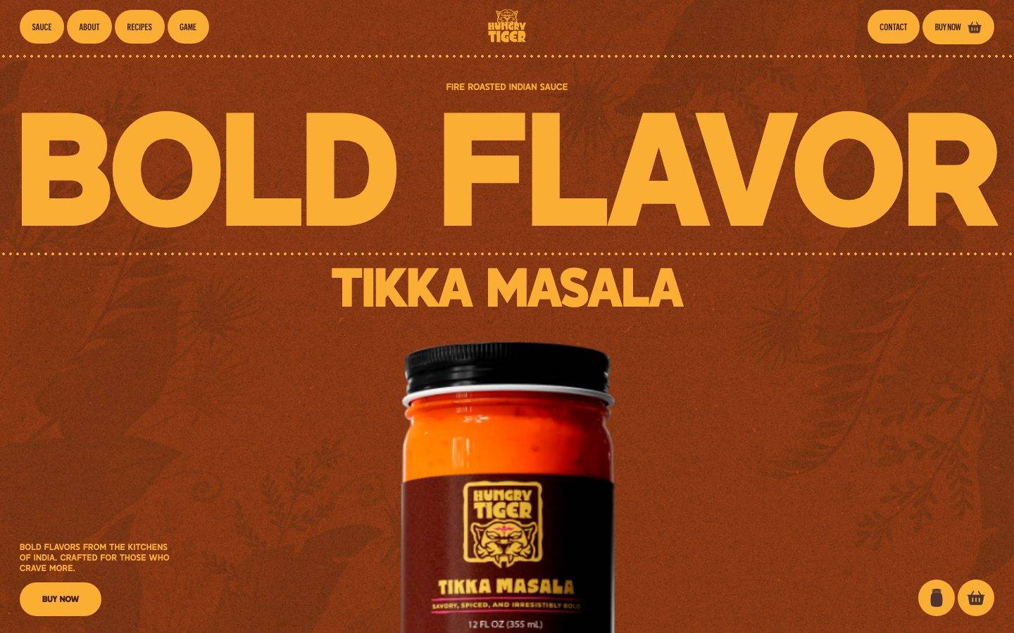
A bold, warm-toned CPG brand site for Hungry Tiger Indian sauces built on a fire-roasted brown canvas (#823513) with oversized amber-gold display typography (Salmond). The system is loud and appetite-driven — enormous condensed headlines ("BOLD FLAVOR"), pill-shaped gold CTAs with dark-brown labels, dotted-rule dividers, and a product jar as the hero focal point. Voltage comes almost entirely from the gold-on-brown contrast and the massive Salmond display scale rather than from accent colors.
Works withClaude CodeCursorCodexGemini CLICopilotv0LovableBoltWindsurfReplit
---
version: alpha
name: HungryTiger-design-analysis
description: "A bold, warm-toned CPG brand site for Hungry Tiger Indian sauces built on a fire-roasted brown canvas (#823513) with oversized amber-gold display typography (Salmond). The system is loud and appetite-driven — enormous condensed headlines (\"BOLD FLAVOR\"), pill-shaped gold CTAs with dark-brown labels, dotted-rule dividers, and a product jar as the hero focal point. Voltage comes almost entirely from the gold-on-brown contrast and the massive Salmond display scale rather than from accent colors."
colors:
  primary: "#faae33"
  ink: "#faae33"
  accent-amber: "#f7ac32"
  on-primary: "#402011"
  canvas: "#823513"
  canvas-deep: "#281006"
  accent-blue: "#3898ec"
  accent-pink: "#d1255c"
  accent-pink-soft: "#ffdede"
  neutral-white: "#ffffff"
  neutral-100: "#fafafa"
  neutral-150: "#f5f5f5"
  neutral-200: "#e6e6e6"
  neutral-300: "#dddddd"
  neutral-400: "#cccccc"
  neutral-500: "#999999"
  neutral-600: "#666666"
  neutral-800: "#333333"
  neutral-900: "#222222"
  black: "#000000"
typography:
  display-xl:
    fontFamily: "Salmond, Anton, Archivo Black, sans-serif"
    fontSize: 213.12px
    fontWeight: 700
    lineHeight: 0.8
    letterSpacing: "-0.02em"
  display-lg:
    fontFamily: "Salmond, Anton, Archivo Black, sans-serif"
    fontSize: 129.6px
    fontWeight: 700
    lineHeight: 0.9
    letterSpacing: "-0.016em"
  display-md:
    fontFamily: "Salmond, Anton, Archivo Black, sans-serif"
    fontSize: 64.8px
    fontWeight: 700
    lineHeight: 0.9
    letterSpacing: "-0.005em"
  button:
    fontFamily: "Graphikx, Inter, sans-serif"
    fontSize: 12.96px
    fontWeight: 500
    lineHeight: 1.0
    letterSpacing: "-0.02em"
rounded:
  sm: 5px
  md: 6px
  pill: 1296px
  circle: "100%"
spacing:
  xxs: 4px
  xs: 8px
  sm: 12px
  md: 16px
  lg: 20px
  xl: 28px
  xxl: 32px
  xxxl: 42px
components:
  button-primary:
    backgroundColor: "{colors.primary}"
    textColor: "{colors.on-primary}"
    typography: "{typography.button}"
    rounded: "{rounded.pill}"
    padding: 0px 17.496px
  button-nav-pill:
    backgroundColor: transparent
    textColor: "{colors.primary}"
    typography: "{typography.button}"
    rounded: "{rounded.pill}"
    padding: 0px 17.496px
  top-nav:
    backgroundColor: "{colors.canvas}"
    textColor: "{colors.primary}"
    typography: "{typography.button}"
  card:
    backgroundColor: "{colors.primary}"
    textColor: "{colors.on-primary}"
    rounded: "{rounded.md}"
  input:
    backgroundColor: "{colors.canvas}"
    textColor: "{colors.primary}"
    rounded: "{rounded.circle}"
---

## Overview

Hungry Tiger's landing page is a loud, appetite-first CPG brand surface. The entire page sits on a fire-roasted brown canvas (`{colors.canvas}` — #823513) and drives all hierarchy through a single high-contrast pairing: amber-gold display type (`{colors.ink}` — #faae33) set at enormous scale against the warm brown ground. There is no white page floor anywhere in the captured landing view — the brown is the system.

The type voice is dominated by **Salmond**, a heavy condensed display face used at extreme sizes ("BOLD FLAVOR" renders at `{typography.display-xl}` — 213px). Salmond appears at three descending display sizes (213px / 129px / 64px), all at weight 700 with tight negative letter-spacing and sub-1.0 line-height, so the headlines stack as dense, poster-like slabs. Supporting UI text (button labels, nav) uses **Graphikx**, a compact grotesque, at small sizes with a small-caps, tracked-in feel.

Brand voltage comes from the gold-on-brown contrast and the massive display scale — not from accent hues. A blue (`{colors.accent-blue}` — #3898ec), a crimson (`{colors.accent-pink}` — #d1255c), and a pale pink (`{colors.accent-pink-soft}`) exist in the measured palette but read as framework defaults / packaging accents rather than deliberate system colors.

**Key Characteristics:**
- Brown canvas (`{colors.canvas}` — #823513) as the universal page floor; there is no light-mode surface in the captured landing.
- Gold primary action + gold display text (`{colors.primary}` / `{colors.ink}` — #faae33) with dark-brown labels (`{colors.on-primary}` — #402011).
- Oversized Salmond display headlines at up to 213px, tight tracking, sub-1.0 line-height — poster-scale, appetite-driven.
- Fully pill-shaped CTAs (`{rounded.pill}` — 1296px, effectively a capsule).
- Flat design: no measured shadows anywhere; depth is created by color contrast and the product jar photo, not elevation.
- Dotted-rule dividers separating the top nav and framing the hero (decorative, visible in screenshots).

## Colors

### Brand & Accent
- **Primary** (`{colors.primary}` — #faae33): The dominant brand gold. Used for all primary CTAs, display headlines, and the wordmark. This is both the action color and the text color — a signature of the system.
- **Ink** (`{colors.ink}` — #faae33): The same gold, used as the max-contrast text color for headlines on the brown canvas. Declared as its own role because it functions as text, not fill.
- **Accent Amber** (`{colors.accent-amber}` — #f7ac32): A near-identical warm gold appearing in secondary UI moments; visually indistinguishable from primary at speed but measured as a distinct value.
- **Accent Blue** (`{colors.accent-blue}` — #3898ec): A framework-default link blue present in the measured palette; not observed as a deliberate brand color on the landing surface.
- **Accent Pink** (`{colors.accent-pink}` — #d1255c) and **Accent Pink Soft** (`{colors.accent-pink-soft}` — #ffdede): Low-frequency accents that appear on packaging chrome / label graphics rather than system UI.

### Surface
- **Canvas** (`{colors.canvas}` — #823513): The fire-roasted brown page floor — the single most defining color of the brand.
- **Canvas Deep** (`{colors.canvas-deep}` — #281006): A darker roasted brown used for lower "What's Inside" bands and deep-shadow zones (visible at page bottom in the full-scroll screenshot).

### Text
- **On Primary** (`{colors.on-primary}` — #402011): Dark-brown text on gold buttons — the inverse of the headline treatment.

### Neutrals
A grayscale ramp is present in the measured palette (`{colors.neutral-white}` #ffffff, `{colors.neutral-100}` #fafafa, `{colors.neutral-150}` #f5f5f5, `{colors.neutral-200}` #e6e6e6, `{colors.neutral-300}` #dddddd, `{colors.neutral-400}` #cccccc, `{colors.neutral-500}` #999999, `{colors.neutral-600}` #666666, `{colors.neutral-800}` #333333, `{colors.neutral-900}` #222222, `{colors.black}` #000000). These are mostly framework baseline values; on the visible landing surface almost nothing uses pure neutrals except the jar photo's cap and label.

## Typography

### Font Family
The system runs **Salmond** for all display headlines and **Graphikx** for UI/button text. Salmond is a heavy condensed display face carrying the brand's poster-scale voice; Graphikx is a compact grotesque used for small controls. Both are proprietary/custom faces — neither is an open web font — so an open-source substitution is required for any faithful rebuild (see below).

The split is strict and functional:
- Salmond (700 weight, tight negative tracking, sub-1.0 line-height) — h1, h2, h3
- Graphikx (500 weight, small size, -0.02em tracking) — buttons, nav labels

### Hierarchy

| Token | Size | Weight | Line Height | Letter Spacing | Use |
|---|---|---|---|---|---|
| `{typography.display-xl}` | 213.12px | 700 | 0.8 | -0.02em | Hero headline ("BOLD FLAVOR") — Salmond |
| `{typography.display-lg}` | 129.6px | 700 | 0.9 | -0.016em | Section heads ("A NEW ANGLE OF FLAVOR", "UNWRAP THE ADVENTURE") — Salmond |
| `{typography.display-md}` | 64.8px | 700 | 0.9 | -0.005em | Sub-heads ("TIKKA MASALA", "WHAT'S INSIDE") — Salmond |
| `{typography.button}` | 12.96px | 500 | 1.0 | -0.02em | Button + nav labels — Graphikx |

### Principles
Salmond is the entire brand voice — every headline is set in it at weight 700 with tight tracking and crushed line-height so multi-word headlines lock into dense slabs. The negative letter-spacing tightens as the size grows (-0.02em at 213px down to -0.005em at 65px), keeping optical density consistent across sizes. Never set body-scale text in Salmond, and never loosen the tracking — the crushed, poster-like density is the signature.

### Note on Font Substitutes
Neither Salmond nor Graphikx is available as an open web font. For Salmond, **Anton** (a free heavy condensed display sans) is the closest open-source approximation of the weight-and-condensation feel; **Archivo Black** is a slightly wider alternative. For Graphikx, **Inter** at weight 500 (or **Space Grotesk**) is a usable substitute for the compact grotesque UI labels. Substitutions preserve weight and tracking but not Salmond's exact letterforms.

## Layout

### Spacing System
- **Base unit:** 4px (the most frequent small increment; the scale steps in 4px multiples).
- **Tokens:** `{spacing.xxs}` 4px · `{spacing.xs}` 8px · `{spacing.sm}` 12px · `{spacing.md}` 16px · `{spacing.lg}` 20px · `{spacing.xl}` 28px · `{spacing.xxl}` 32px · `{spacing.xxxl}` 42px.
- The highest-frequency values are 12px, 4px, 10px, and 28px — a mix of tight control padding (4–12px) and larger block gaps (28–42px).
- **Section rhythm:** The full-scroll capture shows very large vertical gaps between editorial bands (headlines separated by tall empty brown zones). Exact section-spacing values were not measured — see Known Gaps.

### Grid & Container
- **Hero:** Centered single-column composition — a small uppercase kicker ("FIRE ROASTED INDIAN SAUCE"), the giant `{typography.display-xl}` headline, a `{typography.display-md}` sub-head, and the product jar centered below.
- **Top nav:** Left cluster of pill nav items (SAUCE / ABOUT / RECIPES / GAME), centered wordmark, right cluster (CONTACT + BUY NOW pill).
- **Lower bands:** Left-aligned large display heads over open brown space, with small supporting copy blocks and centered CTAs.

### Whitespace Philosophy
The page is deliberately spacious in its vertical rhythm — enormous brown gaps between headline bands give each poster-scale statement room to land. Horizontally, the hero is tightly centered on the product jar. The effect is a scroll-driven, cinematic reveal rather than a dense content grid.

## Elevation & Depth

| Level | Treatment | Use |
|---|---|---|
| Flat | No shadow, no border | All bands, nav, buttons, cards |
| Product photo | Native jar photography with its own lighting | Hero focal point |

No box-shadow values were measured anywhere in the system (`shadows: []`), and the `card` component explicitly measured `shadow: none`. Depth in Hungry Tiger is created entirely by **color contrast** (gold on brown, deep-brown lower bands) and by the **product jar photograph**, not by elevation tokens. There is no neumorphism, glassmorphism, or drop-shadow layering.

### Decorative Depth
- Dotted horizontal rules (visible under the nav and framing the hero) act as decorative dividers on the brown canvas.
- Faint botanical/pattern texture is embossed into the brown background behind the hero (visible in the landing screenshot) — part of the background art, not a token.

## Shapes

### Border Radius Scale

| Token | Value | Use |
|---|---|---|
| `{rounded.sm}` | 5px | Small measured radius (minor UI elements) |
| `{rounded.md}` | 6px | Cards (`{component.card}`) |
| `{rounded.pill}` | 1296px | Buttons + nav pills — an extreme radius that renders as a full capsule |
| `{rounded.circle}` | 100% | Input controls rendered as perfect circles |

The measured radius set includes several very large values (1080px, 1152px, 1224px, 1296px) — all far larger than any element they apply to, so they all resolve to the same **pill/capsule** silhouette. The `{rounded.pill}` token uses the largest measured value (1296px) to represent this intent; the smaller variants are the same capsule behavior at different element widths. The `input` component measured a `100%` radius (`{rounded.circle}`), producing circular controls.

### Photography Geometry
The hero product jar is shown as native cut-out/full-bleed photography with no card framing — it sits directly on the brown canvas as the composition's anchor.

## Components

### Navigation

**`top-nav`** — Top bar on the brown canvas (`{colors.canvas}`). Left cluster holds pill-shaped nav items (SAUCE / ABOUT / RECIPES / GAME), the Hungry Tiger tiger-head wordmark sits centered, and the right cluster carries CONTACT plus a BUY NOW pill. Labels use `{typography.button}` (Graphikx 12.96px / 500). A dotted rule sits just below the nav.

**`button-nav-pill`** — The individual nav items. Rendered as pill capsules (`{rounded.pill}`) with gold label text (`{colors.primary}`) on the brown ground, padding `0px 17.496px`, transparent fill. Used for the primary nav links.

### Buttons

**`button-primary`** — The signature CTA ("BUY NOW"). Background `{colors.primary}` (#faae33), label `{colors.on-primary}` (#402011), type `{typography.button}` (Graphikx 12.96px / 500), fully pill-shaped (`{rounded.pill}`), horizontal padding `17.496px` with 0 vertical padding (height driven by line-box). The gold capsule with dark-brown label is the system's one repeated action shape — it appears in the nav, the hero, and lower CTA bands.

### Cards & Containers

**`card`** — Gold content container. Background `{colors.primary}` (#faae33), text `{colors.on-primary}`, rounded `{rounded.md}` (6px), no shadow. Used for inset content blocks against the brown canvas.

### Inputs & Forms

**`input`** — Measured with a `100%` border-radius (`{rounded.circle}`), rendering as a circular control. Background and text tokens were not directly measured; `{colors.canvas}` / `{colors.primary}` are documented here as the system-consistent defaults — treat fill/text as unconfirmed (see Known Gaps).

## Do's and Don'ts

### Do
- Keep the brown canvas (`{colors.canvas}` — #823513) as the universal page floor. Hungry Tiger has no white mode.
- Drive hierarchy through gold-on-brown contrast and Salmond display scale — bigger before busier.
- Set every headline in Salmond 700 with tight negative tracking and crushed line-height. Multi-word heads should lock into dense slabs.
- Use the gold pill CTA (`{component.button-primary}`) with dark-brown labels for every primary action.
- Keep the design flat — depth comes from color contrast and the product photo, never from shadows.
- Use dotted-rule dividers as the decorative separator on the brown field.

### Don't
- Don't loosen Salmond's letter-spacing or raise its line-height — the crushed density is the brand.
- Don't introduce drop shadows or elevation layers; no shadow tokens exist in the system.
- Don't treat the measured blue (`{colors.accent-blue}`) as a brand color — it reads as a framework default.
- Don't set body-scale copy in Salmond; it is a display-only face.
- Don't square off the CTAs — buttons are full capsules (`{rounded.pill}`).

## Responsive Behavior

The full-height scroll screenshot shows the desktop composition compressing proportionally at a narrower width — the 213px hero headline shrinks and the nav tightens, but the single-column, centered-jar structure is preserved.

### Breakpoints
Exact breakpoint values were not captured (only the landing page was analyzed). Observed behavior:
- **Desktop:** Full nav with all pill items visible; hero headline at maximum `{typography.display-xl}` scale; jar centered large.
- **Narrow (from the compressed capture):** Headline and jar scale down proportionally; nav labels tighten. Column structure stays single-column and centered.

### Touch Targets
- `{component.button-primary}` uses `17.496px` horizontal padding with a small (12.96px) label; the pill silhouette gives a generous tap area, but measured height was not confirmed — verify against the 44px minimum in build.

### Collapsing Strategy
- Not directly measured. The single-column centered composition implies a straightforward vertical stack on mobile with the nav likely collapsing to a compact menu. Treat as unconfirmed — see Known Gaps.

## Iteration Guide

1. Focus on ONE component at a time and reference its YAML key directly (`{component.button-primary}`, `{component.card}`).
2. Variants (`-active`, `-disabled`, focus states) should be added as separate `components:` entries once measured — none were captured here.
3. Use `{token.refs}` everywhere; never inline a hex into a component.
4. Never document hover; default and active/pressed only.
5. Headlines stay Salmond 700 with tight tracking; UI text stays Graphikx 500. The two-face split does not blur.
6. Keep the brown-canvas + gold-contrast relationship intact — it is the whole brand.

## Known Gaps

- **Body / paragraph typography was not measured.** Only h1–h3 (Salmond) and the button label (Graphikx) were captured. The visible small uppercase copy ("BOLD FLAVORS FROM THE KITCHENS OF INDIA…", "FIRE ROASTED INDIAN SAUCE" kicker) and section body text have no measured size/weight/tracking — do not guess.
- **No caption / uppercase-label role is declared.** The uppercase kicker and label copy are visible but unmeasured; a `caption-uppercase` role should only be added once its tracking and size are captured.
- **Button and nav element heights** were not measured (padding is 0px vertical + `17.496px` horizontal). Confirm tap-target height in build.
- **Input fill and text colors** are unmeasured; only the `100%` (circular) radius was captured. The documented `{colors.canvas}`/`{colors.primary}` values are system-consistent assumptions, not measurements.
- **Section vertical spacing** for the large scroll gaps between editorial bands was not measured; only component-level padding/margin/gap values were captured.
- **Shadows are absent from the measurement (`shadows: []`).** The flat treatment is documented from that null result plus the card's explicit `shadow: none`; if any subtle shadows exist they were below detection.
- **Salmond and Graphikx are proprietary faces** (not flagged in `fonts_licensed`, but not open web fonts); open-source substitutes are documented but exact letterforms will differ.
- **Only the landing page was captured** — responsive breakpoints, additional templates, form states, and interior pages are out of scope.
- The **accent colors** (blue #3898ec, crimson #d1255c, pale pink #ffdede) appear in the measured palette but their exact usage could not be confirmed as deliberate system colors versus framework defaults or packaging-photo sampling.

<!-- Documented by Duply · real-world design systems as ready-to-use DESIGN.md for AI coding agents · https://duply.ai/eathungrytiger/design-md -->
Color Palette
Accent
Neutrals
Typography
display-xl213.12px · 700 · 0.8
The quick brown fox jumpsdisplay-lg129.6px · 700 · 0.9
The quick brown fox jumpsdisplay-md64.8px · 700 · 0.9
The quick brown fox jumpsbutton12.96px · 500 · 1
The quick brown fox jumpsSpacing & Shape
Spacing
| Name | Value | Preview |
|---|---|---|
| xxs | 4px | |
| xs | 8px | |
| sm | 12px | |
| md | 16px | |
| lg | 20px | |
| xl | 28px | |
| xxl | 32px | |
| xxxl | 42px |
Border Radius
| Name | Value | Preview |
|---|---|---|
| sm | 5px | |
| md | 6px | |
| pill | 1296px | |
| circle | 100% |
FAQ
- What colors does HungryTiger use?
- HungryTiger's core palette includes #faae33, #faae33, #f7ac32, #402011, #823513. The full color set with usage roles (canvas, ink, surfaces, accent, semantic) is documented in the HungryTiger DESIGN.md.
- What font does HungryTiger use?
- HungryTiger's primary typeface is Salmond. The complete type scale (sizes, weights, line-height and letter-spacing per role), with an open substitute where the original is licensed, is documented in the DESIGN.md.
- What is the HungryTiger design system?
- A bold, warm-toned CPG brand site for Hungry Tiger Indian sauces built on a fire-roasted brown canvas (#823513) with oversized amber-gold display typography (Salmond). The system is loud and appetite-driven — enormous condensed headlines ("BOLD FLAVOR"), pill-shaped gold CTAs with dark-brown
Get this as a working kit
HungryTiger Launch Kit + DESIGN.md
$299$225
One-time payment
- A complete production-stack template, styled like HungryTiger, fully built and wired.
- One-time payment and the codebase is yours. No platform fees, no subscription.
Open it with Claude Code, Cursor, or any coding agent and build in plain language, then ship a complete web app.
- Your private DESIGN.md
- Marketing pages, blog, SEO & legal
- Email capture, newsletter & contact
- Accept payments (Stripe)
- Analytics (GA4 + PostHog)
- One-click deploy
- Auth, login & roles
- A full app dashboard, when you grow
More like this

---
version: alpha
name: HungryTiger-design-analysis
description: "A bold, warm-toned CPG brand site for Hungry Tiger Indian sauces built on a fire-roasted brown canvas (#823513) with oversized amber-gold display typography (Salmond). The system is loud and appetite-driven — enormous condensed headlines (\"BOLD FLAVOR\"), pill-shaped gold CTAs with dark-brown labels, dotted-rule dividers, and a product jar as the hero focal point. Voltage comes almost entirely from the gold-on-brown contrast and the massive Salmond display scale rather than from accent colors."
colors:
  primary: "#faae33"
  ink: "#faae33"
  accent-amber: "#f7ac32"
  on-primary: "#402011"
  canvas: "#823513"
  canvas-deep: "#281006"
  accent-blue: "#3898ec"
  accent-pink: "#d1255c"
  accent-pink-soft: "#ffdede"
  neutral-white: "#ffffff"
  neutral-100: "#fafafa"
  neutral-150: "#f5f5f5"
  neutral-200: "#e6e6e6"
  neutral-300: "#dddddd"
  neutral-400: "#cccccc"
  neutral-500: "#999999"
  neutral-600: "#666666"
  neutral-800: "#333333"
  neutral-900: "#222222"
  black: "#000000"
typography:
  display-xl:
    fontFamily: "Salmond, Anton, Archivo Black, sans-serif"
    fontSize: 213.12px
    fontWeight: 700
    lineHeight: 0.8
    letterSpacing: "-0.02em"
  display-lg:
    fontFamily: "Salmond, Anton, Archivo Black, sans-serif"
    fontSize: 129.6px
    fontWeight: 700
    lineHeight: 0.9
    letterSpacing: "-0.016em"
  display-md:
    fontFamily: "Salmond, Anton, Archivo Black, sans-serif"
    fontSize: 64.8px
    fontWeight: 700
    lineHeight: 0.9
    letterSpacing: "-0.005em"
  button:
    fontFamily: "Graphikx, Inter, sans-serif"
    fontSize: 12.96px
    fontWeight: 500
    lineHeight: 1.0
    letterSpacing: "-0.02em"
rounded:
  sm: 5px
  md: 6px
  pill: 1296px
  circle: "100%"
spacing:
  xxs: 4px
  xs: 8px
  sm: 12px
  md: 16px
  lg: 20px
  xl: 28px
  xxl: 32px
  xxxl: 42px
components:
  button-primary:
    backgroundColor: "{colors.primary}"
    textColor: "{colors.on-primary}"
    typography: "{typography.button}"
    rounded: "{rounded.pill}"
    padding: 0px 17.496px
  button-nav-pill:
    backgroundColor: transparent
    textColor: "{colors.primary}"
    typography: "{typography.button}"
    rounded: "{rounded.pill}"
    padding: 0px 17.496px
  top-nav:
    backgroundColor: "{colors.canvas}"
    textColor: "{colors.primary}"
    typography: "{typography.button}"
  card:
    backgroundColor: "{colors.primary}"
    textColor: "{colors.on-primary}"
    rounded: "{rounded.md}"
  input:
    backgroundColor: "{colors.canvas}"
    textColor: "{colors.primary}"
    rounded: "{rounded.circle}"
---

## Overview

Hungry Tiger's landing page is a loud, appetite-first CPG brand surface. The entire page sits on a fire-roasted brown canvas (`{colors.canvas}` — #823513) and drives all hierarchy through a single high-contrast pairing: amber-gold display type (`{colors.ink}` — #faae33) set at enormous scale against the warm brown ground. There is no white page floor anywhere in the captured landing view — the brown is the system.

The type voice is dominated by **Salmond**, a heavy condensed display face used at extreme sizes ("BOLD FLAVOR" renders at `{typography.display-xl}` — 213px). Salmond appears at three descending display sizes (213px / 129px / 64px), all at weight 700 with tight negative letter-spacing and sub-1.0 line-height, so the headlines stack as dense, poster-like slabs. Supporting UI text (button labels, nav) uses **Graphikx**, a compact grotesque, at small sizes with a small-caps, tracked-in feel.

Brand voltage comes from the gold-on-brown contrast and the massive display scale — not from accent hues. A blue (`{colors.accent-blue}` — #3898ec), a crimson (`{colors.accent-pink}` — #d1255c), and a pale pink (`{colors.accent-pink-soft}`) exist in the measured palette but read as framework defaults / packaging accents rather than deliberate system colors.

**Key Characteristics:**
- Brown canvas (`{colors.canvas}` — #823513) as the universal page floor; there is no light-mode surface in the captured landing.
- Gold primary action + gold display text (`{colors.primary}` / `{colors.ink}` — #faae33) with dark-brown labels (`{colors.on-primary}` — #402011).
- Oversized Salmond display headlines at up to 213px, tight tracking, sub-1.0 line-height — poster-scale, appetite-driven.
- Fully pill-shaped CTAs (`{rounded.pill}` — 1296px, effectively a capsule).
- Flat design: no measured shadows anywhere; depth is created by color contrast and the product jar photo, not elevation.
- Dotted-rule dividers separating the top nav and framing the hero (decorative, visible in screenshots).

## Colors

### Brand & Accent
- **Primary** (`{colors.primary}` — #faae33): The dominant brand gold. Used for all primary CTAs, display headlines, and the wordmark. This is both the action color and the text color — a signature of the system.
- **Ink** (`{colors.ink}` — #faae33): The same gold, used as the max-contrast text color for headlines on the brown canvas. Declared as its own role because it functions as text, not fill.
- **Accent Amber** (`{colors.accent-amber}` — #f7ac32): A near-identical warm gold appearing in secondary UI moments; visually indistinguishable from primary at speed but measured as a distinct value.
- **Accent Blue** (`{colors.accent-blue}` — #3898ec): A framework-default link blue present in the measured palette; not observed as a deliberate brand color on the landing surface.
- **Accent Pink** (`{colors.accent-pink}` — #d1255c) and **Accent Pink Soft** (`{colors.accent-pink-soft}` — #ffdede): Low-frequency accents that appear on packaging chrome / label graphics rather than system UI.

### Surface
- **Canvas** (`{colors.canvas}` — #823513): The fire-roasted brown page floor — the single most defining color of the brand.
- **Canvas Deep** (`{colors.canvas-deep}` — #281006): A darker roasted brown used for lower "What's Inside" bands and deep-shadow zones (visible at page bottom in the full-scroll screenshot).

### Text
- **On Primary** (`{colors.on-primary}` — #402011): Dark-brown text on gold buttons — the inverse of the headline treatment.

### Neutrals
A grayscale ramp is present in the measured palette (`{colors.neutral-white}` #ffffff, `{colors.neutral-100}` #fafafa, `{colors.neutral-150}` #f5f5f5, `{colors.neutral-200}` #e6e6e6, `{colors.neutral-300}` #dddddd, `{colors.neutral-400}` #cccccc, `{colors.neutral-500}` #999999, `{colors.neutral-600}` #666666, `{colors.neutral-800}` #333333, `{colors.neutral-900}` #222222, `{colors.black}` #000000). These are mostly framework baseline values; on the visible landing surface almost nothing uses pure neutrals except the jar photo's cap and label.

## Typography

### Font Family
The system runs **Salmond** for all display headlines and **Graphikx** for UI/button text. Salmond is a heavy condensed display face carrying the brand's poster-scale voice; Graphikx is a compact grotesque used for small controls. Both are proprietary/custom faces — neither is an open web font — so an open-source substitution is required for any faithful rebuild (see below).

The split is strict and functional:
- Salmond (700 weight, tight negative tracking, sub-1.0 line-height) — h1, h2, h3
- Graphikx (500 weight, small size, -0.02em tracking) — buttons, nav labels

### Hierarchy

| Token | Size | Weight | Line Height | Letter Spacing | Use |
|---|---|---|---|---|---|
| `{typography.display-xl}` | 213.12px | 700 | 0.8 | -0.02em | Hero headline ("BOLD FLAVOR") — Salmond |
| `{typography.display-lg}` | 129.6px | 700 | 0.9 | -0.016em | Section heads ("A NEW ANGLE OF FLAVOR", "UNWRAP THE ADVENTURE") — Salmond |
| `{typography.display-md}` | 64.8px | 700 | 0.9 | -0.005em | Sub-heads ("TIKKA MASALA", "WHAT'S INSIDE") — Salmond |
| `{typography.button}` | 12.96px | 500 | 1.0 | -0.02em | Button + nav labels — Graphikx |

### Principles
Salmond is the entire brand voice — every headline is set in it at weight 700 with tight tracking and crushed line-height so multi-word headlines lock into dense slabs. The negative letter-spacing tightens as the size grows (-0.02em at 213px down to -0.005em at 65px), keeping optical density consistent across sizes. Never set body-scale text in Salmond, and never loosen the tracking — the crushed, poster-like density is the signature.

### Note on Font Substitutes
Neither Salmond nor Graphikx is available as an open web font. For Salmond, **Anton** (a free heavy condensed display sans) is the closest open-source approximation of the weight-and-condensation feel; **Archivo Black** is a slightly wider alternative. For Graphikx, **Inter** at weight 500 (or **Space Grotesk**) is a usable substitute for the compact grotesque UI labels. Substitutions preserve weight and tracking but not Salmond's exact letterforms.

## Layout

### Spacing System
- **Base unit:** 4px (the most frequent small increment; the scale steps in 4px multiples).
- **Tokens:** `{spacing.xxs}` 4px · `{spacing.xs}` 8px · `{spacing.sm}` 12px · `{spacing.md}` 16px · `{spacing.lg}` 20px · `{spacing.xl}` 28px · `{spacing.xxl}` 32px · `{spacing.xxxl}` 42px.
- The highest-frequency values are 12px, 4px, 10px, and 28px — a mix of tight control padding (4–12px) and larger block gaps (28–42px).
- **Section rhythm:** The full-scroll capture shows very large vertical gaps between editorial bands (headlines separated by tall empty brown zones). Exact section-spacing values were not measured — see Known Gaps.

### Grid & Container
- **Hero:** Centered single-column composition — a small uppercase kicker ("FIRE ROASTED INDIAN SAUCE"), the giant `{typography.display-xl}` headline, a `{typography.display-md}` sub-head, and the product jar centered below.
- **Top nav:** Left cluster of pill nav items (SAUCE / ABOUT / RECIPES / GAME), centered wordmark, right cluster (CONTACT + BUY NOW pill).
- **Lower bands:** Left-aligned large display heads over open brown space, with small supporting copy blocks and centered CTAs.

### Whitespace Philosophy
The page is deliberately spacious in its vertical rhythm — enormous brown gaps between headline bands give each poster-scale statement room to land. Horizontally, the hero is tightly centered on the product jar. The effect is a scroll-driven, cinematic reveal rather than a dense content grid.

## Elevation & Depth

| Level | Treatment | Use |
|---|---|---|
| Flat | No shadow, no border | All bands, nav, buttons, cards |
| Product photo | Native jar photography with its own lighting | Hero focal point |

No box-shadow values were measured anywhere in the system (`shadows: []`), and the `card` component explicitly measured `shadow: none`. Depth in Hungry Tiger is created entirely by **color contrast** (gold on brown, deep-brown lower bands) and by the **product jar photograph**, not by elevation tokens. There is no neumorphism, glassmorphism, or drop-shadow layering.

### Decorative Depth
- Dotted horizontal rules (visible under the nav and framing the hero) act as decorative dividers on the brown canvas.
- Faint botanical/pattern texture is embossed into the brown background behind the hero (visible in the landing screenshot) — part of the background art, not a token.

## Shapes

### Border Radius Scale

| Token | Value | Use |
|---|---|---|
| `{rounded.sm}` | 5px | Small measured radius (minor UI elements) |
| `{rounded.md}` | 6px | Cards (`{component.card}`) |
| `{rounded.pill}` | 1296px | Buttons + nav pills — an extreme radius that renders as a full capsule |
| `{rounded.circle}` | 100% | Input controls rendered as perfect circles |

The measured radius set includes several very large values (1080px, 1152px, 1224px, 1296px) — all far larger than any element they apply to, so they all resolve to the same **pill/capsule** silhouette. The `{rounded.pill}` token uses the largest measured value (1296px) to represent this intent; the smaller variants are the same capsule behavior at different element widths. The `input` component measured a `100%` radius (`{rounded.circle}`), producing circular controls.

### Photography Geometry
The hero product jar is shown as native cut-out/full-bleed photography with no card framing — it sits directly on the brown canvas as the composition's anchor.

## Components

### Navigation

**`top-nav`** — Top bar on the brown canvas (`{colors.canvas}`). Left cluster holds pill-shaped nav items (SAUCE / ABOUT / RECIPES / GAME), the Hungry Tiger tiger-head wordmark sits centered, and the right cluster carries CONTACT plus a BUY NOW pill. Labels use `{typography.button}` (Graphikx 12.96px / 500). A dotted rule sits just below the nav.

**`button-nav-pill`** — The individual nav items. Rendered as pill capsules (`{rounded.pill}`) with gold label text (`{colors.primary}`) on the brown ground, padding `0px 17.496px`, transparent fill. Used for the primary nav links.

### Buttons

**`button-primary`** — The signature CTA ("BUY NOW"). Background `{colors.primary}` (#faae33), label `{colors.on-primary}` (#402011), type `{typography.button}` (Graphikx 12.96px / 500), fully pill-shaped (`{rounded.pill}`), horizontal padding `17.496px` with 0 vertical padding (height driven by line-box). The gold capsule with dark-brown label is the system's one repeated action shape — it appears in the nav, the hero, and lower CTA bands.

### Cards & Containers

**`card`** — Gold content container. Background `{colors.primary}` (#faae33), text `{colors.on-primary}`, rounded `{rounded.md}` (6px), no shadow. Used for inset content blocks against the brown canvas.

### Inputs & Forms

**`input`** — Measured with a `100%` border-radius (`{rounded.circle}`), rendering as a circular control. Background and text tokens were not directly measured; `{colors.canvas}` / `{colors.primary}` are documented here as the system-consistent defaults — treat fill/text as unconfirmed (see Known Gaps).

## Do's and Don'ts

### Do
- Keep the brown canvas (`{colors.canvas}` — #823513) as the universal page floor. Hungry Tiger has no white mode.
- Drive hierarchy through gold-on-brown contrast and Salmond display scale — bigger before busier.
- Set every headline in Salmond 700 with tight negative tracking and crushed line-height. Multi-word heads should lock into dense slabs.
- Use the gold pill CTA (`{component.button-primary}`) with dark-brown labels for every primary action.
- Keep the design flat — depth comes from color contrast and the product photo, never from shadows.
- Use dotted-rule dividers as the decorative separator on the brown field.

### Don't
- Don't loosen Salmond's letter-spacing or raise its line-height — the crushed density is the brand.
- Don't introduce drop shadows or elevation layers; no shadow tokens exist in the system.
- Don't treat the measured blue (`{colors.accent-blue}`) as a brand color — it reads as a framework default.
- Don't set body-scale copy in Salmond; it is a display-only face.
- Don't square off the CTAs — buttons are full capsules (`{rounded.pill}`).

## Responsive Behavior

The full-height scroll screenshot shows the desktop composition compressing proportionally at a narrower width — the 213px hero headline shrinks and the nav tightens, but the single-column, centered-jar structure is preserved.

### Breakpoints
Exact breakpoint values were not captured (only the landing page was analyzed). Observed behavior:
- **Desktop:** Full nav with all pill items visible; hero headline at maximum `{typography.display-xl}` scale; jar centered large.
- **Narrow (from the compressed capture):** Headline and jar scale down proportionally; nav labels tighten. Column structure stays single-column and centered.

### Touch Targets
- `{component.button-primary}` uses `17.496px` horizontal padding with a small (12.96px) label; the pill silhouette gives a generous tap area, but measured height was not confirmed — verify against the 44px minimum in build.

### Collapsing Strategy
- Not directly measured. The single-column centered composition implies a straightforward vertical stack on mobile with the nav likely collapsing to a compact menu. Treat as unconfirmed — see Known Gaps.

## Iteration Guide

1. Focus on ONE component at a time and reference its YAML key directly (`{component.button-primary}`, `{component.card}`).
2. Variants (`-active`, `-disabled`, focus states) should be added as separate `components:` entries once measured — none were captured here.
3. Use `{token.refs}` everywhere; never inline a hex into a component.
4. Never document hover; default and active/pressed only.
5. Headlines stay Salmond 700 with tight tracking; UI text stays Graphikx 500. The two-face split does not blur.
6. Keep the brown-canvas + gold-contrast relationship intact — it is the whole brand.

## Known Gaps

- **Body / paragraph typography was not measured.** Only h1–h3 (Salmond) and the button label (Graphikx) were captured. The visible small uppercase copy ("BOLD FLAVORS FROM THE KITCHENS OF INDIA…", "FIRE ROASTED INDIAN SAUCE" kicker) and section body text have no measured size/weight/tracking — do not guess.
- **No caption / uppercase-label role is declared.** The uppercase kicker and label copy are visible but unmeasured; a `caption-uppercase` role should only be added once its tracking and size are captured.
- **Button and nav element heights** were not measured (padding is 0px vertical + `17.496px` horizontal). Confirm tap-target height in build.
- **Input fill and text colors** are unmeasured; only the `100%` (circular) radius was captured. The documented `{colors.canvas}`/`{colors.primary}` values are system-consistent assumptions, not measurements.
- **Section vertical spacing** for the large scroll gaps between editorial bands was not measured; only component-level padding/margin/gap values were captured.
- **Shadows are absent from the measurement (`shadows: []`).** The flat treatment is documented from that null result plus the card's explicit `shadow: none`; if any subtle shadows exist they were below detection.
- **Salmond and Graphikx are proprietary faces** (not flagged in `fonts_licensed`, but not open web fonts); open-source substitutes are documented but exact letterforms will differ.
- **Only the landing page was captured** — responsive breakpoints, additional templates, form states, and interior pages are out of scope.
- The **accent colors** (blue #3898ec, crimson #d1255c, pale pink #ffdede) appear in the measured palette but their exact usage could not be confirmed as deliberate system colors versus framework defaults or packaging-photo sampling.

<!-- Documented by Duply · real-world design systems as ready-to-use DESIGN.md for AI coding agents · https://duply.ai/eathungrytiger/design-md -->