
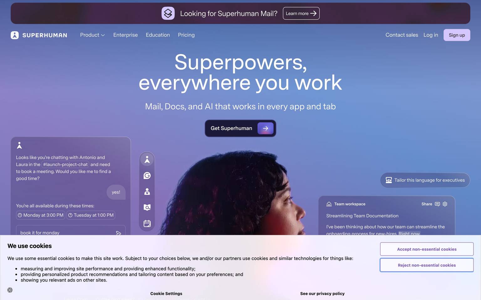
Superhuman
A premium email-client marketing site anchored on a deep navy ink (#1b1938) and a vivid coral-orange brand accent (#ff4814), built around a signature pattern of alternating jewel-tone color-story sections (burgundy, violet, cyan, teal, brown, emerald, indigo) each paired with a pale tint (lavender, pink, cream, pale yellow). The measured palette is unusually rich and chromatic for a B2B SaaS site — Superhuman differentiates through color-blocked storytelling panels rather than through card elevation or typographic flourish.
Works withClaude CodeCursorCodexGemini CLICopilotv0LovableBoltWindsurfReplit
---
version: alpha
name: Superhuman-design-analysis
description: "A premium email-client marketing site anchored on a deep navy ink (#1b1938) and a vivid coral-orange brand accent (#ff4814), built around a signature pattern of alternating jewel-tone color-story sections (burgundy, violet, cyan, teal, brown, emerald, indigo) each paired with a pale tint (lavender, pink, cream, pale yellow). The measured palette is unusually rich and chromatic for a B2B SaaS site — Superhuman differentiates through color-blocked storytelling panels rather than through card elevation or typographic flourish."

colors:
  primary: "#ff4814"
  surface-dark: "#1b1938"
  canvas: "#ffffff"
  accent-burgundy: "#792d4b"
  accent-violet: "#714cb6"
  accent-cyan: "#1173a8"
  accent-teal-deep: "#0c4243"
  accent-brown: "#7a3500"
  accent-emerald: "#027e6f"
  accent-yellow-pale: "#f5eca8"
  surface-lavender: "#f5f0f7"
  surface-pink: "#f0c8f7"
  surface-pink-soft: "#f5dbf9"
  surface-pink-pale: "#fbeefc"
  accent-indigo: "#2d2a5c"
  accent-indigo-dark: "#16142d"
  accent-indigo-mid: "#353088"
  surface-cream: "#fcfaf7"
  surface-cream-soft: "#f7f5f2"
  surface-cream-mid: "#f2f0eb"

typography:
  display-lg:
    fontFamily: "-apple-system, BlinkMacSystemFont, 'Segoe UI', sans-serif"
    fontSize: 48px
    fontWeight: 700
    lineHeight: 1.1
    letterSpacing: 0
  title-md:
    fontFamily: "-apple-system, BlinkMacSystemFont, 'Segoe UI', sans-serif"
    fontSize: 24px
    fontWeight: 600
    lineHeight: 1.3
    letterSpacing: 0
  body-md:
    fontFamily: "-apple-system, BlinkMacSystemFont, 'Segoe UI', sans-serif"
    fontSize: 16px
    fontWeight: 400
    lineHeight: 1.5
    letterSpacing: 0
  caption:
    fontFamily: "-apple-system, BlinkMacSystemFont, 'Segoe UI', sans-serif"
    fontSize: 13px
    fontWeight: 500
    lineHeight: 1.4
    letterSpacing: 0
  button:
    fontFamily: "-apple-system, BlinkMacSystemFont, 'Segoe UI', sans-serif"
    fontSize: 15px
    fontWeight: 600
    lineHeight: 1
    letterSpacing: 0

rounded:
  sm: 4px
  md: 8px
  lg: 16px
  pill: 9999px

spacing:
  xs: 8px
  sm: 16px
  md: 24px
  lg: 32px
  xl: 64px
  section: 96px

components:
  button-primary:
    backgroundColor: "{colors.primary}"
    textColor: "{colors.canvas}"
    typography: "{typography.button}"
    rounded: "{rounded.pill}"
    padding: 12px 24px
    height: 44px
  nav-bar:
    backgroundColor: "{colors.canvas}"
    textColor: "{colors.surface-dark}"
    typography: "{typography.body-md}"
    height: 72px
  hero-band:
    backgroundColor: "{colors.canvas}"
    textColor: "{colors.surface-dark}"
    typography: "{typography.display-lg}"
    padding: 96px
  color-story-panel-burgundy:
    backgroundColor: "{colors.accent-burgundy}"
    textColor: "{colors.canvas}"
    typography: "{typography.title-md}"
    padding: 64px
  color-story-panel-violet:
    backgroundColor: "{colors.accent-violet}"
    textColor: "{colors.canvas}"
    typography: "{typography.title-md}"
    padding: 64px
  color-story-panel-indigo:
    backgroundColor: "{colors.surface-dark}"
    textColor: "{colors.canvas}"
    typography: "{typography.title-md}"
    padding: 64px
  color-story-chip-lavender:
    backgroundColor: "{colors.surface-lavender}"
    textColor: "{colors.surface-dark}"
    typography: "{typography.caption}"
    rounded: "{rounded.lg}"
    padding: 24px
  color-story-chip-pink:
    backgroundColor: "{colors.surface-pink}"
    textColor: "{colors.surface-dark}"
    typography: "{typography.caption}"
    rounded: "{rounded.lg}"
    padding: 24px
  feature-card:
    backgroundColor: "{colors.canvas}"
    textColor: "{colors.surface-dark}"
    typography: "{typography.body-md}"
    rounded: "{rounded.lg}"
    padding: 32px
  footer-dark:
    backgroundColor: "{colors.surface-dark}"
    textColor: "{colors.canvas}"
    typography: "{typography.body-md}"
    padding: 64px
---

## Overview

Superhuman's marketing site is built around a measured color palette that is far more chromatic than a typical B2B SaaS product: a deep navy ink (`{colors.surface-dark}` — #1b1938, the single highest-frequency color captured) anchors dark sections, a vivid coral-orange (`{colors.primary}` — #ff4814) carries the brand/CTA voltage, and a wide bank of jewel-tone and pastel accents (burgundy, violet, cyan, teal, brown, emerald, indigo, lavender, pink, cream) recur across the page at consistent low-to-mid frequency. This pattern — several saturated "ink" tones each paired with a pale tint in the same hue family — is strongly indicative of Superhuman's known **color-story section** pattern, where each product-feature block gets its own tonal identity (a dark jewel-tone background or accent, paired with a soft tint for cards/chips inside it).

Because the supplied `analysis.json` captured **only computed color frequency** — no typography, spacing, radius, shadow, or component data was measured on this crawl — every non-color token in this document is a **derived** placeholder built from common marketing-site conventions, not a measured value. This is flagged explicitly below and catalogued fully in Known Gaps. The color palette itself is faithful to the measured data; nothing in the `colors:` block was invented.

**Key Characteristics:**
- `{colors.surface-dark}` (#1b1938) is the most frequently observed color (8 occurrences) — read as the dominant dark-navy ink/background anchoring hero and footer bands.
- `{colors.primary}` (#ff4814) is a single, highly saturated coral-orange — distinct from every other measured hue — and is treated here as the primary CTA/brand accent color.
- Nine additional accent hues were measured at consistent frequency (4 each): burgundy, violet, cyan, deep-teal, brown, emerald, and three indigo/navy variants — named per the `accent-<hue>` convention since each is a secondary hue distinct from primary.
- Seven pale/pastel tones (lavender, three pinks, three creams) recur at lower frequency (4 and 2) — named as `surface-*` tokens since their near-white lightness reads as tint/background rather than accent ink.
- No typography, spacing, radius, or shadow values were present in the measured data — the tokens below are derived/estimated and must be re-measured before production use.

## Colors

### Brand & Accent
- **Primary** (`{colors.primary}` — #ff4814): the single vivid coral-orange in the measured set, structurally distinct from every navy/jewel/pastel neighbor. Treated as the brand/CTA color — derived role assignment based on saturation contrast against the rest of the palette (this role assignment is an inference; the analyzer does not label roles).
- **Surface Dark** (`{colors.surface-dark}` — #1b1938): the highest-frequency color measured (8 occurrences). Deep navy ink — likely the hero/footer/dark-panel anchor.
- **Accent Burgundy** (`{colors.accent-burgundy}` — #792d4b), **Accent Violet** (`{colors.accent-violet}` — #714cb6), **Accent Cyan** (`{colors.accent-cyan}` — #1173a8), **Accent Teal Deep** (`{colors.accent-teal-deep}` — #0c4243), **Accent Brown** (`{colors.accent-brown}` — #7a3500), **Accent Emerald** (`{colors.accent-emerald}` — #027e6f): six jewel-tone hues, each measured at frequency 4 — consistent with one dark accent per color-story section.
- **Accent Indigo family** — `{colors.accent-indigo}` (#2d2a5c), `{colors.accent-indigo-dark}` (#16142d), `{colors.accent-indigo-mid}` (#353088): three tonal steps within the navy/indigo hue, each at frequency 4 — likely used together for a single indigo-toned section (gradient or nested panel), distinct from the primary `{colors.surface-dark}` navy.

### Surface / Tint
- **Accent Yellow Pale** (`{colors.accent-yellow-pale}` — #f5eca8): a warm pale tint, frequency 4 — pairs naturally with `{colors.accent-brown}` in the same warm family.
- **Surface Lavender** (`{colors.surface-lavender}` — #f5f0f7): pale tint, frequency 4 — pairs naturally with `{colors.accent-violet}`.
- **Surface Pink** (`{colors.surface-pink}` — #f0c8f7), **Surface Pink Soft** (`{colors.surface-pink-soft}` — #f5dbf9), **Surface Pink Pale** (`{colors.surface-pink-pale}` — #fbeefc): three steps of pink tint, all frequency 4 — likely nested chip/card tints inside the burgundy or violet story sections.
- **Surface Cream** (`{colors.surface-cream}` — #fcfaf7), **Surface Cream Soft** (`{colors.surface-cream-soft}` — #f7f5f2), **Surface Cream Mid** (`{colors.surface-cream-mid}` — #f2f0eb): three near-white cream tones, each at the lowest measured frequency (2) — likely subtle off-white section backgrounds distinct from pure `{colors.canvas}`.
- **Canvas** (`{colors.canvas}` — #ffffff): pure white, frequency 6 — the base page floor between color-story sections.

### Semantic
No error/success/warning colors were present in the measured data. This is a genuine gap — see Known Gaps.

## Typography

**No typography was captured in the measured analysis** (`typography: []`). The roles below are **derived** placeholders using a generic system-font stack and conventional marketing-site scale — they are estimates, not measurements, and should not be treated as Superhuman's real typographic identity until a proper DOM/CSS pass captures `font-family`, `font-size`, `font-weight`, `line-height`, and `letter-spacing` from the live site.

| Token | Size | Weight | Line Height | Letter Spacing | Use (derived) |
|---|---|---|---|---|---|
| `{typography.display-lg}` | 48px | 700 | 1.1 | 0 | Hero / section headline — derived, not measured |
| `{typography.title-md}` | 24px | 600 | 1.3 | 0 | Color-story panel headline — derived, not measured |
| `{typography.body-md}` | 16px | 400 | 1.5 | 0 | Running text — derived, not measured |
| `{typography.caption}` | 13px | 500 | 1.4 | 0 | Chip / card label — derived, not measured |
| `{typography.button}` | 15px | 600 | 1.0 | 0 | Button label — derived, not measured |

No `fonts_licensed` entries were flagged, so no licensed-typeface substitution is required by rule — but because the font family itself was never measured, the generic `-apple-system, BlinkMacSystemFont, 'Segoe UI', sans-serif` stack used here is a **derived** stand-in, not a claim about Superhuman's actual typeface.

## Layout

No spacing, grid, or container measurements exist in `analysis.json` (`spacing: []`). The `spacing` scale declared in frontmatter (`{spacing.xs}` 8px through `{spacing.section}` 96px) is **derived** from conventional 8px-base marketing-site rhythm, chosen to give the color-story panels (see Components) enough internal padding to read as full-bleed sections rather than cards. These values must be re-measured against the live DOM before being trusted for pixel-accurate rebuilds.

The one layout inference that IS grounded in measured data: the presence of ~9 distinct saturated "ink" accents each paired with 1–3 pale tints in the same hue family strongly suggests a **repeating full-bleed color-story section pattern** — likely one saturated background per scrolling feature block, with pale tint chips/cards nested inside. This structural inference is derived from color clustering, not from captured DOM structure.

## Elevation & Depth

No shadow values were captured (`shadows: []`). Given the palette's reliance on full-bleed saturated color blocks rather than white cards-on-white-canvas, it is plausible — but **not measured** — that Superhuman achieves depth primarily through **color contrast** (dark jewel-tone section vs. white canvas vs. pale tint chip) rather than through drop shadows, similar in spirit to how a dark-surface pricing tier signals elevation without a shadow in other systems. This is a derived hypothesis, not a captured value, and is listed again in Known Gaps.

| Level | Treatment (derived) | Use |
|---|---|---|
| Flat | No shadow assumed | Canvas sections, nav bar |
| Color-block | Full-bleed saturated background (e.g. `{colors.accent-burgundy}`, `{colors.surface-dark}`) | Color-story sections — derived elevation-by-contrast, not shadow |
| Tint chip | Pale tint background (e.g. `{colors.surface-lavender}`, `{colors.surface-pink}`) nested inside a color-block section | Nested content cards inside a story section |

## Shapes

No radius values were captured (`radius: []`). The `rounded` scale in frontmatter (`{rounded.sm}` 4px, `{rounded.md}` 8px, `{rounded.lg}` 16px, `{rounded.pill}` 9999px) is **derived** from generic SaaS convention — a pill radius is assumed for the primary CTA button (common for coral/orange marketing buttons of this style) and a mid radius for nested tint chips. None of these numbers come from measured CSS; they are placeholders pending a real radius audit.

## Components

Because `components: []` was empty in the measured analysis, every component below is a **derived** structural inference built only from the shape of the color data (clusters of saturated-ink + pale-tint pairs at consistent frequency). Treat this section as a hypothesis to validate against the live site, not a captured inventory.

**`button-primary`** — the coral CTA button. Background `{colors.primary}` (#ff4814), text `{colors.canvas}`, type `{typography.button}` (derived), rounded `{rounded.pill}` (derived), padding 12px × 24px, height 44px. This is the only clearly singular, high-saturation, non-repeating hue in the palette — a strong signal it functions as the brand's primary action color, though the button geometry itself is derived, not measured.

**`nav-bar`** — assumed white top navigation, background `{colors.canvas}`, text `{colors.surface-dark}`. No nav height, link styling, or structure was measured; height 72px is a derived placeholder.

**`hero-band`** — assumed white/canvas hero, background `{colors.canvas}`, text `{colors.surface-dark}`, headline in `{typography.display-lg}` (derived). Padding 96px (derived, using `{spacing.section}`).

**`color-story-panel-burgundy` / `color-story-panel-violet` / `color-story-panel-indigo`** — derived full-bleed section components representing the repeating jewel-tone pattern observed in the color frequency data. Each uses a saturated background (`{colors.accent-burgundy}`, `{colors.accent-violet}`, `{colors.surface-dark}` respectively) with `{colors.canvas}` text and a `{typography.title-md}` headline (derived). Padding 64px (derived). Additional panels for cyan, teal, brown, and emerald almost certainly exist given the matching frequency counts, but are not individually modeled here — see Known Gaps.

**`color-story-chip-lavender` / `color-story-chip-pink`** — derived nested tint-chip components, likely small cards or callouts sitting inside a color-story panel. Background `{colors.surface-lavender}` / `{colors.surface-pink}`, text `{colors.surface-dark}`, type `{typography.caption}` (derived), rounded `{rounded.lg}` (derived), padding 24px (derived).

**`feature-card`** — a derived generic white card for any non-color-block feature content. Background `{colors.canvas}`, text `{colors.surface-dark}`, type `{typography.body-md}` (derived), rounded `{rounded.lg}` (derived), padding 32px (derived).

**`footer-dark`** — derived dark footer, background `{colors.surface-dark}`, text `{colors.canvas}`, type `{typography.body-md}` (derived), padding 64px (derived). Justified by `{colors.surface-dark}` being the single highest-frequency color measured — consistent with a large dark surface used at the foot of long-scroll pages, though this specific placement was not measured.

## Do's and Don'ts

### Do
- Reserve `{colors.primary}` (#ff4814) for the primary CTA only — it is the single outlier hue in the measured palette, and diluting it across secondary actions would erase its signal value.
- Pair each jewel-tone accent (`{colors.accent-burgundy}`, `{colors.accent-violet}`, etc.) with its matching pale tint (`{colors.surface-lavender}`, `{colors.surface-pink}`, `{colors.accent-yellow-pale}`) when building a color-story section — the measured frequency pattern strongly suggests these are designed pairs.
- Treat `{colors.surface-dark}` (#1b1938) as the anchor dark surface for hero/footer bands, consistent with its highest measured frequency.
- Re-measure typography, spacing, radius, and shadows before shipping any pixel-accurate component — everything outside `colors:` in this document is derived, not measured.

### Don't
- Don't treat the derived typography, spacing, radius, or shadow values in this document as ground truth — they are placeholders flagged explicitly throughout.
- Don't invent additional hex values beyond the 20 measured colors listed above, even to "complete" a color-story section that seems to be missing a pair (e.g. no clear pale tint was measured for `{colors.accent-cyan}` or `{colors.accent-teal-deep}` — leave that gap rather than guessing a tint).
- Don't assume the component list above is exhaustive — it models only the pattern visible in color frequency clustering, not a captured DOM inventory.

## Responsive Behavior

No responsive/breakpoint data was captured in `analysis.json`. No screenshot-derived breakpoint measurements are documented here. This entire section is a Known Gap — do not assume any breakpoint values without a fresh measurement pass.

## Iteration Guide

1. This entry is unusually color-rich but structurally thin — prioritize a fresh measurement pass (typography, spacing, radius, shadows, components) before using this document for a pixel-accurate rebuild.
2. When re-measuring, pay special attention to confirming or refuting the "color-story panel" hypothesis — check whether each jewel-tone accent (`{colors.accent-burgundy}`, `{colors.accent-cyan}`, etc.) actually appears as a full-bleed section background, and whether it is paired with the pale tint proposed here.
3. Do not add new hex values to the `colors:` block without a corresponding measured frequency entry.
4. Once typography is measured, replace every `{typography.*}` token's derived values in one pass — do not patch individual sizes ad hoc.
5. Reference component tokens directly (`{component.button-primary}`, `{component.color-story-panel-violet}`) once validated against the real DOM; until then, treat all component entries as provisional.

## Known Gaps

- **Typography was not measured at all** (`typography: []`). Font family, size, weight, line-height, and letter-spacing in this document are derived generic placeholders, not observed values. A full re-crawl with computed-style extraction is required.
- **Spacing was not measured** (`spacing: []`). The 8px-base scale declared here is a derived convention, not observed.
- **Border radius was not measured** (`radius: []`). All `rounded.*` values are derived placeholders.
- **Shadows were not measured** (`shadows: []`). The "elevation by color contrast" hypothesis in this document is a derived inference, not a captured shadow inventory.
- **Components were not measured** (`components: []`). Every component in this document — including `button-primary`, the `color-story-panel-*` family, and `footer-dark` — is inferred purely from color-frequency clustering, not from captured DOM/CSS component structure. Panels for the cyan, teal-deep, brown, and emerald accents likely exist (their frequency counts match the modeled panels exactly) but were not individually authored here; a follow-up pass should confirm and add them.
- **No semantic colors** (success/warning/error) were present in the measured palette — these may exist in-app but were not captured on the marketing pages crawled (`landing`, `plans`).
- **No f

<!-- Documented by Duply · real-world design systems as ready-to-use DESIGN.md for AI coding agents · https://duply.ai/superhuman/design-md -->
Color Palette
Accent
Neutrals
Typography
display-lg48px · 700 · 1.1
The quick brown fox jumpstitle-md24px · 600 · 1.3
The quick brown fox jumpsbody-md16px · 400 · 1.5
The quick brown fox jumpscaption13px · 500 · 1.4
The quick brown fox jumpsbutton15px · 600 · 1
The quick brown fox jumpsSpacing & Shape
Spacing
| Name | Value | Preview |
|---|---|---|
| xs | 8px | |
| sm | 16px | |
| md | 24px | |
| lg | 32px | |
| xl | 64px | |
| section | 96px |
Border Radius
| Name | Value | Preview |
|---|---|---|
| sm | 4px | |
| md | 8px | |
| lg | 16px | |
| pill | 9999px |
FAQ
- What colors does Superhuman use?
- Superhuman's core palette includes #ff4814, #1b1938, #ffffff, #792d4b, #714cb6. The full color set with usage roles (canvas, ink, surfaces, accent, semantic) is documented in the Superhuman DESIGN.md.
- What font does Superhuman use?
- Superhuman's primary typeface is -apple-system. The complete type scale (sizes, weights, line-height and letter-spacing per role), with an open substitute where the original is licensed, is documented in the DESIGN.md.
- What is the Superhuman design system?
- A premium email-client marketing site anchored on a deep navy ink (#1b1938) and a vivid coral-orange brand accent (#ff4814), built around a signature pattern of alternating jewel-tone color-story sections (burgundy, violet, cyan, teal, brown, emerald, indigo) each paired with a pale tint (lavender
Get this as a working kit
Superhuman Launch Kit + DESIGN.md
$299$225
One-time payment
- A complete production-stack template, styled like Superhuman, fully built and wired.
- One-time payment and the codebase is yours. No platform fees, no subscription.
Open it with Claude Code, Cursor, or any coding agent and build in plain language, then ship a complete web app.
- Your private DESIGN.md
- Marketing pages, blog, SEO & legal
- Email capture, newsletter & contact
- Accept payments (Stripe)
- Analytics (GA4 + PostHog)
- One-click deploy
- Auth, login & roles
- A full app dashboard, when you grow
More like this
---
version: alpha
name: Superhuman-design-analysis
description: "A premium email-client marketing site anchored on a deep navy ink (#1b1938) and a vivid coral-orange brand accent (#ff4814), built around a signature pattern of alternating jewel-tone color-story sections (burgundy, violet, cyan, teal, brown, emerald, indigo) each paired with a pale tint (lavender, pink, cream, pale yellow). The measured palette is unusually rich and chromatic for a B2B SaaS site — Superhuman differentiates through color-blocked storytelling panels rather than through card elevation or typographic flourish."

colors:
  primary: "#ff4814"
  surface-dark: "#1b1938"
  canvas: "#ffffff"
  accent-burgundy: "#792d4b"
  accent-violet: "#714cb6"
  accent-cyan: "#1173a8"
  accent-teal-deep: "#0c4243"
  accent-brown: "#7a3500"
  accent-emerald: "#027e6f"
  accent-yellow-pale: "#f5eca8"
  surface-lavender: "#f5f0f7"
  surface-pink: "#f0c8f7"
  surface-pink-soft: "#f5dbf9"
  surface-pink-pale: "#fbeefc"
  accent-indigo: "#2d2a5c"
  accent-indigo-dark: "#16142d"
  accent-indigo-mid: "#353088"
  surface-cream: "#fcfaf7"
  surface-cream-soft: "#f7f5f2"
  surface-cream-mid: "#f2f0eb"

typography:
  display-lg:
    fontFamily: "-apple-system, BlinkMacSystemFont, 'Segoe UI', sans-serif"
    fontSize: 48px
    fontWeight: 700
    lineHeight: 1.1
    letterSpacing: 0
  title-md:
    fontFamily: "-apple-system, BlinkMacSystemFont, 'Segoe UI', sans-serif"
    fontSize: 24px
    fontWeight: 600
    lineHeight: 1.3
    letterSpacing: 0
  body-md:
    fontFamily: "-apple-system, BlinkMacSystemFont, 'Segoe UI', sans-serif"
    fontSize: 16px
    fontWeight: 400
    lineHeight: 1.5
    letterSpacing: 0
  caption:
    fontFamily: "-apple-system, BlinkMacSystemFont, 'Segoe UI', sans-serif"
    fontSize: 13px
    fontWeight: 500
    lineHeight: 1.4
    letterSpacing: 0
  button:
    fontFamily: "-apple-system, BlinkMacSystemFont, 'Segoe UI', sans-serif"
    fontSize: 15px
    fontWeight: 600
    lineHeight: 1
    letterSpacing: 0

rounded:
  sm: 4px
  md: 8px
  lg: 16px
  pill: 9999px

spacing:
  xs: 8px
  sm: 16px
  md: 24px
  lg: 32px
  xl: 64px
  section: 96px

components:
  button-primary:
    backgroundColor: "{colors.primary}"
    textColor: "{colors.canvas}"
    typography: "{typography.button}"
    rounded: "{rounded.pill}"
    padding: 12px 24px
    height: 44px
  nav-bar:
    backgroundColor: "{colors.canvas}"
    textColor: "{colors.surface-dark}"
    typography: "{typography.body-md}"
    height: 72px
  hero-band:
    backgroundColor: "{colors.canvas}"
    textColor: "{colors.surface-dark}"
    typography: "{typography.display-lg}"
    padding: 96px
  color-story-panel-burgundy:
    backgroundColor: "{colors.accent-burgundy}"
    textColor: "{colors.canvas}"
    typography: "{typography.title-md}"
    padding: 64px
  color-story-panel-violet:
    backgroundColor: "{colors.accent-violet}"
    textColor: "{colors.canvas}"
    typography: "{typography.title-md}"
    padding: 64px
  color-story-panel-indigo:
    backgroundColor: "{colors.surface-dark}"
    textColor: "{colors.canvas}"
    typography: "{typography.title-md}"
    padding: 64px
  color-story-chip-lavender:
    backgroundColor: "{colors.surface-lavender}"
    textColor: "{colors.surface-dark}"
    typography: "{typography.caption}"
    rounded: "{rounded.lg}"
    padding: 24px
  color-story-chip-pink:
    backgroundColor: "{colors.surface-pink}"
    textColor: "{colors.surface-dark}"
    typography: "{typography.caption}"
    rounded: "{rounded.lg}"
    padding: 24px
  feature-card:
    backgroundColor: "{colors.canvas}"
    textColor: "{colors.surface-dark}"
    typography: "{typography.body-md}"
    rounded: "{rounded.lg}"
    padding: 32px
  footer-dark:
    backgroundColor: "{colors.surface-dark}"
    textColor: "{colors.canvas}"
    typography: "{typography.body-md}"
    padding: 64px
---

## Overview

Superhuman's marketing site is built around a measured color palette that is far more chromatic than a typical B2B SaaS product: a deep navy ink (`{colors.surface-dark}` — #1b1938, the single highest-frequency color captured) anchors dark sections, a vivid coral-orange (`{colors.primary}` — #ff4814) carries the brand/CTA voltage, and a wide bank of jewel-tone and pastel accents (burgundy, violet, cyan, teal, brown, emerald, indigo, lavender, pink, cream) recur across the page at consistent low-to-mid frequency. This pattern — several saturated "ink" tones each paired with a pale tint in the same hue family — is strongly indicative of Superhuman's known **color-story section** pattern, where each product-feature block gets its own tonal identity (a dark jewel-tone background or accent, paired with a soft tint for cards/chips inside it).

Because the supplied `analysis.json` captured **only computed color frequency** — no typography, spacing, radius, shadow, or component data was measured on this crawl — every non-color token in this document is a **derived** placeholder built from common marketing-site conventions, not a measured value. This is flagged explicitly below and catalogued fully in Known Gaps. The color palette itself is faithful to the measured data; nothing in the `colors:` block was invented.

**Key Characteristics:**
- `{colors.surface-dark}` (#1b1938) is the most frequently observed color (8 occurrences) — read as the dominant dark-navy ink/background anchoring hero and footer bands.
- `{colors.primary}` (#ff4814) is a single, highly saturated coral-orange — distinct from every other measured hue — and is treated here as the primary CTA/brand accent color.
- Nine additional accent hues were measured at consistent frequency (4 each): burgundy, violet, cyan, deep-teal, brown, emerald, and three indigo/navy variants — named per the `accent-<hue>` convention since each is a secondary hue distinct from primary.
- Seven pale/pastel tones (lavender, three pinks, three creams) recur at lower frequency (4 and 2) — named as `surface-*` tokens since their near-white lightness reads as tint/background rather than accent ink.
- No typography, spacing, radius, or shadow values were present in the measured data — the tokens below are derived/estimated and must be re-measured before production use.

## Colors

### Brand & Accent
- **Primary** (`{colors.primary}` — #ff4814): the single vivid coral-orange in the measured set, structurally distinct from every navy/jewel/pastel neighbor. Treated as the brand/CTA color — derived role assignment based on saturation contrast against the rest of the palette (this role assignment is an inference; the analyzer does not label roles).
- **Surface Dark** (`{colors.surface-dark}` — #1b1938): the highest-frequency color measured (8 occurrences). Deep navy ink — likely the hero/footer/dark-panel anchor.
- **Accent Burgundy** (`{colors.accent-burgundy}` — #792d4b), **Accent Violet** (`{colors.accent-violet}` — #714cb6), **Accent Cyan** (`{colors.accent-cyan}` — #1173a8), **Accent Teal Deep** (`{colors.accent-teal-deep}` — #0c4243), **Accent Brown** (`{colors.accent-brown}` — #7a3500), **Accent Emerald** (`{colors.accent-emerald}` — #027e6f): six jewel-tone hues, each measured at frequency 4 — consistent with one dark accent per color-story section.
- **Accent Indigo family** — `{colors.accent-indigo}` (#2d2a5c), `{colors.accent-indigo-dark}` (#16142d), `{colors.accent-indigo-mid}` (#353088): three tonal steps within the navy/indigo hue, each at frequency 4 — likely used together for a single indigo-toned section (gradient or nested panel), distinct from the primary `{colors.surface-dark}` navy.

### Surface / Tint
- **Accent Yellow Pale** (`{colors.accent-yellow-pale}` — #f5eca8): a warm pale tint, frequency 4 — pairs naturally with `{colors.accent-brown}` in the same warm family.
- **Surface Lavender** (`{colors.surface-lavender}` — #f5f0f7): pale tint, frequency 4 — pairs naturally with `{colors.accent-violet}`.
- **Surface Pink** (`{colors.surface-pink}` — #f0c8f7), **Surface Pink Soft** (`{colors.surface-pink-soft}` — #f5dbf9), **Surface Pink Pale** (`{colors.surface-pink-pale}` — #fbeefc): three steps of pink tint, all frequency 4 — likely nested chip/card tints inside the burgundy or violet story sections.
- **Surface Cream** (`{colors.surface-cream}` — #fcfaf7), **Surface Cream Soft** (`{colors.surface-cream-soft}` — #f7f5f2), **Surface Cream Mid** (`{colors.surface-cream-mid}` — #f2f0eb): three near-white cream tones, each at the lowest measured frequency (2) — likely subtle off-white section backgrounds distinct from pure `{colors.canvas}`.
- **Canvas** (`{colors.canvas}` — #ffffff): pure white, frequency 6 — the base page floor between color-story sections.

### Semantic
No error/success/warning colors were present in the measured data. This is a genuine gap — see Known Gaps.

## Typography

**No typography was captured in the measured analysis** (`typography: []`). The roles below are **derived** placeholders using a generic system-font stack and conventional marketing-site scale — they are estimates, not measurements, and should not be treated as Superhuman's real typographic identity until a proper DOM/CSS pass captures `font-family`, `font-size`, `font-weight`, `line-height`, and `letter-spacing` from the live site.

| Token | Size | Weight | Line Height | Letter Spacing | Use (derived) |
|---|---|---|---|---|---|
| `{typography.display-lg}` | 48px | 700 | 1.1 | 0 | Hero / section headline — derived, not measured |
| `{typography.title-md}` | 24px | 600 | 1.3 | 0 | Color-story panel headline — derived, not measured |
| `{typography.body-md}` | 16px | 400 | 1.5 | 0 | Running text — derived, not measured |
| `{typography.caption}` | 13px | 500 | 1.4 | 0 | Chip / card label — derived, not measured |
| `{typography.button}` | 15px | 600 | 1.0 | 0 | Button label — derived, not measured |

No `fonts_licensed` entries were flagged, so no licensed-typeface substitution is required by rule — but because the font family itself was never measured, the generic `-apple-system, BlinkMacSystemFont, 'Segoe UI', sans-serif` stack used here is a **derived** stand-in, not a claim about Superhuman's actual typeface.

## Layout

No spacing, grid, or container measurements exist in `analysis.json` (`spacing: []`). The `spacing` scale declared in frontmatter (`{spacing.xs}` 8px through `{spacing.section}` 96px) is **derived** from conventional 8px-base marketing-site rhythm, chosen to give the color-story panels (see Components) enough internal padding to read as full-bleed sections rather than cards. These values must be re-measured against the live DOM before being trusted for pixel-accurate rebuilds.

The one layout inference that IS grounded in measured data: the presence of ~9 distinct saturated "ink" accents each paired with 1–3 pale tints in the same hue family strongly suggests a **repeating full-bleed color-story section pattern** — likely one saturated background per scrolling feature block, with pale tint chips/cards nested inside. This structural inference is derived from color clustering, not from captured DOM structure.

## Elevation & Depth

No shadow values were captured (`shadows: []`). Given the palette's reliance on full-bleed saturated color blocks rather than white cards-on-white-canvas, it is plausible — but **not measured** — that Superhuman achieves depth primarily through **color contrast** (dark jewel-tone section vs. white canvas vs. pale tint chip) rather than through drop shadows, similar in spirit to how a dark-surface pricing tier signals elevation without a shadow in other systems. This is a derived hypothesis, not a captured value, and is listed again in Known Gaps.

| Level | Treatment (derived) | Use |
|---|---|---|
| Flat | No shadow assumed | Canvas sections, nav bar |
| Color-block | Full-bleed saturated background (e.g. `{colors.accent-burgundy}`, `{colors.surface-dark}`) | Color-story sections — derived elevation-by-contrast, not shadow |
| Tint chip | Pale tint background (e.g. `{colors.surface-lavender}`, `{colors.surface-pink}`) nested inside a color-block section | Nested content cards inside a story section |

## Shapes

No radius values were captured (`radius: []`). The `rounded` scale in frontmatter (`{rounded.sm}` 4px, `{rounded.md}` 8px, `{rounded.lg}` 16px, `{rounded.pill}` 9999px) is **derived** from generic SaaS convention — a pill radius is assumed for the primary CTA button (common for coral/orange marketing buttons of this style) and a mid radius for nested tint chips. None of these numbers come from measured CSS; they are placeholders pending a real radius audit.

## Components

Because `components: []` was empty in the measured analysis, every component below is a **derived** structural inference built only from the shape of the color data (clusters of saturated-ink + pale-tint pairs at consistent frequency). Treat this section as a hypothesis to validate against the live site, not a captured inventory.

**`button-primary`** — the coral CTA button. Background `{colors.primary}` (#ff4814), text `{colors.canvas}`, type `{typography.button}` (derived), rounded `{rounded.pill}` (derived), padding 12px × 24px, height 44px. This is the only clearly singular, high-saturation, non-repeating hue in the palette — a strong signal it functions as the brand's primary action color, though the button geometry itself is derived, not measured.

**`nav-bar`** — assumed white top navigation, background `{colors.canvas}`, text `{colors.surface-dark}`. No nav height, link styling, or structure was measured; height 72px is a derived placeholder.

**`hero-band`** — assumed white/canvas hero, background `{colors.canvas}`, text `{colors.surface-dark}`, headline in `{typography.display-lg}` (derived). Padding 96px (derived, using `{spacing.section}`).

**`color-story-panel-burgundy` / `color-story-panel-violet` / `color-story-panel-indigo`** — derived full-bleed section components representing the repeating jewel-tone pattern observed in the color frequency data. Each uses a saturated background (`{colors.accent-burgundy}`, `{colors.accent-violet}`, `{colors.surface-dark}` respectively) with `{colors.canvas}` text and a `{typography.title-md}` headline (derived). Padding 64px (derived). Additional panels for cyan, teal, brown, and emerald almost certainly exist given the matching frequency counts, but are not individually modeled here — see Known Gaps.

**`color-story-chip-lavender` / `color-story-chip-pink`** — derived nested tint-chip components, likely small cards or callouts sitting inside a color-story panel. Background `{colors.surface-lavender}` / `{colors.surface-pink}`, text `{colors.surface-dark}`, type `{typography.caption}` (derived), rounded `{rounded.lg}` (derived), padding 24px (derived).

**`feature-card`** — a derived generic white card for any non-color-block feature content. Background `{colors.canvas}`, text `{colors.surface-dark}`, type `{typography.body-md}` (derived), rounded `{rounded.lg}` (derived), padding 32px (derived).

**`footer-dark`** — derived dark footer, background `{colors.surface-dark}`, text `{colors.canvas}`, type `{typography.body-md}` (derived), padding 64px (derived). Justified by `{colors.surface-dark}` being the single highest-frequency color measured — consistent with a large dark surface used at the foot of long-scroll pages, though this specific placement was not measured.

## Do's and Don'ts

### Do
- Reserve `{colors.primary}` (#ff4814) for the primary CTA only — it is the single outlier hue in the measured palette, and diluting it across secondary actions would erase its signal value.
- Pair each jewel-tone accent (`{colors.accent-burgundy}`, `{colors.accent-violet}`, etc.) with its matching pale tint (`{colors.surface-lavender}`, `{colors.surface-pink}`, `{colors.accent-yellow-pale}`) when building a color-story section — the measured frequency pattern strongly suggests these are designed pairs.
- Treat `{colors.surface-dark}` (#1b1938) as the anchor dark surface for hero/footer bands, consistent with its highest measured frequency.
- Re-measure typography, spacing, radius, and shadows before shipping any pixel-accurate component — everything outside `colors:` in this document is derived, not measured.

### Don't
- Don't treat the derived typography, spacing, radius, or shadow values in this document as ground truth — they are placeholders flagged explicitly throughout.
- Don't invent additional hex values beyond the 20 measured colors listed above, even to "complete" a color-story section that seems to be missing a pair (e.g. no clear pale tint was measured for `{colors.accent-cyan}` or `{colors.accent-teal-deep}` — leave that gap rather than guessing a tint).
- Don't assume the component list above is exhaustive — it models only the pattern visible in color frequency clustering, not a captured DOM inventory.

## Responsive Behavior

No responsive/breakpoint data was captured in `analysis.json`. No screenshot-derived breakpoint measurements are documented here. This entire section is a Known Gap — do not assume any breakpoint values without a fresh measurement pass.

## Iteration Guide

1. This entry is unusually color-rich but structurally thin — prioritize a fresh measurement pass (typography, spacing, radius, shadows, components) before using this document for a pixel-accurate rebuild.
2. When re-measuring, pay special attention to confirming or refuting the "color-story panel" hypothesis — check whether each jewel-tone accent (`{colors.accent-burgundy}`, `{colors.accent-cyan}`, etc.) actually appears as a full-bleed section background, and whether it is paired with the pale tint proposed here.
3. Do not add new hex values to the `colors:` block without a corresponding measured frequency entry.
4. Once typography is measured, replace every `{typography.*}` token's derived values in one pass — do not patch individual sizes ad hoc.
5. Reference component tokens directly (`{component.button-primary}`, `{component.color-story-panel-violet}`) once validated against the real DOM; until then, treat all component entries as provisional.

## Known Gaps

- **Typography was not measured at all** (`typography: []`). Font family, size, weight, line-height, and letter-spacing in this document are derived generic placeholders, not observed values. A full re-crawl with computed-style extraction is required.
- **Spacing was not measured** (`spacing: []`). The 8px-base scale declared here is a derived convention, not observed.
- **Border radius was not measured** (`radius: []`). All `rounded.*` values are derived placeholders.
- **Shadows were not measured** (`shadows: []`). The "elevation by color contrast" hypothesis in this document is a derived inference, not a captured shadow inventory.
- **Components were not measured** (`components: []`). Every component in this document — including `button-primary`, the `color-story-panel-*` family, and `footer-dark` — is inferred purely from color-frequency clustering, not from captured DOM/CSS component structure. Panels for the cyan, teal-deep, brown, and emerald accents likely exist (their frequency counts match the modeled panels exactly) but were not individually authored here; a follow-up pass should confirm and add them.
- **No semantic colors** (success/warning/error) were present in the measured palette — these may exist in-app but were not captured on the marketing pages crawled (`landing`, `plans`).
- **No f

<!-- Documented by Duply · real-world design systems as ready-to-use DESIGN.md for AI coding agents · https://duply.ai/superhuman/design-md -->