
Fable
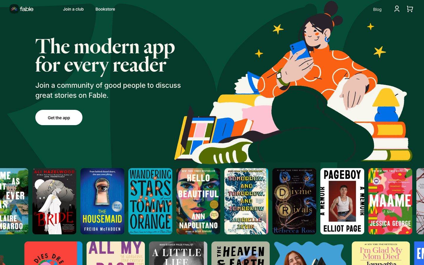
A warm, editorial book-community interface built on a deep forest-green hero canvas, high-contrast Heldane Display serif headlines, and Inter for UI text. The system reads as literary-yet-modern — oversized serif display type, an illustrated hero, and a full-bleed carousel of real book covers doing the chromatic work while the chrome stays near-monochrome green-and-white. A dark near-black testimonial band and footer close the page.
Works withClaude CodeCursorCodexGemini CLICopilotv0LovableBoltWindsurfReplit
---
version: alpha
name: Fable-design-analysis
description: "A warm, editorial book-community interface built on a deep forest-green hero canvas, high-contrast Heldane Display serif headlines, and Inter for UI text. The system reads as literary-yet-modern — oversized serif display type, an illustrated hero, and a full-bleed carousel of real book covers doing the chromatic work while the chrome stays near-monochrome green-and-white. A dark near-black testimonial band and footer close the page."
colors:
  primary: "#064c37"
  ink: "#000000"
  ink-deep: "#161015"
  ink-soft: "#3f383d"
  muted: "#847f7c"
  canvas: "#ffffff"
  surface-cream: "#f7f4ee"
  surface-soft: "#f9f9f9"
  hairline: "#ededed"
  surface-plum: "#433944"
  surface-plum-deep: "#292229"
  surface-charcoal: "#2e272d"
  surface-charcoal-alt: "#332e32"
  near-black: "#070607"
  on-primary: "#ffffff"
  accent-red: "#cb3f3f"
  accent-blue: "#116ecd"
  accent-sky: "#43a1d7"
  accent-green: "#0a8e4f"
  accent-pink: "#e4adbb"
typography:
  display-xl:
    fontFamily: "Heldane Display, Fraunces, Georgia, serif"
    fontSize: 80px
    fontWeight: 500
    lineHeight: 0.938
    letterSpacing: normal
  display-lg:
    fontFamily: "Heldane Display, Fraunces, Georgia, serif"
    fontSize: 72px
    fontWeight: 500
    lineHeight: 0.861
    letterSpacing: normal
  display-sm:
    fontFamily: "Heldane Display, Fraunces, Georgia, serif"
    fontSize: 26px
    fontWeight: 500
    lineHeight: 1.077
    letterSpacing: normal
  button:
    fontFamily: "Inter, sans-serif"
    fontSize: 16px
    fontWeight: 400
    lineHeight: 1.5
    letterSpacing: normal
rounded:
  xs: 2px
  sm: 8px
  md: 12px
  xl: 48px
  pill: 60px
spacing:
  xxs: 4px
  xs: 8px
  sm: 12px
  md: 14px
  lg: 24px
  xl: 28px
  xxl: 40px
  xxxl: 50px
  section: 80px
components:
  top-nav:
    backgroundColor: "{colors.primary}"
    textColor: "{colors.on-primary}"
    typography: "{typography.button}"
  hero-band:
    backgroundColor: "{colors.primary}"
    textColor: "{colors.on-primary}"
    typography: "{typography.display-lg}"
    padding: 80px
  hero-headline:
    backgroundColor: transparent
    textColor: "{colors.on-primary}"
    typography: "{typography.display-lg}"
  button-primary:
    backgroundColor: "{colors.canvas}"
    textColor: "{colors.ink}"
    typography: "{typography.button}"
    rounded: "{rounded.pill}"
    padding: 14px 40px
  icon-button:
    backgroundColor: transparent
    textColor: "{colors.on-primary}"
    typography: "{typography.button}"
  book-cover-card:
    backgroundColor: "{colors.canvas}"
    textColor: "{colors.ink}"
  testimonial-band:
    backgroundColor: "{colors.near-black}"
    textColor: "{colors.on-primary}"
    typography: "{typography.display-sm}"
    padding: 80px
  footer:
    backgroundColor: "{colors.near-black}"
    textColor: "{colors.muted}"
    typography: "{typography.button}"
    padding: 50px
---

## Overview

Fable's marketing landing page is a warm, editorial book-community interface. The dominant surface is a deep forest-green hero canvas (`{colors.primary}` — #064c37) carrying an oversized Heldane Display serif headline in white (`{colors.on-primary}` — #ffffff), a friendly hand-drawn illustration of a reader, and a single white pill CTA. Below the hero, a full-bleed horizontal carousel of real book covers supplies nearly all of the page's color — bright reds, blues, and pastels come from the covers themselves rather than from brand chrome.

The type voice splits cleanly in two: **Heldane Display** (a high-contrast literary serif, weight 500) carries every headline and the testimonial pull-quote, while **Inter** handles UI text like nav links and buttons. The serif is set very tight — line-heights below 1.0 on the largest sizes (0.861 on h1, 0.938 on h2) — so the display type reads as compact, confident, and literary.

The chrome is deliberately near-monochrome: green field, white type, white pill button. Chromatic energy is delegated to content — the book covers and the illustration — while the interface itself stays quiet. The page closes with a dark near-black band (`{colors.near-black}` — #070607) holding a serif testimonial quote, then a footer on the same dark surface.

**Key Characteristics:**
- Deep forest-green hero canvas (`{colors.primary}` — #064c37) with white serif display type — literary, warm, editorial.
- High-contrast **Heldane Display** serif for all headlines, set very tight (line-height 0.861–0.938 on the big sizes). Weight stays at 500 throughout.
- White pill CTA (`{component.button-primary}`) using `{rounded.pill}` (60px) — soft, friendly, singular.
- Full-bleed book-cover carousel where the covers, not the brand, supply the color palette.
- Inter (weight 400) for UI text — nav links and button labels.
- Dark near-black testimonial band + footer (`{colors.near-black}` — #070607) closing the page with a serif pull-quote.
- Cream and off-white neutral surfaces (`{colors.surface-cream}` — #f7f4ee, `{colors.surface-soft}` — #f9f9f9) available for lighter content sections.

## Colors

### Brand
- **Primary** (`{colors.primary}` — #064c37): The deep forest-green hero canvas and the dominant brand field. Carries the nav, hero, and headline zone. All white type sits on this green.
- **On Primary** (`{colors.on-primary}` — #ffffff): White type and the pill CTA fill on the green field.

### Ink / Text
- **Ink** (`{colors.ink}` — #000000): The dominant measured text color — used for CTA label text and dark-on-light content.
- **Ink Deep** (`{colors.ink-deep}` — #161015): Near-black accent used on deep surfaces and dark UI text.
- **Ink Soft** (`{colors.ink-soft}` — #3f383d): A warm dark-plum text tone for secondary body copy.
- **Muted** (`{colors.muted}` — #847f7c): Tertiary / fine-print text, footer link rows.

### Surface
- **Canvas** (`{colors.canvas}` — #ffffff): Pill button fill, light content floor, book-cover backing.
- **Surface Cream** (`{colors.surface-cream}` — #f7f4ee): A warm off-white surface for lighter editorial sections.
- **Surface Soft** (`{colors.surface-soft}` — #f9f9f9): A near-white alternate light surface.
- **Hairline** (`{colors.hairline}` — #ededed): The 1px divider / border tone on light surfaces.
- **Surface Plum / Plum Deep / Charcoal / Charcoal Alt** (`{colors.surface-plum}` — #433944, `{colors.surface-plum-deep}` — #292229, `{colors.surface-charcoal}` — #2e272d, `{colors.surface-charcoal-alt}` — #332e32): A family of warm dark plum-charcoal tones measured across dark UI fragments and cover shadows.
- **Near Black** (`{colors.near-black}` — #070607): The testimonial-band and footer background — the darkest surface on the page.

### Accent
These accent hues are sampled largely from the book covers and illustration; they appear in content rather than on brand chrome:
- **Accent Red** (`{colors.accent-red}` — #cb3f3f)
- **Accent Blue** (`{colors.accent-blue}` — #116ecd)
- **Accent Sky** (`{colors.accent-sky}` — #43a1d7)
- **Accent Green** (`{colors.accent-green}` — #0a8e4f): A brighter emerald distinct from the deep `{colors.primary}` forest green.
- **Accent Pink** (`{colors.accent-pink}` — #e4adbb)

## Typography

### Font Family
The system runs two families. **Heldane Display** is a high-contrast literary serif carrying every headline (h1, h2, h3) and the testimonial pull-quote, always at weight 500. **Inter** handles UI text — nav links and buttons — at weight 400. The boundary is strict: headlines are serif, interface labels are sans.

### Hierarchy

| Token | Family | Size | Weight | Line Height | Letter Spacing | Use |
|---|---|---|---|---|---|---|
| `{typography.display-xl}` | Heldane Display | 80px | 500 | 0.938 | normal | Largest section headline (h2) |
| `{typography.display-lg}` | Heldane Display | 72px | 500 | 0.861 | normal | Hero headline ("The modern app for every reader") (h1) |
| `{typography.display-sm}` | Heldane Display | 26px | 500 | 1.077 | normal | Sub-heads, testimonial pull-quote (h3) |
| `{typography.button}` | Inter | 16px | 400 | 1.5 | normal | Nav links, button labels |

### Principles
The display serif is set extremely tight — line-heights below 1.0 on the two largest sizes make multi-line headlines feel like a stacked literary title block. Weight stays at 500 (never bolder) across all display sizes; the contrast within the Heldane letterforms carries the emphasis, not weight. Never set headlines in Inter, and never set body/UI labels in the serif.

### Note on Font Substitutes
**Heldane Display** is a commercial licensed typeface (Klim Type Foundry) and is not available as a free web font. A usable open-source substitute is **Fraunces** (a variable high-contrast "old-style" serif) at a display optical size, or **Playfair Display** as a second alternative — both preserve the high thick/thin contrast and literary character. **Inter** is open-source and ships as measured.

## Layout

### Spacing System
- **Base unit:** ~4px, though the scale carries several 14/28-based steps.
- **Tokens:** `{spacing.xxs}` 4px · `{spacing.xs}` 8px · `{spacing.sm}` 12px · `{spacing.md}` 14px · `{spacing.lg}` 24px · `{spacing.xl}` 28px · `{spacing.xxl}` 40px · `{spacing.xxxl}` 50px · `{spacing.section}` 80px.
- **Section rhythm:** `{spacing.section}` (80px) is the largest measured band spacing; `{spacing.xxxl}` (50px) is the next step down and appears frequently as footer / band padding.
- The 14px and 28px steps are the most frequently measured values and act as the workhorse gutter/gap unit inside dense rows (nav, cover carousel spacing).

### Grid & Container
- **Hero:** A two-part layout — serif headline + sub-copy + pill CTA on the left, illustrated reader artwork on the right, all on the green field.
- **Book-cover carousel:** A full-bleed horizontal strip of book covers, edge-bleeding off both sides of the viewport, in two stacked rows.
- **Footer:** Multi-column link list (Clubs / Explore / About / Learn more / Follow us) on the dark surface.

### Whitespace Philosophy
The hero gives the serif headline generous room to breathe against flat green, while the book carousel is deliberately dense and edge-to-edge — the contrast between the airy headline zone and the packed cover strip is the page's core rhythm.

## Elevation & Depth

| Level | Treatment | Use |
|---|---|---|
| Flat | No shadow (measured `card` shadow: none) | Book-cover cards, flat green hero field |
| Subtle | `rgba(0,0,0,0.04) 0px 2px 3px -2px` | Very soft lift on small UI elements |
| Card lift | `rgba(0,0,0,0.08) 0px 4px 12px 0px` | Elevated cards / floating elements (measured 3×) |
| Strong on dark | `rgba(0,0,0,0.4) 0px 4px 20px 0px` and `rgba(0,0,0,0.6) 0px 4px 20px 0px` | Heavier drop shadows over dark surfaces (e.g. the near-black testimonial band) |

The measured `card` component itself carries no shadow — book covers sit flat. The heavier 0.4/0.6-alpha shadows are reserved for dark-surface contexts where a softer shadow wouldn't register.

## Shapes

### Border Radius Scale

| Token | Value | Use |
|---|---|---|
| `{rounded.xs}` | 2px | Minimal softening on small elements |
| `{rounded.sm}` | 8px | Standard rounded elements (measured 13×) |
| `{rounded.md}` | 12px | Content cards / rounded containers (measured 12×) |
| `{rounded.xl}` | 48px | Large rounded panels |
| `{rounded.pill}` | 60px | The "Get the app" CTA and other fully-rounded pills |

Book-cover cards render with sharp (0px) corners — the measured `card` radius is 0px, matching the crisp rectangular covers in the carousel. The dominant soft radii (8px and 12px) apply to UI containers and rounded panels rather than to covers.

## Components

### Navigation

**`top-nav`** — Transparent-over-green top bar on the hero. Background `{colors.primary}`, text `{colors.on-primary}`, links in `{typography.button}` (Inter 16px / 400). Carries the Fable wordmark + logo at left, primary links ("Join a club", "Bookstore") center-left, and a right cluster ("Blog", an account `{component.icon-button}`, and a cart `{component.icon-button}`).

**`icon-button`** — Transparent icon control (account, cart) in `{colors.on-primary}` on the green field.

### Hero

**`hero-band`** — The green marquee. Background `{colors.primary}`, text `{colors.on-primary}`, vertical padding `{spacing.section}` (80px). Holds the `{component.hero-headline}`, a sub-line, the `{component.button-primary}`, and the illustrated reader artwork at right.

**`hero-headline`** — The oversized serif headline in `{typography.display-lg}` (Heldane 72px / 500, tight 0.861 line-height), white on green.

### Buttons

**`button-primary`** — The single hero CTA ("Get the app"). Background `{colors.canvas}` (white), text `{colors.ink}`, label in `{typography.button}` (Inter 16px / 400), fully rounded `{rounded.pill}` (60px). Padding **derived** at 14px × 40px from the measured spacing scale (the captured button reported 0px padding — see Known Gaps).

### Content

**`book-cover-card`** — A single rectangular book cover in the full-bleed carousel. Sharp corners (measured radius 0px), no shadow (measured shadow: none). Backing `{colors.canvas}`. These cards supply the page's color through cover artwork rather than any brand token.

### Closing Bands

**`testimonial-band`** — A dark near-black band (`{colors.near-black}` — #070607) holding a centered serif pull-quote ("A more thoughtful — and less toxic — social media app") in `{typography.display-sm}` with attribution below. Text `{colors.on-primary}`, padding `{spacing.section}` (80px).

**`footer`** — Dark footer on `{colors.near-black}`, text `{colors.muted}`, links in `{typography.button}`. Multi-column link list (Clubs / Explore / About / Learn more / Follow us) with the Fable wordmark and social icons, plus a copyright + legal row. Padding `{spacing.xxxl}` (50px). The dark footer + testimonial band together close the page after the green hero.

## Do's and Don'ts

### Do
- Keep the hero on `{colors.primary}` (#064c37) forest green with white serif type — this green-and-white pairing is the brand's core signature.
- Set all headlines in Heldane Display at weight 500 with the measured tight line-heights (0.861–0.938 on the big sizes). The compact stacking is intentional.
- Use `{component.button-primary}` as a single white pill per band — the CTA is friendly and singular.
- Let book covers and the illustration carry the color. The chrome should stay near-monochrome green/white.
- Close the page with the near-black testimonial band + footer — the dark bookend against green is part of the editorial rhythm.

### Don't
- Don't set headlines in Inter or body/UI labels in Heldane — the serif/sans boundary is strict.
- Don't bold the display serif beyond weight 500; its natural contrast provides emphasis.
- Don't spread the accent hues (`{colors.accent-red}`, `{colors.accent-blue}`, etc.) onto brand chrome or CTAs — they belong to cover/illustration content.
- Don't add radius to book-cover cards; they stay sharp-cornered.
- Don't document hover states — default and active/pressed only.

## Responsive Behavior

Only the desktop landing page was captured, so responsive rules are inferred from layout structure rather than measured breakpoints.

- The hero's two-part layout (headline left, illustration right) would collapse to a single stacked column on narrow viewports — headline and CTA first, artwork below.
- The full-bleed book-cover carousel is horizontally scrollable and edge-bleeds at every width; on mobile it stays a swipeable strip.
- The multi-column footer would wrap toward fewer columns on smaller screens.
- Heldane display sizes (72–80px) would need to scale down substantially on mobile to avoid overflow.

### Touch Targets
- `{component.button-primary}` with derived 14×40 padding on a 16px label comfortably clears a 44px tap height.
- Nav `{component.icon-button}` controls (account, cart) sit in the top bar; exact sizing was not measured.

## Iteration Guide

1. Focus on ONE component at a time and reference its YAML key directly (`{component.hero-band}`, `{component.button-primary}`).
2. Variants (`-active`, `-disabled`) should be added as separate entries in `components:`.
3. Use `{token.refs}` everywhere — never inline a hex.
4. Never document hover; default and active/pressed only.
5. Headlines stay Heldane Display 500 with tight line-height; UI text stays Inter 400. The split does not blur.
6. Treat book covers and illustration as the color layer; keep the interface chrome green-and-white.

## Known Gaps

- **Body text typography was not measured** — only h1/h2/h3 (Heldane) and the button (Inter) were captured. Paragraph/body sizing, weight, and line-height are unknown and must not be guessed.
- **Heldane Display is a licensed typeface** but was not flagged in `fonts_licensed`; it cannot be shipped freely. An open-source substitute (Fraunces / Playfair Display) is documented in Typography.
- **Button padding and radius conflict:** the measured `button-primary` reported `radius: 0px` and `padding: 0px`, which contradicts the clearly fully-rounded white pill in the screenshot. The pill radius uses the measured `{rounded.pill}` (60px) and padding is marked derived from the spacing scale.
- **Hero green frequency is low** (`#064c37`, frequency 2) despite covering most of the hero by area — frequency counts element occurrences, not pixel area; the value is confirmed against the screenshot.
- **Many warm dark neutrals** (`#433944`, `#292229`, `#2e272d`, `#332e32`, `#847f7c`) were measured but their exact roles are ambiguous — some are likely cover shadows or dark UI fragments rather than intentional surface tokens.
- **The large blue expanse** between the carousel and the dark footer in the full-page screenshot appears to be an unrendered / lazy-loaded section at capture time; its intended content and background are not documented.
- **Only the landing page was captured** — interior pages, the bookstore, and forms are out of scope, as are animation and transition timings and true responsive breakpoints.

<!-- Documented by Duply · real-world design systems as ready-to-use DESIGN.md for AI coding agents · https://duply.ai/fable/design-md -->
Color Palette
Accent
Neutrals
Typography
display-xl80px · 500 · 0.938
The quick brown fox jumpsdisplay-lg72px · 500 · 0.861
The quick brown fox jumpsdisplay-sm26px · 500 · 1.077
The quick brown fox jumpsbutton16px · 400 · 1.5
The quick brown fox jumpsSpacing & Shape
Spacing
| Name | Value | Preview |
|---|---|---|
| xxs | 4px | |
| xs | 8px | |
| sm | 12px | |
| md | 14px | |
| lg | 24px | |
| xl | 28px | |
| xxl | 40px | |
| xxxl | 50px | |
| section | 80px |
Border Radius
| Name | Value | Preview |
|---|---|---|
| xs | 2px | |
| sm | 8px | |
| md | 12px | |
| xl | 48px | |
| pill | 60px |
FAQ
- What colors does Fable use?
- Fable's core palette includes #064c37, #000000, #161015, #3f383d, #847f7c. The full color set with usage roles (canvas, ink, surfaces, accent, semantic) is documented in the Fable DESIGN.md.
- What font does Fable use?
- Fable's primary typeface is Heldane Display. The complete type scale (sizes, weights, line-height and letter-spacing per role), with an open substitute where the original is licensed, is documented in the DESIGN.md.
- What is the Fable design system?
- A warm, editorial book-community interface built on a deep forest-green hero canvas, high-contrast Heldane Display serif headlines, and Inter for UI text. The system reads as literary-yet-modern — oversized serif display type, an illustrated hero, and a full-bleed carousel of real book covers doing
Get this as a working kit
Fable Launch Kit + DESIGN.md
$299$225
One-time payment
- A complete production-stack template, styled like Fable, fully built and wired.
- One-time payment and the codebase is yours. No platform fees, no subscription.
Open it with Claude Code, Cursor, or any coding agent and build in plain language, then ship a complete web app.
- Your private DESIGN.md
- Marketing pages, blog, SEO & legal
- Email capture, newsletter & contact
- Accept payments (Stripe)
- Analytics (GA4 + PostHog)
- One-click deploy
- Auth, login & roles
- A full app dashboard, when you grow
More like this
---
version: alpha
name: Fable-design-analysis
description: "A warm, editorial book-community interface built on a deep forest-green hero canvas, high-contrast Heldane Display serif headlines, and Inter for UI text. The system reads as literary-yet-modern — oversized serif display type, an illustrated hero, and a full-bleed carousel of real book covers doing the chromatic work while the chrome stays near-monochrome green-and-white. A dark near-black testimonial band and footer close the page."
colors:
  primary: "#064c37"
  ink: "#000000"
  ink-deep: "#161015"
  ink-soft: "#3f383d"
  muted: "#847f7c"
  canvas: "#ffffff"
  surface-cream: "#f7f4ee"
  surface-soft: "#f9f9f9"
  hairline: "#ededed"
  surface-plum: "#433944"
  surface-plum-deep: "#292229"
  surface-charcoal: "#2e272d"
  surface-charcoal-alt: "#332e32"
  near-black: "#070607"
  on-primary: "#ffffff"
  accent-red: "#cb3f3f"
  accent-blue: "#116ecd"
  accent-sky: "#43a1d7"
  accent-green: "#0a8e4f"
  accent-pink: "#e4adbb"
typography:
  display-xl:
    fontFamily: "Heldane Display, Fraunces, Georgia, serif"
    fontSize: 80px
    fontWeight: 500
    lineHeight: 0.938
    letterSpacing: normal
  display-lg:
    fontFamily: "Heldane Display, Fraunces, Georgia, serif"
    fontSize: 72px
    fontWeight: 500
    lineHeight: 0.861
    letterSpacing: normal
  display-sm:
    fontFamily: "Heldane Display, Fraunces, Georgia, serif"
    fontSize: 26px
    fontWeight: 500
    lineHeight: 1.077
    letterSpacing: normal
  button:
    fontFamily: "Inter, sans-serif"
    fontSize: 16px
    fontWeight: 400
    lineHeight: 1.5
    letterSpacing: normal
rounded:
  xs: 2px
  sm: 8px
  md: 12px
  xl: 48px
  pill: 60px
spacing:
  xxs: 4px
  xs: 8px
  sm: 12px
  md: 14px
  lg: 24px
  xl: 28px
  xxl: 40px
  xxxl: 50px
  section: 80px
components:
  top-nav:
    backgroundColor: "{colors.primary}"
    textColor: "{colors.on-primary}"
    typography: "{typography.button}"
  hero-band:
    backgroundColor: "{colors.primary}"
    textColor: "{colors.on-primary}"
    typography: "{typography.display-lg}"
    padding: 80px
  hero-headline:
    backgroundColor: transparent
    textColor: "{colors.on-primary}"
    typography: "{typography.display-lg}"
  button-primary:
    backgroundColor: "{colors.canvas}"
    textColor: "{colors.ink}"
    typography: "{typography.button}"
    rounded: "{rounded.pill}"
    padding: 14px 40px
  icon-button:
    backgroundColor: transparent
    textColor: "{colors.on-primary}"
    typography: "{typography.button}"
  book-cover-card:
    backgroundColor: "{colors.canvas}"
    textColor: "{colors.ink}"
  testimonial-band:
    backgroundColor: "{colors.near-black}"
    textColor: "{colors.on-primary}"
    typography: "{typography.display-sm}"
    padding: 80px
  footer:
    backgroundColor: "{colors.near-black}"
    textColor: "{colors.muted}"
    typography: "{typography.button}"
    padding: 50px
---

## Overview

Fable's marketing landing page is a warm, editorial book-community interface. The dominant surface is a deep forest-green hero canvas (`{colors.primary}` — #064c37) carrying an oversized Heldane Display serif headline in white (`{colors.on-primary}` — #ffffff), a friendly hand-drawn illustration of a reader, and a single white pill CTA. Below the hero, a full-bleed horizontal carousel of real book covers supplies nearly all of the page's color — bright reds, blues, and pastels come from the covers themselves rather than from brand chrome.

The type voice splits cleanly in two: **Heldane Display** (a high-contrast literary serif, weight 500) carries every headline and the testimonial pull-quote, while **Inter** handles UI text like nav links and buttons. The serif is set very tight — line-heights below 1.0 on the largest sizes (0.861 on h1, 0.938 on h2) — so the display type reads as compact, confident, and literary.

The chrome is deliberately near-monochrome: green field, white type, white pill button. Chromatic energy is delegated to content — the book covers and the illustration — while the interface itself stays quiet. The page closes with a dark near-black band (`{colors.near-black}` — #070607) holding a serif testimonial quote, then a footer on the same dark surface.

**Key Characteristics:**
- Deep forest-green hero canvas (`{colors.primary}` — #064c37) with white serif display type — literary, warm, editorial.
- High-contrast **Heldane Display** serif for all headlines, set very tight (line-height 0.861–0.938 on the big sizes). Weight stays at 500 throughout.
- White pill CTA (`{component.button-primary}`) using `{rounded.pill}` (60px) — soft, friendly, singular.
- Full-bleed book-cover carousel where the covers, not the brand, supply the color palette.
- Inter (weight 400) for UI text — nav links and button labels.
- Dark near-black testimonial band + footer (`{colors.near-black}` — #070607) closing the page with a serif pull-quote.
- Cream and off-white neutral surfaces (`{colors.surface-cream}` — #f7f4ee, `{colors.surface-soft}` — #f9f9f9) available for lighter content sections.

## Colors

### Brand
- **Primary** (`{colors.primary}` — #064c37): The deep forest-green hero canvas and the dominant brand field. Carries the nav, hero, and headline zone. All white type sits on this green.
- **On Primary** (`{colors.on-primary}` — #ffffff): White type and the pill CTA fill on the green field.

### Ink / Text
- **Ink** (`{colors.ink}` — #000000): The dominant measured text color — used for CTA label text and dark-on-light content.
- **Ink Deep** (`{colors.ink-deep}` — #161015): Near-black accent used on deep surfaces and dark UI text.
- **Ink Soft** (`{colors.ink-soft}` — #3f383d): A warm dark-plum text tone for secondary body copy.
- **Muted** (`{colors.muted}` — #847f7c): Tertiary / fine-print text, footer link rows.

### Surface
- **Canvas** (`{colors.canvas}` — #ffffff): Pill button fill, light content floor, book-cover backing.
- **Surface Cream** (`{colors.surface-cream}` — #f7f4ee): A warm off-white surface for lighter editorial sections.
- **Surface Soft** (`{colors.surface-soft}` — #f9f9f9): A near-white alternate light surface.
- **Hairline** (`{colors.hairline}` — #ededed): The 1px divider / border tone on light surfaces.
- **Surface Plum / Plum Deep / Charcoal / Charcoal Alt** (`{colors.surface-plum}` — #433944, `{colors.surface-plum-deep}` — #292229, `{colors.surface-charcoal}` — #2e272d, `{colors.surface-charcoal-alt}` — #332e32): A family of warm dark plum-charcoal tones measured across dark UI fragments and cover shadows.
- **Near Black** (`{colors.near-black}` — #070607): The testimonial-band and footer background — the darkest surface on the page.

### Accent
These accent hues are sampled largely from the book covers and illustration; they appear in content rather than on brand chrome:
- **Accent Red** (`{colors.accent-red}` — #cb3f3f)
- **Accent Blue** (`{colors.accent-blue}` — #116ecd)
- **Accent Sky** (`{colors.accent-sky}` — #43a1d7)
- **Accent Green** (`{colors.accent-green}` — #0a8e4f): A brighter emerald distinct from the deep `{colors.primary}` forest green.
- **Accent Pink** (`{colors.accent-pink}` — #e4adbb)

## Typography

### Font Family
The system runs two families. **Heldane Display** is a high-contrast literary serif carrying every headline (h1, h2, h3) and the testimonial pull-quote, always at weight 500. **Inter** handles UI text — nav links and buttons — at weight 400. The boundary is strict: headlines are serif, interface labels are sans.

### Hierarchy

| Token | Family | Size | Weight | Line Height | Letter Spacing | Use |
|---|---|---|---|---|---|---|
| `{typography.display-xl}` | Heldane Display | 80px | 500 | 0.938 | normal | Largest section headline (h2) |
| `{typography.display-lg}` | Heldane Display | 72px | 500 | 0.861 | normal | Hero headline ("The modern app for every reader") (h1) |
| `{typography.display-sm}` | Heldane Display | 26px | 500 | 1.077 | normal | Sub-heads, testimonial pull-quote (h3) |
| `{typography.button}` | Inter | 16px | 400 | 1.5 | normal | Nav links, button labels |

### Principles
The display serif is set extremely tight — line-heights below 1.0 on the two largest sizes make multi-line headlines feel like a stacked literary title block. Weight stays at 500 (never bolder) across all display sizes; the contrast within the Heldane letterforms carries the emphasis, not weight. Never set headlines in Inter, and never set body/UI labels in the serif.

### Note on Font Substitutes
**Heldane Display** is a commercial licensed typeface (Klim Type Foundry) and is not available as a free web font. A usable open-source substitute is **Fraunces** (a variable high-contrast "old-style" serif) at a display optical size, or **Playfair Display** as a second alternative — both preserve the high thick/thin contrast and literary character. **Inter** is open-source and ships as measured.

## Layout

### Spacing System
- **Base unit:** ~4px, though the scale carries several 14/28-based steps.
- **Tokens:** `{spacing.xxs}` 4px · `{spacing.xs}` 8px · `{spacing.sm}` 12px · `{spacing.md}` 14px · `{spacing.lg}` 24px · `{spacing.xl}` 28px · `{spacing.xxl}` 40px · `{spacing.xxxl}` 50px · `{spacing.section}` 80px.
- **Section rhythm:** `{spacing.section}` (80px) is the largest measured band spacing; `{spacing.xxxl}` (50px) is the next step down and appears frequently as footer / band padding.
- The 14px and 28px steps are the most frequently measured values and act as the workhorse gutter/gap unit inside dense rows (nav, cover carousel spacing).

### Grid & Container
- **Hero:** A two-part layout — serif headline + sub-copy + pill CTA on the left, illustrated reader artwork on the right, all on the green field.
- **Book-cover carousel:** A full-bleed horizontal strip of book covers, edge-bleeding off both sides of the viewport, in two stacked rows.
- **Footer:** Multi-column link list (Clubs / Explore / About / Learn more / Follow us) on the dark surface.

### Whitespace Philosophy
The hero gives the serif headline generous room to breathe against flat green, while the book carousel is deliberately dense and edge-to-edge — the contrast between the airy headline zone and the packed cover strip is the page's core rhythm.

## Elevation & Depth

| Level | Treatment | Use |
|---|---|---|
| Flat | No shadow (measured `card` shadow: none) | Book-cover cards, flat green hero field |
| Subtle | `rgba(0,0,0,0.04) 0px 2px 3px -2px` | Very soft lift on small UI elements |
| Card lift | `rgba(0,0,0,0.08) 0px 4px 12px 0px` | Elevated cards / floating elements (measured 3×) |
| Strong on dark | `rgba(0,0,0,0.4) 0px 4px 20px 0px` and `rgba(0,0,0,0.6) 0px 4px 20px 0px` | Heavier drop shadows over dark surfaces (e.g. the near-black testimonial band) |

The measured `card` component itself carries no shadow — book covers sit flat. The heavier 0.4/0.6-alpha shadows are reserved for dark-surface contexts where a softer shadow wouldn't register.

## Shapes

### Border Radius Scale

| Token | Value | Use |
|---|---|---|
| `{rounded.xs}` | 2px | Minimal softening on small elements |
| `{rounded.sm}` | 8px | Standard rounded elements (measured 13×) |
| `{rounded.md}` | 12px | Content cards / rounded containers (measured 12×) |
| `{rounded.xl}` | 48px | Large rounded panels |
| `{rounded.pill}` | 60px | The "Get the app" CTA and other fully-rounded pills |

Book-cover cards render with sharp (0px) corners — the measured `card` radius is 0px, matching the crisp rectangular covers in the carousel. The dominant soft radii (8px and 12px) apply to UI containers and rounded panels rather than to covers.

## Components

### Navigation

**`top-nav`** — Transparent-over-green top bar on the hero. Background `{colors.primary}`, text `{colors.on-primary}`, links in `{typography.button}` (Inter 16px / 400). Carries the Fable wordmark + logo at left, primary links ("Join a club", "Bookstore") center-left, and a right cluster ("Blog", an account `{component.icon-button}`, and a cart `{component.icon-button}`).

**`icon-button`** — Transparent icon control (account, cart) in `{colors.on-primary}` on the green field.

### Hero

**`hero-band`** — The green marquee. Background `{colors.primary}`, text `{colors.on-primary}`, vertical padding `{spacing.section}` (80px). Holds the `{component.hero-headline}`, a sub-line, the `{component.button-primary}`, and the illustrated reader artwork at right.

**`hero-headline`** — The oversized serif headline in `{typography.display-lg}` (Heldane 72px / 500, tight 0.861 line-height), white on green.

### Buttons

**`button-primary`** — The single hero CTA ("Get the app"). Background `{colors.canvas}` (white), text `{colors.ink}`, label in `{typography.button}` (Inter 16px / 400), fully rounded `{rounded.pill}` (60px). Padding **derived** at 14px × 40px from the measured spacing scale (the captured button reported 0px padding — see Known Gaps).

### Content

**`book-cover-card`** — A single rectangular book cover in the full-bleed carousel. Sharp corners (measured radius 0px), no shadow (measured shadow: none). Backing `{colors.canvas}`. These cards supply the page's color through cover artwork rather than any brand token.

### Closing Bands

**`testimonial-band`** — A dark near-black band (`{colors.near-black}` — #070607) holding a centered serif pull-quote ("A more thoughtful — and less toxic — social media app") in `{typography.display-sm}` with attribution below. Text `{colors.on-primary}`, padding `{spacing.section}` (80px).

**`footer`** — Dark footer on `{colors.near-black}`, text `{colors.muted}`, links in `{typography.button}`. Multi-column link list (Clubs / Explore / About / Learn more / Follow us) with the Fable wordmark and social icons, plus a copyright + legal row. Padding `{spacing.xxxl}` (50px). The dark footer + testimonial band together close the page after the green hero.

## Do's and Don'ts

### Do
- Keep the hero on `{colors.primary}` (#064c37) forest green with white serif type — this green-and-white pairing is the brand's core signature.
- Set all headlines in Heldane Display at weight 500 with the measured tight line-heights (0.861–0.938 on the big sizes). The compact stacking is intentional.
- Use `{component.button-primary}` as a single white pill per band — the CTA is friendly and singular.
- Let book covers and the illustration carry the color. The chrome should stay near-monochrome green/white.
- Close the page with the near-black testimonial band + footer — the dark bookend against green is part of the editorial rhythm.

### Don't
- Don't set headlines in Inter or body/UI labels in Heldane — the serif/sans boundary is strict.
- Don't bold the display serif beyond weight 500; its natural contrast provides emphasis.
- Don't spread the accent hues (`{colors.accent-red}`, `{colors.accent-blue}`, etc.) onto brand chrome or CTAs — they belong to cover/illustration content.
- Don't add radius to book-cover cards; they stay sharp-cornered.
- Don't document hover states — default and active/pressed only.

## Responsive Behavior

Only the desktop landing page was captured, so responsive rules are inferred from layout structure rather than measured breakpoints.

- The hero's two-part layout (headline left, illustration right) would collapse to a single stacked column on narrow viewports — headline and CTA first, artwork below.
- The full-bleed book-cover carousel is horizontally scrollable and edge-bleeds at every width; on mobile it stays a swipeable strip.
- The multi-column footer would wrap toward fewer columns on smaller screens.
- Heldane display sizes (72–80px) would need to scale down substantially on mobile to avoid overflow.

### Touch Targets
- `{component.button-primary}` with derived 14×40 padding on a 16px label comfortably clears a 44px tap height.
- Nav `{component.icon-button}` controls (account, cart) sit in the top bar; exact sizing was not measured.

## Iteration Guide

1. Focus on ONE component at a time and reference its YAML key directly (`{component.hero-band}`, `{component.button-primary}`).
2. Variants (`-active`, `-disabled`) should be added as separate entries in `components:`.
3. Use `{token.refs}` everywhere — never inline a hex.
4. Never document hover; default and active/pressed only.
5. Headlines stay Heldane Display 500 with tight line-height; UI text stays Inter 400. The split does not blur.
6. Treat book covers and illustration as the color layer; keep the interface chrome green-and-white.

## Known Gaps

- **Body text typography was not measured** — only h1/h2/h3 (Heldane) and the button (Inter) were captured. Paragraph/body sizing, weight, and line-height are unknown and must not be guessed.
- **Heldane Display is a licensed typeface** but was not flagged in `fonts_licensed`; it cannot be shipped freely. An open-source substitute (Fraunces / Playfair Display) is documented in Typography.
- **Button padding and radius conflict:** the measured `button-primary` reported `radius: 0px` and `padding: 0px`, which contradicts the clearly fully-rounded white pill in the screenshot. The pill radius uses the measured `{rounded.pill}` (60px) and padding is marked derived from the spacing scale.
- **Hero green frequency is low** (`#064c37`, frequency 2) despite covering most of the hero by area — frequency counts element occurrences, not pixel area; the value is confirmed against the screenshot.
- **Many warm dark neutrals** (`#433944`, `#292229`, `#2e272d`, `#332e32`, `#847f7c`) were measured but their exact roles are ambiguous — some are likely cover shadows or dark UI fragments rather than intentional surface tokens.
- **The large blue expanse** between the carousel and the dark footer in the full-page screenshot appears to be an unrendered / lazy-loaded section at capture time; its intended content and background are not documented.
- **Only the landing page was captured** — interior pages, the bookstore, and forms are out of scope, as are animation and transition timings and true responsive breakpoints.

<!-- Documented by Duply · real-world design systems as ready-to-use DESIGN.md for AI coding agents · https://duply.ai/fable/design-md -->