MagicPath
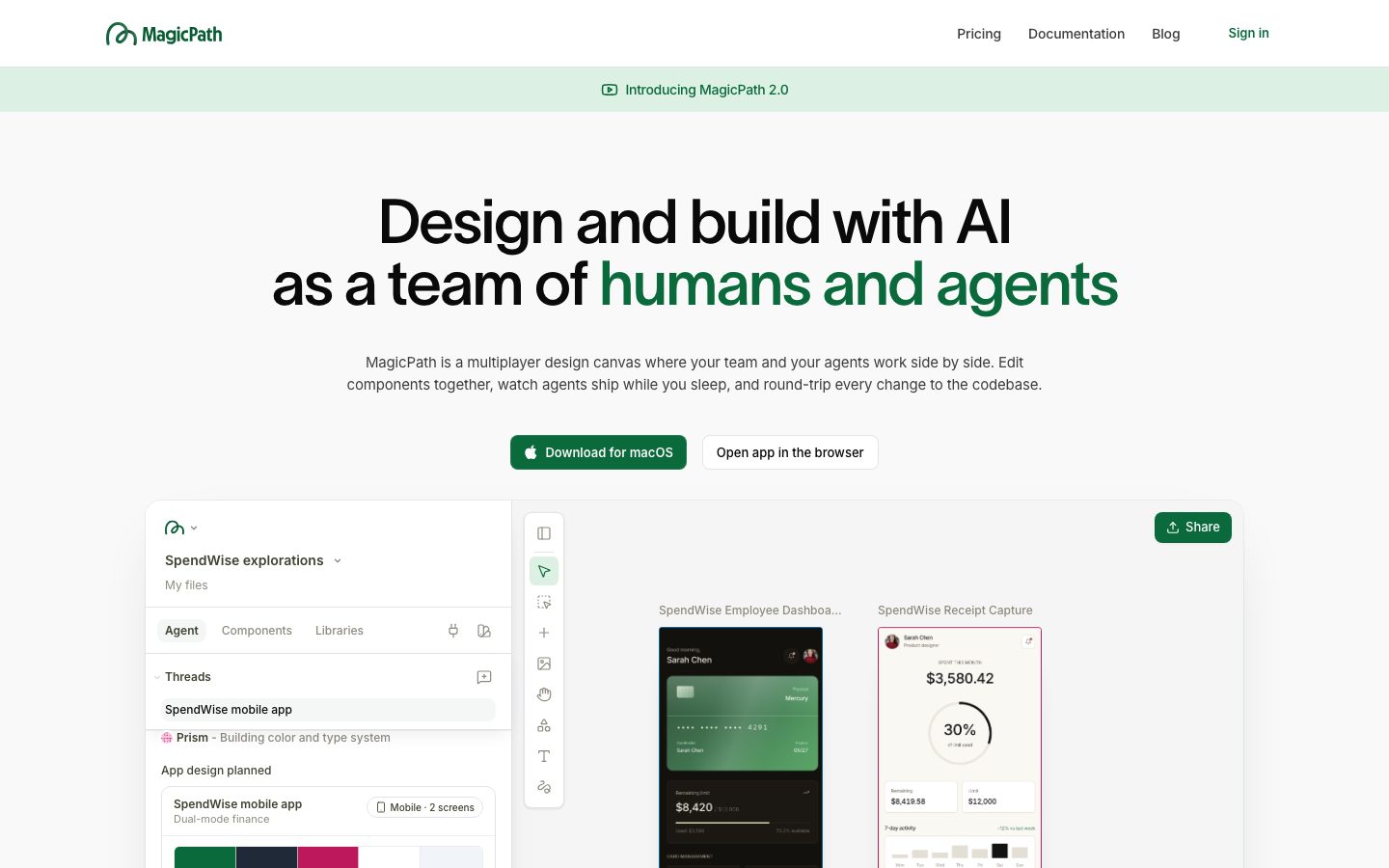
A bright, product-forward SaaS landing surface built on near-white canvas with a deep forest-green brand voltage (#0a6a3c) carried by the wordmark, primary download CTA, and the second clause of the hero headline. The system pairs the custom TWK Lausanne display face (tight negative tracking) with Inter for all UI text, and leans on white product-canvas cards floating on soft-gray bands with low, wide drop shadows. Brand energy comes from the green accent and from real product-canvas screenshots shown directly inside floating cards rather than from color saturation.
---
version: alpha
name: MagicPath-design-analysis
description: A bright, product-forward SaaS landing surface built on near-white canvas with a deep forest-green brand voltage (#0a6a3c) carried by the wordmark, primary download CTA, and the second clause of the hero headline. The system pairs the custom TWK Lausanne display face (tight negative tracking) with Inter for all UI text, and leans on white product-canvas cards floating on soft-gray bands with low, wide drop shadows. Brand energy comes from the green accent and from real product-canvas screenshots shown directly inside floating cards rather than from color saturation.

colors:
  primary: "#0a6a3c"
  primary-soft: "#dcf1e3"
  ink: "#0a0a0a"
  ink-warm: "#1c1917"
  body: "#3d3d3d"
  muted: "#71717a"
  muted-soft: "#a1a1aa"
  neutral-800: "#2a2a2a"
  neutral-900: "#1a1a1a"
  neutral-600: "#5a5a5c"
  green-gray: "#3a4540"
  warm-stone: "#9c8f82"
  black: "#000000"
  canvas: "#ffffff"
  surface-soft: "#fafafa"
  surface: "#f5f5f5"
  surface-alt: "#f9f9f9"
  accent-sand: "#f0ede5"
  accent-blue: "#69b9ea"
  hairline: "#e4e4e7"
  on-primary: "#ffffff"

typography:
  h1:
    fontFamily: "TWK Lausanne, Inter, sans-serif"
    fontSize: 64px
    fontWeight: 500
    lineHeight: 1.0
    letterSpacing: -2.048px
  h2:
    fontFamily: "TWK Lausanne, Inter, sans-serif"
    fontSize: 48px
    fontWeight: 500
    lineHeight: 1.0
    letterSpacing: -1.2px
  h3:
    fontFamily: "Inter, sans-serif"
    fontSize: 18px
    fontWeight: 510
    lineHeight: 1.2
    letterSpacing: -0.396px
  h4:
    fontFamily: "Inter, sans-serif"
    fontSize: 14px
    fontWeight: 600
    lineHeight: 1.429
    letterSpacing: -0.05px
  body:
    fontFamily: "Inter, sans-serif"
    fontSize: 15px
    fontWeight: 400
    lineHeight: 1.55
    letterSpacing: -0.165px
  button:
    fontFamily: "Inter, sans-serif"
    fontSize: 13px
    fontWeight: 590
    lineHeight: 1.0
    letterSpacing: 0

rounded:
  none: 0px
  xs: 3px
  sm: 4px
  md: 6px
  lg: 8px
  xl: 10px
  xxl: 14px
  pill: 56px

spacing:
  xxs: 4px
  xs: 6px
  sm: 8px
  md: 12px
  lg: 16px
  xl: 20px

components:
  top-nav:
    backgroundColor: "{colors.canvas}"
    textColor: "{colors.ink}"
    typography: "{typography.h4}"
  announcement-bar:
    backgroundColor: "{colors.primary-soft}"
    textColor: "{colors.primary}"
    typography: "{typography.h4}"
  button-primary:
    backgroundColor: "{colors.primary}"
    textColor: "{colors.on-primary}"
    typography: "{typography.button}"
    rounded: "{rounded.lg}"
    padding: 0px 14px
  button-secondary:
    backgroundColor: "{colors.canvas}"
    textColor: "{colors.ink}"
    typography: "{typography.button}"
    rounded: "{rounded.lg}"
    padding: 0px 14px
  hero-band:
    backgroundColor: "{colors.surface-soft}"
    textColor: "{colors.ink}"
    typography: "{typography.h1}"
  product-canvas-card:
    backgroundColor: "{colors.canvas}"
    textColor: "{colors.body}"
    rounded: "{rounded.xxl}"
  promo-card:
    backgroundColor: "{colors.primary}"
    textColor: "{colors.on-primary}"
    rounded: "{rounded.lg}"
  feature-block:
    backgroundColor: "{colors.canvas}"
    textColor: "{colors.body}"
    typography: "{typography.h3}"
  logo-strip:
    backgroundColor: "{colors.canvas}"
    textColor: "{colors.muted-soft}"
    typography: "{typography.h4}"
  code-block:
    backgroundColor: "{colors.surface}"
    textColor: "{colors.ink-warm}"
    typography: "{typography.body}"
  input:
    backgroundColor: "{colors.canvas}"
    textColor: "{colors.body}"
    typography: "{typography.body}"
    rounded: "{rounded.none}"
  footer:
    backgroundColor: "{colors.canvas}"
    textColor: "{colors.muted}"
    typography: "{typography.body}"
---

## Overview

MagicPath's landing page is a bright, product-forward SaaS surface anchored on near-white canvas (`{colors.canvas}` — #ffffff) with a single, confident brand voltage: a deep forest green (`{colors.primary}` — #0a6a3c). That green carries the wordmark, the primary "Download for macOS" CTA, and — most distinctively — the second clause of the hero headline ("humans and agents"), where the display type itself switches from `{colors.ink}` black to brand green.

The type system is a two-family split: **TWK Lausanne** (a custom geometric grotesque) handles the large display headlines (h1 64px, h2 48px) at weight 500 with aggressive negative tracking (-2px at h1), while **Inter** handles everything else — sub-heads, body, buttons, labels. The display face is tight, modern, and slightly condensed; the negative letter-spacing is part of its voice.

The system's signature device is the **product-canvas card** — large white cards (`{component.product-canvas-card}`) floating on soft-gray bands, each showing an actual MagicPath canvas, dashboard mockup, mobile design, or code editor at small scale. MagicPath shows the product inside the marketing flow rather than illustrating around it.

The page stays light throughout — there is no dark footer or dark hero. Depth comes entirely from soft, wide, low-opacity drop shadows under the floating cards (e.g. `rgba(15,23,42,0.45) 0px 18px 42px -30px`), with gray surface bands (`{colors.surface-soft}`, `{colors.surface}`) alternating against pure white.

**Key Characteristics:**
- Near-white canvas (`{colors.canvas}`) with a single deep-green brand color (`{colors.primary}` — #0a6a3c) used on the wordmark, primary CTA, and the green half of the hero headline.
- Custom **TWK Lausanne** display face for h1/h2 at weight 500 with heavy negative tracking; **Inter** for all supporting text.
- Floating white product-canvas cards (`{rounded.xxl}` — 14px) showing real product UI, lifted off soft-gray bands by wide low-opacity drop shadows.
- A light forest-green announcement bar (`{colors.primary-soft}` — #dcf1e3) pinned above the hero ("Introducing MagicPath 2.0").
- A monochrome "Trusted by" logo strip in muted gray (`{colors.muted-soft}`).
- Small radii dominate UI chrome: `{rounded.md}` (6px) is by far the most common, with `{rounded.lg}` (8px) on buttons and `{rounded.xl}` (10px) on small cards.
- Square-cornered inputs (`{rounded.none}` — 0px), a deliberate contrast against the rounded chrome.
- Tight spacing rhythm built on a 4px base, with 6px and 8px the most frequent gaps.

## Colors

### Brand & Accent
- **Primary** (`{colors.primary}` — #0a6a3c): The single brand color. Wordmark, the primary "Download for macOS" CTA background, the green clause of the hero headline, and announcement-bar text. This is a deep forest green, not a bright tech green.
- **Primary Soft** (`{colors.primary-soft}` — #dcf1e3): The pale green announcement-bar background and small green-tinted chips.
- **Accent Sand** (`{colors.accent-sand}` — #f0ede5): A warm off-white used sparingly in product-canvas swatches and warm surface accents.
- **Accent Blue** (`{colors.accent-blue}` — #69b9ea): A light sky-blue appearing only inside product UI fragments (chart bars, agent tags) — never on marketing chrome.

### Surface
- **Canvas** (`{colors.canvas}` — #ffffff): The default page floor and the fill of floating product cards.
- **Surface Soft** (`{colors.surface-soft}` — #fafafa): The hero band and several alternating section backgrounds.
- **Surface** (`{colors.surface}` — #f5f5f5): Code-block backgrounds and denser gray bands.
- **Surface Alt** (`{colors.surface-alt}` — #f9f9f9): A barely-cooler gray used for nested panels.
- **Hairline** (`{colors.hairline}` — #e4e4e7): 1px dividers and card outlines on light surfaces.

### Text
- **Ink** (`{colors.ink}` — #0a0a0a): Hero headline (black clause) and max-contrast text.
- **Ink Warm** (`{colors.ink-warm}` — #1c1917): Code and warm-toned dark text inside product fragments.
- **Body** (`{colors.body}` — #3d3d3d): Default running-text color (the hero sub-paragraph).
- **Muted** (`{colors.muted}` — #71717a): Secondary text, nav meta, footer links.
- **Muted Soft** (`{colors.muted-soft}` — #a1a1aa): The highest-frequency neutral — logo-strip labels, placeholder text, tertiary captions.
- **On Primary** (`{colors.on-primary}` — #ffffff): Text on the green primary button.

### Deep Neutrals (product chrome)
- **Neutral 900 / 800 / 600** (`{colors.neutral-900}` — #1a1a1a, `{colors.neutral-800}` — #2a2a2a, `{colors.neutral-600}` — #5a5a5c): Dark UI surfaces and text inside the embedded dashboard mockups (e.g. the dark SpendWise dashboard card).
- **Green Gray** (`{colors.green-gray}` — #3a4540) and **Warm Stone** (`{colors.warm-stone}` — #9c8f82): Tinted neutrals observed inside product-canvas screenshots.
- **Black** (`{colors.black}` — #000000): Pure black, used minimally.

## Typography

### Font Family
The system runs **TWK Lausanne** for large display headlines and **Inter** for everything else. TWK Lausanne is a custom geometric grotesque (commercial type from Weltkern) used at weight 500 with strong negative letter-spacing — it gives the hero its modern, slightly-condensed character. Inter handles sub-heads, body copy, buttons, and labels at 400–600 weight with subtle negative tracking.

The split is functional:
- TWK Lausanne (display, 500 weight, -1.2 to -2px tracking) — h1, h2
- Inter (UI + body, 400–600 weight, slight negative tracking) — h3, h4, body, buttons

### Hierarchy

| Token | Size | Weight | Line Height | Letter Spacing | Use |
|---|---|---|---|---|---|
| `{typography.h1}` | 64px | 500 | 1.0 | -2.048px | Hero headline ("Design and build with AI…") — TWK Lausanne |
| `{typography.h2}` | 48px | 500 | 1.0 | -1.2px | Section headlines — TWK Lausanne |
| `{typography.h3}` | 18px | 510 | 1.2 | -0.396px | Feature-block titles, card headings — Inter |
| `{typography.h4}` | 14px | 600 | 1.429 | -0.05px | Nav links, eyebrow labels, announcement bar — Inter |
| `{typography.body}` | 15px | 400 | 1.55 | -0.165px | Hero sub-paragraph, body copy, footer — Inter |
| `{typography.button}` | 13px | 590 | 1.0 | 0 | Button labels — Inter |

### Principles
TWK Lausanne owns the two largest sizes only — never put body copy in it, never drop a hero headline into Inter. The negative tracking is essential: TWK Lausanne without -1 to -2px tracking reads as off-brand. Display weight stays at 500 (never 700) — the mid-weight is what keeps the hero confident rather than heavy. Inter's tracking runs slightly negative across the board (-0.05 to -0.396px) which keeps UI text tight and aligned with the display voice.

### Note on Font Substitutes
**TWK Lausanne is a commercial/licensed typeface** and is not bundled here. For an open-source substitute, use **Inter** at weight 500 with -0.03em letter-spacing as a baseline-safe fallback (already in the stack), or **Geist** / **General Sans** for a closer geometric-grotesque match. Either substitute should retain the weight-500 + negative-tracking signature; do not increase weight to compensate.

## Layout

### Spacing System
- **Base unit:** 4px.
- **Tokens:** `{spacing.xxs}` 4px · `{spacing.xs}` 6px · `{spacing.sm}` 8px · `{spacing.md}` 12px · `{spacing.lg}` 16px · `{spacing.xl}` 20px.
- The two most frequent gaps measured are 8px (`{spacing.sm}`) and 6px (`{spacing.xs}`), reflecting a tight, dense UI rhythm carried over from the product chrome shown in cards.
- Additional measured one-off values of 10px, 14px, and 15px appear at lower frequency; treat them as derived in-betweens snapping to the nearest token rather than new tokens.

### Grid & Container
- **Hero:** centered single-column — headline, sub-paragraph, and the two-button CTA row are all center-aligned, with the large product-canvas card floating below full-width.
- **Feature bands:** two-up text/visual splits (e.g. "Designs into your repo" / "Components from your repo") alternate text columns against product mockups.
- **Logo strip:** single horizontal row of monochrome partner logos.
- **Footer:** multi-column link list (Getting started / Resources / Support) with the wordmark and tagline at left.

### Whitespace Philosophy
The page breathes through large vertical gaps between bands and full-width floating cards, while the chrome inside each card stays dense (6–8px gaps). The contrast between airy section spacing and tight component spacing is intentional — it lets the embedded product UI read as "real software" against generous marketing whitespace.

## Elevation & Depth

| Level | Treatment | Use |
|---|---|---|
| Flat | No shadow, no border | Body sections, nav, logo strip |
| Hairline | 1px `{colors.hairline}` border / `oklab(0 0 0 / 0.05) 0 0 0 1px` ring | Card outlines, subtle separation |
| Soft lift | `rgba(15,20,16,0.12) 0px 8px 18px -12px` | Small cards, buttons at rest |
| Floating card | `rgba(15,23,42,0.45) 0px 18px 42px -30px` | Product-canvas cards lifted off gray bands |
| Marquee card | `rgba(15,42,28,0.25) 0px 24px 60px -30px` plus a 1px `oklab(0 0 0 / 0.05)` ring | The largest hero product canvas |
| Focus ring | `rgb(255,255,255) 0px 0px 0px 2px` | White inset ring on focused/selected controls |
| Inset hairline | `rgba(255,255,255,0.13) 0px 0px 0px 1px inset` | Subtle inner edge on dark product surfaces |

The elevation language is **soft, wide, and low-opacity** — shadows spread far (40–60px blur) but sit at a heavily negative spread (-30px), so cards appear to float just above the page rather than casting a hard drop. Several shadows carry a faint green/navy tint (`rgba(15,42,28,…)`, `rgba(15,23,42,…)`) rather than neutral black.

### Decorative Depth
- Embedded product mockups (dashboards, mobile screens, code editors) carry their own internal chrome shadows — these belong to the screenshots, not the marketing system.
- The focus ring and inset-hairline shadows originate inside product UI fragments and are documented for completeness, not as page-level tokens.

## Shapes

### Border Radius Scale

| Token | Value | Use |
|---|---|---|
| `{rounded.none}` | 0px | Text inputs (deliberately square) |
| `{rounded.xs}` | 3px | Tiny chips, inline tags inside product UI |
| `{rounded.sm}` | 4px | Small controls, badges |
| `{rounded.md}` | 6px | The dominant radius — most chrome, panels, list rows |
| `{rounded.lg}` | 8px | Primary + secondary buttons, mid-size cards |
| `{rounded.xl}` | 10px | Small feature cards |
| `{rounded.xxl}` | 14px | Floating product-canvas cards |
| `{rounded.pill}` | 56px | Large pill/rounded avatar treatments inside product fragments (also 24/40/48px observed) |

### Photography & Card Geometry
Product-canvas cards use `{rounded.xxl}` (14px). The single most common radius across the whole page is `{rounded.md}` (6px), which sets the default feel of nearly all chrome. Inputs are the notable exception — square corners (`{rounded.none}`) deliberately break from the rounded system.

## Components

### Navigation & Bars

**`top-nav`** — White nav bar with the MagicPath wordmark + green logo glyph at left, primary menu (Pricing, Documentation, Blog) center-right, and a green "Sign in" link at the far right. Links use `{typography.h4}` (Inter 14px / 600). Background `{colors.canvas}`.

**`announcement-bar`** — A full-width pale-green strip pinned directly under the nav ("Introducing MagicPath 2.0"). Background `{colors.primary-soft}` (#dcf1e3), text in `{colors.primary}` (#0a6a3c), `{typography.h4}`. The only persistently colored band on the page.

**`logo-strip`** — A "Trusted by teams at" monochrome row of partner logos (OpenAI, Netflix, Mercury, Webflow, LinkedIn, Vercel, Shopify, Uber, Perplexity, Rippling). Logos render in `{colors.muted-soft}`; the eyebrow label uses `{typography.h4}`.

### Buttons

**`button-primary`** — The signature green CTA ("Download for macOS"). Background `{colors.primary}` (#0a6a3c), text `{colors.on-primary}` (#ffffff), type `{typography.button}` (Inter 13px / 590), rounded `{rounded.lg}` (8px), horizontal padding 14px. Carries a small Apple glyph icon at left.

**`button-secondary`** — White outline button shown beside the primary ("Open app in the browser"). Background `{colors.canvas}`, text `{colors.ink}`, 1px `{colors.hairline}` border, same radius and padding as primary.

### Hero & Cards

**`hero-band`** — Centered hero on `{colors.surface-soft}` (#fafafa). The h1 uses `{typography.h1}` (TWK Lausanne 64px), with the headline split across two color clauses — black (`{colors.ink}`) on line one, green (`{colors.primary}`) on the "humans and agents" clause. Below sit a `{typography.body}` sub-paragraph and the two-button CTA row.

**`product-canvas-card`** — The system's signature surface: a large white card showing the actual MagicPath canvas (file tree, threads panel, agent tools, and child mockup cards). Background `{colors.canvas}`, rounded `{rounded.xxl}` (14px), lifted by the marquee floating shadow. Smaller variants appear throughout the page showing mobile designs, dashboards, and analytics screens.

**`feature-block`** — Two-up text/visual sections ("One request, a whole team at work", "Designs into your repo", "Components from your repo"). Title in `{typography.h3}`, supporting copy in `{typography.body}` (`{colors.body}`), paired with a product mockup. Background `{colors.canvas}`.

**`promo-card`** — A solid green accent block (`{colors.primary}` background, `{colors.on-primary}` text, rounded `{rounded.lg}`) used for high-emphasis CTAs and the green canvas-tool button inside product fragments.

**`code-block`** — Monospaced install/snippet panels ("npx skills add …" and the code-editor mockup). Background `{colors.surface}` (#f5f5f5), text `{colors.ink-warm}`. Font is shown as monospace in the screenshot but a monospace family was not measured — see Known Gaps.

### Inputs

**`input`** — Text input with square corners (`{rounded.none}` — 0px), background `{colors.canvas}`, text `{colors.body}`, type `{typography.body}`. The square geometry is a deliberate departure from the otherwise-rounded chrome.

### Footer

**`footer`** — Light footer (no dark inversion) on `{colors.canvas}`. Carries the wordmark + tagline at left and multi-column link lists (Getting started / Resources / Support) in `{colors.muted}` using `{typography.body}`. Closes the page on the same light register as the rest of the design.

## Do's and Don'ts

### Do
- Reserve `{colors.primary}` (#0a6a3c) for the wordmark, the primary CTA, and accent headline clauses. The green is the brand's only voltage — use it precisely.
- Use TWK Lausanne (or its substitute) only at h1/h2 with negative tracking. Keep Inter for everything else.
- Float white product-canvas cards on soft-gray bands using the wide low-opacity shadows. Let the embedded product UI carry the story.
- Keep `{rounded.md}` (6px) as the default chrome radius, `{rounded.lg}` (8px) on buttons, `{rounded.xxl}` (14px) on big product cards.
- Keep inputs square (`{rounded.none}`) — it's an intentional system contrast.
- Hold the whole page on a light register; depth comes from shadows and gray bands, not dark surfaces.

### Don't
- Don't add a second accent color to marketing chrome. `{colors.accent-blue}` and pastel greens live inside product screenshots only.
- Don't bold the display face past weight 500 or remove its negative tracking.
- Don't introduce a dark footer or dark hero — MagicPath stays light end-to-end.
- Don't use hard, tight drop shadows; the system's shadows are wide, soft, and slightly tinted.
- Don't round inputs to match buttons — square corners are the deliberate choice.
- Don't document hover states; only default and active/pressed are in scope.

## Responsive Behavior

The full-page screenshot shows a desktop composition. Specific breakpoint behavior was not measured; the notes below are derived from the captured layout structure.

### Breakpoints (derived)

| Name | Width | Key Changes (derived) |
|---|---|---|
| Mobile | < 768px | Centered hero likely retains stacking; h1 scales down from 64px; two-up feature blocks stack to single column; logo strip wraps |
| Tablet | 768–1024px | Feature blocks may stay two-up or collapse; product-canvas cards scale proportionally |
| Desktop | > 1024px | Full centered hero, full-width floating product cards, multi-column footer (as captured) |

### Touch Targets
- `{component.button-primary}` and `{component.button-secondary}` measured at 14px horizontal padding; vertical height was not captured (padding measured as 0px vertical, implying height is set elsewhere) — see Known Gaps.

### Image Behavior
- Product-canvas cards retain native aspect ratios and scale proportionally; embedded mockups stay legible at reduced size.

## Iteration Guide

1. Focus on ONE component at a time and reference its YAML key directly (`{component.product-canvas-card}`, `{component.button-primary}`).
2. Variants live as separate `components:` entries; never fork inline.
3. Use `{token.refs}` everywhere — never inline a hex into a component.
4. Document default and active/pressed states only; never hover.
5. The display/UI font split does not blur: TWK Lausanne (substitute Inter 500 + negative tracking) at h1/h2 only, Inter everywhere else.
6. Green is scarce by design. When you need emphasis, prefer bigger TWK Lausanne or a green headline clause before reaching for more color.
7. Keep depth soft and light; resist adding dark surfaces.

## Known Gaps

- **TWK Lausanne is a commercial typeface but was not flagged in `fonts_licensed`** (the array is empty). It is documented here as licensed with open-source substitutes regardless; confirm licensing before shipping the real face.
- Button vertical padding/height was measured as `0px 14px` (zero vertical) — actual control height is set by line-height or an unmeasured min-height. Treat button height as a gap.
- The "card" component measured a solid green background (`#0a6a3c`) at 8px radius; this corresponds to the green CTA/promo surface, documented as `{component.promo-card}`. The large white floating surfaces are documented separately as `{component.product-canvas-card}`.
- No monospace font family was measured for the code-block, though the screenshots clearly show monospaced text; the monospace face is a gap.
- Exact section vertical spacing (band-to-band rhythm) and max content width were not measured — only component-level padding/gap values were captured.
- Responsive breakpoints, mobile nav collapse behavior, and hamburger treatment were not captured (single desktop landing capture only).
- The `{colors.accent-blue}`, `{colors.green-gray}`, `{colors.warm-stone}`, and deep-neutral values appear primarily inside embedded product screenshots; their exact role outside product chrome is uncertain.
- Animation, transition timings, and multiplayer cursor/agent-presence motion are out of scope.

<!-- Documented by duply · real-world design systems as ready-to-use DESIGN.md for AI coding agents · https://duply.ai/magicpath/design-md -->
Color Palette
Accent
Neutrals
Typography
h164px · 500 · 1
The quick brown fox jumpsh248px · 500 · 1
The quick brown fox jumpsh318px · 510 · 1.2
The quick brown fox jumpsh414px · 600 · 1.429
The quick brown fox jumpsbody15px · 400 · 1.55
The quick brown fox jumpsbutton13px · 590 · 1
The quick brown fox jumpsSpacing & Shape
Spacing
| Name | Value | Preview |
|---|---|---|
| xxs | 4px | |
| xs | 6px | |
| sm | 8px | |
| md | 12px | |
| lg | 16px | |
| xl | 20px |
Border Radius
| Name | Value | Preview |
|---|---|---|
| none | 0px | |
| xs | 3px | |
| sm | 4px | |
| md | 6px | |
| lg | 8px | |
| xl | 10px | |
| xxl | 14px | |
| pill | 56px |
More like this


---
version: alpha
name: MagicPath-design-analysis
description: A bright, product-forward SaaS landing surface built on near-white canvas with a deep forest-green brand voltage (#0a6a3c) carried by the wordmark, primary download CTA, and the second clause of the hero headline. The system pairs the custom TWK Lausanne display face (tight negative tracking) with Inter for all UI text, and leans on white product-canvas cards floating on soft-gray bands with low, wide drop shadows. Brand energy comes from the green accent and from real product-canvas screenshots shown directly inside floating cards rather than from color saturation.

colors:
  primary: "#0a6a3c"
  primary-soft: "#dcf1e3"
  ink: "#0a0a0a"
  ink-warm: "#1c1917"
  body: "#3d3d3d"
  muted: "#71717a"
  muted-soft: "#a1a1aa"
  neutral-800: "#2a2a2a"
  neutral-900: "#1a1a1a"
  neutral-600: "#5a5a5c"
  green-gray: "#3a4540"
  warm-stone: "#9c8f82"
  black: "#000000"
  canvas: "#ffffff"
  surface-soft: "#fafafa"
  surface: "#f5f5f5"
  surface-alt: "#f9f9f9"
  accent-sand: "#f0ede5"
  accent-blue: "#69b9ea"
  hairline: "#e4e4e7"
  on-primary: "#ffffff"

typography:
  h1:
    fontFamily: "TWK Lausanne, Inter, sans-serif"
    fontSize: 64px
    fontWeight: 500
    lineHeight: 1.0
    letterSpacing: -2.048px
  h2:
    fontFamily: "TWK Lausanne, Inter, sans-serif"
    fontSize: 48px
    fontWeight: 500
    lineHeight: 1.0
    letterSpacing: -1.2px
  h3:
    fontFamily: "Inter, sans-serif"
    fontSize: 18px
    fontWeight: 510
    lineHeight: 1.2
    letterSpacing: -0.396px
  h4:
    fontFamily: "Inter, sans-serif"
    fontSize: 14px
    fontWeight: 600
    lineHeight: 1.429
    letterSpacing: -0.05px
  body:
    fontFamily: "Inter, sans-serif"
    fontSize: 15px
    fontWeight: 400
    lineHeight: 1.55
    letterSpacing: -0.165px
  button:
    fontFamily: "Inter, sans-serif"
    fontSize: 13px
    fontWeight: 590
    lineHeight: 1.0
    letterSpacing: 0

rounded:
  none: 0px
  xs: 3px
  sm: 4px
  md: 6px
  lg: 8px
  xl: 10px
  xxl: 14px
  pill: 56px

spacing:
  xxs: 4px
  xs: 6px
  sm: 8px
  md: 12px
  lg: 16px
  xl: 20px

components:
  top-nav:
    backgroundColor: "{colors.canvas}"
    textColor: "{colors.ink}"
    typography: "{typography.h4}"
  announcement-bar:
    backgroundColor: "{colors.primary-soft}"
    textColor: "{colors.primary}"
    typography: "{typography.h4}"
  button-primary:
    backgroundColor: "{colors.primary}"
    textColor: "{colors.on-primary}"
    typography: "{typography.button}"
    rounded: "{rounded.lg}"
    padding: 0px 14px
  button-secondary:
    backgroundColor: "{colors.canvas}"
    textColor: "{colors.ink}"
    typography: "{typography.button}"
    rounded: "{rounded.lg}"
    padding: 0px 14px
  hero-band:
    backgroundColor: "{colors.surface-soft}"
    textColor: "{colors.ink}"
    typography: "{typography.h1}"
  product-canvas-card:
    backgroundColor: "{colors.canvas}"
    textColor: "{colors.body}"
    rounded: "{rounded.xxl}"
  promo-card:
    backgroundColor: "{colors.primary}"
    textColor: "{colors.on-primary}"
    rounded: "{rounded.lg}"
  feature-block:
    backgroundColor: "{colors.canvas}"
    textColor: "{colors.body}"
    typography: "{typography.h3}"
  logo-strip:
    backgroundColor: "{colors.canvas}"
    textColor: "{colors.muted-soft}"
    typography: "{typography.h4}"
  code-block:
    backgroundColor: "{colors.surface}"
    textColor: "{colors.ink-warm}"
    typography: "{typography.body}"
  input:
    backgroundColor: "{colors.canvas}"
    textColor: "{colors.body}"
    typography: "{typography.body}"
    rounded: "{rounded.none}"
  footer:
    backgroundColor: "{colors.canvas}"
    textColor: "{colors.muted}"
    typography: "{typography.body}"
---

## Overview

MagicPath's landing page is a bright, product-forward SaaS surface anchored on near-white canvas (`{colors.canvas}` — #ffffff) with a single, confident brand voltage: a deep forest green (`{colors.primary}` — #0a6a3c). That green carries the wordmark, the primary "Download for macOS" CTA, and — most distinctively — the second clause of the hero headline ("humans and agents"), where the display type itself switches from `{colors.ink}` black to brand green.

The type system is a two-family split: **TWK Lausanne** (a custom geometric grotesque) handles the large display headlines (h1 64px, h2 48px) at weight 500 with aggressive negative tracking (-2px at h1), while **Inter** handles everything else — sub-heads, body, buttons, labels. The display face is tight, modern, and slightly condensed; the negative letter-spacing is part of its voice.

The system's signature device is the **product-canvas card** — large white cards (`{component.product-canvas-card}`) floating on soft-gray bands, each showing an actual MagicPath canvas, dashboard mockup, mobile design, or code editor at small scale. MagicPath shows the product inside the marketing flow rather than illustrating around it.

The page stays light throughout — there is no dark footer or dark hero. Depth comes entirely from soft, wide, low-opacity drop shadows under the floating cards (e.g. `rgba(15,23,42,0.45) 0px 18px 42px -30px`), with gray surface bands (`{colors.surface-soft}`, `{colors.surface}`) alternating against pure white.

**Key Characteristics:**
- Near-white canvas (`{colors.canvas}`) with a single deep-green brand color (`{colors.primary}` — #0a6a3c) used on the wordmark, primary CTA, and the green half of the hero headline.
- Custom **TWK Lausanne** display face for h1/h2 at weight 500 with heavy negative tracking; **Inter** for all supporting text.
- Floating white product-canvas cards (`{rounded.xxl}` — 14px) showing real product UI, lifted off soft-gray bands by wide low-opacity drop shadows.
- A light forest-green announcement bar (`{colors.primary-soft}` — #dcf1e3) pinned above the hero ("Introducing MagicPath 2.0").
- A monochrome "Trusted by" logo strip in muted gray (`{colors.muted-soft}`).
- Small radii dominate UI chrome: `{rounded.md}` (6px) is by far the most common, with `{rounded.lg}` (8px) on buttons and `{rounded.xl}` (10px) on small cards.
- Square-cornered inputs (`{rounded.none}` — 0px), a deliberate contrast against the rounded chrome.
- Tight spacing rhythm built on a 4px base, with 6px and 8px the most frequent gaps.

## Colors

### Brand & Accent
- **Primary** (`{colors.primary}` — #0a6a3c): The single brand color. Wordmark, the primary "Download for macOS" CTA background, the green clause of the hero headline, and announcement-bar text. This is a deep forest green, not a bright tech green.
- **Primary Soft** (`{colors.primary-soft}` — #dcf1e3): The pale green announcement-bar background and small green-tinted chips.
- **Accent Sand** (`{colors.accent-sand}` — #f0ede5): A warm off-white used sparingly in product-canvas swatches and warm surface accents.
- **Accent Blue** (`{colors.accent-blue}` — #69b9ea): A light sky-blue appearing only inside product UI fragments (chart bars, agent tags) — never on marketing chrome.

### Surface
- **Canvas** (`{colors.canvas}` — #ffffff): The default page floor and the fill of floating product cards.
- **Surface Soft** (`{colors.surface-soft}` — #fafafa): The hero band and several alternating section backgrounds.
- **Surface** (`{colors.surface}` — #f5f5f5): Code-block backgrounds and denser gray bands.
- **Surface Alt** (`{colors.surface-alt}` — #f9f9f9): A barely-cooler gray used for nested panels.
- **Hairline** (`{colors.hairline}` — #e4e4e7): 1px dividers and card outlines on light surfaces.

### Text
- **Ink** (`{colors.ink}` — #0a0a0a): Hero headline (black clause) and max-contrast text.
- **Ink Warm** (`{colors.ink-warm}` — #1c1917): Code and warm-toned dark text inside product fragments.
- **Body** (`{colors.body}` — #3d3d3d): Default running-text color (the hero sub-paragraph).
- **Muted** (`{colors.muted}` — #71717a): Secondary text, nav meta, footer links.
- **Muted Soft** (`{colors.muted-soft}` — #a1a1aa): The highest-frequency neutral — logo-strip labels, placeholder text, tertiary captions.
- **On Primary** (`{colors.on-primary}` — #ffffff): Text on the green primary button.

### Deep Neutrals (product chrome)
- **Neutral 900 / 800 / 600** (`{colors.neutral-900}` — #1a1a1a, `{colors.neutral-800}` — #2a2a2a, `{colors.neutral-600}` — #5a5a5c): Dark UI surfaces and text inside the embedded dashboard mockups (e.g. the dark SpendWise dashboard card).
- **Green Gray** (`{colors.green-gray}` — #3a4540) and **Warm Stone** (`{colors.warm-stone}` — #9c8f82): Tinted neutrals observed inside product-canvas screenshots.
- **Black** (`{colors.black}` — #000000): Pure black, used minimally.

## Typography

### Font Family
The system runs **TWK Lausanne** for large display headlines and **Inter** for everything else. TWK Lausanne is a custom geometric grotesque (commercial type from Weltkern) used at weight 500 with strong negative letter-spacing — it gives the hero its modern, slightly-condensed character. Inter handles sub-heads, body copy, buttons, and labels at 400–600 weight with subtle negative tracking.

The split is functional:
- TWK Lausanne (display, 500 weight, -1.2 to -2px tracking) — h1, h2
- Inter (UI + body, 400–600 weight, slight negative tracking) — h3, h4, body, buttons

### Hierarchy

| Token | Size | Weight | Line Height | Letter Spacing | Use |
|---|---|---|---|---|---|
| `{typography.h1}` | 64px | 500 | 1.0 | -2.048px | Hero headline ("Design and build with AI…") — TWK Lausanne |
| `{typography.h2}` | 48px | 500 | 1.0 | -1.2px | Section headlines — TWK Lausanne |
| `{typography.h3}` | 18px | 510 | 1.2 | -0.396px | Feature-block titles, card headings — Inter |
| `{typography.h4}` | 14px | 600 | 1.429 | -0.05px | Nav links, eyebrow labels, announcement bar — Inter |
| `{typography.body}` | 15px | 400 | 1.55 | -0.165px | Hero sub-paragraph, body copy, footer — Inter |
| `{typography.button}` | 13px | 590 | 1.0 | 0 | Button labels — Inter |

### Principles
TWK Lausanne owns the two largest sizes only — never put body copy in it, never drop a hero headline into Inter. The negative tracking is essential: TWK Lausanne without -1 to -2px tracking reads as off-brand. Display weight stays at 500 (never 700) — the mid-weight is what keeps the hero confident rather than heavy. Inter's tracking runs slightly negative across the board (-0.05 to -0.396px) which keeps UI text tight and aligned with the display voice.

### Note on Font Substitutes
**TWK Lausanne is a commercial/licensed typeface** and is not bundled here. For an open-source substitute, use **Inter** at weight 500 with -0.03em letter-spacing as a baseline-safe fallback (already in the stack), or **Geist** / **General Sans** for a closer geometric-grotesque match. Either substitute should retain the weight-500 + negative-tracking signature; do not increase weight to compensate.

## Layout

### Spacing System
- **Base unit:** 4px.
- **Tokens:** `{spacing.xxs}` 4px · `{spacing.xs}` 6px · `{spacing.sm}` 8px · `{spacing.md}` 12px · `{spacing.lg}` 16px · `{spacing.xl}` 20px.
- The two most frequent gaps measured are 8px (`{spacing.sm}`) and 6px (`{spacing.xs}`), reflecting a tight, dense UI rhythm carried over from the product chrome shown in cards.
- Additional measured one-off values of 10px, 14px, and 15px appear at lower frequency; treat them as derived in-betweens snapping to the nearest token rather than new tokens.

### Grid & Container
- **Hero:** centered single-column — headline, sub-paragraph, and the two-button CTA row are all center-aligned, with the large product-canvas card floating below full-width.
- **Feature bands:** two-up text/visual splits (e.g. "Designs into your repo" / "Components from your repo") alternate text columns against product mockups.
- **Logo strip:** single horizontal row of monochrome partner logos.
- **Footer:** multi-column link list (Getting started / Resources / Support) with the wordmark and tagline at left.

### Whitespace Philosophy
The page breathes through large vertical gaps between bands and full-width floating cards, while the chrome inside each card stays dense (6–8px gaps). The contrast between airy section spacing and tight component spacing is intentional — it lets the embedded product UI read as "real software" against generous marketing whitespace.

## Elevation & Depth

| Level | Treatment | Use |
|---|---|---|
| Flat | No shadow, no border | Body sections, nav, logo strip |
| Hairline | 1px `{colors.hairline}` border / `oklab(0 0 0 / 0.05) 0 0 0 1px` ring | Card outlines, subtle separation |
| Soft lift | `rgba(15,20,16,0.12) 0px 8px 18px -12px` | Small cards, buttons at rest |
| Floating card | `rgba(15,23,42,0.45) 0px 18px 42px -30px` | Product-canvas cards lifted off gray bands |
| Marquee card | `rgba(15,42,28,0.25) 0px 24px 60px -30px` plus a 1px `oklab(0 0 0 / 0.05)` ring | The largest hero product canvas |
| Focus ring | `rgb(255,255,255) 0px 0px 0px 2px` | White inset ring on focused/selected controls |
| Inset hairline | `rgba(255,255,255,0.13) 0px 0px 0px 1px inset` | Subtle inner edge on dark product surfaces |

The elevation language is **soft, wide, and low-opacity** — shadows spread far (40–60px blur) but sit at a heavily negative spread (-30px), so cards appear to float just above the page rather than casting a hard drop. Several shadows carry a faint green/navy tint (`rgba(15,42,28,…)`, `rgba(15,23,42,…)`) rather than neutral black.

### Decorative Depth
- Embedded product mockups (dashboards, mobile screens, code editors) carry their own internal chrome shadows — these belong to the screenshots, not the marketing system.
- The focus ring and inset-hairline shadows originate inside product UI fragments and are documented for completeness, not as page-level tokens.

## Shapes

### Border Radius Scale

| Token | Value | Use |
|---|---|---|
| `{rounded.none}` | 0px | Text inputs (deliberately square) |
| `{rounded.xs}` | 3px | Tiny chips, inline tags inside product UI |
| `{rounded.sm}` | 4px | Small controls, badges |
| `{rounded.md}` | 6px | The dominant radius — most chrome, panels, list rows |
| `{rounded.lg}` | 8px | Primary + secondary buttons, mid-size cards |
| `{rounded.xl}` | 10px | Small feature cards |
| `{rounded.xxl}` | 14px | Floating product-canvas cards |
| `{rounded.pill}` | 56px | Large pill/rounded avatar treatments inside product fragments (also 24/40/48px observed) |

### Photography & Card Geometry
Product-canvas cards use `{rounded.xxl}` (14px). The single most common radius across the whole page is `{rounded.md}` (6px), which sets the default feel of nearly all chrome. Inputs are the notable exception — square corners (`{rounded.none}`) deliberately break from the rounded system.

## Components

### Navigation & Bars

**`top-nav`** — White nav bar with the MagicPath wordmark + green logo glyph at left, primary menu (Pricing, Documentation, Blog) center-right, and a green "Sign in" link at the far right. Links use `{typography.h4}` (Inter 14px / 600). Background `{colors.canvas}`.

**`announcement-bar`** — A full-width pale-green strip pinned directly under the nav ("Introducing MagicPath 2.0"). Background `{colors.primary-soft}` (#dcf1e3), text in `{colors.primary}` (#0a6a3c), `{typography.h4}`. The only persistently colored band on the page.

**`logo-strip`** — A "Trusted by teams at" monochrome row of partner logos (OpenAI, Netflix, Mercury, Webflow, LinkedIn, Vercel, Shopify, Uber, Perplexity, Rippling). Logos render in `{colors.muted-soft}`; the eyebrow label uses `{typography.h4}`.

### Buttons

**`button-primary`** — The signature green CTA ("Download for macOS"). Background `{colors.primary}` (#0a6a3c), text `{colors.on-primary}` (#ffffff), type `{typography.button}` (Inter 13px / 590), rounded `{rounded.lg}` (8px), horizontal padding 14px. Carries a small Apple glyph icon at left.

**`button-secondary`** — White outline button shown beside the primary ("Open app in the browser"). Background `{colors.canvas}`, text `{colors.ink}`, 1px `{colors.hairline}` border, same radius and padding as primary.

### Hero & Cards

**`hero-band`** — Centered hero on `{colors.surface-soft}` (#fafafa). The h1 uses `{typography.h1}` (TWK Lausanne 64px), with the headline split across two color clauses — black (`{colors.ink}`) on line one, green (`{colors.primary}`) on the "humans and agents" clause. Below sit a `{typography.body}` sub-paragraph and the two-button CTA row.

**`product-canvas-card`** — The system's signature surface: a large white card showing the actual MagicPath canvas (file tree, threads panel, agent tools, and child mockup cards). Background `{colors.canvas}`, rounded `{rounded.xxl}` (14px), lifted by the marquee floating shadow. Smaller variants appear throughout the page showing mobile designs, dashboards, and analytics screens.

**`feature-block`** — Two-up text/visual sections ("One request, a whole team at work", "Designs into your repo", "Components from your repo"). Title in `{typography.h3}`, supporting copy in `{typography.body}` (`{colors.body}`), paired with a product mockup. Background `{colors.canvas}`.

**`promo-card`** — A solid green accent block (`{colors.primary}` background, `{colors.on-primary}` text, rounded `{rounded.lg}`) used for high-emphasis CTAs and the green canvas-tool button inside product fragments.

**`code-block`** — Monospaced install/snippet panels ("npx skills add …" and the code-editor mockup). Background `{colors.surface}` (#f5f5f5), text `{colors.ink-warm}`. Font is shown as monospace in the screenshot but a monospace family was not measured — see Known Gaps.

### Inputs

**`input`** — Text input with square corners (`{rounded.none}` — 0px), background `{colors.canvas}`, text `{colors.body}`, type `{typography.body}`. The square geometry is a deliberate departure from the otherwise-rounded chrome.

### Footer

**`footer`** — Light footer (no dark inversion) on `{colors.canvas}`. Carries the wordmark + tagline at left and multi-column link lists (Getting started / Resources / Support) in `{colors.muted}` using `{typography.body}`. Closes the page on the same light register as the rest of the design.

## Do's and Don'ts

### Do
- Reserve `{colors.primary}` (#0a6a3c) for the wordmark, the primary CTA, and accent headline clauses. The green is the brand's only voltage — use it precisely.
- Use TWK Lausanne (or its substitute) only at h1/h2 with negative tracking. Keep Inter for everything else.
- Float white product-canvas cards on soft-gray bands using the wide low-opacity shadows. Let the embedded product UI carry the story.
- Keep `{rounded.md}` (6px) as the default chrome radius, `{rounded.lg}` (8px) on buttons, `{rounded.xxl}` (14px) on big product cards.
- Keep inputs square (`{rounded.none}`) — it's an intentional system contrast.
- Hold the whole page on a light register; depth comes from shadows and gray bands, not dark surfaces.

### Don't
- Don't add a second accent color to marketing chrome. `{colors.accent-blue}` and pastel greens live inside product screenshots only.
- Don't bold the display face past weight 500 or remove its negative tracking.
- Don't introduce a dark footer or dark hero — MagicPath stays light end-to-end.
- Don't use hard, tight drop shadows; the system's shadows are wide, soft, and slightly tinted.
- Don't round inputs to match buttons — square corners are the deliberate choice.
- Don't document hover states; only default and active/pressed are in scope.

## Responsive Behavior

The full-page screenshot shows a desktop composition. Specific breakpoint behavior was not measured; the notes below are derived from the captured layout structure.

### Breakpoints (derived)

| Name | Width | Key Changes (derived) |
|---|---|---|
| Mobile | < 768px | Centered hero likely retains stacking; h1 scales down from 64px; two-up feature blocks stack to single column; logo strip wraps |
| Tablet | 768–1024px | Feature blocks may stay two-up or collapse; product-canvas cards scale proportionally |
| Desktop | > 1024px | Full centered hero, full-width floating product cards, multi-column footer (as captured) |

### Touch Targets
- `{component.button-primary}` and `{component.button-secondary}` measured at 14px horizontal padding; vertical height was not captured (padding measured as 0px vertical, implying height is set elsewhere) — see Known Gaps.

### Image Behavior
- Product-canvas cards retain native aspect ratios and scale proportionally; embedded mockups stay legible at reduced size.

## Iteration Guide

1. Focus on ONE component at a time and reference its YAML key directly (`{component.product-canvas-card}`, `{component.button-primary}`).
2. Variants live as separate `components:` entries; never fork inline.
3. Use `{token.refs}` everywhere — never inline a hex into a component.
4. Document default and active/pressed states only; never hover.
5. The display/UI font split does not blur: TWK Lausanne (substitute Inter 500 + negative tracking) at h1/h2 only, Inter everywhere else.
6. Green is scarce by design. When you need emphasis, prefer bigger TWK Lausanne or a green headline clause before reaching for more color.
7. Keep depth soft and light; resist adding dark surfaces.

## Known Gaps

- **TWK Lausanne is a commercial typeface but was not flagged in `fonts_licensed`** (the array is empty). It is documented here as licensed with open-source substitutes regardless; confirm licensing before shipping the real face.
- Button vertical padding/height was measured as `0px 14px` (zero vertical) — actual control height is set by line-height or an unmeasured min-height. Treat button height as a gap.
- The "card" component measured a solid green background (`#0a6a3c`) at 8px radius; this corresponds to the green CTA/promo surface, documented as `{component.promo-card}`. The large white floating surfaces are documented separately as `{component.product-canvas-card}`.
- No monospace font family was measured for the code-block, though the screenshots clearly show monospaced text; the monospace face is a gap.
- Exact section vertical spacing (band-to-band rhythm) and max content width were not measured — only component-level padding/gap values were captured.
- Responsive breakpoints, mobile nav collapse behavior, and hamburger treatment were not captured (single desktop landing capture only).
- The `{colors.accent-blue}`, `{colors.green-gray}`, `{colors.warm-stone}`, and deep-neutral values appear primarily inside embedded product screenshots; their exact role outside product chrome is uncertain.
- Animation, transition timings, and multiplayer cursor/agent-presence motion are out of scope.

<!-- Documented by duply · real-world design systems as ready-to-use DESIGN.md for AI coding agents · https://duply.ai/magicpath/design-md -->