Seline
A calm, privacy-first analytics SaaS interface built on a warm stone-gray canvas (#fafaf9) with white product cards, a single sky-blue accent, and lightweight Roobert display headlines paired with Inter body text. The system reads as quiet, engineered, and trustworthy — generous whitespace, soft 10px cards holding real product UI fragments (dashboards, funnels, journeys), pill-shaped controls everywhere, and a restrained green/red semantic palette borrowed from the analytics charts themselves.
---
version: alpha
name: Seline-design-analysis
description: A calm, privacy-first analytics SaaS interface built on a warm stone-gray canvas (#fafaf9) with white product cards, a single sky-blue accent, and lightweight Roobert display headlines paired with Inter body text. The system reads as quiet, engineered, and trustworthy — generous whitespace, soft 10px cards holding real product UI fragments (dashboards, funnels, journeys), pill-shaped controls everywhere, and a restrained green/red semantic palette borrowed from the analytics charts themselves.
colors:
ink: "#0c0a09"
ink-strong: "#1c1917"
body: "#78716c"
muted: "#a8a29e"
muted-cool: "#9ca3af"
on-primary: "#78726d"
accent: "#3ba6f1"
canvas: "#fafaf9"
surface: "#ffffff"
surface-soft: "#f5f5f4"
surface-cool: "#f8fafc"
hairline: "#e7e5e4"
hairline-strong: "#d6d3d1"
hairline-cool: "#e5e7eb"
dark: "#111827"
success: "#16a34a"
success-bright: "#22c55e"
success-soft: "#86efac"
success-strong: "#15803d"
error: "#dc2626"
typography:
display:
fontFamily: "Roobert, Inter, sans-serif"
fontSize: 52px
fontWeight: 400
lineHeight: 1.115
letterSpacing: -1.1px
heading:
fontFamily: "Roobert, Inter, sans-serif"
fontSize: 32px
fontWeight: 400
lineHeight: 1.25
letterSpacing: -0.8px
subheading:
fontFamily: "Roobert, Inter, sans-serif"
fontSize: 20px
fontWeight: 400
lineHeight: 1.2
letterSpacing: -0.1px
body:
fontFamily: "Inter, sans-serif"
fontSize: 14px
fontWeight: 400
lineHeight: 1.643
letterSpacing: 0.05px
button:
fontFamily: "Inter, sans-serif"
fontSize: 14px
fontWeight: 400
lineHeight: 1.643
letterSpacing: normal
rounded:
xs: 2px
sm: 4px
md: 6px
lg: 8px
xl: 10px
xxl: 12px
huge: 16px
pill: 9999px
spacing:
xxs: 4px
xs: 8px
sm: 12px
md: 16px
lg: 24px
xl: 32px
xxl: 48px
xxxl: 64px
wide: 80px
section: 96px
components:
button-primary:
backgroundColor: "{colors.accent}"
textColor: "{colors.surface}"
typography: "{typography.button}"
rounded: "{rounded.pill}"
padding: 8px 12px
button-secondary:
backgroundColor: "{colors.surface}"
textColor: "{colors.on-primary}"
typography: "{typography.button}"
rounded: "{rounded.pill}"
padding: 8px 12px
text-link:
backgroundColor: transparent
textColor: "{colors.accent}"
typography: "{typography.body}"
nav-link:
backgroundColor: transparent
textColor: "{colors.body}"
typography: "{typography.button}"
top-nav:
backgroundColor: "{colors.canvas}"
textColor: "{colors.body}"
typography: "{typography.button}"
card:
backgroundColor: "{colors.surface}"
textColor: "{colors.ink}"
typography: "{typography.body}"
rounded: "{rounded.xl}"
padding: 24px
feature-card:
backgroundColor: "{colors.surface}"
textColor: "{colors.ink}"
typography: "{typography.subheading}"
rounded: "{rounded.xl}"
padding: 24px
product-mockup-card:
backgroundColor: "{colors.surface}"
textColor: "{colors.ink}"
rounded: "{rounded.lg}"
padding: 16px
testimonial-card:
backgroundColor: "{colors.surface}"
textColor: "{colors.body}"
typography: "{typography.body}"
rounded: "{rounded.xl}"
padding: 24px
input:
backgroundColor: "{colors.surface}"
textColor: "{colors.ink}"
typography: "{typography.body}"
rounded: "{rounded.md}"
padding: 8px 12px
badge-pill:
backgroundColor: "{colors.surface-soft}"
textColor: "{colors.muted}"
typography: "{typography.button}"
rounded: "{rounded.pill}"
padding: 4px 8px
metric-delta-positive:
backgroundColor: transparent
textColor: "{colors.success}"
typography: "{typography.body}"
avatar-circle:
backgroundColor: "{colors.surface-soft}"
textColor: "{colors.ink}"
rounded: "{rounded.pill}"
size: 24px
---
## Overview
Seline is a privacy-first web-analytics product, and its marketing surface reads exactly like the product it sells: quiet, engineered, and trustworthy. The page sits on a warm stone-gray canvas (`{colors.canvas}` — #fafaf9) with white cards (`{colors.surface}` — #ffffff) floating above it. There is exactly one brand accent — a sky blue (`{colors.accent}` — #3ba6f1) used on the primary CTA, inline links, and small product-icon glyphs. Everything else is achromatic warm gray.
The type voice splits cleanly into two roles: **Roobert** (a geometric display face) for all headlines at weight 400 with negative letter-spacing, and **Inter** for body and UI text at 14px. The lightweight (400) headlines are distinctive — Seline never bolds its display type; the negative tracking (-0.1px to -1.1px) does the tightening instead. The overall effect is understated and confident rather than loud.
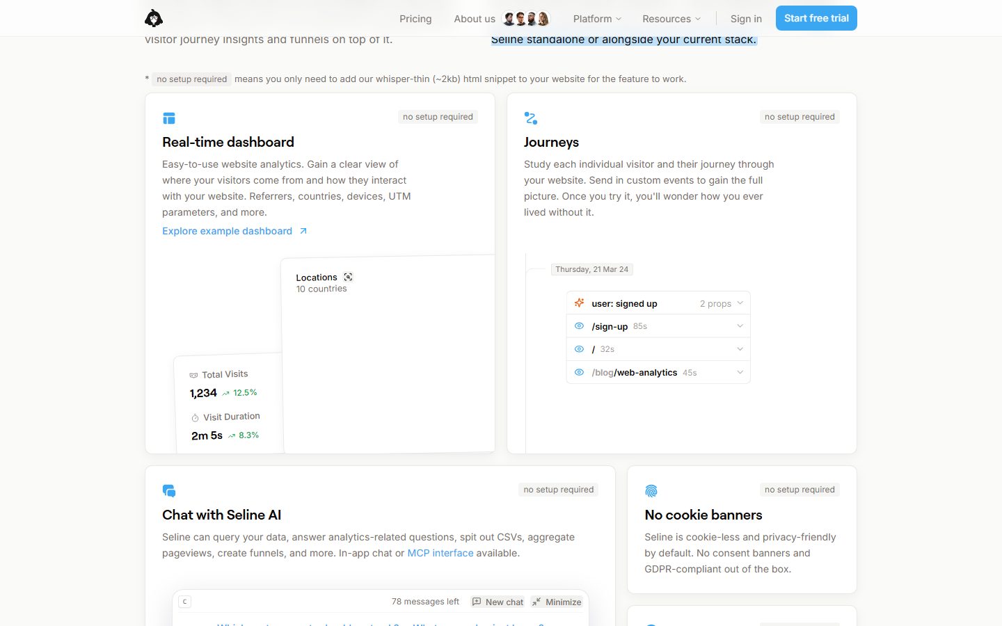
Brand voltage comes from **real product UI fragments embedded directly inside white cards** — dashboards with bar charts, visitor-journey lists, funnel conversions, revenue attribution, and a "Chat with Seline AI" panel. Seline doesn't illustrate analytics; it shows the actual product chrome at small scale inside the marketing grid. The chart greens (`{colors.success}` family) and the occasional red (`{colors.error}`) are not decorative brand colors — they are the product's own data colors surfaced as content.
**Key Characteristics:**
- Warm stone-gray canvas (`{colors.canvas}` — #fafaf9) instead of pure white, with white product cards layered on top. This near-white-on-off-white contrast is the system's signature surface relationship.
- A single sky-blue accent (`{colors.accent}` — #3ba6f1) on the primary CTA and inline links. The brand is otherwise monochrome warm gray.
- Lightweight Roobert headlines (weight 400) with negative letter-spacing — never bold. Body and UI run on Inter 14px.
- Soft cards at `{rounded.xl}` (10px) with a faint `0 4px 16px rgba(0,0,0,0.05)` drop shadow — low, diffuse, never heavy.
- Pill geometry everywhere: buttons, badges ("no setup required", "optional"), and avatars all use `{rounded.pill}` (9999px) — by far the most-measured radius (208 occurrences).
- Real product UI fragments shown in-card — dashboards, journeys, funnels, revenue tracking, AI chat — using the product's own green/red data palette.
- Generous vertical rhythm with `{spacing.section}` (96px) between major bands and tight 8–11px padding inside chips and controls.
## Colors
### Brand & Accent
- **Accent** (`{colors.accent}` — #3ba6f1): The single brand color. Primary CTA background ("Start free trial"), inline text links ("Explore example dashboard", "MCP interface"), and small product-feature glyph icons. Used sparingly — Seline is a near-monochrome brand with one blue.
### Text
- **Ink** (`{colors.ink}` — #0c0a09): Headlines and primary text — maximum contrast against canvas.
- **Ink Strong** (`{colors.ink-strong}` — #1c1917): A secondary near-black used for emphasized inline labels and dense data values.
- **Body** (`{colors.body}` — #78716c): The dominant running-text color (most-measured color overall) — a warm stone gray.
- **Muted** (`{colors.muted}` — #a8a29e): Tertiary text — captions, badge labels, fine print.
- **Muted Cool** (`{colors.muted-cool}` — #9ca3af): A cooler tertiary gray appearing inside product-UI fragments.
- **On Primary** (`{colors.on-primary}` — #78726d): Measured button text color (see Known Gaps — the blue CTA appears to use white labels in screenshots while the analyzer sampled this neutral gray, likely from a ghost/secondary control).
### Surface
- **Canvas** (`{colors.canvas}` — #fafaf9): The warm stone page floor.
- **Surface** (`{colors.surface}` — #ffffff): All cards, inputs, and the product-UI fragments.
- **Surface Soft** (`{colors.surface-soft}` — #f5f5f4): Badge-pill backgrounds, soft fills, avatar backgrounds.
- **Surface Cool** (`{colors.surface-cool}` — #f8fafc): A cooler very-light fill used inside some product-UI panels.
### Hairlines
- **Hairline** (`{colors.hairline}` — #e7e5e4): The default 1px divider/border tone on warm surfaces.
- **Hairline Strong** (`{colors.hairline-strong}` — #d6d3d1): A slightly darker border used on emphasized edges.
- **Hairline Cool** (`{colors.hairline-cool}` — #e5e7eb): A cooler hairline used inside product-UI fragments.
### Semantic (sourced from product data colors)
- **Success** (`{colors.success}` — #16a34a): Positive metric deltas (e.g., "+12.5%"), conversion gains.
- **Success Bright** (`{colors.success-bright}` — #22c55e): Brighter chart fills / progress bars.
- **Success Soft** (`{colors.success-soft}` — #86efac): Light green chart backgrounds and heatmap cells.
- **Success Strong** (`{colors.success-strong}` — #15803d): Deepest green for emphasized data labels.
- **Error** (`{colors.error}` — #dc2626): Negative deltas and drop-off markers in funnels.
- **Dark** (`{colors.dark}` — #111827): A cool near-black used in some product-UI chrome.
## Typography
### Font Family
The system runs **Roobert** for display headlines (h1/h2/h3) and **Inter** for body, buttons, and UI. Roobert is a commercial geometric sans (Displaay Type Foundry) — Seline uses it at weight 400 with negative letter-spacing for an understated, modern-engineered headline voice. Inter handles everything at the working layer.
The split is strict:
- Roobert (display, weight 400, -0.1 to -1.1px tracking) — h1, h2, h3
- Inter (body + UI, weight 400, ~0 tracking) — paragraphs, labels, buttons, nav
### Hierarchy
| Token | Size | Weight | Line Height | Letter Spacing | Use |
|---|---|---|---|---|---|
| `{typography.display}` | 52px | 400 | 1.115 | -1.1px | Hero h1 ("The simple & actionable Google Analytics alternative") — Roobert |
| `{typography.heading}` | 32px | 400 | 1.25 | -0.8px | Section heads ("Why Seline?", "Get Seline running in minutes") — Roobert |
| `{typography.subheading}` | 20px | 400 | 1.2 | -0.1px | Feature-card titles ("Real-time dashboard", "Journeys") — Roobert |
| `{typography.body}` | 14px | 400 | 1.643 | 0.05px | Default running-text, card descriptions, captions — Inter |
| `{typography.button}` | 14px | 400 | 1.643 | normal | Button labels, nav links — Inter |
### Principles
Roobert headlines stay at weight 400 across all sizes — never bold. The hierarchy is built from size and negative tracking, not weight. Body and button text share the same Inter 14px size; the only difference is letter-spacing (body carries a hair of positive tracking at 0.05px). Keep the Roobert/Inter boundary clean: headlines never run in Inter, body never runs in Roobert.
### Note on Font Substitutes
**Roobert is a commercial/licensed typeface and is not shipped here.** If Roobert is unavailable, **Inter** at weight 400–500 with -0.02em letter-spacing is a usable approximation that preserves the lightweight, slightly-tightened headline character. **Hanken Grotesk** or **General Sans** are closer geometric alternatives if a distinct display face is required. The frontmatter fallback stack lists Inter for this reason.
## Layout
### Spacing System
- **Base unit:** 4px, though the system shows a notable amount of 11px and 6px padding inside chips and controls (derived: the 11px value was the single most-frequent spacing measurement and reflects compact control padding).
- **Tokens:** `{spacing.xxs}` 4px · `{spacing.xs}` 8px · `{spacing.sm}` 12px · `{spacing.md}` 16px · `{spacing.lg}` 24px · `{spacing.xl}` 32px · `{spacing.xxl}` 48px · `{spacing.xxxl}` 64px · `{spacing.wide}` 80px · `{spacing.section}` 96px.
- **Section padding:** `{spacing.section}` (96px) between major editorial bands.
- **Card internal padding:** `{spacing.lg}` (24px) for feature/testimonial cards; `{spacing.md}` (16px) inside product-mockup fragments.
- **Gutters:** `{spacing.lg}` (24px) between cards in the 2-up feature grid; `{spacing.xs}` (8px) inside chip and badge rows.
### Grid & Container
- **Max content width:** ~1200px centered.
- **Hero:** single-column stack — h1, sub-line, dual CTA row, social-proof logos, then a full-width dashboard mockup screenshot below.
- **Feature grids:** primarily 2-up cards ("Real-time dashboard" / "Journeys", "Chat with Seline AI" / "No cookie banners"), dropping to 3-up for the lower-density "Purpose-built analytics" band.
- **Testimonials:** inline 2-up quote rows with avatar + name + role.
### Whitespace Philosophy
Seline uses generous whitespace to make a dense, data-heavy product feel calm. Major bands sit 96px apart; cards breathe at 24px internal padding; and the warm canvas keeps the white cards feeling soft rather than stark. The rhythm is calibrated so each feature card can hold a real product-UI fragment without feeling cramped.
## Elevation & Depth
| Level | Treatment | Use |
|---|---|---|
| Flat | No shadow, hairline border only | Top nav, body sections, badge pills |
| Subtle line | `0 1px 2px rgba(0,0,0,0.05)` | Inputs, small inline controls (17 occurrences) |
| Card | `0 4px 16px rgba(0,0,0,0.05)` | Feature cards, testimonial cards — the default card shadow (29 occurrences) |
| Medium | `0 4px 6px -1px rgba(0,0,0,0.1), 0 2px 4px -2px rgba(0,0,0,0.1)` | Elevated product-UI fragments, dropdowns (12 occurrences) |
| Hero glow | `0 4px 80px rgba(0,0,0,0.15)` / `0 12px 45px rgba(17,12,46,0.12)` | The hero dashboard mockup floating on the canvas (1 occurrence each) |
The elevation philosophy is **soft and low-contrast** — shadows stay at 0.05–0.15 alpha and large blur radii, so cards read as gently lifted rather than dramatically floating. There is no neumorphism or glassmorphism. A single steep directional shadow (`-6px 17px 26px -5px rgba(50,50,93,0.15)`) appears once on a tilted product artifact.
### Decorative Depth
- Product-UI fragments carry their own internal chrome shadows (chart cards, dropdown menus) — these are product content, not system tokens.
- The hero dashboard screenshot uses the largest glow in the system to anchor it above the warm canvas.
## Shapes
### Border Radius Scale
| Token | Value | Use |
|---|---|---|
| `{rounded.xs}` | 2px | Tiny inline markers, chart cells |
| `{rounded.sm}` | 4px | Small chips, table cells, inner UI elements (most-used non-pill radius) |
| `{rounded.md}` | 6px | Text inputs |
| `{rounded.lg}` | 8px | Product-mockup fragment containers |
| `{rounded.xl}` | 10px | Standard content cards (feature, testimonial) |
| `{rounded.xxl}` | 12px | Occasional larger panel |
| `{rounded.huge}` | 16px | Rare large container |
| `{rounded.pill}` | 9999px | Buttons, badges, avatars, tag chips — the dominant interactive shape (208 occurrences) |
### Photography & Icon Geometry
Avatars render as `{rounded.pill}` circles (~24px) in testimonial rows. Small product-feature glyph icons (the blue dashboard / journeys / chat marks) sit in the top-left of each feature card. Product-UI fragments retain their native internal radii (chart bars, dropdown rows).
## Components
### Top Navigation
**`top-nav`** — Transparent bar over the canvas (`{colors.canvas}`). Carries the Seline owl logo at left, center menu (Pricing, About us with a small avatar cluster, Platform ▾, Resources ▾), and a right cluster with "Sign in" `{component.nav-link}` and a "Start free trial" `{component.button-primary}`. Menu items in `{typography.button}` / `{colors.body}`.
**`nav-link`** — Inline transparent nav item in `{colors.body}`, type `{typography.button}`. Used for "Pricing", "About us", "Sign in" and dropdown triggers.
### Buttons
**`button-primary`** — The blue CTA ("Start free trial"). Background `{colors.accent}` (#3ba6f1), pill radius `{rounded.pill}`, type `{typography.button}`, padding ~8px × 12px. Text reads as white (`{colors.surface}`) in screenshots — see Known Gaps regarding the measured label color.
**`button-secondary`** — White ghost button ("View live demo", "Get a demo"). Background `{colors.surface}`, text `{colors.on-primary}` (#78726d), 1px hairline border, same pill radius and padding as primary.
**`text-link`** — Inline blue link in `{colors.accent}`, type `{typography.body}`. Used for "Explore example dashboard", "MCP interface", "Seline's guide to funnels", etc.
### Cards & Containers
**`card`** — The base white card: background `{colors.surface}`, rounded `{rounded.xl}` (10px), shadow `0 4px 16px rgba(0,0,0,0.05)`, padding `{spacing.lg}` (24px).
**`feature-card`** — Primary 2-up feature card ("Real-time dashboard", "Journeys", "Chat with Seline AI", "No cookie banners"). Background `{colors.surface}`, rounded `{rounded.xl}`, padding `{spacing.lg}`. Holds a small blue glyph icon top-left, a "no setup required" / "optional" `{component.badge-pill}` top-right, a `{typography.subheading}` title, a `{typography.body}` description, and an embedded `{component.product-mockup-card}`.
**`product-mockup-card`** — A nested white panel showing real product UI (locations list, visitor journey, funnel chart, revenue line graph, AI chat). Background `{colors.surface}`, rounded `{rounded.lg}` (8px), padding `{spacing.md}` (16px). Uses the product's own green/red data palette (`{colors.success}`, `{colors.error}`) internally.
**`testimonial-card`** — Customer-quote block with a top star row, the quote in `{typography.body}`, and a footer row carrying an `{component.avatar-circle}` + name + role. Background `{colors.surface}`, rounded `{rounded.xl}`, padding `{spacing.lg}`.
### Inputs & Forms
**`input`** — Text input. Background `{colors.surface}`, rounded `{rounded.md}` (6px), 1px hairline border in `{colors.hairline}`, type `{typography.body}`, padding ~8px × 12px. Used in the AI chat field ("Ask Seline…") and email capture.
### Tags / Badges / Data
**`badge-pill`** — Small status chip ("no setup required", "optional"). Background `{colors.surface-soft}` (#f5f5f4), text `{colors.muted}`, type `{typography.button}`, rounded `{rounded.pill}`, padding ~4px × 8px.
**`metric-delta-positive`** — Inline positive metric delta ("+12.5%", "+8.3%") in `{colors.success}`, type `{typography.body}`. Negative deltas use `{colors.error}`.
**`avatar-circle`** — ~24px circular avatar (`{rounded.pill}`) used in the nav "About us" cluster and testimonial footers. Background `{colors.surface-soft}` when holding initials.
## Do's and Don'ts
### Do
- Keep the canvas warm (`{colors.canvas}` — #fafaf9) and float white cards on top. The off-white-on-off-white relationship is the system's signature.
- Reserve `{colors.accent}` (#3ba6f1) for the primary CTA, inline links, and small product glyphs. Seline is monochrome warm-gray everywhere else.
- Set headlines in Roobert at weight 400 with negative letter-spacing. Build hierarchy from size + tracking, never from bold weight.
- Embed real product-UI fragments inside feature cards. Show the actual dashboard, journey list, and funnel — don't illustrate them.
- Let the green/red semantic palette appear only inside data/metric contexts (deltas, charts, funnels). They are data colors, not brand colors.
- Use pill radius (`{rounded.pill}`) for buttons, badges, and avatars; reserve `{rounded.xl}` (10px) for content cards.
- Keep shadows soft and low-alpha (0.05). Cards should feel gently lifted, not dramatically floating.
### Don't
- Don't bold Roobert headlines. Weight 400 is the voice; heavier weights read as off-brand.
- Don't introduce a second accent hue. The blue is the only brand color; greens and reds belong to product data.
- Don't put body copy in Roobert or headlines in Inter.
- Don't use heavy or high-contrast drop shadows — the system caps at ~0.15 alpha and only on the hero mockup.
- Don't place blue CTAs on dark surfaces; the system has no dark band — everything stays on warm canvas + white cards.
- Don't add hover-state styling beyond default and pressed.
## Responsive Behavior
The analysis captured a single landing page at desktop width, so breakpoint values below are inferred from the layout structure rather than measured. Treat them as guidance, not extracted tokens.
### Breakpoints (inferred)
| Name | Width | Key Changes |
|---|---|---|
| Mobile | < 768px | Hamburger nav; hero h1 52→~32px; dual CTA row stacks; feature grid 2-up → 1-up; product mockups scale to full width |
| Tablet | 768–1024px | Nav tightens; feature cards stay 2-up; "Purpose-built" band 3-up → 2-up |
| Desktop | 1024–1440px | Full horizontal nav; 2-up feature grid; full hero dashboard mockup |
| Wide | > 1440px | Content caps at ~1200px with added outer margin |
### Touch Targets
- `{component.button-primary}` / `{component.button-secondary}` use ~8px × 12px padding on `{typography.button}` text; verify tap area reaches 44px at mobile (not measured).
- `{component.input}` and AI-chat field padding is compact — confirm height at small breakpoints.
### Collapsing Strategy
- Feature grids reduce columns (2→1) rather than shrinking cards.
- Product-UI fragments retain native aspect ratios while their containing cards resize.
- The hero dashboard screenshot scales proportionally; keep chart legibility in mind on mobile.
## Iteration Guide
1. Focus on ONE component at a time. Reference its YAML key directly (`{component.feature-card}`, `{component.product-mockup-card}`).
2. Variants (`-secondary`, `-active`, future `-disabled`) live as separate entries in `components:`.
3. Use `{token.refs}` everywhere — never inline hex in a component.
4. Never document hover. Default and active/pressed states only.
5. Headlines stay Roobert 400 with negative tracking; body stays Inter 14px. The boundary does not blur.
6. The single blue accent is scarce by design. Add new accents only as documented tokens with a clear rationale.
7. Greens and reds are product-data colors — keep them inside metric/chart contexts.
## Known Gaps
- The measured `button-primary` returned `color: #78726d` (a neutral warm gray), `radius: 0px`, and `padding: 0px 12px` — this conflicts with the screenshots, where the "Start free trial" CTA is a blue pill with a white label. The analyzer most likely sampled a ghost/text button or an unstyled wrapper. The documented `button-primary` uses `{colors.accent}` background, `{colors.surface}` (white) text, and `{rounded.pill}` based on screenshot ground truth + the dominant 9999px radius (208 occurrences); the raw measured neutral text color is preserved as `{colors.on-primary}` and applied to `button-secondary`.
- **Roobert is a commercial typeface** (it was not flagged in `fonts_licensed`, which came back empty, but it is licensed). It is not shipped here; open-source substitutes are documented in the Typography section.
- Only the landing page was captured; no breakpoint widths, hamburger nav, or mobile layouts were measured — responsive values are inferred.
- The 11px (167×) and 6px (43×) spacing measurements are high-frequency but don't fit the 4px base cleanly; they are treated as compact control padding (derived) rather than promoted to named tokens.
- Hover, focus, disabled, and error states for inputs and buttons were not extracted — only default styling is documented.
- The green/red semantic colors are sampled from product-UI chart fragments; their exact roles (positive/negative thresholds, chart series mapping) are inferred from context.
- Animation and transition timings (chart loads, dropdown reveals, AI-chat interactions) are out of scope.
- Footer styling was not captured in the measured data and is not documented.
<!-- Documented by duply · real-world design systems as ready-to-use DESIGN.md for AI coding agents · https://duply.ai/seline/design-md -->
Color Palette
Accent
Neutrals
Typography
display52px · 400 · 1.115
The quick brown fox jumpsheading32px · 400 · 1.25
The quick brown fox jumpssubheading20px · 400 · 1.2
The quick brown fox jumpsbody14px · 400 · 1.643
The quick brown fox jumpsbutton14px · 400 · 1.643
The quick brown fox jumpsSpacing & Shape
Spacing
| Name | Value | Preview |
|---|---|---|
| xxs | 4px | |
| xs | 8px | |
| sm | 12px | |
| md | 16px | |
| lg | 24px | |
| xl | 32px | |
| xxl | 48px | |
| xxxl | 64px | |
| wide | 80px | |
| section | 96px |
Border Radius
| Name | Value | Preview |
|---|---|---|
| xs | 2px | |
| sm | 4px | |
| md | 6px | |
| lg | 8px | |
| xl | 10px | |
| xxl | 12px | |
| huge | 16px | |
| pill | 9999px |
More like this


---
version: alpha
name: Seline-design-analysis
description: A calm, privacy-first analytics SaaS interface built on a warm stone-gray canvas (#fafaf9) with white product cards, a single sky-blue accent, and lightweight Roobert display headlines paired with Inter body text. The system reads as quiet, engineered, and trustworthy — generous whitespace, soft 10px cards holding real product UI fragments (dashboards, funnels, journeys), pill-shaped controls everywhere, and a restrained green/red semantic palette borrowed from the analytics charts themselves.

colors:
  ink: "#0c0a09"
  ink-strong: "#1c1917"
  body: "#78716c"
  muted: "#a8a29e"
  muted-cool: "#9ca3af"
  on-primary: "#78726d"
  accent: "#3ba6f1"
  canvas: "#fafaf9"
  surface: "#ffffff"
  surface-soft: "#f5f5f4"
  surface-cool: "#f8fafc"
  hairline: "#e7e5e4"
  hairline-strong: "#d6d3d1"
  hairline-cool: "#e5e7eb"
  dark: "#111827"
  success: "#16a34a"
  success-bright: "#22c55e"
  success-soft: "#86efac"
  success-strong: "#15803d"
  error: "#dc2626"

typography:
  display:
    fontFamily: "Roobert, Inter, sans-serif"
    fontSize: 52px
    fontWeight: 400
    lineHeight: 1.115
    letterSpacing: -1.1px
  heading:
    fontFamily: "Roobert, Inter, sans-serif"
    fontSize: 32px
    fontWeight: 400
    lineHeight: 1.25
    letterSpacing: -0.8px
  subheading:
    fontFamily: "Roobert, Inter, sans-serif"
    fontSize: 20px
    fontWeight: 400
    lineHeight: 1.2
    letterSpacing: -0.1px
  body:
    fontFamily: "Inter, sans-serif"
    fontSize: 14px
    fontWeight: 400
    lineHeight: 1.643
    letterSpacing: 0.05px
  button:
    fontFamily: "Inter, sans-serif"
    fontSize: 14px
    fontWeight: 400
    lineHeight: 1.643
    letterSpacing: normal

rounded:
  xs: 2px
  sm: 4px
  md: 6px
  lg: 8px
  xl: 10px
  xxl: 12px
  huge: 16px
  pill: 9999px

spacing:
  xxs: 4px
  xs: 8px
  sm: 12px
  md: 16px
  lg: 24px
  xl: 32px
  xxl: 48px
  xxxl: 64px
  wide: 80px
  section: 96px

components:
  button-primary:
    backgroundColor: "{colors.accent}"
    textColor: "{colors.surface}"
    typography: "{typography.button}"
    rounded: "{rounded.pill}"
    padding: 8px 12px
  button-secondary:
    backgroundColor: "{colors.surface}"
    textColor: "{colors.on-primary}"
    typography: "{typography.button}"
    rounded: "{rounded.pill}"
    padding: 8px 12px
  text-link:
    backgroundColor: transparent
    textColor: "{colors.accent}"
    typography: "{typography.body}"
  nav-link:
    backgroundColor: transparent
    textColor: "{colors.body}"
    typography: "{typography.button}"
  top-nav:
    backgroundColor: "{colors.canvas}"
    textColor: "{colors.body}"
    typography: "{typography.button}"
  card:
    backgroundColor: "{colors.surface}"
    textColor: "{colors.ink}"
    typography: "{typography.body}"
    rounded: "{rounded.xl}"
    padding: 24px
  feature-card:
    backgroundColor: "{colors.surface}"
    textColor: "{colors.ink}"
    typography: "{typography.subheading}"
    rounded: "{rounded.xl}"
    padding: 24px
  product-mockup-card:
    backgroundColor: "{colors.surface}"
    textColor: "{colors.ink}"
    rounded: "{rounded.lg}"
    padding: 16px
  testimonial-card:
    backgroundColor: "{colors.surface}"
    textColor: "{colors.body}"
    typography: "{typography.body}"
    rounded: "{rounded.xl}"
    padding: 24px
  input:
    backgroundColor: "{colors.surface}"
    textColor: "{colors.ink}"
    typography: "{typography.body}"
    rounded: "{rounded.md}"
    padding: 8px 12px
  badge-pill:
    backgroundColor: "{colors.surface-soft}"
    textColor: "{colors.muted}"
    typography: "{typography.button}"
    rounded: "{rounded.pill}"
    padding: 4px 8px
  metric-delta-positive:
    backgroundColor: transparent
    textColor: "{colors.success}"
    typography: "{typography.body}"
  avatar-circle:
    backgroundColor: "{colors.surface-soft}"
    textColor: "{colors.ink}"
    rounded: "{rounded.pill}"
    size: 24px
---

## Overview

Seline is a privacy-first web-analytics product, and its marketing surface reads exactly like the product it sells: quiet, engineered, and trustworthy. The page sits on a warm stone-gray canvas (`{colors.canvas}` — #fafaf9) with white cards (`{colors.surface}` — #ffffff) floating above it. There is exactly one brand accent — a sky blue (`{colors.accent}` — #3ba6f1) used on the primary CTA, inline links, and small product-icon glyphs. Everything else is achromatic warm gray.

The type voice splits cleanly into two roles: **Roobert** (a geometric display face) for all headlines at weight 400 with negative letter-spacing, and **Inter** for body and UI text at 14px. The lightweight (400) headlines are distinctive — Seline never bolds its display type; the negative tracking (-0.1px to -1.1px) does the tightening instead. The overall effect is understated and confident rather than loud.

Brand voltage comes from **real product UI fragments embedded directly inside white cards** — dashboards with bar charts, visitor-journey lists, funnel conversions, revenue attribution, and a "Chat with Seline AI" panel. Seline doesn't illustrate analytics; it shows the actual product chrome at small scale inside the marketing grid. The chart greens (`{colors.success}` family) and the occasional red (`{colors.error}`) are not decorative brand colors — they are the product's own data colors surfaced as content.

**Key Characteristics:**
- Warm stone-gray canvas (`{colors.canvas}` — #fafaf9) instead of pure white, with white product cards layered on top. This near-white-on-off-white contrast is the system's signature surface relationship.
- A single sky-blue accent (`{colors.accent}` — #3ba6f1) on the primary CTA and inline links. The brand is otherwise monochrome warm gray.
- Lightweight Roobert headlines (weight 400) with negative letter-spacing — never bold. Body and UI run on Inter 14px.
- Soft cards at `{rounded.xl}` (10px) with a faint `0 4px 16px rgba(0,0,0,0.05)` drop shadow — low, diffuse, never heavy.
- Pill geometry everywhere: buttons, badges ("no setup required", "optional"), and avatars all use `{rounded.pill}` (9999px) — by far the most-measured radius (208 occurrences).
- Real product UI fragments shown in-card — dashboards, journeys, funnels, revenue tracking, AI chat — using the product's own green/red data palette.
- Generous vertical rhythm with `{spacing.section}` (96px) between major bands and tight 8–11px padding inside chips and controls.

## Colors

### Brand & Accent
- **Accent** (`{colors.accent}` — #3ba6f1): The single brand color. Primary CTA background ("Start free trial"), inline text links ("Explore example dashboard", "MCP interface"), and small product-feature glyph icons. Used sparingly — Seline is a near-monochrome brand with one blue.

### Text
- **Ink** (`{colors.ink}` — #0c0a09): Headlines and primary text — maximum contrast against canvas.
- **Ink Strong** (`{colors.ink-strong}` — #1c1917): A secondary near-black used for emphasized inline labels and dense data values.
- **Body** (`{colors.body}` — #78716c): The dominant running-text color (most-measured color overall) — a warm stone gray.
- **Muted** (`{colors.muted}` — #a8a29e): Tertiary text — captions, badge labels, fine print.
- **Muted Cool** (`{colors.muted-cool}` — #9ca3af): A cooler tertiary gray appearing inside product-UI fragments.
- **On Primary** (`{colors.on-primary}` — #78726d): Measured button text color (see Known Gaps — the blue CTA appears to use white labels in screenshots while the analyzer sampled this neutral gray, likely from a ghost/secondary control).

### Surface
- **Canvas** (`{colors.canvas}` — #fafaf9): The warm stone page floor.
- **Surface** (`{colors.surface}` — #ffffff): All cards, inputs, and the product-UI fragments.
- **Surface Soft** (`{colors.surface-soft}` — #f5f5f4): Badge-pill backgrounds, soft fills, avatar backgrounds.
- **Surface Cool** (`{colors.surface-cool}` — #f8fafc): A cooler very-light fill used inside some product-UI panels.

### Hairlines
- **Hairline** (`{colors.hairline}` — #e7e5e4): The default 1px divider/border tone on warm surfaces.
- **Hairline Strong** (`{colors.hairline-strong}` — #d6d3d1): A slightly darker border used on emphasized edges.
- **Hairline Cool** (`{colors.hairline-cool}` — #e5e7eb): A cooler hairline used inside product-UI fragments.

### Semantic (sourced from product data colors)
- **Success** (`{colors.success}` — #16a34a): Positive metric deltas (e.g., "+12.5%"), conversion gains.
- **Success Bright** (`{colors.success-bright}` — #22c55e): Brighter chart fills / progress bars.
- **Success Soft** (`{colors.success-soft}` — #86efac): Light green chart backgrounds and heatmap cells.
- **Success Strong** (`{colors.success-strong}` — #15803d): Deepest green for emphasized data labels.
- **Error** (`{colors.error}` — #dc2626): Negative deltas and drop-off markers in funnels.
- **Dark** (`{colors.dark}` — #111827): A cool near-black used in some product-UI chrome.

## Typography

### Font Family
The system runs **Roobert** for display headlines (h1/h2/h3) and **Inter** for body, buttons, and UI. Roobert is a commercial geometric sans (Displaay Type Foundry) — Seline uses it at weight 400 with negative letter-spacing for an understated, modern-engineered headline voice. Inter handles everything at the working layer.

The split is strict:
- Roobert (display, weight 400, -0.1 to -1.1px tracking) — h1, h2, h3
- Inter (body + UI, weight 400, ~0 tracking) — paragraphs, labels, buttons, nav

### Hierarchy

| Token | Size | Weight | Line Height | Letter Spacing | Use |
|---|---|---|---|---|---|
| `{typography.display}` | 52px | 400 | 1.115 | -1.1px | Hero h1 ("The simple & actionable Google Analytics alternative") — Roobert |
| `{typography.heading}` | 32px | 400 | 1.25 | -0.8px | Section heads ("Why Seline?", "Get Seline running in minutes") — Roobert |
| `{typography.subheading}` | 20px | 400 | 1.2 | -0.1px | Feature-card titles ("Real-time dashboard", "Journeys") — Roobert |
| `{typography.body}` | 14px | 400 | 1.643 | 0.05px | Default running-text, card descriptions, captions — Inter |
| `{typography.button}` | 14px | 400 | 1.643 | normal | Button labels, nav links — Inter |

### Principles
Roobert headlines stay at weight 400 across all sizes — never bold. The hierarchy is built from size and negative tracking, not weight. Body and button text share the same Inter 14px size; the only difference is letter-spacing (body carries a hair of positive tracking at 0.05px). Keep the Roobert/Inter boundary clean: headlines never run in Inter, body never runs in Roobert.

### Note on Font Substitutes
**Roobert is a commercial/licensed typeface and is not shipped here.** If Roobert is unavailable, **Inter** at weight 400–500 with -0.02em letter-spacing is a usable approximation that preserves the lightweight, slightly-tightened headline character. **Hanken Grotesk** or **General Sans** are closer geometric alternatives if a distinct display face is required. The frontmatter fallback stack lists Inter for this reason.

## Layout

### Spacing System
- **Base unit:** 4px, though the system shows a notable amount of 11px and 6px padding inside chips and controls (derived: the 11px value was the single most-frequent spacing measurement and reflects compact control padding).
- **Tokens:** `{spacing.xxs}` 4px · `{spacing.xs}` 8px · `{spacing.sm}` 12px · `{spacing.md}` 16px · `{spacing.lg}` 24px · `{spacing.xl}` 32px · `{spacing.xxl}` 48px · `{spacing.xxxl}` 64px · `{spacing.wide}` 80px · `{spacing.section}` 96px.
- **Section padding:** `{spacing.section}` (96px) between major editorial bands.
- **Card internal padding:** `{spacing.lg}` (24px) for feature/testimonial cards; `{spacing.md}` (16px) inside product-mockup fragments.
- **Gutters:** `{spacing.lg}` (24px) between cards in the 2-up feature grid; `{spacing.xs}` (8px) inside chip and badge rows.

### Grid & Container
- **Max content width:** ~1200px centered.
- **Hero:** single-column stack — h1, sub-line, dual CTA row, social-proof logos, then a full-width dashboard mockup screenshot below.
- **Feature grids:** primarily 2-up cards ("Real-time dashboard" / "Journeys", "Chat with Seline AI" / "No cookie banners"), dropping to 3-up for the lower-density "Purpose-built analytics" band.
- **Testimonials:** inline 2-up quote rows with avatar + name + role.

### Whitespace Philosophy
Seline uses generous whitespace to make a dense, data-heavy product feel calm. Major bands sit 96px apart; cards breathe at 24px internal padding; and the warm canvas keeps the white cards feeling soft rather than stark. The rhythm is calibrated so each feature card can hold a real product-UI fragment without feeling cramped.

## Elevation & Depth

| Level | Treatment | Use |
|---|---|---|
| Flat | No shadow, hairline border only | Top nav, body sections, badge pills |
| Subtle line | `0 1px 2px rgba(0,0,0,0.05)` | Inputs, small inline controls (17 occurrences) |
| Card | `0 4px 16px rgba(0,0,0,0.05)` | Feature cards, testimonial cards — the default card shadow (29 occurrences) |
| Medium | `0 4px 6px -1px rgba(0,0,0,0.1), 0 2px 4px -2px rgba(0,0,0,0.1)` | Elevated product-UI fragments, dropdowns (12 occurrences) |
| Hero glow | `0 4px 80px rgba(0,0,0,0.15)` / `0 12px 45px rgba(17,12,46,0.12)` | The hero dashboard mockup floating on the canvas (1 occurrence each) |

The elevation philosophy is **soft and low-contrast** — shadows stay at 0.05–0.15 alpha and large blur radii, so cards read as gently lifted rather than dramatically floating. There is no neumorphism or glassmorphism. A single steep directional shadow (`-6px 17px 26px -5px rgba(50,50,93,0.15)`) appears once on a tilted product artifact.

### Decorative Depth
- Product-UI fragments carry their own internal chrome shadows (chart cards, dropdown menus) — these are product content, not system tokens.
- The hero dashboard screenshot uses the largest glow in the system to anchor it above the warm canvas.

## Shapes

### Border Radius Scale

| Token | Value | Use |
|---|---|---|
| `{rounded.xs}` | 2px | Tiny inline markers, chart cells |
| `{rounded.sm}` | 4px | Small chips, table cells, inner UI elements (most-used non-pill radius) |
| `{rounded.md}` | 6px | Text inputs |
| `{rounded.lg}` | 8px | Product-mockup fragment containers |
| `{rounded.xl}` | 10px | Standard content cards (feature, testimonial) |
| `{rounded.xxl}` | 12px | Occasional larger panel |
| `{rounded.huge}` | 16px | Rare large container |
| `{rounded.pill}` | 9999px | Buttons, badges, avatars, tag chips — the dominant interactive shape (208 occurrences) |

### Photography & Icon Geometry
Avatars render as `{rounded.pill}` circles (~24px) in testimonial rows. Small product-feature glyph icons (the blue dashboard / journeys / chat marks) sit in the top-left of each feature card. Product-UI fragments retain their native internal radii (chart bars, dropdown rows).

## Components

### Top Navigation

**`top-nav`** — Transparent bar over the canvas (`{colors.canvas}`). Carries the Seline owl logo at left, center menu (Pricing, About us with a small avatar cluster, Platform ▾, Resources ▾), and a right cluster with "Sign in" `{component.nav-link}` and a "Start free trial" `{component.button-primary}`. Menu items in `{typography.button}` / `{colors.body}`.

**`nav-link`** — Inline transparent nav item in `{colors.body}`, type `{typography.button}`. Used for "Pricing", "About us", "Sign in" and dropdown triggers.

### Buttons

**`button-primary`** — The blue CTA ("Start free trial"). Background `{colors.accent}` (#3ba6f1), pill radius `{rounded.pill}`, type `{typography.button}`, padding ~8px × 12px. Text reads as white (`{colors.surface}`) in screenshots — see Known Gaps regarding the measured label color.

**`button-secondary`** — White ghost button ("View live demo", "Get a demo"). Background `{colors.surface}`, text `{colors.on-primary}` (#78726d), 1px hairline border, same pill radius and padding as primary.

**`text-link`** — Inline blue link in `{colors.accent}`, type `{typography.body}`. Used for "Explore example dashboard", "MCP interface", "Seline's guide to funnels", etc.

### Cards & Containers

**`card`** — The base white card: background `{colors.surface}`, rounded `{rounded.xl}` (10px), shadow `0 4px 16px rgba(0,0,0,0.05)`, padding `{spacing.lg}` (24px).

**`feature-card`** — Primary 2-up feature card ("Real-time dashboard", "Journeys", "Chat with Seline AI", "No cookie banners"). Background `{colors.surface}`, rounded `{rounded.xl}`, padding `{spacing.lg}`. Holds a small blue glyph icon top-left, a "no setup required" / "optional" `{component.badge-pill}` top-right, a `{typography.subheading}` title, a `{typography.body}` description, and an embedded `{component.product-mockup-card}`.

**`product-mockup-card`** — A nested white panel showing real product UI (locations list, visitor journey, funnel chart, revenue line graph, AI chat). Background `{colors.surface}`, rounded `{rounded.lg}` (8px), padding `{spacing.md}` (16px). Uses the product's own green/red data palette (`{colors.success}`, `{colors.error}`) internally.

**`testimonial-card`** — Customer-quote block with a top star row, the quote in `{typography.body}`, and a footer row carrying an `{component.avatar-circle}` + name + role. Background `{colors.surface}`, rounded `{rounded.xl}`, padding `{spacing.lg}`.

### Inputs & Forms

**`input`** — Text input. Background `{colors.surface}`, rounded `{rounded.md}` (6px), 1px hairline border in `{colors.hairline}`, type `{typography.body}`, padding ~8px × 12px. Used in the AI chat field ("Ask Seline…") and email capture.

### Tags / Badges / Data

**`badge-pill`** — Small status chip ("no setup required", "optional"). Background `{colors.surface-soft}` (#f5f5f4), text `{colors.muted}`, type `{typography.button}`, rounded `{rounded.pill}`, padding ~4px × 8px.

**`metric-delta-positive`** — Inline positive metric delta ("+12.5%", "+8.3%") in `{colors.success}`, type `{typography.body}`. Negative deltas use `{colors.error}`.

**`avatar-circle`** — ~24px circular avatar (`{rounded.pill}`) used in the nav "About us" cluster and testimonial footers. Background `{colors.surface-soft}` when holding initials.

## Do's and Don'ts

### Do
- Keep the canvas warm (`{colors.canvas}` — #fafaf9) and float white cards on top. The off-white-on-off-white relationship is the system's signature.
- Reserve `{colors.accent}` (#3ba6f1) for the primary CTA, inline links, and small product glyphs. Seline is monochrome warm-gray everywhere else.
- Set headlines in Roobert at weight 400 with negative letter-spacing. Build hierarchy from size + tracking, never from bold weight.
- Embed real product-UI fragments inside feature cards. Show the actual dashboard, journey list, and funnel — don't illustrate them.
- Let the green/red semantic palette appear only inside data/metric contexts (deltas, charts, funnels). They are data colors, not brand colors.
- Use pill radius (`{rounded.pill}`) for buttons, badges, and avatars; reserve `{rounded.xl}` (10px) for content cards.
- Keep shadows soft and low-alpha (0.05). Cards should feel gently lifted, not dramatically floating.

### Don't
- Don't bold Roobert headlines. Weight 400 is the voice; heavier weights read as off-brand.
- Don't introduce a second accent hue. The blue is the only brand color; greens and reds belong to product data.
- Don't put body copy in Roobert or headlines in Inter.
- Don't use heavy or high-contrast drop shadows — the system caps at ~0.15 alpha and only on the hero mockup.
- Don't place blue CTAs on dark surfaces; the system has no dark band — everything stays on warm canvas + white cards.
- Don't add hover-state styling beyond default and pressed.

## Responsive Behavior

The analysis captured a single landing page at desktop width, so breakpoint values below are inferred from the layout structure rather than measured. Treat them as guidance, not extracted tokens.

### Breakpoints (inferred)

| Name | Width | Key Changes |
|---|---|---|
| Mobile | < 768px | Hamburger nav; hero h1 52→~32px; dual CTA row stacks; feature grid 2-up → 1-up; product mockups scale to full width |
| Tablet | 768–1024px | Nav tightens; feature cards stay 2-up; "Purpose-built" band 3-up → 2-up |
| Desktop | 1024–1440px | Full horizontal nav; 2-up feature grid; full hero dashboard mockup |
| Wide | > 1440px | Content caps at ~1200px with added outer margin |

### Touch Targets
- `{component.button-primary}` / `{component.button-secondary}` use ~8px × 12px padding on `{typography.button}` text; verify tap area reaches 44px at mobile (not measured).
- `{component.input}` and AI-chat field padding is compact — confirm height at small breakpoints.

### Collapsing Strategy
- Feature grids reduce columns (2→1) rather than shrinking cards.
- Product-UI fragments retain native aspect ratios while their containing cards resize.
- The hero dashboard screenshot scales proportionally; keep chart legibility in mind on mobile.

## Iteration Guide

1. Focus on ONE component at a time. Reference its YAML key directly (`{component.feature-card}`, `{component.product-mockup-card}`).
2. Variants (`-secondary`, `-active`, future `-disabled`) live as separate entries in `components:`.
3. Use `{token.refs}` everywhere — never inline hex in a component.
4. Never document hover. Default and active/pressed states only.
5. Headlines stay Roobert 400 with negative tracking; body stays Inter 14px. The boundary does not blur.
6. The single blue accent is scarce by design. Add new accents only as documented tokens with a clear rationale.
7. Greens and reds are product-data colors — keep them inside metric/chart contexts.

## Known Gaps

- The measured `button-primary` returned `color: #78726d` (a neutral warm gray), `radius: 0px`, and `padding: 0px 12px` — this conflicts with the screenshots, where the "Start free trial" CTA is a blue pill with a white label. The analyzer most likely sampled a ghost/text button or an unstyled wrapper. The documented `button-primary` uses `{colors.accent}` background, `{colors.surface}` (white) text, and `{rounded.pill}` based on screenshot ground truth + the dominant 9999px radius (208 occurrences); the raw measured neutral text color is preserved as `{colors.on-primary}` and applied to `button-secondary`.
- **Roobert is a commercial typeface** (it was not flagged in `fonts_licensed`, which came back empty, but it is licensed). It is not shipped here; open-source substitutes are documented in the Typography section.
- Only the landing page was captured; no breakpoint widths, hamburger nav, or mobile layouts were measured — responsive values are inferred.
- The 11px (167×) and 6px (43×) spacing measurements are high-frequency but don't fit the 4px base cleanly; they are treated as compact control padding (derived) rather than promoted to named tokens.
- Hover, focus, disabled, and error states for inputs and buttons were not extracted — only default styling is documented.
- The green/red semantic colors are sampled from product-UI chart fragments; their exact roles (positive/negative thresholds, chart series mapping) are inferred from context.
- Animation and transition timings (chart loads, dropdown reveals, AI-chat interactions) are out of scope.
- Footer styling was not captured in the measured data and is not documented.

<!-- Documented by duply · real-world design systems as ready-to-use DESIGN.md for AI coding agents · https://duply.ai/seline/design-md -->