Obsidian
A dark-canvas, privacy-first knowledge-app marketing surface built on near-black surfaces, a single violet brand accent, and large system-sans display headlines. The system reads as calm, technical, and confident — flat dark cards holding real product UI (note panes, graph view, plugin toggles), tight letter-spaced display type, and a violet primary CTA as the only saturated color in an otherwise monochrome grayscale palette.
---
version: alpha
name: Obsidian-design-analysis
description: A dark-canvas, privacy-first knowledge-app marketing surface built on near-black surfaces, a single violet brand accent, and large system-sans display headlines. The system reads as calm, technical, and confident — flat dark cards holding real product UI (note panes, graph view, plugin toggles), tight letter-spaced display type, and a violet primary CTA as the only saturated color in an otherwise monochrome grayscale palette.
colors:
accent: "#8b5cf6"
accent-strong: "#7c3aed"
accent-soft: "#a78bfa"
accent-alt: "#8a5cf5"
canvas: "#171717"
canvas-deep: "#000000"
surface: "#1e1e1e"
surface-input: "#1f1f1f"
surface-card: "#262626"
surface-strong: "#363636"
white: "#ffffff"
heading: "#eeeeee"
text-bright: "#e5e5e5"
ink: "#dadada"
ink-soft: "#bcbcbc"
body: "#b3b3b3"
muted: "#a3a3a3"
muted-soft: "#999999"
faint: "#666666"
faintest: "#525252"
typography:
display-xl:
fontFamily: "ui-sans-serif, system-ui, sans-serif"
fontSize: 60px
fontWeight: 600
lineHeight: 1.0
letterSpacing: -1.2px
lead:
fontFamily: "ui-sans-serif, system-ui, sans-serif"
fontSize: 36px
fontWeight: 400
lineHeight: 1.111
letterSpacing: normal
button:
fontFamily: "ui-sans-serif, system-ui, sans-serif"
fontSize: 14px
fontWeight: 400
lineHeight: 1.429
letterSpacing: normal
nav-link:
fontFamily: "ui-sans-serif, system-ui, sans-serif"
fontSize: 14px
fontWeight: 400
lineHeight: 1.429
letterSpacing: normal
rounded:
xs: 2px
sm: 4px
md: 6px
lg: 8px
xl: 12px
xxl: 16px
huge: 24px
pill: 9999px
spacing:
xxs: 4px
xs: 8px
sm: 12px
md: 16px
lg: 24px
xl: 32px
xxl: 48px
xxxl: 64px
components:
top-nav:
backgroundColor: "{colors.canvas}"
textColor: "{colors.ink}"
typography: "{typography.nav-link}"
nav-link:
backgroundColor: transparent
textColor: "{colors.ink}"
typography: "{typography.nav-link}"
button-primary:
backgroundColor: "{colors.accent}"
textColor: "{colors.white}"
typography: "{typography.button}"
rounded: "{rounded.lg}"
padding: 8px
button-secondary:
backgroundColor: transparent
textColor: "{colors.accent-soft}"
typography: "{typography.button}"
rounded: "{rounded.lg}"
padding: 8px
text-link:
backgroundColor: transparent
textColor: "{colors.accent-soft}"
typography: "{typography.button}"
feature-card:
backgroundColor: "{colors.surface-card}"
textColor: "{colors.body}"
typography: "{typography.button}"
rounded: "{rounded.xl}"
padding: 24px
app-mockup-card:
backgroundColor: "{colors.surface}"
textColor: "{colors.body}"
rounded: "{rounded.lg}"
padding: 16px
input:
backgroundColor: "{colors.surface-input}"
textColor: "{colors.body}"
typography: "{typography.button}"
rounded: "{rounded.sm}"
padding: 8px
tag-pill:
backgroundColor: "{colors.accent-strong}"
textColor: "{colors.white}"
typography: "{typography.button}"
rounded: "{rounded.sm}"
padding: 4px
plugin-toggle:
backgroundColor: "{colors.accent}"
textColor: "{colors.white}"
rounded: "{rounded.pill}"
footer:
backgroundColor: "{colors.canvas}"
textColor: "{colors.muted}"
typography: "{typography.button}"
padding: 48px
---
## Overview
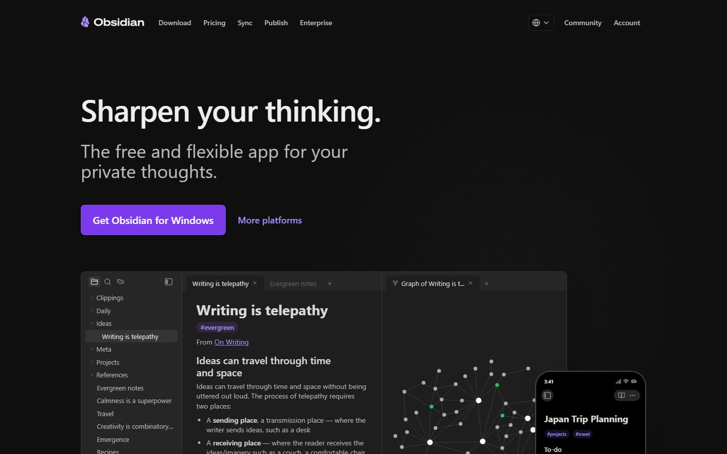
Obsidian's marketing surface is a calm, technical, dark-mode interface. The whole site lives on near-black canvas (`{colors.canvas}` — #171717, fading to `{colors.canvas-deep}` — #000000 in the hero), with a single violet brand accent (`{colors.accent}` — #8b5cf6) carrying every primary action and product highlight. Everything else is a graded grayscale — text steps from `{colors.heading}` (#eeeeee) down through `{colors.body}` (#b3b3b3) to `{colors.faintest}` (#525252).
The voice is confident and quiet: a huge weight-600 system-sans headline ("Sharpen your thinking.") at 60px with tight -1.2px tracking, a relaxed 36px-weight-400 sub-line, and real product UI shown directly in dark cards — note panes, the graph view, plugin toggle rows, shared-vault forms. Obsidian doesn't illustrate the product; it shows the actual app chrome embedded in the page.
The only saturated color in the system is violet. It appears on the primary CTA, on inline "More platforms"-style links, on tag pills (`#evergreen`, `#projects`), and on enabled plugin toggles. Everything around it stays monochrome, which makes the accent read as a deliberate, scarce signal rather than decoration.
**Key Characteristics:**
- Dark canvas (`{colors.canvas}` — #171717) with a graded grayscale text ramp. No light surfaces anywhere except embedded product screenshots.
- Single violet brand accent (`{colors.accent}` — #8b5cf6, with `{colors.accent-strong}` — #7c3aed and `{colors.accent-soft}` — #a78bfa) for CTAs, links, tags, and toggles.
- Large system-sans display type — `{typography.display-xl}` (60px / 600 / -1.2px) — paired with a generous 36px weight-400 lead paragraph (`{typography.lead}`).
- Flat dark cards (`{colors.surface-card}` — #262626) holding real product UI fragments. Cards use a faint inset hairline glow rather than drop shadows.
- Violet primary button (`{component.button-primary}`) at `{rounded.lg}` (8px) with 8px padding — the only solid-color button in the system.
- Subtle border treatment: 1px inset white-at-5% glow (`rgba(255,255,255,0.05)`) and a `rgb(64,64,64)` ring define card edges instead of heavy shadows.
- Spacing rhythm built on a 4px base — 4 / 8 / 12 / 16 / 24 / 32 / 48 / 64.
## Colors
### Brand & Accent
- **Accent** (`{colors.accent}` — #8b5cf6): The primary brand violet. Primary CTA background, enabled plugin toggles, product highlights.
- **Accent Strong** (`{colors.accent-strong}` — #7c3aed): The deeper violet used for tag pills (`#evergreen`, `#projects`, `#travel`) and pressed CTA states.
- **Accent Soft** (`{colors.accent-soft}` — #a78bfa): The lighter violet used on inline text links ("More platforms", "Download now", "Learn more.").
- **Accent Alt** (`{colors.accent-alt}` — #8a5cf5): A near-duplicate violet measured in the gradients/logo region; treat as equivalent to `{colors.accent}`.
### Surface
- **Canvas** (`{colors.canvas}` — #171717): The default page floor across both landing and pricing pages.
- **Canvas Deep** (`{colors.canvas-deep}` — #000000): The deepest black, used in the hero's lower fade and behind the app-mockup region.
- **Surface** (`{colors.surface}` — #1e1e1e): Slightly raised panels — app-mockup chrome, secondary bands.
- **Surface Input** (`{colors.surface-input}` — #1f1f1f): Text input fields.
- **Surface Card** (`{colors.surface-card}` — #262626): Feature cards (Links / Graph / Canvas / Plugins).
- **Surface Strong** (`{colors.surface-strong}` — #363636): Raised inner elements, dividers, hover-fill rows.
### Text
- **Heading** (`{colors.heading}` — #eeeeee): Display headlines and the brightest text. Also the measured link color.
- **Text Bright** (`{colors.text-bright}` — #e5e5e5): Strong secondary headings.
- **Ink** (`{colors.ink}` — #dadada): The most frequent neutral — nav items, primary UI labels.
- **Ink Soft** (`{colors.ink-soft}` — #bcbcbc): Measured primary text color; sub-labels.
- **Body** (`{colors.body}` — #b3b3b3): Default running paragraph text in cards.
- **Muted** (`{colors.muted}` — #a3a3a3) / **Muted Soft** (`{colors.muted-soft}` — #999999): Secondary text, footer links.
- **Faint** (`{colors.faint}` — #666666) / **Faintest** (`{colors.faintest}` — #525252): Fine-print, disabled labels, faint dividers.
- **White** (`{colors.white}` — #ffffff): Text on the violet primary CTA and on tag pills.
## Typography
### Font Family
The system runs the platform system-sans stack — measured as `ui-sans-serif` — for every role. There is no custom or licensed typeface (`fonts_licensed` is empty), so the live site renders whatever the OS provides (San Francisco, Segoe UI, Roboto). If a stable cross-platform match is wanted, **Inter** is a faithful substitute that preserves the geometric, neutral character; declare it ahead of `ui-sans-serif` in the stack.
### Hierarchy
| Token | Size | Weight | Line Height | Letter Spacing | Use |
|---|---|---|---|---|---|
| `{typography.display-xl}` | 60px | 600 | 1.0 | -1.2px | Hero h1 ("Sharpen your thinking.") and section h2 ("Spark ideas.", "Sync securely.") |
| `{typography.lead}` | 36px | 400 | 1.111 | normal | Hero sub-line and large lead paragraphs |
| `{typography.button}` | 14px | 400 | 1.429 | normal | Button labels, tag text, footer links |
| `{typography.nav-link}` | 14px | 400 | 1.429 | normal | Top-nav menu items (derived from the measured button role — same family/size/weight) |
### Principles
Display headlines and section headers share the same `{typography.display-xl}` spec — h1 and h2 were measured identically (60px / 600 / -1.2px / lh 1.0). The tight negative tracking and weight 600 are the signature; do not bump display weight to 700. The 36px weight-400 lead creates a strong, deliberate size jump beneath each headline.
Note: only display, lead, and button/nav sizes were measured. Smaller body copy inside feature cards and the footer is rendered here with `{typography.button}` as the nearest measured role — actual small-body sizes are an unmeasured gap (see Known Gaps).
## Layout
### Spacing System
- **Base unit:** 4px.
- **Tokens:** `{spacing.xxs}` 4px · `{spacing.xs}` 8px · `{spacing.sm}` 12px · `{spacing.md}` 16px · `{spacing.lg}` 24px · `{spacing.xl}` 32px · `{spacing.xxl}` 48px · `{spacing.xxxl}` 64px.
- **Most frequent:** 8px (gap/padding workhorse), then 4px, 12px, and 24px.
- **Off-grid values:** 6px and 23px were also measured at moderate frequency — likely icon gaps and a one-off section inset; round to `{spacing.xs}` / `{spacing.lg}` in new work.
- **Section padding:** large bands use `{spacing.xxl}` (48px) and `{spacing.xxxl}` (64px) of vertical breathing room.
### Grid & Container
- **Editorial body:** centered single column with a wide hero (h1 + sub-line + button row) sitting above a full-width app-mockup region.
- **Feature grids:** 2-up cards at desktop (Links / Graph, Canvas / Plugins).
- **Footer:** multi-column link list (Get started / Learn / Community / Obsidian / Resources) collapsing toward fewer columns on narrow viewports.
### Whitespace Philosophy
Obsidian uses generous vertical spacing between bands and a clear single-action hero. The density rises only inside product-UI fragments (note panes, plugin lists), where the real app chrome is shown at small scale.
## Elevation & Depth
| Level | Treatment | Use |
|---|---|---|
| Flat | No shadow, no border | Body bands on `{colors.canvas}` |
| Inset hairline | `rgba(255,255,255,0.05) 0 0 0 1px inset` | Card and button edges — a faint top-glow border instead of a shadow |
| Ring border | `rgb(64,64,64) 0 0 0 1px` | Defined edges on inputs and bordered cards |
| Soft drop | `rgba(0,0,0,0.1) 0 20px 25px -5px, rgba(0,0,0,0.1) 0 8px 10px -6px` | Floating elements (mobile mockup, shared-vault form) |
| Deep drop | `rgba(0,0,0,0.25) 0 25px 50px -12px` | The hero app window and the largest floating mockups |
The elevation philosophy is **dark-mode-native**: on a near-black canvas, light comes from faint inset white hairlines (1px at 5–10% white) rather than dark drop shadows. Heavy black shadows appear only on the largest floating product mockups, where they separate the screenshot from the page.
### Decorative Depth
- Embedded product UI (graph view, note panes, mobile phone mockup) carries its own internal chrome and shadows — these are content, not system tokens.
- The violet accent and green graph-node dots inside the product screenshots add the only chromatic flourishes against the grayscale.
## Shapes
### Border Radius Scale
| Token | Value | Use |
|---|---|---|
| `{rounded.xs}` | 2px | Tiny inline chips, fine UI corners |
| `{rounded.sm}` | 4px | Inputs, tag pills — the most frequent radius |
| `{rounded.md}` | 6px | Small buttons, dropdown items |
| `{rounded.lg}` | 8px | Primary CTA buttons, app-mockup chrome |
| `{rounded.xl}` | 12px | Content / feature cards |
| `{rounded.xxl}` | 16px | Larger panels, the app logo tile |
| `{rounded.huge}` | 24px | Occasional large rounded container |
| `{rounded.pill}` | 9999px | Plugin toggles, fully-round pills |
A measured radius of 0px (`{component.card}` in analysis) appears on some flush product-UI panes (e.g. the note-pane header bars) — these intentionally read as squared app chrome rather than rounded marketing cards.
### Photography Geometry
Product mockups (graph view, mobile note, shared-vault panel) are shown in their native app frames. The mobile mockup uses a heavily rounded phone silhouette; the inline note/graph windows use `{rounded.lg}`–`{rounded.xl}` corners with deep drop shadows.
## Components
### Top Navigation
**`top-nav`** — Transparent-to-canvas nav pinned to the top. Carries the violet Obsidian crystal logo + wordmark at left, primary menu (Download, Pricing, Sync, Publish, Enterprise) center, and a right cluster with a language selector, Community, and Account. Items use `{typography.nav-link}` in `{colors.ink}`.
**`nav-link`** — Inline nav item. Transparent background, `{colors.ink}` text, `{typography.nav-link}`.
### Buttons
**`button-primary`** — The signature CTA ("Get Obsidian for Windows", "Get Obsidian"). Background `{colors.accent}` (#8b5cf6), text `{colors.white}`, type `{typography.button}`, rounded `{rounded.lg}` (8px), padding 8px. The only solid-fill button in the system.
**`button-secondary`** — Text-style secondary action ("More platforms") rendered in `{colors.accent-soft}` on a transparent background, sharing `{typography.button}` and `{rounded.lg}`.
**`text-link`** — Inline links inside body copy ("Download now", "thousands of plugins", "Learn more.") in `{colors.accent-soft}`, transparent background, `{typography.button}`.
### Cards & Containers
**`feature-card`** — Used in the 2-up feature grids (Links, Graph, Canvas, Plugins). Background `{colors.surface-card}` (#262626), body text `{colors.body}`, rounded `{rounded.xl}` (12px), internal padding `{spacing.lg}` (24px). Each holds a title, short description, and an embedded product UI fragment.
**`app-mockup-card`** — The large hero/inline product window showing real Obsidian panes (file tree, note editor, graph view). Background `{colors.surface}` (#1e1e1e), rounded `{rounded.lg}` (8px), padding `{spacing.md}` (16px), carried on a deep drop shadow. Shows the product, not a decoration of it.
### Inputs & Forms
**`input`** — Text field (e.g. "Invite by email…" in the shared-vault panel). Background `{colors.surface-input}` (#1f1f1f), text `{colors.body}`, rounded `{rounded.sm}` (4px), padding `{spacing.xs}` (8px).
### Tags / Toggles
**`tag-pill`** — Small note tags (`#evergreen`, `#projects`, `#travel`). Background `{colors.accent-strong}` (#7c3aed), text `{colors.white}`, type `{typography.button}`, rounded `{rounded.sm}` (4px), padding `{spacing.xxs}` (4px).
**`plugin-toggle`** — The enabled-state switch in the community-plugins list. Background `{colors.accent}` when on, rounded `{rounded.pill}`. The violet fill is the on-state signal.
### Footer
**`footer`** — Dark footer on `{colors.canvas}` (#171717), text `{colors.muted}`, multi-column link list (Get started / Learn / Community / Obsidian / Resources) plus a Follow-us row (Discord, Twitter, Bluesky, Threads, Mastodon, YouTube, GitHub). Type `{typography.button}`, padding `{spacing.xxl}` (48px). Carries the wordmark top-left and a language selector + copyright at the bottom.
## Do's and Don'ts
### Do
- Keep violet (`{colors.accent}`) as the only saturated color — reserve it for the primary CTA, links, tags, and enabled toggles.
- Use `{colors.canvas}` (#171717) as the page floor and step text down the grayscale ramp (`{colors.heading}` → `{colors.body}` → `{colors.faintest}`) for hierarchy.
- Use `{typography.display-xl}` (60px / 600 / -1.2px) for both h1 and h2 — they share one spec.
- Define card edges with the faint inset white hairline rather than dark drop shadows; reserve deep shadows for floating product mockups.
- Embed real Obsidian product UI inside `{component.feature-card}` and `{component.app-mockup-card}` — show the app, don't illustrate it.
- Keep the primary CTA squared-soft at `{rounded.lg}` (8px) and inputs at `{rounded.sm}` (4px).
### Don't
- Don't introduce a second accent hue — the system is monochrome-plus-violet.
- Don't push display weight past 600 or drop the -1.2px tracking; the tight headline is the voice.
- Don't place light/white surfaces in the layout except inside embedded product screenshots.
- Don't add heavy black drop shadows to small cards — they flatten into the dark canvas; use the inset hairline.
- Don't document hover states; primary darkens toward `{colors.accent-strong}` on press, nothing else changes.
## Responsive Behavior
### Breakpoints
The captures were desktop-width landing and pricing pages; exact breakpoint widths were not measured. Observed structure implies:
| Name | Width (inferred) | Key Changes |
|---|---|---|
| Mobile | < 768px | Nav collapses; hero h1 scales down from 60px; feature grids go 1-up; footer columns stack |
| Tablet | 768–1024px | Feature cards 1–2-up; nav tightens |
| Desktop | > 1024px | Full horizontal nav; 2-up feature grids; hero with side-by-side app mockup |
### Touch Targets
- `{component.button-primary}` uses 8px padding around 14px text — verify it meets a 44px minimum tap height in implementation (the measured padding alone is tight).
- `{component.input}` and `{component.nav-link}` tap areas were not explicitly measured.
### Collapsing Strategy
- Feature grids reduce column count rather than shrinking cards.
- Footer link columns wrap toward a single stacked list.
- The hero app-mockup region scales proportionally while keeping the note pane legible.
## Iteration Guide
1. Focus on ONE component at a time, referencing its YAML key directly (`{component.feature-card}`, `{component.button-primary}`).
2. Variants (`-active`, `-disabled`) live as separate entries in `components:`.
3. Use `{token.refs}` everywhere — never inline a hex in a component.
4. Never document hover. Default and active/pressed only.
5. Keep violet scarce: accent on actions and tags, grayscale everywhere else.
6. Headlines stay `{typography.display-xl}` with -1.2px tracking; the lead stays weight 400.
7. When adding new surfaces, step within the measured dark ramp (#171717 → #1e1e1e → #262626 → #363636) rather than inventing new grays.
## Known Gaps
- **Button text color discrepancy:** the analyzer measured `button-primary` text/color as `#bcbcbc` (`{colors.ink-soft}`), but the screenshot ground-truth shows white text on a violet fill. This entry uses `{colors.white}` on `{colors.accent}` per the screenshot; the measured `#bcbcbc` likely came from a non-CTA secondary/link button.
- **Card radius conflict:** `computed:card` returned `radius 0px, shadow none`, while feature cards in the screenshots read as ~12px rounded. The 0px value is documented as flush product-UI chrome; `{component.feature-card}` uses `{rounded.xl}` from the measured 12px radius and screenshot evidence.
- **Small body type unmeasured:** only display (60px), lead (36px), and 14px button/nav sizes were captured. The smaller paragraph copy inside feature cards and the footer is rendered with `{typography.button}` as the nearest measured role — true small-body size/weight is a gap.
- **Font identity:** measured family is the generic `ui-sans-serif` system stack with no licensed face; the exact OS font varies by device. Inter is suggested as a stable substitute but was not confirmed on the live site.
- **Border/hairline color:** the card ring color `rgb(64,64,64)` (#404040) appears only in box-shadow values, not in the measured color set, so it is documented as a shadow value rather than a color token.
- **Breakpoints, transitions, and toggle off-state:** responsive widths, animation timings, and the disabled/off styling of `{component.plugin-toggle}` were not extracted.
- **Pricing-page-specific components** (plan cards, billing toggle) were captured but not surfaced as distinct measured components; their specs would need a dedicated extraction.
<!-- Documented by duply · real-world design systems as ready-to-use DESIGN.md for AI coding agents · https://duply.ai/obsidian/design-md -->
Color Palette
Accent
Neutrals
Typography
display-xl60px · 600 · 1
The quick brown fox jumpslead36px · 400 · 1.111
The quick brown fox jumpsbutton14px · 400 · 1.429
The quick brown fox jumpsnav-link14px · 400 · 1.429
The quick brown fox jumpsSpacing & Shape
Spacing
| Name | Value | Preview |
|---|---|---|
| xxs | 4px | |
| xs | 8px | |
| sm | 12px | |
| md | 16px | |
| lg | 24px | |
| xl | 32px | |
| xxl | 48px | |
| xxxl | 64px |
Border Radius
| Name | Value | Preview |
|---|---|---|
| xs | 2px | |
| sm | 4px | |
| md | 6px | |
| lg | 8px | |
| xl | 12px | |
| xxl | 16px | |
| huge | 24px | |
| pill | 9999px |
More like this


---
version: alpha
name: Obsidian-design-analysis
description: A dark-canvas, privacy-first knowledge-app marketing surface built on near-black surfaces, a single violet brand accent, and large system-sans display headlines. The system reads as calm, technical, and confident — flat dark cards holding real product UI (note panes, graph view, plugin toggles), tight letter-spaced display type, and a violet primary CTA as the only saturated color in an otherwise monochrome grayscale palette.

colors:
  accent: "#8b5cf6"
  accent-strong: "#7c3aed"
  accent-soft: "#a78bfa"
  accent-alt: "#8a5cf5"
  canvas: "#171717"
  canvas-deep: "#000000"
  surface: "#1e1e1e"
  surface-input: "#1f1f1f"
  surface-card: "#262626"
  surface-strong: "#363636"
  white: "#ffffff"
  heading: "#eeeeee"
  text-bright: "#e5e5e5"
  ink: "#dadada"
  ink-soft: "#bcbcbc"
  body: "#b3b3b3"
  muted: "#a3a3a3"
  muted-soft: "#999999"
  faint: "#666666"
  faintest: "#525252"

typography:
  display-xl:
    fontFamily: "ui-sans-serif, system-ui, sans-serif"
    fontSize: 60px
    fontWeight: 600
    lineHeight: 1.0
    letterSpacing: -1.2px
  lead:
    fontFamily: "ui-sans-serif, system-ui, sans-serif"
    fontSize: 36px
    fontWeight: 400
    lineHeight: 1.111
    letterSpacing: normal
  button:
    fontFamily: "ui-sans-serif, system-ui, sans-serif"
    fontSize: 14px
    fontWeight: 400
    lineHeight: 1.429
    letterSpacing: normal
  nav-link:
    fontFamily: "ui-sans-serif, system-ui, sans-serif"
    fontSize: 14px
    fontWeight: 400
    lineHeight: 1.429
    letterSpacing: normal

rounded:
  xs: 2px
  sm: 4px
  md: 6px
  lg: 8px
  xl: 12px
  xxl: 16px
  huge: 24px
  pill: 9999px

spacing:
  xxs: 4px
  xs: 8px
  sm: 12px
  md: 16px
  lg: 24px
  xl: 32px
  xxl: 48px
  xxxl: 64px

components:
  top-nav:
    backgroundColor: "{colors.canvas}"
    textColor: "{colors.ink}"
    typography: "{typography.nav-link}"
  nav-link:
    backgroundColor: transparent
    textColor: "{colors.ink}"
    typography: "{typography.nav-link}"
  button-primary:
    backgroundColor: "{colors.accent}"
    textColor: "{colors.white}"
    typography: "{typography.button}"
    rounded: "{rounded.lg}"
    padding: 8px
  button-secondary:
    backgroundColor: transparent
    textColor: "{colors.accent-soft}"
    typography: "{typography.button}"
    rounded: "{rounded.lg}"
    padding: 8px
  text-link:
    backgroundColor: transparent
    textColor: "{colors.accent-soft}"
    typography: "{typography.button}"
  feature-card:
    backgroundColor: "{colors.surface-card}"
    textColor: "{colors.body}"
    typography: "{typography.button}"
    rounded: "{rounded.xl}"
    padding: 24px
  app-mockup-card:
    backgroundColor: "{colors.surface}"
    textColor: "{colors.body}"
    rounded: "{rounded.lg}"
    padding: 16px
  input:
    backgroundColor: "{colors.surface-input}"
    textColor: "{colors.body}"
    typography: "{typography.button}"
    rounded: "{rounded.sm}"
    padding: 8px
  tag-pill:
    backgroundColor: "{colors.accent-strong}"
    textColor: "{colors.white}"
    typography: "{typography.button}"
    rounded: "{rounded.sm}"
    padding: 4px
  plugin-toggle:
    backgroundColor: "{colors.accent}"
    textColor: "{colors.white}"
    rounded: "{rounded.pill}"
  footer:
    backgroundColor: "{colors.canvas}"
    textColor: "{colors.muted}"
    typography: "{typography.button}"
    padding: 48px
---

## Overview

Obsidian's marketing surface is a calm, technical, dark-mode interface. The whole site lives on near-black canvas (`{colors.canvas}` — #171717, fading to `{colors.canvas-deep}` — #000000 in the hero), with a single violet brand accent (`{colors.accent}` — #8b5cf6) carrying every primary action and product highlight. Everything else is a graded grayscale — text steps from `{colors.heading}` (#eeeeee) down through `{colors.body}` (#b3b3b3) to `{colors.faintest}` (#525252).

The voice is confident and quiet: a huge weight-600 system-sans headline ("Sharpen your thinking.") at 60px with tight -1.2px tracking, a relaxed 36px-weight-400 sub-line, and real product UI shown directly in dark cards — note panes, the graph view, plugin toggle rows, shared-vault forms. Obsidian doesn't illustrate the product; it shows the actual app chrome embedded in the page.

The only saturated color in the system is violet. It appears on the primary CTA, on inline "More platforms"-style links, on tag pills (`#evergreen`, `#projects`), and on enabled plugin toggles. Everything around it stays monochrome, which makes the accent read as a deliberate, scarce signal rather than decoration.

**Key Characteristics:**
- Dark canvas (`{colors.canvas}` — #171717) with a graded grayscale text ramp. No light surfaces anywhere except embedded product screenshots.
- Single violet brand accent (`{colors.accent}` — #8b5cf6, with `{colors.accent-strong}` — #7c3aed and `{colors.accent-soft}` — #a78bfa) for CTAs, links, tags, and toggles.
- Large system-sans display type — `{typography.display-xl}` (60px / 600 / -1.2px) — paired with a generous 36px weight-400 lead paragraph (`{typography.lead}`).
- Flat dark cards (`{colors.surface-card}` — #262626) holding real product UI fragments. Cards use a faint inset hairline glow rather than drop shadows.
- Violet primary button (`{component.button-primary}`) at `{rounded.lg}` (8px) with 8px padding — the only solid-color button in the system.
- Subtle border treatment: 1px inset white-at-5% glow (`rgba(255,255,255,0.05)`) and a `rgb(64,64,64)` ring define card edges instead of heavy shadows.
- Spacing rhythm built on a 4px base — 4 / 8 / 12 / 16 / 24 / 32 / 48 / 64.

## Colors

### Brand & Accent
- **Accent** (`{colors.accent}` — #8b5cf6): The primary brand violet. Primary CTA background, enabled plugin toggles, product highlights.
- **Accent Strong** (`{colors.accent-strong}` — #7c3aed): The deeper violet used for tag pills (`#evergreen`, `#projects`, `#travel`) and pressed CTA states.
- **Accent Soft** (`{colors.accent-soft}` — #a78bfa): The lighter violet used on inline text links ("More platforms", "Download now", "Learn more.").
- **Accent Alt** (`{colors.accent-alt}` — #8a5cf5): A near-duplicate violet measured in the gradients/logo region; treat as equivalent to `{colors.accent}`.

### Surface
- **Canvas** (`{colors.canvas}` — #171717): The default page floor across both landing and pricing pages.
- **Canvas Deep** (`{colors.canvas-deep}` — #000000): The deepest black, used in the hero's lower fade and behind the app-mockup region.
- **Surface** (`{colors.surface}` — #1e1e1e): Slightly raised panels — app-mockup chrome, secondary bands.
- **Surface Input** (`{colors.surface-input}` — #1f1f1f): Text input fields.
- **Surface Card** (`{colors.surface-card}` — #262626): Feature cards (Links / Graph / Canvas / Plugins).
- **Surface Strong** (`{colors.surface-strong}` — #363636): Raised inner elements, dividers, hover-fill rows.

### Text
- **Heading** (`{colors.heading}` — #eeeeee): Display headlines and the brightest text. Also the measured link color.
- **Text Bright** (`{colors.text-bright}` — #e5e5e5): Strong secondary headings.
- **Ink** (`{colors.ink}` — #dadada): The most frequent neutral — nav items, primary UI labels.
- **Ink Soft** (`{colors.ink-soft}` — #bcbcbc): Measured primary text color; sub-labels.
- **Body** (`{colors.body}` — #b3b3b3): Default running paragraph text in cards.
- **Muted** (`{colors.muted}` — #a3a3a3) / **Muted Soft** (`{colors.muted-soft}` — #999999): Secondary text, footer links.
- **Faint** (`{colors.faint}` — #666666) / **Faintest** (`{colors.faintest}` — #525252): Fine-print, disabled labels, faint dividers.
- **White** (`{colors.white}` — #ffffff): Text on the violet primary CTA and on tag pills.

## Typography

### Font Family
The system runs the platform system-sans stack — measured as `ui-sans-serif` — for every role. There is no custom or licensed typeface (`fonts_licensed` is empty), so the live site renders whatever the OS provides (San Francisco, Segoe UI, Roboto). If a stable cross-platform match is wanted, **Inter** is a faithful substitute that preserves the geometric, neutral character; declare it ahead of `ui-sans-serif` in the stack.

### Hierarchy

| Token | Size | Weight | Line Height | Letter Spacing | Use |
|---|---|---|---|---|---|
| `{typography.display-xl}` | 60px | 600 | 1.0 | -1.2px | Hero h1 ("Sharpen your thinking.") and section h2 ("Spark ideas.", "Sync securely.") |
| `{typography.lead}` | 36px | 400 | 1.111 | normal | Hero sub-line and large lead paragraphs |
| `{typography.button}` | 14px | 400 | 1.429 | normal | Button labels, tag text, footer links |
| `{typography.nav-link}` | 14px | 400 | 1.429 | normal | Top-nav menu items (derived from the measured button role — same family/size/weight) |

### Principles
Display headlines and section headers share the same `{typography.display-xl}` spec — h1 and h2 were measured identically (60px / 600 / -1.2px / lh 1.0). The tight negative tracking and weight 600 are the signature; do not bump display weight to 700. The 36px weight-400 lead creates a strong, deliberate size jump beneath each headline.

Note: only display, lead, and button/nav sizes were measured. Smaller body copy inside feature cards and the footer is rendered here with `{typography.button}` as the nearest measured role — actual small-body sizes are an unmeasured gap (see Known Gaps).

## Layout

### Spacing System
- **Base unit:** 4px.
- **Tokens:** `{spacing.xxs}` 4px · `{spacing.xs}` 8px · `{spacing.sm}` 12px · `{spacing.md}` 16px · `{spacing.lg}` 24px · `{spacing.xl}` 32px · `{spacing.xxl}` 48px · `{spacing.xxxl}` 64px.
- **Most frequent:** 8px (gap/padding workhorse), then 4px, 12px, and 24px.
- **Off-grid values:** 6px and 23px were also measured at moderate frequency — likely icon gaps and a one-off section inset; round to `{spacing.xs}` / `{spacing.lg}` in new work.
- **Section padding:** large bands use `{spacing.xxl}` (48px) and `{spacing.xxxl}` (64px) of vertical breathing room.

### Grid & Container
- **Editorial body:** centered single column with a wide hero (h1 + sub-line + button row) sitting above a full-width app-mockup region.
- **Feature grids:** 2-up cards at desktop (Links / Graph, Canvas / Plugins).
- **Footer:** multi-column link list (Get started / Learn / Community / Obsidian / Resources) collapsing toward fewer columns on narrow viewports.

### Whitespace Philosophy
Obsidian uses generous vertical spacing between bands and a clear single-action hero. The density rises only inside product-UI fragments (note panes, plugin lists), where the real app chrome is shown at small scale.

## Elevation & Depth

| Level | Treatment | Use |
|---|---|---|
| Flat | No shadow, no border | Body bands on `{colors.canvas}` |
| Inset hairline | `rgba(255,255,255,0.05) 0 0 0 1px inset` | Card and button edges — a faint top-glow border instead of a shadow |
| Ring border | `rgb(64,64,64) 0 0 0 1px` | Defined edges on inputs and bordered cards |
| Soft drop | `rgba(0,0,0,0.1) 0 20px 25px -5px, rgba(0,0,0,0.1) 0 8px 10px -6px` | Floating elements (mobile mockup, shared-vault form) |
| Deep drop | `rgba(0,0,0,0.25) 0 25px 50px -12px` | The hero app window and the largest floating mockups |

The elevation philosophy is **dark-mode-native**: on a near-black canvas, light comes from faint inset white hairlines (1px at 5–10% white) rather than dark drop shadows. Heavy black shadows appear only on the largest floating product mockups, where they separate the screenshot from the page.

### Decorative Depth
- Embedded product UI (graph view, note panes, mobile phone mockup) carries its own internal chrome and shadows — these are content, not system tokens.
- The violet accent and green graph-node dots inside the product screenshots add the only chromatic flourishes against the grayscale.

## Shapes

### Border Radius Scale

| Token | Value | Use |
|---|---|---|
| `{rounded.xs}` | 2px | Tiny inline chips, fine UI corners |
| `{rounded.sm}` | 4px | Inputs, tag pills — the most frequent radius |
| `{rounded.md}` | 6px | Small buttons, dropdown items |
| `{rounded.lg}` | 8px | Primary CTA buttons, app-mockup chrome |
| `{rounded.xl}` | 12px | Content / feature cards |
| `{rounded.xxl}` | 16px | Larger panels, the app logo tile |
| `{rounded.huge}` | 24px | Occasional large rounded container |
| `{rounded.pill}` | 9999px | Plugin toggles, fully-round pills |

A measured radius of 0px (`{component.card}` in analysis) appears on some flush product-UI panes (e.g. the note-pane header bars) — these intentionally read as squared app chrome rather than rounded marketing cards.

### Photography Geometry
Product mockups (graph view, mobile note, shared-vault panel) are shown in their native app frames. The mobile mockup uses a heavily rounded phone silhouette; the inline note/graph windows use `{rounded.lg}`–`{rounded.xl}` corners with deep drop shadows.

## Components

### Top Navigation

**`top-nav`** — Transparent-to-canvas nav pinned to the top. Carries the violet Obsidian crystal logo + wordmark at left, primary menu (Download, Pricing, Sync, Publish, Enterprise) center, and a right cluster with a language selector, Community, and Account. Items use `{typography.nav-link}` in `{colors.ink}`.

**`nav-link`** — Inline nav item. Transparent background, `{colors.ink}` text, `{typography.nav-link}`.

### Buttons

**`button-primary`** — The signature CTA ("Get Obsidian for Windows", "Get Obsidian"). Background `{colors.accent}` (#8b5cf6), text `{colors.white}`, type `{typography.button}`, rounded `{rounded.lg}` (8px), padding 8px. The only solid-fill button in the system.

**`button-secondary`** — Text-style secondary action ("More platforms") rendered in `{colors.accent-soft}` on a transparent background, sharing `{typography.button}` and `{rounded.lg}`.

**`text-link`** — Inline links inside body copy ("Download now", "thousands of plugins", "Learn more.") in `{colors.accent-soft}`, transparent background, `{typography.button}`.

### Cards & Containers

**`feature-card`** — Used in the 2-up feature grids (Links, Graph, Canvas, Plugins). Background `{colors.surface-card}` (#262626), body text `{colors.body}`, rounded `{rounded.xl}` (12px), internal padding `{spacing.lg}` (24px). Each holds a title, short description, and an embedded product UI fragment.

**`app-mockup-card`** — The large hero/inline product window showing real Obsidian panes (file tree, note editor, graph view). Background `{colors.surface}` (#1e1e1e), rounded `{rounded.lg}` (8px), padding `{spacing.md}` (16px), carried on a deep drop shadow. Shows the product, not a decoration of it.

### Inputs & Forms

**`input`** — Text field (e.g. "Invite by email…" in the shared-vault panel). Background `{colors.surface-input}` (#1f1f1f), text `{colors.body}`, rounded `{rounded.sm}` (4px), padding `{spacing.xs}` (8px).

### Tags / Toggles

**`tag-pill`** — Small note tags (`#evergreen`, `#projects`, `#travel`). Background `{colors.accent-strong}` (#7c3aed), text `{colors.white}`, type `{typography.button}`, rounded `{rounded.sm}` (4px), padding `{spacing.xxs}` (4px).

**`plugin-toggle`** — The enabled-state switch in the community-plugins list. Background `{colors.accent}` when on, rounded `{rounded.pill}`. The violet fill is the on-state signal.

### Footer

**`footer`** — Dark footer on `{colors.canvas}` (#171717), text `{colors.muted}`, multi-column link list (Get started / Learn / Community / Obsidian / Resources) plus a Follow-us row (Discord, Twitter, Bluesky, Threads, Mastodon, YouTube, GitHub). Type `{typography.button}`, padding `{spacing.xxl}` (48px). Carries the wordmark top-left and a language selector + copyright at the bottom.

## Do's and Don'ts

### Do
- Keep violet (`{colors.accent}`) as the only saturated color — reserve it for the primary CTA, links, tags, and enabled toggles.
- Use `{colors.canvas}` (#171717) as the page floor and step text down the grayscale ramp (`{colors.heading}` → `{colors.body}` → `{colors.faintest}`) for hierarchy.
- Use `{typography.display-xl}` (60px / 600 / -1.2px) for both h1 and h2 — they share one spec.
- Define card edges with the faint inset white hairline rather than dark drop shadows; reserve deep shadows for floating product mockups.
- Embed real Obsidian product UI inside `{component.feature-card}` and `{component.app-mockup-card}` — show the app, don't illustrate it.
- Keep the primary CTA squared-soft at `{rounded.lg}` (8px) and inputs at `{rounded.sm}` (4px).

### Don't
- Don't introduce a second accent hue — the system is monochrome-plus-violet.
- Don't push display weight past 600 or drop the -1.2px tracking; the tight headline is the voice.
- Don't place light/white surfaces in the layout except inside embedded product screenshots.
- Don't add heavy black drop shadows to small cards — they flatten into the dark canvas; use the inset hairline.
- Don't document hover states; primary darkens toward `{colors.accent-strong}` on press, nothing else changes.

## Responsive Behavior

### Breakpoints
The captures were desktop-width landing and pricing pages; exact breakpoint widths were not measured. Observed structure implies:

| Name | Width (inferred) | Key Changes |
|---|---|---|
| Mobile | < 768px | Nav collapses; hero h1 scales down from 60px; feature grids go 1-up; footer columns stack |
| Tablet | 768–1024px | Feature cards 1–2-up; nav tightens |
| Desktop | > 1024px | Full horizontal nav; 2-up feature grids; hero with side-by-side app mockup |

### Touch Targets
- `{component.button-primary}` uses 8px padding around 14px text — verify it meets a 44px minimum tap height in implementation (the measured padding alone is tight).
- `{component.input}` and `{component.nav-link}` tap areas were not explicitly measured.

### Collapsing Strategy
- Feature grids reduce column count rather than shrinking cards.
- Footer link columns wrap toward a single stacked list.
- The hero app-mockup region scales proportionally while keeping the note pane legible.

## Iteration Guide

1. Focus on ONE component at a time, referencing its YAML key directly (`{component.feature-card}`, `{component.button-primary}`).
2. Variants (`-active`, `-disabled`) live as separate entries in `components:`.
3. Use `{token.refs}` everywhere — never inline a hex in a component.
4. Never document hover. Default and active/pressed only.
5. Keep violet scarce: accent on actions and tags, grayscale everywhere else.
6. Headlines stay `{typography.display-xl}` with -1.2px tracking; the lead stays weight 400.
7. When adding new surfaces, step within the measured dark ramp (#171717 → #1e1e1e → #262626 → #363636) rather than inventing new grays.

## Known Gaps

- **Button text color discrepancy:** the analyzer measured `button-primary` text/color as `#bcbcbc` (`{colors.ink-soft}`), but the screenshot ground-truth shows white text on a violet fill. This entry uses `{colors.white}` on `{colors.accent}` per the screenshot; the measured `#bcbcbc` likely came from a non-CTA secondary/link button.
- **Card radius conflict:** `computed:card` returned `radius 0px, shadow none`, while feature cards in the screenshots read as ~12px rounded. The 0px value is documented as flush product-UI chrome; `{component.feature-card}` uses `{rounded.xl}` from the measured 12px radius and screenshot evidence.
- **Small body type unmeasured:** only display (60px), lead (36px), and 14px button/nav sizes were captured. The smaller paragraph copy inside feature cards and the footer is rendered with `{typography.button}` as the nearest measured role — true small-body size/weight is a gap.
- **Font identity:** measured family is the generic `ui-sans-serif` system stack with no licensed face; the exact OS font varies by device. Inter is suggested as a stable substitute but was not confirmed on the live site.
- **Border/hairline color:** the card ring color `rgb(64,64,64)` (#404040) appears only in box-shadow values, not in the measured color set, so it is documented as a shadow value rather than a color token.
- **Breakpoints, transitions, and toggle off-state:** responsive widths, animation timings, and the disabled/off styling of `{component.plugin-toggle}` were not extracted.
- **Pricing-page-specific components** (plan cards, billing toggle) were captured but not surfaced as distinct measured components; their specs would need a dedicated extraction.

<!-- Documented by duply · real-world design systems as ready-to-use DESIGN.md for AI coding agents · https://duply.ai/obsidian/design-md -->