Cron
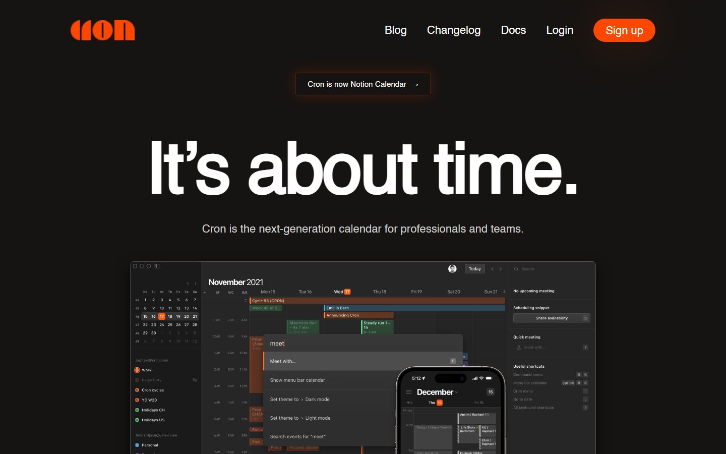
A dark, focused calendar-software interface built on a warm near-black canvas (#161412) with a single high-voltage orange CTA (#ff4700) and oversized Helvetica Neue display type. The system reads as confident, minimal, and product-first — one enormous headline, one orange button, and a large embedded product screenshot doing all the persuasion. Brand voltage comes entirely from the orange accent and the 140px display headline against the dark floor.
---
version: alpha
name: Cron-design-analysis
description: A dark, focused calendar-software interface built on a warm near-black canvas (#161412) with a single high-voltage orange CTA (#ff4700) and oversized Helvetica Neue display type. The system reads as confident, minimal, and product-first — one enormous headline, one orange button, and a large embedded product screenshot doing all the persuasion. Brand voltage comes entirely from the orange accent and the 140px display headline against the dark floor.

colors:
  primary: "#ff4700"
  ink: "#ffffff"
  muted: "#cccccc"
  canvas: "#161412"
  surface-dark: "#0f0d0a"
  black: "#000000"
  accent-amber: "#ffaa00"
  accent-orange-soft: "#ff661a"
  accent-orange-deep: "#ff4705"

typography:
  display-xl:
    fontFamily: "Helvetica Neue, Helvetica, Arial, sans-serif"
    fontSize: 140px
    fontWeight: 700
    lineHeight: 0.9
    letterSpacing: -3px
  body:
    fontFamily: "Helvetica Neue, Helvetica, Arial, sans-serif"
    fontSize: 22px
    fontWeight: 400
    lineHeight: 1.7
    letterSpacing: 0
  button:
    fontFamily: "Helvetica Neue, Helvetica, Arial, sans-serif"
    fontSize: 22px
    fontWeight: 500
    lineHeight: 1.0
    letterSpacing: 0

rounded:
  sm: 4px
  pill: 9999px
  full: 9999px

spacing:
  xs: 12px
  sm: 20px
  md: 24px
  xl: 80px
  section: 140px

components:
  button-primary:
    backgroundColor: "{colors.primary}"
    textColor: "{colors.ink}"
    typography: "{typography.button}"
    rounded: "{rounded.full}"
    padding: 12px 24px
  top-nav:
    backgroundColor: "{colors.canvas}"
    textColor: "{colors.ink}"
    typography: "{typography.button}"
  announcement-pill:
    backgroundColor: "{colors.surface-dark}"
    textColor: "{colors.ink}"
    typography: "{typography.body}"
    rounded: "{rounded.sm}"
    padding: 12px 24px
  hero-band:
    backgroundColor: "{colors.canvas}"
    textColor: "{colors.ink}"
    typography: "{typography.display-xl}"
    padding: 140px
  hero-subhead:
    backgroundColor: transparent
    textColor: "{colors.muted}"
    typography: "{typography.body}"
  product-mockup-card:
    backgroundColor: "{colors.surface-dark}"
    textColor: "{colors.ink}"
    rounded: "{rounded.sm}"
  footer:
    backgroundColor: "{colors.canvas}"
    textColor: "{colors.muted}"
    typography: "{typography.body}"
    padding: 80px
---

## Overview

Cron's marketing surface is a single-screen, dark, product-first interface. The page floor is a warm near-black `{colors.canvas}` (#161412), the headline is an enormous Helvetica Neue display word ("It's about time.") in pure white `{colors.ink}` (#ffffff), and the only saturated color anywhere is the orange `{colors.primary}` (#ff4700) used on the "Sign up" CTA and the brand wordmark. The system is ruthlessly minimal — one headline, one supporting line, one button, and one large embedded product screenshot.

The type voice is a single family — **Helvetica Neue** — used at three measured scales: a 140px display headline at weight 700 with tight -3px letter-spacing, a 22px body line at weight 400 with loose 1.7 line-height, and a 22px button label at weight 500. There is no second typeface; the contrast comes entirely from size and weight, not from font pairing.

Brand voltage is concentrated in two places: the **orange accent** (`{colors.primary}`) on the CTA and logo, and the **oversized display headline** against the dark floor. Everything else recedes — the supporting copy sits in `{colors.muted}` (#cccccc), nav links are quiet white, and the product is shown as a real screenshot rather than illustrated.

**Key Characteristics:**
- Warm near-black canvas (`{colors.canvas}` — #161412) rather than pure black. The whole page is dark; there is no light mode on the marketing surface.
- A single high-voltage orange CTA (`{colors.primary}` — #ff4700) rendered as a fully-rounded pill (`{rounded.full}`). This is the only saturated surface on the page.
- Oversized display headline (`{typography.display-xl}` — 140px / 700 / -3px) in pure white. The headline IS the hero.
- Single-family type system: Helvetica Neue at all three measured roles. Hierarchy comes from size and weight, not from font contrast.
- A large embedded product screenshot (the actual Cron calendar UI + companion iPhone) carries the product narrative — Cron shows the product, it does not illustrate around it.
- Orange glow shadows (e.g. `rgba(255,71,0,0.2) 0 0 100px`) provide the only "elevation" — soft halos around the CTA and announcement pill rather than dark drop shadows.
- Minimal radius vocabulary: `{rounded.sm}` (4px) for the announcement pill and product card corners, `{rounded.full}` (9999px) for the CTA pill.
- Generous vertical rhythm built on a `{spacing.section}` (140px) cadence between major blocks.

## Colors

### Brand & Accent
- **Primary** (`{colors.primary}` — #ff4700): The single dominant action color. Used on the "Sign up" CTA pill and the Cron wordmark. The entire chromatic identity is carried by this one orange.
- **Accent Orange Deep** (`{colors.accent-orange-deep}` — #ff4705): A near-identical orange measured in the CSS — effectively a duplicate of primary, likely used in gradients or glows.
- **Accent Orange Soft** (`{colors.accent-orange-soft}` — #ff661a): A lighter, slightly tinted orange found in the palette. A reasonable choice for a derived CTA pressed/lighter state, though no explicit active state was measured (derived).
- **Accent Amber** (`{colors.accent-amber}` — #ffaa00): A warmer amber found in the palette, likely used inside the product screenshot's event chips. Appears as a minor accent, never on a CTA.

### Surface
- **Canvas** (`{colors.canvas}` — #161412): The warm near-black page floor. The default surface for the entire marketing page.
- **Surface Dark** (`{colors.surface-dark}` — #0f0d0a): A deeper near-black used for the announcement pill background and the recessed product screenshot frame.
- **Black** (`{colors.black}` — #000000): True black, used sparingly in the palette (e.g. inside the embedded product UI).

### Text
- **Ink** (`{colors.ink}` — #ffffff): The headline and primary text color — maximum contrast against the dark canvas.
- **Muted** (`{colors.muted}` — #cccccc): The supporting sub-headline, nav links, and footer text. The most-frequent text tone on the page.

## Typography

### Font Family
The system runs a single typeface: **Helvetica Neue**. There is no secondary or display font — the entire hierarchy is achieved through size and weight changes within one family. The fallback stack walks `Helvetica, Arial, sans-serif`.

The three measured roles split cleanly:
- Display (140px, weight 700, -3px tracking) — the hero headline
- Body (22px, weight 400, 1.7 line-height) — supporting copy
- Button (22px, weight 500, 1.0 line-height) — CTA + nav labels

### Hierarchy

| Token | Size | Weight | Line Height | Letter Spacing | Use |
|---|---|---|---|---|---|
| `{typography.display-xl}` | 140px | 700 | 0.9 | -3px | Hero headline ("It's about time.") |
| `{typography.body}` | 22px | 400 | 1.7 | 0 | Sub-headline, footer links, supporting copy |
| `{typography.button}` | 22px | 500 | 1.0 | 0 | CTA labels and top-nav menu items |

### Principles
The hierarchy is extreme and intentional: the 140px headline towers over the 22px body — roughly a 6× scale jump with nothing in between on the marketing surface. The tight -3px tracking on the display size keeps the giant headline feeling dense and engineered rather than airy. Body copy uses a loose 1.7 line-height for comfortable reading at 22px.

### Note on Font Substitutes
Helvetica Neue is a licensed Apple/Linotype typeface and is not freely redistributable as a web font. Although `fonts_licensed` flagged nothing, ship an open-source substitute rather than self-hosting Helvetica Neue: **Inter** or **Roboto** at the matching weights (700 for display with negative tracking, 400 body, 500 button) is the closest practical approximation. **Arial** is the safe system fallback already encoded in the stack.

## Layout

### Spacing System
- **Tokens (measured):** `{spacing.xs}` 12px · `{spacing.sm}` 20px · `{spacing.md}` 24px · `{spacing.xl}` 80px · `{spacing.section}` 140px.
- **Section rhythm:** `{spacing.section}` (140px) is the dominant large-gap value, spacing the hero headline, sub-head, and product screenshot apart.
- **Footer padding:** `{spacing.xl}` (80px) of vertical breathing room above the footer link row.
- **Button padding:** 12px × 24px (`{spacing.xs}` × `{spacing.md}`) — the measured CTA padding.
- **Tight internal gaps:** `{spacing.md}` (24px) is the most frequent small spacing unit for grouped elements.

### Grid & Container
- **Single centered column:** The marketing page is a single centered stack — wordmark + nav at top, centered announcement pill, centered headline, centered sub-head, then a full-width product screenshot below.
- **Top nav** spans the full width with the wordmark left and menu + CTA right.
- **Footer** is a simple left-aligned link row (Privacy Policy / Terms of Service / Web app / Download).

### Whitespace Philosophy
Cron's layout is almost entirely whitespace — the 140px section cadence and the lone centered headline give the page enormous breathing room. The page makes one statement, then shows the product. There are no feature grids, card rows, or dense lists on the captured landing surface.

## Elevation & Depth

| Level | Treatment | Use |
|---|---|---|
| Flat | No shadow, no border | Canvas, nav, headline, body copy |
| Orange halo glow | `rgba(255,71,0,0.2) 0 0 100px 0` | Soft orange glow radiating from the CTA / hero area |
| Inset ring + glow | `rgba(255,71,0,0.5) 0 0 0 0.5px inset, rgba(255,72,0,0.2) 0 0 28px 0` | The announcement pill — a 0.5px orange inset hairline plus a 28px orange glow |

Cron's depth model is **light, not shadow**. Instead of dark drop shadows (which would be invisible on a dark canvas), the system uses soft orange glows to lift the CTA and the announcement pill off the near-black floor. The inset 0.5px orange ring on the announcement pill is the system's signature edge treatment — a hairline of brand color rather than a fill.

### Decorative Depth
- The embedded product screenshot carries its own internal product chrome (calendar grid, event chips, command menu, companion iPhone) — these shadows belong to the product, not the design system.

## Shapes

### Border Radius Scale

| Token | Value | Use |
|---|---|---|
| `{rounded.sm}` | 4px | Announcement pill body, product screenshot frame corners |
| `{rounded.pill}` | 9999px | Alias for fully-rounded elements |
| `{rounded.full}` | 9999px | The "Sign up" CTA — a fully-rounded pill |

The radius vocabulary is minimal: a soft 4px corner for rectangular containers and a fully-rounded pill for the single CTA. The contrast between the sharp-cornered product screenshot and the fully-rounded orange button is part of the visual signature.

### Photography / Screenshot Geometry
The hero product screenshot is shown as a near-full-width rectangular frame with `{rounded.sm}` (4px) corners, sitting directly on the canvas. A companion iPhone mockup overlaps the lower edge of the desktop screenshot.

## Components

### Top Navigation

**`top-nav`** — A transparent-over-canvas nav bar (`{colors.canvas}`). The orange Cron wordmark sits at left; the menu (Blog, Changelog, Docs, Login) and the "Sign up" CTA sit at right. Menu items render in `{typography.button}` (Helvetica Neue 22px / 500) in `{colors.ink}`.

### Buttons

**`button-primary`** — The single signature CTA ("Sign up"). Background `{colors.primary}` (#ff4700), text `{colors.ink}` (#ffffff), type `{typography.button}` (22px / 500), padding 12px × 24px, fully rounded `{rounded.full}` (9999px). Carries a soft orange glow (`rgba(255,71,0,0.2) 0 0 100px`) lifting it off the dark canvas. No measured pressed/active variant — see Known Gaps.

### Pills & Banners

**`announcement-pill`** — The "Cron is now Notion Calendar →" banner centered above the headline. Background `{colors.surface-dark}` (#0f0d0a), text `{colors.ink}`, `{rounded.sm}` (4px), padding 12px × 24px. Distinguished by its measured inset orange hairline + glow (`rgba(255,71,0,0.5) 0 0 0 0.5px inset, rgba(255,72,0,0.2) 0 0 28px`) — a brand-color edge rather than a fill.

### Hero

**`hero-band`** — The centered hero stack on `{colors.canvas}`. Carries the oversized `{typography.display-xl}` headline ("It's about time.") in `{colors.ink}`, with `{spacing.section}` (140px) vertical rhythm.

**`hero-subhead`** — The supporting line ("Cron is the next-generation calendar for professionals and teams.") in `{colors.muted}` (#cccccc), `{typography.body}` (22px / 400). Transparent background.

### Product

**`product-mockup-card`** — The large embedded product screenshot showing the actual Cron desktop calendar UI plus a companion iPhone. Background `{colors.surface-dark}` (#0f0d0a), `{rounded.sm}` (4px). The card displays the real product chrome rather than an illustration.

### Footer

**`footer`** — A quiet left-aligned link row (Privacy Policy / Terms of Service / Web app / Download). Background stays `{colors.canvas}`, text `{colors.muted}`, type `{typography.body}`, with `{spacing.xl}` (80px) of vertical padding. No dark inversion is needed — the whole page is already dark.

## Do's and Don'ts

### Do
- Reserve `{colors.primary}` (#ff4700) for the single CTA and the wordmark. The orange's power comes from its scarcity against the dark canvas.
- Use the warm near-black `{colors.canvas}` (#161412), not pure black, for the page floor.
- Lean on the oversized `{typography.display-xl}` headline as the hero — let size and weight carry the hierarchy.
- Keep the -3px tracking on the display headline; the dense letter-spacing is part of the engineered voice.
- Use orange glow shadows (not dark drop shadows) to lift elements off the dark floor.
- Show the real product screenshot rather than illustrating around the product.
- Apply the inset orange hairline to the announcement pill — the brand-color edge is signature.

### Don't
- Don't introduce a second typeface. The system is single-family Helvetica Neue; contrast comes from size and weight only.
- Don't fill multiple surfaces with orange. One saturated CTA per screen.
- Don't add dark drop shadows on the dark canvas — they read as nothing. Use glows.
- Don't tighten the body line-height; 1.7 at 22px is the comfortable reading rhythm.
- Don't add a light mode to the marketing surface — the dark canvas is the identity.
- Don't document hover state styling; only default and (derived) pressed states apply to the CTA.

## Responsive Behavior

The analysis captured a single desktop landing page; responsive breakpoints were not measured. The following is inferred from the single-column structure and should be confirmed against live breakpoints (derived).

### Breakpoints (inferred)
| Name | Width | Likely Changes |
|---|---|---|
| Mobile | < 768px | Display headline scales down dramatically from 140px; nav likely collapses; product screenshot scales to fit |
| Tablet | 768–1024px | Headline reduces; nav stays horizontal |
| Desktop | > 1024px | Full 140px headline, full nav, full-width product screenshot as captured |

### Touch Targets
- `{component.button-primary}` with 12px × 24px padding at 22px type comfortably exceeds 44px tap height.
- Top-nav links at 22px provide generous tap targets.

### Collapsing Strategy
- The single-column centered stack collapses naturally — headline, sub-head, and product screenshot remain in one column at all widths.
- The 140px display headline is the primary responsive risk and will need aggressive downscaling on small screens (exact mobile size not measured).

## Iteration Guide

1. Focus on ONE component at a time. Reference its YAML key directly (`{component.button-primary}`, `{component.announcement-pill}`).
2. Variants of an existing component (`-active`, `-pressed`) live as separate entries in `components:` — none are measured yet.
3. Use `{token.refs}` everywhere — never inline a hex into a component.
4. Never document hover. Default and (derived) Active/Pressed only.
5. The orange `{colors.primary}` stays scarce — one CTA per screen.
6. The headline stays Helvetica Neue 700 at -3px tracking; body stays 400 at 1.7 line-height. The single-family system does not blur.
7. When in doubt about emphasis: bigger headline before any new color.

## Known Gaps

- Only one page (landing) was captured; interior pages, the Blog/Changelog/Docs surfaces, and any light-mode product views are out of scope.
- No CTA pressed/active or disabled state was measured. `{colors.accent-orange-soft}` (#ff661a) is suggested as a derived lighter pressed shade but is unconfirmed.
- The palette contains several near-duplicate oranges (`#ff4700`, `#ff4705`, `#ff661a`, `#ffaa00`); their exact functional split (CTA vs. glow vs. product-chip) was not fully disambiguated by the measurement.
- Only three typography roles were measured (display, body, button). Intermediate heading sizes (h2/h3), captions, and nav-specific sizing were not separately captured.
- Responsive breakpoints and the mobile display-headline size were not measured; the Responsive section is inferred.
- Shadow values are captured as raw box-shadow strings (orange glows) and are documented as literals rather than named tokens.
- Helvetica Neue is a licensed typeface; an open-source substitute (Inter/Roboto) is recommended in the Typography section.
- Animation and transition timings were not in scope.

<!-- Documented by duply · real-world design systems as ready-to-use DESIGN.md for AI coding agents · https://duply.ai/cron/design-md -->
Color Palette
Accent
Neutrals
Typography
display-xl140px · 700 · 0.9
The quick brown fox jumpsbody22px · 400 · 1.7
The quick brown fox jumpsbutton22px · 500 · 1
The quick brown fox jumpsSpacing & Shape
Spacing
| Name | Value | Preview |
|---|---|---|
| xs | 12px | |
| sm | 20px | |
| md | 24px | |
| xl | 80px | |
| section | 140px |
Border Radius
| Name | Value | Preview |
|---|---|---|
| sm | 4px | |
| pill | 9999px | |
| full | 9999px |
More like this


---
version: alpha
name: Cron-design-analysis
description: A dark, focused calendar-software interface built on a warm near-black canvas (#161412) with a single high-voltage orange CTA (#ff4700) and oversized Helvetica Neue display type. The system reads as confident, minimal, and product-first — one enormous headline, one orange button, and a large embedded product screenshot doing all the persuasion. Brand voltage comes entirely from the orange accent and the 140px display headline against the dark floor.

colors:
  primary: "#ff4700"
  ink: "#ffffff"
  muted: "#cccccc"
  canvas: "#161412"
  surface-dark: "#0f0d0a"
  black: "#000000"
  accent-amber: "#ffaa00"
  accent-orange-soft: "#ff661a"
  accent-orange-deep: "#ff4705"

typography:
  display-xl:
    fontFamily: "Helvetica Neue, Helvetica, Arial, sans-serif"
    fontSize: 140px
    fontWeight: 700
    lineHeight: 0.9
    letterSpacing: -3px
  body:
    fontFamily: "Helvetica Neue, Helvetica, Arial, sans-serif"
    fontSize: 22px
    fontWeight: 400
    lineHeight: 1.7
    letterSpacing: 0
  button:
    fontFamily: "Helvetica Neue, Helvetica, Arial, sans-serif"
    fontSize: 22px
    fontWeight: 500
    lineHeight: 1.0
    letterSpacing: 0

rounded:
  sm: 4px
  pill: 9999px
  full: 9999px

spacing:
  xs: 12px
  sm: 20px
  md: 24px
  xl: 80px
  section: 140px

components:
  button-primary:
    backgroundColor: "{colors.primary}"
    textColor: "{colors.ink}"
    typography: "{typography.button}"
    rounded: "{rounded.full}"
    padding: 12px 24px
  top-nav:
    backgroundColor: "{colors.canvas}"
    textColor: "{colors.ink}"
    typography: "{typography.button}"
  announcement-pill:
    backgroundColor: "{colors.surface-dark}"
    textColor: "{colors.ink}"
    typography: "{typography.body}"
    rounded: "{rounded.sm}"
    padding: 12px 24px
  hero-band:
    backgroundColor: "{colors.canvas}"
    textColor: "{colors.ink}"
    typography: "{typography.display-xl}"
    padding: 140px
  hero-subhead:
    backgroundColor: transparent
    textColor: "{colors.muted}"
    typography: "{typography.body}"
  product-mockup-card:
    backgroundColor: "{colors.surface-dark}"
    textColor: "{colors.ink}"
    rounded: "{rounded.sm}"
  footer:
    backgroundColor: "{colors.canvas}"
    textColor: "{colors.muted}"
    typography: "{typography.body}"
    padding: 80px
---

## Overview

Cron's marketing surface is a single-screen, dark, product-first interface. The page floor is a warm near-black `{colors.canvas}` (#161412), the headline is an enormous Helvetica Neue display word ("It's about time.") in pure white `{colors.ink}` (#ffffff), and the only saturated color anywhere is the orange `{colors.primary}` (#ff4700) used on the "Sign up" CTA and the brand wordmark. The system is ruthlessly minimal — one headline, one supporting line, one button, and one large embedded product screenshot.

The type voice is a single family — **Helvetica Neue** — used at three measured scales: a 140px display headline at weight 700 with tight -3px letter-spacing, a 22px body line at weight 400 with loose 1.7 line-height, and a 22px button label at weight 500. There is no second typeface; the contrast comes entirely from size and weight, not from font pairing.

Brand voltage is concentrated in two places: the **orange accent** (`{colors.primary}`) on the CTA and logo, and the **oversized display headline** against the dark floor. Everything else recedes — the supporting copy sits in `{colors.muted}` (#cccccc), nav links are quiet white, and the product is shown as a real screenshot rather than illustrated.

**Key Characteristics:**
- Warm near-black canvas (`{colors.canvas}` — #161412) rather than pure black. The whole page is dark; there is no light mode on the marketing surface.
- A single high-voltage orange CTA (`{colors.primary}` — #ff4700) rendered as a fully-rounded pill (`{rounded.full}`). This is the only saturated surface on the page.
- Oversized display headline (`{typography.display-xl}` — 140px / 700 / -3px) in pure white. The headline IS the hero.
- Single-family type system: Helvetica Neue at all three measured roles. Hierarchy comes from size and weight, not from font contrast.
- A large embedded product screenshot (the actual Cron calendar UI + companion iPhone) carries the product narrative — Cron shows the product, it does not illustrate around it.
- Orange glow shadows (e.g. `rgba(255,71,0,0.2) 0 0 100px`) provide the only "elevation" — soft halos around the CTA and announcement pill rather than dark drop shadows.
- Minimal radius vocabulary: `{rounded.sm}` (4px) for the announcement pill and product card corners, `{rounded.full}` (9999px) for the CTA pill.
- Generous vertical rhythm built on a `{spacing.section}` (140px) cadence between major blocks.

## Colors

### Brand & Accent
- **Primary** (`{colors.primary}` — #ff4700): The single dominant action color. Used on the "Sign up" CTA pill and the Cron wordmark. The entire chromatic identity is carried by this one orange.
- **Accent Orange Deep** (`{colors.accent-orange-deep}` — #ff4705): A near-identical orange measured in the CSS — effectively a duplicate of primary, likely used in gradients or glows.
- **Accent Orange Soft** (`{colors.accent-orange-soft}` — #ff661a): A lighter, slightly tinted orange found in the palette. A reasonable choice for a derived CTA pressed/lighter state, though no explicit active state was measured (derived).
- **Accent Amber** (`{colors.accent-amber}` — #ffaa00): A warmer amber found in the palette, likely used inside the product screenshot's event chips. Appears as a minor accent, never on a CTA.

### Surface
- **Canvas** (`{colors.canvas}` — #161412): The warm near-black page floor. The default surface for the entire marketing page.
- **Surface Dark** (`{colors.surface-dark}` — #0f0d0a): A deeper near-black used for the announcement pill background and the recessed product screenshot frame.
- **Black** (`{colors.black}` — #000000): True black, used sparingly in the palette (e.g. inside the embedded product UI).

### Text
- **Ink** (`{colors.ink}` — #ffffff): The headline and primary text color — maximum contrast against the dark canvas.
- **Muted** (`{colors.muted}` — #cccccc): The supporting sub-headline, nav links, and footer text. The most-frequent text tone on the page.

## Typography

### Font Family
The system runs a single typeface: **Helvetica Neue**. There is no secondary or display font — the entire hierarchy is achieved through size and weight changes within one family. The fallback stack walks `Helvetica, Arial, sans-serif`.

The three measured roles split cleanly:
- Display (140px, weight 700, -3px tracking) — the hero headline
- Body (22px, weight 400, 1.7 line-height) — supporting copy
- Button (22px, weight 500, 1.0 line-height) — CTA + nav labels

### Hierarchy

| Token | Size | Weight | Line Height | Letter Spacing | Use |
|---|---|---|---|---|---|
| `{typography.display-xl}` | 140px | 700 | 0.9 | -3px | Hero headline ("It's about time.") |
| `{typography.body}` | 22px | 400 | 1.7 | 0 | Sub-headline, footer links, supporting copy |
| `{typography.button}` | 22px | 500 | 1.0 | 0 | CTA labels and top-nav menu items |

### Principles
The hierarchy is extreme and intentional: the 140px headline towers over the 22px body — roughly a 6× scale jump with nothing in between on the marketing surface. The tight -3px tracking on the display size keeps the giant headline feeling dense and engineered rather than airy. Body copy uses a loose 1.7 line-height for comfortable reading at 22px.

### Note on Font Substitutes
Helvetica Neue is a licensed Apple/Linotype typeface and is not freely redistributable as a web font. Although `fonts_licensed` flagged nothing, ship an open-source substitute rather than self-hosting Helvetica Neue: **Inter** or **Roboto** at the matching weights (700 for display with negative tracking, 400 body, 500 button) is the closest practical approximation. **Arial** is the safe system fallback already encoded in the stack.

## Layout

### Spacing System
- **Tokens (measured):** `{spacing.xs}` 12px · `{spacing.sm}` 20px · `{spacing.md}` 24px · `{spacing.xl}` 80px · `{spacing.section}` 140px.
- **Section rhythm:** `{spacing.section}` (140px) is the dominant large-gap value, spacing the hero headline, sub-head, and product screenshot apart.
- **Footer padding:** `{spacing.xl}` (80px) of vertical breathing room above the footer link row.
- **Button padding:** 12px × 24px (`{spacing.xs}` × `{spacing.md}`) — the measured CTA padding.
- **Tight internal gaps:** `{spacing.md}` (24px) is the most frequent small spacing unit for grouped elements.

### Grid & Container
- **Single centered column:** The marketing page is a single centered stack — wordmark + nav at top, centered announcement pill, centered headline, centered sub-head, then a full-width product screenshot below.
- **Top nav** spans the full width with the wordmark left and menu + CTA right.
- **Footer** is a simple left-aligned link row (Privacy Policy / Terms of Service / Web app / Download).

### Whitespace Philosophy
Cron's layout is almost entirely whitespace — the 140px section cadence and the lone centered headline give the page enormous breathing room. The page makes one statement, then shows the product. There are no feature grids, card rows, or dense lists on the captured landing surface.

## Elevation & Depth

| Level | Treatment | Use |
|---|---|---|
| Flat | No shadow, no border | Canvas, nav, headline, body copy |
| Orange halo glow | `rgba(255,71,0,0.2) 0 0 100px 0` | Soft orange glow radiating from the CTA / hero area |
| Inset ring + glow | `rgba(255,71,0,0.5) 0 0 0 0.5px inset, rgba(255,72,0,0.2) 0 0 28px 0` | The announcement pill — a 0.5px orange inset hairline plus a 28px orange glow |

Cron's depth model is **light, not shadow**. Instead of dark drop shadows (which would be invisible on a dark canvas), the system uses soft orange glows to lift the CTA and the announcement pill off the near-black floor. The inset 0.5px orange ring on the announcement pill is the system's signature edge treatment — a hairline of brand color rather than a fill.

### Decorative Depth
- The embedded product screenshot carries its own internal product chrome (calendar grid, event chips, command menu, companion iPhone) — these shadows belong to the product, not the design system.

## Shapes

### Border Radius Scale

| Token | Value | Use |
|---|---|---|
| `{rounded.sm}` | 4px | Announcement pill body, product screenshot frame corners |
| `{rounded.pill}` | 9999px | Alias for fully-rounded elements |
| `{rounded.full}` | 9999px | The "Sign up" CTA — a fully-rounded pill |

The radius vocabulary is minimal: a soft 4px corner for rectangular containers and a fully-rounded pill for the single CTA. The contrast between the sharp-cornered product screenshot and the fully-rounded orange button is part of the visual signature.

### Photography / Screenshot Geometry
The hero product screenshot is shown as a near-full-width rectangular frame with `{rounded.sm}` (4px) corners, sitting directly on the canvas. A companion iPhone mockup overlaps the lower edge of the desktop screenshot.

## Components

### Top Navigation

**`top-nav`** — A transparent-over-canvas nav bar (`{colors.canvas}`). The orange Cron wordmark sits at left; the menu (Blog, Changelog, Docs, Login) and the "Sign up" CTA sit at right. Menu items render in `{typography.button}` (Helvetica Neue 22px / 500) in `{colors.ink}`.

### Buttons

**`button-primary`** — The single signature CTA ("Sign up"). Background `{colors.primary}` (#ff4700), text `{colors.ink}` (#ffffff), type `{typography.button}` (22px / 500), padding 12px × 24px, fully rounded `{rounded.full}` (9999px). Carries a soft orange glow (`rgba(255,71,0,0.2) 0 0 100px`) lifting it off the dark canvas. No measured pressed/active variant — see Known Gaps.

### Pills & Banners

**`announcement-pill`** — The "Cron is now Notion Calendar →" banner centered above the headline. Background `{colors.surface-dark}` (#0f0d0a), text `{colors.ink}`, `{rounded.sm}` (4px), padding 12px × 24px. Distinguished by its measured inset orange hairline + glow (`rgba(255,71,0,0.5) 0 0 0 0.5px inset, rgba(255,72,0,0.2) 0 0 28px`) — a brand-color edge rather than a fill.

### Hero

**`hero-band`** — The centered hero stack on `{colors.canvas}`. Carries the oversized `{typography.display-xl}` headline ("It's about time.") in `{colors.ink}`, with `{spacing.section}` (140px) vertical rhythm.

**`hero-subhead`** — The supporting line ("Cron is the next-generation calendar for professionals and teams.") in `{colors.muted}` (#cccccc), `{typography.body}` (22px / 400). Transparent background.

### Product

**`product-mockup-card`** — The large embedded product screenshot showing the actual Cron desktop calendar UI plus a companion iPhone. Background `{colors.surface-dark}` (#0f0d0a), `{rounded.sm}` (4px). The card displays the real product chrome rather than an illustration.

### Footer

**`footer`** — A quiet left-aligned link row (Privacy Policy / Terms of Service / Web app / Download). Background stays `{colors.canvas}`, text `{colors.muted}`, type `{typography.body}`, with `{spacing.xl}` (80px) of vertical padding. No dark inversion is needed — the whole page is already dark.

## Do's and Don'ts

### Do
- Reserve `{colors.primary}` (#ff4700) for the single CTA and the wordmark. The orange's power comes from its scarcity against the dark canvas.
- Use the warm near-black `{colors.canvas}` (#161412), not pure black, for the page floor.
- Lean on the oversized `{typography.display-xl}` headline as the hero — let size and weight carry the hierarchy.
- Keep the -3px tracking on the display headline; the dense letter-spacing is part of the engineered voice.
- Use orange glow shadows (not dark drop shadows) to lift elements off the dark floor.
- Show the real product screenshot rather than illustrating around the product.
- Apply the inset orange hairline to the announcement pill — the brand-color edge is signature.

### Don't
- Don't introduce a second typeface. The system is single-family Helvetica Neue; contrast comes from size and weight only.
- Don't fill multiple surfaces with orange. One saturated CTA per screen.
- Don't add dark drop shadows on the dark canvas — they read as nothing. Use glows.
- Don't tighten the body line-height; 1.7 at 22px is the comfortable reading rhythm.
- Don't add a light mode to the marketing surface — the dark canvas is the identity.
- Don't document hover state styling; only default and (derived) pressed states apply to the CTA.

## Responsive Behavior

The analysis captured a single desktop landing page; responsive breakpoints were not measured. The following is inferred from the single-column structure and should be confirmed against live breakpoints (derived).

### Breakpoints (inferred)
| Name | Width | Likely Changes |
|---|---|---|
| Mobile | < 768px | Display headline scales down dramatically from 140px; nav likely collapses; product screenshot scales to fit |
| Tablet | 768–1024px | Headline reduces; nav stays horizontal |
| Desktop | > 1024px | Full 140px headline, full nav, full-width product screenshot as captured |

### Touch Targets
- `{component.button-primary}` with 12px × 24px padding at 22px type comfortably exceeds 44px tap height.
- Top-nav links at 22px provide generous tap targets.

### Collapsing Strategy
- The single-column centered stack collapses naturally — headline, sub-head, and product screenshot remain in one column at all widths.
- The 140px display headline is the primary responsive risk and will need aggressive downscaling on small screens (exact mobile size not measured).

## Iteration Guide

1. Focus on ONE component at a time. Reference its YAML key directly (`{component.button-primary}`, `{component.announcement-pill}`).
2. Variants of an existing component (`-active`, `-pressed`) live as separate entries in `components:` — none are measured yet.
3. Use `{token.refs}` everywhere — never inline a hex into a component.
4. Never document hover. Default and (derived) Active/Pressed only.
5. The orange `{colors.primary}` stays scarce — one CTA per screen.
6. The headline stays Helvetica Neue 700 at -3px tracking; body stays 400 at 1.7 line-height. The single-family system does not blur.
7. When in doubt about emphasis: bigger headline before any new color.

## Known Gaps

- Only one page (landing) was captured; interior pages, the Blog/Changelog/Docs surfaces, and any light-mode product views are out of scope.
- No CTA pressed/active or disabled state was measured. `{colors.accent-orange-soft}` (#ff661a) is suggested as a derived lighter pressed shade but is unconfirmed.
- The palette contains several near-duplicate oranges (`#ff4700`, `#ff4705`, `#ff661a`, `#ffaa00`); their exact functional split (CTA vs. glow vs. product-chip) was not fully disambiguated by the measurement.
- Only three typography roles were measured (display, body, button). Intermediate heading sizes (h2/h3), captions, and nav-specific sizing were not separately captured.
- Responsive breakpoints and the mobile display-headline size were not measured; the Responsive section is inferred.
- Shadow values are captured as raw box-shadow strings (orange glows) and are documented as literals rather than named tokens.
- Helvetica Neue is a licensed typeface; an open-source substitute (Inter/Roboto) is recommended in the Typography section.
- Animation and transition timings were not in scope.

<!-- Documented by duply · real-world design systems as ready-to-use DESIGN.md for AI coding agents · https://duply.ai/cron/design-md -->