
MikeMatas
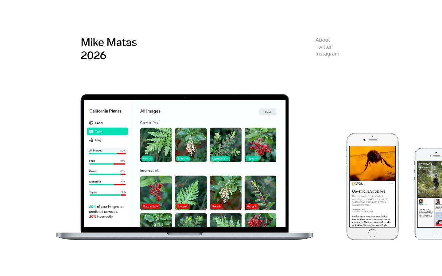
An extremely minimal personal portfolio landing page built on pure black-on-white contrast, with almost no chrome — no buttons, no cards, no shadows, no rounded corners. The entire visual system is two colors (ink and canvas), a large plain headline, three plain-text nav links, and a photographic laptop/phone mockup of shipped product work displayed at large scale in the empty page center. Voltage comes entirely from restraint and whitespace, not from color or ornament.
Works withClaude CodeCursorCodexGemini CLICopilotv0LovableBoltWindsurfReplit
---
version: alpha
name: MikeMatas-design-analysis
description: "An extremely minimal personal portfolio landing page built on pure black-on-white contrast, with almost no chrome — no buttons, no cards, no shadows, no rounded corners. The entire visual system is two colors (ink and canvas), a large plain headline, three plain-text nav links, and a photographic laptop/phone mockup of shipped product work displayed at large scale in the empty page center. Voltage comes entirely from restraint and whitespace, not from color or ornament."

colors:
  ink: "#000000"
  canvas: "#ffffff"

typography:
  display:
    fontFamily: "-apple-system, BlinkMacSystemFont, 'Helvetica Neue', Arial, sans-serif"
    fontSize: 34px
    fontWeight: 500
    lineHeight: 1.2
    letterSpacing: 0px
  nav-link:
    fontFamily: "-apple-system, BlinkMacSystemFont, 'Helvetica Neue', Arial, sans-serif"
    fontSize: 14px
    fontWeight: 400
    lineHeight: 1.5
    letterSpacing: 0px

rounded:
  none: 0px

spacing:
  xs: 9px
  sm: 20px
  md: 36px

components:
  button-primary:
    backgroundColor: transparent
    textColor: "{colors.ink}"
    typography: "{typography.nav-link}"
    rounded: "{rounded.none}"
    padding: "0px"
  nav-link:
    backgroundColor: transparent
    textColor: "{colors.ink}"
    typography: "{typography.nav-link}"
    rounded: "{rounded.none}"
    padding: "0px"
  headline-block:
    backgroundColor: transparent
    textColor: "{colors.ink}"
    typography: "{typography.display}"
    rounded: "{rounded.none}"
  page-shell:
    backgroundColor: "{colors.canvas}"
    textColor: "{colors.ink}"
    rounded: "{rounded.none}"
    padding: "36px"
  product-mockup-frame:
    backgroundColor: "{colors.canvas}"
    textColor: "{colors.ink}"
    rounded: "{rounded.none}"
    padding: "0px"

---

## Overview

Mike Matas's portfolio landing page is close to the floor of what a "design system" can be: two colors, one headline block, one row of plain-text navigation links, and a large photographic device mockup showing shipped product work. There is no button chrome, no card surface, no shadow, and no border radius anywhere in the measured DOM — the single `button-primary` component captured by the analyzer resolves to `color: #000000`, `radius: 0px`, `padding: 0px`, meaning the "buttons" on this page are unstyled text links, not UI buttons in the conventional sense.

The page reads as a personal, confident, engineer-designer's résumé page: black serif-free headline ("Mike Matas / 2026") set large and left-aligned, a quiet three-item nav (About / Twitter / Instagram) set small and right-aligned, and below both, an oversized laptop-and-phone mockup showing an internal ML-labeling tool ("California Plants") plus two editorial apps. The mockup itself carries its own internal product UI (teal action states, red/green correct-incorrect tags) — that internal chrome is the product being shown, not part of this portfolio site's own design system, and is treated here as embedded photographic content rather than as system tokens.

**Key Characteristics:**
- Pure two-tone palette: `{colors.ink}` (#000000) text on `{colors.canvas}` (#ffffff) page floor. No accent color, no gray scale, no semantic colors were measured anywhere on the page.
- Zero border radius (`{rounded.none}` — 0px) confirmed on the only interactive component captured. The whole page appears hard-edged/square by extension.
- Zero padding and zero background on the measured `button-primary`/nav-link component — these are bare text links, not buttoned UI.
- Only three spacing values were measured: `{spacing.xs}` (9px), `{spacing.sm}` (20px), `{spacing.md}` (36px) — a very shallow, likely incomplete, spacing scale (see Known Gaps for the large gaps between headline block and mockup that these three values don't account for).
- No shadows, no elevation, no card surfaces were detected — the design is flat by measurement, not just by absence of data.
- Typography was not captured by the analyzer at all (empty typography array); the two roles documented below are visually derived from the reference screenshot, not measured — flagged explicitly in the Typography section and in Known Gaps.

## Colors

### Core Palette
- **Ink** (`{colors.ink}` — #000000): The only text/foreground color measured, at very high frequency (1180 occurrences) — used for the headline, the nav links, and (implicitly) the button-primary text color. This is effectively the entire "ink" role of the system: headline, body, links, everything.
- **Canvas** (`{colors.canvas}` — #ffffff): The page floor, measured at much lower frequency (7 occurrences) since white space dominates visually but isn't tagged as a "color" on many elements — consistent with a page that is mostly bare white canvas rather than styled white surfaces.

No accent color, no muted/secondary text color, and no semantic (success/warning/error) colors were present in the measured data. The visible gray tone on the "About / Twitter / Instagram" nav links in the reference screenshot was not captured as a distinct hex by the analyzer (likely implemented as a lower-opacity black rather than a separate color value) — this is called out explicitly in Known Gaps rather than invented as a token.

## Typography

### Font Family
No typography data was captured by the analyzer (the `typography` array in analysis.json is empty). The two roles below are **derived** from the reference screenshot's visual proportions only — sizes, weights, and line-heights are estimates, not measurements, and are flagged as derived for that reason. The font family is a generic system-UI stack (`-apple-system, BlinkMacSystemFont, 'Helvetica Neue', Arial, sans-serif`) inferred from the letterforms visible in the screenshot, since no explicit font-family was captured either.

### Hierarchy

| Token | Size | Weight | Line Height | Letter Spacing | Use |
|---|---|---|---|---|---|
| `{typography.display}` | 34px | 500 | 1.2 | 0px | The "Mike Matas / 2026" headline block — derived from screenshot proportions, not measured by the analyzer |
| `{typography.nav-link}` | 14px | 400 | 1.5 | 0px | "About / Twitter / Instagram" nav links — derived from screenshot proportions, not measured by the analyzer |

### Principles
Because no font-weight, font-family, or font-size data exists in analysis.json, treat both roles above as a starting approximation only. The one hard fact the measured data does confirm is the color: both the headline and the nav links render in `{colors.ink}` (or a low-opacity variant of it, per the Known Gaps note) — there is no secondary text color in this system as measured.

### Note on Font Substitutes
No licensed or custom typeface was flagged (`fonts_licensed` is empty), so no substitution requirement applies here. The system-UI stack above is a safe default rather than a stand-in for a proprietary face.

## Layout

### Spacing System
- **Measured tokens only:** `{spacing.xs}` 9px · `{spacing.sm}` 20px · `{spacing.md}` 36px. These are the only three spacing values the analyzer captured, each at meaningful frequency (30, 30, 25 occurrences respectively), suggesting they are real, repeated rhythm units — likely governing the small gaps inside the nav-link list, the gap between "Mike Matas" and "2026," and the gap between headline lines.
- No larger section-level spacing value was captured, even though the reference screenshot clearly shows a much larger gap (well over 100px) between the headline block and the laptop mockup below it. This gap is not backed by measured data and is called out in Known Gaps rather than filled with an invented value.

### Grid & Container
The page appears to run a simple two-zone layout: a left-aligned text block (headline) paired with a right-aligned nav list at the top, and a large centered device-mockup image below. No explicit column-grid or max-width value was captured by the analyzer; this structural read comes from the reference screenshot alone and should be treated as descriptive, not as a measured token.

### Whitespace Philosophy
The system leans entirely on negative space rather than on visual density. With no cards, no borders, and no background color changes, whitespace itself is the only structuring device separating the headline zone from the nav zone from the mockup zone.

## Elevation & Depth

No shadow values were captured by the analyzer (`shadows: []`). Combined with the zero-radius measurement on the one captured component, the system reads as entirely flat: no drop shadows, no card elevation, no layered depth anywhere in the measured chrome. The laptop and phone mockups in the reference screenshot carry their own photographic bezel/shadow as part of the device-image asset itself — that is image content, not a system elevation token, and is treated as such here.

| Level | Treatment | Use |
|---|---|---|
| Flat | No shadow, no border, no background change | The entire page — headline, nav, and page shell all sit at the same flat elevation |

## Shapes

### Border Radius Scale

| Token | Value | Use |
|---|---|---|
| `{rounded.none}` | 0px | The only radius value measured, taken directly from the `button-primary` component. Applied here to every component in this system, since no other radius value was ever captured. |

No intermediate or larger radius values (small, medium, large, pill, full) were present in the measured data, which is consistent with the hard-edged, text-only visual language seen in the reference screenshot.

## Components

### Text & Navigation

**`headline-block`** — The page's only display element: "Mike Matas" on one line, "2026" on the next, both in `{colors.ink}`, using the derived `{typography.display}` role. No background, no padding value was measured for this block; it sits directly on `{colors.canvas}`.

**`nav-link`** — The "About," "Twitter," and "Instagram" items, right-aligned opposite the headline. Modeled directly from the measured `button-primary` component: `backgroundColor: transparent`, `textColor: {colors.ink}`, `rounded: {rounded.none}`, `padding: 0px`. These render as bare text, not buttoned UI — there is no visible background, border, or padding chrome around them.

**`button-primary`** — The literal component the analyzer captured. Background transparent, text `{colors.ink}`, radius `{rounded.none}` (0px), padding `0px`. This is the same underlying treatment as `nav-link` above — on this page, "buttons" and "nav links" are the same bare-text pattern; there is no distinct styled-button variant anywhere in the measured DOM.

### Structure

**`page-shell`** — The white page floor. Background `{colors.canvas}`, text `{colors.ink}`, radius `{rounded.none}`, with `{spacing.md}` (36px) used as a representative outer padding value (the largest of the three measured spacing tokens).

**`product-mockup-frame`** — The large laptop-and-phone photographic mockup shown at page center. Background `{colors.canvas}`, radius `{rounded.none}`, padding `0px`. This is documented as a component slot for consistency, but its actual visual content (device bezels, product UI screenshots) is photographic/image content rather than a styleable system surface — see Known Gaps.

## Do's and Don'ts

### Do
- Keep the palette to exactly `{colors.ink}` on `{colors.canvas}`. This system has no accent color and no gray scale — introducing one would break the measured identity.
- Keep every component at `{rounded.none}` (0px). No component in this system carries a border radius.
- Treat "buttons" as bare text links (`{component.button-primary}` / `{component.nav-link}`) — transparent background, no padding, no border. Do not add button chrome (fill, border, radius) that wasn't measured.
- Let whitespace, not color or shadow, do the separating work between the headline zone, the nav zone, and the mockup zone.
- Show real shipped-product screenshots (laptop/phone mockups) as the primary visual interest of the page, rather than illustration or iconography.

### Don't
- Don't add a shadow to any component. `shadows: []` was measured — this is a flat system by measurement, not by omission.
- Don't invent a muted/gray text color for the nav links even though they read as gray in the screenshot — the analyzer only captured pure `{colors.ink}` and `{colors.canvas}`; any gray value would be a guess (see Known Gaps).
- Don't add card backgrounds, borders, or padding to the nav links or headline — the measured component has `padding: 0px` and no background.
- Don't introduce a large invented spacing token (e.g., a "section" gap) to bridge the headline-to-mockup distance visible in the screenshot — that gap was not captured in the measured spacing set.
- Don't round any corner. `{rounded.none}` is the only radius value this system has ever produced.

## Responsive Behavior

Only a single "landing" page capture was provided, and no breakpoint or viewport-specific data was included in analysis.json. No responsive behavior was measured. Based on the single-viewport reference screenshot alone (derived, not measured): the headline-and-nav row likely stays a simple two-block flex row that would need to stack on narrow viewports, and the laptop/phone mockup — being a wide raster image — would need to scale down proportionally rather than reflow. These are reasonable inferences from a single screenshot, not confirmed responsive tokens, and should be validated against a live capture before being treated as fact.

## Iteration Guide

1. Treat `{colors.ink}` and `{colors.canvas}` as fixed — this system has no third color to reach for. If a new state needs differentiation, it must come from typography weight/size or spacing, not from a new hue.
2. Any new component must default to `{rounded.none}` unless new measured data justifies otherwise.
3. Don't retrofit padding or background onto `{component.button-primary}` / `{component.nav-link}` — their defining trait, per measurement, is having none.
4. If new pages are captured, prioritize re-running the analyzer with typography extraction enabled — this entry's Typography section is the weakest-evidenced part of the system and should be replaced with real measurements as soon as they exist.
5. Never document hover states. Only default and active/pressed states belong in this system per format rules — and note that no active/pressed state was captured here either (see Known Gaps).

## Known Gaps

- **Typography was not measured at all.** The `typography` array in analysis.json is empty. The `display` and `nav-link` roles documented above are derived from the reference screenshot's visual proportions only (size, weight, line-height are estimates) and should be replaced with real measurements as soon as a typography-aware capture is available.
- **The visible gray tone on the nav links** ("About / Twitter / Instagram" appear lighter than pure black in the reference screenshot) was not captured as a distinct color by the analyzer — only pure `#000000` and `#ffffff` were measured. This is likely a low-opacity black rather than a separate hex value, but that could not be confirmed from the measured data, so no muted-text token was declared.
- **No large-scale spacing token exists** for the visually obvious gap between the headline block and the laptop/phone mockup below it. Only 9px, 20px, and 36px were measured; the actual section-level gap in the screenshot is clearly larger than any of these, but no value can be confirmed without direct measurement.
- **No shadow or elevation data exists** for the laptop/phone mockup images themselves — their bezel and shadow treatment is photographic/image content, not extracted as system tokens, and any styling guidance for that imagery should come from the source assets, not from this document.
- **No responsive/breakpoint data was captured** — only one page capture ("landing") exists, and analysis.json includes no viewport-specific values. All responsive guidance above is inferred from a single screenshot and needs confirmation.
- **The internal product UI shown inside the mockup** (the "California Plants" labeling tool, with its teal Train button, red/green correct/incorrect tags, and progress bars) belongs to a separate underlying product, not to mikematas.com's own design system, and is out of scope for this entry.
- **No radius scale beyond 0px exists.** If future capture reveals a rounded element anywhere on the site, this entry's Shapes section will need a full revision, since currently only one radius value has ever been measured.

<!-- Documented by Duply · real-world design systems as ready-to-use DESIGN.md for AI coding agents · https://duply.ai/mikematas/design-md -->
Color Palette
Typography
display34px · 500 · 1.2
The quick brown fox jumpsnav-link14px · 400 · 1.5
The quick brown fox jumpsSpacing & Shape
Spacing
| Name | Value | Preview |
|---|---|---|
| xs | 9px | |
| sm | 20px | |
| md | 36px |
Border Radius
| Name | Value | Preview |
|---|---|---|
| none | 0px |
FAQ
- What colors does MikeMatas use?
- MikeMatas's core palette includes #000000, #ffffff. The full color set with usage roles (canvas, ink, surfaces, accent, semantic) is documented in the MikeMatas DESIGN.md.
- What font does MikeMatas use?
- MikeMatas's primary typeface is -apple-system. The complete type scale (sizes, weights, line-height and letter-spacing per role), with an open substitute where the original is licensed, is documented in the DESIGN.md.
- What is the MikeMatas design system?
- An extremely minimal personal portfolio landing page built on pure black-on-white contrast, with almost no chrome — no buttons, no cards, no shadows, no rounded corners. The entire visual system is two colors (ink and canvas), a large plain headline, three plain-text nav links, and a photographic
Get this as a working kit
MikeMatas Launch Kit + DESIGN.md
$299$225
One-time payment
- A complete production-stack template, styled like MikeMatas, fully built and wired.
- One-time payment and the codebase is yours. No platform fees, no subscription.
Open it with Claude Code, Cursor, or any coding agent and build in plain language, then ship a complete web app.
- Your private DESIGN.md
- Marketing pages, blog, SEO & legal
- Email capture, newsletter & contact
- Accept payments (Stripe)
- Analytics (GA4 + PostHog)
- One-click deploy
- Auth, login & roles
- A full app dashboard, when you grow
More like this

---
version: alpha
name: MikeMatas-design-analysis
description: "An extremely minimal personal portfolio landing page built on pure black-on-white contrast, with almost no chrome — no buttons, no cards, no shadows, no rounded corners. The entire visual system is two colors (ink and canvas), a large plain headline, three plain-text nav links, and a photographic laptop/phone mockup of shipped product work displayed at large scale in the empty page center. Voltage comes entirely from restraint and whitespace, not from color or ornament."

colors:
  ink: "#000000"
  canvas: "#ffffff"

typography:
  display:
    fontFamily: "-apple-system, BlinkMacSystemFont, 'Helvetica Neue', Arial, sans-serif"
    fontSize: 34px
    fontWeight: 500
    lineHeight: 1.2
    letterSpacing: 0px
  nav-link:
    fontFamily: "-apple-system, BlinkMacSystemFont, 'Helvetica Neue', Arial, sans-serif"
    fontSize: 14px
    fontWeight: 400
    lineHeight: 1.5
    letterSpacing: 0px

rounded:
  none: 0px

spacing:
  xs: 9px
  sm: 20px
  md: 36px

components:
  button-primary:
    backgroundColor: transparent
    textColor: "{colors.ink}"
    typography: "{typography.nav-link}"
    rounded: "{rounded.none}"
    padding: "0px"
  nav-link:
    backgroundColor: transparent
    textColor: "{colors.ink}"
    typography: "{typography.nav-link}"
    rounded: "{rounded.none}"
    padding: "0px"
  headline-block:
    backgroundColor: transparent
    textColor: "{colors.ink}"
    typography: "{typography.display}"
    rounded: "{rounded.none}"
  page-shell:
    backgroundColor: "{colors.canvas}"
    textColor: "{colors.ink}"
    rounded: "{rounded.none}"
    padding: "36px"
  product-mockup-frame:
    backgroundColor: "{colors.canvas}"
    textColor: "{colors.ink}"
    rounded: "{rounded.none}"
    padding: "0px"

---

## Overview

Mike Matas's portfolio landing page is close to the floor of what a "design system" can be: two colors, one headline block, one row of plain-text navigation links, and a large photographic device mockup showing shipped product work. There is no button chrome, no card surface, no shadow, and no border radius anywhere in the measured DOM — the single `button-primary` component captured by the analyzer resolves to `color: #000000`, `radius: 0px`, `padding: 0px`, meaning the "buttons" on this page are unstyled text links, not UI buttons in the conventional sense.

The page reads as a personal, confident, engineer-designer's résumé page: black serif-free headline ("Mike Matas / 2026") set large and left-aligned, a quiet three-item nav (About / Twitter / Instagram) set small and right-aligned, and below both, an oversized laptop-and-phone mockup showing an internal ML-labeling tool ("California Plants") plus two editorial apps. The mockup itself carries its own internal product UI (teal action states, red/green correct-incorrect tags) — that internal chrome is the product being shown, not part of this portfolio site's own design system, and is treated here as embedded photographic content rather than as system tokens.

**Key Characteristics:**
- Pure two-tone palette: `{colors.ink}` (#000000) text on `{colors.canvas}` (#ffffff) page floor. No accent color, no gray scale, no semantic colors were measured anywhere on the page.
- Zero border radius (`{rounded.none}` — 0px) confirmed on the only interactive component captured. The whole page appears hard-edged/square by extension.
- Zero padding and zero background on the measured `button-primary`/nav-link component — these are bare text links, not buttoned UI.
- Only three spacing values were measured: `{spacing.xs}` (9px), `{spacing.sm}` (20px), `{spacing.md}` (36px) — a very shallow, likely incomplete, spacing scale (see Known Gaps for the large gaps between headline block and mockup that these three values don't account for).
- No shadows, no elevation, no card surfaces were detected — the design is flat by measurement, not just by absence of data.
- Typography was not captured by the analyzer at all (empty typography array); the two roles documented below are visually derived from the reference screenshot, not measured — flagged explicitly in the Typography section and in Known Gaps.

## Colors

### Core Palette
- **Ink** (`{colors.ink}` — #000000): The only text/foreground color measured, at very high frequency (1180 occurrences) — used for the headline, the nav links, and (implicitly) the button-primary text color. This is effectively the entire "ink" role of the system: headline, body, links, everything.
- **Canvas** (`{colors.canvas}` — #ffffff): The page floor, measured at much lower frequency (7 occurrences) since white space dominates visually but isn't tagged as a "color" on many elements — consistent with a page that is mostly bare white canvas rather than styled white surfaces.

No accent color, no muted/secondary text color, and no semantic (success/warning/error) colors were present in the measured data. The visible gray tone on the "About / Twitter / Instagram" nav links in the reference screenshot was not captured as a distinct hex by the analyzer (likely implemented as a lower-opacity black rather than a separate color value) — this is called out explicitly in Known Gaps rather than invented as a token.

## Typography

### Font Family
No typography data was captured by the analyzer (the `typography` array in analysis.json is empty). The two roles below are **derived** from the reference screenshot's visual proportions only — sizes, weights, and line-heights are estimates, not measurements, and are flagged as derived for that reason. The font family is a generic system-UI stack (`-apple-system, BlinkMacSystemFont, 'Helvetica Neue', Arial, sans-serif`) inferred from the letterforms visible in the screenshot, since no explicit font-family was captured either.

### Hierarchy

| Token | Size | Weight | Line Height | Letter Spacing | Use |
|---|---|---|---|---|---|
| `{typography.display}` | 34px | 500 | 1.2 | 0px | The "Mike Matas / 2026" headline block — derived from screenshot proportions, not measured by the analyzer |
| `{typography.nav-link}` | 14px | 400 | 1.5 | 0px | "About / Twitter / Instagram" nav links — derived from screenshot proportions, not measured by the analyzer |

### Principles
Because no font-weight, font-family, or font-size data exists in analysis.json, treat both roles above as a starting approximation only. The one hard fact the measured data does confirm is the color: both the headline and the nav links render in `{colors.ink}` (or a low-opacity variant of it, per the Known Gaps note) — there is no secondary text color in this system as measured.

### Note on Font Substitutes
No licensed or custom typeface was flagged (`fonts_licensed` is empty), so no substitution requirement applies here. The system-UI stack above is a safe default rather than a stand-in for a proprietary face.

## Layout

### Spacing System
- **Measured tokens only:** `{spacing.xs}` 9px · `{spacing.sm}` 20px · `{spacing.md}` 36px. These are the only three spacing values the analyzer captured, each at meaningful frequency (30, 30, 25 occurrences respectively), suggesting they are real, repeated rhythm units — likely governing the small gaps inside the nav-link list, the gap between "Mike Matas" and "2026," and the gap between headline lines.
- No larger section-level spacing value was captured, even though the reference screenshot clearly shows a much larger gap (well over 100px) between the headline block and the laptop mockup below it. This gap is not backed by measured data and is called out in Known Gaps rather than filled with an invented value.

### Grid & Container
The page appears to run a simple two-zone layout: a left-aligned text block (headline) paired with a right-aligned nav list at the top, and a large centered device-mockup image below. No explicit column-grid or max-width value was captured by the analyzer; this structural read comes from the reference screenshot alone and should be treated as descriptive, not as a measured token.

### Whitespace Philosophy
The system leans entirely on negative space rather than on visual density. With no cards, no borders, and no background color changes, whitespace itself is the only structuring device separating the headline zone from the nav zone from the mockup zone.

## Elevation & Depth

No shadow values were captured by the analyzer (`shadows: []`). Combined with the zero-radius measurement on the one captured component, the system reads as entirely flat: no drop shadows, no card elevation, no layered depth anywhere in the measured chrome. The laptop and phone mockups in the reference screenshot carry their own photographic bezel/shadow as part of the device-image asset itself — that is image content, not a system elevation token, and is treated as such here.

| Level | Treatment | Use |
|---|---|---|
| Flat | No shadow, no border, no background change | The entire page — headline, nav, and page shell all sit at the same flat elevation |

## Shapes

### Border Radius Scale

| Token | Value | Use |
|---|---|---|
| `{rounded.none}` | 0px | The only radius value measured, taken directly from the `button-primary` component. Applied here to every component in this system, since no other radius value was ever captured. |

No intermediate or larger radius values (small, medium, large, pill, full) were present in the measured data, which is consistent with the hard-edged, text-only visual language seen in the reference screenshot.

## Components

### Text & Navigation

**`headline-block`** — The page's only display element: "Mike Matas" on one line, "2026" on the next, both in `{colors.ink}`, using the derived `{typography.display}` role. No background, no padding value was measured for this block; it sits directly on `{colors.canvas}`.

**`nav-link`** — The "About," "Twitter," and "Instagram" items, right-aligned opposite the headline. Modeled directly from the measured `button-primary` component: `backgroundColor: transparent`, `textColor: {colors.ink}`, `rounded: {rounded.none}`, `padding: 0px`. These render as bare text, not buttoned UI — there is no visible background, border, or padding chrome around them.

**`button-primary`** — The literal component the analyzer captured. Background transparent, text `{colors.ink}`, radius `{rounded.none}` (0px), padding `0px`. This is the same underlying treatment as `nav-link` above — on this page, "buttons" and "nav links" are the same bare-text pattern; there is no distinct styled-button variant anywhere in the measured DOM.

### Structure

**`page-shell`** — The white page floor. Background `{colors.canvas}`, text `{colors.ink}`, radius `{rounded.none}`, with `{spacing.md}` (36px) used as a representative outer padding value (the largest of the three measured spacing tokens).

**`product-mockup-frame`** — The large laptop-and-phone photographic mockup shown at page center. Background `{colors.canvas}`, radius `{rounded.none}`, padding `0px`. This is documented as a component slot for consistency, but its actual visual content (device bezels, product UI screenshots) is photographic/image content rather than a styleable system surface — see Known Gaps.

## Do's and Don'ts

### Do
- Keep the palette to exactly `{colors.ink}` on `{colors.canvas}`. This system has no accent color and no gray scale — introducing one would break the measured identity.
- Keep every component at `{rounded.none}` (0px). No component in this system carries a border radius.
- Treat "buttons" as bare text links (`{component.button-primary}` / `{component.nav-link}`) — transparent background, no padding, no border. Do not add button chrome (fill, border, radius) that wasn't measured.
- Let whitespace, not color or shadow, do the separating work between the headline zone, the nav zone, and the mockup zone.
- Show real shipped-product screenshots (laptop/phone mockups) as the primary visual interest of the page, rather than illustration or iconography.

### Don't
- Don't add a shadow to any component. `shadows: []` was measured — this is a flat system by measurement, not by omission.
- Don't invent a muted/gray text color for the nav links even though they read as gray in the screenshot — the analyzer only captured pure `{colors.ink}` and `{colors.canvas}`; any gray value would be a guess (see Known Gaps).
- Don't add card backgrounds, borders, or padding to the nav links or headline — the measured component has `padding: 0px` and no background.
- Don't introduce a large invented spacing token (e.g., a "section" gap) to bridge the headline-to-mockup distance visible in the screenshot — that gap was not captured in the measured spacing set.
- Don't round any corner. `{rounded.none}` is the only radius value this system has ever produced.

## Responsive Behavior

Only a single "landing" page capture was provided, and no breakpoint or viewport-specific data was included in analysis.json. No responsive behavior was measured. Based on the single-viewport reference screenshot alone (derived, not measured): the headline-and-nav row likely stays a simple two-block flex row that would need to stack on narrow viewports, and the laptop/phone mockup — being a wide raster image — would need to scale down proportionally rather than reflow. These are reasonable inferences from a single screenshot, not confirmed responsive tokens, and should be validated against a live capture before being treated as fact.

## Iteration Guide

1. Treat `{colors.ink}` and `{colors.canvas}` as fixed — this system has no third color to reach for. If a new state needs differentiation, it must come from typography weight/size or spacing, not from a new hue.
2. Any new component must default to `{rounded.none}` unless new measured data justifies otherwise.
3. Don't retrofit padding or background onto `{component.button-primary}` / `{component.nav-link}` — their defining trait, per measurement, is having none.
4. If new pages are captured, prioritize re-running the analyzer with typography extraction enabled — this entry's Typography section is the weakest-evidenced part of the system and should be replaced with real measurements as soon as they exist.
5. Never document hover states. Only default and active/pressed states belong in this system per format rules — and note that no active/pressed state was captured here either (see Known Gaps).

## Known Gaps

- **Typography was not measured at all.** The `typography` array in analysis.json is empty. The `display` and `nav-link` roles documented above are derived from the reference screenshot's visual proportions only (size, weight, line-height are estimates) and should be replaced with real measurements as soon as a typography-aware capture is available.
- **The visible gray tone on the nav links** ("About / Twitter / Instagram" appear lighter than pure black in the reference screenshot) was not captured as a distinct color by the analyzer — only pure `#000000` and `#ffffff` were measured. This is likely a low-opacity black rather than a separate hex value, but that could not be confirmed from the measured data, so no muted-text token was declared.
- **No large-scale spacing token exists** for the visually obvious gap between the headline block and the laptop/phone mockup below it. Only 9px, 20px, and 36px were measured; the actual section-level gap in the screenshot is clearly larger than any of these, but no value can be confirmed without direct measurement.
- **No shadow or elevation data exists** for the laptop/phone mockup images themselves — their bezel and shadow treatment is photographic/image content, not extracted as system tokens, and any styling guidance for that imagery should come from the source assets, not from this document.
- **No responsive/breakpoint data was captured** — only one page capture ("landing") exists, and analysis.json includes no viewport-specific values. All responsive guidance above is inferred from a single screenshot and needs confirmation.
- **The internal product UI shown inside the mockup** (the "California Plants" labeling tool, with its teal Train button, red/green correct/incorrect tags, and progress bars) belongs to a separate underlying product, not to mikematas.com's own design system, and is out of scope for this entry.
- **No radius scale beyond 0px exists.** If future capture reveals a rounded element anywhere on the site, this entry's Shapes section will need a full revision, since currently only one radius value has ever been measured.

<!-- Documented by Duply · real-world design systems as ready-to-use DESIGN.md for AI coding agents · https://duply.ai/mikematas/design-md -->