Cuberto
A bold, monochrome agency portfolio built on a stark white canvas with massive black Suisse Intl display headlines, generous whitespace, and full-bleed media panels that flip to near-black. The system is near-zero-chroma — black ink on white, soft-rounded media cards, a single deep-dark showcase panel with large rounded corners, and a circular floating avatar/contact badge. Brand voltage comes entirely from oversized 81px display type and the white-to-near-black panel contrast, not from accent color.
---
version: alpha
name: Cuberto-design-analysis
description: "A bold, monochrome agency portfolio built on a stark white canvas with massive black Suisse Intl display headlines, generous whitespace, and full-bleed media panels that flip to near-black. The system is near-zero-chroma — black ink on white, soft-rounded media cards, a single deep-dark showcase panel with large rounded corners, and a circular floating avatar/contact badge. Brand voltage comes entirely from oversized 81px display type and the white-to-near-black panel contrast, not from accent color."
colors:
canvas: "#ffffff"
ink: "#000000"
muted: "#888888"
surface-dark: "#161616"
on-dark: "#ffffff"
typography:
display:
fontFamily: "Suisse Intl, Inter, sans-serif"
fontSize: 81px
fontWeight: 500
lineHeight: 1.0
letterSpacing: -0.81px
display-tight:
fontFamily: "Suisse Intl, Inter, sans-serif"
fontSize: 81px
fontWeight: 500
lineHeight: 1.0
letterSpacing: -1.62px
body:
fontFamily: "Suisse Intl, Inter, sans-serif"
fontSize: 21.6px
fontWeight: 400
lineHeight: 1.2
letterSpacing: 0.432px
rounded:
lg: 18px
xl: 72px
pill: 1000px
full: 99999px
spacing:
xxs: 4px
xs: 5px
sm: 11px
md: 16px
lg: 22px
xl: 29px
xxl: 50px
huge: 54px
components:
top-nav:
backgroundColor: "{colors.canvas}"
textColor: "{colors.ink}"
typography: "{typography.body}"
wordmark:
backgroundColor: transparent
textColor: "{colors.ink}"
typography: "{typography.body}"
nav-link:
backgroundColor: transparent
textColor: "{colors.ink}"
typography: "{typography.body}"
hero-band:
backgroundColor: "{colors.canvas}"
textColor: "{colors.ink}"
typography: "{typography.display}"
hero-subtext:
backgroundColor: transparent
textColor: "{colors.ink}"
typography: "{typography.body}"
media-card:
backgroundColor: "{colors.surface-dark}"
textColor: "{colors.on-dark}"
rounded: "{rounded.lg}"
dark-panel:
backgroundColor: "{colors.surface-dark}"
textColor: "{colors.on-dark}"
rounded: "{rounded.xl}"
body-copy-block:
backgroundColor: transparent
textColor: "{colors.ink}"
typography: "{typography.body}"
avatar-badge:
backgroundColor: "{colors.canvas}"
textColor: "{colors.ink}"
rounded: "{rounded.full}"
card:
backgroundColor: "{colors.canvas}"
textColor: "{colors.ink}"
rounded: "{rounded.lg}"
---
## Overview
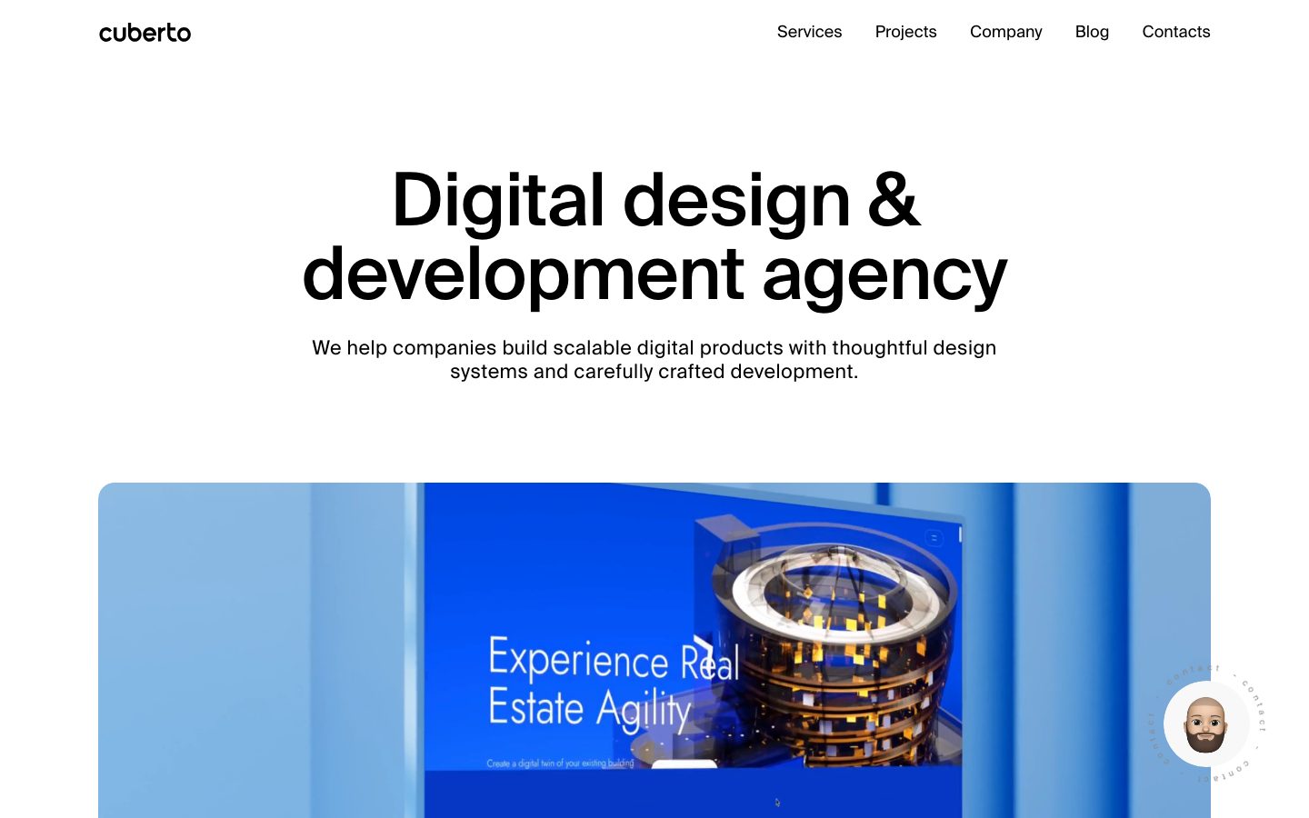
Cuberto's landing surface is a stark, confident agency portfolio — a pure white canvas (`{colors.canvas}` — #ffffff) carrying enormous black display type (`{colors.ink}` — #000000) set in **Suisse Intl** at 81px. The system is almost entirely monochrome: black ink on white, a single grey for secondary text (`{colors.muted}` — #888888), and a near-black showcase panel (`{colors.surface-dark}` — #161616) that the page scrolls into. There is no accent color in the measured data — the brand voltage is the type scale and the white-to-near-black contrast, nothing else.
Type voice is single-family: **Suisse Intl** runs both display and body. Display headlines (`{typography.display}` / `{typography.display-tight}`) are 81px, weight 500, line-height 1.0, with negative letter-spacing (-0.81px on h1, -1.62px on h2) — tight, dense, oversized. Body copy (`{typography.body}`) is 21.6px weight 400 with slightly positive tracking (0.432px). The whole page reads as a few very large statements with generous air around them.
Component voltage comes from **full-bleed media** — a soft-rounded video/project card (`{rounded.lg}` — 18px) showing project work, and a large near-black panel (`{rounded.xl}` — 72px top corners) that swallows the lower viewport. A circular floating **avatar/contact badge** (`{rounded.full}`) sits at the lower-right with an orbiting "contact" label — the one persistent interactive flourish.
**Key Characteristics:**
- Pure white canvas with pure black ink. The system is near-zero-chroma — no measured accent color.
- Oversized Suisse Intl display type (81px, weight 500, negative tracking) carries all hierarchy. Substituted with Inter here.
- A single muted grey (`{colors.muted}` — #888888) for secondary / orbiting label text.
- Soft-rounded media cards at `{rounded.lg}` (18px) for project showcases.
- A large near-black panel (`{colors.surface-dark}` — #161616) with `{rounded.xl}` (72px) top corners that the page scrolls into — the dominant lower-page surface.
- Circular floating contact badge at `{rounded.full}` (effectively a perfect circle) with an orbiting text ring.
- No shadows measured anywhere — the system is flat, relying on color-block contrast for depth.
- Generous, irregular whitespace rhythm — measured spacing clusters around 16px, 22px, 29px, and 50–54px.
## Colors
### Brand & Ink
- **Ink** (`{colors.ink}` — #000000): Pure black. All display headlines, body copy, nav links, and the wordmark. This is the dominant content color on white.
- **On Dark** (`{colors.on-dark}` — #ffffff): White text used on the near-black panel and media card. The same measured white as the canvas, used in its inverted role.
### Surface
- **Canvas** (`{colors.canvas}` — #ffffff): The default page floor — the entire upper page is white.
- **Surface Dark** (`{colors.surface-dark}` — #161616): The near-black showcase panel that fills the lower viewport, and the dark video/media card surface. The only dark surface in the system and the page's primary depth signal.
### Text
- **Muted** (`{colors.muted}` — #888888): Secondary text — the orbiting "contact" label around the avatar badge, fine captions, and low-emphasis micro-labels.
The palette is deliberately monochrome — black, white, one grey, one near-black. No measured accent, no semantic colors. Color expression is entirely tonal.
## Typography
### Font Family
The system runs **Suisse Intl** for everything — display headlines and body copy alike. Suisse Intl is a licensed Swiss grotesque (clean, neutral, tightly-set). Display sizes use weight 500 with negative letter-spacing; body uses weight 400 with slightly positive tracking. There is no secondary family — the single-typeface discipline is part of the voice.
### Hierarchy
| Token | Size | Weight | Line Height | Letter Spacing | Use |
|---|---|---|---|---|---|
| `{typography.display}` | 81px | 500 | 1.0 | -0.81px | Hero h1 ("Digital design & development agency") |
| `{typography.display-tight}` | 81px | 500 | 1.0 | -1.62px | Section h2 headlines — tighter tracking variant |
| `{typography.body}` | 21.6px | 400 | 1.2 | 0.432px | Sub-headlines, running copy, nav links |
### Principles
The display type is the brand — oversized (81px), weight 500 (never bolder), line-height a tight 1.0, and negative letter-spacing that packs the words into dense blocks. h2 pushes tracking even tighter (-1.62px) than h1 (-0.81px). Body copy inverts the relationship — slightly positive tracking (0.432px) and a comfortable 1.2 line-height for legibility at 21.6px. Never set display type at the body weight, and never loosen the display tracking — the dense, negative-tracked headline is the signature.
### Note on Font Substitutes
**Suisse Intl** is a licensed commercial typeface (flagged in the analysis) and is not shipped here. Use **Inter** at weight 500 with roughly -0.01 to -0.02em letter-spacing as the display substitute, and Inter weight 400 for body. Inter's humanist proportions differ slightly from Suisse Intl's grotesque neutrality, but the weight and tracking signature carries. **Helvetica Now** or **Neue Haas Grotesk** are closer (also licensed) alternatives if available.
## Layout
### Spacing System
- **Base unit:** Loosely 4–5px; the measured rhythm is irregular rather than a strict 8px grid.
- **Tokens:** `{spacing.xxs}` 4px · `{spacing.xs}` 5px · `{spacing.sm}` 11px · `{spacing.md}` 16px · `{spacing.lg}` 22px · `{spacing.xl}` 29px · `{spacing.xxl}` 50px · `{spacing.huge}` 54px.
- **Most-frequent values:** 5px and 4px dominate at the micro scale; 16px, 22px, and 29px carry component-internal spacing; 50–54px handles larger gaps.
### Grid & Container
- **Hero:** Centered single-column composition — wordmark + nav across the top, then a centered 81px headline and centered sub-paragraph below.
- **Media:** Full-width media card spanning the content width below the hero.
- **Body copy:** A narrow right-aligned text column (measured in the second screenshot) sits against generous left whitespace.
- **Dark panel:** Full-bleed, edge-to-edge, with rounded top corners (`{rounded.xl}` — 72px).
### Whitespace Philosophy
Cuberto uses aggressive whitespace — the hero headline sits in a large empty field, and the body-copy block is deliberately small against a wide blank margin. The composition trusts scale and emptiness to do the work: a few enormous statements separated by air, then a hard cut into the dark panel.
## Elevation & Depth
| Level | Treatment | Use |
|---|---|---|
| Flat | No shadow, no border | All white-canvas content, nav, headlines |
| Media card | `{colors.surface-dark}` fill, `{rounded.lg}` corners, no shadow | Project/video showcase card |
| Dark panel | `{colors.surface-dark}` full-bleed fill, `{rounded.xl}` top corners, no shadow | The page's lower showcase section |
The system measured **zero shadows**. Depth is created entirely by color-block contrast — the near-black panel against white reads as a foreground plane purely through tone and the large rounded top corners. No drop shadows, no glassmorphism, no neumorphism.
### Decorative Depth
- The circular avatar/contact badge floats at lower-right with an orbiting `{colors.muted}` text ring ("contact · contact ·"), the one piece of decorative motion-implying chrome.
- The rounded top corners of the dark panel (`{rounded.xl}` — 72px) read as the page peeling up into a second surface.
## Shapes
### Border Radius Scale
| Token | Value | Use |
|---|---|---|
| `{rounded.lg}` | 18px | Media / project showcase cards (19 measured occurrences) |
| `{rounded.xl}` | 72px | Large rounded top corners on the full-bleed dark panel |
| `{rounded.pill}` | 1000px | Pill-radius elements / fully-rounded buttons or labels |
| `{rounded.full}` | 99999px | Circular avatar/contact badge |
### Photography Geometry
Project media is presented inside `{rounded.lg}` (18px) soft-rounded cards retaining native landscape ratios. The floating avatar uses `{rounded.full}` for a perfect circle. The dark showcase panel uses an unusually large `{rounded.xl}` (72px) only on its top corners, framing the transition from white into near-black.
## Components
### Navigation
**`top-nav`** — White nav bar across the top of the page. Background `{colors.canvas}`, text `{colors.ink}`. Carries the `{component.wordmark}` ("cuberto") at left and a horizontal menu (Services, Projects, Company, Blog, Contacts) at right.
**`wordmark`** — The lowercase "cuberto" logotype at top-left, in `{colors.ink}`.
**`nav-link`** — Horizontal menu items in `{colors.ink}`. (Exact nav type size was not separately measured — see Known Gaps; documented here referencing `{typography.body}`.)
### Hero
**`hero-band`** — Centered hero on white canvas. Background `{colors.canvas}`, the 81px headline in `{colors.ink}` using `{typography.display}`. Two-line oversized statement ("Digital design & development agency").
**`hero-subtext`** — The centered sub-paragraph below the headline ("We help companies build scalable digital products…"). Text `{colors.ink}`, typography `{typography.body}`.
### Media & Surfaces
**`media-card`** — Full-width project/video showcase card. Background `{colors.surface-dark}` (the artwork shows through), rounded `{rounded.lg}` (18px), no shadow. Holds project video / imagery with embedded labels.
**`dark-panel`** — The large near-black panel the page scrolls into. Background `{colors.surface-dark}` (#161616), text `{colors.on-dark}`, full-bleed with `{rounded.xl}` (72px) top corners. The dominant lower-page surface and the system's only large dark plane.
**`body-copy-block`** — A narrow right-aligned running-text column on white. Text `{colors.ink}`, typography `{typography.body}`. Used for the "Since 2010…" intro paragraphs.
**`card`** — Generic content card. Background `{colors.canvas}`, text `{colors.ink}`. (The frequency analyzer measured one card element at radius 0px / no shadow; rounded media cards use `{rounded.lg}` — see Known Gaps.)
### Floating Badge
**`avatar-badge`** — Circular floating contact badge at lower-right. Background `{colors.canvas}`, rounded `{rounded.full}` (perfect circle), holding an avatar image inside an orbiting `{colors.muted}` "contact" text ring. The one persistent interactive flourish.
## Do's and Don'ts
### Do
- Keep the palette monochrome — black ink on white, with `{colors.muted}` reserved for micro-labels only.
- Set display headlines at the full 81px, weight 500, with negative letter-spacing. The dense oversized headline is the entire brand.
- Use `{colors.surface-dark}` (#161616) as a deliberate, scarce surface — the showcase panel and media cards only.
- Apply `{rounded.lg}` (18px) to project media and the large `{rounded.xl}` (72px) only to the dark panel's top corners.
- Let whitespace dominate — a few enormous statements with wide blank margins.
- Keep the avatar/contact badge a perfect circle (`{rounded.full}`).
### Don't
- Don't introduce an accent color — there is none in the measured system. Expression stays tonal.
- Don't set display type below weight 500 or loosen its negative tracking. Off-tracking reads as off-brand.
- Don't add drop shadows — the system measured zero. Use color-block contrast for depth.
- Don't put running body copy in the display tracking; body uses positive tracking (0.432px).
- Don't scatter dark surfaces across the page — the near-black is a single deliberate plane.
- Don't document hover states — only default and active/pressed.
## Responsive Behavior
### Breakpoints
Breakpoint values were not captured in the measured analysis (single landing page at one viewport). The following is a reasonable adaptation strategy, not measured data.
| Name | Width | Key Changes (derived) |
|---|---|---|
| Mobile | < 768px | Nav likely collapses to a menu trigger; 81px display scales down substantially; media card and dark panel go edge-to-edge |
| Tablet | 768–1024px | Display type scales down; centered hero retained |
| Desktop | 1024px+ | Full 81px display; horizontal nav; full-width media card and dark panel |
### Touch Targets
- Nav links and the floating `{component.avatar-badge}` should meet a 44×44px minimum tap area; the badge is comfortably larger as a circle.
- Specific control dimensions were not measured (see Known Gaps).
### Collapsing Strategy
- The centered hero stack (wordmark/nav → headline → sub-paragraph → media) collapses naturally to single-column.
- The dark panel stays full-bleed at all widths, retaining its `{rounded.xl}` top corners.
- The right-aligned body-copy block likely centers or full-widths on mobile.
## Iteration Guide
1. Focus on ONE component at a time. Reference its YAML key directly (`{component.hero-band}`, `{component.dark-panel}`).
2. Variants of an existing component (`-active`, `-disabled`) live as separate entries in `components:`.
3. Use `{token.refs}` everywhere — never inline hex.
4. Never document hover. Default and Active/Pressed states only.
5. Display headlines stay Suisse Intl (Inter substitute) weight 500 with negative tracking. The single-family discipline does not blur.
6. The near-black panel is the only large dark surface — don't add others casually.
7. When in doubt about emphasis: bigger display type before any new color.
## Known Gaps
- **Suisse Intl is licensed** and not shipped; Inter is documented as the open-source substitute in the Typography section. Exact display weights beyond 500 were not observed.
- Only three typography roles (h1, h2, body) were measured. Nav-link, button, and caption type sizes were not separately captured — nav-link is documented referencing `{typography.body}` as an approximation.
- The frequency analyzer reported one generic `card` at radius 0px / no shadow, which conflicts with the 19 measured occurrences of 18px radius on media cards. The `{component.card}` and `{component.media-card}` entries reconcile this from screenshot ground-truth, but a precise per-card radius map was not extracted.
- `{rounded.pill}` (1000px) and the 99999px / `{rounded.full}` radii were measured but their exact element assignments (buttons vs. badges vs. labels) were not fully attributed; `{rounded.full}` is documented on the avatar badge from the screenshot.
- No accent or semantic colors were measured — if the live site uses color on hover, scroll, or project tiles, it is out of scope here.
- No shadow tokens were measured; the flat treatment is documented as observed.
- Breakpoints, responsive type scaling, and touch-target dimensions were not captured (single landing page, single viewport) — the Responsive section is derived guidance.
- Animation/transition timings (the orbiting contact-badge ring, scroll-into-dark-panel transition) are not in scope.
<!-- Documented by duply · real-world design systems as ready-to-use DESIGN.md for AI coding agents · https://duply.ai/cuberto/design-md -->
Color Palette
Typography
display81px · 500 · 1
The quick brown fox jumpsdisplay-tight81px · 500 · 1
The quick brown fox jumpsbody21.6px · 400 · 1.2
The quick brown fox jumpsSpacing & Shape
Spacing
| Name | Value | Preview |
|---|---|---|
| xxs | 4px | |
| xs | 5px | |
| sm | 11px | |
| md | 16px | |
| lg | 22px | |
| xl | 29px | |
| xxl | 50px | |
| huge | 54px |
Border Radius
| Name | Value | Preview |
|---|---|---|
| lg | 18px | |
| xl | 72px | |
| pill | 1000px | |
| full | 99999px |
More like this


---
version: alpha
name: Cuberto-design-analysis
description: "A bold, monochrome agency portfolio built on a stark white canvas with massive black Suisse Intl display headlines, generous whitespace, and full-bleed media panels that flip to near-black. The system is near-zero-chroma — black ink on white, soft-rounded media cards, a single deep-dark showcase panel with large rounded corners, and a circular floating avatar/contact badge. Brand voltage comes entirely from oversized 81px display type and the white-to-near-black panel contrast, not from accent color."

colors:
  canvas: "#ffffff"
  ink: "#000000"
  muted: "#888888"
  surface-dark: "#161616"
  on-dark: "#ffffff"

typography:
  display:
    fontFamily: "Suisse Intl, Inter, sans-serif"
    fontSize: 81px
    fontWeight: 500
    lineHeight: 1.0
    letterSpacing: -0.81px
  display-tight:
    fontFamily: "Suisse Intl, Inter, sans-serif"
    fontSize: 81px
    fontWeight: 500
    lineHeight: 1.0
    letterSpacing: -1.62px
  body:
    fontFamily: "Suisse Intl, Inter, sans-serif"
    fontSize: 21.6px
    fontWeight: 400
    lineHeight: 1.2
    letterSpacing: 0.432px

rounded:
  lg: 18px
  xl: 72px
  pill: 1000px
  full: 99999px

spacing:
  xxs: 4px
  xs: 5px
  sm: 11px
  md: 16px
  lg: 22px
  xl: 29px
  xxl: 50px
  huge: 54px

components:
  top-nav:
    backgroundColor: "{colors.canvas}"
    textColor: "{colors.ink}"
    typography: "{typography.body}"
  wordmark:
    backgroundColor: transparent
    textColor: "{colors.ink}"
    typography: "{typography.body}"
  nav-link:
    backgroundColor: transparent
    textColor: "{colors.ink}"
    typography: "{typography.body}"
  hero-band:
    backgroundColor: "{colors.canvas}"
    textColor: "{colors.ink}"
    typography: "{typography.display}"
  hero-subtext:
    backgroundColor: transparent
    textColor: "{colors.ink}"
    typography: "{typography.body}"
  media-card:
    backgroundColor: "{colors.surface-dark}"
    textColor: "{colors.on-dark}"
    rounded: "{rounded.lg}"
  dark-panel:
    backgroundColor: "{colors.surface-dark}"
    textColor: "{colors.on-dark}"
    rounded: "{rounded.xl}"
  body-copy-block:
    backgroundColor: transparent
    textColor: "{colors.ink}"
    typography: "{typography.body}"
  avatar-badge:
    backgroundColor: "{colors.canvas}"
    textColor: "{colors.ink}"
    rounded: "{rounded.full}"
  card:
    backgroundColor: "{colors.canvas}"
    textColor: "{colors.ink}"
    rounded: "{rounded.lg}"
---

## Overview

Cuberto's landing surface is a stark, confident agency portfolio — a pure white canvas (`{colors.canvas}` — #ffffff) carrying enormous black display type (`{colors.ink}` — #000000) set in **Suisse Intl** at 81px. The system is almost entirely monochrome: black ink on white, a single grey for secondary text (`{colors.muted}` — #888888), and a near-black showcase panel (`{colors.surface-dark}` — #161616) that the page scrolls into. There is no accent color in the measured data — the brand voltage is the type scale and the white-to-near-black contrast, nothing else.

Type voice is single-family: **Suisse Intl** runs both display and body. Display headlines (`{typography.display}` / `{typography.display-tight}`) are 81px, weight 500, line-height 1.0, with negative letter-spacing (-0.81px on h1, -1.62px on h2) — tight, dense, oversized. Body copy (`{typography.body}`) is 21.6px weight 400 with slightly positive tracking (0.432px). The whole page reads as a few very large statements with generous air around them.

Component voltage comes from **full-bleed media** — a soft-rounded video/project card (`{rounded.lg}` — 18px) showing project work, and a large near-black panel (`{rounded.xl}` — 72px top corners) that swallows the lower viewport. A circular floating **avatar/contact badge** (`{rounded.full}`) sits at the lower-right with an orbiting "contact" label — the one persistent interactive flourish.

**Key Characteristics:**
- Pure white canvas with pure black ink. The system is near-zero-chroma — no measured accent color.
- Oversized Suisse Intl display type (81px, weight 500, negative tracking) carries all hierarchy. Substituted with Inter here.
- A single muted grey (`{colors.muted}` — #888888) for secondary / orbiting label text.
- Soft-rounded media cards at `{rounded.lg}` (18px) for project showcases.
- A large near-black panel (`{colors.surface-dark}` — #161616) with `{rounded.xl}` (72px) top corners that the page scrolls into — the dominant lower-page surface.
- Circular floating contact badge at `{rounded.full}` (effectively a perfect circle) with an orbiting text ring.
- No shadows measured anywhere — the system is flat, relying on color-block contrast for depth.
- Generous, irregular whitespace rhythm — measured spacing clusters around 16px, 22px, 29px, and 50–54px.

## Colors

### Brand & Ink
- **Ink** (`{colors.ink}` — #000000): Pure black. All display headlines, body copy, nav links, and the wordmark. This is the dominant content color on white.
- **On Dark** (`{colors.on-dark}` — #ffffff): White text used on the near-black panel and media card. The same measured white as the canvas, used in its inverted role.

### Surface
- **Canvas** (`{colors.canvas}` — #ffffff): The default page floor — the entire upper page is white.
- **Surface Dark** (`{colors.surface-dark}` — #161616): The near-black showcase panel that fills the lower viewport, and the dark video/media card surface. The only dark surface in the system and the page's primary depth signal.

### Text
- **Muted** (`{colors.muted}` — #888888): Secondary text — the orbiting "contact" label around the avatar badge, fine captions, and low-emphasis micro-labels.

The palette is deliberately monochrome — black, white, one grey, one near-black. No measured accent, no semantic colors. Color expression is entirely tonal.

## Typography

### Font Family
The system runs **Suisse Intl** for everything — display headlines and body copy alike. Suisse Intl is a licensed Swiss grotesque (clean, neutral, tightly-set). Display sizes use weight 500 with negative letter-spacing; body uses weight 400 with slightly positive tracking. There is no secondary family — the single-typeface discipline is part of the voice.

### Hierarchy

| Token | Size | Weight | Line Height | Letter Spacing | Use |
|---|---|---|---|---|---|
| `{typography.display}` | 81px | 500 | 1.0 | -0.81px | Hero h1 ("Digital design & development agency") |
| `{typography.display-tight}` | 81px | 500 | 1.0 | -1.62px | Section h2 headlines — tighter tracking variant |
| `{typography.body}` | 21.6px | 400 | 1.2 | 0.432px | Sub-headlines, running copy, nav links |

### Principles
The display type is the brand — oversized (81px), weight 500 (never bolder), line-height a tight 1.0, and negative letter-spacing that packs the words into dense blocks. h2 pushes tracking even tighter (-1.62px) than h1 (-0.81px). Body copy inverts the relationship — slightly positive tracking (0.432px) and a comfortable 1.2 line-height for legibility at 21.6px. Never set display type at the body weight, and never loosen the display tracking — the dense, negative-tracked headline is the signature.

### Note on Font Substitutes
**Suisse Intl** is a licensed commercial typeface (flagged in the analysis) and is not shipped here. Use **Inter** at weight 500 with roughly -0.01 to -0.02em letter-spacing as the display substitute, and Inter weight 400 for body. Inter's humanist proportions differ slightly from Suisse Intl's grotesque neutrality, but the weight and tracking signature carries. **Helvetica Now** or **Neue Haas Grotesk** are closer (also licensed) alternatives if available.

## Layout

### Spacing System
- **Base unit:** Loosely 4–5px; the measured rhythm is irregular rather than a strict 8px grid.
- **Tokens:** `{spacing.xxs}` 4px · `{spacing.xs}` 5px · `{spacing.sm}` 11px · `{spacing.md}` 16px · `{spacing.lg}` 22px · `{spacing.xl}` 29px · `{spacing.xxl}` 50px · `{spacing.huge}` 54px.
- **Most-frequent values:** 5px and 4px dominate at the micro scale; 16px, 22px, and 29px carry component-internal spacing; 50–54px handles larger gaps.

### Grid & Container
- **Hero:** Centered single-column composition — wordmark + nav across the top, then a centered 81px headline and centered sub-paragraph below.
- **Media:** Full-width media card spanning the content width below the hero.
- **Body copy:** A narrow right-aligned text column (measured in the second screenshot) sits against generous left whitespace.
- **Dark panel:** Full-bleed, edge-to-edge, with rounded top corners (`{rounded.xl}` — 72px).

### Whitespace Philosophy
Cuberto uses aggressive whitespace — the hero headline sits in a large empty field, and the body-copy block is deliberately small against a wide blank margin. The composition trusts scale and emptiness to do the work: a few enormous statements separated by air, then a hard cut into the dark panel.

## Elevation & Depth

| Level | Treatment | Use |
|---|---|---|
| Flat | No shadow, no border | All white-canvas content, nav, headlines |
| Media card | `{colors.surface-dark}` fill, `{rounded.lg}` corners, no shadow | Project/video showcase card |
| Dark panel | `{colors.surface-dark}` full-bleed fill, `{rounded.xl}` top corners, no shadow | The page's lower showcase section |

The system measured **zero shadows**. Depth is created entirely by color-block contrast — the near-black panel against white reads as a foreground plane purely through tone and the large rounded top corners. No drop shadows, no glassmorphism, no neumorphism.

### Decorative Depth
- The circular avatar/contact badge floats at lower-right with an orbiting `{colors.muted}` text ring ("contact · contact ·"), the one piece of decorative motion-implying chrome.
- The rounded top corners of the dark panel (`{rounded.xl}` — 72px) read as the page peeling up into a second surface.

## Shapes

### Border Radius Scale

| Token | Value | Use |
|---|---|---|
| `{rounded.lg}` | 18px | Media / project showcase cards (19 measured occurrences) |
| `{rounded.xl}` | 72px | Large rounded top corners on the full-bleed dark panel |
| `{rounded.pill}` | 1000px | Pill-radius elements / fully-rounded buttons or labels |
| `{rounded.full}` | 99999px | Circular avatar/contact badge |

### Photography Geometry
Project media is presented inside `{rounded.lg}` (18px) soft-rounded cards retaining native landscape ratios. The floating avatar uses `{rounded.full}` for a perfect circle. The dark showcase panel uses an unusually large `{rounded.xl}` (72px) only on its top corners, framing the transition from white into near-black.

## Components

### Navigation

**`top-nav`** — White nav bar across the top of the page. Background `{colors.canvas}`, text `{colors.ink}`. Carries the `{component.wordmark}` ("cuberto") at left and a horizontal menu (Services, Projects, Company, Blog, Contacts) at right.

**`wordmark`** — The lowercase "cuberto" logotype at top-left, in `{colors.ink}`.

**`nav-link`** — Horizontal menu items in `{colors.ink}`. (Exact nav type size was not separately measured — see Known Gaps; documented here referencing `{typography.body}`.)

### Hero

**`hero-band`** — Centered hero on white canvas. Background `{colors.canvas}`, the 81px headline in `{colors.ink}` using `{typography.display}`. Two-line oversized statement ("Digital design & development agency").

**`hero-subtext`** — The centered sub-paragraph below the headline ("We help companies build scalable digital products…"). Text `{colors.ink}`, typography `{typography.body}`.

### Media & Surfaces

**`media-card`** — Full-width project/video showcase card. Background `{colors.surface-dark}` (the artwork shows through), rounded `{rounded.lg}` (18px), no shadow. Holds project video / imagery with embedded labels.

**`dark-panel`** — The large near-black panel the page scrolls into. Background `{colors.surface-dark}` (#161616), text `{colors.on-dark}`, full-bleed with `{rounded.xl}` (72px) top corners. The dominant lower-page surface and the system's only large dark plane.

**`body-copy-block`** — A narrow right-aligned running-text column on white. Text `{colors.ink}`, typography `{typography.body}`. Used for the "Since 2010…" intro paragraphs.

**`card`** — Generic content card. Background `{colors.canvas}`, text `{colors.ink}`. (The frequency analyzer measured one card element at radius 0px / no shadow; rounded media cards use `{rounded.lg}` — see Known Gaps.)

### Floating Badge

**`avatar-badge`** — Circular floating contact badge at lower-right. Background `{colors.canvas}`, rounded `{rounded.full}` (perfect circle), holding an avatar image inside an orbiting `{colors.muted}` "contact" text ring. The one persistent interactive flourish.

## Do's and Don'ts

### Do
- Keep the palette monochrome — black ink on white, with `{colors.muted}` reserved for micro-labels only.
- Set display headlines at the full 81px, weight 500, with negative letter-spacing. The dense oversized headline is the entire brand.
- Use `{colors.surface-dark}` (#161616) as a deliberate, scarce surface — the showcase panel and media cards only.
- Apply `{rounded.lg}` (18px) to project media and the large `{rounded.xl}` (72px) only to the dark panel's top corners.
- Let whitespace dominate — a few enormous statements with wide blank margins.
- Keep the avatar/contact badge a perfect circle (`{rounded.full}`).

### Don't
- Don't introduce an accent color — there is none in the measured system. Expression stays tonal.
- Don't set display type below weight 500 or loosen its negative tracking. Off-tracking reads as off-brand.
- Don't add drop shadows — the system measured zero. Use color-block contrast for depth.
- Don't put running body copy in the display tracking; body uses positive tracking (0.432px).
- Don't scatter dark surfaces across the page — the near-black is a single deliberate plane.
- Don't document hover states — only default and active/pressed.

## Responsive Behavior

### Breakpoints
Breakpoint values were not captured in the measured analysis (single landing page at one viewport). The following is a reasonable adaptation strategy, not measured data.

| Name | Width | Key Changes (derived) |
|---|---|---|
| Mobile | < 768px | Nav likely collapses to a menu trigger; 81px display scales down substantially; media card and dark panel go edge-to-edge |
| Tablet | 768–1024px | Display type scales down; centered hero retained |
| Desktop | 1024px+ | Full 81px display; horizontal nav; full-width media card and dark panel |

### Touch Targets
- Nav links and the floating `{component.avatar-badge}` should meet a 44×44px minimum tap area; the badge is comfortably larger as a circle.
- Specific control dimensions were not measured (see Known Gaps).

### Collapsing Strategy
- The centered hero stack (wordmark/nav → headline → sub-paragraph → media) collapses naturally to single-column.
- The dark panel stays full-bleed at all widths, retaining its `{rounded.xl}` top corners.
- The right-aligned body-copy block likely centers or full-widths on mobile.

## Iteration Guide

1. Focus on ONE component at a time. Reference its YAML key directly (`{component.hero-band}`, `{component.dark-panel}`).
2. Variants of an existing component (`-active`, `-disabled`) live as separate entries in `components:`.
3. Use `{token.refs}` everywhere — never inline hex.
4. Never document hover. Default and Active/Pressed states only.
5. Display headlines stay Suisse Intl (Inter substitute) weight 500 with negative tracking. The single-family discipline does not blur.
6. The near-black panel is the only large dark surface — don't add others casually.
7. When in doubt about emphasis: bigger display type before any new color.

## Known Gaps

- **Suisse Intl is licensed** and not shipped; Inter is documented as the open-source substitute in the Typography section. Exact display weights beyond 500 were not observed.
- Only three typography roles (h1, h2, body) were measured. Nav-link, button, and caption type sizes were not separately captured — nav-link is documented referencing `{typography.body}` as an approximation.
- The frequency analyzer reported one generic `card` at radius 0px / no shadow, which conflicts with the 19 measured occurrences of 18px radius on media cards. The `{component.card}` and `{component.media-card}` entries reconcile this from screenshot ground-truth, but a precise per-card radius map was not extracted.
- `{rounded.pill}` (1000px) and the 99999px / `{rounded.full}` radii were measured but their exact element assignments (buttons vs. badges vs. labels) were not fully attributed; `{rounded.full}` is documented on the avatar badge from the screenshot.
- No accent or semantic colors were measured — if the live site uses color on hover, scroll, or project tiles, it is out of scope here.
- No shadow tokens were measured; the flat treatment is documented as observed.
- Breakpoints, responsive type scaling, and touch-target dimensions were not captured (single landing page, single viewport) — the Responsive section is derived guidance.
- Animation/transition timings (the orbiting contact-badge ring, scroll-into-dark-panel transition) are not in scope.

<!-- Documented by duply · real-world design systems as ready-to-use DESIGN.md for AI coding agents · https://duply.ai/cuberto/design-md -->