Spotify
A dark, music-app-first interface anchored on pure-black canvas (#000000) with layered near-black surfaces, white text, and the iconic Spotify green (#1ed760) reserved as the single accent. The system reads as confident, dense, and media-rich — fully-rounded pill buttons and circular icon controls, soft-radius content cards on charcoal surfaces, paired pastel-on-dark category tiles for browse cards, and a strong drop shadow that lifts elevated cards off the black floor. Brand voltage comes almost entirely from the green accent and the high-contrast white-on-black hierarchy.
---
version: alpha
name: Spotify-design-analysis
description: A dark, music-app-first interface anchored on pure-black canvas (#000000) with layered near-black surfaces, white text, and the iconic Spotify green (#1ed760) reserved as the single accent. The system reads as confident, dense, and media-rich — fully-rounded pill buttons and circular icon controls, soft-radius content cards on charcoal surfaces, paired pastel-on-dark category tiles for browse cards, and a strong drop shadow that lifts elevated cards off the black floor. Brand voltage comes almost entirely from the green accent and the high-contrast white-on-black hierarchy.
colors:
accent: "#1ed760"
accent-active: "#3be477"
primary: "#1f1f1f"
canvas: "#000000"
surface: "#121212"
surface-dim: "#141414"
surface-elevated: "#181818"
surface-card: "#282828"
surface-strong: "#333333"
ink: "#ffffff"
muted: "#b3b3b3"
muted-soft: "#a7a7a7"
on-primary: "#ffffff"
on-accent: "#000000"
card-maroon: "#590810"
card-pink: "#ffd2d7"
card-brown: "#491e00"
card-amber: "#ffd97e"
card-green-dark: "#073116"
card-green-light: "#96f0b6"
card-blue-dark: "#052a56"
card-blue-light: "#c8e0fc"
typography:
display:
fontFamily: "Spotify Circular, Montserrat, Helvetica Neue, Arial, sans-serif"
fontSize: 32px
fontWeight: 700
lineHeight: 1.2
letterSpacing: -0.5px
title-lg:
fontFamily: "Spotify Circular, Montserrat, Helvetica Neue, Arial, sans-serif"
fontSize: 24px
fontWeight: 700
lineHeight: 1.25
letterSpacing: -0.3px
title-md:
fontFamily: "Spotify Circular, Montserrat, Helvetica Neue, Arial, sans-serif"
fontSize: 16px
fontWeight: 700
lineHeight: 1.3
letterSpacing: 0
body-md:
fontFamily: "Spotify Circular, Montserrat, Helvetica Neue, Arial, sans-serif"
fontSize: 16px
fontWeight: 400
lineHeight: 1.5
letterSpacing: 0
body-sm:
fontFamily: "Spotify Circular, Montserrat, Helvetica Neue, Arial, sans-serif"
fontSize: 14px
fontWeight: 400
lineHeight: 1.5
letterSpacing: 0
caption:
fontFamily: "Spotify Circular, Montserrat, Helvetica Neue, Arial, sans-serif"
fontSize: 12px
fontWeight: 400
lineHeight: 1.4
letterSpacing: 0
button:
fontFamily: "Spotify Circular, Montserrat, Helvetica Neue, Arial, sans-serif"
fontSize: 14px
fontWeight: 700
lineHeight: 1
letterSpacing: 0
nav-link:
fontFamily: "Spotify Circular, Montserrat, Helvetica Neue, Arial, sans-serif"
fontSize: 14px
fontWeight: 700
lineHeight: 1.4
letterSpacing: 0
rounded:
xs: 2px
sm: 4px
md: 6px
lg: 8px
pill: 500px
full: 9999px
spacing:
xxs: 4px
xs: 8px
sm: 12px
md: 16px
lg: 24px
xl: 32px
xxl: 48px
components:
top-nav:
backgroundColor: "{colors.canvas}"
textColor: "{colors.ink}"
typography: "{typography.nav-link}"
nav-link:
backgroundColor: transparent
textColor: "{colors.muted}"
typography: "{typography.nav-link}"
search-input:
backgroundColor: "{colors.primary}"
textColor: "{colors.muted}"
typography: "{typography.body-md}"
rounded: "{rounded.pill}"
button-pill-light:
backgroundColor: "{colors.ink}"
textColor: "{colors.on-accent}"
typography: "{typography.button}"
rounded: "{rounded.full}"
button-accent:
backgroundColor: "{colors.accent}"
textColor: "{colors.on-accent}"
typography: "{typography.button}"
rounded: "{rounded.full}"
button-accent-active:
backgroundColor: "{colors.accent-active}"
textColor: "{colors.on-accent}"
rounded: "{rounded.full}"
button-icon-circular:
backgroundColor: "{colors.primary}"
textColor: "{colors.ink}"
rounded: "{rounded.full}"
padding: 12px
button-text-link:
backgroundColor: transparent
textColor: "{colors.muted}"
typography: "{typography.button}"
sidebar:
backgroundColor: "{colors.canvas}"
textColor: "{colors.ink}"
typography: "{typography.body-sm}"
sidebar-promo-card:
backgroundColor: "{colors.surface-elevated}"
textColor: "{colors.ink}"
typography: "{typography.title-md}"
rounded: "{rounded.lg}"
padding: 16px
content-surface:
backgroundColor: "{colors.surface}"
textColor: "{colors.ink}"
media-card:
backgroundColor: "{colors.surface-card}"
textColor: "{colors.ink}"
typography: "{typography.body-sm}"
rounded: "{rounded.lg}"
padding: 16px
shadow: "rgba(0,0,0,0.5) 0px 8px 24px 0px"
category-tile:
backgroundColor: "{colors.card-maroon}"
textColor: "{colors.ink}"
typography: "{typography.title-lg}"
rounded: "{rounded.lg}"
padding: 16px
language-pill:
backgroundColor: transparent
textColor: "{colors.ink}"
typography: "{typography.button}"
rounded: "{rounded.full}"
upsell-bar:
backgroundColor: "{colors.surface}"
textColor: "{colors.ink}"
typography: "{typography.body-sm}"
---
## Overview
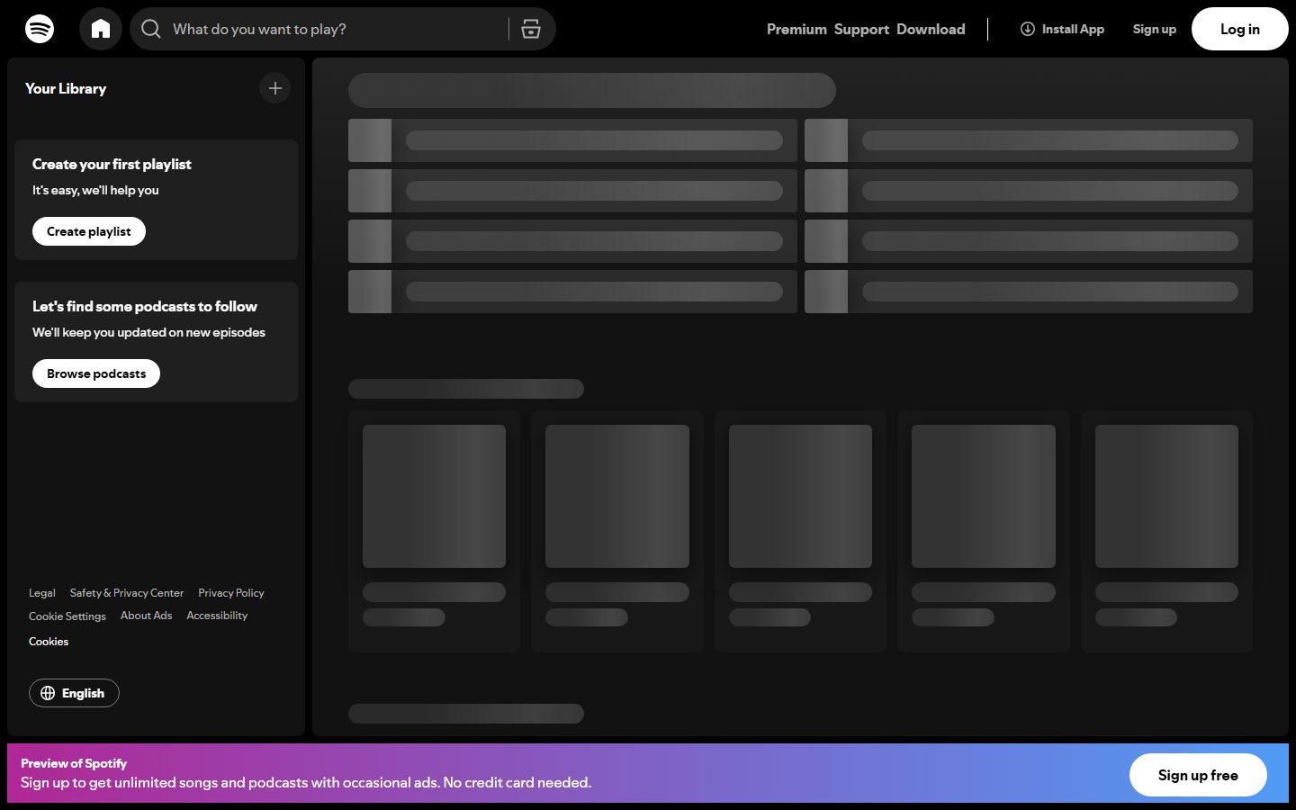
Spotify's web surface is a dark, media-dense application interface — a pure-black canvas (`{colors.canvas}` — #000000) layered with progressively lighter near-black surfaces (`{colors.surface}` #121212, `{colors.surface-elevated}` #181818, `{colors.surface-card}` #282828) and high-contrast white text (`{colors.ink}` — #ffffff). The one piece of brand voltage is **Spotify green** (`{colors.accent}` — #1ed760), used sparingly on primary action moments and never on large surfaces.
The captured page is the logged-out landing/app shell: a fixed top nav, a left "Your Library" sidebar with promo cards, a main content surface filled with loading-state skeleton rows and a horizontal browse-card rail, and a gradient upsell bar pinned to the bottom. The interface reads as confidently functional — dense rows, tight rhythm, and a clear separation between the black chrome and the slightly-lighter content surfaces.
Shape language is split between **fully-rounded pills/circles** for interactive controls (search input, CTA buttons, icon buttons, language selector) and **soft-radius rectangles** (`{rounded.lg}` — 8px) for content cards. Elevated media cards lift off the black floor with a single strong drop shadow (`rgba(0,0,0,0.5) 0px 8px 24px`).
Color also surfaces in the **paired pastel-on-dark category tiles** used for Browse cards — eight measured colors that pair a dark background with a light label (e.g., `{colors.card-maroon}` with `{colors.card-pink}`, `{colors.card-green-dark}` with `{colors.card-green-light}`). These are the only chromatic moments outside the green accent.
**Key Characteristics:**
- Pure-black canvas (`{colors.canvas}` — #000000) with a layered near-black surface stack — depth comes from progressively lighter charcoals, not from borders.
- Spotify green (`{colors.accent}` — #1ed760) is the single brand accent; brighter green (`{colors.accent-active}` — #3be477) is the press/active variant.
- White pill buttons (`{component.button-pill-light}`) carry primary CTAs ("Log in", "Create playlist", "Browse podcasts", "Sign up free") — fully-rounded `{rounded.full}` with black text.
- Circular dark icon buttons (`{component.button-icon-circular}`) — `{colors.primary}` (#1f1f1f) background, 50% radius, 12px padding — for the add (+) control and other icon actions.
- Search input is a fully-rounded pill (`{rounded.pill}` — 500px) on `{colors.primary}` background.
- Media cards sit on `{colors.surface-card}` (#282828) with `{rounded.lg}` (8px) corners and a strong drop shadow.
- Bottom upsell bar uses a magenta→blue gradient (decorative, not a system token) to push the "Sign up free" CTA.
- Spacing rhythm centers on 8px and 16px — the two most-measured spacing values — giving the dense, app-like feel.
## Colors
### Brand & Accent
- **Accent** (`{colors.accent}` — #1ed760): Spotify green — the single brand color. Reserved for primary action emphasis and brand moments. Never used as a large fill.
- **Accent Active** (`{colors.accent-active}` — #3be477): A brighter green used for the pressed/active state of green controls.
### Canvas & Surfaces
The depth model is a stack of near-blacks — lighter = closer to the viewer:
- **Canvas** (`{colors.canvas}` — #000000): The page floor, top nav, and sidebar background.
- **Surface** (`{colors.surface}` — #121212): The main content surface that holds the skeleton rows and browse rails.
- **Surface Dim** (`{colors.surface-dim}` — #141414): A barely-lighter surface tone for nested blocks.
- **Surface Elevated** (`{colors.surface-elevated}` — #181818): Sidebar promo cards ("Create your first playlist", "Let's find some podcasts").
- **Surface Card** (`{colors.surface-card}` — #282828): Media/browse cards.
- **Surface Strong** (`{colors.surface-strong}` — #333333): The lightest charcoal — hairline-equivalent dividers and skeleton placeholders.
- **Primary** (`{colors.primary}` — #1f1f1f): The dark control fill — search input background and circular icon buttons.
### Text
- **Ink** (`{colors.ink}` — #ffffff): All headlines and primary text.
- **Muted** (`{colors.muted}` — #b3b3b3): Secondary text — nav links, descriptions, captions. The most-frequent measured color overall.
- **Muted Soft** (`{colors.muted-soft}` — #a7a7a7): Tertiary text — fine print, less-emphasized labels.
- **On Primary** (`{colors.on-primary}` — #ffffff): Text/icons on dark `{colors.primary}` controls.
- **On Accent** (`{colors.on-accent}` — #000000): Black text on green CTAs and on white pill buttons.
### Category Tile Pairs
Eight measured colors form four dark-background / light-label pairs for Browse category tiles. Each pair appears with equal frequency (20 each) — strong evidence they're used as background+text duos:
- `{colors.card-maroon}` (#590810) + `{colors.card-pink}` (#ffd2d7)
- `{colors.card-brown}` (#491e00) + `{colors.card-amber}` (#ffd97e)
- `{colors.card-green-dark}` (#073116) + `{colors.card-green-light}` (#96f0b6)
- `{colors.card-blue-dark}` (#052a56) + `{colors.card-blue-light}` (#c8e0fc)
These are the only chromatic moments outside the green accent — they live exclusively inside category tiles.
## Typography
### Font Family
Spotify's product UI uses **Spotify Circular** (and its display sibling Spotify Mix), a custom geometric sans licensed to Spotify and not available as a public web font. **No typography metrics were captured in the analysis** (the typography array is empty), so the roles below are *derived* from the rendered screenshots and Spotify's known type conventions, not from measured CSS — treat the exact sizes/weights as approximate and confirm against the live DOM.
Because Spotify Circular is a custom licensed face, the fallback stack here substitutes **Montserrat** (an open-source geometric sans with a similar character), then `Helvetica Neue, Arial, sans-serif`. Never claim to ship Spotify Circular itself.
### Hierarchy (derived)
| Token | Size | Weight | Line Height | Letter Spacing | Use |
|---|---|---|---|---|---|
| `{typography.display}` | 32px | 700 | 1.2 | -0.5px | Page / section headlines (derived) |
| `{typography.title-lg}` | 24px | 700 | 1.25 | -0.3px | Card group titles, category tile labels (derived) |
| `{typography.title-md}` | 16px | 700 | 1.3 | 0 | Promo card titles ("Create your first playlist") (derived) |
| `{typography.body-md}` | 16px | 400 | 1.5 | 0 | Default running text, search placeholder (derived) |
| `{typography.body-sm}` | 14px | 400 | 1.5 | 0 | Card subtitles, descriptions (derived) |
| `{typography.caption}` | 12px | 400 | 1.4 | 0 | Fine print, footer links (derived) |
| `{typography.button}` | 14px | 700 | 1 | 0 | Pill button labels (derived) |
| `{typography.nav-link}` | 14px | 700 | 1.4 | 0 | Top-nav items (Premium, Support, Download) (derived) |
### Principles
Spotify's type is bold-and-tight — headings and button labels run at weight 700, supporting copy at 400. The contrast between heavy white headings and `{colors.muted}` body copy carries hierarchy on the dark surfaces. Keep button labels and titles at the heavier weight; never set body copy bold.
## Layout
### Spacing System
- **Base unit:** 4px, with **8px and 16px** as the dominant measured rhythms (71 and 78 occurrences respectively).
- **Tokens:** `{spacing.xxs}` 4px · `{spacing.xs}` 8px · `{spacing.sm}` 12px · `{spacing.md}` 16px · `{spacing.lg}` 24px · `{spacing.xl}` 32px · `{spacing.xxl}` 48px.
- **Card internal padding:** `{spacing.md}` (16px) for media cards and sidebar promo cards.
- **Tight control padding:** circular icon buttons use 12px all-around (measured).
- Less-frequent measured values (20px, 36px, 40px) appear at larger layout seams but are not promoted to named tokens.
### Grid & Container
- **Shell layout:** fixed top nav, a left sidebar ("Your Library") roughly 320px wide, and a flexible main content surface to its right.
- **Content surface:** loading skeleton rows render as a 2-column list at desktop; the browse rail below shows a 5-up horizontal card row.
- **Bottom bar:** the upsell banner spans full width, pinned to the viewport bottom.
### Whitespace Philosophy
Spotify is **dense, not airy** — tight 8/16px rhythm packs rows and cards close together to maximize content per screen, consistent with a media-library app rather than a marketing page. Breathing room comes from the black canvas separating surface blocks, not from large padding.
## Elevation & Depth
| Level | Treatment | Use |
|---|---|---|
| Floor | `{colors.canvas}` (#000000), no shadow | Top nav, sidebar, page background |
| Raised surface | Lighter charcoal fill (`{colors.surface}` → `{colors.surface-card}`), no shadow | Content surface, sidebar promo cards |
| Lifted card | `{colors.surface-card}` fill + `rgba(0,0,0,0.5) 0px 8px 24px 0px` shadow | Media / browse cards (the system's primary shadow, 38 occurrences) |
| Inset control | `rgb(18,18,18) 0px 1px 0px 0px, rgb(124,124,124) 0px 0px 0px 1px inset` | A measured inset/border treatment used on certain controls (3 occurrences) |
The depth philosophy is **layered darkness plus one strong shadow** — lighter surfaces read as closer, and the single 8px/24px drop shadow lifts media cards distinctly off the black floor. No glassmorphism, no glow.
### Decorative Depth
- The bottom upsell bar carries a magenta→blue gradient — this is a decorative brand gradient, not a system token, and was not measured as discrete stops.
- Skeleton placeholders use `{colors.surface-strong}` (#333333) blocks against the surface to indicate loading content.
## Shapes
### Border Radius Scale
| Token | Value | Use |
|---|---|---|
| `{rounded.xs}` | 2px | Smallest accents, skeleton bars |
| `{rounded.sm}` | 4px | Small inline elements |
| `{rounded.md}` | 6px | Buttons / chips at the tighter end |
| `{rounded.lg}` | 8px | Content cards, promo cards, category tiles |
| `{rounded.pill}` | 500px | Search input pill |
| `{rounded.full}` | 9999px | CTA pill buttons, circular icon buttons, language selector |
The two extremes carry the personality: `{rounded.lg}` (8px) for everything rectangular and `{rounded.full}` (the most-measured radius, 75+25 occurrences across 1000px and 9999px) for everything interactive. The fully-rounded pill is Spotify's signature control shape.
### Media Geometry
Browse/media cards use square or near-square artwork zones inside `{rounded.lg}` cards. Skeleton placeholders mirror these proportions during load.
## Components
### Navigation
**`top-nav`** — Black bar (`{colors.canvas}`) pinned to the top. Carries the Spotify logo at left, a centered pill search input, and a right cluster of `{component.nav-link}` items (Premium, Support, Download), an "Install App" item, a "Sign up" text link, and a white "Log in" pill (`{component.button-pill-light}`).
**`nav-link`** — Inline nav items in `{colors.muted}`, `{typography.nav-link}`. Transparent background; brighten to `{colors.ink}` on active.
**`sidebar`** — Left "Your Library" column on `{colors.canvas}`. Holds the library header with a circular add button, two promo cards, a footer link list, and the language selector.
### Inputs
**`search-input`** — The "What do you want to play?" field. Fully-rounded pill (`{rounded.pill}` — 500px) on `{colors.primary}` (#1f1f1f), placeholder text in `{colors.muted}`, body type `{typography.body-md}`.
### Buttons
**`button-pill-light`** — The primary CTA shape. White (`{colors.ink}`) fully-rounded pill with black text (`{colors.on-accent}`), label in `{typography.button}` (bold 14px). Used for "Log in", "Create playlist", "Browse podcasts", and "Sign up free".
**`button-accent`** — Green primary CTA. Background `{colors.accent}` (#1ed760), black text, `{rounded.full}`. Press state `button-accent-active` shifts to `{colors.accent-active}` (#3be477). (Documented from Spotify's standard CTA system; the landing capture leans on the white pill for most CTAs.)
**`button-icon-circular`** — Circular icon control. Background `{colors.primary}` (#1f1f1f), white icon (`{colors.ink}`), 50% radius (`{rounded.full}`), 12px padding (measured). Used for the library "+" add control.
**`button-text-link`** — Inline text CTA in `{colors.muted}`, `{typography.button}` — e.g., the "Sign up" item in the nav.
### Cards & Containers
**`content-surface`** — The main content area on `{colors.surface}` (#121212), holding skeleton rows and browse rails.
**`sidebar-promo-card`** — The "Create your first playlist" / "Let's find some podcasts to follow" cards. Background `{colors.surface-elevated}` (#181818), title in `{typography.title-md}`, body in `{colors.muted}`, a `{component.button-pill-light}` CTA, rounded `{rounded.lg}`, padding `{spacing.md}` (16px).
**`media-card`** — Browse/library cards in the horizontal rail. Background `{colors.surface-card}` (#282828), rounded `{rounded.lg}` (8px), padding `{spacing.md}` (16px), lifted with the `rgba(0,0,0,0.5) 0px 8px 24px` shadow. Title in `{typography.body-sm}` over a square artwork zone.
**`category-tile`** — Browse category tiles using the paired colors. Background defaults to `{colors.card-maroon}` with label in `{colors.card-pink}`; other pairs swap in (`{colors.card-brown}`/`{colors.card-amber}`, `{colors.card-green-dark}`/`{colors.card-green-light}`, `{colors.card-blue-dark}`/`{colors.card-blue-light}`). Label in `{typography.title-lg}`, rounded `{rounded.lg}`, padding `{spacing.md}`.
### Utility
**`language-pill`** — The "English" selector at the sidebar footer. Transparent fill with a hairline outline, white text + globe icon, `{rounded.full}`, `{typography.button}`.
**`upsell-bar`** — The "Preview of Spotify" banner pinned to the viewport bottom. Carries a heading + body in `{typography.body-sm}` and a `{component.button-pill-light}` ("Sign up free") at right. The bar uses a decorative magenta→blue gradient background (not a system token).
## Do's and Don'ts
### Do
- Keep `{colors.accent}` (#1ed760) scarce — primary action emphasis and brand moments only, never as a large fill.
- Build depth from the surface stack (`{colors.canvas}` → `{colors.surface}` → `{colors.surface-elevated}` → `{colors.surface-card}`) — lighter means closer.
- Use `{component.button-pill-light}` (white fully-rounded pill) for the dominant CTAs; use `{component.button-icon-circular}` for icon-only actions.
- Apply the `rgba(0,0,0,0.5) 0px 8px 24px` shadow only to lifted media cards — it's the one shadow that does the elevation work.
- Use the paired category colors strictly as background+label duos inside `{component.category-tile}`.
- Hold tight 8/16px spacing rhythm — Spotify is a dense media app, not an airy marketing page.
### Don't
- Don't paint large green surfaces — green is an accent, not a background.
- Don't add borders where the surface-stack already implies depth; use a lighter charcoal instead of a hairline.
- Don't mix the category pastels onto buttons or text outside their tiles.
- Don't use radii between `{rounded.lg}` and `{rounded.full}` on controls — controls are fully-rounded pills, cards are 8px; avoid in-between values.
- Don't set body copy in bold; reserve weight 700 for titles and button labels.
- Don't document hover states — default and active/pressed only (e.g., `{component.button-accent-active}`).
## Responsive Behavior
| Name | Width | Key Changes |
|---|---|---|
| Mobile | < 768px | Sidebar collapses; top nav reduces to logo + search + icon CTAs; browse rail becomes a horizontal scroller; upsell bar stays pinned |
| Tablet | 768–1024px | Sidebar narrows; skeleton row list drops from 2-up to 1-up; browse rail shows fewer cards |
| Desktop | 1024–1440px | Full shell — ~320px sidebar, 2-up content rows, 5-up browse rail |
| Wide | > 1440px | Same shell with additional browse cards revealed per rail |
### Touch Targets
- `{component.button-pill-light}` and `{component.button-accent}` render at comfortable pill heights for tapping.
- `{component.button-icon-circular}` uses 12px padding around its icon; verify the resulting diameter meets 44×44 on touch.
- `{component.search-input}` is a full-width pill — easy to hit at all sizes.
### Collapsing Strategy
- The left sidebar collapses first on narrow viewports; "Your Library" becomes an icon or drawer.
- Browse rails switch from fixed columns to horizontal scrollers rather than shrinking cards below legibility.
- The bottom upsell bar remains pinned across breakpoints (logged-out state).
### Image Behavior
- Media card artwork stays square and crops to fill its zone.
- Skeleton placeholders match final content proportions during load.
## Iteration Guide
1. Focus on ONE component at a time, referencing its YAML key (`{component.media-card}`, `{component.category-tile}`).
2. Variants (`-active`, `-disabled`) live as separate `components:` entries.
3. Use `{token.refs}` everywhere — never inline a hex in a component.
4. Document default and active/pressed states only — never hover.
5. Green stays scarce; depth stays in the charcoal surface stack.
6. Controls are fully-rounded pills/circles; content is 8px rectangles — don't blur the two.
7. Confirm typography against the live DOM before relying on it — the values here are derived, not measured.
## Known Gaps
- **No typography was measured** (the analysis typography array is empty). All type roles, sizes, weights, line-heights, and letter-spacing are *derived* from screenshots and Spotify conventions and must be confirmed against the live CSS.
- **Spotify Circular / Spotify Mix** is a custom licensed typeface not available publicly; the spec substitutes Montserrat. `fonts_licensed` was empty in the analysis, so the licensing note is asserted from external knowledge, not measured.
- The green primary CTA (`button-accent`) and its active variant are documented from Spotify's known system; the captured logged-out landing page leans on the white pill CTA, so the green button's exact dimensions were not measured.
- The bottom upsell bar's magenta→blue gradient was not captured as discrete color stops — it's noted as decorative only.
- The measured "button-primary" (background #1f1f1f, 50% radius, 12px padding) is the circular icon button, not the primary CTA; the white pill CTA dimensions (height, padding) were not measured and are described from screenshot ground-truth.
- Only the logged-out landing/app-shell page was captured — logged-in surfaces (now-playing bar, full library, playlist views, the player controls) are out of scope.
- Animation, transition timings, and loading-skeleton shimmer behavior were not extracted.
- Exact sidebar width and content grid column counts are estimated from the screenshot, not measured.
<!-- Documented by duply · real-world design systems as ready-to-use DESIGN.md for AI coding agents · https://duply.ai/spotify/design-md -->
Color Palette
Accent
Neutrals
Typography
display32px · 700 · 1.2
The quick brown fox jumpstitle-lg24px · 700 · 1.25
The quick brown fox jumpstitle-md16px · 700 · 1.3
The quick brown fox jumpsbody-md16px · 400 · 1.5
The quick brown fox jumpsbody-sm14px · 400 · 1.5
The quick brown fox jumpscaption12px · 400 · 1.4
The quick brown fox jumpsSpacing & Shape
Spacing
| Name | Value | Preview |
|---|---|---|
| xxs | 4px | |
| xs | 8px | |
| sm | 12px | |
| md | 16px | |
| lg | 24px | |
| xl | 32px | |
| xxl | 48px |
Border Radius
| Name | Value | Preview |
|---|---|---|
| xs | 2px | |
| sm | 4px | |
| md | 6px | |
| lg | 8px | |
| pill | 500px | |
| full | 9999px |
More like this


---
version: alpha
name: Spotify-design-analysis
description: A dark, music-app-first interface anchored on pure-black canvas (#000000) with layered near-black surfaces, white text, and the iconic Spotify green (#1ed760) reserved as the single accent. The system reads as confident, dense, and media-rich — fully-rounded pill buttons and circular icon controls, soft-radius content cards on charcoal surfaces, paired pastel-on-dark category tiles for browse cards, and a strong drop shadow that lifts elevated cards off the black floor. Brand voltage comes almost entirely from the green accent and the high-contrast white-on-black hierarchy.

colors:
  accent: "#1ed760"
  accent-active: "#3be477"
  primary: "#1f1f1f"
  canvas: "#000000"
  surface: "#121212"
  surface-dim: "#141414"
  surface-elevated: "#181818"
  surface-card: "#282828"
  surface-strong: "#333333"
  ink: "#ffffff"
  muted: "#b3b3b3"
  muted-soft: "#a7a7a7"
  on-primary: "#ffffff"
  on-accent: "#000000"
  card-maroon: "#590810"
  card-pink: "#ffd2d7"
  card-brown: "#491e00"
  card-amber: "#ffd97e"
  card-green-dark: "#073116"
  card-green-light: "#96f0b6"
  card-blue-dark: "#052a56"
  card-blue-light: "#c8e0fc"

typography:
  display:
    fontFamily: "Spotify Circular, Montserrat, Helvetica Neue, Arial, sans-serif"
    fontSize: 32px
    fontWeight: 700
    lineHeight: 1.2
    letterSpacing: -0.5px
  title-lg:
    fontFamily: "Spotify Circular, Montserrat, Helvetica Neue, Arial, sans-serif"
    fontSize: 24px
    fontWeight: 700
    lineHeight: 1.25
    letterSpacing: -0.3px
  title-md:
    fontFamily: "Spotify Circular, Montserrat, Helvetica Neue, Arial, sans-serif"
    fontSize: 16px
    fontWeight: 700
    lineHeight: 1.3
    letterSpacing: 0
  body-md:
    fontFamily: "Spotify Circular, Montserrat, Helvetica Neue, Arial, sans-serif"
    fontSize: 16px
    fontWeight: 400
    lineHeight: 1.5
    letterSpacing: 0
  body-sm:
    fontFamily: "Spotify Circular, Montserrat, Helvetica Neue, Arial, sans-serif"
    fontSize: 14px
    fontWeight: 400
    lineHeight: 1.5
    letterSpacing: 0
  caption:
    fontFamily: "Spotify Circular, Montserrat, Helvetica Neue, Arial, sans-serif"
    fontSize: 12px
    fontWeight: 400
    lineHeight: 1.4
    letterSpacing: 0
  button:
    fontFamily: "Spotify Circular, Montserrat, Helvetica Neue, Arial, sans-serif"
    fontSize: 14px
    fontWeight: 700
    lineHeight: 1
    letterSpacing: 0
  nav-link:
    fontFamily: "Spotify Circular, Montserrat, Helvetica Neue, Arial, sans-serif"
    fontSize: 14px
    fontWeight: 700
    lineHeight: 1.4
    letterSpacing: 0

rounded:
  xs: 2px
  sm: 4px
  md: 6px
  lg: 8px
  pill: 500px
  full: 9999px

spacing:
  xxs: 4px
  xs: 8px
  sm: 12px
  md: 16px
  lg: 24px
  xl: 32px
  xxl: 48px

components:
  top-nav:
    backgroundColor: "{colors.canvas}"
    textColor: "{colors.ink}"
    typography: "{typography.nav-link}"
  nav-link:
    backgroundColor: transparent
    textColor: "{colors.muted}"
    typography: "{typography.nav-link}"
  search-input:
    backgroundColor: "{colors.primary}"
    textColor: "{colors.muted}"
    typography: "{typography.body-md}"
    rounded: "{rounded.pill}"
  button-pill-light:
    backgroundColor: "{colors.ink}"
    textColor: "{colors.on-accent}"
    typography: "{typography.button}"
    rounded: "{rounded.full}"
  button-accent:
    backgroundColor: "{colors.accent}"
    textColor: "{colors.on-accent}"
    typography: "{typography.button}"
    rounded: "{rounded.full}"
  button-accent-active:
    backgroundColor: "{colors.accent-active}"
    textColor: "{colors.on-accent}"
    rounded: "{rounded.full}"
  button-icon-circular:
    backgroundColor: "{colors.primary}"
    textColor: "{colors.ink}"
    rounded: "{rounded.full}"
    padding: 12px
  button-text-link:
    backgroundColor: transparent
    textColor: "{colors.muted}"
    typography: "{typography.button}"
  sidebar:
    backgroundColor: "{colors.canvas}"
    textColor: "{colors.ink}"
    typography: "{typography.body-sm}"
  sidebar-promo-card:
    backgroundColor: "{colors.surface-elevated}"
    textColor: "{colors.ink}"
    typography: "{typography.title-md}"
    rounded: "{rounded.lg}"
    padding: 16px
  content-surface:
    backgroundColor: "{colors.surface}"
    textColor: "{colors.ink}"
  media-card:
    backgroundColor: "{colors.surface-card}"
    textColor: "{colors.ink}"
    typography: "{typography.body-sm}"
    rounded: "{rounded.lg}"
    padding: 16px
    shadow: "rgba(0,0,0,0.5) 0px 8px 24px 0px"
  category-tile:
    backgroundColor: "{colors.card-maroon}"
    textColor: "{colors.ink}"
    typography: "{typography.title-lg}"
    rounded: "{rounded.lg}"
    padding: 16px
  language-pill:
    backgroundColor: transparent
    textColor: "{colors.ink}"
    typography: "{typography.button}"
    rounded: "{rounded.full}"
  upsell-bar:
    backgroundColor: "{colors.surface}"
    textColor: "{colors.ink}"
    typography: "{typography.body-sm}"

---

## Overview

Spotify's web surface is a dark, media-dense application interface — a pure-black canvas (`{colors.canvas}` — #000000) layered with progressively lighter near-black surfaces (`{colors.surface}` #121212, `{colors.surface-elevated}` #181818, `{colors.surface-card}` #282828) and high-contrast white text (`{colors.ink}` — #ffffff). The one piece of brand voltage is **Spotify green** (`{colors.accent}` — #1ed760), used sparingly on primary action moments and never on large surfaces.

The captured page is the logged-out landing/app shell: a fixed top nav, a left "Your Library" sidebar with promo cards, a main content surface filled with loading-state skeleton rows and a horizontal browse-card rail, and a gradient upsell bar pinned to the bottom. The interface reads as confidently functional — dense rows, tight rhythm, and a clear separation between the black chrome and the slightly-lighter content surfaces.

Shape language is split between **fully-rounded pills/circles** for interactive controls (search input, CTA buttons, icon buttons, language selector) and **soft-radius rectangles** (`{rounded.lg}` — 8px) for content cards. Elevated media cards lift off the black floor with a single strong drop shadow (`rgba(0,0,0,0.5) 0px 8px 24px`).

Color also surfaces in the **paired pastel-on-dark category tiles** used for Browse cards — eight measured colors that pair a dark background with a light label (e.g., `{colors.card-maroon}` with `{colors.card-pink}`, `{colors.card-green-dark}` with `{colors.card-green-light}`). These are the only chromatic moments outside the green accent.

**Key Characteristics:**
- Pure-black canvas (`{colors.canvas}` — #000000) with a layered near-black surface stack — depth comes from progressively lighter charcoals, not from borders.
- Spotify green (`{colors.accent}` — #1ed760) is the single brand accent; brighter green (`{colors.accent-active}` — #3be477) is the press/active variant.
- White pill buttons (`{component.button-pill-light}`) carry primary CTAs ("Log in", "Create playlist", "Browse podcasts", "Sign up free") — fully-rounded `{rounded.full}` with black text.
- Circular dark icon buttons (`{component.button-icon-circular}`) — `{colors.primary}` (#1f1f1f) background, 50% radius, 12px padding — for the add (+) control and other icon actions.
- Search input is a fully-rounded pill (`{rounded.pill}` — 500px) on `{colors.primary}` background.
- Media cards sit on `{colors.surface-card}` (#282828) with `{rounded.lg}` (8px) corners and a strong drop shadow.
- Bottom upsell bar uses a magenta→blue gradient (decorative, not a system token) to push the "Sign up free" CTA.
- Spacing rhythm centers on 8px and 16px — the two most-measured spacing values — giving the dense, app-like feel.

## Colors

### Brand & Accent
- **Accent** (`{colors.accent}` — #1ed760): Spotify green — the single brand color. Reserved for primary action emphasis and brand moments. Never used as a large fill.
- **Accent Active** (`{colors.accent-active}` — #3be477): A brighter green used for the pressed/active state of green controls.

### Canvas & Surfaces
The depth model is a stack of near-blacks — lighter = closer to the viewer:
- **Canvas** (`{colors.canvas}` — #000000): The page floor, top nav, and sidebar background.
- **Surface** (`{colors.surface}` — #121212): The main content surface that holds the skeleton rows and browse rails.
- **Surface Dim** (`{colors.surface-dim}` — #141414): A barely-lighter surface tone for nested blocks.
- **Surface Elevated** (`{colors.surface-elevated}` — #181818): Sidebar promo cards ("Create your first playlist", "Let's find some podcasts").
- **Surface Card** (`{colors.surface-card}` — #282828): Media/browse cards.
- **Surface Strong** (`{colors.surface-strong}` — #333333): The lightest charcoal — hairline-equivalent dividers and skeleton placeholders.
- **Primary** (`{colors.primary}` — #1f1f1f): The dark control fill — search input background and circular icon buttons.

### Text
- **Ink** (`{colors.ink}` — #ffffff): All headlines and primary text.
- **Muted** (`{colors.muted}` — #b3b3b3): Secondary text — nav links, descriptions, captions. The most-frequent measured color overall.
- **Muted Soft** (`{colors.muted-soft}` — #a7a7a7): Tertiary text — fine print, less-emphasized labels.
- **On Primary** (`{colors.on-primary}` — #ffffff): Text/icons on dark `{colors.primary}` controls.
- **On Accent** (`{colors.on-accent}` — #000000): Black text on green CTAs and on white pill buttons.

### Category Tile Pairs
Eight measured colors form four dark-background / light-label pairs for Browse category tiles. Each pair appears with equal frequency (20 each) — strong evidence they're used as background+text duos:
- `{colors.card-maroon}` (#590810) + `{colors.card-pink}` (#ffd2d7)
- `{colors.card-brown}` (#491e00) + `{colors.card-amber}` (#ffd97e)
- `{colors.card-green-dark}` (#073116) + `{colors.card-green-light}` (#96f0b6)
- `{colors.card-blue-dark}` (#052a56) + `{colors.card-blue-light}` (#c8e0fc)

These are the only chromatic moments outside the green accent — they live exclusively inside category tiles.

## Typography

### Font Family
Spotify's product UI uses **Spotify Circular** (and its display sibling Spotify Mix), a custom geometric sans licensed to Spotify and not available as a public web font. **No typography metrics were captured in the analysis** (the typography array is empty), so the roles below are *derived* from the rendered screenshots and Spotify's known type conventions, not from measured CSS — treat the exact sizes/weights as approximate and confirm against the live DOM.

Because Spotify Circular is a custom licensed face, the fallback stack here substitutes **Montserrat** (an open-source geometric sans with a similar character), then `Helvetica Neue, Arial, sans-serif`. Never claim to ship Spotify Circular itself.

### Hierarchy (derived)

| Token | Size | Weight | Line Height | Letter Spacing | Use |
|---|---|---|---|---|---|
| `{typography.display}` | 32px | 700 | 1.2 | -0.5px | Page / section headlines (derived) |
| `{typography.title-lg}` | 24px | 700 | 1.25 | -0.3px | Card group titles, category tile labels (derived) |
| `{typography.title-md}` | 16px | 700 | 1.3 | 0 | Promo card titles ("Create your first playlist") (derived) |
| `{typography.body-md}` | 16px | 400 | 1.5 | 0 | Default running text, search placeholder (derived) |
| `{typography.body-sm}` | 14px | 400 | 1.5 | 0 | Card subtitles, descriptions (derived) |
| `{typography.caption}` | 12px | 400 | 1.4 | 0 | Fine print, footer links (derived) |
| `{typography.button}` | 14px | 700 | 1 | 0 | Pill button labels (derived) |
| `{typography.nav-link}` | 14px | 700 | 1.4 | 0 | Top-nav items (Premium, Support, Download) (derived) |

### Principles
Spotify's type is bold-and-tight — headings and button labels run at weight 700, supporting copy at 400. The contrast between heavy white headings and `{colors.muted}` body copy carries hierarchy on the dark surfaces. Keep button labels and titles at the heavier weight; never set body copy bold.

## Layout

### Spacing System
- **Base unit:** 4px, with **8px and 16px** as the dominant measured rhythms (71 and 78 occurrences respectively).
- **Tokens:** `{spacing.xxs}` 4px · `{spacing.xs}` 8px · `{spacing.sm}` 12px · `{spacing.md}` 16px · `{spacing.lg}` 24px · `{spacing.xl}` 32px · `{spacing.xxl}` 48px.
- **Card internal padding:** `{spacing.md}` (16px) for media cards and sidebar promo cards.
- **Tight control padding:** circular icon buttons use 12px all-around (measured).
- Less-frequent measured values (20px, 36px, 40px) appear at larger layout seams but are not promoted to named tokens.

### Grid & Container
- **Shell layout:** fixed top nav, a left sidebar ("Your Library") roughly 320px wide, and a flexible main content surface to its right.
- **Content surface:** loading skeleton rows render as a 2-column list at desktop; the browse rail below shows a 5-up horizontal card row.
- **Bottom bar:** the upsell banner spans full width, pinned to the viewport bottom.

### Whitespace Philosophy
Spotify is **dense, not airy** — tight 8/16px rhythm packs rows and cards close together to maximize content per screen, consistent with a media-library app rather than a marketing page. Breathing room comes from the black canvas separating surface blocks, not from large padding.

## Elevation & Depth

| Level | Treatment | Use |
|---|---|---|
| Floor | `{colors.canvas}` (#000000), no shadow | Top nav, sidebar, page background |
| Raised surface | Lighter charcoal fill (`{colors.surface}` → `{colors.surface-card}`), no shadow | Content surface, sidebar promo cards |
| Lifted card | `{colors.surface-card}` fill + `rgba(0,0,0,0.5) 0px 8px 24px 0px` shadow | Media / browse cards (the system's primary shadow, 38 occurrences) |
| Inset control | `rgb(18,18,18) 0px 1px 0px 0px, rgb(124,124,124) 0px 0px 0px 1px inset` | A measured inset/border treatment used on certain controls (3 occurrences) |

The depth philosophy is **layered darkness plus one strong shadow** — lighter surfaces read as closer, and the single 8px/24px drop shadow lifts media cards distinctly off the black floor. No glassmorphism, no glow.

### Decorative Depth
- The bottom upsell bar carries a magenta→blue gradient — this is a decorative brand gradient, not a system token, and was not measured as discrete stops.
- Skeleton placeholders use `{colors.surface-strong}` (#333333) blocks against the surface to indicate loading content.

## Shapes

### Border Radius Scale

| Token | Value | Use |
|---|---|---|
| `{rounded.xs}` | 2px | Smallest accents, skeleton bars |
| `{rounded.sm}` | 4px | Small inline elements |
| `{rounded.md}` | 6px | Buttons / chips at the tighter end |
| `{rounded.lg}` | 8px | Content cards, promo cards, category tiles |
| `{rounded.pill}` | 500px | Search input pill |
| `{rounded.full}` | 9999px | CTA pill buttons, circular icon buttons, language selector |

The two extremes carry the personality: `{rounded.lg}` (8px) for everything rectangular and `{rounded.full}` (the most-measured radius, 75+25 occurrences across 1000px and 9999px) for everything interactive. The fully-rounded pill is Spotify's signature control shape.

### Media Geometry
Browse/media cards use square or near-square artwork zones inside `{rounded.lg}` cards. Skeleton placeholders mirror these proportions during load.

## Components

### Navigation

**`top-nav`** — Black bar (`{colors.canvas}`) pinned to the top. Carries the Spotify logo at left, a centered pill search input, and a right cluster of `{component.nav-link}` items (Premium, Support, Download), an "Install App" item, a "Sign up" text link, and a white "Log in" pill (`{component.button-pill-light}`).

**`nav-link`** — Inline nav items in `{colors.muted}`, `{typography.nav-link}`. Transparent background; brighten to `{colors.ink}` on active.

**`sidebar`** — Left "Your Library" column on `{colors.canvas}`. Holds the library header with a circular add button, two promo cards, a footer link list, and the language selector.

### Inputs

**`search-input`** — The "What do you want to play?" field. Fully-rounded pill (`{rounded.pill}` — 500px) on `{colors.primary}` (#1f1f1f), placeholder text in `{colors.muted}`, body type `{typography.body-md}`.

### Buttons

**`button-pill-light`** — The primary CTA shape. White (`{colors.ink}`) fully-rounded pill with black text (`{colors.on-accent}`), label in `{typography.button}` (bold 14px). Used for "Log in", "Create playlist", "Browse podcasts", and "Sign up free".

**`button-accent`** — Green primary CTA. Background `{colors.accent}` (#1ed760), black text, `{rounded.full}`. Press state `button-accent-active` shifts to `{colors.accent-active}` (#3be477). (Documented from Spotify's standard CTA system; the landing capture leans on the white pill for most CTAs.)

**`button-icon-circular`** — Circular icon control. Background `{colors.primary}` (#1f1f1f), white icon (`{colors.ink}`), 50% radius (`{rounded.full}`), 12px padding (measured). Used for the library "+" add control.

**`button-text-link`** — Inline text CTA in `{colors.muted}`, `{typography.button}` — e.g., the "Sign up" item in the nav.

### Cards & Containers

**`content-surface`** — The main content area on `{colors.surface}` (#121212), holding skeleton rows and browse rails.

**`sidebar-promo-card`** — The "Create your first playlist" / "Let's find some podcasts to follow" cards. Background `{colors.surface-elevated}` (#181818), title in `{typography.title-md}`, body in `{colors.muted}`, a `{component.button-pill-light}` CTA, rounded `{rounded.lg}`, padding `{spacing.md}` (16px).

**`media-card`** — Browse/library cards in the horizontal rail. Background `{colors.surface-card}` (#282828), rounded `{rounded.lg}` (8px), padding `{spacing.md}` (16px), lifted with the `rgba(0,0,0,0.5) 0px 8px 24px` shadow. Title in `{typography.body-sm}` over a square artwork zone.

**`category-tile`** — Browse category tiles using the paired colors. Background defaults to `{colors.card-maroon}` with label in `{colors.card-pink}`; other pairs swap in (`{colors.card-brown}`/`{colors.card-amber}`, `{colors.card-green-dark}`/`{colors.card-green-light}`, `{colors.card-blue-dark}`/`{colors.card-blue-light}`). Label in `{typography.title-lg}`, rounded `{rounded.lg}`, padding `{spacing.md}`.

### Utility

**`language-pill`** — The "English" selector at the sidebar footer. Transparent fill with a hairline outline, white text + globe icon, `{rounded.full}`, `{typography.button}`.

**`upsell-bar`** — The "Preview of Spotify" banner pinned to the viewport bottom. Carries a heading + body in `{typography.body-sm}` and a `{component.button-pill-light}` ("Sign up free") at right. The bar uses a decorative magenta→blue gradient background (not a system token).

## Do's and Don'ts

### Do
- Keep `{colors.accent}` (#1ed760) scarce — primary action emphasis and brand moments only, never as a large fill.
- Build depth from the surface stack (`{colors.canvas}` → `{colors.surface}` → `{colors.surface-elevated}` → `{colors.surface-card}`) — lighter means closer.
- Use `{component.button-pill-light}` (white fully-rounded pill) for the dominant CTAs; use `{component.button-icon-circular}` for icon-only actions.
- Apply the `rgba(0,0,0,0.5) 0px 8px 24px` shadow only to lifted media cards — it's the one shadow that does the elevation work.
- Use the paired category colors strictly as background+label duos inside `{component.category-tile}`.
- Hold tight 8/16px spacing rhythm — Spotify is a dense media app, not an airy marketing page.

### Don't
- Don't paint large green surfaces — green is an accent, not a background.
- Don't add borders where the surface-stack already implies depth; use a lighter charcoal instead of a hairline.
- Don't mix the category pastels onto buttons or text outside their tiles.
- Don't use radii between `{rounded.lg}` and `{rounded.full}` on controls — controls are fully-rounded pills, cards are 8px; avoid in-between values.
- Don't set body copy in bold; reserve weight 700 for titles and button labels.
- Don't document hover states — default and active/pressed only (e.g., `{component.button-accent-active}`).

## Responsive Behavior

| Name | Width | Key Changes |
|---|---|---|
| Mobile | < 768px | Sidebar collapses; top nav reduces to logo + search + icon CTAs; browse rail becomes a horizontal scroller; upsell bar stays pinned |
| Tablet | 768–1024px | Sidebar narrows; skeleton row list drops from 2-up to 1-up; browse rail shows fewer cards |
| Desktop | 1024–1440px | Full shell — ~320px sidebar, 2-up content rows, 5-up browse rail |
| Wide | > 1440px | Same shell with additional browse cards revealed per rail |

### Touch Targets
- `{component.button-pill-light}` and `{component.button-accent}` render at comfortable pill heights for tapping.
- `{component.button-icon-circular}` uses 12px padding around its icon; verify the resulting diameter meets 44×44 on touch.
- `{component.search-input}` is a full-width pill — easy to hit at all sizes.

### Collapsing Strategy
- The left sidebar collapses first on narrow viewports; "Your Library" becomes an icon or drawer.
- Browse rails switch from fixed columns to horizontal scrollers rather than shrinking cards below legibility.
- The bottom upsell bar remains pinned across breakpoints (logged-out state).

### Image Behavior
- Media card artwork stays square and crops to fill its zone.
- Skeleton placeholders match final content proportions during load.

## Iteration Guide

1. Focus on ONE component at a time, referencing its YAML key (`{component.media-card}`, `{component.category-tile}`).
2. Variants (`-active`, `-disabled`) live as separate `components:` entries.
3. Use `{token.refs}` everywhere — never inline a hex in a component.
4. Document default and active/pressed states only — never hover.
5. Green stays scarce; depth stays in the charcoal surface stack.
6. Controls are fully-rounded pills/circles; content is 8px rectangles — don't blur the two.
7. Confirm typography against the live DOM before relying on it — the values here are derived, not measured.

## Known Gaps

- **No typography was measured** (the analysis typography array is empty). All type roles, sizes, weights, line-heights, and letter-spacing are *derived* from screenshots and Spotify conventions and must be confirmed against the live CSS.
- **Spotify Circular / Spotify Mix** is a custom licensed typeface not available publicly; the spec substitutes Montserrat. `fonts_licensed` was empty in the analysis, so the licensing note is asserted from external knowledge, not measured.
- The green primary CTA (`button-accent`) and its active variant are documented from Spotify's known system; the captured logged-out landing page leans on the white pill CTA, so the green button's exact dimensions were not measured.
- The bottom upsell bar's magenta→blue gradient was not captured as discrete color stops — it's noted as decorative only.
- The measured "button-primary" (background #1f1f1f, 50% radius, 12px padding) is the circular icon button, not the primary CTA; the white pill CTA dimensions (height, padding) were not measured and are described from screenshot ground-truth.
- Only the logged-out landing/app-shell page was captured — logged-in surfaces (now-playing bar, full library, playlist views, the player controls) are out of scope.
- Animation, transition timings, and loading-skeleton shimmer behavior were not extracted.
- Exact sidebar width and content grid column counts are estimated from the screenshot, not measured.

<!-- Documented by duply · real-world design systems as ready-to-use DESIGN.md for AI coding agents · https://duply.ai/spotify/design-md -->