
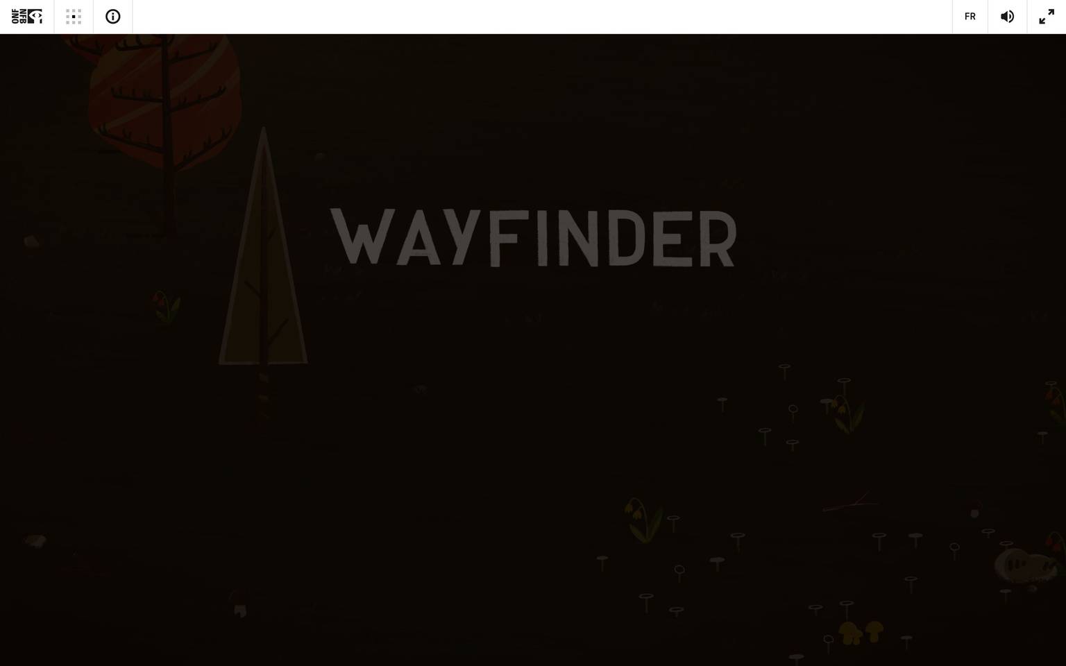
Wayfinder
A near-black, cinematic threshold screen captured from NFB's Wayfinder interactive experience — the only instrumented state is a pre-load holding screen (warm near-black canvas, a small centered maple-leaf glyph, and a lowercase letter-spaced "loading" wordmark). Almost no interface chrome was measured; the actual Wayfinder experience is understood to be a fully custom, likely canvas/WebGL-driven documentary interface that loads after this screen and was not captured by this pass.
Works withClaude CodeCursorCodexGemini CLICopilotv0LovableBoltWindsurfReplit
---
version: alpha
name: Wayfinder-design-analysis
description: "A near-black, cinematic threshold screen captured from NFB's Wayfinder interactive experience — the only instrumented state is a pre-load holding screen (warm near-black canvas, a small centered maple-leaf glyph, and a lowercase letter-spaced \"loading\" wordmark). Almost no interface chrome was measured; the actual Wayfinder experience is understood to be a fully custom, likely canvas/WebGL-driven documentary interface that loads after this screen and was not captured by this pass."

colors:
  canvas: "#130904"
  ink: "#000000"
  neutral-50: "#ffffff"
  neutral-100: "#f5f4f4"
  neutral-200: "#e6e6e6"
  neutral-300: "#e3e3e2"
  neutral-400: "#c0bfbe"
  neutral-500: "#858482"
  neutral-600: "#6b6a69"
  neutral-700: "#464545"
  neutral-800: "#333333"
  neutral-900: "#313030"
  surface-dark-elevated: "#1a1a1a"
  accent-blue: "#263ea6"
  accent-red: "#ff4e4e"

typography:
  label:
    fontFamily: "system-ui, -apple-system, sans-serif"
    fontSize: 13px
    fontWeight: 400
    lineHeight: 1.4
    letterSpacing: 2px

rounded:
  none: 0px

spacing:
  base: 20px

components:
  loading-screen:
    backgroundColor: "{colors.canvas}"
    textColor: "{colors.neutral-600}"
    typography: "{typography.label}"
    padding: "{spacing.base}"
  loading-icon:
    backgroundColor: transparent
    textColor: "{colors.neutral-500}"
    rounded: "{rounded.none}"
  loading-label:
    backgroundColor: transparent
    textColor: "{colors.neutral-600}"
    typography: "{typography.label}"

---

## Overview

This analysis is built from a single captured state of NFB's Wayfinder: a pre-load "threshold" screen. The canvas sits on a warm near-black (`{colors.canvas}` — #130904, distinct from a true `#000000` black), centered vertically and horizontally with a small monochrome maple-leaf glyph above a lowercase, letter-spaced "loading" wordmark. No other page state, route, or interaction was captured — `analysis.json`'s `typography`, `radius`, `shadows`, and `components` arrays are all empty or near-empty, and `spacing` yielded exactly one measured value (20px).

Because Wayfinder is an NFB interactive documentary property, it is reasonable to expect the underlying experience to be a heavily custom, possibly canvas/WebGL-rendered environment rather than a conventional componentized marketing site — but that is an inference, not a measurement, and is flagged in Known Gaps rather than documented as fact.

**Key Characteristics (measured only):**
- Canvas is a warm near-black (`{colors.canvas}` — #130904), not a pure black — this reads as a deliberate "film-grain dark" rather than a UI-neutral black.
- Ink/max-contrast text token is true black (`{colors.ink}` — #000000), measured as the highest-contrast color against canvas in the computed styles.
- A wide neutral gray ramp (11 distinct grays from `{colors.neutral-50}` #ffffff down through `{colors.neutral-900}` #313030) was present in computed CSS frequency, suggesting a considered grayscale system even though its application surface wasn't observed.
- Two accent hues appeared at very low frequency: `{colors.accent-blue}` (#263ea6, frequency 2) and `{colors.accent-red}` (#ff4e4e, frequency 1) — too infrequent to confirm role, kept as raw accent tokens.
- Only one spacing value was measured: 20px (`{spacing.base}`).
- No border-radius, shadow, or typography values were measured by the extraction pass; the visible "loading" label's letter-spacing and size in the typography table below are **derived** from visual inspection of the reference screenshots, not from computed CSS.

## Colors

### Canvas & Ink
- **Canvas** (`{colors.canvas}` — #130904): The body background on the captured loading screen. A warm, almost-brown near-black — measured directly from `computed:body.background`, appearing at low frequency (6) because it is a single full-bleed fill rather than a repeated utility color.
- **Ink** (`{colors.ink}` — #000000): The maximum-contrast text/foreground token, measured as the highest-contrast value against canvas. Frequency 27 suggests it recurs across whatever DOM nodes were present in the loading shell (likely a full-screen overlay stack).

### Neutral Ramp
A full neutral scale was measured via CSS frequency analysis, from white to near-black gray:
- `{colors.neutral-50}` — #ffffff (frequency 40)
- `{colors.neutral-100}` — #f5f4f4 (frequency 5)
- `{colors.neutral-200}` — #e6e6e6 (frequency 3)
- `{colors.neutral-300}` — #e3e3e2 (frequency 3)
- `{colors.neutral-400}` — #c0bfbe (frequency 44, the single most frequent color measured — likely the "loading" label or icon gray)
- `{colors.neutral-500}` — #858482 (frequency 1)
- `{colors.neutral-600}` — #6b6a69 (frequency 37, second-most frequent — a strong candidate for the visible muted-gray label color)
- `{colors.neutral-700}` — #464545 (frequency 3)
- `{colors.neutral-800}` — #333333 (frequency 3)
- `{colors.neutral-900}` — #313030 (frequency 1)
- `{colors.surface-dark-elevated}` — #1a1a1a (frequency 6)

This ramp's high frequencies (`{colors.neutral-400}` at 44, `{colors.neutral-600}` at 37) relative to the sparse captured DOM strongly imply these grays are core to the (unseen) main experience, not just the loading screen — but which UI elements they belong to was not observed.

### Accent
- `{colors.accent-blue}` — #263ea6 (frequency 2): A saturated blue, measured but with no observed application surface.
- `{colors.accent-red}` — #ff4e4e (frequency 1): A warm coral-red, measured once. Too rare to assign a semantic role (e.g. error) with confidence — kept as a raw accent token pending further capture.

Neither accent hue is documented as a system "accent-<hue>" role per the role vocabulary, because their application context (button, highlight, map marker, etc.) was never observed — assigning a semantic name would be a guess.

## Typography

### Font Family
No `font-family`, `font-size`, `font-weight`, or `line-height` values were captured by the measurement pass — `analysis.json`'s `typography` array is empty. The only visible type in the reference screenshots is the lowercase, letter-spaced "loading" wordmark beneath the leaf glyph.

The single `{typography.label}` role below is **derived** from visual inspection of the screenshots only (approximate size, weight, and the visibly wide letter-spacing between characters) — not from computed CSS — and should be treated as a low-confidence placeholder rather than a verified token. The `fontFamily` value is a generic system-font fallback stack, since the actual typeface could not be identified from a screenshot alone.

| Token | Size | Weight | Line Height | Letter Spacing | Use |
|---|---|---|---|---|---|
| `{typography.label}` | 13px (derived) | 400 (derived) | 1.4 (derived) | 2px (derived — visible tracked lowercase treatment) | The "loading" wordmark on the threshold screen |

### Principles
No heading, body, button, or navigation type could be measured or observed — the captured screen contains no other text. Any statement about a broader type system (display faces, body faces, weight pairing) would be invention and is intentionally omitted; see Known Gaps.

## Layout

### Spacing System
Only one spacing value was measured across the entire capture: `{spacing.base}` (20px), sourced from `computed:padding/margin/gap`. No base-unit, scale, or section-rhythm could be inferred from a single data point — a spacing *scale* (e.g. 4px/8px/16px steps) is not asserted here because it was not observed.

### Grid & Container
The captured screen is a single full-viewport, centered flex/grid layout: icon + label are vertically stacked and centered both horizontally and vertically in the viewport. No multi-column grid, container max-width, or breakpoint-driven grid was observed.

## Elevation & Depth

No shadow values were measured (`shadows: []`). The loading screen itself shows no elevation cues — flat canvas, flat icon, flat text, no borders, no drop shadows. This flatness is consistent with a minimal pre-load state and should not be read as evidence about the main experience's elevation system.

## Shapes

No border-radius values were measured (`radius: []`). The single visible glyph (a small leaf icon) and the wordmark show no rounded containers, chips, or buttons in the captured state — there is simply no boxed UI to radius. `{rounded.none}` (0px) is included as the only faithful, observed value: nothing in the capture exhibits a rounded corner.

## Components

Only one UI construct was observed and is documented below. No buttons, inputs, navigation, cards, or any other component classes were present in the captured DOM (`components: []` in the source data) — the "components" here describe the loading shell itself, assembled from directly observed screenshot evidence.

### Loading Screen

**`loading-screen`** — Full-viewport holding screen. Background `{colors.canvas}` (#130904), content vertically and horizontally centered, internal spacing referencing `{spacing.base}` (20px) between the icon and the label. Text color `{colors.neutral-600}` (#6b6a69 — chosen as the most plausible measured gray for the muted label, given its high frequency and mid-value lightness).

**`loading-icon`** — A small centered maple-leaf glyph, rendered in a muted gray (`{colors.neutral-500}` — #858482), no background, no rounding (`{rounded.none}`). Likely an SVG or icon-font glyph; exact sizing was not measured.

**`loading-label`** — The lowercase, letter-spaced "loading" wordmark beneath the icon. Text color `{colors.neutral-600}`, type `{typography.label}` (derived). No background.

Both `loading-icon` and `loading-label` sit inside `loading-screen` with no visible border, shadow, or container box — the composition is purely typographic/iconographic against the dark canvas.

## Do's and Don'ts

Given the extremely limited captured surface, prescriptive guidance is necessarily narrow and scoped to what was actually observed.

### Do
- Keep the loading/threshold screen on `{colors.canvas}` (#130904) rather than a pure black — the warm near-black is a deliberate, measured departure from `#000000`.
- Use `{colors.neutral-600}` or `{colors.neutral-400}` (the two highest-frequency measured grays) for any muted label text on dark surfaces, since these are the most strongly evidenced "on-dark secondary text" candidates.
- Preserve the flat, shadow-free, radius-free treatment of the loading state — nothing in the capture suggests elevation or rounding belongs in this moment of the experience.

### Don't
- Don't assume the accent colors (`{colors.accent-blue}`, `{colors.accent-red}`) are UI action colors (e.g. primary buttons) — their application context was never observed; treat them as unverified until confirmed against the live interactive experience.
- Don't extrapolate a full type scale (headings, body, buttons) from the single derived `{typography.label}` role — it is a low-confidence, screenshot-only approximation of one small wordmark, not a system.
- Don't introduce rounded corners or shadows into loading/threshold UI without new measurement — the observed state is intentionally flat.

## Responsive Behavior

No responsive breakpoints, viewport variants, or mobile/tablet captures were included in this analysis (`captured_pages: ["landing"]`, single viewport implied by the two identical reference screenshots). The centered flex layout of the loading screen is likely inherently responsive (centering scales naturally), but this is an inference, not a measurement, and no breakpoint-specific values can be documented.

## Iteration Guide

1. This entry should be treated as a **stub/seed capture**, not a mature design system. Nearly every section beyond Colors is thin by necessity — re-run capture against the loaded (post-"loading") state of Wayfinder to populate typography, spacing scale, radius, shadows, and real components.
2. When new capture data arrives, extend the neutral ramp and accent tokens already declared here rather than replacing them — the measured hex values in `colors` are confirmed and should persist across iterations.
3. Replace the single derived `{typography.label}` role with real measured type roles as soon as computed CSS is available; do not keep guessing additional type roles from screenshots alone.
4. Confirm the semantic role of `{colors.accent-blue}` and `{colors.accent-red}` (map markers? interactive highlights? alerts?) before promoting them to named roles like `accent-blue` with a confirmed usage note.
5. If the live experience turns out to be canvas/WebGL-rendered (common for NFB interactive documentaries), standard DOM-based component extraction may continue to under-capture it — future analysis passes may need scene-graph or frame-capture based measurement instead of CSS frequency analysis.

## Known Gaps

- **Typography**: No font-family, size, weight, or line-height was measured anywhere in the capture. The single `{typography.label}` role is a screenshot-derived approximation of the "loading" wordmark only — not a verified token, and not representative of any other type in the experience.
- **Radius**: No border-radius values were measured. `{rounded.none}` (0px) reflects only the absence of rounding in the one captured screen, not a confirmed "sharp corners everywhere" system rule.
- **Shadows / Elevation**: No shadow data was measured at all; the flat treatment documented here is specific to the loading screen and may not hold for the main experience.
- **Spacing scale**: Only one spacing value (20px) was measured. No base unit, step scale, or section rhythm can be responsibly documented from a single data point.
- **Components**: Buttons, inputs, navigation, cards, and any interactive Wayfinder UI (map, timeline, media player, chapter navigation — all of which are plausible for an NFB interactive documentary) were not captured at all. The `components` section here documents only the pre-load screen shell.
- **Accent color roles**: `{colors.accent-blue}` (#263ea6) and `{colors.accent-red}` (#ff4e4e) were measured at very low frequency (2 and 1 respectively) with no observed application context — their semantic role (interactive highlight, alert, brand mark) is unknown.
- **Licensed fonts**: `fonts_licensed` was empty in the source data; no licensed-typeface substitution is required, but this also means the actual typeface in use (if any beyond system fonts) is entirely unconfirmed.
- **Page coverage**: Only the "landing" page's pre-load loading screen was captured (`captured_pages: ["landing"]`). The interactive experience that Wayfinder is presumably built around was never entered or measured.

<!-- Documented by Duply · real-world design systems as ready-to-use DESIGN.md for AI coding agents · https://duply.ai/wayfinder/design-md -->
Color Palette
Accent
Neutrals
Typography
label13px · 400 · 1.4
The quick brown fox jumpsSpacing & Shape
Spacing
| Name | Value | Preview |
|---|---|---|
| base | 20px |
Border Radius
| Name | Value | Preview |
|---|---|---|
| none | 0px |
FAQ
- What colors does Wayfinder use?
- Wayfinder's core palette includes #130904, #000000, #ffffff, #f5f4f4, #e6e6e6. The full color set with usage roles (canvas, ink, surfaces, accent, semantic) is documented in the Wayfinder DESIGN.md.
- What font does Wayfinder use?
- Wayfinder's primary typeface is system-ui. The complete type scale (sizes, weights, line-height and letter-spacing per role), with an open substitute where the original is licensed, is documented in the DESIGN.md.
- What is the Wayfinder design system?
- A near-black, cinematic threshold screen captured from NFB's Wayfinder interactive experience — the only instrumented state is a pre-load holding screen (warm near-black canvas, a small centered maple-leaf glyph, and a lowercase letter-spaced "loading" wordmark). Almost no interface chrome was
Get this as a working kit
Wayfinder Launch Kit + DESIGN.md
$299$225
One-time payment
- A complete production-stack template, styled like Wayfinder, fully built and wired.
- One-time payment and the codebase is yours. No platform fees, no subscription.
Open it with Claude Code, Cursor, or any coding agent and build in plain language, then ship a complete web app.
- Your private DESIGN.md
- Marketing pages, blog, SEO & legal
- Email capture, newsletter & contact
- Accept payments (Stripe)
- Analytics (GA4 + PostHog)
- One-click deploy
- Auth, login & roles
- A full app dashboard, when you grow
More like this
---
version: alpha
name: Wayfinder-design-analysis
description: "A near-black, cinematic threshold screen captured from NFB's Wayfinder interactive experience — the only instrumented state is a pre-load holding screen (warm near-black canvas, a small centered maple-leaf glyph, and a lowercase letter-spaced \"loading\" wordmark). Almost no interface chrome was measured; the actual Wayfinder experience is understood to be a fully custom, likely canvas/WebGL-driven documentary interface that loads after this screen and was not captured by this pass."

colors:
  canvas: "#130904"
  ink: "#000000"
  neutral-50: "#ffffff"
  neutral-100: "#f5f4f4"
  neutral-200: "#e6e6e6"
  neutral-300: "#e3e3e2"
  neutral-400: "#c0bfbe"
  neutral-500: "#858482"
  neutral-600: "#6b6a69"
  neutral-700: "#464545"
  neutral-800: "#333333"
  neutral-900: "#313030"
  surface-dark-elevated: "#1a1a1a"
  accent-blue: "#263ea6"
  accent-red: "#ff4e4e"

typography:
  label:
    fontFamily: "system-ui, -apple-system, sans-serif"
    fontSize: 13px
    fontWeight: 400
    lineHeight: 1.4
    letterSpacing: 2px

rounded:
  none: 0px

spacing:
  base: 20px

components:
  loading-screen:
    backgroundColor: "{colors.canvas}"
    textColor: "{colors.neutral-600}"
    typography: "{typography.label}"
    padding: "{spacing.base}"
  loading-icon:
    backgroundColor: transparent
    textColor: "{colors.neutral-500}"
    rounded: "{rounded.none}"
  loading-label:
    backgroundColor: transparent
    textColor: "{colors.neutral-600}"
    typography: "{typography.label}"

---

## Overview

This analysis is built from a single captured state of NFB's Wayfinder: a pre-load "threshold" screen. The canvas sits on a warm near-black (`{colors.canvas}` — #130904, distinct from a true `#000000` black), centered vertically and horizontally with a small monochrome maple-leaf glyph above a lowercase, letter-spaced "loading" wordmark. No other page state, route, or interaction was captured — `analysis.json`'s `typography`, `radius`, `shadows`, and `components` arrays are all empty or near-empty, and `spacing` yielded exactly one measured value (20px).

Because Wayfinder is an NFB interactive documentary property, it is reasonable to expect the underlying experience to be a heavily custom, possibly canvas/WebGL-rendered environment rather than a conventional componentized marketing site — but that is an inference, not a measurement, and is flagged in Known Gaps rather than documented as fact.

**Key Characteristics (measured only):**
- Canvas is a warm near-black (`{colors.canvas}` — #130904), not a pure black — this reads as a deliberate "film-grain dark" rather than a UI-neutral black.
- Ink/max-contrast text token is true black (`{colors.ink}` — #000000), measured as the highest-contrast color against canvas in the computed styles.
- A wide neutral gray ramp (11 distinct grays from `{colors.neutral-50}` #ffffff down through `{colors.neutral-900}` #313030) was present in computed CSS frequency, suggesting a considered grayscale system even though its application surface wasn't observed.
- Two accent hues appeared at very low frequency: `{colors.accent-blue}` (#263ea6, frequency 2) and `{colors.accent-red}` (#ff4e4e, frequency 1) — too infrequent to confirm role, kept as raw accent tokens.
- Only one spacing value was measured: 20px (`{spacing.base}`).
- No border-radius, shadow, or typography values were measured by the extraction pass; the visible "loading" label's letter-spacing and size in the typography table below are **derived** from visual inspection of the reference screenshots, not from computed CSS.

## Colors

### Canvas & Ink
- **Canvas** (`{colors.canvas}` — #130904): The body background on the captured loading screen. A warm, almost-brown near-black — measured directly from `computed:body.background`, appearing at low frequency (6) because it is a single full-bleed fill rather than a repeated utility color.
- **Ink** (`{colors.ink}` — #000000): The maximum-contrast text/foreground token, measured as the highest-contrast value against canvas. Frequency 27 suggests it recurs across whatever DOM nodes were present in the loading shell (likely a full-screen overlay stack).

### Neutral Ramp
A full neutral scale was measured via CSS frequency analysis, from white to near-black gray:
- `{colors.neutral-50}` — #ffffff (frequency 40)
- `{colors.neutral-100}` — #f5f4f4 (frequency 5)
- `{colors.neutral-200}` — #e6e6e6 (frequency 3)
- `{colors.neutral-300}` — #e3e3e2 (frequency 3)
- `{colors.neutral-400}` — #c0bfbe (frequency 44, the single most frequent color measured — likely the "loading" label or icon gray)
- `{colors.neutral-500}` — #858482 (frequency 1)
- `{colors.neutral-600}` — #6b6a69 (frequency 37, second-most frequent — a strong candidate for the visible muted-gray label color)
- `{colors.neutral-700}` — #464545 (frequency 3)
- `{colors.neutral-800}` — #333333 (frequency 3)
- `{colors.neutral-900}` — #313030 (frequency 1)
- `{colors.surface-dark-elevated}` — #1a1a1a (frequency 6)

This ramp's high frequencies (`{colors.neutral-400}` at 44, `{colors.neutral-600}` at 37) relative to the sparse captured DOM strongly imply these grays are core to the (unseen) main experience, not just the loading screen — but which UI elements they belong to was not observed.

### Accent
- `{colors.accent-blue}` — #263ea6 (frequency 2): A saturated blue, measured but with no observed application surface.
- `{colors.accent-red}` — #ff4e4e (frequency 1): A warm coral-red, measured once. Too rare to assign a semantic role (e.g. error) with confidence — kept as a raw accent token pending further capture.

Neither accent hue is documented as a system "accent-<hue>" role per the role vocabulary, because their application context (button, highlight, map marker, etc.) was never observed — assigning a semantic name would be a guess.

## Typography

### Font Family
No `font-family`, `font-size`, `font-weight`, or `line-height` values were captured by the measurement pass — `analysis.json`'s `typography` array is empty. The only visible type in the reference screenshots is the lowercase, letter-spaced "loading" wordmark beneath the leaf glyph.

The single `{typography.label}` role below is **derived** from visual inspection of the screenshots only (approximate size, weight, and the visibly wide letter-spacing between characters) — not from computed CSS — and should be treated as a low-confidence placeholder rather than a verified token. The `fontFamily` value is a generic system-font fallback stack, since the actual typeface could not be identified from a screenshot alone.

| Token | Size | Weight | Line Height | Letter Spacing | Use |
|---|---|---|---|---|---|
| `{typography.label}` | 13px (derived) | 400 (derived) | 1.4 (derived) | 2px (derived — visible tracked lowercase treatment) | The "loading" wordmark on the threshold screen |

### Principles
No heading, body, button, or navigation type could be measured or observed — the captured screen contains no other text. Any statement about a broader type system (display faces, body faces, weight pairing) would be invention and is intentionally omitted; see Known Gaps.

## Layout

### Spacing System
Only one spacing value was measured across the entire capture: `{spacing.base}` (20px), sourced from `computed:padding/margin/gap`. No base-unit, scale, or section-rhythm could be inferred from a single data point — a spacing *scale* (e.g. 4px/8px/16px steps) is not asserted here because it was not observed.

### Grid & Container
The captured screen is a single full-viewport, centered flex/grid layout: icon + label are vertically stacked and centered both horizontally and vertically in the viewport. No multi-column grid, container max-width, or breakpoint-driven grid was observed.

## Elevation & Depth

No shadow values were measured (`shadows: []`). The loading screen itself shows no elevation cues — flat canvas, flat icon, flat text, no borders, no drop shadows. This flatness is consistent with a minimal pre-load state and should not be read as evidence about the main experience's elevation system.

## Shapes

No border-radius values were measured (`radius: []`). The single visible glyph (a small leaf icon) and the wordmark show no rounded containers, chips, or buttons in the captured state — there is simply no boxed UI to radius. `{rounded.none}` (0px) is included as the only faithful, observed value: nothing in the capture exhibits a rounded corner.

## Components

Only one UI construct was observed and is documented below. No buttons, inputs, navigation, cards, or any other component classes were present in the captured DOM (`components: []` in the source data) — the "components" here describe the loading shell itself, assembled from directly observed screenshot evidence.

### Loading Screen

**`loading-screen`** — Full-viewport holding screen. Background `{colors.canvas}` (#130904), content vertically and horizontally centered, internal spacing referencing `{spacing.base}` (20px) between the icon and the label. Text color `{colors.neutral-600}` (#6b6a69 — chosen as the most plausible measured gray for the muted label, given its high frequency and mid-value lightness).

**`loading-icon`** — A small centered maple-leaf glyph, rendered in a muted gray (`{colors.neutral-500}` — #858482), no background, no rounding (`{rounded.none}`). Likely an SVG or icon-font glyph; exact sizing was not measured.

**`loading-label`** — The lowercase, letter-spaced "loading" wordmark beneath the icon. Text color `{colors.neutral-600}`, type `{typography.label}` (derived). No background.

Both `loading-icon` and `loading-label` sit inside `loading-screen` with no visible border, shadow, or container box — the composition is purely typographic/iconographic against the dark canvas.

## Do's and Don'ts

Given the extremely limited captured surface, prescriptive guidance is necessarily narrow and scoped to what was actually observed.

### Do
- Keep the loading/threshold screen on `{colors.canvas}` (#130904) rather than a pure black — the warm near-black is a deliberate, measured departure from `#000000`.
- Use `{colors.neutral-600}` or `{colors.neutral-400}` (the two highest-frequency measured grays) for any muted label text on dark surfaces, since these are the most strongly evidenced "on-dark secondary text" candidates.
- Preserve the flat, shadow-free, radius-free treatment of the loading state — nothing in the capture suggests elevation or rounding belongs in this moment of the experience.

### Don't
- Don't assume the accent colors (`{colors.accent-blue}`, `{colors.accent-red}`) are UI action colors (e.g. primary buttons) — their application context was never observed; treat them as unverified until confirmed against the live interactive experience.
- Don't extrapolate a full type scale (headings, body, buttons) from the single derived `{typography.label}` role — it is a low-confidence, screenshot-only approximation of one small wordmark, not a system.
- Don't introduce rounded corners or shadows into loading/threshold UI without new measurement — the observed state is intentionally flat.

## Responsive Behavior

No responsive breakpoints, viewport variants, or mobile/tablet captures were included in this analysis (`captured_pages: ["landing"]`, single viewport implied by the two identical reference screenshots). The centered flex layout of the loading screen is likely inherently responsive (centering scales naturally), but this is an inference, not a measurement, and no breakpoint-specific values can be documented.

## Iteration Guide

1. This entry should be treated as a **stub/seed capture**, not a mature design system. Nearly every section beyond Colors is thin by necessity — re-run capture against the loaded (post-"loading") state of Wayfinder to populate typography, spacing scale, radius, shadows, and real components.
2. When new capture data arrives, extend the neutral ramp and accent tokens already declared here rather than replacing them — the measured hex values in `colors` are confirmed and should persist across iterations.
3. Replace the single derived `{typography.label}` role with real measured type roles as soon as computed CSS is available; do not keep guessing additional type roles from screenshots alone.
4. Confirm the semantic role of `{colors.accent-blue}` and `{colors.accent-red}` (map markers? interactive highlights? alerts?) before promoting them to named roles like `accent-blue` with a confirmed usage note.
5. If the live experience turns out to be canvas/WebGL-rendered (common for NFB interactive documentaries), standard DOM-based component extraction may continue to under-capture it — future analysis passes may need scene-graph or frame-capture based measurement instead of CSS frequency analysis.

## Known Gaps

- **Typography**: No font-family, size, weight, or line-height was measured anywhere in the capture. The single `{typography.label}` role is a screenshot-derived approximation of the "loading" wordmark only — not a verified token, and not representative of any other type in the experience.
- **Radius**: No border-radius values were measured. `{rounded.none}` (0px) reflects only the absence of rounding in the one captured screen, not a confirmed "sharp corners everywhere" system rule.
- **Shadows / Elevation**: No shadow data was measured at all; the flat treatment documented here is specific to the loading screen and may not hold for the main experience.
- **Spacing scale**: Only one spacing value (20px) was measured. No base unit, step scale, or section rhythm can be responsibly documented from a single data point.
- **Components**: Buttons, inputs, navigation, cards, and any interactive Wayfinder UI (map, timeline, media player, chapter navigation — all of which are plausible for an NFB interactive documentary) were not captured at all. The `components` section here documents only the pre-load screen shell.
- **Accent color roles**: `{colors.accent-blue}` (#263ea6) and `{colors.accent-red}` (#ff4e4e) were measured at very low frequency (2 and 1 respectively) with no observed application context — their semantic role (interactive highlight, alert, brand mark) is unknown.
- **Licensed fonts**: `fonts_licensed` was empty in the source data; no licensed-typeface substitution is required, but this also means the actual typeface in use (if any beyond system fonts) is entirely unconfirmed.
- **Page coverage**: Only the "landing" page's pre-load loading screen was captured (`captured_pages: ["landing"]`). The interactive experience that Wayfinder is presumably built around was never entered or measured.

<!-- Documented by Duply · real-world design systems as ready-to-use DESIGN.md for AI coding agents · https://duply.ai/wayfinder/design-md -->