
Oryzo
A dark, cinematic product-launch interface built on a near-black canvas warmed by a deep-brown gradient, with cream (#ffedd7) display type and a single hot-orange (#dc5000) primary CTA. The system reads as a moody, high-contrast hardware/AI teaser — oversized Halyard Display headlines set tight (line-height 0.9), pill-shaped orange buttons, an olive-and-tan earthy accent palette, and orange glow shadows used as the only source of light in an otherwise unlit layout.
Works withClaude CodeCursorCodexGemini CLICopilotv0LovableBoltWindsurfReplit
---
version: alpha
name: Oryzo-design-analysis
description: "A dark, cinematic product-launch interface built on a near-black canvas warmed by a deep-brown gradient, with cream (#ffedd7) display type and a single hot-orange (#dc5000) primary CTA. The system reads as a moody, high-contrast hardware/AI teaser — oversized Halyard Display headlines set tight (line-height 0.9), pill-shaped orange buttons, an olive-and-tan earthy accent palette, and orange glow shadows used as the only source of light in an otherwise unlit layout."
colors:
  primary: "#dc5000"
  primary-bright: "#e07010"
  on-primary: "#100904"
  ink: "#ffedd7"
  ink-soft: "#ffedd6"
  ink-cream: "#f6e0c6"
  tan: "#bbac97"
  taupe: "#6c5f51"
  brown: "#382416"
  accent-olive: "#445231"
  accent-olive-soft: "#5d6c49"
  accent-olive-deep: "#4b5c3d"
  accent-amber: "#ffa000"
  accent-gold: "#ffbf02"
  accent-red: "#ff0000"
  accent-coral: "#ff6b6b"
  canvas: "#000000"
  surface: "#0c0a0a"
  on-dark: "#ffffff"
typography:
  display-xl:
    fontFamily: "halyard-display-variable, Jost, sans-serif"
    fontSize: 123px
    fontWeight: 500
    lineHeight: 0.9
    letterSpacing: "-0.018em"
  display-lg:
    fontFamily: "halyard-display-variable, Jost, sans-serif"
    fontSize: 51px
    fontWeight: 500
    lineHeight: 1.0
    letterSpacing: normal
  display-md:
    fontFamily: "halyard-display-variable, Jost, sans-serif"
    fontSize: 33.75px
    fontWeight: 500
    lineHeight: 1.0
    letterSpacing: normal
  title:
    fontFamily: "halyard-display-variable, Jost, sans-serif"
    fontSize: 24px
    fontWeight: 500
    lineHeight: 1.09
    letterSpacing: normal
  button:
    fontFamily: "Arial, sans-serif"
    fontSize: 12px
    fontWeight: 500
    lineHeight: 1.1
    letterSpacing: normal
rounded:
  sm: 12px
  md: 22px
  lg: 36px
spacing:
  xxs: 6px
  xs: 9px
  sm: 12px
  md: 14px
  lg: 18px
  xl: 24px
  xxl: 30px
components:
  top-nav:
    backgroundColor: transparent
    textColor: "{colors.on-dark}"
  nav-badge:
    backgroundColor: "{colors.ink-soft}"
    textColor: "{colors.on-primary}"
    typography: "{typography.button}"
  button-primary:
    backgroundColor: "{colors.primary}"
    textColor: "{colors.on-primary}"
    typography: "{typography.button}"
    rounded: "{rounded.lg}"
    padding: 14.4px 24px
  input:
    backgroundColor: "{colors.surface}"
    textColor: "{colors.ink}"
    rounded: "0px"
---

## Overview

Oryzo's landing surface is a dark, cinematic product teaser — the canvas is pure black (`{colors.canvas}` — #000000) transitioning into a deep-brown gradient (`{colors.surface}` — #0c0a0a and warmer browns below the fold). Almost the entire screen is unlit; the design uses darkness as its primary material and reveals content through cream type and a single hot-orange CTA.

The type voice is **Halyard Display** (a geometric variable display face) used at weight 500 for every heading level, from a massive 123px hero headline down to 24px titles. The hero headline is set extremely tight (line-height 0.9, letter-spacing -0.018em) — it reads as a confident, oversized product wordmark rather than running copy. Body text and headlines share a warm cream ink (`{colors.ink}` — #ffedd7) that glows softly against the black.

Brand voltage comes from two places: the **hot-orange primary CTA** (`{colors.primary}` — #dc5000), a pill-shaped button that is the only saturated element on most screens; and the **orange glow shadows** (`rgba(255,140,0,0.6) 0 0 10px 3px` and layered inset amber glows) that make key elements appear self-illuminated in the dark. A secondary earthy palette — olive greens (`{colors.accent-olive}` — #445231), tan (`{colors.tan}` — #bbac97), and browns — grounds the system in a natural, organic register that contrasts the synthetic orange.

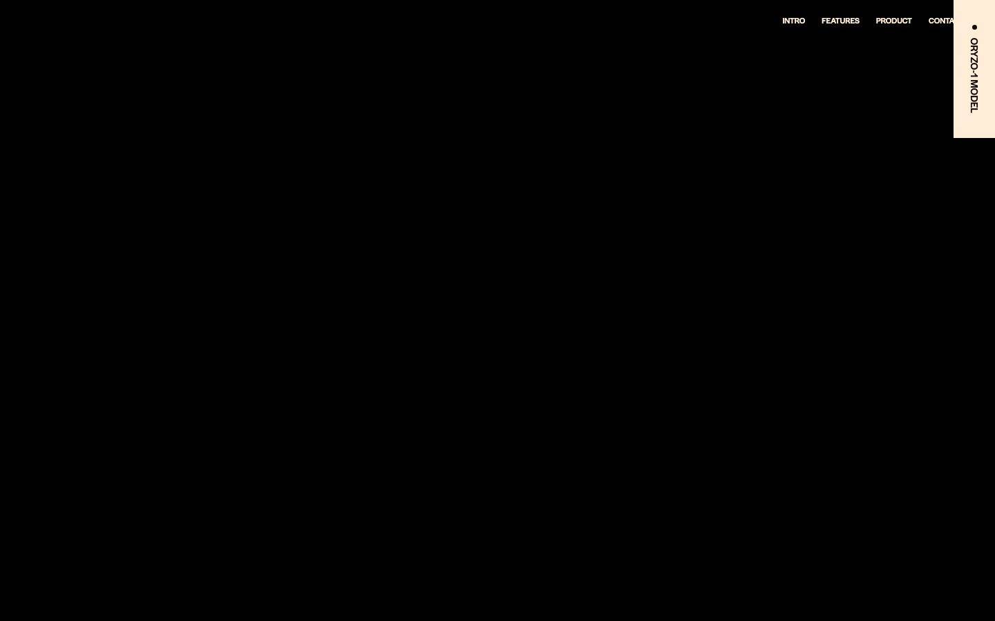
The signature interface artifact is a rotated cream **nav-badge** ("ORYZO-1 MODEL") pinned to the top-right, set vertically — a labelling device that frames the page like a physical product spec plate.

**Key Characteristics:**
- Near-black canvas (`{colors.canvas}` — #000000) warming into a brown gradient down-page — darkness is the dominant material.
- Oversized Halyard Display headlines at weight 500 with very tight line-height (0.9 at hero) — the type is the hero.
- A single hot-orange pill CTA (`{colors.primary}` — #dc5000, `{rounded.lg}` 36px) as the only saturated action element.
- Orange/amber glow box-shadows used as literal light sources in an unlit layout.
- Warm cream ink (`{colors.ink}` — #ffedd7) for all text — never pure white for body.
- An earthy secondary palette (olive, tan, brown) that offsets the synthetic orange.
- Vertically-rotated cream nav-badge as a product spec-plate motif.

## Colors

### Brand & Accent
- **Primary** (`{colors.primary}` — #dc5000): The hot-orange primary CTA color — the single saturated action element across the layout. It is also the source hue for the glow shadows.
- **Primary Bright** (`{colors.primary-bright}` — #e07010): A slightly lighter orange used in gradient/glow layering (appears in the inset button glow shadow).
- **Accent Amber / Gold** (`{colors.accent-amber}` — #ffa000, `{colors.accent-gold}` — #ffbf02): Warm amber tones used in glow accents and small highlights. The glow shadow uses `rgb(255,140,0)` in the orange-amber family.
- **Accent Red / Coral** (`{colors.accent-red}` — #ff0000, `{colors.accent-coral}` — #ff6b6b): Low-frequency reds appearing in small accent moments.
- **Accent Olive family** (`{colors.accent-olive}` — #445231, `{colors.accent-olive-soft}` — #5d6c49, `{colors.accent-olive-deep}` — #4b5c3d): Earthy green tones — the second-most-frequent color group (#445231 at 211 occurrences). These ground the palette in a natural, organic register.

### Surface
- **Canvas** (`{colors.canvas}` — #000000): The default page floor, especially the hero.
- **Surface** (`{colors.surface}` — #0c0a0a): A near-black warm surface used for lower bands as the black transitions into brown.
- **Brown** (`{colors.brown}` — #382416): A deep warm brown appearing in the down-page gradient and earthy accents.

### Text
- **Ink** (`{colors.ink}` — #ffedd7): The primary cream text color — all headings and body copy. Never pure white.
- **Ink Soft** (`{colors.ink-soft}` — #ffedd6): The near-identical cream used as the nav-badge fill background.
- **Ink Cream** (`{colors.ink-cream}` — #f6e0c6): A slightly deeper cream tint for secondary text/accents.
- **Tan** (`{colors.tan}` — #bbac97) and **Taupe** (`{colors.taupe}` — #6c5f51): Muted earthy neutrals for tertiary text and quiet UI detail.
- **On Primary** (`{colors.on-primary}` — #100904): The near-black ink used for text on the orange CTA and inside the cream nav-badge.
- **On Dark** (`{colors.on-dark}` — #ffffff): Pure white used sparingly — the top-nav menu links render in white rather than cream.

## Typography

### Font Family
The system runs **Halyard Display** (variable, "halyard-display-variable") for every heading level, and **Arial** for the small button label. Halyard Display is a geometric sans display face; all headings use weight 500 — the system never varies heading weight, only size.

Halyard Display is a commercial typeface (Adobe Fonts / Darden Studio). If it is unavailable, **Jost** (a geometric open-source face on Google Fonts) at weight 500 is the closest substitute, preserving the geometric proportions and the tight display feel; **Poppins** at 500 is a secondary fallback. The button falls back to Arial as measured.

### Hierarchy

| Token | Size | Weight | Line Height | Letter Spacing | Use |
|---|---|---|---|---|---|
| `{typography.display-xl}` | 123px | 500 | 0.9 | -0.018em | Hero headline — the marquee wordmark-scale display |
| `{typography.display-lg}` | 51px | 500 | 1.0 | normal | Section headlines |
| `{typography.display-md}` | 33.75px | 500 | 1.0 | normal | Sub-section headings |
| `{typography.title}` | 24px | 500 | 1.09 | normal | Small titles / lead-ins |
| `{typography.button}` | 12px | 500 | 1.1 | normal | CTA button labels, nav-badge — Arial |

### Principles
Heading weight is fixed at 500 across every size — hierarchy is expressed entirely through scale, not weight. The hero headline's tight line-height (0.9) and negative tracking (-0.018em) are the defining display treatment; smaller headings relax to line-height 1.0. Body/UI micro-text drops to Arial 12px, a deliberate contrast between the expressive display face and a neutral utility font.

## Layout

### Spacing System
- **Base rhythm:** Irregular but clusters around a set of measured values. The dominant gap value is `{spacing.lg}` (18px, 34 occurrences), with `{spacing.md}` (14px) and `{spacing.xl}` (24px) also frequent.
- **Tokens:** `{spacing.xxs}` 6px · `{spacing.xs}` 9px · `{spacing.sm}` 12px · `{spacing.md}` 14px · `{spacing.lg}` 18px · `{spacing.xl}` 24px · `{spacing.xxl}` 30px.
- **Button padding:** 14.4px vertical × 24px horizontal on the primary CTA.

### Grid & Container
- The captured layout is a full-bleed dark canvas with a top nav pinned to the top edge and a rotated nav-badge in the top-right corner. Content bands below the hero are long, dark vertical scroll sections. Exact grid columns and max-width were not measurable from the captured frames (see Known Gaps).

### Whitespace Philosophy
Oryzo uses vast empty darkness as compositional whitespace — the hero is almost entirely unlit black, with content concentrated at the edges (nav top, badge right). This creates a cinematic, anticipatory feel; the emptiness is deliberate negative space, not missing content.

## Elevation & Depth

| Level | Treatment | Use |
|---|---|---|
| Flat dark | No shadow — `{colors.canvas}` / `{colors.surface}` | Base bands, hero |
| Orange glow | `rgba(255,140,0,0.6) 0px 0px 10px 3px` | An outer orange halo on a key element — makes it appear self-illuminated |
| Inset amber glow | `rgb(255,160,0) 0px 0px 3px 2px inset, rgb(224,112,16) 0px 0px 8px 4px inset` | Layered inset glow (amber over orange) — gives buttons/elements an internal-light, heated look |

The elevation philosophy is **light-in-darkness**: rather than drop shadows for lift, Oryzo uses colored glow (orange/amber) to make elements read as emitting light against the black canvas. There are no neutral drop shadows measured — the only shadows are chromatic glows.

## Shapes

### Border Radius Scale

| Token | Value | Use |
|---|---|---|
| `{rounded.sm}` | 12px | Small containers / cards (4 occurrences) |
| `{rounded.md}` | 22px | Mid-size rounded container (1 occurrence) |
| `{rounded.lg}` | 36px | Pill-radius CTA buttons — the dominant radius (9 occurrences) |

Inputs break the rounded scale entirely: the measured `input` uses **0px** radius (sharp corners) — a deliberate hard-edge contrast against the soft 36px pill buttons.

## Components

### Navigation

**`top-nav`** — Transparent nav bar pinned to the top of the page. Menu links ("INTRO", "FEATURES", "PRODUCT", "CONTACT") render in white (`{colors.on-dark}`) small uppercase labels against the black canvas. No background fill, no visible divider.

**`nav-badge`** — A cream (`{colors.ink-soft}` — #ffedd6) rectangular plate pinned to the top-right corner, with its text ("ORYZO-1 MODEL") rotated to read vertically. Text is near-black (`{colors.on-primary}`), set in the small `{typography.button}` (Arial 12/500). Functions as a product spec-plate motif framing the page.

### Buttons

**`button-primary`** — The signature hot-orange pill CTA. Background `{colors.primary}` (#dc5000), text `{colors.on-primary}` (#100904), type `{typography.button}` (Arial 12/500), rounded `{rounded.lg}` (36px), padding 14.4px × 24px. This is the only saturated action element on most screens and often carries an orange/amber glow shadow (see Elevation).

### Inputs

**`input`** — Text input with sharp 0px corners (rounded: "0px"), background `{colors.surface}`, text `{colors.ink}`. The hard-edged rectangle is a deliberate contrast to the fully-pilled buttons.

## Do's and Don'ts

### Do
- Keep the canvas black-to-brown (`{colors.canvas}` → `{colors.surface}`) and use darkness as the primary compositional material.
- Use `{colors.ink}` (#ffedd7) cream for all text; reserve pure white (`{colors.on-dark}`) only for top-nav menu links.
- Reserve `{colors.primary}` (#dc5000) for the single primary CTA — one saturated element per view.
- Set headlines in Halyard Display weight 500 and lean on scale, not weight, for hierarchy.
- Use the orange/amber glow shadows to make key elements read as self-illuminated — this is the system's only elevation tool.
- Keep buttons fully pilled (`{rounded.lg}` 36px) and inputs sharp (0px) — the contrast is intentional.
- Ground the synthetic orange with the earthy olive/tan/brown accents rather than adding new bright hues.

### Don't
- Don't introduce a light/white canvas — the entire identity depends on the dark, cinematic floor.
- Don't set body text in pure white; cream (`{colors.ink}`) is the voice.
- Don't add a second saturated CTA color — the orange is scarce by design.
- Don't vary heading weight above 500 or blur the tight hero line-height (0.9) — the oversized-tight display treatment is the signature.
- Don't apply neutral drop shadows; if an element needs lift, use the chromatic glow.
- Don't round inputs — sharp corners are part of the button/input contrast.

## Responsive Behavior

Only a desktop-width capture was analyzed. The top nav sits inline with all menu items visible, and the nav-badge is pinned to the top-right corner. Mobile/tablet breakpoints, collapse strategy, and touch-target sizing were not measurable from the captured frames — see Known Gaps. The CTA button's 14.4px × 24px padding and 36px pill radius produce a comfortable target on desktop; touch-target minimums are unverified.

## Iteration Guide

1. Focus on ONE component at a time and reference its YAML key directly (`{component.button-primary}`, `{component.nav-badge}`).
2. Variants (`-active`, `-disabled`) should be added as separate `components:` entries once their states are measured — none were captured here.
3. Use `{token.refs}` everywhere — never inline a hex in a component.
4. Never document hover; default and active/pressed states only.
5. Headlines stay Halyard Display 500; only scale changes. Body stays cream.
6. The orange CTA and its glow are scarce, high-value signals — don't multiply them.
7. When in doubt about emphasis: bigger Halyard Display before any additional color.

## Known Gaps

- The captured screenshots are almost entirely unlit black/brown canvas — most content (hero copy, feature sections, product imagery) did not render or was below the fold, so component inventory is limited to what was measured: top-nav, nav-badge, button-primary, and input.
- **Halyard Display** is a commercial typeface not shippable as a free web font; the open-source substitute (Jost / Poppins) is documented but will differ subtly in proportion.
- The exact down-page gradient stops (the warm brown transition visible in the tall capture) were not sampled as discrete tokens; `{colors.surface}` (#0c0a0a) and `{colors.brown}` (#382416) are the measured anchors, but intermediate gradient values are un-tokenized.
- Grid columns, container max-width, and section vertical rhythm could not be derived from the mostly-empty frames.
- Responsive breakpoints, mobile nav collapse, and touch-target compliance are unverified (desktop capture only).
- No `-active`, `-disabled`, `-focused`, or hover states were captured for buttons or inputs.
- Body/paragraph text typography (below the heading scale) was not measured — only h1–h4 and the button label were computed.
- The two glow box-shadows are documented from raw measured values; which specific elements carry each glow could not be fully attributed from the captures.

<!-- Documented by Duply · real-world design systems as ready-to-use DESIGN.md for AI coding agents · https://duply.ai/oryzo/design-md -->
Color Palette
Accent
Neutrals
Typography
display-xl123px · 500 · 0.9
The quick brown fox jumpsdisplay-lg51px · 500 · 1
The quick brown fox jumpsdisplay-md33.75px · 500 · 1
The quick brown fox jumpstitle24px · 500 · 1.09
The quick brown fox jumpsbutton12px · 500 · 1.1
The quick brown fox jumpsSpacing & Shape
Spacing
| Name | Value | Preview |
|---|---|---|
| xxs | 6px | |
| xs | 9px | |
| sm | 12px | |
| md | 14px | |
| lg | 18px | |
| xl | 24px | |
| xxl | 30px |
Border Radius
| Name | Value | Preview |
|---|---|---|
| sm | 12px | |
| md | 22px | |
| lg | 36px |
FAQ
- What colors does Oryzo use?
- Oryzo's core palette includes #dc5000, #e07010, #100904, #ffedd7, #ffedd6. The full color set with usage roles (canvas, ink, surfaces, accent, semantic) is documented in the Oryzo DESIGN.md.
- What font does Oryzo use?
- Oryzo's primary typeface is halyard-display-variable. The complete type scale (sizes, weights, line-height and letter-spacing per role), with an open substitute where the original is licensed, is documented in the DESIGN.md.
- What is the Oryzo design system?
- A dark, cinematic product-launch interface built on a near-black canvas warmed by a deep-brown gradient, with cream (#ffedd7) display type and a single hot-orange (#dc5000) primary CTA. The system reads as a moody, high-contrast hardware/AI teaser — oversized Halyard Display headlines set tight
Get this as a working kit
Oryzo Launch Kit + DESIGN.md
$299$225
One-time payment
- A complete production-stack template, styled like Oryzo, fully built and wired.
- One-time payment and the codebase is yours. No platform fees, no subscription.
Open it with Claude Code, Cursor, or any coding agent and build in plain language, then ship a complete web app.
- Your private DESIGN.md
- Marketing pages, blog, SEO & legal
- Email capture, newsletter & contact
- Accept payments (Stripe)
- Analytics (GA4 + PostHog)
- One-click deploy
- Auth, login & roles
- A full app dashboard, when you grow
More like this
---
version: alpha
name: Oryzo-design-analysis
description: "A dark, cinematic product-launch interface built on a near-black canvas warmed by a deep-brown gradient, with cream (#ffedd7) display type and a single hot-orange (#dc5000) primary CTA. The system reads as a moody, high-contrast hardware/AI teaser — oversized Halyard Display headlines set tight (line-height 0.9), pill-shaped orange buttons, an olive-and-tan earthy accent palette, and orange glow shadows used as the only source of light in an otherwise unlit layout."
colors:
  primary: "#dc5000"
  primary-bright: "#e07010"
  on-primary: "#100904"
  ink: "#ffedd7"
  ink-soft: "#ffedd6"
  ink-cream: "#f6e0c6"
  tan: "#bbac97"
  taupe: "#6c5f51"
  brown: "#382416"
  accent-olive: "#445231"
  accent-olive-soft: "#5d6c49"
  accent-olive-deep: "#4b5c3d"
  accent-amber: "#ffa000"
  accent-gold: "#ffbf02"
  accent-red: "#ff0000"
  accent-coral: "#ff6b6b"
  canvas: "#000000"
  surface: "#0c0a0a"
  on-dark: "#ffffff"
typography:
  display-xl:
    fontFamily: "halyard-display-variable, Jost, sans-serif"
    fontSize: 123px
    fontWeight: 500
    lineHeight: 0.9
    letterSpacing: "-0.018em"
  display-lg:
    fontFamily: "halyard-display-variable, Jost, sans-serif"
    fontSize: 51px
    fontWeight: 500
    lineHeight: 1.0
    letterSpacing: normal
  display-md:
    fontFamily: "halyard-display-variable, Jost, sans-serif"
    fontSize: 33.75px
    fontWeight: 500
    lineHeight: 1.0
    letterSpacing: normal
  title:
    fontFamily: "halyard-display-variable, Jost, sans-serif"
    fontSize: 24px
    fontWeight: 500
    lineHeight: 1.09
    letterSpacing: normal
  button:
    fontFamily: "Arial, sans-serif"
    fontSize: 12px
    fontWeight: 500
    lineHeight: 1.1
    letterSpacing: normal
rounded:
  sm: 12px
  md: 22px
  lg: 36px
spacing:
  xxs: 6px
  xs: 9px
  sm: 12px
  md: 14px
  lg: 18px
  xl: 24px
  xxl: 30px
components:
  top-nav:
    backgroundColor: transparent
    textColor: "{colors.on-dark}"
  nav-badge:
    backgroundColor: "{colors.ink-soft}"
    textColor: "{colors.on-primary}"
    typography: "{typography.button}"
  button-primary:
    backgroundColor: "{colors.primary}"
    textColor: "{colors.on-primary}"
    typography: "{typography.button}"
    rounded: "{rounded.lg}"
    padding: 14.4px 24px
  input:
    backgroundColor: "{colors.surface}"
    textColor: "{colors.ink}"
    rounded: "0px"
---

## Overview

Oryzo's landing surface is a dark, cinematic product teaser — the canvas is pure black (`{colors.canvas}` — #000000) transitioning into a deep-brown gradient (`{colors.surface}` — #0c0a0a and warmer browns below the fold). Almost the entire screen is unlit; the design uses darkness as its primary material and reveals content through cream type and a single hot-orange CTA.

The type voice is **Halyard Display** (a geometric variable display face) used at weight 500 for every heading level, from a massive 123px hero headline down to 24px titles. The hero headline is set extremely tight (line-height 0.9, letter-spacing -0.018em) — it reads as a confident, oversized product wordmark rather than running copy. Body text and headlines share a warm cream ink (`{colors.ink}` — #ffedd7) that glows softly against the black.

Brand voltage comes from two places: the **hot-orange primary CTA** (`{colors.primary}` — #dc5000), a pill-shaped button that is the only saturated element on most screens; and the **orange glow shadows** (`rgba(255,140,0,0.6) 0 0 10px 3px` and layered inset amber glows) that make key elements appear self-illuminated in the dark. A secondary earthy palette — olive greens (`{colors.accent-olive}` — #445231), tan (`{colors.tan}` — #bbac97), and browns — grounds the system in a natural, organic register that contrasts the synthetic orange.

The signature interface artifact is a rotated cream **nav-badge** ("ORYZO-1 MODEL") pinned to the top-right, set vertically — a labelling device that frames the page like a physical product spec plate.

**Key Characteristics:**
- Near-black canvas (`{colors.canvas}` — #000000) warming into a brown gradient down-page — darkness is the dominant material.
- Oversized Halyard Display headlines at weight 500 with very tight line-height (0.9 at hero) — the type is the hero.
- A single hot-orange pill CTA (`{colors.primary}` — #dc5000, `{rounded.lg}` 36px) as the only saturated action element.
- Orange/amber glow box-shadows used as literal light sources in an unlit layout.
- Warm cream ink (`{colors.ink}` — #ffedd7) for all text — never pure white for body.
- An earthy secondary palette (olive, tan, brown) that offsets the synthetic orange.
- Vertically-rotated cream nav-badge as a product spec-plate motif.

## Colors

### Brand & Accent
- **Primary** (`{colors.primary}` — #dc5000): The hot-orange primary CTA color — the single saturated action element across the layout. It is also the source hue for the glow shadows.
- **Primary Bright** (`{colors.primary-bright}` — #e07010): A slightly lighter orange used in gradient/glow layering (appears in the inset button glow shadow).
- **Accent Amber / Gold** (`{colors.accent-amber}` — #ffa000, `{colors.accent-gold}` — #ffbf02): Warm amber tones used in glow accents and small highlights. The glow shadow uses `rgb(255,140,0)` in the orange-amber family.
- **Accent Red / Coral** (`{colors.accent-red}` — #ff0000, `{colors.accent-coral}` — #ff6b6b): Low-frequency reds appearing in small accent moments.
- **Accent Olive family** (`{colors.accent-olive}` — #445231, `{colors.accent-olive-soft}` — #5d6c49, `{colors.accent-olive-deep}` — #4b5c3d): Earthy green tones — the second-most-frequent color group (#445231 at 211 occurrences). These ground the palette in a natural, organic register.

### Surface
- **Canvas** (`{colors.canvas}` — #000000): The default page floor, especially the hero.
- **Surface** (`{colors.surface}` — #0c0a0a): A near-black warm surface used for lower bands as the black transitions into brown.
- **Brown** (`{colors.brown}` — #382416): A deep warm brown appearing in the down-page gradient and earthy accents.

### Text
- **Ink** (`{colors.ink}` — #ffedd7): The primary cream text color — all headings and body copy. Never pure white.
- **Ink Soft** (`{colors.ink-soft}` — #ffedd6): The near-identical cream used as the nav-badge fill background.
- **Ink Cream** (`{colors.ink-cream}` — #f6e0c6): A slightly deeper cream tint for secondary text/accents.
- **Tan** (`{colors.tan}` — #bbac97) and **Taupe** (`{colors.taupe}` — #6c5f51): Muted earthy neutrals for tertiary text and quiet UI detail.
- **On Primary** (`{colors.on-primary}` — #100904): The near-black ink used for text on the orange CTA and inside the cream nav-badge.
- **On Dark** (`{colors.on-dark}` — #ffffff): Pure white used sparingly — the top-nav menu links render in white rather than cream.

## Typography

### Font Family
The system runs **Halyard Display** (variable, "halyard-display-variable") for every heading level, and **Arial** for the small button label. Halyard Display is a geometric sans display face; all headings use weight 500 — the system never varies heading weight, only size.

Halyard Display is a commercial typeface (Adobe Fonts / Darden Studio). If it is unavailable, **Jost** (a geometric open-source face on Google Fonts) at weight 500 is the closest substitute, preserving the geometric proportions and the tight display feel; **Poppins** at 500 is a secondary fallback. The button falls back to Arial as measured.

### Hierarchy

| Token | Size | Weight | Line Height | Letter Spacing | Use |
|---|---|---|---|---|---|
| `{typography.display-xl}` | 123px | 500 | 0.9 | -0.018em | Hero headline — the marquee wordmark-scale display |
| `{typography.display-lg}` | 51px | 500 | 1.0 | normal | Section headlines |
| `{typography.display-md}` | 33.75px | 500 | 1.0 | normal | Sub-section headings |
| `{typography.title}` | 24px | 500 | 1.09 | normal | Small titles / lead-ins |
| `{typography.button}` | 12px | 500 | 1.1 | normal | CTA button labels, nav-badge — Arial |

### Principles
Heading weight is fixed at 500 across every size — hierarchy is expressed entirely through scale, not weight. The hero headline's tight line-height (0.9) and negative tracking (-0.018em) are the defining display treatment; smaller headings relax to line-height 1.0. Body/UI micro-text drops to Arial 12px, a deliberate contrast between the expressive display face and a neutral utility font.

## Layout

### Spacing System
- **Base rhythm:** Irregular but clusters around a set of measured values. The dominant gap value is `{spacing.lg}` (18px, 34 occurrences), with `{spacing.md}` (14px) and `{spacing.xl}` (24px) also frequent.
- **Tokens:** `{spacing.xxs}` 6px · `{spacing.xs}` 9px · `{spacing.sm}` 12px · `{spacing.md}` 14px · `{spacing.lg}` 18px · `{spacing.xl}` 24px · `{spacing.xxl}` 30px.
- **Button padding:** 14.4px vertical × 24px horizontal on the primary CTA.

### Grid & Container
- The captured layout is a full-bleed dark canvas with a top nav pinned to the top edge and a rotated nav-badge in the top-right corner. Content bands below the hero are long, dark vertical scroll sections. Exact grid columns and max-width were not measurable from the captured frames (see Known Gaps).

### Whitespace Philosophy
Oryzo uses vast empty darkness as compositional whitespace — the hero is almost entirely unlit black, with content concentrated at the edges (nav top, badge right). This creates a cinematic, anticipatory feel; the emptiness is deliberate negative space, not missing content.

## Elevation & Depth

| Level | Treatment | Use |
|---|---|---|
| Flat dark | No shadow — `{colors.canvas}` / `{colors.surface}` | Base bands, hero |
| Orange glow | `rgba(255,140,0,0.6) 0px 0px 10px 3px` | An outer orange halo on a key element — makes it appear self-illuminated |
| Inset amber glow | `rgb(255,160,0) 0px 0px 3px 2px inset, rgb(224,112,16) 0px 0px 8px 4px inset` | Layered inset glow (amber over orange) — gives buttons/elements an internal-light, heated look |

The elevation philosophy is **light-in-darkness**: rather than drop shadows for lift, Oryzo uses colored glow (orange/amber) to make elements read as emitting light against the black canvas. There are no neutral drop shadows measured — the only shadows are chromatic glows.

## Shapes

### Border Radius Scale

| Token | Value | Use |
|---|---|---|
| `{rounded.sm}` | 12px | Small containers / cards (4 occurrences) |
| `{rounded.md}` | 22px | Mid-size rounded container (1 occurrence) |
| `{rounded.lg}` | 36px | Pill-radius CTA buttons — the dominant radius (9 occurrences) |

Inputs break the rounded scale entirely: the measured `input` uses **0px** radius (sharp corners) — a deliberate hard-edge contrast against the soft 36px pill buttons.

## Components

### Navigation

**`top-nav`** — Transparent nav bar pinned to the top of the page. Menu links ("INTRO", "FEATURES", "PRODUCT", "CONTACT") render in white (`{colors.on-dark}`) small uppercase labels against the black canvas. No background fill, no visible divider.

**`nav-badge`** — A cream (`{colors.ink-soft}` — #ffedd6) rectangular plate pinned to the top-right corner, with its text ("ORYZO-1 MODEL") rotated to read vertically. Text is near-black (`{colors.on-primary}`), set in the small `{typography.button}` (Arial 12/500). Functions as a product spec-plate motif framing the page.

### Buttons

**`button-primary`** — The signature hot-orange pill CTA. Background `{colors.primary}` (#dc5000), text `{colors.on-primary}` (#100904), type `{typography.button}` (Arial 12/500), rounded `{rounded.lg}` (36px), padding 14.4px × 24px. This is the only saturated action element on most screens and often carries an orange/amber glow shadow (see Elevation).

### Inputs

**`input`** — Text input with sharp 0px corners (rounded: "0px"), background `{colors.surface}`, text `{colors.ink}`. The hard-edged rectangle is a deliberate contrast to the fully-pilled buttons.

## Do's and Don'ts

### Do
- Keep the canvas black-to-brown (`{colors.canvas}` → `{colors.surface}`) and use darkness as the primary compositional material.
- Use `{colors.ink}` (#ffedd7) cream for all text; reserve pure white (`{colors.on-dark}`) only for top-nav menu links.
- Reserve `{colors.primary}` (#dc5000) for the single primary CTA — one saturated element per view.
- Set headlines in Halyard Display weight 500 and lean on scale, not weight, for hierarchy.
- Use the orange/amber glow shadows to make key elements read as self-illuminated — this is the system's only elevation tool.
- Keep buttons fully pilled (`{rounded.lg}` 36px) and inputs sharp (0px) — the contrast is intentional.
- Ground the synthetic orange with the earthy olive/tan/brown accents rather than adding new bright hues.

### Don't
- Don't introduce a light/white canvas — the entire identity depends on the dark, cinematic floor.
- Don't set body text in pure white; cream (`{colors.ink}`) is the voice.
- Don't add a second saturated CTA color — the orange is scarce by design.
- Don't vary heading weight above 500 or blur the tight hero line-height (0.9) — the oversized-tight display treatment is the signature.
- Don't apply neutral drop shadows; if an element needs lift, use the chromatic glow.
- Don't round inputs — sharp corners are part of the button/input contrast.

## Responsive Behavior

Only a desktop-width capture was analyzed. The top nav sits inline with all menu items visible, and the nav-badge is pinned to the top-right corner. Mobile/tablet breakpoints, collapse strategy, and touch-target sizing were not measurable from the captured frames — see Known Gaps. The CTA button's 14.4px × 24px padding and 36px pill radius produce a comfortable target on desktop; touch-target minimums are unverified.

## Iteration Guide

1. Focus on ONE component at a time and reference its YAML key directly (`{component.button-primary}`, `{component.nav-badge}`).
2. Variants (`-active`, `-disabled`) should be added as separate `components:` entries once their states are measured — none were captured here.
3. Use `{token.refs}` everywhere — never inline a hex in a component.
4. Never document hover; default and active/pressed states only.
5. Headlines stay Halyard Display 500; only scale changes. Body stays cream.
6. The orange CTA and its glow are scarce, high-value signals — don't multiply them.
7. When in doubt about emphasis: bigger Halyard Display before any additional color.

## Known Gaps

- The captured screenshots are almost entirely unlit black/brown canvas — most content (hero copy, feature sections, product imagery) did not render or was below the fold, so component inventory is limited to what was measured: top-nav, nav-badge, button-primary, and input.
- **Halyard Display** is a commercial typeface not shippable as a free web font; the open-source substitute (Jost / Poppins) is documented but will differ subtly in proportion.
- The exact down-page gradient stops (the warm brown transition visible in the tall capture) were not sampled as discrete tokens; `{colors.surface}` (#0c0a0a) and `{colors.brown}` (#382416) are the measured anchors, but intermediate gradient values are un-tokenized.
- Grid columns, container max-width, and section vertical rhythm could not be derived from the mostly-empty frames.
- Responsive breakpoints, mobile nav collapse, and touch-target compliance are unverified (desktop capture only).
- No `-active`, `-disabled`, `-focused`, or hover states were captured for buttons or inputs.
- Body/paragraph text typography (below the heading scale) was not measured — only h1–h4 and the button label were computed.
- The two glow box-shadows are documented from raw measured values; which specific elements carry each glow could not be fully attributed from the captures.

<!-- Documented by Duply · real-world design systems as ready-to-use DESIGN.md for AI coding agents · https://duply.ai/oryzo/design-md -->