Hex
A data-platform marketing surface built on a near-monochrome deep-violet ink palette with an editorial display voice — a wide grotesque "PP Formula" headline face paired with a serif-italic flourish and an ultralight "Cinetype" body. The system reads as precise and engineered: sharp 1–3px corners, thin hairline borders, heavily-floated product-UI cards (real Hex notebooks shown in-page), and a viridis data-viz spectrum that supplies the only chromatic voltage inside charts. Brand energy comes from typographic contrast and embedded product chrome rather than from UI accent color.
---
version: alpha
name: Hex-design-analysis
description: "A data-platform marketing surface built on a near-monochrome deep-violet ink palette with an editorial display voice — a wide grotesque \"PP Formula\" headline face paired with a serif-italic flourish and an ultralight \"Cinetype\" body. The system reads as precise and engineered: sharp 1–3px corners, thin hairline borders, heavily-floated product-UI cards (real Hex notebooks shown in-page), and a viridis data-viz spectrum that supplies the only chromatic voltage inside charts. Brand energy comes from typographic contrast and embedded product chrome rather than from UI accent color."
colors:
ink: "#01011b"
body: "#31263b"
link: "#43394c"
muted: "#717a94"
muted-alt: "#5e6687"
primary: "#14141c"
canvas: "#14141c"
surface: "#ecedf2"
white: "#ffffff"
black: "#000000"
ink-soft: "#1c1b1c"
focus: "#472d7b"
focus-alt: "#473982"
viz-indigo: "#3b528b"
viz-blue: "#2458b3"
viz-teal: "#21918c"
viz-green: "#5ec962"
viz-lime: "#addc30"
viz-yellow: "#fde725"
syntax-green: "#22863a"
syntax-gold: "#a67908"
typography:
display:
fontFamily: "PP Formula SemiExtended, Archivo Expanded, sans-serif"
fontSize: 51.2px
fontWeight: 700
lineHeight: 1.3
letterSpacing: -1.57696px
heading-lg:
fontFamily: "PP Formula, Archivo Expanded, sans-serif"
fontSize: 28px
fontWeight: 800
lineHeight: 1.3
letterSpacing: -0.7px
heading-md:
fontFamily: "PP Formula, Archivo Expanded, sans-serif"
fontSize: 20px
fontWeight: 600
lineHeight: 1.3
letterSpacing: -0.5px
eyebrow:
fontFamily: "IBM Plex Sans, sans-serif"
fontSize: 16px
fontWeight: 600
lineHeight: 1.4
letterSpacing: -0.4px
body:
fontFamily: "Cinetype, Inter, sans-serif"
fontSize: 24px
fontWeight: 300
lineHeight: 1.5
letterSpacing: normal
button:
fontFamily: "Cinetype, Inter, sans-serif"
fontSize: 14px
fontWeight: 400
lineHeight: 1.0
letterSpacing: normal
rounded:
sharp: 1px
xs: 2px
sm: 3px
md: 4px
lg: 6px
xl: 8px
input: 7px
pill: 99px
full: 9999px
spacing:
xxs: 4px
xs: 8px
sm: 10px
md: 12px
lg: 16px
xl: 18px
xxl: 20px
components:
announcement-bar:
backgroundColor: "{colors.canvas}"
textColor: "{colors.white}"
typography: "{typography.button}"
padding: 8px 16px
top-nav:
backgroundColor: "{colors.surface}"
textColor: "{colors.ink}"
typography: "{typography.button}"
padding: 12px 20px
button-primary:
backgroundColor: transparent
textColor: "{colors.primary}"
borderColor: "{colors.focus}"
typography: "{typography.button}"
rounded: "{rounded.sharp}"
padding: 9.6px 13.6px
button-secondary:
backgroundColor: transparent
textColor: "{colors.ink}"
borderColor: "{colors.surface}"
typography: "{typography.button}"
rounded: "{rounded.sharp}"
padding: 9.6px 13.6px
button-ghost:
backgroundColor: transparent
textColor: "{colors.muted}"
typography: "{typography.button}"
padding: 9.6px 13.6px
nav-link:
backgroundColor: transparent
textColor: "{colors.ink}"
typography: "{typography.button}"
hero-band:
backgroundColor: "{colors.surface}"
textColor: "{colors.ink}"
typography: "{typography.display}"
padding: 20px
product-mockup-card:
backgroundColor: "{colors.white}"
textColor: "{colors.body}"
borderColor: "{colors.surface}"
rounded: "{rounded.lg}"
padding: 12px
chat-card:
backgroundColor: "{colors.white}"
textColor: "{colors.body}"
borderColor: "{colors.surface}"
rounded: "{rounded.lg}"
padding: 16px
code-cell:
backgroundColor: "{colors.white}"
textColor: "{colors.body}"
typography: "{typography.button}"
rounded: "{rounded.sm}"
padding: 8px
testimonial-card:
backgroundColor: "{colors.surface}"
textColor: "{colors.body}"
typography: "{typography.body}"
padding: 18px
text-input:
backgroundColor: "{colors.white}"
textColor: "{colors.ink}"
borderColor: "{colors.surface}"
typography: "{typography.button}"
rounded: "{rounded.input}"
padding: 8px 12px
text-input-focused:
backgroundColor: "{colors.white}"
textColor: "{colors.ink}"
borderColor: "{colors.focus}"
rounded: "{rounded.input}"
---
## Overview
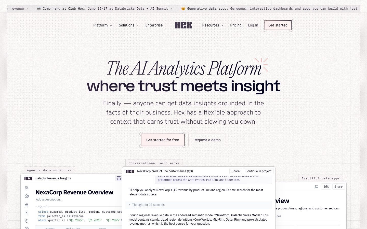
Hex's marketing surface is an editorial data-platform interface anchored on a near-monochrome **deep-violet ink** family — `{colors.ink}` (#01011b) for headings and dominant text, `{colors.body}` (#31263b) for running copy, and a light `{colors.surface}` (#ecedf2) for the page floor. The system reads as precise and engineered: thin hairline borders, very sharp corners (1–6px), and real Hex product UI floated directly into the page as the primary visual.
The type voice is the brand. Hex pairs a **wide grotesque display face — PP Formula** (used at `{typography.display}` 51.2px / 700 with aggressive negative tracking) with a **serif-italic flourish** for the "The AI Analytics Platform" lockup and an **ultralight body face — Cinetype** at weight 300. The contrast between the heavy extended headline and the hairline-thin body is the signature move — confident, technical, editorial.
Color voltage is deliberately quarantined: the UI chrome stays monochrome violet-ink, and the only saturated color in the system is the **viridis data-viz spectrum** (`{colors.viz-indigo}` → `{colors.viz-teal}` → `{colors.viz-green}` → `{colors.viz-lime}` → `{colors.viz-yellow}`) that appears inside the embedded charts, plus syntax-highlight tones inside SQL code cells. Hex doesn't decorate with accent color — it shows the product, and the product carries the color.
**Key Characteristics:**
- Near-monochrome violet-ink palette (`{colors.ink}` #01011b) for all chrome; saturated color only inside product/chart fragments.
- Editorial typographic contrast: wide-extended PP Formula display + ultralight Cinetype body (weight 300).
- Very sharp corners — `{rounded.sharp}` (1px) on buttons, `{rounded.sm}` (3px) is the most frequent radius in the system.
- Buttons are outlined/light, not filled — `{component.button-primary}` carries a purple inset focus-ring border (`{colors.focus}` #472d7b) rather than a solid fill.
- Real Hex notebooks, chat panels, and data apps floated into the page as heavily-shadowed cards (`{component.product-mockup-card}`) — the product IS the hero illustration.
- A persistent top **announcement bar** ticker (`{component.announcement-bar}`) sits above the nav.
- Hairline borders everywhere (`rgb(218,221,230)` 1px and faint violet insets) instead of heavy chrome.
## Colors
### Ink & Text
- **Ink** (`{colors.ink}` — #01011b): The dominant color in the system (highest measured frequency). Headlines, primary text, the HEX wordmark.
- **Body** (`{colors.body}` — #31263b): Default running-text color — a desaturated plum.
- **Link** (`{colors.link}` — #43394c): Inline links, kept inside the violet-ink family rather than a saturated blue.
- **Muted** (`{colors.muted}` — #717a94): Secondary text, "Log in", nav meta.
- **Muted Alt** (`{colors.muted-alt}` — #5e6687): Tertiary captions and labels.
- **Ink Soft** (`{colors.ink-soft}` — #1c1b1c): A near-black neutral used in dense UI chrome.
### Surface
- **Primary** (`{colors.primary}` — #14141c): The button label/fill ink and the measured body background value.
- **Canvas** (`{colors.canvas}` — #14141c): Measured `body.background` value (see Known Gaps — the visible marketing canvas reads as a light cream/off-white that was not captured as a discrete token).
- **Surface** (`{colors.surface}` — #ecedf2): Light panel surface, hairline alternative, testimonial-band background.
- **White** (`{colors.white}` — #ffffff): Floated card surfaces (notebooks, chat panels, inputs).
- **Black** (`{colors.black}` — #000000): Reserved pure-black accents.
### Focus / Interaction
- **Focus** (`{colors.focus}` — #472d7b): The signature purple inset focus ring (`rgb(71,57,130)` measured) on buttons and inputs.
- **Focus Alt** (`{colors.focus-alt}` — #473982): A second violet used in faint border-inset states.
### Data-Viz Spectrum (viridis)
Saturated color is confined to chart fragments. The measured palette is a viridis-style ramp:
- **Viz Indigo** (`{colors.viz-indigo}` — #3b528b)
- **Viz Blue** (`{colors.viz-blue}` — #2458b3)
- **Viz Teal** (`{colors.viz-teal}` — #21918c)
- **Viz Green** (`{colors.viz-green}` — #5ec962)
- **Viz Lime** (`{colors.viz-lime}` — #addc30)
- **Viz Yellow** (`{colors.viz-yellow}` — #fde725)
### Syntax
- **Syntax Green** (`{colors.syntax-green}` — #22863a) and **Syntax Gold** (`{colors.syntax-gold}` — #a67908): SQL keyword/value tones inside `{component.code-cell}`.
## Typography
### Font Family
Hex runs three voices. **PP Formula** (a wide/extended grotesque from Pangram Pangram, custom-licensed) carries all display + heading roles. **Cinetype** (a custom ultralight sans) carries body and button labels at weight 300–400. **IBM Plex Sans** (open-source) handles small eyebrow/label headings.
The editorial signature is the weight contrast: the heavy extended PP Formula headline (700–800, negative tracking down to -1.58px) sitting directly above ultralight Cinetype body copy (300). A serif-italic flourish ("The AI Analytics Platform") appears as a brand lockup above the grotesque headline — that serif face was not isolated as a measured token (see Known Gaps).
### Hierarchy
| Token | Family | Size | Weight | Line Height | Letter Spacing | Use |
|---|---|---|---|---|---|---|
| `{typography.display}` | PP Formula SemiExtended | 51.2px | 700 | 1.3 | -1.57696px | Hero h1 ("where trust meets insight") |
| `{typography.heading-lg}` | PP Formula | 28px | 800 | 1.3 | -0.7px | Section heads |
| `{typography.heading-md}` | PP Formula | 20px | 600 | 1.3 | -0.5px | Sub-section / card titles |
| `{typography.eyebrow}` | IBM Plex Sans | 16px | 600 | 1.4 | -0.4px | Eyebrow labels, small headings |
| `{typography.body}` | Cinetype | 24px | 300 | 1.5 | normal | Hero sub-copy, running text |
| `{typography.button}` | Cinetype | 14px | 400 | 1.0 | normal | Button + nav labels |
### Principles
The weight contrast (heavy extended display vs. ultralight body) is the brand. Never run body copy in PP Formula, never set a headline in Cinetype. Display tracking is always negative — the extended grotesque without tight tracking reads as off-brand.
### Note on Font Substitutes
**PP Formula** and **Cinetype** are custom/proprietary faces and are not redistributable as web fonts. Use open-source substitutes:
- For PP Formula / PP Formula SemiExtended → **Archivo Expanded** (weights 700/800) preserves the wide-grotesque silhouette and negative-tracking behavior.
- For Cinetype → **Inter** at weight 300 is the closest ultralight humanist substitute.
- **IBM Plex Sans** is open-source and may ship directly.
## Layout
### Spacing System
- **Base unit:** 4px (by far the two most frequent steps are 4px and 8px).
- **Tokens:** `{spacing.xxs}` 4px · `{spacing.xs}` 8px · `{spacing.sm}` 10px · `{spacing.md}` 12px · `{spacing.lg}` 16px · `{spacing.xl}` 18px · `{spacing.xxl}` 20px.
- The system is tight — measured padding/gap values cluster heavily at 4/8/12px, with little use above 20px. Larger section rhythm (vertical band spacing) was not isolated as a discrete token (see Known Gaps).
### Grid & Container
- **Hero:** Centered single-column lockup (serif-italic line + extended grotesque headline + body sub-copy + button row), content centered on the page.
- **Product showcase:** Overlapping/floated product-UI cards arranged below the hero — a notebook card on the left, a chat-card center, a data-app card on the right.
- **Testimonial band:** 2-up quote columns on a `{colors.surface}` strip.
### Whitespace Philosophy
Hex centers its hero and surrounds it with generous negative space, then lets heavily-shadowed product cards break the baseline by overlapping. The result is editorial-but-technical: airy at the headline, dense inside the embedded product chrome.
## Elevation & Depth
| Level | Treatment | Use |
|---|---|---|
| Flat | No shadow | Hero band, nav, body sections |
| Hairline border | `rgb(218,221,230) 0 0 0 1px` | Card outlines, dividers |
| Faint inset | `rgba(71,57,130,0.1) 0 0 0 1px inset` | Subtle violet card borders |
| Soft card | `rgba(0,0,0,0.08) 0 4px 12px` | Small floating UI fragments |
| Floated product card | `rgba(49,38,59,0.22) 0 0 0 1px, rgba(49,38,59,0.09) 0 103px 103px, rgba(49,38,59,0.1) 0 26px 57px` | The large notebook/chat/data-app mockups |
| Focus ring | `rgb(71,57,130) 0 0 0 1px inset, rgba(71,57,130,0.25) 0 0 0 5px inset` | Button + input focus/active state |
The elevation philosophy is **long, soft, low-alpha drop shadows** (note the 103px blur radius) that make product cards float dramatically above the light surface, combined with a crisp 1px hairline ring. The purple double-inset ring is the system's signature interactive affordance.
## Shapes
### Border Radius Scale
| Token | Value | Use |
|---|---|---|
| `{rounded.sharp}` | 1px | Buttons (`{component.button-primary}`) — nearly square corners |
| `{rounded.xs}` | 2px | Small chips, tight UI elements |
| `{rounded.sm}` | 3px | The most frequent radius — code cells, small cards, UI chrome |
| `{rounded.md}` | 4px | Standard small containers |
| `{rounded.lg}` | 6px | Product-mockup / chat card corners |
| `{rounded.xl}` | 8px | Larger panels |
| `{rounded.input}` | 7px | Text inputs |
| `{rounded.pill}` | 99px | Pill elements |
| `{rounded.full}` | 9999px | Avatars, circular controls |
The system is overwhelmingly sharp — 3px is the dominant radius and buttons round to just 1px. There is almost no soft-rounded surface; the brand reads precise and technical.
## Components
### Top Chrome
**`announcement-bar`** — A persistent ticker strip above the nav on `{colors.canvas}` with white `{typography.button}` text ("Come hang at Club Hex…", "Generative data apps…"). Padding ~8px × 16px.
**`top-nav`** — Horizontal nav on `{colors.surface}`. Center-aligned HEX wordmark with Platform / Solutions / Enterprise to the left and Resources / Pricing / Log in / "Get started" to the right. Links use `{typography.button}`; the trailing "Get started" renders as `{component.button-primary}`.
**`nav-link`** — Inline nav item in `{colors.ink}`, `{typography.button}`. "Log in" drops to `{colors.muted}`.
### Buttons
**`button-primary`** — The signature CTA ("Get started", "Get started for free"). Outlined/light rather than filled: transparent background, `{colors.primary}` label, a `{colors.focus}` violet inset ring border, `{typography.button}`, rounded `{rounded.sharp}` (1px), padding 9.6px × 13.6px (measured). The double inset purple ring (`rgb(71,57,130)` 1px + `rgba(71,57,130,0.25)` 5px) is its active/focus signature.
**`button-secondary`** — Outline variant ("Request a demo"). Transparent background, `{colors.ink}` label, `{colors.surface}` hairline border, same radius + padding as primary.
**`button-ghost`** — Plain text button ("Log in") in `{colors.muted}`, no border.
### Cards & Product Fragments
**`hero-band`** — Centered hero on `{colors.surface}` carrying the serif-italic brand lockup, the `{typography.display}` headline, `{typography.body}` sub-copy, and the button row.
**`product-mockup-card`** — A real Hex notebook ("NexaCorp Revenue Overview") floated into the page. White background, `{colors.surface}` hairline border, rounded `{rounded.lg}`, the heavy long-blur drop shadow. Contains its own SQL chrome and viridis charts.
**`chat-card`** — The "Conversational self-serve" panel. White background, hairline border, rounded `{rounded.lg}`, padding `{spacing.lg}`. Carries a HEX-badged conversation thread with "Share" / "Continue in project" controls.
**`code-cell`** — SQL cell inside notebook mockups. White background, `{typography.button}` mono-like rendering, rounded `{rounded.sm}`. Keywords/values tint with `{colors.syntax-green}` and `{colors.syntax-gold}`.
**`testimonial-card`** — Customer quotes (Mercor, Algolia) on a `{colors.surface}` band. Quote in `{typography.body}`, attribution in `{colors.muted}`.
### Inputs
**`text-input`** — White background, `{colors.ink}` text, `{colors.surface}` hairline border, rounded `{rounded.input}` (7px, measured), padding 8px × 12px, `{typography.button}`.
**`text-input-focused`** — Focus state shifts the border to `{colors.focus}` and renders the purple double inset ring.
## Do's and Don'ts
### Do
- Keep all UI chrome in the violet-ink family (`{colors.ink}`, `{colors.body}`, `{colors.muted}`). Reserve saturated color for charts.
- Use the viridis ramp (`{colors.viz-indigo}` → `{colors.viz-yellow}`) only inside data-viz fragments.
- Pair heavy extended PP Formula headlines with ultralight Cinetype body — the weight contrast is the brand.
- Apply negative tracking on display type.
- Float real Hex product UI into the page with the long-blur drop shadow — show the product, don't illustrate it.
- Keep corners sharp — 1px on buttons, 3px on UI cells.
- Use the purple double-inset ring (`{colors.focus}`) for button/input focus.
### Don't
- Don't fill primary buttons with a solid color — they are outlined/light with a violet ring.
- Don't set body copy in PP Formula or headlines in Cinetype.
- Don't introduce saturated accent color into the chrome — color belongs to charts and syntax only.
- Don't round corners heavily; large radii read off-brand against this sharp, technical system.
- Don't document hover states — default and active/pressed (focus-ring) only.
## Responsive Behavior
Breakpoint-specific values were not captured in this measurement pass; the following is inferred from the captured desktop layout and standard practice (derived).
| Name | Width | Key Changes (derived) |
|---|---|---|
| Mobile | < 768px | Nav collapses to a menu trigger; hero lockup scales down (display 51.2px → smaller); floated product cards stack single-column |
| Tablet | 768–1024px | Nav tightens; product showcase reduces to 1–2 cards visible |
| Desktop | 1024px+ | Full center-aligned nav; overlapping 3-card product showcase below hero |
### Touch Targets
- `{component.button-primary}` padding 9.6px × 13.6px produces a compact target; on touch surfaces it should be padded toward a 44px minimum height (derived).
- `{component.text-input}` padding 8px × 12px is similarly compact.
### Collapsing Strategy (derived)
- Heavily-floated product cards should stack rather than overlap on narrow viewports to preserve legibility of the embedded notebook/chart chrome.
- Testimonial 2-up band collapses to single column.
## Iteration Guide
1. Focus on ONE component at a time, referencing its YAML key (`{component.product-mockup-card}`, `{component.button-primary}`).
2. Variants (`-focused`, `-disabled`) live as separate entries in `components:`.
3. Use `{token.refs}` everywhere — never inline a hex into a component.
4. Document default and active/pressed (focus-ring) states only — never hover.
5. Headlines stay PP Formula (extended, negative tracking); body stays Cinetype 300. The weight contrast does not blur.
6. Saturated color stays inside chart and syntax fragments — chrome remains violet-ink monochrome.
7. When emphasizing, increase display size before adding color.
## Known Gaps
- **Canvas color conflict:** the measured `body.background` token is `{colors.canvas}` (#14141c, dark), but the captured screenshots show a light cream/off-white marketing canvas. The exact cream surface hex was not isolated as a discrete token — only `{colors.surface}` (#ecedf2) and `{colors.white}` were measured as light surfaces. Treat the visible page floor as cream and confirm against the live CSS.
- The serif-italic "The AI Analytics Platform" brand lockup is visible in screenshots but was not captured as a measured typography role; its family, size, and weight are unknown.
- **PP Formula** and **Cinetype** are custom/proprietary faces (not flagged in `fonts_licensed`, but clearly non-public); open-source substitutes are documented in the Typography section.
- Section-level vertical rhythm (band-to-band spacing) was not isolated — measured spacing tops out at 20px, which reflects component-internal padding, not layout gutters.
- Only `button-primary` and `input` were captured as measured component primitives; nav, cards, announcement bar, and testimonial specs are reconstructed from screenshot ground-truth and may carry derived padding/radius values.
- Responsive breakpoints, touch-target sizing, and collapse behavior are derived, not measured.
- Disabled/error states for buttons and inputs were not extracted; a sign-up or pricing flow would be needed to confirm them.
- Animation and transition timings (chat "Thought for 11 seconds", chart reveals) are out of scope.
<!-- Documented by duply · real-world design systems as ready-to-use DESIGN.md for AI coding agents · https://duply.ai/hex/design-md -->
Color Palette
Accent
Neutrals
Typography
display51.2px · 700 · 1.3
The quick brown fox jumpsheading-lg28px · 800 · 1.3
The quick brown fox jumpsheading-md20px · 600 · 1.3
The quick brown fox jumpseyebrow16px · 600 · 1.4
The quick brown fox jumpsbody24px · 300 · 1.5
The quick brown fox jumpsbutton14px · 400 · 1
The quick brown fox jumpsSpacing & Shape
Spacing
| Name | Value | Preview |
|---|---|---|
| xxs | 4px | |
| xs | 8px | |
| sm | 10px | |
| md | 12px | |
| lg | 16px | |
| xl | 18px | |
| xxl | 20px |
Border Radius
| Name | Value | Preview |
|---|---|---|
| sharp | 1px | |
| xs | 2px | |
| sm | 3px | |
| md | 4px | |
| lg | 6px | |
| xl | 8px | |
| input | 7px | |
| pill | 99px | |
| full | 9999px |
More like this


---
version: alpha
name: Hex-design-analysis
description: "A data-platform marketing surface built on a near-monochrome deep-violet ink palette with an editorial display voice — a wide grotesque \"PP Formula\" headline face paired with a serif-italic flourish and an ultralight \"Cinetype\" body. The system reads as precise and engineered: sharp 1–3px corners, thin hairline borders, heavily-floated product-UI cards (real Hex notebooks shown in-page), and a viridis data-viz spectrum that supplies the only chromatic voltage inside charts. Brand energy comes from typographic contrast and embedded product chrome rather than from UI accent color."

colors:
  ink: "#01011b"
  body: "#31263b"
  link: "#43394c"
  muted: "#717a94"
  muted-alt: "#5e6687"
  primary: "#14141c"
  canvas: "#14141c"
  surface: "#ecedf2"
  white: "#ffffff"
  black: "#000000"
  ink-soft: "#1c1b1c"
  focus: "#472d7b"
  focus-alt: "#473982"
  viz-indigo: "#3b528b"
  viz-blue: "#2458b3"
  viz-teal: "#21918c"
  viz-green: "#5ec962"
  viz-lime: "#addc30"
  viz-yellow: "#fde725"
  syntax-green: "#22863a"
  syntax-gold: "#a67908"

typography:
  display:
    fontFamily: "PP Formula SemiExtended, Archivo Expanded, sans-serif"
    fontSize: 51.2px
    fontWeight: 700
    lineHeight: 1.3
    letterSpacing: -1.57696px
  heading-lg:
    fontFamily: "PP Formula, Archivo Expanded, sans-serif"
    fontSize: 28px
    fontWeight: 800
    lineHeight: 1.3
    letterSpacing: -0.7px
  heading-md:
    fontFamily: "PP Formula, Archivo Expanded, sans-serif"
    fontSize: 20px
    fontWeight: 600
    lineHeight: 1.3
    letterSpacing: -0.5px
  eyebrow:
    fontFamily: "IBM Plex Sans, sans-serif"
    fontSize: 16px
    fontWeight: 600
    lineHeight: 1.4
    letterSpacing: -0.4px
  body:
    fontFamily: "Cinetype, Inter, sans-serif"
    fontSize: 24px
    fontWeight: 300
    lineHeight: 1.5
    letterSpacing: normal
  button:
    fontFamily: "Cinetype, Inter, sans-serif"
    fontSize: 14px
    fontWeight: 400
    lineHeight: 1.0
    letterSpacing: normal

rounded:
  sharp: 1px
  xs: 2px
  sm: 3px
  md: 4px
  lg: 6px
  xl: 8px
  input: 7px
  pill: 99px
  full: 9999px

spacing:
  xxs: 4px
  xs: 8px
  sm: 10px
  md: 12px
  lg: 16px
  xl: 18px
  xxl: 20px

components:
  announcement-bar:
    backgroundColor: "{colors.canvas}"
    textColor: "{colors.white}"
    typography: "{typography.button}"
    padding: 8px 16px
  top-nav:
    backgroundColor: "{colors.surface}"
    textColor: "{colors.ink}"
    typography: "{typography.button}"
    padding: 12px 20px
  button-primary:
    backgroundColor: transparent
    textColor: "{colors.primary}"
    borderColor: "{colors.focus}"
    typography: "{typography.button}"
    rounded: "{rounded.sharp}"
    padding: 9.6px 13.6px
  button-secondary:
    backgroundColor: transparent
    textColor: "{colors.ink}"
    borderColor: "{colors.surface}"
    typography: "{typography.button}"
    rounded: "{rounded.sharp}"
    padding: 9.6px 13.6px
  button-ghost:
    backgroundColor: transparent
    textColor: "{colors.muted}"
    typography: "{typography.button}"
    padding: 9.6px 13.6px
  nav-link:
    backgroundColor: transparent
    textColor: "{colors.ink}"
    typography: "{typography.button}"
  hero-band:
    backgroundColor: "{colors.surface}"
    textColor: "{colors.ink}"
    typography: "{typography.display}"
    padding: 20px
  product-mockup-card:
    backgroundColor: "{colors.white}"
    textColor: "{colors.body}"
    borderColor: "{colors.surface}"
    rounded: "{rounded.lg}"
    padding: 12px
  chat-card:
    backgroundColor: "{colors.white}"
    textColor: "{colors.body}"
    borderColor: "{colors.surface}"
    rounded: "{rounded.lg}"
    padding: 16px
  code-cell:
    backgroundColor: "{colors.white}"
    textColor: "{colors.body}"
    typography: "{typography.button}"
    rounded: "{rounded.sm}"
    padding: 8px
  testimonial-card:
    backgroundColor: "{colors.surface}"
    textColor: "{colors.body}"
    typography: "{typography.body}"
    padding: 18px
  text-input:
    backgroundColor: "{colors.white}"
    textColor: "{colors.ink}"
    borderColor: "{colors.surface}"
    typography: "{typography.button}"
    rounded: "{rounded.input}"
    padding: 8px 12px
  text-input-focused:
    backgroundColor: "{colors.white}"
    textColor: "{colors.ink}"
    borderColor: "{colors.focus}"
    rounded: "{rounded.input}"
---

## Overview

Hex's marketing surface is an editorial data-platform interface anchored on a near-monochrome **deep-violet ink** family — `{colors.ink}` (#01011b) for headings and dominant text, `{colors.body}` (#31263b) for running copy, and a light `{colors.surface}` (#ecedf2) for the page floor. The system reads as precise and engineered: thin hairline borders, very sharp corners (1–6px), and real Hex product UI floated directly into the page as the primary visual.

The type voice is the brand. Hex pairs a **wide grotesque display face — PP Formula** (used at `{typography.display}` 51.2px / 700 with aggressive negative tracking) with a **serif-italic flourish** for the "The AI Analytics Platform" lockup and an **ultralight body face — Cinetype** at weight 300. The contrast between the heavy extended headline and the hairline-thin body is the signature move — confident, technical, editorial.

Color voltage is deliberately quarantined: the UI chrome stays monochrome violet-ink, and the only saturated color in the system is the **viridis data-viz spectrum** (`{colors.viz-indigo}` → `{colors.viz-teal}` → `{colors.viz-green}` → `{colors.viz-lime}` → `{colors.viz-yellow}`) that appears inside the embedded charts, plus syntax-highlight tones inside SQL code cells. Hex doesn't decorate with accent color — it shows the product, and the product carries the color.

**Key Characteristics:**
- Near-monochrome violet-ink palette (`{colors.ink}` #01011b) for all chrome; saturated color only inside product/chart fragments.
- Editorial typographic contrast: wide-extended PP Formula display + ultralight Cinetype body (weight 300).
- Very sharp corners — `{rounded.sharp}` (1px) on buttons, `{rounded.sm}` (3px) is the most frequent radius in the system.
- Buttons are outlined/light, not filled — `{component.button-primary}` carries a purple inset focus-ring border (`{colors.focus}` #472d7b) rather than a solid fill.
- Real Hex notebooks, chat panels, and data apps floated into the page as heavily-shadowed cards (`{component.product-mockup-card}`) — the product IS the hero illustration.
- A persistent top **announcement bar** ticker (`{component.announcement-bar}`) sits above the nav.
- Hairline borders everywhere (`rgb(218,221,230)` 1px and faint violet insets) instead of heavy chrome.

## Colors

### Ink & Text
- **Ink** (`{colors.ink}` — #01011b): The dominant color in the system (highest measured frequency). Headlines, primary text, the HEX wordmark.
- **Body** (`{colors.body}` — #31263b): Default running-text color — a desaturated plum.
- **Link** (`{colors.link}` — #43394c): Inline links, kept inside the violet-ink family rather than a saturated blue.
- **Muted** (`{colors.muted}` — #717a94): Secondary text, "Log in", nav meta.
- **Muted Alt** (`{colors.muted-alt}` — #5e6687): Tertiary captions and labels.
- **Ink Soft** (`{colors.ink-soft}` — #1c1b1c): A near-black neutral used in dense UI chrome.

### Surface
- **Primary** (`{colors.primary}` — #14141c): The button label/fill ink and the measured body background value.
- **Canvas** (`{colors.canvas}` — #14141c): Measured `body.background` value (see Known Gaps — the visible marketing canvas reads as a light cream/off-white that was not captured as a discrete token).
- **Surface** (`{colors.surface}` — #ecedf2): Light panel surface, hairline alternative, testimonial-band background.
- **White** (`{colors.white}` — #ffffff): Floated card surfaces (notebooks, chat panels, inputs).
- **Black** (`{colors.black}` — #000000): Reserved pure-black accents.

### Focus / Interaction
- **Focus** (`{colors.focus}` — #472d7b): The signature purple inset focus ring (`rgb(71,57,130)` measured) on buttons and inputs.
- **Focus Alt** (`{colors.focus-alt}` — #473982): A second violet used in faint border-inset states.

### Data-Viz Spectrum (viridis)
Saturated color is confined to chart fragments. The measured palette is a viridis-style ramp:
- **Viz Indigo** (`{colors.viz-indigo}` — #3b528b)
- **Viz Blue** (`{colors.viz-blue}` — #2458b3)
- **Viz Teal** (`{colors.viz-teal}` — #21918c)
- **Viz Green** (`{colors.viz-green}` — #5ec962)
- **Viz Lime** (`{colors.viz-lime}` — #addc30)
- **Viz Yellow** (`{colors.viz-yellow}` — #fde725)

### Syntax
- **Syntax Green** (`{colors.syntax-green}` — #22863a) and **Syntax Gold** (`{colors.syntax-gold}` — #a67908): SQL keyword/value tones inside `{component.code-cell}`.

## Typography

### Font Family
Hex runs three voices. **PP Formula** (a wide/extended grotesque from Pangram Pangram, custom-licensed) carries all display + heading roles. **Cinetype** (a custom ultralight sans) carries body and button labels at weight 300–400. **IBM Plex Sans** (open-source) handles small eyebrow/label headings.

The editorial signature is the weight contrast: the heavy extended PP Formula headline (700–800, negative tracking down to -1.58px) sitting directly above ultralight Cinetype body copy (300). A serif-italic flourish ("The AI Analytics Platform") appears as a brand lockup above the grotesque headline — that serif face was not isolated as a measured token (see Known Gaps).

### Hierarchy

| Token | Family | Size | Weight | Line Height | Letter Spacing | Use |
|---|---|---|---|---|---|---|
| `{typography.display}` | PP Formula SemiExtended | 51.2px | 700 | 1.3 | -1.57696px | Hero h1 ("where trust meets insight") |
| `{typography.heading-lg}` | PP Formula | 28px | 800 | 1.3 | -0.7px | Section heads |
| `{typography.heading-md}` | PP Formula | 20px | 600 | 1.3 | -0.5px | Sub-section / card titles |
| `{typography.eyebrow}` | IBM Plex Sans | 16px | 600 | 1.4 | -0.4px | Eyebrow labels, small headings |
| `{typography.body}` | Cinetype | 24px | 300 | 1.5 | normal | Hero sub-copy, running text |
| `{typography.button}` | Cinetype | 14px | 400 | 1.0 | normal | Button + nav labels |

### Principles
The weight contrast (heavy extended display vs. ultralight body) is the brand. Never run body copy in PP Formula, never set a headline in Cinetype. Display tracking is always negative — the extended grotesque without tight tracking reads as off-brand.

### Note on Font Substitutes
**PP Formula** and **Cinetype** are custom/proprietary faces and are not redistributable as web fonts. Use open-source substitutes:
- For PP Formula / PP Formula SemiExtended → **Archivo Expanded** (weights 700/800) preserves the wide-grotesque silhouette and negative-tracking behavior.
- For Cinetype → **Inter** at weight 300 is the closest ultralight humanist substitute.
- **IBM Plex Sans** is open-source and may ship directly.

## Layout

### Spacing System
- **Base unit:** 4px (by far the two most frequent steps are 4px and 8px).
- **Tokens:** `{spacing.xxs}` 4px · `{spacing.xs}` 8px · `{spacing.sm}` 10px · `{spacing.md}` 12px · `{spacing.lg}` 16px · `{spacing.xl}` 18px · `{spacing.xxl}` 20px.
- The system is tight — measured padding/gap values cluster heavily at 4/8/12px, with little use above 20px. Larger section rhythm (vertical band spacing) was not isolated as a discrete token (see Known Gaps).

### Grid & Container
- **Hero:** Centered single-column lockup (serif-italic line + extended grotesque headline + body sub-copy + button row), content centered on the page.
- **Product showcase:** Overlapping/floated product-UI cards arranged below the hero — a notebook card on the left, a chat-card center, a data-app card on the right.
- **Testimonial band:** 2-up quote columns on a `{colors.surface}` strip.

### Whitespace Philosophy
Hex centers its hero and surrounds it with generous negative space, then lets heavily-shadowed product cards break the baseline by overlapping. The result is editorial-but-technical: airy at the headline, dense inside the embedded product chrome.

## Elevation & Depth

| Level | Treatment | Use |
|---|---|---|
| Flat | No shadow | Hero band, nav, body sections |
| Hairline border | `rgb(218,221,230) 0 0 0 1px` | Card outlines, dividers |
| Faint inset | `rgba(71,57,130,0.1) 0 0 0 1px inset` | Subtle violet card borders |
| Soft card | `rgba(0,0,0,0.08) 0 4px 12px` | Small floating UI fragments |
| Floated product card | `rgba(49,38,59,0.22) 0 0 0 1px, rgba(49,38,59,0.09) 0 103px 103px, rgba(49,38,59,0.1) 0 26px 57px` | The large notebook/chat/data-app mockups |
| Focus ring | `rgb(71,57,130) 0 0 0 1px inset, rgba(71,57,130,0.25) 0 0 0 5px inset` | Button + input focus/active state |

The elevation philosophy is **long, soft, low-alpha drop shadows** (note the 103px blur radius) that make product cards float dramatically above the light surface, combined with a crisp 1px hairline ring. The purple double-inset ring is the system's signature interactive affordance.

## Shapes

### Border Radius Scale

| Token | Value | Use |
|---|---|---|
| `{rounded.sharp}` | 1px | Buttons (`{component.button-primary}`) — nearly square corners |
| `{rounded.xs}` | 2px | Small chips, tight UI elements |
| `{rounded.sm}` | 3px | The most frequent radius — code cells, small cards, UI chrome |
| `{rounded.md}` | 4px | Standard small containers |
| `{rounded.lg}` | 6px | Product-mockup / chat card corners |
| `{rounded.xl}` | 8px | Larger panels |
| `{rounded.input}` | 7px | Text inputs |
| `{rounded.pill}` | 99px | Pill elements |
| `{rounded.full}` | 9999px | Avatars, circular controls |

The system is overwhelmingly sharp — 3px is the dominant radius and buttons round to just 1px. There is almost no soft-rounded surface; the brand reads precise and technical.

## Components

### Top Chrome

**`announcement-bar`** — A persistent ticker strip above the nav on `{colors.canvas}` with white `{typography.button}` text ("Come hang at Club Hex…", "Generative data apps…"). Padding ~8px × 16px.

**`top-nav`** — Horizontal nav on `{colors.surface}`. Center-aligned HEX wordmark with Platform / Solutions / Enterprise to the left and Resources / Pricing / Log in / "Get started" to the right. Links use `{typography.button}`; the trailing "Get started" renders as `{component.button-primary}`.

**`nav-link`** — Inline nav item in `{colors.ink}`, `{typography.button}`. "Log in" drops to `{colors.muted}`.

### Buttons

**`button-primary`** — The signature CTA ("Get started", "Get started for free"). Outlined/light rather than filled: transparent background, `{colors.primary}` label, a `{colors.focus}` violet inset ring border, `{typography.button}`, rounded `{rounded.sharp}` (1px), padding 9.6px × 13.6px (measured). The double inset purple ring (`rgb(71,57,130)` 1px + `rgba(71,57,130,0.25)` 5px) is its active/focus signature.

**`button-secondary`** — Outline variant ("Request a demo"). Transparent background, `{colors.ink}` label, `{colors.surface}` hairline border, same radius + padding as primary.

**`button-ghost`** — Plain text button ("Log in") in `{colors.muted}`, no border.

### Cards & Product Fragments

**`hero-band`** — Centered hero on `{colors.surface}` carrying the serif-italic brand lockup, the `{typography.display}` headline, `{typography.body}` sub-copy, and the button row.

**`product-mockup-card`** — A real Hex notebook ("NexaCorp Revenue Overview") floated into the page. White background, `{colors.surface}` hairline border, rounded `{rounded.lg}`, the heavy long-blur drop shadow. Contains its own SQL chrome and viridis charts.

**`chat-card`** — The "Conversational self-serve" panel. White background, hairline border, rounded `{rounded.lg}`, padding `{spacing.lg}`. Carries a HEX-badged conversation thread with "Share" / "Continue in project" controls.

**`code-cell`** — SQL cell inside notebook mockups. White background, `{typography.button}` mono-like rendering, rounded `{rounded.sm}`. Keywords/values tint with `{colors.syntax-green}` and `{colors.syntax-gold}`.

**`testimonial-card`** — Customer quotes (Mercor, Algolia) on a `{colors.surface}` band. Quote in `{typography.body}`, attribution in `{colors.muted}`.

### Inputs

**`text-input`** — White background, `{colors.ink}` text, `{colors.surface}` hairline border, rounded `{rounded.input}` (7px, measured), padding 8px × 12px, `{typography.button}`.

**`text-input-focused`** — Focus state shifts the border to `{colors.focus}` and renders the purple double inset ring.

## Do's and Don'ts

### Do
- Keep all UI chrome in the violet-ink family (`{colors.ink}`, `{colors.body}`, `{colors.muted}`). Reserve saturated color for charts.
- Use the viridis ramp (`{colors.viz-indigo}` → `{colors.viz-yellow}`) only inside data-viz fragments.
- Pair heavy extended PP Formula headlines with ultralight Cinetype body — the weight contrast is the brand.
- Apply negative tracking on display type.
- Float real Hex product UI into the page with the long-blur drop shadow — show the product, don't illustrate it.
- Keep corners sharp — 1px on buttons, 3px on UI cells.
- Use the purple double-inset ring (`{colors.focus}`) for button/input focus.

### Don't
- Don't fill primary buttons with a solid color — they are outlined/light with a violet ring.
- Don't set body copy in PP Formula or headlines in Cinetype.
- Don't introduce saturated accent color into the chrome — color belongs to charts and syntax only.
- Don't round corners heavily; large radii read off-brand against this sharp, technical system.
- Don't document hover states — default and active/pressed (focus-ring) only.

## Responsive Behavior

Breakpoint-specific values were not captured in this measurement pass; the following is inferred from the captured desktop layout and standard practice (derived).

| Name | Width | Key Changes (derived) |
|---|---|---|
| Mobile | < 768px | Nav collapses to a menu trigger; hero lockup scales down (display 51.2px → smaller); floated product cards stack single-column |
| Tablet | 768–1024px | Nav tightens; product showcase reduces to 1–2 cards visible |
| Desktop | 1024px+ | Full center-aligned nav; overlapping 3-card product showcase below hero |

### Touch Targets
- `{component.button-primary}` padding 9.6px × 13.6px produces a compact target; on touch surfaces it should be padded toward a 44px minimum height (derived).
- `{component.text-input}` padding 8px × 12px is similarly compact.

### Collapsing Strategy (derived)
- Heavily-floated product cards should stack rather than overlap on narrow viewports to preserve legibility of the embedded notebook/chart chrome.
- Testimonial 2-up band collapses to single column.

## Iteration Guide

1. Focus on ONE component at a time, referencing its YAML key (`{component.product-mockup-card}`, `{component.button-primary}`).
2. Variants (`-focused`, `-disabled`) live as separate entries in `components:`.
3. Use `{token.refs}` everywhere — never inline a hex into a component.
4. Document default and active/pressed (focus-ring) states only — never hover.
5. Headlines stay PP Formula (extended, negative tracking); body stays Cinetype 300. The weight contrast does not blur.
6. Saturated color stays inside chart and syntax fragments — chrome remains violet-ink monochrome.
7. When emphasizing, increase display size before adding color.

## Known Gaps

- **Canvas color conflict:** the measured `body.background` token is `{colors.canvas}` (#14141c, dark), but the captured screenshots show a light cream/off-white marketing canvas. The exact cream surface hex was not isolated as a discrete token — only `{colors.surface}` (#ecedf2) and `{colors.white}` were measured as light surfaces. Treat the visible page floor as cream and confirm against the live CSS.
- The serif-italic "The AI Analytics Platform" brand lockup is visible in screenshots but was not captured as a measured typography role; its family, size, and weight are unknown.
- **PP Formula** and **Cinetype** are custom/proprietary faces (not flagged in `fonts_licensed`, but clearly non-public); open-source substitutes are documented in the Typography section.
- Section-level vertical rhythm (band-to-band spacing) was not isolated — measured spacing tops out at 20px, which reflects component-internal padding, not layout gutters.
- Only `button-primary` and `input` were captured as measured component primitives; nav, cards, announcement bar, and testimonial specs are reconstructed from screenshot ground-truth and may carry derived padding/radius values.
- Responsive breakpoints, touch-target sizing, and collapse behavior are derived, not measured.
- Disabled/error states for buttons and inputs were not extracted; a sign-up or pricing flow would be needed to confirm them.
- Animation and transition timings (chat "Thought for 11 seconds", chart reveals) are out of scope.

<!-- Documented by duply · real-world design systems as ready-to-use DESIGN.md for AI coding agents · https://duply.ai/hex/design-md -->