Granola
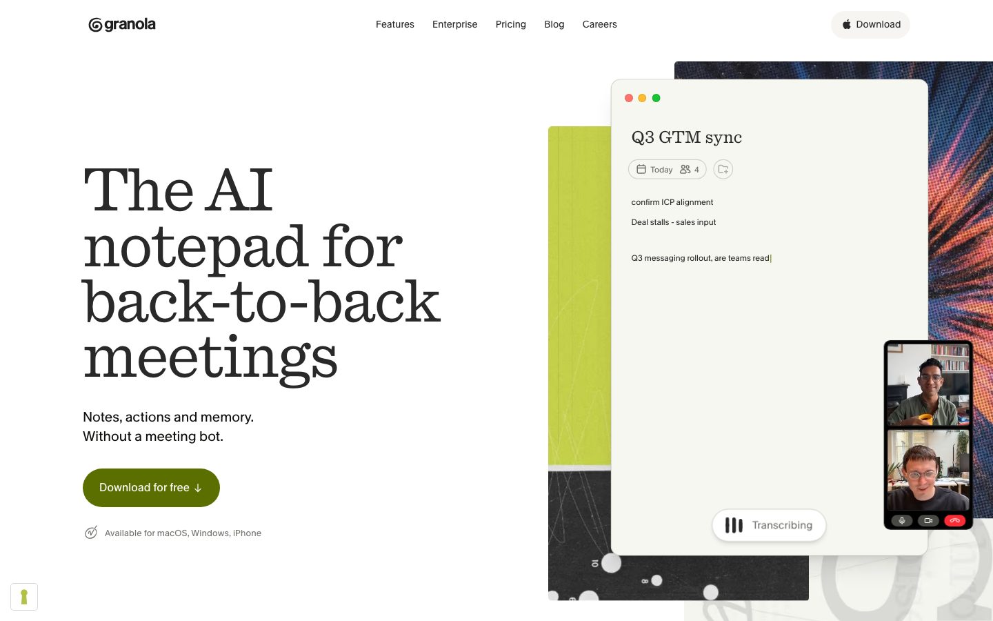
An editorial, type-forward interface for an AI meeting notepad — warm near-white canvas, a serif display face running at enormous sizes, and a single olive-green pill CTA carrying all the brand voltage. The system reads as confident-but-quiet desktop software: oversized Quadrant serif headlines, compact Melange sans body, cream note-cards that mirror the product's own UI, and one near-black band that anchors logo/testimonial proof.
---
version: alpha
name: Granola-design-analysis
description: "An editorial, type-forward interface for an AI meeting notepad — warm near-white canvas, a serif display face running at enormous sizes, and a single olive-green pill CTA carrying all the brand voltage. The system reads as confident-but-quiet desktop software: oversized Quadrant serif headlines, compact Melange sans body, cream note-cards that mirror the product's own UI, and one near-black band that anchors logo/testimonial proof."
colors:
  primary: "#5b6f00"
  ink: "#292929"
  neutral-strong: "#0e0f0c"
  canvas: "#ffffff"
  off-white: "#fcfcf8"
  surface-cream: "#f7f7f2"
  muted: "#72726e"
  muted-mid: "#9e9e99"
  muted-soft: "#acada8"
  neutral-700: "#4e4d4b"
  neutral-800: "#363635"
  hairline: "#d5d5d2"
  hairline-soft: "#dedede"
  accent-lime: "#d1e043"
  accent-olive: "#788c15"
  accent-yellow: "#febe29"
  accent-amber: "#febc2e"
  accent-violet: "#cebef8"
  accent-pink: "#ff91e0"
  accent-coral: "#ff736a"
  success: "#22c55e"

typography:
  h1:
    fontFamily: "Quadrant, Georgia, 'Times New Roman', serif"
    fontSize: 86.4px
    fontWeight: 400
    lineHeight: 0.93
    letterSpacing: -1.728px
  h2:
    fontFamily: "Quadrant, Georgia, 'Times New Roman', serif"
    fontSize: 160px
    fontWeight: 400
    lineHeight: 1.0
    letterSpacing: -2.4px
  h3:
    fontFamily: "Quadrant, Georgia, 'Times New Roman', serif"
    fontSize: 24px
    fontWeight: 400
    lineHeight: 1.05
    letterSpacing: -0.24px
  body:
    fontFamily: "Melange, Inter, sans-serif"
    fontSize: 14px
    fontWeight: 500
    lineHeight: 1.286
    letterSpacing: 0.14px
  button:
    fontFamily: "Melange, Inter, sans-serif"
    fontSize: 14px
    fontWeight: 400
    lineHeight: 1.286
    letterSpacing: 0.14px

rounded:
  xs: 4px
  sm: 6px
  md: 8px
  lg: 12px
  xl: 16px
  xxl: 24px
  xxxl: 28px
  full: 9999px

spacing:
  xxs: 4px
  xs: 8px
  sm: 12px
  md: 16px
  lg: 22px
  xl: 24px
  xxl: 32px
  xxxl: 36px

components:
  top-nav:
    backgroundColor: "{colors.canvas}"
    textColor: "{colors.ink}"
    typography: "{typography.body}"
    padding: 24px
  nav-link:
    backgroundColor: transparent
    textColor: "{colors.ink}"
    typography: "{typography.body}"
  button-primary:
    backgroundColor: "{colors.primary}"
    textColor: "{colors.canvas}"
    typography: "{typography.button}"
    rounded: "{rounded.full}"
    padding: 10px 48px 10px 16px
  button-nav-download:
    backgroundColor: "{colors.ink}"
    textColor: "{colors.canvas}"
    typography: "{typography.button}"
    rounded: "{rounded.md}"
    padding: 10px 16px
  hero-band:
    backgroundColor: "{colors.canvas}"
    textColor: "{colors.ink}"
    typography: "{typography.h1}"
    padding: 36px
  app-mockup-card:
    backgroundColor: "{colors.off-white}"
    textColor: "{colors.ink}"
    rounded: "{rounded.xxl}"
    padding: 24px
  note-card:
    backgroundColor: "{colors.surface-cream}"
    textColor: "{colors.ink}"
    typography: "{typography.body}"
    rounded: "{rounded.xl}"
    padding: 22px
  meta-pill:
    backgroundColor: "{colors.canvas}"
    textColor: "{colors.muted}"
    typography: "{typography.body}"
    rounded: "{rounded.sm}"
    padding: 4px 8px
  feature-row:
    backgroundColor: "{colors.canvas}"
    textColor: "{colors.ink}"
    typography: "{typography.body}"
    rounded: "{rounded.lg}"
    padding: 16px
  proof-band:
    backgroundColor: "{colors.neutral-strong}"
    textColor: "{colors.muted-soft}"
    typography: "{typography.body}"
    padding: 36px
  testimonial-card:
    backgroundColor: "{colors.neutral-strong}"
    textColor: "{colors.canvas}"
    typography: "{typography.body}"
    rounded: "{rounded.md}"
    padding: 24px
  chat-band:
    backgroundColor: "{colors.accent-lime}"
    textColor: "{colors.ink}"
    typography: "{typography.h2}"
    padding: 36px
  input-field:
    backgroundColor: "{colors.canvas}"
    textColor: "{colors.ink}"
    typography: "{typography.body}"
    rounded: "{rounded.xl}"
    padding: 16px
---

## Overview

Granola's marketing surface is an **editorial, type-forward** interface for an AI meeting notepad. The canvas is plain white (`{colors.canvas}` — #ffffff) and occasionally a warm off-white (`{colors.off-white}` — #fcfcf8), and almost all the page's character comes from typography rather than color: an enormous serif display face (Quadrant) set at sizes up to 160px, paired with a compact sans (Melange) for everything functional.

The brand's single loud gesture is the **olive-green pill CTA** (`{colors.primary}` — #5b6f00) carrying "Download for free." It is the only saturated, filled action element on the page — everything else is monochrome ink-on-white. A lime accent (`{colors.accent-lime}` — #d1e043) appears as a full-bleed section background ("Perfect meeting memory") and as small product-UI flourishes, giving the otherwise quiet palette a recognizable Granola hue.

The product itself is shown as **cream-surfaced note cards** (`{colors.surface-cream}` — #f7f7f2) and app-mockup windows embedded directly in the flow — the actual notepad chrome (window dots, "Today" meta pills, transcription widget) appears at small scale rather than illustrated. A single near-black band (`{colors.neutral-strong}` — #0e0f0c) carries the "Trusted by teams we admire" logo wall and the testimonial cards, anchoring the long white scroll.

**Key Characteristics:**
- White / off-white canvas with one olive-green pill CTA (`{colors.primary}` — #5b6f00), pill-radius (`{rounded.full}`), with a download arrow padded to the right (10px 48px 10px 16px).
- Oversized **Quadrant serif** display type — h1 at 86.4px, section heads (h2) up to 160px, all at weight 400 with tight negative tracking (-1.728px to -2.4px). The serif is the entire visual identity.
- **Melange sans** for body + buttons at 14px — compact, slightly loose tracking (0.14px). Functional copy stays small and quiet beneath the giant headlines.
- Cream note-cards (`{colors.surface-cream}` — #f7f7f2) and off-white app-mockup windows (`{colors.off-white}` — #fcfcf8) show real product UI inside the marketing flow.
- One near-black band (`{colors.neutral-strong}` — #0e0f0c) for logo proof + testimonials; one full-bleed lime band (`{colors.accent-lime}` — #d1e043) for the "memory" feature.
- A pastel/saturated accent set (lime, yellow, violet, pink, coral, green) used only inside product-UI fragments and small dots — never on primary actions.
- Soft, low-alpha drop shadows lift the app-mockup windows off the canvas; an olive-tinted focus ring (`rgba(71,67,42,0.05)`) appears on interactive product elements.
- Radius is hierarchical: `{rounded.sm}` (6px) for meta pills, `{rounded.md}` (8px) for the nav download button, `{rounded.lg}`–`{rounded.xxxl}` (12–28px) for note/app cards, `{rounded.full}` for the primary pill CTA.

## Colors

### Brand & Accent
- **Primary / Olive CTA** (`{colors.primary}` — #5b6f00): The single filled action color. Carries the "Download for free" pill. White text sits on top (derived — observed in screenshots, mapped to `{colors.canvas}`). This is the only saturated, filled CTA on the page.
- **Accent Lime** (`{colors.accent-lime}` — #d1e043): A full-bleed section background ("Perfect meeting memory") and the brand mark / small product accents. The recognizable Granola green.
- **Accent Olive** (`{colors.accent-olive}` — #788c15): A darker olive used in gradient/edge transitions near the lime band and on small UI marks.
- **Accent set** — `{colors.accent-yellow}` (#febe29), `{colors.accent-amber}` (#febc2e), `{colors.accent-violet}` (#cebef8), `{colors.accent-pink}` (#ff91e0), `{colors.accent-coral}` (#ff736a), `{colors.success}` (#22c55e): These appear inside product-UI fragments (window traffic-light dots, calendar/status accents, transcribing controls). They never appear on marketing CTAs.

### Surface
- **Canvas** (`{colors.canvas}` — #ffffff): The default page floor.
- **Off-white** (`{colors.off-white}` — #fcfcf8): Warm near-white used on app-mockup window surfaces and soft section fields.
- **Surface Cream** (`{colors.surface-cream}` — #f7f7f2): Note-card backgrounds — the product's own note surface shown in marketing.
- **Neutral Strong** (`{colors.neutral-strong}` — #0e0f0c): The near-black band carrying the logo wall and testimonial cards — the only dark surface on the page.
- **Hairline** (`{colors.hairline}` — #d5d5d2) and **Hairline Soft** (`{colors.hairline-soft}` — #dedede): 1px divider and card-outline tones on light surfaces.

### Text
- **Ink** (`{colors.ink}` — #292929): All display headlines and primary text — the max-contrast color measured against canvas.
- **Neutral 700 / 800** (`{colors.neutral-700}` — #4e4d4b, `{colors.neutral-800}` — #363635): Secondary dark text and dense UI labels.
- **Muted** (`{colors.muted}` — #72726e): Secondary running text, sub-labels.
- **Muted Mid** (`{colors.muted-mid}` — #9e9e99) and **Muted Soft** (`{colors.muted-soft}` — #acada8): Tertiary captions, placeholder text, and the muted logo-wall marks on the dark band.

## Typography

### Font Family
The system runs two custom-named webfonts: **Quadrant** (a serif display face, served as `__quadrant_2f05b1`) for all headlines, and **Melange** (a sans, served as `__melange_3929d6`) for body and buttons. The analysis flagged no licensed fonts (`fonts_licensed: []`), but both are bespoke/obfuscated names unlikely to be publicly distributable — substitutes are documented below.

The split is strict and functional:
- **Quadrant** (serif, weight 400, negative tracking) — h1, h2, h3. The entire brand voice.
- **Melange** (sans, weight 400–500, +0.14px tracking) — body copy, buttons, nav, meta labels.

### Hierarchy

| Token | Size | Weight | Line Height | Letter Spacing | Use |
|---|---|---|---|---|---|
| `{typography.h2}` | 160px | 400 | 1.0 | -2.4px | Full-width section heads ("For the doers", "Perfect meeting memory", "Works everywhere") — Quadrant |
| `{typography.h1}` | 86.4px | 400 | 0.93 | -1.728px | Hero headline ("The AI notepad for back-to-back meetings") — Quadrant |
| `{typography.h3}` | 24px | 400 | 1.05 | -0.24px | Sub-section heads, card titles ("Start your meeting prepared") — Quadrant |
| `{typography.body}` | 14px | 500 | 1.286 | 0.14px | Running text, nav links, captions, meta labels — Melange |
| `{typography.button}` | 14px | 400 | 1.286 | 0.14px | Button labels — Melange |

### Principles
Quadrant is the identity — every headline is the serif, run very large at weight 400 with tight negative tracking. Granola never bolds the display face; the size and the serif forms carry the weight. Melange stays small (14px) and quiet beneath, so the body never competes with the headline. Never put a headline in Melange or body copy in Quadrant.

### Note on Font Substitutes
**Quadrant** is a serif display face not available as a public web font. A usable open-source substitute is **Spectral** (or **Source Serif 4**) at weight 400 with negative letter-spacing (around -0.02em), or **Newsreader** for a similar editorial serif character. **Melange** is a compact humanist sans; **Inter** at weight 400–500 with +0.14px tracking is a close substitute, with **IBM Plex Sans** as an alternative. The substitutions preserve the size/weight/tracking signature, though the exact letterforms of the originals differ.

## Layout

### Spacing System
- **Base unit:** ~4px.
- **Tokens:** `{spacing.xxs}` 4px · `{spacing.xs}` 8px · `{spacing.sm}` 12px · `{spacing.md}` 16px · `{spacing.lg}` 22px · `{spacing.xl}` 24px · `{spacing.xxl}` 32px · `{spacing.xxxl}` 36px.
- **Most frequent measured gaps:** 12px (82×), 22px (55×), 16px (53×), 8px (49×) — the dominant internal rhythm for cards and inline UI clusters.
- **Card internal padding:** `{spacing.lg}` (22px) for note-cards; `{spacing.xl}` (24px) for app-mockup windows and testimonial cards.

### Grid & Container
- **Hero:** ~50/50 split — left column headline + sub-line + CTA; right column the app-mockup window stack.
- **Feature flow:** single centered editorial column with right-aligned product cards in a stepped vertical rhythm ("before / during / after").
- **Logo wall:** ~6-up grid across two rows on the dark band.
- **Testimonials:** 2-up cards on the dark band.

### Whitespace Philosophy
Granola leans on **dramatic scale contrast** rather than dense layout — a 160px serif headline above 14px sans body, separated by generous vertical air. Sections breathe; each band makes one statement (one headline, one product artifact, one CTA). The result reads as calm, premium desktop software rather than busy SaaS.

## Elevation & Depth

| Level | Treatment | Use |
|---|---|---|
| Flat | No shadow | Body sections, top nav, dark proof band, lime chat band |
| Subtle | `0 1px 3px rgba(0,0,0,0.1)` / `0 1px 2px` | Small UI chips, meta pills |
| Card | `0 4px 6px -1px rgba(0,0,0,0.1)` | Note-cards and feature cards lifted off canvas |
| Lifted | `0 10px 15px -3px rgba(0,0,0,0.1)` / `0 8px 12px -4px rgba(0,0,0,0.05)` | App-mockup windows |
| Floating | `0 20px 25px -5px rgba(0,0,0,0.1)` | The hero app-mockup window — the most elevated element |
| Ambient glow | `0 0 36px rgba(0,0,0,0.03)` | Very soft halo around floated product chrome |
| Focus ring | `0 0 0 6px` / `0 0 0 8px rgba(71,67,42,0.05)` | Olive-tinted focus ring on interactive product-UI elements |

The elevation philosophy is **soft and warm** — low-alpha black drop shadows scale with the importance of the surface, and the focus ring is olive-tinted (`rgba(71,67,42,0.05)`) rather than blue, keeping interactive states inside the brand's warm-neutral world. No heavy shadows, no glassmorphism.

## Shapes

### Border Radius Scale

| Token | Value | Use |
|---|---|---|
| `{rounded.xs}` | 4px | Smallest inline chips, the most frequent radius (14×) |
| `{rounded.sm}` | 6px | Meta pills ("Today", attendee count) |
| `{rounded.md}` | 8px | Nav download button |
| `{rounded.lg}` | 12px | Feature rows, small content cards |
| `{rounded.xl}` | 16px | Note-cards, input fields |
| `{rounded.xxl}` | 24px | App-mockup windows |
| `{rounded.xxxl}` | 28px | Largest product window containers |
| `{rounded.full}` | 9999px | The primary olive pill CTA |

### Photography & Product Geometry
Product-UI fragments (calendar/video tiles, transcription widget, note windows) retain their native chrome and corner radii. Video-call avatar tiles are rounded rectangles, not circles. The hero app-mockup window is the marquee shape — a large `{rounded.xxl}`+ container floating on a subtle drop shadow.

## Components

### Navigation

**`top-nav`** — White nav pinned to the top. Carries the `granola` wordmark at left, a centered menu (Features, Enterprise, Pricing, Blog, Careers) in `{typography.body}` / `{colors.ink}`, and a right-side **`button-nav-download`**. Padding `{spacing.xxxl}` (36px) horizontally.

**`nav-link`** — Inline menu items, transparent background, `{colors.ink}` text, `{typography.body}` (Melange 14px). No accent color.

### Buttons

**`button-primary`** — The signature olive download pill. Background `{colors.primary}` (#5b6f00), text `{colors.canvas}` (white, derived from screenshot), type `{typography.button}`, rounded `{rounded.full}`, padding 10px 48px 10px 16px (the extra right padding holds the download-arrow icon). This is the only filled, saturated CTA in the system.

**`button-nav-download`** — The compact top-right download button. Background `{colors.ink}` (#292929 — derived from the measured button color), text `{colors.canvas}`, rounded `{rounded.md}` (8px), padding 10px 16px. A smaller, darker counterpart to the olive hero pill.

### Cards & Containers

**`hero-band`** — White hero with a ~50/50 split: oversized Quadrant h1 + sub-line + `{component.button-primary}` on the left, the floating app-mockup window stack on the right.

**`app-mockup-card`** — The product window shown in the hero and feature flow (Granola notepad chrome with traffic-light dots, title, transcription widget). Background `{colors.off-white}` (#fcfcf8), rounded `{rounded.xxl}` (24px), padding `{spacing.xl}` (24px), floating drop shadow.

**`note-card`** — A cream note surface ("Northwind Sync" notes, Brief panel). Background `{colors.surface-cream}` (#f7f7f2), text `{colors.ink}`, type `{typography.body}`, rounded `{rounded.xl}` (16px), padding `{spacing.lg}` (22px). These mirror the actual product note surface.

**`feature-row`** — A single feature line item with icon + label ("Uses your computer audio", "Private by default", "Works with Zoom…"). Background `{colors.canvas}`, text `{colors.ink}`, type `{typography.body}`, rounded `{rounded.lg}`, padding `{spacing.md}` (16px).

**`meta-pill`** — Small in-product label chip ("Today", attendee count). Background `{colors.canvas}`, text `{colors.muted}`, type `{typography.body}`, rounded `{rounded.sm}` (6px), padding 4px × 8px.

### Proof & Editorial Bands

**`proof-band`** — The "Trusted by teams we admire" logo wall. Background `{colors.neutral-strong}` (#0e0f0c), logo marks in `{colors.muted-soft}`, body in `{typography.body}`, padding `{spacing.xxxl}` (36px). The only dark band on the page.

**`testimonial-card`** — Quote cards on the dark band ("Granola was one of those things that just clicked instantly."). Background `{colors.neutral-strong}`, text `{colors.canvas}`, type `{typography.body}`, rounded `{rounded.md}`, padding `{spacing.xl}` (24px), with a hairline outline.

**`chat-band`** — The full-bleed "Perfect meeting memory" band. Background `{colors.accent-lime}` (#d1e043), text `{colors.ink}`, headline in `{typography.h2}`, padding `{spacing.xxxl}` (36px). Holds a white **`input-field`** chat surface.

### Inputs

**`input-field`** — Granola Chat input surface. Background `{colors.canvas}`, text `{colors.ink}`, type `{typography.body}`, rounded `{rounded.xl}` (16px), padding `{spacing.md}` (16px).

## Do's and Don'ts

### Do
- Set headlines in **Quadrant serif at weight 400** with negative tracking. The serif at scale is the entire identity.
- Reserve `{colors.primary}` (#5b6f00) olive for the single filled "Download" CTA. One loud action per view.
- Keep body copy small (14px) in Melange — the scale gap between 14px body and 86–160px headlines is the design.
- Show real product UI in `{component.note-card}` and `{component.app-mockup-card}` — Granola displays the actual notepad chrome, it doesn't illustrate around it.
- Use the lime band (`{colors.accent-lime}`) and the dark proof band (`{colors.neutral-strong}`) as deliberate, scarce full-bleed punctuation between white sections.
- Keep accent colors (yellow, violet, pink, coral, green) inside product-UI fragments only.

### Don't
- Don't bold Quadrant. Display stays at weight 400 — size carries hierarchy, never weight.
- Don't put body/UI copy in Quadrant or headlines in Melange. The serif/sans boundary is strict.
- Don't add a second filled CTA color. The olive pill is the only saturated action; the nav download is the dark variant.
- Don't scatter the accent pastels onto marketing buttons or section backgrounds beyond the one lime band.
- Don't introduce dark cards outside the single near-black proof/testimonial band.
- Don't document hover states — default and active/pressed only.

## Responsive Behavior

### Breakpoints

| Name | Width | Key Changes |
|---|---|---|
| Mobile | < 768px | Nav collapses; hero h1 scales down from 86px; section h2 scales down well below 160px; app-mockup stacks below headline; feature rows 1-up; testimonials 1-up |
| Tablet | 768–1024px | Horizontal nav tightens; hero split compresses; logo wall reflows to fewer columns |
| Desktop | 1024–1440px | Full hero split; logo wall ~6-up; testimonials 2-up |
| Wide | > 1440px | Same as desktop with more outer margin; giant h2 displays at full 160px |

The 160px h2 is a desktop-only flourish — it must scale down substantially on smaller viewports to avoid overflow. Exact mobile type ramps were not measured (see Known Gaps).

### Touch Targets
- `{component.button-primary}` pill is tall enough (10px vertical padding + 14px label) to clear comfortable tap area; the wide right padding gives a generous hit zone.
- `{component.meta-pill}` chips at 4px × 8px padding are display-only product chrome, not primary tap targets.

### Collapsing Strategy
- Hero's left/right split collapses to single column: headline → sub-line → CTA → app-mockup.
- Feature flow's stepped product cards stack into a single column.
- Logo wall reduces columns rather than shrinking marks.
- Full-bleed lime and dark bands stay full-bleed at every breakpoint.

## Iteration Guide

1. Focus on ONE component at a time. Reference its YAML key directly (`{component.note-card}`, `{component.button-primary}`).
2. Variants (`-active`, `-disabled`) live as separate entries in `components:`.
3. Use `{token.refs}` everywhere — never inline a hex in a component.
4. Never document hover. Default and Active/Pressed states only.
5. Headlines stay Quadrant 400 with negative tracking; body stays Melange 14px. The two faces never swap roles.
6. The olive pill is the only filled CTA; the dark band is the only dark surface. Both are scarce by design.
7. When in doubt about emphasis: bigger Quadrant, never bolder.

## Known Gaps

- **Font identity is obfuscated.** The faces are served as `__quadrant_2f05b1` and `__melange_3929d6`; `fonts_licensed` was empty, but both are almost certainly bespoke/non-distributable. Documented names ("Quadrant", "Melange") are inferred from the obfuscated hashes; open-source substitutes are provided in Typography.
- **Button color conflict.** The measured `button-primary` returned `color: #292929` with `radius: 8px`, while the measured `card` returned `background: #5b6f00` with a pill radius — these appear to be two different elements (the dark nav download vs. the olive hero pill). The olive pill's white text color is derived from screenshots, not measured. Exact backgrounds for each button variant need re-capture.
- **`card` radius `3.35544e+07px`** is a measurement artifact for a fully-rounded (`{rounded.full}`) pill; treated as full radius.
- **On-primary / on-dark text colors** (white on olive and on the dark band) are derived from screenshots and mapped to `{colors.canvas}`; no explicit white text token was measured.
- **Mobile type ramp** for the 86px h1 and 160px h2 was not measured; responsive sizes are inferred and must be confirmed.
- **Footer** was not captured in the provided pages; its tokens are out of scope.
- **Animation/transition timings** (transcription widget, chat reveal, scroll-stepped product cards) were not extracted.
- Several spacing values (6, 9, 10, 14, 15, 18, 20, 28px) were measured but not promoted to named tokens; the scale documented covers the dominant frequencies.

<!-- Documented by duply · real-world design systems as ready-to-use DESIGN.md for AI coding agents · https://duply.ai/granola/design-md -->
Color Palette
Accent
Neutrals
Typography
h186.4px · 400 · 0.93
The quick brown fox jumpsh2160px · 400 · 1
The quick brown fox jumpsh324px · 400 · 1.05
The quick brown fox jumpsbody14px · 500 · 1.286
The quick brown fox jumpsbutton14px · 400 · 1.286
The quick brown fox jumpsSpacing & Shape
Spacing
| Name | Value | Preview |
|---|---|---|
| xxs | 4px | |
| xs | 8px | |
| sm | 12px | |
| md | 16px | |
| lg | 22px | |
| xl | 24px | |
| xxl | 32px | |
| xxxl | 36px |
Border Radius
| Name | Value | Preview |
|---|---|---|
| xs | 4px | |
| sm | 6px | |
| md | 8px | |
| lg | 12px | |
| xl | 16px | |
| xxl | 24px | |
| xxxl | 28px | |
| full | 9999px |
More like this


---
version: alpha
name: Granola-design-analysis
description: "An editorial, type-forward interface for an AI meeting notepad — warm near-white canvas, a serif display face running at enormous sizes, and a single olive-green pill CTA carrying all the brand voltage. The system reads as confident-but-quiet desktop software: oversized Quadrant serif headlines, compact Melange sans body, cream note-cards that mirror the product's own UI, and one near-black band that anchors logo/testimonial proof."
colors:
  primary: "#5b6f00"
  ink: "#292929"
  neutral-strong: "#0e0f0c"
  canvas: "#ffffff"
  off-white: "#fcfcf8"
  surface-cream: "#f7f7f2"
  muted: "#72726e"
  muted-mid: "#9e9e99"
  muted-soft: "#acada8"
  neutral-700: "#4e4d4b"
  neutral-800: "#363635"
  hairline: "#d5d5d2"
  hairline-soft: "#dedede"
  accent-lime: "#d1e043"
  accent-olive: "#788c15"
  accent-yellow: "#febe29"
  accent-amber: "#febc2e"
  accent-violet: "#cebef8"
  accent-pink: "#ff91e0"
  accent-coral: "#ff736a"
  success: "#22c55e"

typography:
  h1:
    fontFamily: "Quadrant, Georgia, 'Times New Roman', serif"
    fontSize: 86.4px
    fontWeight: 400
    lineHeight: 0.93
    letterSpacing: -1.728px
  h2:
    fontFamily: "Quadrant, Georgia, 'Times New Roman', serif"
    fontSize: 160px
    fontWeight: 400
    lineHeight: 1.0
    letterSpacing: -2.4px
  h3:
    fontFamily: "Quadrant, Georgia, 'Times New Roman', serif"
    fontSize: 24px
    fontWeight: 400
    lineHeight: 1.05
    letterSpacing: -0.24px
  body:
    fontFamily: "Melange, Inter, sans-serif"
    fontSize: 14px
    fontWeight: 500
    lineHeight: 1.286
    letterSpacing: 0.14px
  button:
    fontFamily: "Melange, Inter, sans-serif"
    fontSize: 14px
    fontWeight: 400
    lineHeight: 1.286
    letterSpacing: 0.14px

rounded:
  xs: 4px
  sm: 6px
  md: 8px
  lg: 12px
  xl: 16px
  xxl: 24px
  xxxl: 28px
  full: 9999px

spacing:
  xxs: 4px
  xs: 8px
  sm: 12px
  md: 16px
  lg: 22px
  xl: 24px
  xxl: 32px
  xxxl: 36px

components:
  top-nav:
    backgroundColor: "{colors.canvas}"
    textColor: "{colors.ink}"
    typography: "{typography.body}"
    padding: 24px
  nav-link:
    backgroundColor: transparent
    textColor: "{colors.ink}"
    typography: "{typography.body}"
  button-primary:
    backgroundColor: "{colors.primary}"
    textColor: "{colors.canvas}"
    typography: "{typography.button}"
    rounded: "{rounded.full}"
    padding: 10px 48px 10px 16px
  button-nav-download:
    backgroundColor: "{colors.ink}"
    textColor: "{colors.canvas}"
    typography: "{typography.button}"
    rounded: "{rounded.md}"
    padding: 10px 16px
  hero-band:
    backgroundColor: "{colors.canvas}"
    textColor: "{colors.ink}"
    typography: "{typography.h1}"
    padding: 36px
  app-mockup-card:
    backgroundColor: "{colors.off-white}"
    textColor: "{colors.ink}"
    rounded: "{rounded.xxl}"
    padding: 24px
  note-card:
    backgroundColor: "{colors.surface-cream}"
    textColor: "{colors.ink}"
    typography: "{typography.body}"
    rounded: "{rounded.xl}"
    padding: 22px
  meta-pill:
    backgroundColor: "{colors.canvas}"
    textColor: "{colors.muted}"
    typography: "{typography.body}"
    rounded: "{rounded.sm}"
    padding: 4px 8px
  feature-row:
    backgroundColor: "{colors.canvas}"
    textColor: "{colors.ink}"
    typography: "{typography.body}"
    rounded: "{rounded.lg}"
    padding: 16px
  proof-band:
    backgroundColor: "{colors.neutral-strong}"
    textColor: "{colors.muted-soft}"
    typography: "{typography.body}"
    padding: 36px
  testimonial-card:
    backgroundColor: "{colors.neutral-strong}"
    textColor: "{colors.canvas}"
    typography: "{typography.body}"
    rounded: "{rounded.md}"
    padding: 24px
  chat-band:
    backgroundColor: "{colors.accent-lime}"
    textColor: "{colors.ink}"
    typography: "{typography.h2}"
    padding: 36px
  input-field:
    backgroundColor: "{colors.canvas}"
    textColor: "{colors.ink}"
    typography: "{typography.body}"
    rounded: "{rounded.xl}"
    padding: 16px
---

## Overview

Granola's marketing surface is an **editorial, type-forward** interface for an AI meeting notepad. The canvas is plain white (`{colors.canvas}` — #ffffff) and occasionally a warm off-white (`{colors.off-white}` — #fcfcf8), and almost all the page's character comes from typography rather than color: an enormous serif display face (Quadrant) set at sizes up to 160px, paired with a compact sans (Melange) for everything functional.

The brand's single loud gesture is the **olive-green pill CTA** (`{colors.primary}` — #5b6f00) carrying "Download for free." It is the only saturated, filled action element on the page — everything else is monochrome ink-on-white. A lime accent (`{colors.accent-lime}` — #d1e043) appears as a full-bleed section background ("Perfect meeting memory") and as small product-UI flourishes, giving the otherwise quiet palette a recognizable Granola hue.

The product itself is shown as **cream-surfaced note cards** (`{colors.surface-cream}` — #f7f7f2) and app-mockup windows embedded directly in the flow — the actual notepad chrome (window dots, "Today" meta pills, transcription widget) appears at small scale rather than illustrated. A single near-black band (`{colors.neutral-strong}` — #0e0f0c) carries the "Trusted by teams we admire" logo wall and the testimonial cards, anchoring the long white scroll.

**Key Characteristics:**
- White / off-white canvas with one olive-green pill CTA (`{colors.primary}` — #5b6f00), pill-radius (`{rounded.full}`), with a download arrow padded to the right (10px 48px 10px 16px).
- Oversized **Quadrant serif** display type — h1 at 86.4px, section heads (h2) up to 160px, all at weight 400 with tight negative tracking (-1.728px to -2.4px). The serif is the entire visual identity.
- **Melange sans** for body + buttons at 14px — compact, slightly loose tracking (0.14px). Functional copy stays small and quiet beneath the giant headlines.
- Cream note-cards (`{colors.surface-cream}` — #f7f7f2) and off-white app-mockup windows (`{colors.off-white}` — #fcfcf8) show real product UI inside the marketing flow.
- One near-black band (`{colors.neutral-strong}` — #0e0f0c) for logo proof + testimonials; one full-bleed lime band (`{colors.accent-lime}` — #d1e043) for the "memory" feature.
- A pastel/saturated accent set (lime, yellow, violet, pink, coral, green) used only inside product-UI fragments and small dots — never on primary actions.
- Soft, low-alpha drop shadows lift the app-mockup windows off the canvas; an olive-tinted focus ring (`rgba(71,67,42,0.05)`) appears on interactive product elements.
- Radius is hierarchical: `{rounded.sm}` (6px) for meta pills, `{rounded.md}` (8px) for the nav download button, `{rounded.lg}`–`{rounded.xxxl}` (12–28px) for note/app cards, `{rounded.full}` for the primary pill CTA.

## Colors

### Brand & Accent
- **Primary / Olive CTA** (`{colors.primary}` — #5b6f00): The single filled action color. Carries the "Download for free" pill. White text sits on top (derived — observed in screenshots, mapped to `{colors.canvas}`). This is the only saturated, filled CTA on the page.
- **Accent Lime** (`{colors.accent-lime}` — #d1e043): A full-bleed section background ("Perfect meeting memory") and the brand mark / small product accents. The recognizable Granola green.
- **Accent Olive** (`{colors.accent-olive}` — #788c15): A darker olive used in gradient/edge transitions near the lime band and on small UI marks.
- **Accent set** — `{colors.accent-yellow}` (#febe29), `{colors.accent-amber}` (#febc2e), `{colors.accent-violet}` (#cebef8), `{colors.accent-pink}` (#ff91e0), `{colors.accent-coral}` (#ff736a), `{colors.success}` (#22c55e): These appear inside product-UI fragments (window traffic-light dots, calendar/status accents, transcribing controls). They never appear on marketing CTAs.

### Surface
- **Canvas** (`{colors.canvas}` — #ffffff): The default page floor.
- **Off-white** (`{colors.off-white}` — #fcfcf8): Warm near-white used on app-mockup window surfaces and soft section fields.
- **Surface Cream** (`{colors.surface-cream}` — #f7f7f2): Note-card backgrounds — the product's own note surface shown in marketing.
- **Neutral Strong** (`{colors.neutral-strong}` — #0e0f0c): The near-black band carrying the logo wall and testimonial cards — the only dark surface on the page.
- **Hairline** (`{colors.hairline}` — #d5d5d2) and **Hairline Soft** (`{colors.hairline-soft}` — #dedede): 1px divider and card-outline tones on light surfaces.

### Text
- **Ink** (`{colors.ink}` — #292929): All display headlines and primary text — the max-contrast color measured against canvas.
- **Neutral 700 / 800** (`{colors.neutral-700}` — #4e4d4b, `{colors.neutral-800}` — #363635): Secondary dark text and dense UI labels.
- **Muted** (`{colors.muted}` — #72726e): Secondary running text, sub-labels.
- **Muted Mid** (`{colors.muted-mid}` — #9e9e99) and **Muted Soft** (`{colors.muted-soft}` — #acada8): Tertiary captions, placeholder text, and the muted logo-wall marks on the dark band.

## Typography

### Font Family
The system runs two custom-named webfonts: **Quadrant** (a serif display face, served as `__quadrant_2f05b1`) for all headlines, and **Melange** (a sans, served as `__melange_3929d6`) for body and buttons. The analysis flagged no licensed fonts (`fonts_licensed: []`), but both are bespoke/obfuscated names unlikely to be publicly distributable — substitutes are documented below.

The split is strict and functional:
- **Quadrant** (serif, weight 400, negative tracking) — h1, h2, h3. The entire brand voice.
- **Melange** (sans, weight 400–500, +0.14px tracking) — body copy, buttons, nav, meta labels.

### Hierarchy

| Token | Size | Weight | Line Height | Letter Spacing | Use |
|---|---|---|---|---|---|
| `{typography.h2}` | 160px | 400 | 1.0 | -2.4px | Full-width section heads ("For the doers", "Perfect meeting memory", "Works everywhere") — Quadrant |
| `{typography.h1}` | 86.4px | 400 | 0.93 | -1.728px | Hero headline ("The AI notepad for back-to-back meetings") — Quadrant |
| `{typography.h3}` | 24px | 400 | 1.05 | -0.24px | Sub-section heads, card titles ("Start your meeting prepared") — Quadrant |
| `{typography.body}` | 14px | 500 | 1.286 | 0.14px | Running text, nav links, captions, meta labels — Melange |
| `{typography.button}` | 14px | 400 | 1.286 | 0.14px | Button labels — Melange |

### Principles
Quadrant is the identity — every headline is the serif, run very large at weight 400 with tight negative tracking. Granola never bolds the display face; the size and the serif forms carry the weight. Melange stays small (14px) and quiet beneath, so the body never competes with the headline. Never put a headline in Melange or body copy in Quadrant.

### Note on Font Substitutes
**Quadrant** is a serif display face not available as a public web font. A usable open-source substitute is **Spectral** (or **Source Serif 4**) at weight 400 with negative letter-spacing (around -0.02em), or **Newsreader** for a similar editorial serif character. **Melange** is a compact humanist sans; **Inter** at weight 400–500 with +0.14px tracking is a close substitute, with **IBM Plex Sans** as an alternative. The substitutions preserve the size/weight/tracking signature, though the exact letterforms of the originals differ.

## Layout

### Spacing System
- **Base unit:** ~4px.
- **Tokens:** `{spacing.xxs}` 4px · `{spacing.xs}` 8px · `{spacing.sm}` 12px · `{spacing.md}` 16px · `{spacing.lg}` 22px · `{spacing.xl}` 24px · `{spacing.xxl}` 32px · `{spacing.xxxl}` 36px.
- **Most frequent measured gaps:** 12px (82×), 22px (55×), 16px (53×), 8px (49×) — the dominant internal rhythm for cards and inline UI clusters.
- **Card internal padding:** `{spacing.lg}` (22px) for note-cards; `{spacing.xl}` (24px) for app-mockup windows and testimonial cards.

### Grid & Container
- **Hero:** ~50/50 split — left column headline + sub-line + CTA; right column the app-mockup window stack.
- **Feature flow:** single centered editorial column with right-aligned product cards in a stepped vertical rhythm ("before / during / after").
- **Logo wall:** ~6-up grid across two rows on the dark band.
- **Testimonials:** 2-up cards on the dark band.

### Whitespace Philosophy
Granola leans on **dramatic scale contrast** rather than dense layout — a 160px serif headline above 14px sans body, separated by generous vertical air. Sections breathe; each band makes one statement (one headline, one product artifact, one CTA). The result reads as calm, premium desktop software rather than busy SaaS.

## Elevation & Depth

| Level | Treatment | Use |
|---|---|---|
| Flat | No shadow | Body sections, top nav, dark proof band, lime chat band |
| Subtle | `0 1px 3px rgba(0,0,0,0.1)` / `0 1px 2px` | Small UI chips, meta pills |
| Card | `0 4px 6px -1px rgba(0,0,0,0.1)` | Note-cards and feature cards lifted off canvas |
| Lifted | `0 10px 15px -3px rgba(0,0,0,0.1)` / `0 8px 12px -4px rgba(0,0,0,0.05)` | App-mockup windows |
| Floating | `0 20px 25px -5px rgba(0,0,0,0.1)` | The hero app-mockup window — the most elevated element |
| Ambient glow | `0 0 36px rgba(0,0,0,0.03)` | Very soft halo around floated product chrome |
| Focus ring | `0 0 0 6px` / `0 0 0 8px rgba(71,67,42,0.05)` | Olive-tinted focus ring on interactive product-UI elements |

The elevation philosophy is **soft and warm** — low-alpha black drop shadows scale with the importance of the surface, and the focus ring is olive-tinted (`rgba(71,67,42,0.05)`) rather than blue, keeping interactive states inside the brand's warm-neutral world. No heavy shadows, no glassmorphism.

## Shapes

### Border Radius Scale

| Token | Value | Use |
|---|---|---|
| `{rounded.xs}` | 4px | Smallest inline chips, the most frequent radius (14×) |
| `{rounded.sm}` | 6px | Meta pills ("Today", attendee count) |
| `{rounded.md}` | 8px | Nav download button |
| `{rounded.lg}` | 12px | Feature rows, small content cards |
| `{rounded.xl}` | 16px | Note-cards, input fields |
| `{rounded.xxl}` | 24px | App-mockup windows |
| `{rounded.xxxl}` | 28px | Largest product window containers |
| `{rounded.full}` | 9999px | The primary olive pill CTA |

### Photography & Product Geometry
Product-UI fragments (calendar/video tiles, transcription widget, note windows) retain their native chrome and corner radii. Video-call avatar tiles are rounded rectangles, not circles. The hero app-mockup window is the marquee shape — a large `{rounded.xxl}`+ container floating on a subtle drop shadow.

## Components

### Navigation

**`top-nav`** — White nav pinned to the top. Carries the `granola` wordmark at left, a centered menu (Features, Enterprise, Pricing, Blog, Careers) in `{typography.body}` / `{colors.ink}`, and a right-side **`button-nav-download`**. Padding `{spacing.xxxl}` (36px) horizontally.

**`nav-link`** — Inline menu items, transparent background, `{colors.ink}` text, `{typography.body}` (Melange 14px). No accent color.

### Buttons

**`button-primary`** — The signature olive download pill. Background `{colors.primary}` (#5b6f00), text `{colors.canvas}` (white, derived from screenshot), type `{typography.button}`, rounded `{rounded.full}`, padding 10px 48px 10px 16px (the extra right padding holds the download-arrow icon). This is the only filled, saturated CTA in the system.

**`button-nav-download`** — The compact top-right download button. Background `{colors.ink}` (#292929 — derived from the measured button color), text `{colors.canvas}`, rounded `{rounded.md}` (8px), padding 10px 16px. A smaller, darker counterpart to the olive hero pill.

### Cards & Containers

**`hero-band`** — White hero with a ~50/50 split: oversized Quadrant h1 + sub-line + `{component.button-primary}` on the left, the floating app-mockup window stack on the right.

**`app-mockup-card`** — The product window shown in the hero and feature flow (Granola notepad chrome with traffic-light dots, title, transcription widget). Background `{colors.off-white}` (#fcfcf8), rounded `{rounded.xxl}` (24px), padding `{spacing.xl}` (24px), floating drop shadow.

**`note-card`** — A cream note surface ("Northwind Sync" notes, Brief panel). Background `{colors.surface-cream}` (#f7f7f2), text `{colors.ink}`, type `{typography.body}`, rounded `{rounded.xl}` (16px), padding `{spacing.lg}` (22px). These mirror the actual product note surface.

**`feature-row`** — A single feature line item with icon + label ("Uses your computer audio", "Private by default", "Works with Zoom…"). Background `{colors.canvas}`, text `{colors.ink}`, type `{typography.body}`, rounded `{rounded.lg}`, padding `{spacing.md}` (16px).

**`meta-pill`** — Small in-product label chip ("Today", attendee count). Background `{colors.canvas}`, text `{colors.muted}`, type `{typography.body}`, rounded `{rounded.sm}` (6px), padding 4px × 8px.

### Proof & Editorial Bands

**`proof-band`** — The "Trusted by teams we admire" logo wall. Background `{colors.neutral-strong}` (#0e0f0c), logo marks in `{colors.muted-soft}`, body in `{typography.body}`, padding `{spacing.xxxl}` (36px). The only dark band on the page.

**`testimonial-card`** — Quote cards on the dark band ("Granola was one of those things that just clicked instantly."). Background `{colors.neutral-strong}`, text `{colors.canvas}`, type `{typography.body}`, rounded `{rounded.md}`, padding `{spacing.xl}` (24px), with a hairline outline.

**`chat-band`** — The full-bleed "Perfect meeting memory" band. Background `{colors.accent-lime}` (#d1e043), text `{colors.ink}`, headline in `{typography.h2}`, padding `{spacing.xxxl}` (36px). Holds a white **`input-field`** chat surface.

### Inputs

**`input-field`** — Granola Chat input surface. Background `{colors.canvas}`, text `{colors.ink}`, type `{typography.body}`, rounded `{rounded.xl}` (16px), padding `{spacing.md}` (16px).

## Do's and Don'ts

### Do
- Set headlines in **Quadrant serif at weight 400** with negative tracking. The serif at scale is the entire identity.
- Reserve `{colors.primary}` (#5b6f00) olive for the single filled "Download" CTA. One loud action per view.
- Keep body copy small (14px) in Melange — the scale gap between 14px body and 86–160px headlines is the design.
- Show real product UI in `{component.note-card}` and `{component.app-mockup-card}` — Granola displays the actual notepad chrome, it doesn't illustrate around it.
- Use the lime band (`{colors.accent-lime}`) and the dark proof band (`{colors.neutral-strong}`) as deliberate, scarce full-bleed punctuation between white sections.
- Keep accent colors (yellow, violet, pink, coral, green) inside product-UI fragments only.

### Don't
- Don't bold Quadrant. Display stays at weight 400 — size carries hierarchy, never weight.
- Don't put body/UI copy in Quadrant or headlines in Melange. The serif/sans boundary is strict.
- Don't add a second filled CTA color. The olive pill is the only saturated action; the nav download is the dark variant.
- Don't scatter the accent pastels onto marketing buttons or section backgrounds beyond the one lime band.
- Don't introduce dark cards outside the single near-black proof/testimonial band.
- Don't document hover states — default and active/pressed only.

## Responsive Behavior

### Breakpoints

| Name | Width | Key Changes |
|---|---|---|
| Mobile | < 768px | Nav collapses; hero h1 scales down from 86px; section h2 scales down well below 160px; app-mockup stacks below headline; feature rows 1-up; testimonials 1-up |
| Tablet | 768–1024px | Horizontal nav tightens; hero split compresses; logo wall reflows to fewer columns |
| Desktop | 1024–1440px | Full hero split; logo wall ~6-up; testimonials 2-up |
| Wide | > 1440px | Same as desktop with more outer margin; giant h2 displays at full 160px |

The 160px h2 is a desktop-only flourish — it must scale down substantially on smaller viewports to avoid overflow. Exact mobile type ramps were not measured (see Known Gaps).

### Touch Targets
- `{component.button-primary}` pill is tall enough (10px vertical padding + 14px label) to clear comfortable tap area; the wide right padding gives a generous hit zone.
- `{component.meta-pill}` chips at 4px × 8px padding are display-only product chrome, not primary tap targets.

### Collapsing Strategy
- Hero's left/right split collapses to single column: headline → sub-line → CTA → app-mockup.
- Feature flow's stepped product cards stack into a single column.
- Logo wall reduces columns rather than shrinking marks.
- Full-bleed lime and dark bands stay full-bleed at every breakpoint.

## Iteration Guide

1. Focus on ONE component at a time. Reference its YAML key directly (`{component.note-card}`, `{component.button-primary}`).
2. Variants (`-active`, `-disabled`) live as separate entries in `components:`.
3. Use `{token.refs}` everywhere — never inline a hex in a component.
4. Never document hover. Default and Active/Pressed states only.
5. Headlines stay Quadrant 400 with negative tracking; body stays Melange 14px. The two faces never swap roles.
6. The olive pill is the only filled CTA; the dark band is the only dark surface. Both are scarce by design.
7. When in doubt about emphasis: bigger Quadrant, never bolder.

## Known Gaps

- **Font identity is obfuscated.** The faces are served as `__quadrant_2f05b1` and `__melange_3929d6`; `fonts_licensed` was empty, but both are almost certainly bespoke/non-distributable. Documented names ("Quadrant", "Melange") are inferred from the obfuscated hashes; open-source substitutes are provided in Typography.
- **Button color conflict.** The measured `button-primary` returned `color: #292929` with `radius: 8px`, while the measured `card` returned `background: #5b6f00` with a pill radius — these appear to be two different elements (the dark nav download vs. the olive hero pill). The olive pill's white text color is derived from screenshots, not measured. Exact backgrounds for each button variant need re-capture.
- **`card` radius `3.35544e+07px`** is a measurement artifact for a fully-rounded (`{rounded.full}`) pill; treated as full radius.
- **On-primary / on-dark text colors** (white on olive and on the dark band) are derived from screenshots and mapped to `{colors.canvas}`; no explicit white text token was measured.
- **Mobile type ramp** for the 86px h1 and 160px h2 was not measured; responsive sizes are inferred and must be confirmed.
- **Footer** was not captured in the provided pages; its tokens are out of scope.
- **Animation/transition timings** (transcription widget, chat reveal, scroll-stepped product cards) were not extracted.
- Several spacing values (6, 9, 10, 14, 15, 18, 20, 28px) were measured but not promoted to named tokens; the scale documented covers the dominant frequencies.

<!-- Documented by duply · real-world design systems as ready-to-use DESIGN.md for AI coding agents · https://duply.ai/granola/design-md -->