Harvey
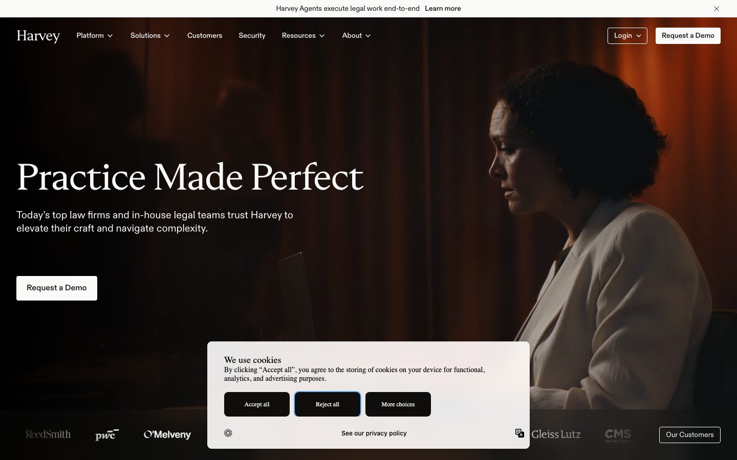
A dark, cinematic enterprise-legal-AI interface built on a near-black warm canvas (#0f0e0d) with white text, a large editorial serif headline, and a restrained warm-neutral palette. The system reads as premium, serious, and law-firm-confident — full-bleed photographic hero, near-zero ornamentation, sharp-edged light CTA buttons, and warm off-white surfaces (#fafaf9) used as the only bright relief against the dark canvas. Brand voltage comes entirely from the serif display face and the dark-to-light tonal contrast, not from accent color.
---
version: alpha
name: Harvey-design-analysis
description: A dark, cinematic enterprise-legal-AI interface built on a near-black warm canvas (#0f0e0d) with white text, a large editorial serif headline, and a restrained warm-neutral palette. The system reads as premium, serious, and law-firm-confident — full-bleed photographic hero, near-zero ornamentation, sharp-edged light CTA buttons, and warm off-white surfaces (#fafaf9) used as the only bright relief against the dark canvas. Brand voltage comes entirely from the serif display face and the dark-to-light tonal contrast, not from accent color.

colors:
  primary: "#0f0e0d"
  canvas: "#0f0e0d"
  canvas-elevated: "#1a1917"
  canvas-elevated-2: "#1f1d1a"
  ink: "#ffffff"
  body: "#cccac6"
  muted: "#8f8b85"
  muted-stone: "#706d66"
  muted-warm: "#848079"
  neutral-black: "#000000"
  surface: "#fafaf9"
  surface-warm: "#f7f6f4"
  surface-cool: "#f2f3f5"
  surface-soft: "#f2f1f0"
  accent-cream: "#e8e4dd"
  accent-cream-2: "#f0ede8"
  accent-cream-3: "#f1efec"
  accent-slate: "#474e5c"
  accent-blue: "#1a5bdb"
  accent-green: "#16a34a"
  accent-mint: "#d1f5dd"

typography:
  display:
    fontFamily: "HarveySerifFont, Spectral, Georgia, serif"
    fontSize: 72px
    fontWeight: 400
    lineHeight: 1.05
    letterSpacing: -0.9px
  title:
    fontFamily: "HarveySansFont, Inter, sans-serif"
    fontSize: 32px
    fontWeight: 500
    lineHeight: 1.1
    letterSpacing: -0.32px
  label:
    fontFamily: "HarveySansFont, Inter, sans-serif"
    fontSize: 14px
    fontWeight: 500
    lineHeight: 1.3
    letterSpacing: -0.14px
  body:
    fontFamily: "HarveySansFont, Inter, sans-serif"
    fontSize: 14px
    fontWeight: 400
    lineHeight: 1.3
    letterSpacing: normal
  button:
    fontFamily: "HarveySansFont, Inter, sans-serif"
    fontSize: 14px
    fontWeight: 400
    lineHeight: 1.3
    letterSpacing: normal

rounded:
  none: 0px
  sm: 4px
  md: 8px

spacing:
  xxs: 4px
  xs: 8px
  sm: 12px
  md: 16px
  lg: 24px
  xl: 32px
  xxl: 64px
  huge: 128px

components:
  button-primary:
    backgroundColor: "{colors.surface}"
    textColor: "{colors.canvas}"
    typography: "{typography.button}"
    rounded: "{rounded.none}"
    padding: 8px
  card:
    backgroundColor: "{colors.surface}"
    textColor: "{colors.canvas}"
    rounded: "{rounded.sm}"
    padding: 24px
  top-nav:
    backgroundColor: transparent
    textColor: "{colors.ink}"
    typography: "{typography.label}"
  nav-link:
    backgroundColor: transparent
    textColor: "{colors.ink}"
    typography: "{typography.label}"
  button-outline:
    backgroundColor: transparent
    textColor: "{colors.ink}"
    typography: "{typography.button}"
    rounded: "{rounded.md}"
    padding: 8px
  hero-band:
    backgroundColor: "{colors.canvas}"
    textColor: "{colors.ink}"
    typography: "{typography.display}"
    padding: 128px
  section-dark:
    backgroundColor: "{colors.canvas}"
    textColor: "{colors.ink}"
    typography: "{typography.title}"
    padding: 64px
  section-light:
    backgroundColor: "{colors.surface}"
    textColor: "{colors.canvas}"
    typography: "{typography.title}"
    padding: 64px
  testimonial-card:
    backgroundColor: "{colors.surface}"
    textColor: "{colors.canvas}"
    typography: "{typography.body}"
    rounded: "{rounded.sm}"
    padding: 32px
  stat-row:
    backgroundColor: "{colors.canvas}"
    textColor: "{colors.ink}"
    typography: "{typography.title}"
    padding: 24px
  cookie-card:
    backgroundColor: "{colors.surface}"
    textColor: "{colors.canvas}"
    rounded: "{rounded.md}"
    padding: 24px
  footer:
    backgroundColor: "{colors.canvas}"
    textColor: "{colors.muted}"
    typography: "{typography.body}"
    padding: 64px

---

## Overview

Harvey's marketing surface is a dark, cinematic enterprise interface for legal-AI software. The page floor is a warm near-black canvas (`{colors.canvas}` — #0f0e0d) carrying white text (`{colors.ink}` — #ffffff), a large editorial serif headline (`HarveySerifFont`), and a deliberately tiny supporting type scale. The system reads as premium and serious — the visual language of top law firms — with almost no ornamentation, no shadows, and no rounded-everything softness.

Type voice splits into exactly two roles: a **serif display face** (`HarveySerifFont`) reserved for the hero headline ("Practice Made Perfect"), and a **grotesque sans** (`HarveySansFont`) used for everything else — section heads, body copy, navigation, buttons, captions. The serif is the entire brand voltage: it carries the gravitas, while the sans stays small (14px body) and quiet.

The only bright relief against the dark canvas is `{colors.surface}` (#fafaf9), a warm off-white used for content cards, the testimonial band, the cookie dialog, and the primary CTA fill. Harvey alternates dark and light bands down the page — full-bleed dark hero, light platform-mockup band, light testimonial band, dark stats-and-security band, dark footer — using tonal contrast (not accent color) to pace the scroll.

**Key Characteristics:**
- Warm near-black canvas (`{colors.canvas}` — #0f0e0d) as the dominant surface. White ink, warm-gray body text (`{colors.body}` — #cccac6), low-contrast muted heads (`{colors.muted}` — #8f8b85).
- Serif display headline (`HarveySerifFont`, 72px / weight 400 / -0.9px tracking) — the single carrier of brand character. Substituted here with a serif fallback (see Typography).
- Tiny, restrained sans scale — body and buttons share 14px / weight 400 — keeps the page feeling editorial and document-like rather than consumer-SaaS.
- Sharp-edged light CTA button: `{colors.surface}` fill, `{colors.canvas}` text, `{rounded.none}` (0px corners), 8px padding. The hard corners are a deliberate seriousness signal.
- Warm off-white cards (`{colors.surface}` — #fafaf9) at `{rounded.sm}` (4px) — the only bright surface, used sparingly.
- No shadows anywhere (`shadows: []`). Depth comes entirely from tonal dark/light banding.
- Full-bleed cinematic hero photography (a lawyer in warm low-key lighting) underneath the headline.
- Accent colors (`{colors.accent-blue}` — #1a5bdb, `{colors.accent-green}` — #16a34a) appear only in trace amounts — UI focus rings and status states — never on hero CTAs.

## Colors

### Brand & Action
- **Primary / Canvas** (`{colors.canvas}` / `{colors.primary}` — #0f0e0d): The dominant surface and the text color for the light CTA button. Harvey is a dark-first brand — the near-black warm tone is the identity.
- **Surface** (`{colors.surface}` — #fafaf9): The warm off-white used for cards, light bands, the CTA fill, and the cookie dialog. This is the only bright color in the system and it does all the contrast work.

### Surface Tones (Dark)
- **Canvas Elevated** (`{colors.canvas-elevated}` — #1a1917) and **Canvas Elevated 2** (`{colors.canvas-elevated-2}` — #1f1d1a): Slightly lifted dark tones for nested panels and dividers inside the dark bands.
- **Neutral Black** (`{colors.neutral-black}` — #000000): True black used in image/video areas and overlays.

### Surface Tones (Light)
- **Surface Warm** (`{colors.surface-warm}` — #f7f6f4), **Surface Cool** (`{colors.surface-cool}` — #f2f3f5), **Surface Soft** (`{colors.surface-soft}` — #f2f1f0): Subtle off-white variants used for nested cards and section dividers inside the light bands.
- **Accent Cream** trio (`{colors.accent-cream}` — #e8e4dd, `{colors.accent-cream-2}` — #f0ede8, `{colors.accent-cream-3}` — #f1efec): Warm neutral fills used for inset panels, gradient washes, and the cookie-dialog backdrop.

### Text
- **Ink** (`{colors.ink}` — #ffffff): All headlines and primary text on the dark canvas.
- **Body** (`{colors.body}` — #cccac6): Warm-gray running text on dark surfaces.
- **Muted** (`{colors.muted}` — #8f8b85): Low-contrast section sub-heads and secondary text.
- **Muted Stone** (`{colors.muted-stone}` — #706d66) and **Muted Warm** (`{colors.muted-warm}` — #848079): Tertiary text — fine print, footer links, logo-wall labels.

### Accent (Trace Use)
- **Accent Blue** (`{colors.accent-blue}` — #1a5bdb): Focus rings, the occasional inline link / selected-button outline (visible on the "Reject all" cookie button). Appears rarely.
- **Accent Green** (`{colors.accent-green}` — #16a34a) and **Accent Mint** (`{colors.accent-mint}` — #d1f5dd): Success / status states inside product UI fragments.
- **Accent Slate** (`{colors.accent-slate}` — #474e5c): A cool gray used for image backdrops and the testimonial portrait background.

## Typography

### Font Family
The system runs two custom Harvey typefaces: **HarveySerifFont** (an editorial transitional serif used only for the hero display headline) and **HarveySansFont** (a neutral grotesque sans used for everything else — section heads, body, navigation, buttons, captions). Both are custom/branded faces; neither is a public web font.

### Note on Font Substitutes
HarveySerifFont and HarveySansFont are proprietary to Harvey and are not available for redistribution. Use open-source substitutes that preserve the weight + tracking signature:
- **HarveySerifFont → Spectral** (or **Source Serif 4**) at weight 400 with negative letter-spacing (~-0.012em) approximates the refined editorial display character.
- **HarveySansFont → Inter** at weights 400–500 is a close neutral-grotesque substitute for the body/UI sans.

Both substitutes are encoded in the fallback stacks in the frontmatter. Never claim to ship the Harvey faces themselves.

### Hierarchy

| Token | Family | Size | Weight | Line Height | Letter Spacing | Use |
|---|---|---|---|---|---|---|
| `{typography.display}` | HarveySerifFont (serif) | 72px | 400 | 1.05 | -0.9px | Hero headline ("Practice Made Perfect") |
| `{typography.title}` | HarveySansFont (sans) | 32px | 500 | 1.1 | -0.32px | Section heads, stat figures |
| `{typography.label}` | HarveySansFont (sans) | 14px | 500 | 1.3 | -0.14px | Nav links, small labels, eyebrow text |
| `{typography.body}` | HarveySansFont (sans) | 14px | 400 | 1.3 | normal | Running text, captions, footer |
| `{typography.button}` | HarveySansFont (sans) | 14px | 400 | 1.3 | normal | Button labels |

### Principles
The serif/sans boundary is strict: the serif is reserved for the marquee hero headline (and the brand wordmark), while everything supporting — including 32px section heads — stays in the sans. The scale is deliberately compressed at the bottom: body, labels, and buttons all sit at 14px, which keeps the interface feeling document-like and precise rather than oversized-consumer-SaaS. The serif at 72px against 14px body is the entire typographic drama — a single large gesture above a quiet, legalistic supporting voice.

## Layout

### Spacing System
- **Base unit:** 4px.
- **Tokens:** `{spacing.xxs}` 4px · `{spacing.xs}` 8px · `{spacing.sm}` 12px · `{spacing.md}` 16px · `{spacing.lg}` 24px · `{spacing.xl}` 32px · `{spacing.xxl}` 64px · `{spacing.huge}` 128px.
- **Dominant rhythms:** 16px and 24px are the most frequent (62 and 46 occurrences) — they govern internal gaps and gutters. 32px (39) handles card padding; 64px (11) and 128px (5) handle section bands.
- **Card internal padding:** `{spacing.lg}` (24px) to `{spacing.xl}` (32px).
- **Section padding:** `{spacing.xxl}` (64px) between standard bands; `{spacing.huge}` (128px) for the hero. (Intermediate values 20px, 40px, 44px, 80px, 116px were measured but appear once or twice — treated as one-off adjustments, derived from the same 4px base.)

### Grid & Container
- **Editorial body:** Single centered column for hero copy (left-aligned over full-bleed photography).
- **Logo wall:** Horizontal row of client wordmarks (ReedSmith, PwC, O'Melveny, Gleiss Lutz, CMS) pinned below the hero.
- **Testimonial band:** Two-column split — portrait left, quote right.
- **Stats band:** Stacked full-width rows, each with a label left and a large figure right (20+, 142,000+, 1,500+, 60, 65+).
- **Security band:** 3-column grid of certification labels (SOC2, CCPA, ISO 27001, GDPR, ISO 27701, ISO 42001).
- **Footer:** Multi-column link list (Platform / Solutions / About / Resources / Follow).

### Whitespace Philosophy
Harvey uses generous vertical banding (64–128px) but tight internal spacing (8–24px). The result is a page that breathes between sections while keeping individual content blocks dense and document-like — appropriate for a tool sold to legal professionals.

## Elevation & Depth

| Level | Treatment | Use |
|---|---|---|
| Flat (dark) | No shadow, `{colors.canvas}` | Hero, stats band, security band, footer |
| Flat (light) | No shadow, `{colors.surface}` | Cards, testimonial band, cookie dialog |
| Tonal lift | `{colors.canvas-elevated}` / `{colors.canvas-elevated-2}` on dark canvas | Nested panels inside dark bands |
| Photographic | Full-bleed image / video under dark overlay | Hero, customer-story cards |

The analysis captured **no box-shadows** (`shadows: []`). All depth in this system is achieved through tonal banding — dark canvas vs. light surface — and through full-bleed photography, never through drop shadows or blur. This is a deliberate flatness consistent with the serious, editorial tone.

## Shapes

### Border Radius Scale

| Token | Value | Use |
|---|---|---|
| `{rounded.none}` | 0px | Primary CTA button — sharp corners are a deliberate seriousness signal |
| `{rounded.sm}` | 4px | Cards (`{component.card}`) — measured most-used small radius alongside 8px |
| `{rounded.md}` | 8px | Larger panels, the cookie dialog, outline buttons (42 occurrences — the dominant radius) |

The radius vocabulary is intentionally tiny — only 4px and 8px were measured, plus the 0px CTA. Nothing is pill-shaped; nothing is heavily rounded. The near-square geometry reinforces the premium, legalistic tone.

### Photography Geometry
The hero uses full-bleed cinematic photography (a lawyer in warm low-key lighting) with no corner rounding. Testimonial portraits and customer-story video thumbnails sit in 4px–8px-radius frames. Video play buttons are the only true circles on the page (native player chrome, not a system token).

## Components

### Navigation

**`top-nav`** — Transparent bar over the hero photography. Carries the serif "Harvey" wordmark at left, a horizontal menu (Platform, Solutions, Customers, Security, Resources, About) center, and a right-side cluster with a "Login" dropdown (`{component.button-outline}`) and a "Request a Demo" `{component.button-primary}`. Links use `{typography.label}` in `{colors.ink}`.

**`nav-link`** — Individual menu item, transparent background, `{colors.ink}` text, `{typography.label}` (sans 14px / 500).

### Buttons

**`button-primary`** — The signature CTA ("Request a Demo"). Light fill (`{colors.surface}` — #fafaf9), dark text (`{colors.canvas}` — #0f0e0d), `{typography.button}`, **`{rounded.none}` (0px sharp corners)**, 8px padding. The light-on-dark inversion makes it the brightest element on the hero.

**`button-outline`** — Hairline-outlined button used for "Login" and secondary actions over dark photography. Transparent background, `{colors.ink}` text, `{rounded.md}` (8px). The selected/focused state shows `{colors.accent-blue}` (#1a5bdb) — visible on the "Reject all" cookie button.

### Cards & Containers

**`card`** — The base content card. Warm off-white background (`{colors.surface}` — #fafaf9), `{rounded.sm}` (4px), no shadow. The fundamental bright container against the dark canvas.

**`hero-band`** — Full-bleed dark band (`{colors.canvas}`) with cinematic background photography. Carries the 72px serif headline (`{typography.display}`), a short sub-headline in `{typography.body}` (`{colors.body}`), and a single `{component.button-primary}`. Vertical padding `{spacing.huge}` (128px).

**`section-dark`** — Standard dark content band (`{colors.canvas}`, white ink). Used for the stats band, security band, and pre-footer CTA. Padding `{spacing.xxl}` (64px). Section heads in `{typography.title}`.

**`section-light`** — Light content band (`{colors.surface}`, dark text). Used for the platform-mockup band and the "top legal teams use Harvey for" list. Padding `{spacing.xxl}` (64px).

**`testimonial-card`** — Two-column quote block on a light band. Background `{colors.surface}`, `{rounded.sm}`, padding `{spacing.xl}` (32px). Portrait left over `{colors.accent-slate}` backdrop; quote right in `{typography.body}` with attribution in `{colors.muted}`.

**`stat-row`** — Full-width row on the dark stats band: a small label (`{typography.body}`) at left, a large figure (`{typography.title}`) at right. Rows separated by hairline dividers, padding `{spacing.lg}` (24px).

**`cookie-card`** — The consent dialog floating over the hero. Background `{colors.surface}` with a warm-cream gradient wash (`{colors.accent-cream}` family), `{rounded.md}` (8px), padding `{spacing.lg}` (24px). Contains "Accept all" (dark fill) and "Reject all" (outlined, blue focus) buttons.

### Footer

**`footer`** — Dark footer (`{colors.canvas}`) closing the page. Serif "H" mark top-left, multi-column link list (Platform / Solutions / About / Resources / Follow) in `{typography.body}`, link text in `{colors.muted}`. Copyright line in `{colors.muted-stone}`. Padding `{spacing.xxl}` (64px).

## Do's and Don'ts

### Do
- Keep the canvas dark and warm (`{colors.canvas}` — #0f0e0d). Harvey's identity is the near-black floor, not white.
- Reserve `HarveySerifFont` (substitute: Spectral) for the hero headline and wordmark only. Everything else stays in the sans.
- Use `{colors.surface}` (#fafaf9) sparingly — it's the only bright relief and earns its impact through scarcity.
- Keep the primary CTA sharp-cornered (`{rounded.none}`) with light fill and dark text. The hard edges signal seriousness.
- Pace the page by alternating dark and light bands — tonal contrast is the depth system.
- Keep body and UI type small (14px) and quiet. The compressed scale is the editorial voice.

### Don't
- Don't add drop shadows. The analysis measured zero shadows — depth is tonal, not elevated.
- Don't round corners beyond `{rounded.md}` (8px). No pills, no soft consumer-SaaS radii.
- Don't put `{colors.accent-blue}` or `{colors.accent-green}` on primary CTAs — accents are trace-only (focus, status).
- Don't set body or section heads in the serif. The serif is a single large gesture, not a body face.
- Don't lighten the canvas to a cool gray — the warmth (#0f0e0d, #1a1917) is intentional.
- Don't document hover states — default and active/pressed only.

## Responsive Behavior

### Breakpoints
Only the desktop landing capture was measured; breakpoint values below are **derived** from the observed layout structure and standard practice — they are not measured tokens.

| Name | Width | Key Changes (derived) |
|---|---|---|
| Mobile | < 768px | Hamburger nav; hero serif scales down from 72px; logo wall wraps; stats rows stack label-over-figure; footer columns collapse to 1–2 |
| Tablet | 768–1024px | Tightened horizontal nav; testimonial band may stack portrait-over-quote; security grid 3→2 columns |
| Desktop | 1024–1440px | Full horizontal nav; two-column testimonial; 3-column security grid |
| Wide | > 1440px | Full-bleed hero photography extends; content column stays centered |

### Touch Targets
- `{component.button-primary}` measured padding is 8px — small; effective tap area depends on label width. On touch surfaces this should be increased to meet a 44px minimum (derived recommendation).
- Nav links at `{typography.label}` (14px) need adequate surrounding padding on mobile.

### Collapsing Strategy
- Hero headline scales down on mobile while keeping the serif character.
- Dark/light banding order is preserved at every breakpoint — the tonal rhythm is the layout's backbone.
- Stats rows convert from label-left / figure-right to stacked on narrow screens.
- Logo wall and certification grid reduce column counts rather than shrinking marks.

### Image Behavior
- Hero photography stays full-bleed and crops to fill at every breakpoint, keeping the subject framed right.
- Customer-story video thumbnails retain aspect ratio with native circular play controls centered.

## Iteration Guide

1. Focus on ONE component at a time, referencing its YAML key directly (`{component.button-primary}`, `{component.testimonial-card}`).
2. Variants (`-active`, `-disabled`, `-focused`) live as separate entries in `components:`.
3. Use `{token.refs}` everywhere — never inline a hex in a component.
4. Never document hover. Default and active/pressed states only.
5. Keep the serif/sans split strict: serif for the hero only, sans for everything else.
6. The dark canvas is the brand. Light surfaces are scarce relief, not the default.
7. When adding emphasis, scale the serif up before reaching for accent color — Harvey is near-monochrome by design.

## Known Gaps

- Only the desktop landing page was captured; all responsive breakpoints are derived, not measured.
- **HarveySerifFont** and **HarveySansFont** are custom Harvey typefaces (not flagged in `fonts_licensed`, which was empty, but clearly proprietary). Open-source substitutes (Spectral, Inter) are documented; exact metrics will differ.
- The button component measured `padding: 8px` and `radius: 0px`, but height and horizontal/vertical padding split were not separately captured — button sizing is approximate.
- No box-shadows were measured; the cookie dialog and floating cards appear to use subtle elevation in screenshots that the analyzer did not capture as tokens.
- The accent palette (blue #1a5bdb, green #16a34a, mint #d1f5dd, slate #474e5c) was captured at very low frequency (2–4 occurrences); exact usage contexts beyond focus/status states are inferred from screenshots.
- Animation, transition, and video-player timing are out of scope.
- Form/input field styling, dropdown menu states, and the platform product-UI interior were not extracted from this capture.
- The cookie-card cream gradient wash is documented from the cream accent tones (`{colors.accent-cream}` family) but the exact gradient stops were not measured.

<!-- Documented by duply · real-world design systems as ready-to-use DESIGN.md for AI coding agents · https://duply.ai/harvey/design-md -->
Color Palette
Accent
Neutrals
Typography
display72px · 400 · 1.05
The quick brown fox jumpstitle32px · 500 · 1.1
The quick brown fox jumpslabel14px · 500 · 1.3
The quick brown fox jumpsbody14px · 400 · 1.3
The quick brown fox jumpsbutton14px · 400 · 1.3
The quick brown fox jumpsSpacing & Shape
Spacing
| Name | Value | Preview |
|---|---|---|
| xxs | 4px | |
| xs | 8px | |
| sm | 12px | |
| md | 16px | |
| lg | 24px | |
| xl | 32px | |
| xxl | 64px | |
| huge | 128px |
Border Radius
| Name | Value | Preview |
|---|---|---|
| none | 0px | |
| sm | 4px | |
| md | 8px |
More like this


---
version: alpha
name: Harvey-design-analysis
description: A dark, cinematic enterprise-legal-AI interface built on a near-black warm canvas (#0f0e0d) with white text, a large editorial serif headline, and a restrained warm-neutral palette. The system reads as premium, serious, and law-firm-confident — full-bleed photographic hero, near-zero ornamentation, sharp-edged light CTA buttons, and warm off-white surfaces (#fafaf9) used as the only bright relief against the dark canvas. Brand voltage comes entirely from the serif display face and the dark-to-light tonal contrast, not from accent color.

colors:
  primary: "#0f0e0d"
  canvas: "#0f0e0d"
  canvas-elevated: "#1a1917"
  canvas-elevated-2: "#1f1d1a"
  ink: "#ffffff"
  body: "#cccac6"
  muted: "#8f8b85"
  muted-stone: "#706d66"
  muted-warm: "#848079"
  neutral-black: "#000000"
  surface: "#fafaf9"
  surface-warm: "#f7f6f4"
  surface-cool: "#f2f3f5"
  surface-soft: "#f2f1f0"
  accent-cream: "#e8e4dd"
  accent-cream-2: "#f0ede8"
  accent-cream-3: "#f1efec"
  accent-slate: "#474e5c"
  accent-blue: "#1a5bdb"
  accent-green: "#16a34a"
  accent-mint: "#d1f5dd"

typography:
  display:
    fontFamily: "HarveySerifFont, Spectral, Georgia, serif"
    fontSize: 72px
    fontWeight: 400
    lineHeight: 1.05
    letterSpacing: -0.9px
  title:
    fontFamily: "HarveySansFont, Inter, sans-serif"
    fontSize: 32px
    fontWeight: 500
    lineHeight: 1.1
    letterSpacing: -0.32px
  label:
    fontFamily: "HarveySansFont, Inter, sans-serif"
    fontSize: 14px
    fontWeight: 500
    lineHeight: 1.3
    letterSpacing: -0.14px
  body:
    fontFamily: "HarveySansFont, Inter, sans-serif"
    fontSize: 14px
    fontWeight: 400
    lineHeight: 1.3
    letterSpacing: normal
  button:
    fontFamily: "HarveySansFont, Inter, sans-serif"
    fontSize: 14px
    fontWeight: 400
    lineHeight: 1.3
    letterSpacing: normal

rounded:
  none: 0px
  sm: 4px
  md: 8px

spacing:
  xxs: 4px
  xs: 8px
  sm: 12px
  md: 16px
  lg: 24px
  xl: 32px
  xxl: 64px
  huge: 128px

components:
  button-primary:
    backgroundColor: "{colors.surface}"
    textColor: "{colors.canvas}"
    typography: "{typography.button}"
    rounded: "{rounded.none}"
    padding: 8px
  card:
    backgroundColor: "{colors.surface}"
    textColor: "{colors.canvas}"
    rounded: "{rounded.sm}"
    padding: 24px
  top-nav:
    backgroundColor: transparent
    textColor: "{colors.ink}"
    typography: "{typography.label}"
  nav-link:
    backgroundColor: transparent
    textColor: "{colors.ink}"
    typography: "{typography.label}"
  button-outline:
    backgroundColor: transparent
    textColor: "{colors.ink}"
    typography: "{typography.button}"
    rounded: "{rounded.md}"
    padding: 8px
  hero-band:
    backgroundColor: "{colors.canvas}"
    textColor: "{colors.ink}"
    typography: "{typography.display}"
    padding: 128px
  section-dark:
    backgroundColor: "{colors.canvas}"
    textColor: "{colors.ink}"
    typography: "{typography.title}"
    padding: 64px
  section-light:
    backgroundColor: "{colors.surface}"
    textColor: "{colors.canvas}"
    typography: "{typography.title}"
    padding: 64px
  testimonial-card:
    backgroundColor: "{colors.surface}"
    textColor: "{colors.canvas}"
    typography: "{typography.body}"
    rounded: "{rounded.sm}"
    padding: 32px
  stat-row:
    backgroundColor: "{colors.canvas}"
    textColor: "{colors.ink}"
    typography: "{typography.title}"
    padding: 24px
  cookie-card:
    backgroundColor: "{colors.surface}"
    textColor: "{colors.canvas}"
    rounded: "{rounded.md}"
    padding: 24px
  footer:
    backgroundColor: "{colors.canvas}"
    textColor: "{colors.muted}"
    typography: "{typography.body}"
    padding: 64px

---

## Overview

Harvey's marketing surface is a dark, cinematic enterprise interface for legal-AI software. The page floor is a warm near-black canvas (`{colors.canvas}` — #0f0e0d) carrying white text (`{colors.ink}` — #ffffff), a large editorial serif headline (`HarveySerifFont`), and a deliberately tiny supporting type scale. The system reads as premium and serious — the visual language of top law firms — with almost no ornamentation, no shadows, and no rounded-everything softness.

Type voice splits into exactly two roles: a **serif display face** (`HarveySerifFont`) reserved for the hero headline ("Practice Made Perfect"), and a **grotesque sans** (`HarveySansFont`) used for everything else — section heads, body copy, navigation, buttons, captions. The serif is the entire brand voltage: it carries the gravitas, while the sans stays small (14px body) and quiet.

The only bright relief against the dark canvas is `{colors.surface}` (#fafaf9), a warm off-white used for content cards, the testimonial band, the cookie dialog, and the primary CTA fill. Harvey alternates dark and light bands down the page — full-bleed dark hero, light platform-mockup band, light testimonial band, dark stats-and-security band, dark footer — using tonal contrast (not accent color) to pace the scroll.

**Key Characteristics:**
- Warm near-black canvas (`{colors.canvas}` — #0f0e0d) as the dominant surface. White ink, warm-gray body text (`{colors.body}` — #cccac6), low-contrast muted heads (`{colors.muted}` — #8f8b85).
- Serif display headline (`HarveySerifFont`, 72px / weight 400 / -0.9px tracking) — the single carrier of brand character. Substituted here with a serif fallback (see Typography).
- Tiny, restrained sans scale — body and buttons share 14px / weight 400 — keeps the page feeling editorial and document-like rather than consumer-SaaS.
- Sharp-edged light CTA button: `{colors.surface}` fill, `{colors.canvas}` text, `{rounded.none}` (0px corners), 8px padding. The hard corners are a deliberate seriousness signal.
- Warm off-white cards (`{colors.surface}` — #fafaf9) at `{rounded.sm}` (4px) — the only bright surface, used sparingly.
- No shadows anywhere (`shadows: []`). Depth comes entirely from tonal dark/light banding.
- Full-bleed cinematic hero photography (a lawyer in warm low-key lighting) underneath the headline.
- Accent colors (`{colors.accent-blue}` — #1a5bdb, `{colors.accent-green}` — #16a34a) appear only in trace amounts — UI focus rings and status states — never on hero CTAs.

## Colors

### Brand & Action
- **Primary / Canvas** (`{colors.canvas}` / `{colors.primary}` — #0f0e0d): The dominant surface and the text color for the light CTA button. Harvey is a dark-first brand — the near-black warm tone is the identity.
- **Surface** (`{colors.surface}` — #fafaf9): The warm off-white used for cards, light bands, the CTA fill, and the cookie dialog. This is the only bright color in the system and it does all the contrast work.

### Surface Tones (Dark)
- **Canvas Elevated** (`{colors.canvas-elevated}` — #1a1917) and **Canvas Elevated 2** (`{colors.canvas-elevated-2}` — #1f1d1a): Slightly lifted dark tones for nested panels and dividers inside the dark bands.
- **Neutral Black** (`{colors.neutral-black}` — #000000): True black used in image/video areas and overlays.

### Surface Tones (Light)
- **Surface Warm** (`{colors.surface-warm}` — #f7f6f4), **Surface Cool** (`{colors.surface-cool}` — #f2f3f5), **Surface Soft** (`{colors.surface-soft}` — #f2f1f0): Subtle off-white variants used for nested cards and section dividers inside the light bands.
- **Accent Cream** trio (`{colors.accent-cream}` — #e8e4dd, `{colors.accent-cream-2}` — #f0ede8, `{colors.accent-cream-3}` — #f1efec): Warm neutral fills used for inset panels, gradient washes, and the cookie-dialog backdrop.

### Text
- **Ink** (`{colors.ink}` — #ffffff): All headlines and primary text on the dark canvas.
- **Body** (`{colors.body}` — #cccac6): Warm-gray running text on dark surfaces.
- **Muted** (`{colors.muted}` — #8f8b85): Low-contrast section sub-heads and secondary text.
- **Muted Stone** (`{colors.muted-stone}` — #706d66) and **Muted Warm** (`{colors.muted-warm}` — #848079): Tertiary text — fine print, footer links, logo-wall labels.

### Accent (Trace Use)
- **Accent Blue** (`{colors.accent-blue}` — #1a5bdb): Focus rings, the occasional inline link / selected-button outline (visible on the "Reject all" cookie button). Appears rarely.
- **Accent Green** (`{colors.accent-green}` — #16a34a) and **Accent Mint** (`{colors.accent-mint}` — #d1f5dd): Success / status states inside product UI fragments.
- **Accent Slate** (`{colors.accent-slate}` — #474e5c): A cool gray used for image backdrops and the testimonial portrait background.

## Typography

### Font Family
The system runs two custom Harvey typefaces: **HarveySerifFont** (an editorial transitional serif used only for the hero display headline) and **HarveySansFont** (a neutral grotesque sans used for everything else — section heads, body, navigation, buttons, captions). Both are custom/branded faces; neither is a public web font.

### Note on Font Substitutes
HarveySerifFont and HarveySansFont are proprietary to Harvey and are not available for redistribution. Use open-source substitutes that preserve the weight + tracking signature:
- **HarveySerifFont → Spectral** (or **Source Serif 4**) at weight 400 with negative letter-spacing (~-0.012em) approximates the refined editorial display character.
- **HarveySansFont → Inter** at weights 400–500 is a close neutral-grotesque substitute for the body/UI sans.

Both substitutes are encoded in the fallback stacks in the frontmatter. Never claim to ship the Harvey faces themselves.

### Hierarchy

| Token | Family | Size | Weight | Line Height | Letter Spacing | Use |
|---|---|---|---|---|---|---|
| `{typography.display}` | HarveySerifFont (serif) | 72px | 400 | 1.05 | -0.9px | Hero headline ("Practice Made Perfect") |
| `{typography.title}` | HarveySansFont (sans) | 32px | 500 | 1.1 | -0.32px | Section heads, stat figures |
| `{typography.label}` | HarveySansFont (sans) | 14px | 500 | 1.3 | -0.14px | Nav links, small labels, eyebrow text |
| `{typography.body}` | HarveySansFont (sans) | 14px | 400 | 1.3 | normal | Running text, captions, footer |
| `{typography.button}` | HarveySansFont (sans) | 14px | 400 | 1.3 | normal | Button labels |

### Principles
The serif/sans boundary is strict: the serif is reserved for the marquee hero headline (and the brand wordmark), while everything supporting — including 32px section heads — stays in the sans. The scale is deliberately compressed at the bottom: body, labels, and buttons all sit at 14px, which keeps the interface feeling document-like and precise rather than oversized-consumer-SaaS. The serif at 72px against 14px body is the entire typographic drama — a single large gesture above a quiet, legalistic supporting voice.

## Layout

### Spacing System
- **Base unit:** 4px.
- **Tokens:** `{spacing.xxs}` 4px · `{spacing.xs}` 8px · `{spacing.sm}` 12px · `{spacing.md}` 16px · `{spacing.lg}` 24px · `{spacing.xl}` 32px · `{spacing.xxl}` 64px · `{spacing.huge}` 128px.
- **Dominant rhythms:** 16px and 24px are the most frequent (62 and 46 occurrences) — they govern internal gaps and gutters. 32px (39) handles card padding; 64px (11) and 128px (5) handle section bands.
- **Card internal padding:** `{spacing.lg}` (24px) to `{spacing.xl}` (32px).
- **Section padding:** `{spacing.xxl}` (64px) between standard bands; `{spacing.huge}` (128px) for the hero. (Intermediate values 20px, 40px, 44px, 80px, 116px were measured but appear once or twice — treated as one-off adjustments, derived from the same 4px base.)

### Grid & Container
- **Editorial body:** Single centered column for hero copy (left-aligned over full-bleed photography).
- **Logo wall:** Horizontal row of client wordmarks (ReedSmith, PwC, O'Melveny, Gleiss Lutz, CMS) pinned below the hero.
- **Testimonial band:** Two-column split — portrait left, quote right.
- **Stats band:** Stacked full-width rows, each with a label left and a large figure right (20+, 142,000+, 1,500+, 60, 65+).
- **Security band:** 3-column grid of certification labels (SOC2, CCPA, ISO 27001, GDPR, ISO 27701, ISO 42001).
- **Footer:** Multi-column link list (Platform / Solutions / About / Resources / Follow).

### Whitespace Philosophy
Harvey uses generous vertical banding (64–128px) but tight internal spacing (8–24px). The result is a page that breathes between sections while keeping individual content blocks dense and document-like — appropriate for a tool sold to legal professionals.

## Elevation & Depth

| Level | Treatment | Use |
|---|---|---|
| Flat (dark) | No shadow, `{colors.canvas}` | Hero, stats band, security band, footer |
| Flat (light) | No shadow, `{colors.surface}` | Cards, testimonial band, cookie dialog |
| Tonal lift | `{colors.canvas-elevated}` / `{colors.canvas-elevated-2}` on dark canvas | Nested panels inside dark bands |
| Photographic | Full-bleed image / video under dark overlay | Hero, customer-story cards |

The analysis captured **no box-shadows** (`shadows: []`). All depth in this system is achieved through tonal banding — dark canvas vs. light surface — and through full-bleed photography, never through drop shadows or blur. This is a deliberate flatness consistent with the serious, editorial tone.

## Shapes

### Border Radius Scale

| Token | Value | Use |
|---|---|---|
| `{rounded.none}` | 0px | Primary CTA button — sharp corners are a deliberate seriousness signal |
| `{rounded.sm}` | 4px | Cards (`{component.card}`) — measured most-used small radius alongside 8px |
| `{rounded.md}` | 8px | Larger panels, the cookie dialog, outline buttons (42 occurrences — the dominant radius) |

The radius vocabulary is intentionally tiny — only 4px and 8px were measured, plus the 0px CTA. Nothing is pill-shaped; nothing is heavily rounded. The near-square geometry reinforces the premium, legalistic tone.

### Photography Geometry
The hero uses full-bleed cinematic photography (a lawyer in warm low-key lighting) with no corner rounding. Testimonial portraits and customer-story video thumbnails sit in 4px–8px-radius frames. Video play buttons are the only true circles on the page (native player chrome, not a system token).

## Components

### Navigation

**`top-nav`** — Transparent bar over the hero photography. Carries the serif "Harvey" wordmark at left, a horizontal menu (Platform, Solutions, Customers, Security, Resources, About) center, and a right-side cluster with a "Login" dropdown (`{component.button-outline}`) and a "Request a Demo" `{component.button-primary}`. Links use `{typography.label}` in `{colors.ink}`.

**`nav-link`** — Individual menu item, transparent background, `{colors.ink}` text, `{typography.label}` (sans 14px / 500).

### Buttons

**`button-primary`** — The signature CTA ("Request a Demo"). Light fill (`{colors.surface}` — #fafaf9), dark text (`{colors.canvas}` — #0f0e0d), `{typography.button}`, **`{rounded.none}` (0px sharp corners)**, 8px padding. The light-on-dark inversion makes it the brightest element on the hero.

**`button-outline`** — Hairline-outlined button used for "Login" and secondary actions over dark photography. Transparent background, `{colors.ink}` text, `{rounded.md}` (8px). The selected/focused state shows `{colors.accent-blue}` (#1a5bdb) — visible on the "Reject all" cookie button.

### Cards & Containers

**`card`** — The base content card. Warm off-white background (`{colors.surface}` — #fafaf9), `{rounded.sm}` (4px), no shadow. The fundamental bright container against the dark canvas.

**`hero-band`** — Full-bleed dark band (`{colors.canvas}`) with cinematic background photography. Carries the 72px serif headline (`{typography.display}`), a short sub-headline in `{typography.body}` (`{colors.body}`), and a single `{component.button-primary}`. Vertical padding `{spacing.huge}` (128px).

**`section-dark`** — Standard dark content band (`{colors.canvas}`, white ink). Used for the stats band, security band, and pre-footer CTA. Padding `{spacing.xxl}` (64px). Section heads in `{typography.title}`.

**`section-light`** — Light content band (`{colors.surface}`, dark text). Used for the platform-mockup band and the "top legal teams use Harvey for" list. Padding `{spacing.xxl}` (64px).

**`testimonial-card`** — Two-column quote block on a light band. Background `{colors.surface}`, `{rounded.sm}`, padding `{spacing.xl}` (32px). Portrait left over `{colors.accent-slate}` backdrop; quote right in `{typography.body}` with attribution in `{colors.muted}`.

**`stat-row`** — Full-width row on the dark stats band: a small label (`{typography.body}`) at left, a large figure (`{typography.title}`) at right. Rows separated by hairline dividers, padding `{spacing.lg}` (24px).

**`cookie-card`** — The consent dialog floating over the hero. Background `{colors.surface}` with a warm-cream gradient wash (`{colors.accent-cream}` family), `{rounded.md}` (8px), padding `{spacing.lg}` (24px). Contains "Accept all" (dark fill) and "Reject all" (outlined, blue focus) buttons.

### Footer

**`footer`** — Dark footer (`{colors.canvas}`) closing the page. Serif "H" mark top-left, multi-column link list (Platform / Solutions / About / Resources / Follow) in `{typography.body}`, link text in `{colors.muted}`. Copyright line in `{colors.muted-stone}`. Padding `{spacing.xxl}` (64px).

## Do's and Don'ts

### Do
- Keep the canvas dark and warm (`{colors.canvas}` — #0f0e0d). Harvey's identity is the near-black floor, not white.
- Reserve `HarveySerifFont` (substitute: Spectral) for the hero headline and wordmark only. Everything else stays in the sans.
- Use `{colors.surface}` (#fafaf9) sparingly — it's the only bright relief and earns its impact through scarcity.
- Keep the primary CTA sharp-cornered (`{rounded.none}`) with light fill and dark text. The hard edges signal seriousness.
- Pace the page by alternating dark and light bands — tonal contrast is the depth system.
- Keep body and UI type small (14px) and quiet. The compressed scale is the editorial voice.

### Don't
- Don't add drop shadows. The analysis measured zero shadows — depth is tonal, not elevated.
- Don't round corners beyond `{rounded.md}` (8px). No pills, no soft consumer-SaaS radii.
- Don't put `{colors.accent-blue}` or `{colors.accent-green}` on primary CTAs — accents are trace-only (focus, status).
- Don't set body or section heads in the serif. The serif is a single large gesture, not a body face.
- Don't lighten the canvas to a cool gray — the warmth (#0f0e0d, #1a1917) is intentional.
- Don't document hover states — default and active/pressed only.

## Responsive Behavior

### Breakpoints
Only the desktop landing capture was measured; breakpoint values below are **derived** from the observed layout structure and standard practice — they are not measured tokens.

| Name | Width | Key Changes (derived) |
|---|---|---|
| Mobile | < 768px | Hamburger nav; hero serif scales down from 72px; logo wall wraps; stats rows stack label-over-figure; footer columns collapse to 1–2 |
| Tablet | 768–1024px | Tightened horizontal nav; testimonial band may stack portrait-over-quote; security grid 3→2 columns |
| Desktop | 1024–1440px | Full horizontal nav; two-column testimonial; 3-column security grid |
| Wide | > 1440px | Full-bleed hero photography extends; content column stays centered |

### Touch Targets
- `{component.button-primary}` measured padding is 8px — small; effective tap area depends on label width. On touch surfaces this should be increased to meet a 44px minimum (derived recommendation).
- Nav links at `{typography.label}` (14px) need adequate surrounding padding on mobile.

### Collapsing Strategy
- Hero headline scales down on mobile while keeping the serif character.
- Dark/light banding order is preserved at every breakpoint — the tonal rhythm is the layout's backbone.
- Stats rows convert from label-left / figure-right to stacked on narrow screens.
- Logo wall and certification grid reduce column counts rather than shrinking marks.

### Image Behavior
- Hero photography stays full-bleed and crops to fill at every breakpoint, keeping the subject framed right.
- Customer-story video thumbnails retain aspect ratio with native circular play controls centered.

## Iteration Guide

1. Focus on ONE component at a time, referencing its YAML key directly (`{component.button-primary}`, `{component.testimonial-card}`).
2. Variants (`-active`, `-disabled`, `-focused`) live as separate entries in `components:`.
3. Use `{token.refs}` everywhere — never inline a hex in a component.
4. Never document hover. Default and active/pressed states only.
5. Keep the serif/sans split strict: serif for the hero only, sans for everything else.
6. The dark canvas is the brand. Light surfaces are scarce relief, not the default.
7. When adding emphasis, scale the serif up before reaching for accent color — Harvey is near-monochrome by design.

## Known Gaps

- Only the desktop landing page was captured; all responsive breakpoints are derived, not measured.
- **HarveySerifFont** and **HarveySansFont** are custom Harvey typefaces (not flagged in `fonts_licensed`, which was empty, but clearly proprietary). Open-source substitutes (Spectral, Inter) are documented; exact metrics will differ.
- The button component measured `padding: 8px` and `radius: 0px`, but height and horizontal/vertical padding split were not separately captured — button sizing is approximate.
- No box-shadows were measured; the cookie dialog and floating cards appear to use subtle elevation in screenshots that the analyzer did not capture as tokens.
- The accent palette (blue #1a5bdb, green #16a34a, mint #d1f5dd, slate #474e5c) was captured at very low frequency (2–4 occurrences); exact usage contexts beyond focus/status states are inferred from screenshots.
- Animation, transition, and video-player timing are out of scope.
- Form/input field styling, dropdown menu states, and the platform product-UI interior were not extracted from this capture.
- The cookie-card cream gradient wash is documented from the cream accent tones (`{colors.accent-cream}` family) but the exact gradient stops were not measured.

<!-- Documented by duply · real-world design systems as ready-to-use DESIGN.md for AI coding agents · https://duply.ai/harvey/design-md -->