Unkey
A dark, developer-platform interface built on a near-black canvas (#040406) with white display type, near-zero corner radii, and a monochrome surface palette punctuated by saturated terminal accents (lime, blue, teal, red). The system reads as precise engineering tooling — sharp-cornered cards, JetBrains Mono labels, embedded product-UI fragments, and editorial articulat-cf headlines. Brand voltage comes from a small set of high-saturation accent squares set against an almost entirely grayscale dark field.
---
version: alpha
name: Unkey-design-analysis
description: "A dark, developer-platform interface built on a near-black canvas (#040406) with white display type, near-zero corner radii, and a monochrome surface palette punctuated by saturated terminal accents (lime, blue, teal, red). The system reads as precise engineering tooling — sharp-cornered cards, JetBrains Mono labels, embedded product-UI fragments, and editorial articulat-cf headlines. Brand voltage comes from a small set of high-saturation accent squares set against an almost entirely grayscale dark field."
colors:
ink: "#ffffff"
canvas: "#040406"
surface: "#121317"
surface-strong: "#27272a"
border: "#2e3038"
hairline: "#464853"
hairline-light: "#e3e4e9"
body: "#9194a1"
muted: "#60606c"
text-soft: "#c7c9d1"
text-mid: "#a1a1aa"
text-faint: "#abaebb"
off-white: "#fafafa"
on-light: "#040406"
black: "#000000"
accent-teal: "#35f1e4"
accent-lime: "#def135"
accent-green: "#3ceeae"
accent-blue: "#3dc5fa"
accent-red: "#fb1048"
accent-yellow: "#ffd55d"
typography:
display-xl:
fontFamily: "articulat-cf, Hanken Grotesk, sans-serif"
fontSize: 64px
fontWeight: 400
lineHeight: 1.125
letterSpacing: normal
display-lg:
fontFamily: "articulat-cf, Hanken Grotesk, sans-serif"
fontSize: 44px
fontWeight: 400
lineHeight: 1.125
letterSpacing: normal
mono-label:
fontFamily: "JetBrains Mono, ui-monospace, monospace"
fontSize: 15px
fontWeight: 400
lineHeight: 1.25
letterSpacing: normal
body:
fontFamily: "Inter, sans-serif"
fontSize: 16px
fontWeight: 400
lineHeight: 1.375
letterSpacing: -0.16px
button:
fontFamily: "Inter, sans-serif"
fontSize: 14px
fontWeight: 500
lineHeight: 1.0
letterSpacing: -0.35px
rounded:
none: 0px
xs: 2px
sm: 6px
spacing:
xxs: 4px
xs: 8px
sm: 12px
md: 16px
lg: 20px
xl: 24px
xxl: 32px
huge: 36px
components:
button-primary:
backgroundColor: "{colors.ink}"
textColor: "{colors.on-light}"
typography: "{typography.button}"
rounded: "{rounded.none}"
padding: 0px 20px
button-secondary:
backgroundColor: transparent
textColor: "{colors.ink}"
typography: "{typography.button}"
rounded: "{rounded.none}"
padding: 0px 20px
top-nav:
backgroundColor: "{colors.canvas}"
textColor: "{colors.ink}"
typography: "{typography.button}"
nav-pill:
backgroundColor: "{colors.surface}"
textColor: "{colors.ink}"
typography: "{typography.button}"
rounded: "{rounded.sm}"
hero-band:
backgroundColor: "{colors.canvas}"
textColor: "{colors.ink}"
typography: "{typography.display-xl}"
padding: 32px
card:
backgroundColor: "{colors.surface}"
textColor: "{colors.ink}"
rounded: "{rounded.sm}"
padding: 20px
feature-card:
backgroundColor: "{colors.canvas}"
textColor: "{colors.body}"
typography: "{typography.body}"
rounded: "{rounded.none}"
padding: 24px
product-mockup-card:
backgroundColor: "{colors.surface}"
textColor: "{colors.ink}"
rounded: "{rounded.sm}"
padding: 20px
mono-eyebrow:
backgroundColor: transparent
textColor: "{colors.body}"
typography: "{typography.mono-label}"
tab:
backgroundColor: transparent
textColor: "{colors.body}"
typography: "{typography.button}"
rounded: "{rounded.none}"
padding: 12px 20px
tab-active:
backgroundColor: "{colors.surface}"
textColor: "{colors.ink}"
typography: "{typography.button}"
rounded: "{rounded.none}"
padding: 12px 20px
accent-tag-square:
backgroundColor: "{colors.accent-teal}"
textColor: "{colors.on-light}"
typography: "{typography.mono-label}"
rounded: "{rounded.xs}"
---
## Overview
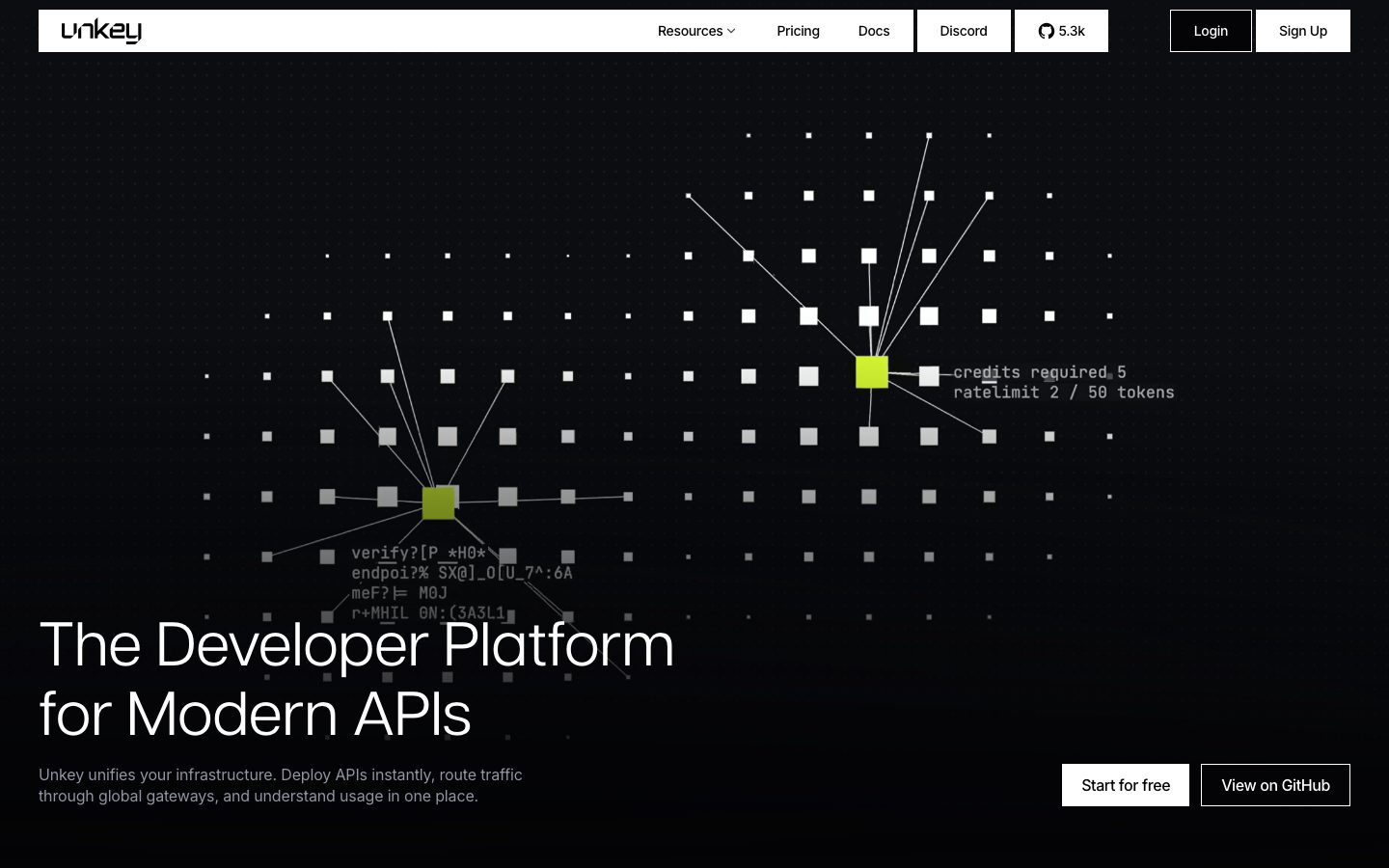
Unkey's marketing surface is a dark developer-platform interface — an almost-black canvas (`{colors.canvas}` — #040406) with white display headlines (`{colors.ink}` — #ffffff) and muted gray body copy (`{colors.body}` — #9194a1). The system reads as precise, engineered tooling: near-zero corner radii, hairline-bordered cards, monospace section labels, and embedded product-UI fragments shown at small scale inside the page flow.
Type voice splits three ways. **articulat-cf** (a geometric grotesque) carries the large editorial headlines at weight 400 — "The Developer Platform for Modern APIs" runs at 64px. **JetBrains Mono** handles small section labels and the terminal-style overlay text ("credits required 5", "ratelimit 2 / 50 tokens"). **Inter** does everything else — body copy, button labels, nav. The mix of monospace labels against a geometric display face is the source of the developer-tooling feel.
Brand voltage comes from a small set of **high-saturation accent squares** dropped onto an otherwise grayscale dark field. The hero's node diagram lights up two squares in `{colors.accent-lime}` (#def135); feature mockups use `{colors.accent-blue}` (#3dc5fa) for chart bars and highlights; a wider accent set (teal, green, red, yellow) appears across product chrome. The accents are scarce and deliberate — almost everything else is monochrome.
The whole site stays dark. There is no light-mode flip; even the primary CTA inverts to a **white button with dark text** rather than introducing a colored fill.
**Key Characteristics:**
- Near-black canvas (`{colors.canvas}` — #040406) under white display type. The entire page is one continuous dark field.
- Primary CTA is a white button (`{component.button-primary}`) — background `{colors.ink}`, text `{colors.on-light}` (#040406), and crucially **0px radius** (sharp corners). Buttons are rectangles, not pills.
- Near-zero corner radii throughout: `{rounded.none}` (0px) for buttons and feature panels, `{rounded.xs}` (2px) for small accent squares, `{rounded.sm}` (6px) for cards. The system reads as sharp and technical.
- articulat-cf display headlines at weight 400 — large, editorial, low-contrast weight. No bold display type.
- JetBrains Mono section labels and overlay text — the monospace is the developer-tooling signal.
- Scarce, saturated accent squares (`{colors.accent-lime}`, `{colors.accent-blue}`, `{colors.accent-teal}`) against a grayscale field.
- Hairline borders (`{colors.border}` — #2e3038, `{colors.hairline}` — #464853) define cards and grid lines rather than drop shadows. The system is nearly shadowless.
- Product-UI fragments (git-import dialogs, container-runtime panels, usage charts) embedded directly in the page as content.
## Colors
### Brand & Accent
Unkey is a monochrome-dark brand with a saturated terminal-accent set. Accents appear as small squares, chart bars, and highlight fills — never on large surfaces and never on the primary CTA.
- **Accent Lime** (`{colors.accent-lime}` — #def135): The hero's signature — the lit nodes in the network diagram. The most prominent accent.
- **Accent Blue** (`{colors.accent-blue}` — #3dc5fa): Chart bars and progress fills inside feature/product mockups.
- **Accent Teal** (`{colors.accent-teal}` — #35f1e4): Highlight squares and tags.
- **Accent Green** (`{colors.accent-green}` — #3ceeae): Secondary status/accent.
- **Accent Red** (`{colors.accent-red}` — #fb1048): Alert/error accent.
- **Accent Yellow** (`{colors.accent-yellow}` — #ffd55d): Warning/highlight accent.
### Surface
- **Canvas** (`{colors.canvas}` — #040406): The page floor — an almost-pure black with a faint warm-violet lift.
- **Surface** (`{colors.surface}` — #121317): Slightly raised card / panel surface.
- **Surface Strong** (`{colors.surface-strong}` — #27272a): The most-used neutral — raised chips, hovered rows, stronger panel fills.
- **Border** (`{colors.border}` — #2e3038): Standard 1px card and grid border on the dark field.
- **Hairline** (`{colors.hairline}` — #464853): A lighter divider used for stronger separation.
- **Black** (`{colors.black}` — #000000): Deepest fills inside product chrome.
### Text
- **Ink** (`{colors.ink}` — #ffffff): All display headlines and primary text.
- **Body** (`{colors.body}` — #9194a1): Default running-text gray.
- **Text Soft** (`{colors.text-soft}` — #c7c9d1): Slightly brighter secondary text.
- **Text Mid** (`{colors.text-mid}` — #a1a1aa) / **Text Faint** (`{colors.text-faint}` — #abaebb): Tertiary labels and faint UI text inside product chrome.
- **Muted** (`{colors.muted}` — #60606c): Low-contrast text — disabled labels, faint captions, the dim overlay copy.
- **On Light** (`{colors.on-light}` — #040406): Text on the white primary button.
### Light-surface neutrals
- **Off White** (`{colors.off-white}` — #fafafa) and **Hairline Light** (`{colors.hairline-light}` — #e3e4e9) appear only inside light-themed product-UI fragments (e.g., the "Import Git repository" dialog shown as a screenshot-style mockup), not on the marketing chrome itself.
## Typography
### Font Family
The system runs three families. **articulat-cf** (a geometric grotesque display face) for large headlines; **JetBrains Mono** for small section labels and terminal overlay text; **Inter** for body copy and UI. Display weight stays at 400 — Unkey does not bold its headlines. The combination of a geometric display face with monospace eyebrow labels is the core developer-tooling signature.
### Hierarchy
| Token | Family | Size | Weight | Line Height | Letter Spacing | Use |
|---|---|---|---|---|---|---|
| `{typography.display-xl}` | articulat-cf | 64px | 400 | 1.125 | normal | Hero h1 ("The Developer Platform for Modern APIs") |
| `{typography.display-lg}` | articulat-cf | 44px | 400 | 1.125 | normal | Section heads ("Deploy in minutes. Roll back in seconds.") |
| `{typography.mono-label}` | JetBrains Mono | 15px | 400 | 1.25 | normal | Section eyebrows, card labels, terminal overlay text |
| `{typography.body}` | Inter | 16px | 400 | 1.375 | -0.16px | Default running-text and descriptions |
| `{typography.button}` | Inter | 14px | 500 | 1.0 | -0.35px | Button labels, nav links, tabs |
### Principles
Display type is articulat-cf at weight 400 — never bolded. The low weight keeps the large headlines feeling editorial rather than shouty. Monospace (JetBrains Mono) is reserved for labels and product-chrome text; never set body paragraphs in mono. Inter carries all running text with a small negative tracking (-0.16px) that tightens the gray body copy.
### Note on Font Substitutes
**articulat-cf** (Connary Fagen) is a commercial/licensed typeface and cannot be shipped as a free web font. A close open-source substitute is **Hanken Grotesk** at weight 400, or **Manrope** as a slightly more geometric alternative — both preserve the wide, even-weight grotesque character of the headlines. **JetBrains Mono** and **Inter** are both open-source and can ship directly.
## Layout
### Spacing System
- **Base unit:** 4px.
- **Tokens:** `{spacing.xxs}` 4px · `{spacing.xs}` 8px · `{spacing.sm}` 12px · `{spacing.md}` 16px · `{spacing.lg}` 20px · `{spacing.xl}` 24px · `{spacing.xxl}` 32px · `{spacing.huge}` 36px.
- **Most-used values:** 32px (`{spacing.xxl}`) and 20px (`{spacing.lg}`) dominate the measured spacing distribution — they set card padding and inter-element gaps.
- **Card internal padding:** `{spacing.lg}` (20px) for the standard card; `{spacing.xl}` (24px) for feature panels.
### Grid & Container
- **Feature grids:** 4-up at desktop (the "Branch overview / Manage API keys / Control Plane / Usage 30 days" row), reducing on smaller widths.
- **Tab-driven sections:** A horizontal tab strip ("Connect / Deploy / Preview / Ship / Validate") above a two-column content + mockup layout.
- **Gateway / production grids:** 3-up and 2-up feature columns with hairline cell borders.
### Whitespace Philosophy
Sections are separated by generous vertical space and hairline rules rather than color blocks. The dark canvas does the visual quieting; content sits in loosely bordered grid cells. The rhythm is calm and technical — every band carries a mono eyebrow label, a display headline, and a supporting grid.
## Elevation & Depth
| Level | Treatment | Use |
|---|---|---|
| Flat | No shadow, no border | Body sections, hero, nav |
| Hairline border | 1px `{colors.border}` (#2e3038) or `{colors.hairline}` (#464853) | Cards, feature grid cells, tab strips |
| Raised surface | `{colors.surface}` (#121317) / `{colors.surface-strong}` (#27272a) fill | Cards, chips, product panels |
| Drop shadow (rare) | `0 10px 15px -3px rgba(0,0,0,0.1)` + `0 4px … rgba(0,0,0,0.1)` | A single elevated mockup element |
The elevation philosophy is **borders and surface lift, not shadows**. Only one measured shadow exists in the system — used on a floating product-mockup element. Depth is otherwise communicated by the small surface-color steps between `{colors.canvas}` → `{colors.surface}` → `{colors.surface-strong}` and by 1px hairline borders.
### Decorative Depth
- The hero's dot-grid network diagram creates a sense of depth through perspective lines and scaled squares — this is illustrative content, not a system token.
- Embedded product-UI fragments (git-import dialog, container-runtime panel) carry their own internal chrome shadows; these are product screenshots shown as content.
## Shapes
### Border Radius Scale
| Token | Value | Use |
|---|---|---|
| `{rounded.none}` | 0px | Buttons, feature panels, tabs — the default. The system is sharp-cornered. |
| `{rounded.xs}` | 2px | Small accent squares and chips in product chrome / hero nodes |
| `{rounded.sm}` | 6px | Cards and rounded product-mockup containers |
Unkey is a sharp-cornered system. The primary CTA has **0px radius** — a true rectangle. The largest measured radius is 6px, reserved for cards. There are no pills, no fully-round elements.
### Geometry
The hero diagram is built from squares (2px radius accent nodes and gray grid squares). The square-grid motif — sharp accent squares against a dimmed dot field — is the brand's central visual device.
## Components
### Top Navigation
**`top-nav`** — Dark nav bar on `{colors.canvas}`. Carries the lowercase "unkey" wordmark at left, center menu (Resources, Pricing, Docs), a Discord and GitHub-stars chip, and a right cluster with an outlined "Login" (`{component.button-secondary}`) and a white "Sign Up" (`{component.button-primary}`). Labels in `{typography.button}` (Inter 14px / 500).
**`nav-pill`** — Grouped chip elements (the Discord and "GitHub 5.3k" buttons) on `{colors.surface}`, rounded `{rounded.sm}` (6px), with hairline borders.
### Buttons
**`button-primary`** — The signature CTA. Background `{colors.ink}` (#ffffff), text `{colors.on-light}` (#040406), type `{typography.button}`, padding 0px × 20px, **rounded `{rounded.none}` (0px)**. Used for "Sign Up" and "Start for free". On a dark site, the white rectangle is the loudest element.
**`button-secondary`** — Outlined / transparent button with white text (`{colors.ink}`) and a hairline border. Same padding and 0px radius as primary. Used for "Login", "View on GitHub".
### Cards & Containers
**`hero-band`** — Full-width dark hero with the square-grid network illustration behind a bottom-left headline block: `{typography.display-xl}` h1, a `{typography.body}` sub-line in `{colors.body}`, and a button row with `{component.button-primary}` + `{component.button-secondary}`. Padding `{spacing.xxl}` (32px).
**`card`** — Standard raised card. Background `{colors.surface}` (#121317), rounded `{rounded.sm}` (6px), no shadow, hairline border. Used for the rounded product-mockup containers.
**`feature-card`** — Used in the 4-up feature row ("Branch overview / Manage API keys / Control Plane / Usage 30 days"). Background `{colors.canvas}` with hairline cell borders, rounded `{rounded.none}` (0px), padding `{spacing.xl}` (24px). Carries a mono label, a small product-chart fragment (often with an `{colors.accent-blue}` bar), and a bold lead-in + `{typography.body}` description.
**`product-mockup-card`** — Larger panels showing actual product UI (the "Import Git repository" dialog, the "Container Runtime" settings panel). Background `{colors.surface}`, rounded `{rounded.sm}`, padding `{spacing.lg}` (20px). The product chrome inside is shown as content.
### Labels & Tags
**`mono-eyebrow`** — Small monospace section labels ("BUILD & DEPLOY", "GATEWAY", "BUILT FOR PRODUCTION"), often preceded by a small accent square. Transparent background, `{colors.body}` text, type `{typography.mono-label}` (JetBrains Mono 15px).
**`accent-tag-square`** — Small saturated squares used as bullet markers and node highlights. Background one of the accent tokens (`{colors.accent-teal}`, `{colors.accent-lime}`, etc.), rounded `{rounded.xs}` (2px). The hero's lit nodes are the largest expression of this element.
### Tabs
**`tab`** + **`tab-active`** — Horizontal tab strip ("Connect / Deploy / Preview / Ship / Validate"). Inactive: transparent, `{colors.body}` text. Active: `{colors.surface}` fill, `{colors.ink}` text, with a hairline underline/separator. Padding 12px × 20px, rounded `{rounded.none}`. Drives a swap of the content + product-mockup area below.
## Do's and Don'ts
### Do
- Keep the canvas dark (`{colors.canvas}` — #040406). The entire system lives on one continuous near-black field.
- Make the primary CTA a white rectangle (`{component.button-primary}`) — sharp 0px corners, dark text. The white fill is the action signal.
- Set display headlines in articulat-cf at weight 400. Don't bold them.
- Use JetBrains Mono only for eyebrow labels and product-chrome text. Keep body copy in Inter.
- Use accent colors sparingly — as small squares, chart bars, and node highlights against grayscale. The scarcity is the point.
- Define cards with hairline borders and small surface-color steps, not shadows.
- Pair every section head with a mono eyebrow label preceded by a small accent square.
- Embed real product-UI fragments as content rather than illustrating them.
### Don't
- Don't introduce pills or large radii. The system tops out at `{rounded.sm}` (6px); buttons are 0px.
- Don't fill large surfaces with accent color. Accents are square-sized, not band-sized.
- Don't bold the display type — articulat-cf stays at 400.
- Don't add a light mode or flip large sections to white; only embedded product screenshots carry light surfaces.
- Don't lean on drop shadows for depth — use borders and the canvas → surface → surface-strong steps.
- Don't document hover styling beyond default and pressed states.
## Responsive Behavior
### Breakpoints
| Name | Width | Key Changes |
|---|---|---|
| Mobile | < 768px | Hamburger nav; hero h1 64→~32px; feature grids stack 1-up; tab content stacks above mockups; product mockups scale to full width |
| Tablet | 768–1024px | Nav tightens; 4-up feature row → 2-up; tab strip may scroll horizontally |
| Desktop | 1024–1440px | Full nav; 4-up feature row; two-column tab content + mockup layout |
| Wide | > 1440px | Same as desktop with more outer breathing room |
(Breakpoint pixel values are derived from observed layout behavior in the captured screenshots; exact CSS breakpoints were not measured.)
### Touch Targets
- `{component.button-primary}` uses 0px × 20px horizontal padding; effective height comes from line-box + vertical padding (not separately measured — see Known Gaps).
- Tab targets carry 12px × 20px padding, giving a comfortable horizontal tap area.
### Collapsing Strategy
- The 4-up feature grid reduces columns rather than shrinking cards.
- The tab-driven "Deploy" section stacks its content column above its product-mockup column on narrow widths.
- The hero square-grid illustration scales/crops behind the headline block at smaller widths.
## Iteration Guide
1. Focus on ONE component at a time. Reference its YAML key directly (`{component.feature-card}`, `{component.product-mockup-card}`).
2. Variants (`-active`, `-secondary`) live as separate entries in `components:`.
3. Use `{token.refs}` everywhere — never inline hex.
4. Never document hover. Default and Active/Pressed states only.
5. Display stays articulat-cf 400; labels stay JetBrains Mono; body stays Inter. The three roles don't blur.
6. Accents are square-scale only. When in doubt, add monochrome before adding color.
7. Keep corners sharp — 0px for actions and panels, 6px max for cards.
## Known Gaps
- **articulat-cf** is a commercial/licensed typeface (Connary Fagen) — though `fonts_licensed` came back empty, it cannot be shipped freely; an open-source substitute (Hanken Grotesk / Manrope) is documented in Typography.
- Button height was not captured — `{component.button-primary}` measured padding is `0px 20px` with no measured height; the vertical size is set by the line-box and was not extracted.
- Only two components (`button-primary`, `card`) were directly measured; nav, tabs, feature cards, and mockup containers are documented from screenshot ground-truth using measured tokens.
- The full role-mapping of the accent set (which accent means success vs. warning vs. decorative) is inferred from context; only the lime hero-node and blue chart-bar usages are screenshot-confirmed.
- The single measured box-shadow value was truncated in capture; its exact second-layer offsets are approximate.
- Letter-spacing for display roles reads as `normal` (unmeasured offset); if a designer wants tighter display tracking it must be added deliberately — do not assume.
- Pricing-page-specific components were not separately measured beyond the shared system tokens; pricing-tier card specs are out of scope here.
- Animation/transition timings (hero diagram, tab switching, mockup reveals) were not captured.
<!-- Documented by duply · real-world design systems as ready-to-use DESIGN.md for AI coding agents · https://duply.ai/unkey/design-md -->
Color Palette
Accent
Neutrals
Typography
display-xl64px · 400 · 1.125
The quick brown fox jumpsdisplay-lg44px · 400 · 1.125
The quick brown fox jumpsmono-label15px · 400 · 1.25
The quick brown fox jumpsbody16px · 400 · 1.375
The quick brown fox jumpsbutton14px · 500 · 1
The quick brown fox jumpsSpacing & Shape
Spacing
| Name | Value | Preview |
|---|---|---|
| xxs | 4px | |
| xs | 8px | |
| sm | 12px | |
| md | 16px | |
| lg | 20px | |
| xl | 24px | |
| xxl | 32px | |
| huge | 36px |
Border Radius
| Name | Value | Preview |
|---|---|---|
| none | 0px | |
| xs | 2px | |
| sm | 6px |
More like this


---
version: alpha
name: Unkey-design-analysis
description: "A dark, developer-platform interface built on a near-black canvas (#040406) with white display type, near-zero corner radii, and a monochrome surface palette punctuated by saturated terminal accents (lime, blue, teal, red). The system reads as precise engineering tooling — sharp-cornered cards, JetBrains Mono labels, embedded product-UI fragments, and editorial articulat-cf headlines. Brand voltage comes from a small set of high-saturation accent squares set against an almost entirely grayscale dark field."

colors:
  ink: "#ffffff"
  canvas: "#040406"
  surface: "#121317"
  surface-strong: "#27272a"
  border: "#2e3038"
  hairline: "#464853"
  hairline-light: "#e3e4e9"
  body: "#9194a1"
  muted: "#60606c"
  text-soft: "#c7c9d1"
  text-mid: "#a1a1aa"
  text-faint: "#abaebb"
  off-white: "#fafafa"
  on-light: "#040406"
  black: "#000000"
  accent-teal: "#35f1e4"
  accent-lime: "#def135"
  accent-green: "#3ceeae"
  accent-blue: "#3dc5fa"
  accent-red: "#fb1048"
  accent-yellow: "#ffd55d"

typography:
  display-xl:
    fontFamily: "articulat-cf, Hanken Grotesk, sans-serif"
    fontSize: 64px
    fontWeight: 400
    lineHeight: 1.125
    letterSpacing: normal
  display-lg:
    fontFamily: "articulat-cf, Hanken Grotesk, sans-serif"
    fontSize: 44px
    fontWeight: 400
    lineHeight: 1.125
    letterSpacing: normal
  mono-label:
    fontFamily: "JetBrains Mono, ui-monospace, monospace"
    fontSize: 15px
    fontWeight: 400
    lineHeight: 1.25
    letterSpacing: normal
  body:
    fontFamily: "Inter, sans-serif"
    fontSize: 16px
    fontWeight: 400
    lineHeight: 1.375
    letterSpacing: -0.16px
  button:
    fontFamily: "Inter, sans-serif"
    fontSize: 14px
    fontWeight: 500
    lineHeight: 1.0
    letterSpacing: -0.35px

rounded:
  none: 0px
  xs: 2px
  sm: 6px

spacing:
  xxs: 4px
  xs: 8px
  sm: 12px
  md: 16px
  lg: 20px
  xl: 24px
  xxl: 32px
  huge: 36px

components:
  button-primary:
    backgroundColor: "{colors.ink}"
    textColor: "{colors.on-light}"
    typography: "{typography.button}"
    rounded: "{rounded.none}"
    padding: 0px 20px
  button-secondary:
    backgroundColor: transparent
    textColor: "{colors.ink}"
    typography: "{typography.button}"
    rounded: "{rounded.none}"
    padding: 0px 20px
  top-nav:
    backgroundColor: "{colors.canvas}"
    textColor: "{colors.ink}"
    typography: "{typography.button}"
  nav-pill:
    backgroundColor: "{colors.surface}"
    textColor: "{colors.ink}"
    typography: "{typography.button}"
    rounded: "{rounded.sm}"
  hero-band:
    backgroundColor: "{colors.canvas}"
    textColor: "{colors.ink}"
    typography: "{typography.display-xl}"
    padding: 32px
  card:
    backgroundColor: "{colors.surface}"
    textColor: "{colors.ink}"
    rounded: "{rounded.sm}"
    padding: 20px
  feature-card:
    backgroundColor: "{colors.canvas}"
    textColor: "{colors.body}"
    typography: "{typography.body}"
    rounded: "{rounded.none}"
    padding: 24px
  product-mockup-card:
    backgroundColor: "{colors.surface}"
    textColor: "{colors.ink}"
    rounded: "{rounded.sm}"
    padding: 20px
  mono-eyebrow:
    backgroundColor: transparent
    textColor: "{colors.body}"
    typography: "{typography.mono-label}"
  tab:
    backgroundColor: transparent
    textColor: "{colors.body}"
    typography: "{typography.button}"
    rounded: "{rounded.none}"
    padding: 12px 20px
  tab-active:
    backgroundColor: "{colors.surface}"
    textColor: "{colors.ink}"
    typography: "{typography.button}"
    rounded: "{rounded.none}"
    padding: 12px 20px
  accent-tag-square:
    backgroundColor: "{colors.accent-teal}"
    textColor: "{colors.on-light}"
    typography: "{typography.mono-label}"
    rounded: "{rounded.xs}"
---

## Overview

Unkey's marketing surface is a dark developer-platform interface — an almost-black canvas (`{colors.canvas}` — #040406) with white display headlines (`{colors.ink}` — #ffffff) and muted gray body copy (`{colors.body}` — #9194a1). The system reads as precise, engineered tooling: near-zero corner radii, hairline-bordered cards, monospace section labels, and embedded product-UI fragments shown at small scale inside the page flow.

Type voice splits three ways. **articulat-cf** (a geometric grotesque) carries the large editorial headlines at weight 400 — "The Developer Platform for Modern APIs" runs at 64px. **JetBrains Mono** handles small section labels and the terminal-style overlay text ("credits required 5", "ratelimit 2 / 50 tokens"). **Inter** does everything else — body copy, button labels, nav. The mix of monospace labels against a geometric display face is the source of the developer-tooling feel.

Brand voltage comes from a small set of **high-saturation accent squares** dropped onto an otherwise grayscale dark field. The hero's node diagram lights up two squares in `{colors.accent-lime}` (#def135); feature mockups use `{colors.accent-blue}` (#3dc5fa) for chart bars and highlights; a wider accent set (teal, green, red, yellow) appears across product chrome. The accents are scarce and deliberate — almost everything else is monochrome.

The whole site stays dark. There is no light-mode flip; even the primary CTA inverts to a **white button with dark text** rather than introducing a colored fill.

**Key Characteristics:**
- Near-black canvas (`{colors.canvas}` — #040406) under white display type. The entire page is one continuous dark field.
- Primary CTA is a white button (`{component.button-primary}`) — background `{colors.ink}`, text `{colors.on-light}` (#040406), and crucially **0px radius** (sharp corners). Buttons are rectangles, not pills.
- Near-zero corner radii throughout: `{rounded.none}` (0px) for buttons and feature panels, `{rounded.xs}` (2px) for small accent squares, `{rounded.sm}` (6px) for cards. The system reads as sharp and technical.
- articulat-cf display headlines at weight 400 — large, editorial, low-contrast weight. No bold display type.
- JetBrains Mono section labels and overlay text — the monospace is the developer-tooling signal.
- Scarce, saturated accent squares (`{colors.accent-lime}`, `{colors.accent-blue}`, `{colors.accent-teal}`) against a grayscale field.
- Hairline borders (`{colors.border}` — #2e3038, `{colors.hairline}` — #464853) define cards and grid lines rather than drop shadows. The system is nearly shadowless.
- Product-UI fragments (git-import dialogs, container-runtime panels, usage charts) embedded directly in the page as content.

## Colors

### Brand & Accent
Unkey is a monochrome-dark brand with a saturated terminal-accent set. Accents appear as small squares, chart bars, and highlight fills — never on large surfaces and never on the primary CTA.
- **Accent Lime** (`{colors.accent-lime}` — #def135): The hero's signature — the lit nodes in the network diagram. The most prominent accent.
- **Accent Blue** (`{colors.accent-blue}` — #3dc5fa): Chart bars and progress fills inside feature/product mockups.
- **Accent Teal** (`{colors.accent-teal}` — #35f1e4): Highlight squares and tags.
- **Accent Green** (`{colors.accent-green}` — #3ceeae): Secondary status/accent.
- **Accent Red** (`{colors.accent-red}` — #fb1048): Alert/error accent.
- **Accent Yellow** (`{colors.accent-yellow}` — #ffd55d): Warning/highlight accent.

### Surface
- **Canvas** (`{colors.canvas}` — #040406): The page floor — an almost-pure black with a faint warm-violet lift.
- **Surface** (`{colors.surface}` — #121317): Slightly raised card / panel surface.
- **Surface Strong** (`{colors.surface-strong}` — #27272a): The most-used neutral — raised chips, hovered rows, stronger panel fills.
- **Border** (`{colors.border}` — #2e3038): Standard 1px card and grid border on the dark field.
- **Hairline** (`{colors.hairline}` — #464853): A lighter divider used for stronger separation.
- **Black** (`{colors.black}` — #000000): Deepest fills inside product chrome.

### Text
- **Ink** (`{colors.ink}` — #ffffff): All display headlines and primary text.
- **Body** (`{colors.body}` — #9194a1): Default running-text gray.
- **Text Soft** (`{colors.text-soft}` — #c7c9d1): Slightly brighter secondary text.
- **Text Mid** (`{colors.text-mid}` — #a1a1aa) / **Text Faint** (`{colors.text-faint}` — #abaebb): Tertiary labels and faint UI text inside product chrome.
- **Muted** (`{colors.muted}` — #60606c): Low-contrast text — disabled labels, faint captions, the dim overlay copy.
- **On Light** (`{colors.on-light}` — #040406): Text on the white primary button.

### Light-surface neutrals
- **Off White** (`{colors.off-white}` — #fafafa) and **Hairline Light** (`{colors.hairline-light}` — #e3e4e9) appear only inside light-themed product-UI fragments (e.g., the "Import Git repository" dialog shown as a screenshot-style mockup), not on the marketing chrome itself.

## Typography

### Font Family
The system runs three families. **articulat-cf** (a geometric grotesque display face) for large headlines; **JetBrains Mono** for small section labels and terminal overlay text; **Inter** for body copy and UI. Display weight stays at 400 — Unkey does not bold its headlines. The combination of a geometric display face with monospace eyebrow labels is the core developer-tooling signature.

### Hierarchy

| Token | Family | Size | Weight | Line Height | Letter Spacing | Use |
|---|---|---|---|---|---|---|
| `{typography.display-xl}` | articulat-cf | 64px | 400 | 1.125 | normal | Hero h1 ("The Developer Platform for Modern APIs") |
| `{typography.display-lg}` | articulat-cf | 44px | 400 | 1.125 | normal | Section heads ("Deploy in minutes. Roll back in seconds.") |
| `{typography.mono-label}` | JetBrains Mono | 15px | 400 | 1.25 | normal | Section eyebrows, card labels, terminal overlay text |
| `{typography.body}` | Inter | 16px | 400 | 1.375 | -0.16px | Default running-text and descriptions |
| `{typography.button}` | Inter | 14px | 500 | 1.0 | -0.35px | Button labels, nav links, tabs |

### Principles
Display type is articulat-cf at weight 400 — never bolded. The low weight keeps the large headlines feeling editorial rather than shouty. Monospace (JetBrains Mono) is reserved for labels and product-chrome text; never set body paragraphs in mono. Inter carries all running text with a small negative tracking (-0.16px) that tightens the gray body copy.

### Note on Font Substitutes
**articulat-cf** (Connary Fagen) is a commercial/licensed typeface and cannot be shipped as a free web font. A close open-source substitute is **Hanken Grotesk** at weight 400, or **Manrope** as a slightly more geometric alternative — both preserve the wide, even-weight grotesque character of the headlines. **JetBrains Mono** and **Inter** are both open-source and can ship directly.

## Layout

### Spacing System
- **Base unit:** 4px.
- **Tokens:** `{spacing.xxs}` 4px · `{spacing.xs}` 8px · `{spacing.sm}` 12px · `{spacing.md}` 16px · `{spacing.lg}` 20px · `{spacing.xl}` 24px · `{spacing.xxl}` 32px · `{spacing.huge}` 36px.
- **Most-used values:** 32px (`{spacing.xxl}`) and 20px (`{spacing.lg}`) dominate the measured spacing distribution — they set card padding and inter-element gaps.
- **Card internal padding:** `{spacing.lg}` (20px) for the standard card; `{spacing.xl}` (24px) for feature panels.

### Grid & Container
- **Feature grids:** 4-up at desktop (the "Branch overview / Manage API keys / Control Plane / Usage 30 days" row), reducing on smaller widths.
- **Tab-driven sections:** A horizontal tab strip ("Connect / Deploy / Preview / Ship / Validate") above a two-column content + mockup layout.
- **Gateway / production grids:** 3-up and 2-up feature columns with hairline cell borders.

### Whitespace Philosophy
Sections are separated by generous vertical space and hairline rules rather than color blocks. The dark canvas does the visual quieting; content sits in loosely bordered grid cells. The rhythm is calm and technical — every band carries a mono eyebrow label, a display headline, and a supporting grid.

## Elevation & Depth

| Level | Treatment | Use |
|---|---|---|
| Flat | No shadow, no border | Body sections, hero, nav |
| Hairline border | 1px `{colors.border}` (#2e3038) or `{colors.hairline}` (#464853) | Cards, feature grid cells, tab strips |
| Raised surface | `{colors.surface}` (#121317) / `{colors.surface-strong}` (#27272a) fill | Cards, chips, product panels |
| Drop shadow (rare) | `0 10px 15px -3px rgba(0,0,0,0.1)` + `0 4px … rgba(0,0,0,0.1)` | A single elevated mockup element |

The elevation philosophy is **borders and surface lift, not shadows**. Only one measured shadow exists in the system — used on a floating product-mockup element. Depth is otherwise communicated by the small surface-color steps between `{colors.canvas}` → `{colors.surface}` → `{colors.surface-strong}` and by 1px hairline borders.

### Decorative Depth
- The hero's dot-grid network diagram creates a sense of depth through perspective lines and scaled squares — this is illustrative content, not a system token.
- Embedded product-UI fragments (git-import dialog, container-runtime panel) carry their own internal chrome shadows; these are product screenshots shown as content.

## Shapes

### Border Radius Scale

| Token | Value | Use |
|---|---|---|
| `{rounded.none}` | 0px | Buttons, feature panels, tabs — the default. The system is sharp-cornered. |
| `{rounded.xs}` | 2px | Small accent squares and chips in product chrome / hero nodes |
| `{rounded.sm}` | 6px | Cards and rounded product-mockup containers |

Unkey is a sharp-cornered system. The primary CTA has **0px radius** — a true rectangle. The largest measured radius is 6px, reserved for cards. There are no pills, no fully-round elements.

### Geometry
The hero diagram is built from squares (2px radius accent nodes and gray grid squares). The square-grid motif — sharp accent squares against a dimmed dot field — is the brand's central visual device.

## Components

### Top Navigation

**`top-nav`** — Dark nav bar on `{colors.canvas}`. Carries the lowercase "unkey" wordmark at left, center menu (Resources, Pricing, Docs), a Discord and GitHub-stars chip, and a right cluster with an outlined "Login" (`{component.button-secondary}`) and a white "Sign Up" (`{component.button-primary}`). Labels in `{typography.button}` (Inter 14px / 500).

**`nav-pill`** — Grouped chip elements (the Discord and "GitHub 5.3k" buttons) on `{colors.surface}`, rounded `{rounded.sm}` (6px), with hairline borders.

### Buttons

**`button-primary`** — The signature CTA. Background `{colors.ink}` (#ffffff), text `{colors.on-light}` (#040406), type `{typography.button}`, padding 0px × 20px, **rounded `{rounded.none}` (0px)**. Used for "Sign Up" and "Start for free". On a dark site, the white rectangle is the loudest element.

**`button-secondary`** — Outlined / transparent button with white text (`{colors.ink}`) and a hairline border. Same padding and 0px radius as primary. Used for "Login", "View on GitHub".

### Cards & Containers

**`hero-band`** — Full-width dark hero with the square-grid network illustration behind a bottom-left headline block: `{typography.display-xl}` h1, a `{typography.body}` sub-line in `{colors.body}`, and a button row with `{component.button-primary}` + `{component.button-secondary}`. Padding `{spacing.xxl}` (32px).

**`card`** — Standard raised card. Background `{colors.surface}` (#121317), rounded `{rounded.sm}` (6px), no shadow, hairline border. Used for the rounded product-mockup containers.

**`feature-card`** — Used in the 4-up feature row ("Branch overview / Manage API keys / Control Plane / Usage 30 days"). Background `{colors.canvas}` with hairline cell borders, rounded `{rounded.none}` (0px), padding `{spacing.xl}` (24px). Carries a mono label, a small product-chart fragment (often with an `{colors.accent-blue}` bar), and a bold lead-in + `{typography.body}` description.

**`product-mockup-card`** — Larger panels showing actual product UI (the "Import Git repository" dialog, the "Container Runtime" settings panel). Background `{colors.surface}`, rounded `{rounded.sm}`, padding `{spacing.lg}` (20px). The product chrome inside is shown as content.

### Labels & Tags

**`mono-eyebrow`** — Small monospace section labels ("BUILD & DEPLOY", "GATEWAY", "BUILT FOR PRODUCTION"), often preceded by a small accent square. Transparent background, `{colors.body}` text, type `{typography.mono-label}` (JetBrains Mono 15px).

**`accent-tag-square`** — Small saturated squares used as bullet markers and node highlights. Background one of the accent tokens (`{colors.accent-teal}`, `{colors.accent-lime}`, etc.), rounded `{rounded.xs}` (2px). The hero's lit nodes are the largest expression of this element.

### Tabs

**`tab`** + **`tab-active`** — Horizontal tab strip ("Connect / Deploy / Preview / Ship / Validate"). Inactive: transparent, `{colors.body}` text. Active: `{colors.surface}` fill, `{colors.ink}` text, with a hairline underline/separator. Padding 12px × 20px, rounded `{rounded.none}`. Drives a swap of the content + product-mockup area below.

## Do's and Don'ts

### Do
- Keep the canvas dark (`{colors.canvas}` — #040406). The entire system lives on one continuous near-black field.
- Make the primary CTA a white rectangle (`{component.button-primary}`) — sharp 0px corners, dark text. The white fill is the action signal.
- Set display headlines in articulat-cf at weight 400. Don't bold them.
- Use JetBrains Mono only for eyebrow labels and product-chrome text. Keep body copy in Inter.
- Use accent colors sparingly — as small squares, chart bars, and node highlights against grayscale. The scarcity is the point.
- Define cards with hairline borders and small surface-color steps, not shadows.
- Pair every section head with a mono eyebrow label preceded by a small accent square.
- Embed real product-UI fragments as content rather than illustrating them.

### Don't
- Don't introduce pills or large radii. The system tops out at `{rounded.sm}` (6px); buttons are 0px.
- Don't fill large surfaces with accent color. Accents are square-sized, not band-sized.
- Don't bold the display type — articulat-cf stays at 400.
- Don't add a light mode or flip large sections to white; only embedded product screenshots carry light surfaces.
- Don't lean on drop shadows for depth — use borders and the canvas → surface → surface-strong steps.
- Don't document hover styling beyond default and pressed states.

## Responsive Behavior

### Breakpoints

| Name | Width | Key Changes |
|---|---|---|
| Mobile | < 768px | Hamburger nav; hero h1 64→~32px; feature grids stack 1-up; tab content stacks above mockups; product mockups scale to full width |
| Tablet | 768–1024px | Nav tightens; 4-up feature row → 2-up; tab strip may scroll horizontally |
| Desktop | 1024–1440px | Full nav; 4-up feature row; two-column tab content + mockup layout |
| Wide | > 1440px | Same as desktop with more outer breathing room |

(Breakpoint pixel values are derived from observed layout behavior in the captured screenshots; exact CSS breakpoints were not measured.)

### Touch Targets
- `{component.button-primary}` uses 0px × 20px horizontal padding; effective height comes from line-box + vertical padding (not separately measured — see Known Gaps).
- Tab targets carry 12px × 20px padding, giving a comfortable horizontal tap area.

### Collapsing Strategy
- The 4-up feature grid reduces columns rather than shrinking cards.
- The tab-driven "Deploy" section stacks its content column above its product-mockup column on narrow widths.
- The hero square-grid illustration scales/crops behind the headline block at smaller widths.

## Iteration Guide

1. Focus on ONE component at a time. Reference its YAML key directly (`{component.feature-card}`, `{component.product-mockup-card}`).
2. Variants (`-active`, `-secondary`) live as separate entries in `components:`.
3. Use `{token.refs}` everywhere — never inline hex.
4. Never document hover. Default and Active/Pressed states only.
5. Display stays articulat-cf 400; labels stay JetBrains Mono; body stays Inter. The three roles don't blur.
6. Accents are square-scale only. When in doubt, add monochrome before adding color.
7. Keep corners sharp — 0px for actions and panels, 6px max for cards.

## Known Gaps

- **articulat-cf** is a commercial/licensed typeface (Connary Fagen) — though `fonts_licensed` came back empty, it cannot be shipped freely; an open-source substitute (Hanken Grotesk / Manrope) is documented in Typography.
- Button height was not captured — `{component.button-primary}` measured padding is `0px 20px` with no measured height; the vertical size is set by the line-box and was not extracted.
- Only two components (`button-primary`, `card`) were directly measured; nav, tabs, feature cards, and mockup containers are documented from screenshot ground-truth using measured tokens.
- The full role-mapping of the accent set (which accent means success vs. warning vs. decorative) is inferred from context; only the lime hero-node and blue chart-bar usages are screenshot-confirmed.
- The single measured box-shadow value was truncated in capture; its exact second-layer offsets are approximate.
- Letter-spacing for display roles reads as `normal` (unmeasured offset); if a designer wants tighter display tracking it must be added deliberately — do not assume.
- Pricing-page-specific components were not separately measured beyond the shared system tokens; pricing-tier card specs are out of scope here.
- Animation/transition timings (hero diagram, tab switching, mockup reveals) were not captured.

<!-- Documented by duply · real-world design systems as ready-to-use DESIGN.md for AI coding agents · https://duply.ai/unkey/design-md -->