Snyk
A dark, security-engineering interface built on a pure-black canvas (#000000) with white display typography and high-voltage purple accents. The system reads as confident, technical, and AI-forward — Geist sans for headlines and buttons, Geist Mono for tracked-out eyebrow labels, near-square cards on near-black surfaces (#181818), and a multi-hue accent palette (purple, mint, cyan, pink, gold) that surfaces almost exclusively inside product UI fragments and chart artifacts rather than on chrome. Brand voltage comes from the inverted black-on-white primary button and purple-tinted glow shadows.
---
version: alpha
name: Snyk-design-analysis
description: A dark, security-engineering interface built on a pure-black canvas (#000000) with white display typography and high-voltage purple accents. The system reads as confident, technical, and AI-forward — Geist sans for headlines and buttons, Geist Mono for tracked-out eyebrow labels, near-square cards on near-black surfaces (#181818), and a multi-hue accent palette (purple, mint, cyan, pink, gold) that surfaces almost exclusively inside product UI fragments and chart artifacts rather than on chrome. Brand voltage comes from the inverted black-on-white primary button and purple-tinted glow shadows.
colors:
ink: "#ffffff"
canvas: "#000000"
surface-dark: "#181818"
surface-deep: "#01011e"
body: "#c0c0c0"
muted: "#a2a1af"
surface-light: "#f2f1f4"
hairline: "#e9e9e9"
accent-purple: "#c481f3"
accent-purple-deep: "#9043c6"
accent-purple-soft: "#d6a7f7"
accent-peach: "#feebde"
accent-mint: "#c0f5f2"
accent-yellow: "#ffe792"
accent-yellow-bright: "#ffdf20"
accent-gold: "#f9c748"
accent-blue: "#9bcfff"
accent-cyan: "#00ffff"
accent-pink: "#ff78e1"
accent-teal: "#4bd6b5"
typography:
display:
fontFamily: "Geist, sans-serif"
fontSize: 64px
fontWeight: 700
lineHeight: 1.125
letterSpacing: -0.64px
title:
fontFamily: "Geist, sans-serif"
fontSize: 32px
fontWeight: 700
lineHeight: 1.25
letterSpacing: -0.32px
label-mono:
fontFamily: "Geist Mono, ui-monospace, monospace"
fontSize: 14px
fontWeight: 700
lineHeight: 1.714
letterSpacing: 1.68px
button:
fontFamily: "Geist, sans-serif"
fontSize: 16px
fontWeight: 700
lineHeight: 0.875
letterSpacing: 0.08px
rounded:
none: 0px
xs: 2px
sm: 4px
md: 8px
lg: 12px
spacing:
xxs: 4px
xs: 8px
sm: 12px
md: 16px
lg: 24px
xl: 32px
xxl: 40px
huge: 80px
section: 160px
components:
top-nav:
backgroundColor: "{colors.canvas}"
textColor: "{colors.ink}"
typography: "{typography.button}"
button-primary:
backgroundColor: "{colors.ink}"
textColor: "{colors.canvas}"
typography: "{typography.button}"
rounded: "{rounded.sm}"
padding: 16px 24px
button-secondary:
backgroundColor: transparent
textColor: "{colors.ink}"
typography: "{typography.button}"
rounded: "{rounded.sm}"
padding: 16px 24px
button-text-link:
backgroundColor: transparent
textColor: "{colors.accent-purple}"
typography: "{typography.button}"
announcement-pill:
backgroundColor: transparent
textColor: "{colors.accent-teal}"
typography: "{typography.button}"
rounded: "{rounded.md}"
padding: 16px 24px
eyebrow-label:
backgroundColor: transparent
textColor: "{colors.muted}"
typography: "{typography.label-mono}"
hero-band:
backgroundColor: "{colors.canvas}"
textColor: "{colors.ink}"
typography: "{typography.display}"
padding: 80px
feature-card:
backgroundColor: "{colors.surface-dark}"
textColor: "{colors.ink}"
typography: "{typography.title}"
rounded: "{rounded.lg}"
padding: 24px
product-mockup-card:
backgroundColor: "{colors.surface-dark}"
textColor: "{colors.ink}"
rounded: "{rounded.md}"
padding: 16px
stat-block:
backgroundColor: transparent
textColor: "{colors.muted}"
typography: "{typography.label-mono}"
section-card:
backgroundColor: "{colors.canvas}"
textColor: "{colors.ink}"
rounded: "{rounded.none}"
input:
backgroundColor: "{colors.canvas}"
textColor: "{colors.ink}"
typography: "{typography.button}"
rounded: "{rounded.sm}"
footer:
backgroundColor: "{colors.canvas}"
textColor: "{colors.body}"
typography: "{typography.label-mono}"
padding: 80px
---
## Overview
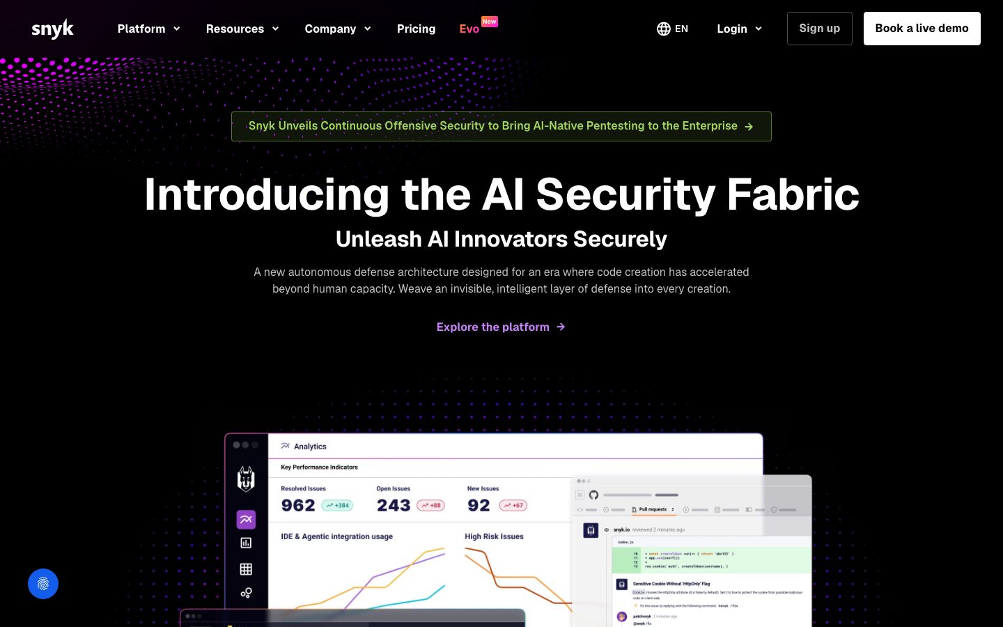
Snyk's marketing surface is a dark, security-engineering interface — a pure-black canvas (`{colors.canvas}` — #000000) carrying white display headlines (`{colors.ink}` — #ffffff) and an inverted black-on-white primary button. The system reads as confident, technical, and AI-forward: tight negative-tracked Geist headlines, generous vertical rhythm, and product UI fragments (analytics dashboards, code-review panes, integration grids) shown directly inside dark cards rather than illustrated.
Type voice splits between **Geist** (the open-source Vercel sans — used for h1, h2, buttons, nav) and **Geist Mono** (used for tracked-out eyebrow labels and small technical metadata). The mono role carries a distinctive wide letter-spacing (1.68px) at weight 700 — it signals "engineering" without shouting.
Brand voltage comes from two places: the **inverted primary button** (white fill, black text) which pops hard against the black canvas, and a **multi-hue accent palette** — purple (`{colors.accent-purple}` — #c481f3), mint, cyan, pink, gold — that surfaces almost exclusively inside chart artifacts, dotted hero textures, and product UI fragments. The chrome stays monochrome; color lives in the content.
Depth is handled with **purple-tinted glow shadows** (rgba(68, 28, 153, …)) — a security-product signature that makes elevated mockups appear to float over the black floor.
**Key Characteristics:**
- Pure-black canvas (`{colors.canvas}` — #000000) with white ink. Everything is dark-mode-native; there is no light page variant in the captured surfaces.
- Inverted primary CTA: white background (`{colors.ink}`), black text (`{colors.canvas}`), `{rounded.sm}` (4px), padding 16px × 24px. The button is the single highest-contrast element on every band.
- Geist 700 display headlines with negative tracking (-0.64px at 64px, -0.32px at 32px). Tight, geometric, confident.
- Geist Mono eyebrow labels at weight 700 with +1.68px letter-spacing — the "technical metadata" voice.
- Near-square radius hierarchy: `{rounded.xs}` (2px) and `{rounded.sm}` (4px) for inputs and buttons, `{rounded.md}` (8px) and `{rounded.lg}` (12px) for cards. Full-bleed section bands measure `{rounded.none}` (0px).
- `{colors.surface-dark}` (#181818) cards lift product UI fragments and feature blocks one step off the black floor.
- Purple glow shadows for elevated mockups; multi-hue accents reserved for charts and product chrome.
- Wide vertical rhythm — `{spacing.huge}` (80px) between bands, up to `{spacing.section}` (160px) at major breaks.
## Colors
### Brand & Accent
- **Accent Purple** (`{colors.accent-purple}` — #c481f3): The primary brand accent. Inline "Explore the platform" links, the dotted hero texture, glow highlights. Snyk's signature hue.
- **Accent Purple Deep** (`{colors.accent-purple-deep}` — #9043c6): A deeper purple used in gradient transitions and the dotted-mesh background fades.
- **Accent Purple Soft** (`{colors.accent-purple-soft}` — #d6a7f7): A lighter tint used in chart strokes and subtle highlights.
- **Accent Teal** (`{colors.accent-teal}` — #4bd6b5): Used on the green-toned announcement pill text and success-state product chrome.
- **Chart / Product palette** — a multi-hue set that appears almost exclusively inside product UI fragments, analytics charts, and decorative hero textures: `{colors.accent-mint}` (#c0f5f2), `{colors.accent-cyan}` (#00ffff), `{colors.accent-blue}` (#9bcfff), `{colors.accent-pink}` (#ff78e1), `{colors.accent-peach}` (#feebde), `{colors.accent-yellow}` (#ffe792), `{colors.accent-yellow-bright}` (#ffdf20), `{colors.accent-gold}` (#f9c748). These never touch chrome or CTAs.
### Surface
- **Canvas** (`{colors.canvas}` — #000000): The default page floor and footer background. Pure black.
- **Surface Dark** (`{colors.surface-dark}` — #181818): Feature cards and product-mockup cards lifted one step off the black floor.
- **Surface Deep** (`{colors.surface-deep}` — #01011e): A near-black navy used in deep gradient fades behind hero artifacts.
- **Surface Light** (`{colors.surface-light}` — #f2f1f4): A light surface that appears inside embedded product UI fragments (the white dashboard chrome), not on the marketing chrome itself.
- **Hairline** (`{colors.hairline}` — #e9e9e9): A light divider tone appearing inside product UI fragments.
### Text
- **Ink** (`{colors.ink}` — #ffffff): All headlines and primary text. Also the primary-button fill.
- **Body** (`{colors.body}` — #c0c0c0): Default running-text / supporting copy color on the dark canvas.
- **Muted** (`{colors.muted}` — #a2a1af): Tertiary text — eyebrow labels, fine print, footer metadata.
## Typography
### Font Family
The system runs **Geist** for display, headings, navigation, and buttons, and **Geist Mono** for tracked-out eyebrow labels and small technical metadata. Both are open-source typefaces from Vercel (`fonts_licensed` flagged none), so they can ship directly — no substitution required. A safe fallback stack is `Geist, -apple-system, BlinkMacSystemFont, "Segoe UI", sans-serif` for the sans and `Geist Mono, ui-monospace, "SFMono-Regular", monospace` for the mono.
The split is functional:
- Geist (700 weight, negative tracking) — h1, h2, buttons, nav
- Geist Mono (700 weight, +1.68px tracking) — eyebrow labels, technical metadata
### Hierarchy
| Token | Size | Weight | Line Height | Letter Spacing | Use |
|---|---|---|---|---|---|
| `{typography.display}` | 64px | 700 | 1.125 | -0.64px | Homepage h1 ("Introducing the AI Security Fabric") — Geist |
| `{typography.title}` | 32px | 700 | 1.25 | -0.32px | Section heads ("The Snyk AI Security Platform"), sub-headlines — Geist |
| `{typography.label-mono}` | 14px | 700 | 1.714 | 1.68px | Eyebrow labels, stat captions, footer metadata — Geist Mono |
| `{typography.button}` | 16px | 700 | 0.875 | 0.08px | Button labels, nav links — Geist |
### Principles
Geist headlines carry negative letter-spacing (-0.64px at display, -0.32px at title) — the tracking is part of the voice; Geist set loose reads as off-brand. Display weight stays at 700 across measured roles.
Geist Mono is reserved for short labels and metadata, never running body copy. Its wide +1.68px tracking and uppercase-feeling rhythm are what give Snyk its "engineering tool" voice — use it sparingly for eyebrows and stat captions.
### Note on Font Substitutes
Geist and Geist Mono are open-source (Vercel) and ship directly — no licensed-font substitution is required. If unavailable, **Inter** (700, slight negative tracking) approximates the sans and **JetBrains Mono** approximates the mono, though both lose Geist's specific geometric character.
## Layout
### Spacing System
- **Base unit:** 8px (the dominant measured value — 265 occurrences at 8px, 118 at 16px).
- **Tokens:** `{spacing.xxs}` 4px · `{spacing.xs}` 8px · `{spacing.sm}` 12px · `{spacing.md}` 16px · `{spacing.lg}` 24px · `{spacing.xl}` 32px · `{spacing.xxl}` 40px · `{spacing.huge}` 80px · `{spacing.section}` 160px.
- **Section padding:** `{spacing.huge}` (80px) is the dominant band rhythm; a single `{spacing.section}` (160px) gap appears at the largest editorial break.
- **Card internal padding:** `{spacing.lg}` (24px) for feature cards; `{spacing.md}` (16px) for product-mockup cards.
- **Micro-spacing:** `{spacing.xs}` (8px) and `{spacing.md}` (16px) dominate inside component clusters (button rows, nav items, stat groups).
### Grid & Container
- **Editorial body:** Centered single-column hero with display headline + sub-headline + button row stacked, product mockup below.
- **Feature card grids:** 3-up at desktop (the "You're shipping risk / Attackers are accelerating / Your AI features" row).
- **Stat blocks:** 2-up paired grid (288% / 80%, 75% / 60%, etc.).
- **Footer:** Multi-column link list (Platform / Our Resources / Knowledge & Docs / Company & Community / Why Snyk).
### Whitespace Philosophy
Snyk uses generous vertical breathing room on a black canvas — 80px band rhythm with a 160px break at the largest editorial seam. The dark floor lets sparse white type and a single high-contrast CTA carry each band without dense packing. Content density lives only inside the embedded product UI fragments.
## Elevation & Depth
| Level | Treatment | Use |
|---|---|---|
| Flat | No shadow on black canvas | Body sections, top nav, hero type |
| Card surface | `{colors.surface-dark}` (#181818) background, no shadow | Feature cards, product-mockup cards lifted off the black floor |
| Soft glow | `rgba(68, 28, 153, 0.3) 0px 1px 3px 1px` | Small elevated chips / buttons |
| Floating mockup | `rgba(68, 28, 153, 0.25) 0px 10px 15px 0px` | Product dashboard mockups floating over the hero |
| Ambient halo | `rgba(68, 28, 153, 0.4) 0px 0px 60px 0px` | Large ambient purple bloom behind the hero artifact |
The elevation philosophy is **purple-glow-on-black** — every shadow is tinted with the same deep purple (rgb(68, 28, 153)), so elevated surfaces appear to emit a security-product glow rather than cast a neutral drop shadow. No neutral grays, no neumorphism.
### Decorative Depth
- The hero carries a dotted-mesh texture in purple gradients (`{colors.accent-purple}` → `{colors.accent-purple-deep}`) fading into the black corners.
- Product UI fragments (analytics dashboards, PR-review panes) retain their own internal light chrome (`{colors.surface-light}`) and sit at angled, layered depth over the canvas.
- The ambient 60px purple halo blooms behind the centered hero mockup, anchoring the composition.
## Shapes
### Border Radius Scale
| Token | Value | Use |
|---|---|---|
| `{rounded.none}` | 0px | Full-bleed section bands (measured at 0 radius) |
| `{rounded.xs}` | 2px | Small inline chips, tightest accents |
| `{rounded.sm}` | 4px | Primary/secondary buttons, text inputs |
| `{rounded.md}` | 8px | Product-mockup cards, announcement pill (most frequent radius — 101 occurrences) |
| `{rounded.lg}` | 12px | Feature cards, larger content containers |
### Geometry
The radius scale is tight and near-square — buttons and inputs sit at 4px, cards top out at 12px. This restraint reads as professional security tooling rather than consumer-app softness. Product UI fragments embedded in cards retain their own native chrome radii.
## Components
### Top Navigation
**`top-nav`** — Black nav bar at the top of every page. `{colors.canvas}` background, `{colors.ink}` text. Carries the lowercase "snyk" wordmark at left, primary menu (Platform, Resources, Company, Pricing, Evo) with dropdown carets, and a right-side cluster: language selector (EN), "Login" dropdown, a `{component.button-secondary}` ("Sign up"), and a `{component.button-primary}` ("Book a live demo"). Links use `{typography.button}` (Geist 16 / 700).
### Buttons
**`button-primary`** — The signature inverted CTA. Background `{colors.ink}` (#ffffff), text `{colors.canvas}` (#000000), type `{typography.button}` (Geist 16 / 700), padding 16px × 24px, rounded `{rounded.sm}` (4px). Highest-contrast element on every black band ("Book a live demo", "Get Started").
**`button-secondary`** — Outlined button on the dark canvas. Transparent background, `{colors.ink}` text, 1px border, same padding + radius as primary ("Sign up", "Learn More", "View all integrations").
**`button-text-link`** — Inline text link in `{colors.accent-purple}` ("Explore the platform →"). The only place purple touches chrome-level UI.
### Pills & Labels
**`announcement-pill`** — The top-of-hero announcement bar ("Snyk Unveils Continuous Offensive Security…"). Transparent fill with a thin teal/green outline, `{colors.accent-teal}` text, rounded `{rounded.md}` (8px), padding 16px × 24px.
**`eyebrow-label`** — Tracked-out Geist Mono labels above stat blocks and section heads. Transparent, `{colors.muted}` text, `{typography.label-mono}` (Geist Mono 14 / 700 / +1.68px).
### Cards & Containers
**`hero-band`** — Black-canvas hero with centered display headline, sub-headline, body copy, and a `{component.button-text-link}` row, with a floating product mockup below. Vertical padding `{spacing.huge}` (80px).
**`feature-card`** — Used in the 3-up feature row ("You're shipping risk at record speeds", "Attackers are accelerating", "Your AI features are now attack vectors"). Background `{colors.surface-dark}` (#181818), rounded `{rounded.lg}` (12px), padding `{spacing.lg}` (24px). Carries an embedded code/UI fragment at top, a `{typography.title}`-scale headline, and `{colors.body}` description text.
**`product-mockup-card`** — A card showing actual Snyk product UI fragments (analytics dashboard, PR-review pane, integration grid). Background `{colors.surface-dark}`, rounded `{rounded.md}` (8px), padding `{spacing.md}` (16px). The product chrome inside carries its own light surface (`{colors.surface-light}`) and multi-hue chart accents.
**`stat-block`** — Large numeric stat with a Geist Mono caption ("288% ROI", "80% faster scan time"). Transparent background, number in `{colors.muted}`, caption in `{typography.label-mono}`.
**`section-card`** — Full-bleed editorial band measured at `{rounded.none}` (0px) radius, no shadow. Background `{colors.canvas}`, text `{colors.ink}`.
### Inputs
**`input`** — Text input measured at `{rounded.sm}` (4px) radius. Background `{colors.canvas}`, text `{colors.ink}`, type `{typography.button}`. Used in newsletter / sign-up fields.
### Footer
**`footer`** — Black footer that closes every page. Background `{colors.canvas}`, text `{colors.body}`, metadata in `{typography.label-mono}`. Multi-column link list (Platform / Our Resources / Knowledge & Docs / Company & Community / Why Snyk) with the "snyk" wordmark and a "Patched & Dispatched" newsletter strip. Vertical padding `{spacing.huge}` (80px).
## Do's and Don'ts
### Do
- Keep the canvas pure black (`{colors.canvas}` — #000000). Snyk is dark-mode-native; the white inverted button is the contrast anchor.
- Reserve `{component.button-primary}` (white fill, black text) for the single primary action per band.
- Use Geist 700 with negative tracking for every headline. Pair with Geist Mono eyebrow labels for technical metadata.
- Confine the multi-hue accent palette (mint, cyan, pink, gold, purple tints) to charts, product UI fragments, and decorative hero textures.
- Use purple-tinted glow shadows (rgb(68, 28, 153)) for elevated mockups — the colored glow is the depth signature.
- Lift cards onto `{colors.surface-dark}` (#181818) one step off the black floor.
- Keep radii tight — 4px on buttons/inputs, 8–12px on cards.
### Don't
- Don't paint accent colors onto chrome-level CTAs or nav. The action layer stays monochrome (white/black), with `{colors.accent-purple}` only on inline text links.
- Don't set Geist headlines loose — the negative tracking is part of the voice.
- Don't run body copy in Geist Mono; reserve mono for short tracked-out labels.
- Don't use neutral gray drop shadows — every elevation shadow carries the purple tint.
- Don't exceed `{rounded.lg}` (12px) on cards; larger radii read as consumer-app, not security tooling.
- Don't add hover-state styling beyond default + pressed.
## Responsive Behavior
### Breakpoints
The two captured renders (full desktop and a narrow composite) confirm a centered single-column hero that holds its structure while bands stack. Specific numeric breakpoints were not measured; the following is inferred from the captured layouts.
| Name | Width | Key Changes (inferred) |
|---|---|---|
| Mobile | < 768px | Hamburger nav; display h1 scales down from 64px; hero mockup stacks; feature grid 1-up; stat blocks 1-up |
| Tablet | 768–1024px | Nav tightens; feature cards 2-up; stat blocks 2-up |
| Desktop | 1024–1440px | Full top-nav; 3-up feature cards; centered hero with floating mockup |
| Wide | > 1440px | Same as desktop with more outer breathing room |
### Touch Targets
- `{component.button-primary}` at padding 16px × 24px comfortably exceeds 44px tap height.
- `{component.input}` and nav links inherit the same generous padding rhythm.
### Collapsing Strategy
- Hero stays centered single-column at every width; the product mockup scales proportionally.
- Feature card row collapses 3 → 2 → 1.
- Stat blocks collapse from 2-up to 1-up.
- Footer link columns wrap toward single-column on mobile.
## Iteration Guide
1. Focus on ONE component at a time. Reference its YAML key directly (`{component.feature-card}`, `{component.button-primary}`).
2. Variants (`-active`, `-disabled`, `-focused`) live as separate entries in `components:`.
3. Use `{token.refs}` everywhere — never inline hex.
4. Never document hover. Default and Active/Pressed states only.
5. The inverted white button is the contrast anchor — don't dilute it with accents.
6. Keep the multi-hue palette inside product UI and charts; chrome stays monochrome.
7. When in doubt about emphasis: bigger Geist before adding color.
## Known Gaps
- Running body / paragraph copy was measured only as the Geist Mono `label-mono` role (700 / +1.68px) — the gray descriptive paragraphs on the dark canvas (apparently Geist regular in `{colors.body}`) were not captured as a distinct token. A `body` type role would need a dedicated measurement.
- Button active/pressed and disabled states were not measured; only the default `{component.button-primary}` props (white fill, black text, 4px radius, 16×24 padding) are confirmed.
- The `card` component measured at `0px` radius with `none` shadow is interpreted as a full-bleed `section-card`; its `{rounded.none}` token is derived from that single measurement and may not represent content cards.
- The announcement-pill border color reads as teal/green in the screenshot and is mapped to `{colors.accent-teal}` (#4bd6b5); the exact border hex was not isolated in the color extraction.
- Secondary/outline button border color and weight were observed from screenshots, not measured.
- Responsive breakpoints are inferred from two captured renders; exact pixel thresholds were not extracted.
- The full accent palette (mint, cyan, pink, gold, blue, peach, yellows) was extracted at low frequency (3 occurrences each) and appears tied to product UI fragments and chart strokes; exact role assignments per chart may vary by page.
- Animation, gradient mesh, and transition timings (hero dotted texture, mockup float, integration grid) are not in scope.
<!-- Documented by duply · real-world design systems as ready-to-use DESIGN.md for AI coding agents · https://duply.ai/snyk/design-md -->
Color Palette
Accent
Neutrals
Typography
display64px · 700 · 1.125
The quick brown fox jumpstitle32px · 700 · 1.25
The quick brown fox jumpslabel-mono14px · 700 · 1.714
The quick brown fox jumpsbutton16px · 700 · 0.875
The quick brown fox jumpsSpacing & Shape
Spacing
| Name | Value | Preview |
|---|---|---|
| xxs | 4px | |
| xs | 8px | |
| sm | 12px | |
| md | 16px | |
| lg | 24px | |
| xl | 32px | |
| xxl | 40px | |
| huge | 80px | |
| section | 160px |
Border Radius
| Name | Value | Preview |
|---|---|---|
| none | 0px | |
| xs | 2px | |
| sm | 4px | |
| md | 8px | |
| lg | 12px |
More like this


---
version: alpha
name: Snyk-design-analysis
description: A dark, security-engineering interface built on a pure-black canvas (#000000) with white display typography and high-voltage purple accents. The system reads as confident, technical, and AI-forward — Geist sans for headlines and buttons, Geist Mono for tracked-out eyebrow labels, near-square cards on near-black surfaces (#181818), and a multi-hue accent palette (purple, mint, cyan, pink, gold) that surfaces almost exclusively inside product UI fragments and chart artifacts rather than on chrome. Brand voltage comes from the inverted black-on-white primary button and purple-tinted glow shadows.

colors:
  ink: "#ffffff"
  canvas: "#000000"
  surface-dark: "#181818"
  surface-deep: "#01011e"
  body: "#c0c0c0"
  muted: "#a2a1af"
  surface-light: "#f2f1f4"
  hairline: "#e9e9e9"
  accent-purple: "#c481f3"
  accent-purple-deep: "#9043c6"
  accent-purple-soft: "#d6a7f7"
  accent-peach: "#feebde"
  accent-mint: "#c0f5f2"
  accent-yellow: "#ffe792"
  accent-yellow-bright: "#ffdf20"
  accent-gold: "#f9c748"
  accent-blue: "#9bcfff"
  accent-cyan: "#00ffff"
  accent-pink: "#ff78e1"
  accent-teal: "#4bd6b5"

typography:
  display:
    fontFamily: "Geist, sans-serif"
    fontSize: 64px
    fontWeight: 700
    lineHeight: 1.125
    letterSpacing: -0.64px
  title:
    fontFamily: "Geist, sans-serif"
    fontSize: 32px
    fontWeight: 700
    lineHeight: 1.25
    letterSpacing: -0.32px
  label-mono:
    fontFamily: "Geist Mono, ui-monospace, monospace"
    fontSize: 14px
    fontWeight: 700
    lineHeight: 1.714
    letterSpacing: 1.68px
  button:
    fontFamily: "Geist, sans-serif"
    fontSize: 16px
    fontWeight: 700
    lineHeight: 0.875
    letterSpacing: 0.08px

rounded:
  none: 0px
  xs: 2px
  sm: 4px
  md: 8px
  lg: 12px

spacing:
  xxs: 4px
  xs: 8px
  sm: 12px
  md: 16px
  lg: 24px
  xl: 32px
  xxl: 40px
  huge: 80px
  section: 160px

components:
  top-nav:
    backgroundColor: "{colors.canvas}"
    textColor: "{colors.ink}"
    typography: "{typography.button}"
  button-primary:
    backgroundColor: "{colors.ink}"
    textColor: "{colors.canvas}"
    typography: "{typography.button}"
    rounded: "{rounded.sm}"
    padding: 16px 24px
  button-secondary:
    backgroundColor: transparent
    textColor: "{colors.ink}"
    typography: "{typography.button}"
    rounded: "{rounded.sm}"
    padding: 16px 24px
  button-text-link:
    backgroundColor: transparent
    textColor: "{colors.accent-purple}"
    typography: "{typography.button}"
  announcement-pill:
    backgroundColor: transparent
    textColor: "{colors.accent-teal}"
    typography: "{typography.button}"
    rounded: "{rounded.md}"
    padding: 16px 24px
  eyebrow-label:
    backgroundColor: transparent
    textColor: "{colors.muted}"
    typography: "{typography.label-mono}"
  hero-band:
    backgroundColor: "{colors.canvas}"
    textColor: "{colors.ink}"
    typography: "{typography.display}"
    padding: 80px
  feature-card:
    backgroundColor: "{colors.surface-dark}"
    textColor: "{colors.ink}"
    typography: "{typography.title}"
    rounded: "{rounded.lg}"
    padding: 24px
  product-mockup-card:
    backgroundColor: "{colors.surface-dark}"
    textColor: "{colors.ink}"
    rounded: "{rounded.md}"
    padding: 16px
  stat-block:
    backgroundColor: transparent
    textColor: "{colors.muted}"
    typography: "{typography.label-mono}"
  section-card:
    backgroundColor: "{colors.canvas}"
    textColor: "{colors.ink}"
    rounded: "{rounded.none}"
  input:
    backgroundColor: "{colors.canvas}"
    textColor: "{colors.ink}"
    typography: "{typography.button}"
    rounded: "{rounded.sm}"
  footer:
    backgroundColor: "{colors.canvas}"
    textColor: "{colors.body}"
    typography: "{typography.label-mono}"
    padding: 80px
---

## Overview

Snyk's marketing surface is a dark, security-engineering interface — a pure-black canvas (`{colors.canvas}` — #000000) carrying white display headlines (`{colors.ink}` — #ffffff) and an inverted black-on-white primary button. The system reads as confident, technical, and AI-forward: tight negative-tracked Geist headlines, generous vertical rhythm, and product UI fragments (analytics dashboards, code-review panes, integration grids) shown directly inside dark cards rather than illustrated.

Type voice splits between **Geist** (the open-source Vercel sans — used for h1, h2, buttons, nav) and **Geist Mono** (used for tracked-out eyebrow labels and small technical metadata). The mono role carries a distinctive wide letter-spacing (1.68px) at weight 700 — it signals "engineering" without shouting.

Brand voltage comes from two places: the **inverted primary button** (white fill, black text) which pops hard against the black canvas, and a **multi-hue accent palette** — purple (`{colors.accent-purple}` — #c481f3), mint, cyan, pink, gold — that surfaces almost exclusively inside chart artifacts, dotted hero textures, and product UI fragments. The chrome stays monochrome; color lives in the content.

Depth is handled with **purple-tinted glow shadows** (rgba(68, 28, 153, …)) — a security-product signature that makes elevated mockups appear to float over the black floor.

**Key Characteristics:**
- Pure-black canvas (`{colors.canvas}` — #000000) with white ink. Everything is dark-mode-native; there is no light page variant in the captured surfaces.
- Inverted primary CTA: white background (`{colors.ink}`), black text (`{colors.canvas}`), `{rounded.sm}` (4px), padding 16px × 24px. The button is the single highest-contrast element on every band.
- Geist 700 display headlines with negative tracking (-0.64px at 64px, -0.32px at 32px). Tight, geometric, confident.
- Geist Mono eyebrow labels at weight 700 with +1.68px letter-spacing — the "technical metadata" voice.
- Near-square radius hierarchy: `{rounded.xs}` (2px) and `{rounded.sm}` (4px) for inputs and buttons, `{rounded.md}` (8px) and `{rounded.lg}` (12px) for cards. Full-bleed section bands measure `{rounded.none}` (0px).
- `{colors.surface-dark}` (#181818) cards lift product UI fragments and feature blocks one step off the black floor.
- Purple glow shadows for elevated mockups; multi-hue accents reserved for charts and product chrome.
- Wide vertical rhythm — `{spacing.huge}` (80px) between bands, up to `{spacing.section}` (160px) at major breaks.

## Colors

### Brand & Accent
- **Accent Purple** (`{colors.accent-purple}` — #c481f3): The primary brand accent. Inline "Explore the platform" links, the dotted hero texture, glow highlights. Snyk's signature hue.
- **Accent Purple Deep** (`{colors.accent-purple-deep}` — #9043c6): A deeper purple used in gradient transitions and the dotted-mesh background fades.
- **Accent Purple Soft** (`{colors.accent-purple-soft}` — #d6a7f7): A lighter tint used in chart strokes and subtle highlights.
- **Accent Teal** (`{colors.accent-teal}` — #4bd6b5): Used on the green-toned announcement pill text and success-state product chrome.
- **Chart / Product palette** — a multi-hue set that appears almost exclusively inside product UI fragments, analytics charts, and decorative hero textures: `{colors.accent-mint}` (#c0f5f2), `{colors.accent-cyan}` (#00ffff), `{colors.accent-blue}` (#9bcfff), `{colors.accent-pink}` (#ff78e1), `{colors.accent-peach}` (#feebde), `{colors.accent-yellow}` (#ffe792), `{colors.accent-yellow-bright}` (#ffdf20), `{colors.accent-gold}` (#f9c748). These never touch chrome or CTAs.

### Surface
- **Canvas** (`{colors.canvas}` — #000000): The default page floor and footer background. Pure black.
- **Surface Dark** (`{colors.surface-dark}` — #181818): Feature cards and product-mockup cards lifted one step off the black floor.
- **Surface Deep** (`{colors.surface-deep}` — #01011e): A near-black navy used in deep gradient fades behind hero artifacts.
- **Surface Light** (`{colors.surface-light}` — #f2f1f4): A light surface that appears inside embedded product UI fragments (the white dashboard chrome), not on the marketing chrome itself.
- **Hairline** (`{colors.hairline}` — #e9e9e9): A light divider tone appearing inside product UI fragments.

### Text
- **Ink** (`{colors.ink}` — #ffffff): All headlines and primary text. Also the primary-button fill.
- **Body** (`{colors.body}` — #c0c0c0): Default running-text / supporting copy color on the dark canvas.
- **Muted** (`{colors.muted}` — #a2a1af): Tertiary text — eyebrow labels, fine print, footer metadata.

## Typography

### Font Family
The system runs **Geist** for display, headings, navigation, and buttons, and **Geist Mono** for tracked-out eyebrow labels and small technical metadata. Both are open-source typefaces from Vercel (`fonts_licensed` flagged none), so they can ship directly — no substitution required. A safe fallback stack is `Geist, -apple-system, BlinkMacSystemFont, "Segoe UI", sans-serif` for the sans and `Geist Mono, ui-monospace, "SFMono-Regular", monospace` for the mono.

The split is functional:
- Geist (700 weight, negative tracking) — h1, h2, buttons, nav
- Geist Mono (700 weight, +1.68px tracking) — eyebrow labels, technical metadata

### Hierarchy

| Token | Size | Weight | Line Height | Letter Spacing | Use |
|---|---|---|---|---|---|
| `{typography.display}` | 64px | 700 | 1.125 | -0.64px | Homepage h1 ("Introducing the AI Security Fabric") — Geist |
| `{typography.title}` | 32px | 700 | 1.25 | -0.32px | Section heads ("The Snyk AI Security Platform"), sub-headlines — Geist |
| `{typography.label-mono}` | 14px | 700 | 1.714 | 1.68px | Eyebrow labels, stat captions, footer metadata — Geist Mono |
| `{typography.button}` | 16px | 700 | 0.875 | 0.08px | Button labels, nav links — Geist |

### Principles
Geist headlines carry negative letter-spacing (-0.64px at display, -0.32px at title) — the tracking is part of the voice; Geist set loose reads as off-brand. Display weight stays at 700 across measured roles.

Geist Mono is reserved for short labels and metadata, never running body copy. Its wide +1.68px tracking and uppercase-feeling rhythm are what give Snyk its "engineering tool" voice — use it sparingly for eyebrows and stat captions.

### Note on Font Substitutes
Geist and Geist Mono are open-source (Vercel) and ship directly — no licensed-font substitution is required. If unavailable, **Inter** (700, slight negative tracking) approximates the sans and **JetBrains Mono** approximates the mono, though both lose Geist's specific geometric character.

## Layout

### Spacing System
- **Base unit:** 8px (the dominant measured value — 265 occurrences at 8px, 118 at 16px).
- **Tokens:** `{spacing.xxs}` 4px · `{spacing.xs}` 8px · `{spacing.sm}` 12px · `{spacing.md}` 16px · `{spacing.lg}` 24px · `{spacing.xl}` 32px · `{spacing.xxl}` 40px · `{spacing.huge}` 80px · `{spacing.section}` 160px.
- **Section padding:** `{spacing.huge}` (80px) is the dominant band rhythm; a single `{spacing.section}` (160px) gap appears at the largest editorial break.
- **Card internal padding:** `{spacing.lg}` (24px) for feature cards; `{spacing.md}` (16px) for product-mockup cards.
- **Micro-spacing:** `{spacing.xs}` (8px) and `{spacing.md}` (16px) dominate inside component clusters (button rows, nav items, stat groups).

### Grid & Container
- **Editorial body:** Centered single-column hero with display headline + sub-headline + button row stacked, product mockup below.
- **Feature card grids:** 3-up at desktop (the "You're shipping risk / Attackers are accelerating / Your AI features" row).
- **Stat blocks:** 2-up paired grid (288% / 80%, 75% / 60%, etc.).
- **Footer:** Multi-column link list (Platform / Our Resources / Knowledge & Docs / Company & Community / Why Snyk).

### Whitespace Philosophy
Snyk uses generous vertical breathing room on a black canvas — 80px band rhythm with a 160px break at the largest editorial seam. The dark floor lets sparse white type and a single high-contrast CTA carry each band without dense packing. Content density lives only inside the embedded product UI fragments.

## Elevation & Depth

| Level | Treatment | Use |
|---|---|---|
| Flat | No shadow on black canvas | Body sections, top nav, hero type |
| Card surface | `{colors.surface-dark}` (#181818) background, no shadow | Feature cards, product-mockup cards lifted off the black floor |
| Soft glow | `rgba(68, 28, 153, 0.3) 0px 1px 3px 1px` | Small elevated chips / buttons |
| Floating mockup | `rgba(68, 28, 153, 0.25) 0px 10px 15px 0px` | Product dashboard mockups floating over the hero |
| Ambient halo | `rgba(68, 28, 153, 0.4) 0px 0px 60px 0px` | Large ambient purple bloom behind the hero artifact |

The elevation philosophy is **purple-glow-on-black** — every shadow is tinted with the same deep purple (rgb(68, 28, 153)), so elevated surfaces appear to emit a security-product glow rather than cast a neutral drop shadow. No neutral grays, no neumorphism.

### Decorative Depth
- The hero carries a dotted-mesh texture in purple gradients (`{colors.accent-purple}` → `{colors.accent-purple-deep}`) fading into the black corners.
- Product UI fragments (analytics dashboards, PR-review panes) retain their own internal light chrome (`{colors.surface-light}`) and sit at angled, layered depth over the canvas.
- The ambient 60px purple halo blooms behind the centered hero mockup, anchoring the composition.

## Shapes

### Border Radius Scale

| Token | Value | Use |
|---|---|---|
| `{rounded.none}` | 0px | Full-bleed section bands (measured at 0 radius) |
| `{rounded.xs}` | 2px | Small inline chips, tightest accents |
| `{rounded.sm}` | 4px | Primary/secondary buttons, text inputs |
| `{rounded.md}` | 8px | Product-mockup cards, announcement pill (most frequent radius — 101 occurrences) |
| `{rounded.lg}` | 12px | Feature cards, larger content containers |

### Geometry
The radius scale is tight and near-square — buttons and inputs sit at 4px, cards top out at 12px. This restraint reads as professional security tooling rather than consumer-app softness. Product UI fragments embedded in cards retain their own native chrome radii.

## Components

### Top Navigation

**`top-nav`** — Black nav bar at the top of every page. `{colors.canvas}` background, `{colors.ink}` text. Carries the lowercase "snyk" wordmark at left, primary menu (Platform, Resources, Company, Pricing, Evo) with dropdown carets, and a right-side cluster: language selector (EN), "Login" dropdown, a `{component.button-secondary}` ("Sign up"), and a `{component.button-primary}` ("Book a live demo"). Links use `{typography.button}` (Geist 16 / 700).

### Buttons

**`button-primary`** — The signature inverted CTA. Background `{colors.ink}` (#ffffff), text `{colors.canvas}` (#000000), type `{typography.button}` (Geist 16 / 700), padding 16px × 24px, rounded `{rounded.sm}` (4px). Highest-contrast element on every black band ("Book a live demo", "Get Started").

**`button-secondary`** — Outlined button on the dark canvas. Transparent background, `{colors.ink}` text, 1px border, same padding + radius as primary ("Sign up", "Learn More", "View all integrations").

**`button-text-link`** — Inline text link in `{colors.accent-purple}` ("Explore the platform →"). The only place purple touches chrome-level UI.

### Pills & Labels

**`announcement-pill`** — The top-of-hero announcement bar ("Snyk Unveils Continuous Offensive Security…"). Transparent fill with a thin teal/green outline, `{colors.accent-teal}` text, rounded `{rounded.md}` (8px), padding 16px × 24px.

**`eyebrow-label`** — Tracked-out Geist Mono labels above stat blocks and section heads. Transparent, `{colors.muted}` text, `{typography.label-mono}` (Geist Mono 14 / 700 / +1.68px).

### Cards & Containers

**`hero-band`** — Black-canvas hero with centered display headline, sub-headline, body copy, and a `{component.button-text-link}` row, with a floating product mockup below. Vertical padding `{spacing.huge}` (80px).

**`feature-card`** — Used in the 3-up feature row ("You're shipping risk at record speeds", "Attackers are accelerating", "Your AI features are now attack vectors"). Background `{colors.surface-dark}` (#181818), rounded `{rounded.lg}` (12px), padding `{spacing.lg}` (24px). Carries an embedded code/UI fragment at top, a `{typography.title}`-scale headline, and `{colors.body}` description text.

**`product-mockup-card`** — A card showing actual Snyk product UI fragments (analytics dashboard, PR-review pane, integration grid). Background `{colors.surface-dark}`, rounded `{rounded.md}` (8px), padding `{spacing.md}` (16px). The product chrome inside carries its own light surface (`{colors.surface-light}`) and multi-hue chart accents.

**`stat-block`** — Large numeric stat with a Geist Mono caption ("288% ROI", "80% faster scan time"). Transparent background, number in `{colors.muted}`, caption in `{typography.label-mono}`.

**`section-card`** — Full-bleed editorial band measured at `{rounded.none}` (0px) radius, no shadow. Background `{colors.canvas}`, text `{colors.ink}`.

### Inputs

**`input`** — Text input measured at `{rounded.sm}` (4px) radius. Background `{colors.canvas}`, text `{colors.ink}`, type `{typography.button}`. Used in newsletter / sign-up fields.

### Footer

**`footer`** — Black footer that closes every page. Background `{colors.canvas}`, text `{colors.body}`, metadata in `{typography.label-mono}`. Multi-column link list (Platform / Our Resources / Knowledge & Docs / Company & Community / Why Snyk) with the "snyk" wordmark and a "Patched & Dispatched" newsletter strip. Vertical padding `{spacing.huge}` (80px).

## Do's and Don'ts

### Do
- Keep the canvas pure black (`{colors.canvas}` — #000000). Snyk is dark-mode-native; the white inverted button is the contrast anchor.
- Reserve `{component.button-primary}` (white fill, black text) for the single primary action per band.
- Use Geist 700 with negative tracking for every headline. Pair with Geist Mono eyebrow labels for technical metadata.
- Confine the multi-hue accent palette (mint, cyan, pink, gold, purple tints) to charts, product UI fragments, and decorative hero textures.
- Use purple-tinted glow shadows (rgb(68, 28, 153)) for elevated mockups — the colored glow is the depth signature.
- Lift cards onto `{colors.surface-dark}` (#181818) one step off the black floor.
- Keep radii tight — 4px on buttons/inputs, 8–12px on cards.

### Don't
- Don't paint accent colors onto chrome-level CTAs or nav. The action layer stays monochrome (white/black), with `{colors.accent-purple}` only on inline text links.
- Don't set Geist headlines loose — the negative tracking is part of the voice.
- Don't run body copy in Geist Mono; reserve mono for short tracked-out labels.
- Don't use neutral gray drop shadows — every elevation shadow carries the purple tint.
- Don't exceed `{rounded.lg}` (12px) on cards; larger radii read as consumer-app, not security tooling.
- Don't add hover-state styling beyond default + pressed.

## Responsive Behavior

### Breakpoints

The two captured renders (full desktop and a narrow composite) confirm a centered single-column hero that holds its structure while bands stack. Specific numeric breakpoints were not measured; the following is inferred from the captured layouts.

| Name | Width | Key Changes (inferred) |
|---|---|---|
| Mobile | < 768px | Hamburger nav; display h1 scales down from 64px; hero mockup stacks; feature grid 1-up; stat blocks 1-up |
| Tablet | 768–1024px | Nav tightens; feature cards 2-up; stat blocks 2-up |
| Desktop | 1024–1440px | Full top-nav; 3-up feature cards; centered hero with floating mockup |
| Wide | > 1440px | Same as desktop with more outer breathing room |

### Touch Targets
- `{component.button-primary}` at padding 16px × 24px comfortably exceeds 44px tap height.
- `{component.input}` and nav links inherit the same generous padding rhythm.

### Collapsing Strategy
- Hero stays centered single-column at every width; the product mockup scales proportionally.
- Feature card row collapses 3 → 2 → 1.
- Stat blocks collapse from 2-up to 1-up.
- Footer link columns wrap toward single-column on mobile.

## Iteration Guide

1. Focus on ONE component at a time. Reference its YAML key directly (`{component.feature-card}`, `{component.button-primary}`).
2. Variants (`-active`, `-disabled`, `-focused`) live as separate entries in `components:`.
3. Use `{token.refs}` everywhere — never inline hex.
4. Never document hover. Default and Active/Pressed states only.
5. The inverted white button is the contrast anchor — don't dilute it with accents.
6. Keep the multi-hue palette inside product UI and charts; chrome stays monochrome.
7. When in doubt about emphasis: bigger Geist before adding color.

## Known Gaps

- Running body / paragraph copy was measured only as the Geist Mono `label-mono` role (700 / +1.68px) — the gray descriptive paragraphs on the dark canvas (apparently Geist regular in `{colors.body}`) were not captured as a distinct token. A `body` type role would need a dedicated measurement.
- Button active/pressed and disabled states were not measured; only the default `{component.button-primary}` props (white fill, black text, 4px radius, 16×24 padding) are confirmed.
- The `card` component measured at `0px` radius with `none` shadow is interpreted as a full-bleed `section-card`; its `{rounded.none}` token is derived from that single measurement and may not represent content cards.
- The announcement-pill border color reads as teal/green in the screenshot and is mapped to `{colors.accent-teal}` (#4bd6b5); the exact border hex was not isolated in the color extraction.
- Secondary/outline button border color and weight were observed from screenshots, not measured.
- Responsive breakpoints are inferred from two captured renders; exact pixel thresholds were not extracted.
- The full accent palette (mint, cyan, pink, gold, blue, peach, yellows) was extracted at low frequency (3 occurrences each) and appears tied to product UI fragments and chart strokes; exact role assignments per chart may vary by page.
- Animation, gradient mesh, and transition timings (hero dotted texture, mockup float, integration grid) are not in scope.

<!-- Documented by duply · real-world design systems as ready-to-use DESIGN.md for AI coding agents · https://duply.ai/snyk/design-md -->