dope.security
A near-black, aviation-themed cybersecurity interface built on a deep
---
version: alpha
name: dope.security-design-analysis
description: A near-black, aviation-themed cybersecurity interface built on a deep #090909 canvas with white display type, an electric purple (#af50ff) brand accent, and a distinctive Whyte Inktrap / Whyte Inktrap Mono typographic pairing. The system reads as confident and editorial — oversized inktrap headlines with crushed line-height, wide-tracked monospace section labels, glassy "boarding pass" hero card over a dusk-sky photograph, and square-cornered feature rows. Brand voltage comes from the purple accent (CTA glow borders, play button) and the editorial inktrap display face rather than from surface color variety.
colors:
primary: "#af50ff"
primary-light: "#d4a0ff"
ink: "#ffffff"
body: "#f0f0f0"
muted: "#919699"
muted-soft: "#8e8e8e"
canvas: "#090909"
surface-darker: "#000000"
surface-dark: "#10151b"
surface-light: "#f7f9fa"
hairline: "#333333"
hairline-soft: "#222222"
on-primary: "#ffffff"
neutral-strong: "#dddddd"
neutral-soft: "#cccccc"
slate: "#475467"
slate-blue: "#4d5da5"
cyan: "#4bd1ff"
blue: "#3898ec"
success: "#00d37e"
warning: "#d14424"
typography:
display-xl:
fontFamily: "Whyte Inktrap, Space Grotesk, sans-serif"
fontSize: 88px
fontWeight: 500
lineHeight: 0.8
letterSpacing: -2.64px
display-md:
fontFamily: "Whyte Inktrap, Space Grotesk, sans-serif"
fontSize: 48px
fontWeight: 400
lineHeight: 1.2
letterSpacing: 0
mono-display:
fontFamily: "Whyte Inktrap Mono, Space Mono, monospace"
fontSize: 73.6px
fontWeight: 400
lineHeight: 0.9
letterSpacing: 14.72px
body:
fontFamily: "Whyte Inktrap Mono, Space Mono, monospace"
fontSize: 14px
fontWeight: 400
lineHeight: 1.5
letterSpacing: 0
button:
fontFamily: "Helvetica, Arial, sans-serif"
fontSize: 16px
fontWeight: 400
lineHeight: 1.5
letterSpacing: 0
rounded:
none: 0px
xs: 4px
sm: 6px
md: 8px
lg: 11px
xl: 19px
pill: 100px
full: 1584px
spacing:
xxs: 6px
xs: 8px
sm: 12px
md: 16px
lg: 24px
xl: 32px
xxl: 48px
components:
top-nav:
backgroundColor: "{colors.canvas}"
textColor: "{colors.ink}"
typography: "{typography.button}"
button-primary:
backgroundColor: transparent
textColor: "{colors.ink}"
typography: "{typography.button}"
rounded: "{rounded.none}"
padding: 3.2px
button-outline:
backgroundColor: transparent
textColor: "{colors.ink}"
typography: "{typography.button}"
rounded: "{rounded.md}"
trial-button-pill:
backgroundColor: transparent
textColor: "{colors.ink}"
typography: "{typography.button}"
rounded: "{rounded.pill}"
play-button:
backgroundColor: transparent
textColor: "{colors.primary}"
rounded: "{rounded.full}"
size: 60px
boarding-pass-card:
backgroundColor: transparent
textColor: "{colors.ink}"
typography: "{typography.body}"
rounded: "{rounded.xl}"
feature-list-row:
backgroundColor: transparent
textColor: "{colors.ink}"
typography: "{typography.mono-display}"
rounded: "{rounded.none}"
card:
backgroundColor: "{colors.surface-dark}"
textColor: "{colors.ink}"
rounded: "{rounded.none}"
cookie-bar:
backgroundColor: "{colors.surface-darker}"
textColor: "{colors.ink}"
typography: "{typography.button}"
cookie-accept-button:
backgroundColor: "{colors.primary}"
textColor: "{colors.on-primary}"
typography: "{typography.button}"
rounded: "{rounded.md}"
---
## Overview
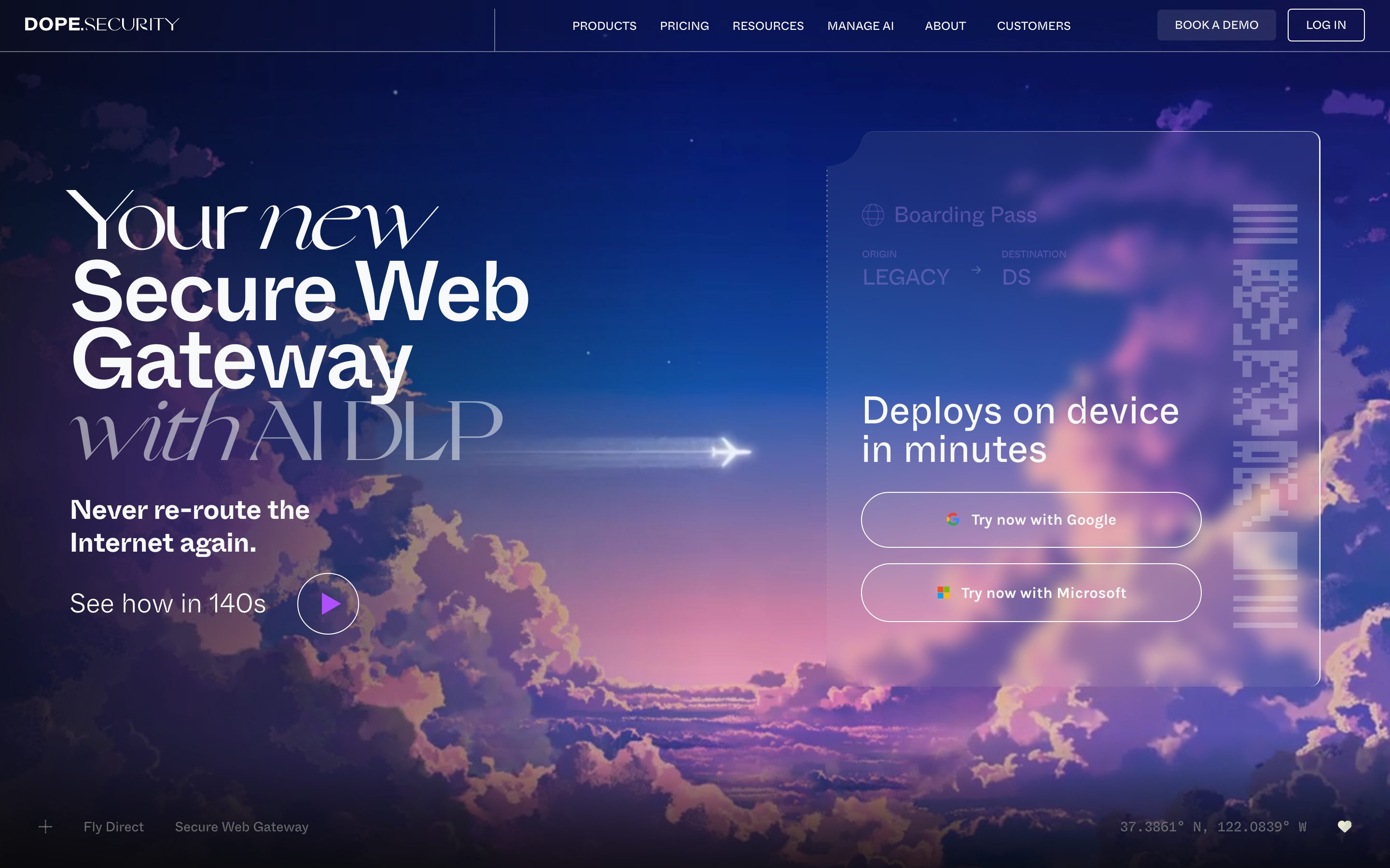
dope.security's marketing surface is a near-black editorial interface — a deep `{colors.canvas}` (#090909) floor with white display type (`{colors.ink}` — #ffffff) and a single electric-purple brand accent (`{colors.primary}` — #af50ff). The aesthetic is confident and aviation-themed: the hero pairs an oversized inktrap headline against a dusk-sky photograph with a contrail-trailing jet, and a glassy "Boarding Pass" card floats at the right. Below the fold the page goes to pure near-black, with wide-tracked monospace feature rows ("SSL INSPECTION", "URL FILTERING") stacked like a departures board.
The type voice is the system's defining gesture. **Whyte Inktrap** carries the display headlines — at 88px with a crushed 0.8 line-height and aggressive -2.64px tracking, it reads as editorial and high-fashion rather than typical SaaS. **Whyte Inktrap Mono** carries both the running body (14px) and the giant wide-tracked section labels (73.6px / +14.72px letter-spacing), giving the page a technical, terminal-like cadence. A neutral **Helvetica** handles button labels.
Brand voltage comes almost entirely from two sources: the purple accent (the CTA pill glow-border, the circular play button, the cookie "Got it!" button) and the inktrap display face. Surfaces stay near-monochrome — black on black, with the only bright surface being the off-white `{colors.surface-light}` (#f7f9fa) used sparingly. There is no card-color variety; depth comes from the hero photograph and the glassy boarding-pass card outline.
**Key Characteristics:**
- Deep near-black canvas (`{colors.canvas}` — #090909) with white type — the page is essentially a dark editorial poster.
- Whyte Inktrap display headlines (88px / weight 500 / -2.64px tracking / 0.8 line-height) — crushed, oversized, high-fashion editorial feel.
- Whyte Inktrap Mono used twice: 14px running body and 73.6px wide-tracked (+14.72px) section labels rendered like a departures board.
- A single electric-purple accent (`{colors.primary}` — #af50ff) carries the CTA glow-border, the play button, and the cookie-accept button — used scarcely against the monochrome field.
- Pill-radius trial CTAs (`{rounded.pill}` — 100px) with a purple inset glow-border; square-cornered (`{rounded.none}`) feature rows and cards elsewhere.
- A glassy "Boarding Pass" hero card with a large rounded corner (`{rounded.xl}` — 19px) floating over a dusk-sky photograph.
- Spacing rhythm built on a 16px base unit (the dominant measured gap), with 6/8/12px fine spacing inside controls.
## Colors
### Brand & Accent
- **Primary** (`{colors.primary}` — #af50ff): The single electric-purple brand accent. Drives the trial-CTA glow-border, the circular play button, and the cookie "Got it!" button. Used scarcely against the near-black field.
- **Primary Light** (`{colors.primary-light}` — #d4a0ff): A lighter purple tint observed on hover/secondary accent moments inside the hero zone.
- **Secondary Accents** — A small additional accent set surfaced in the measured palette but used minimally on this surface: `{colors.cyan}` (#4bd1ff), `{colors.blue}` (#3898ec), `{colors.slate-blue}` (#4d5da5), `{colors.slate}` (#475467). These appear inside diagrams, photographic gradients, and product UI fragments rather than on CTAs.
### Surface
- **Canvas** (`{colors.canvas}` — #090909): The default near-black page floor.
- **Surface Darker** (`{colors.surface-darker}` — #000000): Pure black — used for the cookie bar and deepest sections.
- **Surface Dark** (`{colors.surface-dark}` — #10151b): A very slightly raised dark surface for cards and nested panels.
- **Surface Light** (`{colors.surface-light}` — #f7f9fa): The high-frequency off-white — used for light fills and inverted moments. The only bright surface in the system.
### Text
- **Ink** (`{colors.ink}` — #ffffff): All display headlines and primary text. White on near-black is the system's default contrast pairing.
- **Body** (`{colors.body}` — #f0f0f0): Near-white running text on dark surfaces.
- **Muted** (`{colors.muted}` — #919699): Secondary text — labels, sub-headings ("ORIGIN", "DESTINATION").
- **Muted Soft** (`{colors.muted-soft}` — #8e8e8e): Tertiary text — fine print and de-emphasized captions.
- **Neutral Strong / Soft** (`{colors.neutral-strong}` — #dddddd / `{colors.neutral-soft}` — #cccccc): Light grays for outlines and faint dividers on dark.
- **On Primary** (`{colors.on-primary}` — #ffffff): Text on the purple accent button.
### Hairline
- **Hairline** (`{colors.hairline}` — #333333): The divider tone on dark surfaces — feature-row separators, faint borders.
- **Hairline Soft** (`{colors.hairline-soft}` — #222222): A barely-visible divider between near-black sections.
### Semantic
- **Success** (`{colors.success}` — #00d37e): Confirmation states / positive indicators in product UI.
- **Warning** (`{colors.warning}` — #d14424): Warning / alert callouts.
## Typography
### Font Family
The system runs **Whyte Inktrap** for display headlines and **Whyte Inktrap Mono** for both running body and oversized section labels, with **Helvetica** for button labels. Whyte Inktrap is a commercial typeface (ABC Dinamo) — the inktrap detailing (the small notches carved into letter joints) is what gives the headlines their editorial, high-fashion character. Mono is used at two scales: tiny 14px body and a giant 73.6px wide-tracked display label.
The split is functional:
- Whyte Inktrap (display, weight 400–500, crushed line-height, negative tracking) — h1, h2
- Whyte Inktrap Mono (mono, weight 400) — running body (14px) AND the wide-tracked departures-board section labels (73.6px / +14.72px)
- Helvetica (UI) — button labels only
### Hierarchy
| Token | Size | Weight | Line Height | Letter Spacing | Use |
|---|---|---|---|---|---|
| `{typography.display-xl}` | 88px | 500 | 0.8 | -2.64px | Hero h1 ("Secure Web Gateway with AI DLP") — Whyte Inktrap |
| `{typography.display-md}` | 48px | 400 | 1.2 | 0 | Section heads ("There's a problem with swgs today.") — Whyte Inktrap |
| `{typography.mono-display}` | 73.6px | 400 | 0.9 | 14.72px | Wide-tracked feature-row labels ("SSL INSPECTION") — Whyte Inktrap Mono |
| `{typography.body}` | 14px | 400 | 1.5 | 0 | Running text, card labels, fine print — Whyte Inktrap Mono |
| `{typography.button}` | 16px | 400 | 1.5 | 0 | Button + nav labels — Helvetica |
### Principles
The display headline uses crushed line-height (0.8) and heavy negative tracking (-2.64px) — the inktrap face is meant to be set tight and large. The mono face does double duty: at 14px it reads as quiet technical body copy; at 73.6px with +14.72px tracking it becomes a wide-spaced architectural label, like an airport departures board. Never set the giant mono label tight, and never set the body mono loose — the contrast between the two scales is the voice.
### Note on Font Substitutes
Whyte Inktrap and Whyte Inktrap Mono are commercial typefaces and are not shipped here. For the display face, **Space Grotesk** (weight 500) is a usable open-source approximation that preserves the geometric, slightly technical character — though it lacks the literal inktrap notches. For the mono face, **Space Mono** (or **JetBrains Mono** / **Spline Sans Mono**) at weight 400 reproduces the terminal-label cadence, especially at the wide-tracked display size. The fallback stacks declared in the tokens walk these substitutes.
## Layout
### Spacing System
- **Base unit:** 16px is the dominant measured gap (frequency 27 — by far the most common value).
- **Tokens:** `{spacing.xxs}` 6px · `{spacing.xs}` 8px · `{spacing.sm}` 12px · `{spacing.md}` 16px · `{spacing.lg}` 24px · `{spacing.xl}` 32px · `{spacing.xxl}` 48px.
- **Fine control spacing:** 6px / 8px / 10px / 12px appear inside buttons and tight clusters.
- **Card / section internal padding:** `{spacing.xl}` (32px) and `{spacing.xxl}` (48px) are the largest measured values.
- No large section-rhythm value (e.g. 96px) was measured — see Known Gaps.
### Grid & Container
- **Hero band:** A two-zone split — oversized h1 + sub-headline + play link on the left, the floating boarding-pass card on the right.
- **Feature list:** A single full-width stacked list of mono-label rows, each terminated by a right-arrow glyph, stacked like a departures board.
- **Editorial bands below:** Single-column, generous near-black negative space between blocks.
### Whitespace Philosophy
The page uses large vertical voids of pure near-black between editorial blocks — the "There's a problem with swgs today." section sits alone in a vast dark field. The whitespace is dramatic and editorial rather than utilitarian, treating the dark canvas as a poster ground.
## Elevation & Depth
| Level | Treatment | Use |
|---|---|---|
| Flat | No shadow, no border, near-black on near-black | Body sections, feature list rows, top nav |
| Subtle hairline | 1px `{colors.hairline}` divider | Feature-row separators |
| Subtle drop shadow | `rgba(16, 24, 40, 0.05) 0px 1px 2px 0px` | One faint elevated surface (measured) |
| Purple glow border | `rgb(175, 80, 255)` multi-layer inset border (measured) | The trial-CTA pill — a purple inset edge-glow instead of a fill |
| Photographic depth | Dusk-sky photograph behind hero | Hero band — the photo and the glassy boarding-pass card create the only strong depth on the page |
The elevation philosophy is **flat-on-dark with photographic and glow accents**. There are only two measured shadows: a faint neutral drop shadow and the signature purple inset glow-border on the trial CTA. The hero's depth comes from the photograph and the translucent boarding-pass card, not from box shadows.
### Decorative Depth
- The hero "Boarding Pass" card is a translucent glassy panel with a large rounded corner that floats over the sky photograph — the card edge catches the photo's purple/blue gradient.
- The contrail-trailing jet illustration and the dusk-sky gradient (purple to gold) supply the only chromatic warmth on the page.
## Shapes
### Border Radius Scale
| Token | Value | Use |
|---|---|---|
| `{rounded.none}` | 0px | Feature-list rows, cards, primary button — the system's default is square |
| `{rounded.xs}` | 4px | Small inline accents |
| `{rounded.sm}` | 6px | Small controls, tags |
| `{rounded.md}` | 8px | Outline nav buttons, cookie-accept button (most common non-zero radius) |
| `{rounded.lg}` | 11px | Mid-size panels |
| `{rounded.xl}` | 19px | The glassy boarding-pass hero card |
| `{rounded.pill}` | 100px | Trial-CTA pills ("Try now with Google / Microsoft") |
| `{rounded.full}` | 1584px | Circular play button and fully-round elements |
The shape language is bimodal: most structural elements (rows, cards, primary button) are perfectly square (`{rounded.none}`), while interactive CTAs go fully rounded — pill (`{rounded.pill}`) for the trial buttons and full-round (`{rounded.full}`) for the play button. The 8px (`{rounded.md}`) radius on outline nav buttons sits between these extremes.
### Photography Geometry
The hero photograph fills the upper band edge-to-edge as a full-bleed dusk sky. The boarding-pass card sits over it with a `{rounded.xl}` (19px) corner. There is no other photography on the captured surface.
## Components
### Top Navigation
**`top-nav`** — Transparent/near-black nav pinned to the top over the hero photograph. Carries the "DOPE.SECURITY" wordmark at left (the "DOPE" bold, ".SECURITY" lighter), a horizontal menu center (Products, Pricing, Resources, Manage AI, About, Customers) in `{typography.button}` (Helvetica 16px), and a right-side cluster with a "BOOK A DEMO" `{component.button-outline}` and a "LOG IN" outline button. Background `{colors.canvas}`, text `{colors.ink}`.
### Buttons
**`button-primary`** — The measured base button: text `{colors.ink}`, square corners (`{rounded.none}`), padding 3.2px, label in `{typography.button}` (Helvetica 16px). Transparent background — text-forward on the dark canvas.
**`button-outline`** — Outlined nav buttons ("BOOK A DEMO", "LOG IN"). Background transparent, text `{colors.ink}`, 1px hairline border, rounded `{rounded.md}` (8px), Helvetica label.
**`trial-button-pill`** — The hero's signature CTA ("Try now with Google", "Try now with Microsoft"). Transparent background, white label, rounded `{rounded.pill}` (100px), carrying a multi-layer **purple inset glow-border** (`rgb(175, 80, 255)` — measured). Each button leads with a small provider logo glyph. The purple edge-glow is the brand's most distinctive interactive treatment.
**`play-button`** — A circular ("See how in 140s") video trigger. Transparent fill, `{rounded.full}`, ~60px diameter, with a `{colors.primary}` purple play triangle. The only solidly-colored brand element in the hero left column.
### Cards & Containers
**`boarding-pass-card`** — The hero's right-side artifact, styled as an airline boarding pass. Translucent glassy panel over the sky photograph, rounded `{rounded.xl}` (19px), with a perforated-edge motif and a barcode strip at right. Carries "Boarding Pass" / "ORIGIN: LEGACY → DESTINATION: DS" labels in `{typography.body}` (`{colors.muted}`), a "Free Instant Trial" heading, and the two `{component.trial-button-pill}` CTAs. Text `{colors.ink}`.
**`card`** — Generic content card. Background `{colors.surface-dark}` (#10151b), square corners (`{rounded.none}`, measured), no shadow (measured). The system's cards are flat dark rectangles.
### Feature List
**`feature-list-row`** — A full-width stacked row in the departures-board feature list ("SSL INSPECTION", "URL FILTERING", "BLOCK PERSONAL EMAIL", etc.). Transparent background, square corners, label set in `{typography.mono-display}` (Whyte Inktrap Mono 73.6px, +14.72px tracking) in `{colors.ink}`, terminated by a right-arrow (→) glyph at the row's far right. Rows are separated by a `{colors.hairline}` divider — the wide mono labels stacked vertically are a signature page element.
### Cookie / Utility
**`cookie-bar`** — A bottom-pinned consent bar. Background `{colors.surface-darker}` (#000000), text `{colors.ink}` in `{typography.button}`, carrying a "This site uses cookies. Learn more" message and the accept button at far right.
**`cookie-accept-button`** — The "Got it!" button. Background `{colors.primary}` (#af50ff), text `{colors.on-primary}`, rounded `{rounded.md}` (8px). One of the few solid-purple fills in the system.
## Do's and Don'ts
### Do
- Keep the canvas near-black (`{colors.canvas}` — #090909) and let white type carry the contrast. The page is an editorial poster, not a light SaaS UI.
- Reserve `{colors.primary}` (#af50ff) for scarce moments — the trial-CTA glow-border, the play button, the cookie-accept button. Purple is precious.
- Set the Whyte Inktrap display headline large and tight: 88px, -2.64px tracking, 0.8 line-height. The crushed setting is the voice.
- Use Whyte Inktrap Mono at both scales deliberately — tiny 14px body and giant +14.72px-tracked section labels. The scale contrast is intentional.
- Render feature lists as stacked wide-mono rows with trailing arrows — the departures-board treatment is signature.
- Use the pill (`{rounded.pill}`) glow-border treatment only on primary trial CTAs; keep structural elements square (`{rounded.none}`).
### Don't
- Don't introduce additional surface colors. The system is monochrome-on-dark; the only bright surface is `{colors.surface-light}`.
- Don't fill the trial CTAs with solid purple — the brand treatment is a purple inset edge-glow over a transparent pill, not a solid fill.
- Don't set the giant mono labels tight or the small body mono loose. The two scales are tuned oppositely.
- Don't round the feature rows or cards — they are square (`{rounded.none}`) by system rule.
- Don't add heavy shadows. The only measured elevations are one faint neutral drop shadow and the purple glow-border.
- Don't document hover states — primary buttons and CTAs only have default and pressed states here.
## Responsive Behavior
### Breakpoints
The captures cover a wide desktop landing and a narrow full-page render. Exact breakpoint widths were not measured — the notes below are inferred from the two captured layouts.
| Name | Width | Key Changes |
|---|---|---|
| Mobile | < 768px | Hero h1 scales down from 88px; boarding-pass card stacks below the headline; mono feature labels reduce from 73.6px to remain legible; nav likely collapses |
| Tablet | 768–1024px | Hero two-zone split tightens; feature rows stay full-width stacked |
| Desktop | 1024–1440px | Full hero split (h1 left, boarding-pass card right); full horizontal nav |
| Wide | > 1440px | Hero photograph fills full bleed; content holds a centered max width |
### Touch Targets
- `{component.trial-button-pill}` is generously tall (full pill height) — comfortably exceeds 44px.
- `{component.play-button}` at ~60px diameter is a large, easy target.
- `{component.button-outline}` nav buttons rely on padding to reach tappable size.
- `{component.feature-list-row}` rows are very tall (73.6px label) — effectively oversized tap targets.
### Collapsing Strategy
- The hero's left-content / right-card split collapses to a single column on narrow viewports, with the boarding-pass card moving below the headline.
- Feature-list rows stay full-width and stacked at every breakpoint; the giant mono label is the element most likely to scale down.
- Top nav likely collapses to a menu trigger below tablet (not captured).
### Image Behavior
- The hero dusk-sky photograph is full-bleed and scales to fill the band at every width.
- The boarding-pass card scales proportionally and retains its `{rounded.xl}` corner and barcode strip.
## Iteration Guide
1. Focus on ONE component at a time. Reference its YAML key directly (`{component.trial-button-pill}`, `{component.feature-list-row}`).
2. Variants of an existing component live as separate entries in `components:`.
3. Use `{token.refs}` everywhere — never inline a hex in a component.
4. Never document hover. Default and Active/Pressed states only.
5. Display headlines stay Whyte Inktrap, tight and large. Body and section labels stay Whyte Inktrap Mono. Buttons stay Helvetica. The split does not blur.
6. Purple (`{colors.primary}`) is scarce — adding more purple dilutes the brand.
7. When in doubt about emphasis: bigger inktrap before brighter color.
## Known Gaps
- Whyte Inktrap and Whyte Inktrap Mono are commercial typefaces (`fonts_licensed` was returned empty by the analyzer, but these are not freely shippable); open-source substitutes are documented in the Typography section.
- No large section-rhythm spacing value (e.g. 64–96px) was measured — the largest captured gap is 48px (`{spacing.xxl}`). The dramatic vertical voids visible in the full-page screenshot are not represented in the measured spacing tokens.
- The measured `button-primary` (radius 0px, padding 3.2px, white text) appears to reflect a base/text button; the visually prominent hero CTAs are the pill `{component.trial-button-pill}` with a purple glow-border — these were reconciled from screenshot ground-truth plus the measured purple inset box-shadow.
- The `1584px` radius is a measured artifact of fully-rounded elements (effectively `{rounded.full}`) and `100px` of the pill CTAs; exact element-to-token mapping beyond these is inferred.
- The hero dusk-sky photograph's gradient colors (purple → gold) are content, not declared tokens; the secondary accents (`{colors.cyan}`, `{colors.blue}`, `{colors.slate}`) were measured at low frequency and may originate from product UI fragments or the photo rather than UI chrome.
- Animation/transition timings (play-button, card reveals, scroll behavior) are out of scope.
- The pricing page was captured but no pricing-specific components were measured beyond those shared with the landing page; pricing-tier card specs are a gap.
- Form/input and validation states were not extracted — no form surface was present in the captures.
<!-- Documented by duply · real-world design systems as ready-to-use DESIGN.md for AI coding agents · https://duply.ai/dope/design-md -->
Color Palette
Accent
Neutrals
Typography
display-xl88px · 500 · 0.8
The quick brown fox jumpsdisplay-md48px · 400 · 1.2
The quick brown fox jumpsmono-display73.6px · 400 · 0.9
The quick brown fox jumpsbody14px · 400 · 1.5
The quick brown fox jumpsbutton16px · 400 · 1.5
The quick brown fox jumpsSpacing & Shape
Spacing
| Name | Value | Preview |
|---|---|---|
| xxs | 6px | |
| xs | 8px | |
| sm | 12px | |
| md | 16px | |
| lg | 24px | |
| xl | 32px | |
| xxl | 48px |
Border Radius
| Name | Value | Preview |
|---|---|---|
| none | 0px | |
| xs | 4px | |
| sm | 6px | |
| md | 8px | |
| lg | 11px | |
| xl | 19px | |
| pill | 100px | |
| full | 1584px |
More like this


---
version: alpha
name: dope.security-design-analysis
description: A near-black, aviation-themed cybersecurity interface built on a deep #090909 canvas with white display type, an electric purple (#af50ff) brand accent, and a distinctive Whyte Inktrap / Whyte Inktrap Mono typographic pairing. The system reads as confident and editorial — oversized inktrap headlines with crushed line-height, wide-tracked monospace section labels, glassy "boarding pass" hero card over a dusk-sky photograph, and square-cornered feature rows. Brand voltage comes from the purple accent (CTA glow borders, play button) and the editorial inktrap display face rather than from surface color variety.

colors:
  primary: "#af50ff"
  primary-light: "#d4a0ff"
  ink: "#ffffff"
  body: "#f0f0f0"
  muted: "#919699"
  muted-soft: "#8e8e8e"
  canvas: "#090909"
  surface-darker: "#000000"
  surface-dark: "#10151b"
  surface-light: "#f7f9fa"
  hairline: "#333333"
  hairline-soft: "#222222"
  on-primary: "#ffffff"
  neutral-strong: "#dddddd"
  neutral-soft: "#cccccc"
  slate: "#475467"
  slate-blue: "#4d5da5"
  cyan: "#4bd1ff"
  blue: "#3898ec"
  success: "#00d37e"
  warning: "#d14424"

typography:
  display-xl:
    fontFamily: "Whyte Inktrap, Space Grotesk, sans-serif"
    fontSize: 88px
    fontWeight: 500
    lineHeight: 0.8
    letterSpacing: -2.64px
  display-md:
    fontFamily: "Whyte Inktrap, Space Grotesk, sans-serif"
    fontSize: 48px
    fontWeight: 400
    lineHeight: 1.2
    letterSpacing: 0
  mono-display:
    fontFamily: "Whyte Inktrap Mono, Space Mono, monospace"
    fontSize: 73.6px
    fontWeight: 400
    lineHeight: 0.9
    letterSpacing: 14.72px
  body:
    fontFamily: "Whyte Inktrap Mono, Space Mono, monospace"
    fontSize: 14px
    fontWeight: 400
    lineHeight: 1.5
    letterSpacing: 0
  button:
    fontFamily: "Helvetica, Arial, sans-serif"
    fontSize: 16px
    fontWeight: 400
    lineHeight: 1.5
    letterSpacing: 0

rounded:
  none: 0px
  xs: 4px
  sm: 6px
  md: 8px
  lg: 11px
  xl: 19px
  pill: 100px
  full: 1584px

spacing:
  xxs: 6px
  xs: 8px
  sm: 12px
  md: 16px
  lg: 24px
  xl: 32px
  xxl: 48px

components:
  top-nav:
    backgroundColor: "{colors.canvas}"
    textColor: "{colors.ink}"
    typography: "{typography.button}"
  button-primary:
    backgroundColor: transparent
    textColor: "{colors.ink}"
    typography: "{typography.button}"
    rounded: "{rounded.none}"
    padding: 3.2px
  button-outline:
    backgroundColor: transparent
    textColor: "{colors.ink}"
    typography: "{typography.button}"
    rounded: "{rounded.md}"
  trial-button-pill:
    backgroundColor: transparent
    textColor: "{colors.ink}"
    typography: "{typography.button}"
    rounded: "{rounded.pill}"
  play-button:
    backgroundColor: transparent
    textColor: "{colors.primary}"
    rounded: "{rounded.full}"
    size: 60px
  boarding-pass-card:
    backgroundColor: transparent
    textColor: "{colors.ink}"
    typography: "{typography.body}"
    rounded: "{rounded.xl}"
  feature-list-row:
    backgroundColor: transparent
    textColor: "{colors.ink}"
    typography: "{typography.mono-display}"
    rounded: "{rounded.none}"
  card:
    backgroundColor: "{colors.surface-dark}"
    textColor: "{colors.ink}"
    rounded: "{rounded.none}"
  cookie-bar:
    backgroundColor: "{colors.surface-darker}"
    textColor: "{colors.ink}"
    typography: "{typography.button}"
  cookie-accept-button:
    backgroundColor: "{colors.primary}"
    textColor: "{colors.on-primary}"
    typography: "{typography.button}"
    rounded: "{rounded.md}"
---

## Overview

dope.security's marketing surface is a near-black editorial interface — a deep `{colors.canvas}` (#090909) floor with white display type (`{colors.ink}` — #ffffff) and a single electric-purple brand accent (`{colors.primary}` — #af50ff). The aesthetic is confident and aviation-themed: the hero pairs an oversized inktrap headline against a dusk-sky photograph with a contrail-trailing jet, and a glassy "Boarding Pass" card floats at the right. Below the fold the page goes to pure near-black, with wide-tracked monospace feature rows ("SSL INSPECTION", "URL FILTERING") stacked like a departures board.

The type voice is the system's defining gesture. **Whyte Inktrap** carries the display headlines — at 88px with a crushed 0.8 line-height and aggressive -2.64px tracking, it reads as editorial and high-fashion rather than typical SaaS. **Whyte Inktrap Mono** carries both the running body (14px) and the giant wide-tracked section labels (73.6px / +14.72px letter-spacing), giving the page a technical, terminal-like cadence. A neutral **Helvetica** handles button labels.

Brand voltage comes almost entirely from two sources: the purple accent (the CTA pill glow-border, the circular play button, the cookie "Got it!" button) and the inktrap display face. Surfaces stay near-monochrome — black on black, with the only bright surface being the off-white `{colors.surface-light}` (#f7f9fa) used sparingly. There is no card-color variety; depth comes from the hero photograph and the glassy boarding-pass card outline.

**Key Characteristics:**
- Deep near-black canvas (`{colors.canvas}` — #090909) with white type — the page is essentially a dark editorial poster.
- Whyte Inktrap display headlines (88px / weight 500 / -2.64px tracking / 0.8 line-height) — crushed, oversized, high-fashion editorial feel.
- Whyte Inktrap Mono used twice: 14px running body and 73.6px wide-tracked (+14.72px) section labels rendered like a departures board.
- A single electric-purple accent (`{colors.primary}` — #af50ff) carries the CTA glow-border, the play button, and the cookie-accept button — used scarcely against the monochrome field.
- Pill-radius trial CTAs (`{rounded.pill}` — 100px) with a purple inset glow-border; square-cornered (`{rounded.none}`) feature rows and cards elsewhere.
- A glassy "Boarding Pass" hero card with a large rounded corner (`{rounded.xl}` — 19px) floating over a dusk-sky photograph.
- Spacing rhythm built on a 16px base unit (the dominant measured gap), with 6/8/12px fine spacing inside controls.

## Colors

### Brand & Accent
- **Primary** (`{colors.primary}` — #af50ff): The single electric-purple brand accent. Drives the trial-CTA glow-border, the circular play button, and the cookie "Got it!" button. Used scarcely against the near-black field.
- **Primary Light** (`{colors.primary-light}` — #d4a0ff): A lighter purple tint observed on hover/secondary accent moments inside the hero zone.
- **Secondary Accents** — A small additional accent set surfaced in the measured palette but used minimally on this surface: `{colors.cyan}` (#4bd1ff), `{colors.blue}` (#3898ec), `{colors.slate-blue}` (#4d5da5), `{colors.slate}` (#475467). These appear inside diagrams, photographic gradients, and product UI fragments rather than on CTAs.

### Surface
- **Canvas** (`{colors.canvas}` — #090909): The default near-black page floor.
- **Surface Darker** (`{colors.surface-darker}` — #000000): Pure black — used for the cookie bar and deepest sections.
- **Surface Dark** (`{colors.surface-dark}` — #10151b): A very slightly raised dark surface for cards and nested panels.
- **Surface Light** (`{colors.surface-light}` — #f7f9fa): The high-frequency off-white — used for light fills and inverted moments. The only bright surface in the system.

### Text
- **Ink** (`{colors.ink}` — #ffffff): All display headlines and primary text. White on near-black is the system's default contrast pairing.
- **Body** (`{colors.body}` — #f0f0f0): Near-white running text on dark surfaces.
- **Muted** (`{colors.muted}` — #919699): Secondary text — labels, sub-headings ("ORIGIN", "DESTINATION").
- **Muted Soft** (`{colors.muted-soft}` — #8e8e8e): Tertiary text — fine print and de-emphasized captions.
- **Neutral Strong / Soft** (`{colors.neutral-strong}` — #dddddd / `{colors.neutral-soft}` — #cccccc): Light grays for outlines and faint dividers on dark.
- **On Primary** (`{colors.on-primary}` — #ffffff): Text on the purple accent button.

### Hairline
- **Hairline** (`{colors.hairline}` — #333333): The divider tone on dark surfaces — feature-row separators, faint borders.
- **Hairline Soft** (`{colors.hairline-soft}` — #222222): A barely-visible divider between near-black sections.

### Semantic
- **Success** (`{colors.success}` — #00d37e): Confirmation states / positive indicators in product UI.
- **Warning** (`{colors.warning}` — #d14424): Warning / alert callouts.

## Typography

### Font Family
The system runs **Whyte Inktrap** for display headlines and **Whyte Inktrap Mono** for both running body and oversized section labels, with **Helvetica** for button labels. Whyte Inktrap is a commercial typeface (ABC Dinamo) — the inktrap detailing (the small notches carved into letter joints) is what gives the headlines their editorial, high-fashion character. Mono is used at two scales: tiny 14px body and a giant 73.6px wide-tracked display label.

The split is functional:
- Whyte Inktrap (display, weight 400–500, crushed line-height, negative tracking) — h1, h2
- Whyte Inktrap Mono (mono, weight 400) — running body (14px) AND the wide-tracked departures-board section labels (73.6px / +14.72px)
- Helvetica (UI) — button labels only

### Hierarchy

| Token | Size | Weight | Line Height | Letter Spacing | Use |
|---|---|---|---|---|---|
| `{typography.display-xl}` | 88px | 500 | 0.8 | -2.64px | Hero h1 ("Secure Web Gateway with AI DLP") — Whyte Inktrap |
| `{typography.display-md}` | 48px | 400 | 1.2 | 0 | Section heads ("There's a problem with swgs today.") — Whyte Inktrap |
| `{typography.mono-display}` | 73.6px | 400 | 0.9 | 14.72px | Wide-tracked feature-row labels ("SSL INSPECTION") — Whyte Inktrap Mono |
| `{typography.body}` | 14px | 400 | 1.5 | 0 | Running text, card labels, fine print — Whyte Inktrap Mono |
| `{typography.button}` | 16px | 400 | 1.5 | 0 | Button + nav labels — Helvetica |

### Principles
The display headline uses crushed line-height (0.8) and heavy negative tracking (-2.64px) — the inktrap face is meant to be set tight and large. The mono face does double duty: at 14px it reads as quiet technical body copy; at 73.6px with +14.72px tracking it becomes a wide-spaced architectural label, like an airport departures board. Never set the giant mono label tight, and never set the body mono loose — the contrast between the two scales is the voice.

### Note on Font Substitutes
Whyte Inktrap and Whyte Inktrap Mono are commercial typefaces and are not shipped here. For the display face, **Space Grotesk** (weight 500) is a usable open-source approximation that preserves the geometric, slightly technical character — though it lacks the literal inktrap notches. For the mono face, **Space Mono** (or **JetBrains Mono** / **Spline Sans Mono**) at weight 400 reproduces the terminal-label cadence, especially at the wide-tracked display size. The fallback stacks declared in the tokens walk these substitutes.

## Layout

### Spacing System
- **Base unit:** 16px is the dominant measured gap (frequency 27 — by far the most common value).
- **Tokens:** `{spacing.xxs}` 6px · `{spacing.xs}` 8px · `{spacing.sm}` 12px · `{spacing.md}` 16px · `{spacing.lg}` 24px · `{spacing.xl}` 32px · `{spacing.xxl}` 48px.
- **Fine control spacing:** 6px / 8px / 10px / 12px appear inside buttons and tight clusters.
- **Card / section internal padding:** `{spacing.xl}` (32px) and `{spacing.xxl}` (48px) are the largest measured values.
- No large section-rhythm value (e.g. 96px) was measured — see Known Gaps.

### Grid & Container
- **Hero band:** A two-zone split — oversized h1 + sub-headline + play link on the left, the floating boarding-pass card on the right.
- **Feature list:** A single full-width stacked list of mono-label rows, each terminated by a right-arrow glyph, stacked like a departures board.
- **Editorial bands below:** Single-column, generous near-black negative space between blocks.

### Whitespace Philosophy
The page uses large vertical voids of pure near-black between editorial blocks — the "There's a problem with swgs today." section sits alone in a vast dark field. The whitespace is dramatic and editorial rather than utilitarian, treating the dark canvas as a poster ground.

## Elevation & Depth

| Level | Treatment | Use |
|---|---|---|
| Flat | No shadow, no border, near-black on near-black | Body sections, feature list rows, top nav |
| Subtle hairline | 1px `{colors.hairline}` divider | Feature-row separators |
| Subtle drop shadow | `rgba(16, 24, 40, 0.05) 0px 1px 2px 0px` | One faint elevated surface (measured) |
| Purple glow border | `rgb(175, 80, 255)` multi-layer inset border (measured) | The trial-CTA pill — a purple inset edge-glow instead of a fill |
| Photographic depth | Dusk-sky photograph behind hero | Hero band — the photo and the glassy boarding-pass card create the only strong depth on the page |

The elevation philosophy is **flat-on-dark with photographic and glow accents**. There are only two measured shadows: a faint neutral drop shadow and the signature purple inset glow-border on the trial CTA. The hero's depth comes from the photograph and the translucent boarding-pass card, not from box shadows.

### Decorative Depth
- The hero "Boarding Pass" card is a translucent glassy panel with a large rounded corner that floats over the sky photograph — the card edge catches the photo's purple/blue gradient.
- The contrail-trailing jet illustration and the dusk-sky gradient (purple to gold) supply the only chromatic warmth on the page.

## Shapes

### Border Radius Scale

| Token | Value | Use |
|---|---|---|
| `{rounded.none}` | 0px | Feature-list rows, cards, primary button — the system's default is square |
| `{rounded.xs}` | 4px | Small inline accents |
| `{rounded.sm}` | 6px | Small controls, tags |
| `{rounded.md}` | 8px | Outline nav buttons, cookie-accept button (most common non-zero radius) |
| `{rounded.lg}` | 11px | Mid-size panels |
| `{rounded.xl}` | 19px | The glassy boarding-pass hero card |
| `{rounded.pill}` | 100px | Trial-CTA pills ("Try now with Google / Microsoft") |
| `{rounded.full}` | 1584px | Circular play button and fully-round elements |

The shape language is bimodal: most structural elements (rows, cards, primary button) are perfectly square (`{rounded.none}`), while interactive CTAs go fully rounded — pill (`{rounded.pill}`) for the trial buttons and full-round (`{rounded.full}`) for the play button. The 8px (`{rounded.md}`) radius on outline nav buttons sits between these extremes.

### Photography Geometry
The hero photograph fills the upper band edge-to-edge as a full-bleed dusk sky. The boarding-pass card sits over it with a `{rounded.xl}` (19px) corner. There is no other photography on the captured surface.

## Components

### Top Navigation

**`top-nav`** — Transparent/near-black nav pinned to the top over the hero photograph. Carries the "DOPE.SECURITY" wordmark at left (the "DOPE" bold, ".SECURITY" lighter), a horizontal menu center (Products, Pricing, Resources, Manage AI, About, Customers) in `{typography.button}` (Helvetica 16px), and a right-side cluster with a "BOOK A DEMO" `{component.button-outline}` and a "LOG IN" outline button. Background `{colors.canvas}`, text `{colors.ink}`.

### Buttons

**`button-primary`** — The measured base button: text `{colors.ink}`, square corners (`{rounded.none}`), padding 3.2px, label in `{typography.button}` (Helvetica 16px). Transparent background — text-forward on the dark canvas.

**`button-outline`** — Outlined nav buttons ("BOOK A DEMO", "LOG IN"). Background transparent, text `{colors.ink}`, 1px hairline border, rounded `{rounded.md}` (8px), Helvetica label.

**`trial-button-pill`** — The hero's signature CTA ("Try now with Google", "Try now with Microsoft"). Transparent background, white label, rounded `{rounded.pill}` (100px), carrying a multi-layer **purple inset glow-border** (`rgb(175, 80, 255)` — measured). Each button leads with a small provider logo glyph. The purple edge-glow is the brand's most distinctive interactive treatment.

**`play-button`** — A circular ("See how in 140s") video trigger. Transparent fill, `{rounded.full}`, ~60px diameter, with a `{colors.primary}` purple play triangle. The only solidly-colored brand element in the hero left column.

### Cards & Containers

**`boarding-pass-card`** — The hero's right-side artifact, styled as an airline boarding pass. Translucent glassy panel over the sky photograph, rounded `{rounded.xl}` (19px), with a perforated-edge motif and a barcode strip at right. Carries "Boarding Pass" / "ORIGIN: LEGACY → DESTINATION: DS" labels in `{typography.body}` (`{colors.muted}`), a "Free Instant Trial" heading, and the two `{component.trial-button-pill}` CTAs. Text `{colors.ink}`.

**`card`** — Generic content card. Background `{colors.surface-dark}` (#10151b), square corners (`{rounded.none}`, measured), no shadow (measured). The system's cards are flat dark rectangles.

### Feature List

**`feature-list-row`** — A full-width stacked row in the departures-board feature list ("SSL INSPECTION", "URL FILTERING", "BLOCK PERSONAL EMAIL", etc.). Transparent background, square corners, label set in `{typography.mono-display}` (Whyte Inktrap Mono 73.6px, +14.72px tracking) in `{colors.ink}`, terminated by a right-arrow (→) glyph at the row's far right. Rows are separated by a `{colors.hairline}` divider — the wide mono labels stacked vertically are a signature page element.

### Cookie / Utility

**`cookie-bar`** — A bottom-pinned consent bar. Background `{colors.surface-darker}` (#000000), text `{colors.ink}` in `{typography.button}`, carrying a "This site uses cookies. Learn more" message and the accept button at far right.

**`cookie-accept-button`** — The "Got it!" button. Background `{colors.primary}` (#af50ff), text `{colors.on-primary}`, rounded `{rounded.md}` (8px). One of the few solid-purple fills in the system.

## Do's and Don'ts

### Do
- Keep the canvas near-black (`{colors.canvas}` — #090909) and let white type carry the contrast. The page is an editorial poster, not a light SaaS UI.
- Reserve `{colors.primary}` (#af50ff) for scarce moments — the trial-CTA glow-border, the play button, the cookie-accept button. Purple is precious.
- Set the Whyte Inktrap display headline large and tight: 88px, -2.64px tracking, 0.8 line-height. The crushed setting is the voice.
- Use Whyte Inktrap Mono at both scales deliberately — tiny 14px body and giant +14.72px-tracked section labels. The scale contrast is intentional.
- Render feature lists as stacked wide-mono rows with trailing arrows — the departures-board treatment is signature.
- Use the pill (`{rounded.pill}`) glow-border treatment only on primary trial CTAs; keep structural elements square (`{rounded.none}`).

### Don't
- Don't introduce additional surface colors. The system is monochrome-on-dark; the only bright surface is `{colors.surface-light}`.
- Don't fill the trial CTAs with solid purple — the brand treatment is a purple inset edge-glow over a transparent pill, not a solid fill.
- Don't set the giant mono labels tight or the small body mono loose. The two scales are tuned oppositely.
- Don't round the feature rows or cards — they are square (`{rounded.none}`) by system rule.
- Don't add heavy shadows. The only measured elevations are one faint neutral drop shadow and the purple glow-border.
- Don't document hover states — primary buttons and CTAs only have default and pressed states here.

## Responsive Behavior

### Breakpoints
The captures cover a wide desktop landing and a narrow full-page render. Exact breakpoint widths were not measured — the notes below are inferred from the two captured layouts.

| Name | Width | Key Changes |
|---|---|---|
| Mobile | < 768px | Hero h1 scales down from 88px; boarding-pass card stacks below the headline; mono feature labels reduce from 73.6px to remain legible; nav likely collapses |
| Tablet | 768–1024px | Hero two-zone split tightens; feature rows stay full-width stacked |
| Desktop | 1024–1440px | Full hero split (h1 left, boarding-pass card right); full horizontal nav |
| Wide | > 1440px | Hero photograph fills full bleed; content holds a centered max width |

### Touch Targets
- `{component.trial-button-pill}` is generously tall (full pill height) — comfortably exceeds 44px.
- `{component.play-button}` at ~60px diameter is a large, easy target.
- `{component.button-outline}` nav buttons rely on padding to reach tappable size.
- `{component.feature-list-row}` rows are very tall (73.6px label) — effectively oversized tap targets.

### Collapsing Strategy
- The hero's left-content / right-card split collapses to a single column on narrow viewports, with the boarding-pass card moving below the headline.
- Feature-list rows stay full-width and stacked at every breakpoint; the giant mono label is the element most likely to scale down.
- Top nav likely collapses to a menu trigger below tablet (not captured).

### Image Behavior
- The hero dusk-sky photograph is full-bleed and scales to fill the band at every width.
- The boarding-pass card scales proportionally and retains its `{rounded.xl}` corner and barcode strip.

## Iteration Guide

1. Focus on ONE component at a time. Reference its YAML key directly (`{component.trial-button-pill}`, `{component.feature-list-row}`).
2. Variants of an existing component live as separate entries in `components:`.
3. Use `{token.refs}` everywhere — never inline a hex in a component.
4. Never document hover. Default and Active/Pressed states only.
5. Display headlines stay Whyte Inktrap, tight and large. Body and section labels stay Whyte Inktrap Mono. Buttons stay Helvetica. The split does not blur.
6. Purple (`{colors.primary}`) is scarce — adding more purple dilutes the brand.
7. When in doubt about emphasis: bigger inktrap before brighter color.

## Known Gaps

- Whyte Inktrap and Whyte Inktrap Mono are commercial typefaces (`fonts_licensed` was returned empty by the analyzer, but these are not freely shippable); open-source substitutes are documented in the Typography section.
- No large section-rhythm spacing value (e.g. 64–96px) was measured — the largest captured gap is 48px (`{spacing.xxl}`). The dramatic vertical voids visible in the full-page screenshot are not represented in the measured spacing tokens.
- The measured `button-primary` (radius 0px, padding 3.2px, white text) appears to reflect a base/text button; the visually prominent hero CTAs are the pill `{component.trial-button-pill}` with a purple glow-border — these were reconciled from screenshot ground-truth plus the measured purple inset box-shadow.
- The `1584px` radius is a measured artifact of fully-rounded elements (effectively `{rounded.full}`) and `100px` of the pill CTAs; exact element-to-token mapping beyond these is inferred.
- The hero dusk-sky photograph's gradient colors (purple → gold) are content, not declared tokens; the secondary accents (`{colors.cyan}`, `{colors.blue}`, `{colors.slate}`) were measured at low frequency and may originate from product UI fragments or the photo rather than UI chrome.
- Animation/transition timings (play-button, card reveals, scroll behavior) are out of scope.
- The pricing page was captured but no pricing-specific components were measured beyond those shared with the landing page; pricing-tier card specs are a gap.
- Form/input and validation states were not extracted — no form surface was present in the captures.

<!-- Documented by duply · real-world design systems as ready-to-use DESIGN.md for AI coding agents · https://duply.ai/dope/design-md -->