Factory.ai
A near-black, terminal-native developer interface for an AI software-engineering agent ("Droid"). The system is almost entirely monochrome — a
---
version: alpha
name: Factory.ai-design-analysis
description: A near-black, terminal-native developer interface for an AI software-engineering agent ("Droid"). The system is almost entirely monochrome — a #020202 canvas with light #eeeeee ink — punctured by a single hot-orange accent (#ef6f2e) that drives progress bars and active states. The brand voltage comes not from color but from the product itself shown as a live terminal "Mission Control" card embedded in the hero, Geist for display headlines paired with Geist Mono for nearly all UI text, and squared-off zero-radius buttons that read as CLI tooling rather than consumer SaaS.
colors:
accent: "#ef6f2e"
accent-deep: "#ee6018"
accent-blue: "#7db5e8"
ink: "#eeeeee"
canvas: "#020202"
canvas-soft: "#101010"
surface: "#1f1d1c"
surface-elevated: "#2e2c2b"
surface-deep: "#0a0908"
hairline: "#3d3a39"
neutral-warm: "#4d4947"
body: "#8a8380"
muted: "#908a86"
muted-cool: "#858b97"
slate: "#62666d"
white: "#ffffff"
off-white: "#fafafa"
cream: "#f0eee8"
terminal-red: "#ff5f57"
terminal-yellow: "#febc2e"
typography:
display:
fontFamily: "Geist, sans-serif"
fontSize: 51.84px
fontWeight: 400
lineHeight: 1.0
letterSpacing: -2.88px
heading:
fontFamily: "Geist, sans-serif"
fontSize: 36px
fontWeight: 400
lineHeight: 1.1
letterSpacing: -1.12px
mono-body:
fontFamily: "Geist Mono, ui-monospace, monospace"
fontSize: 12px
fontWeight: 400
lineHeight: 1.0
letterSpacing: -0.24px
button:
fontFamily: "Geist, sans-serif"
fontSize: 16px
fontWeight: 400
lineHeight: 1.5
letterSpacing: normal
rounded:
none: 0px
xs: 3px
sm: 6px
md: 8px
lg: 10px
xl: 12px
spacing:
xxs: 4px
xs: 8px
sm: 12px
md: 16px
lg: 24px
xl: 36px
xxl: 48px
huge: 64px
section: 80px
components:
top-nav:
backgroundColor: "{colors.canvas}"
textColor: "{colors.ink}"
typography: "{typography.mono-body}"
logo-wordmark:
backgroundColor: transparent
textColor: "{colors.ink}"
typography: "{typography.mono-body}"
nav-link:
backgroundColor: transparent
textColor: "{colors.ink}"
typography: "{typography.mono-body}"
button-primary:
backgroundColor: transparent
textColor: "{colors.ink}"
typography: "{typography.button}"
rounded: "{rounded.none}"
padding: 24px 0px
button-solid:
backgroundColor: "{colors.white}"
textColor: "{colors.canvas}"
typography: "{typography.button}"
rounded: "{rounded.none}"
padding: 24px 0px
button-outline:
backgroundColor: transparent
textColor: "{colors.ink}"
typography: "{typography.button}"
rounded: "{rounded.none}"
padding: 24px 0px
install-command:
backgroundColor: "{colors.surface}"
textColor: "{colors.ink}"
typography: "{typography.mono-body}"
rounded: "{rounded.xs}"
padding: 16px
hero-band:
backgroundColor: "{colors.canvas}"
textColor: "{colors.ink}"
typography: "{typography.display}"
padding: 80px
terminal-card:
backgroundColor: "{colors.surface-deep}"
textColor: "{colors.ink}"
typography: "{typography.mono-body}"
rounded: "{rounded.sm}"
padding: 24px
terminal-titlebar:
backgroundColor: "{colors.surface}"
textColor: "{colors.muted}"
typography: "{typography.mono-body}"
progress-bar:
backgroundColor: "{colors.neutral-warm}"
textColor: "{colors.accent}"
rounded: "{rounded.none}"
card:
backgroundColor: "{colors.surface}"
textColor: "{colors.ink}"
rounded: "{rounded.sm}"
padding: 24px
logo-cloud:
backgroundColor: "{colors.canvas}"
textColor: "{colors.muted}"
typography: "{typography.mono-body}"
padding: 36px
---
## Overview
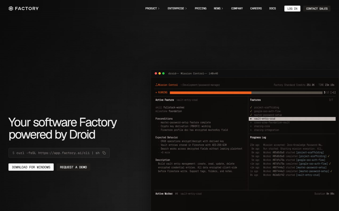
Factory.ai is a near-black, terminal-native developer interface for an AI software-engineering agent the brand calls "Droid." The page floor is `{colors.canvas}` (#020202) — a true near-black, not a soft charcoal — with light `{colors.ink}` (#eeeeee) text. The system is almost entirely monochrome; the only chromatic voltage is a single hot orange (`{colors.accent}` — #ef6f2e) used on the live progress bar, the "RUNNING" status dot, and active-state highlights.
The defining move is that **the product is the hero artifact**. Rather than illustrate the agent, Factory drops a live terminal-style "Mission Control" card directly into the hero — complete with macOS traffic-light dots, a feature checklist, a progress log streaming worker events, and an orange progress bar at "3/13." The marketing surface is, quite literally, a screenshot of the CLI doing work.
Type voice splits into two roles: **Geist** for display headlines (large, weight 400, heavily negative letter-spacing down to -2.88px) and **Geist Mono** for nearly everything else — nav links, body copy, the install command, and all the terminal chrome. The mono-everywhere choice is the brand's signature: this is a tool built by engineers for engineers, and the UI wears that on its sleeve.
**Key Characteristics:**
- Near-black canvas (`{colors.canvas}` — #020202) with light ink (`{colors.ink}` — #eeeeee). The entire site is dark — there is no light mode in the captured pages.
- A single hot-orange accent (`{colors.accent}` — #ef6f2e, with a deeper `{colors.accent-deep}` — #ee6018) driving the progress bar and active/running states. Color is scarce and load-bearing.
- Geist for display, Geist Mono for UI and body — both open-source Vercel typefaces, shipped as measured. Display headlines run weight 400 with aggressive negative tracking.
- Zero-radius buttons (`{rounded.none}`) with tall 24px vertical padding — squared CLI-tool aesthetic rather than soft consumer pills.
- The hero "Mission Control" terminal card (`{component.terminal-card}`) sits on `{colors.surface-deep}` (#0a0908) with a 6px radius and a single soft glow shadow — the marquee component.
- Spacing rhythm is dominated by `{spacing.lg}` (24px) — by far the most-measured value (freq 75) — with `{spacing.section}` (80px) reserved for the largest band gaps.
- A muted, grayscale logo cloud ("Trusted by leading engineering teams") sits below the hero, logos rendered in low-contrast `{colors.muted}`.
## Colors
### Accent
- **Accent** (`{colors.accent}` — #ef6f2e): The single brand accent. Drives the hero progress bar, the "RUNNING" status dot, and the brand snowflake glyph. Used sparingly and deliberately.
- **Accent Deep** (`{colors.accent-deep}` — #ee6018): A slightly deeper orange used on the progress-bar fill / hotter portions of the gradient.
- **Accent Blue** (`{colors.accent-blue}` — #7db5e8): A cool blue measured at low frequency — appears in syntax-highlight fragments inside the terminal card. Secondary, never on CTAs.
### Surface
- **Canvas** (`{colors.canvas}` — #020202): The default page floor — a true near-black.
- **Canvas Soft** (`{colors.canvas-soft}` — #101010): A marginally lighter black used for large background sections.
- **Surface** (`{colors.surface}` — #1f1d1c): The first elevation step — terminal title bar, install-command box, content cards.
- **Surface Elevated** (`{colors.surface-elevated}` — #2e2c2b): A second elevation step for nested panels and active row highlights inside the terminal.
- **Surface Deep** (`{colors.surface-deep}` — #0a0908): The terminal card body — slightly off the pure canvas so the card reads as a distinct panel.
- **Hairline** (`{colors.hairline}` — #3d3a39): The 1px divider tone separating terminal columns and panel edges.
- **Neutral Warm** (`{colors.neutral-warm}` — #4d4947): The most-frequent neutral — the unfilled track of the progress bar and warm-gray UI furniture.
### Text
- **Ink** (`{colors.ink}` — #eeeeee): Headlines and primary text.
- **Body** (`{colors.body}` — #8a8380): Default running-text / secondary terminal text — a warm mid-gray.
- **Muted** (`{colors.muted}` — #908a86): Tertiary text, logo-cloud marks.
- **Muted Cool** (`{colors.muted-cool}` — #858b97): A cooler gray used for timestamps / metadata in the progress log.
- **Slate** (`{colors.slate}` — #62666d): A cool slate for the faintest log lines.
- **White / Off-white / Cream** (`{colors.white}` — #ffffff, `{colors.off-white}` — #fafafa, `{colors.cream}` — #f0eee8): The brightest tones — used on solid buttons and the highest-contrast labels.
### Terminal Chrome
- **Terminal Red** (`{colors.terminal-red}` — #ff5f57) and **Terminal Yellow** (`{colors.terminal-yellow}` — #febc2e): The macOS window traffic-light dots in the terminal card's title bar. These are decorative window chrome, not semantic status colors.
## Typography
### Font Family
The system runs **Geist** for display headlines and **Geist Mono** for body, navigation, and all terminal chrome. Both are open-source typefaces (Vercel's Geist family), so they ship exactly as measured — no licensed-font substitution is required. The mono fallback stack walks `ui-monospace, monospace`; the sans stack falls back to `sans-serif`.
The split is unusually mono-heavy:
- Geist (display, weight 400, heavy negative tracking) — h1, h2
- Geist Mono (weight 400) — body text, nav links, install command, terminal log, metadata
### Hierarchy
| Token | Size | Weight | Line Height | Letter Spacing | Use |
|---|---|---|---|---|---|
| `{typography.display}` | 51.84px | 400 | 1.0 | -2.88px | Hero h1 ("Your software Factory powered by Droid") — Geist |
| `{typography.heading}` | 36px | 400 | 1.1 | -1.12px | Section heads — Geist |
| `{typography.mono-body}` | 12px | 400 | 1.0 | -0.24px | Body text, nav links, terminal log, metadata — Geist Mono |
| `{typography.button}` | 16px | 400 | 1.5 | normal | Button labels — Geist |
### Principles
Weight stays at 400 across every role — the system never bolds. Hierarchy is built from size and the aggressive negative letter-spacing on display sizes (-2.88px on h1, -1.12px on h2), which tightens the large Geist headlines into a dense, engineered block. Geist Mono at 12px is the workhorse — it carries nav, body, and the entire terminal interior, reinforcing the CLI identity.
### Note on Font Substitutes
None required — Geist and Geist Mono are open-source and ship directly. If unavailable, **Inter** (for Geist) and **JetBrains Mono** or **IBM Plex Mono** (for Geist Mono) are acceptable approximations that preserve the geometric-sans / clean-monospace pairing.
## Layout
### Spacing System
- **Base unit:** 4px.
- **Tokens:** `{spacing.xxs}` 4px · `{spacing.xs}` 8px · `{spacing.sm}` 12px · `{spacing.md}` 16px · `{spacing.lg}` 24px · `{spacing.xl}` 36px · `{spacing.xxl}` 48px · `{spacing.huge}` 64px · `{spacing.section}` 80px.
- **Dominant rhythm:** `{spacing.lg}` (24px) is overwhelmingly the most-measured value (frequency 75) — it governs card padding, terminal-column gutters, and most inter-element gaps.
- **Section padding:** `{spacing.section}` (80px) for the largest band separations; `{spacing.huge}` (64px) as a secondary large step.
### Grid & Container
- **Hero band:** Two-zone split — left zone carries the h1, install command, and the CTA row; right zone holds the wide `{component.terminal-card}` "Mission Control" panel.
- **Terminal interior:** itself a two-column grid — left column "Active Feature" detail (preconditions, expected behavior, description), right column "Features" checklist + "Progress Log."
- **Logo cloud:** a single horizontal row of grayscale partner logos below the hero.
### Whitespace Philosophy
The hero is deliberately top-heavy and asymmetric: the headline sits low-left while the terminal dominates the right. The dark canvas does most of the spatial work — generous negative space around a single dense product artifact. Inside the terminal, by contrast, density is the point: tightly packed monospace rows mimic a real CLI session.
## Elevation & Depth
| Level | Treatment | Use |
|---|---|---|
| Flat | No shadow, no border, on `{colors.canvas}` | Hero text, nav, logo cloud |
| Panel | `{colors.surface}` / `{colors.surface-deep}` fill, no shadow | Install command box, content cards |
| Glow | `rgba(0,0,0,0.8) 0px 0px 80px -20px` | The terminal "Mission Control" card — a single soft dark glow that lifts it off the canvas |
| Active row | `{colors.surface-elevated}` fill | Selected feature row inside the terminal checklist |
The only measured shadow is a wide, soft, dark glow (`0px 0px 80px -20px` at 0.8 alpha) applied to the marquee terminal card. Everything else relies on near-black-on-near-black surface stepping (`{colors.canvas}` → `{colors.surface-deep}` → `{colors.surface}` → `{colors.surface-elevated}`) rather than shadow to express depth.
### Decorative Depth
- The terminal card carries its own internal chrome — traffic-light dots, a title bar in `{colors.surface}`, and column dividers in `{colors.hairline}` — which read as product depth rather than system elevation.
- The orange progress bar provides the single moment of saturated color against the otherwise grayscale depth stack.
## Shapes
### Border Radius Scale
| Token | Value | Use |
|---|---|---|
| `{rounded.none}` | 0px | Buttons — squared CLI-tool silhouette |
| `{rounded.xs}` | 3px | Most-common small radius — install command box, inline chips (frequency 8) |
| `{rounded.sm}` | 6px | The terminal card and content cards |
| `{rounded.md}` | 8px | Occasional larger panel |
| `{rounded.lg}` | 10px | Rare larger container |
| `{rounded.xl}` | 12px | Largest measured radius — rare |
The radius language is tight: buttons are fully squared (0px), small UI furniture uses 3px, and cards use 6px. Nothing approaches a pill or fully-rounded form. The squared geometry reinforces the terminal/tooling identity.
### Photography Geometry
The captured pages carry no photography — the only imagery is the synthetic terminal UI and grayscale partner logos. The terminal card uses a 6px-radius rectangular frame.
## Components
### Navigation
**`top-nav`** — Transparent over the `{colors.canvas}` hero. Left holds the `{component.logo-wordmark}` (snowflake glyph + "FACTORY"). Center holds mono nav links (PRODUCT, ENTERPRISE, PRICING, NEWS, COMPANY, CAREERS, DOCS) in `{typography.mono-body}`, `{colors.ink}`. Right holds a "LOG IN" `{component.button-solid}` and a "CONTACT SALES" `{component.button-outline}`.
**`logo-wordmark`** — The snowflake mark plus "FACTORY" in uppercase mono, `{colors.ink}`.
**`nav-link`** — Transparent background, `{colors.ink}` text, `{typography.mono-body}`. Several carry a small "›" disclosure chevron.
### Buttons
**`button-primary`** — Measured directly: transparent background, `{colors.ink}` text, `{typography.button}` (Geist 16px / 400), `{rounded.none}` (0px), padding 24px × 0px. The vertical-only padding measurement reflects a full-width / wrapper-driven layout.
**`button-solid`** — The white CTA seen on "LOG IN" and "DOWNLOAD FOR WINDOWS." Background `{colors.white}`, text `{colors.canvas}` (derived — the dark text color on the white fill was read from the screenshot, not from the measured `color` property). `{rounded.none}`, `{typography.button}`.
**`button-outline`** — The "REQUEST A DEMO" / "CONTACT SALES" treatment. Transparent background with a hairline border, `{colors.ink}` text, `{rounded.none}`, `{typography.button}`.
### Hero & Terminal
**`hero-band`** — `{colors.canvas}` background, `{typography.display}` headline in `{colors.ink}`, section padding `{spacing.section}` (80px). Asymmetric two-zone layout with headline + CTAs left, terminal right.
**`install-command`** — The `$ curl -fsSL https://app.factory.ai/cli | sh` box. Background `{colors.surface}`, mono text in `{colors.ink}`, `{rounded.xs}` (3px), padding `{spacing.md}` (16px), with a copy icon at the right edge.
**`terminal-card`** — The marquee "Mission Control" panel. Background `{colors.surface-deep}` (#0a0908), `{typography.mono-body}` interior, `{rounded.sm}` (6px), padding `{spacing.lg}` (24px), and the single glow shadow. Contains a two-column body: "Active Feature" detail on the left, "Features" checklist + "Progress Log" on the right.
**`terminal-titlebar`** — The window chrome strip at the top of the terminal card. Background `{colors.surface}`, label text in `{colors.muted}` ("droid— Mission Control— 140x46"), with `{colors.terminal-red}` / `{colors.terminal-yellow}` / green traffic-light dots at the left.
**`progress-bar`** — The "RUNNING 3/13" bar. Track in `{colors.neutral-warm}` (#4d4947), fill in `{colors.accent}` (#ef6f2e), `{rounded.none}`. The single most saturated element on the page.
### Cards & Sections
**`card`** — Generic content card. Background `{colors.surface}`, `{rounded.sm}` (6px), no shadow, padding `{spacing.lg}` (24px), text `{colors.ink}`.
**`logo-cloud`** — The "Trusted by leading engineering teams" row. Background `{colors.canvas}`, partner logos rendered in low-contrast `{colors.muted}`, label in `{typography.mono-body}`, padding `{spacing.xl}` (36px).
## Do's and Don'ts
### Do
- Keep the canvas near-black (`{colors.canvas}` — #020202) and text light (`{colors.ink}` — #eeeeee). The whole system is dark.
- Reserve `{colors.accent}` (orange) for status and progress — the running bar, the live dot. It is the only saturated color and it must stay scarce.
- Use Geist Mono for nav, body, and all terminal chrome. The mono-everywhere choice is the brand identity.
- Apply heavy negative letter-spacing on display headlines (-2.88px on h1) — the tight Geist block is the headline voice.
- Keep buttons squared (`{rounded.none}`). The zero-radius silhouette signals CLI tooling.
- Show the actual product as a live terminal card rather than illustrating it. The `{component.terminal-card}` is the hero, not decoration.
- Build depth from surface stepping (`{colors.surface-deep}` → `{colors.surface}` → `{colors.surface-elevated}`) rather than shadows.
### Don't
- Don't introduce a second saturated accent on CTAs — the blue (`{colors.accent-blue}`) belongs inside terminal syntax, not on buttons.
- Don't bold type — every role is weight 400. Build hierarchy from size and tracking.
- Don't round buttons. Pills read as consumer SaaS and break the tooling identity.
- Don't add shadows to ordinary cards — only the marquee terminal card carries the glow.
- Don't lighten the canvas toward charcoal; the true near-black (#020202) is part of the voltage.
- Don't add hover-state documentation here — default and active/pressed only.
## Responsive Behavior
The full-page mobile screenshot shows the same dark hero scaled down: the wordmark + condensed nav stay at top, the headline ("Your software Factory powered by Droid") sits left, the `{component.terminal-card}` shrinks but retains its full interior, and the grayscale logo cloud sits below. Beyond this, no breakpoint system, container max-width, or column-collapse rules were measured.
### Touch Targets
- Button padding is measured at 24px vertical — generous enough to clear comfortable tap heights — but horizontal padding and exact button dimensions were not captured.
- Nav-link tap areas were not measured.
### Collapsing Strategy
- The terminal card scales proportionally rather than restructuring; its dense mono interior remains legible-as-artifact even when shrunk on mobile.
- The hero's two-zone layout appears to stack (text above, terminal below) on narrow viewports, though exact breakpoints are not in the measured data.
## Iteration Guide
1. Focus on ONE component at a time. Reference its YAML key directly (`{component.terminal-card}`, `{component.button-solid}`).
2. Variants of an existing component live as separate entries in `components:`.
3. Use `{token.refs}` everywhere — never inline hex.
4. Never document hover. Default and Active/Pressed states only.
5. Keep type at weight 400 with size + tracking driving hierarchy. The Geist / Geist Mono split does not blur.
6. Orange is scarce and load-bearing — reach for surface stepping before reaching for color.
7. When adding surfaces, step through the measured grayscale ladder rather than inventing new grays.
## Known Gaps
- Only the landing hero was richly captured; the `pricing` and `product-desktop` pages were listed but yielded no distinct measured tokens — pricing tables, feature grids, and footer are undocumented.
- `button-solid` text color (`{colors.canvas}` on white) is **derived** from the screenshot; the measured `color` property on `button-primary` was `#eeeeee`, indicating the captured selector was the dark/light-text button variant, not the white CTA.
- Button horizontal padding, exact heights, and nav-bar height were not measured.
- No footer was captured in the analysis data despite a long-scroll mobile screenshot.
- The green traffic-light dot in the terminal title bar is visible in screenshots but was not captured as a hex value in the palette.
- Animation and transition timings (the streaming progress log, the advancing orange progress bar) are out of scope.
- Responsive breakpoints, container max-widths, and grid column counts were not measured — responsive notes are inferred from the two screenshots only.
- Form/input states, focus rings, and validation styling were not captured.
<!-- Documented by duply · real-world design systems as ready-to-use DESIGN.md for AI coding agents · https://duply.ai/factory/design-md -->
Color Palette
Accent
Neutrals
Typography
display51.84px · 400 · 1
The quick brown fox jumpsheading36px · 400 · 1.1
The quick brown fox jumpsmono-body12px · 400 · 1
The quick brown fox jumpsbutton16px · 400 · 1.5
The quick brown fox jumpsSpacing & Shape
Spacing
| Name | Value | Preview |
|---|---|---|
| xxs | 4px | |
| xs | 8px | |
| sm | 12px | |
| md | 16px | |
| lg | 24px | |
| xl | 36px | |
| xxl | 48px | |
| huge | 64px | |
| section | 80px |
Border Radius
| Name | Value | Preview |
|---|---|---|
| none | 0px | |
| xs | 3px | |
| sm | 6px | |
| md | 8px | |
| lg | 10px | |
| xl | 12px |
More like this


---
version: alpha
name: Factory.ai-design-analysis
description: A near-black, terminal-native developer interface for an AI software-engineering agent ("Droid"). The system is almost entirely monochrome — a #020202 canvas with light #eeeeee ink — punctured by a single hot-orange accent (#ef6f2e) that drives progress bars and active states. The brand voltage comes not from color but from the product itself shown as a live terminal "Mission Control" card embedded in the hero, Geist for display headlines paired with Geist Mono for nearly all UI text, and squared-off zero-radius buttons that read as CLI tooling rather than consumer SaaS.

colors:
  accent: "#ef6f2e"
  accent-deep: "#ee6018"
  accent-blue: "#7db5e8"
  ink: "#eeeeee"
  canvas: "#020202"
  canvas-soft: "#101010"
  surface: "#1f1d1c"
  surface-elevated: "#2e2c2b"
  surface-deep: "#0a0908"
  hairline: "#3d3a39"
  neutral-warm: "#4d4947"
  body: "#8a8380"
  muted: "#908a86"
  muted-cool: "#858b97"
  slate: "#62666d"
  white: "#ffffff"
  off-white: "#fafafa"
  cream: "#f0eee8"
  terminal-red: "#ff5f57"
  terminal-yellow: "#febc2e"

typography:
  display:
    fontFamily: "Geist, sans-serif"
    fontSize: 51.84px
    fontWeight: 400
    lineHeight: 1.0
    letterSpacing: -2.88px
  heading:
    fontFamily: "Geist, sans-serif"
    fontSize: 36px
    fontWeight: 400
    lineHeight: 1.1
    letterSpacing: -1.12px
  mono-body:
    fontFamily: "Geist Mono, ui-monospace, monospace"
    fontSize: 12px
    fontWeight: 400
    lineHeight: 1.0
    letterSpacing: -0.24px
  button:
    fontFamily: "Geist, sans-serif"
    fontSize: 16px
    fontWeight: 400
    lineHeight: 1.5
    letterSpacing: normal

rounded:
  none: 0px
  xs: 3px
  sm: 6px
  md: 8px
  lg: 10px
  xl: 12px

spacing:
  xxs: 4px
  xs: 8px
  sm: 12px
  md: 16px
  lg: 24px
  xl: 36px
  xxl: 48px
  huge: 64px
  section: 80px

components:
  top-nav:
    backgroundColor: "{colors.canvas}"
    textColor: "{colors.ink}"
    typography: "{typography.mono-body}"
  logo-wordmark:
    backgroundColor: transparent
    textColor: "{colors.ink}"
    typography: "{typography.mono-body}"
  nav-link:
    backgroundColor: transparent
    textColor: "{colors.ink}"
    typography: "{typography.mono-body}"
  button-primary:
    backgroundColor: transparent
    textColor: "{colors.ink}"
    typography: "{typography.button}"
    rounded: "{rounded.none}"
    padding: 24px 0px
  button-solid:
    backgroundColor: "{colors.white}"
    textColor: "{colors.canvas}"
    typography: "{typography.button}"
    rounded: "{rounded.none}"
    padding: 24px 0px
  button-outline:
    backgroundColor: transparent
    textColor: "{colors.ink}"
    typography: "{typography.button}"
    rounded: "{rounded.none}"
    padding: 24px 0px
  install-command:
    backgroundColor: "{colors.surface}"
    textColor: "{colors.ink}"
    typography: "{typography.mono-body}"
    rounded: "{rounded.xs}"
    padding: 16px
  hero-band:
    backgroundColor: "{colors.canvas}"
    textColor: "{colors.ink}"
    typography: "{typography.display}"
    padding: 80px
  terminal-card:
    backgroundColor: "{colors.surface-deep}"
    textColor: "{colors.ink}"
    typography: "{typography.mono-body}"
    rounded: "{rounded.sm}"
    padding: 24px
  terminal-titlebar:
    backgroundColor: "{colors.surface}"
    textColor: "{colors.muted}"
    typography: "{typography.mono-body}"
  progress-bar:
    backgroundColor: "{colors.neutral-warm}"
    textColor: "{colors.accent}"
    rounded: "{rounded.none}"
  card:
    backgroundColor: "{colors.surface}"
    textColor: "{colors.ink}"
    rounded: "{rounded.sm}"
    padding: 24px
  logo-cloud:
    backgroundColor: "{colors.canvas}"
    textColor: "{colors.muted}"
    typography: "{typography.mono-body}"
    padding: 36px

---

## Overview

Factory.ai is a near-black, terminal-native developer interface for an AI software-engineering agent the brand calls "Droid." The page floor is `{colors.canvas}` (#020202) — a true near-black, not a soft charcoal — with light `{colors.ink}` (#eeeeee) text. The system is almost entirely monochrome; the only chromatic voltage is a single hot orange (`{colors.accent}` — #ef6f2e) used on the live progress bar, the "RUNNING" status dot, and active-state highlights.

The defining move is that **the product is the hero artifact**. Rather than illustrate the agent, Factory drops a live terminal-style "Mission Control" card directly into the hero — complete with macOS traffic-light dots, a feature checklist, a progress log streaming worker events, and an orange progress bar at "3/13." The marketing surface is, quite literally, a screenshot of the CLI doing work.

Type voice splits into two roles: **Geist** for display headlines (large, weight 400, heavily negative letter-spacing down to -2.88px) and **Geist Mono** for nearly everything else — nav links, body copy, the install command, and all the terminal chrome. The mono-everywhere choice is the brand's signature: this is a tool built by engineers for engineers, and the UI wears that on its sleeve.

**Key Characteristics:**
- Near-black canvas (`{colors.canvas}` — #020202) with light ink (`{colors.ink}` — #eeeeee). The entire site is dark — there is no light mode in the captured pages.
- A single hot-orange accent (`{colors.accent}` — #ef6f2e, with a deeper `{colors.accent-deep}` — #ee6018) driving the progress bar and active/running states. Color is scarce and load-bearing.
- Geist for display, Geist Mono for UI and body — both open-source Vercel typefaces, shipped as measured. Display headlines run weight 400 with aggressive negative tracking.
- Zero-radius buttons (`{rounded.none}`) with tall 24px vertical padding — squared CLI-tool aesthetic rather than soft consumer pills.
- The hero "Mission Control" terminal card (`{component.terminal-card}`) sits on `{colors.surface-deep}` (#0a0908) with a 6px radius and a single soft glow shadow — the marquee component.
- Spacing rhythm is dominated by `{spacing.lg}` (24px) — by far the most-measured value (freq 75) — with `{spacing.section}` (80px) reserved for the largest band gaps.
- A muted, grayscale logo cloud ("Trusted by leading engineering teams") sits below the hero, logos rendered in low-contrast `{colors.muted}`.

## Colors

### Accent
- **Accent** (`{colors.accent}` — #ef6f2e): The single brand accent. Drives the hero progress bar, the "RUNNING" status dot, and the brand snowflake glyph. Used sparingly and deliberately.
- **Accent Deep** (`{colors.accent-deep}` — #ee6018): A slightly deeper orange used on the progress-bar fill / hotter portions of the gradient.
- **Accent Blue** (`{colors.accent-blue}` — #7db5e8): A cool blue measured at low frequency — appears in syntax-highlight fragments inside the terminal card. Secondary, never on CTAs.

### Surface
- **Canvas** (`{colors.canvas}` — #020202): The default page floor — a true near-black.
- **Canvas Soft** (`{colors.canvas-soft}` — #101010): A marginally lighter black used for large background sections.
- **Surface** (`{colors.surface}` — #1f1d1c): The first elevation step — terminal title bar, install-command box, content cards.
- **Surface Elevated** (`{colors.surface-elevated}` — #2e2c2b): A second elevation step for nested panels and active row highlights inside the terminal.
- **Surface Deep** (`{colors.surface-deep}` — #0a0908): The terminal card body — slightly off the pure canvas so the card reads as a distinct panel.
- **Hairline** (`{colors.hairline}` — #3d3a39): The 1px divider tone separating terminal columns and panel edges.
- **Neutral Warm** (`{colors.neutral-warm}` — #4d4947): The most-frequent neutral — the unfilled track of the progress bar and warm-gray UI furniture.

### Text
- **Ink** (`{colors.ink}` — #eeeeee): Headlines and primary text.
- **Body** (`{colors.body}` — #8a8380): Default running-text / secondary terminal text — a warm mid-gray.
- **Muted** (`{colors.muted}` — #908a86): Tertiary text, logo-cloud marks.
- **Muted Cool** (`{colors.muted-cool}` — #858b97): A cooler gray used for timestamps / metadata in the progress log.
- **Slate** (`{colors.slate}` — #62666d): A cool slate for the faintest log lines.
- **White / Off-white / Cream** (`{colors.white}` — #ffffff, `{colors.off-white}` — #fafafa, `{colors.cream}` — #f0eee8): The brightest tones — used on solid buttons and the highest-contrast labels.

### Terminal Chrome
- **Terminal Red** (`{colors.terminal-red}` — #ff5f57) and **Terminal Yellow** (`{colors.terminal-yellow}` — #febc2e): The macOS window traffic-light dots in the terminal card's title bar. These are decorative window chrome, not semantic status colors.

## Typography

### Font Family
The system runs **Geist** for display headlines and **Geist Mono** for body, navigation, and all terminal chrome. Both are open-source typefaces (Vercel's Geist family), so they ship exactly as measured — no licensed-font substitution is required. The mono fallback stack walks `ui-monospace, monospace`; the sans stack falls back to `sans-serif`.

The split is unusually mono-heavy:
- Geist (display, weight 400, heavy negative tracking) — h1, h2
- Geist Mono (weight 400) — body text, nav links, install command, terminal log, metadata

### Hierarchy

| Token | Size | Weight | Line Height | Letter Spacing | Use |
|---|---|---|---|---|---|
| `{typography.display}` | 51.84px | 400 | 1.0 | -2.88px | Hero h1 ("Your software Factory powered by Droid") — Geist |
| `{typography.heading}` | 36px | 400 | 1.1 | -1.12px | Section heads — Geist |
| `{typography.mono-body}` | 12px | 400 | 1.0 | -0.24px | Body text, nav links, terminal log, metadata — Geist Mono |
| `{typography.button}` | 16px | 400 | 1.5 | normal | Button labels — Geist |

### Principles
Weight stays at 400 across every role — the system never bolds. Hierarchy is built from size and the aggressive negative letter-spacing on display sizes (-2.88px on h1, -1.12px on h2), which tightens the large Geist headlines into a dense, engineered block. Geist Mono at 12px is the workhorse — it carries nav, body, and the entire terminal interior, reinforcing the CLI identity.

### Note on Font Substitutes
None required — Geist and Geist Mono are open-source and ship directly. If unavailable, **Inter** (for Geist) and **JetBrains Mono** or **IBM Plex Mono** (for Geist Mono) are acceptable approximations that preserve the geometric-sans / clean-monospace pairing.

## Layout

### Spacing System
- **Base unit:** 4px.
- **Tokens:** `{spacing.xxs}` 4px · `{spacing.xs}` 8px · `{spacing.sm}` 12px · `{spacing.md}` 16px · `{spacing.lg}` 24px · `{spacing.xl}` 36px · `{spacing.xxl}` 48px · `{spacing.huge}` 64px · `{spacing.section}` 80px.
- **Dominant rhythm:** `{spacing.lg}` (24px) is overwhelmingly the most-measured value (frequency 75) — it governs card padding, terminal-column gutters, and most inter-element gaps.
- **Section padding:** `{spacing.section}` (80px) for the largest band separations; `{spacing.huge}` (64px) as a secondary large step.

### Grid & Container
- **Hero band:** Two-zone split — left zone carries the h1, install command, and the CTA row; right zone holds the wide `{component.terminal-card}` "Mission Control" panel.
- **Terminal interior:** itself a two-column grid — left column "Active Feature" detail (preconditions, expected behavior, description), right column "Features" checklist + "Progress Log."
- **Logo cloud:** a single horizontal row of grayscale partner logos below the hero.

### Whitespace Philosophy
The hero is deliberately top-heavy and asymmetric: the headline sits low-left while the terminal dominates the right. The dark canvas does most of the spatial work — generous negative space around a single dense product artifact. Inside the terminal, by contrast, density is the point: tightly packed monospace rows mimic a real CLI session.

## Elevation & Depth

| Level | Treatment | Use |
|---|---|---|
| Flat | No shadow, no border, on `{colors.canvas}` | Hero text, nav, logo cloud |
| Panel | `{colors.surface}` / `{colors.surface-deep}` fill, no shadow | Install command box, content cards |
| Glow | `rgba(0,0,0,0.8) 0px 0px 80px -20px` | The terminal "Mission Control" card — a single soft dark glow that lifts it off the canvas |
| Active row | `{colors.surface-elevated}` fill | Selected feature row inside the terminal checklist |

The only measured shadow is a wide, soft, dark glow (`0px 0px 80px -20px` at 0.8 alpha) applied to the marquee terminal card. Everything else relies on near-black-on-near-black surface stepping (`{colors.canvas}` → `{colors.surface-deep}` → `{colors.surface}` → `{colors.surface-elevated}`) rather than shadow to express depth.

### Decorative Depth
- The terminal card carries its own internal chrome — traffic-light dots, a title bar in `{colors.surface}`, and column dividers in `{colors.hairline}` — which read as product depth rather than system elevation.
- The orange progress bar provides the single moment of saturated color against the otherwise grayscale depth stack.

## Shapes

### Border Radius Scale

| Token | Value | Use |
|---|---|---|
| `{rounded.none}` | 0px | Buttons — squared CLI-tool silhouette |
| `{rounded.xs}` | 3px | Most-common small radius — install command box, inline chips (frequency 8) |
| `{rounded.sm}` | 6px | The terminal card and content cards |
| `{rounded.md}` | 8px | Occasional larger panel |
| `{rounded.lg}` | 10px | Rare larger container |
| `{rounded.xl}` | 12px | Largest measured radius — rare |

The radius language is tight: buttons are fully squared (0px), small UI furniture uses 3px, and cards use 6px. Nothing approaches a pill or fully-rounded form. The squared geometry reinforces the terminal/tooling identity.

### Photography Geometry
The captured pages carry no photography — the only imagery is the synthetic terminal UI and grayscale partner logos. The terminal card uses a 6px-radius rectangular frame.

## Components

### Navigation

**`top-nav`** — Transparent over the `{colors.canvas}` hero. Left holds the `{component.logo-wordmark}` (snowflake glyph + "FACTORY"). Center holds mono nav links (PRODUCT, ENTERPRISE, PRICING, NEWS, COMPANY, CAREERS, DOCS) in `{typography.mono-body}`, `{colors.ink}`. Right holds a "LOG IN" `{component.button-solid}` and a "CONTACT SALES" `{component.button-outline}`.

**`logo-wordmark`** — The snowflake mark plus "FACTORY" in uppercase mono, `{colors.ink}`.

**`nav-link`** — Transparent background, `{colors.ink}` text, `{typography.mono-body}`. Several carry a small "›" disclosure chevron.

### Buttons

**`button-primary`** — Measured directly: transparent background, `{colors.ink}` text, `{typography.button}` (Geist 16px / 400), `{rounded.none}` (0px), padding 24px × 0px. The vertical-only padding measurement reflects a full-width / wrapper-driven layout.

**`button-solid`** — The white CTA seen on "LOG IN" and "DOWNLOAD FOR WINDOWS." Background `{colors.white}`, text `{colors.canvas}` (derived — the dark text color on the white fill was read from the screenshot, not from the measured `color` property). `{rounded.none}`, `{typography.button}`.

**`button-outline`** — The "REQUEST A DEMO" / "CONTACT SALES" treatment. Transparent background with a hairline border, `{colors.ink}` text, `{rounded.none}`, `{typography.button}`.

### Hero & Terminal

**`hero-band`** — `{colors.canvas}` background, `{typography.display}` headline in `{colors.ink}`, section padding `{spacing.section}` (80px). Asymmetric two-zone layout with headline + CTAs left, terminal right.

**`install-command`** — The `$ curl -fsSL https://app.factory.ai/cli | sh` box. Background `{colors.surface}`, mono text in `{colors.ink}`, `{rounded.xs}` (3px), padding `{spacing.md}` (16px), with a copy icon at the right edge.

**`terminal-card`** — The marquee "Mission Control" panel. Background `{colors.surface-deep}` (#0a0908), `{typography.mono-body}` interior, `{rounded.sm}` (6px), padding `{spacing.lg}` (24px), and the single glow shadow. Contains a two-column body: "Active Feature" detail on the left, "Features" checklist + "Progress Log" on the right.

**`terminal-titlebar`** — The window chrome strip at the top of the terminal card. Background `{colors.surface}`, label text in `{colors.muted}` ("droid— Mission Control— 140x46"), with `{colors.terminal-red}` / `{colors.terminal-yellow}` / green traffic-light dots at the left.

**`progress-bar`** — The "RUNNING 3/13" bar. Track in `{colors.neutral-warm}` (#4d4947), fill in `{colors.accent}` (#ef6f2e), `{rounded.none}`. The single most saturated element on the page.

### Cards & Sections

**`card`** — Generic content card. Background `{colors.surface}`, `{rounded.sm}` (6px), no shadow, padding `{spacing.lg}` (24px), text `{colors.ink}`.

**`logo-cloud`** — The "Trusted by leading engineering teams" row. Background `{colors.canvas}`, partner logos rendered in low-contrast `{colors.muted}`, label in `{typography.mono-body}`, padding `{spacing.xl}` (36px).

## Do's and Don'ts

### Do
- Keep the canvas near-black (`{colors.canvas}` — #020202) and text light (`{colors.ink}` — #eeeeee). The whole system is dark.
- Reserve `{colors.accent}` (orange) for status and progress — the running bar, the live dot. It is the only saturated color and it must stay scarce.
- Use Geist Mono for nav, body, and all terminal chrome. The mono-everywhere choice is the brand identity.
- Apply heavy negative letter-spacing on display headlines (-2.88px on h1) — the tight Geist block is the headline voice.
- Keep buttons squared (`{rounded.none}`). The zero-radius silhouette signals CLI tooling.
- Show the actual product as a live terminal card rather than illustrating it. The `{component.terminal-card}` is the hero, not decoration.
- Build depth from surface stepping (`{colors.surface-deep}` → `{colors.surface}` → `{colors.surface-elevated}`) rather than shadows.

### Don't
- Don't introduce a second saturated accent on CTAs — the blue (`{colors.accent-blue}`) belongs inside terminal syntax, not on buttons.
- Don't bold type — every role is weight 400. Build hierarchy from size and tracking.
- Don't round buttons. Pills read as consumer SaaS and break the tooling identity.
- Don't add shadows to ordinary cards — only the marquee terminal card carries the glow.
- Don't lighten the canvas toward charcoal; the true near-black (#020202) is part of the voltage.
- Don't add hover-state documentation here — default and active/pressed only.

## Responsive Behavior

The full-page mobile screenshot shows the same dark hero scaled down: the wordmark + condensed nav stay at top, the headline ("Your software Factory powered by Droid") sits left, the `{component.terminal-card}` shrinks but retains its full interior, and the grayscale logo cloud sits below. Beyond this, no breakpoint system, container max-width, or column-collapse rules were measured.

### Touch Targets
- Button padding is measured at 24px vertical — generous enough to clear comfortable tap heights — but horizontal padding and exact button dimensions were not captured.
- Nav-link tap areas were not measured.

### Collapsing Strategy
- The terminal card scales proportionally rather than restructuring; its dense mono interior remains legible-as-artifact even when shrunk on mobile.
- The hero's two-zone layout appears to stack (text above, terminal below) on narrow viewports, though exact breakpoints are not in the measured data.

## Iteration Guide

1. Focus on ONE component at a time. Reference its YAML key directly (`{component.terminal-card}`, `{component.button-solid}`).
2. Variants of an existing component live as separate entries in `components:`.
3. Use `{token.refs}` everywhere — never inline hex.
4. Never document hover. Default and Active/Pressed states only.
5. Keep type at weight 400 with size + tracking driving hierarchy. The Geist / Geist Mono split does not blur.
6. Orange is scarce and load-bearing — reach for surface stepping before reaching for color.
7. When adding surfaces, step through the measured grayscale ladder rather than inventing new grays.

## Known Gaps

- Only the landing hero was richly captured; the `pricing` and `product-desktop` pages were listed but yielded no distinct measured tokens — pricing tables, feature grids, and footer are undocumented.
- `button-solid` text color (`{colors.canvas}` on white) is **derived** from the screenshot; the measured `color` property on `button-primary` was `#eeeeee`, indicating the captured selector was the dark/light-text button variant, not the white CTA.
- Button horizontal padding, exact heights, and nav-bar height were not measured.
- No footer was captured in the analysis data despite a long-scroll mobile screenshot.
- The green traffic-light dot in the terminal title bar is visible in screenshots but was not captured as a hex value in the palette.
- Animation and transition timings (the streaming progress log, the advancing orange progress bar) are out of scope.
- Responsive breakpoints, container max-widths, and grid column counts were not measured — responsive notes are inferred from the two screenshots only.
- Form/input states, focus rings, and validation styling were not captured.

<!-- Documented by duply · real-world design systems as ready-to-use DESIGN.md for AI coding agents · https://duply.ai/factory/design-md -->