turbopuffer
A terminal-grade developer-infrastructure interface where everything is rendered in JetBrains Mono on a near-white canvas, anchored by a deep navy hero band and an orange "Sign up" CTA. The system reads like a typeset man-page: monospaced type at every level, hairline-ruled tables and panels, near-sharp corners (3px), and retro hard-offset bevel shadows that make buttons and quote cards feel like ASCII-boxed UI. Brand voltage comes from the monospace voice and the orange accent, not from chrome.
---
version: alpha
name: turbopuffer-design-analysis
description: "A terminal-grade developer-infrastructure interface where everything is rendered in JetBrains Mono on a near-white canvas, anchored by a deep navy hero band and an orange \"Sign up\" CTA. The system reads like a typeset man-page: monospaced type at every level, hairline-ruled tables and panels, near-sharp corners (3px), and retro hard-offset bevel shadows that make buttons and quote cards feel like ASCII-boxed UI. Brand voltage comes from the monospace voice and the orange accent, not from chrome."
colors:
ink: "#0f172a"
ink-deep: "#0f1729"
black: "#000000"
surface-dark: "#111827"
surface-dark-2: "#1f2937"
body: "#374151"
muted: "#4b5563"
muted-2: "#637083"
slate: "#64748b"
slate-soft: "#94a3b8"
neutral: "#6b7280"
neutral-soft: "#9ca3af"
canvas: "#f9fafc"
surface: "#ffffff"
surface-soft: "#f1f5f9"
hairline: "#e5e7eb"
hairline-strong: "#d1d5db"
hairline-soft: "#cbd5e1"
accent-orange: "#fdba74"
accent-mint: "#5dd7b9"
on-dark: "#ffffff"
typography:
display:
fontFamily: "JetBrains Mono, ui-monospace, monospace"
fontSize: 30px
fontWeight: 800
lineHeight: 1.2
letterSpacing: normal
heading:
fontFamily: "JetBrains Mono, ui-monospace, monospace"
fontSize: 18px
fontWeight: 600
lineHeight: 1.556
letterSpacing: normal
subhead:
fontFamily: "JetBrains Mono, ui-monospace, monospace"
fontSize: 16px
fontWeight: 400
lineHeight: 1.5
letterSpacing: normal
body:
fontFamily: "JetBrains Mono, ui-monospace, monospace"
fontSize: 16px
fontWeight: 400
lineHeight: 1.5
letterSpacing: normal
button:
fontFamily: "JetBrains Mono, ui-monospace, monospace"
fontSize: 14px
fontWeight: 400
lineHeight: 1.429
letterSpacing: normal
rounded:
none: 0px
xs: 3px
sm: 4px
full: 9999px
spacing:
xxs: 4px
xs2: 6px
xs: 8px
sm: 12px
md: 16px
ml: 20px
lg: 24px
xl: 32px
xxl: 48px
huge: 64px
components:
top-banner:
backgroundColor: "{colors.accent-orange}"
textColor: "{colors.ink}"
typography: "{typography.button}"
rounded: "{rounded.none}"
padding: 16px
top-nav:
backgroundColor: "{colors.ink}"
textColor: "{colors.on-dark}"
typography: "{typography.button}"
rounded: "{rounded.none}"
padding: 16px 24px
hero-band:
backgroundColor: "{colors.ink}"
textColor: "{colors.on-dark}"
typography: "{typography.display}"
rounded: "{rounded.none}"
padding: 48px
button-cta:
backgroundColor: "{colors.accent-orange}"
textColor: "{colors.ink}"
typography: "{typography.button}"
rounded: "{rounded.xs}"
padding: 8px 12px
button-primary:
backgroundColor: "{colors.surface}"
textColor: "{colors.ink}"
typography: "{typography.button}"
rounded: "{rounded.xs}"
padding: 8px 12px
button-text-link:
backgroundColor: transparent
textColor: "{colors.on-dark}"
typography: "{typography.button}"
rounded: "{rounded.none}"
logo-wall:
backgroundColor: "{colors.ink}"
textColor: "{colors.on-dark}"
typography: "{typography.heading}"
rounded: "{rounded.none}"
padding: 24px
cost-calculator-panel:
backgroundColor: "{colors.canvas}"
textColor: "{colors.ink}"
typography: "{typography.body}"
rounded: "{rounded.none}"
padding: 24px
perf-panel:
backgroundColor: "{colors.canvas}"
textColor: "{colors.ink}"
typography: "{typography.body}"
rounded: "{rounded.none}"
padding: 24px
card:
backgroundColor: "{colors.canvas}"
textColor: "{colors.ink}"
typography: "{typography.body}"
rounded: "{rounded.none}"
padding: 24px
testimonial-card:
backgroundColor: "{colors.surface}"
textColor: "{colors.body}"
typography: "{typography.body}"
rounded: "{rounded.none}"
padding: 24px
select-input:
backgroundColor: "{colors.surface}"
textColor: "{colors.ink}"
typography: "{typography.body}"
rounded: "{rounded.none}"
padding: 12px 16px
text-input:
backgroundColor: "{colors.surface}"
textColor: "{colors.ink}"
typography: "{typography.body}"
rounded: "{rounded.none}"
padding: 8px 12px
tab:
backgroundColor: transparent
textColor: "{colors.slate}"
typography: "{typography.button}"
rounded: "{rounded.none}"
padding: 8px 12px
tab-active:
backgroundColor: "{colors.surface-soft}"
textColor: "{colors.ink}"
typography: "{typography.button}"
rounded: "{rounded.none}"
padding: 8px 12px
limits-table:
backgroundColor: "{colors.surface}"
textColor: "{colors.ink}"
typography: "{typography.body}"
rounded: "{rounded.none}"
padding: 16px 24px
footer:
backgroundColor: "{colors.canvas}"
textColor: "{colors.body}"
typography: "{typography.body}"
rounded: "{rounded.none}"
padding: 48px
---
## Overview
turbopuffer's marketing surface is a terminal-grade developer-infrastructure interface — it reads like a typeset man-page rendered straight to the browser. **Every** text element is set in JetBrains Mono (the monospace is the entire brand voice), the page floor is a near-white `{colors.canvas}` (#f9fafc), the hero and logo-wall invert to a deep navy `{colors.ink}` (#0f172a), and the single hot accent is an orange `{colors.accent-orange}` (#fdba74) reserved for the "Sign up" CTA and the top announcement banner.
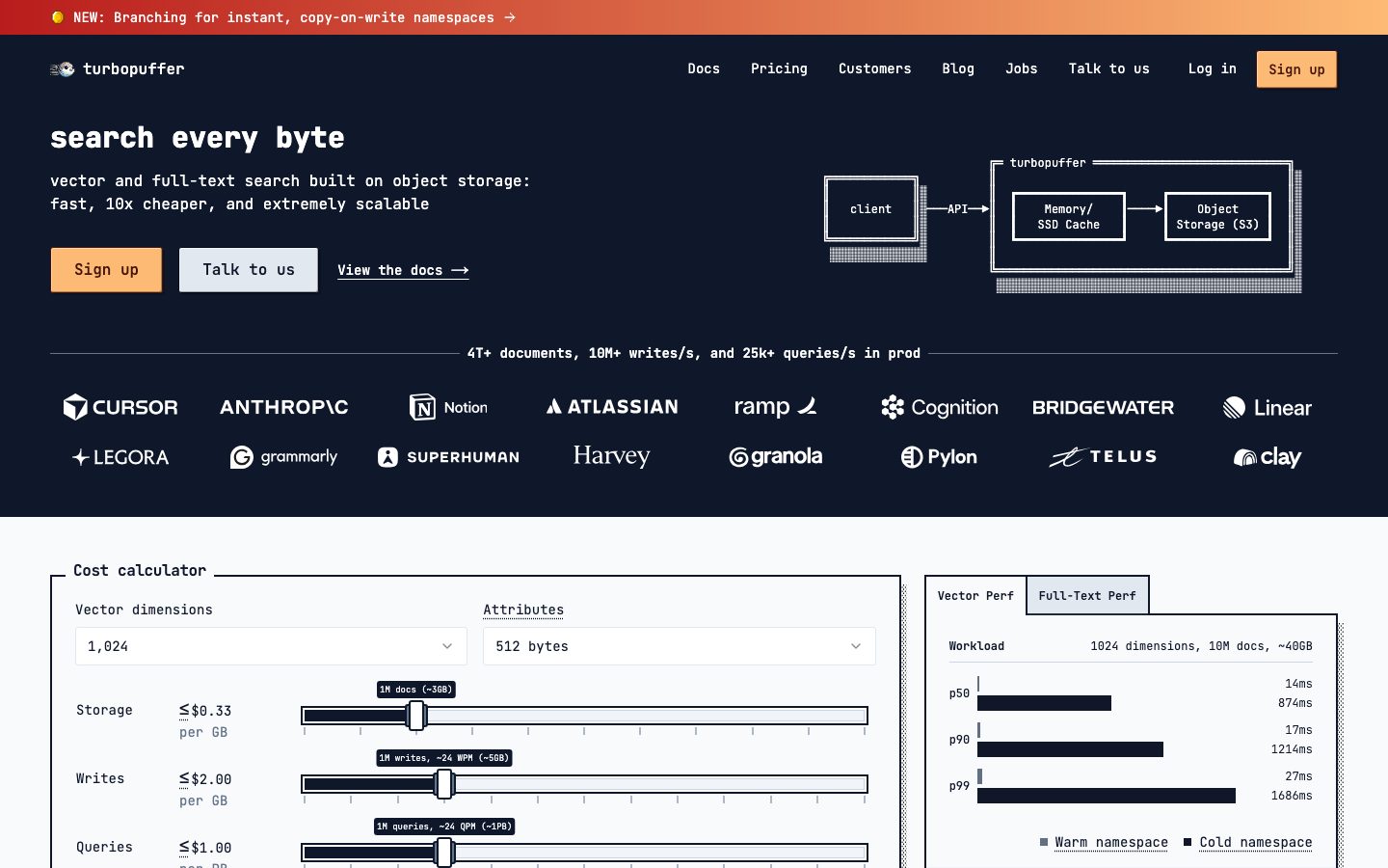
The structural language is **boxed UI**: hairline-ruled rectangular panels, a cost-calculator with monospaced sliders and tick marks, an ASCII-style architecture diagram (client → API → Memory/SSD Cache → Object Storage), and tables of production limits. Corners are nearly sharp — the system only ever rounds to `{rounded.xs}` (3px) on buttons and `{rounded.sm}` (4px) on a few controls; cards and inputs are dead-square `{rounded.none}` (0px).
Depth is the system's most distinctive trait: instead of soft modern drop shadows, panels and quote cards carry a **retro hard-offset bevel shadow** (a 1px white inset highlight, a 1px dark inset, and a 2px solid black-alpha offset) that makes elements feel like physical ASCII-boxed widgets. There is no blur, no gradient on surfaces, no glassmorphism — just rules, offsets, and monospace.
**Key Characteristics:**
- One typeface only: **JetBrains Mono** at four weights/sizes. No sans, no serif anywhere — the monospace IS the brand.
- Deep navy hero + logo-wall (`{colors.ink}` — #0f172a) bracketed by near-white body bands (`{colors.canvas}` — #f9fafc). The dark/light alternation gives the long page its rhythm.
- A single orange accent (`{colors.accent-orange}` — #fdba74) on the "Sign up" CTA and the top banner. Everything else is monochrome navy/slate/white.
- Near-sharp corners — `{rounded.xs}` (3px) on buttons, `{rounded.sm}` (4px) on a few controls, `{rounded.none}` (0px) on cards and inputs.
- Retro hard-offset bevel shadows on buttons and quote cards (derived: `rgba(255,255,255,0.4) 1px 1px inset, rgba(0,0,0,0.3) -1px -1px inset, rgba(0,0,0,0.2) 2px 2px`). The shadow is the chrome.
- Hairline-ruled panels and tables (`{colors.hairline}` — #e5e7eb) — the cost calculator and limits table are pure rule-and-cell layouts.
- A faint mint `{colors.accent-mint}` (#5dd7b9) appears rarely (logo / small accents) — it is not part of the action layer.
## Colors
### Brand & Accent
- **Accent Orange** (`{colors.accent-orange}` — #fdba74): The sole hot accent. The "Sign up" CTA and the top announcement banner gradient. Used nowhere on body copy — it marks the single highest-priority action.
- **Accent Mint** (`{colors.accent-mint}` — #5dd7b9): A cool teal that appears rarely (logo mark / tiny accents). Not part of the action or text system — treat as a brand flourish.
### Dark Surfaces (hero / nav / logo-wall)
- **Ink** (`{colors.ink}` — #0f172a): The dominant dark — hero band, top nav, logo-wall background, and the strongest body text on light surfaces.
- **Ink Deep** (`{colors.ink-deep}` — #0f1729): A near-twin of ink used in a few diagram strokes / deep fills.
- **Black** (`{colors.black}` — #000000): Used in diagram chrome, dense rule lines, and the offset bevel shadow.
- **Surface Dark / Surface Dark 2** (`{colors.surface-dark}` — #111827, `{colors.surface-dark-2}` — #1f2937): Nested dark fills inside the hero diagram and dark UI fragments.
### Light Surfaces
- **Canvas** (`{colors.canvas}` — #f9fafc): The default page floor and the panel/card fill.
- **Surface** (`{colors.surface}` — #ffffff): Inputs, primary (white) buttons, and the testimonial-card fill that sits above the calculator band.
- **Surface Soft** (`{colors.surface-soft}` — #f1f5f9): The active-tab fill ("Full-Text Perf" / "Vector Perf" toggle) and soft row striping.
- **Hairline** (`{colors.hairline}` — #e5e7eb): The 1px rule on panels, tables, and cell dividers.
- **Hairline Strong** (`{colors.hairline-strong}` — #d1d5db) / **Hairline Soft** (`{colors.hairline-soft}` — #cbd5e1): Slightly heavier and softer rule variants for slider tracks and tick marks.
### Text
- **Ink** (`{colors.ink}` — #0f172a): Headlines and primary text on light surfaces.
- **Body** (`{colors.body}` — #374151): Default running text in panels and tables.
- **Muted / Muted 2** (`{colors.muted}` — #4b5563, `{colors.muted-2}` — #637083): Secondary labels and captions.
- **Slate / Slate Soft** (`{colors.slate}` — #64748b, `{colors.slate-soft}` — #94a3b8): Inactive tab labels, axis labels, fine-print.
- **Neutral / Neutral Soft** (`{colors.neutral}` — #6b7280, `{colors.neutral-soft}` — #9ca3af): Tertiary gray text and disabled hints.
- **On Dark** (`{colors.on-dark}` — #ffffff): All text on the navy hero, nav, and logo-wall.
## Typography
### Font Family
The entire system runs on **JetBrains Mono** — a single open-source monospaced typeface used for headlines, body, navigation, buttons, tables, and labels alike. There is no secondary family. The measured stack reports the Next.js-hashed face `__JetBrains_Mono_3c557b`, which resolves to JetBrains Mono; the fallback stack walks `ui-monospace, monospace`. JetBrains Mono is freely licensed (no licensed/custom typeface flagged), so it ships as-is — no substitution required.
The monospace-only choice is the brand: turbopuffer wants to read like a developer tool, so even marketing headlines stay in fixed-width type at weight 800.
### Hierarchy
| Token | Size | Weight | Line Height | Letter Spacing | Use |
|---|---|---|---|---|---|
| `{typography.display}` | 30px | 800 | 1.2 | normal | Hero h1 ("search every byte"), section heads — JetBrains Mono ExtraBold |
| `{typography.heading}` | 18px | 600 | 1.556 | normal | Panel titles ("Cost calculator"), logo-wall stat line, subsection heads |
| `{typography.subhead}` | 16px | 400 | 1.5 | normal | h3-level labels, table column heads |
| `{typography.body}` | 16px | 400 | 1.5 | normal | Default running text, panel copy, table cells |
| `{typography.button}` | 14px | 400 | 1.429 | normal | Buttons, nav links, tabs, badges |
### Principles
The hierarchy is carried almost entirely by **weight and size**, not by family contrast — because there is only one family. The 800-weight `{typography.display}` is the loudest voice; everything else sits at 400–600. There is no negative or positive tracking — letter-spacing is `normal` everywhere, which is correct for a monospaced face (the fixed advance width already controls rhythm).
Keep body copy at weight 400 and reserve 800 strictly for the hero/section headlines. Bolding mid-level text to 700 breaks the deliberate man-page calm.
### Note on Font Substitutes
JetBrains Mono is open-source and ships directly — no substitute is needed. If unavailable, **IBM Plex Mono** or the generic `ui-monospace` stack are the closest fallbacks; both preserve the fixed-width developer-tool voice. Avoid swapping in a proportional sans — that would erase the brand's defining characteristic.
## Layout
### Spacing System
- **Base unit:** 4px.
- **Tokens:** `{spacing.xxs}` 4px · `{spacing.xs2}` 6px · `{spacing.xs}` 8px · `{spacing.sm}` 12px · `{spacing.md}` 16px · `{spacing.ml}` 20px · `{spacing.lg}` 24px · `{spacing.xl}` 32px · `{spacing.xxl}` 48px · `{spacing.huge}` 64px.
- **Dominant rhythm:** `{spacing.md}` (16px, the most frequent measured value) drives gaps and internal padding; `{spacing.lg}` (24px) sets panel inset; `{spacing.xxl}` (48px) and `{spacing.huge}` (64px) separate the major bands.
- **Button padding:** 8px × 12px (`{spacing.xs}` × `{spacing.sm}`).
- **Input padding:** 12px × 16px on selects, 8px × 12px on compact inputs.
### Grid & Container
- **Hero:** Two-column split — h1 + sub-headline + button row on the left, ASCII architecture diagram on the right.
- **Logo-wall:** A 7-up / 6-up customer-logo grid on the dark band beneath the hero.
- **Mid-page:** Two-column at desktop — cost-calculator panel left, performance panel right.
- **Testimonials:** 3-up quote-card grid.
- **Limits table:** Full-width 3-column table (Limit / Observed in production / Current production limit).
- **Footer:** 4-column link list (Company / Support / Follow / legal column).
### Whitespace Philosophy
Density is deliberately **higher than typical SaaS** — this is a tool's documentation surface, not a landing page that needs to breathe. Panels pack labels, sliders, ticks, and values into tight ruled grids. Whitespace is used to separate the major bands (dark hero → dark logo-wall → light calculator → light testimonials → light table → footer), not to give individual elements air.
## Elevation & Depth
| Level | Treatment | Use |
|---|---|---|
| Flat | No shadow; hairline rule only (`{colors.hairline}`) | Panels, tables, inputs, cards |
| Retro bevel | derived `rgba(255,255,255,0.4) 1px 1px 0 inset, rgba(0,0,0,0.3) -1px -1px 0 inset, rgba(0,0,0,0.2) 2px 2px 0` | Buttons and testimonial quote cards — a hard-offset ASCII-box lift |
| Focus ring | derived `#ffffff 0 0 0 2px, #0f172a 0 0 0 4px` | Keyboard focus on interactive controls — a white gap then an ink ring |
The elevation philosophy is **hard-edged and retro**, not soft-modern. There is no blur radius anywhere — the bevel shadow uses a solid 2px offset, and the focus state is a crisp two-ring outline. This makes the whole UI feel like a typeset terminal widget set.
### Decorative Depth
- The hero architecture diagram (client → API → Memory/SSD Cache → Object Storage) is drawn with stacked offset rectangles and dotted-fill back-plates — a hand-drawn ASCII-box aesthetic rather than a rendered illustration.
- Cost-calculator sliders carry tick marks and bevel-shadowed handles, reinforcing the physical-control feel.
## Shapes
### Border Radius Scale
| Token | Value | Use |
|---|---|---|
| `{rounded.none}` | 0px | Cards, panels, inputs, tables — the default sharp corner |
| `{rounded.xs}` | 3px | Buttons (primary, CTA) |
| `{rounded.sm}` | 4px | A small set of secondary controls / chips |
| `{rounded.full}` | 9999px | Round avatar thumbnails in testimonial cards; pill-shaped slider handles |
### Photography Geometry
The only photographic content is the small circular co-founder avatars in testimonial cards (`{rounded.full}`). Customer logos in the logo-wall are monochrome white wordmarks on the dark band. There is no marketing photography — the product is represented by the ASCII diagram and the live cost-calculator UI, not imagery.
## Components
### Banner & Navigation
**`top-banner`** — A full-width orange announcement strip at the very top ("NEW: Branching for instant, copy-on-write namespaces →"). Background `{colors.accent-orange}`, text `{colors.ink}`, type `{typography.button}`, padding `{spacing.md}` (16px), square corners. The only place orange spans full width.
**`top-nav`** — Navy bar pinned beneath the banner. Background `{colors.ink}`, text `{colors.on-dark}`, type `{typography.button}` (JetBrains Mono 14px). Carries the lowercase "turbopuffer" wordmark + mark at left, a horizontal menu (Docs, Pricing, Customers, Blog, Jobs, Talk to us, Log in) center-right, and the orange `{component.button-cta}` "Sign up" at far right.
### Buttons
**`button-cta`** — The orange primary action ("Sign up"). Background `{colors.accent-orange}`, text `{colors.ink}`, type `{typography.button}`, rounded `{rounded.xs}` (3px), padding 8px × 12px. Carries the retro bevel shadow. The single highest-priority action color in the system.
**`button-primary`** — White action button ("Talk to us"). Background `{colors.surface}`, text `{colors.ink}`, type `{typography.button}`, rounded `{rounded.xs}` (3px), padding 8px × 12px. This is the value captured by the measured button computation; it sits beside the orange CTA as the secondary action.
**`button-text-link`** — Inline underlined link ("View the docs →", "Case study →"). Transparent background, `{colors.on-dark}` on dark bands / `{colors.ink}` on light bands, type `{typography.button}`. Drawn with a literal arrow glyph, in keeping with the monospace voice.
### Bands & Containers
**`hero-band`** — Navy hero. Background `{colors.ink}`, text `{colors.on-dark}`, h1 in `{typography.display}` (30px / 800). Two-column: headline + sub-headline + button row left, ASCII architecture diagram right.
**`logo-wall`** — Dark customer-logo band beneath the hero. Background `{colors.ink}`, text `{colors.on-dark}`. Opens with the stat line ("4T+ documents, 10M+ writes/s, and 25k+ queries/s in prod") in `{typography.heading}`, then a multi-row grid of monochrome white customer wordmarks.
**`cost-calculator-panel`** — A hairline-ruled interactive panel with `{colors.canvas}` background, square corners, padding `{spacing.lg}` (24px). Contains two `{component.select-input}` dropdowns (Vector dimensions, Attributes), four labeled sliders (Storage / Writes / Queries / Namespaces) with tick marks and bevel-shadowed handles, and an "Estimated cost" footer row.
**`perf-panel`** — The right-hand benchmark panel. Background `{colors.canvas}`, hairline rule, square corners. Carries a `{component.tab}` / `{component.tab-active}` toggle (Vector Perf / Full-Text Perf), a workload header, and p50/p90/p99 latency bars for Warm vs Cold namespace.
**`card`** — Generic ruled container (the measured card: `{colors.canvas}` background, `{rounded.none}`, no shadow). Used for grouped content panels across the page.
**`testimonial-card`** — Customer-quote card in the 3-up grid. Background `{colors.surface}` (#ffffff), text `{colors.body}`, square corners, padding `{spacing.lg}` (24px), and the retro bevel shadow that lifts it off the canvas. Top: a large quote glyph; body: the quote in `{typography.body}`; footer: circular avatar (`{rounded.full}`) + name + role + customer wordmark + a `{component.button-text-link}` "Case study →".
### Inputs & Controls
**`select-input`** — Dropdown control in the cost calculator (Vector dimensions, Attributes). Background `{colors.surface}`, text `{colors.ink}`, type `{typography.body}`, square corners (`{rounded.none}`), padding 12px × 16px, hairline border + caret glyph.
**`text-input`** — Standard input (measured: `{colors.surface}` background, `{rounded.none}`). Square corners, hairline border, padding 8px × 12px. Focus state applies the derived two-ring focus shadow.
**`tab`** / **`tab-active`** — The Vector/Full-Text Perf toggle. Inactive: transparent background, `{colors.slate}` text. Active: `{colors.surface-soft}` background, `{colors.ink}` text. Both square-cornered, padding 8px × 12px, type `{typography.button}`.
### Data Display
**`limits-table`** — Full-width production-limits table. Background `{colors.surface}`, text `{colors.ink}`, type `{typography.body}`, hairline (`{colors.hairline}`) row dividers, padding 16px × 24px per cell. Three columns (Limit / Observed in production / Current production limit) with underlined links inside cells. No fill striping beyond the hairline rules.
### Footer
**`footer`** — Light footer that closes the page. Background `{colors.canvas}`, text `{colors.body}`, type `{typography.body}`, padding `{spacing.xxl}` (48px). The "turbopuffer" wordmark sits top-left; four link columns (Company / Support / Follow / legal) follow; social glyphs and a "© 2026 turbopuffer Inc." line anchor the bottom. The footer stays light — unlike the hero, turbopuffer does not invert to dark at the page end.
## Do's and Don'ts
### Do
- Set **everything** in JetBrains Mono. The monospace is the brand — headlines, body, buttons, tables, all of it.
- Reserve `{colors.accent-orange}` (#fdba74) for the single primary action ("Sign up") and the announcement banner. Keep everything else monochrome navy/slate/white.
- Use hairline rules (`{colors.hairline}`) and square corners to build ruled, man-page-style panels and tables.
- Apply the retro bevel shadow to buttons and quote cards — the hard 2px offset is the system's depth signature.
- Alternate dark bands (`{colors.ink}` hero + logo-wall) with light bands (`{colors.canvas}` calculator, testimonials, table) to pace the long scroll.
- Keep corners at `{rounded.xs}` (3px) on buttons and `{rounded.none}` (0px) everywhere else. The near-sharp geometry is intentional.
- Draw the product as ASCII-boxed diagrams and live calculator UI, not as marketing illustration.
### Don't
- Don't introduce a proportional sans or serif anywhere — it erases the monospace identity.
- Don't add letter-spacing to monospaced type; the fixed advance width already sets the rhythm (measured: `normal` everywhere).
- Don't use orange on body copy, links, or secondary buttons — it is the single hot action color.
- Don't replace the hard bevel shadow with a soft blurred drop shadow; the retro offset is the point.
- Don't round cards or inputs — they stay square (`{rounded.none}`).
- Don't add hover-state documentation; default + focus/active (the derived two-ring focus shadow) only.
## Responsive Behavior
### Breakpoints
Breakpoints were not directly measured; the following is inferred from the two captured layouts (landing, pricing) and standard practice.
| Name | Width | Key Changes |
|---|---|---|
| Mobile | < 768px | Nav collapses; hero stacks (headline + buttons, then ASCII diagram below); logo-wall reflows to 2–3 per row; calculator + perf panels stack 1-up; testimonial grid 1-up; limits table scrolls horizontally or reflows |
| Tablet | 768–1024px | Nav tightens; logo-wall 3–4 per row; calculator/perf panels may stay side-by-side or stack; testimonials 2-up |
| Desktop | 1024–1440px | Full horizontal nav; hero two-column; calculator + perf side-by-side; testimonials 3-up; full-width limits table |
| Wide | > 1440px | Same as desktop with more outer margin |
### Touch Targets
- `{component.button-cta}` and `{component.button-primary}` use 8px × 12px padding on 14px type — compact; effective tap height lands near the lower bound of comfortable touch and may warrant enlarging on mobile (Known Gap).
- `{component.select-input}` at 12px × 16px padding is the most comfortable touch target.
- Slider handles inside the calculator are small bevel-shadowed grips — fine on pointer devices; touch sizing is unverified.
### Collapsing Strategy
- The hero's two-column split collapses to single-column on mobile, diagram beneath the copy.
- The wide limits table is the most fragile element on small screens — expect horizontal scroll or a stacked label/value reflow.
- Logo-wall reduces columns rather than shrinking wordmarks below legibility.
### Image Behavior
- Circular avatars stay `{rounded.full}` at every breakpoint.
- Customer wordmarks remain monochrome white on the dark logo-wall and scale within their grid cells.
## Iteration Guide
1. Focus on ONE component at a time. Reference its YAML key directly (`{component.cost-calculator-panel}`, `{component.testimonial-card}`).
2. Variants (`-active`, focus, disabled) live as separate entries in `components:`.
3. Use `{token.refs}` everywhere — never inline a hex.
4. Document default and focus/active only — no hover states.
5. The monospace voice is non-negotiable: all type stays JetBrains Mono; weight (400 → 600 → 800) carries hierarchy.
6. Orange stays scarce — one action, one banner. When adding emphasis, reach for weight or a ruled box before color.
7. Keep corners near-sharp and shadows hard-offset; soft modern chrome is off-brand here.
## Known Gaps
- The frequency analyzer assigned the role "muted" to `#ffffff` (sourced as "low-contrast text") — this is almost certainly white text on the dark hero/nav, not a muted gray. It is documented as `{colors.on-dark}` for clarity.
- The measured `button-primary` returned a **white** background (`#ffffff`), while the visually dominant CTA in screenshots is orange. Both are documented: `{component.button-primary}` (white, "Talk to us") from the computed value, and `{component.button-cta}` (orange, "Sign up") built from the measured `{colors.accent-orange}` token. The exact orange used on the CTA vs. the banner gradient was not separately captured.
- `{colors.accent-mint}` (#5dd7b9) was measured but its exact placement (logo mark vs. small accents) is inferred, not confirmed.
- Letter-spacing is reported `normal` for every role; no fractional tracking values were captured.
- Exact shadow tokens are taken verbatim from `computed:box-shadow` (focus ring + retro bevel); their per-component assignment beyond buttons/cards is inferred (marked derived).
- Breakpoints, transition/animation timings (slider drag, tab switch, cost recompute), and form validation/error states were not measured.
- Only two pages (landing, pricing) were captured; Docs, Customers, Blog, and Jobs surfaces may introduce components not represented here.
<!-- Documented by duply · real-world design systems as ready-to-use DESIGN.md for AI coding agents · https://duply.ai/turbopuffer/design-md -->
Color Palette
Accent
Neutrals
Typography
display30px · 800 · 1.2
The quick brown fox jumpsheading18px · 600 · 1.556
The quick brown fox jumpssubhead16px · 400 · 1.5
The quick brown fox jumpsbody16px · 400 · 1.5
The quick brown fox jumpsbutton14px · 400 · 1.429
The quick brown fox jumpsSpacing & Shape
Spacing
| Name | Value | Preview |
|---|---|---|
| xxs | 4px | |
| xs2 | 6px | |
| xs | 8px | |
| sm | 12px | |
| md | 16px | |
| ml | 20px | |
| lg | 24px | |
| xl | 32px | |
| xxl | 48px | |
| huge | 64px |
Border Radius
| Name | Value | Preview |
|---|---|---|
| none | 0px | |
| xs | 3px | |
| sm | 4px | |
| full | 9999px |
More like this


---
version: alpha
name: turbopuffer-design-analysis
description: "A terminal-grade developer-infrastructure interface where everything is rendered in JetBrains Mono on a near-white canvas, anchored by a deep navy hero band and an orange \"Sign up\" CTA. The system reads like a typeset man-page: monospaced type at every level, hairline-ruled tables and panels, near-sharp corners (3px), and retro hard-offset bevel shadows that make buttons and quote cards feel like ASCII-boxed UI. Brand voltage comes from the monospace voice and the orange accent, not from chrome."
colors:
  ink: "#0f172a"
  ink-deep: "#0f1729"
  black: "#000000"
  surface-dark: "#111827"
  surface-dark-2: "#1f2937"
  body: "#374151"
  muted: "#4b5563"
  muted-2: "#637083"
  slate: "#64748b"
  slate-soft: "#94a3b8"
  neutral: "#6b7280"
  neutral-soft: "#9ca3af"
  canvas: "#f9fafc"
  surface: "#ffffff"
  surface-soft: "#f1f5f9"
  hairline: "#e5e7eb"
  hairline-strong: "#d1d5db"
  hairline-soft: "#cbd5e1"
  accent-orange: "#fdba74"
  accent-mint: "#5dd7b9"
  on-dark: "#ffffff"

typography:
  display:
    fontFamily: "JetBrains Mono, ui-monospace, monospace"
    fontSize: 30px
    fontWeight: 800
    lineHeight: 1.2
    letterSpacing: normal
  heading:
    fontFamily: "JetBrains Mono, ui-monospace, monospace"
    fontSize: 18px
    fontWeight: 600
    lineHeight: 1.556
    letterSpacing: normal
  subhead:
    fontFamily: "JetBrains Mono, ui-monospace, monospace"
    fontSize: 16px
    fontWeight: 400
    lineHeight: 1.5
    letterSpacing: normal
  body:
    fontFamily: "JetBrains Mono, ui-monospace, monospace"
    fontSize: 16px
    fontWeight: 400
    lineHeight: 1.5
    letterSpacing: normal
  button:
    fontFamily: "JetBrains Mono, ui-monospace, monospace"
    fontSize: 14px
    fontWeight: 400
    lineHeight: 1.429
    letterSpacing: normal

rounded:
  none: 0px
  xs: 3px
  sm: 4px
  full: 9999px

spacing:
  xxs: 4px
  xs2: 6px
  xs: 8px
  sm: 12px
  md: 16px
  ml: 20px
  lg: 24px
  xl: 32px
  xxl: 48px
  huge: 64px

components:
  top-banner:
    backgroundColor: "{colors.accent-orange}"
    textColor: "{colors.ink}"
    typography: "{typography.button}"
    rounded: "{rounded.none}"
    padding: 16px
  top-nav:
    backgroundColor: "{colors.ink}"
    textColor: "{colors.on-dark}"
    typography: "{typography.button}"
    rounded: "{rounded.none}"
    padding: 16px 24px
  hero-band:
    backgroundColor: "{colors.ink}"
    textColor: "{colors.on-dark}"
    typography: "{typography.display}"
    rounded: "{rounded.none}"
    padding: 48px
  button-cta:
    backgroundColor: "{colors.accent-orange}"
    textColor: "{colors.ink}"
    typography: "{typography.button}"
    rounded: "{rounded.xs}"
    padding: 8px 12px
  button-primary:
    backgroundColor: "{colors.surface}"
    textColor: "{colors.ink}"
    typography: "{typography.button}"
    rounded: "{rounded.xs}"
    padding: 8px 12px
  button-text-link:
    backgroundColor: transparent
    textColor: "{colors.on-dark}"
    typography: "{typography.button}"
    rounded: "{rounded.none}"
  logo-wall:
    backgroundColor: "{colors.ink}"
    textColor: "{colors.on-dark}"
    typography: "{typography.heading}"
    rounded: "{rounded.none}"
    padding: 24px
  cost-calculator-panel:
    backgroundColor: "{colors.canvas}"
    textColor: "{colors.ink}"
    typography: "{typography.body}"
    rounded: "{rounded.none}"
    padding: 24px
  perf-panel:
    backgroundColor: "{colors.canvas}"
    textColor: "{colors.ink}"
    typography: "{typography.body}"
    rounded: "{rounded.none}"
    padding: 24px
  card:
    backgroundColor: "{colors.canvas}"
    textColor: "{colors.ink}"
    typography: "{typography.body}"
    rounded: "{rounded.none}"
    padding: 24px
  testimonial-card:
    backgroundColor: "{colors.surface}"
    textColor: "{colors.body}"
    typography: "{typography.body}"
    rounded: "{rounded.none}"
    padding: 24px
  select-input:
    backgroundColor: "{colors.surface}"
    textColor: "{colors.ink}"
    typography: "{typography.body}"
    rounded: "{rounded.none}"
    padding: 12px 16px
  text-input:
    backgroundColor: "{colors.surface}"
    textColor: "{colors.ink}"
    typography: "{typography.body}"
    rounded: "{rounded.none}"
    padding: 8px 12px
  tab:
    backgroundColor: transparent
    textColor: "{colors.slate}"
    typography: "{typography.button}"
    rounded: "{rounded.none}"
    padding: 8px 12px
  tab-active:
    backgroundColor: "{colors.surface-soft}"
    textColor: "{colors.ink}"
    typography: "{typography.button}"
    rounded: "{rounded.none}"
    padding: 8px 12px
  limits-table:
    backgroundColor: "{colors.surface}"
    textColor: "{colors.ink}"
    typography: "{typography.body}"
    rounded: "{rounded.none}"
    padding: 16px 24px
  footer:
    backgroundColor: "{colors.canvas}"
    textColor: "{colors.body}"
    typography: "{typography.body}"
    rounded: "{rounded.none}"
    padding: 48px
---

## Overview

turbopuffer's marketing surface is a terminal-grade developer-infrastructure interface — it reads like a typeset man-page rendered straight to the browser. **Every** text element is set in JetBrains Mono (the monospace is the entire brand voice), the page floor is a near-white `{colors.canvas}` (#f9fafc), the hero and logo-wall invert to a deep navy `{colors.ink}` (#0f172a), and the single hot accent is an orange `{colors.accent-orange}` (#fdba74) reserved for the "Sign up" CTA and the top announcement banner.

The structural language is **boxed UI**: hairline-ruled rectangular panels, a cost-calculator with monospaced sliders and tick marks, an ASCII-style architecture diagram (client → API → Memory/SSD Cache → Object Storage), and tables of production limits. Corners are nearly sharp — the system only ever rounds to `{rounded.xs}` (3px) on buttons and `{rounded.sm}` (4px) on a few controls; cards and inputs are dead-square `{rounded.none}` (0px).

Depth is the system's most distinctive trait: instead of soft modern drop shadows, panels and quote cards carry a **retro hard-offset bevel shadow** (a 1px white inset highlight, a 1px dark inset, and a 2px solid black-alpha offset) that makes elements feel like physical ASCII-boxed widgets. There is no blur, no gradient on surfaces, no glassmorphism — just rules, offsets, and monospace.

**Key Characteristics:**
- One typeface only: **JetBrains Mono** at four weights/sizes. No sans, no serif anywhere — the monospace IS the brand.
- Deep navy hero + logo-wall (`{colors.ink}` — #0f172a) bracketed by near-white body bands (`{colors.canvas}` — #f9fafc). The dark/light alternation gives the long page its rhythm.
- A single orange accent (`{colors.accent-orange}` — #fdba74) on the "Sign up" CTA and the top banner. Everything else is monochrome navy/slate/white.
- Near-sharp corners — `{rounded.xs}` (3px) on buttons, `{rounded.sm}` (4px) on a few controls, `{rounded.none}` (0px) on cards and inputs.
- Retro hard-offset bevel shadows on buttons and quote cards (derived: `rgba(255,255,255,0.4) 1px 1px inset, rgba(0,0,0,0.3) -1px -1px inset, rgba(0,0,0,0.2) 2px 2px`). The shadow is the chrome.
- Hairline-ruled panels and tables (`{colors.hairline}` — #e5e7eb) — the cost calculator and limits table are pure rule-and-cell layouts.
- A faint mint `{colors.accent-mint}` (#5dd7b9) appears rarely (logo / small accents) — it is not part of the action layer.

## Colors

### Brand & Accent
- **Accent Orange** (`{colors.accent-orange}` — #fdba74): The sole hot accent. The "Sign up" CTA and the top announcement banner gradient. Used nowhere on body copy — it marks the single highest-priority action.
- **Accent Mint** (`{colors.accent-mint}` — #5dd7b9): A cool teal that appears rarely (logo mark / tiny accents). Not part of the action or text system — treat as a brand flourish.

### Dark Surfaces (hero / nav / logo-wall)
- **Ink** (`{colors.ink}` — #0f172a): The dominant dark — hero band, top nav, logo-wall background, and the strongest body text on light surfaces.
- **Ink Deep** (`{colors.ink-deep}` — #0f1729): A near-twin of ink used in a few diagram strokes / deep fills.
- **Black** (`{colors.black}` — #000000): Used in diagram chrome, dense rule lines, and the offset bevel shadow.
- **Surface Dark / Surface Dark 2** (`{colors.surface-dark}` — #111827, `{colors.surface-dark-2}` — #1f2937): Nested dark fills inside the hero diagram and dark UI fragments.

### Light Surfaces
- **Canvas** (`{colors.canvas}` — #f9fafc): The default page floor and the panel/card fill.
- **Surface** (`{colors.surface}` — #ffffff): Inputs, primary (white) buttons, and the testimonial-card fill that sits above the calculator band.
- **Surface Soft** (`{colors.surface-soft}` — #f1f5f9): The active-tab fill ("Full-Text Perf" / "Vector Perf" toggle) and soft row striping.
- **Hairline** (`{colors.hairline}` — #e5e7eb): The 1px rule on panels, tables, and cell dividers.
- **Hairline Strong** (`{colors.hairline-strong}` — #d1d5db) / **Hairline Soft** (`{colors.hairline-soft}` — #cbd5e1): Slightly heavier and softer rule variants for slider tracks and tick marks.

### Text
- **Ink** (`{colors.ink}` — #0f172a): Headlines and primary text on light surfaces.
- **Body** (`{colors.body}` — #374151): Default running text in panels and tables.
- **Muted / Muted 2** (`{colors.muted}` — #4b5563, `{colors.muted-2}` — #637083): Secondary labels and captions.
- **Slate / Slate Soft** (`{colors.slate}` — #64748b, `{colors.slate-soft}` — #94a3b8): Inactive tab labels, axis labels, fine-print.
- **Neutral / Neutral Soft** (`{colors.neutral}` — #6b7280, `{colors.neutral-soft}` — #9ca3af): Tertiary gray text and disabled hints.
- **On Dark** (`{colors.on-dark}` — #ffffff): All text on the navy hero, nav, and logo-wall.

## Typography

### Font Family
The entire system runs on **JetBrains Mono** — a single open-source monospaced typeface used for headlines, body, navigation, buttons, tables, and labels alike. There is no secondary family. The measured stack reports the Next.js-hashed face `__JetBrains_Mono_3c557b`, which resolves to JetBrains Mono; the fallback stack walks `ui-monospace, monospace`. JetBrains Mono is freely licensed (no licensed/custom typeface flagged), so it ships as-is — no substitution required.

The monospace-only choice is the brand: turbopuffer wants to read like a developer tool, so even marketing headlines stay in fixed-width type at weight 800.

### Hierarchy

| Token | Size | Weight | Line Height | Letter Spacing | Use |
|---|---|---|---|---|---|
| `{typography.display}` | 30px | 800 | 1.2 | normal | Hero h1 ("search every byte"), section heads — JetBrains Mono ExtraBold |
| `{typography.heading}` | 18px | 600 | 1.556 | normal | Panel titles ("Cost calculator"), logo-wall stat line, subsection heads |
| `{typography.subhead}` | 16px | 400 | 1.5 | normal | h3-level labels, table column heads |
| `{typography.body}` | 16px | 400 | 1.5 | normal | Default running text, panel copy, table cells |
| `{typography.button}` | 14px | 400 | 1.429 | normal | Buttons, nav links, tabs, badges |

### Principles
The hierarchy is carried almost entirely by **weight and size**, not by family contrast — because there is only one family. The 800-weight `{typography.display}` is the loudest voice; everything else sits at 400–600. There is no negative or positive tracking — letter-spacing is `normal` everywhere, which is correct for a monospaced face (the fixed advance width already controls rhythm).

Keep body copy at weight 400 and reserve 800 strictly for the hero/section headlines. Bolding mid-level text to 700 breaks the deliberate man-page calm.

### Note on Font Substitutes
JetBrains Mono is open-source and ships directly — no substitute is needed. If unavailable, **IBM Plex Mono** or the generic `ui-monospace` stack are the closest fallbacks; both preserve the fixed-width developer-tool voice. Avoid swapping in a proportional sans — that would erase the brand's defining characteristic.

## Layout

### Spacing System
- **Base unit:** 4px.
- **Tokens:** `{spacing.xxs}` 4px · `{spacing.xs2}` 6px · `{spacing.xs}` 8px · `{spacing.sm}` 12px · `{spacing.md}` 16px · `{spacing.ml}` 20px · `{spacing.lg}` 24px · `{spacing.xl}` 32px · `{spacing.xxl}` 48px · `{spacing.huge}` 64px.
- **Dominant rhythm:** `{spacing.md}` (16px, the most frequent measured value) drives gaps and internal padding; `{spacing.lg}` (24px) sets panel inset; `{spacing.xxl}` (48px) and `{spacing.huge}` (64px) separate the major bands.
- **Button padding:** 8px × 12px (`{spacing.xs}` × `{spacing.sm}`).
- **Input padding:** 12px × 16px on selects, 8px × 12px on compact inputs.

### Grid & Container
- **Hero:** Two-column split — h1 + sub-headline + button row on the left, ASCII architecture diagram on the right.
- **Logo-wall:** A 7-up / 6-up customer-logo grid on the dark band beneath the hero.
- **Mid-page:** Two-column at desktop — cost-calculator panel left, performance panel right.
- **Testimonials:** 3-up quote-card grid.
- **Limits table:** Full-width 3-column table (Limit / Observed in production / Current production limit).
- **Footer:** 4-column link list (Company / Support / Follow / legal column).

### Whitespace Philosophy
Density is deliberately **higher than typical SaaS** — this is a tool's documentation surface, not a landing page that needs to breathe. Panels pack labels, sliders, ticks, and values into tight ruled grids. Whitespace is used to separate the major bands (dark hero → dark logo-wall → light calculator → light testimonials → light table → footer), not to give individual elements air.

## Elevation & Depth

| Level | Treatment | Use |
|---|---|---|
| Flat | No shadow; hairline rule only (`{colors.hairline}`) | Panels, tables, inputs, cards |
| Retro bevel | derived `rgba(255,255,255,0.4) 1px 1px 0 inset, rgba(0,0,0,0.3) -1px -1px 0 inset, rgba(0,0,0,0.2) 2px 2px 0` | Buttons and testimonial quote cards — a hard-offset ASCII-box lift |
| Focus ring | derived `#ffffff 0 0 0 2px, #0f172a 0 0 0 4px` | Keyboard focus on interactive controls — a white gap then an ink ring |

The elevation philosophy is **hard-edged and retro**, not soft-modern. There is no blur radius anywhere — the bevel shadow uses a solid 2px offset, and the focus state is a crisp two-ring outline. This makes the whole UI feel like a typeset terminal widget set.

### Decorative Depth
- The hero architecture diagram (client → API → Memory/SSD Cache → Object Storage) is drawn with stacked offset rectangles and dotted-fill back-plates — a hand-drawn ASCII-box aesthetic rather than a rendered illustration.
- Cost-calculator sliders carry tick marks and bevel-shadowed handles, reinforcing the physical-control feel.

## Shapes

### Border Radius Scale

| Token | Value | Use |
|---|---|---|
| `{rounded.none}` | 0px | Cards, panels, inputs, tables — the default sharp corner |
| `{rounded.xs}` | 3px | Buttons (primary, CTA) |
| `{rounded.sm}` | 4px | A small set of secondary controls / chips |
| `{rounded.full}` | 9999px | Round avatar thumbnails in testimonial cards; pill-shaped slider handles |

### Photography Geometry
The only photographic content is the small circular co-founder avatars in testimonial cards (`{rounded.full}`). Customer logos in the logo-wall are monochrome white wordmarks on the dark band. There is no marketing photography — the product is represented by the ASCII diagram and the live cost-calculator UI, not imagery.

## Components

### Banner & Navigation

**`top-banner`** — A full-width orange announcement strip at the very top ("NEW: Branching for instant, copy-on-write namespaces →"). Background `{colors.accent-orange}`, text `{colors.ink}`, type `{typography.button}`, padding `{spacing.md}` (16px), square corners. The only place orange spans full width.

**`top-nav`** — Navy bar pinned beneath the banner. Background `{colors.ink}`, text `{colors.on-dark}`, type `{typography.button}` (JetBrains Mono 14px). Carries the lowercase "turbopuffer" wordmark + mark at left, a horizontal menu (Docs, Pricing, Customers, Blog, Jobs, Talk to us, Log in) center-right, and the orange `{component.button-cta}` "Sign up" at far right.

### Buttons

**`button-cta`** — The orange primary action ("Sign up"). Background `{colors.accent-orange}`, text `{colors.ink}`, type `{typography.button}`, rounded `{rounded.xs}` (3px), padding 8px × 12px. Carries the retro bevel shadow. The single highest-priority action color in the system.

**`button-primary`** — White action button ("Talk to us"). Background `{colors.surface}`, text `{colors.ink}`, type `{typography.button}`, rounded `{rounded.xs}` (3px), padding 8px × 12px. This is the value captured by the measured button computation; it sits beside the orange CTA as the secondary action.

**`button-text-link`** — Inline underlined link ("View the docs →", "Case study →"). Transparent background, `{colors.on-dark}` on dark bands / `{colors.ink}` on light bands, type `{typography.button}`. Drawn with a literal arrow glyph, in keeping with the monospace voice.

### Bands & Containers

**`hero-band`** — Navy hero. Background `{colors.ink}`, text `{colors.on-dark}`, h1 in `{typography.display}` (30px / 800). Two-column: headline + sub-headline + button row left, ASCII architecture diagram right.

**`logo-wall`** — Dark customer-logo band beneath the hero. Background `{colors.ink}`, text `{colors.on-dark}`. Opens with the stat line ("4T+ documents, 10M+ writes/s, and 25k+ queries/s in prod") in `{typography.heading}`, then a multi-row grid of monochrome white customer wordmarks.

**`cost-calculator-panel`** — A hairline-ruled interactive panel with `{colors.canvas}` background, square corners, padding `{spacing.lg}` (24px). Contains two `{component.select-input}` dropdowns (Vector dimensions, Attributes), four labeled sliders (Storage / Writes / Queries / Namespaces) with tick marks and bevel-shadowed handles, and an "Estimated cost" footer row.

**`perf-panel`** — The right-hand benchmark panel. Background `{colors.canvas}`, hairline rule, square corners. Carries a `{component.tab}` / `{component.tab-active}` toggle (Vector Perf / Full-Text Perf), a workload header, and p50/p90/p99 latency bars for Warm vs Cold namespace.

**`card`** — Generic ruled container (the measured card: `{colors.canvas}` background, `{rounded.none}`, no shadow). Used for grouped content panels across the page.

**`testimonial-card`** — Customer-quote card in the 3-up grid. Background `{colors.surface}` (#ffffff), text `{colors.body}`, square corners, padding `{spacing.lg}` (24px), and the retro bevel shadow that lifts it off the canvas. Top: a large quote glyph; body: the quote in `{typography.body}`; footer: circular avatar (`{rounded.full}`) + name + role + customer wordmark + a `{component.button-text-link}` "Case study →".

### Inputs & Controls

**`select-input`** — Dropdown control in the cost calculator (Vector dimensions, Attributes). Background `{colors.surface}`, text `{colors.ink}`, type `{typography.body}`, square corners (`{rounded.none}`), padding 12px × 16px, hairline border + caret glyph.

**`text-input`** — Standard input (measured: `{colors.surface}` background, `{rounded.none}`). Square corners, hairline border, padding 8px × 12px. Focus state applies the derived two-ring focus shadow.

**`tab`** / **`tab-active`** — The Vector/Full-Text Perf toggle. Inactive: transparent background, `{colors.slate}` text. Active: `{colors.surface-soft}` background, `{colors.ink}` text. Both square-cornered, padding 8px × 12px, type `{typography.button}`.

### Data Display

**`limits-table`** — Full-width production-limits table. Background `{colors.surface}`, text `{colors.ink}`, type `{typography.body}`, hairline (`{colors.hairline}`) row dividers, padding 16px × 24px per cell. Three columns (Limit / Observed in production / Current production limit) with underlined links inside cells. No fill striping beyond the hairline rules.

### Footer

**`footer`** — Light footer that closes the page. Background `{colors.canvas}`, text `{colors.body}`, type `{typography.body}`, padding `{spacing.xxl}` (48px). The "turbopuffer" wordmark sits top-left; four link columns (Company / Support / Follow / legal) follow; social glyphs and a "© 2026 turbopuffer Inc." line anchor the bottom. The footer stays light — unlike the hero, turbopuffer does not invert to dark at the page end.

## Do's and Don'ts

### Do
- Set **everything** in JetBrains Mono. The monospace is the brand — headlines, body, buttons, tables, all of it.
- Reserve `{colors.accent-orange}` (#fdba74) for the single primary action ("Sign up") and the announcement banner. Keep everything else monochrome navy/slate/white.
- Use hairline rules (`{colors.hairline}`) and square corners to build ruled, man-page-style panels and tables.
- Apply the retro bevel shadow to buttons and quote cards — the hard 2px offset is the system's depth signature.
- Alternate dark bands (`{colors.ink}` hero + logo-wall) with light bands (`{colors.canvas}` calculator, testimonials, table) to pace the long scroll.
- Keep corners at `{rounded.xs}` (3px) on buttons and `{rounded.none}` (0px) everywhere else. The near-sharp geometry is intentional.
- Draw the product as ASCII-boxed diagrams and live calculator UI, not as marketing illustration.

### Don't
- Don't introduce a proportional sans or serif anywhere — it erases the monospace identity.
- Don't add letter-spacing to monospaced type; the fixed advance width already sets the rhythm (measured: `normal` everywhere).
- Don't use orange on body copy, links, or secondary buttons — it is the single hot action color.
- Don't replace the hard bevel shadow with a soft blurred drop shadow; the retro offset is the point.
- Don't round cards or inputs — they stay square (`{rounded.none}`).
- Don't add hover-state documentation; default + focus/active (the derived two-ring focus shadow) only.

## Responsive Behavior

### Breakpoints
Breakpoints were not directly measured; the following is inferred from the two captured layouts (landing, pricing) and standard practice.

| Name | Width | Key Changes |
|---|---|---|
| Mobile | < 768px | Nav collapses; hero stacks (headline + buttons, then ASCII diagram below); logo-wall reflows to 2–3 per row; calculator + perf panels stack 1-up; testimonial grid 1-up; limits table scrolls horizontally or reflows |
| Tablet | 768–1024px | Nav tightens; logo-wall 3–4 per row; calculator/perf panels may stay side-by-side or stack; testimonials 2-up |
| Desktop | 1024–1440px | Full horizontal nav; hero two-column; calculator + perf side-by-side; testimonials 3-up; full-width limits table |
| Wide | > 1440px | Same as desktop with more outer margin |

### Touch Targets
- `{component.button-cta}` and `{component.button-primary}` use 8px × 12px padding on 14px type — compact; effective tap height lands near the lower bound of comfortable touch and may warrant enlarging on mobile (Known Gap).
- `{component.select-input}` at 12px × 16px padding is the most comfortable touch target.
- Slider handles inside the calculator are small bevel-shadowed grips — fine on pointer devices; touch sizing is unverified.

### Collapsing Strategy
- The hero's two-column split collapses to single-column on mobile, diagram beneath the copy.
- The wide limits table is the most fragile element on small screens — expect horizontal scroll or a stacked label/value reflow.
- Logo-wall reduces columns rather than shrinking wordmarks below legibility.

### Image Behavior
- Circular avatars stay `{rounded.full}` at every breakpoint.
- Customer wordmarks remain monochrome white on the dark logo-wall and scale within their grid cells.

## Iteration Guide

1. Focus on ONE component at a time. Reference its YAML key directly (`{component.cost-calculator-panel}`, `{component.testimonial-card}`).
2. Variants (`-active`, focus, disabled) live as separate entries in `components:`.
3. Use `{token.refs}` everywhere — never inline a hex.
4. Document default and focus/active only — no hover states.
5. The monospace voice is non-negotiable: all type stays JetBrains Mono; weight (400 → 600 → 800) carries hierarchy.
6. Orange stays scarce — one action, one banner. When adding emphasis, reach for weight or a ruled box before color.
7. Keep corners near-sharp and shadows hard-offset; soft modern chrome is off-brand here.

## Known Gaps

- The frequency analyzer assigned the role "muted" to `#ffffff` (sourced as "low-contrast text") — this is almost certainly white text on the dark hero/nav, not a muted gray. It is documented as `{colors.on-dark}` for clarity.
- The measured `button-primary` returned a **white** background (`#ffffff`), while the visually dominant CTA in screenshots is orange. Both are documented: `{component.button-primary}` (white, "Talk to us") from the computed value, and `{component.button-cta}` (orange, "Sign up") built from the measured `{colors.accent-orange}` token. The exact orange used on the CTA vs. the banner gradient was not separately captured.
- `{colors.accent-mint}` (#5dd7b9) was measured but its exact placement (logo mark vs. small accents) is inferred, not confirmed.
- Letter-spacing is reported `normal` for every role; no fractional tracking values were captured.
- Exact shadow tokens are taken verbatim from `computed:box-shadow` (focus ring + retro bevel); their per-component assignment beyond buttons/cards is inferred (marked derived).
- Breakpoints, transition/animation timings (slider drag, tab switch, cost recompute), and form validation/error states were not measured.
- Only two pages (landing, pricing) were captured; Docs, Customers, Blog, and Jobs surfaces may introduce components not represented here.

<!-- Documented by duply · real-world design systems as ready-to-use DESIGN.md for AI coding agents · https://duply.ai/turbopuffer/design-md -->