Firecrawl
A bright, developer-first marketing surface built on a near-white canvas with a single high-voltage orange brand accent and Suisse-family display typography. The system reads as precise, technical, and open-source — generous whitespace, soft floating product/code cards with ultra-subtle multi-layer shadows, pill-shaped tags and toggles everywhere, and a strict near-monochrome palette punctuated only by Firecrawl orange on primary CTAs and inline highlight words.
---
version: alpha
name: Firecrawl-design-analysis
description: A bright, developer-first marketing surface built on a near-white canvas with a single high-voltage orange brand accent and Suisse-family display typography. The system reads as precise, technical, and open-source — generous whitespace, soft floating product/code cards with ultra-subtle multi-layer shadows, pill-shaped tags and toggles everywhere, and a strict near-monochrome palette punctuated only by Firecrawl orange on primary CTAs and inline highlight words.
colors:
primary: "#fa4500"
primary-alt: "#fa5d19"
ink: "#111827"
ink-near: "#171717"
ink-strong: "#000000"
slate-800: "#1f2937"
body: "#374151"
body-soft: "#4b5563"
muted: "#6b7280"
muted-soft: "#9ca3af"
neutral: "#c2c2c2"
hairline: "#e5e7eb"
hairline-strong: "#d1d5db"
surface-muted: "#f3f4f6"
surface-alt: "#ededed"
surface-soft: "#fdfdfd"
canvas: "#ffffff"
on-primary: "#ffffff"
success: "#22c55e"
warning: "#eab308"
error: "#ef4444"
typography:
display-xl:
fontFamily: "Suisse, Inter, sans-serif"
fontSize: 60px
fontWeight: 500
lineHeight: 1.067
letterSpacing: -0.3px
display-lg:
fontFamily: "Suisse, Inter, sans-serif"
fontSize: 52px
fontWeight: 500
lineHeight: 1.077
letterSpacing: -0.52px
body-md:
fontFamily: "Suisse, Inter, sans-serif"
fontSize: 16px
fontWeight: 400
lineHeight: 1.5
letterSpacing: 0
button:
fontFamily: "Suisse, Inter, sans-serif"
fontSize: 14px
fontWeight: 450
lineHeight: 1.429
letterSpacing: 0
rounded:
xs: 4px
sm: 6px
md: 8px
lg: 10px
xl: 12px
xxl: 16px
xxxl: 20px
full: 999px
spacing:
xxs: 4px
xs: 6px
sm: 8px
md: 12px
lg: 16px
xl: 20px
xxl: 24px
components:
button-primary:
backgroundColor: "{colors.primary}"
textColor: "{colors.on-primary}"
typography: "{typography.button}"
rounded: "{rounded.md}"
padding: 6px 10px
button-secondary:
backgroundColor: "{colors.canvas}"
textColor: "{colors.ink}"
typography: "{typography.button}"
rounded: "{rounded.md}"
padding: 6px 10px
nav-bar:
backgroundColor: "{colors.canvas}"
textColor: "{colors.ink}"
typography: "{typography.button}"
nav-link:
backgroundColor: transparent
textColor: "{colors.body}"
typography: "{typography.button}"
search-input:
backgroundColor: "{colors.canvas}"
textColor: "{colors.body}"
typography: "{typography.body-md}"
rounded: "{rounded.full}"
toggle-pill:
backgroundColor: "{colors.surface-muted}"
textColor: "{colors.body}"
typography: "{typography.button}"
rounded: "{rounded.full}"
text-input:
backgroundColor: "{colors.canvas}"
textColor: "{colors.body}"
typography: "{typography.body-md}"
radius: 0px
product-card:
backgroundColor: "{colors.canvas}"
textColor: "{colors.ink}"
rounded: "{rounded.xxl}"
feature-card:
backgroundColor: "{colors.canvas}"
textColor: "{colors.body}"
typography: "{typography.body-md}"
rounded: "{rounded.xxl}"
code-block:
backgroundColor: "{colors.surface-soft}"
textColor: "{colors.body}"
typography: "{typography.body-md}"
rounded: "{rounded.xl}"
pricing-card:
backgroundColor: "{colors.canvas}"
textColor: "{colors.ink}"
typography: "{typography.body-md}"
rounded: "{rounded.xxl}"
faq-accordion-item:
backgroundColor: "{colors.canvas}"
textColor: "{colors.ink}"
typography: "{typography.body-md}"
badge-pill:
backgroundColor: "{colors.surface-muted}"
textColor: "{colors.body}"
typography: "{typography.button}"
rounded: "{rounded.full}"
logo-strip:
backgroundColor: "{colors.canvas}"
textColor: "{colors.muted}"
typography: "{typography.body-md}"
footer:
backgroundColor: "{colors.canvas}"
textColor: "{colors.muted}"
typography: "{typography.body-md}"
---
## Overview
Firecrawl's marketing surface is a bright, developer-first interface — a near-white canvas (`{colors.canvas}` — #ffffff) carrying near-monochrome neutral text and a single high-voltage brand accent: **Firecrawl orange** (`{colors.primary}` — #fa4500). The system reads as precise, technical, and open-source: lots of whitespace, faint floating product and code cards, pill-shaped toggles and tags everywhere, and headlines where a single word is set in orange to anchor the eye.
Type is set in the **Suisse** family (a licensed Swiss grotesque, substituted with Inter here). Display headlines sit at weight 500 with negative letter-spacing (`{typography.display-xl}` 60px / -0.3px, `{typography.display-lg}` 52px / -0.52px), while body and UI labels stay light-to-medium (400–450 weight). The voice is engineered-and-quiet — confident headlines, no bombast.
Brand voltage comes from two places: the **orange accent** (used on primary CTAs, inline highlight words like "clean web data" / "scraping" / "open source", and small status markers) and **product/code artifacts shown directly in floating cards** — the hero search bar, JSON/markdown output panes, code snippets, benchmark bars, and the GitHub repo card. Firecrawl shows the actual product chrome at small scale rather than drawing illustrations around it.
**Key Characteristics:**
- White canvas with a single orange primary CTA (`{colors.primary}` — #fa4500). Primary buttons are `{rounded.md}` (8px) with compact 6×10px padding and a subtle orange inset glow.
- Suisse-family display type (substituted with Inter) at weight 500 with negative tracking — modern, technical, slightly tightened.
- Pill geometry is dominant — `{rounded.full}` (999px) appears on 172 measured elements: the hero search bar, mode toggles (Search / Scrape / Map / Crawl), tags, and badges.
- Content cards use `{rounded.xxl}` (16px) and float on ultra-soft, multi-layer drop shadows at very low alpha — the elevation is barely-there, almost a hairline ring (`rgba(0,0,0,0.03) 0 0 0 1px`).
- Product UI fragments and code blocks are embedded directly in cards — search input, JSON output, Python/Node/cURL snippets, benchmark bars, GitHub repo card.
- Near-monochrome neutral ramp from `{colors.ink}` (#111827) through `{colors.muted-soft}` (#9ca3af) to `{colors.hairline}` (#e5e7eb) carries all structure; orange is the only saturated brand hue.
- Semantic colors (`{colors.success}`, `{colors.warning}`, `{colors.error}`) appear only inside product UI fragments and benchmark visuals.
## Colors
### Brand & Accent
- **Primary** (`{colors.primary}` — #fa4500): Firecrawl orange. Drives the primary CTA ("Sign up"), the top announcement bar, inline highlight words in headlines, and small accent marks. The system is otherwise monochrome — orange is scarce and deliberate.
- **Primary Alt** (`{colors.primary-alt}` — #fa5d19): A slightly warmer/lighter orange used in gradients and the inset-glow shadow on the primary button (the orange `display-p3` box-shadow layers resolve to this hue).
### Text
- **Ink** (`{colors.ink}` — #111827): Primary headline and high-emphasis text.
- **Ink Near** (`{colors.ink-near}` — #171717) and **Ink Strong** (`{colors.ink-strong}` — #000000): Used sparingly for the wordmark and the darkest UI strokes.
- **Body** (`{colors.body}` — #374151): Default running-text color.
- **Body Soft** (`{colors.body-soft}` — #4b5563): Secondary paragraph text.
- **Muted** (`{colors.muted}` — #6b7280): Sub-labels, captions, footer text.
- **Muted Soft** (`{colors.muted-soft}` — #9ca3af): Tertiary text, placeholder, "FOOTER" markers, fine print.
- **Neutral** (`{colors.neutral}` — #c2c2c2): The lowest-contrast neutral — faint dividers, disabled glyphs, decorative grid lines in the hero background.
### Surface
- **Canvas** (`{colors.canvas}` — #ffffff): The default page floor and card surface.
- **Surface Soft** (`{colors.surface-soft}` — #fdfdfd): Near-white code-block and panel fills; also the color of the faint 6–8px ring halo behind floating UI fragments.
- **Surface Muted** (`{colors.surface-muted}` — #f3f4f6): Pill toggles, tags, and inset chip backgrounds.
- **Surface Alt** (`{colors.surface-alt}` — #ededed): Slightly stronger gray fill for nested panels and benchmark tracks.
- **Slate 800** (`{colors.slate-800}` — #1f2937): The darkest neutral surface tone, used on small dark code/badge chips inside product fragments.
### Lines
- **Hairline** (`{colors.hairline}` — #e5e7eb): The 1px border tone on light surfaces — card outlines, dividers, the FAQ row separators.
- **Hairline Strong** (`{colors.hairline-strong}` — #d1d5db): Slightly stronger border for inputs and emphasized dividers.
### Semantic
- **Success** (`{colors.success}` — #22c55e): Success states inside product UI and benchmark visuals.
- **Warning** (`{colors.warning}` — #eab308): Warning markers in product fragments.
- **Error** (`{colors.error}` — #ef4444): Error / failed-request states in product UI.
## Typography
### Font Family
The system runs the **Suisse** family for everything — display headlines, body, and UI labels. Suisse is a licensed Swiss grotesque; **it is not shipped here**. The documented substitute is **Inter**, which preserves the geometric-humanist grotesque character and the negative-tracking display feel. The fallback stack is `Suisse, Inter, sans-serif`.
### Hierarchy
| Token | Size | Weight | Line Height | Letter Spacing | Use |
|---|---|---|---|---|---|
| `{typography.display-xl}` | 60px | 500 | 1.067 | -0.3px | Hero h1 ("Power AI agents with clean web data") |
| `{typography.display-lg}` | 52px | 500 | 1.077 | -0.52px | Section heads ("Start scraping today", "We handle the hard stuff") |
| `{typography.body-md}` | 16px | 400 | 1.5 | 0 | Default running-text, sub-headlines, FAQ answers |
| `{typography.button}` | 14px | 450 | 1.429 | 0 | Button labels, nav links, tags, captions |
### Principles
Display weight stays at 500 — never heavier — which is what keeps the big headlines technical rather than loud. Negative letter-spacing (-0.3 to -0.52px) tightens the display sizes; body and UI text run at default tracking. Inline orange highlight words inside otherwise-ink headlines are a signature move (e.g., "clean web data", "scraping", "open source", "hard stuff").
### Note on Font Substitute
Suisse is flagged as licensed (`fonts_licensed`). **Inter** at weight 500 with roughly -0.01em tracking on display sizes is the documented open-source substitute and should be used in any build that does not own a Suisse license. Never claim to ship Suisse.
## Layout
### Spacing System
- **Base unit:** 4px.
- **Tokens:** `{spacing.xxs}` 4px · `{spacing.xs}` 6px · `{spacing.sm}` 8px · `{spacing.md}` 12px · `{spacing.lg}` 16px · `{spacing.xl}` 20px · `{spacing.xxl}` 24px.
- **Most frequent steps:** 20px (most common gap/padding), 16px, and 12px form the workhorse rhythm; 6px and 8px handle tight intra-component padding (e.g., the 6×10px primary button).
- The two intermediate values of 10px and 15px were also measured and appear in some paddings (see Known Gaps) but are not promoted to canonical tokens.
### Grid & Container
- Centered marketing column with generous outer margins; the captured layout shows a single-column editorial flow with full-width section bands.
- Hero uses a centered stack — announcement bar, h1, sub-headline, then the pill search bar, then floating product/output cards below.
- Feature rows render as multi-up card groups (3-up "Search / Scrape / Interact"; 2-up "One command / Agent onboarding"; paired benchmark + repo cards).
- FAQ and pricing sections render as stacked full-width rows with hairline dividers.
### Whitespace Philosophy
Whitespace is generous and the page breathes — content cards float with wide margins on a quiet near-white field. The hero background carries faint decorative grid dots and plus-marks in `{colors.neutral}` that add texture without competing with the type.
## Elevation & Depth
| Level | Treatment | Use |
|---|---|---|
| Flat | No shadow, no border | Body sections, nav bar, headline bands |
| Hairline ring | `rgba(0,0,0,0.02–0.03) 0 0 0 1px` as the last shadow layer | Card outlines that read as a 1px border without a stroke |
| Halo ring | `rgb(249,249,249) 0 0 0 6px` / `rgb(253,253,253) 0 0 0 8px` | A soft same-tone halo around floating UI fragments and avatars (most frequent shadow, 16×) |
| Soft float | `rgba(0,0,0,0.03) 0 24px 32px -12px, 0 16px 24px -8px, 0 8px 16px -4px, 0 0 0 1px` | Standard floating product/code cards |
| Deep float | `rgba(0,0,0,0.02–0.03) 0 40px 48px -20px … 0 0 0 1px` and the deepest 88px-blur stack | The hero product mockup and large output cards |
| Orange glow | `display-p3 orange 0 -6px 12px inset, 0 2px 4px, 0 1px 1px` | The primary CTA's warm inset glow + drop |
The elevation philosophy is **ultra-soft and additive** — multiple layers at 0.02–0.04 alpha stack into a barely-perceptible lift, always closed by a 1px hairline-ring layer so cards read crisp even at low shadow opacity. No heavy shadows, no glassmorphism. The only saturated shadow is the orange glow on the primary button.
### Decorative Depth
- Faint dot-grid and plus-mark texture sits behind the hero in `{colors.neutral}` — decorative, not a system token surface.
- Product fragments (search bar, JSON pane, benchmark bars) carry their own internal chrome; they are shown as content, not redrawn.
## Shapes
### Border Radius Scale
| Token | Value | Use |
|---|---|---|
| `{rounded.xs}` | 4px | Rare — small inline chips |
| `{rounded.sm}` | 6px | Small buttons, dropdown items |
| `{rounded.md}` | 8px | Primary/secondary buttons (most common button radius, 34×) |
| `{rounded.lg}` | 10px | Mid-size inset panels |
| `{rounded.xl}` | 12px | Code blocks, nested panels |
| `{rounded.xxl}` | 16px | Content cards, product/feature/pricing cards |
| `{rounded.xxxl}` | 20px | Largest containers / hero mockup framing |
| `{rounded.full}` | 999px | Pill search bar, mode toggles, tags, badges, avatars (dominant — 172×) |
Pill geometry (`{rounded.full}`) is the single most common shape in the system. Buttons settle at 8px; content cards at 16px. The measured `text-input` border-radius is **0px** (square) — the visually-rounded hero search field is a separate pill `search-input` element, not the squared form input.
### Photography / Artifact Geometry
There is little photography; the visual interest is product chrome. Logos in the trust strip ("Trusted by 150,000+ companies") render flat at `{colors.muted}`. UI fragments retain their native internal radii.
## Components
### Navigation
**`nav-bar`** — White top nav (`{colors.canvas}`) carrying the Firecrawl flame wordmark at left, a horizontal menu (Products, Playground, Docs, Pricing, Integrations, Blog, Resources) in `{component.nav-link}`, a GitHub star count ("132.3K"), and the orange `{component.button-primary}` ("Sign up") at right. Menu labels use `{typography.button}` (Suisse 14px / 450).
**`nav-link`** — Inline transparent nav item in `{colors.body}`, `{typography.button}`. Some carry small dropdown carets (Products, Integrations, Resources).
### Buttons
**`button-primary`** — The signature orange CTA. Background `{colors.primary}` (#fa4500), text `{colors.on-primary}`, type `{typography.button}` (Suisse 14px / 450), rounded `{rounded.md}` (8px), compact padding 6×10px, with a warm orange inset glow (see Elevation). Used for "Sign up" and primary actions.
**`button-secondary`** — White button on the same 8px radius and 6×10px padding, text `{colors.ink}` (derived from screenshot ground-truth — Firecrawl renders most non-primary actions as quiet text/outline buttons; exact fill not separately measured).
### Inputs & Toggles
**`search-input`** — The hero command bar — a full-pill (`{rounded.full}`) input on `{colors.canvas}` with placeholder "https://example.com" in `{colors.muted-soft}` and a trailing orange action button. The signature interactive component of the landing page.
**`toggle-pill`** — Pill-radius mode switch beneath the search bar (Search / Scrape / Map / Crawl). Background `{colors.surface-muted}`, label `{typography.button}`, rounded `{rounded.full}`. The active segment renders on `{colors.canvas}`.
**`text-input`** — Standard form input, background `{colors.canvas}`, text `{colors.body}`, type `{typography.body-md}`. Measured border-radius is **0px** (square corners) — distinct from the rounded `search-input`.
### Cards & Containers
**`product-card`** — Floating card showing real product UI (the hero JSON/markdown output pane, scraping status, request panes). Background `{colors.canvas}`, rounded `{rounded.xxl}` (16px), deep-float shadow closed by a 1px hairline ring.
**`feature-card`** — Used in the 3-up "Search / Scrape / Interact" row and "We handle the hard stuff" grid. Background `{colors.canvas}`, body in `{typography.body-md}`, rounded `{rounded.xxl}`, soft-float elevation.
**`code-block`** — Code snippet panel (Python / Node.js / cURL / CLI tabs, "Copy code"). Background `{colors.surface-soft}`, text `{colors.body}`, rounded `{rounded.xl}` (12px). Tabs render as small toggles above the pane.
**`pricing-card`** — Pricing tier container. Background `{colors.canvas}`, ink title, body checklist in `{typography.body-md}`, rounded `{rounded.xxl}`, soft-float elevation, with an embedded `{component.button-primary}`.
### Content Rows
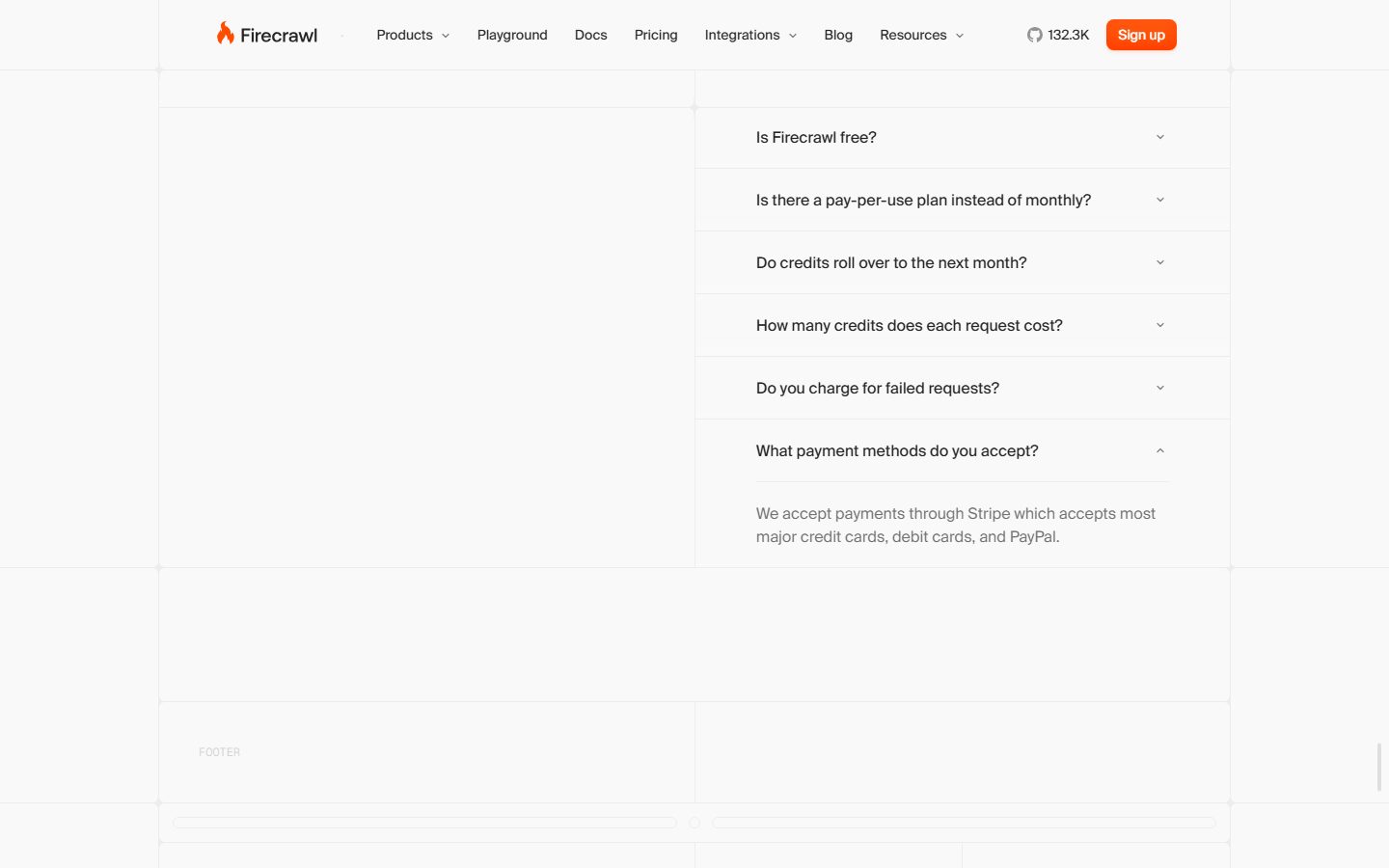
**`faq-accordion-item`** — Full-width FAQ row (e.g., "Is Firecrawl free?", "What payment methods do you accept?"). Background `{colors.canvas}`, question in `{colors.ink}`, answer in `{colors.body}` / `{typography.body-md}`, separated by `{colors.hairline}` dividers, with a chevron affordance at right (down = collapsed, up = expanded).
**`logo-strip`** — "Trusted by 150,000+ companies" customer-logo row (Lovable, Canva, Zapier, Apple, Replit). Logos render flat in `{colors.muted}` on `{colors.canvas}`.
### Tags / Badges
**`badge-pill`** — Small pill label (section eyebrows like "Developer First", "Zero configuration", "Agent Ready", and status tags). Background `{colors.surface-muted}`, text `{colors.body}`, type `{typography.button}`, rounded `{rounded.full}`.
### Footer
**`footer`** — Light footer on `{colors.canvas}` with link columns in `{colors.muted}` and the Firecrawl wordmark. Stays on the white canvas — the system has no dark surface band.
## Do's and Don'ts
### Do
- Reserve `{colors.primary}` (#fa4500) for the primary CTA, the announcement bar, and inline highlight words. Orange is the only saturated hue — keep it scarce.
- Set display headlines in Suisse/Inter at weight 500 with negative tracking. Bumping to 600+ breaks the technical, quiet voice.
- Use `{rounded.full}` for the search bar, toggles, tags, and avatars; `{rounded.md}` (8px) for buttons; `{rounded.xxl}` (16px) for content cards. The pill-vs-card distinction is core.
- Float cards on the ultra-soft multi-layer shadow, always closed by the 1px hairline-ring layer so edges stay crisp at low alpha.
- Embed real product UI and code fragments inside cards — show the output, don't illustrate it.
- Keep the canvas near-white (`{colors.canvas}` / `{colors.surface-soft}`); let neutral grays carry all structure.
### Don't
- Don't apply orange to large surfaces or multiple CTAs in one band — the action layer is single-accent.
- Don't add saturated semantic colors (`{colors.success}`, `{colors.warning}`, `{colors.error}`) outside product-UI fragments and benchmark visuals.
- Don't introduce heavy or dark drop shadows — the system's elevation lives at 0.02–0.04 alpha.
- Don't round content cards into pills or square off pills — respect the 16px-card / 999px-pill split.
- Don't document hover states — primary CTA gets its orange glow at rest; only default and active/pressed are in scope.
## Responsive Behavior
| Name | Width | Key Changes (inferred) |
|---|---|---|
| Mobile | < 768px | Nav collapses to a hamburger; hero h1 scales down from 60px; search bar goes full-width; feature/pricing grids stack 1-up |
| Tablet | 768–1024px | Horizontal nav tightens; feature cards drop to 2-up; floating cards reflow under headlines |
| Desktop | 1024–1440px | Full nav with all menu items; 3-up feature row; paired benchmark + repo cards side by side |
| Wide | > 1440px | Same as desktop with wider outer margins; centered content column caps |
Breakpoint specifics were not directly measured; the table above is inferred from the captured single-column desktop layout (see Known Gaps).
### Touch Targets
- `{component.button-primary}` is compact (6×10px padding) — at mobile it should be padded out to a 44px minimum tap height.
- `{component.toggle-pill}` and `{component.faq-accordion-item}` rows give large horizontal tap areas.
### Collapsing Strategy
- The hero stack (announcement → h1 → sub-head → search → product cards) stays vertical at every breakpoint and simply tightens.
- Code-block tab rows wrap or scroll horizontally on narrow viewports.
- Logo strip wraps to multiple rows on mobile.
## Iteration Guide
1. Focus on ONE component at a time and reference its YAML key directly (`{component.search-input}`, `{component.pricing-card}`).
2. Variants of a component (`-active`, `-disabled`, `-focused`) belong as separate `components:` entries.
3. Use `{token.refs}` for all color-bearing props — never inline a hex.
4. Document default and active/pressed states only — never hover.
5. Display headlines stay Suisse/Inter weight 500 with negative tracking; body stays 400. Don't blur the weight ladder.
6. Keep orange scarce — one accent per band. When you need more emphasis, use size and whitespace before more color.
7. The whole surface stays light — resist adding dark bands the measured system does not have.
## Known Gaps
- **Suisse is licensed** and is not shippable; Inter is the documented substitute. The exact Suisse weights beyond the four measured roles (display-xl 60/500, display-lg 52/500, body 16/400, button 14/450) were not captured — intermediate title/caption sizes are not in scope.
- Only three components were machine-measured (`button-primary`, `card`, `input`); the measured `card` reported `radius: 999px` (a pill capture) while content cards visually use 16px — `product-card`/`feature-card`/`pricing-card` radii are documented from the 16px radius cluster (16× frequency) plus screenshot ground-truth.
- `button-secondary` fill and `nav-link` treatment are derived from screenshot inspection, not isolated measurement.
- The measured `text-input` radius is 0px; the rounded hero field is documented as a separate `search-input` pill.
- Two intermediate spacing values (10px, 15px) were measured but not promoted to canonical tokens; builders may encounter them in legacy paddings.
- The orange CTA shadow uses `display-p3` color values that were truncated in capture; the inset-glow is documented qualitatively and mapped to `{colors.primary-alt}`.
- Responsive breakpoints, animation/transition timings, focus/error form states, and the dropdown menus (Products / Integrations / Resources) were not measured and are out of scope.
- Footer link structure is only partially visible in the captured screenshots (marked "FOOTER" placeholder), so footer column layout is inferred.
<!-- Documented by duply · real-world design systems as ready-to-use DESIGN.md for AI coding agents · https://duply.ai/firecrawl/design-md -->
Color Palette
Accent
Neutrals
Typography
display-xl60px · 500 · 1.067
The quick brown fox jumpsdisplay-lg52px · 500 · 1.077
The quick brown fox jumpsbody-md16px · 400 · 1.5
The quick brown fox jumpsbutton14px · 450 · 1.429
The quick brown fox jumpsSpacing & Shape
Spacing
| Name | Value | Preview |
|---|---|---|
| xxs | 4px | |
| xs | 6px | |
| sm | 8px | |
| md | 12px | |
| lg | 16px | |
| xl | 20px | |
| xxl | 24px |
Border Radius
| Name | Value | Preview |
|---|---|---|
| xs | 4px | |
| sm | 6px | |
| md | 8px | |
| lg | 10px | |
| xl | 12px | |
| xxl | 16px | |
| xxxl | 20px | |
| full | 999px |
More like this


---
version: alpha
name: Firecrawl-design-analysis
description: A bright, developer-first marketing surface built on a near-white canvas with a single high-voltage orange brand accent and Suisse-family display typography. The system reads as precise, technical, and open-source — generous whitespace, soft floating product/code cards with ultra-subtle multi-layer shadows, pill-shaped tags and toggles everywhere, and a strict near-monochrome palette punctuated only by Firecrawl orange on primary CTAs and inline highlight words.
colors:
  primary: "#fa4500"
  primary-alt: "#fa5d19"
  ink: "#111827"
  ink-near: "#171717"
  ink-strong: "#000000"
  slate-800: "#1f2937"
  body: "#374151"
  body-soft: "#4b5563"
  muted: "#6b7280"
  muted-soft: "#9ca3af"
  neutral: "#c2c2c2"
  hairline: "#e5e7eb"
  hairline-strong: "#d1d5db"
  surface-muted: "#f3f4f6"
  surface-alt: "#ededed"
  surface-soft: "#fdfdfd"
  canvas: "#ffffff"
  on-primary: "#ffffff"
  success: "#22c55e"
  warning: "#eab308"
  error: "#ef4444"
typography:
  display-xl:
    fontFamily: "Suisse, Inter, sans-serif"
    fontSize: 60px
    fontWeight: 500
    lineHeight: 1.067
    letterSpacing: -0.3px
  display-lg:
    fontFamily: "Suisse, Inter, sans-serif"
    fontSize: 52px
    fontWeight: 500
    lineHeight: 1.077
    letterSpacing: -0.52px
  body-md:
    fontFamily: "Suisse, Inter, sans-serif"
    fontSize: 16px
    fontWeight: 400
    lineHeight: 1.5
    letterSpacing: 0
  button:
    fontFamily: "Suisse, Inter, sans-serif"
    fontSize: 14px
    fontWeight: 450
    lineHeight: 1.429
    letterSpacing: 0
rounded:
  xs: 4px
  sm: 6px
  md: 8px
  lg: 10px
  xl: 12px
  xxl: 16px
  xxxl: 20px
  full: 999px
spacing:
  xxs: 4px
  xs: 6px
  sm: 8px
  md: 12px
  lg: 16px
  xl: 20px
  xxl: 24px
components:
  button-primary:
    backgroundColor: "{colors.primary}"
    textColor: "{colors.on-primary}"
    typography: "{typography.button}"
    rounded: "{rounded.md}"
    padding: 6px 10px
  button-secondary:
    backgroundColor: "{colors.canvas}"
    textColor: "{colors.ink}"
    typography: "{typography.button}"
    rounded: "{rounded.md}"
    padding: 6px 10px
  nav-bar:
    backgroundColor: "{colors.canvas}"
    textColor: "{colors.ink}"
    typography: "{typography.button}"
  nav-link:
    backgroundColor: transparent
    textColor: "{colors.body}"
    typography: "{typography.button}"
  search-input:
    backgroundColor: "{colors.canvas}"
    textColor: "{colors.body}"
    typography: "{typography.body-md}"
    rounded: "{rounded.full}"
  toggle-pill:
    backgroundColor: "{colors.surface-muted}"
    textColor: "{colors.body}"
    typography: "{typography.button}"
    rounded: "{rounded.full}"
  text-input:
    backgroundColor: "{colors.canvas}"
    textColor: "{colors.body}"
    typography: "{typography.body-md}"
    radius: 0px
  product-card:
    backgroundColor: "{colors.canvas}"
    textColor: "{colors.ink}"
    rounded: "{rounded.xxl}"
  feature-card:
    backgroundColor: "{colors.canvas}"
    textColor: "{colors.body}"
    typography: "{typography.body-md}"
    rounded: "{rounded.xxl}"
  code-block:
    backgroundColor: "{colors.surface-soft}"
    textColor: "{colors.body}"
    typography: "{typography.body-md}"
    rounded: "{rounded.xl}"
  pricing-card:
    backgroundColor: "{colors.canvas}"
    textColor: "{colors.ink}"
    typography: "{typography.body-md}"
    rounded: "{rounded.xxl}"
  faq-accordion-item:
    backgroundColor: "{colors.canvas}"
    textColor: "{colors.ink}"
    typography: "{typography.body-md}"
  badge-pill:
    backgroundColor: "{colors.surface-muted}"
    textColor: "{colors.body}"
    typography: "{typography.button}"
    rounded: "{rounded.full}"
  logo-strip:
    backgroundColor: "{colors.canvas}"
    textColor: "{colors.muted}"
    typography: "{typography.body-md}"
  footer:
    backgroundColor: "{colors.canvas}"
    textColor: "{colors.muted}"
    typography: "{typography.body-md}"
---

## Overview

Firecrawl's marketing surface is a bright, developer-first interface — a near-white canvas (`{colors.canvas}` — #ffffff) carrying near-monochrome neutral text and a single high-voltage brand accent: **Firecrawl orange** (`{colors.primary}` — #fa4500). The system reads as precise, technical, and open-source: lots of whitespace, faint floating product and code cards, pill-shaped toggles and tags everywhere, and headlines where a single word is set in orange to anchor the eye.

Type is set in the **Suisse** family (a licensed Swiss grotesque, substituted with Inter here). Display headlines sit at weight 500 with negative letter-spacing (`{typography.display-xl}` 60px / -0.3px, `{typography.display-lg}` 52px / -0.52px), while body and UI labels stay light-to-medium (400–450 weight). The voice is engineered-and-quiet — confident headlines, no bombast.

Brand voltage comes from two places: the **orange accent** (used on primary CTAs, inline highlight words like "clean web data" / "scraping" / "open source", and small status markers) and **product/code artifacts shown directly in floating cards** — the hero search bar, JSON/markdown output panes, code snippets, benchmark bars, and the GitHub repo card. Firecrawl shows the actual product chrome at small scale rather than drawing illustrations around it.

**Key Characteristics:**
- White canvas with a single orange primary CTA (`{colors.primary}` — #fa4500). Primary buttons are `{rounded.md}` (8px) with compact 6×10px padding and a subtle orange inset glow.
- Suisse-family display type (substituted with Inter) at weight 500 with negative tracking — modern, technical, slightly tightened.
- Pill geometry is dominant — `{rounded.full}` (999px) appears on 172 measured elements: the hero search bar, mode toggles (Search / Scrape / Map / Crawl), tags, and badges.
- Content cards use `{rounded.xxl}` (16px) and float on ultra-soft, multi-layer drop shadows at very low alpha — the elevation is barely-there, almost a hairline ring (`rgba(0,0,0,0.03) 0 0 0 1px`).
- Product UI fragments and code blocks are embedded directly in cards — search input, JSON output, Python/Node/cURL snippets, benchmark bars, GitHub repo card.
- Near-monochrome neutral ramp from `{colors.ink}` (#111827) through `{colors.muted-soft}` (#9ca3af) to `{colors.hairline}` (#e5e7eb) carries all structure; orange is the only saturated brand hue.
- Semantic colors (`{colors.success}`, `{colors.warning}`, `{colors.error}`) appear only inside product UI fragments and benchmark visuals.

## Colors

### Brand & Accent
- **Primary** (`{colors.primary}` — #fa4500): Firecrawl orange. Drives the primary CTA ("Sign up"), the top announcement bar, inline highlight words in headlines, and small accent marks. The system is otherwise monochrome — orange is scarce and deliberate.
- **Primary Alt** (`{colors.primary-alt}` — #fa5d19): A slightly warmer/lighter orange used in gradients and the inset-glow shadow on the primary button (the orange `display-p3` box-shadow layers resolve to this hue).

### Text
- **Ink** (`{colors.ink}` — #111827): Primary headline and high-emphasis text.
- **Ink Near** (`{colors.ink-near}` — #171717) and **Ink Strong** (`{colors.ink-strong}` — #000000): Used sparingly for the wordmark and the darkest UI strokes.
- **Body** (`{colors.body}` — #374151): Default running-text color.
- **Body Soft** (`{colors.body-soft}` — #4b5563): Secondary paragraph text.
- **Muted** (`{colors.muted}` — #6b7280): Sub-labels, captions, footer text.
- **Muted Soft** (`{colors.muted-soft}` — #9ca3af): Tertiary text, placeholder, "FOOTER" markers, fine print.
- **Neutral** (`{colors.neutral}` — #c2c2c2): The lowest-contrast neutral — faint dividers, disabled glyphs, decorative grid lines in the hero background.

### Surface
- **Canvas** (`{colors.canvas}` — #ffffff): The default page floor and card surface.
- **Surface Soft** (`{colors.surface-soft}` — #fdfdfd): Near-white code-block and panel fills; also the color of the faint 6–8px ring halo behind floating UI fragments.
- **Surface Muted** (`{colors.surface-muted}` — #f3f4f6): Pill toggles, tags, and inset chip backgrounds.
- **Surface Alt** (`{colors.surface-alt}` — #ededed): Slightly stronger gray fill for nested panels and benchmark tracks.
- **Slate 800** (`{colors.slate-800}` — #1f2937): The darkest neutral surface tone, used on small dark code/badge chips inside product fragments.

### Lines
- **Hairline** (`{colors.hairline}` — #e5e7eb): The 1px border tone on light surfaces — card outlines, dividers, the FAQ row separators.
- **Hairline Strong** (`{colors.hairline-strong}` — #d1d5db): Slightly stronger border for inputs and emphasized dividers.

### Semantic
- **Success** (`{colors.success}` — #22c55e): Success states inside product UI and benchmark visuals.
- **Warning** (`{colors.warning}` — #eab308): Warning markers in product fragments.
- **Error** (`{colors.error}` — #ef4444): Error / failed-request states in product UI.

## Typography

### Font Family
The system runs the **Suisse** family for everything — display headlines, body, and UI labels. Suisse is a licensed Swiss grotesque; **it is not shipped here**. The documented substitute is **Inter**, which preserves the geometric-humanist grotesque character and the negative-tracking display feel. The fallback stack is `Suisse, Inter, sans-serif`.

### Hierarchy

| Token | Size | Weight | Line Height | Letter Spacing | Use |
|---|---|---|---|---|---|
| `{typography.display-xl}` | 60px | 500 | 1.067 | -0.3px | Hero h1 ("Power AI agents with clean web data") |
| `{typography.display-lg}` | 52px | 500 | 1.077 | -0.52px | Section heads ("Start scraping today", "We handle the hard stuff") |
| `{typography.body-md}` | 16px | 400 | 1.5 | 0 | Default running-text, sub-headlines, FAQ answers |
| `{typography.button}` | 14px | 450 | 1.429 | 0 | Button labels, nav links, tags, captions |

### Principles
Display weight stays at 500 — never heavier — which is what keeps the big headlines technical rather than loud. Negative letter-spacing (-0.3 to -0.52px) tightens the display sizes; body and UI text run at default tracking. Inline orange highlight words inside otherwise-ink headlines are a signature move (e.g., "clean web data", "scraping", "open source", "hard stuff").

### Note on Font Substitute
Suisse is flagged as licensed (`fonts_licensed`). **Inter** at weight 500 with roughly -0.01em tracking on display sizes is the documented open-source substitute and should be used in any build that does not own a Suisse license. Never claim to ship Suisse.

## Layout

### Spacing System
- **Base unit:** 4px.
- **Tokens:** `{spacing.xxs}` 4px · `{spacing.xs}` 6px · `{spacing.sm}` 8px · `{spacing.md}` 12px · `{spacing.lg}` 16px · `{spacing.xl}` 20px · `{spacing.xxl}` 24px.
- **Most frequent steps:** 20px (most common gap/padding), 16px, and 12px form the workhorse rhythm; 6px and 8px handle tight intra-component padding (e.g., the 6×10px primary button).
- The two intermediate values of 10px and 15px were also measured and appear in some paddings (see Known Gaps) but are not promoted to canonical tokens.

### Grid & Container
- Centered marketing column with generous outer margins; the captured layout shows a single-column editorial flow with full-width section bands.
- Hero uses a centered stack — announcement bar, h1, sub-headline, then the pill search bar, then floating product/output cards below.
- Feature rows render as multi-up card groups (3-up "Search / Scrape / Interact"; 2-up "One command / Agent onboarding"; paired benchmark + repo cards).
- FAQ and pricing sections render as stacked full-width rows with hairline dividers.

### Whitespace Philosophy
Whitespace is generous and the page breathes — content cards float with wide margins on a quiet near-white field. The hero background carries faint decorative grid dots and plus-marks in `{colors.neutral}` that add texture without competing with the type.

## Elevation & Depth

| Level | Treatment | Use |
|---|---|---|
| Flat | No shadow, no border | Body sections, nav bar, headline bands |
| Hairline ring | `rgba(0,0,0,0.02–0.03) 0 0 0 1px` as the last shadow layer | Card outlines that read as a 1px border without a stroke |
| Halo ring | `rgb(249,249,249) 0 0 0 6px` / `rgb(253,253,253) 0 0 0 8px` | A soft same-tone halo around floating UI fragments and avatars (most frequent shadow, 16×) |
| Soft float | `rgba(0,0,0,0.03) 0 24px 32px -12px, 0 16px 24px -8px, 0 8px 16px -4px, 0 0 0 1px` | Standard floating product/code cards |
| Deep float | `rgba(0,0,0,0.02–0.03) 0 40px 48px -20px … 0 0 0 1px` and the deepest 88px-blur stack | The hero product mockup and large output cards |
| Orange glow | `display-p3 orange 0 -6px 12px inset, 0 2px 4px, 0 1px 1px` | The primary CTA's warm inset glow + drop |

The elevation philosophy is **ultra-soft and additive** — multiple layers at 0.02–0.04 alpha stack into a barely-perceptible lift, always closed by a 1px hairline-ring layer so cards read crisp even at low shadow opacity. No heavy shadows, no glassmorphism. The only saturated shadow is the orange glow on the primary button.

### Decorative Depth
- Faint dot-grid and plus-mark texture sits behind the hero in `{colors.neutral}` — decorative, not a system token surface.
- Product fragments (search bar, JSON pane, benchmark bars) carry their own internal chrome; they are shown as content, not redrawn.

## Shapes

### Border Radius Scale

| Token | Value | Use |
|---|---|---|
| `{rounded.xs}` | 4px | Rare — small inline chips |
| `{rounded.sm}` | 6px | Small buttons, dropdown items |
| `{rounded.md}` | 8px | Primary/secondary buttons (most common button radius, 34×) |
| `{rounded.lg}` | 10px | Mid-size inset panels |
| `{rounded.xl}` | 12px | Code blocks, nested panels |
| `{rounded.xxl}` | 16px | Content cards, product/feature/pricing cards |
| `{rounded.xxxl}` | 20px | Largest containers / hero mockup framing |
| `{rounded.full}` | 999px | Pill search bar, mode toggles, tags, badges, avatars (dominant — 172×) |

Pill geometry (`{rounded.full}`) is the single most common shape in the system. Buttons settle at 8px; content cards at 16px. The measured `text-input` border-radius is **0px** (square) — the visually-rounded hero search field is a separate pill `search-input` element, not the squared form input.

### Photography / Artifact Geometry
There is little photography; the visual interest is product chrome. Logos in the trust strip ("Trusted by 150,000+ companies") render flat at `{colors.muted}`. UI fragments retain their native internal radii.

## Components

### Navigation

**`nav-bar`** — White top nav (`{colors.canvas}`) carrying the Firecrawl flame wordmark at left, a horizontal menu (Products, Playground, Docs, Pricing, Integrations, Blog, Resources) in `{component.nav-link}`, a GitHub star count ("132.3K"), and the orange `{component.button-primary}` ("Sign up") at right. Menu labels use `{typography.button}` (Suisse 14px / 450).

**`nav-link`** — Inline transparent nav item in `{colors.body}`, `{typography.button}`. Some carry small dropdown carets (Products, Integrations, Resources).

### Buttons

**`button-primary`** — The signature orange CTA. Background `{colors.primary}` (#fa4500), text `{colors.on-primary}`, type `{typography.button}` (Suisse 14px / 450), rounded `{rounded.md}` (8px), compact padding 6×10px, with a warm orange inset glow (see Elevation). Used for "Sign up" and primary actions.

**`button-secondary`** — White button on the same 8px radius and 6×10px padding, text `{colors.ink}` (derived from screenshot ground-truth — Firecrawl renders most non-primary actions as quiet text/outline buttons; exact fill not separately measured).

### Inputs & Toggles

**`search-input`** — The hero command bar — a full-pill (`{rounded.full}`) input on `{colors.canvas}` with placeholder "https://example.com" in `{colors.muted-soft}` and a trailing orange action button. The signature interactive component of the landing page.

**`toggle-pill`** — Pill-radius mode switch beneath the search bar (Search / Scrape / Map / Crawl). Background `{colors.surface-muted}`, label `{typography.button}`, rounded `{rounded.full}`. The active segment renders on `{colors.canvas}`.

**`text-input`** — Standard form input, background `{colors.canvas}`, text `{colors.body}`, type `{typography.body-md}`. Measured border-radius is **0px** (square corners) — distinct from the rounded `search-input`.

### Cards & Containers

**`product-card`** — Floating card showing real product UI (the hero JSON/markdown output pane, scraping status, request panes). Background `{colors.canvas}`, rounded `{rounded.xxl}` (16px), deep-float shadow closed by a 1px hairline ring.

**`feature-card`** — Used in the 3-up "Search / Scrape / Interact" row and "We handle the hard stuff" grid. Background `{colors.canvas}`, body in `{typography.body-md}`, rounded `{rounded.xxl}`, soft-float elevation.

**`code-block`** — Code snippet panel (Python / Node.js / cURL / CLI tabs, "Copy code"). Background `{colors.surface-soft}`, text `{colors.body}`, rounded `{rounded.xl}` (12px). Tabs render as small toggles above the pane.

**`pricing-card`** — Pricing tier container. Background `{colors.canvas}`, ink title, body checklist in `{typography.body-md}`, rounded `{rounded.xxl}`, soft-float elevation, with an embedded `{component.button-primary}`.

### Content Rows

**`faq-accordion-item`** — Full-width FAQ row (e.g., "Is Firecrawl free?", "What payment methods do you accept?"). Background `{colors.canvas}`, question in `{colors.ink}`, answer in `{colors.body}` / `{typography.body-md}`, separated by `{colors.hairline}` dividers, with a chevron affordance at right (down = collapsed, up = expanded).

**`logo-strip`** — "Trusted by 150,000+ companies" customer-logo row (Lovable, Canva, Zapier, Apple, Replit). Logos render flat in `{colors.muted}` on `{colors.canvas}`.

### Tags / Badges

**`badge-pill`** — Small pill label (section eyebrows like "Developer First", "Zero configuration", "Agent Ready", and status tags). Background `{colors.surface-muted}`, text `{colors.body}`, type `{typography.button}`, rounded `{rounded.full}`.

### Footer

**`footer`** — Light footer on `{colors.canvas}` with link columns in `{colors.muted}` and the Firecrawl wordmark. Stays on the white canvas — the system has no dark surface band.

## Do's and Don'ts

### Do
- Reserve `{colors.primary}` (#fa4500) for the primary CTA, the announcement bar, and inline highlight words. Orange is the only saturated hue — keep it scarce.
- Set display headlines in Suisse/Inter at weight 500 with negative tracking. Bumping to 600+ breaks the technical, quiet voice.
- Use `{rounded.full}` for the search bar, toggles, tags, and avatars; `{rounded.md}` (8px) for buttons; `{rounded.xxl}` (16px) for content cards. The pill-vs-card distinction is core.
- Float cards on the ultra-soft multi-layer shadow, always closed by the 1px hairline-ring layer so edges stay crisp at low alpha.
- Embed real product UI and code fragments inside cards — show the output, don't illustrate it.
- Keep the canvas near-white (`{colors.canvas}` / `{colors.surface-soft}`); let neutral grays carry all structure.

### Don't
- Don't apply orange to large surfaces or multiple CTAs in one band — the action layer is single-accent.
- Don't add saturated semantic colors (`{colors.success}`, `{colors.warning}`, `{colors.error}`) outside product-UI fragments and benchmark visuals.
- Don't introduce heavy or dark drop shadows — the system's elevation lives at 0.02–0.04 alpha.
- Don't round content cards into pills or square off pills — respect the 16px-card / 999px-pill split.
- Don't document hover states — primary CTA gets its orange glow at rest; only default and active/pressed are in scope.

## Responsive Behavior

| Name | Width | Key Changes (inferred) |
|---|---|---|
| Mobile | < 768px | Nav collapses to a hamburger; hero h1 scales down from 60px; search bar goes full-width; feature/pricing grids stack 1-up |
| Tablet | 768–1024px | Horizontal nav tightens; feature cards drop to 2-up; floating cards reflow under headlines |
| Desktop | 1024–1440px | Full nav with all menu items; 3-up feature row; paired benchmark + repo cards side by side |
| Wide | > 1440px | Same as desktop with wider outer margins; centered content column caps |

Breakpoint specifics were not directly measured; the table above is inferred from the captured single-column desktop layout (see Known Gaps).

### Touch Targets
- `{component.button-primary}` is compact (6×10px padding) — at mobile it should be padded out to a 44px minimum tap height.
- `{component.toggle-pill}` and `{component.faq-accordion-item}` rows give large horizontal tap areas.

### Collapsing Strategy
- The hero stack (announcement → h1 → sub-head → search → product cards) stays vertical at every breakpoint and simply tightens.
- Code-block tab rows wrap or scroll horizontally on narrow viewports.
- Logo strip wraps to multiple rows on mobile.

## Iteration Guide

1. Focus on ONE component at a time and reference its YAML key directly (`{component.search-input}`, `{component.pricing-card}`).
2. Variants of a component (`-active`, `-disabled`, `-focused`) belong as separate `components:` entries.
3. Use `{token.refs}` for all color-bearing props — never inline a hex.
4. Document default and active/pressed states only — never hover.
5. Display headlines stay Suisse/Inter weight 500 with negative tracking; body stays 400. Don't blur the weight ladder.
6. Keep orange scarce — one accent per band. When you need more emphasis, use size and whitespace before more color.
7. The whole surface stays light — resist adding dark bands the measured system does not have.

## Known Gaps

- **Suisse is licensed** and is not shippable; Inter is the documented substitute. The exact Suisse weights beyond the four measured roles (display-xl 60/500, display-lg 52/500, body 16/400, button 14/450) were not captured — intermediate title/caption sizes are not in scope.
- Only three components were machine-measured (`button-primary`, `card`, `input`); the measured `card` reported `radius: 999px` (a pill capture) while content cards visually use 16px — `product-card`/`feature-card`/`pricing-card` radii are documented from the 16px radius cluster (16× frequency) plus screenshot ground-truth.
- `button-secondary` fill and `nav-link` treatment are derived from screenshot inspection, not isolated measurement.
- The measured `text-input` radius is 0px; the rounded hero field is documented as a separate `search-input` pill.
- Two intermediate spacing values (10px, 15px) were measured but not promoted to canonical tokens; builders may encounter them in legacy paddings.
- The orange CTA shadow uses `display-p3` color values that were truncated in capture; the inset-glow is documented qualitatively and mapped to `{colors.primary-alt}`.
- Responsive breakpoints, animation/transition timings, focus/error form states, and the dropdown menus (Products / Integrations / Resources) were not measured and are out of scope.
- Footer link structure is only partially visible in the captured screenshots (marked "FOOTER" placeholder), so footer column layout is inferred.

<!-- Documented by duply · real-world design systems as ready-to-use DESIGN.md for AI coding agents · https://duply.ai/firecrawl/design-md -->