Coroot
A developer-tooling observability marketing site built on a near-white #fafafa canvas with a vivid brand-green primary CTA, Poppins display typography, and deep navy/near-black bands that frame product screenshots and testimonials. The system reads as confident open-source infra-tooling — large rounded-pill buttons, dark dashboard mockups shown directly in-page, and a high-contrast green accent reserved for headlines, stat figures, and the single primary action.
---
version: alpha
name: Coroot-design-analysis
description: "A developer-tooling observability marketing site built on a near-white #fafafa canvas with a vivid brand-green primary CTA, Poppins display typography, and deep navy/near-black bands that frame product screenshots and testimonials. The system reads as confident open-source infra-tooling — large rounded-pill buttons, dark dashboard mockups shown directly in-page, and a high-contrast green accent reserved for headlines, stat figures, and the single primary action."
colors:
primary: "#4cb649"
accent-green: "#10b981"
ink: "#262626"
ink-strong: "#1a1a1a"
body: "#374151"
body-soft: "#4b5563"
muted: "#737373"
muted-soft: "#6b7280"
muted-faint: "#9ca3af"
hairline: "#d1d5db"
hairline-soft: "#e5e7eb"
hairline-faint: "#cccccc"
surface-tint: "#f3f4f6"
canvas: "#fafafa"
canvas-warm: "#fcfefc"
surface: "#ffffff"
surface-dark: "#1e2839"
surface-dark-alt: "#1f2937"
surface-darkest: "#111827"
surface-dark-green: "#0a1a0a"
on-primary: "#ffffff"
on-dark: "#ffffff"
typography:
display:
fontFamily: "Poppins, sans-serif"
fontSize: 60px
fontWeight: 700
lineHeight: 1.0
letterSpacing: 0
title:
fontFamily: "Poppins, sans-serif"
fontSize: 24px
fontWeight: 700
lineHeight: 1.333
letterSpacing: 0
subtitle:
fontFamily: "Poppins, sans-serif"
fontSize: 16px
fontWeight: 400
lineHeight: 1.5
letterSpacing: 0
body:
fontFamily: "Poppins, sans-serif"
fontSize: 20px
fontWeight: 400
lineHeight: 1.625
letterSpacing: 0
button:
fontFamily: "Poppins, sans-serif"
fontSize: 16px
fontWeight: 400
lineHeight: 1.5
letterSpacing: 0
rounded:
xs: 4px
sm: 6px
md: 8px
lg: 12px
xl: 24px
pill: 9999px
full: 9999px
spacing:
xxs: 4px
xxs2: 6px
xs: 8px
sm: 12px
md: 16px
lg: 24px
xl: 32px
xxl: 48px
xxxl: 64px
section: 80px
components:
top-nav:
backgroundColor: "{colors.ink-strong}"
textColor: "{colors.on-dark}"
typography: "{typography.button}"
nav-link:
backgroundColor: transparent
textColor: "{colors.on-dark}"
typography: "{typography.button}"
button-primary:
backgroundColor: "{colors.primary}"
textColor: "{colors.on-primary}"
typography: "{typography.button}"
rounded: "{rounded.pill}"
padding: 6px
button-secondary:
backgroundColor: "{colors.surface-dark-alt}"
textColor: "{colors.on-dark}"
typography: "{typography.button}"
rounded: "{rounded.pill}"
padding: 6px
hero-band:
backgroundColor: "{colors.canvas}"
textColor: "{colors.ink}"
typography: "{typography.display}"
padding: 80px
stat-figure:
backgroundColor: transparent
textColor: "{colors.primary}"
typography: "{typography.title}"
product-screenshot-card:
backgroundColor: "{colors.surface-darkest}"
textColor: "{colors.on-dark}"
rounded: "{rounded.lg}"
feature-screenshot-card:
backgroundColor: "{colors.surface}"
textColor: "{colors.ink}"
rounded: "{rounded.lg}"
feature-row:
backgroundColor: "{colors.canvas}"
textColor: "{colors.body}"
typography: "{typography.body}"
logo-cloud:
backgroundColor: "{colors.canvas}"
textColor: "{colors.muted}"
typography: "{typography.subtitle}"
testimonial-band:
backgroundColor: "{colors.surface-dark}"
textColor: "{colors.on-dark}"
typography: "{typography.body}"
testimonial-card:
backgroundColor: "{colors.surface-dark-alt}"
textColor: "{colors.on-dark}"
typography: "{typography.subtitle}"
rounded: "{rounded.lg}"
padding: 24px
explore-card:
backgroundColor: "{colors.surface}"
textColor: "{colors.ink}"
typography: "{typography.title}"
rounded: "{rounded.xl}"
padding: 48px
cta-band:
backgroundColor: "{colors.canvas}"
textColor: "{colors.ink}"
typography: "{typography.title}"
padding: 80px
footer:
backgroundColor: "{colors.surface-darkest}"
textColor: "{colors.muted-faint}"
typography: "{typography.subtitle}"
padding: 64px
---
## Overview
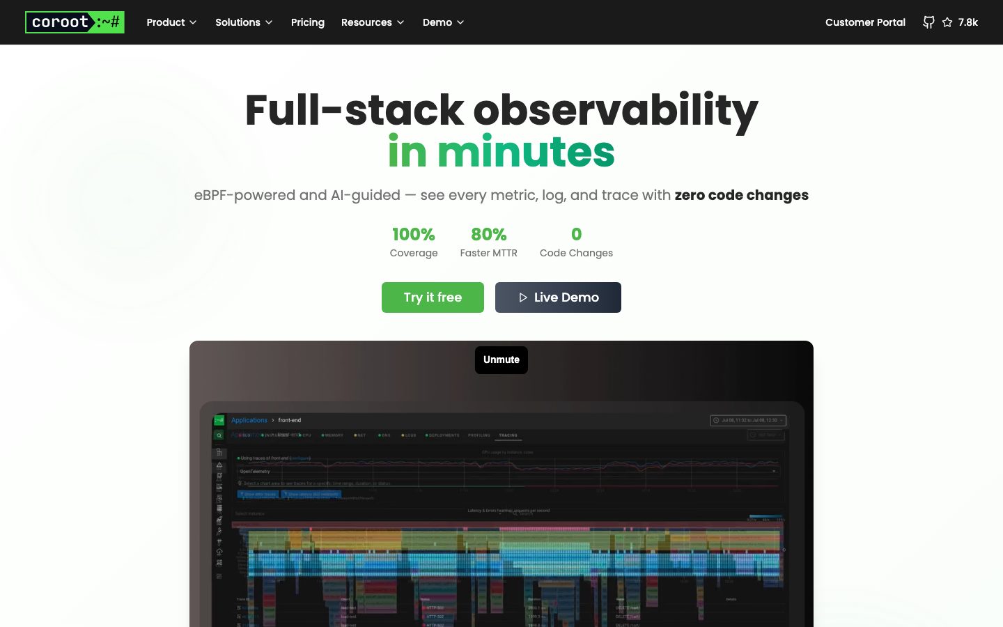
Coroot's marketing site is a developer-tooling observability surface — a near-white `{colors.canvas}` (#fafafa) floor anchored by a single vivid brand-green primary CTA (`{colors.primary}` — #4cb649) and Poppins display typography. The voice is open-source infra-tooling: confident, technical, and screenshot-forward. Rather than marketing illustrations, Coroot shows its actual dark-themed dashboard product chrome (service maps, trace heatmaps, root-cause panels) embedded directly in-page.
The system runs almost entirely in **Poppins** — the bold 700-weight 60px h1 carries the headline ("Full-stack observability **in minutes**"), with the second line set in the brand green. Body copy steps up to a generous 20px / 1.625, which reads as airy and confident rather than dense.
Color voltage comes from two sources: the **brand green** (`{colors.primary}` — #4cb649) used on the primary CTA, headline accent, and stat figures; and the **deep navy / near-black bands** (`{colors.surface-dark}` #1e2839, `{colors.surface-darkest}` #111827, `{colors.ink-strong}` #1a1a1a) that frame the top nav, testimonial section, and footer. The page alternates light editorial bands with dark product/social-proof bands, closing on the near-black footer.
**Key Characteristics:**
- Near-white canvas (`{colors.canvas}` — #fafafa) with a single brand-green primary CTA (`{colors.primary}` — #4cb649). Buttons are fully pill-rounded (`{rounded.pill}`).
- Poppins everywhere — bold 700 for display + titles, regular 400 for body and buttons. No secondary typeface.
- Dark dashboard screenshots shown in-page on `{colors.surface-darkest}` cards with a soft drop shadow — the product chrome is the hero artwork.
- Dark navy testimonial band (`{colors.surface-dark}` — #1e2839) holding `{component.testimonial-card}` quote cards in a slightly lighter navy (`{colors.surface-dark-alt}` — #1f2937).
- Near-black top nav (`{colors.ink-strong}` — #1a1a1a) carrying the lockup `coroot :~#` terminal-style wordmark.
- Stat figures (100% / 80% / 0) rendered in brand green at title weight — a small, confident proof row under the hero.
- Hierarchical radius: pill (`{rounded.pill}`) for buttons and badges, `{rounded.lg}` (12px) for screenshot/content cards, `{rounded.xl}` (24px) for the larger "Explore All Features" card.
- Generous vertical rhythm — major bands separated by `{spacing.section}` (80px).
## Colors
### Brand & Accent
- **Primary** (`{colors.primary}` — #4cb649): The brand green. Used on the primary CTA ("Try it free"), the second line of the hero headline, and stat figures. This is the system's single high-voltage color.
- **Accent Green** (`{colors.accent-green}` — #10b981): A secondary green measured in small accents and status indicators inside product chrome and the dark bands. Used sparingly.
### Surface
- **Canvas** (`{colors.canvas}` — #fafafa): The default page floor for hero, feature, and CTA bands.
- **Canvas Warm** (`{colors.canvas-warm}` — #fcfefc): A barely-tinted near-white measured on subtle gradient transitions.
- **Surface** (`{colors.surface}` — #ffffff): White cards (feature screenshot cards, explore card).
- **Surface Tint** (`{colors.surface-tint}` — #f3f4f6): Soft light-gray fill for dividers and subtle sub-bands.
- **Surface Dark** (`{colors.surface-dark}` — #1e2839): The navy testimonial band background.
- **Surface Dark Alt** (`{colors.surface-dark-alt}` — #1f2937): Slightly lighter navy for nested testimonial cards and the secondary CTA button.
- **Surface Darkest** (`{colors.surface-darkest}` — #111827): The footer and the dark product-screenshot card background.
- **Surface Dark Green** (`{colors.surface-dark-green}` — #0a1a0a): A very dark green measured in brand/lockup contexts.
- **Ink Strong** (`{colors.ink-strong}` — #1a1a1a): The near-black top-nav background.
### Text
- **Ink** (`{colors.ink}` — #262626): Headlines and primary text on light surfaces.
- **Body** (`{colors.body}` — #374151): Default running-text color.
- **Body Soft** (`{colors.body-soft}` — #4b5563): Slightly lighter body text.
- **Muted** (`{colors.muted}` — #737373): Secondary text — stat labels, captions.
- **Muted Soft** (`{colors.muted-soft}` — #6b7280): Tertiary text.
- **Muted Faint** (`{colors.muted-faint}` — #9ca3af): Faintest text — footer links, fine-print.
- **On Primary / On Dark** (`{colors.on-primary}` / `{colors.on-dark}` — #ffffff): Text on the green CTA and on dark navy bands.
### Hairlines
- **Hairline** (`{colors.hairline}` — #d1d5db): The primary 1px border tone on light surfaces.
- **Hairline Soft** (`{colors.hairline-soft}` — #e5e7eb): Softer divider tone.
- **Hairline Faint** (`{colors.hairline-faint}` — #cccccc): Faintest border tone.
## Typography
### Font Family
The system runs entirely on **Poppins**, a geometric open-source sans (Google Fonts). Poppins is freely available and ships directly — no licensed substitution needed. The fallback stack walks `Poppins, sans-serif`. The split is by weight, not family: bold 700 for display and titles, regular 400 for body, subtitles, and buttons.
### Hierarchy
| Token | Size | Weight | Line Height | Letter Spacing | Use |
|---|---|---|---|---|---|
| `{typography.display}` | 60px | 700 | 1.0 | 0 | Hero h1 ("Full-stack observability in minutes") |
| `{typography.title}` | 24px | 700 | 1.333 | 0 | Section headings, feature titles, stat figures |
| `{typography.body}` | 20px | 400 | 1.625 | 0 | Default running-text, feature descriptions |
| `{typography.subtitle}` | 16px | 400 | 1.5 | 0 | Sub-headlines (h2 role), eyebrow lines, footer links |
| `{typography.button}` | 16px | 400 | 1.5 | 0 | Button labels, nav links |
### Principles
Poppins carries the entire system. Hierarchy is built from size and weight contrast: bold 700 display/titles against regular 400 body. The hero headline is the only place type reaches 60px, and its second clause flips to brand green (`{colors.primary}`) — color, not weight, signals the emphasis. Body copy is intentionally large (20px / 1.625) for an open, technical-but-approachable feel.
### Note on Font Substitutes
No licensed typefaces are used. Poppins is open-source and ships as-is. If Poppins is unavailable, **Inter** or **Montserrat** at matching weights are reasonable geometric fallbacks, though Poppins' rounder, more circular geometry is part of the brand voice.
## Layout
### Spacing System
- **Base unit:** 4px (with a 6px half-step measured in tight button/nav contexts).
- **Tokens:** `{spacing.xxs}` 4px · `{spacing.xxs2}` 6px · `{spacing.xs}` 8px · `{spacing.sm}` 12px · `{spacing.md}` 16px · `{spacing.lg}` 24px · `{spacing.xl}` 32px · `{spacing.xxl}` 48px · `{spacing.xxxl}` 64px · `{spacing.section}` 80px.
- **Section padding:** `{spacing.section}` (80px) — the vertical rhythm between major editorial/product bands.
- **Card internal padding:** `{spacing.xxl}` (48px) on the larger explore card; `{spacing.lg}` (24px) on testimonial cards.
- **Most-frequent unit:** 8px dominates micro-spacing (gaps, inner padding); 16px and 24px handle component-to-component spacing.
### Grid & Container
- **Hero:** Single centered column — headline, sub-head, stat row, button row, then the wide dark product screenshot below.
- **Feature rows:** Alternating two-column layout — text on one side, a screenshot card on the other.
- **Testimonial grid:** Multi-column quote-card grid inside the dark navy band.
- **Footer:** 4-column link list (Solutions / Comparisons / Resources / Legal) plus a Company column.
### Whitespace Philosophy
Coroot uses generous whitespace with large 20px body type and 80px band separation. The page reads as scan-friendly and confident, alternating light editorial bands with dark product/social-proof bands to pace the long scroll.
## Elevation & Depth
| Level | Treatment | Use |
|---|---|---|
| Flat | No shadow, no border | Body sections, hero text, light editorial bands |
| Subtle | `0 1px 2px rgba(0,0,0,0.05)` | Small inline chips / faint card edges |
| Standard card | `0 10px 15px -3px rgba(0,0,0,0.1), 0 4px 6px -4px rgba(0,0,0,0.1)` | The dominant elevation — screenshot cards and content cards (measured 21×, the system's default shadow) |
| Raised | `0 20px 25px -5px rgba(0,0,0,0.1), 0 8px 10px -6px rgba(0,0,0,0.1)` | The hero product-screenshot card / most prominent floating element |
The elevation philosophy is **soft and modern** — low-alpha multi-layer drop shadows lift screenshot cards off the light canvas. The dark product-screenshot cards (`{colors.surface-darkest}`) use the standard shadow to float above #fafafa. No heavy shadows, no neumorphism.
### Decorative Depth
- Dark product screenshots carry their own internal dashboard chrome (chart panels, trace heatmaps, service-map nodes) — this is product UI shown as content, not system tokens.
- The dark navy testimonial band provides depth through color-block contrast rather than shadow.
## Shapes
### Border Radius Scale
| Token | Value | Use |
|---|---|---|
| `{rounded.xs}` | 4px | Small inline elements, tight chips |
| `{rounded.sm}` | 6px | Small buttons, dropdown items, badges |
| `{rounded.md}` | 8px | Medium controls |
| `{rounded.lg}` | 12px | Content cards, screenshot cards |
| `{rounded.xl}` | 24px | The larger "Explore All Features" card |
| `{rounded.pill}` | 9999px | Primary and secondary CTA buttons (most frequent radius, 19×) |
| `{rounded.full}` | 9999px | Avatar circles in testimonials, icon dots |
### Photography Geometry
Avatar photos in testimonials use `{rounded.full}` circles. Product screenshots sit in `{rounded.lg}` (12px) cards on dark or white backgrounds and retain their native dashboard chrome. The fully-pill buttons (`{rounded.pill}`) are a defining shape signature of the system.
## Components
### Top Navigation
**`top-nav`** — Near-black bar (`{colors.ink-strong}` — #1a1a1a) pinned to the top of the page, carrying the `coroot :~#` terminal-style wordmark (green-on-black) at left, primary horizontal menu (Product, Solutions, Pricing, Resources, Demo) center, and a right cluster with "Customer Portal" plus a GitHub star count (7.8k). Menu items in `{typography.button}` (Poppins 16px / 400), white text.
**`nav-link`** — Inline nav menu item. Transparent background, white text (`{colors.on-dark}`), `{typography.button}`.
### Buttons
**`button-primary`** — The signature CTA ("Try it free"). Background `{colors.primary}` (#4cb649), text `{colors.on-primary}` (#ffffff), type `{typography.button}`, fully pill-rounded `{rounded.pill}`. Inner padding measured at 6px (derived — visual padding is larger; the measured value reflects the inner content box only).
**`button-secondary`** — The dark companion CTA ("Live Demo", "Talk to an engineer"). Background `{colors.surface-dark-alt}` (#1f2937), white text, same pill radius. Often paired immediately right of the primary green button.
### Hero
**`hero-band`** — Centered single-column hero on `{colors.canvas}` (#fafafa). Carries the 60px `{typography.display}` headline (with the second clause in `{colors.primary}` green), a `{typography.subtitle}` supporting line, the stat row, and the dual button row. Vertical padding `{spacing.section}` (80px).
**`stat-figure`** — The proof row beneath the hero (100% Coverage · 80% Faster MTTR · 0 Code Changes). Large brand-green figures in `{colors.primary}` at `{typography.title}` weight, with `{colors.muted}` labels below.
### Cards & Containers
**`product-screenshot-card`** — The hero/section product mockup. Background `{colors.surface-darkest}` (#111827), rounded `{rounded.lg}` (12px), raised drop shadow. Holds actual Coroot dashboard chrome (trace heatmaps, service maps). The product is the artwork.
**`feature-screenshot-card`** — Lighter product screenshot used in alternating feature rows. Background `{colors.surface}` (#ffffff), rounded `{rounded.lg}`, standard drop shadow. Shows incident/root-cause and query-analysis panels.
**`feature-row`** — Two-column feature block (text + screenshot card) on `{colors.canvas}`. Title in `{typography.title}`, description in `{typography.body}` (`{colors.body}`), with an optional green "Learn more" link.
**`logo-cloud`** — "Trusted by SREs and DevOps teams" row of grayscale customer logos (Walmart, Safaricom, Leidos, Comcast) plus a GitHub-stat row (7,300+ Stars · 25M+ Downloads · 400+ Forks). Background `{colors.canvas}`, labels in `{colors.muted}`, `{typography.subtitle}`.
**`explore-card`** — The "See what makes Coroot different" mid-page card. Background `{colors.surface}` (#ffffff), rounded `{rounded.xl}` (24px), padding `{spacing.xxl}` (48px). Carries a title in `{typography.title}`, supporting body, and a `{component.button-secondary}`.
### Social Proof
**`testimonial-band`** — Full-width dark navy band ("Observability teams love Coroot"). Background `{colors.surface-dark}` (#1e2839), white text. Holds a grid of testimonial cards.
**`testimonial-card`** — Quote card inside the dark band. Background `{colors.surface-dark-alt}` (#1f2937), white text, rounded `{rounded.lg}`, padding `{spacing.lg}` (24px). Top row carries a circular avatar (`{rounded.full}`) + name + role; below sits the quote in `{typography.subtitle}`.
### CTA / Footer
**`cta-band`** — Pre-footer CTA ("See exactly what's happening in your systems"). Background `{colors.canvas}`, title in `{typography.title}`, paired green primary + dark secondary buttons, with a reassurance row (✓ No credit card · ✓ 2-minute setup · ✓ Full-featured trial). Vertical padding `{spacing.section}` (80px).
**`footer`** — Near-black footer that closes the page. Background `{colors.surface-darkest}` (#111827), text `{colors.muted-faint}` (#9ca3af). 4-column link list (Solutions / Comparisons / Resources / Legal) plus a Company column and social icon row. Labels in `{typography.subtitle}`. Vertical padding `{spacing.xxxl}` (64px).
## Do's and Don'ts
### Do
- Reserve `{colors.primary}` (#4cb649) for the primary CTA, the hero headline accent, and stat figures. The green is the system's single high-voltage color — use it sparingly.
- Pair the green `{component.button-primary}` with the dark `{component.button-secondary}` in CTA rows. The green-then-dark duo is the signature button pattern.
- Show real Coroot dashboard chrome inside `{component.product-screenshot-card}` and `{component.feature-screenshot-card}`. Coroot demonstrates the product directly rather than illustrating it.
- Keep buttons fully pill-rounded (`{rounded.pill}`). The pill is a defining shape.
- Alternate light editorial bands with dark navy social-proof / footer bands to pace the long scroll.
- Use Poppins 700 for display and titles, Poppins 400 for body and buttons. Build hierarchy from size and weight, not a second typeface.
- Keep body copy large (20px / 1.625) — the airy reading rhythm is part of the voice.
### Don't
- Don't introduce a second typeface. The system is Poppins-only.
- Don't put green on dark navy cards casually — green reads as the action/accent color, not a surface tint.
- Don't use sharp-corner buttons. Buttons are pills.
- Don't add heavy or dark drop shadows. Elevation stays soft and low-alpha.
- Don't repeat the same surface mode in consecutive bands; the pacing alternates light canvas → dark product card → light feature rows → dark testimonial band → near-black footer.
- Don't document hover state styling — default and active/pressed only.
## Responsive Behavior
### Breakpoints
| Name | Width | Key Changes |
|---|---|---|
| Mobile | < 768px | Hamburger nav; hero headline scales down from 60px; stat row may wrap; feature rows stack text-over-screenshot; testimonial grid 1-up; footer columns stack |
| Tablet | 768–1024px | Top nav tightens; feature rows stay two-column or stack; testimonial grid 2-up |
| Desktop | 1024–1440px | Full horizontal nav; alternating two-column feature rows; multi-column testimonial grid; 4-up footer |
| Wide | > 1440px | Same as desktop with more outer breathing room; centered content column |
### Touch Targets
- `{component.button-primary}` and `{component.button-secondary}` are pill-shaped CTAs with comfortable horizontal padding; effective tap area meets 44px+ at the rendered button height.
- Top-nav links rely on standard nav spacing; the mobile hamburger replaces the horizontal menu below 768px.
### Collapsing Strategy
- Top nav collapses to a hamburger menu on mobile.
- Hero stays centered single-column; the wide product screenshot scales proportionally.
- Feature rows collapse their two-column text/screenshot layout to stacked single-column.
- Testimonial cards reflow from multi-column to 1-up; the dark navy band stays full-width.
- Footer link columns stack vertically.
### Image Behavior
- Product screenshots retain native aspect ratios; the cards resize around them.
- Testimonial avatars crop to circles at every breakpoint.
- Customer logos in the logo cloud wrap to fewer-per-row on narrow screens.
## Iteration Guide
1. Focus on ONE component at a time. Reference its YAML key directly (`{component.product-screenshot-card}`, `{component.testimonial-card}`).
2. Variants of an existing component (`-active`, `-disabled`, `-secondary`) live as separate entries in `components:`.
3. Use `{token.refs}` everywhere — never inline hex.
4. Never document hover. Default and Active/Pressed states only.
5. Keep the green scarce — it belongs to the primary CTA, the headline accent, and stat figures. Adding green elsewhere dilutes the action signal.
6. The dark bands (nav, testimonials, footer) are the only dark surfaces — don't scatter dark cards across the light editorial bands.
7. When in doubt about emphasis: bigger Poppins or a green accent before a heavier weight.
## Known Gaps
- The component extractor reported `button-primary` color as `#9ca3af` (a muted gray) and a `card` with `#4cb649` background at pill radius — the selectors crossed wires between the green CTA fill and a secondary/disabled text color. Ground-truth screenshots confirm the primary CTA is brand-green (`{colors.primary}` — #4cb649) with white text; the `#9ca3af` is documented here as `{colors.muted-faint}` (footer/fine-print text). Button styles are reconciled from screenshots.
- Button padding was measured at 6px (inner content box only); the rendered CTAs have larger visual padding — the larger figure is derived and not captured precisely.
- Only `display`, `title`, `subtitle`, `body`, and `button` type roles were measured. Smaller caption / nav-specific / footer-link sizes are inferred from `{typography.subtitle}` and `{typography.button}` and not independently confirmed.
- The two greens (`{colors.primary}` #4cb649 and `{colors.accent-green}` #10b981) coexist; exact usage boundaries between them inside product chrome were not isolated.
- Animation and transition timings (the "Unmute" video hero, hover-reveals, screenshot autoplay) are not in scope.
- Form/input states (sign-up flow, validation) were not captured on the landing or pricing pages.
- The pricing page was captured but its tier-card structure and pricing-specific tokens were not separately measured; pricing components are out of scope for this entry.
- The terminal-style `coroot :~#` wordmark lockup colors (involving `{colors.surface-dark-green}` #0a1a0a) are observed but not fully specified as a component.
<!-- Documented by duply · real-world design systems as ready-to-use DESIGN.md for AI coding agents · https://duply.ai/coroot/design-md -->
Color Palette
Accent
Neutrals
Typography
display60px · 700 · 1
The quick brown fox jumpstitle24px · 700 · 1.333
The quick brown fox jumpssubtitle16px · 400 · 1.5
The quick brown fox jumpsbody20px · 400 · 1.625
The quick brown fox jumpsbutton16px · 400 · 1.5
The quick brown fox jumpsSpacing & Shape
Spacing
| Name | Value | Preview |
|---|---|---|
| xxs | 4px | |
| xxs2 | 6px | |
| xs | 8px | |
| sm | 12px | |
| md | 16px | |
| lg | 24px | |
| xl | 32px | |
| xxl | 48px | |
| xxxl | 64px | |
| section | 80px |
Border Radius
| Name | Value | Preview |
|---|---|---|
| xs | 4px | |
| sm | 6px | |
| md | 8px | |
| lg | 12px | |
| xl | 24px | |
| pill | 9999px | |
| full | 9999px |
More like this


---
version: alpha
name: Coroot-design-analysis
description: "A developer-tooling observability marketing site built on a near-white #fafafa canvas with a vivid brand-green primary CTA, Poppins display typography, and deep navy/near-black bands that frame product screenshots and testimonials. The system reads as confident open-source infra-tooling — large rounded-pill buttons, dark dashboard mockups shown directly in-page, and a high-contrast green accent reserved for headlines, stat figures, and the single primary action."

colors:
  primary: "#4cb649"
  accent-green: "#10b981"
  ink: "#262626"
  ink-strong: "#1a1a1a"
  body: "#374151"
  body-soft: "#4b5563"
  muted: "#737373"
  muted-soft: "#6b7280"
  muted-faint: "#9ca3af"
  hairline: "#d1d5db"
  hairline-soft: "#e5e7eb"
  hairline-faint: "#cccccc"
  surface-tint: "#f3f4f6"
  canvas: "#fafafa"
  canvas-warm: "#fcfefc"
  surface: "#ffffff"
  surface-dark: "#1e2839"
  surface-dark-alt: "#1f2937"
  surface-darkest: "#111827"
  surface-dark-green: "#0a1a0a"
  on-primary: "#ffffff"
  on-dark: "#ffffff"

typography:
  display:
    fontFamily: "Poppins, sans-serif"
    fontSize: 60px
    fontWeight: 700
    lineHeight: 1.0
    letterSpacing: 0
  title:
    fontFamily: "Poppins, sans-serif"
    fontSize: 24px
    fontWeight: 700
    lineHeight: 1.333
    letterSpacing: 0
  subtitle:
    fontFamily: "Poppins, sans-serif"
    fontSize: 16px
    fontWeight: 400
    lineHeight: 1.5
    letterSpacing: 0
  body:
    fontFamily: "Poppins, sans-serif"
    fontSize: 20px
    fontWeight: 400
    lineHeight: 1.625
    letterSpacing: 0
  button:
    fontFamily: "Poppins, sans-serif"
    fontSize: 16px
    fontWeight: 400
    lineHeight: 1.5
    letterSpacing: 0

rounded:
  xs: 4px
  sm: 6px
  md: 8px
  lg: 12px
  xl: 24px
  pill: 9999px
  full: 9999px

spacing:
  xxs: 4px
  xxs2: 6px
  xs: 8px
  sm: 12px
  md: 16px
  lg: 24px
  xl: 32px
  xxl: 48px
  xxxl: 64px
  section: 80px

components:
  top-nav:
    backgroundColor: "{colors.ink-strong}"
    textColor: "{colors.on-dark}"
    typography: "{typography.button}"
  nav-link:
    backgroundColor: transparent
    textColor: "{colors.on-dark}"
    typography: "{typography.button}"
  button-primary:
    backgroundColor: "{colors.primary}"
    textColor: "{colors.on-primary}"
    typography: "{typography.button}"
    rounded: "{rounded.pill}"
    padding: 6px
  button-secondary:
    backgroundColor: "{colors.surface-dark-alt}"
    textColor: "{colors.on-dark}"
    typography: "{typography.button}"
    rounded: "{rounded.pill}"
    padding: 6px
  hero-band:
    backgroundColor: "{colors.canvas}"
    textColor: "{colors.ink}"
    typography: "{typography.display}"
    padding: 80px
  stat-figure:
    backgroundColor: transparent
    textColor: "{colors.primary}"
    typography: "{typography.title}"
  product-screenshot-card:
    backgroundColor: "{colors.surface-darkest}"
    textColor: "{colors.on-dark}"
    rounded: "{rounded.lg}"
  feature-screenshot-card:
    backgroundColor: "{colors.surface}"
    textColor: "{colors.ink}"
    rounded: "{rounded.lg}"
  feature-row:
    backgroundColor: "{colors.canvas}"
    textColor: "{colors.body}"
    typography: "{typography.body}"
  logo-cloud:
    backgroundColor: "{colors.canvas}"
    textColor: "{colors.muted}"
    typography: "{typography.subtitle}"
  testimonial-band:
    backgroundColor: "{colors.surface-dark}"
    textColor: "{colors.on-dark}"
    typography: "{typography.body}"
  testimonial-card:
    backgroundColor: "{colors.surface-dark-alt}"
    textColor: "{colors.on-dark}"
    typography: "{typography.subtitle}"
    rounded: "{rounded.lg}"
    padding: 24px
  explore-card:
    backgroundColor: "{colors.surface}"
    textColor: "{colors.ink}"
    typography: "{typography.title}"
    rounded: "{rounded.xl}"
    padding: 48px
  cta-band:
    backgroundColor: "{colors.canvas}"
    textColor: "{colors.ink}"
    typography: "{typography.title}"
    padding: 80px
  footer:
    backgroundColor: "{colors.surface-darkest}"
    textColor: "{colors.muted-faint}"
    typography: "{typography.subtitle}"
    padding: 64px
---

## Overview

Coroot's marketing site is a developer-tooling observability surface — a near-white `{colors.canvas}` (#fafafa) floor anchored by a single vivid brand-green primary CTA (`{colors.primary}` — #4cb649) and Poppins display typography. The voice is open-source infra-tooling: confident, technical, and screenshot-forward. Rather than marketing illustrations, Coroot shows its actual dark-themed dashboard product chrome (service maps, trace heatmaps, root-cause panels) embedded directly in-page.

The system runs almost entirely in **Poppins** — the bold 700-weight 60px h1 carries the headline ("Full-stack observability **in minutes**"), with the second line set in the brand green. Body copy steps up to a generous 20px / 1.625, which reads as airy and confident rather than dense.

Color voltage comes from two sources: the **brand green** (`{colors.primary}` — #4cb649) used on the primary CTA, headline accent, and stat figures; and the **deep navy / near-black bands** (`{colors.surface-dark}` #1e2839, `{colors.surface-darkest}` #111827, `{colors.ink-strong}` #1a1a1a) that frame the top nav, testimonial section, and footer. The page alternates light editorial bands with dark product/social-proof bands, closing on the near-black footer.

**Key Characteristics:**
- Near-white canvas (`{colors.canvas}` — #fafafa) with a single brand-green primary CTA (`{colors.primary}` — #4cb649). Buttons are fully pill-rounded (`{rounded.pill}`).
- Poppins everywhere — bold 700 for display + titles, regular 400 for body and buttons. No secondary typeface.
- Dark dashboard screenshots shown in-page on `{colors.surface-darkest}` cards with a soft drop shadow — the product chrome is the hero artwork.
- Dark navy testimonial band (`{colors.surface-dark}` — #1e2839) holding `{component.testimonial-card}` quote cards in a slightly lighter navy (`{colors.surface-dark-alt}` — #1f2937).
- Near-black top nav (`{colors.ink-strong}` — #1a1a1a) carrying the lockup `coroot :~#` terminal-style wordmark.
- Stat figures (100% / 80% / 0) rendered in brand green at title weight — a small, confident proof row under the hero.
- Hierarchical radius: pill (`{rounded.pill}`) for buttons and badges, `{rounded.lg}` (12px) for screenshot/content cards, `{rounded.xl}` (24px) for the larger "Explore All Features" card.
- Generous vertical rhythm — major bands separated by `{spacing.section}` (80px).

## Colors

### Brand & Accent
- **Primary** (`{colors.primary}` — #4cb649): The brand green. Used on the primary CTA ("Try it free"), the second line of the hero headline, and stat figures. This is the system's single high-voltage color.
- **Accent Green** (`{colors.accent-green}` — #10b981): A secondary green measured in small accents and status indicators inside product chrome and the dark bands. Used sparingly.

### Surface
- **Canvas** (`{colors.canvas}` — #fafafa): The default page floor for hero, feature, and CTA bands.
- **Canvas Warm** (`{colors.canvas-warm}` — #fcfefc): A barely-tinted near-white measured on subtle gradient transitions.
- **Surface** (`{colors.surface}` — #ffffff): White cards (feature screenshot cards, explore card).
- **Surface Tint** (`{colors.surface-tint}` — #f3f4f6): Soft light-gray fill for dividers and subtle sub-bands.
- **Surface Dark** (`{colors.surface-dark}` — #1e2839): The navy testimonial band background.
- **Surface Dark Alt** (`{colors.surface-dark-alt}` — #1f2937): Slightly lighter navy for nested testimonial cards and the secondary CTA button.
- **Surface Darkest** (`{colors.surface-darkest}` — #111827): The footer and the dark product-screenshot card background.
- **Surface Dark Green** (`{colors.surface-dark-green}` — #0a1a0a): A very dark green measured in brand/lockup contexts.
- **Ink Strong** (`{colors.ink-strong}` — #1a1a1a): The near-black top-nav background.

### Text
- **Ink** (`{colors.ink}` — #262626): Headlines and primary text on light surfaces.
- **Body** (`{colors.body}` — #374151): Default running-text color.
- **Body Soft** (`{colors.body-soft}` — #4b5563): Slightly lighter body text.
- **Muted** (`{colors.muted}` — #737373): Secondary text — stat labels, captions.
- **Muted Soft** (`{colors.muted-soft}` — #6b7280): Tertiary text.
- **Muted Faint** (`{colors.muted-faint}` — #9ca3af): Faintest text — footer links, fine-print.
- **On Primary / On Dark** (`{colors.on-primary}` / `{colors.on-dark}` — #ffffff): Text on the green CTA and on dark navy bands.

### Hairlines
- **Hairline** (`{colors.hairline}` — #d1d5db): The primary 1px border tone on light surfaces.
- **Hairline Soft** (`{colors.hairline-soft}` — #e5e7eb): Softer divider tone.
- **Hairline Faint** (`{colors.hairline-faint}` — #cccccc): Faintest border tone.

## Typography

### Font Family
The system runs entirely on **Poppins**, a geometric open-source sans (Google Fonts). Poppins is freely available and ships directly — no licensed substitution needed. The fallback stack walks `Poppins, sans-serif`. The split is by weight, not family: bold 700 for display and titles, regular 400 for body, subtitles, and buttons.

### Hierarchy

| Token | Size | Weight | Line Height | Letter Spacing | Use |
|---|---|---|---|---|---|
| `{typography.display}` | 60px | 700 | 1.0 | 0 | Hero h1 ("Full-stack observability in minutes") |
| `{typography.title}` | 24px | 700 | 1.333 | 0 | Section headings, feature titles, stat figures |
| `{typography.body}` | 20px | 400 | 1.625 | 0 | Default running-text, feature descriptions |
| `{typography.subtitle}` | 16px | 400 | 1.5 | 0 | Sub-headlines (h2 role), eyebrow lines, footer links |
| `{typography.button}` | 16px | 400 | 1.5 | 0 | Button labels, nav links |

### Principles
Poppins carries the entire system. Hierarchy is built from size and weight contrast: bold 700 display/titles against regular 400 body. The hero headline is the only place type reaches 60px, and its second clause flips to brand green (`{colors.primary}`) — color, not weight, signals the emphasis. Body copy is intentionally large (20px / 1.625) for an open, technical-but-approachable feel.

### Note on Font Substitutes
No licensed typefaces are used. Poppins is open-source and ships as-is. If Poppins is unavailable, **Inter** or **Montserrat** at matching weights are reasonable geometric fallbacks, though Poppins' rounder, more circular geometry is part of the brand voice.

## Layout

### Spacing System
- **Base unit:** 4px (with a 6px half-step measured in tight button/nav contexts).
- **Tokens:** `{spacing.xxs}` 4px · `{spacing.xxs2}` 6px · `{spacing.xs}` 8px · `{spacing.sm}` 12px · `{spacing.md}` 16px · `{spacing.lg}` 24px · `{spacing.xl}` 32px · `{spacing.xxl}` 48px · `{spacing.xxxl}` 64px · `{spacing.section}` 80px.
- **Section padding:** `{spacing.section}` (80px) — the vertical rhythm between major editorial/product bands.
- **Card internal padding:** `{spacing.xxl}` (48px) on the larger explore card; `{spacing.lg}` (24px) on testimonial cards.
- **Most-frequent unit:** 8px dominates micro-spacing (gaps, inner padding); 16px and 24px handle component-to-component spacing.

### Grid & Container
- **Hero:** Single centered column — headline, sub-head, stat row, button row, then the wide dark product screenshot below.
- **Feature rows:** Alternating two-column layout — text on one side, a screenshot card on the other.
- **Testimonial grid:** Multi-column quote-card grid inside the dark navy band.
- **Footer:** 4-column link list (Solutions / Comparisons / Resources / Legal) plus a Company column.

### Whitespace Philosophy
Coroot uses generous whitespace with large 20px body type and 80px band separation. The page reads as scan-friendly and confident, alternating light editorial bands with dark product/social-proof bands to pace the long scroll.

## Elevation & Depth

| Level | Treatment | Use |
|---|---|---|
| Flat | No shadow, no border | Body sections, hero text, light editorial bands |
| Subtle | `0 1px 2px rgba(0,0,0,0.05)` | Small inline chips / faint card edges |
| Standard card | `0 10px 15px -3px rgba(0,0,0,0.1), 0 4px 6px -4px rgba(0,0,0,0.1)` | The dominant elevation — screenshot cards and content cards (measured 21×, the system's default shadow) |
| Raised | `0 20px 25px -5px rgba(0,0,0,0.1), 0 8px 10px -6px rgba(0,0,0,0.1)` | The hero product-screenshot card / most prominent floating element |

The elevation philosophy is **soft and modern** — low-alpha multi-layer drop shadows lift screenshot cards off the light canvas. The dark product-screenshot cards (`{colors.surface-darkest}`) use the standard shadow to float above #fafafa. No heavy shadows, no neumorphism.

### Decorative Depth
- Dark product screenshots carry their own internal dashboard chrome (chart panels, trace heatmaps, service-map nodes) — this is product UI shown as content, not system tokens.
- The dark navy testimonial band provides depth through color-block contrast rather than shadow.

## Shapes

### Border Radius Scale

| Token | Value | Use |
|---|---|---|
| `{rounded.xs}` | 4px | Small inline elements, tight chips |
| `{rounded.sm}` | 6px | Small buttons, dropdown items, badges |
| `{rounded.md}` | 8px | Medium controls |
| `{rounded.lg}` | 12px | Content cards, screenshot cards |
| `{rounded.xl}` | 24px | The larger "Explore All Features" card |
| `{rounded.pill}` | 9999px | Primary and secondary CTA buttons (most frequent radius, 19×) |
| `{rounded.full}` | 9999px | Avatar circles in testimonials, icon dots |

### Photography Geometry
Avatar photos in testimonials use `{rounded.full}` circles. Product screenshots sit in `{rounded.lg}` (12px) cards on dark or white backgrounds and retain their native dashboard chrome. The fully-pill buttons (`{rounded.pill}`) are a defining shape signature of the system.

## Components

### Top Navigation

**`top-nav`** — Near-black bar (`{colors.ink-strong}` — #1a1a1a) pinned to the top of the page, carrying the `coroot :~#` terminal-style wordmark (green-on-black) at left, primary horizontal menu (Product, Solutions, Pricing, Resources, Demo) center, and a right cluster with "Customer Portal" plus a GitHub star count (7.8k). Menu items in `{typography.button}` (Poppins 16px / 400), white text.

**`nav-link`** — Inline nav menu item. Transparent background, white text (`{colors.on-dark}`), `{typography.button}`.

### Buttons

**`button-primary`** — The signature CTA ("Try it free"). Background `{colors.primary}` (#4cb649), text `{colors.on-primary}` (#ffffff), type `{typography.button}`, fully pill-rounded `{rounded.pill}`. Inner padding measured at 6px (derived — visual padding is larger; the measured value reflects the inner content box only).

**`button-secondary`** — The dark companion CTA ("Live Demo", "Talk to an engineer"). Background `{colors.surface-dark-alt}` (#1f2937), white text, same pill radius. Often paired immediately right of the primary green button.

### Hero

**`hero-band`** — Centered single-column hero on `{colors.canvas}` (#fafafa). Carries the 60px `{typography.display}` headline (with the second clause in `{colors.primary}` green), a `{typography.subtitle}` supporting line, the stat row, and the dual button row. Vertical padding `{spacing.section}` (80px).

**`stat-figure`** — The proof row beneath the hero (100% Coverage · 80% Faster MTTR · 0 Code Changes). Large brand-green figures in `{colors.primary}` at `{typography.title}` weight, with `{colors.muted}` labels below.

### Cards & Containers

**`product-screenshot-card`** — The hero/section product mockup. Background `{colors.surface-darkest}` (#111827), rounded `{rounded.lg}` (12px), raised drop shadow. Holds actual Coroot dashboard chrome (trace heatmaps, service maps). The product is the artwork.

**`feature-screenshot-card`** — Lighter product screenshot used in alternating feature rows. Background `{colors.surface}` (#ffffff), rounded `{rounded.lg}`, standard drop shadow. Shows incident/root-cause and query-analysis panels.

**`feature-row`** — Two-column feature block (text + screenshot card) on `{colors.canvas}`. Title in `{typography.title}`, description in `{typography.body}` (`{colors.body}`), with an optional green "Learn more" link.

**`logo-cloud`** — "Trusted by SREs and DevOps teams" row of grayscale customer logos (Walmart, Safaricom, Leidos, Comcast) plus a GitHub-stat row (7,300+ Stars · 25M+ Downloads · 400+ Forks). Background `{colors.canvas}`, labels in `{colors.muted}`, `{typography.subtitle}`.

**`explore-card`** — The "See what makes Coroot different" mid-page card. Background `{colors.surface}` (#ffffff), rounded `{rounded.xl}` (24px), padding `{spacing.xxl}` (48px). Carries a title in `{typography.title}`, supporting body, and a `{component.button-secondary}`.

### Social Proof

**`testimonial-band`** — Full-width dark navy band ("Observability teams love Coroot"). Background `{colors.surface-dark}` (#1e2839), white text. Holds a grid of testimonial cards.

**`testimonial-card`** — Quote card inside the dark band. Background `{colors.surface-dark-alt}` (#1f2937), white text, rounded `{rounded.lg}`, padding `{spacing.lg}` (24px). Top row carries a circular avatar (`{rounded.full}`) + name + role; below sits the quote in `{typography.subtitle}`.

### CTA / Footer

**`cta-band`** — Pre-footer CTA ("See exactly what's happening in your systems"). Background `{colors.canvas}`, title in `{typography.title}`, paired green primary + dark secondary buttons, with a reassurance row (✓ No credit card · ✓ 2-minute setup · ✓ Full-featured trial). Vertical padding `{spacing.section}` (80px).

**`footer`** — Near-black footer that closes the page. Background `{colors.surface-darkest}` (#111827), text `{colors.muted-faint}` (#9ca3af). 4-column link list (Solutions / Comparisons / Resources / Legal) plus a Company column and social icon row. Labels in `{typography.subtitle}`. Vertical padding `{spacing.xxxl}` (64px).

## Do's and Don'ts

### Do
- Reserve `{colors.primary}` (#4cb649) for the primary CTA, the hero headline accent, and stat figures. The green is the system's single high-voltage color — use it sparingly.
- Pair the green `{component.button-primary}` with the dark `{component.button-secondary}` in CTA rows. The green-then-dark duo is the signature button pattern.
- Show real Coroot dashboard chrome inside `{component.product-screenshot-card}` and `{component.feature-screenshot-card}`. Coroot demonstrates the product directly rather than illustrating it.
- Keep buttons fully pill-rounded (`{rounded.pill}`). The pill is a defining shape.
- Alternate light editorial bands with dark navy social-proof / footer bands to pace the long scroll.
- Use Poppins 700 for display and titles, Poppins 400 for body and buttons. Build hierarchy from size and weight, not a second typeface.
- Keep body copy large (20px / 1.625) — the airy reading rhythm is part of the voice.

### Don't
- Don't introduce a second typeface. The system is Poppins-only.
- Don't put green on dark navy cards casually — green reads as the action/accent color, not a surface tint.
- Don't use sharp-corner buttons. Buttons are pills.
- Don't add heavy or dark drop shadows. Elevation stays soft and low-alpha.
- Don't repeat the same surface mode in consecutive bands; the pacing alternates light canvas → dark product card → light feature rows → dark testimonial band → near-black footer.
- Don't document hover state styling — default and active/pressed only.

## Responsive Behavior

### Breakpoints

| Name | Width | Key Changes |
|---|---|---|
| Mobile | < 768px | Hamburger nav; hero headline scales down from 60px; stat row may wrap; feature rows stack text-over-screenshot; testimonial grid 1-up; footer columns stack |
| Tablet | 768–1024px | Top nav tightens; feature rows stay two-column or stack; testimonial grid 2-up |
| Desktop | 1024–1440px | Full horizontal nav; alternating two-column feature rows; multi-column testimonial grid; 4-up footer |
| Wide | > 1440px | Same as desktop with more outer breathing room; centered content column |

### Touch Targets
- `{component.button-primary}` and `{component.button-secondary}` are pill-shaped CTAs with comfortable horizontal padding; effective tap area meets 44px+ at the rendered button height.
- Top-nav links rely on standard nav spacing; the mobile hamburger replaces the horizontal menu below 768px.

### Collapsing Strategy
- Top nav collapses to a hamburger menu on mobile.
- Hero stays centered single-column; the wide product screenshot scales proportionally.
- Feature rows collapse their two-column text/screenshot layout to stacked single-column.
- Testimonial cards reflow from multi-column to 1-up; the dark navy band stays full-width.
- Footer link columns stack vertically.

### Image Behavior
- Product screenshots retain native aspect ratios; the cards resize around them.
- Testimonial avatars crop to circles at every breakpoint.
- Customer logos in the logo cloud wrap to fewer-per-row on narrow screens.

## Iteration Guide

1. Focus on ONE component at a time. Reference its YAML key directly (`{component.product-screenshot-card}`, `{component.testimonial-card}`).
2. Variants of an existing component (`-active`, `-disabled`, `-secondary`) live as separate entries in `components:`.
3. Use `{token.refs}` everywhere — never inline hex.
4. Never document hover. Default and Active/Pressed states only.
5. Keep the green scarce — it belongs to the primary CTA, the headline accent, and stat figures. Adding green elsewhere dilutes the action signal.
6. The dark bands (nav, testimonials, footer) are the only dark surfaces — don't scatter dark cards across the light editorial bands.
7. When in doubt about emphasis: bigger Poppins or a green accent before a heavier weight.

## Known Gaps

- The component extractor reported `button-primary` color as `#9ca3af` (a muted gray) and a `card` with `#4cb649` background at pill radius — the selectors crossed wires between the green CTA fill and a secondary/disabled text color. Ground-truth screenshots confirm the primary CTA is brand-green (`{colors.primary}` — #4cb649) with white text; the `#9ca3af` is documented here as `{colors.muted-faint}` (footer/fine-print text). Button styles are reconciled from screenshots.
- Button padding was measured at 6px (inner content box only); the rendered CTAs have larger visual padding — the larger figure is derived and not captured precisely.
- Only `display`, `title`, `subtitle`, `body`, and `button` type roles were measured. Smaller caption / nav-specific / footer-link sizes are inferred from `{typography.subtitle}` and `{typography.button}` and not independently confirmed.
- The two greens (`{colors.primary}` #4cb649 and `{colors.accent-green}` #10b981) coexist; exact usage boundaries between them inside product chrome were not isolated.
- Animation and transition timings (the "Unmute" video hero, hover-reveals, screenshot autoplay) are not in scope.
- Form/input states (sign-up flow, validation) were not captured on the landing or pricing pages.
- The pricing page was captured but its tier-card structure and pricing-specific tokens were not separately measured; pricing components are out of scope for this entry.
- The terminal-style `coroot :~#` wordmark lockup colors (involving `{colors.surface-dark-green}` #0a1a0a) are observed but not fully specified as a component.

<!-- Documented by duply · real-world design systems as ready-to-use DESIGN.md for AI coding agents · https://duply.ai/coroot/design-md -->