Apidog
A bright, developer-tools marketing surface built on white-to-pale-blue gradient canvas with an electric indigo-blue primary CTA (#4d6aff), rounded Poppins display headlines, and product UI screenshots presented inside soft-shadowed cards. The system reads as friendly, modern API-tooling SaaS — generous radii, near-white #fafbff surfaces, a multi-hue accent palette borrowed from API status/method colors, and large embedded app mockups that show the real product chrome rather than illustrations.
---
version: alpha
name: Apidog-design-analysis
description: "A bright, developer-tools marketing surface built on white-to-pale-blue gradient canvas with an electric indigo-blue primary CTA (#4d6aff), rounded Poppins display headlines, and product UI screenshots presented inside soft-shadowed cards. The system reads as friendly, modern API-tooling SaaS — generous radii, near-white #fafbff surfaces, a multi-hue accent palette borrowed from API status/method colors, and large embedded app mockups that show the real product chrome rather than illustrations."
colors:
primary: "#4d6aff"
primary-bold: "#1a66ff"
accent-blue: "#2563eb"
accent-indigo: "#6366f1"
accent-sky: "#31a6ff"
accent-cyan: "#00bfff"
accent-azure: "#00aaff"
accent-violet: "#7f66ff"
accent-teal: "#00c7a6"
accent-amber: "#ffb21a"
ink: "#0c1230"
ink-strong: "#1d2447"
heading: "#2f3659"
body: "#464d6a"
muted: "#7f85a3"
black: "#000000"
on-primary: "#ffffff"
canvas: "#ffffff"
surface: "#fafbff"
surface-soft: "#f5f5f5"
surface-dark: "#26282c"
typography:
display-xl:
fontFamily: "Poppins, sans-serif"
fontSize: 64px
fontWeight: 600
lineHeight: 1.5
letterSpacing: normal
display-lg:
fontFamily: "Poppins, sans-serif"
fontSize: 48px
fontWeight: 600
lineHeight: 1.0
letterSpacing: normal
display-md:
fontFamily: "Poppins, sans-serif"
fontSize: 44px
fontWeight: 700
lineHeight: 1.25
letterSpacing: normal
body:
fontFamily: "Poppins, sans-serif"
fontSize: 14px
fontWeight: 500
lineHeight: 1.4
letterSpacing: normal
button:
fontFamily: "Poppins, sans-serif"
fontSize: 16px
fontWeight: 400
lineHeight: 1.5
letterSpacing: normal
rounded:
xs: 6px
sm: 8px
md: 10px
lg: 12px
card: 14px
xl: 16px
xxl: 20px
xxxl: 24px
huge: 32px
pill: 9999px
spacing:
xxs: 4px
xs: 8px
sm: 12px
md: 16px
lg: 24px
xl: 32px
xxl: 40px
xxxl: 48px
huge: 64px
giant: 80px
components:
top-nav:
backgroundColor: transparent
textColor: "{colors.body}"
typography: "{typography.body}"
height: 60px
padding: 16px 40px
button-primary:
backgroundColor: "{colors.primary}"
textColor: "{colors.on-primary}"
typography: "{typography.button}"
rounded: "{rounded.pill}"
padding: 12px 32px
button-launch-dark:
backgroundColor: "{colors.black}"
textColor: "{colors.on-primary}"
typography: "{typography.button}"
rounded: "{rounded.lg}"
padding: 12px 24px
button-secondary:
backgroundColor: "{colors.canvas}"
textColor: "{colors.heading}"
typography: "{typography.button}"
rounded: "{rounded.pill}"
padding: 12px 32px
compare-features-pill:
backgroundColor: transparent
textColor: "{colors.primary}"
typography: "{typography.body}"
rounded: "{rounded.pill}"
padding: 8px 16px
badge-pill:
backgroundColor: "{colors.canvas}"
textColor: "{colors.body}"
typography: "{typography.body}"
rounded: "{rounded.pill}"
padding: 8px 16px
tab-pill-group:
backgroundColor: "{colors.canvas}"
textColor: "{colors.muted}"
typography: "{typography.body}"
rounded: "{rounded.xl}"
padding: 6px
tab-pill:
backgroundColor: transparent
textColor: "{colors.muted}"
typography: "{typography.body}"
rounded: "{rounded.lg}"
padding: 12px 20px
tab-pill-active:
backgroundColor: "{colors.canvas}"
textColor: "{colors.primary}"
typography: "{typography.body}"
rounded: "{rounded.lg}"
padding: 12px 20px
card:
backgroundColor: "{colors.surface}"
textColor: "{colors.body}"
typography: "{typography.body}"
rounded: "{rounded.card}"
product-mockup-card:
backgroundColor: "{colors.canvas}"
textColor: "{colors.body}"
rounded: "{rounded.lg}"
padding: 16px
feature-media-card:
backgroundColor: "{colors.surface}"
textColor: "{colors.body}"
rounded: "{rounded.xxxl}"
padding: 32px
feature-block:
backgroundColor: "{colors.canvas}"
textColor: "{colors.body}"
typography: "{typography.body}"
rounded: "{rounded.huge}"
padding: 40px
---
## Overview
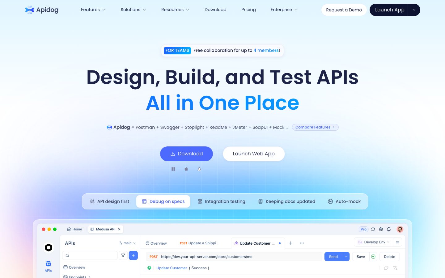
Apidog's marketing landing page is a bright, friendly developer-tools surface. The page floor is a white-to-pale-blue gradient canvas (`{colors.canvas}` — #ffffff fading through soft sky tints) anchored by an electric indigo-blue primary CTA (`{colors.primary}` — #4d6aff) and rounded **Poppins** display headlines. The dominant content gesture is the **product UI screenshot embedded inside a soft-shadowed card** — Apidog shows its actual API design/debug/test interface at scale rather than drawing marketing illustrations.
Type voice is single-family: **Poppins** carries everything — the rounded geometric display headlines ("Design, Build, and Test APIs"), the body copy, and the button labels. Display sizes run weight 600–700 (h1 at 64px / 600, the section h3 at 44px / 700), while body text sits at a compact 14px / 500. The rounded Poppins forms give the brand its approachable, modern-SaaS character.
Color voltage comes from a **multi-hue accent palette** drawn from API tooling conventions — blues (`{colors.primary}`, `{colors.primary-bold}`, `{colors.accent-sky}`, `{colors.accent-cyan}`), plus teal (`{colors.accent-teal}`), violet (`{colors.accent-violet}`), and amber (`{colors.accent-amber}`) that appear as method/status chips inside the product UI fragments and as feature-tile accents. Headlines deepen to a near-black navy (`{colors.ink}` — #0c1230), and the two-line hero splits color: dark navy first line, blue (`{colors.primary}` family) emphasis line.
Surfaces stay light throughout: the signature card surface is `{colors.surface}` (#fafbff), a barely-blue off-white that separates softly from the pure-white canvas. The whole system favors generous radii — `{rounded.lg}` (12px) is the dominant card radius, with pill-radius (`{rounded.pill}`) on buttons and badges, and large `{rounded.huge}` (32px) on the big feature media blocks.
**Key Characteristics:**
- Pale-blue gradient hero canvas with deep navy + blue two-tone headline; the second headline line carries the blue brand emphasis.
- Single-family **Poppins** typography across display, body, and buttons — rounded, geometric, friendly.
- Electric indigo-blue pill primary CTA (`{colors.primary}` — #4d6aff), padding 12px × 32px, fully pill-rounded (`{rounded.pill}`).
- A black pill "Launch App" CTA with a split dropdown affordance in the top-right nav — the only near-black action surface.
- Near-white card surface (`{colors.surface}` — #fafbff) with a soft layered shadow that makes embedded product screenshots float.
- Multi-hue accent set (blue / teal / violet / amber / cyan) used for API-method chips and feature-tile color, never for primary CTAs.
- Tab-pill-group selector under the hero ("API design first / Debug on specs / Integration testing / …") — a rounded white wrapper with a white active pill.
- Large rounded feature media blocks (`{rounded.huge}` — 32px) alternating colored fills and product screenshots down the page.
## Colors
### Brand & Primary
- **Primary** (`{colors.primary}` — #4d6aff): The dominant action color — primary CTAs ("Download"), the blue emphasis line of the hero headline, active tab text, accent links. This is the brand's electric indigo-blue.
- **Primary Bold** (`{colors.primary-bold}` — #1a66ff): A slightly more saturated blue used for emphasis text and gradient stops.
- **Black** (`{colors.black}` — #000000): The "Launch App" nav CTA and default link color. The only near-black action surface in the system.
### Accent Palette
Apidog uses a multi-hue accent set borrowed from API tooling conventions — these appear as HTTP-method/status chips inside the embedded product UI and as feature-tile color moments, never on the primary CTA:
- **Accent Blue** (`{colors.accent-blue}` — #2563eb)
- **Accent Indigo** (`{colors.accent-indigo}` — #6366f1)
- **Accent Sky** (`{colors.accent-sky}` — #31a6ff)
- **Accent Cyan** (`{colors.accent-cyan}` — #00bfff)
- **Accent Azure** (`{colors.accent-azure}` — #00aaff)
- **Accent Violet** (`{colors.accent-violet}` — #7f66ff)
- **Accent Teal** (`{colors.accent-teal}` — #00c7a6)
- **Accent Amber** (`{colors.accent-amber}` — #ffb21a)
### Surface
- **Canvas** (`{colors.canvas}` — #ffffff): The default page floor (overlaid with a subtle pale-blue gradient in the hero).
- **Surface** (`{colors.surface}` — #fafbff): The signature card surface — a barely-blue off-white for product-mockup cards and feature media blocks.
- **Surface Soft** (`{colors.surface-soft}` — #f5f5f5): A neutral light gray for soft dividers and inactive chip backgrounds.
- **Surface Dark** (`{colors.surface-dark}` — #26282c): A dark near-charcoal used sparingly inside product UI chrome (window bars, dark panels in the embedded app screenshots).
### Text
- **Ink** (`{colors.ink}` — #0c1230): The deepest navy — primary headlines.
- **Ink Strong** (`{colors.ink-strong}` — #1d2447): Secondary heading tone.
- **Heading** (`{colors.heading}` — #2f3659): Sub-headings and strong labels.
- **Body** (`{colors.body}` — #464d6a): The default running-text color (highest-frequency text tone).
- **Muted** (`{colors.muted}` — #7f85a3): Secondary text, inactive tab labels, captions.
- **On Primary** (`{colors.on-primary}` — #ffffff): Text on the blue primary CTA and the black Launch App button.
## Typography
### Font Family
The system runs **Poppins** for everything — display headlines, body copy, and buttons. Poppins is a rounded geometric sans that gives Apidog its friendly, approachable, modern-developer-tooling character. It is an open-source Google font, so it ships directly — no substitution required. A safe fallback stack is `Poppins, "Helvetica Neue", Arial, sans-serif`.
There is no licensed/custom typeface in the measured set (`fonts_licensed` is empty).
### Hierarchy
| Token | Size | Weight | Line Height | Letter Spacing | Use |
|---|---|---|---|---|---|
| `{typography.display-xl}` | 64px | 600 | 1.5 | normal | Hero h1 ("Design, Build, and Test APIs / All in One Place") |
| `{typography.display-lg}` | 48px | 600 | 1.0 | normal | Large section headlines |
| `{typography.display-md}` | 44px | 700 | 1.25 | normal | Section heads ("One workflow for your entire API lifecycle", "Built for the AI Era") |
| `{typography.body}` | 14px | 500 | 1.4 | normal | Default running-text, nav links, feature descriptions, tab labels |
| `{typography.button}` | 16px | 400 | 1.5 | normal | CTA button labels |
### Principles
The brand is single-family, so hierarchy is driven by size and weight rather than typeface contrast. Display headlines use the heavier weights (600 at the hero, 700 for mid-page section heads) while body text holds a compact 14px / 500 — dense, scannable, developer-doc-like. Headlines deepen to navy (`{colors.ink}`); the hero second line flips to blue for brand emphasis. Keep body copy at weight 500 — lighter weights read as washed-out against the pale-blue canvas.
### Note on Font Substitutes
None required — Poppins is open-source and shipped directly. If unavailable, **Inter** or **Mulish** at matching weights are usable approximations, though both are less geometrically rounded than Poppins.
## Layout
### Spacing System
- **Base unit:** 4px.
- **Tokens:** `{spacing.xxs}` 4px · `{spacing.xs}` 8px · `{spacing.sm}` 12px · `{spacing.md}` 16px · `{spacing.lg}` 24px · `{spacing.xl}` 32px · `{spacing.xxl}` 40px · `{spacing.xxxl}` 48px · `{spacing.huge}` 64px · `{spacing.giant}` 80px.
- **Highest-frequency steps:** 8px and 16px (inline/component gaps), 40px and 32px (block padding) dominate the measured set.
- **Card internal padding:** `{spacing.xl}` (32px) for feature media cards; `{spacing.xxl}` (40px) for the larger feature blocks; `{spacing.md}` (16px) inside the product-mockup card frame.
### Grid & Container
- **Hero:** Center-aligned single column — badge pill, two-line headline, comparison line, dual CTA row, platform icons, tab-pill-group, then the large product-mockup card spanning a wide centered container.
- **Feature bands:** Alternating two-column layout — text column (title + description + checklist + "Learn More" link) paired with a product-screenshot media card. Sides alternate down the page.
- **Lower bands:** Two-up split cards ("Native MCP Server" / "Built-In Visual MCP Client").
### Whitespace Philosophy
Apidog uses generous vertical rhythm between bands (64–80px steps) while keeping component internals tight (8/16px). The result is a page that breathes between sections but stays information-dense inside each feature block — appropriate for a technical audience that wants to see the product working.
## Elevation & Depth
| Level | Treatment | Use |
|---|---|---|
| Flat | No shadow | Hero text, nav, body sections on gradient canvas |
| Subtle | `rgba(0,0,0,0.05) 0px 1px 2px` | Small chips, badge pills |
| Soft card | `rgba(12,18,48,0.04) 0px 2px 12px` | Default light cards, tab-pill-group |
| Inset | `rgba(0,0,0,0.05) 0px 2px 4px inset` | Pressed / recessed input fields inside product UI |
| Floating card | `rgba(255,255,255,0.5) 0px -8px 24px, rgba(0,4,56,0.08) 0px 2px 12px` | The signature product-mockup `{component.card}` — a top white-glow plus a soft navy drop |
| Hairline glow | `rgba(208,216,231,0.2) 0px -2px 6px, rgba(208,216,231,0.15) 0px 4px 12px` | Soft pale-blue separators around floating panels |
| Primary glow | `rgba(59,130,246,0.3) 0px 10px 15px -3px, rgba(59,130,246,0.3) 0px 4px 6px -4px` | Blue CTA hover/emphasis glow (derived: blue-tinted shadow tracks the primary color) |
| Deep modal | `rgba(0,0,0,0.25) 0px 25px 50px -12px` | High-elevation overlays / popovers |
The elevation philosophy is **soft and luminous** — low-alpha navy drops combined with white top-glows make cards appear to float above the pale-blue canvas. No hard borders, no heavy shadows.
### Decorative Depth
- The hero product-mockup card carries the floating-card shadow with a white top-glow, lifting the screenshot off the gradient.
- Embedded product UI fragments carry their own internal chrome shadows (window bars, panels) which read as product content, not system tokens.
## Shapes
### Border Radius Scale
| Token | Value | Use |
|---|---|---|
| `{rounded.xs}` | 6px | Small inline chips, tight controls |
| `{rounded.sm}` | 8px | Small buttons, dropdown items |
| `{rounded.md}` | 10px | Inputs, secondary chips |
| `{rounded.lg}` | 12px | Dominant card radius — product-mockup frame, most content cards |
| `{rounded.card}` | 14px | The measured `{component.card}` surface radius |
| `{rounded.xl}` | 16px | Tab-pill-group container, mid-size cards |
| `{rounded.xxl}` | 20px | Larger panels |
| `{rounded.xxxl}` | 24px | Feature media cards |
| `{rounded.huge}` | 32px | The largest feature blocks |
| `{rounded.pill}` | 9999px | Primary/secondary CTAs, badge pills, tabs, comparison pill |
The dominant radius is `{rounded.lg}` (12px, by far the highest frequency), with pill-radius (`{rounded.pill}`) the second-most-used — buttons and badges are fully rounded. Larger blocks step up to 24–32px.
### Photography / Media Geometry
Product UI screenshots sit inside cards with `{rounded.lg}` corners and retain their native window chrome (traffic-light dots, tabs, panels). Feature media cards use larger `{rounded.huge}` corners. There are no circular avatar crops in the measured landing surface.
## Components
### Top Navigation
**`top-nav`** — Transparent bar over the gradient hero. Carries the Apidog wordmark + logo at left, a horizontal menu (Features, Solutions, Resources, Download, Pricing, Enterprise) with dropdown carets in `{typography.body}` (Poppins 14px / 500), and a right cluster: a white outline "Request a Demo" pill plus the black "Launch App" CTA. ~60px tall, padding ~16px × 40px.
### Buttons
**`button-primary`** — The signature blue CTA ("Download"). Background `{colors.primary}` (#4d6aff), text `{colors.on-primary}`, type `{typography.button}` (Poppins 16px / 400), padding 12px × 32px, fully pill-rounded (`{rounded.pill}`). Carries the blue primary glow shadow on emphasis.
**`button-launch-dark`** — The black "Launch App" nav CTA with an adjacent split dropdown affordance. Background `{colors.black}`, text `{colors.on-primary}`, `{typography.button}`. Radius set to `{rounded.lg}` (derived: the dark button's exact radius was not measured; it reads as a softly rounded rectangle, not a full pill).
**`button-secondary`** — White outline CTA ("Launch Web App", "Request a Demo"). Background `{colors.canvas}`, text `{colors.heading}`, 1px hairline border, `{typography.button}`, pill-rounded (`{rounded.pill}`), padding 12px × 32px.
**`compare-features-pill`** — A small inline outline pill link ("Compare Features ›") next to the hero comparison line. Transparent background, text `{colors.primary}`, `{rounded.pill}`, padding 8px × 16px.
### Badges & Tabs
**`badge-pill`** — The hero "FOR TEAMS — Free collaboration for up to 4 members!" pill. White background (`{colors.canvas}`), soft card shadow, `{rounded.pill}`, padding 8px × 16px, body text `{typography.body}`. The "FOR TEAMS" tag inside it uses a blue accent fill.
**`tab-pill-group`** — The horizontal selector below the hero CTAs ("API design first / Debug on specs / Integration testing / Keeping docs updated / Auto-mock"). White rounded container (`{colors.canvas}`, `{rounded.xl}`, padding 6px) with a soft card shadow.
**`tab-pill`** + **`tab-pill-active`** — Inactive: transparent background, `{colors.muted}` text. Active: `{colors.canvas}` background with the blue text (`{colors.primary}`), `{rounded.lg}`, padding 12px × 20px. Both use `{typography.body}`.
### Cards & Containers
**`card`** — The measured base card. Background `{colors.surface}` (#fafbff), `{rounded.card}` (14px), with the signature floating-card shadow (white top-glow + soft navy drop). Used as the wrapper that lifts content off the gradient.
**`product-mockup-card`** — The large hero app screenshot container and the feature-band screenshots. Background `{colors.canvas}`, `{rounded.lg}` (12px), padding ~16px, floating-card shadow. Holds the real Apidog interface (project tree, request/response panels, method chips) at scale — Apidog shows the product, not an illustration of it.
**`feature-media-card`** — The screenshot/illustration media tile in each alternating feature band. Background `{colors.surface}`, `{rounded.xxxl}` (24px), padding `{spacing.xl}` (32px). Some bands use a flat color fill (e.g. an amber `{colors.accent-amber}` block) instead of a screenshot.
**`feature-block`** — The largest rounded content blocks lower on the page. Background `{colors.canvas}`, `{rounded.huge}` (32px), padding `{spacing.xxl}` (40px), body text `{typography.body}`. Carries a small icon-label, a display heading, a description, a two-column feature checklist, and a "Learn More ›" text link.
## Do's and Don'ts
### Do
- Reserve `{colors.primary}` (#4d6aff) for primary CTAs and the blue hero emphasis line. The brand's action color is electric indigo-blue.
- Use the black `{component.button-launch-dark}` only for the app-launch action in the nav — it's the single near-black surface.
- Set headlines in Poppins at weight 600–700; keep body copy at weight 500. Hierarchy comes from size + weight, not typeface contrast.
- Use the multi-hue accent palette for API-method/status chips and feature-tile color moments — never on the primary CTA.
- Show real product UI inside `{component.product-mockup-card}` rather than drawing illustrations of the product.
- Use the floating-card shadow (white top-glow + soft navy drop) to lift cards off the pale-blue canvas.
- Keep buttons and badges fully pill-rounded (`{rounded.pill}`); use `{rounded.lg}` (12px) as the default card radius.
### Don't
- Don't introduce dark backgrounds for content sections — the system is light throughout; `{colors.surface-dark}` belongs inside product UI chrome only.
- Don't mix typefaces — Poppins carries everything.
- Don't put accent hues (teal, violet, amber) on the primary CTA; the action layer is blue/black only.
- Don't drop body text below weight 500 — lighter weights wash out on the pale-blue canvas.
- Don't add hard borders to cards; use the soft layered shadow for separation.
- Don't add hover-state styling beyond what's documented — default and pressed/active states only.
## Responsive Behavior
The analysis captured the desktop landing page only; the second screenshot shows the full-length desktop scroll. Mobile and tablet breakpoints were not measured — the behavior below is inferred from the desktop structure and flagged in Known Gaps.
### Breakpoints (inferred)
| Name | Width | Key Changes |
|---|---|---|
| Mobile | < 768px | Nav likely collapses to a hamburger; hero headline scales down from 64px; dual CTA row stacks; tab-pill-group wraps or becomes scrollable; feature bands collapse to single column |
| Tablet | 768–1024px | Feature bands tighten; product-mockup card scales proportionally |
| Desktop | > 1024px | Full horizontal nav, center-aligned hero, alternating two-column feature bands as measured |
### Touch Targets
- `{component.button-primary}` at padding 12px × 32px comfortably exceeds 44px effective height.
- `{component.tab-pill}` at 12px × 20px padding meets tap-target size within the pill-group.
### Collapsing Strategy (inferred)
- Alternating feature bands collapse to single column (text above media) on narrow viewports.
- The product-mockup card scales proportionally; embedded UI chrome may become illegible at small sizes and is typically swapped for a cropped view.
## Iteration Guide
1. Focus on ONE component at a time. Reference its YAML key directly (`{component.product-mockup-card}`, `{component.feature-block}`).
2. Variants (`-active`, `-disabled`, `-focused`) live as separate entries in `components:`.
3. Use `{token.refs}` everywhere — never inline a hex into a component.
4. Never document hover. Default and active/pressed states only.
5. Keep the action layer blue + black; accents stay in product chrome and feature tiles.
6. Default card radius is `{rounded.lg}` (12px); buttons and badges are `{rounded.pill}`.
7. When elevating a card, reach for the floating-card shadow, not a border.
## Known Gaps
- Only the desktop landing page was captured; mobile and tablet breakpoints, the nav dropdown menus, and the footer were not measured. Responsive behavior is inferred.
- The black "Launch App" CTA radius and the split-dropdown affordance dimensions were not measured; `{component.button-launch-dark}` radius is documented as derived.
- The hero gradient (white → pale blue) is visible in screenshots but no gradient stops were extracted; only solid surface tones (`{colors.canvas}`, `{colors.surface}`) are in the token set.
- Exact line-height for body copy is measured at 1.4 and h1 at 1.5; intermediate text roles (captions, fine print, eyebrow labels) were not separately captured and inherit `{typography.body}`.
- The multi-hue accent palette is documented from frequency data; specific assignments to individual HTTP-method/status chips inside the product UI were not mapped one-to-one.
- Measured radii of 30px and 32px exist but were folded into `{rounded.huge}`; the 30px outliers are not separately tokenized.
- Animation, transition timings, and any scroll-triggered reveals are out of scope.
- Form input, validation, and focus states were not extracted from the marketing surface (they live inside the product UI shown as screenshots).
<!-- Documented by duply · real-world design systems as ready-to-use DESIGN.md for AI coding agents · https://duply.ai/apidog/design-md -->
Color Palette
Accent
Neutrals
Typography
display-xl64px · 600 · 1.5
The quick brown fox jumpsdisplay-lg48px · 600 · 1
The quick brown fox jumpsdisplay-md44px · 700 · 1.25
The quick brown fox jumpsbody14px · 500 · 1.4
The quick brown fox jumpsbutton16px · 400 · 1.5
The quick brown fox jumpsSpacing & Shape
Spacing
| Name | Value | Preview |
|---|---|---|
| xxs | 4px | |
| xs | 8px | |
| sm | 12px | |
| md | 16px | |
| lg | 24px | |
| xl | 32px | |
| xxl | 40px | |
| xxxl | 48px | |
| huge | 64px | |
| giant | 80px |
Border Radius
| Name | Value | Preview |
|---|---|---|
| xs | 6px | |
| sm | 8px | |
| md | 10px | |
| lg | 12px | |
| card | 14px | |
| xl | 16px | |
| xxl | 20px | |
| xxxl | 24px | |
| huge | 32px | |
| pill | 9999px |
More like this


---
version: alpha
name: Apidog-design-analysis
description: "A bright, developer-tools marketing surface built on white-to-pale-blue gradient canvas with an electric indigo-blue primary CTA (#4d6aff), rounded Poppins display headlines, and product UI screenshots presented inside soft-shadowed cards. The system reads as friendly, modern API-tooling SaaS — generous radii, near-white #fafbff surfaces, a multi-hue accent palette borrowed from API status/method colors, and large embedded app mockups that show the real product chrome rather than illustrations."

colors:
  primary: "#4d6aff"
  primary-bold: "#1a66ff"
  accent-blue: "#2563eb"
  accent-indigo: "#6366f1"
  accent-sky: "#31a6ff"
  accent-cyan: "#00bfff"
  accent-azure: "#00aaff"
  accent-violet: "#7f66ff"
  accent-teal: "#00c7a6"
  accent-amber: "#ffb21a"
  ink: "#0c1230"
  ink-strong: "#1d2447"
  heading: "#2f3659"
  body: "#464d6a"
  muted: "#7f85a3"
  black: "#000000"
  on-primary: "#ffffff"
  canvas: "#ffffff"
  surface: "#fafbff"
  surface-soft: "#f5f5f5"
  surface-dark: "#26282c"

typography:
  display-xl:
    fontFamily: "Poppins, sans-serif"
    fontSize: 64px
    fontWeight: 600
    lineHeight: 1.5
    letterSpacing: normal
  display-lg:
    fontFamily: "Poppins, sans-serif"
    fontSize: 48px
    fontWeight: 600
    lineHeight: 1.0
    letterSpacing: normal
  display-md:
    fontFamily: "Poppins, sans-serif"
    fontSize: 44px
    fontWeight: 700
    lineHeight: 1.25
    letterSpacing: normal
  body:
    fontFamily: "Poppins, sans-serif"
    fontSize: 14px
    fontWeight: 500
    lineHeight: 1.4
    letterSpacing: normal
  button:
    fontFamily: "Poppins, sans-serif"
    fontSize: 16px
    fontWeight: 400
    lineHeight: 1.5
    letterSpacing: normal

rounded:
  xs: 6px
  sm: 8px
  md: 10px
  lg: 12px
  card: 14px
  xl: 16px
  xxl: 20px
  xxxl: 24px
  huge: 32px
  pill: 9999px

spacing:
  xxs: 4px
  xs: 8px
  sm: 12px
  md: 16px
  lg: 24px
  xl: 32px
  xxl: 40px
  xxxl: 48px
  huge: 64px
  giant: 80px

components:
  top-nav:
    backgroundColor: transparent
    textColor: "{colors.body}"
    typography: "{typography.body}"
    height: 60px
    padding: 16px 40px
  button-primary:
    backgroundColor: "{colors.primary}"
    textColor: "{colors.on-primary}"
    typography: "{typography.button}"
    rounded: "{rounded.pill}"
    padding: 12px 32px
  button-launch-dark:
    backgroundColor: "{colors.black}"
    textColor: "{colors.on-primary}"
    typography: "{typography.button}"
    rounded: "{rounded.lg}"
    padding: 12px 24px
  button-secondary:
    backgroundColor: "{colors.canvas}"
    textColor: "{colors.heading}"
    typography: "{typography.button}"
    rounded: "{rounded.pill}"
    padding: 12px 32px
  compare-features-pill:
    backgroundColor: transparent
    textColor: "{colors.primary}"
    typography: "{typography.body}"
    rounded: "{rounded.pill}"
    padding: 8px 16px
  badge-pill:
    backgroundColor: "{colors.canvas}"
    textColor: "{colors.body}"
    typography: "{typography.body}"
    rounded: "{rounded.pill}"
    padding: 8px 16px
  tab-pill-group:
    backgroundColor: "{colors.canvas}"
    textColor: "{colors.muted}"
    typography: "{typography.body}"
    rounded: "{rounded.xl}"
    padding: 6px
  tab-pill:
    backgroundColor: transparent
    textColor: "{colors.muted}"
    typography: "{typography.body}"
    rounded: "{rounded.lg}"
    padding: 12px 20px
  tab-pill-active:
    backgroundColor: "{colors.canvas}"
    textColor: "{colors.primary}"
    typography: "{typography.body}"
    rounded: "{rounded.lg}"
    padding: 12px 20px
  card:
    backgroundColor: "{colors.surface}"
    textColor: "{colors.body}"
    typography: "{typography.body}"
    rounded: "{rounded.card}"
  product-mockup-card:
    backgroundColor: "{colors.canvas}"
    textColor: "{colors.body}"
    rounded: "{rounded.lg}"
    padding: 16px
  feature-media-card:
    backgroundColor: "{colors.surface}"
    textColor: "{colors.body}"
    rounded: "{rounded.xxxl}"
    padding: 32px
  feature-block:
    backgroundColor: "{colors.canvas}"
    textColor: "{colors.body}"
    typography: "{typography.body}"
    rounded: "{rounded.huge}"
    padding: 40px
---

## Overview

Apidog's marketing landing page is a bright, friendly developer-tools surface. The page floor is a white-to-pale-blue gradient canvas (`{colors.canvas}` — #ffffff fading through soft sky tints) anchored by an electric indigo-blue primary CTA (`{colors.primary}` — #4d6aff) and rounded **Poppins** display headlines. The dominant content gesture is the **product UI screenshot embedded inside a soft-shadowed card** — Apidog shows its actual API design/debug/test interface at scale rather than drawing marketing illustrations.

Type voice is single-family: **Poppins** carries everything — the rounded geometric display headlines ("Design, Build, and Test APIs"), the body copy, and the button labels. Display sizes run weight 600–700 (h1 at 64px / 600, the section h3 at 44px / 700), while body text sits at a compact 14px / 500. The rounded Poppins forms give the brand its approachable, modern-SaaS character.

Color voltage comes from a **multi-hue accent palette** drawn from API tooling conventions — blues (`{colors.primary}`, `{colors.primary-bold}`, `{colors.accent-sky}`, `{colors.accent-cyan}`), plus teal (`{colors.accent-teal}`), violet (`{colors.accent-violet}`), and amber (`{colors.accent-amber}`) that appear as method/status chips inside the product UI fragments and as feature-tile accents. Headlines deepen to a near-black navy (`{colors.ink}` — #0c1230), and the two-line hero splits color: dark navy first line, blue (`{colors.primary}` family) emphasis line.

Surfaces stay light throughout: the signature card surface is `{colors.surface}` (#fafbff), a barely-blue off-white that separates softly from the pure-white canvas. The whole system favors generous radii — `{rounded.lg}` (12px) is the dominant card radius, with pill-radius (`{rounded.pill}`) on buttons and badges, and large `{rounded.huge}` (32px) on the big feature media blocks.

**Key Characteristics:**
- Pale-blue gradient hero canvas with deep navy + blue two-tone headline; the second headline line carries the blue brand emphasis.
- Single-family **Poppins** typography across display, body, and buttons — rounded, geometric, friendly.
- Electric indigo-blue pill primary CTA (`{colors.primary}` — #4d6aff), padding 12px × 32px, fully pill-rounded (`{rounded.pill}`).
- A black pill "Launch App" CTA with a split dropdown affordance in the top-right nav — the only near-black action surface.
- Near-white card surface (`{colors.surface}` — #fafbff) with a soft layered shadow that makes embedded product screenshots float.
- Multi-hue accent set (blue / teal / violet / amber / cyan) used for API-method chips and feature-tile color, never for primary CTAs.
- Tab-pill-group selector under the hero ("API design first / Debug on specs / Integration testing / …") — a rounded white wrapper with a white active pill.
- Large rounded feature media blocks (`{rounded.huge}` — 32px) alternating colored fills and product screenshots down the page.

## Colors

### Brand & Primary
- **Primary** (`{colors.primary}` — #4d6aff): The dominant action color — primary CTAs ("Download"), the blue emphasis line of the hero headline, active tab text, accent links. This is the brand's electric indigo-blue.
- **Primary Bold** (`{colors.primary-bold}` — #1a66ff): A slightly more saturated blue used for emphasis text and gradient stops.
- **Black** (`{colors.black}` — #000000): The "Launch App" nav CTA and default link color. The only near-black action surface in the system.

### Accent Palette
Apidog uses a multi-hue accent set borrowed from API tooling conventions — these appear as HTTP-method/status chips inside the embedded product UI and as feature-tile color moments, never on the primary CTA:
- **Accent Blue** (`{colors.accent-blue}` — #2563eb)
- **Accent Indigo** (`{colors.accent-indigo}` — #6366f1)
- **Accent Sky** (`{colors.accent-sky}` — #31a6ff)
- **Accent Cyan** (`{colors.accent-cyan}` — #00bfff)
- **Accent Azure** (`{colors.accent-azure}` — #00aaff)
- **Accent Violet** (`{colors.accent-violet}` — #7f66ff)
- **Accent Teal** (`{colors.accent-teal}` — #00c7a6)
- **Accent Amber** (`{colors.accent-amber}` — #ffb21a)

### Surface
- **Canvas** (`{colors.canvas}` — #ffffff): The default page floor (overlaid with a subtle pale-blue gradient in the hero).
- **Surface** (`{colors.surface}` — #fafbff): The signature card surface — a barely-blue off-white for product-mockup cards and feature media blocks.
- **Surface Soft** (`{colors.surface-soft}` — #f5f5f5): A neutral light gray for soft dividers and inactive chip backgrounds.
- **Surface Dark** (`{colors.surface-dark}` — #26282c): A dark near-charcoal used sparingly inside product UI chrome (window bars, dark panels in the embedded app screenshots).

### Text
- **Ink** (`{colors.ink}` — #0c1230): The deepest navy — primary headlines.
- **Ink Strong** (`{colors.ink-strong}` — #1d2447): Secondary heading tone.
- **Heading** (`{colors.heading}` — #2f3659): Sub-headings and strong labels.
- **Body** (`{colors.body}` — #464d6a): The default running-text color (highest-frequency text tone).
- **Muted** (`{colors.muted}` — #7f85a3): Secondary text, inactive tab labels, captions.
- **On Primary** (`{colors.on-primary}` — #ffffff): Text on the blue primary CTA and the black Launch App button.

## Typography

### Font Family
The system runs **Poppins** for everything — display headlines, body copy, and buttons. Poppins is a rounded geometric sans that gives Apidog its friendly, approachable, modern-developer-tooling character. It is an open-source Google font, so it ships directly — no substitution required. A safe fallback stack is `Poppins, "Helvetica Neue", Arial, sans-serif`.

There is no licensed/custom typeface in the measured set (`fonts_licensed` is empty).

### Hierarchy

| Token | Size | Weight | Line Height | Letter Spacing | Use |
|---|---|---|---|---|---|
| `{typography.display-xl}` | 64px | 600 | 1.5 | normal | Hero h1 ("Design, Build, and Test APIs / All in One Place") |
| `{typography.display-lg}` | 48px | 600 | 1.0 | normal | Large section headlines |
| `{typography.display-md}` | 44px | 700 | 1.25 | normal | Section heads ("One workflow for your entire API lifecycle", "Built for the AI Era") |
| `{typography.body}` | 14px | 500 | 1.4 | normal | Default running-text, nav links, feature descriptions, tab labels |
| `{typography.button}` | 16px | 400 | 1.5 | normal | CTA button labels |

### Principles
The brand is single-family, so hierarchy is driven by size and weight rather than typeface contrast. Display headlines use the heavier weights (600 at the hero, 700 for mid-page section heads) while body text holds a compact 14px / 500 — dense, scannable, developer-doc-like. Headlines deepen to navy (`{colors.ink}`); the hero second line flips to blue for brand emphasis. Keep body copy at weight 500 — lighter weights read as washed-out against the pale-blue canvas.

### Note on Font Substitutes
None required — Poppins is open-source and shipped directly. If unavailable, **Inter** or **Mulish** at matching weights are usable approximations, though both are less geometrically rounded than Poppins.

## Layout

### Spacing System
- **Base unit:** 4px.
- **Tokens:** `{spacing.xxs}` 4px · `{spacing.xs}` 8px · `{spacing.sm}` 12px · `{spacing.md}` 16px · `{spacing.lg}` 24px · `{spacing.xl}` 32px · `{spacing.xxl}` 40px · `{spacing.xxxl}` 48px · `{spacing.huge}` 64px · `{spacing.giant}` 80px.
- **Highest-frequency steps:** 8px and 16px (inline/component gaps), 40px and 32px (block padding) dominate the measured set.
- **Card internal padding:** `{spacing.xl}` (32px) for feature media cards; `{spacing.xxl}` (40px) for the larger feature blocks; `{spacing.md}` (16px) inside the product-mockup card frame.

### Grid & Container
- **Hero:** Center-aligned single column — badge pill, two-line headline, comparison line, dual CTA row, platform icons, tab-pill-group, then the large product-mockup card spanning a wide centered container.
- **Feature bands:** Alternating two-column layout — text column (title + description + checklist + "Learn More" link) paired with a product-screenshot media card. Sides alternate down the page.
- **Lower bands:** Two-up split cards ("Native MCP Server" / "Built-In Visual MCP Client").

### Whitespace Philosophy
Apidog uses generous vertical rhythm between bands (64–80px steps) while keeping component internals tight (8/16px). The result is a page that breathes between sections but stays information-dense inside each feature block — appropriate for a technical audience that wants to see the product working.

## Elevation & Depth

| Level | Treatment | Use |
|---|---|---|
| Flat | No shadow | Hero text, nav, body sections on gradient canvas |
| Subtle | `rgba(0,0,0,0.05) 0px 1px 2px` | Small chips, badge pills |
| Soft card | `rgba(12,18,48,0.04) 0px 2px 12px` | Default light cards, tab-pill-group |
| Inset | `rgba(0,0,0,0.05) 0px 2px 4px inset` | Pressed / recessed input fields inside product UI |
| Floating card | `rgba(255,255,255,0.5) 0px -8px 24px, rgba(0,4,56,0.08) 0px 2px 12px` | The signature product-mockup `{component.card}` — a top white-glow plus a soft navy drop |
| Hairline glow | `rgba(208,216,231,0.2) 0px -2px 6px, rgba(208,216,231,0.15) 0px 4px 12px` | Soft pale-blue separators around floating panels |
| Primary glow | `rgba(59,130,246,0.3) 0px 10px 15px -3px, rgba(59,130,246,0.3) 0px 4px 6px -4px` | Blue CTA hover/emphasis glow (derived: blue-tinted shadow tracks the primary color) |
| Deep modal | `rgba(0,0,0,0.25) 0px 25px 50px -12px` | High-elevation overlays / popovers |

The elevation philosophy is **soft and luminous** — low-alpha navy drops combined with white top-glows make cards appear to float above the pale-blue canvas. No hard borders, no heavy shadows.

### Decorative Depth
- The hero product-mockup card carries the floating-card shadow with a white top-glow, lifting the screenshot off the gradient.
- Embedded product UI fragments carry their own internal chrome shadows (window bars, panels) which read as product content, not system tokens.

## Shapes

### Border Radius Scale

| Token | Value | Use |
|---|---|---|
| `{rounded.xs}` | 6px | Small inline chips, tight controls |
| `{rounded.sm}` | 8px | Small buttons, dropdown items |
| `{rounded.md}` | 10px | Inputs, secondary chips |
| `{rounded.lg}` | 12px | Dominant card radius — product-mockup frame, most content cards |
| `{rounded.card}` | 14px | The measured `{component.card}` surface radius |
| `{rounded.xl}` | 16px | Tab-pill-group container, mid-size cards |
| `{rounded.xxl}` | 20px | Larger panels |
| `{rounded.xxxl}` | 24px | Feature media cards |
| `{rounded.huge}` | 32px | The largest feature blocks |
| `{rounded.pill}` | 9999px | Primary/secondary CTAs, badge pills, tabs, comparison pill |

The dominant radius is `{rounded.lg}` (12px, by far the highest frequency), with pill-radius (`{rounded.pill}`) the second-most-used — buttons and badges are fully rounded. Larger blocks step up to 24–32px.

### Photography / Media Geometry
Product UI screenshots sit inside cards with `{rounded.lg}` corners and retain their native window chrome (traffic-light dots, tabs, panels). Feature media cards use larger `{rounded.huge}` corners. There are no circular avatar crops in the measured landing surface.

## Components

### Top Navigation

**`top-nav`** — Transparent bar over the gradient hero. Carries the Apidog wordmark + logo at left, a horizontal menu (Features, Solutions, Resources, Download, Pricing, Enterprise) with dropdown carets in `{typography.body}` (Poppins 14px / 500), and a right cluster: a white outline "Request a Demo" pill plus the black "Launch App" CTA. ~60px tall, padding ~16px × 40px.

### Buttons

**`button-primary`** — The signature blue CTA ("Download"). Background `{colors.primary}` (#4d6aff), text `{colors.on-primary}`, type `{typography.button}` (Poppins 16px / 400), padding 12px × 32px, fully pill-rounded (`{rounded.pill}`). Carries the blue primary glow shadow on emphasis.

**`button-launch-dark`** — The black "Launch App" nav CTA with an adjacent split dropdown affordance. Background `{colors.black}`, text `{colors.on-primary}`, `{typography.button}`. Radius set to `{rounded.lg}` (derived: the dark button's exact radius was not measured; it reads as a softly rounded rectangle, not a full pill).

**`button-secondary`** — White outline CTA ("Launch Web App", "Request a Demo"). Background `{colors.canvas}`, text `{colors.heading}`, 1px hairline border, `{typography.button}`, pill-rounded (`{rounded.pill}`), padding 12px × 32px.

**`compare-features-pill`** — A small inline outline pill link ("Compare Features ›") next to the hero comparison line. Transparent background, text `{colors.primary}`, `{rounded.pill}`, padding 8px × 16px.

### Badges & Tabs

**`badge-pill`** — The hero "FOR TEAMS — Free collaboration for up to 4 members!" pill. White background (`{colors.canvas}`), soft card shadow, `{rounded.pill}`, padding 8px × 16px, body text `{typography.body}`. The "FOR TEAMS" tag inside it uses a blue accent fill.

**`tab-pill-group`** — The horizontal selector below the hero CTAs ("API design first / Debug on specs / Integration testing / Keeping docs updated / Auto-mock"). White rounded container (`{colors.canvas}`, `{rounded.xl}`, padding 6px) with a soft card shadow.

**`tab-pill`** + **`tab-pill-active`** — Inactive: transparent background, `{colors.muted}` text. Active: `{colors.canvas}` background with the blue text (`{colors.primary}`), `{rounded.lg}`, padding 12px × 20px. Both use `{typography.body}`.

### Cards & Containers

**`card`** — The measured base card. Background `{colors.surface}` (#fafbff), `{rounded.card}` (14px), with the signature floating-card shadow (white top-glow + soft navy drop). Used as the wrapper that lifts content off the gradient.

**`product-mockup-card`** — The large hero app screenshot container and the feature-band screenshots. Background `{colors.canvas}`, `{rounded.lg}` (12px), padding ~16px, floating-card shadow. Holds the real Apidog interface (project tree, request/response panels, method chips) at scale — Apidog shows the product, not an illustration of it.

**`feature-media-card`** — The screenshot/illustration media tile in each alternating feature band. Background `{colors.surface}`, `{rounded.xxxl}` (24px), padding `{spacing.xl}` (32px). Some bands use a flat color fill (e.g. an amber `{colors.accent-amber}` block) instead of a screenshot.

**`feature-block`** — The largest rounded content blocks lower on the page. Background `{colors.canvas}`, `{rounded.huge}` (32px), padding `{spacing.xxl}` (40px), body text `{typography.body}`. Carries a small icon-label, a display heading, a description, a two-column feature checklist, and a "Learn More ›" text link.

## Do's and Don'ts

### Do
- Reserve `{colors.primary}` (#4d6aff) for primary CTAs and the blue hero emphasis line. The brand's action color is electric indigo-blue.
- Use the black `{component.button-launch-dark}` only for the app-launch action in the nav — it's the single near-black surface.
- Set headlines in Poppins at weight 600–700; keep body copy at weight 500. Hierarchy comes from size + weight, not typeface contrast.
- Use the multi-hue accent palette for API-method/status chips and feature-tile color moments — never on the primary CTA.
- Show real product UI inside `{component.product-mockup-card}` rather than drawing illustrations of the product.
- Use the floating-card shadow (white top-glow + soft navy drop) to lift cards off the pale-blue canvas.
- Keep buttons and badges fully pill-rounded (`{rounded.pill}`); use `{rounded.lg}` (12px) as the default card radius.

### Don't
- Don't introduce dark backgrounds for content sections — the system is light throughout; `{colors.surface-dark}` belongs inside product UI chrome only.
- Don't mix typefaces — Poppins carries everything.
- Don't put accent hues (teal, violet, amber) on the primary CTA; the action layer is blue/black only.
- Don't drop body text below weight 500 — lighter weights wash out on the pale-blue canvas.
- Don't add hard borders to cards; use the soft layered shadow for separation.
- Don't add hover-state styling beyond what's documented — default and pressed/active states only.

## Responsive Behavior

The analysis captured the desktop landing page only; the second screenshot shows the full-length desktop scroll. Mobile and tablet breakpoints were not measured — the behavior below is inferred from the desktop structure and flagged in Known Gaps.

### Breakpoints (inferred)

| Name | Width | Key Changes |
|---|---|---|
| Mobile | < 768px | Nav likely collapses to a hamburger; hero headline scales down from 64px; dual CTA row stacks; tab-pill-group wraps or becomes scrollable; feature bands collapse to single column |
| Tablet | 768–1024px | Feature bands tighten; product-mockup card scales proportionally |
| Desktop | > 1024px | Full horizontal nav, center-aligned hero, alternating two-column feature bands as measured |

### Touch Targets
- `{component.button-primary}` at padding 12px × 32px comfortably exceeds 44px effective height.
- `{component.tab-pill}` at 12px × 20px padding meets tap-target size within the pill-group.

### Collapsing Strategy (inferred)
- Alternating feature bands collapse to single column (text above media) on narrow viewports.
- The product-mockup card scales proportionally; embedded UI chrome may become illegible at small sizes and is typically swapped for a cropped view.

## Iteration Guide

1. Focus on ONE component at a time. Reference its YAML key directly (`{component.product-mockup-card}`, `{component.feature-block}`).
2. Variants (`-active`, `-disabled`, `-focused`) live as separate entries in `components:`.
3. Use `{token.refs}` everywhere — never inline a hex into a component.
4. Never document hover. Default and active/pressed states only.
5. Keep the action layer blue + black; accents stay in product chrome and feature tiles.
6. Default card radius is `{rounded.lg}` (12px); buttons and badges are `{rounded.pill}`.
7. When elevating a card, reach for the floating-card shadow, not a border.

## Known Gaps

- Only the desktop landing page was captured; mobile and tablet breakpoints, the nav dropdown menus, and the footer were not measured. Responsive behavior is inferred.
- The black "Launch App" CTA radius and the split-dropdown affordance dimensions were not measured; `{component.button-launch-dark}` radius is documented as derived.
- The hero gradient (white → pale blue) is visible in screenshots but no gradient stops were extracted; only solid surface tones (`{colors.canvas}`, `{colors.surface}`) are in the token set.
- Exact line-height for body copy is measured at 1.4 and h1 at 1.5; intermediate text roles (captions, fine print, eyebrow labels) were not separately captured and inherit `{typography.body}`.
- The multi-hue accent palette is documented from frequency data; specific assignments to individual HTTP-method/status chips inside the product UI were not mapped one-to-one.
- Measured radii of 30px and 32px exist but were folded into `{rounded.huge}`; the 30px outliers are not separately tokenized.
- Animation, transition timings, and any scroll-triggered reveals are out of scope.
- Form input, validation, and focus states were not extracted from the marketing surface (they live inside the product UI shown as screenshots).

<!-- Documented by duply · real-world design systems as ready-to-use DESIGN.md for AI coding agents · https://duply.ai/apidog/design-md -->