Vector
A clean, developer-tooling marketing surface for Vector (by Datadog) — white canvas, near-black ink type, and light-gray pill-shaped action chips. The brand voltage is a cyan-to-magenta gradient (the Vector "V" hexagon mark) applied to section headings and the logo, set against an otherwise monochrome, system-font UI. The page reads as fast, technical, and unfussy: pill buttons, a terminal-style config card, and a wide range of source/transform/sink listing columns.
---
version: alpha
name: Vector-design-analysis
description: "A clean, developer-tooling marketing surface for Vector (by Datadog) — white canvas, near-black ink type, and light-gray pill-shaped action chips. The brand voltage is a cyan-to-magenta gradient (the Vector \"V\" hexagon mark) applied to section headings and the logo, set against an otherwise monochrome, system-font UI. The page reads as fast, technical, and unfussy: pill buttons, a terminal-style config card, and a wide range of source/transform/sink listing columns."
colors:
ink: "#191927"
on-primary: "#000000"
canvas: "#ffffff"
surface: "#e5e7eb"
surface-soft: "#f4f4f5"
hairline: "#e4e4e7"
neutral-700: "#3f3f46"
neutral-600: "#52525b"
neutral-500: "#71717a"
neutral-gray: "#6b7280"
neutral-400: "#a1a1aa"
neutral-300: "#d4d4d8"
accent-cyan: "#28d9f2"
accent-teal: "#00a9bc"
accent-blue: "#93c5fd"
accent-violet: "#c4b5fd"
accent-mint: "#6ee7b7"
accent-pink: "#f472b6"
accent-magenta: "#f44af5"
accent-magenta-pure: "#ff00ff"
typography:
display:
fontFamily: "Segoe UI, system-ui, sans-serif"
fontSize: 36px
fontWeight: 800
lineHeight: 1.111
letterSpacing: normal
lead:
fontFamily: "Segoe UI, system-ui, sans-serif"
fontSize: 30px
fontWeight: 400
lineHeight: 1.2
letterSpacing: normal
eyebrow:
fontFamily: "Segoe UI, system-ui, sans-serif"
fontSize: 16px
fontWeight: 600
lineHeight: 1.5
letterSpacing: 0.8px
body:
fontFamily: "Segoe UI, system-ui, sans-serif"
fontSize: 16px
fontWeight: 400
lineHeight: 1.5
letterSpacing: normal
button:
fontFamily: "Segoe UI, system-ui, sans-serif"
fontSize: 16px
fontWeight: 400
lineHeight: 1.5
letterSpacing: normal
rounded:
xs: 2px
sm: 4px
md: 6px
lg: 12px
pill: 9999px
spacing:
xxs: 4px
xs: 6px
sm: 8px
md: 12px
lg: 16px
xl: 32px
xxl: 40px
section: 80px
components:
top-nav:
backgroundColor: "{colors.canvas}"
textColor: "{colors.ink}"
typography: "{typography.body}"
padding: 12px 32px
nav-link:
backgroundColor: transparent
textColor: "{colors.ink}"
typography: "{typography.body}"
search-input:
backgroundColor: "{colors.surface-soft}"
textColor: "{colors.neutral-500}"
typography: "{typography.body}"
rounded: "{rounded.sm}"
padding: 8px 12px
button-primary:
backgroundColor: "{colors.surface}"
textColor: "{colors.on-primary}"
typography: "{typography.button}"
rounded: "{rounded.pill}"
padding: 8px 16px
pill-action-chip:
backgroundColor: "{colors.surface}"
textColor: "{colors.on-primary}"
typography: "{typography.eyebrow}"
rounded: "{rounded.pill}"
padding: 8px 16px
version-badge:
backgroundColor: "{colors.ink}"
textColor: "{colors.canvas}"
typography: "{typography.eyebrow}"
rounded: "{rounded.pill}"
padding: 6px 12px
section-heading:
backgroundColor: transparent
textColor: "{colors.accent-violet}"
typography: "{typography.display}"
feature-row-title:
backgroundColor: transparent
textColor: "{colors.ink}"
typography: "{typography.eyebrow}"
feature-row-body:
backgroundColor: transparent
textColor: "{colors.neutral-600}"
typography: "{typography.body}"
config-card:
backgroundColor: "{colors.ink}"
textColor: "{colors.canvas}"
typography: "{typography.body}"
rounded: "{rounded.md}"
padding: 16px
install-snippet:
backgroundColor: "{colors.on-primary}"
textColor: "{colors.accent-mint}"
typography: "{typography.body}"
rounded: "{rounded.sm}"
padding: 12px 16px
listing-column:
backgroundColor: "{colors.canvas}"
textColor: "{colors.ink}"
typography: "{typography.body}"
listing-row:
backgroundColor: "{colors.surface-soft}"
textColor: "{colors.neutral-600}"
typography: "{typography.body}"
rounded: "{rounded.sm}"
padding: 8px 12px
segmented-toggle:
backgroundColor: "{colors.surface}"
textColor: "{colors.neutral-600}"
typography: "{typography.eyebrow}"
rounded: "{rounded.pill}"
padding: 6px 12px
segmented-toggle-active:
backgroundColor: "{colors.accent-teal}"
textColor: "{colors.canvas}"
typography: "{typography.eyebrow}"
rounded: "{rounded.pill}"
padding: 6px 12px
stat-figure:
backgroundColor: transparent
textColor: "{colors.ink}"
typography: "{typography.display}"
footer:
backgroundColor: "{colors.canvas}"
textColor: "{colors.neutral-600}"
typography: "{typography.body}"
padding: 80px 32px
---
## Overview
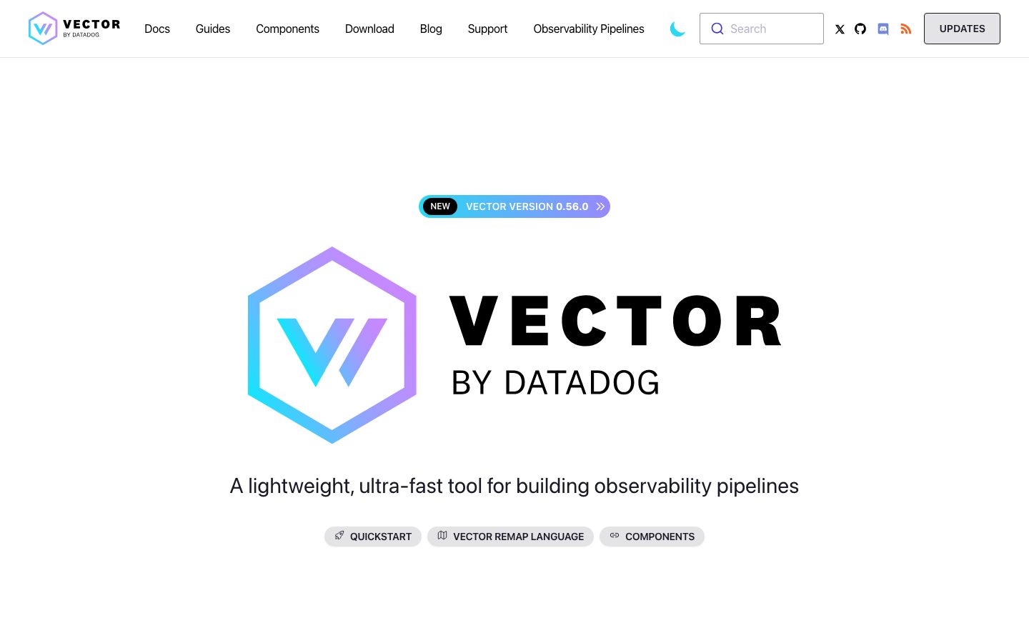
Vector's landing page is a clean, developer-tooling marketing surface — white canvas (`{colors.canvas}` — #ffffff), near-black ink type (`{colors.ink}` — #191927), and light-gray pill-shaped action chips (`{colors.surface}` — #e5e7eb). The system reads as fast and technical: there are no large hero illustrations except the gradient Vector mark, and the heaviest content moments are a terminal-style config card and multi-column listings of sources / transforms / sinks.
The brand's only chromatic voltage is a **cyan-to-magenta gradient** that lives in the Vector "V" hexagon logo and in the centered section headings (`Take control of your observability data`, `Why Vector?`, etc.). The gradient is built from a measured spread of accent values — cyan (`{colors.accent-cyan}` — #28d9f2), teal (`{colors.accent-teal}` — #00a9bc), blue (`{colors.accent-blue}` — #93c5fd), violet (`{colors.accent-violet}` — #c4b5fd), pink (`{colors.accent-pink}` — #f472b6), and magenta (`{colors.accent-magenta}` — #f44af5 / `{colors.accent-magenta-pure}` — #ff00ff). Everything else is monochrome — black/ink text on white, with a Zinc-style gray ramp for secondary copy.
Type is set entirely in the **Segoe UI / system-ui** stack — there is no custom or licensed display face. The hierarchy is unusual for marketing: the page leans on weight (800 for headings, 400 for the rest) and a single uppercase eyebrow style (16px / 600 / 0.8px tracking) rather than a deep size scale.
**Key Characteristics:**
- White canvas, ink-black text, light-gray pill chips. Action chips like "QUICKSTART", "VECTOR REMAP LANGUAGE", "COMPONENTS" are `{colors.surface}` (#e5e7eb) pills with black text and an icon.
- Gradient brand mark + gradient centered section headings are the only color in an otherwise monochrome UI. Accent hexes are used decoratively, not on CTAs.
- System font stack (Segoe UI) throughout — no custom typeface. Headings carry weight 800; the hero tagline is a light-weight 30px lead line.
- Uppercase eyebrow style (`{typography.eyebrow}` — 16px / 600 / 0.8px tracking) used for small section labels and pill-chip captions.
- A terminal-style **config card** (`{component.config-card}`) renders the example `vector.yaml` on a near-black surface — the technical centerpiece of the page.
- Pill radius (`{rounded.pill}` — 9999px) on all buttons, badges, and the segmented topology toggle; small `{rounded.sm}` (4px) on inputs and listing rows.
- Multi-column listing layout ("47 sources / 18 transforms / 62 sinks") of soft-gray rows for the components catalog.
- Shadows are minimal and tight (1–3px) — this is a near-flat layout.
## Colors
### Brand & Accent
The brand color is a gradient, not a single hex. The measured accent ramp, in spectrum order:
- **Cyan** (`{colors.accent-cyan}` — #28d9f2) and **Teal** (`{colors.accent-teal}` — #00a9bc): the cool end of the Vector "V" gradient; teal also fills the active segmented-toggle pill.
- **Blue** (`{colors.accent-blue}` — #93c5fd) and **Violet** (`{colors.accent-violet}` — #c4b5fd): the mid-gradient and the rendered tint of the centered section headings.
- **Mint** (`{colors.accent-mint}` — #6ee7b7): syntax-highlight green inside the install one-liner snippet.
- **Pink** (`{colors.accent-pink}` — #f472b6), **Magenta** (`{colors.accent-magenta}` — #f44af5), **Pure Magenta** (`{colors.accent-magenta-pure}` — #ff00ff): the warm end of the gradient, used in the logo and the transform diagram.
These accents appear in the logo, in gradient headings, and in product/diagram artwork — never on a primary action button.
### Surface
- **Canvas** (`{colors.canvas}` — #ffffff): the page floor and footer background.
- **Surface** (`{colors.surface}` — #e5e7eb): light-gray pill chips, the "UPDATES" nav button, the segmented toggle track.
- **Surface Soft** (`{colors.surface-soft}` — #f4f4f5): the search input background and listing-row fills.
- **Hairline** (`{colors.hairline}` — #e4e4e7): 1px dividers and faint borders.
- **Ink as surface** (`{colors.ink}` — #191927): the terminal config card and the version badge invert to this near-black surface.
### Text
- **Ink** (`{colors.ink}` — #191927): headings and primary copy.
- **Neutral 700 / 600 / 500** (`{colors.neutral-700}` — #3f3f46, `{colors.neutral-600}` — #52525b, `{colors.neutral-500}` — #71717a): body and secondary copy in a Zinc-style ramp.
- **Neutral Gray** (`{colors.neutral-gray}` — #6b7280): muted captions.
- **Neutral 400 / 300** (`{colors.neutral-400}` — #a1a1aa, `{colors.neutral-300}` — #d4d4d8): tertiary/disabled text and placeholder tones.
- **On Primary** (`{colors.on-primary}` — #000000): black text on the light-gray pill chips; also the install-snippet's near-black surface.
### Semantic
No dedicated success / warning / error palette was measured. Semantic states are documented as a Known Gap.
## Typography
### Font Family
The system runs entirely on the **Segoe UI / system-ui** stack — there is no custom or licensed display face (`fonts_licensed` is empty). The captured family is the OS-resolved fallback; the intended stack walks `system-ui, -apple-system, "Segoe UI", Roboto, sans-serif`. The hierarchy is built from weight and case rather than a wide size ramp.
### Hierarchy
| Token | Size | Weight | Line Height | Letter Spacing | Use |
|---|---|---|---|---|---|
| `{typography.display}` | 36px | 800 | 1.111 | normal | Centered gradient section headings; large stat figures (13k+, 300+) |
| `{typography.lead}` | 30px | 400 | 1.2 | normal | Hero tagline ("A lightweight, ultra-fast tool for building observability pipelines") |
| `{typography.eyebrow}` | 16px | 600 | 1.5 | 0.8px | Uppercase pill-chip captions, small section labels, feature-row titles |
| `{typography.body}` | 16px | 400 | 1.5 | normal | Running copy, nav links, feature descriptions, listing rows |
| `{typography.button}` | 16px | 400 | 1.5 | normal | Button / chip labels |
### Principles
The system uses a barbell of weights — heavy 800 for headlines and stats, light 400 for everything else — with the 16px/600 eyebrow style carrying the only uppercase-tracked role. Color, not size, separates the headline tier: the gradient/violet tint on `{typography.display}` is what marks a section header, since body and button share the same 16px base size.
### Note on Font Substitutes
No custom typeface ships with this site, so there is nothing licensed to substitute. To reproduce faithfully on non-Windows platforms, use the native `system-ui` stack so the host OS resolves its default UI face; **Inter** is a close cross-platform substitute that preserves the geometric, neutral feel at the same weights (800 / 600 / 400).
## Layout
### Spacing System
- **Base unit:** measured spacing clusters on a loose 4px grid, with 8px (most frequent), 12px, and 6px dominating tight gaps.
- **Tokens:** `{spacing.xxs}` 4px · `{spacing.xs}` 6px · `{spacing.sm}` 8px · `{spacing.md}` 12px · `{spacing.lg}` 16px · `{spacing.xl}` 32px · `{spacing.xxl}` 40px · `{spacing.section}` 80px.
- **Section padding:** `{spacing.section}` (80px) is the dominant vertical rhythm between editorial bands.
- **Component padding:** pill chips and rows use `{spacing.sm}`–`{spacing.md}` (8–12px) internally; cards use `{spacing.lg}` (16px).
- Larger one-off values (24px, 48px, 64px, 192px) were measured at low frequency and are treated as exceptional band offsets rather than tokens — see Known Gaps.
### Grid & Container
- **Centered single-column editorial** axis: most bands (hero, headings, taglines, diagrams) are centered on a narrow measure.
- **Two-column feature grid:** "Why Vector?" uses a 2-up row layout of icon + title + body.
- **Three-column listing grid:** the components catalog renders three side-by-side columns (sources / transforms / sinks).
- The page is content-narrow and centered rather than edge-to-edge; the nav and footer span full width with `{spacing.xl}` (32px) horizontal padding.
### Whitespace Philosophy
Vector uses generous vertical whitespace (80px between bands) around compact, centered content blocks. The effect is calm and technical — large empty margins frame the gradient mark and each section heading, while dense information (config YAML, component listings) is contained inside tight cards and rows.
## Elevation & Depth
| Level | Treatment | Use |
|---|---|---|
| Flat | No shadow | Body sections, headings, nav, footer |
| Hairline | 1px `{colors.hairline}` border | Dividers, input outlines |
| Soft 1 | `0 1px 2px rgba(0,0,0,0.05)` | Pill chips, small surfaces |
| Soft 2 | `0 1px 3px rgba(0,0,0,0.1), 0 1px 2px rgba(0,0,0,0.06)` | Cards, search input |
| Lifted | `0 10px 15px -3px rgba(0,0,0,0.1), 0 4px 6px -2px rgba(0,0,0,0.05)` | The config card / most-elevated surface (single occurrence) |
The elevation philosophy is **near-flat** — three measured shadow tiers, all low-alpha and tight-radius. There is no neumorphism or glass; depth comes from the inverted ink surfaces (config card, version badge) rather than heavy drop shadows.
### Decorative Depth
- The gradient Vector "V" hexagon mark is the only large decorative element; it carries its own internal color depth, not a system shadow.
- The processing-topology diagram ("Sources → Transforms → Sinks") uses gradient-stacked layers as illustration — color-block depth, not token shadows.
## Shapes
### Border Radius Scale
| Token | Value | Use |
|---|---|---|
| `{rounded.xs}` | 2px | Small inline accents, tiny tags |
| `{rounded.sm}` | 4px | Inputs, listing rows, the install snippet — the most common radius |
| `{rounded.md}` | 6px | The terminal config card |
| `{rounded.lg}` | 12px | Larger framed surfaces (rare) |
| `{rounded.pill}` | 9999px | All buttons, action chips, the version badge, the segmented topology toggle |
### Photography / Logo Geometry
There is little photography. The brand mark is a hexagonal "V" rendered in gradient. Icons (platform badges in "Installs everywhere", feature-row glyphs) are circular or simple line icons. The dominant geometry is the contrast between full-pill controls (9999px) and the small 4px corner radius on functional surfaces.
## Components
### Navigation
**`top-nav`** — White bar pinned to the top of the page. Background `{colors.canvas}`, ink text, `{typography.body}` link labels. Carries the gradient "VECTOR BY DATADOG" wordmark at left, a horizontal menu (Docs, Guides, Components, Download, Blog, Support, Observability Pipelines) center, a dark-mode toggle, a `{component.search-input}`, social icons, and an "UPDATES" pill at the far right.
**`nav-link`** — Inline transparent-background menu item in `{colors.ink}`, `{typography.body}`.
**`search-input`** — Soft-gray rounded search field. Background `{colors.surface-soft}`, placeholder text `{colors.neutral-500}`, rounded `{rounded.sm}`, padding 8px × 12px, with a leading magnifier icon.
### Buttons & Chips
**`button-primary`** — The site's action button is a light-gray pill. Background `{colors.surface}` (#e5e7eb), text `{colors.on-primary}` (#000000), `{typography.button}`, rounded `{rounded.pill}`. Note: the measured selector reported `radius: 0px, padding: 0px` because the button is an `<a>` element; the pill radius and 8px × 16px padding are taken from screenshot ground-truth (derived).
**`pill-action-chip`** — The hero CTA chips ("QUICKSTART", "VECTOR REMAP LANGUAGE", "COMPONENTS") and the "UPDATES" nav button. Background `{colors.surface}`, black text in `{typography.eyebrow}` (uppercase, 0.8px tracking), a leading icon, rounded `{rounded.pill}`, padding 8px × 16px (derived from ground-truth).
**`version-badge`** — The "NEW · VECTOR VERSION 0.56.0 »" badge above the hero. Inverted to `{colors.ink}` surface with `{colors.canvas}` text and a gradient-outlined edge, `{typography.eyebrow}`, rounded `{rounded.pill}`.
### Headings & Feature Rows
**`section-heading`** — Centered gradient/violet section title. Transparent background, text tinted toward `{colors.accent-violet}`, `{typography.display}` (36px / 800). Examples: "Take control of your observability data", "Why Vector?", "Highly flexible processing topologies".
**`feature-row-title`** — Small bold label in the "Why Vector?" grid. Transparent, `{colors.ink}`, `{typography.eyebrow}`.
**`feature-row-body`** — Supporting description text in `{colors.neutral-600}`, `{typography.body}`, with inline gradient/violet links.
### Cards & Code
**`config-card`** — The terminal-style `vector.yaml` example card and the page's most-elevated surface. Background `{colors.ink}` (#191927), text `{colors.canvas}`, rounded `{rounded.md}` (6px), padding `{spacing.lg}` (16px), with a window-chrome dot row and a `/etc/vector/vector.yaml` filename label.
**`install-snippet`** — The one-line install command (`curl --proto 'https' ... | bash`). Near-black background `{colors.on-primary}` (#000000), mint syntax text `{colors.accent-mint}`, rounded `{rounded.sm}`, padding 12px × 16px.
### Listings & Toggles
**`listing-column`** — One of the three catalog columns (sources / transforms / sinks). White background, ink heading + count, stacked listing rows.
**`listing-row`** — A single catalog entry ("AMQP", "Apache Metrics", "Remap with VRL"). Background `{colors.surface-soft}`, text `{colors.neutral-600}`, `{typography.body}`, rounded `{rounded.sm}`, padding 8px × 12px.
**`segmented-toggle`** + **`segmented-toggle-active`** — The deployment-topology switcher ("DISTRIBUTED / CENTRALIZED / STREAM BASED"). Track + inactive segments use `{colors.surface}` with `{colors.neutral-600}` text; the active segment fills `{colors.accent-teal}` with `{colors.canvas}` text. Both rounded `{rounded.pill}`, `{typography.eyebrow}`.
### Stats & Footer
**`stat-figure`** — Large community stat numbers ("13k+", "300+", "30m+", "40"). Transparent background, `{colors.ink}`, `{typography.display}` (36px / 800), with a small `{typography.body}` caption below.
**`footer`** — White footer that closes the page. Background `{colors.canvas}`, text `{colors.neutral-600}`, `{typography.body}`, vertical padding `{spacing.section}` (80px). Multi-column link list (ABOUT / COMPONENTS / SETUP / COMMUNITY / DOWNLOAD) with social icons and a copyright row.
## Do's and Don'ts
### Do
- Keep the UI monochrome: ink text on white, light-gray pills. Reserve the accent ramp for the logo, gradient headings, and diagrams.
- Use `{rounded.pill}` for every button, chip, badge, and the segmented toggle. The full-pill is the system's signature control shape.
- Render headings with `{typography.display}` (36px / 800) and tint them with the gradient/violet — color is what separates a heading from body, since both sit near 16px.
- Use the uppercase `{typography.eyebrow}` (0.8px tracking) for chip labels and small section labels only.
- Invert to `{colors.ink}` for the terminal config card and version badge — these dark surfaces are the page's depth moments.
- Use mint (`{colors.accent-mint}`) for code/terminal syntax highlights against the near-black snippet surface.
- Keep listing rows compact: `{colors.surface-soft}` fill, `{rounded.sm}`, tight 8px × 12px padding.
### Don't
- Don't put accent gradient colors on action buttons — buttons stay light-gray pills with black text.
- Don't introduce heavy drop shadows; the system is near-flat (max measured shadow is the single lifted config card).
- Don't add radii larger than `{rounded.lg}` (12px) to rectangular surfaces — functional surfaces use `{rounded.sm}` (4px).
- Don't bold body copy; weight 800 is reserved for headings and stat figures, everything else is 400.
- Don't claim a custom typeface — the system runs the native system-ui / Segoe UI stack.
- Don't document hover states; default and active/pressed only (e.g. the segmented-toggle active fill).
## Responsive Behavior
### Breakpoints
Only the landing page at desktop width was captured, so breakpoints below are inferred from the centered single-column structure and are derived.
| Name | Width | Key Changes (derived) |
|---|---|---|
| Mobile | < 768px | Nav collapses to a menu/icon row; hero mark + tagline stack; feature grid 2-up → 1-up; listing columns 3 → 1; footer columns wrap to 1 |
| Tablet | 768–1024px | Nav tightens; feature grid stays 2-up; listing columns may drop 3 → 2 |
| Desktop | 1024–1440px | Full horizontal nav; 2-up feature grid; 3-up listing columns |
| Wide | > 1440px | Centered content stays narrow; outer margins grow |
### Touch Targets
- `{component.pill-action-chip}` and `{component.button-primary}` carry 8px × 16px padding on a 16px label — effective tap height comfortably clears finger-size minimums.
- `{component.search-input}` is a single-line field at ~8px vertical padding; on touch it would need to meet 44px height.
- `{component.segmented-toggle}` segments at 6px × 12px padding are compact; tap area is acceptable within the surrounding pill track.
### Collapsing Strategy
- The three-column components catalog (sources / transforms / sinks) is the most likely band to reflow to a single column on mobile.
- The "Why Vector?" 2-up feature grid collapses to a single stacked list.
- The config card and install snippet should scroll horizontally rather than shrink type below legibility.
### Image Behavior
- The gradient Vector mark scales proportionally and remains the centered focal point at every width.
- The topology diagram is illustrative artwork; it should scale down as a unit rather than reflow.
## Iteration Guide
1. Focus on ONE component at a time. Reference its YAML key directly (`{component.config-card}`, `{component.segmented-toggle-active}`).
2. Variants of an existing component (`-active`, etc.) live as separate entries in `components:`.
3. Use `{token.refs}` everywhere — never inline a hex in a component.
4. Never document hover. Default and Active/Pressed states only.
5. Keep color scarce: gradient accents for brand + headings; everything else monochrome.
6. Headings stay weight 800; body stays 400. Don't add intermediate heading weights.
7. When emphasizing a section, tint the heading with the gradient before increasing its size.
## Known Gaps
- The dembrandt analyzer captured `button-primary` with `radius: 0px, padding: 0px` because Vector renders CTAs as styled `<a>` elements; pill radius and padding are reconstructed from screenshot ground-truth (derived).
- The brand gradient is captured as discrete accent hexes (cyan → teal → blue → violet → pink → magenta); the actual gradient stops, angles, and CSS definitions were not extracted.
- No semantic color palette (success / warning / error) was measured — only the brand accent ramp and a neutral gray scale.
- The hero "body" measurement (30px / 400) corresponds to the tagline line; smaller paragraph body sizes elsewhere may exist but resolved to the same 16px `{typography.body}` token.
- Low-frequency spacing values (24px, 48px, 64px, 192px) were measured but not promoted to tokens; the 192px value is a single large band offset.
- Dark mode is present (a toggle exists in the nav) but only the light theme was captured; dark-theme token values are unknown.
- Responsive breakpoints, touch-target heights, and collapsing behavior are inferred from a single desktop landing capture (derived) — no mobile or tablet renders were measured.
- Animation and transition timings (toggle switching, hover reveals, scroll behavior) are out of scope.
<!-- Documented by duply · real-world design systems as ready-to-use DESIGN.md for AI coding agents · https://duply.ai/vector/design-md -->
Color Palette
Accent
Neutrals
Typography
display36px · 800 · 1.111
The quick brown fox jumpslead30px · 400 · 1.2
The quick brown fox jumpseyebrow16px · 600 · 1.5
The quick brown fox jumpsbody16px · 400 · 1.5
The quick brown fox jumpsbutton16px · 400 · 1.5
The quick brown fox jumpsSpacing & Shape
Spacing
| Name | Value | Preview |
|---|---|---|
| xxs | 4px | |
| xs | 6px | |
| sm | 8px | |
| md | 12px | |
| lg | 16px | |
| xl | 32px | |
| xxl | 40px | |
| section | 80px |
Border Radius
| Name | Value | Preview |
|---|---|---|
| xs | 2px | |
| sm | 4px | |
| md | 6px | |
| lg | 12px | |
| pill | 9999px |
More like this


---
version: alpha
name: Vector-design-analysis
description: "A clean, developer-tooling marketing surface for Vector (by Datadog) — white canvas, near-black ink type, and light-gray pill-shaped action chips. The brand voltage is a cyan-to-magenta gradient (the Vector \"V\" hexagon mark) applied to section headings and the logo, set against an otherwise monochrome, system-font UI. The page reads as fast, technical, and unfussy: pill buttons, a terminal-style config card, and a wide range of source/transform/sink listing columns."
colors:
  ink: "#191927"
  on-primary: "#000000"
  canvas: "#ffffff"
  surface: "#e5e7eb"
  surface-soft: "#f4f4f5"
  hairline: "#e4e4e7"
  neutral-700: "#3f3f46"
  neutral-600: "#52525b"
  neutral-500: "#71717a"
  neutral-gray: "#6b7280"
  neutral-400: "#a1a1aa"
  neutral-300: "#d4d4d8"
  accent-cyan: "#28d9f2"
  accent-teal: "#00a9bc"
  accent-blue: "#93c5fd"
  accent-violet: "#c4b5fd"
  accent-mint: "#6ee7b7"
  accent-pink: "#f472b6"
  accent-magenta: "#f44af5"
  accent-magenta-pure: "#ff00ff"
typography:
  display:
    fontFamily: "Segoe UI, system-ui, sans-serif"
    fontSize: 36px
    fontWeight: 800
    lineHeight: 1.111
    letterSpacing: normal
  lead:
    fontFamily: "Segoe UI, system-ui, sans-serif"
    fontSize: 30px
    fontWeight: 400
    lineHeight: 1.2
    letterSpacing: normal
  eyebrow:
    fontFamily: "Segoe UI, system-ui, sans-serif"
    fontSize: 16px
    fontWeight: 600
    lineHeight: 1.5
    letterSpacing: 0.8px
  body:
    fontFamily: "Segoe UI, system-ui, sans-serif"
    fontSize: 16px
    fontWeight: 400
    lineHeight: 1.5
    letterSpacing: normal
  button:
    fontFamily: "Segoe UI, system-ui, sans-serif"
    fontSize: 16px
    fontWeight: 400
    lineHeight: 1.5
    letterSpacing: normal
rounded:
  xs: 2px
  sm: 4px
  md: 6px
  lg: 12px
  pill: 9999px
spacing:
  xxs: 4px
  xs: 6px
  sm: 8px
  md: 12px
  lg: 16px
  xl: 32px
  xxl: 40px
  section: 80px
components:
  top-nav:
    backgroundColor: "{colors.canvas}"
    textColor: "{colors.ink}"
    typography: "{typography.body}"
    padding: 12px 32px
  nav-link:
    backgroundColor: transparent
    textColor: "{colors.ink}"
    typography: "{typography.body}"
  search-input:
    backgroundColor: "{colors.surface-soft}"
    textColor: "{colors.neutral-500}"
    typography: "{typography.body}"
    rounded: "{rounded.sm}"
    padding: 8px 12px
  button-primary:
    backgroundColor: "{colors.surface}"
    textColor: "{colors.on-primary}"
    typography: "{typography.button}"
    rounded: "{rounded.pill}"
    padding: 8px 16px
  pill-action-chip:
    backgroundColor: "{colors.surface}"
    textColor: "{colors.on-primary}"
    typography: "{typography.eyebrow}"
    rounded: "{rounded.pill}"
    padding: 8px 16px
  version-badge:
    backgroundColor: "{colors.ink}"
    textColor: "{colors.canvas}"
    typography: "{typography.eyebrow}"
    rounded: "{rounded.pill}"
    padding: 6px 12px
  section-heading:
    backgroundColor: transparent
    textColor: "{colors.accent-violet}"
    typography: "{typography.display}"
  feature-row-title:
    backgroundColor: transparent
    textColor: "{colors.ink}"
    typography: "{typography.eyebrow}"
  feature-row-body:
    backgroundColor: transparent
    textColor: "{colors.neutral-600}"
    typography: "{typography.body}"
  config-card:
    backgroundColor: "{colors.ink}"
    textColor: "{colors.canvas}"
    typography: "{typography.body}"
    rounded: "{rounded.md}"
    padding: 16px
  install-snippet:
    backgroundColor: "{colors.on-primary}"
    textColor: "{colors.accent-mint}"
    typography: "{typography.body}"
    rounded: "{rounded.sm}"
    padding: 12px 16px
  listing-column:
    backgroundColor: "{colors.canvas}"
    textColor: "{colors.ink}"
    typography: "{typography.body}"
  listing-row:
    backgroundColor: "{colors.surface-soft}"
    textColor: "{colors.neutral-600}"
    typography: "{typography.body}"
    rounded: "{rounded.sm}"
    padding: 8px 12px
  segmented-toggle:
    backgroundColor: "{colors.surface}"
    textColor: "{colors.neutral-600}"
    typography: "{typography.eyebrow}"
    rounded: "{rounded.pill}"
    padding: 6px 12px
  segmented-toggle-active:
    backgroundColor: "{colors.accent-teal}"
    textColor: "{colors.canvas}"
    typography: "{typography.eyebrow}"
    rounded: "{rounded.pill}"
    padding: 6px 12px
  stat-figure:
    backgroundColor: transparent
    textColor: "{colors.ink}"
    typography: "{typography.display}"
  footer:
    backgroundColor: "{colors.canvas}"
    textColor: "{colors.neutral-600}"
    typography: "{typography.body}"
    padding: 80px 32px
---

## Overview

Vector's landing page is a clean, developer-tooling marketing surface — white canvas (`{colors.canvas}` — #ffffff), near-black ink type (`{colors.ink}` — #191927), and light-gray pill-shaped action chips (`{colors.surface}` — #e5e7eb). The system reads as fast and technical: there are no large hero illustrations except the gradient Vector mark, and the heaviest content moments are a terminal-style config card and multi-column listings of sources / transforms / sinks.

The brand's only chromatic voltage is a **cyan-to-magenta gradient** that lives in the Vector "V" hexagon logo and in the centered section headings (`Take control of your observability data`, `Why Vector?`, etc.). The gradient is built from a measured spread of accent values — cyan (`{colors.accent-cyan}` — #28d9f2), teal (`{colors.accent-teal}` — #00a9bc), blue (`{colors.accent-blue}` — #93c5fd), violet (`{colors.accent-violet}` — #c4b5fd), pink (`{colors.accent-pink}` — #f472b6), and magenta (`{colors.accent-magenta}` — #f44af5 / `{colors.accent-magenta-pure}` — #ff00ff). Everything else is monochrome — black/ink text on white, with a Zinc-style gray ramp for secondary copy.

Type is set entirely in the **Segoe UI / system-ui** stack — there is no custom or licensed display face. The hierarchy is unusual for marketing: the page leans on weight (800 for headings, 400 for the rest) and a single uppercase eyebrow style (16px / 600 / 0.8px tracking) rather than a deep size scale.

**Key Characteristics:**
- White canvas, ink-black text, light-gray pill chips. Action chips like "QUICKSTART", "VECTOR REMAP LANGUAGE", "COMPONENTS" are `{colors.surface}` (#e5e7eb) pills with black text and an icon.
- Gradient brand mark + gradient centered section headings are the only color in an otherwise monochrome UI. Accent hexes are used decoratively, not on CTAs.
- System font stack (Segoe UI) throughout — no custom typeface. Headings carry weight 800; the hero tagline is a light-weight 30px lead line.
- Uppercase eyebrow style (`{typography.eyebrow}` — 16px / 600 / 0.8px tracking) used for small section labels and pill-chip captions.
- A terminal-style **config card** (`{component.config-card}`) renders the example `vector.yaml` on a near-black surface — the technical centerpiece of the page.
- Pill radius (`{rounded.pill}` — 9999px) on all buttons, badges, and the segmented topology toggle; small `{rounded.sm}` (4px) on inputs and listing rows.
- Multi-column listing layout ("47 sources / 18 transforms / 62 sinks") of soft-gray rows for the components catalog.
- Shadows are minimal and tight (1–3px) — this is a near-flat layout.

## Colors

### Brand & Accent
The brand color is a gradient, not a single hex. The measured accent ramp, in spectrum order:
- **Cyan** (`{colors.accent-cyan}` — #28d9f2) and **Teal** (`{colors.accent-teal}` — #00a9bc): the cool end of the Vector "V" gradient; teal also fills the active segmented-toggle pill.
- **Blue** (`{colors.accent-blue}` — #93c5fd) and **Violet** (`{colors.accent-violet}` — #c4b5fd): the mid-gradient and the rendered tint of the centered section headings.
- **Mint** (`{colors.accent-mint}` — #6ee7b7): syntax-highlight green inside the install one-liner snippet.
- **Pink** (`{colors.accent-pink}` — #f472b6), **Magenta** (`{colors.accent-magenta}` — #f44af5), **Pure Magenta** (`{colors.accent-magenta-pure}` — #ff00ff): the warm end of the gradient, used in the logo and the transform diagram.

These accents appear in the logo, in gradient headings, and in product/diagram artwork — never on a primary action button.

### Surface
- **Canvas** (`{colors.canvas}` — #ffffff): the page floor and footer background.
- **Surface** (`{colors.surface}` — #e5e7eb): light-gray pill chips, the "UPDATES" nav button, the segmented toggle track.
- **Surface Soft** (`{colors.surface-soft}` — #f4f4f5): the search input background and listing-row fills.
- **Hairline** (`{colors.hairline}` — #e4e4e7): 1px dividers and faint borders.
- **Ink as surface** (`{colors.ink}` — #191927): the terminal config card and the version badge invert to this near-black surface.

### Text
- **Ink** (`{colors.ink}` — #191927): headings and primary copy.
- **Neutral 700 / 600 / 500** (`{colors.neutral-700}` — #3f3f46, `{colors.neutral-600}` — #52525b, `{colors.neutral-500}` — #71717a): body and secondary copy in a Zinc-style ramp.
- **Neutral Gray** (`{colors.neutral-gray}` — #6b7280): muted captions.
- **Neutral 400 / 300** (`{colors.neutral-400}` — #a1a1aa, `{colors.neutral-300}` — #d4d4d8): tertiary/disabled text and placeholder tones.
- **On Primary** (`{colors.on-primary}` — #000000): black text on the light-gray pill chips; also the install-snippet's near-black surface.

### Semantic
No dedicated success / warning / error palette was measured. Semantic states are documented as a Known Gap.

## Typography

### Font Family
The system runs entirely on the **Segoe UI / system-ui** stack — there is no custom or licensed display face (`fonts_licensed` is empty). The captured family is the OS-resolved fallback; the intended stack walks `system-ui, -apple-system, "Segoe UI", Roboto, sans-serif`. The hierarchy is built from weight and case rather than a wide size ramp.

### Hierarchy

| Token | Size | Weight | Line Height | Letter Spacing | Use |
|---|---|---|---|---|---|
| `{typography.display}` | 36px | 800 | 1.111 | normal | Centered gradient section headings; large stat figures (13k+, 300+) |
| `{typography.lead}` | 30px | 400 | 1.2 | normal | Hero tagline ("A lightweight, ultra-fast tool for building observability pipelines") |
| `{typography.eyebrow}` | 16px | 600 | 1.5 | 0.8px | Uppercase pill-chip captions, small section labels, feature-row titles |
| `{typography.body}` | 16px | 400 | 1.5 | normal | Running copy, nav links, feature descriptions, listing rows |
| `{typography.button}` | 16px | 400 | 1.5 | normal | Button / chip labels |

### Principles
The system uses a barbell of weights — heavy 800 for headlines and stats, light 400 for everything else — with the 16px/600 eyebrow style carrying the only uppercase-tracked role. Color, not size, separates the headline tier: the gradient/violet tint on `{typography.display}` is what marks a section header, since body and button share the same 16px base size.

### Note on Font Substitutes
No custom typeface ships with this site, so there is nothing licensed to substitute. To reproduce faithfully on non-Windows platforms, use the native `system-ui` stack so the host OS resolves its default UI face; **Inter** is a close cross-platform substitute that preserves the geometric, neutral feel at the same weights (800 / 600 / 400).

## Layout

### Spacing System
- **Base unit:** measured spacing clusters on a loose 4px grid, with 8px (most frequent), 12px, and 6px dominating tight gaps.
- **Tokens:** `{spacing.xxs}` 4px · `{spacing.xs}` 6px · `{spacing.sm}` 8px · `{spacing.md}` 12px · `{spacing.lg}` 16px · `{spacing.xl}` 32px · `{spacing.xxl}` 40px · `{spacing.section}` 80px.
- **Section padding:** `{spacing.section}` (80px) is the dominant vertical rhythm between editorial bands.
- **Component padding:** pill chips and rows use `{spacing.sm}`–`{spacing.md}` (8–12px) internally; cards use `{spacing.lg}` (16px).
- Larger one-off values (24px, 48px, 64px, 192px) were measured at low frequency and are treated as exceptional band offsets rather than tokens — see Known Gaps.

### Grid & Container
- **Centered single-column editorial** axis: most bands (hero, headings, taglines, diagrams) are centered on a narrow measure.
- **Two-column feature grid:** "Why Vector?" uses a 2-up row layout of icon + title + body.
- **Three-column listing grid:** the components catalog renders three side-by-side columns (sources / transforms / sinks).
- The page is content-narrow and centered rather than edge-to-edge; the nav and footer span full width with `{spacing.xl}` (32px) horizontal padding.

### Whitespace Philosophy
Vector uses generous vertical whitespace (80px between bands) around compact, centered content blocks. The effect is calm and technical — large empty margins frame the gradient mark and each section heading, while dense information (config YAML, component listings) is contained inside tight cards and rows.

## Elevation & Depth

| Level | Treatment | Use |
|---|---|---|
| Flat | No shadow | Body sections, headings, nav, footer |
| Hairline | 1px `{colors.hairline}` border | Dividers, input outlines |
| Soft 1 | `0 1px 2px rgba(0,0,0,0.05)` | Pill chips, small surfaces |
| Soft 2 | `0 1px 3px rgba(0,0,0,0.1), 0 1px 2px rgba(0,0,0,0.06)` | Cards, search input |
| Lifted | `0 10px 15px -3px rgba(0,0,0,0.1), 0 4px 6px -2px rgba(0,0,0,0.05)` | The config card / most-elevated surface (single occurrence) |

The elevation philosophy is **near-flat** — three measured shadow tiers, all low-alpha and tight-radius. There is no neumorphism or glass; depth comes from the inverted ink surfaces (config card, version badge) rather than heavy drop shadows.

### Decorative Depth
- The gradient Vector "V" hexagon mark is the only large decorative element; it carries its own internal color depth, not a system shadow.
- The processing-topology diagram ("Sources → Transforms → Sinks") uses gradient-stacked layers as illustration — color-block depth, not token shadows.

## Shapes

### Border Radius Scale

| Token | Value | Use |
|---|---|---|
| `{rounded.xs}` | 2px | Small inline accents, tiny tags |
| `{rounded.sm}` | 4px | Inputs, listing rows, the install snippet — the most common radius |
| `{rounded.md}` | 6px | The terminal config card |
| `{rounded.lg}` | 12px | Larger framed surfaces (rare) |
| `{rounded.pill}` | 9999px | All buttons, action chips, the version badge, the segmented topology toggle |

### Photography / Logo Geometry
There is little photography. The brand mark is a hexagonal "V" rendered in gradient. Icons (platform badges in "Installs everywhere", feature-row glyphs) are circular or simple line icons. The dominant geometry is the contrast between full-pill controls (9999px) and the small 4px corner radius on functional surfaces.

## Components

### Navigation

**`top-nav`** — White bar pinned to the top of the page. Background `{colors.canvas}`, ink text, `{typography.body}` link labels. Carries the gradient "VECTOR BY DATADOG" wordmark at left, a horizontal menu (Docs, Guides, Components, Download, Blog, Support, Observability Pipelines) center, a dark-mode toggle, a `{component.search-input}`, social icons, and an "UPDATES" pill at the far right.

**`nav-link`** — Inline transparent-background menu item in `{colors.ink}`, `{typography.body}`.

**`search-input`** — Soft-gray rounded search field. Background `{colors.surface-soft}`, placeholder text `{colors.neutral-500}`, rounded `{rounded.sm}`, padding 8px × 12px, with a leading magnifier icon.

### Buttons & Chips

**`button-primary`** — The site's action button is a light-gray pill. Background `{colors.surface}` (#e5e7eb), text `{colors.on-primary}` (#000000), `{typography.button}`, rounded `{rounded.pill}`. Note: the measured selector reported `radius: 0px, padding: 0px` because the button is an `<a>` element; the pill radius and 8px × 16px padding are taken from screenshot ground-truth (derived).

**`pill-action-chip`** — The hero CTA chips ("QUICKSTART", "VECTOR REMAP LANGUAGE", "COMPONENTS") and the "UPDATES" nav button. Background `{colors.surface}`, black text in `{typography.eyebrow}` (uppercase, 0.8px tracking), a leading icon, rounded `{rounded.pill}`, padding 8px × 16px (derived from ground-truth).

**`version-badge`** — The "NEW · VECTOR VERSION 0.56.0 »" badge above the hero. Inverted to `{colors.ink}` surface with `{colors.canvas}` text and a gradient-outlined edge, `{typography.eyebrow}`, rounded `{rounded.pill}`.

### Headings & Feature Rows

**`section-heading`** — Centered gradient/violet section title. Transparent background, text tinted toward `{colors.accent-violet}`, `{typography.display}` (36px / 800). Examples: "Take control of your observability data", "Why Vector?", "Highly flexible processing topologies".

**`feature-row-title`** — Small bold label in the "Why Vector?" grid. Transparent, `{colors.ink}`, `{typography.eyebrow}`.

**`feature-row-body`** — Supporting description text in `{colors.neutral-600}`, `{typography.body}`, with inline gradient/violet links.

### Cards & Code

**`config-card`** — The terminal-style `vector.yaml` example card and the page's most-elevated surface. Background `{colors.ink}` (#191927), text `{colors.canvas}`, rounded `{rounded.md}` (6px), padding `{spacing.lg}` (16px), with a window-chrome dot row and a `/etc/vector/vector.yaml` filename label.

**`install-snippet`** — The one-line install command (`curl --proto 'https' ... | bash`). Near-black background `{colors.on-primary}` (#000000), mint syntax text `{colors.accent-mint}`, rounded `{rounded.sm}`, padding 12px × 16px.

### Listings & Toggles

**`listing-column`** — One of the three catalog columns (sources / transforms / sinks). White background, ink heading + count, stacked listing rows.

**`listing-row`** — A single catalog entry ("AMQP", "Apache Metrics", "Remap with VRL"). Background `{colors.surface-soft}`, text `{colors.neutral-600}`, `{typography.body}`, rounded `{rounded.sm}`, padding 8px × 12px.

**`segmented-toggle`** + **`segmented-toggle-active`** — The deployment-topology switcher ("DISTRIBUTED / CENTRALIZED / STREAM BASED"). Track + inactive segments use `{colors.surface}` with `{colors.neutral-600}` text; the active segment fills `{colors.accent-teal}` with `{colors.canvas}` text. Both rounded `{rounded.pill}`, `{typography.eyebrow}`.

### Stats & Footer

**`stat-figure`** — Large community stat numbers ("13k+", "300+", "30m+", "40"). Transparent background, `{colors.ink}`, `{typography.display}` (36px / 800), with a small `{typography.body}` caption below.

**`footer`** — White footer that closes the page. Background `{colors.canvas}`, text `{colors.neutral-600}`, `{typography.body}`, vertical padding `{spacing.section}` (80px). Multi-column link list (ABOUT / COMPONENTS / SETUP / COMMUNITY / DOWNLOAD) with social icons and a copyright row.

## Do's and Don'ts

### Do
- Keep the UI monochrome: ink text on white, light-gray pills. Reserve the accent ramp for the logo, gradient headings, and diagrams.
- Use `{rounded.pill}` for every button, chip, badge, and the segmented toggle. The full-pill is the system's signature control shape.
- Render headings with `{typography.display}` (36px / 800) and tint them with the gradient/violet — color is what separates a heading from body, since both sit near 16px.
- Use the uppercase `{typography.eyebrow}` (0.8px tracking) for chip labels and small section labels only.
- Invert to `{colors.ink}` for the terminal config card and version badge — these dark surfaces are the page's depth moments.
- Use mint (`{colors.accent-mint}`) for code/terminal syntax highlights against the near-black snippet surface.
- Keep listing rows compact: `{colors.surface-soft}` fill, `{rounded.sm}`, tight 8px × 12px padding.

### Don't
- Don't put accent gradient colors on action buttons — buttons stay light-gray pills with black text.
- Don't introduce heavy drop shadows; the system is near-flat (max measured shadow is the single lifted config card).
- Don't add radii larger than `{rounded.lg}` (12px) to rectangular surfaces — functional surfaces use `{rounded.sm}` (4px).
- Don't bold body copy; weight 800 is reserved for headings and stat figures, everything else is 400.
- Don't claim a custom typeface — the system runs the native system-ui / Segoe UI stack.
- Don't document hover states; default and active/pressed only (e.g. the segmented-toggle active fill).

## Responsive Behavior

### Breakpoints
Only the landing page at desktop width was captured, so breakpoints below are inferred from the centered single-column structure and are derived.

| Name | Width | Key Changes (derived) |
|---|---|---|
| Mobile | < 768px | Nav collapses to a menu/icon row; hero mark + tagline stack; feature grid 2-up → 1-up; listing columns 3 → 1; footer columns wrap to 1 |
| Tablet | 768–1024px | Nav tightens; feature grid stays 2-up; listing columns may drop 3 → 2 |
| Desktop | 1024–1440px | Full horizontal nav; 2-up feature grid; 3-up listing columns |
| Wide | > 1440px | Centered content stays narrow; outer margins grow |

### Touch Targets
- `{component.pill-action-chip}` and `{component.button-primary}` carry 8px × 16px padding on a 16px label — effective tap height comfortably clears finger-size minimums.
- `{component.search-input}` is a single-line field at ~8px vertical padding; on touch it would need to meet 44px height.
- `{component.segmented-toggle}` segments at 6px × 12px padding are compact; tap area is acceptable within the surrounding pill track.

### Collapsing Strategy
- The three-column components catalog (sources / transforms / sinks) is the most likely band to reflow to a single column on mobile.
- The "Why Vector?" 2-up feature grid collapses to a single stacked list.
- The config card and install snippet should scroll horizontally rather than shrink type below legibility.

### Image Behavior
- The gradient Vector mark scales proportionally and remains the centered focal point at every width.
- The topology diagram is illustrative artwork; it should scale down as a unit rather than reflow.

## Iteration Guide

1. Focus on ONE component at a time. Reference its YAML key directly (`{component.config-card}`, `{component.segmented-toggle-active}`).
2. Variants of an existing component (`-active`, etc.) live as separate entries in `components:`.
3. Use `{token.refs}` everywhere — never inline a hex in a component.
4. Never document hover. Default and Active/Pressed states only.
5. Keep color scarce: gradient accents for brand + headings; everything else monochrome.
6. Headings stay weight 800; body stays 400. Don't add intermediate heading weights.
7. When emphasizing a section, tint the heading with the gradient before increasing its size.

## Known Gaps

- The dembrandt analyzer captured `button-primary` with `radius: 0px, padding: 0px` because Vector renders CTAs as styled `<a>` elements; pill radius and padding are reconstructed from screenshot ground-truth (derived).
- The brand gradient is captured as discrete accent hexes (cyan → teal → blue → violet → pink → magenta); the actual gradient stops, angles, and CSS definitions were not extracted.
- No semantic color palette (success / warning / error) was measured — only the brand accent ramp and a neutral gray scale.
- The hero "body" measurement (30px / 400) corresponds to the tagline line; smaller paragraph body sizes elsewhere may exist but resolved to the same 16px `{typography.body}` token.
- Low-frequency spacing values (24px, 48px, 64px, 192px) were measured but not promoted to tokens; the 192px value is a single large band offset.
- Dark mode is present (a toggle exists in the nav) but only the light theme was captured; dark-theme token values are unknown.
- Responsive breakpoints, touch-target heights, and collapsing behavior are inferred from a single desktop landing capture (derived) — no mobile or tablet renders were measured.
- Animation and transition timings (toggle switching, hover reveals, scroll behavior) are out of scope.

<!-- Documented by duply · real-world design systems as ready-to-use DESIGN.md for AI coding agents · https://duply.ai/vector/design-md -->