osohq
A security-product marketing interface built on a high-contrast pairing of deep indigo-purple brand surfaces and a single saturated yellow call-to-action. White canvas carries the editorial body, while hero, testimonial, research, and closing CTA bands invert to a rich purple (`#392396`). Type voice is Poppins (medium-weight, rounded geometric display) over Roboto body — confident, technical, friendly. Cards are pale lavender with a large 26px radius; the yellow CTA is the system's only loud accent.
---
version: alpha
name: osohq-design-analysis
description: A security-product marketing interface built on a high-contrast pairing of deep indigo-purple brand surfaces and a single saturated yellow call-to-action. White canvas carries the editorial body, while hero, testimonial, research, and closing CTA bands invert to a rich purple (`#392396`). Type voice is Poppins (medium-weight, rounded geometric display) over Roboto body — confident, technical, friendly. Cards are pale lavender with a large 26px radius; the yellow CTA is the system's only loud accent.
colors:
canvas: "#ffffff"
ink: "#141414"
primary: "#392396"
on-primary: "#ffffff"
accent: "#ffd803"
on-accent: "#392396"
accent-soft: "#f9edb6"
purple-deep: "#463a9f"
purple-mid: "#5641a5"
purple-light: "#8e75ff"
lavender: "#d9d4f0"
surface-card: "#edf1fe"
teal: "#bae8e8"
teal-pale: "#e3f6f5"
surface-soft: "#f8f8f8"
surface-muted: "#ebebec"
hairline: "#dddddd"
neutral-strong: "#333333"
neutral-stronger: "#222222"
surface-dark: "#1f1f1f"
surface-darkest: "#0a0a0a"
black: "#000000"
typography:
display:
fontFamily: "Poppins, sans-serif"
fontSize: 56px
fontWeight: 500
lineHeight: 1.2
letterSpacing: normal
heading:
fontFamily: "Poppins, sans-serif"
fontSize: 28px
fontWeight: 500
lineHeight: 1.2
letterSpacing: normal
body:
fontFamily: "Roboto, sans-serif"
fontSize: 16px
fontWeight: 400
lineHeight: 1.5
letterSpacing: normal
button:
fontFamily: "Roboto, sans-serif"
fontSize: 16px
fontWeight: 600
lineHeight: 1.5
letterSpacing: normal
rounded:
sm: 6px
md: 8px
lg: 12px
xl: 26px
full: 1440px
spacing:
xxs: 4px
xs: 8px
sm: 12px
md: 16px
lg: 24px
xl: 32px
xxl: 48px
huge: 64px
section: 72px
section-lg: 80px
max: 128px
components:
announcement-bar:
backgroundColor: "{colors.accent}"
textColor: "{colors.ink}"
typography: "{typography.body}"
padding: 12px 16px
top-nav:
backgroundColor: "{colors.canvas}"
textColor: "{colors.ink}"
typography: "{typography.body}"
height: 72px
hero-band:
backgroundColor: "{colors.primary}"
textColor: "{colors.on-primary}"
typography: "{typography.display}"
padding: 80px
button-primary:
backgroundColor: "{colors.accent}"
textColor: "{colors.on-accent}"
typography: "{typography.button}"
rounded: "{rounded.md}"
padding: 16px 24px
button-primary-active:
backgroundColor: "{colors.accent-soft}"
textColor: "{colors.on-accent}"
rounded: "{rounded.md}"
button-outline:
backgroundColor: transparent
textColor: "{colors.on-primary}"
typography: "{typography.button}"
rounded: "{rounded.md}"
padding: 16px 24px
toggle-pill-active:
backgroundColor: "{colors.lavender}"
textColor: "{colors.primary}"
typography: "{typography.button}"
rounded: "{rounded.full}"
padding: 8px 24px
toggle-pill-inactive:
backgroundColor: transparent
textColor: "{colors.on-primary}"
typography: "{typography.button}"
rounded: "{rounded.full}"
padding: 8px 24px
ask-ai-pill:
backgroundColor: "{colors.surface-darkest}"
textColor: "{colors.on-primary}"
typography: "{typography.button}"
rounded: "{rounded.full}"
padding: 16px 24px
card:
backgroundColor: "{colors.surface-card}"
textColor: "{colors.ink}"
typography: "{typography.body}"
rounded: "{rounded.xl}"
padding: 32px
feature-blog-card:
backgroundColor: "{colors.surface-card}"
textColor: "{colors.ink}"
typography: "{typography.heading}"
rounded: "{rounded.xl}"
padding: 48px
testimonial-card:
backgroundColor: "{colors.primary}"
textColor: "{colors.on-primary}"
typography: "{typography.body}"
rounded: "{rounded.md}"
padding: 24px
research-card:
backgroundColor: "{colors.primary}"
textColor: "{colors.on-primary}"
typography: "{typography.heading}"
rounded: "{rounded.md}"
padding: 48px
integration-tile:
backgroundColor: "{colors.canvas}"
textColor: "{colors.ink}"
rounded: "{rounded.md}"
padding: 16px
input:
backgroundColor: "{colors.canvas}"
textColor: "{colors.ink}"
typography: "{typography.body}"
rounded: 0px
cta-band:
backgroundColor: "{colors.primary}"
textColor: "{colors.on-primary}"
typography: "{typography.display}"
padding: 80px
footer:
backgroundColor: "{colors.surface-darkest}"
textColor: "{colors.on-primary}"
typography: "{typography.body}"
padding: 64px
---
## Overview
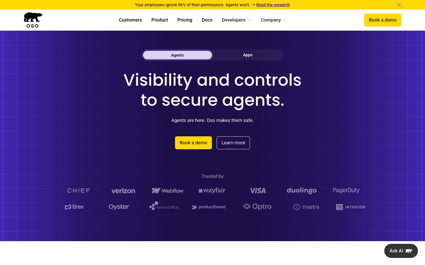
Oso's marketing surface is a security-product interface built on one strong contrast pairing: a deep indigo-purple brand color (`{colors.primary}` — #392396) and a single saturated yellow CTA (`{colors.accent}` — #ffd803). The white canvas (`{colors.canvas}` — #ffffff) carries the editorial body — feature explainers, integration grids, testimonials — while the hero, the research-report card, the testimonials band, and the closing CTA invert to the deep purple. The result reads as technical and confident without feeling cold: the purple grounds the brand, the yellow button is the one loud moment that pulls the eye to "Book a demo."
The type voice splits into two open-source families: **Poppins** (a rounded geometric face, medium weight 500) for all display and section headings, and **Roboto** for body copy, buttons, and navigation. Poppins at weight 500 gives the headlines a friendly, slightly soft geometric character; Roboto keeps the running text neutral and dense. There is no negative letter-spacing in the measured set — tracking is `normal` throughout.
The signature container is the pale-lavender card (`{colors.surface-card}` — #edf1fe) with a generous 26px corner radius (`{rounded.xl}`) — used for the featured-blog band. Most cards and tiles otherwise sit at the dominant 8px radius (`{rounded.md}`), and pill-shaped controls (the Agents/Apps toggle, the floating "Ask AI" button) use the fully-rounded `{rounded.full}` (1440px). The footer closes every page on the darkest neutral (`{colors.surface-darkest}` — #0a0a0a).
**Key Characteristics:**
- Deep purple brand band (`{colors.primary}` — #392396) for hero, testimonials, research card, and closing CTA; white canvas everywhere else.
- One loud yellow CTA (`{colors.accent}` — #ffd803) with deep-purple label text (`{colors.on-accent}` — #392396). The yellow is the system's only saturated accent on actions.
- Poppins 500 for display + headings; Roboto for body + buttons. Both are open-source — no substitution needed.
- Pale-lavender cards (`{colors.surface-card}`) with an unusually large 26px radius (`{rounded.xl}`).
- Pill controls at `{rounded.full}` — the Agents/Apps segmented toggle and the floating "Ask AI" button.
- Soft, layered drop shadow on elevated cards and integration tiles.
- Generous vertical rhythm — section spacing clusters around 72px and 80px.
## Colors
### Brand & Accent
- **Primary** (`{colors.primary}` — #392396): The deep indigo-purple brand color. Fills the hero band, testimonial cards, the research-report card, and the closing CTA band. Also used as label text on the yellow CTA (`{colors.on-accent}` references the same value).
- **Accent** (`{colors.accent}` — #ffd803): The single loud yellow. Used for the announcement bar and the primary "Book a demo" button. The system's only saturated action color.
- **Accent Soft** (`{colors.accent-soft}` — #f9edb6): A pale yellow tint; used as a derived pressed/disabled variant of the accent button.
- **Purple Deep / Mid / Light** (`{colors.purple-deep}` — #463a9f, `{colors.purple-mid}` — #5641a5, `{colors.purple-light}` — #8e75ff): The purple family used for gradient grids in the hero, illustrative artwork (the robot card), and secondary purple surfaces.
- **Lavender** (`{colors.lavender}` — #d9d4f0): The active fill behind the segmented toggle pill and soft purple highlights.
- **Teal / Teal Pale** (`{colors.teal}` — #bae8e8, `{colors.teal-pale}` — #e3f6f5): A cool accent pair appearing in illustration and badge moments — used sparingly, never on primary actions.
### Surface
- **Canvas** (`{colors.canvas}` — #ffffff): The default page floor and input background.
- **Surface Card** (`{colors.surface-card}` — #edf1fe): The pale-lavender card surface (featured-blog band, content cards).
- **Surface Soft** (`{colors.surface-soft}` — #f8f8f8): Very-light section dividers and soft fills.
- **Surface Muted** (`{colors.surface-muted}` — #ebebec): Slightly deeper neutral fill for "Featured in" strips.
- **Surface Dark** (`{colors.surface-dark}` — #1f1f1f) / **Surface Darkest** (`{colors.surface-darkest}` — #0a0a0a): The footer background and the "Ask AI" pill — the darkest neutrals close the page.
### Text
- **Ink** (`{colors.ink}` — #141414): All body copy and headings on white surfaces (max contrast vs canvas).
- **On Primary** (`{colors.on-primary}` — #ffffff): Text on purple bands and the dark footer.
- **On Accent** (`{colors.on-accent}` — #392396): Deep-purple label text on the yellow CTA.
- **Neutral Strong / Stronger** (`{colors.neutral-strong}` — #333333, `{colors.neutral-stronger}` — #222222): Secondary text and UI chrome inside product-screenshot fragments.
- **Black** (`{colors.black}` — #000000): The OSO bear wordmark and high-contrast iconography.
### Lines
- **Hairline** (`{colors.hairline}` — #dddddd): 1px dividers in feature lists and table rows.
## Typography
### Font Family
The system runs **Poppins** for display + headings and **Roboto** for body + UI. Both are open-source Google fonts (`fonts_licensed` is empty) — they ship as-is with no substitution required. Poppins handles the marquee headlines and section heads at weight 500; Roboto handles paragraphs, button labels, and navigation. The split is functional: Poppins for anything that announces, Roboto for anything that explains.
### Hierarchy
| Token | Size | Weight | Line Height | Letter Spacing | Use |
|---|---|---|---|---|---|
| `{typography.display}` | 56px | 500 | 1.2 | normal | Section heads and hero headline ("Visibility and controls to secure agents.") — Poppins |
| `{typography.heading}` | 28px | 500 | 1.2 | normal | Sub-section heads, card titles ("Least Privilege Manifesto") — Poppins |
| `{typography.body}` | 16px | 400 | 1.5 | normal | Default running text, nav links, captions — Roboto |
| `{typography.button}` | 16px | 600 | 1.5 | normal | Button + pill labels — Roboto semibold |
### Principles
Poppins stays at weight 500 across both display sizes — never heavier. The friendly, slightly-soft geometric character at medium weight is the brand's voice. Roboto carries everything at 400, jumping to 600 only for interactive labels. Letter-spacing is `normal` everywhere — the system does not lean on tracking for personality; it leans on the Poppins/Roboto contrast and the purple/yellow color pairing.
### Note on Font Substitutes
Both Poppins and Roboto are open-source and freely embeddable; no licensed-font substitution is required. If either is unavailable in a build, system-sans fallbacks (`sans-serif`) are encoded in the family stacks.
## Layout
### Spacing System
- **Base unit:** 8px (by far the most frequent measured value, with 16px the second).
- **Tokens:** `{spacing.xxs}` 4px · `{spacing.xs}` 8px · `{spacing.sm}` 12px · `{spacing.md}` 16px · `{spacing.lg}` 24px · `{spacing.xl}` 32px · `{spacing.xxl}` 48px · `{spacing.huge}` 64px · `{spacing.section}` 72px · `{spacing.section-lg}` 80px · `{spacing.max}` 128px.
- **Section rhythm:** Major bands separate on `{spacing.section}` (72px) and `{spacing.section-lg}` (80px) — both are heavily used measured values.
- **Card internal padding:** `{spacing.xl}` (32px) for standard cards; `{spacing.xxl}` (48px) for the larger feature-blog and research cards.
- **Component gutters:** `{spacing.md}` (16px) and `{spacing.lg}` (24px) inside grids and button rows.
### Grid & Container
- **Hero:** Single centered column — headline, sub-line, and a two-button row, with a logo wall ("Trusted by") below.
- **Feature explainer:** Two-column split — a stacked accordion of steps (Discover / Monitor / Detect / Control / Report) at left, product screenshot at right.
- **Integration grid:** Multi-column tile grid of partner logos in white rounded tiles.
- **Testimonials:** Horizontal carousel of purple cards with prev/next controls.
- **Footer:** Multi-column link list (Product / Resources / AI Authorization) on the darkest surface.
### Whitespace Philosophy
Oso uses generous vertical spacing — 72–80px between editorial bands — to keep dense security copy scannable. Each band carries one Poppins headline plus supporting Roboto body, never tightly packed. The purple bands act as visual punctuation between white explainer sections.
## Elevation & Depth
| Level | Treatment | Use |
|---|---|---|
| Flat | No shadow | Body sections, purple bands, top nav |
| Layered card shadow | `rgba(0,0,0,0.03) 0 4px 6px -2px, rgba(0,0,0,0.08) 0 12px 16px -4px` | Product screenshots, integration tiles, elevated cards (the dominant measured shadow — 112 occurrences) |
| Soft ambient | `rgba(0,0,0,0.03) 0 4px 20px 0` | Occasional softer floated element |
| Light glow | `rgba(255,255,255,0.24) 0 0 11px 0` | A single light-on-dark glow accent |
The elevation philosophy is **soft and layered** — the primary shadow is a two-stop low-alpha drop that lifts cards and product UI fragments gently off the canvas. No heavy shadows, no neumorphism. Notably, the lavender content card (`{component.card}`) itself was measured with `shadow: none` — depth there comes from the surface-color contrast, not a shadow.
## Shapes
### Border Radius Scale
| Token | Value | Use |
|---|---|---|
| `{rounded.sm}` | 6px | Small inline controls and minor tiles |
| `{rounded.md}` | 8px | The dominant radius — buttons (derived), integration tiles, testimonial cards, most surfaces |
| `{rounded.lg}` | 12px | Occasional mid-size element |
| `{rounded.xl}` | 26px | The pale-lavender feature/content cards — the signature large-radius container |
| `{rounded.full}` | 1440px | Pill controls — the Agents/Apps toggle and the floating "Ask AI" button |
### Shape Voice
The system mostly lives at 8px (126 measured occurrences), with two deliberate exceptions: the 26px lavender card radius (a soft, distinctly oversized corner) and the full-pill controls. Inputs were measured at 0px radius — Oso's form fields are square-cornered, a sharper contrast against the otherwise rounded UI.
## Components
### Navigation & Chrome
**`announcement-bar`** — A full-width yellow strip pinned above the nav ("Your employees ignore 96% of their permissions. Agents won't. → Read the research"). Background `{colors.accent}`, text `{colors.ink}`, body type, dismissible via an × at the right.
**`top-nav`** — White top bar, ~72px tall. Carries the OSO bear wordmark at left (`{colors.black}`), a center menu (Customers, Product, Pricing, Docs, Developers, Company) in `{typography.body}`, and the yellow `{component.button-primary}` ("Book a demo") at right.
**`ask-ai-pill`** — A floating dark pill anchored bottom-right ("Ask AI"). Background `{colors.surface-darkest}`, text `{colors.on-primary}`, fully rounded `{rounded.full}`, button type.
### Buttons & Toggles
**`button-primary`** — The signature yellow CTA. Background `{colors.accent}` (#ffd803), label `{colors.on-accent}` (#392396), `{typography.button}` (Roboto 16/600), padding ~16px × 24px, rounded `{rounded.md}` (8px, derived — measurement returned 0px but screenshots show a soft corner consistent with the dominant 8px radius). Pressed variant `button-primary-active` tints to `{colors.accent-soft}`.
**`button-outline`** — The hero's secondary action ("Learn more"). Transparent background, `{colors.on-primary}` white text and border on the purple band, `{typography.button}`, rounded `{rounded.md}`.
**`toggle-pill-active`** / **`toggle-pill-inactive`** — The hero's segmented Agents/Apps switcher. The active segment fills `{colors.lavender}` with `{colors.primary}` text; the inactive segment is transparent with `{colors.on-primary}` text. Both rounded `{rounded.full}`.
### Cards & Containers
**`hero-band`** — The deep-purple opening band. Background `{colors.primary}`, text `{colors.on-primary}`, display headline, with a faint gridded purple texture. Vertical padding ~80px (`{spacing.section-lg}`).
**`card`** — The pale-lavender content card. Background `{colors.surface-card}` (#edf1fe), ink text, rounded `{rounded.xl}` (26px), padding `{spacing.xl}` (32px), no shadow.
**`feature-blog-card`** — The larger featured-blog band ("Least Privilege Manifesto") — a lavender card holding an image at left and a heading + body + read link at right. Background `{colors.surface-card}`, rounded `{rounded.xl}`, padding `{spacing.xxl}` (48px).
**`research-card`** — The deep-purple co-branded research promo ("Least Privilege Research Report"). Background `{colors.primary}`, text `{colors.on-primary}`, heading type, rounded `{rounded.md}`, padding `{spacing.xxl}`.
**`testimonial-card`** — Purple quote cards in a horizontal carousel. Background `{colors.primary}`, text `{colors.on-primary}`, body type, rounded `{rounded.md}`, padding `{spacing.lg}` (24px). Footer line carries the attributed name + role.
**`integration-tile`** — White rounded tiles in the "Integrated into your stack" grid, each holding a partner logo. Background `{colors.canvas}`, rounded `{rounded.md}`, the layered card shadow lifts each tile slightly.
**`cta-band`** — The closing "Get your arms around agent adoption" band. Background `{colors.primary}`, text `{colors.on-primary}`, display headline, with a centered yellow `{component.button-primary}` ("Request a demo"). Padding ~80px.
### Forms
**`input`** — Square-cornered text input. Background `{colors.canvas}`, text `{colors.ink}`, `{typography.body}`, radius 0px (measured — Oso's inputs are sharp-cornered).
### Footer
**`footer`** — Darkest-surface footer that closes every page. Background `{colors.surface-darkest}` (#0a0a0a), text `{colors.on-primary}`, body type, multi-column link list (Product / Resources / AI Authorization), padding ~64px (`{spacing.huge}`). Copyright + social row at the bottom.
## Do's and Don'ts
### Do
- Reserve `{colors.accent}` (#ffd803) for the primary CTA and the announcement bar only — it is the one loud color and it loses force if repeated.
- Pair the yellow button background with `{colors.on-accent}` (#392396) label text — never white text on yellow.
- Use `{colors.primary}` purple bands as visual punctuation between white explainer sections (hero → white → purple research card → white → purple CTA → dark footer).
- Use Poppins 500 for headings and Roboto for body. Keep the boundary strict.
- Use the 26px `{rounded.xl}` radius for lavender content cards; keep everything else at the 8px `{rounded.md}` baseline.
- Lift product screenshots and integration tiles with the layered two-stop shadow — that soft elevation is the depth signature.
### Don't
- Don't add a second saturated accent on actions — teal and the purple tints are for illustration and surfaces, never CTAs.
- Don't put Poppins above weight 500 — the medium weight is the brand's friendly geometric voice.
- Don't round inputs — measured form fields are square (0px) and contrast deliberately with the rounded buttons.
- Don't apply a drop shadow to the lavender `{component.card}` — its depth comes from surface contrast, not shadow.
- Don't document hover. Default and pressed/active states only.
## Responsive Behavior
### Breakpoints
The reference captures desktop and a long-scroll composite; specific breakpoint widths were not measured. The following are inferred from layout structure and should be confirmed against the live site.
| Name | Width | Key Changes (inferred) |
|---|---|---|
| Mobile | < 768px | Nav collapses to a menu trigger; hero stays single-column; feature two-column splits stack; integration grid reduces columns; testimonial carousel shows one card |
| Tablet | 768–1024px | Nav tightens; two-column feature band may stack; integration grid 2–3 up |
| Desktop | > 1024px | Full horizontal nav; two-column feature band; multi-column integration grid; multi-card testimonial carousel |
### Touch Targets
- `{component.button-primary}` and `{component.button-outline}` carry ~16px × 24px padding, comfortably exceeding 44px tap height.
- `{component.ask-ai-pill}` is a large fully-rounded floating target.
- Toggle pill segments use 8px × 24px padding; the surrounding pill provides additional tap area.
### Collapsing Strategy
- The hero's two-column logo wall wraps to fewer columns on smaller screens.
- The Discover/Monitor/Detect/Control/Report accordion stacks above its product screenshot on mobile.
- Footer link columns collapse toward a single stacked list.
## Iteration Guide
1. Focus on ONE component at a time and reference its YAML key directly (`{component.card}`, `{component.testimonial-card}`).
2. Variants live as separate entries in `components:` (`-active`, `-inactive`).
3. Use `{token.refs}` everywhere — never inline a hex into a component.
4. Never document hover — default and active/pressed states only.
5. Keep the purple/yellow contrast intact: purple bands ground the page, the single yellow CTA pulls action. Don't dilute either.
6. Headlines stay Poppins 500; body stays Roboto 400. The two-family split is the type system.
7. The dark footer (`{colors.surface-darkest}`) is the only near-black surface — don't introduce other dark cards casually.
## Known Gaps
- **No h1 measured.** The hero headline is visibly larger than the 56px `{typography.display}` (h2) in the screenshots, but no h1 value was captured. The hero headline is documented under `{typography.display}` as the largest measured role; a true h1 size is a gap.
- **Button radius conflict.** The component scan returned `radius: 0px` and `padding: 0px` for the primary button (a likely measurement artifact catching an inner element). Screenshots clearly show a soft-cornered yellow button, so `{rounded.md}` (8px) is used as a derived value from the dominant radius token; exact button radius and padding should be confirmed.
- **Button color measurement.** The button scan returned `#392396` as the button color — this is the label/text color on the yellow fill, not the background. Background `{colors.accent}` + label `{colors.on-accent}` are reconstructed from screenshot ground-truth.
- **Hero band exact shade.** The hero/CTA purple is rendered as `{colors.primary}` (#392396); the surrounding gridded gradient may include `{colors.purple-deep}`/`{colors.purple-mid}` tones that were measured but whose exact placement is not confirmed.
- **No measured radius for footer/CTA bands** — purple bands are treated as flat full-bleed sections.
- **Breakpoints, animation, and transition timings** (carousel motion, accordion step transitions, "Ask AI" reveal) were not captured and are out of scope.
- **Form states** beyond the default input (focus, error, success) were not extracted — a sign-up or demo flow would be needed to confirm.
<!-- Documented by duply · real-world design systems as ready-to-use DESIGN.md for AI coding agents · https://duply.ai/osohq/design-md -->
Color Palette
Accent
Neutrals
Typography
display56px · 500 · 1.2
The quick brown fox jumpsheading28px · 500 · 1.2
The quick brown fox jumpsbody16px · 400 · 1.5
The quick brown fox jumpsbutton16px · 600 · 1.5
The quick brown fox jumpsSpacing & Shape
Spacing
| Name | Value | Preview |
|---|---|---|
| xxs | 4px | |
| xs | 8px | |
| sm | 12px | |
| md | 16px | |
| lg | 24px | |
| xl | 32px | |
| xxl | 48px | |
| huge | 64px | |
| section | 72px | |
| section-lg | 80px | |
| max | 128px |
Border Radius
| Name | Value | Preview |
|---|---|---|
| sm | 6px | |
| md | 8px | |
| lg | 12px | |
| xl | 26px | |
| full | 1440px |
More like this


---
version: alpha
name: osohq-design-analysis
description: A security-product marketing interface built on a high-contrast pairing of deep indigo-purple brand surfaces and a single saturated yellow call-to-action. White canvas carries the editorial body, while hero, testimonial, research, and closing CTA bands invert to a rich purple (`#392396`). Type voice is Poppins (medium-weight, rounded geometric display) over Roboto body — confident, technical, friendly. Cards are pale lavender with a large 26px radius; the yellow CTA is the system's only loud accent.
colors:
  canvas: "#ffffff"
  ink: "#141414"
  primary: "#392396"
  on-primary: "#ffffff"
  accent: "#ffd803"
  on-accent: "#392396"
  accent-soft: "#f9edb6"
  purple-deep: "#463a9f"
  purple-mid: "#5641a5"
  purple-light: "#8e75ff"
  lavender: "#d9d4f0"
  surface-card: "#edf1fe"
  teal: "#bae8e8"
  teal-pale: "#e3f6f5"
  surface-soft: "#f8f8f8"
  surface-muted: "#ebebec"
  hairline: "#dddddd"
  neutral-strong: "#333333"
  neutral-stronger: "#222222"
  surface-dark: "#1f1f1f"
  surface-darkest: "#0a0a0a"
  black: "#000000"
typography:
  display:
    fontFamily: "Poppins, sans-serif"
    fontSize: 56px
    fontWeight: 500
    lineHeight: 1.2
    letterSpacing: normal
  heading:
    fontFamily: "Poppins, sans-serif"
    fontSize: 28px
    fontWeight: 500
    lineHeight: 1.2
    letterSpacing: normal
  body:
    fontFamily: "Roboto, sans-serif"
    fontSize: 16px
    fontWeight: 400
    lineHeight: 1.5
    letterSpacing: normal
  button:
    fontFamily: "Roboto, sans-serif"
    fontSize: 16px
    fontWeight: 600
    lineHeight: 1.5
    letterSpacing: normal
rounded:
  sm: 6px
  md: 8px
  lg: 12px
  xl: 26px
  full: 1440px
spacing:
  xxs: 4px
  xs: 8px
  sm: 12px
  md: 16px
  lg: 24px
  xl: 32px
  xxl: 48px
  huge: 64px
  section: 72px
  section-lg: 80px
  max: 128px
components:
  announcement-bar:
    backgroundColor: "{colors.accent}"
    textColor: "{colors.ink}"
    typography: "{typography.body}"
    padding: 12px 16px
  top-nav:
    backgroundColor: "{colors.canvas}"
    textColor: "{colors.ink}"
    typography: "{typography.body}"
    height: 72px
  hero-band:
    backgroundColor: "{colors.primary}"
    textColor: "{colors.on-primary}"
    typography: "{typography.display}"
    padding: 80px
  button-primary:
    backgroundColor: "{colors.accent}"
    textColor: "{colors.on-accent}"
    typography: "{typography.button}"
    rounded: "{rounded.md}"
    padding: 16px 24px
  button-primary-active:
    backgroundColor: "{colors.accent-soft}"
    textColor: "{colors.on-accent}"
    rounded: "{rounded.md}"
  button-outline:
    backgroundColor: transparent
    textColor: "{colors.on-primary}"
    typography: "{typography.button}"
    rounded: "{rounded.md}"
    padding: 16px 24px
  toggle-pill-active:
    backgroundColor: "{colors.lavender}"
    textColor: "{colors.primary}"
    typography: "{typography.button}"
    rounded: "{rounded.full}"
    padding: 8px 24px
  toggle-pill-inactive:
    backgroundColor: transparent
    textColor: "{colors.on-primary}"
    typography: "{typography.button}"
    rounded: "{rounded.full}"
    padding: 8px 24px
  ask-ai-pill:
    backgroundColor: "{colors.surface-darkest}"
    textColor: "{colors.on-primary}"
    typography: "{typography.button}"
    rounded: "{rounded.full}"
    padding: 16px 24px
  card:
    backgroundColor: "{colors.surface-card}"
    textColor: "{colors.ink}"
    typography: "{typography.body}"
    rounded: "{rounded.xl}"
    padding: 32px
  feature-blog-card:
    backgroundColor: "{colors.surface-card}"
    textColor: "{colors.ink}"
    typography: "{typography.heading}"
    rounded: "{rounded.xl}"
    padding: 48px
  testimonial-card:
    backgroundColor: "{colors.primary}"
    textColor: "{colors.on-primary}"
    typography: "{typography.body}"
    rounded: "{rounded.md}"
    padding: 24px
  research-card:
    backgroundColor: "{colors.primary}"
    textColor: "{colors.on-primary}"
    typography: "{typography.heading}"
    rounded: "{rounded.md}"
    padding: 48px
  integration-tile:
    backgroundColor: "{colors.canvas}"
    textColor: "{colors.ink}"
    rounded: "{rounded.md}"
    padding: 16px
  input:
    backgroundColor: "{colors.canvas}"
    textColor: "{colors.ink}"
    typography: "{typography.body}"
    rounded: 0px
  cta-band:
    backgroundColor: "{colors.primary}"
    textColor: "{colors.on-primary}"
    typography: "{typography.display}"
    padding: 80px
  footer:
    backgroundColor: "{colors.surface-darkest}"
    textColor: "{colors.on-primary}"
    typography: "{typography.body}"
    padding: 64px
---

## Overview

Oso's marketing surface is a security-product interface built on one strong contrast pairing: a deep indigo-purple brand color (`{colors.primary}` — #392396) and a single saturated yellow CTA (`{colors.accent}` — #ffd803). The white canvas (`{colors.canvas}` — #ffffff) carries the editorial body — feature explainers, integration grids, testimonials — while the hero, the research-report card, the testimonials band, and the closing CTA invert to the deep purple. The result reads as technical and confident without feeling cold: the purple grounds the brand, the yellow button is the one loud moment that pulls the eye to "Book a demo."

The type voice splits into two open-source families: **Poppins** (a rounded geometric face, medium weight 500) for all display and section headings, and **Roboto** for body copy, buttons, and navigation. Poppins at weight 500 gives the headlines a friendly, slightly soft geometric character; Roboto keeps the running text neutral and dense. There is no negative letter-spacing in the measured set — tracking is `normal` throughout.

The signature container is the pale-lavender card (`{colors.surface-card}` — #edf1fe) with a generous 26px corner radius (`{rounded.xl}`) — used for the featured-blog band. Most cards and tiles otherwise sit at the dominant 8px radius (`{rounded.md}`), and pill-shaped controls (the Agents/Apps toggle, the floating "Ask AI" button) use the fully-rounded `{rounded.full}` (1440px). The footer closes every page on the darkest neutral (`{colors.surface-darkest}` — #0a0a0a).

**Key Characteristics:**
- Deep purple brand band (`{colors.primary}` — #392396) for hero, testimonials, research card, and closing CTA; white canvas everywhere else.
- One loud yellow CTA (`{colors.accent}` — #ffd803) with deep-purple label text (`{colors.on-accent}` — #392396). The yellow is the system's only saturated accent on actions.
- Poppins 500 for display + headings; Roboto for body + buttons. Both are open-source — no substitution needed.
- Pale-lavender cards (`{colors.surface-card}`) with an unusually large 26px radius (`{rounded.xl}`).
- Pill controls at `{rounded.full}` — the Agents/Apps segmented toggle and the floating "Ask AI" button.
- Soft, layered drop shadow on elevated cards and integration tiles.
- Generous vertical rhythm — section spacing clusters around 72px and 80px.

## Colors

### Brand & Accent
- **Primary** (`{colors.primary}` — #392396): The deep indigo-purple brand color. Fills the hero band, testimonial cards, the research-report card, and the closing CTA band. Also used as label text on the yellow CTA (`{colors.on-accent}` references the same value).
- **Accent** (`{colors.accent}` — #ffd803): The single loud yellow. Used for the announcement bar and the primary "Book a demo" button. The system's only saturated action color.
- **Accent Soft** (`{colors.accent-soft}` — #f9edb6): A pale yellow tint; used as a derived pressed/disabled variant of the accent button.
- **Purple Deep / Mid / Light** (`{colors.purple-deep}` — #463a9f, `{colors.purple-mid}` — #5641a5, `{colors.purple-light}` — #8e75ff): The purple family used for gradient grids in the hero, illustrative artwork (the robot card), and secondary purple surfaces.
- **Lavender** (`{colors.lavender}` — #d9d4f0): The active fill behind the segmented toggle pill and soft purple highlights.
- **Teal / Teal Pale** (`{colors.teal}` — #bae8e8, `{colors.teal-pale}` — #e3f6f5): A cool accent pair appearing in illustration and badge moments — used sparingly, never on primary actions.

### Surface
- **Canvas** (`{colors.canvas}` — #ffffff): The default page floor and input background.
- **Surface Card** (`{colors.surface-card}` — #edf1fe): The pale-lavender card surface (featured-blog band, content cards).
- **Surface Soft** (`{colors.surface-soft}` — #f8f8f8): Very-light section dividers and soft fills.
- **Surface Muted** (`{colors.surface-muted}` — #ebebec): Slightly deeper neutral fill for "Featured in" strips.
- **Surface Dark** (`{colors.surface-dark}` — #1f1f1f) / **Surface Darkest** (`{colors.surface-darkest}` — #0a0a0a): The footer background and the "Ask AI" pill — the darkest neutrals close the page.

### Text
- **Ink** (`{colors.ink}` — #141414): All body copy and headings on white surfaces (max contrast vs canvas).
- **On Primary** (`{colors.on-primary}` — #ffffff): Text on purple bands and the dark footer.
- **On Accent** (`{colors.on-accent}` — #392396): Deep-purple label text on the yellow CTA.
- **Neutral Strong / Stronger** (`{colors.neutral-strong}` — #333333, `{colors.neutral-stronger}` — #222222): Secondary text and UI chrome inside product-screenshot fragments.
- **Black** (`{colors.black}` — #000000): The OSO bear wordmark and high-contrast iconography.

### Lines
- **Hairline** (`{colors.hairline}` — #dddddd): 1px dividers in feature lists and table rows.

## Typography

### Font Family
The system runs **Poppins** for display + headings and **Roboto** for body + UI. Both are open-source Google fonts (`fonts_licensed` is empty) — they ship as-is with no substitution required. Poppins handles the marquee headlines and section heads at weight 500; Roboto handles paragraphs, button labels, and navigation. The split is functional: Poppins for anything that announces, Roboto for anything that explains.

### Hierarchy

| Token | Size | Weight | Line Height | Letter Spacing | Use |
|---|---|---|---|---|---|
| `{typography.display}` | 56px | 500 | 1.2 | normal | Section heads and hero headline ("Visibility and controls to secure agents.") — Poppins |
| `{typography.heading}` | 28px | 500 | 1.2 | normal | Sub-section heads, card titles ("Least Privilege Manifesto") — Poppins |
| `{typography.body}` | 16px | 400 | 1.5 | normal | Default running text, nav links, captions — Roboto |
| `{typography.button}` | 16px | 600 | 1.5 | normal | Button + pill labels — Roboto semibold |

### Principles
Poppins stays at weight 500 across both display sizes — never heavier. The friendly, slightly-soft geometric character at medium weight is the brand's voice. Roboto carries everything at 400, jumping to 600 only for interactive labels. Letter-spacing is `normal` everywhere — the system does not lean on tracking for personality; it leans on the Poppins/Roboto contrast and the purple/yellow color pairing.

### Note on Font Substitutes
Both Poppins and Roboto are open-source and freely embeddable; no licensed-font substitution is required. If either is unavailable in a build, system-sans fallbacks (`sans-serif`) are encoded in the family stacks.

## Layout

### Spacing System
- **Base unit:** 8px (by far the most frequent measured value, with 16px the second).
- **Tokens:** `{spacing.xxs}` 4px · `{spacing.xs}` 8px · `{spacing.sm}` 12px · `{spacing.md}` 16px · `{spacing.lg}` 24px · `{spacing.xl}` 32px · `{spacing.xxl}` 48px · `{spacing.huge}` 64px · `{spacing.section}` 72px · `{spacing.section-lg}` 80px · `{spacing.max}` 128px.
- **Section rhythm:** Major bands separate on `{spacing.section}` (72px) and `{spacing.section-lg}` (80px) — both are heavily used measured values.
- **Card internal padding:** `{spacing.xl}` (32px) for standard cards; `{spacing.xxl}` (48px) for the larger feature-blog and research cards.
- **Component gutters:** `{spacing.md}` (16px) and `{spacing.lg}` (24px) inside grids and button rows.

### Grid & Container
- **Hero:** Single centered column — headline, sub-line, and a two-button row, with a logo wall ("Trusted by") below.
- **Feature explainer:** Two-column split — a stacked accordion of steps (Discover / Monitor / Detect / Control / Report) at left, product screenshot at right.
- **Integration grid:** Multi-column tile grid of partner logos in white rounded tiles.
- **Testimonials:** Horizontal carousel of purple cards with prev/next controls.
- **Footer:** Multi-column link list (Product / Resources / AI Authorization) on the darkest surface.

### Whitespace Philosophy
Oso uses generous vertical spacing — 72–80px between editorial bands — to keep dense security copy scannable. Each band carries one Poppins headline plus supporting Roboto body, never tightly packed. The purple bands act as visual punctuation between white explainer sections.

## Elevation & Depth

| Level | Treatment | Use |
|---|---|---|
| Flat | No shadow | Body sections, purple bands, top nav |
| Layered card shadow | `rgba(0,0,0,0.03) 0 4px 6px -2px, rgba(0,0,0,0.08) 0 12px 16px -4px` | Product screenshots, integration tiles, elevated cards (the dominant measured shadow — 112 occurrences) |
| Soft ambient | `rgba(0,0,0,0.03) 0 4px 20px 0` | Occasional softer floated element |
| Light glow | `rgba(255,255,255,0.24) 0 0 11px 0` | A single light-on-dark glow accent |

The elevation philosophy is **soft and layered** — the primary shadow is a two-stop low-alpha drop that lifts cards and product UI fragments gently off the canvas. No heavy shadows, no neumorphism. Notably, the lavender content card (`{component.card}`) itself was measured with `shadow: none` — depth there comes from the surface-color contrast, not a shadow.

## Shapes

### Border Radius Scale

| Token | Value | Use |
|---|---|---|
| `{rounded.sm}` | 6px | Small inline controls and minor tiles |
| `{rounded.md}` | 8px | The dominant radius — buttons (derived), integration tiles, testimonial cards, most surfaces |
| `{rounded.lg}` | 12px | Occasional mid-size element |
| `{rounded.xl}` | 26px | The pale-lavender feature/content cards — the signature large-radius container |
| `{rounded.full}` | 1440px | Pill controls — the Agents/Apps toggle and the floating "Ask AI" button |

### Shape Voice
The system mostly lives at 8px (126 measured occurrences), with two deliberate exceptions: the 26px lavender card radius (a soft, distinctly oversized corner) and the full-pill controls. Inputs were measured at 0px radius — Oso's form fields are square-cornered, a sharper contrast against the otherwise rounded UI.

## Components

### Navigation & Chrome

**`announcement-bar`** — A full-width yellow strip pinned above the nav ("Your employees ignore 96% of their permissions. Agents won't. → Read the research"). Background `{colors.accent}`, text `{colors.ink}`, body type, dismissible via an × at the right.

**`top-nav`** — White top bar, ~72px tall. Carries the OSO bear wordmark at left (`{colors.black}`), a center menu (Customers, Product, Pricing, Docs, Developers, Company) in `{typography.body}`, and the yellow `{component.button-primary}` ("Book a demo") at right.

**`ask-ai-pill`** — A floating dark pill anchored bottom-right ("Ask AI"). Background `{colors.surface-darkest}`, text `{colors.on-primary}`, fully rounded `{rounded.full}`, button type.

### Buttons & Toggles

**`button-primary`** — The signature yellow CTA. Background `{colors.accent}` (#ffd803), label `{colors.on-accent}` (#392396), `{typography.button}` (Roboto 16/600), padding ~16px × 24px, rounded `{rounded.md}` (8px, derived — measurement returned 0px but screenshots show a soft corner consistent with the dominant 8px radius). Pressed variant `button-primary-active` tints to `{colors.accent-soft}`.

**`button-outline`** — The hero's secondary action ("Learn more"). Transparent background, `{colors.on-primary}` white text and border on the purple band, `{typography.button}`, rounded `{rounded.md}`.

**`toggle-pill-active`** / **`toggle-pill-inactive`** — The hero's segmented Agents/Apps switcher. The active segment fills `{colors.lavender}` with `{colors.primary}` text; the inactive segment is transparent with `{colors.on-primary}` text. Both rounded `{rounded.full}`.

### Cards & Containers

**`hero-band`** — The deep-purple opening band. Background `{colors.primary}`, text `{colors.on-primary}`, display headline, with a faint gridded purple texture. Vertical padding ~80px (`{spacing.section-lg}`).

**`card`** — The pale-lavender content card. Background `{colors.surface-card}` (#edf1fe), ink text, rounded `{rounded.xl}` (26px), padding `{spacing.xl}` (32px), no shadow.

**`feature-blog-card`** — The larger featured-blog band ("Least Privilege Manifesto") — a lavender card holding an image at left and a heading + body + read link at right. Background `{colors.surface-card}`, rounded `{rounded.xl}`, padding `{spacing.xxl}` (48px).

**`research-card`** — The deep-purple co-branded research promo ("Least Privilege Research Report"). Background `{colors.primary}`, text `{colors.on-primary}`, heading type, rounded `{rounded.md}`, padding `{spacing.xxl}`.

**`testimonial-card`** — Purple quote cards in a horizontal carousel. Background `{colors.primary}`, text `{colors.on-primary}`, body type, rounded `{rounded.md}`, padding `{spacing.lg}` (24px). Footer line carries the attributed name + role.

**`integration-tile`** — White rounded tiles in the "Integrated into your stack" grid, each holding a partner logo. Background `{colors.canvas}`, rounded `{rounded.md}`, the layered card shadow lifts each tile slightly.

**`cta-band`** — The closing "Get your arms around agent adoption" band. Background `{colors.primary}`, text `{colors.on-primary}`, display headline, with a centered yellow `{component.button-primary}` ("Request a demo"). Padding ~80px.

### Forms

**`input`** — Square-cornered text input. Background `{colors.canvas}`, text `{colors.ink}`, `{typography.body}`, radius 0px (measured — Oso's inputs are sharp-cornered).

### Footer

**`footer`** — Darkest-surface footer that closes every page. Background `{colors.surface-darkest}` (#0a0a0a), text `{colors.on-primary}`, body type, multi-column link list (Product / Resources / AI Authorization), padding ~64px (`{spacing.huge}`). Copyright + social row at the bottom.

## Do's and Don'ts

### Do
- Reserve `{colors.accent}` (#ffd803) for the primary CTA and the announcement bar only — it is the one loud color and it loses force if repeated.
- Pair the yellow button background with `{colors.on-accent}` (#392396) label text — never white text on yellow.
- Use `{colors.primary}` purple bands as visual punctuation between white explainer sections (hero → white → purple research card → white → purple CTA → dark footer).
- Use Poppins 500 for headings and Roboto for body. Keep the boundary strict.
- Use the 26px `{rounded.xl}` radius for lavender content cards; keep everything else at the 8px `{rounded.md}` baseline.
- Lift product screenshots and integration tiles with the layered two-stop shadow — that soft elevation is the depth signature.

### Don't
- Don't add a second saturated accent on actions — teal and the purple tints are for illustration and surfaces, never CTAs.
- Don't put Poppins above weight 500 — the medium weight is the brand's friendly geometric voice.
- Don't round inputs — measured form fields are square (0px) and contrast deliberately with the rounded buttons.
- Don't apply a drop shadow to the lavender `{component.card}` — its depth comes from surface contrast, not shadow.
- Don't document hover. Default and pressed/active states only.

## Responsive Behavior

### Breakpoints
The reference captures desktop and a long-scroll composite; specific breakpoint widths were not measured. The following are inferred from layout structure and should be confirmed against the live site.

| Name | Width | Key Changes (inferred) |
|---|---|---|
| Mobile | < 768px | Nav collapses to a menu trigger; hero stays single-column; feature two-column splits stack; integration grid reduces columns; testimonial carousel shows one card |
| Tablet | 768–1024px | Nav tightens; two-column feature band may stack; integration grid 2–3 up |
| Desktop | > 1024px | Full horizontal nav; two-column feature band; multi-column integration grid; multi-card testimonial carousel |

### Touch Targets
- `{component.button-primary}` and `{component.button-outline}` carry ~16px × 24px padding, comfortably exceeding 44px tap height.
- `{component.ask-ai-pill}` is a large fully-rounded floating target.
- Toggle pill segments use 8px × 24px padding; the surrounding pill provides additional tap area.

### Collapsing Strategy
- The hero's two-column logo wall wraps to fewer columns on smaller screens.
- The Discover/Monitor/Detect/Control/Report accordion stacks above its product screenshot on mobile.
- Footer link columns collapse toward a single stacked list.

## Iteration Guide

1. Focus on ONE component at a time and reference its YAML key directly (`{component.card}`, `{component.testimonial-card}`).
2. Variants live as separate entries in `components:` (`-active`, `-inactive`).
3. Use `{token.refs}` everywhere — never inline a hex into a component.
4. Never document hover — default and active/pressed states only.
5. Keep the purple/yellow contrast intact: purple bands ground the page, the single yellow CTA pulls action. Don't dilute either.
6. Headlines stay Poppins 500; body stays Roboto 400. The two-family split is the type system.
7. The dark footer (`{colors.surface-darkest}`) is the only near-black surface — don't introduce other dark cards casually.

## Known Gaps

- **No h1 measured.** The hero headline is visibly larger than the 56px `{typography.display}` (h2) in the screenshots, but no h1 value was captured. The hero headline is documented under `{typography.display}` as the largest measured role; a true h1 size is a gap.
- **Button radius conflict.** The component scan returned `radius: 0px` and `padding: 0px` for the primary button (a likely measurement artifact catching an inner element). Screenshots clearly show a soft-cornered yellow button, so `{rounded.md}` (8px) is used as a derived value from the dominant radius token; exact button radius and padding should be confirmed.
- **Button color measurement.** The button scan returned `#392396` as the button color — this is the label/text color on the yellow fill, not the background. Background `{colors.accent}` + label `{colors.on-accent}` are reconstructed from screenshot ground-truth.
- **Hero band exact shade.** The hero/CTA purple is rendered as `{colors.primary}` (#392396); the surrounding gridded gradient may include `{colors.purple-deep}`/`{colors.purple-mid}` tones that were measured but whose exact placement is not confirmed.
- **No measured radius for footer/CTA bands** — purple bands are treated as flat full-bleed sections.
- **Breakpoints, animation, and transition timings** (carousel motion, accordion step transitions, "Ask AI" reveal) were not captured and are out of scope.
- **Form states** beyond the default input (focus, error, success) were not extracted — a sign-up or demo flow would be needed to confirm.

<!-- Documented by duply · real-world design systems as ready-to-use DESIGN.md for AI coding agents · https://duply.ai/osohq/design-md -->