
Loom
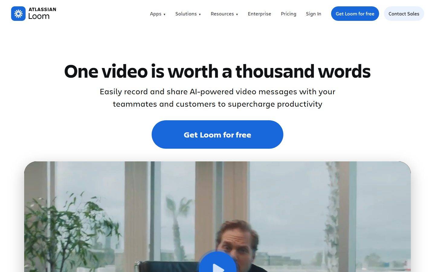
A bright, video-first marketing interface on white canvas anchored by a saturated electric-blue CTA (#1868db) rendered as fully-rounded pill buttons and Atlassian's custom Charlie typeface set. The system reads as friendly, modern productivity SaaS — bold black Charlie Display headlines, oversized rounded video/product cards, a colorful pastel use-case grid, and a near-black "keep your content safe" card that anchors the lower page. Brand voltage comes from the heavy display headlines, the pill-shaped blue CTA, and product UI shown inside generously-rounded cards.
Works withClaude CodeCursorCodexGemini CLICopilotv0LovableBoltWindsurfReplit
---
version: alpha
name: Loom-design-analysis
description: A bright, video-first marketing interface on white canvas anchored by a saturated electric-blue CTA (#1868db) rendered as fully-rounded pill buttons and Atlassian's custom Charlie typeface set. The system reads as friendly, modern productivity SaaS — bold black Charlie Display headlines, oversized rounded video/product cards, a colorful pastel use-case grid, and a near-black "keep your content safe" card that anchors the lower page. Brand voltage comes from the heavy display headlines, the pill-shaped blue CTA, and product UI shown inside generously-rounded cards.

colors:
  primary: "#1868db"
  primary-deep: "#1558bc"
  primary-navy: "#123263"
  ink: "#101214"
  ink-soft: "#292a2e"
  muted: "#7d818a"
  canvas: "#ffffff"
  surface-dark: "#101214"
  surface-blue-soft: "#e9f2fe"
  surface-blue-faint: "#eff0ff"
  accent-purple: "#bf63f3"
  accent-purple-soft: "#c97cf4"
  accent-purple-deep: "#48245d"
  surface-purple-soft: "#f8eefe"
  surface-purple-faint: "#eed7fc"
  accent-orange: "#ff613d"
  accent-orange-soft: "#dc684d"
  accent-gold: "#ffa900"
  accent-green: "#82b536"
  accent-green-soft: "#94c748"
  surface-green-faint: "#efffd6"
  on-primary: "#ffffff"

typography:
  display-xl:
    fontFamily: "Charlie Display, Inter, sans-serif"
    fontSize: 63px
    fontWeight: 700
    lineHeight: 1.03
    letterSpacing: normal
  display-lg:
    fontFamily: "Charlie Display, Inter, sans-serif"
    fontSize: 44px
    fontWeight: 700
    lineHeight: 1.14
    letterSpacing: normal
  display-md:
    fontFamily: "Charlie Display, Inter, sans-serif"
    fontSize: 32px
    fontWeight: 700
    lineHeight: 1.27
    letterSpacing: normal
  body-lg:
    fontFamily: "Charlie Text, Inter, sans-serif"
    fontSize: 26px
    fontWeight: 400
    lineHeight: 1.52
    letterSpacing: normal
  button:
    fontFamily: "Charlie Text, Inter, sans-serif"
    fontSize: 16px
    fontWeight: 400
    lineHeight: 1.5
    letterSpacing: normal
  eyebrow:
    fontFamily: "Charlie Text, Inter, sans-serif"
    fontSize: 13px
    fontWeight: 700
    lineHeight: 1.46
    letterSpacing: normal

rounded:
  sm: 6px
  md: 8px
  lg: 12px
  xl: 16px
  blob: 42px
  blob-lg: 69px
  full: 9999px

spacing:
  xxs: 6px
  xs: 8px
  sm: 16px
  md: 24px
  lg: 36px
  xl: 48px
  xxl: 64px
  section: 71px
  section-lg: 91px

components:
  top-nav:
    backgroundColor: "{colors.canvas}"
    textColor: "{colors.ink}"
    typography: "{typography.button}"
    padding: 16px 24px
  button-primary:
    backgroundColor: "{colors.primary}"
    textColor: "{colors.on-primary}"
    typography: "{typography.button}"
    rounded: "{rounded.full}"
    padding: 8px 16px
  button-primary-active:
    backgroundColor: "{colors.primary-deep}"
    textColor: "{colors.on-primary}"
    rounded: "{rounded.full}"
  button-secondary:
    backgroundColor: "{colors.surface-blue-faint}"
    textColor: "{colors.ink}"
    typography: "{typography.button}"
    rounded: "{rounded.full}"
    padding: 8px 16px
  button-dark:
    backgroundColor: "{colors.ink}"
    textColor: "{colors.on-primary}"
    typography: "{typography.button}"
    rounded: "{rounded.full}"
    padding: 8px 16px
  text-link:
    backgroundColor: transparent
    textColor: "{colors.primary}"
    typography: "{typography.button}"
  nav-link:
    backgroundColor: transparent
    textColor: "{colors.muted}"
    typography: "{typography.button}"
  video-player-card:
    backgroundColor: "{colors.surface-dark}"
    textColor: "{colors.on-primary}"
    rounded: "{rounded.xl}"
  feature-banner-blue:
    backgroundColor: "{colors.primary}"
    textColor: "{colors.on-primary}"
    typography: "{typography.display-md}"
    rounded: "{rounded.blob-lg}"
    padding: 48px
  card-dark:
    backgroundColor: "{colors.surface-dark}"
    textColor: "{colors.on-primary}"
    typography: "{typography.display-md}"
    rounded: "{rounded.blob}"
    padding: 48px
  product-mockup-card:
    backgroundColor: "{colors.canvas}"
    textColor: "{colors.ink}"
    rounded: "{rounded.xl}"
    padding: 24px
  use-case-card-green:
    backgroundColor: "{colors.surface-green-faint}"
    textColor: "{colors.ink}"
    typography: "{typography.eyebrow}"
    rounded: "{rounded.xl}"
    padding: 24px
  use-case-card-purple:
    backgroundColor: "{colors.surface-purple-soft}"
    textColor: "{colors.ink}"
    typography: "{typography.eyebrow}"
    rounded: "{rounded.xl}"
    padding: 24px
  use-case-card-blue:
    backgroundColor: "{colors.surface-blue-soft}"
    textColor: "{colors.ink}"
    typography: "{typography.eyebrow}"
    rounded: "{rounded.xl}"
    padding: 24px
  eyebrow-label:
    backgroundColor: transparent
    textColor: "{colors.ink}"
    typography: "{typography.eyebrow}"
---

## Overview

Loom's marketing surface (now part of Atlassian) is a bright, video-first modern-SaaS interface built on white canvas (`{colors.canvas}` — #ffffff) with a single saturated electric-blue CTA (`{colors.primary}` — #1868db). The headline voice is heavy: **Charlie Display** at weight 700 sets bold black hero type ("One video is worth a thousand words"), while **Charlie Text** carries the running copy. The system reads as friendly, confident, and product-forward — the hero shows the actual Loom player inside a rounded card rather than a marketing illustration.

The most distinctive shape signal is the **pill** — buttons render as fully-rounded `{rounded.full}` pills, and content cards use unusually large corner radii (`{rounded.blob}` 42px and `{rounded.blob-lg}` 69px). This generous rounding is the brand's geometric signature; nothing in the system uses tight corners.

Color voltage is monochrome at the action layer (one blue CTA) but expands into a **pastel palette** lower on the page, where use-case cards take soft green (`{colors.surface-green-faint}`), purple (`{colors.surface-purple-soft}`), and blue (`{colors.surface-blue-soft}`) fills. A near-black card (`{colors.surface-dark}` — #101214) for "Keep your content safe" anchors the lower page — the only dark surface in the body.

**Key Characteristics:**
- White canvas with a single saturated electric-blue CTA (`{colors.primary}` — #1868db) rendered as a fully-rounded pill (`{rounded.full}`). Press state derived as `{colors.primary-deep}` (#1558bc).
- Custom **Charlie Display** headlines at weight 700 (substituted with Inter weight 700 here). Heavy, bold, black headline voice.
- **Charlie Text** for body, buttons, and eyebrow labels — Charlie Text at weight 400 for copy, 700 for small eyebrow labels.
- Generously-rounded cards — `{rounded.blob}` (42px) and `{rounded.blob-lg}` (69px) on hero/feature/dark cards; the large radius is the brand's shape signature.
- Product UI shown directly inside cards — the hero video player, the AI bug-report panel, and the timeline mockups are real product chrome shown at small scale, not illustrations.
- A pastel use-case grid lower on the page — soft green / purple / blue card fills (`{colors.surface-green-faint}`, `{colors.surface-purple-soft}`, `{colors.surface-blue-soft}`) provide chromatic flourish without touching the CTA layer.
- One dark card (`{colors.surface-dark}` — #101214) anchors the "Keep your content safe" band — the only dark surface in the body.
- Spacing rhythm leans on `{spacing.lg}` (36px) and `{spacing.section}` (71px) between bands.

## Colors

### Brand & Action
- **Primary** (`{colors.primary}` — #1868db): The single saturated CTA color. Every primary action — "Get Loom for free", "Download now", "Join us" — uses this blue. Press state derived as `{colors.primary-deep}` (#1558bc).
- **Primary Navy** (`{colors.primary-navy}` — #123263): A deep navy used in dark product-chrome accents and gradients inside mockups.
- **On Primary** (`{colors.on-primary}` — #ffffff): Text/icons on the blue CTA.

### Text
- **Ink** (`{colors.ink}` — #101214): All headlines and primary text — a near-black.
- **Ink Soft** (`{colors.ink-soft}` — #292a2e): A slightly softer near-black measured as the default button label color; used on light pill buttons and dense UI text.
- **Muted** (`{colors.muted}` — #7d818a): Secondary text and inactive nav links.

### Surface
- **Canvas** (`{colors.canvas}` — #ffffff): The default page floor.
- **Surface Dark** (`{colors.surface-dark}` — #101214): The "Keep your content safe" card and the hero video-player frame — the only dark surfaces in the body.
- **Surface Blue Soft** (`{colors.surface-blue-soft}` — #e9f2fe) and **Surface Blue Faint** (`{colors.surface-blue-faint}` — #eff0ff): Light-blue card fills and the secondary button background.

### Pastel Accent Set
Used on the use-case card grid and small product-UI flourishes — never on CTAs:
- **Purple family:** `{colors.accent-purple}` (#bf63f3), `{colors.accent-purple-soft}` (#c97cf4), `{colors.accent-purple-deep}` (#48245d), `{colors.surface-purple-soft}` (#f8eefe), `{colors.surface-purple-faint}` (#eed7fc).
- **Orange family:** `{colors.accent-orange}` (#ff613d), `{colors.accent-orange-soft}` (#dc684d).
- **Green family:** `{colors.accent-green}` (#82b536), `{colors.accent-green-soft}` (#94c748), `{colors.surface-green-faint}` (#efffd6).
- **Gold:** `{colors.accent-gold}` (#ffa900).

These pastels appear as soft card fills and inside the embedded product mockups. The brand voice stays monochrome-blue at the action layer; the pastels are decorative emphasis lower in the page.

## Typography

### Font Family
The system runs **Charlie Display** for headlines and **Charlie Text** for body and UI. Both are Atlassian's proprietary typeface family — Charlie is custom and not freely licensable, so the fallback stack walks `Inter, -apple-system, BlinkMacSystemFont, "Segoe UI", Roboto, sans-serif`. Charlie Display is used at weight 700 for h1/h2/h3; Charlie Text handles body copy (400) and small eyebrow labels (700).

### Hierarchy

| Token | Size | Weight | Line Height | Letter Spacing | Use |
|---|---|---|---|---|---|
| `{typography.display-xl}` | 63px | 700 | 1.03 | normal | Hero h1 ("One video is worth a thousand words") — Charlie Display |
| `{typography.display-lg}` | 44px | 700 | 1.14 | normal | Section heads ("The easiest screen recorder you'll ever use") — Charlie Display |
| `{typography.display-md}` | 32px | 700 | 1.27 | normal | Sub-section heads, card titles ("Ship faster with AI bug reports") — Charlie Display |
| `{typography.body-lg}` | 26px | 400 | 1.52 | normal | Hero sub-headline and large running copy — Charlie Text |
| `{typography.button}` | 16px | 400 | 1.5 | normal | Button labels, nav links — Charlie Text |
| `{typography.eyebrow}` | 13px | 700 | 1.46 | normal | Small eyebrow labels, use-case card titles, fine labels — Charlie Text 700 |

### Principles
Charlie Display at weight 700 is the brand voice — every display headline is heavy and black. Charlie Text carries everything else, mostly at weight 400 with the exception of the small bold eyebrow labels. The boundary is strict: headlines are Display, copy is Text. The hero sub-headline runs unusually large (26px) — Loom uses big readable supporting copy rather than fine print under its headlines.

### Note on Font Substitutes
**Charlie Display** and **Charlie Text** are Atlassian's proprietary brand typefaces and are not available as open web fonts. **Inter** is the recommended substitute — Inter weight 700 for the display roles and Inter weight 400/700 for Charlie Text. **Manrope** weight 700 is an alternate display substitute that better matches Charlie Display's slightly rounded, friendly geometry. Never claim to ship Charlie.

## Layout

### Spacing System
- **Tokens:** `{spacing.xxs}` 6px · `{spacing.xs}` 8px · `{spacing.sm}` 16px · `{spacing.md}` 24px · `{spacing.lg}` 36px · `{spacing.xl}` 48px · `{spacing.xxl}` 64px · `{spacing.section}` 71px · `{spacing.section-lg}` 91px.
- **Most frequent units:** 16px (`{spacing.sm}`) and 36px (`{spacing.lg}`) dominate the measured spacing — these are the default gap and component-padding rhythm.
- **Section padding:** `{spacing.section}` (71px) is the primary vertical rhythm between bands, stepping up to `{spacing.section-lg}` (91px) on major transitions.
- **Card internal padding:** `{spacing.xl}` (48px) on the blue feature banner and dark card; `{spacing.md}` (24px) on product-mockup and use-case cards.

> Note: measured spacing also includes off-grid values (9, 23, 27, 30, 32, 47, 56px) — see Known Gaps. The token set above captures the dominant rhythm.

### Grid & Container
- **Hero:** Centered single-column — h1, sub-head, and CTA stack center-aligned, with the video-player card below spanning the content width.
- **Feature bands:** Two-up split (text + product mockup) on desktop; the blue AI banner pairs the bug-report panel left with the headline+copy right.
- **Logo wall:** Multi-row centered grid of customer logos.
- **Use-case grid:** 4-up pastel cards at desktop (Sales / Engineering / Customer support / Design).

### Whitespace Philosophy
Loom uses generous centered whitespace in the hero, then alternates left/right product-mockup bands. The big body type (26px sub-headline) plus 71px section gaps give the page a confident, unhurried scanning rhythm.

## Elevation & Depth

| Level | Treatment | Use |
|---|---|---|
| Flat | No shadow | Body sections, nav, pastel use-case cards |
| Soft layered | `0 2px 6px rgba(0,0,0,0.04)`, `0 5px 18px rgba(0,0,0,0.06)`, `0 24px 83px rgba(0,0,0,0.1)` (measured) | Floating product-mockup cards, hero player |
| Deep layered | `0 4px 6.4px rgba(0,0,0,0.03)` … `0 32px 96px rgba(0,0,0,0.1)` (measured) | Larger elevated product cards |
| Card drop | `0 15px 50px rgba(0,0,0,0.25)` (measured) | Dark card (`{component.card-dark}`) |
| Focus ring | `0 0 0 4.45px rgba(0,0,0,0)` / `0 0 0 5px rgba(255,255,255,0.4)` (measured) | Focused/elevated interactive elements |

The elevation philosophy is **soft, multi-layered drop shadows** — Loom stacks 3–5 low-alpha shadows to float product mockups gently off the white canvas. The dark card uses a single heavier `0 15px 50px rgba(0,0,0,0.25)` drop. No neumorphism, no glass.

## Shapes

### Border Radius Scale

| Token | Value | Use |
|---|---|---|
| `{rounded.sm}` | 6px | Small inline UI elements inside product mockups |
| `{rounded.md}` | 8px | Small chips, inner product-UI rows |
| `{rounded.lg}` | 12px | Inner cards, image frames |
| `{rounded.xl}` | 16px | Product-mockup cards, pastel use-case cards, video frame |
| `{rounded.blob}` | 42px | Large content cards (`{component.card-dark}`) |
| `{rounded.blob-lg}` | 69px | Largest feature banners (`{component.feature-banner-blue}`) |
| `{rounded.full}` | 9999px | All buttons (pill CTAs), avatars, icon buttons |

The signature is the **large radius**: cards round to 42–69px and buttons are full pills. There is no tight-corner geometry in the system — even the biggest blocks are softly rounded.

### Photography & Media Geometry
The hero video and embedded product mockups sit inside `{rounded.xl}` (16px) frames with soft layered shadows. Avatars inside product UI are circular (`{rounded.full}`).

## Components

### Top Navigation

**`top-nav`** — White nav bar at the top of every page carrying the "ATLASSIAN Loom" lockup at left, primary menu (Apps, Solutions, Resources, Enterprise, Pricing, Sign In) center, and a right cluster: a blue **`button-primary`** ("Get Loom for free") plus a light **`button-secondary`** ("Contact Sales"). Menu links use `{typography.button}` (Charlie Text 16px) in `{colors.ink}`; inactive links lean toward `{colors.muted}`.

### Buttons

**`button-primary`** — The signature CTA. Background `{colors.primary}` (#1868db), text `{colors.on-primary}`, type `{typography.button}`, fully-rounded `{rounded.full}` pill, padding 8px × 16px (measured). The hero "Get Loom for free" renders this same pill at larger scale. Active state `button-primary-active` shifts to `{colors.primary-deep}` (#1558bc) — derived.

**`button-secondary`** — Light pill button ("Contact Sales"). Background `{colors.surface-blue-faint}` (#eff0ff), text `{colors.ink}`, fully-rounded `{rounded.full}`, same padding as primary.

**`button-dark`** — Near-black pill ("Learn more" inside the blue AI banner and dark card). Background `{colors.ink}` (#101214), text `{colors.on-primary}`, fully-rounded `{rounded.full}`.

**`text-link`** — Inline blue link ("Record now →", "Start sharing →", "Connect over video →") in `{colors.primary}`, type `{typography.button}`.

**`nav-link`** — Top-nav menu item, transparent background, `{colors.muted}` text, `{typography.button}`.

### Cards & Containers

**`video-player-card`** — The hero video player and inline players. Background `{colors.surface-dark}` (the video frame), rounded `{rounded.xl}` (16px), soft layered drop shadow. Shows the real Loom player UI (play button, speed, timer).

**`feature-banner-blue`** — The "Ship faster with AI bug reports" band. Background `{colors.primary}` (#1868db), text `{colors.on-primary}`, headline in `{typography.display-md}`, rounded `{rounded.blob-lg}` (69px), internal padding `{spacing.xl}` (48px). Carries a "New!" eyebrow, the headline, body copy, a `{component.button-dark}` "Learn more", and an embedded product-UI panel.

**`card-dark`** — The "Keep your content safe" band. Background `{colors.surface-dark}` (#101214), text `{colors.on-primary}`, headline in `{typography.display-md}`, rounded `{rounded.blob}` (42px, measured), padding `{spacing.xl}` (48px), drop shadow `0 15px 50px rgba(0,0,0,0.25)`. The only dark card in the body — a deliberate, scarce anchor.

**`product-mockup-card`** — Cards showing real Loom product UI (timeline, editor, transcript). Background `{colors.canvas}`, rounded `{rounded.xl}`, padding `{spacing.md}` (24px), soft layered shadow. The product is shown, not illustrated.

**`use-case-card-green` / `use-case-card-purple` / `use-case-card-blue`** — The 4-up "Video messaging for all use cases" grid. Pastel fills — `{colors.surface-green-faint}` (#efffd6), `{colors.surface-purple-soft}` (#f8eefe), `{colors.surface-blue-soft}` (#e9f2fe) — text `{colors.ink}`, title in `{typography.eyebrow}`, rounded `{rounded.xl}` (16px), padding `{spacing.md}` (24px). The pastels appear only here.

### Labels

**`eyebrow-label`** — Small bold kicker labels ("New!", section eyebrows). Transparent background, `{colors.ink}` text, `{typography.eyebrow}` (Charlie Text 13px / 700).

## Do's and Don'ts

### Do
- Reserve `{colors.primary}` (#1868db) for primary CTAs only. Loom's action layer is a single saturated blue.
- Render all buttons as full pills (`{rounded.full}`). The pill is the brand's button signature.
- Use the large card radii — `{rounded.blob}` (42px) and `{rounded.blob-lg}` (69px) — on feature banners and dark cards. The generous rounding is the shape voice.
- Set headlines in Charlie Display weight 700 (heavy and black). Pair with Charlie Text body. Keep the boundary strict.
- Embed real Loom product UI inside cards — the player, the AI bug-report panel, the editor — instead of marketing illustrations.
- Keep the pastel set (`{colors.surface-green-faint}`, `{colors.surface-purple-soft}`, `{colors.surface-blue-soft}`) confined to the use-case grid and product mockups.
- Use the single dark card (`{component.card-dark}`) as a scarce anchor near the bottom of the page.

### Don't
- Don't tint the primary CTA with the pastel accents — they never touch the action layer.
- Don't use tight corners. Even the largest blocks round to 42–69px; buttons are full pills.
- Don't drop display weight below 700 — Charlie Display's bold weight is the headline voice.
- Don't add additional dark surfaces beyond the one `{component.card-dark}` band and the video frames.
- Don't claim to ship Charlie Display / Charlie Text — substitute with Inter or Manrope.
- Don't document hover state styling beyond default + pressed; primary darkens to `{colors.primary-deep}` on press.

## Responsive Behavior

### Breakpoints

| Name | Width | Key Changes |
|---|---|---|
| Mobile | < 768px | Hamburger nav (the captured mobile screenshot shows the menu collapsed); hero h1 scales down from 63px; video player stacks full-width; feature bands stack single-column; use-case grid 4 → 1 |
| Tablet | 768–1024px | Nav tightens; feature bands stay two-up where space allows; use-case grid 4 → 2 |
| Desktop | 1024–1440px | Full top-nav with all menu items; two-up feature bands; 4-up use-case grid |
| Wide | > 1440px | Same as desktop with more outer breathing room; content stays centered |

### Touch Targets
- `{component.button-primary}` and `{component.button-secondary}` use 8px × 16px padding on the pill; hero CTAs render larger and comfortably exceed 44px.
- Nav links rely on surrounding spacing for tap area.

### Collapsing Strategy
- Top nav collapses to a hamburger on mobile; the right-side CTA cluster moves into the menu sheet.
- The hero remains center-aligned at all widths; the video-player card spans full content width.
- Two-up feature bands (text + mockup) stack to single column on mobile, text first.
- The pastel use-case grid reduces columns (4 → 2 → 1) rather than shrinking cards.

### Image Behavior
- Embedded product mockups retain native aspect ratios inside `{rounded.xl}` frames; the cards resize around them.
- The hero video frame scales proportionally and keeps the play control centered.

## Iteration Guide

1. Focus on ONE component at a time. Reference its YAML key directly (`{component.feature-banner-blue}`, `{component.card-dark}`).
2. Variants of an existing component (`-active`) live as separate entries in `components:`.
3. Use `{token.refs}` everywhere — never inline hex.
4. Never document hover. Default and Active/Pressed states only.
5. Headlines stay Charlie Display 700; body stays Charlie Text 400. The boundary does not blur.
6. Keep the action layer monochrome blue; the pastel set is decorative only.
7. When increasing emphasis: bigger Charlie Display before any new color.

## Known Gaps

- The measured `button-primary` color came back as `#292a2e` (the `button.color` text value) while screenshot ground-truth shows the dominant hero CTA as electric-blue (`#1868db`) with white text. The blue pill is documented from screenshot evidence + the measured `#1868db` accent token; `#292a2e` is preserved as `{colors.ink-soft}` (light-pill / dense-UI text). Exact mapping of every button variant to background vs. text would need per-button extraction.
- Charlie Display / Charlie Text are Atlassian proprietary typefaces (not flagged in `fonts_licensed`, but custom and unlicensable as web fonts); open-source substitutes are documented in Typography.
- The `letterSpacing` on every type role measured as `normal`; precise tracking values were not captured.
- Spacing includes off-grid measured values (9, 23, 27, 30, 32, 47, 56px) not mapped to tokens — the token set captures the dominant 16/24/36/71px rhythm.
- The two `blob` radii (42px, 69px) were measured on specific cards; intermediate card radii (50px appeared once) are not generalized.
- Pricing-page-specific components (tier cards, comparison tables) were captured as a page but not measured into discrete component tokens — out of scope here.
- Animation/transition timings (video playback controls, card hover-reveals) are not in scope.
- The exact pastel-to-use-case mapping (which color belongs to Sales vs. Design, etc.) is inferred from the screenshot grid and may rotate.

<!-- Documented by Duply · real-world design systems as ready-to-use DESIGN.md for AI coding agents · https://duply.ai/loom/design-md -->
Color Palette
Accent
Neutrals
Typography
display-xl63px · 700 · 1.03
The quick brown fox jumpsdisplay-lg44px · 700 · 1.14
The quick brown fox jumpsdisplay-md32px · 700 · 1.27
The quick brown fox jumpsbody-lg26px · 400 · 1.52
The quick brown fox jumpsbutton16px · 400 · 1.5
The quick brown fox jumpseyebrow13px · 700 · 1.46
The quick brown fox jumpsSpacing & Shape
Spacing
| Name | Value | Preview |
|---|---|---|
| xxs | 6px | |
| xs | 8px | |
| sm | 16px | |
| md | 24px | |
| lg | 36px | |
| xl | 48px | |
| xxl | 64px | |
| section | 71px | |
| section-lg | 91px |
Border Radius
| Name | Value | Preview |
|---|---|---|
| sm | 6px | |
| md | 8px | |
| lg | 12px | |
| xl | 16px | |
| blob | 42px | |
| blob-lg | 69px | |
| full | 9999px |
FAQ
- What colors does Loom use?
- Loom's core palette includes #1868db, #1558bc, #123263, #101214, #292a2e. The full color set with usage roles (canvas, ink, surfaces, accent, semantic) is documented in the Loom DESIGN.md.
- What font does Loom use?
- Loom's primary typeface is Charlie Display. The complete type scale (sizes, weights, line-height and letter-spacing per role), with an open substitute where the original is licensed, is documented in the DESIGN.md.
- What is the Loom design system?
- A bright, video-first marketing interface on white canvas anchored by a saturated electric-blue CTA (#1868db) rendered as fully-rounded pill buttons and Atlassian's custom Charlie typeface set. The system reads as friendly, modern productivity SaaS — bold black Charlie Display headlines, oversized
Get this as a working kit
Loom Launch Kit + DESIGN.md
$299$225
One-time payment
- A complete production-stack template, styled like Loom, fully built and wired.
- One-time payment and the codebase is yours. No platform fees, no subscription.
Open it with Claude Code, Cursor, or any coding agent and build in plain language, then ship a complete web app.
- Your private DESIGN.md
- Marketing pages, blog, SEO & legal
- Email capture, newsletter & contact
- Accept payments (Stripe)
- Analytics (GA4 + PostHog)
- One-click deploy
- Auth, login & roles
- A full app dashboard, when you grow
More like this
---
version: alpha
name: Loom-design-analysis
description: A bright, video-first marketing interface on white canvas anchored by a saturated electric-blue CTA (#1868db) rendered as fully-rounded pill buttons and Atlassian's custom Charlie typeface set. The system reads as friendly, modern productivity SaaS — bold black Charlie Display headlines, oversized rounded video/product cards, a colorful pastel use-case grid, and a near-black "keep your content safe" card that anchors the lower page. Brand voltage comes from the heavy display headlines, the pill-shaped blue CTA, and product UI shown inside generously-rounded cards.

colors:
  primary: "#1868db"
  primary-deep: "#1558bc"
  primary-navy: "#123263"
  ink: "#101214"
  ink-soft: "#292a2e"
  muted: "#7d818a"
  canvas: "#ffffff"
  surface-dark: "#101214"
  surface-blue-soft: "#e9f2fe"
  surface-blue-faint: "#eff0ff"
  accent-purple: "#bf63f3"
  accent-purple-soft: "#c97cf4"
  accent-purple-deep: "#48245d"
  surface-purple-soft: "#f8eefe"
  surface-purple-faint: "#eed7fc"
  accent-orange: "#ff613d"
  accent-orange-soft: "#dc684d"
  accent-gold: "#ffa900"
  accent-green: "#82b536"
  accent-green-soft: "#94c748"
  surface-green-faint: "#efffd6"
  on-primary: "#ffffff"

typography:
  display-xl:
    fontFamily: "Charlie Display, Inter, sans-serif"
    fontSize: 63px
    fontWeight: 700
    lineHeight: 1.03
    letterSpacing: normal
  display-lg:
    fontFamily: "Charlie Display, Inter, sans-serif"
    fontSize: 44px
    fontWeight: 700
    lineHeight: 1.14
    letterSpacing: normal
  display-md:
    fontFamily: "Charlie Display, Inter, sans-serif"
    fontSize: 32px
    fontWeight: 700
    lineHeight: 1.27
    letterSpacing: normal
  body-lg:
    fontFamily: "Charlie Text, Inter, sans-serif"
    fontSize: 26px
    fontWeight: 400
    lineHeight: 1.52
    letterSpacing: normal
  button:
    fontFamily: "Charlie Text, Inter, sans-serif"
    fontSize: 16px
    fontWeight: 400
    lineHeight: 1.5
    letterSpacing: normal
  eyebrow:
    fontFamily: "Charlie Text, Inter, sans-serif"
    fontSize: 13px
    fontWeight: 700
    lineHeight: 1.46
    letterSpacing: normal

rounded:
  sm: 6px
  md: 8px
  lg: 12px
  xl: 16px
  blob: 42px
  blob-lg: 69px
  full: 9999px

spacing:
  xxs: 6px
  xs: 8px
  sm: 16px
  md: 24px
  lg: 36px
  xl: 48px
  xxl: 64px
  section: 71px
  section-lg: 91px

components:
  top-nav:
    backgroundColor: "{colors.canvas}"
    textColor: "{colors.ink}"
    typography: "{typography.button}"
    padding: 16px 24px
  button-primary:
    backgroundColor: "{colors.primary}"
    textColor: "{colors.on-primary}"
    typography: "{typography.button}"
    rounded: "{rounded.full}"
    padding: 8px 16px
  button-primary-active:
    backgroundColor: "{colors.primary-deep}"
    textColor: "{colors.on-primary}"
    rounded: "{rounded.full}"
  button-secondary:
    backgroundColor: "{colors.surface-blue-faint}"
    textColor: "{colors.ink}"
    typography: "{typography.button}"
    rounded: "{rounded.full}"
    padding: 8px 16px
  button-dark:
    backgroundColor: "{colors.ink}"
    textColor: "{colors.on-primary}"
    typography: "{typography.button}"
    rounded: "{rounded.full}"
    padding: 8px 16px
  text-link:
    backgroundColor: transparent
    textColor: "{colors.primary}"
    typography: "{typography.button}"
  nav-link:
    backgroundColor: transparent
    textColor: "{colors.muted}"
    typography: "{typography.button}"
  video-player-card:
    backgroundColor: "{colors.surface-dark}"
    textColor: "{colors.on-primary}"
    rounded: "{rounded.xl}"
  feature-banner-blue:
    backgroundColor: "{colors.primary}"
    textColor: "{colors.on-primary}"
    typography: "{typography.display-md}"
    rounded: "{rounded.blob-lg}"
    padding: 48px
  card-dark:
    backgroundColor: "{colors.surface-dark}"
    textColor: "{colors.on-primary}"
    typography: "{typography.display-md}"
    rounded: "{rounded.blob}"
    padding: 48px
  product-mockup-card:
    backgroundColor: "{colors.canvas}"
    textColor: "{colors.ink}"
    rounded: "{rounded.xl}"
    padding: 24px
  use-case-card-green:
    backgroundColor: "{colors.surface-green-faint}"
    textColor: "{colors.ink}"
    typography: "{typography.eyebrow}"
    rounded: "{rounded.xl}"
    padding: 24px
  use-case-card-purple:
    backgroundColor: "{colors.surface-purple-soft}"
    textColor: "{colors.ink}"
    typography: "{typography.eyebrow}"
    rounded: "{rounded.xl}"
    padding: 24px
  use-case-card-blue:
    backgroundColor: "{colors.surface-blue-soft}"
    textColor: "{colors.ink}"
    typography: "{typography.eyebrow}"
    rounded: "{rounded.xl}"
    padding: 24px
  eyebrow-label:
    backgroundColor: transparent
    textColor: "{colors.ink}"
    typography: "{typography.eyebrow}"
---

## Overview

Loom's marketing surface (now part of Atlassian) is a bright, video-first modern-SaaS interface built on white canvas (`{colors.canvas}` — #ffffff) with a single saturated electric-blue CTA (`{colors.primary}` — #1868db). The headline voice is heavy: **Charlie Display** at weight 700 sets bold black hero type ("One video is worth a thousand words"), while **Charlie Text** carries the running copy. The system reads as friendly, confident, and product-forward — the hero shows the actual Loom player inside a rounded card rather than a marketing illustration.

The most distinctive shape signal is the **pill** — buttons render as fully-rounded `{rounded.full}` pills, and content cards use unusually large corner radii (`{rounded.blob}` 42px and `{rounded.blob-lg}` 69px). This generous rounding is the brand's geometric signature; nothing in the system uses tight corners.

Color voltage is monochrome at the action layer (one blue CTA) but expands into a **pastel palette** lower on the page, where use-case cards take soft green (`{colors.surface-green-faint}`), purple (`{colors.surface-purple-soft}`), and blue (`{colors.surface-blue-soft}`) fills. A near-black card (`{colors.surface-dark}` — #101214) for "Keep your content safe" anchors the lower page — the only dark surface in the body.

**Key Characteristics:**
- White canvas with a single saturated electric-blue CTA (`{colors.primary}` — #1868db) rendered as a fully-rounded pill (`{rounded.full}`). Press state derived as `{colors.primary-deep}` (#1558bc).
- Custom **Charlie Display** headlines at weight 700 (substituted with Inter weight 700 here). Heavy, bold, black headline voice.
- **Charlie Text** for body, buttons, and eyebrow labels — Charlie Text at weight 400 for copy, 700 for small eyebrow labels.
- Generously-rounded cards — `{rounded.blob}` (42px) and `{rounded.blob-lg}` (69px) on hero/feature/dark cards; the large radius is the brand's shape signature.
- Product UI shown directly inside cards — the hero video player, the AI bug-report panel, and the timeline mockups are real product chrome shown at small scale, not illustrations.
- A pastel use-case grid lower on the page — soft green / purple / blue card fills (`{colors.surface-green-faint}`, `{colors.surface-purple-soft}`, `{colors.surface-blue-soft}`) provide chromatic flourish without touching the CTA layer.
- One dark card (`{colors.surface-dark}` — #101214) anchors the "Keep your content safe" band — the only dark surface in the body.
- Spacing rhythm leans on `{spacing.lg}` (36px) and `{spacing.section}` (71px) between bands.

## Colors

### Brand & Action
- **Primary** (`{colors.primary}` — #1868db): The single saturated CTA color. Every primary action — "Get Loom for free", "Download now", "Join us" — uses this blue. Press state derived as `{colors.primary-deep}` (#1558bc).
- **Primary Navy** (`{colors.primary-navy}` — #123263): A deep navy used in dark product-chrome accents and gradients inside mockups.
- **On Primary** (`{colors.on-primary}` — #ffffff): Text/icons on the blue CTA.

### Text
- **Ink** (`{colors.ink}` — #101214): All headlines and primary text — a near-black.
- **Ink Soft** (`{colors.ink-soft}` — #292a2e): A slightly softer near-black measured as the default button label color; used on light pill buttons and dense UI text.
- **Muted** (`{colors.muted}` — #7d818a): Secondary text and inactive nav links.

### Surface
- **Canvas** (`{colors.canvas}` — #ffffff): The default page floor.
- **Surface Dark** (`{colors.surface-dark}` — #101214): The "Keep your content safe" card and the hero video-player frame — the only dark surfaces in the body.
- **Surface Blue Soft** (`{colors.surface-blue-soft}` — #e9f2fe) and **Surface Blue Faint** (`{colors.surface-blue-faint}` — #eff0ff): Light-blue card fills and the secondary button background.

### Pastel Accent Set
Used on the use-case card grid and small product-UI flourishes — never on CTAs:
- **Purple family:** `{colors.accent-purple}` (#bf63f3), `{colors.accent-purple-soft}` (#c97cf4), `{colors.accent-purple-deep}` (#48245d), `{colors.surface-purple-soft}` (#f8eefe), `{colors.surface-purple-faint}` (#eed7fc).
- **Orange family:** `{colors.accent-orange}` (#ff613d), `{colors.accent-orange-soft}` (#dc684d).
- **Green family:** `{colors.accent-green}` (#82b536), `{colors.accent-green-soft}` (#94c748), `{colors.surface-green-faint}` (#efffd6).
- **Gold:** `{colors.accent-gold}` (#ffa900).

These pastels appear as soft card fills and inside the embedded product mockups. The brand voice stays monochrome-blue at the action layer; the pastels are decorative emphasis lower in the page.

## Typography

### Font Family
The system runs **Charlie Display** for headlines and **Charlie Text** for body and UI. Both are Atlassian's proprietary typeface family — Charlie is custom and not freely licensable, so the fallback stack walks `Inter, -apple-system, BlinkMacSystemFont, "Segoe UI", Roboto, sans-serif`. Charlie Display is used at weight 700 for h1/h2/h3; Charlie Text handles body copy (400) and small eyebrow labels (700).

### Hierarchy

| Token | Size | Weight | Line Height | Letter Spacing | Use |
|---|---|---|---|---|---|
| `{typography.display-xl}` | 63px | 700 | 1.03 | normal | Hero h1 ("One video is worth a thousand words") — Charlie Display |
| `{typography.display-lg}` | 44px | 700 | 1.14 | normal | Section heads ("The easiest screen recorder you'll ever use") — Charlie Display |
| `{typography.display-md}` | 32px | 700 | 1.27 | normal | Sub-section heads, card titles ("Ship faster with AI bug reports") — Charlie Display |
| `{typography.body-lg}` | 26px | 400 | 1.52 | normal | Hero sub-headline and large running copy — Charlie Text |
| `{typography.button}` | 16px | 400 | 1.5 | normal | Button labels, nav links — Charlie Text |
| `{typography.eyebrow}` | 13px | 700 | 1.46 | normal | Small eyebrow labels, use-case card titles, fine labels — Charlie Text 700 |

### Principles
Charlie Display at weight 700 is the brand voice — every display headline is heavy and black. Charlie Text carries everything else, mostly at weight 400 with the exception of the small bold eyebrow labels. The boundary is strict: headlines are Display, copy is Text. The hero sub-headline runs unusually large (26px) — Loom uses big readable supporting copy rather than fine print under its headlines.

### Note on Font Substitutes
**Charlie Display** and **Charlie Text** are Atlassian's proprietary brand typefaces and are not available as open web fonts. **Inter** is the recommended substitute — Inter weight 700 for the display roles and Inter weight 400/700 for Charlie Text. **Manrope** weight 700 is an alternate display substitute that better matches Charlie Display's slightly rounded, friendly geometry. Never claim to ship Charlie.

## Layout

### Spacing System
- **Tokens:** `{spacing.xxs}` 6px · `{spacing.xs}` 8px · `{spacing.sm}` 16px · `{spacing.md}` 24px · `{spacing.lg}` 36px · `{spacing.xl}` 48px · `{spacing.xxl}` 64px · `{spacing.section}` 71px · `{spacing.section-lg}` 91px.
- **Most frequent units:** 16px (`{spacing.sm}`) and 36px (`{spacing.lg}`) dominate the measured spacing — these are the default gap and component-padding rhythm.
- **Section padding:** `{spacing.section}` (71px) is the primary vertical rhythm between bands, stepping up to `{spacing.section-lg}` (91px) on major transitions.
- **Card internal padding:** `{spacing.xl}` (48px) on the blue feature banner and dark card; `{spacing.md}` (24px) on product-mockup and use-case cards.

> Note: measured spacing also includes off-grid values (9, 23, 27, 30, 32, 47, 56px) — see Known Gaps. The token set above captures the dominant rhythm.

### Grid & Container
- **Hero:** Centered single-column — h1, sub-head, and CTA stack center-aligned, with the video-player card below spanning the content width.
- **Feature bands:** Two-up split (text + product mockup) on desktop; the blue AI banner pairs the bug-report panel left with the headline+copy right.
- **Logo wall:** Multi-row centered grid of customer logos.
- **Use-case grid:** 4-up pastel cards at desktop (Sales / Engineering / Customer support / Design).

### Whitespace Philosophy
Loom uses generous centered whitespace in the hero, then alternates left/right product-mockup bands. The big body type (26px sub-headline) plus 71px section gaps give the page a confident, unhurried scanning rhythm.

## Elevation & Depth

| Level | Treatment | Use |
|---|---|---|
| Flat | No shadow | Body sections, nav, pastel use-case cards |
| Soft layered | `0 2px 6px rgba(0,0,0,0.04)`, `0 5px 18px rgba(0,0,0,0.06)`, `0 24px 83px rgba(0,0,0,0.1)` (measured) | Floating product-mockup cards, hero player |
| Deep layered | `0 4px 6.4px rgba(0,0,0,0.03)` … `0 32px 96px rgba(0,0,0,0.1)` (measured) | Larger elevated product cards |
| Card drop | `0 15px 50px rgba(0,0,0,0.25)` (measured) | Dark card (`{component.card-dark}`) |
| Focus ring | `0 0 0 4.45px rgba(0,0,0,0)` / `0 0 0 5px rgba(255,255,255,0.4)` (measured) | Focused/elevated interactive elements |

The elevation philosophy is **soft, multi-layered drop shadows** — Loom stacks 3–5 low-alpha shadows to float product mockups gently off the white canvas. The dark card uses a single heavier `0 15px 50px rgba(0,0,0,0.25)` drop. No neumorphism, no glass.

## Shapes

### Border Radius Scale

| Token | Value | Use |
|---|---|---|
| `{rounded.sm}` | 6px | Small inline UI elements inside product mockups |
| `{rounded.md}` | 8px | Small chips, inner product-UI rows |
| `{rounded.lg}` | 12px | Inner cards, image frames |
| `{rounded.xl}` | 16px | Product-mockup cards, pastel use-case cards, video frame |
| `{rounded.blob}` | 42px | Large content cards (`{component.card-dark}`) |
| `{rounded.blob-lg}` | 69px | Largest feature banners (`{component.feature-banner-blue}`) |
| `{rounded.full}` | 9999px | All buttons (pill CTAs), avatars, icon buttons |

The signature is the **large radius**: cards round to 42–69px and buttons are full pills. There is no tight-corner geometry in the system — even the biggest blocks are softly rounded.

### Photography & Media Geometry
The hero video and embedded product mockups sit inside `{rounded.xl}` (16px) frames with soft layered shadows. Avatars inside product UI are circular (`{rounded.full}`).

## Components

### Top Navigation

**`top-nav`** — White nav bar at the top of every page carrying the "ATLASSIAN Loom" lockup at left, primary menu (Apps, Solutions, Resources, Enterprise, Pricing, Sign In) center, and a right cluster: a blue **`button-primary`** ("Get Loom for free") plus a light **`button-secondary`** ("Contact Sales"). Menu links use `{typography.button}` (Charlie Text 16px) in `{colors.ink}`; inactive links lean toward `{colors.muted}`.

### Buttons

**`button-primary`** — The signature CTA. Background `{colors.primary}` (#1868db), text `{colors.on-primary}`, type `{typography.button}`, fully-rounded `{rounded.full}` pill, padding 8px × 16px (measured). The hero "Get Loom for free" renders this same pill at larger scale. Active state `button-primary-active` shifts to `{colors.primary-deep}` (#1558bc) — derived.

**`button-secondary`** — Light pill button ("Contact Sales"). Background `{colors.surface-blue-faint}` (#eff0ff), text `{colors.ink}`, fully-rounded `{rounded.full}`, same padding as primary.

**`button-dark`** — Near-black pill ("Learn more" inside the blue AI banner and dark card). Background `{colors.ink}` (#101214), text `{colors.on-primary}`, fully-rounded `{rounded.full}`.

**`text-link`** — Inline blue link ("Record now →", "Start sharing →", "Connect over video →") in `{colors.primary}`, type `{typography.button}`.

**`nav-link`** — Top-nav menu item, transparent background, `{colors.muted}` text, `{typography.button}`.

### Cards & Containers

**`video-player-card`** — The hero video player and inline players. Background `{colors.surface-dark}` (the video frame), rounded `{rounded.xl}` (16px), soft layered drop shadow. Shows the real Loom player UI (play button, speed, timer).

**`feature-banner-blue`** — The "Ship faster with AI bug reports" band. Background `{colors.primary}` (#1868db), text `{colors.on-primary}`, headline in `{typography.display-md}`, rounded `{rounded.blob-lg}` (69px), internal padding `{spacing.xl}` (48px). Carries a "New!" eyebrow, the headline, body copy, a `{component.button-dark}` "Learn more", and an embedded product-UI panel.

**`card-dark`** — The "Keep your content safe" band. Background `{colors.surface-dark}` (#101214), text `{colors.on-primary}`, headline in `{typography.display-md}`, rounded `{rounded.blob}` (42px, measured), padding `{spacing.xl}` (48px), drop shadow `0 15px 50px rgba(0,0,0,0.25)`. The only dark card in the body — a deliberate, scarce anchor.

**`product-mockup-card`** — Cards showing real Loom product UI (timeline, editor, transcript). Background `{colors.canvas}`, rounded `{rounded.xl}`, padding `{spacing.md}` (24px), soft layered shadow. The product is shown, not illustrated.

**`use-case-card-green` / `use-case-card-purple` / `use-case-card-blue`** — The 4-up "Video messaging for all use cases" grid. Pastel fills — `{colors.surface-green-faint}` (#efffd6), `{colors.surface-purple-soft}` (#f8eefe), `{colors.surface-blue-soft}` (#e9f2fe) — text `{colors.ink}`, title in `{typography.eyebrow}`, rounded `{rounded.xl}` (16px), padding `{spacing.md}` (24px). The pastels appear only here.

### Labels

**`eyebrow-label`** — Small bold kicker labels ("New!", section eyebrows). Transparent background, `{colors.ink}` text, `{typography.eyebrow}` (Charlie Text 13px / 700).

## Do's and Don'ts

### Do
- Reserve `{colors.primary}` (#1868db) for primary CTAs only. Loom's action layer is a single saturated blue.
- Render all buttons as full pills (`{rounded.full}`). The pill is the brand's button signature.
- Use the large card radii — `{rounded.blob}` (42px) and `{rounded.blob-lg}` (69px) — on feature banners and dark cards. The generous rounding is the shape voice.
- Set headlines in Charlie Display weight 700 (heavy and black). Pair with Charlie Text body. Keep the boundary strict.
- Embed real Loom product UI inside cards — the player, the AI bug-report panel, the editor — instead of marketing illustrations.
- Keep the pastel set (`{colors.surface-green-faint}`, `{colors.surface-purple-soft}`, `{colors.surface-blue-soft}`) confined to the use-case grid and product mockups.
- Use the single dark card (`{component.card-dark}`) as a scarce anchor near the bottom of the page.

### Don't
- Don't tint the primary CTA with the pastel accents — they never touch the action layer.
- Don't use tight corners. Even the largest blocks round to 42–69px; buttons are full pills.
- Don't drop display weight below 700 — Charlie Display's bold weight is the headline voice.
- Don't add additional dark surfaces beyond the one `{component.card-dark}` band and the video frames.
- Don't claim to ship Charlie Display / Charlie Text — substitute with Inter or Manrope.
- Don't document hover state styling beyond default + pressed; primary darkens to `{colors.primary-deep}` on press.

## Responsive Behavior

### Breakpoints

| Name | Width | Key Changes |
|---|---|---|
| Mobile | < 768px | Hamburger nav (the captured mobile screenshot shows the menu collapsed); hero h1 scales down from 63px; video player stacks full-width; feature bands stack single-column; use-case grid 4 → 1 |
| Tablet | 768–1024px | Nav tightens; feature bands stay two-up where space allows; use-case grid 4 → 2 |
| Desktop | 1024–1440px | Full top-nav with all menu items; two-up feature bands; 4-up use-case grid |
| Wide | > 1440px | Same as desktop with more outer breathing room; content stays centered |

### Touch Targets
- `{component.button-primary}` and `{component.button-secondary}` use 8px × 16px padding on the pill; hero CTAs render larger and comfortably exceed 44px.
- Nav links rely on surrounding spacing for tap area.

### Collapsing Strategy
- Top nav collapses to a hamburger on mobile; the right-side CTA cluster moves into the menu sheet.
- The hero remains center-aligned at all widths; the video-player card spans full content width.
- Two-up feature bands (text + mockup) stack to single column on mobile, text first.
- The pastel use-case grid reduces columns (4 → 2 → 1) rather than shrinking cards.

### Image Behavior
- Embedded product mockups retain native aspect ratios inside `{rounded.xl}` frames; the cards resize around them.
- The hero video frame scales proportionally and keeps the play control centered.

## Iteration Guide

1. Focus on ONE component at a time. Reference its YAML key directly (`{component.feature-banner-blue}`, `{component.card-dark}`).
2. Variants of an existing component (`-active`) live as separate entries in `components:`.
3. Use `{token.refs}` everywhere — never inline hex.
4. Never document hover. Default and Active/Pressed states only.
5. Headlines stay Charlie Display 700; body stays Charlie Text 400. The boundary does not blur.
6. Keep the action layer monochrome blue; the pastel set is decorative only.
7. When increasing emphasis: bigger Charlie Display before any new color.

## Known Gaps

- The measured `button-primary` color came back as `#292a2e` (the `button.color` text value) while screenshot ground-truth shows the dominant hero CTA as electric-blue (`#1868db`) with white text. The blue pill is documented from screenshot evidence + the measured `#1868db` accent token; `#292a2e` is preserved as `{colors.ink-soft}` (light-pill / dense-UI text). Exact mapping of every button variant to background vs. text would need per-button extraction.
- Charlie Display / Charlie Text are Atlassian proprietary typefaces (not flagged in `fonts_licensed`, but custom and unlicensable as web fonts); open-source substitutes are documented in Typography.
- The `letterSpacing` on every type role measured as `normal`; precise tracking values were not captured.
- Spacing includes off-grid measured values (9, 23, 27, 30, 32, 47, 56px) not mapped to tokens — the token set captures the dominant 16/24/36/71px rhythm.
- The two `blob` radii (42px, 69px) were measured on specific cards; intermediate card radii (50px appeared once) are not generalized.
- Pricing-page-specific components (tier cards, comparison tables) were captured as a page but not measured into discrete component tokens — out of scope here.
- Animation/transition timings (video playback controls, card hover-reveals) are not in scope.
- The exact pastel-to-use-case mapping (which color belongs to Sales vs. Design, etc.) is inferred from the screenshot grid and may rotate.

<!-- Documented by Duply · real-world design systems as ready-to-use DESIGN.md for AI coding agents · https://duply.ai/loom/design-md -->