Coda
A bold, editorial fintech interface built on a warm cream canvas (#f8f9eb) with heavy black ABC Monument Grotesk display type, monospaced JetBrains Mono UI labels, and saturated color-block cards (deep blue, mint green, forest green). The system reads as confident payments-infrastructure brand — oversized condensed headlines, outlined geometric glyphs interrupting words, rounded pill chips, and a dramatic dark-green organic hero blob anchoring the fold. Brand voltage comes from extreme display weight (800) and a punchy mint accent rather than from gradients or imagery.
---
version: alpha
name: Coda-design-analysis
description: A bold, editorial fintech interface built on a warm cream canvas (#f8f9eb) with heavy black ABC Monument Grotesk display type, monospaced JetBrains Mono UI labels, and saturated color-block cards (deep blue, mint green, forest green). The system reads as confident payments-infrastructure brand — oversized condensed headlines, outlined geometric glyphs interrupting words, rounded pill chips, and a dramatic dark-green organic hero blob anchoring the fold. Brand voltage comes from extreme display weight (800) and a punchy mint accent rather than from gradients or imagery.
colors:
ink: "#000000"
canvas: "#f8f9eb"
on-dark: "#f8f9eb"
surface-white: "#ffffff"
body: "#5a5a4f"
muted: "#7c7d76"
muted-soft: "#c0c2a9"
neutral-gray: "#9ca3af"
surface-dark: "#000000"
surface-dark-elevated: "#202020"
accent-mint: "#aafdc0"
accent-ice: "#b0f4ff"
green-deep: "#003d21"
green: "#007c44"
blue-deep: "#041668"
blue: "#002eff"
violet: "#671fff"
violet-deep: "#2d0078"
plum: "#3f0929"
pink: "#d62c92"
pink-soft: "#ffc0e6"
lilac: "#d3beff"
typography:
display:
fontFamily: "ABC Monument Grotesk, Space Grotesk, Arial, sans-serif"
fontSize: 71.56px
fontWeight: 800
lineHeight: 0.9
letterSpacing: -0.7156px
lead:
fontFamily: "ABC Monument Grotesk, Space Grotesk, Arial, sans-serif"
fontSize: 24.6px
fontWeight: 800
lineHeight: 1.02
letterSpacing: -0.246px
heading:
fontFamily: "ABC Monument Grotesk, Space Grotesk, Arial, sans-serif"
fontSize: 22.36px
fontWeight: 400
lineHeight: 1.3
letterSpacing: 0.2236px
label:
fontFamily: "ui-sans-serif, system-ui, sans-serif"
fontSize: 14.08px
fontWeight: 600
lineHeight: 1.7
letterSpacing: 0
button-mono:
fontFamily: "JetBrains Mono, ui-monospace, monospace"
fontSize: 12px
fontWeight: 400
lineHeight: 1.2
letterSpacing: 0
rounded:
xs: 2px
sm: 9px
md: 13px
lg: 18px
xl: 22px
xxl: 27px
xxxl: 45px
pill: 9999px
spacing:
xxs: 4px
xs: 9px
sm: 13px
md: 18px
lg: 27px
xl: 36px
xxl: 45px
xxxl: 63px
section: 72px
section-lg: 107px
components:
announcement-bar:
backgroundColor: "{colors.ink}"
textColor: "{colors.on-dark}"
typography: "{typography.button-mono}"
padding: 13px 18px
top-nav:
backgroundColor: "{colors.canvas}"
textColor: "{colors.ink}"
typography: "{typography.label}"
padding: 18px 36px
button-primary:
backgroundColor: "{colors.ink}"
textColor: "{colors.on-dark}"
typography: "{typography.label}"
rounded: "{rounded.pill}"
padding: 13px 27px
pill-chip-light:
backgroundColor: "{colors.muted-soft}"
textColor: "{colors.ink}"
typography: "{typography.button-mono}"
rounded: "{rounded.pill}"
padding: 13px 27px
pill-chip-dark:
backgroundColor: "{colors.ink}"
textColor: "{colors.on-dark}"
typography: "{typography.button-mono}"
rounded: "{rounded.pill}"
padding: 13px 27px
hero-heading:
backgroundColor: transparent
textColor: "{colors.ink}"
typography: "{typography.display}"
icon-glyph-badge:
backgroundColor: transparent
textColor: "{colors.ink}"
rounded: "{rounded.pill}"
size: 63px
hero-blob:
backgroundColor: "{colors.green-deep}"
textColor: "{colors.on-dark}"
stat-display:
backgroundColor: transparent
textColor: "{colors.ink}"
typography: "{typography.display}"
feature-card-blue:
backgroundColor: "{colors.blue-deep}"
textColor: "{colors.on-dark}"
typography: "{typography.lead}"
rounded: "{rounded.xl}"
padding: 27px
feature-card-mint:
backgroundColor: "{colors.accent-mint}"
textColor: "{colors.ink}"
typography: "{typography.lead}"
rounded: "{rounded.xl}"
padding: 27px
feature-card-green:
backgroundColor: "{colors.green-deep}"
textColor: "{colors.on-dark}"
typography: "{typography.lead}"
rounded: "{rounded.xl}"
padding: 27px
card:
backgroundColor: "{colors.surface-white}"
textColor: "{colors.ink}"
rounded: "{rounded.xl}"
padding: 27px
footer:
backgroundColor: "{colors.ink}"
textColor: "{colors.on-dark}"
typography: "{typography.button-mono}"
padding: 63px
---
## Overview
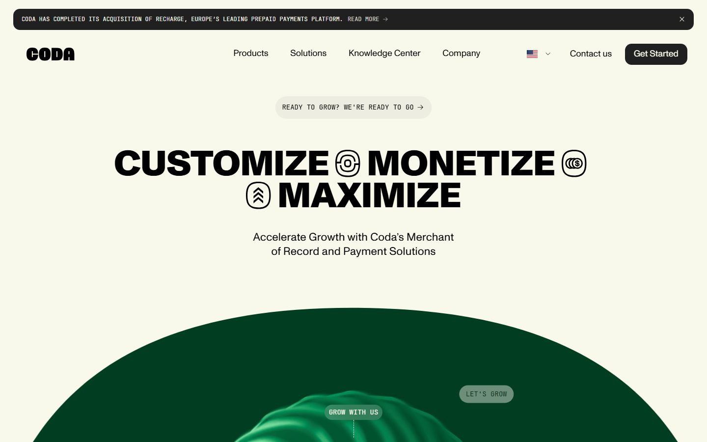
Coda's marketing surface is a bold, editorial fintech interface built on a warm cream canvas (`{colors.canvas}` — #f8f9eb) with heavy black display type (`{colors.ink}` — #000000) and a punchy mint accent (`{colors.accent-mint}` — #aafdc0). The system reads as confident payments-infrastructure brand: oversized condensed headlines set in **ABC Monument Grotesk** at weight 800, monospaced **JetBrains Mono** for UI chrome (buttons, chips, eyebrows), and saturated color-block cards (deep blue, mint, forest green) that announce sections at full intensity.
The type voice is the dominant signal. The hero headline ("CUSTOMIZE / MONETIZE / MAXIMIZE") is set at 71.56px / weight 800 with a tight -0.7156px tracking and a crushed 0.9 line-height — the words nearly touch their own ascenders, interrupted by outlined circular glyph badges (`{component.icon-glyph-badge}`) that sit inline between words. This is a brand that builds voltage from typographic mass, not imagery.
The fold is anchored by a dramatic dark-green organic blob (`{component.hero-blob}` — `{colors.green-deep}` #003d21) that rises from the bottom of the hero like a horizon — the only large organic/photographic element on the page. Below it, content shifts into a high-contrast rhythm of cream sections and bold color-block feature cards.
UI chrome runs entirely in monospace: the "GET STARTED" pill button, the "READY TO GROW? WE'RE READY TO GO →" chip, the announcement bar at the very top — all use JetBrains Mono at 12px, uppercase, lending a technical/infrastructure feel that counterbalances the heavy display type.
**Key Characteristics:**
- Warm cream canvas (`{colors.canvas}` — #f8f9eb) instead of pure white — the entire light surface is slightly off-white/parchment.
- Extreme display weight: ABC Monument Grotesk 800 at 71.56px with negative tracking and a 0.9 line-height. Headlines are the brand.
- Monospace UI layer: JetBrains Mono 12px for buttons, pill chips, eyebrows, and the announcement bar — a deliberate technical accent.
- Outlined geometric glyph badges (`{component.icon-glyph-badge}`) interrupt headline words inline — circular target/coin/chevron icons rendered as thin-stroke outlines.
- Saturated color-block feature cards: deep blue (`{colors.blue-deep}` — #041668), mint (`{colors.accent-mint}` — #aafdc0), forest green (`{colors.green-deep}` — #003d21), each with rounded corners (`{rounded.xl}` — 22px).
- A single dramatic dark-green organic hero blob closes the fold.
- Pill chips (`{rounded.pill}`) for navigational/marketing micro-CTAs; larger color cards use `{rounded.xl}`.
- Black announcement bar and black footer bracket the page top and bottom in `{colors.ink}` with cream text.
## Colors
### Brand & Accent
- **Ink** (`{colors.ink}` — #000000): The dominant brand color. All display headlines, body, the primary button, announcement bar, and footer. Coda is a black-on-cream brand at the structural layer.
- **Accent Mint** (`{colors.accent-mint}` — #aafdc0): The signature accent — used as a full-bleed feature-card background ("EARN WITH CODA") and on small accent moments. The brightest, most energetic note in the palette.
- **Accent Ice** (`{colors.accent-ice}` — #b0f4ff): A pale cyan used sparingly inside product/card accents.
- **Green Deep** (`{colors.green-deep}` — #003d21) / **Green** (`{colors.green}` — #007c44): The forest-green family — used on the hero blob and on the "COMPLY WITH CODA" feature card.
### Brand Pop Set
A saturated multi-hue set appears on color-block cards and small accent fragments:
- **Blue Deep** (`{colors.blue-deep}` — #041668) / **Blue** (`{colors.blue}` — #002eff): The "EXPAND WITH CODA" card and electric blue accents.
- **Violet** (`{colors.violet}` — #671fff) / **Violet Deep** (`{colors.violet-deep}` — #2d0078): Deep purple accents.
- **Plum** (`{colors.plum}` — #3f0929), **Pink** (`{colors.pink}` — #d62c92), **Pink Soft** (`{colors.pink-soft}` — #ffc0e6), **Lilac** (`{colors.lilac}` — #d3beff): Low-frequency accent tones observed on small UI fragments and tags. Use sparingly — these are punctuation, not structure.
### Surface
- **Canvas** (`{colors.canvas}` — #f8f9eb): The default warm-cream page floor.
- **Surface White** (`{colors.surface-white}` — #ffffff): Pure white used for nested cards/imagery frames against cream.
- **Surface Dark** (`{colors.surface-dark}` — #000000): Black sections — the announcement bar, the footer, and the dark "WHAT'S YOUR GOAL" band.
- **Surface Dark Elevated** (`{colors.surface-dark-elevated}` — #202020): Slightly lifted dark surface for nested elements inside black bands.
### Text
- **Ink** (`{colors.ink}` — #000000): Headlines and primary text on cream.
- **On Dark** (`{colors.on-dark}` — #f8f9eb): Cream text on black/dark-green surfaces (also the highest-frequency measured text color — the cream tone does double duty as canvas and as on-dark type).
- **Body** (`{colors.body}` — #5a5a4f): Warm gray running text on cream.
- **Muted** (`{colors.muted}` — #7c7d76): Secondary/captions.
- **Muted Soft** (`{colors.muted-soft}` — #c0c2a9): Sage-tinted fill for light pill chips and faint dividers.
- **Neutral Gray** (`{colors.neutral-gray}` — #9ca3af): Tertiary gray for fine-print and disabled text.
## Typography
### Font Family
The system runs **ABC Monument Grotesk** for display + brand type and **JetBrains Mono** for all UI chrome, with a generic **ui-sans-serif** stack picking up small labels. ABC Monument Grotesk is a commercial grotesque (Dinamo Typefaces) — it carries the heavy 800-weight headlines that define the brand. JetBrains Mono handles buttons, pill chips, eyebrows, and the announcement bar — its monospaced rhythm gives Coda its "infrastructure" voice.
The split is functional:
- ABC Monument Grotesk (800 weight, negative tracking) — display headlines, lead statements, stat numbers
- JetBrains Mono (400 weight, 12px, uppercase) — buttons, chips, technical labels
- ui-sans-serif (600 weight) — small inline labels / nav items
### Hierarchy
| Token | Size | Weight | Line Height | Letter Spacing | Use |
|---|---|---|---|---|---|
| `{typography.display}` | 71.56px | 800 | 0.9 | -0.7156px | Hero headlines ("CUSTOMIZE / MONETIZE / MAXIMIZE"), large stat numbers ("400+") — ABC Monument Grotesk |
| `{typography.lead}` | 24.6px | 800 | 1.02 | -0.246px | Bold lead statements, card titles ("EXPAND WITH CODA") — ABC Monument Grotesk |
| `{typography.heading}` | 22.36px | 400 | 1.3 | 0.2236px | Regular-weight headings / sub-heads — ABC Monument Grotesk at 400 |
| `{typography.label}` | 14.08px | 600 | 1.7 | 0 | Nav items, small section labels — ui-sans-serif |
| `{typography.button-mono}` | 12px | 400 | 1.2 | 0 | Buttons, pill chips, eyebrows, announcement bar — JetBrains Mono uppercase |
### Principles
ABC Monument Grotesk at 800 is the brand voice — the crushed 0.9 line-height and -0.7156px tracking at display size are part of the identity; headlines are meant to read as a dense typographic block. The mono UI layer (JetBrains Mono uppercase) is the deliberate counterweight — never set body copy in the mono face, and never set buttons/chips in the grotesque.
Note the unusual measured pairing: the page's body-text role itself measured at weight 800 / 24.6px (`{typography.lead}`) — Coda runs heavy weight even into its lead statements rather than a conventional light body. Lighter running paragraph copy (the sub-head "Accelerate Growth with Coda's Merchant of Record…") was not separately captured as a distinct token; see Known Gaps.
### Note on Font Substitutes
**ABC Monument Grotesk** is a licensed commercial typeface and cannot be shipped freely. The closest open-source substitute is **Space Grotesk** (weight 700 for the 800 display sizes, with -0.02em tracking applied) — it preserves the geometric grotesque character and tight tracking. **JetBrains Mono** is open-source (Apache 2.0) and ships directly. The `ui-sans-serif` label role resolves to the platform system stack.
## Layout
### Spacing System
- **Base unit:** the rhythm clusters around a ~9px module (9, 18, 27, 36, 45, 63, 72) plus a 13px sub-step.
- **Tokens:** `{spacing.xxs}` 4px · `{spacing.xs}` 9px · `{spacing.sm}` 13px · `{spacing.md}` 18px · `{spacing.lg}` 27px · `{spacing.xl}` 36px · `{spacing.xxl}` 45px · `{spacing.xxxl}` 63px · `{spacing.section}` 72px · `{spacing.section-lg}` 107px.
- **Section padding:** `{spacing.section}` (72px) and `{spacing.section-lg}` (107px) for the largest vertical breaks between bands.
- **Card internal padding:** `{spacing.lg}` (27px) on color-block feature cards.
- **Gutters:** the two highest-frequency steps (9px and 13px) drive tight internal gaps inside chips, buttons, and nav clusters.
### Grid & Container
- **Editorial body:** centered single column; the hero headline spans a wide centered measure with inline glyph badges.
- **Feature card grids:** 3-up at desktop ("EXPAND / EARN / COMPLY WITH CODA"), reducing on smaller breakpoints.
- **Stat band:** centered single-figure layout ("400+ Payment Channels") with an arc/dotted progress motif.
- **Footer:** dark, multi-column link list.
### Whitespace Philosophy
Coda uses generous vertical whitespace around its oversized headlines — the display type is large enough that it needs air, and the cream canvas keeps the negative space warm rather than clinical. Sections alternate between airy cream editorial bands and dense, saturated color-block card rows.
## Elevation & Depth
| Level | Treatment | Use |
|---|---|---|
| Flat | No shadow, no border | Body sections, nav, headlines (the only measured shadow value is an explicit "none") |
| Color-block | Saturated background fill, no shadow | Feature cards — depth comes from hue contrast against cream, not shadow |
| Dark band | `{colors.surface-dark}` / `{colors.surface-dark-elevated}` | Announcement bar, footer, "WHAT'S YOUR GOAL" section — color inversion does the elevation work |
| Organic blob | `{colors.green-deep}` full-bleed shape | Hero blob — a soft organic mass that reads as depth via its own internal gradient/3D rendering (product art, not a token) |
The elevation philosophy is **flat color-blocking**. The measured shadow set contains exactly one entry — a fully-transparent `0px 0px 0px` (i.e. no shadow). Depth is created entirely through hue contrast (saturated cards on cream, black bands bracketing the page) and through the single dimensional hero blob.
### Decorative Depth
- The hero green blob carries its own internal 3D/gradient rendering — this is illustration/product art, not a system shadow token.
- Outlined glyph badges (`{component.icon-glyph-badge}`) sit inline in headlines as thin-stroke geometric outlines — flat, no fill, no shadow.
## Shapes
### Border Radius Scale
| Token | Value | Use |
|---|---|---|
| `{rounded.xs}` | 2px | Rare hairline rounding |
| `{rounded.sm}` | 9px | Small inner elements / tight rounding |
| `{rounded.md}` | 13px | The most-used radius (69 occurrences) — default inner card/element corners |
| `{rounded.lg}` | 18px | Mid elements |
| `{rounded.xl}` | 22px | Large feature/color-block cards |
| `{rounded.xxl}` | 27px | Larger panels / hero card containers |
| `{rounded.xxxl}` | 45px | Extra-large rounded blocks |
| `{rounded.pill}` | 9999px | Pill chips, "Get Started" button, micro-CTAs, glyph badges |
### Photography & Shape Geometry
The hero green blob is an organic non-rectangular mass occupying the bottom of the fold. Photographic content (e.g. the smiling-person image inside the "COMPLY WITH CODA" card) is clipped into rounded-corner rectangles (`{rounded.xl}`). Inline glyph badges are perfect circles (`{rounded.pill}`).
## Components
### Bars & Navigation
**`announcement-bar`** — Full-width black bar pinned to the very top of every page. Background `{colors.ink}`, text `{colors.on-dark}`, type `{typography.button-mono}` (JetBrains Mono 12px uppercase). Carries the acquisition notice ("CODA HAS COMPLETED ITS ACQUISITION OF RECHARGE…") with an inline "READ MORE →" link and a dismiss (×) at the right. Padding ~13px.
**`top-nav`** — Cream nav bar below the announcement. Background `{colors.canvas}`, text `{colors.ink}`. The "CODA" wordmark sits at far left in heavy black grotesque; menu items (Products, Solutions, Knowledge Center, Company) center in `{typography.label}`; right cluster holds a language selector, a "Contact us" link, and the "Get Started" `{component.button-primary}`.
### Buttons & Chips
**`button-primary`** — The "Get Started" CTA. Background `{colors.ink}`, text `{colors.on-dark}`, rounded `{rounded.pill}`. Set in label/mono register. (Note: the analyzer measured this element with `radius: 0px / padding: 0px`; the rendered pill shape and padding here are taken from screenshot ground-truth — see Known Gaps.)
**`pill-chip-light`** — Light marketing chip ("READY TO GROW? WE'RE READY TO GO →", "LET'S GROW"). Background `{colors.muted-soft}` (sage), text `{colors.ink}`, type `{typography.button-mono}`, rounded `{rounded.pill}`, padding ~13px × 27px.
**`pill-chip-dark`** — Dark micro-CTA ("GROW WITH US"). Background `{colors.ink}`, text `{colors.on-dark}`, type `{typography.button-mono}`, rounded `{rounded.pill}`.
### Hero
**`hero-heading`** — The marquee headline ("CUSTOMIZE / MONETIZE / MAXIMIZE"). Transparent background, `{colors.ink}` text, `{typography.display}` (ABC Monument Grotesk 800 / 71.56px / -0.7156px tracking / 0.9 line-height). Words are interrupted inline by `{component.icon-glyph-badge}`.
**`icon-glyph-badge`** — Thin-stroke outlined circular glyph (target, stacked coins, double-chevron) placed inline between headline words. Transparent fill, `{colors.ink}` stroke, rounded `{rounded.pill}`, ~63px diameter.
**`hero-blob`** — The dramatic organic dark-green mass rising from the bottom of the fold. Background `{colors.green-deep}`, hosting the "GROW WITH US" and "LET'S GROW" chips. Decorative anchor element.
### Content
**`stat-display`** — Large centered statistic ("400+") in the "THE NUMBERS SPEAK FOR THEMSELVES" band. Transparent background, `{colors.ink}` text, `{typography.display}`, with a small `{typography.label}` caption ("Payment Channels") beneath.
**`feature-card-blue`** — "EXPAND WITH CODA" card. Background `{colors.blue-deep}`, text `{colors.on-dark}`, title in `{typography.lead}`, rounded `{rounded.xl}`, padding `{spacing.lg}` (27px). Carries a small corner badge.
**`feature-card-mint`** — "EARN WITH CODA" card. Background `{colors.accent-mint}`, text `{colors.ink}` (dark text on the bright mint), rounded `{rounded.xl}`, padding `{spacing.lg}`. Hosts a large outlined double-chevron glyph.
**`feature-card-green`** — "COMPLY WITH CODA" card. Background `{colors.green-deep}`, text `{colors.on-dark}`, rounded `{rounded.xl}`, padding `{spacing.lg}`. Holds a rounded-corner photograph in its lower zone.
**`card`** — Generic white nested card / image frame. Background `{colors.surface-white}`, text `{colors.ink}`, rounded `{rounded.xl}`. (Analyzer measured the base card element with `radius: 0px / shadow: none`; the visible rounded card corners are taken from screenshot ground-truth — see Known Gaps.)
### Footer
**`footer`** — Full-width black footer closing the page. Background `{colors.ink}`, text `{colors.on-dark}`, type `{typography.button-mono}`. Padding ~63px. The black footer mirrors the black announcement bar, bracketing the cream body top and bottom.
## Do's and Don'ts
### Do
- Build on the warm cream canvas (`{colors.canvas}` — #f8f9eb). Don't substitute pure white for the page floor — the parchment tone is part of the brand.
- Set display headlines in ABC Monument Grotesk 800 with the tight tracking and crushed 0.9 line-height. The dense typographic block IS the identity.
- Keep all UI chrome (buttons, chips, eyebrows, announcement bar) in JetBrains Mono uppercase at 12px. The mono layer is the deliberate technical counterweight.
- Use saturated full-bleed color cards (blue, mint, green) for feature rows — let hue do the work that shadow does in other systems.
- Place outlined glyph badges inline inside headlines for the signature interrupted-word treatment.
- Bracket pages with black bands (announcement bar at top, footer at bottom).
- Reserve `{colors.accent-mint}` for high-energy accent moments (one feature card, small highlights), not as a structural fill everywhere.
### Don't
- Don't add drop shadows. The system is flat — the only measured shadow is "none". Depth comes from color contrast.
- Don't set body copy or UI chrome in the heavy grotesque, and don't set headlines in the mono face. The two type registers stay strictly separated.
- Don't lighten the display weight below 800 for hero headlines — the brand depends on typographic mass.
- Don't scatter the brand-pop accents (violet, plum, pink, lilac) as structure; they are low-frequency punctuation only.
- Don't repeat the same saturated color on two adjacent feature cards — the row alternates blue / mint / green for contrast.
- Don't document hover state styling beyond default and active/pressed.
## Responsive Behavior
### Breakpoints
| Name | Width | Key Changes |
|---|---|---|
| Mobile | < 768px | Hamburger nav; hero headline scales down dramatically from 71.56px; feature cards stack 1-up; hero blob shrinks to a banded shape |
| Tablet | 768–1024px | Nav tightens; feature cards 2-up; stat band stays centered |
| Desktop | 1024–1440px | Full horizontal nav; 3-up feature cards; full-scale 71.56px display headline with inline glyph badges |
| Wide | > 1440px | Same as desktop with more outer breathing room around the centered editorial column |
### Touch Targets
- `{component.button-primary}` and pill chips use ~13px × 27px padding plus `{rounded.pill}` — comfortably above tap-target minimums at full pill size.
- Nav items in `{typography.label}` (1.7 line-height) carry generous vertical click area.
- The announcement bar dismiss (×) is a small target; confirm a 44px hit area at mobile (not separately measured).
### Collapsing Strategy
- Top nav collapses to a hamburger on mobile; the announcement bar persists above it.
- The 3-up feature card row collapses to 2-up then 1-up; each card keeps its saturated fill and `{rounded.xl}` corners at every breakpoint.
- The hero headline reflows from a 3-line block to more lines on narrow screens; inline glyph badges stay anchored between words.
- The hero blob compresses to a shorter banded shape on mobile (visible in the captured mobile render).
### Image Behavior
- Photographs inside feature cards crop to `{rounded.xl}` rectangles and scale proportionally.
- The organic green hero blob is rendered art and rescales as a unit.
## Iteration Guide
1. Focus on ONE component at a time. Reference its YAML key directly (`{component.feature-card-mint}`, `{component.button-primary}`).
2. Variants of an existing component live as separate entries in `components:` (e.g. the color-block card variants are documented individually).
3. Use `{token.refs}` everywhere — never inline a hex in a component.
4. Never document hover. Default and Active/Pressed states only.
5. Display headlines stay ABC Monument Grotesk 800 with negative tracking; UI chrome stays JetBrains Mono uppercase. The two registers do not blur.
6. Keep the system flat — no shadows. Reach for hue contrast and dark bands for emphasis.
7. When in doubt about emphasis: bigger display type or a more saturated color block before any decorative effect.
## Known Gaps
- The `button-primary` and `card` components were measured with `radius: 0px` (and `padding: 0px` for the button), but screenshots clearly show a pill-shaped Get Started button and rounded-corner cards. The radius/padding values in those component entries are reconciled from screenshot ground-truth and the measured radius scale; the analyzer likely captured an inner unstyled node.
- Only one shadow value was captured (a fully transparent "none"), confirming a flat system but leaving any subtle elevation unverified.
- A lighter running-body paragraph style (the sub-headline "Accelerate Growth with Coda's Merchant of Record…") was not captured as a distinct token — the measured "body" role resolved to a heavy 800-weight lead. A true light body token would need re-extraction.
- ABC Monument Grotesk is a licensed commercial typeface (not flagged in `fonts_licensed`, but confirmed by name); it cannot be shipped and is documented here with the open-source substitute Space Grotesk.
- Exact section vertical padding values are inferred from the spacing frequency clusters (72px / 107px); precise per-band measurements were not isolated.
- The low-frequency brand-pop accents (#671fff, #2d0078, #3f0929, #d62c92, #ffc0e6, #d3beff, #b0f4ff) were measured at 1–9 occurrences each; their exact placement (tags, small UI fragments, product chrome) is not fully confirmed.
- Animation/scroll behavior (the long-scroll reveal sequence, the carousel in the "WHAT'S YOUR GOAL" band, hero blob motion) is out of scope.
- Form input, validation, and dropdown states were not captured on the analyzed pages.
<!-- Documented by duply · real-world design systems as ready-to-use DESIGN.md for AI coding agents · https://duply.ai/coda/design-md -->
Color Palette
Accent
Neutrals
Typography
display71.56px · 800 · 0.9
The quick brown fox jumpslead24.6px · 800 · 1.02
The quick brown fox jumpsheading22.36px · 400 · 1.3
The quick brown fox jumpslabel14.08px · 600 · 1.7
The quick brown fox jumpsbutton-mono12px · 400 · 1.2
The quick brown fox jumpsSpacing & Shape
Spacing
| Name | Value | Preview |
|---|---|---|
| xxs | 4px | |
| xs | 9px | |
| sm | 13px | |
| md | 18px | |
| lg | 27px | |
| xl | 36px | |
| xxl | 45px | |
| xxxl | 63px | |
| section | 72px | |
| section-lg | 107px |
Border Radius
| Name | Value | Preview |
|---|---|---|
| xs | 2px | |
| sm | 9px | |
| md | 13px | |
| lg | 18px | |
| xl | 22px | |
| xxl | 27px | |
| xxxl | 45px | |
| pill | 9999px |
More like this


---
version: alpha
name: Coda-design-analysis
description: A bold, editorial fintech interface built on a warm cream canvas (#f8f9eb) with heavy black ABC Monument Grotesk display type, monospaced JetBrains Mono UI labels, and saturated color-block cards (deep blue, mint green, forest green). The system reads as confident payments-infrastructure brand — oversized condensed headlines, outlined geometric glyphs interrupting words, rounded pill chips, and a dramatic dark-green organic hero blob anchoring the fold. Brand voltage comes from extreme display weight (800) and a punchy mint accent rather than from gradients or imagery.
colors:
  ink: "#000000"
  canvas: "#f8f9eb"
  on-dark: "#f8f9eb"
  surface-white: "#ffffff"
  body: "#5a5a4f"
  muted: "#7c7d76"
  muted-soft: "#c0c2a9"
  neutral-gray: "#9ca3af"
  surface-dark: "#000000"
  surface-dark-elevated: "#202020"
  accent-mint: "#aafdc0"
  accent-ice: "#b0f4ff"
  green-deep: "#003d21"
  green: "#007c44"
  blue-deep: "#041668"
  blue: "#002eff"
  violet: "#671fff"
  violet-deep: "#2d0078"
  plum: "#3f0929"
  pink: "#d62c92"
  pink-soft: "#ffc0e6"
  lilac: "#d3beff"
typography:
  display:
    fontFamily: "ABC Monument Grotesk, Space Grotesk, Arial, sans-serif"
    fontSize: 71.56px
    fontWeight: 800
    lineHeight: 0.9
    letterSpacing: -0.7156px
  lead:
    fontFamily: "ABC Monument Grotesk, Space Grotesk, Arial, sans-serif"
    fontSize: 24.6px
    fontWeight: 800
    lineHeight: 1.02
    letterSpacing: -0.246px
  heading:
    fontFamily: "ABC Monument Grotesk, Space Grotesk, Arial, sans-serif"
    fontSize: 22.36px
    fontWeight: 400
    lineHeight: 1.3
    letterSpacing: 0.2236px
  label:
    fontFamily: "ui-sans-serif, system-ui, sans-serif"
    fontSize: 14.08px
    fontWeight: 600
    lineHeight: 1.7
    letterSpacing: 0
  button-mono:
    fontFamily: "JetBrains Mono, ui-monospace, monospace"
    fontSize: 12px
    fontWeight: 400
    lineHeight: 1.2
    letterSpacing: 0
rounded:
  xs: 2px
  sm: 9px
  md: 13px
  lg: 18px
  xl: 22px
  xxl: 27px
  xxxl: 45px
  pill: 9999px
spacing:
  xxs: 4px
  xs: 9px
  sm: 13px
  md: 18px
  lg: 27px
  xl: 36px
  xxl: 45px
  xxxl: 63px
  section: 72px
  section-lg: 107px
components:
  announcement-bar:
    backgroundColor: "{colors.ink}"
    textColor: "{colors.on-dark}"
    typography: "{typography.button-mono}"
    padding: 13px 18px
  top-nav:
    backgroundColor: "{colors.canvas}"
    textColor: "{colors.ink}"
    typography: "{typography.label}"
    padding: 18px 36px
  button-primary:
    backgroundColor: "{colors.ink}"
    textColor: "{colors.on-dark}"
    typography: "{typography.label}"
    rounded: "{rounded.pill}"
    padding: 13px 27px
  pill-chip-light:
    backgroundColor: "{colors.muted-soft}"
    textColor: "{colors.ink}"
    typography: "{typography.button-mono}"
    rounded: "{rounded.pill}"
    padding: 13px 27px
  pill-chip-dark:
    backgroundColor: "{colors.ink}"
    textColor: "{colors.on-dark}"
    typography: "{typography.button-mono}"
    rounded: "{rounded.pill}"
    padding: 13px 27px
  hero-heading:
    backgroundColor: transparent
    textColor: "{colors.ink}"
    typography: "{typography.display}"
  icon-glyph-badge:
    backgroundColor: transparent
    textColor: "{colors.ink}"
    rounded: "{rounded.pill}"
    size: 63px
  hero-blob:
    backgroundColor: "{colors.green-deep}"
    textColor: "{colors.on-dark}"
  stat-display:
    backgroundColor: transparent
    textColor: "{colors.ink}"
    typography: "{typography.display}"
  feature-card-blue:
    backgroundColor: "{colors.blue-deep}"
    textColor: "{colors.on-dark}"
    typography: "{typography.lead}"
    rounded: "{rounded.xl}"
    padding: 27px
  feature-card-mint:
    backgroundColor: "{colors.accent-mint}"
    textColor: "{colors.ink}"
    typography: "{typography.lead}"
    rounded: "{rounded.xl}"
    padding: 27px
  feature-card-green:
    backgroundColor: "{colors.green-deep}"
    textColor: "{colors.on-dark}"
    typography: "{typography.lead}"
    rounded: "{rounded.xl}"
    padding: 27px
  card:
    backgroundColor: "{colors.surface-white}"
    textColor: "{colors.ink}"
    rounded: "{rounded.xl}"
    padding: 27px
  footer:
    backgroundColor: "{colors.ink}"
    textColor: "{colors.on-dark}"
    typography: "{typography.button-mono}"
    padding: 63px
---

## Overview

Coda's marketing surface is a bold, editorial fintech interface built on a warm cream canvas (`{colors.canvas}` — #f8f9eb) with heavy black display type (`{colors.ink}` — #000000) and a punchy mint accent (`{colors.accent-mint}` — #aafdc0). The system reads as confident payments-infrastructure brand: oversized condensed headlines set in **ABC Monument Grotesk** at weight 800, monospaced **JetBrains Mono** for UI chrome (buttons, chips, eyebrows), and saturated color-block cards (deep blue, mint, forest green) that announce sections at full intensity.

The type voice is the dominant signal. The hero headline ("CUSTOMIZE / MONETIZE / MAXIMIZE") is set at 71.56px / weight 800 with a tight -0.7156px tracking and a crushed 0.9 line-height — the words nearly touch their own ascenders, interrupted by outlined circular glyph badges (`{component.icon-glyph-badge}`) that sit inline between words. This is a brand that builds voltage from typographic mass, not imagery.

The fold is anchored by a dramatic dark-green organic blob (`{component.hero-blob}` — `{colors.green-deep}` #003d21) that rises from the bottom of the hero like a horizon — the only large organic/photographic element on the page. Below it, content shifts into a high-contrast rhythm of cream sections and bold color-block feature cards.

UI chrome runs entirely in monospace: the "GET STARTED" pill button, the "READY TO GROW? WE'RE READY TO GO →" chip, the announcement bar at the very top — all use JetBrains Mono at 12px, uppercase, lending a technical/infrastructure feel that counterbalances the heavy display type.

**Key Characteristics:**
- Warm cream canvas (`{colors.canvas}` — #f8f9eb) instead of pure white — the entire light surface is slightly off-white/parchment.
- Extreme display weight: ABC Monument Grotesk 800 at 71.56px with negative tracking and a 0.9 line-height. Headlines are the brand.
- Monospace UI layer: JetBrains Mono 12px for buttons, pill chips, eyebrows, and the announcement bar — a deliberate technical accent.
- Outlined geometric glyph badges (`{component.icon-glyph-badge}`) interrupt headline words inline — circular target/coin/chevron icons rendered as thin-stroke outlines.
- Saturated color-block feature cards: deep blue (`{colors.blue-deep}` — #041668), mint (`{colors.accent-mint}` — #aafdc0), forest green (`{colors.green-deep}` — #003d21), each with rounded corners (`{rounded.xl}` — 22px).
- A single dramatic dark-green organic hero blob closes the fold.
- Pill chips (`{rounded.pill}`) for navigational/marketing micro-CTAs; larger color cards use `{rounded.xl}`.
- Black announcement bar and black footer bracket the page top and bottom in `{colors.ink}` with cream text.

## Colors

### Brand & Accent
- **Ink** (`{colors.ink}` — #000000): The dominant brand color. All display headlines, body, the primary button, announcement bar, and footer. Coda is a black-on-cream brand at the structural layer.
- **Accent Mint** (`{colors.accent-mint}` — #aafdc0): The signature accent — used as a full-bleed feature-card background ("EARN WITH CODA") and on small accent moments. The brightest, most energetic note in the palette.
- **Accent Ice** (`{colors.accent-ice}` — #b0f4ff): A pale cyan used sparingly inside product/card accents.
- **Green Deep** (`{colors.green-deep}` — #003d21) / **Green** (`{colors.green}` — #007c44): The forest-green family — used on the hero blob and on the "COMPLY WITH CODA" feature card.

### Brand Pop Set
A saturated multi-hue set appears on color-block cards and small accent fragments:
- **Blue Deep** (`{colors.blue-deep}` — #041668) / **Blue** (`{colors.blue}` — #002eff): The "EXPAND WITH CODA" card and electric blue accents.
- **Violet** (`{colors.violet}` — #671fff) / **Violet Deep** (`{colors.violet-deep}` — #2d0078): Deep purple accents.
- **Plum** (`{colors.plum}` — #3f0929), **Pink** (`{colors.pink}` — #d62c92), **Pink Soft** (`{colors.pink-soft}` — #ffc0e6), **Lilac** (`{colors.lilac}` — #d3beff): Low-frequency accent tones observed on small UI fragments and tags. Use sparingly — these are punctuation, not structure.

### Surface
- **Canvas** (`{colors.canvas}` — #f8f9eb): The default warm-cream page floor.
- **Surface White** (`{colors.surface-white}` — #ffffff): Pure white used for nested cards/imagery frames against cream.
- **Surface Dark** (`{colors.surface-dark}` — #000000): Black sections — the announcement bar, the footer, and the dark "WHAT'S YOUR GOAL" band.
- **Surface Dark Elevated** (`{colors.surface-dark-elevated}` — #202020): Slightly lifted dark surface for nested elements inside black bands.

### Text
- **Ink** (`{colors.ink}` — #000000): Headlines and primary text on cream.
- **On Dark** (`{colors.on-dark}` — #f8f9eb): Cream text on black/dark-green surfaces (also the highest-frequency measured text color — the cream tone does double duty as canvas and as on-dark type).
- **Body** (`{colors.body}` — #5a5a4f): Warm gray running text on cream.
- **Muted** (`{colors.muted}` — #7c7d76): Secondary/captions.
- **Muted Soft** (`{colors.muted-soft}` — #c0c2a9): Sage-tinted fill for light pill chips and faint dividers.
- **Neutral Gray** (`{colors.neutral-gray}` — #9ca3af): Tertiary gray for fine-print and disabled text.

## Typography

### Font Family
The system runs **ABC Monument Grotesk** for display + brand type and **JetBrains Mono** for all UI chrome, with a generic **ui-sans-serif** stack picking up small labels. ABC Monument Grotesk is a commercial grotesque (Dinamo Typefaces) — it carries the heavy 800-weight headlines that define the brand. JetBrains Mono handles buttons, pill chips, eyebrows, and the announcement bar — its monospaced rhythm gives Coda its "infrastructure" voice.

The split is functional:
- ABC Monument Grotesk (800 weight, negative tracking) — display headlines, lead statements, stat numbers
- JetBrains Mono (400 weight, 12px, uppercase) — buttons, chips, technical labels
- ui-sans-serif (600 weight) — small inline labels / nav items

### Hierarchy

| Token | Size | Weight | Line Height | Letter Spacing | Use |
|---|---|---|---|---|---|
| `{typography.display}` | 71.56px | 800 | 0.9 | -0.7156px | Hero headlines ("CUSTOMIZE / MONETIZE / MAXIMIZE"), large stat numbers ("400+") — ABC Monument Grotesk |
| `{typography.lead}` | 24.6px | 800 | 1.02 | -0.246px | Bold lead statements, card titles ("EXPAND WITH CODA") — ABC Monument Grotesk |
| `{typography.heading}` | 22.36px | 400 | 1.3 | 0.2236px | Regular-weight headings / sub-heads — ABC Monument Grotesk at 400 |
| `{typography.label}` | 14.08px | 600 | 1.7 | 0 | Nav items, small section labels — ui-sans-serif |
| `{typography.button-mono}` | 12px | 400 | 1.2 | 0 | Buttons, pill chips, eyebrows, announcement bar — JetBrains Mono uppercase |

### Principles
ABC Monument Grotesk at 800 is the brand voice — the crushed 0.9 line-height and -0.7156px tracking at display size are part of the identity; headlines are meant to read as a dense typographic block. The mono UI layer (JetBrains Mono uppercase) is the deliberate counterweight — never set body copy in the mono face, and never set buttons/chips in the grotesque.

Note the unusual measured pairing: the page's body-text role itself measured at weight 800 / 24.6px (`{typography.lead}`) — Coda runs heavy weight even into its lead statements rather than a conventional light body. Lighter running paragraph copy (the sub-head "Accelerate Growth with Coda's Merchant of Record…") was not separately captured as a distinct token; see Known Gaps.

### Note on Font Substitutes
**ABC Monument Grotesk** is a licensed commercial typeface and cannot be shipped freely. The closest open-source substitute is **Space Grotesk** (weight 700 for the 800 display sizes, with -0.02em tracking applied) — it preserves the geometric grotesque character and tight tracking. **JetBrains Mono** is open-source (Apache 2.0) and ships directly. The `ui-sans-serif` label role resolves to the platform system stack.

## Layout

### Spacing System
- **Base unit:** the rhythm clusters around a ~9px module (9, 18, 27, 36, 45, 63, 72) plus a 13px sub-step.
- **Tokens:** `{spacing.xxs}` 4px · `{spacing.xs}` 9px · `{spacing.sm}` 13px · `{spacing.md}` 18px · `{spacing.lg}` 27px · `{spacing.xl}` 36px · `{spacing.xxl}` 45px · `{spacing.xxxl}` 63px · `{spacing.section}` 72px · `{spacing.section-lg}` 107px.
- **Section padding:** `{spacing.section}` (72px) and `{spacing.section-lg}` (107px) for the largest vertical breaks between bands.
- **Card internal padding:** `{spacing.lg}` (27px) on color-block feature cards.
- **Gutters:** the two highest-frequency steps (9px and 13px) drive tight internal gaps inside chips, buttons, and nav clusters.

### Grid & Container
- **Editorial body:** centered single column; the hero headline spans a wide centered measure with inline glyph badges.
- **Feature card grids:** 3-up at desktop ("EXPAND / EARN / COMPLY WITH CODA"), reducing on smaller breakpoints.
- **Stat band:** centered single-figure layout ("400+ Payment Channels") with an arc/dotted progress motif.
- **Footer:** dark, multi-column link list.

### Whitespace Philosophy
Coda uses generous vertical whitespace around its oversized headlines — the display type is large enough that it needs air, and the cream canvas keeps the negative space warm rather than clinical. Sections alternate between airy cream editorial bands and dense, saturated color-block card rows.

## Elevation & Depth

| Level | Treatment | Use |
|---|---|---|
| Flat | No shadow, no border | Body sections, nav, headlines (the only measured shadow value is an explicit "none") |
| Color-block | Saturated background fill, no shadow | Feature cards — depth comes from hue contrast against cream, not shadow |
| Dark band | `{colors.surface-dark}` / `{colors.surface-dark-elevated}` | Announcement bar, footer, "WHAT'S YOUR GOAL" section — color inversion does the elevation work |
| Organic blob | `{colors.green-deep}` full-bleed shape | Hero blob — a soft organic mass that reads as depth via its own internal gradient/3D rendering (product art, not a token) |

The elevation philosophy is **flat color-blocking**. The measured shadow set contains exactly one entry — a fully-transparent `0px 0px 0px` (i.e. no shadow). Depth is created entirely through hue contrast (saturated cards on cream, black bands bracketing the page) and through the single dimensional hero blob.

### Decorative Depth
- The hero green blob carries its own internal 3D/gradient rendering — this is illustration/product art, not a system shadow token.
- Outlined glyph badges (`{component.icon-glyph-badge}`) sit inline in headlines as thin-stroke geometric outlines — flat, no fill, no shadow.

## Shapes

### Border Radius Scale

| Token | Value | Use |
|---|---|---|
| `{rounded.xs}` | 2px | Rare hairline rounding |
| `{rounded.sm}` | 9px | Small inner elements / tight rounding |
| `{rounded.md}` | 13px | The most-used radius (69 occurrences) — default inner card/element corners |
| `{rounded.lg}` | 18px | Mid elements |
| `{rounded.xl}` | 22px | Large feature/color-block cards |
| `{rounded.xxl}` | 27px | Larger panels / hero card containers |
| `{rounded.xxxl}` | 45px | Extra-large rounded blocks |
| `{rounded.pill}` | 9999px | Pill chips, "Get Started" button, micro-CTAs, glyph badges |

### Photography & Shape Geometry
The hero green blob is an organic non-rectangular mass occupying the bottom of the fold. Photographic content (e.g. the smiling-person image inside the "COMPLY WITH CODA" card) is clipped into rounded-corner rectangles (`{rounded.xl}`). Inline glyph badges are perfect circles (`{rounded.pill}`).

## Components

### Bars & Navigation

**`announcement-bar`** — Full-width black bar pinned to the very top of every page. Background `{colors.ink}`, text `{colors.on-dark}`, type `{typography.button-mono}` (JetBrains Mono 12px uppercase). Carries the acquisition notice ("CODA HAS COMPLETED ITS ACQUISITION OF RECHARGE…") with an inline "READ MORE →" link and a dismiss (×) at the right. Padding ~13px.

**`top-nav`** — Cream nav bar below the announcement. Background `{colors.canvas}`, text `{colors.ink}`. The "CODA" wordmark sits at far left in heavy black grotesque; menu items (Products, Solutions, Knowledge Center, Company) center in `{typography.label}`; right cluster holds a language selector, a "Contact us" link, and the "Get Started" `{component.button-primary}`.

### Buttons & Chips

**`button-primary`** — The "Get Started" CTA. Background `{colors.ink}`, text `{colors.on-dark}`, rounded `{rounded.pill}`. Set in label/mono register. (Note: the analyzer measured this element with `radius: 0px / padding: 0px`; the rendered pill shape and padding here are taken from screenshot ground-truth — see Known Gaps.)

**`pill-chip-light`** — Light marketing chip ("READY TO GROW? WE'RE READY TO GO →", "LET'S GROW"). Background `{colors.muted-soft}` (sage), text `{colors.ink}`, type `{typography.button-mono}`, rounded `{rounded.pill}`, padding ~13px × 27px.

**`pill-chip-dark`** — Dark micro-CTA ("GROW WITH US"). Background `{colors.ink}`, text `{colors.on-dark}`, type `{typography.button-mono}`, rounded `{rounded.pill}`.

### Hero

**`hero-heading`** — The marquee headline ("CUSTOMIZE / MONETIZE / MAXIMIZE"). Transparent background, `{colors.ink}` text, `{typography.display}` (ABC Monument Grotesk 800 / 71.56px / -0.7156px tracking / 0.9 line-height). Words are interrupted inline by `{component.icon-glyph-badge}`.

**`icon-glyph-badge`** — Thin-stroke outlined circular glyph (target, stacked coins, double-chevron) placed inline between headline words. Transparent fill, `{colors.ink}` stroke, rounded `{rounded.pill}`, ~63px diameter.

**`hero-blob`** — The dramatic organic dark-green mass rising from the bottom of the fold. Background `{colors.green-deep}`, hosting the "GROW WITH US" and "LET'S GROW" chips. Decorative anchor element.

### Content

**`stat-display`** — Large centered statistic ("400+") in the "THE NUMBERS SPEAK FOR THEMSELVES" band. Transparent background, `{colors.ink}` text, `{typography.display}`, with a small `{typography.label}` caption ("Payment Channels") beneath.

**`feature-card-blue`** — "EXPAND WITH CODA" card. Background `{colors.blue-deep}`, text `{colors.on-dark}`, title in `{typography.lead}`, rounded `{rounded.xl}`, padding `{spacing.lg}` (27px). Carries a small corner badge.

**`feature-card-mint`** — "EARN WITH CODA" card. Background `{colors.accent-mint}`, text `{colors.ink}` (dark text on the bright mint), rounded `{rounded.xl}`, padding `{spacing.lg}`. Hosts a large outlined double-chevron glyph.

**`feature-card-green`** — "COMPLY WITH CODA" card. Background `{colors.green-deep}`, text `{colors.on-dark}`, rounded `{rounded.xl}`, padding `{spacing.lg}`. Holds a rounded-corner photograph in its lower zone.

**`card`** — Generic white nested card / image frame. Background `{colors.surface-white}`, text `{colors.ink}`, rounded `{rounded.xl}`. (Analyzer measured the base card element with `radius: 0px / shadow: none`; the visible rounded card corners are taken from screenshot ground-truth — see Known Gaps.)

### Footer

**`footer`** — Full-width black footer closing the page. Background `{colors.ink}`, text `{colors.on-dark}`, type `{typography.button-mono}`. Padding ~63px. The black footer mirrors the black announcement bar, bracketing the cream body top and bottom.

## Do's and Don'ts

### Do
- Build on the warm cream canvas (`{colors.canvas}` — #f8f9eb). Don't substitute pure white for the page floor — the parchment tone is part of the brand.
- Set display headlines in ABC Monument Grotesk 800 with the tight tracking and crushed 0.9 line-height. The dense typographic block IS the identity.
- Keep all UI chrome (buttons, chips, eyebrows, announcement bar) in JetBrains Mono uppercase at 12px. The mono layer is the deliberate technical counterweight.
- Use saturated full-bleed color cards (blue, mint, green) for feature rows — let hue do the work that shadow does in other systems.
- Place outlined glyph badges inline inside headlines for the signature interrupted-word treatment.
- Bracket pages with black bands (announcement bar at top, footer at bottom).
- Reserve `{colors.accent-mint}` for high-energy accent moments (one feature card, small highlights), not as a structural fill everywhere.

### Don't
- Don't add drop shadows. The system is flat — the only measured shadow is "none". Depth comes from color contrast.
- Don't set body copy or UI chrome in the heavy grotesque, and don't set headlines in the mono face. The two type registers stay strictly separated.
- Don't lighten the display weight below 800 for hero headlines — the brand depends on typographic mass.
- Don't scatter the brand-pop accents (violet, plum, pink, lilac) as structure; they are low-frequency punctuation only.
- Don't repeat the same saturated color on two adjacent feature cards — the row alternates blue / mint / green for contrast.
- Don't document hover state styling beyond default and active/pressed.

## Responsive Behavior

### Breakpoints

| Name | Width | Key Changes |
|---|---|---|
| Mobile | < 768px | Hamburger nav; hero headline scales down dramatically from 71.56px; feature cards stack 1-up; hero blob shrinks to a banded shape |
| Tablet | 768–1024px | Nav tightens; feature cards 2-up; stat band stays centered |
| Desktop | 1024–1440px | Full horizontal nav; 3-up feature cards; full-scale 71.56px display headline with inline glyph badges |
| Wide | > 1440px | Same as desktop with more outer breathing room around the centered editorial column |

### Touch Targets
- `{component.button-primary}` and pill chips use ~13px × 27px padding plus `{rounded.pill}` — comfortably above tap-target minimums at full pill size.
- Nav items in `{typography.label}` (1.7 line-height) carry generous vertical click area.
- The announcement bar dismiss (×) is a small target; confirm a 44px hit area at mobile (not separately measured).

### Collapsing Strategy
- Top nav collapses to a hamburger on mobile; the announcement bar persists above it.
- The 3-up feature card row collapses to 2-up then 1-up; each card keeps its saturated fill and `{rounded.xl}` corners at every breakpoint.
- The hero headline reflows from a 3-line block to more lines on narrow screens; inline glyph badges stay anchored between words.
- The hero blob compresses to a shorter banded shape on mobile (visible in the captured mobile render).

### Image Behavior
- Photographs inside feature cards crop to `{rounded.xl}` rectangles and scale proportionally.
- The organic green hero blob is rendered art and rescales as a unit.

## Iteration Guide

1. Focus on ONE component at a time. Reference its YAML key directly (`{component.feature-card-mint}`, `{component.button-primary}`).
2. Variants of an existing component live as separate entries in `components:` (e.g. the color-block card variants are documented individually).
3. Use `{token.refs}` everywhere — never inline a hex in a component.
4. Never document hover. Default and Active/Pressed states only.
5. Display headlines stay ABC Monument Grotesk 800 with negative tracking; UI chrome stays JetBrains Mono uppercase. The two registers do not blur.
6. Keep the system flat — no shadows. Reach for hue contrast and dark bands for emphasis.
7. When in doubt about emphasis: bigger display type or a more saturated color block before any decorative effect.

## Known Gaps

- The `button-primary` and `card` components were measured with `radius: 0px` (and `padding: 0px` for the button), but screenshots clearly show a pill-shaped Get Started button and rounded-corner cards. The radius/padding values in those component entries are reconciled from screenshot ground-truth and the measured radius scale; the analyzer likely captured an inner unstyled node.
- Only one shadow value was captured (a fully transparent "none"), confirming a flat system but leaving any subtle elevation unverified.
- A lighter running-body paragraph style (the sub-headline "Accelerate Growth with Coda's Merchant of Record…") was not captured as a distinct token — the measured "body" role resolved to a heavy 800-weight lead. A true light body token would need re-extraction.
- ABC Monument Grotesk is a licensed commercial typeface (not flagged in `fonts_licensed`, but confirmed by name); it cannot be shipped and is documented here with the open-source substitute Space Grotesk.
- Exact section vertical padding values are inferred from the spacing frequency clusters (72px / 107px); precise per-band measurements were not isolated.
- The low-frequency brand-pop accents (#671fff, #2d0078, #3f0929, #d62c92, #ffc0e6, #d3beff, #b0f4ff) were measured at 1–9 occurrences each; their exact placement (tags, small UI fragments, product chrome) is not fully confirmed.
- Animation/scroll behavior (the long-scroll reveal sequence, the carousel in the "WHAT'S YOUR GOAL" band, hero blob motion) is out of scope.
- Form input, validation, and dropdown states were not captured on the analyzed pages.

<!-- Documented by duply · real-world design systems as ready-to-use DESIGN.md for AI coding agents · https://duply.ai/coda/design-md -->