Fly.io
A playful, illustration-led developer-platform interface built on a near-white lavender canvas with a deep indigo-purple ink and vivid violet CTAs. The system reads as friendly-but-technical — a hand-drawn surreal hero mural sets a whimsical tone, while a serif Mackinac display face paired with the Bricolage-grotesque body keeps the voice editorial. Brand voltage comes from the violet action color (#7c3aed) and a full-bleed purple "Use the Tech You Love" band, set against generous whitespace and soft pill-shaped controls.
---
version: alpha
name: Fly.io-design-analysis
description: "A playful, illustration-led developer-platform interface built on a near-white lavender canvas with a deep indigo-purple ink and vivid violet CTAs. The system reads as friendly-but-technical — a hand-drawn surreal hero mural sets a whimsical tone, while a serif Mackinac display face paired with the Bricolage-grotesque body keeps the voice editorial. Brand voltage comes from the violet action color (#7c3aed) and a full-bleed purple \"Use the Tech You Love\" band, set against generous whitespace and soft pill-shaped controls."
colors:
primary: "#7c3aed"
primary-active: "#6d28d9"
primary-bright: "#b54ff3"
accent-violet: "#8b5cf6"
accent-violet-light: "#a78bfa"
accent-violet-soft: "#ddd6fe"
ink: "#281950"
ink-deep: "#111827"
ink-slate: "#202237"
body: "#374151"
muted: "#676b89"
muted-soft: "#9698b6"
muted-violet: "#a39ac1"
muted-gray: "#9ca3af"
hairline: "#e5e7eb"
hairline-soft: "#e6e6e6"
hairline-strong: "#d1d5db"
surface-soft: "#e1e4ef"
canvas: "#ffffff"
rust: "#aa2e06"
on-primary: "#ffffff"
typography:
display-xl:
fontFamily: "Mackinac, Fraunces, Georgia, serif"
fontSize: 64px
fontWeight: 500
lineHeight: 1.15
letterSpacing: -2.88px
display-md:
fontFamily: "Mackinac, Fraunces, Georgia, serif"
fontSize: 36px
fontWeight: 500
lineHeight: 1.325
letterSpacing: -0.9px
body:
fontFamily: "Bricolage Grotesque, Inter, sans-serif"
fontSize: 18px
fontWeight: 325
lineHeight: 1.5
letterSpacing: normal
rounded:
xs: 4px
sm: 8px
md: 10px
lg: 16px
xl: 20px
pill: 9999px
full: 9999px
spacing:
xxs: 4px
xs: 8px
sm: 12px
md: 16px
lg: 24px
xl: 32px
xxl: 48px
xxxl: 64px
section: 80px
section-lg: 128px
components:
top-nav:
backgroundColor: "{colors.canvas}"
textColor: "{colors.ink}"
typography: "{typography.body}"
rounded: "{rounded.pill}"
padding: 12px 32px
nav-link:
backgroundColor: transparent
textColor: "{colors.ink}"
typography: "{typography.body}"
button-primary:
backgroundColor: "{colors.primary}"
textColor: "{colors.on-primary}"
typography: "{typography.body}"
rounded: "{rounded.pill}"
padding: 12px 24px
button-primary-active:
backgroundColor: "{colors.primary-active}"
textColor: "{colors.on-primary}"
rounded: "{rounded.pill}"
button-secondary:
backgroundColor: "{colors.canvas}"
textColor: "{colors.ink}"
typography: "{typography.body}"
rounded: "{rounded.pill}"
padding: 12px 24px
hero-band:
backgroundColor: "{colors.canvas}"
textColor: "{colors.ink}"
typography: "{typography.display-xl}"
padding: 80px
feature-card:
backgroundColor: "{colors.canvas}"
textColor: "{colors.ink}"
typography: "{typography.display-md}"
rounded: "{rounded.lg}"
padding: 32px
feature-icon-card:
backgroundColor: "{colors.canvas}"
textColor: "{colors.ink}"
typography: "{typography.body}"
rounded: "{rounded.md}"
padding: 24px
tech-band:
backgroundColor: "{colors.primary}"
textColor: "{colors.on-primary}"
typography: "{typography.display-md}"
padding: 80px
tech-logo-tile:
backgroundColor: "{colors.canvas}"
textColor: "{colors.ink}"
rounded: "{rounded.lg}"
padding: 16px
checklist-card:
backgroundColor: "{colors.canvas}"
textColor: "{colors.body}"
typography: "{typography.body}"
rounded: "{rounded.lg}"
padding: 24px
footer:
backgroundColor: "{colors.ink-slate}"
textColor: "{colors.muted-soft}"
typography: "{typography.body}"
padding: 64px
---
## Overview
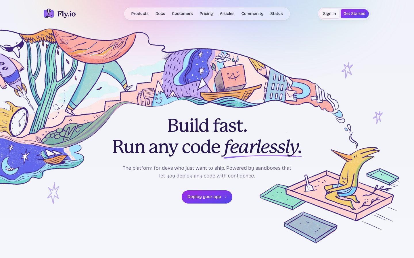
Fly.io's marketing surface is a playful, illustration-led developer-platform interface. The canvas is a near-white lavender wash (`{colors.canvas}` — #ffffff with soft gradient tinting in the hero), the type ink is a deep indigo-purple (`{colors.ink}` — #281950), and the action color is a vivid violet (`{colors.primary}` — #7c3aed). The system reads as friendly-but-technical: a hand-drawn surreal mural unfurls across the hero (a kingfisher-like creature, floating sandbox trays, mushrooms, night skies) while the copy stays editorial and confident.
Type voice is the system's most distinctive choice. Headlines run in **Mackinac**, a high-contrast serif display face at weight 500 with aggressive negative tracking (-2.88px at the 64px h1) — including an italic emphasis word ("*fearlessly*") underlined in violet. Body copy runs in **Bricolage Grotesque** at a light 325 weight, giving the supporting text an airy, modern-grotesque feel. The serif-display + grotesque-body pairing is what makes Fly.io feel hand-crafted rather than template-SaaS.
Brand voltage comes from two places: the violet action color (`{colors.primary}`) used on every primary CTA as a soft pill, and a single full-bleed purple band ("Use the Tech You Love") that anchors the lower scroll. Everything else stays on the light lavender canvas with generous whitespace and surreal spot illustrations replacing conventional product screenshots.
**Key Characteristics:**
- Lavender-white canvas (`{colors.canvas}`) with deep indigo-purple ink (`{colors.ink}` — #281950). Almost no flat gray — the neutrals carry a violet undertone (`{colors.muted-violet}` — #a39ac1, `{colors.muted}` — #676b89).
- Serif display type (**Mackinac**, weight 500) with heavy negative letter-spacing, paired with a light-weight grotesque body (**Bricolage Grotesque**, weight 325).
- Pill-shaped controls everywhere: the top-nav wrapper, primary CTAs, and secondary buttons all use `{rounded.pill}` (9999px).
- Vivid violet primary CTA (`{colors.primary}` — #7c3aed), pressing darker to `{colors.primary-active}` (#6d28d9).
- Hand-drawn surreal illustrations stand in for product screenshots throughout — Fly.io shows whimsy, not chrome.
- One full-bleed violet band (`{component.tech-band}`) carrying framework logo tiles; the rest of the page stays light.
- Dark slate footer (`{colors.ink-slate}` — #202237) closes the page.
- Soft violet-tinted shadows (`rgba(91,33,182,0.1)`) lift cards and CTAs gently — no heavy elevation.
## Colors
### Brand & Accent
- **Primary** (`{colors.primary}` — #7c3aed): The violet action color. All primary CTAs ("Get Started", "Deploy your app"), the full-bleed tech band background. Press state shifts to `{colors.primary-active}` (#6d28d9).
- **Primary Bright** (`{colors.primary-bright}` — #b54ff3): A lighter violet used for accents and the hero's underline flourish on "*fearlessly*".
- **Accent Violet** (`{colors.accent-violet}` — #8b5cf6) / **Accent Violet Light** (`{colors.accent-violet-light}` — #a78bfa) / **Accent Violet Soft** (`{colors.accent-violet-soft}` — #ddd6fe): The violet ramp used in gradients, icon fills, illustration accents, and soft tints inside the purple band.
- **Rust** (`{colors.rust}` — #aa2e06): A warm burnt-orange that appears in the spot illustrations (the kingfisher, sandbox trays) — the lone warm accent against the violet-dominant palette.
### Text
- **Ink** (`{colors.ink}` — #281950): All headlines and primary text. A deep indigo-purple, not true black.
- **Ink Deep** (`{colors.ink-deep}` — #111827) / **Ink Slate** (`{colors.ink-slate}` — #202237): Near-black slate tones used for the footer surface and darkest UI text.
- **Body** (`{colors.body}` — #374151): Running-text gray-slate for paragraphs.
- **Muted** (`{colors.muted}` — #676b89) / **Muted Soft** (`{colors.muted-soft}` — #9698b6) / **Muted Violet** (`{colors.muted-violet}` — #a39ac1): Secondary and tertiary text — sub-headings, captions, footer links. All carry a violet cast.
- **Muted Gray** (`{colors.muted-gray}` — #9ca3af): The one near-neutral gray, used for fine-print and de-emphasized labels.
- **On Primary** (`{colors.on-primary}` — #ffffff): Text on violet CTAs and inside the purple band.
### Surface & Hairline
- **Canvas** (`{colors.canvas}` — #ffffff): The page floor (rendered with a soft lavender gradient in the hero zone).
- **Surface Soft** (`{colors.surface-soft}` — #e1e4ef): Soft lavender-gray panel fills and dividers.
- **Hairline** (`{colors.hairline}` — #e5e7eb) / **Hairline Soft** (`{colors.hairline-soft}` — #e6e6e6) / **Hairline Strong** (`{colors.hairline-strong}` — #d1d5db): The 1px border ramp on light surfaces — input borders, card outlines, dividers.
## Typography
### Font Family
The system runs **Mackinac** for display headlines and **Bricolage Grotesque** for body text. Mackinac is a high-contrast transitional serif used at weight 500 with strong negative tracking, giving headlines an editorial, almost literary feel. Bricolage Grotesque is a contemporary variable grotesque used at a light 325 weight for paragraphs and UI labels — airy and modern.
The split is strict:
- Mackinac (serif, 500 weight, -0.9 to -2.88px tracking) — h1, h2, section headlines, italic emphasis words
- Bricolage Grotesque (grotesque, 325 weight) — paragraphs, nav links, button labels, captions
### Hierarchy
| Token | Size | Weight | Line Height | Letter Spacing | Use |
|---|---|---|---|---|---|
| `{typography.display-xl}` | 64px | 500 | 1.15 | -2.88px | Hero h1 ("Build fast. Run any code *fearlessly*.") — Mackinac |
| `{typography.display-md}` | 36px | 500 | 1.325 | -0.9px | Section heads ("Modern Compute Without the Complexity", "Storage That Keeps Up") — Mackinac |
| `{typography.body}` | 18px | 325 | 1.5 | normal | Running text, sub-headlines, button labels, nav links — Bricolage Grotesque |
### Principles
Mackinac is the brand voice — every headline uses the serif. The negative letter-spacing (heaviest at -2.88px on the h1) is part of the signature; without it the headlines read as generic serif. The hero uses Mackinac's italic for emphasis ("*fearlessly*") with a hand-drawn violet underline beneath it.
Body weight stays at a deliberately light 325 — heavier weights would lose the airy, editorial feel that balances the playful illustrations. Never set body copy in Mackinac, never set headlines in Bricolage Grotesque.
### Note on Font Substitutes
**Mackinac** is a commercial display serif (P22 Mackinac) and is not freely redistributable — do not assume it ships. A close open-source substitute is **Fraunces** (a high-contrast variable serif) at weight 500 with tightened tracking, or **Source Serif 4** as a calmer fallback. **Bricolage Grotesque** is available as an open-source variable font (Google Fonts), so it can ship directly; the measured family string ("Fricolage Grotesque") is treated as Bricolage Grotesque. If unavailable, **Inter** at weight 300–400 approximates the light grotesque body.
## Layout
### Spacing System
- **Base unit:** 4px.
- **Tokens:** `{spacing.xxs}` 4px · `{spacing.xs}` 8px · `{spacing.sm}` 12px · `{spacing.md}` 16px · `{spacing.lg}` 24px · `{spacing.xl}` 32px · `{spacing.xxl}` 48px · `{spacing.xxxl}` 64px · `{spacing.section}` 80px · `{spacing.section-lg}` 128px.
- **Most frequent steps:** 32px (`{spacing.xl}`, the dominant internal gap), 16px (`{spacing.md}`), 12px (`{spacing.sm}`), and 24px (`{spacing.lg}`) carry most card-internal rhythm.
- **Section rhythm:** `{spacing.section}` (80px) and `{spacing.section-lg}` (128px) set the vertical breathing room between major editorial bands.
- Intermediate steps of 10px and 20px were measured (derived secondary control padding) but the system rounds toward the 4-based scale above.
### Grid & Container
- **Editorial body:** Centered single column with a left-text / right-illustration split on alternating bands (illustration alternates sides as the page scrolls).
- **Feature grids:** 2-up icon-card grids ("VMs That Do Everything You Need", "Fork Off VMs Like They're Processes").
- **Tech band:** Text-left, framework logo tiles arranged in a 3-up grid on the right inside the violet band.
- **Footer:** 5-column link list (Company / Articles / Resources / Contact / Legal).
### Whitespace Philosophy
Fly.io uses generous whitespace — section gaps of 80px to 128px — so that the surreal illustrations have room to breathe between text blocks. Each band carries a single headline + short paragraph + one CTA, never densely packed. The result feels editorial and unhurried despite the playful art.
## Elevation & Depth
| Level | Treatment | Use |
|---|---|---|
| Flat | No shadow | Body sections on the lavender canvas, the hero |
| Soft violet lift | `rgba(91,33,182,0.1) 0px 5px 5px -2px, rgba(91,33,182,0.1) 0px 2px 4px -2px` | CTAs, lifted cards (8 occurrences — the system's default shadow) |
| Inset ring | `rgba(67,56,202,0.25) 0px 0px 0px 1px inset` | The violet pill CTA / card edge ring (6 occurrences) |
| Card drop | `rgba(32,34,55,0.075) 0px 0px 0px 1px, rgba(32,34,55,0.05) 0px 10px 15px -3px, rgba(32,34,55,0.05) 0px 4px 6px -4px` | Elevated white cards with a 1px slate ring plus soft drop |
| Colored glow | 1px ring + soft 20px glow tinted to the accent | Special tiles — measured glows in emerald `rgba(16,185,129,…)`, blue `rgba(59,130,246,…)`, orange `rgba(249,115,22,…)`, amber `rgba(245,158,11,…)` |
The elevation philosophy is **soft and tinted** — shadows pick up the violet brand cast rather than neutral black, and elevation is gentle. The colored glow shadows decorate a small set of accent tiles; their hue values are present only in the shadow definitions (not as standalone color tokens) — treat them as decorative glows, not palette colors.
### Decorative Depth
- Hand-drawn spot illustrations carry their own internal shading and stand in for product screenshots throughout the scroll.
- The hero "*fearlessly*" underline is a hand-drawn violet stroke, not a CSS border — a deliberate sketched flourish.
## Shapes
### Border Radius Scale
| Token | Value | Use |
|---|---|---|
| `{rounded.xs}` | 4px | Small inline accents (measured, minimal use) |
| `{rounded.sm}` | 8px | Small controls / chips |
| `{rounded.md}` | 10px | Icon-card and small tile corners |
| `{rounded.lg}` | 16px | Content cards, logo tiles (the dominant card radius — 9 occurrences) |
| `{rounded.xl}` | 20px | Larger panels |
| `{rounded.pill}` / `{rounded.full}` | 9999px | Top-nav wrapper, all CTAs, secondary buttons (9 occurrences) |
The shape language splits cleanly: **pills** for interactive controls (nav, buttons) and **16px-rounded rectangles** for content cards and tiles. The combination of the rounded nav pill and rounded pill CTAs is a defining visual signature.
### Illustration Geometry
Spot illustrations are free-form (no bounding frame) and bleed across the canvas, most dramatically in the hero where the mural extends full-width behind the headline. Tiles and logo cards retain `{rounded.lg}` corners.
## Components
### Top Navigation
**`top-nav`** — A floating white pill bar centered at the top of the page, `{rounded.pill}` radius. Carries the Fly.io wordmark + balloon logo at the left (outside the pill), the primary menu (Products, Docs, Customers, Pricing, Articles, Community, Status) inside the pill in `{typography.body}` / `{colors.ink}`, and a right cluster with a `{component.button-secondary}` "Sign In" and a `{component.button-primary}` "Get Started". The fully-rounded nav wrapper is one of the system's signatures.
**`nav-link`** — Inline nav menu item, no background, text `{colors.ink}` in `{typography.body}`.
### Buttons
**`button-primary`** — The violet pill CTA ("Deploy your app", "Get Started", "Learn More", "Build for scale from Day One"). Background `{colors.primary}` (#7c3aed), text `{colors.on-primary}`, `{rounded.pill}`, with the soft violet lift shadow and an inset violet ring (`rgba(67,56,202,0.25)` inset). Active state `button-primary-active` darkens to `{colors.primary-active}` (#6d28d9).
**`button-secondary`** — White pill button ("Sign In"). Background `{colors.canvas}`, text `{colors.ink}`, `{rounded.pill}`, with a soft hairline edge.
### Bands & Cards
**`hero-band`** — The full-width opening band on the lavender canvas. Centered serif h1 in `{typography.display-xl}`, a `{typography.body}` sub-line in `{colors.muted}`, and a centered `{component.button-primary}`. The surreal hand-drawn mural bleeds behind and around the text. Vertical padding `{spacing.section}` (80px).
**`feature-card`** — Alternating text-and-illustration bands ("Modern Compute Without the Complexity", "Sandboxes That Feel Like a Superpower", "Storage That Keeps Up"). Headline in `{typography.display-md}`, paragraph in `{typography.body}` / `{colors.body}`, a spot illustration on one side. `{rounded.lg}` corners where bounded, padding `{spacing.xl}` (32px).
**`feature-icon-card`** — Used in the 2-up feature grid lower on the page ("VMs That Do Everything You Need", "Fork Off VMs Like They're Processes", "Built for Distributed Systems", "Get Right in Your Users' Faces"). A small rounded icon chip, a `{typography.body}` title, and a short description. Background `{colors.canvas}`, `{rounded.md}` (10px), padding `{spacing.lg}` (24px).
**`tech-band`** — The full-bleed violet band ("Use the Tech You Love"). Background `{colors.primary}` (#7c3aed), text `{colors.on-primary}`, headline in `{typography.display-md}`, with a `{component.button-primary}`-style "Learn More" control and a 3-up grid of `{component.tech-logo-tile}` framework logos (Phoenix, Rails, Docker, Django, Laravel, Next.js). The only full-color band on the page; vertical padding `{spacing.section}` (80px).
**`tech-logo-tile`** — White rounded tile holding a framework logo. Background `{colors.canvas}`, `{rounded.lg}`, padding `{spacing.md}` (16px).
**`checklist-card`** — The enterprise feature checklist ("Single Sign-On", "Guaranteed Support Response Times", "SOC2 Type 2 Attested", "Memory-safe Rust and Go stack", "CI/CD Integration") with violet check marks. Background `{colors.canvas}`, text `{colors.body}` in `{typography.body}`, `{rounded.lg}`, padding `{spacing.lg}` (24px).
### Footer
**`footer`** — The dark slate footer that closes the page. Background `{colors.ink-slate}` (#202237), link text `{colors.muted-soft}`, in `{typography.body}`. Five-column link list (Company / Articles / Resources / Contact / Legal) with the Fly.io wordmark top-left. Vertical padding `{spacing.xxxl}` (64px). The only dark surface on the page.
## Do's and Don'ts
### Do
- Reserve `{colors.primary}` (#7c3aed) for primary CTAs and the single full-bleed tech band. The violet is the brand's action signal.
- Set every headline in Mackinac (serif, weight 500) with negative letter-spacing. The serif display is the brand voice.
- Keep body copy in Bricolage Grotesque at the light 325 weight — the airy paragraph weight balances the dense serif headlines.
- Use pill-shaped controls (`{rounded.pill}`) for nav and buttons, and `{rounded.lg}` (16px) for content cards and tiles. Keep the two shape families distinct.
- Use hand-drawn surreal illustrations in place of product screenshots — whimsy is the brand's differentiator.
- Let shadows carry the violet tint (`rgba(91,33,182,0.1)`) rather than neutral black.
- Keep ink in deep indigo-purple (`{colors.ink}` — #281950), not true black — the warm-violet ink ties the whole palette together.
### Don't
- Don't use true black or pure neutral grays for text; the system's neutrals carry a violet cast (`{colors.muted}`, `{colors.muted-violet}`).
- Don't bold the Mackinac display beyond weight 500 — heavier weights break the literary feel.
- Don't drop the negative letter-spacing on headlines; the tight tracking is part of the brand.
- Don't add multiple full-color bands — there is exactly one violet band; the rest stays on the lavender canvas.
- Don't put body copy in Mackinac or headlines in Bricolage Grotesque. The serif/grotesque boundary is strict.
- Don't add heavy or neutral-black drop shadows; elevation stays soft and violet-tinted.
## Responsive Behavior
| Name | Width | Key Changes |
|---|---|---|
| Mobile | < 768px | Nav collapses (the floating pill simplifies to wordmark + menu trigger); hero h1 scales down from 64px; text/illustration bands stack vertically; feature grids go 1-up; footer columns stack |
| Tablet | 768–1024px | Nav pill tightens; feature icon grid stays 2-up; tech band logo tiles wrap |
| Desktop | 1024–1440px | Full floating pill nav; alternating text/illustration bands; 2-up feature grids; 3-up logo tiles in the tech band |
| Wide | > 1440px | Same as desktop with more outer breathing room; centered content max-width |
### Touch Targets
- `{component.button-primary}` and `{component.button-secondary}` are pill controls with `{spacing.sm}`–`{spacing.lg}` vertical/horizontal padding (derived); comfortable tap area.
- Nav links sit inside the pill bar with `{spacing.sm}` (12px) spacing.
### Collapsing Strategy
- The hero mural is the most fragile element — it bleeds full-width on desktop and must crop/simplify on mobile rather than scale uniformly.
- Alternating text/illustration bands collapse to text-then-illustration single columns on mobile.
- Feature icon grids reduce from 2-up to 1-up rather than shrinking cards.
- The violet tech band keeps its color block at every breakpoint; logo tiles reflow to fewer columns.
### Image Behavior
- Spot illustrations retain native aspect ratios and reposition above/below text on narrow screens.
- The hero underline flourish on "*fearlessly*" stays anchored to the italic word as it reflows.
## Iteration Guide
1. Focus on ONE component at a time. Reference its YAML key directly (`{component.feature-card}`, `{component.tech-band}`).
2. Variants of an existing component (`-active`, etc.) live as separate entries in `components:`.
3. Use `{token.refs}` everywhere — never inline hex.
4. Never document hover. Default and Active/Pressed states only.
5. Headlines stay Mackinac 500 with negative tracking; body stays Bricolage Grotesque 325. The pairing does not blur.
6. The violet band and the dark footer are the only non-canvas surfaces — don't add more color blocks casually.
7. When in doubt about emphasis: bigger Mackinac before bolder Mackinac.
## Known Gaps
- Only three type roles were measured (h1, h2, body). Button, nav-link, caption, and small-text sizes were not separately captured — components reference `{typography.body}` as the closest measured role, and button/nav padding values are derived from the spacing scale.
- **Mackinac** is a commercial display serif; it was not flagged in `fonts_licensed` but is not freely redistributable. A Fraunces / Source Serif substitute is documented in Typography — do not assume the licensed face ships.
- The measured body family string "Fricolage Grotesque" is treated as the open-source **Bricolage Grotesque**; confirm the exact family before shipping.
- The colored glow shadows (emerald, blue, orange, amber) appear only in shadow definitions, not as standalone palette colors — they are documented as decorative glows; their exact hues were not promoted to color tokens.
- The single measured `card` component reports a #7c3aed background with a 9999px radius and inset ring — this matches the violet pill CTA rather than a content card; content-card specs (feature/icon/checklist) are reconstructed from screenshots plus the measured radius/shadow scale.
- The hero's lavender gradient wash and the surreal illustration assets are not captured as tokens; gradient stops and illustration treatments are out of scope.
- Animation and transition timings (CTA press, illustration motion) are not in scope.
- Pricing-page-specific components were captured in the page list but no pricing-only tokens surfaced distinct from the landing system; pricing-tier card specs would need a dedicated extraction.
<!-- Documented by duply · real-world design systems as ready-to-use DESIGN.md for AI coding agents · https://duply.ai/fly/design-md -->
Color Palette
Accent
Neutrals
Typography
display-xl64px · 500 · 1.15
The quick brown fox jumpsdisplay-md36px · 500 · 1.325
The quick brown fox jumpsbody18px · 325 · 1.5
The quick brown fox jumpsSpacing & Shape
Spacing
| Name | Value | Preview |
|---|---|---|
| xxs | 4px | |
| xs | 8px | |
| sm | 12px | |
| md | 16px | |
| lg | 24px | |
| xl | 32px | |
| xxl | 48px | |
| xxxl | 64px | |
| section | 80px | |
| section-lg | 128px |
Border Radius
| Name | Value | Preview |
|---|---|---|
| xs | 4px | |
| sm | 8px | |
| md | 10px | |
| lg | 16px | |
| xl | 20px | |
| pill | 9999px | |
| full | 9999px |
More like this


---
version: alpha
name: Fly.io-design-analysis
description: "A playful, illustration-led developer-platform interface built on a near-white lavender canvas with a deep indigo-purple ink and vivid violet CTAs. The system reads as friendly-but-technical — a hand-drawn surreal hero mural sets a whimsical tone, while a serif Mackinac display face paired with the Bricolage-grotesque body keeps the voice editorial. Brand voltage comes from the violet action color (#7c3aed) and a full-bleed purple \"Use the Tech You Love\" band, set against generous whitespace and soft pill-shaped controls."

colors:
  primary: "#7c3aed"
  primary-active: "#6d28d9"
  primary-bright: "#b54ff3"
  accent-violet: "#8b5cf6"
  accent-violet-light: "#a78bfa"
  accent-violet-soft: "#ddd6fe"
  ink: "#281950"
  ink-deep: "#111827"
  ink-slate: "#202237"
  body: "#374151"
  muted: "#676b89"
  muted-soft: "#9698b6"
  muted-violet: "#a39ac1"
  muted-gray: "#9ca3af"
  hairline: "#e5e7eb"
  hairline-soft: "#e6e6e6"
  hairline-strong: "#d1d5db"
  surface-soft: "#e1e4ef"
  canvas: "#ffffff"
  rust: "#aa2e06"
  on-primary: "#ffffff"

typography:
  display-xl:
    fontFamily: "Mackinac, Fraunces, Georgia, serif"
    fontSize: 64px
    fontWeight: 500
    lineHeight: 1.15
    letterSpacing: -2.88px
  display-md:
    fontFamily: "Mackinac, Fraunces, Georgia, serif"
    fontSize: 36px
    fontWeight: 500
    lineHeight: 1.325
    letterSpacing: -0.9px
  body:
    fontFamily: "Bricolage Grotesque, Inter, sans-serif"
    fontSize: 18px
    fontWeight: 325
    lineHeight: 1.5
    letterSpacing: normal

rounded:
  xs: 4px
  sm: 8px
  md: 10px
  lg: 16px
  xl: 20px
  pill: 9999px
  full: 9999px

spacing:
  xxs: 4px
  xs: 8px
  sm: 12px
  md: 16px
  lg: 24px
  xl: 32px
  xxl: 48px
  xxxl: 64px
  section: 80px
  section-lg: 128px

components:
  top-nav:
    backgroundColor: "{colors.canvas}"
    textColor: "{colors.ink}"
    typography: "{typography.body}"
    rounded: "{rounded.pill}"
    padding: 12px 32px
  nav-link:
    backgroundColor: transparent
    textColor: "{colors.ink}"
    typography: "{typography.body}"
  button-primary:
    backgroundColor: "{colors.primary}"
    textColor: "{colors.on-primary}"
    typography: "{typography.body}"
    rounded: "{rounded.pill}"
    padding: 12px 24px
  button-primary-active:
    backgroundColor: "{colors.primary-active}"
    textColor: "{colors.on-primary}"
    rounded: "{rounded.pill}"
  button-secondary:
    backgroundColor: "{colors.canvas}"
    textColor: "{colors.ink}"
    typography: "{typography.body}"
    rounded: "{rounded.pill}"
    padding: 12px 24px
  hero-band:
    backgroundColor: "{colors.canvas}"
    textColor: "{colors.ink}"
    typography: "{typography.display-xl}"
    padding: 80px
  feature-card:
    backgroundColor: "{colors.canvas}"
    textColor: "{colors.ink}"
    typography: "{typography.display-md}"
    rounded: "{rounded.lg}"
    padding: 32px
  feature-icon-card:
    backgroundColor: "{colors.canvas}"
    textColor: "{colors.ink}"
    typography: "{typography.body}"
    rounded: "{rounded.md}"
    padding: 24px
  tech-band:
    backgroundColor: "{colors.primary}"
    textColor: "{colors.on-primary}"
    typography: "{typography.display-md}"
    padding: 80px
  tech-logo-tile:
    backgroundColor: "{colors.canvas}"
    textColor: "{colors.ink}"
    rounded: "{rounded.lg}"
    padding: 16px
  checklist-card:
    backgroundColor: "{colors.canvas}"
    textColor: "{colors.body}"
    typography: "{typography.body}"
    rounded: "{rounded.lg}"
    padding: 24px
  footer:
    backgroundColor: "{colors.ink-slate}"
    textColor: "{colors.muted-soft}"
    typography: "{typography.body}"
    padding: 64px

---

## Overview

Fly.io's marketing surface is a playful, illustration-led developer-platform interface. The canvas is a near-white lavender wash (`{colors.canvas}` — #ffffff with soft gradient tinting in the hero), the type ink is a deep indigo-purple (`{colors.ink}` — #281950), and the action color is a vivid violet (`{colors.primary}` — #7c3aed). The system reads as friendly-but-technical: a hand-drawn surreal mural unfurls across the hero (a kingfisher-like creature, floating sandbox trays, mushrooms, night skies) while the copy stays editorial and confident.

Type voice is the system's most distinctive choice. Headlines run in **Mackinac**, a high-contrast serif display face at weight 500 with aggressive negative tracking (-2.88px at the 64px h1) — including an italic emphasis word ("*fearlessly*") underlined in violet. Body copy runs in **Bricolage Grotesque** at a light 325 weight, giving the supporting text an airy, modern-grotesque feel. The serif-display + grotesque-body pairing is what makes Fly.io feel hand-crafted rather than template-SaaS.

Brand voltage comes from two places: the violet action color (`{colors.primary}`) used on every primary CTA as a soft pill, and a single full-bleed purple band ("Use the Tech You Love") that anchors the lower scroll. Everything else stays on the light lavender canvas with generous whitespace and surreal spot illustrations replacing conventional product screenshots.

**Key Characteristics:**
- Lavender-white canvas (`{colors.canvas}`) with deep indigo-purple ink (`{colors.ink}` — #281950). Almost no flat gray — the neutrals carry a violet undertone (`{colors.muted-violet}` — #a39ac1, `{colors.muted}` — #676b89).
- Serif display type (**Mackinac**, weight 500) with heavy negative letter-spacing, paired with a light-weight grotesque body (**Bricolage Grotesque**, weight 325).
- Pill-shaped controls everywhere: the top-nav wrapper, primary CTAs, and secondary buttons all use `{rounded.pill}` (9999px).
- Vivid violet primary CTA (`{colors.primary}` — #7c3aed), pressing darker to `{colors.primary-active}` (#6d28d9).
- Hand-drawn surreal illustrations stand in for product screenshots throughout — Fly.io shows whimsy, not chrome.
- One full-bleed violet band (`{component.tech-band}`) carrying framework logo tiles; the rest of the page stays light.
- Dark slate footer (`{colors.ink-slate}` — #202237) closes the page.
- Soft violet-tinted shadows (`rgba(91,33,182,0.1)`) lift cards and CTAs gently — no heavy elevation.

## Colors

### Brand & Accent
- **Primary** (`{colors.primary}` — #7c3aed): The violet action color. All primary CTAs ("Get Started", "Deploy your app"), the full-bleed tech band background. Press state shifts to `{colors.primary-active}` (#6d28d9).
- **Primary Bright** (`{colors.primary-bright}` — #b54ff3): A lighter violet used for accents and the hero's underline flourish on "*fearlessly*".
- **Accent Violet** (`{colors.accent-violet}` — #8b5cf6) / **Accent Violet Light** (`{colors.accent-violet-light}` — #a78bfa) / **Accent Violet Soft** (`{colors.accent-violet-soft}` — #ddd6fe): The violet ramp used in gradients, icon fills, illustration accents, and soft tints inside the purple band.
- **Rust** (`{colors.rust}` — #aa2e06): A warm burnt-orange that appears in the spot illustrations (the kingfisher, sandbox trays) — the lone warm accent against the violet-dominant palette.

### Text
- **Ink** (`{colors.ink}` — #281950): All headlines and primary text. A deep indigo-purple, not true black.
- **Ink Deep** (`{colors.ink-deep}` — #111827) / **Ink Slate** (`{colors.ink-slate}` — #202237): Near-black slate tones used for the footer surface and darkest UI text.
- **Body** (`{colors.body}` — #374151): Running-text gray-slate for paragraphs.
- **Muted** (`{colors.muted}` — #676b89) / **Muted Soft** (`{colors.muted-soft}` — #9698b6) / **Muted Violet** (`{colors.muted-violet}` — #a39ac1): Secondary and tertiary text — sub-headings, captions, footer links. All carry a violet cast.
- **Muted Gray** (`{colors.muted-gray}` — #9ca3af): The one near-neutral gray, used for fine-print and de-emphasized labels.
- **On Primary** (`{colors.on-primary}` — #ffffff): Text on violet CTAs and inside the purple band.

### Surface & Hairline
- **Canvas** (`{colors.canvas}` — #ffffff): The page floor (rendered with a soft lavender gradient in the hero zone).
- **Surface Soft** (`{colors.surface-soft}` — #e1e4ef): Soft lavender-gray panel fills and dividers.
- **Hairline** (`{colors.hairline}` — #e5e7eb) / **Hairline Soft** (`{colors.hairline-soft}` — #e6e6e6) / **Hairline Strong** (`{colors.hairline-strong}` — #d1d5db): The 1px border ramp on light surfaces — input borders, card outlines, dividers.

## Typography

### Font Family
The system runs **Mackinac** for display headlines and **Bricolage Grotesque** for body text. Mackinac is a high-contrast transitional serif used at weight 500 with strong negative tracking, giving headlines an editorial, almost literary feel. Bricolage Grotesque is a contemporary variable grotesque used at a light 325 weight for paragraphs and UI labels — airy and modern.

The split is strict:
- Mackinac (serif, 500 weight, -0.9 to -2.88px tracking) — h1, h2, section headlines, italic emphasis words
- Bricolage Grotesque (grotesque, 325 weight) — paragraphs, nav links, button labels, captions

### Hierarchy

| Token | Size | Weight | Line Height | Letter Spacing | Use |
|---|---|---|---|---|---|
| `{typography.display-xl}` | 64px | 500 | 1.15 | -2.88px | Hero h1 ("Build fast. Run any code *fearlessly*.") — Mackinac |
| `{typography.display-md}` | 36px | 500 | 1.325 | -0.9px | Section heads ("Modern Compute Without the Complexity", "Storage That Keeps Up") — Mackinac |
| `{typography.body}` | 18px | 325 | 1.5 | normal | Running text, sub-headlines, button labels, nav links — Bricolage Grotesque |

### Principles
Mackinac is the brand voice — every headline uses the serif. The negative letter-spacing (heaviest at -2.88px on the h1) is part of the signature; without it the headlines read as generic serif. The hero uses Mackinac's italic for emphasis ("*fearlessly*") with a hand-drawn violet underline beneath it.

Body weight stays at a deliberately light 325 — heavier weights would lose the airy, editorial feel that balances the playful illustrations. Never set body copy in Mackinac, never set headlines in Bricolage Grotesque.

### Note on Font Substitutes
**Mackinac** is a commercial display serif (P22 Mackinac) and is not freely redistributable — do not assume it ships. A close open-source substitute is **Fraunces** (a high-contrast variable serif) at weight 500 with tightened tracking, or **Source Serif 4** as a calmer fallback. **Bricolage Grotesque** is available as an open-source variable font (Google Fonts), so it can ship directly; the measured family string ("Fricolage Grotesque") is treated as Bricolage Grotesque. If unavailable, **Inter** at weight 300–400 approximates the light grotesque body.

## Layout

### Spacing System
- **Base unit:** 4px.
- **Tokens:** `{spacing.xxs}` 4px · `{spacing.xs}` 8px · `{spacing.sm}` 12px · `{spacing.md}` 16px · `{spacing.lg}` 24px · `{spacing.xl}` 32px · `{spacing.xxl}` 48px · `{spacing.xxxl}` 64px · `{spacing.section}` 80px · `{spacing.section-lg}` 128px.
- **Most frequent steps:** 32px (`{spacing.xl}`, the dominant internal gap), 16px (`{spacing.md}`), 12px (`{spacing.sm}`), and 24px (`{spacing.lg}`) carry most card-internal rhythm.
- **Section rhythm:** `{spacing.section}` (80px) and `{spacing.section-lg}` (128px) set the vertical breathing room between major editorial bands.
- Intermediate steps of 10px and 20px were measured (derived secondary control padding) but the system rounds toward the 4-based scale above.

### Grid & Container
- **Editorial body:** Centered single column with a left-text / right-illustration split on alternating bands (illustration alternates sides as the page scrolls).
- **Feature grids:** 2-up icon-card grids ("VMs That Do Everything You Need", "Fork Off VMs Like They're Processes").
- **Tech band:** Text-left, framework logo tiles arranged in a 3-up grid on the right inside the violet band.
- **Footer:** 5-column link list (Company / Articles / Resources / Contact / Legal).

### Whitespace Philosophy
Fly.io uses generous whitespace — section gaps of 80px to 128px — so that the surreal illustrations have room to breathe between text blocks. Each band carries a single headline + short paragraph + one CTA, never densely packed. The result feels editorial and unhurried despite the playful art.

## Elevation & Depth

| Level | Treatment | Use |
|---|---|---|
| Flat | No shadow | Body sections on the lavender canvas, the hero |
| Soft violet lift | `rgba(91,33,182,0.1) 0px 5px 5px -2px, rgba(91,33,182,0.1) 0px 2px 4px -2px` | CTAs, lifted cards (8 occurrences — the system's default shadow) |
| Inset ring | `rgba(67,56,202,0.25) 0px 0px 0px 1px inset` | The violet pill CTA / card edge ring (6 occurrences) |
| Card drop | `rgba(32,34,55,0.075) 0px 0px 0px 1px, rgba(32,34,55,0.05) 0px 10px 15px -3px, rgba(32,34,55,0.05) 0px 4px 6px -4px` | Elevated white cards with a 1px slate ring plus soft drop |
| Colored glow | 1px ring + soft 20px glow tinted to the accent | Special tiles — measured glows in emerald `rgba(16,185,129,…)`, blue `rgba(59,130,246,…)`, orange `rgba(249,115,22,…)`, amber `rgba(245,158,11,…)` |

The elevation philosophy is **soft and tinted** — shadows pick up the violet brand cast rather than neutral black, and elevation is gentle. The colored glow shadows decorate a small set of accent tiles; their hue values are present only in the shadow definitions (not as standalone color tokens) — treat them as decorative glows, not palette colors.

### Decorative Depth
- Hand-drawn spot illustrations carry their own internal shading and stand in for product screenshots throughout the scroll.
- The hero "*fearlessly*" underline is a hand-drawn violet stroke, not a CSS border — a deliberate sketched flourish.

## Shapes

### Border Radius Scale

| Token | Value | Use |
|---|---|---|
| `{rounded.xs}` | 4px | Small inline accents (measured, minimal use) |
| `{rounded.sm}` | 8px | Small controls / chips |
| `{rounded.md}` | 10px | Icon-card and small tile corners |
| `{rounded.lg}` | 16px | Content cards, logo tiles (the dominant card radius — 9 occurrences) |
| `{rounded.xl}` | 20px | Larger panels |
| `{rounded.pill}` / `{rounded.full}` | 9999px | Top-nav wrapper, all CTAs, secondary buttons (9 occurrences) |

The shape language splits cleanly: **pills** for interactive controls (nav, buttons) and **16px-rounded rectangles** for content cards and tiles. The combination of the rounded nav pill and rounded pill CTAs is a defining visual signature.

### Illustration Geometry
Spot illustrations are free-form (no bounding frame) and bleed across the canvas, most dramatically in the hero where the mural extends full-width behind the headline. Tiles and logo cards retain `{rounded.lg}` corners.

## Components

### Top Navigation

**`top-nav`** — A floating white pill bar centered at the top of the page, `{rounded.pill}` radius. Carries the Fly.io wordmark + balloon logo at the left (outside the pill), the primary menu (Products, Docs, Customers, Pricing, Articles, Community, Status) inside the pill in `{typography.body}` / `{colors.ink}`, and a right cluster with a `{component.button-secondary}` "Sign In" and a `{component.button-primary}` "Get Started". The fully-rounded nav wrapper is one of the system's signatures.

**`nav-link`** — Inline nav menu item, no background, text `{colors.ink}` in `{typography.body}`.

### Buttons

**`button-primary`** — The violet pill CTA ("Deploy your app", "Get Started", "Learn More", "Build for scale from Day One"). Background `{colors.primary}` (#7c3aed), text `{colors.on-primary}`, `{rounded.pill}`, with the soft violet lift shadow and an inset violet ring (`rgba(67,56,202,0.25)` inset). Active state `button-primary-active` darkens to `{colors.primary-active}` (#6d28d9).

**`button-secondary`** — White pill button ("Sign In"). Background `{colors.canvas}`, text `{colors.ink}`, `{rounded.pill}`, with a soft hairline edge.

### Bands & Cards

**`hero-band`** — The full-width opening band on the lavender canvas. Centered serif h1 in `{typography.display-xl}`, a `{typography.body}` sub-line in `{colors.muted}`, and a centered `{component.button-primary}`. The surreal hand-drawn mural bleeds behind and around the text. Vertical padding `{spacing.section}` (80px).

**`feature-card`** — Alternating text-and-illustration bands ("Modern Compute Without the Complexity", "Sandboxes That Feel Like a Superpower", "Storage That Keeps Up"). Headline in `{typography.display-md}`, paragraph in `{typography.body}` / `{colors.body}`, a spot illustration on one side. `{rounded.lg}` corners where bounded, padding `{spacing.xl}` (32px).

**`feature-icon-card`** — Used in the 2-up feature grid lower on the page ("VMs That Do Everything You Need", "Fork Off VMs Like They're Processes", "Built for Distributed Systems", "Get Right in Your Users' Faces"). A small rounded icon chip, a `{typography.body}` title, and a short description. Background `{colors.canvas}`, `{rounded.md}` (10px), padding `{spacing.lg}` (24px).

**`tech-band`** — The full-bleed violet band ("Use the Tech You Love"). Background `{colors.primary}` (#7c3aed), text `{colors.on-primary}`, headline in `{typography.display-md}`, with a `{component.button-primary}`-style "Learn More" control and a 3-up grid of `{component.tech-logo-tile}` framework logos (Phoenix, Rails, Docker, Django, Laravel, Next.js). The only full-color band on the page; vertical padding `{spacing.section}` (80px).

**`tech-logo-tile`** — White rounded tile holding a framework logo. Background `{colors.canvas}`, `{rounded.lg}`, padding `{spacing.md}` (16px).

**`checklist-card`** — The enterprise feature checklist ("Single Sign-On", "Guaranteed Support Response Times", "SOC2 Type 2 Attested", "Memory-safe Rust and Go stack", "CI/CD Integration") with violet check marks. Background `{colors.canvas}`, text `{colors.body}` in `{typography.body}`, `{rounded.lg}`, padding `{spacing.lg}` (24px).

### Footer

**`footer`** — The dark slate footer that closes the page. Background `{colors.ink-slate}` (#202237), link text `{colors.muted-soft}`, in `{typography.body}`. Five-column link list (Company / Articles / Resources / Contact / Legal) with the Fly.io wordmark top-left. Vertical padding `{spacing.xxxl}` (64px). The only dark surface on the page.

## Do's and Don'ts

### Do
- Reserve `{colors.primary}` (#7c3aed) for primary CTAs and the single full-bleed tech band. The violet is the brand's action signal.
- Set every headline in Mackinac (serif, weight 500) with negative letter-spacing. The serif display is the brand voice.
- Keep body copy in Bricolage Grotesque at the light 325 weight — the airy paragraph weight balances the dense serif headlines.
- Use pill-shaped controls (`{rounded.pill}`) for nav and buttons, and `{rounded.lg}` (16px) for content cards and tiles. Keep the two shape families distinct.
- Use hand-drawn surreal illustrations in place of product screenshots — whimsy is the brand's differentiator.
- Let shadows carry the violet tint (`rgba(91,33,182,0.1)`) rather than neutral black.
- Keep ink in deep indigo-purple (`{colors.ink}` — #281950), not true black — the warm-violet ink ties the whole palette together.

### Don't
- Don't use true black or pure neutral grays for text; the system's neutrals carry a violet cast (`{colors.muted}`, `{colors.muted-violet}`).
- Don't bold the Mackinac display beyond weight 500 — heavier weights break the literary feel.
- Don't drop the negative letter-spacing on headlines; the tight tracking is part of the brand.
- Don't add multiple full-color bands — there is exactly one violet band; the rest stays on the lavender canvas.
- Don't put body copy in Mackinac or headlines in Bricolage Grotesque. The serif/grotesque boundary is strict.
- Don't add heavy or neutral-black drop shadows; elevation stays soft and violet-tinted.

## Responsive Behavior

| Name | Width | Key Changes |
|---|---|---|
| Mobile | < 768px | Nav collapses (the floating pill simplifies to wordmark + menu trigger); hero h1 scales down from 64px; text/illustration bands stack vertically; feature grids go 1-up; footer columns stack |
| Tablet | 768–1024px | Nav pill tightens; feature icon grid stays 2-up; tech band logo tiles wrap |
| Desktop | 1024–1440px | Full floating pill nav; alternating text/illustration bands; 2-up feature grids; 3-up logo tiles in the tech band |
| Wide | > 1440px | Same as desktop with more outer breathing room; centered content max-width |

### Touch Targets
- `{component.button-primary}` and `{component.button-secondary}` are pill controls with `{spacing.sm}`–`{spacing.lg}` vertical/horizontal padding (derived); comfortable tap area.
- Nav links sit inside the pill bar with `{spacing.sm}` (12px) spacing.

### Collapsing Strategy
- The hero mural is the most fragile element — it bleeds full-width on desktop and must crop/simplify on mobile rather than scale uniformly.
- Alternating text/illustration bands collapse to text-then-illustration single columns on mobile.
- Feature icon grids reduce from 2-up to 1-up rather than shrinking cards.
- The violet tech band keeps its color block at every breakpoint; logo tiles reflow to fewer columns.

### Image Behavior
- Spot illustrations retain native aspect ratios and reposition above/below text on narrow screens.
- The hero underline flourish on "*fearlessly*" stays anchored to the italic word as it reflows.

## Iteration Guide

1. Focus on ONE component at a time. Reference its YAML key directly (`{component.feature-card}`, `{component.tech-band}`).
2. Variants of an existing component (`-active`, etc.) live as separate entries in `components:`.
3. Use `{token.refs}` everywhere — never inline hex.
4. Never document hover. Default and Active/Pressed states only.
5. Headlines stay Mackinac 500 with negative tracking; body stays Bricolage Grotesque 325. The pairing does not blur.
6. The violet band and the dark footer are the only non-canvas surfaces — don't add more color blocks casually.
7. When in doubt about emphasis: bigger Mackinac before bolder Mackinac.

## Known Gaps

- Only three type roles were measured (h1, h2, body). Button, nav-link, caption, and small-text sizes were not separately captured — components reference `{typography.body}` as the closest measured role, and button/nav padding values are derived from the spacing scale.
- **Mackinac** is a commercial display serif; it was not flagged in `fonts_licensed` but is not freely redistributable. A Fraunces / Source Serif substitute is documented in Typography — do not assume the licensed face ships.
- The measured body family string "Fricolage Grotesque" is treated as the open-source **Bricolage Grotesque**; confirm the exact family before shipping.
- The colored glow shadows (emerald, blue, orange, amber) appear only in shadow definitions, not as standalone palette colors — they are documented as decorative glows; their exact hues were not promoted to color tokens.
- The single measured `card` component reports a #7c3aed background with a 9999px radius and inset ring — this matches the violet pill CTA rather than a content card; content-card specs (feature/icon/checklist) are reconstructed from screenshots plus the measured radius/shadow scale.
- The hero's lavender gradient wash and the surreal illustration assets are not captured as tokens; gradient stops and illustration treatments are out of scope.
- Animation and transition timings (CTA press, illustration motion) are not in scope.
- Pricing-page-specific components were captured in the page list but no pricing-only tokens surfaced distinct from the landing system; pricing-tier card specs would need a dedicated extraction.

<!-- Documented by duply · real-world design systems as ready-to-use DESIGN.md for AI coding agents · https://duply.ai/fly/design-md -->