Flagsmith
A developer-tooling marketing surface built on a warm cream-to-white canvas, anchored by a heavy Bitter Pro serif display voice and a bright teal primary action. The system pairs editorial serif headlines with Open Sans body copy, floats soft-shadowed white cards (code windows, feature-toggle widgets, testimonials, pricing tiers) over a near-white field, and uses a small playful accent set — teal, yellow, purple — for product UI fragments and plus/equals connector glyphs. The tone reads as friendly, open-source, engineer-credible.
---
version: alpha
name: Flagsmith-design-analysis
description: A developer-tooling marketing surface built on a warm cream-to-white canvas, anchored by a heavy Bitter Pro serif display voice and a bright teal primary action. The system pairs editorial serif headlines with Open Sans body copy, floats soft-shadowed white cards (code windows, feature-toggle widgets, testimonials, pricing tiers) over a near-white field, and uses a small playful accent set — teal, yellow, purple — for product UI fragments and plus/equals connector glyphs. The tone reads as friendly, open-source, engineer-credible.
colors:
primary: "#0ac2a3"
ink: "#1e0d26"
ink-soft: "#222222"
ink-muted: "#4f4554"
body: "#333333"
muted: "#827986"
muted-soft: "#8e8792"
neutral-400: "#c0bcc2"
neutral-300: "#cccccc"
neutral-200: "#dddddd"
border: "#e6e4e7"
canvas: "#ffffff"
surface-cream: "#f8f8f2"
surface-soft: "#f8f8f7"
surface-warm: "#f6f3ee"
accent-yellow: "#f7d56e"
accent-purple: "#7b51fb"
accent-blue: "#3898ec"
navy: "#22194d"
black: "#000000"
typography:
h1:
fontFamily: "Bitter Pro, Bitter, Georgia, serif"
fontSize: 52.5px
fontWeight: 800
lineHeight: 1.3
letterSpacing: normal
h2:
fontFamily: "Bitter Pro, Bitter, Georgia, serif"
fontSize: 35px
fontWeight: 800
lineHeight: 1.3
letterSpacing: normal
h3:
fontFamily: "Open Sans, sans-serif"
fontSize: 19.25px
fontWeight: 700
lineHeight: 1.3
letterSpacing: normal
body:
fontFamily: "Open Sans, sans-serif"
fontSize: 17.5px
fontWeight: 400
lineHeight: 1.5
letterSpacing: normal
button:
fontFamily: "Open Sans, sans-serif"
fontSize: 14px
fontWeight: 600
lineHeight: 1.5
letterSpacing: normal
rounded:
xs: 5px
sm: 7px
md: 9px
lg: 20px
pill: 22px
spacing:
xxs: 4px
xs: 7px
sm: 9px
md: 14px
lg: 18px
xl: 26px
xxl: 37px
huge: 48px
components:
top-nav:
backgroundColor: "{colors.surface-cream}"
textColor: "{colors.ink}"
typography: "{typography.button}"
button-primary:
backgroundColor: "{colors.primary}"
textColor: "{colors.canvas}"
typography: "{typography.button}"
rounded: "{rounded.xs}"
padding: 18px 26px
button-dark:
backgroundColor: "{colors.ink}"
textColor: "{colors.canvas}"
typography: "{typography.button}"
rounded: "{rounded.xs}"
padding: 18px 26px
button-text:
backgroundColor: transparent
textColor: "{colors.ink}"
typography: "{typography.button}"
card:
backgroundColor: "{colors.canvas}"
textColor: "{colors.ink}"
rounded: "{rounded.md}"
padding: 26px
code-window-card:
backgroundColor: "{colors.ink}"
textColor: "{colors.canvas}"
rounded: "{rounded.md}"
padding: 18px
feature-toggle-card:
backgroundColor: "{colors.canvas}"
textColor: "{colors.ink}"
typography: "{typography.body}"
rounded: "{rounded.md}"
padding: 26px
testimonial-card:
backgroundColor: "{colors.canvas}"
textColor: "{colors.body}"
typography: "{typography.body}"
rounded: "{rounded.md}"
padding: 26px
pricing-card:
backgroundColor: "{colors.canvas}"
textColor: "{colors.ink}"
typography: "{typography.h3}"
rounded: "{rounded.md}"
padding: 26px
promo-popup-card:
backgroundColor: "{colors.canvas}"
textColor: "{colors.ink}"
rounded: "{rounded.md}"
padding: 26px
connector-glyph:
backgroundColor: "{colors.accent-yellow}"
textColor: "{colors.ink}"
rounded: "{rounded.sm}"
footer:
backgroundColor: "{colors.accent-yellow}"
textColor: "{colors.ink}"
typography: "{typography.body}"
padding: 37px
---
## Overview
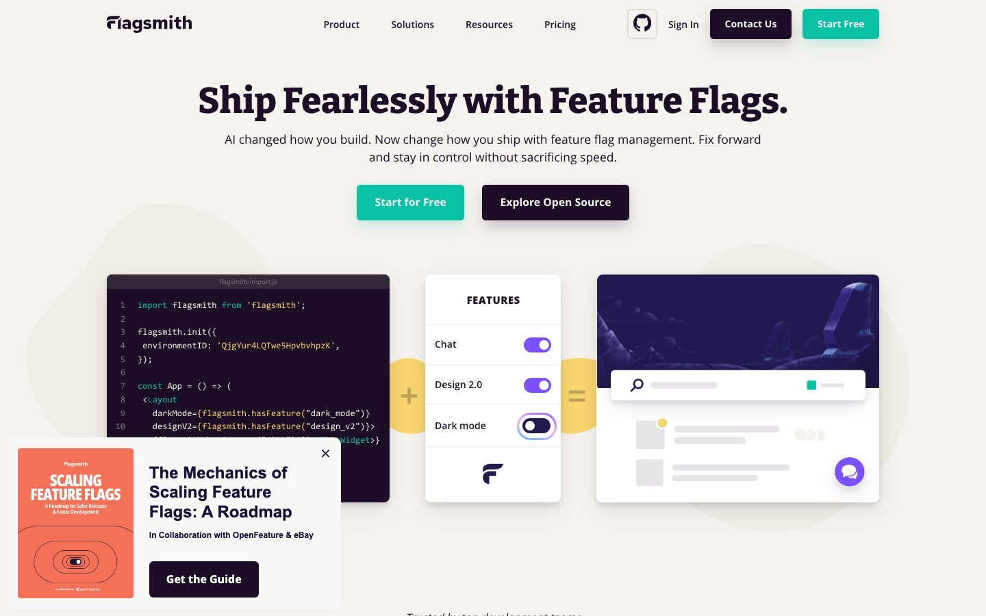
Flagsmith's marketing surface is a warm, engineer-credible developer-tooling page. The canvas is a soft cream (`{colors.surface-cream}` — #f8f8f2) that reads almost-white, with pure white (`{colors.canvas}` — #ffffff) reserved for floating cards. The brand voice comes from two places: a heavy **Bitter Pro** serif used at weight 800 for headlines ("Ship Fearlessly with Feature Flags."), and a bright teal primary action (`{colors.primary}` — #0ac2a3) that drives every "Start Free" CTA.
The type pairing is the core of the system: a chunky, editorial serif (Bitter Pro) for h1/h2 paired with **Open Sans** for h3, body, and buttons. The serif gives the page personality and weight; the sans keeps the dense technical copy readable. Headlines sit at deep aubergine-near-black `{colors.ink}` (#1e0d26) rather than pure black, which warms the page.
Brand voltage comes from **product UI fragments shown directly inside white cards** — a dark code window (`{component.code-window-card}`), a feature-toggle widget with teal/purple switches, and a dashboard chrome card — arranged in a "code + features = result" equation joined by `{colors.accent-yellow}` plus/equals connector glyphs. The accent palette (teal, yellow `#f7d56e`, purple `#7b51fb`, blue `#3898ec`) appears almost exclusively inside these product fragments and small decorative moments, never on running text.
Cards float on soft purple-tinted drop shadows (`rgba(30, 13, 38, 0.1)`), keeping the page airy and modern rather than flat.
**Key Characteristics:**
- Warm cream canvas (`{colors.surface-cream}` — #f8f8f2) with pure-white floating cards (`{colors.canvas}`).
- Heavy serif display voice: **Bitter Pro** weight 800 for h1 (52.5px) and h2 (35px); **Open Sans** for everything else.
- Bright teal primary CTA (`{colors.primary}` — #0ac2a3) and a dark aubergine secondary button (`{colors.ink}` — #1e0d26).
- Product UI fragments embedded in cards — dark code windows, feature-toggle widgets, dashboard chrome — joined by yellow connector glyphs.
- Soft purple-tinted card shadows (`rgba(30, 13, 38, 0.1)`) give gentle elevation; one teal-tinted shadow variant exists for accent emphasis.
- Modest border radius — `{rounded.md}` (9px) on cards, `{rounded.xs}` (5px) on buttons — nothing heavily rounded.
- A small playful accent set (teal / yellow / purple / blue) used inside product chrome and decorative glyphs, never on body copy.
## Colors
### Brand & Accent
- **Primary** (`{colors.primary}` — #0ac2a3): The teal action color. Every "Start Free" / "Start for Free" CTA. Also appears as the active toggle fill in the feature-widget product fragment, and as a teal-tinted shadow on accent cards.
- **Accent Yellow** (`{colors.accent-yellow}` — #f7d56e): The connector glyph color ("+" and "=" badges between hero cards) and the footer/CTA band background. The page's brightest decorative note.
- **Accent Purple** (`{colors.accent-purple}` — #7b51fb): Used on toggle switches and inline word highlights inside product UI fragments ("Individual Segments").
- **Accent Blue** (`{colors.accent-blue}` — #3898ec): A small accent used in product chrome and links inside dashboard fragments.
- **Navy** (`{colors.navy}` — #22194d): A deep blue-violet appearing in product imagery / chrome.
### Surface
- **Canvas** (`{colors.canvas}` — #ffffff): Floating card surfaces — code windows, feature widgets, testimonials, pricing tiers.
- **Surface Cream** (`{colors.surface-cream}` — #f8f8f2): The dominant page floor — a warm near-white.
- **Surface Soft** (`{colors.surface-soft}` — #f8f8f7): A barely-cooler alternate section background.
- **Surface Warm** (`{colors.surface-warm}` — #f6f3ee): A slightly warmer cream used on alternating bands.
- **Border** (`{colors.border}` — #e6e4e7): The 1px hairline tone on light surfaces and card dividers.
### Text
- **Ink** (`{colors.ink}` — #1e0d26): All Bitter Pro headlines and primary text — a deep aubergine that reads near-black but warmer.
- **Ink Soft** (`{colors.ink-soft}` — #222222): A near-black used in dense/secondary headings.
- **Ink Muted** (`{colors.ink-muted}` — #4f4554): A muted aubergine for sub-text.
- **Body** (`{colors.body}` — #333333): Default link / running-text dark gray.
- **Muted** (`{colors.muted}` — #827986): Secondary copy — sub-headlines, captions, testimonial roles.
- **Muted Soft** (`{colors.muted-soft}` — #8e8792): Tertiary text and fine print.
- **Neutrals** (`{colors.neutral-400}` #c0bcc2 · `{colors.neutral-300}` #cccccc · `{colors.neutral-200}` #dddddd): Disabled states, placeholder bars in product chrome, faint dividers.
- **Black** (`{colors.black}` — #000000): Reserved for occasional logos / icon fills.
White text (`{colors.canvas}`) is used on top of teal buttons, dark buttons, and the dark code-window card.
## Typography
### Font Family
The system runs **Bitter Pro** for display headlines (h1, h2) and **Open Sans** for h3, body, and buttons. Bitter Pro is a chunky slab-influenced serif used at weight 800 — it carries the editorial, confident "ship fearlessly" voice. Open Sans is the humanist sans workhorse for the dense technical copy across feature and pricing bands.
The split is functional:
- Bitter Pro (serif, 800 weight) — h1, h2
- Open Sans (sans, 400–700) — h3, body, captions, buttons, nav
### Hierarchy
| Token | Size | Weight | Line Height | Letter Spacing | Use |
|---|---|---|---|---|---|
| `{typography.h1}` | 52.5px | 800 | 1.3 | normal | Hero headline ("Ship Fearlessly with Feature Flags.") — Bitter Pro |
| `{typography.h2}` | 35px | 800 | 1.3 | normal | Section heads ("Release with Confidence", "Available in many languages") — Bitter Pro |
| `{typography.h3}` | 19.25px | 700 | 1.3 | normal | Feature titles, card headings, pricing tier names — Open Sans |
| `{typography.body}` | 17.5px | 400 | 1.5 | normal | Default running text, feature descriptions, testimonial quotes |
| `{typography.button}` | 14px | 600 | 1.5 | normal | Button labels and top-nav menu items |
### Principles
Headlines stay Bitter Pro at weight 800 — the heaviness is the brand. Never set a headline in Open Sans, and never set body copy in Bitter Pro. The h1/h2 serif → h3/body sans handoff is the system's defining typographic move: serif for impact, sans for the dense developer-facing detail.
### Note on Font Substitutes
Bitter Pro is a commercial superfamily; the open-source **Bitter** (Google Fonts) at weight 800 is a near-exact substitute and is included in the fallback stack. Open Sans is itself open-source (Google Fonts) and ships directly. Fallbacks walk `Bitter, Georgia, serif` for display and `sans-serif` for body.
## Layout
### Spacing System
- **Base unit:** Irregular — measured values cluster around a ~7–9px rhythm rather than a strict 4/8 grid.
- **Tokens:** `{spacing.xxs}` 4px · `{spacing.xs}` 7px · `{spacing.sm}` 9px · `{spacing.md}` 14px · `{spacing.lg}` 18px · `{spacing.xl}` 26px · `{spacing.xxl}` 37px · `{spacing.huge}` 48px.
- **Most common gap:** `{spacing.xl}` (26px, highest measured frequency) — the dominant card-internal and inter-element spacing.
- **Card internal padding:** `{spacing.xl}` (26px) on white content cards.
### Grid & Container
- **Hero band:** centered headline + sub-head + dual CTA row, with a 3-up "code + features = result" card row beneath joined by connector glyphs.
- **Feature grids:** 3-up icon-and-text columns at desktop ("Manage feature flags / Powerful segmenting / Drive A/B tests").
- **Testimonial row:** 3-up quote cards with avatar + name + role.
- **Pricing / deployment grid:** 3-up cards (SaaS / Private Cloud / On-Prem).
### Whitespace Philosophy
The page uses generous vertical breathing room between editorial bands and centers most headline blocks. Content cards float with clear margins on the cream field, and the alternating cream tones (`{colors.surface-cream}`, `{colors.surface-soft}`, `{colors.surface-warm}`) subtly separate bands without hard rules.
## Elevation & Depth
| Level | Treatment | Use |
|---|---|---|
| Flat | No shadow on cream canvas | Body sections, feature columns |
| Card shadow | `rgba(30, 13, 38, 0.1) 0px 5px 10px 0px, rgba(30, 13, 38, 0.1) 0px 10px 30px 0px` | Default white cards (most common — 13 occurrences) |
| Soft shadow | `rgba(30, 13, 38, 0.1) 0px 4px 8px 0px, rgba(30, 13, 38, 0.1) 0px 8px 25.2px 0px` | Lighter-lift cards |
| Strong shadow | `rgba(30, 13, 38, 0.2) 0px 10px 20px 0px` | Emphasis cards / popups |
| Teal-tinted shadow | `rgba(10, 194, 163, 0.2) 0px 10px 20px 0px` | Accent / primary-emphasis elements |
The elevation philosophy is **soft and warm** — all shadows are tinted with the aubergine ink color (`rgba(30, 13, 38, …)`) rather than neutral black, so cards lift gently off the cream canvas without harsh contrast. One teal-tinted shadow variant exists for accent emphasis.
### Decorative Depth
- Hero product fragments (code window, feature-toggle widget, dashboard chrome) carry their own internal product chrome and the standard card shadow.
- Yellow connector glyphs ("+", "=") sit between hero cards as decorative depth markers — flat color blocks, not shadowed.
## Shapes
### Border Radius Scale
| Token | Value | Use |
|---|---|---|
| `{rounded.xs}` | 5px | Buttons, small inline elements |
| `{rounded.sm}` | 7px | Small chips / glyph badges |
| `{rounded.md}` | 9px | Content cards (measured at ~8.75px on the card component) |
| `{rounded.lg}` | 20px | Larger rounded containers / pill-ish elements |
| `{rounded.pill}` | 22px | Fully-rounded toggle tracks and pills inside product chrome |
### Photography Geometry
Testimonial avatars render as small circles. Product UI fragments inside cards retain their native chrome (code-editor line numbers, toggle switches, search bars), each with its own internal radii. Cards themselves stay at the modest `{rounded.md}` (9px).
## Components
### Top Navigation
**`top-nav`** — Cream-background nav matching the page canvas (`{colors.surface-cream}`). Carries the "flagsmith" wordmark at left, a horizontal menu (Product, Solutions, Resources, Pricing) center, and a right-side cluster: a GitHub icon, a "Sign In" `{component.button-text}`, a dark "Contact Us" `{component.button-dark}`, and a teal "Start Free" `{component.button-primary}`. Menu items in `{typography.button}` (Open Sans 14px / 600).
### Buttons
**`button-primary`** — The signature teal CTA ("Start Free", "Start for Free"). Background `{colors.primary}` (#0ac2a3), text `{colors.canvas}`, type `{typography.button}`, rounded `{rounded.xs}` (5px), padding 18px × 26px (derived from measured spacing tokens; the raw measured padding was `24.5px 0px`).
**`button-dark`** — The dark secondary CTA ("Contact Us", "Explore Open Source"). Background `{colors.ink}` (#1e0d26), text `{colors.canvas}`, same type, radius, and padding as primary.
**`button-text`** — Inline text button ("Sign In") with transparent background and `{colors.ink}` label.
### Cards & Containers
**`card`** — The base white card. Background `{colors.canvas}`, rounded `{rounded.md}` (~9px), padding `{spacing.xl}` (26px), default card shadow. The structural basis for most floating surfaces.
**`code-window-card`** — A dark code-editor fragment shown in the hero ("flagsmith-import.js") and the "Available in many languages" band. Background `{colors.ink}` (#1e0d26), syntax text on white/teal/purple/yellow inside, rounded `{rounded.md}`, padding `{spacing.lg}` (18px). Displays real Flagsmith SDK code at small scale.
**`feature-toggle-card`** — The hero "FEATURES" widget showing Chat / Design 2.0 / Dark mode toggle rows. Background `{colors.canvas}`, type `{typography.body}`, rounded `{rounded.md}`, padding `{spacing.xl}` (26px). Active toggles render in `{colors.primary}` and `{colors.accent-purple}` — the only place those accents appear at this scale.
**`testimonial-card`** — Customer quote cards (3-up). Background `{colors.canvas}`, body text `{colors.body}`, type `{typography.body}`, rounded `{rounded.md}`, padding `{spacing.xl}`. Top row carries a circular avatar + name in `{colors.ink}` + role in `{colors.muted}`, with a "Read the case study" link below.
**`pricing-card`** — Deployment-option / pricing tier cards (SaaS / Private Cloud / On-Prem). Background `{colors.canvas}`, tier name in `{typography.h3}`, body in `{typography.body}`, rounded `{rounded.md}`, padding `{spacing.xl}`, with a "Learn More" link footer.
**`promo-popup-card`** — The lower-left "The Mechanics of Scaling Feature Flags" guide popup. Background `{colors.canvas}`, rounded `{rounded.md}`, padding `{spacing.xl}`, carries a thumbnail, headline in `{typography.h3}`, and a dark "Get the Guide" `{component.button-dark}`.
### Decorative
**`connector-glyph`** — Yellow "+" and "=" badges between hero cards forming a "code + features = result" equation. Background `{colors.accent-yellow}`, glyph in `{colors.ink}`, rounded `{rounded.sm}`. A signature playful brand moment.
### Footer / CTA
**`footer`** — A warm yellow CTA/footer band closing the page. Background `{colors.accent-yellow}` (#f7d56e), text `{colors.ink}`, type `{typography.body}`, padding `{spacing.xxl}` (37px). The yellow band is the page's brightest closing note, inverting the cream-canvas rhythm.
## Do's and Don'ts
### Do
- Reserve `{colors.primary}` (#0ac2a3) teal for primary "Start Free" CTAs and active toggle states.
- Set headlines in Bitter Pro weight 800; set h3, body, buttons, and nav in Open Sans. Never blur the boundary.
- Use the warm cream canvas (`{colors.surface-cream}`) as the page floor and pure white (`{colors.canvas}`) for floating cards — the contrast is subtle and intentional.
- Apply ink-tinted shadows (`rgba(30, 13, 38, 0.1)`) on cards, not neutral-black shadows — the warm tint is part of the system.
- Embed real product UI fragments inside cards (code windows, toggle widgets, dashboard chrome). Flagsmith shows the product, it doesn't illustrate it.
- Keep the accent set (teal / yellow / purple / blue) inside product chrome and decorative glyphs.
- Use the yellow connector glyphs sparingly as the "+ / =" equation device — it's a signature moment.
### Don't
- Don't put accent colors on running body copy — text stays `{colors.ink}` / `{colors.body}` / `{colors.muted}`.
- Don't set headlines in Open Sans or body in Bitter Pro.
- Don't over-round — cards stay at `{rounded.md}` (9px), buttons at `{rounded.xs}` (5px). Avoid heavily-rounded pill cards.
- Don't reach for pure black `#000000` as a text color; the warm `{colors.ink}` (#1e0d26) is the system's near-black.
- Don't document hover states — default and active/pressed only.
## Responsive Behavior
| Name | Width | Key Changes |
|---|---|---|
| Mobile | < 768px | Hamburger nav; hero h1 scales down from 52.5px; the 3-up hero card equation stacks vertically; feature/testimonial/pricing grids collapse to 1-up |
| Tablet | 768–1024px | Nav tightens; feature and pricing grids reduce to 2-up |
| Desktop | 1024–1440px | Full horizontal nav; 3-up feature, testimonial, and pricing grids; hero equation shown side-by-side with connector glyphs |
| Wide | > 1440px | Same as desktop with additional outer breathing room |
### Touch Targets
- `{component.button-primary}` and `{component.button-dark}` carry generous vertical padding (~18px), comfortably exceeding 44px tap height.
- Nav text items use `{typography.button}` at 14px with surrounding padding for tap area.
### Collapsing Strategy
- The hero "code + features = result" card equation stacks to a single column on mobile, dropping the connector glyphs or re-flowing them between stacked cards.
- Feature, testimonial, and deployment/pricing grids reduce columns rather than shrinking cards.
- The promo popup card collapses or docks to the bottom on small screens.
### Image Behavior
- Code-window fragments retain their native aspect; the dark card resizes around the code block.
- Avatar photos crop to circles at every breakpoint.
## Iteration Guide
1. Focus on ONE component at a time. Reference its YAML key directly (`{component.feature-toggle-card}`, `{component.pricing-card}`).
2. Variants of an existing component (`-active`, `-disabled`) live as separate entries in `components:`.
3. Use `{token.refs}` everywhere — never inline a hex in a component.
4. Never document hover. Default and active/pressed states only.
5. Headlines stay Bitter Pro 800; body stays Open Sans 400. The serif/sans split does not blur.
6. Accent colors (teal / yellow / purple / blue) belong to product chrome and decorative glyphs — keep them off running text.
7. When in doubt about emphasis: lean on bigger Bitter Pro before adding accent color.
## Known Gaps
- The measured `button-primary` component reported `radius: 0px` and `padding: 24.5px 0px` — these conflict with the visibly rounded, horizontally-padded buttons in the screenshots. Button radius is documented as `{rounded.xs}` (5px) and padding as 18px × 26px (derived from measured spacing tokens); the raw measured padding's `0px` horizontal value is likely a full-width-container artifact.
- The measured palette captured a teal accent (`#0ac2a3`) and a dark aubergine (`#1e0d26`) but did not resolve a single "background vs text" mapping for the primary button; the teal "Start Free" and dark "Contact Us"/"Explore Open Source" buttons are documented as separate components from screenshot ground-truth.
- The orange/salmon promo thumbnail ("Scaling Feature Flags" booklet) color is not present in the measured palette; the promo card is documented on the white card surface only.
- Spacing values are irregular (clustering around 7–9px rather than a clean 4/8 grid); tokens are mapped to measured frequencies and may not reflect an intentional scale.
- Bitter Pro is a commercial superfamily; the open-source Bitter is documented as the substitute, but exact weight/optical-size matching was not verified.
- Animation, transition timings, and toggle-switch interaction states are out of scope.
- Pricing-page-specific tokens beyond shared components were not separately extracted; pricing is documented from the shared card system.
- Form/input states were not captured (no measured input component).
<!-- Documented by duply · real-world design systems as ready-to-use DESIGN.md for AI coding agents · https://duply.ai/flagsmith/design-md -->
Color Palette
Accent
Neutrals
Typography
h152.5px · 800 · 1.3
The quick brown fox jumpsh235px · 800 · 1.3
The quick brown fox jumpsh319.25px · 700 · 1.3
The quick brown fox jumpsbody17.5px · 400 · 1.5
The quick brown fox jumpsbutton14px · 600 · 1.5
The quick brown fox jumpsSpacing & Shape
Spacing
| Name | Value | Preview |
|---|---|---|
| xxs | 4px | |
| xs | 7px | |
| sm | 9px | |
| md | 14px | |
| lg | 18px | |
| xl | 26px | |
| xxl | 37px | |
| huge | 48px |
Border Radius
| Name | Value | Preview |
|---|---|---|
| xs | 5px | |
| sm | 7px | |
| md | 9px | |
| lg | 20px | |
| pill | 22px |
More like this


---
version: alpha
name: Flagsmith-design-analysis
description: A developer-tooling marketing surface built on a warm cream-to-white canvas, anchored by a heavy Bitter Pro serif display voice and a bright teal primary action. The system pairs editorial serif headlines with Open Sans body copy, floats soft-shadowed white cards (code windows, feature-toggle widgets, testimonials, pricing tiers) over a near-white field, and uses a small playful accent set — teal, yellow, purple — for product UI fragments and plus/equals connector glyphs. The tone reads as friendly, open-source, engineer-credible.
colors:
  primary: "#0ac2a3"
  ink: "#1e0d26"
  ink-soft: "#222222"
  ink-muted: "#4f4554"
  body: "#333333"
  muted: "#827986"
  muted-soft: "#8e8792"
  neutral-400: "#c0bcc2"
  neutral-300: "#cccccc"
  neutral-200: "#dddddd"
  border: "#e6e4e7"
  canvas: "#ffffff"
  surface-cream: "#f8f8f2"
  surface-soft: "#f8f8f7"
  surface-warm: "#f6f3ee"
  accent-yellow: "#f7d56e"
  accent-purple: "#7b51fb"
  accent-blue: "#3898ec"
  navy: "#22194d"
  black: "#000000"
typography:
  h1:
    fontFamily: "Bitter Pro, Bitter, Georgia, serif"
    fontSize: 52.5px
    fontWeight: 800
    lineHeight: 1.3
    letterSpacing: normal
  h2:
    fontFamily: "Bitter Pro, Bitter, Georgia, serif"
    fontSize: 35px
    fontWeight: 800
    lineHeight: 1.3
    letterSpacing: normal
  h3:
    fontFamily: "Open Sans, sans-serif"
    fontSize: 19.25px
    fontWeight: 700
    lineHeight: 1.3
    letterSpacing: normal
  body:
    fontFamily: "Open Sans, sans-serif"
    fontSize: 17.5px
    fontWeight: 400
    lineHeight: 1.5
    letterSpacing: normal
  button:
    fontFamily: "Open Sans, sans-serif"
    fontSize: 14px
    fontWeight: 600
    lineHeight: 1.5
    letterSpacing: normal
rounded:
  xs: 5px
  sm: 7px
  md: 9px
  lg: 20px
  pill: 22px
spacing:
  xxs: 4px
  xs: 7px
  sm: 9px
  md: 14px
  lg: 18px
  xl: 26px
  xxl: 37px
  huge: 48px
components:
  top-nav:
    backgroundColor: "{colors.surface-cream}"
    textColor: "{colors.ink}"
    typography: "{typography.button}"
  button-primary:
    backgroundColor: "{colors.primary}"
    textColor: "{colors.canvas}"
    typography: "{typography.button}"
    rounded: "{rounded.xs}"
    padding: 18px 26px
  button-dark:
    backgroundColor: "{colors.ink}"
    textColor: "{colors.canvas}"
    typography: "{typography.button}"
    rounded: "{rounded.xs}"
    padding: 18px 26px
  button-text:
    backgroundColor: transparent
    textColor: "{colors.ink}"
    typography: "{typography.button}"
  card:
    backgroundColor: "{colors.canvas}"
    textColor: "{colors.ink}"
    rounded: "{rounded.md}"
    padding: 26px
  code-window-card:
    backgroundColor: "{colors.ink}"
    textColor: "{colors.canvas}"
    rounded: "{rounded.md}"
    padding: 18px
  feature-toggle-card:
    backgroundColor: "{colors.canvas}"
    textColor: "{colors.ink}"
    typography: "{typography.body}"
    rounded: "{rounded.md}"
    padding: 26px
  testimonial-card:
    backgroundColor: "{colors.canvas}"
    textColor: "{colors.body}"
    typography: "{typography.body}"
    rounded: "{rounded.md}"
    padding: 26px
  pricing-card:
    backgroundColor: "{colors.canvas}"
    textColor: "{colors.ink}"
    typography: "{typography.h3}"
    rounded: "{rounded.md}"
    padding: 26px
  promo-popup-card:
    backgroundColor: "{colors.canvas}"
    textColor: "{colors.ink}"
    rounded: "{rounded.md}"
    padding: 26px
  connector-glyph:
    backgroundColor: "{colors.accent-yellow}"
    textColor: "{colors.ink}"
    rounded: "{rounded.sm}"
  footer:
    backgroundColor: "{colors.accent-yellow}"
    textColor: "{colors.ink}"
    typography: "{typography.body}"
    padding: 37px
---

## Overview

Flagsmith's marketing surface is a warm, engineer-credible developer-tooling page. The canvas is a soft cream (`{colors.surface-cream}` — #f8f8f2) that reads almost-white, with pure white (`{colors.canvas}` — #ffffff) reserved for floating cards. The brand voice comes from two places: a heavy **Bitter Pro** serif used at weight 800 for headlines ("Ship Fearlessly with Feature Flags."), and a bright teal primary action (`{colors.primary}` — #0ac2a3) that drives every "Start Free" CTA.

The type pairing is the core of the system: a chunky, editorial serif (Bitter Pro) for h1/h2 paired with **Open Sans** for h3, body, and buttons. The serif gives the page personality and weight; the sans keeps the dense technical copy readable. Headlines sit at deep aubergine-near-black `{colors.ink}` (#1e0d26) rather than pure black, which warms the page.

Brand voltage comes from **product UI fragments shown directly inside white cards** — a dark code window (`{component.code-window-card}`), a feature-toggle widget with teal/purple switches, and a dashboard chrome card — arranged in a "code + features = result" equation joined by `{colors.accent-yellow}` plus/equals connector glyphs. The accent palette (teal, yellow `#f7d56e`, purple `#7b51fb`, blue `#3898ec`) appears almost exclusively inside these product fragments and small decorative moments, never on running text.

Cards float on soft purple-tinted drop shadows (`rgba(30, 13, 38, 0.1)`), keeping the page airy and modern rather than flat.

**Key Characteristics:**
- Warm cream canvas (`{colors.surface-cream}` — #f8f8f2) with pure-white floating cards (`{colors.canvas}`).
- Heavy serif display voice: **Bitter Pro** weight 800 for h1 (52.5px) and h2 (35px); **Open Sans** for everything else.
- Bright teal primary CTA (`{colors.primary}` — #0ac2a3) and a dark aubergine secondary button (`{colors.ink}` — #1e0d26).
- Product UI fragments embedded in cards — dark code windows, feature-toggle widgets, dashboard chrome — joined by yellow connector glyphs.
- Soft purple-tinted card shadows (`rgba(30, 13, 38, 0.1)`) give gentle elevation; one teal-tinted shadow variant exists for accent emphasis.
- Modest border radius — `{rounded.md}` (9px) on cards, `{rounded.xs}` (5px) on buttons — nothing heavily rounded.
- A small playful accent set (teal / yellow / purple / blue) used inside product chrome and decorative glyphs, never on body copy.

## Colors

### Brand & Accent
- **Primary** (`{colors.primary}` — #0ac2a3): The teal action color. Every "Start Free" / "Start for Free" CTA. Also appears as the active toggle fill in the feature-widget product fragment, and as a teal-tinted shadow on accent cards.
- **Accent Yellow** (`{colors.accent-yellow}` — #f7d56e): The connector glyph color ("+" and "=" badges between hero cards) and the footer/CTA band background. The page's brightest decorative note.
- **Accent Purple** (`{colors.accent-purple}` — #7b51fb): Used on toggle switches and inline word highlights inside product UI fragments ("Individual Segments").
- **Accent Blue** (`{colors.accent-blue}` — #3898ec): A small accent used in product chrome and links inside dashboard fragments.
- **Navy** (`{colors.navy}` — #22194d): A deep blue-violet appearing in product imagery / chrome.

### Surface
- **Canvas** (`{colors.canvas}` — #ffffff): Floating card surfaces — code windows, feature widgets, testimonials, pricing tiers.
- **Surface Cream** (`{colors.surface-cream}` — #f8f8f2): The dominant page floor — a warm near-white.
- **Surface Soft** (`{colors.surface-soft}` — #f8f8f7): A barely-cooler alternate section background.
- **Surface Warm** (`{colors.surface-warm}` — #f6f3ee): A slightly warmer cream used on alternating bands.
- **Border** (`{colors.border}` — #e6e4e7): The 1px hairline tone on light surfaces and card dividers.

### Text
- **Ink** (`{colors.ink}` — #1e0d26): All Bitter Pro headlines and primary text — a deep aubergine that reads near-black but warmer.
- **Ink Soft** (`{colors.ink-soft}` — #222222): A near-black used in dense/secondary headings.
- **Ink Muted** (`{colors.ink-muted}` — #4f4554): A muted aubergine for sub-text.
- **Body** (`{colors.body}` — #333333): Default link / running-text dark gray.
- **Muted** (`{colors.muted}` — #827986): Secondary copy — sub-headlines, captions, testimonial roles.
- **Muted Soft** (`{colors.muted-soft}` — #8e8792): Tertiary text and fine print.
- **Neutrals** (`{colors.neutral-400}` #c0bcc2 · `{colors.neutral-300}` #cccccc · `{colors.neutral-200}` #dddddd): Disabled states, placeholder bars in product chrome, faint dividers.
- **Black** (`{colors.black}` — #000000): Reserved for occasional logos / icon fills.

White text (`{colors.canvas}`) is used on top of teal buttons, dark buttons, and the dark code-window card.

## Typography

### Font Family
The system runs **Bitter Pro** for display headlines (h1, h2) and **Open Sans** for h3, body, and buttons. Bitter Pro is a chunky slab-influenced serif used at weight 800 — it carries the editorial, confident "ship fearlessly" voice. Open Sans is the humanist sans workhorse for the dense technical copy across feature and pricing bands.

The split is functional:
- Bitter Pro (serif, 800 weight) — h1, h2
- Open Sans (sans, 400–700) — h3, body, captions, buttons, nav

### Hierarchy

| Token | Size | Weight | Line Height | Letter Spacing | Use |
|---|---|---|---|---|---|
| `{typography.h1}` | 52.5px | 800 | 1.3 | normal | Hero headline ("Ship Fearlessly with Feature Flags.") — Bitter Pro |
| `{typography.h2}` | 35px | 800 | 1.3 | normal | Section heads ("Release with Confidence", "Available in many languages") — Bitter Pro |
| `{typography.h3}` | 19.25px | 700 | 1.3 | normal | Feature titles, card headings, pricing tier names — Open Sans |
| `{typography.body}` | 17.5px | 400 | 1.5 | normal | Default running text, feature descriptions, testimonial quotes |
| `{typography.button}` | 14px | 600 | 1.5 | normal | Button labels and top-nav menu items |

### Principles
Headlines stay Bitter Pro at weight 800 — the heaviness is the brand. Never set a headline in Open Sans, and never set body copy in Bitter Pro. The h1/h2 serif → h3/body sans handoff is the system's defining typographic move: serif for impact, sans for the dense developer-facing detail.

### Note on Font Substitutes
Bitter Pro is a commercial superfamily; the open-source **Bitter** (Google Fonts) at weight 800 is a near-exact substitute and is included in the fallback stack. Open Sans is itself open-source (Google Fonts) and ships directly. Fallbacks walk `Bitter, Georgia, serif` for display and `sans-serif` for body.

## Layout

### Spacing System
- **Base unit:** Irregular — measured values cluster around a ~7–9px rhythm rather than a strict 4/8 grid.
- **Tokens:** `{spacing.xxs}` 4px · `{spacing.xs}` 7px · `{spacing.sm}` 9px · `{spacing.md}` 14px · `{spacing.lg}` 18px · `{spacing.xl}` 26px · `{spacing.xxl}` 37px · `{spacing.huge}` 48px.
- **Most common gap:** `{spacing.xl}` (26px, highest measured frequency) — the dominant card-internal and inter-element spacing.
- **Card internal padding:** `{spacing.xl}` (26px) on white content cards.

### Grid & Container
- **Hero band:** centered headline + sub-head + dual CTA row, with a 3-up "code + features = result" card row beneath joined by connector glyphs.
- **Feature grids:** 3-up icon-and-text columns at desktop ("Manage feature flags / Powerful segmenting / Drive A/B tests").
- **Testimonial row:** 3-up quote cards with avatar + name + role.
- **Pricing / deployment grid:** 3-up cards (SaaS / Private Cloud / On-Prem).

### Whitespace Philosophy
The page uses generous vertical breathing room between editorial bands and centers most headline blocks. Content cards float with clear margins on the cream field, and the alternating cream tones (`{colors.surface-cream}`, `{colors.surface-soft}`, `{colors.surface-warm}`) subtly separate bands without hard rules.

## Elevation & Depth

| Level | Treatment | Use |
|---|---|---|
| Flat | No shadow on cream canvas | Body sections, feature columns |
| Card shadow | `rgba(30, 13, 38, 0.1) 0px 5px 10px 0px, rgba(30, 13, 38, 0.1) 0px 10px 30px 0px` | Default white cards (most common — 13 occurrences) |
| Soft shadow | `rgba(30, 13, 38, 0.1) 0px 4px 8px 0px, rgba(30, 13, 38, 0.1) 0px 8px 25.2px 0px` | Lighter-lift cards |
| Strong shadow | `rgba(30, 13, 38, 0.2) 0px 10px 20px 0px` | Emphasis cards / popups |
| Teal-tinted shadow | `rgba(10, 194, 163, 0.2) 0px 10px 20px 0px` | Accent / primary-emphasis elements |

The elevation philosophy is **soft and warm** — all shadows are tinted with the aubergine ink color (`rgba(30, 13, 38, …)`) rather than neutral black, so cards lift gently off the cream canvas without harsh contrast. One teal-tinted shadow variant exists for accent emphasis.

### Decorative Depth
- Hero product fragments (code window, feature-toggle widget, dashboard chrome) carry their own internal product chrome and the standard card shadow.
- Yellow connector glyphs ("+", "=") sit between hero cards as decorative depth markers — flat color blocks, not shadowed.

## Shapes

### Border Radius Scale

| Token | Value | Use |
|---|---|---|
| `{rounded.xs}` | 5px | Buttons, small inline elements |
| `{rounded.sm}` | 7px | Small chips / glyph badges |
| `{rounded.md}` | 9px | Content cards (measured at ~8.75px on the card component) |
| `{rounded.lg}` | 20px | Larger rounded containers / pill-ish elements |
| `{rounded.pill}` | 22px | Fully-rounded toggle tracks and pills inside product chrome |

### Photography Geometry
Testimonial avatars render as small circles. Product UI fragments inside cards retain their native chrome (code-editor line numbers, toggle switches, search bars), each with its own internal radii. Cards themselves stay at the modest `{rounded.md}` (9px).

## Components

### Top Navigation

**`top-nav`** — Cream-background nav matching the page canvas (`{colors.surface-cream}`). Carries the "flagsmith" wordmark at left, a horizontal menu (Product, Solutions, Resources, Pricing) center, and a right-side cluster: a GitHub icon, a "Sign In" `{component.button-text}`, a dark "Contact Us" `{component.button-dark}`, and a teal "Start Free" `{component.button-primary}`. Menu items in `{typography.button}` (Open Sans 14px / 600).

### Buttons

**`button-primary`** — The signature teal CTA ("Start Free", "Start for Free"). Background `{colors.primary}` (#0ac2a3), text `{colors.canvas}`, type `{typography.button}`, rounded `{rounded.xs}` (5px), padding 18px × 26px (derived from measured spacing tokens; the raw measured padding was `24.5px 0px`).

**`button-dark`** — The dark secondary CTA ("Contact Us", "Explore Open Source"). Background `{colors.ink}` (#1e0d26), text `{colors.canvas}`, same type, radius, and padding as primary.

**`button-text`** — Inline text button ("Sign In") with transparent background and `{colors.ink}` label.

### Cards & Containers

**`card`** — The base white card. Background `{colors.canvas}`, rounded `{rounded.md}` (~9px), padding `{spacing.xl}` (26px), default card shadow. The structural basis for most floating surfaces.

**`code-window-card`** — A dark code-editor fragment shown in the hero ("flagsmith-import.js") and the "Available in many languages" band. Background `{colors.ink}` (#1e0d26), syntax text on white/teal/purple/yellow inside, rounded `{rounded.md}`, padding `{spacing.lg}` (18px). Displays real Flagsmith SDK code at small scale.

**`feature-toggle-card`** — The hero "FEATURES" widget showing Chat / Design 2.0 / Dark mode toggle rows. Background `{colors.canvas}`, type `{typography.body}`, rounded `{rounded.md}`, padding `{spacing.xl}` (26px). Active toggles render in `{colors.primary}` and `{colors.accent-purple}` — the only place those accents appear at this scale.

**`testimonial-card`** — Customer quote cards (3-up). Background `{colors.canvas}`, body text `{colors.body}`, type `{typography.body}`, rounded `{rounded.md}`, padding `{spacing.xl}`. Top row carries a circular avatar + name in `{colors.ink}` + role in `{colors.muted}`, with a "Read the case study" link below.

**`pricing-card`** — Deployment-option / pricing tier cards (SaaS / Private Cloud / On-Prem). Background `{colors.canvas}`, tier name in `{typography.h3}`, body in `{typography.body}`, rounded `{rounded.md}`, padding `{spacing.xl}`, with a "Learn More" link footer.

**`promo-popup-card`** — The lower-left "The Mechanics of Scaling Feature Flags" guide popup. Background `{colors.canvas}`, rounded `{rounded.md}`, padding `{spacing.xl}`, carries a thumbnail, headline in `{typography.h3}`, and a dark "Get the Guide" `{component.button-dark}`.

### Decorative

**`connector-glyph`** — Yellow "+" and "=" badges between hero cards forming a "code + features = result" equation. Background `{colors.accent-yellow}`, glyph in `{colors.ink}`, rounded `{rounded.sm}`. A signature playful brand moment.

### Footer / CTA

**`footer`** — A warm yellow CTA/footer band closing the page. Background `{colors.accent-yellow}` (#f7d56e), text `{colors.ink}`, type `{typography.body}`, padding `{spacing.xxl}` (37px). The yellow band is the page's brightest closing note, inverting the cream-canvas rhythm.

## Do's and Don'ts

### Do
- Reserve `{colors.primary}` (#0ac2a3) teal for primary "Start Free" CTAs and active toggle states.
- Set headlines in Bitter Pro weight 800; set h3, body, buttons, and nav in Open Sans. Never blur the boundary.
- Use the warm cream canvas (`{colors.surface-cream}`) as the page floor and pure white (`{colors.canvas}`) for floating cards — the contrast is subtle and intentional.
- Apply ink-tinted shadows (`rgba(30, 13, 38, 0.1)`) on cards, not neutral-black shadows — the warm tint is part of the system.
- Embed real product UI fragments inside cards (code windows, toggle widgets, dashboard chrome). Flagsmith shows the product, it doesn't illustrate it.
- Keep the accent set (teal / yellow / purple / blue) inside product chrome and decorative glyphs.
- Use the yellow connector glyphs sparingly as the "+ / =" equation device — it's a signature moment.

### Don't
- Don't put accent colors on running body copy — text stays `{colors.ink}` / `{colors.body}` / `{colors.muted}`.
- Don't set headlines in Open Sans or body in Bitter Pro.
- Don't over-round — cards stay at `{rounded.md}` (9px), buttons at `{rounded.xs}` (5px). Avoid heavily-rounded pill cards.
- Don't reach for pure black `#000000` as a text color; the warm `{colors.ink}` (#1e0d26) is the system's near-black.
- Don't document hover states — default and active/pressed only.

## Responsive Behavior

| Name | Width | Key Changes |
|---|---|---|
| Mobile | < 768px | Hamburger nav; hero h1 scales down from 52.5px; the 3-up hero card equation stacks vertically; feature/testimonial/pricing grids collapse to 1-up |
| Tablet | 768–1024px | Nav tightens; feature and pricing grids reduce to 2-up |
| Desktop | 1024–1440px | Full horizontal nav; 3-up feature, testimonial, and pricing grids; hero equation shown side-by-side with connector glyphs |
| Wide | > 1440px | Same as desktop with additional outer breathing room |

### Touch Targets
- `{component.button-primary}` and `{component.button-dark}` carry generous vertical padding (~18px), comfortably exceeding 44px tap height.
- Nav text items use `{typography.button}` at 14px with surrounding padding for tap area.

### Collapsing Strategy
- The hero "code + features = result" card equation stacks to a single column on mobile, dropping the connector glyphs or re-flowing them between stacked cards.
- Feature, testimonial, and deployment/pricing grids reduce columns rather than shrinking cards.
- The promo popup card collapses or docks to the bottom on small screens.

### Image Behavior
- Code-window fragments retain their native aspect; the dark card resizes around the code block.
- Avatar photos crop to circles at every breakpoint.

## Iteration Guide

1. Focus on ONE component at a time. Reference its YAML key directly (`{component.feature-toggle-card}`, `{component.pricing-card}`).
2. Variants of an existing component (`-active`, `-disabled`) live as separate entries in `components:`.
3. Use `{token.refs}` everywhere — never inline a hex in a component.
4. Never document hover. Default and active/pressed states only.
5. Headlines stay Bitter Pro 800; body stays Open Sans 400. The serif/sans split does not blur.
6. Accent colors (teal / yellow / purple / blue) belong to product chrome and decorative glyphs — keep them off running text.
7. When in doubt about emphasis: lean on bigger Bitter Pro before adding accent color.

## Known Gaps

- The measured `button-primary` component reported `radius: 0px` and `padding: 24.5px 0px` — these conflict with the visibly rounded, horizontally-padded buttons in the screenshots. Button radius is documented as `{rounded.xs}` (5px) and padding as 18px × 26px (derived from measured spacing tokens); the raw measured padding's `0px` horizontal value is likely a full-width-container artifact.
- The measured palette captured a teal accent (`#0ac2a3`) and a dark aubergine (`#1e0d26`) but did not resolve a single "background vs text" mapping for the primary button; the teal "Start Free" and dark "Contact Us"/"Explore Open Source" buttons are documented as separate components from screenshot ground-truth.
- The orange/salmon promo thumbnail ("Scaling Feature Flags" booklet) color is not present in the measured palette; the promo card is documented on the white card surface only.
- Spacing values are irregular (clustering around 7–9px rather than a clean 4/8 grid); tokens are mapped to measured frequencies and may not reflect an intentional scale.
- Bitter Pro is a commercial superfamily; the open-source Bitter is documented as the substitute, but exact weight/optical-size matching was not verified.
- Animation, transition timings, and toggle-switch interaction states are out of scope.
- Pricing-page-specific tokens beyond shared components were not separately extracted; pricing is documented from the shared card system.
- Form/input states were not captured (no measured input component).

<!-- Documented by duply · real-world design systems as ready-to-use DESIGN.md for AI coding agents · https://duply.ai/flagsmith/design-md -->