MotherDuck
A playful, developer-warm marketing surface built on a cream canvas (#f4efea) and an entirely monospace type system (Aeonik Mono display + Aeonik Fono body). The system reads like a friendly terminal — uppercase mono headlines, sky-blue CTA buttons with sharp 0–2px corners, a bright yellow announcement bar and marquee bands, hard offset "sticker" shadows, and hand-drawn duck/cloud illustrations. Brand voltage comes from the mono typography, the cream-and-blue palette, and the cheerful illustration layer rather than from heavy depth or accent saturation.
---
version: alpha
name: MotherDuck-design-analysis
description: A playful, developer-warm marketing surface built on a cream canvas (#f4efea) and an entirely monospace type system (Aeonik Mono display + Aeonik Fono body). The system reads like a friendly terminal — uppercase mono headlines, sky-blue CTA buttons with sharp 0–2px corners, a bright yellow announcement bar and marquee bands, hard offset "sticker" shadows, and hand-drawn duck/cloud illustrations. Brand voltage comes from the mono typography, the cream-and-blue palette, and the cheerful illustration layer rather than from heavy depth or accent saturation.
colors:
primary: "#6fc2ff"
primary-soft: "#96d0ff"
primary-deep: "#316dca"
highlight: "#ffde00"
ink: "#000000"
on-primary: "#383838"
body: "#666666"
muted: "#9ca3af"
canvas: "#f4efea"
surface-white: "#ffffff"
surface-soft: "#f8f8f7"
hairline: "#adbac7"
slate: "#768390"
code-surface: "#22272e"
syntax-red: "#f47067"
syntax-orange: "#f69d50"
syntax-purple: "#dcbdfb"
syntax-blue: "#6cb6ff"
syntax-green: "#8ddb8c"
syntax-yellow: "#eac55f"
typography:
display:
fontFamily: "Aeonik Mono, ui-monospace, monospace"
fontSize: 56px
fontWeight: 400
lineHeight: 1.2
letterSpacing: 1.12px
heading:
fontFamily: "Aeonik Mono, ui-monospace, monospace"
fontSize: 24px
fontWeight: 400
lineHeight: 1.2
letterSpacing: normal
label:
fontFamily: "Aeonik Mono, ui-monospace, monospace"
fontSize: 16px
fontWeight: 600
lineHeight: 1.2
letterSpacing: 0.48px
body:
fontFamily: "Aeonik Fono, ui-monospace, monospace"
fontSize: 14px
fontWeight: 400
lineHeight: 1.2
letterSpacing: normal
button:
fontFamily: "Inter, sans-serif"
fontSize: 16px
fontWeight: 400
lineHeight: 1.0
letterSpacing: normal
rounded:
none: 0px
sm: 2px
spacing:
xxs: 4px
xs: 8px
sm: 12px
md: 16px
lg: 20px
xl: 22px
components:
top-banner:
backgroundColor: "{colors.highlight}"
textColor: "{colors.ink}"
typography: "{typography.body}"
rounded: "{rounded.none}"
top-nav:
backgroundColor: "{colors.canvas}"
textColor: "{colors.ink}"
typography: "{typography.label}"
padding: 16px
nav-cta:
backgroundColor: "{colors.primary}"
textColor: "{colors.on-primary}"
typography: "{typography.label}"
rounded: "{rounded.none}"
padding: 12px 20px
button-primary:
backgroundColor: "{colors.primary}"
textColor: "{colors.on-primary}"
typography: "{typography.button}"
rounded: "{rounded.none}"
padding: 16px 22px
button-secondary:
backgroundColor: transparent
textColor: "{colors.ink}"
typography: "{typography.button}"
rounded: "{rounded.none}"
padding: 16px 22px
badge-pill:
backgroundColor: "{colors.highlight}"
textColor: "{colors.ink}"
typography: "{typography.body}"
rounded: "{rounded.none}"
padding: 4px 8px
card:
backgroundColor: "{colors.surface-white}"
textColor: "{colors.ink}"
rounded: "{rounded.none}"
feature-card:
backgroundColor: "{colors.surface-white}"
textColor: "{colors.ink}"
typography: "{typography.heading}"
rounded: "{rounded.none}"
padding: 22px
ai-widget-card:
backgroundColor: "{colors.surface-white}"
textColor: "{colors.ink}"
typography: "{typography.body}"
rounded: "{rounded.none}"
input:
backgroundColor: "{colors.surface-white}"
textColor: "{colors.ink}"
typography: "{typography.body}"
rounded: "{rounded.none}"
padding: 12px 16px
logo-strip:
backgroundColor: "{colors.canvas}"
textColor: "{colors.ink}"
marquee-band:
backgroundColor: "{colors.highlight}"
textColor: "{colors.ink}"
typography: "{typography.display}"
usecases-band:
backgroundColor: "{colors.primary}"
textColor: "{colors.ink}"
typography: "{typography.heading}"
section-label-chip:
backgroundColor: "{colors.code-surface}"
textColor: "{colors.surface-white}"
typography: "{typography.label}"
rounded: "{rounded.none}"
padding: 8px 12px
---
## Overview
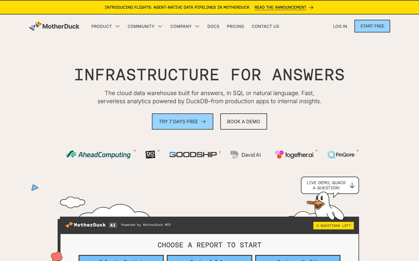
MotherDuck's marketing surface is a playful, developer-warm interface built on a **cream canvas** (`{colors.canvas}` — #f4efea) and an entirely **monospace type system**. Headlines run in **Aeonik Mono** (uppercase, generously tracked) and body copy in **Aeonik Fono** — the page reads like a friendly, well-lit terminal. Primary actions are **sky-blue** (`{colors.primary}` — #6fc2ff) with near-sharp corners, and the system is punctuated by bright **yellow** bands (`{colors.highlight}` — #ffde00) — the top announcement bar and the scrolling "DATA WAREHOUSE + AI" marquee.
The brand voice is built from three things: the all-mono typography, the cream-blue-yellow palette, and a layer of **hand-drawn duck and cloud illustrations** that float around product cards. There is almost no border radius — corners are 0px on most components and 2px at most (`{rounded.sm}`) — which gives the UI a deliberate, blocky, almost-printed feel. The one signature depth treatment is a **hard offset "sticker" shadow** (`rgb(56,56,56) -8px 8px 0px 0px`) — a solid drop with no blur.
**Key Characteristics:**
- Cream canvas (`{colors.canvas}` — #f4efea) under everything; white (`{colors.surface-white}` — #ffffff) reserved for cards and inputs.
- All-monospace typography: Aeonik Mono for display/headings, Aeonik Fono for body. Buttons fall back to Inter (`{typography.button}`).
- Uppercase, tracked display headlines — `{typography.display}` (56px, +1.12px letter-spacing) is the marquee hero treatment ("INFRASTRUCTURE FOR ANSWERS").
- Sky-blue CTAs (`{component.button-primary}`) with dark `{colors.on-primary}` (#383838) labels and sharp `{rounded.none}` corners.
- Yellow bands (`{colors.highlight}`) for the announcement bar, "questions left" badges, and the scrolling marquee.
- Near-zero radius across the system: `{rounded.none}` (0px) on buttons, cards, and inputs; `{rounded.sm}` (2px) is the maximum measured.
- A hard, blur-less offset shadow (`{colors.on-primary}` at -8px / +8px) — a sticker/cutout depth signature.
- Hand-drawn duck and cloud illustrations float between sections; an embedded "MotherDuck AI" widget card shows real product chrome.
## Colors
### Brand & Accent
- **Primary** (`{colors.primary}` — #6fc2ff): The sky-blue CTA color. All primary buttons, the nav "START FREE" cta, and the full-bleed use-cases band. Carries dark `{colors.on-primary}` labels rather than white.
- **Primary Soft** (`{colors.primary-soft}` — #96d0ff): A lighter blue used in illustration fills and secondary blue surfaces.
- **Primary Deep** (`{colors.primary-deep}` — #316dca): A deeper blue used in illustration line art and accents.
- **Highlight** (`{colors.highlight}` — #ffde00): The brand yellow — announcement bar, "3 QUESTIONS LEFT" pill, and the scrolling marquee band. The loudest color in the system; used in bands and chips, never on body buttons.
### Surface
- **Canvas** (`{colors.canvas}` — #f4efea): The warm cream page floor under every band.
- **Surface White** (`{colors.surface-white}` — #ffffff): Card bodies, input fields, the AI-widget card interior.
- **Surface Soft** (`{colors.surface-soft}` — #f8f8f7): A near-white used for very-soft nested surfaces.
- **Code Surface** (`{colors.code-surface}` — #22272e): A near-black used for the AI-widget header bar and dark section-label chips.
- **Hairline** (`{colors.hairline}` — #adbac7): The cool blue-gray border/divider tone.
- **Slate** (`{colors.slate}` — #768390): A muted blue-gray for secondary chrome and divider tones.
### Text
- **Ink** (`{colors.ink}` — #000000): Maximum-contrast headline and primary text against the cream canvas.
- **On Primary** (`{colors.on-primary}` — #383838): The dark-gray label color used on blue buttons (measured from `button.color`). The brand keeps button text dark, not white.
- **Body** (`{colors.body}` — #666666): Default running-text gray for paragraphs and sub-heads.
- **Muted** (`{colors.muted}` — #9ca3af): Tertiary text — fine print, captions, secondary labels.
### Code / Illustration Palette
A GitHub-dimmed-style syntax set appears inside code fragments and duck/cloud illustration art — never on marketing CTAs:
- **Syntax Red** (`{colors.syntax-red}` — #f47067), **Syntax Orange** (`{colors.syntax-orange}` — #f69d50), **Syntax Purple** (`{colors.syntax-purple}` — #dcbdfb), **Syntax Blue** (`{colors.syntax-blue}` — #6cb6ff), **Syntax Green** (`{colors.syntax-green}` — #8ddb8c), **Syntax Yellow** (`{colors.syntax-yellow}` — #eac55f).
## Typography
### Font Family
The system is **all monospace**. Display and headings run in **Aeonik Mono**; body copy runs in **Aeonik Fono** (a companion mono cut). Buttons are the one exception — they render in **Inter** (`{typography.button}`, 16px / 400). The mono families are commercial/custom faces; the fallback stack walks `ui-monospace, SFMono-Regular, Menlo, monospace`.
The split is functional:
- Aeonik Mono — uppercase display headlines, section headings, and tracked eyebrow labels.
- Aeonik Fono — running body text, descriptions, form labels.
- Inter — button labels only.
### Hierarchy
| Token | Size | Weight | Line Height | Letter Spacing | Use |
|---|---|---|---|---|---|
| `{typography.display}` | 56px | 400 | 1.2 | 1.12px | Hero h1 ("INFRASTRUCTURE FOR ANSWERS"), marquee band — Aeonik Mono |
| `{typography.heading}` | 24px | 400 | 1.2 | normal | Section headings, feature-card titles — Aeonik Mono |
| `{typography.label}` | 16px | 600 | 1.2 | 0.48px | Eyebrow / section labels, nav items, badges — Aeonik Mono |
| `{typography.body}` | 14px | 400 | 1.2 | normal | Running paragraph text, form labels, captions — Aeonik Fono |
| `{typography.button}` | 16px | 400 | 1.0 | normal | Button labels — Inter |
### Principles
The all-mono identity is the brand. Display headlines are uppercase with positive tracking (+1.12px at 56px) — the spacing is part of the voice and should not be removed. Line-height holds tight at 1.2 across every role, which gives blocky, dense type masses. The only non-mono escape is the Inter button label; never push mono headlines below their tracked, uppercase treatment.
### Note on Font Substitutes
**Aeonik Mono** and **Aeonik Fono** are commercial typefaces (CoType Foundry) and are not freely redistributable — do not assume they ship. Open-source substitutes that preserve the geometric-monospace voice: **JetBrains Mono** or **Space Mono** for the display/heading roles, and **IBM Plex Mono** for body. Match the uppercase + positive-tracking treatment on display sizes to keep the feel.
## Layout
### Spacing System
- **Base unit:** 4px (the dominant measured step).
- **Tokens:** `{spacing.xxs}` 4px · `{spacing.xs}` 8px · `{spacing.sm}` 12px · `{spacing.md}` 16px · `{spacing.lg}` 20px · `{spacing.xl}` 22px.
- **Most frequent steps:** 8px (93×), 4px (68×), 16px (51×), 12px (43×), 10px (40×) — the rhythm clusters tightly in the 4–16px range.
- **Card internal padding:** ~22px (`{spacing.xl}`) on feature cards; 12–16px on inputs and chips.
### Grid & Container
- **Hero band:** centered single-column — display h1, sub-head, and a two-button CTA row, all center-aligned over the cream canvas.
- **Logo strip:** a single horizontal row of partner logos beneath the hero.
- **Feature rows:** alternating image/illustration + text blocks within the blue use-cases band.
- **Section labels:** small dark or yellow chips ("WHO IS IT FOR?", "HOW WE SCALE", "USE CASES") introduce each band.
(Exact max content width and column counts were not measured — see Known Gaps.)
### Whitespace Philosophy
The layout uses generous vertical breathing room around centered hero content, with illustrations (ducks, clouds) occupying the margins. Tight type line-height (1.2) packs headline masses densely, but bands are well-separated, letting the cream canvas and floating illustrations carry the rhythm.
## Elevation & Depth
| Level | Treatment | Use |
|---|---|---|
| Flat | No shadow, no border | Body bands, top nav, marquee, logo strip |
| Hairline | 1px `{colors.hairline}` (#adbac7) border | Inputs, dividers, card outlines |
| Sticker shadow | `rgb(56,56,56) -8px 8px 0px 0px` — solid offset, **no blur** | The single measured depth signature; applied to a featured card/element |
The depth philosophy is **flat-with-a-hard-cutout**. There is exactly one measured shadow — a blur-less solid offset in `{colors.on-primary}` (#383838), thrown up-left/down (-8px / +8px). It reads like a printed sticker or cut paper, not a soft material shadow. Cards otherwise carry `shadow: none` per measurement.
### Decorative Depth
- Hand-drawn duck and cloud illustrations float between and around cards, providing visual layering without true elevation.
- The embedded "MotherDuck AI" widget card shows real product chrome (report tiles, a query input) with its own internal contrast — product-as-content, not decoration.
## Shapes
### Border Radius Scale
| Token | Value | Use |
|---|---|---|
| `{rounded.none}` | 0px | Buttons, cards, inputs — sharp corners are the default (measured 0px on `button`, `card`, `input`) |
| `{rounded.sm}` | 2px | The maximum measured radius — slight softening on a subset of surfaces (83× in the data) |
The system is intentionally blocky. Nothing rounds beyond 2px; primary buttons and cards sit at a true 0px. This squared geometry pairs with the monospace type to reinforce the terminal/print aesthetic.
### Illustration Geometry
Duck and cloud illustrations are loose hand-drawn line art with organic curves — the only "soft" geometry in the system, and they live entirely in the illustration layer, not the UI chrome.
## Components
### Banners & Navigation
**`top-banner`** — A full-bleed yellow announcement bar at the very top (`{colors.highlight}`, `{colors.ink}` text, `{typography.body}`). Carries a single message ("INTRODUCING FLIGHTS: AGENT-NATIVE DATA PIPELINES…") with an underlined "READ THE ANNOUNCEMENT →" link.
**`top-nav`** — Cream-canvas nav bar (`{colors.canvas}`) holding the MotherDuck duck wordmark at left, a center menu (PRODUCT, COMMUNITY, COMPANY, DOCS, PRICING, CONTACT US) in `{typography.label}`, and a right cluster: a "LOG IN" text link plus the `{component.nav-cta}` "START FREE" button.
**`nav-cta`** — The blue "START FREE" button in the nav. Background `{colors.primary}`, label `{colors.on-primary}`, sharp `{rounded.none}` corners.
### Buttons
**`button-primary`** — The signature CTA ("TRY 7 DAYS FREE →"). Background `{colors.primary}` (#6fc2ff), label `{colors.on-primary}` (#383838) in `{typography.button}` (Inter 16px), sharp `{rounded.none}` corners. Note the dark-on-blue label — the brand does not use white button text.
**`button-secondary`** — Outlined/ghost CTA ("BOOK A DEMO"). Transparent background, `{colors.ink}` label, hairline border, same sharp corners and sizing as primary.
### Badges & Chips
**`badge-pill`** — Small yellow status chip ("3 QUESTIONS LEFT"). Background `{colors.highlight}`, `{colors.ink}` text, `{typography.body}`, sharp `{rounded.none}` corners.
**`section-label-chip`** — A dark eyebrow chip introducing bands ("HOW WE SCALE"). Background `{colors.code-surface}` (#22272e), text `{colors.surface-white}`, `{typography.label}`. (Some section labels also render as yellow or gray chips — chip color varies by band.)
### Cards & Containers
**`card`** — Base white container. Background `{colors.surface-white}`, sharp `{rounded.none}` corners, no shadow by default. The featured instance carries the hard `rgb(56,56,56) -8px 8px 0px 0px` sticker shadow.
**`feature-card`** — Used in the use-cases band (e.g. "HYPERTENANCY DATA WAREHOUSE", "MOTHERDUCK MCP SERVER"). White background, a heading in `{typography.heading}`, a description in `{typography.body}`, and an inline text/secondary CTA ("LEARN MORE"). Internal padding ~`{spacing.xl}` (22px), sharp corners. Often paired with a blue-tinted illustration tile to its left.
**`ai-widget-card`** — The embedded "MotherDuck AI" demo card. White body (`{colors.surface-white}`) with a dark `{colors.code-surface}` header bar carrying the "MotherDuck AI · Powered by MotherDuck MCP" label and a yellow `{component.badge-pill}`. Holds selectable report tiles ("Sales by Product", "Regional Sales", "Customer Health") and a query input row. Shows real product chrome as content.
### Inputs & Forms
**`input`** — Standard text field (e.g. the "DUCKDB IN ACTION" book email capture). Background `{colors.surface-white}`, `{colors.ink}` text, `{typography.body}`, sharp `{rounded.none}` corners, ~12px × 16px padding.
### Bands
**`logo-strip`** — Cream-canvas row of partner logos (AheadComputing, GOODSHIP, David AI, together.ai, FinQore) below the hero.
**`marquee-band`** — A full-bleed yellow scrolling band (`{colors.highlight}`) repeating "DATA WAREHOUSE + AI" in `{typography.display}` mono. A loud rhythmic divider between sections.
**`usecases-band`** — A full-bleed sky-blue band (`{colors.primary}`) holding the stacked `{component.feature-card}` rows. Also appears as a teal/blue "USE CASES" marquee in the captures.
## Do's and Don'ts
### Do
- Keep the entire type system monospace — Aeonik Mono for display/headings, Aeonik Fono for body. Use Inter only for button labels.
- Set display headlines uppercase with positive tracking (+1.12px). The spacing is part of the voice.
- Use `{colors.primary}` (#6fc2ff) for CTAs with dark `{colors.on-primary}` (#383838) labels — never white button text.
- Keep corners sharp: `{rounded.none}` for buttons/cards/inputs, `{rounded.sm}` (2px) at most.
- Reserve `{colors.highlight}` (#ffde00) for bands, the announcement bar, and small status chips — loud accents, not body buttons.
- Apply the hard offset sticker shadow (`{colors.on-primary}` at -8px/+8px, no blur) sparingly on a single featured surface.
- Let duck and cloud illustrations float in the margins to carry warmth between flat bands.
### Don't
- Don't introduce a proportional/sans display font — the mono identity is the brand. Body copy in a sans face reads as off-brand.
- Don't round corners beyond 2px. Pill or 12px+ radii break the blocky, printed feel.
- Don't add soft, blurred drop shadows. The system's only depth is the hard, blur-less offset.
- Don't put the syntax/illustration palette (`{colors.syntax-*}`) on CTAs — those colors live in code fragments and illustration art only.
- Don't use white text on the blue primary button; the measured label color is `{colors.on-primary}` (#383838).
- Don't document hover states — default and active/pressed only.
## Responsive Behavior
The captures include a desktop landing page and a tall full-page composite; an explicit mobile capture was not measured, so breakpoint values below are inferred from the layout and flagged in Known Gaps.
### Breakpoints (inferred)
| Name | Width | Key Changes |
|---|---|---|
| Mobile | < 768px | Nav likely collapses to a menu; hero h1 (`{typography.display}` 56px) scales down; CTA row stacks; feature cards go 1-up |
| Tablet | 768–1024px | Center menu tightens; feature card image + text rows may stack |
| Desktop | > 1024px | Full horizontal nav; centered hero; alternating image/text feature rows in the blue band |
### Touch Targets
- `{component.button-primary}` / `{component.nav-cta}` carry ~16×22px padding, giving comfortable tap height.
- `{component.input}` uses ~12×16px padding.
- (Exact rendered heights were not measured — see Known Gaps.)
### Collapsing Strategy
- Hero stays centered single-column at all sizes; the two CTAs stack on narrow viewports.
- The logo strip wraps/scrolls when logos exceed the row width.
- Marquee bands continue to scroll horizontally regardless of viewport.
- Feature rows in the blue band collapse from side-by-side image/text to stacked.
## Iteration Guide
1. Focus on ONE component at a time. Reference its YAML key directly (`{component.feature-card}`, `{component.ai-widget-card}`).
2. Variants of an existing component (`-active`, `-disabled`) live as separate entries in `components:`.
3. Use `{token.refs}` everywhere — never inline a hex in a component.
4. Never document hover. Default and Active/Pressed states only.
5. Headlines stay monospace, uppercase, and tracked. Body stays Aeonik Fono. Buttons stay Inter. The split does not blur.
6. Corners stay sharp (0–2px). The hard offset shadow is the only depth move — apply it scarcely.
7. When in doubt about emphasis: bigger mono before bolder mono, and reach for a yellow band before adding a new accent color.
## Known Gaps
- The button measurement reported `radius: 0px, padding: 0px` with `color: #383838` (label color only) — the blue background and exact padding were read from the screenshots, so button padding tokens (16×22px) are approximate/derived.
- **Aeonik Mono** and **Aeonik Fono** are commercial faces but were not flagged in `fonts_licensed`; substitutes are documented in Typography out of caution. Confirm licensing before shipping.
- Only one shadow was captured (`rgb(56,56,56) -8px 8px 0px 0px`); the specific element(s) it applies to are inferred.
- No footer was captured — footer surface, columns, and link styling are unknown.
- Max content width, grid column counts, and section vertical spacing were not measured; spacing tokens cap at 22px from the data, so any larger section rhythm is undocumented.
- No mobile/tablet capture was provided; all responsive breakpoints and collapsing behavior are inferred from the desktop layout.
- Several accents (`#22272e`, `#f47067`, `#dcbdfb`, `#6cb6ff`, `#96d0ff`, `#f69d50`, `#8ddb8c`, `#316dca`, `#eac55f`) resemble a syntax-highlighting palette and are documented as code/illustration colors; their exact in-product roles were not isolated.
- Active/pressed and focus states for buttons and inputs were not extracted — only default appearance is measured.
- The "muted" role in the source data resolved to #ffffff (flagged as low-contrast text on a dark band); it is treated here as `{colors.surface-white}` rather than a distinct text token.
<!-- Documented by duply · real-world design systems as ready-to-use DESIGN.md for AI coding agents · https://duply.ai/motherduck/design-md -->
Color Palette
Accent
Neutrals
Typography
display56px · 400 · 1.2
The quick brown fox jumpsheading24px · 400 · 1.2
The quick brown fox jumpslabel16px · 600 · 1.2
The quick brown fox jumpsbody14px · 400 · 1.2
The quick brown fox jumpsbutton16px · 400 · 1
The quick brown fox jumpsSpacing & Shape
Spacing
| Name | Value | Preview |
|---|---|---|
| xxs | 4px | |
| xs | 8px | |
| sm | 12px | |
| md | 16px | |
| lg | 20px | |
| xl | 22px |
Border Radius
| Name | Value | Preview |
|---|---|---|
| none | 0px | |
| sm | 2px |
More like this


---
version: alpha
name: MotherDuck-design-analysis
description: A playful, developer-warm marketing surface built on a cream canvas (#f4efea) and an entirely monospace type system (Aeonik Mono display + Aeonik Fono body). The system reads like a friendly terminal — uppercase mono headlines, sky-blue CTA buttons with sharp 0–2px corners, a bright yellow announcement bar and marquee bands, hard offset "sticker" shadows, and hand-drawn duck/cloud illustrations. Brand voltage comes from the mono typography, the cream-and-blue palette, and the cheerful illustration layer rather than from heavy depth or accent saturation.

colors:
  primary: "#6fc2ff"
  primary-soft: "#96d0ff"
  primary-deep: "#316dca"
  highlight: "#ffde00"
  ink: "#000000"
  on-primary: "#383838"
  body: "#666666"
  muted: "#9ca3af"
  canvas: "#f4efea"
  surface-white: "#ffffff"
  surface-soft: "#f8f8f7"
  hairline: "#adbac7"
  slate: "#768390"
  code-surface: "#22272e"
  syntax-red: "#f47067"
  syntax-orange: "#f69d50"
  syntax-purple: "#dcbdfb"
  syntax-blue: "#6cb6ff"
  syntax-green: "#8ddb8c"
  syntax-yellow: "#eac55f"

typography:
  display:
    fontFamily: "Aeonik Mono, ui-monospace, monospace"
    fontSize: 56px
    fontWeight: 400
    lineHeight: 1.2
    letterSpacing: 1.12px
  heading:
    fontFamily: "Aeonik Mono, ui-monospace, monospace"
    fontSize: 24px
    fontWeight: 400
    lineHeight: 1.2
    letterSpacing: normal
  label:
    fontFamily: "Aeonik Mono, ui-monospace, monospace"
    fontSize: 16px
    fontWeight: 600
    lineHeight: 1.2
    letterSpacing: 0.48px
  body:
    fontFamily: "Aeonik Fono, ui-monospace, monospace"
    fontSize: 14px
    fontWeight: 400
    lineHeight: 1.2
    letterSpacing: normal
  button:
    fontFamily: "Inter, sans-serif"
    fontSize: 16px
    fontWeight: 400
    lineHeight: 1.0
    letterSpacing: normal

rounded:
  none: 0px
  sm: 2px

spacing:
  xxs: 4px
  xs: 8px
  sm: 12px
  md: 16px
  lg: 20px
  xl: 22px

components:
  top-banner:
    backgroundColor: "{colors.highlight}"
    textColor: "{colors.ink}"
    typography: "{typography.body}"
    rounded: "{rounded.none}"
  top-nav:
    backgroundColor: "{colors.canvas}"
    textColor: "{colors.ink}"
    typography: "{typography.label}"
    padding: 16px
  nav-cta:
    backgroundColor: "{colors.primary}"
    textColor: "{colors.on-primary}"
    typography: "{typography.label}"
    rounded: "{rounded.none}"
    padding: 12px 20px
  button-primary:
    backgroundColor: "{colors.primary}"
    textColor: "{colors.on-primary}"
    typography: "{typography.button}"
    rounded: "{rounded.none}"
    padding: 16px 22px
  button-secondary:
    backgroundColor: transparent
    textColor: "{colors.ink}"
    typography: "{typography.button}"
    rounded: "{rounded.none}"
    padding: 16px 22px
  badge-pill:
    backgroundColor: "{colors.highlight}"
    textColor: "{colors.ink}"
    typography: "{typography.body}"
    rounded: "{rounded.none}"
    padding: 4px 8px
  card:
    backgroundColor: "{colors.surface-white}"
    textColor: "{colors.ink}"
    rounded: "{rounded.none}"
  feature-card:
    backgroundColor: "{colors.surface-white}"
    textColor: "{colors.ink}"
    typography: "{typography.heading}"
    rounded: "{rounded.none}"
    padding: 22px
  ai-widget-card:
    backgroundColor: "{colors.surface-white}"
    textColor: "{colors.ink}"
    typography: "{typography.body}"
    rounded: "{rounded.none}"
  input:
    backgroundColor: "{colors.surface-white}"
    textColor: "{colors.ink}"
    typography: "{typography.body}"
    rounded: "{rounded.none}"
    padding: 12px 16px
  logo-strip:
    backgroundColor: "{colors.canvas}"
    textColor: "{colors.ink}"
  marquee-band:
    backgroundColor: "{colors.highlight}"
    textColor: "{colors.ink}"
    typography: "{typography.display}"
  usecases-band:
    backgroundColor: "{colors.primary}"
    textColor: "{colors.ink}"
    typography: "{typography.heading}"
  section-label-chip:
    backgroundColor: "{colors.code-surface}"
    textColor: "{colors.surface-white}"
    typography: "{typography.label}"
    rounded: "{rounded.none}"
    padding: 8px 12px
---

## Overview

MotherDuck's marketing surface is a playful, developer-warm interface built on a **cream canvas** (`{colors.canvas}` — #f4efea) and an entirely **monospace type system**. Headlines run in **Aeonik Mono** (uppercase, generously tracked) and body copy in **Aeonik Fono** — the page reads like a friendly, well-lit terminal. Primary actions are **sky-blue** (`{colors.primary}` — #6fc2ff) with near-sharp corners, and the system is punctuated by bright **yellow** bands (`{colors.highlight}` — #ffde00) — the top announcement bar and the scrolling "DATA WAREHOUSE + AI" marquee.

The brand voice is built from three things: the all-mono typography, the cream-blue-yellow palette, and a layer of **hand-drawn duck and cloud illustrations** that float around product cards. There is almost no border radius — corners are 0px on most components and 2px at most (`{rounded.sm}`) — which gives the UI a deliberate, blocky, almost-printed feel. The one signature depth treatment is a **hard offset "sticker" shadow** (`rgb(56,56,56) -8px 8px 0px 0px`) — a solid drop with no blur.

**Key Characteristics:**
- Cream canvas (`{colors.canvas}` — #f4efea) under everything; white (`{colors.surface-white}` — #ffffff) reserved for cards and inputs.
- All-monospace typography: Aeonik Mono for display/headings, Aeonik Fono for body. Buttons fall back to Inter (`{typography.button}`).
- Uppercase, tracked display headlines — `{typography.display}` (56px, +1.12px letter-spacing) is the marquee hero treatment ("INFRASTRUCTURE FOR ANSWERS").
- Sky-blue CTAs (`{component.button-primary}`) with dark `{colors.on-primary}` (#383838) labels and sharp `{rounded.none}` corners.
- Yellow bands (`{colors.highlight}`) for the announcement bar, "questions left" badges, and the scrolling marquee.
- Near-zero radius across the system: `{rounded.none}` (0px) on buttons, cards, and inputs; `{rounded.sm}` (2px) is the maximum measured.
- A hard, blur-less offset shadow (`{colors.on-primary}` at -8px / +8px) — a sticker/cutout depth signature.
- Hand-drawn duck and cloud illustrations float between sections; an embedded "MotherDuck AI" widget card shows real product chrome.

## Colors

### Brand & Accent
- **Primary** (`{colors.primary}` — #6fc2ff): The sky-blue CTA color. All primary buttons, the nav "START FREE" cta, and the full-bleed use-cases band. Carries dark `{colors.on-primary}` labels rather than white.
- **Primary Soft** (`{colors.primary-soft}` — #96d0ff): A lighter blue used in illustration fills and secondary blue surfaces.
- **Primary Deep** (`{colors.primary-deep}` — #316dca): A deeper blue used in illustration line art and accents.
- **Highlight** (`{colors.highlight}` — #ffde00): The brand yellow — announcement bar, "3 QUESTIONS LEFT" pill, and the scrolling marquee band. The loudest color in the system; used in bands and chips, never on body buttons.

### Surface
- **Canvas** (`{colors.canvas}` — #f4efea): The warm cream page floor under every band.
- **Surface White** (`{colors.surface-white}` — #ffffff): Card bodies, input fields, the AI-widget card interior.
- **Surface Soft** (`{colors.surface-soft}` — #f8f8f7): A near-white used for very-soft nested surfaces.
- **Code Surface** (`{colors.code-surface}` — #22272e): A near-black used for the AI-widget header bar and dark section-label chips.
- **Hairline** (`{colors.hairline}` — #adbac7): The cool blue-gray border/divider tone.
- **Slate** (`{colors.slate}` — #768390): A muted blue-gray for secondary chrome and divider tones.

### Text
- **Ink** (`{colors.ink}` — #000000): Maximum-contrast headline and primary text against the cream canvas.
- **On Primary** (`{colors.on-primary}` — #383838): The dark-gray label color used on blue buttons (measured from `button.color`). The brand keeps button text dark, not white.
- **Body** (`{colors.body}` — #666666): Default running-text gray for paragraphs and sub-heads.
- **Muted** (`{colors.muted}` — #9ca3af): Tertiary text — fine print, captions, secondary labels.

### Code / Illustration Palette
A GitHub-dimmed-style syntax set appears inside code fragments and duck/cloud illustration art — never on marketing CTAs:
- **Syntax Red** (`{colors.syntax-red}` — #f47067), **Syntax Orange** (`{colors.syntax-orange}` — #f69d50), **Syntax Purple** (`{colors.syntax-purple}` — #dcbdfb), **Syntax Blue** (`{colors.syntax-blue}` — #6cb6ff), **Syntax Green** (`{colors.syntax-green}` — #8ddb8c), **Syntax Yellow** (`{colors.syntax-yellow}` — #eac55f).

## Typography

### Font Family
The system is **all monospace**. Display and headings run in **Aeonik Mono**; body copy runs in **Aeonik Fono** (a companion mono cut). Buttons are the one exception — they render in **Inter** (`{typography.button}`, 16px / 400). The mono families are commercial/custom faces; the fallback stack walks `ui-monospace, SFMono-Regular, Menlo, monospace`.

The split is functional:
- Aeonik Mono — uppercase display headlines, section headings, and tracked eyebrow labels.
- Aeonik Fono — running body text, descriptions, form labels.
- Inter — button labels only.

### Hierarchy

| Token | Size | Weight | Line Height | Letter Spacing | Use |
|---|---|---|---|---|---|
| `{typography.display}` | 56px | 400 | 1.2 | 1.12px | Hero h1 ("INFRASTRUCTURE FOR ANSWERS"), marquee band — Aeonik Mono |
| `{typography.heading}` | 24px | 400 | 1.2 | normal | Section headings, feature-card titles — Aeonik Mono |
| `{typography.label}` | 16px | 600 | 1.2 | 0.48px | Eyebrow / section labels, nav items, badges — Aeonik Mono |
| `{typography.body}` | 14px | 400 | 1.2 | normal | Running paragraph text, form labels, captions — Aeonik Fono |
| `{typography.button}` | 16px | 400 | 1.0 | normal | Button labels — Inter |

### Principles
The all-mono identity is the brand. Display headlines are uppercase with positive tracking (+1.12px at 56px) — the spacing is part of the voice and should not be removed. Line-height holds tight at 1.2 across every role, which gives blocky, dense type masses. The only non-mono escape is the Inter button label; never push mono headlines below their tracked, uppercase treatment.

### Note on Font Substitutes
**Aeonik Mono** and **Aeonik Fono** are commercial typefaces (CoType Foundry) and are not freely redistributable — do not assume they ship. Open-source substitutes that preserve the geometric-monospace voice: **JetBrains Mono** or **Space Mono** for the display/heading roles, and **IBM Plex Mono** for body. Match the uppercase + positive-tracking treatment on display sizes to keep the feel.

## Layout

### Spacing System
- **Base unit:** 4px (the dominant measured step).
- **Tokens:** `{spacing.xxs}` 4px · `{spacing.xs}` 8px · `{spacing.sm}` 12px · `{spacing.md}` 16px · `{spacing.lg}` 20px · `{spacing.xl}` 22px.
- **Most frequent steps:** 8px (93×), 4px (68×), 16px (51×), 12px (43×), 10px (40×) — the rhythm clusters tightly in the 4–16px range.
- **Card internal padding:** ~22px (`{spacing.xl}`) on feature cards; 12–16px on inputs and chips.

### Grid & Container
- **Hero band:** centered single-column — display h1, sub-head, and a two-button CTA row, all center-aligned over the cream canvas.
- **Logo strip:** a single horizontal row of partner logos beneath the hero.
- **Feature rows:** alternating image/illustration + text blocks within the blue use-cases band.
- **Section labels:** small dark or yellow chips ("WHO IS IT FOR?", "HOW WE SCALE", "USE CASES") introduce each band.

(Exact max content width and column counts were not measured — see Known Gaps.)

### Whitespace Philosophy
The layout uses generous vertical breathing room around centered hero content, with illustrations (ducks, clouds) occupying the margins. Tight type line-height (1.2) packs headline masses densely, but bands are well-separated, letting the cream canvas and floating illustrations carry the rhythm.

## Elevation & Depth

| Level | Treatment | Use |
|---|---|---|
| Flat | No shadow, no border | Body bands, top nav, marquee, logo strip |
| Hairline | 1px `{colors.hairline}` (#adbac7) border | Inputs, dividers, card outlines |
| Sticker shadow | `rgb(56,56,56) -8px 8px 0px 0px` — solid offset, **no blur** | The single measured depth signature; applied to a featured card/element |

The depth philosophy is **flat-with-a-hard-cutout**. There is exactly one measured shadow — a blur-less solid offset in `{colors.on-primary}` (#383838), thrown up-left/down (-8px / +8px). It reads like a printed sticker or cut paper, not a soft material shadow. Cards otherwise carry `shadow: none` per measurement.

### Decorative Depth
- Hand-drawn duck and cloud illustrations float between and around cards, providing visual layering without true elevation.
- The embedded "MotherDuck AI" widget card shows real product chrome (report tiles, a query input) with its own internal contrast — product-as-content, not decoration.

## Shapes

### Border Radius Scale

| Token | Value | Use |
|---|---|---|
| `{rounded.none}` | 0px | Buttons, cards, inputs — sharp corners are the default (measured 0px on `button`, `card`, `input`) |
| `{rounded.sm}` | 2px | The maximum measured radius — slight softening on a subset of surfaces (83× in the data) |

The system is intentionally blocky. Nothing rounds beyond 2px; primary buttons and cards sit at a true 0px. This squared geometry pairs with the monospace type to reinforce the terminal/print aesthetic.

### Illustration Geometry
Duck and cloud illustrations are loose hand-drawn line art with organic curves — the only "soft" geometry in the system, and they live entirely in the illustration layer, not the UI chrome.

## Components

### Banners & Navigation

**`top-banner`** — A full-bleed yellow announcement bar at the very top (`{colors.highlight}`, `{colors.ink}` text, `{typography.body}`). Carries a single message ("INTRODUCING FLIGHTS: AGENT-NATIVE DATA PIPELINES…") with an underlined "READ THE ANNOUNCEMENT →" link.

**`top-nav`** — Cream-canvas nav bar (`{colors.canvas}`) holding the MotherDuck duck wordmark at left, a center menu (PRODUCT, COMMUNITY, COMPANY, DOCS, PRICING, CONTACT US) in `{typography.label}`, and a right cluster: a "LOG IN" text link plus the `{component.nav-cta}` "START FREE" button.

**`nav-cta`** — The blue "START FREE" button in the nav. Background `{colors.primary}`, label `{colors.on-primary}`, sharp `{rounded.none}` corners.

### Buttons

**`button-primary`** — The signature CTA ("TRY 7 DAYS FREE →"). Background `{colors.primary}` (#6fc2ff), label `{colors.on-primary}` (#383838) in `{typography.button}` (Inter 16px), sharp `{rounded.none}` corners. Note the dark-on-blue label — the brand does not use white button text.

**`button-secondary`** — Outlined/ghost CTA ("BOOK A DEMO"). Transparent background, `{colors.ink}` label, hairline border, same sharp corners and sizing as primary.

### Badges & Chips

**`badge-pill`** — Small yellow status chip ("3 QUESTIONS LEFT"). Background `{colors.highlight}`, `{colors.ink}` text, `{typography.body}`, sharp `{rounded.none}` corners.

**`section-label-chip`** — A dark eyebrow chip introducing bands ("HOW WE SCALE"). Background `{colors.code-surface}` (#22272e), text `{colors.surface-white}`, `{typography.label}`. (Some section labels also render as yellow or gray chips — chip color varies by band.)

### Cards & Containers

**`card`** — Base white container. Background `{colors.surface-white}`, sharp `{rounded.none}` corners, no shadow by default. The featured instance carries the hard `rgb(56,56,56) -8px 8px 0px 0px` sticker shadow.

**`feature-card`** — Used in the use-cases band (e.g. "HYPERTENANCY DATA WAREHOUSE", "MOTHERDUCK MCP SERVER"). White background, a heading in `{typography.heading}`, a description in `{typography.body}`, and an inline text/secondary CTA ("LEARN MORE"). Internal padding ~`{spacing.xl}` (22px), sharp corners. Often paired with a blue-tinted illustration tile to its left.

**`ai-widget-card`** — The embedded "MotherDuck AI" demo card. White body (`{colors.surface-white}`) with a dark `{colors.code-surface}` header bar carrying the "MotherDuck AI · Powered by MotherDuck MCP" label and a yellow `{component.badge-pill}`. Holds selectable report tiles ("Sales by Product", "Regional Sales", "Customer Health") and a query input row. Shows real product chrome as content.

### Inputs & Forms

**`input`** — Standard text field (e.g. the "DUCKDB IN ACTION" book email capture). Background `{colors.surface-white}`, `{colors.ink}` text, `{typography.body}`, sharp `{rounded.none}` corners, ~12px × 16px padding.

### Bands

**`logo-strip`** — Cream-canvas row of partner logos (AheadComputing, GOODSHIP, David AI, together.ai, FinQore) below the hero.

**`marquee-band`** — A full-bleed yellow scrolling band (`{colors.highlight}`) repeating "DATA WAREHOUSE + AI" in `{typography.display}` mono. A loud rhythmic divider between sections.

**`usecases-band`** — A full-bleed sky-blue band (`{colors.primary}`) holding the stacked `{component.feature-card}` rows. Also appears as a teal/blue "USE CASES" marquee in the captures.

## Do's and Don'ts

### Do
- Keep the entire type system monospace — Aeonik Mono for display/headings, Aeonik Fono for body. Use Inter only for button labels.
- Set display headlines uppercase with positive tracking (+1.12px). The spacing is part of the voice.
- Use `{colors.primary}` (#6fc2ff) for CTAs with dark `{colors.on-primary}` (#383838) labels — never white button text.
- Keep corners sharp: `{rounded.none}` for buttons/cards/inputs, `{rounded.sm}` (2px) at most.
- Reserve `{colors.highlight}` (#ffde00) for bands, the announcement bar, and small status chips — loud accents, not body buttons.
- Apply the hard offset sticker shadow (`{colors.on-primary}` at -8px/+8px, no blur) sparingly on a single featured surface.
- Let duck and cloud illustrations float in the margins to carry warmth between flat bands.

### Don't
- Don't introduce a proportional/sans display font — the mono identity is the brand. Body copy in a sans face reads as off-brand.
- Don't round corners beyond 2px. Pill or 12px+ radii break the blocky, printed feel.
- Don't add soft, blurred drop shadows. The system's only depth is the hard, blur-less offset.
- Don't put the syntax/illustration palette (`{colors.syntax-*}`) on CTAs — those colors live in code fragments and illustration art only.
- Don't use white text on the blue primary button; the measured label color is `{colors.on-primary}` (#383838).
- Don't document hover states — default and active/pressed only.

## Responsive Behavior

The captures include a desktop landing page and a tall full-page composite; an explicit mobile capture was not measured, so breakpoint values below are inferred from the layout and flagged in Known Gaps.

### Breakpoints (inferred)

| Name | Width | Key Changes |
|---|---|---|
| Mobile | < 768px | Nav likely collapses to a menu; hero h1 (`{typography.display}` 56px) scales down; CTA row stacks; feature cards go 1-up |
| Tablet | 768–1024px | Center menu tightens; feature card image + text rows may stack |
| Desktop | > 1024px | Full horizontal nav; centered hero; alternating image/text feature rows in the blue band |

### Touch Targets
- `{component.button-primary}` / `{component.nav-cta}` carry ~16×22px padding, giving comfortable tap height.
- `{component.input}` uses ~12×16px padding.
- (Exact rendered heights were not measured — see Known Gaps.)

### Collapsing Strategy
- Hero stays centered single-column at all sizes; the two CTAs stack on narrow viewports.
- The logo strip wraps/scrolls when logos exceed the row width.
- Marquee bands continue to scroll horizontally regardless of viewport.
- Feature rows in the blue band collapse from side-by-side image/text to stacked.

## Iteration Guide

1. Focus on ONE component at a time. Reference its YAML key directly (`{component.feature-card}`, `{component.ai-widget-card}`).
2. Variants of an existing component (`-active`, `-disabled`) live as separate entries in `components:`.
3. Use `{token.refs}` everywhere — never inline a hex in a component.
4. Never document hover. Default and Active/Pressed states only.
5. Headlines stay monospace, uppercase, and tracked. Body stays Aeonik Fono. Buttons stay Inter. The split does not blur.
6. Corners stay sharp (0–2px). The hard offset shadow is the only depth move — apply it scarcely.
7. When in doubt about emphasis: bigger mono before bolder mono, and reach for a yellow band before adding a new accent color.

## Known Gaps

- The button measurement reported `radius: 0px, padding: 0px` with `color: #383838` (label color only) — the blue background and exact padding were read from the screenshots, so button padding tokens (16×22px) are approximate/derived.
- **Aeonik Mono** and **Aeonik Fono** are commercial faces but were not flagged in `fonts_licensed`; substitutes are documented in Typography out of caution. Confirm licensing before shipping.
- Only one shadow was captured (`rgb(56,56,56) -8px 8px 0px 0px`); the specific element(s) it applies to are inferred.
- No footer was captured — footer surface, columns, and link styling are unknown.
- Max content width, grid column counts, and section vertical spacing were not measured; spacing tokens cap at 22px from the data, so any larger section rhythm is undocumented.
- No mobile/tablet capture was provided; all responsive breakpoints and collapsing behavior are inferred from the desktop layout.
- Several accents (`#22272e`, `#f47067`, `#dcbdfb`, `#6cb6ff`, `#96d0ff`, `#f69d50`, `#8ddb8c`, `#316dca`, `#eac55f`) resemble a syntax-highlighting palette and are documented as code/illustration colors; their exact in-product roles were not isolated.
- Active/pressed and focus states for buttons and inputs were not extracted — only default appearance is measured.
- The "muted" role in the source data resolved to #ffffff (flagged as low-contrast text on a dark band); it is treated here as `{colors.surface-white}` rather than a distinct text token.

<!-- Documented by duply · real-world design systems as ready-to-use DESIGN.md for AI coding agents · https://duply.ai/motherduck/design-md -->